Shot-consciousness
Tuesday | January 16, 2007 open printable version
Most professional critics seem uninterested in the film shot as a shot. They might notice when the images call flagrant attention to themselves, as in Zhang Yimou’s recent films, or in those protracted walk-and-talk Steadicam takes. On the whole, though, reviewers prefer to talk about plot and acting.
Granted, it’s hard to be aware of shots, especially if you get engrossed in the story. But if we want to be fully alert to how movies work on us, we should keep our eyes open. Back in 1968, I read The Moving Image by Robert Gessner, one of the first teachers of cinema studies in the US. There Gessner offered a sturdy piece of advice: Be shot-conscious.
About twenty years later, trying to be shot-conscious and all, I started to notice a certain type of image becoming more common, especially in European and Asian films. Then it started to appear in US films as well, especially indie items. Now it’s very common everywhere, though it’s still not the predominant sort of shot.
Here’s a fairly early example, from R. W. Fassbinder’s Katzelmacher (1969).
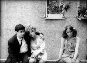
How to characterize it? The camera stands perpendicular to a rear surface, usually a wall. The characters are strung across the frame like clothes on a line. Sometimes they’re facing us, so the image looks like people in a police lineup. Sometimes the figures are in profile, usually for the sake of conversation, but just as often they talk while facing front.
Sometimes the shots are taken from fairly close, at other times the characters are dwarfed by the surroundings. In either case, this sort of framing avoids lining them up along receding diagonals. When there is a vanishing point, it tends to be in the center. If the characters are set up in depth, they tend to occupy parallel rows.
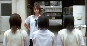
Linda Linda Linda (2005)
No one to my knowledge had noticed this sort of shot, let alone named it. I started to call it mug-shot framing, but I found that art historian Heinrich Wölfflin had called it planar or planimetric composition. I went with “planimetric” because that term suggests the rectangular geometry so often seen in these shots.
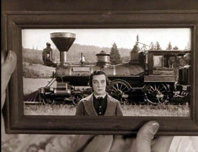
What’s striking is that such imagery is quite rare before, say, 1960. We can find some examples, principally in silent comedy and especially the films of Buster Keaton (himself a pretty geometrical director). But in the 1960s, we find Antonioni and Godard using planimetric shots fairly often.
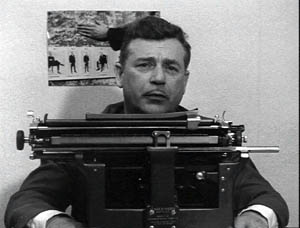
Vivre sa vie (1962)
This image design became more popular from the 1970s onward. Why? In On the History of Film Style and Figures Traced in Light, I tried to trace out some sources and functions of it. Briefly, I think that the planimetric shot emerged from filmmakers’ growing reliance on long lenses, which tend to create a flatter-looking, more cardboardy space than wide-angle lenses do. A telephoto shot makes an image seem less voluminous. It seems to be made of slices of space lined up one behind another.
Filmmakers began using long lenses for many purposes, often because of the demands of filming on location. And some directors realized that long-lens optics offered fresh resources for staging and composition.
For instance, the planimetric scheme is well-suited to a “painterly” or strongly pictorial approach to cinema. In Figures, I discuss two directors who made planimetric shots central to their style. Hou Hsiao-hsien saw very deeply into the possibilities of these shots; I think he learned it from his early skill at shooting on the street with long lenses. You can find more about that here. By contrast, Angelopoulos used the planimetric image in conjunction with architecture and landscape to create a sort of de-dramatized spectacle, a spare grandeur reminiscent of icon painting.
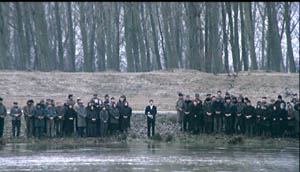
The Suspended Step of the Stork (1991)
The functions of the planimetric image can vary a lot. Often it’s used to suggest stasis and passivity, as in the Katzelmacher instance. Kitano Takeshi picks up on this sense of torpor in certain shots of Sonatine, which suggests that being a gangster means having a lot of time to kill just hanging out.
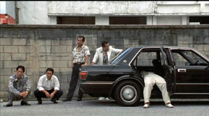
Kitano’s use of the image also suggests a kind of childish simplicity or naïve cinema. Unlike Hou and Angelopoulos, Kitano uses the planimetric schema as if it were just the most basic way to film anything. Line up your characters and shoot ’em, as if they were figures in South Park or Cathy.
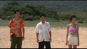
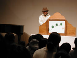
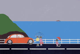
Kitano has compared himself to the kamishibai man, the street performer who narrates stories for children by flipping through illustrated cards, and Kitano’s paintings are more sophisticated, often planimetric versions of those drawings.
The planimetric schema can suggest something more oppressive too. That’s one purpose, I think, of certain shots in Terence Davies’ remarkable Distant Voices, Still Lives. The film’s stylistic system is quite rigorous in its use of straight-on compositions, and it’s worth more attention than I can give it here. For now I’ll just mention that the first part presents tableaux of unhappiness that suggest bleak family portraits.
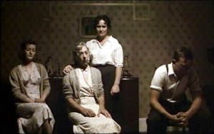
Here and more generally, the planimetric image often carries the connotations of a posed photograph. Possibly the dry, rectilinear imagery of Walker Evans and the wide-eyed attitudes of Diane Arbus’s portraits have contributed to the sense of stiff ceremony such shots sometimes have.

Walker Evans, Roadside Stand Near Birmingham (1936)
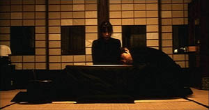
Asian filmmakers combined the planimetric image with very long takes. In Kore-eda Hirokazu’s Maborosi, Yumiko’s husband comes home drunk, a slip from his usual reliable habits. She has just been remembering her previous husband, dead in a bike accident. The rocklike stability of the shot, aided by the grid backing the characters, throws every gesture into relief, particularly when Yumiko’s face lifts slightly into and out of shadow in the course of the action.
In the 1990s US indie filmmakers adapted this staging strategy. In Safe, Todd Haynes uses it to suggest the hard-edged sterility of the wife’s suburban life, which surrounds her with cubical furniture.
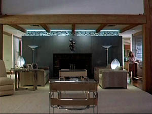
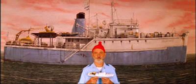
Wes Anderson used the image schema occasionally in Bottle Rocket but came to rely on it more and more. (He tended to use wide-angle rather than longer lenses, though; note the bulging effect in the Life Aquatic shot below.)
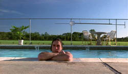
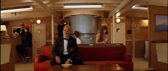
For Anderson, as for Keaton and Kitano, the static, geometrical frame can evoke a deadpan comic quality. This comes out as well in Jared Hess’s Napoleon Dynamite.
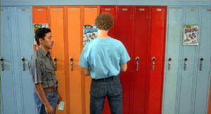
Initially, this scheme also helped filmmakers distinguish their work from Hollywood. Mainstream American films tend to film players in 3/4 views, except for certain situations, such as a theatrical performance or a scene showing a mammoth image display.
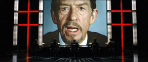
V for Vendetta (2005)
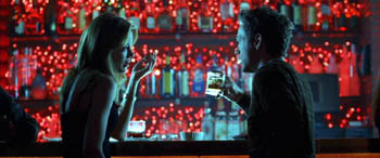
Some American directors seem to have used the planimetric shot decoratively, as a nifty one-off touch, as here in Kiss Kiss Bang Bang.
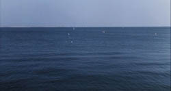
Many overseas directors who rely on this schema adjust their cutting accordingly. In Figures I called it compass-point editing. The usual tactic is to follow one planimetric shot with a reverse shot that’s also planimetric. In the first four shots of Kitano’s A Scene at the Sea, the camera angle switches either 180 degrees or zero degrees.
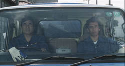
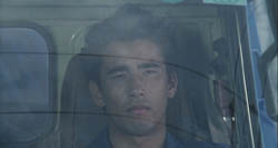
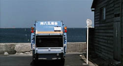
When I asked Kitano why he cut this way, he gestured toward me, then at himself. “When we are speaking, this is the way we look toward each other. It’s the most natural way to show a conversation.” Apparently this is why over-the-shoulder shots are pretty rare in Kitano’s films.
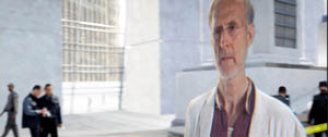
Planimetric shot/ reverse shot is seldom used in Hollywood films, and it seems to be reserved for certain confrontational situations, or institutional scenes (e.g., doctor/ patient conversations). It can sometimes suggest an unnerving or unnatural encounter, as in I, Robot. The detective Spooner is calling on his old friend Dr. Lanning, and their dialogue is shot in to-camera medium-shots.
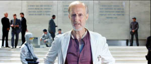
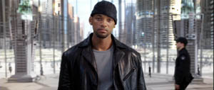
At the climax of the conversation, the camera takes up a 3/4 position and arcs around Lanning, revealing him to be only a hologram, presenting his dying message to Spooner. The planimetric image is motivated as suitable for a flat, virtual presence.
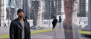
Proyas has cleverly prepared us for this subterfuge by ending the previous scene with an unremarkable planimetric framing on Spooner as elevator doors close on him.
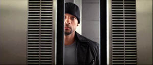
This shot leads directly to the initial shot of Dr. Lanning above, apparently addressing us, in a sort of shot/ reverse shot cut across two scenes.
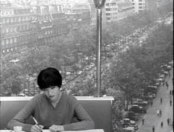
As we might expect, Godard, who helped disseminate the schema, is all up for upsetting it, in Vivre sa vie and Made in USA. The first shot below teases us to read the flat background as a high-angle vista; the second carries the idea of a conversation in a planimetric frame to a beautiful absurdity.
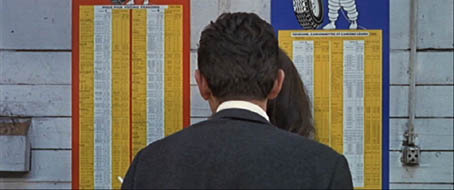
My quick survey doesn’t exhaust the various forms and uses of this strategy. I just wanted to show how shot-consciousness can lead us to notice when filmmakers take up new pictorial tools and modify them for particular purposes.


