Professor sees more parallels between things, other things
Tuesday | June 19, 2007 open printable version
An Onion report brought to my attention by Stew Fyfe celebrates the comparative method (“Professor Sees Parallels between Things, Other Things”). I confess myself an admirer of this approach. We can learn a lot by setting two things alongside one another. It’s even better if we have a reason to do so.
I thought about this when Kristin and I visited the Auckland Art Gallery in May. Their modern wing was hosting an intriguing Triennial show called Turbulence, an array of contemporary work, but I was more drawn to the Museum’s traditional collection. I saw a very nice Brueghel (he’s one of my favorites) and an arresting Adoration of the infant Jesus, painted by the rather minor Francisco Antolinez y Sarabia (1644-1700).
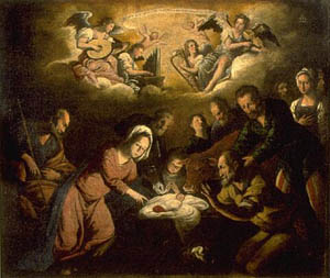
Though indifferently painted, it reminds me of El Greco in its tipped, piled-up figures. I enjoyed the acrobatic Madonna: Is she crouching, leaping, or tripping? It recalls Eisenstein’s point that much classic art creates impossible contortions which suggest various stages of movement, a point I discussed in a blog last year.
To get to those parallels: We wandered through the Gallery’s sturdy collection of British art and I was once again captivated by narrative painting of the late nineteenth century. Paintings have long been assigned the task of telling stories, but usually those stories were already well-known to the viewers, drawn as they were from history or mythology. In what’s come to be called “narrative painting,” the stories seem to be taken from life, although they’re really invoking our knowledge of prototypical situations.
Without the advantage of easily recognized religious or mythological tales, such pictures usually rely on a title to coax us fill in the story. The title specifies the context for the concrete action we see. For example, two prosperous young women are sitting in a garden. One is reading from a sheet of paper. What’s going on?
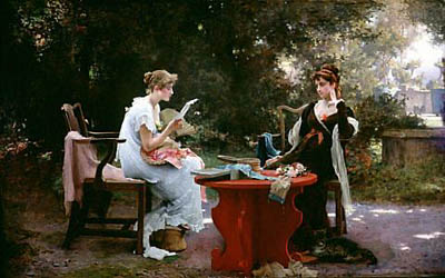
The title, Her First Love Letter, helps us zero in on specific aspects of the action and fill in the situation. The girl on the left, bathed in light, leaning forward eagerly and wearing the pale frilly dress, can be seen as the more inexperienced of the pair, caught up in the anticipation of the young man’s ardor. The more worldly woman sits relaxed, perhaps a little skeptical but also tolerant of the ways of young love. You can’t see it in reproduction, but the flower in the darker woman’s bosom is a mere spatter of paint, the brightest bit of red in the picture. The painting is by Marcus Stone and dates from 1889.
Narrative paintings like this are evidently one source of early cinema’s approach to staging and composition. This “full shot” somewhat recalls the sort of thing we see throughout European filmmaking of the first twenty years. Staging the action on more or less the same plane, viewing from a distance characters grouped around a table, is very common at the time.
Another picture can teach us a bit about acting.
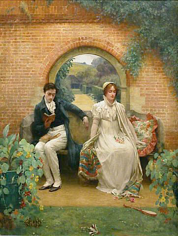
Here the body language and facial expressions yield hints. The man sits casually, the woman more rigid, and his arm is not quite brushing hers. Absorbed in his book, he seems unaware she’s there. She sits stiffly, with downcast eyes and an expression that seems stoic. You can even take her slight unfolding of the colorful shawl as an invitation to the touch that he doesn’t offer.
This painting, by Walter Sadler, is called Married (undated but presumably turn of the century). Once the title tells us that the couple are husband and wife, we can infer that their passion has subsided, largely through the husband’s self-absorbed inattention. Did he really need to take three books into the garden? The single-word title also lets us see certain elements as iconographic clues. The woman’s white dress and bouquet recall the wedding, and the fallen badminton birdie and racket suggest an earlier time when they played together. Kristin sees sexual symbolism in the flowers in her lap and the books in his. The gallery’s caption suggests that the turtle is going off to hibernate and that the blocked-off back garden suggests no future for the relationship.
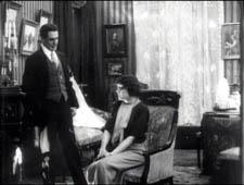
Putting aside the symbolic connotations, though, the strong cues supplied by the figures’ postures and expressions point us toward the sort of slight changes in body language provided by acting in early cinema. Some viewers think that early film acting was expansive and overblown, but that’s not always the case. Here is an instance from Evgenii Bauer’s Twilight of a Woman’s Soul (1913), in which Vera starts to confess an indiscretion to her admirer Prince Bol’skii. She raises her hands , an obvious indication of her anxiety, but more subtle is what’s going on below. At first her legs are turned toward him, but as she lifts her hands they shift a bit further away from him. Her small adjustment of her torso is a kind of accompaniment of the hand gesture, like a harmonic change accompanying a melody.
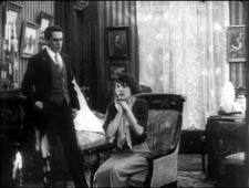
Both Her First Love Letter and Married lay their figures out along a line perpendicular to the viewer, a common strategy in early film. I discuss this in Figures Traced in Light; for other examples, see figs. 2A.7-11 here. The alternative is to arrange figures in depth, and one of the jewels of the Auckland collection illustrates this nicely. The title is more allusive than our others: For of Such Is the Kingdom of Heaven (1891), a reference to Jesus’s admonition to let children come to him (Matthew 19:14). The painter is Frank Bramley.
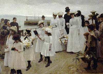
We are watching the funeral of a child, with the family carrying the almost weightless casket, swathed in flowers. In the picture’s suggestion of solemn movement, we might be tempted to say, we find early cinema before cinema. More to my point, though, is the way in which a diagonal layout creates a play between strong composition and rich ancillary effects.
The picture is composed along two lines, with the adult mourners grouped at the point where the procession intersects with the horizon. That horizon is given a widening sliver of light, a rolling wave that accentuates the heads of the two women right of center. The central bright patch of grays, whites and pastels is set off against the earth tones of the docks and the robust but respectful working-class onlookers. At the peak of the picture, the crowning moment of the angle formed by horizon and pier, is the bowed black head of the father.
The depth composition also guides our visual search, allowing us to discover a great variety of postures and facial views. The little girls in the center stride and sing from their hymnals dutifully, while the girl in the straw boater, bearing a huge bouquet, is staring at us—a disturbing effect, since her face is unhealthily gray. Will she be another victim?
In the years after 1908 or so, many filmmakers adopted the diagonal layout as a dynamic way to play out scenes. Here’s an instance from Bauer’s Twilight of a Woman’s Soul. Vera is calling on a men’s club where they practice fencing and pistol shooting. They put on a show for her.
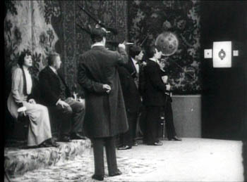
The diagonal draws our attention to the target, but Vera’s contrasting bright costume and her tilted face are further accented by putting her at the opposite end of the vector. All these factors make sure we note that her eye is on the handsome marksman, Prince Bol’skii. Receding compositions like this offered 1910s filmmakers a way to guide visual search in ways similar to Bramley’s painting.
Even more intriguing to me in For of Such Is the Kingdom of Heaven is the figure who’s evidently the dead child’s mother. She is bowed and tucked away to the right of the husband and behind two pallbearers. Bramley has taken advantage of the diagonal view to mask her off, as if viewing her grief would be too great for us to bear. This device has a parallel in cinema too.
A film scene unfolds in time, unlike a painting’s action. So filmmakers can block certain parts of the action and then, at the proper moment, reveal it. If Bramley were working in film, he could arrange his cortege so that the mother’s face came gradually into view as the group advanced, creating both a dramatic and pictorial climax. This blocking-and-revealing tactic is common in the choreographed staging we find in 1910s films, and again Bauer’s Twilight of a Woman’s Soul offers a nice illustration.
Vera, now ill, is visited by her suitor Prince Dol’skii. Her parents object, but she begs her father to let him in, and he reluctantly agrees. As the action starts, she clutches her father as the doctor looks on. The men’s bodies mask a doorway in the background, and as a servant comes through it, they pivot, revealing him.
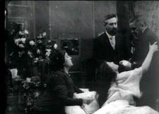
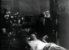
I’d argue that the servant’s entrance primes this area of the shot for the dramatically important entrance, that of Dol’skii. The father, the doctor, and the servant withdraw toward the back wall. After a pause, the Prince enters and advances.
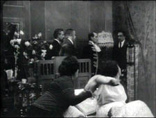
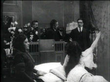
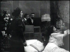
Vera greets him warmly as he takes the father’s place in the shot.
I’m not arguing that these particular paintings influenced filmmakers, only that the principles that the painters employed were picked up by directors. The more general point is that in understanding film aesthetics, we can usefully compare movies to other movies, and movies to other arts. By doing this, we sharpen our sense of what various media can do. The professor in the Onion story wisely notes, “It’s not just similarities that are important, though—the differences between things are also worth exploring at length.”
All paintings shown here are in the permanent collection of the Auckland Art Gallery. Bauer’s film is available on a Milestone DVD. I hope to blog more about his work later this summer.


