Rat rapture
Friday | August 24, 2007 open printable version
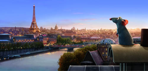
Recently we went to see Ratatouille and both loved it. We thought it was the best Hollywood movie we’ve seen this summer.
KT: Last October, in the infancy of this blog, I posted an entry on Cars. There I said, “For me, part of the fun of watching a Pixar film is to try and figure out what technical challenge the filmmakers have set themselves this time. Every film pushes the limits of computer animation in one major area, so that the studio has been perpetually on the cutting edge.” For Cars it was the dazzling displays of light and reflections in the shiny surfaces of the characters.
Figuring out the main self-imposed challenge in a new Pixar film is like a game, and I avoid reading any statements about the films by their makers ahead of time.
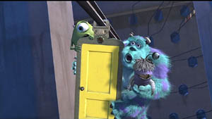
At first glance Ratatouille might seem to be “about” fur. True, there are lots of rats with impressively rendered fur—but fur was the big challenge way back in Monsters, Inc. Surely Pixar wasn’t repeating itself. To be sure, Monsters, Inc. contained only one major furry character, Sulley, and his fur was the long wispy type that some stuffed animals have. Difficult to render, no doubt, but different from the rats’ fur, which is dense, short, and has to ripple with the movements of the animals.
Not only that, but in Ratatouille, we see furry rats in all sorts of situations: just running round, crawling out of water and various other liquids, and in one virtuoso throwaway shot, emerging all fluffed up from a dishwasher. It’s all very impressive, but I didn’t think that was the main technical feat that the filmmakers were aiming at.
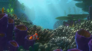
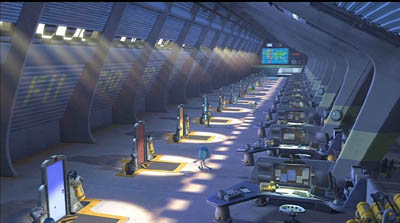
I quickly became aware that there was something different about the settings. Pixar films always have eye-catching settings: the beautiful and convincing underwater seascapes of Finding Nemo, the huge vistas of the factory in Monsters, Inc., the stylized domestic settings in the The Incredibles.
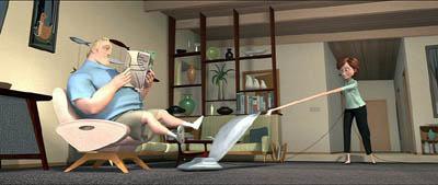
The Incredibles, the first film that Brad Bird directed for Pixar, was deliberately cartoony-looking, evoking the streamlined Populuxe look of 1950s cartoons. Ratatouille, his second effort, takes a very different approach. Here the settings are far more realistic and three-dimensional, approaching photo-realism in some of the Parisian street scenes. Often our vantage-point moves rapidly through these settings, twisting, turning, and plunging from high angle to low angle framings in a second. In the scene where the protagonist Remy is swept away from his family through the sewers until he emerges in Paris, the twists and turns of the pipes sweep by. Likewise, the camera explores the crevices of the restaurant’s crowded pantry.
The settings have a tangible and immediate presence beyond what we have seen in previous Pixar films, partly because so many objects in the surroundings are pulled into the action. Ingredients sit in bowls and jars that take up considerable portions of the kitchen set, and the rat dashes among them, sniffing to find the ones he needs for a new concoction. The lessons learned in Cars return here to make the shiny copper cooking utensils reflect their surroundings. The brick arch and floor tiles of the restaurant kitchen were individually tweaked, so that they don’t have the uniformity that CGI tends to give repetitive patterns. Dense combinations of bricks, tiles, wood panels, carpets, patterned wallpaper, glass, and Venetian blinds make every shot too busy for the eye to fully take in.
A delightful demonstration of all these features and more is given in the “Ratatouille QuickTime Virtual Tour.” 360-degree spherical space allows you to look up at the ceiling and down at the floor as well as scan the walls. (The download time is reasonably quick; you need to move your cursor into the window that opens and use it to scroll in any direction and at variable speeds. Use the shift key to zoom in and the control key to zoom out.)
DB: Two things, one general and one specific to Ratatouille:
(1) The idea of explaining artists’ works in terms of problems and solutions is common in art history and musicology, but not so common in film studies. It can be fruitful to consider that sometimes filmmakers face common problems and that they compete to solve them, or to find different problems they can solve.
I sometimes try to imagine what animators for other Hollywood studios thought when they walked out of Snow White and the Seven Dwarfs. Did the talents at Warners, Fleischer et al. just throw up their hands in despair? Disney must have been the Pixar of its day, challenging its rivals with a dazzling series of achievements along many dimensions. Disney had solved so many problems—of rendering color and depth, of catching detail and voluminous movement, of blending pathos with comedy—that the others could hardly compete in the same race. So it seems that they carved out other niches. Fleischer, though trying its hand at feature cartoons as well, concentrated on the familiar and presold comic-strip world of Popeye. Warners avoided child-oriented sentimentality and offered more insolent and whacked-out entertainment, personified in Bugs and Daffy. In today’s CGI realm, Pixar seems to set the pace, staking its claim before anybody else has realized the territory has opened up–though Aardman consistently offers something different.
(2) Along with the problems that you’ve mentioned, I was struck by what we might call a general task facing all animators: the need to display a sophisticated cinematic intelligence that fit contemporary tastes in live-action movies. So the pacing has to be fast (here, an average shot length of about 3.5 seconds), but it isn’t frantic. Today’s movies are overstuffed with details, so this is too; but here many stand out sharply. Central are all the minutiae of food and its preparation, which you mention below. Our friend Leslie Midkiff Debauche reports that her son, a chef, noticed the burn mark on Colette’s right forearm—a combat wound of the professional cook. Instead of the heavy satire and flatulence of the Shrek cycle, Pixar always gives us something that would engage us even if it weren’t animated.
Every director, I think, should study this film for lessons in making movement expressive. The velocity of our rats’ scampering depends on the surface they cross, and the differences in acceleration and braking are vivid. The vertigo-inducing river turbulence that carries Remy away from his clan displays the old Disney genius in rendering the behavior of water. There’s a caricatural difference in body language among all the characters, from the cadaverous Ego to the heaving movements of pudgy Emile and the spasmodic twirling of Linguini when Remy is at the controls. Shot scale is always well-judged. When there’s a moment of uncertainty about whether the kitchen team will support Linguini, the pause is accentuated by the fierce Horst taking a step forward toward the boy, in big close-up. Will this be the signal for the others to join him? The close-up conceals the key piece of information: Horst has stripped off his apron, and only when he lifts it into the frame do we realize that he’s walking out. Perhaps the visual expressiveness of silent filmmaking survives best today in animation.
KT: A secondary but still important challenge seemed to be the effort to find ways of rendering the textures of surfaces that are difficult to capture in animation. Most obviously the food—slices of carrots and tomatoes, stalks of celery—must look realistic and attractive if we are to believe that the dishes Remy devises are truly as scrumptious as the characters find them. (The film wisely sticks to soups, desserts, and, yes, ratatouille, sidestepping the problematic notion of an animal cooking other animals.)
Once you decide what you think the Pixar crew was working on extra hard in their newest film, it’s usually easy to find supporting evidence in interviews with the top people involved. For some reason Bird was reluctant to talk much about the big technical challenges for Ratatouille, but he gave a good summary in the interview on Collider.com:
I think our goal is to get the impression of something rather than perfect photographic reality. It’s to get the feeling of something so I think that our challenge was the computer basically wants to do things that are clean and perfect and don’t have any history to them. If you want to do something that’s different than that you have to put that information in there and the computer kind of fights you. It really doesn’t want to do that and Paris is a very rich city that has a lot of history to it and it’s lived in. Everything’s beautiful but it’s lived in. It has history to it, so it has imperfections and it’s part of why it’s beautiful is you can feel the history in every little nook and cranny. For us every single bit of that has to be put in there. We can’t go somewhere and film something. If there’s a crack in there, we have to design the crack and if you noticed the tiles on the floor of the restaurant, they’re not perfectly flat, they’re like slightly angled differently, and they catch light differently. Somebody has to sit there and angle them all separately so we had to focus on that a lot.
DB: This relates back to the idea that an animated film has to offer its own equivalent of what live-action has led viewers to expect. Since at least Alien and Blade Runner, we’ve come to equate realism with a worn-out world. No more spanking-clean spaceships, but rather creaky Gothic ones; no more shiny futures, only dilapidated ones. Bird acknowledges that once his team opts for more detailed settings, they have to look lived-in, rather than the rather generic ones we find in Toy Story and even The Incredibles. But then the food contrasts with this air of casual imperfection; it looks pristine.
KT: Speaking of food, in another interview, Bird expands on the difficulties of rendering it:
There was quite a bit of effort expended to make the food look delicious. Because if one of the things your movie is about is gourmet food, then you can’t have it not look delicious. And computers aren’t really very interested in making things look delicious. They’re interested in things looking clean and things looking geometrically precise, and usually hard not squishy – not tactile. Computers are great for perfection. They’re not great at organic things. We had to work really hard to get the food to look like you could taste it and smell it and enjoy it.
The interviews I’ve read don’t mention it, but the film also takes a small but impressive step toward solving the ever-difficult problem of rendering human skin. Most of the characters are given the usual smooth skin that we have come to expect in computer-animated films.
DB: Agreed! One of the things that put me off CGI animation years ago was the overpolished look of CGI surfaces. Volume without texture always looked plastic to me. But in Ratatouille, the Pixar team has made great progress in dirtying up the surfaces. That kitchen is full of spills and stains, but the faces are still pretty balloon-like, except for that villainous chef Skinner. He’s the most cartoony character, I suppose, and the range of expressions he passes through just in delivering a single line had me in stitches. The Termite Terrace legacy lives on in him.
KT: Yes, Skinner must have inspired the filmmakers. His face gets very sophisticated treatment. In most character animation, eyes and eyebrows are the main means of creating expressions in the upper half of the face. Several times, however, Skinner comes into extreme close-up, so that his expressions of rage and shock are complete with elaborate forehead wrinkles. There’s even a patch of pores on his nose. That degree of detail is used sparingly in this film, but perhaps we see a sign of things to come as the Pixar animators set up new hurdles to jump.
PS 25 August: For an interesting, more thematically oriented discussion of Ratatouille, see Michael J. Anderson and Lisa K. Broad’s entry on the Tativille blog.
PPS 31 August: Bill Desowitz has a lively and informative feature on the film, including behind-the-scenes interview material, at Animation World.


