Foreground, background, playground
Tuesday | March 30, 2010 open printable version
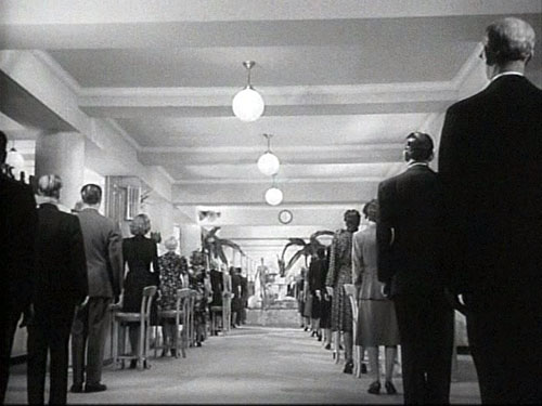
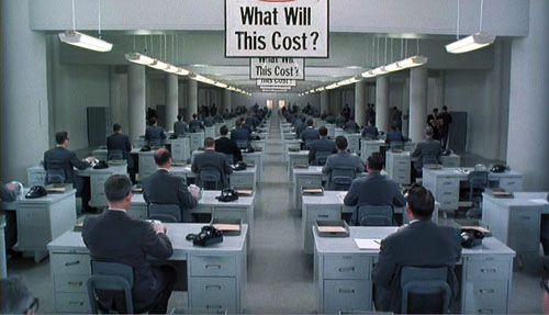
The Devil and Miss Jones (1941); The Hudsucker Proxy (1994)
DB here:
I’ve been waiting for thirty years for Alice in Wonderland. No, not the theatrical release of Tim Burton’s version. That interests me only mildly. I’m referring to the DVD release of the 1933 Paramount picture. I saw it on TV as a kid, and remembered it only dimly. But it bobbed up on my horizon in the summer of 1981 when I was doing research on our book The Classical Hollywood Cinema.
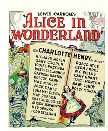 I was in the old Academy library in Los Angeles studying the emergence of certain compositional schemas. I can’t recall what put me on the track, but I requested the shooting script of Alice. What came was Farciot Edouart’s copy, over six hundred pages teeming with sketches for each shot. And a lot of those shots had a startling similarity to good old Citizen Kane.
I was reluctant to attribute pioneering spirit to director Norman Z. McLeod. Instead, I realized that these images’ somewhat freaky look owed more to one of the strangest talents in Hollywood history.
I tried to see Alice in Wonderland, but I couldn’t track down a print. So for years I’ve been waiting to find if it confirmed what I saw on those typescript pages. In the meantime, for the CHC book and thereafter, I’ve bided my time, sporadically looking in on the career of one of Hollywood’s most eccentric creators. He’s the subject of a new web essay I’ve just posted here (or click on the top item under “Essays” on the left sidebar). Today’s blog entry is a teaser trailer for that.
Deep thinkers
It’s commonplace now to say that Citizen Kane (1941) pioneered vigorous depth imagery, both through staging and cinematography. Many of the film’s shots set a big head or object in the foreground against a dramatically important element in the distance, both kept in fairly good focus. But where did this image schema come from?
The standard answer used to be: The genius of Gregg Toland and Orson Welles. In the 1980s, however, I wanted to explore the possibility that something like the deep-focus look had been a minor option on the Hollywood menu for some time. Once you look, it’s not hard to find Kane-ish images in 1920s studio films, from Greed (1924) to A Woman of Affairs (1929).
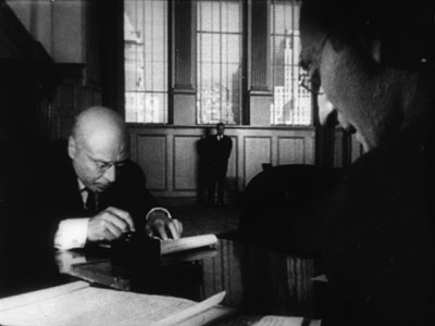
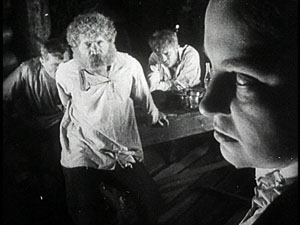
During the 1930s, William Wyler cultivated such imagery in some films shot with Toland, such as Dead End (1937), and some films shot by other DPs, such as Jezebel (1938). In turn, Toland had undertaken comparable depth experiments in films with other directors. Moreover, yet other directors, notably John Ford, had used this sort of imagery in films shot by Toland and others, such as George Barnes, Toland’s mentor. There are plenty of non-auteur instances too. (See my post on 1933 Columbia films.) We also find similar imagery in films from outside America. Here’s a stunner from Eisenstein’s Bezhin Meadow (banned 1937).
You see how complicated it gets.
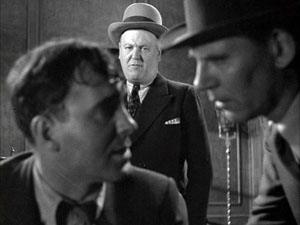
What I concluded in Chapter 27 of CHC was that Toland and Welles didn’t invent the depth technique. They fine-tuned it and popularized it. Their predecessors, in the US and elsewhere, had staged the action in aggressive depth and used many of the same compositional layouts. But the wide-angle lenses then in use couldn’t always maintain crisp focus in both planes (below, American Madness, 1932).
Welles and Toland found ways to keep both close and far-off planes in sharp focus. They deployed arc lamps, coated lenses, and faster film stock. Although it wasn’t publicized at the time, we now know that some of the most famous “deep-focus” shots were also accomplished through back-projection, matte work, double exposure, and other special effects, not through straight photography. Again, though, this tactic was anticipated in earlier films. One of my favorite examples comes from a matte shot in Mr. Moto’s Gamble (1935).
Menzies seems to have planned for similar fakery. In the script for Alice in Wonderland we find: “CLOSE UP, leg of mutton. The room and characters in the background are on a transparency.”
The flashy depth compositions of the 1920s and 1930s were typically one-off effects, used to heighten a particular moment. Welles and Toland pushed further by making the depth look central to Kane’s overall design and by featuring such imagery in fixed long takes. The prominence of Kane may have encouraged several 1940s filmmakers, such as Anthony Mann, to make the depth schema part of their repertoire. But as the style was diffused across the industry, the hard-edged foregrounds became absorbed into dominant patterns of cutting and spatial breakdown. The static long takes of Kane remained a rare option, perhaps because they dwelt on their own virtuosity.
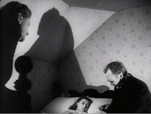
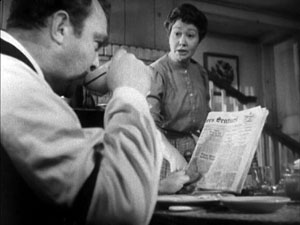
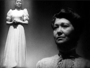
Digging up films made around the time of Kane, I found many filmmakers experimenting with the look that Toland and Welles highlighted. You can see touches of it in The Maltese Falcon (1941) and All That Money Can Buy (1941). Above all, there are two remarkable movies directed by, of all people, Sam Wood. Our Town (1940) turns Wilder’s play (itself surprisingly melancholy) into a Caligariesque exercise.
Several shots anticipate the low-slung depth, bulging foregrounds and all, that became the hallmark of Citizen Kane a year later.
Our Town also uses postproduction techniques that yield depth-of-field effects you couldn’t get in camera.
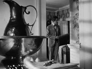
Perhaps even more startling is Wood’s Kings Row (1942), with deep-focus imagery that occasionally rivals Kane‘s.
From the evidence I was encountering, it seemed that Welles and Toland’s accomplishment was to synthesize and push further some deep-space schemas that were already circulating in ambitious Hollywood circles. Connecting some dots, I realized that one of the earliest champions of aggressive imagery in general, not just big foregrounds and deep backgrounds, was William Cameron Menzies.
Menzies frenzies
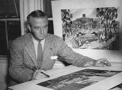
Menzies started out as an art director, most famously for United Artists. He designed sets for Mary Pickford’s Rosita (1923, directed by Lubitsch) and several Fairbanks films, notably The Thief of Bagdad (1924). He won the first Academy Award for set design and went on to a noteworthy career—most famously as production designer for Gone with the Wind (1939). He also directed films, such as Things to Come (1936) and Invaders from Mars (1953). Most significant for my purposes, he was production designer for Our Town, Kings Row, and three other films of the early 1940s directed by Sam Wood. And he designed the 1933 Alice in Wonderland. The drawings I saw in Edouart’s script were by Menzies or his assistants.
Menzies was one of the chief importers of German Expressionist visuals to the US. Although his early efforts leaned toward Art Nouveau effects, by the end of the 1920s he was cultivating a dark, contorted look keyed to the harsh geometry of city landscapes.
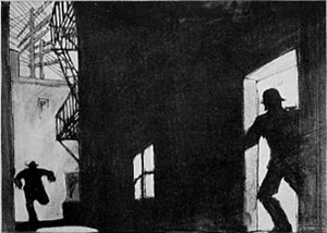
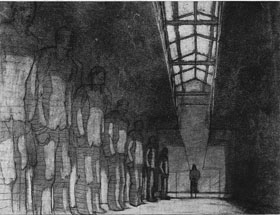
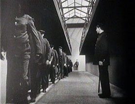
Since the late 1920s, Menzies had explored the possibility of steep depth compositions. He didn’t usually employ a big foreground, but he did favor overwhelming perspective–either abnormally centered or abnormally decentered. Here is his sketch for Roland West’s Alibi (1929) and the shot from the finished film.
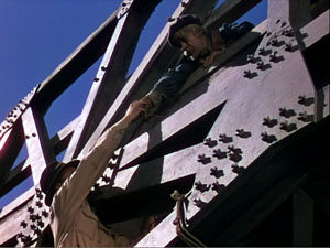
Menzies loved slashing diagonals created by architectural edges and worm’s-eye viewpoints. The harrowing opening of Things to Come is full of such flashy imagery.
Menzies calmed his style down for GWTW, although the sequences he directed bear traces of his inclinations. And in his work for other directors he managed to slip in a few odd shots. Here, for instance, is a typically maniacal central perspective view from H. C. Potter’s Mr. Lucky (1943). Squint at this image and you’ll see that it’s weirdly symmetrical across both horizontal and vertical axes.
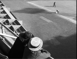
When he met Sam Wood, it seems, Menzies found a director ready to let his imagination roam further. In these collaborations, we get depth shots à la Welles and Toland, but also skewed perspectives. Pride of the Yankees (1943/44) searches for ways to make a baseball stadium look like a Lissitzky abstraction.
Menzies subjects the partisans of For Whom the Bell Tolls (1944) to his sharp diagonals as well.
Alice, we hardly knew ye
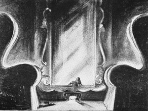
What then of Alice in Wonderland? Back in the early 1980s, I wasn’t permitted to photocopy or photograph script pages. Here is one of the few sketches I later found for the film. Alice crawls into the mirror with looming armchairs in the foreground.
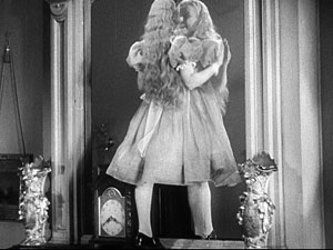
Surely, I thought, the film would be an early example of the depth aesthetic that would be developed by Welles, Wyler, and Wood/ Menzies. Alas, the film has nothing like those imperious armchairs.
In fact, Alice proves a huge disappointment on the pictorial front. Menzies expended all his ingenuity on the special effects, coordinated by Paramount master Farciot Edouart. Although the spfx are not in the league of that other big 1933 effects-film King Kong, they are pretty solid for the time. It’s just that this remains a painfully arch, flatly filmed exercise.
But I look on the bright side. Menzies created some memorable movies, both on his own and with other directors. (Of his directed films, not only Things to Come but Address Unknown, 1944, remain of interest today.) Perhaps most important, his stylistic boldness may have encouraged other filmmakers to try something fresh. Most immediately there is Since You Went Away (1944), a big Selznick production that bears traces of the Menzies touch.
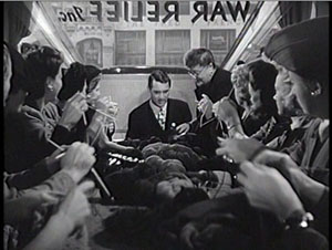
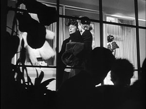
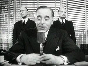
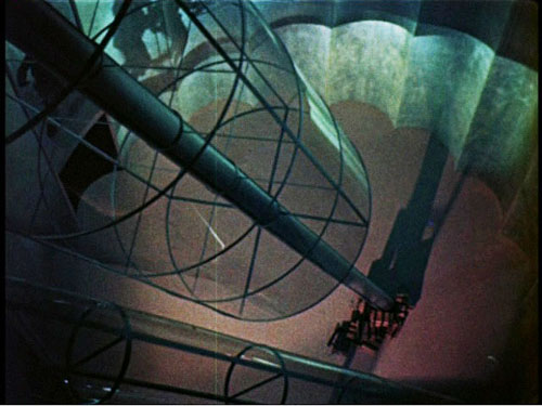
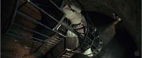
More broadly, Menzies represents a strand in American cinema that never really disappeared. His frantic Piranesian perspectives, canting the camera and filling the frame with grids, whorls, and cylinders, are still in use. And his head-on, wide-angle grotesquerie looks ahead to the Coen brothers. This shot of a department-store manager in The Devil and Miss Jones (1941) could come from any of their films.
Menzies’ films, though mostly not celebrated as classics, gave American cinema the permission to be peculiar. Meet me in the sidebar for a closer look at one of Hollywood’s most eccentric creators. Special thanks to Meg Hamel for going beyond the call of duty in posting that essay.
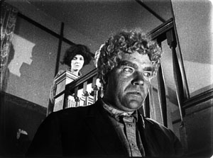
Invaders from Mars (1953); Shutter Island (2010).


