Not-quite-lost shadows
Sunday | July 22, 2012 open printable version
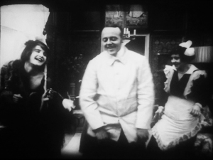
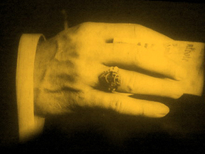
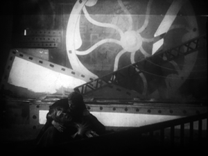
I.N.R.I.: The Catastrophe of the People (1920).
DB here:
One way to write the history of film as an art is to chart firsts. When was the first close-up, the first moving camera, the first use of cutting? Asking such questions was a common strategy of the earliest film historians, and it has persisted to this day in pop histories. Civilian readers can be excused for thinking that Griffith invented the close-up and Welles originated ceilings on sets. These myths have been recycled for decades.
The “revisionist” historians of the 1970s, mostly academics who aimed to do primary research, pointed out that talking about first times is risky. Too often the official account is wrong, and earlier instances can be found. In most cases, we can’t really know about first times. Too many films have vanished, and nobody can see everything that has survived. Innovation is always worth studying, but, the revisionists argued, it’s best understood within a context.
So they set themselves to figuring out not when certain cinematic techniques began but when they became common practice–when most filmmakers in a given time or place adopted them. That way we can discover innovations more reliably; they’ll stand out against the background of more orthodox choices. But of course, to build up a sense of these norms, it’s not enough to focus on the masterpieces cited in the official histories. You need bulk viewing.
Studying norms of storytelling and visual style is a large part of what Kristin and I have done since the 1970s. One section of our 1985 book The Classical Hollywood Cinema tried to chart when certain fundamental techniques of Hollywood storytelling coalesced into common practice. Kristin argued that the late 1910s are the key years, with 1917 as a plausible tipping point. By then, continuity editing and goal-oriented plotting, among other creative options, became dominant practices in American features. If you’re interested in blog posts touching on this, see the codicil.
Yet it’s reasonable to ask: But what happened in other countries? Was Hollywood unique, or were there comparable norms emerging in Russia, France, Germany, Denmark, Sweden, and elsewhere?
Several years ago, I began trying to watch as many US and overseas features from the period 1908-1920 just to see what I might find. Doing this led me to make arguments about the development of staging-driven cinema (often, but not only, European), as opposed to editing-driven cinema (usually, but not invariably, American).
A vast resource for my bulk viewing of 1910s cinema has been the Royal Film Archive here in Brussels. While the collection houses virtually every classic, it also includes films that haven’t been discussed by many historians–obscurities, if not downright rarities. Films from many countries passed through Brussels, and the archive was able to acquire copies from many distributors going back to the 1910s. Although I had watched several German films in the collection on earlier visits, this year I had a pretty concentrated dose. So as in previous years (see that codicil again), I offer you some chips from the workbench.
Cinematic scarcity
I.N.R.I.
German films of this period are of special interest for my research questions because of an unusual situation. From 1916, films from the US and nearly all of Europe were banned from Germany, and this ban held good until 31 December 1920. As Kristin puts it in her book Herr Lubitsch Goes to Hollywood (available as a pdf here):
Foreign films appeared only gradually on the German market. In 1921, German cinema emerged from years of artificially created isolation. . . .Because of the ban on imports, German filmmakers had missed the crucial period when Hollywood’s film style was changing rapidly and becoming standard practice. . . . The continuity editing system, with its efficient methods of laying out a clear space for the action, had already been formulated by 1917. The three-point system of lighting was also taking shape. In contrast, German film style had developed relatively little during this era.
Kristin was again exploring craft norms, the creative choices favored by Lubitsch’s contemporaries. She drew some of her evidence from films she saw here at the Cinematheque, but I wanted to revisit those and see some others. What exactly did German films look like at this point? Not the official classics like Caligari and Nosferatu, but more ordinary, maybe even bad movies?
The basic assumption: Since the German directors weren’t seeing American movies, they’d be less likely to imitate them. Some hypotheses follow from this. German directors would presumably rely less on cutting, especially within scenes, than Americans did. They might incline toward staging complicated action in a single shot. The cutting is likely to be what Kristin calls “rough continuity” or “proto-continuity”–essentially, long shots of the whole action broken by occasional axial cuts that enlarge something for emphasis. We wouldn’t expect to find sustained passages of close-up or medium-shot framings.
To give myself some reference points, on each visit I’ve watched European films in conjunction with American films of the same era. This mental trick helped differences pop out more easily.
Fortunately for peace in our household, I’ve found Kristin’s claims about German cinema well-founded. As in other years, I also stumbled across some gratifyingly strange movies.
Blocking, tackled
Throughout the period 1908-1920, we find many scenes staged in a single fixed shot. In many other blog entries, and in books like On the History of Film Style and Figures Traced in Light, I’ve tried to show that this wasn’t simply a passive recording of a “theatrical” scene. Drawing on capacities specific to the film medium, directors used composition, lighting, setting, and figure movement to shape the perceptual and emotional flow of the scene.
Here’s a late example from The Brothers Karamazov (1920) directed by Carl Froelich and Dmitri Buchowetzki. Starring Fritz Kortner, Emil Jannings, Werner Krauss, and other heavyweights, it has perhaps more ham per square inch than any other film I saw on this pass. Yet its tableau moments subordinate the performers’ charisma to an overall expressive dynamic.
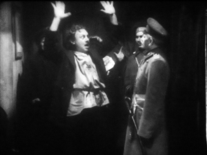
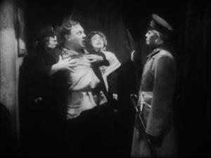
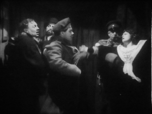
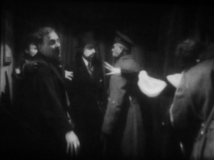
Old Fyodor Karamazov has been murdered, and his son Dmitri is accused of the crime. Protesting his innocence, he’s about to be arrested when Grushenka bursts out. “I’m the guilty one!”
In the tableau tradition, “blocking” takes on a double meaning–not only arranging actors in the shot, but also judiciously using them to mask or reveal areas of space. Thus Dmitri at first blocks Grushenka, but when he lowers his hands, she pops into visibility–frontal and centered, so we can’t miss her. Dmitri sinks to the lower half of the shot when her dialogue title comes up, leaving her to command the frame. Meanwhile the police official has pivoted slightly, making sure that we pay attention to her outburst. Not incidentally, he blocks another policeman behind him, keeping the frame dominated by Grushenka.
This scene goes on quite a bit longer, with some careful balancing and rebalancing of points of interest in the lower part of the frame. The action ends with a nice touch: the embracing Dmitri and Grushenka are separated, and she’s pulled away, one arm flailing.
Without benefit of cutting, then, techniques of tableau construction guide our attention smoothly in the frame by using movement, centering, advance to the camera, character looks, blocking and revealing, and other tactics.
The Germans had embraced this tableau option in the earliest 1910s. The films of Franz Hofer and others show how an entire scene could be covered in a single camera position, with staging providing a continuous flow of interest. Go here for an amusing example from The Boss of the Firm, a 1914 comedy starring Lubitsch.
The commitment persisted into later years. The earliest film I watched in this cycle, Hilde Warren and Death (1917), by the quite interesting director Joe May, had several passages of tableau staging. In the most elaborate one, the mistress of Hilde’s dissolute son tells him that now he’s out of money, she has switched her affections to a rival. It plays out without a cut or intertitle for about a minute at 18 frames per second. When Fernande spurns him, he grovels, just as the salon door opens. (Whenever there’s a rear door like this, we’re likely to get a tableau scene.) His rival shows up to take her to the opera.
Fernande asks him to stay outside, but the son demands that he stay, waving his hand. In a staging tactic that should be familiar to us now, the son rises, blocking the rival for an instant.
The rival rebalances the composition, and makes himself visible, by moving to the right background. This switching of characters’ position in the frame is known as the Cross. But when the son gets angry, the rival crosses again, easing himself toward the area of conflict. Note that the son’s bodily attitude, tensing up, actually shifts him rightward a little, opening up a space for the other actor to be seen.
Now the rival steps to the forefront and wedges himself in between Fernande and the son. He invites the young man to leave, with a gesture that occupies the dead center of the frame: Who could miss its assured insolence? And now the maid, previously in the background and blocked by Fernande, makes herself known. Seeing how things are developing, she fetches the son’s hat.
The son gets off one last grimace, front and center, before departing. As he walks back, the rival swivels to blot him out, leading the ladies in mocking laughter. (It’s clear the rival belongs to the 1%.)
One good Cross deserves another: Now the rival settles in where the son was at the start of the scene, and the son is retreating in shame along the rival’s path.
This tableau technique, constantly calculating points of interest from the standpoint of monocular projection–that is, what the camera lens takes in–is far from theatrical. Well-timed blocking and revealing wouldn’t work given the multiple sightlines of a theatre stage. The action is staged for the only eye that matters: the camera’s.
Once we grant that theatrical playing space is quite different from that provided by the camera, we can see more exactly what the tableau tradition owes to the stage. Silent cinema’s “precision staging,” as Yuri Tsivian has called it, is close to choreography. If we want to appreciate what directors of this period accomplished we need to look at the scenes as varieties of pictorialized dance, designed around the axis of the camera lens.
Along the lens axis
To return to the first question: Yes, German films seem to have clung to the tableau tradition after 1917, when Americans had abandoned it. Yet shots like those in The Brothers Karamazov and Hilde Warren are fairly rare; most scenes in most German films of the period use a fair amount of editing. What do we make of that?
The trend is fairly general. Some staging-driven films, like Ingeborg Holm (1913) and the early serials of Feuillade, are built entirely out of one setup per scene, occasionally broken by cut-ins of printed matter or other details. This period constituted a brief golden age of this “tableau” tradition–visible in American cinema, but more pervasive in European cinema. But by the late 1910s, most directors around the world were cutting up their dialogue scenes at least a little. Gradually, the tight choreography of the tableau gave way to the easier method of using close-ups to pick out key instants.
The European default seems to have been what Americans called the “scene-insert” method. A long shot (called the “scene”) is interrupted by a cut to some part of it (the “insert”). Then we go back to the orienting view. The cuts are typically straight in and back along the lens axis.
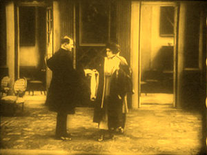
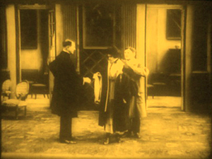
Here’s a straightforward German example from The Devil’s Marionettes (Marionetten des Teufels, 1920). A fake medium has been brought to a rich man’s home to read the fortune of his daughter. As she leaves he pays her, and from his ring she’s able to identify him as a Duke.
Note that the first setup is much farther back than the tableau scenes in Brothers Karamazov and Hilde Warren. There’s not much to be done with such a distant shot except cut in.
The Devil’s Marionettes scene has two inserts, but it’s conservative by American standards. By 1917, Hollywood directors were increasing the number of “inserts” considerably and making them the dominant source of the ongoing action. Some European directors took this option; notable instances are Abel Gance and Victor Sjöström. Others, though, relied on the scene-insert approach, not building the action out of a lot of closer views. The post-1917 German films I’ve seen, most recently and on other occasions, favor a moderate scene-insert approach like the one in Marionettes. Accordingly, the “pure” tableau option waned.
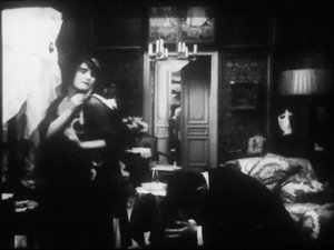
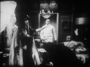
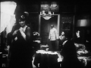
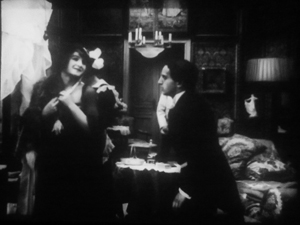
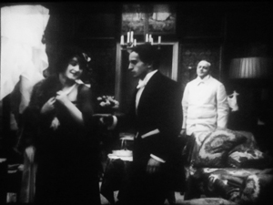
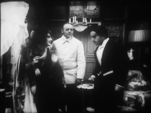
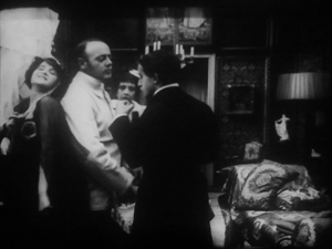
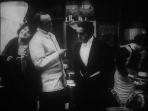
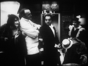
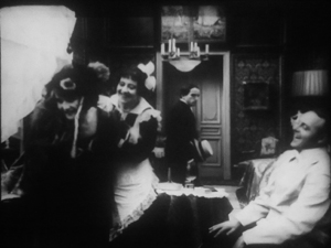
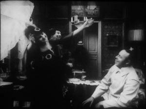
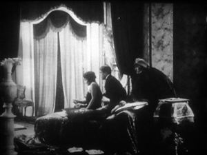
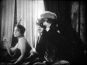
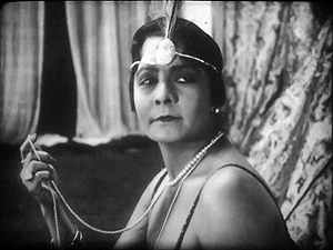
Yet one basic idea of the tableau strategy persisted. We can see this in directors’ use of the axial cut, which provides a constant orientation to the setting. While American directors were often building up a scene from many angles, German directors seemed reluctant to show the action, at least in interior sets, from distinctly varied viewpoints. So when they broke a dialogue scene into many shots, they stuck to the camera axis, cutting in and out along that. You can see that in the Marionettes scene. Consider as well this moment in I.N.R.I.: The Catastrophe of the People (1920). Within a single overall orientation, the editing enlarges or de-enlarges the three characters in the boudoir.
Even with the drastic enlargement from the first shot to the second, or from the third to the fourth, our orientation is basically the same. The staging cooperates with this strategy, making sure that all three players’ faces turn to the camera, even if their bodies are angled away from it. They’re playing to the lens axis, we might say.
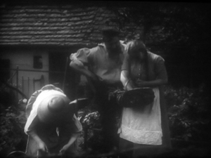
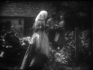
When directors try to shift the angle more drastically, the consequences can be strange. In Rose Bernd (1919), an adaptation of a famous Gerhardt Hauptmann play, an axial cut has brought the bullying Streckmann striding toward the camera to meet his wife and Rose, chatting in his garden.
As he flirts with Rose, director Alfred Halm provides another axial cut, from farther back, as a neighbor woman passes in the foreground. Rose turns to look.
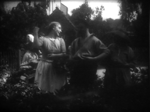
The print is missing dialogue titles, but there evidently was one here, as Rose comments on the woman passing. The dialogue title provides some cover for the extraordinary cut to the next shot.
The time is clearly continuous, as the woman is still walking past the garden gate, now in the distance. But Rose, Streckmann, and his wife have been completely rearranged in the frame. They’re positioned frontally, as in the I.N.R.I. boudoir example, and they create the sort of foreground/ background dynamic characteristic of 1910s cinema generally. Halm could have shown Rose’s comment and the others’ reaction by cutting back in along the axis, to a closer shot of the group in the garden (like the second one above). Instead, he shifted his camera position sharply. The new shot does highlight Rose and her gesture, but at the price of spatial coherence.
Aliens, missing shadows, and lustful monks
Tötet nicht Mehr!: Misericordia (To Kill No More!: Misericordia, 1919).
So some of our hypotheses seem borne out. Many German directors apparently adopted a conservative position toward American-style analytical editing until the ban relaxed in 1921. After that, as Kristin documents in her Lubitsch book, films by Murnau, Lang, and others employ more varied angles and less frontal staging. It seems likely that the Germans learned about this approach from the new availability of films from America and European countries (some of which were adopting the American approach).
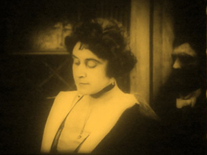
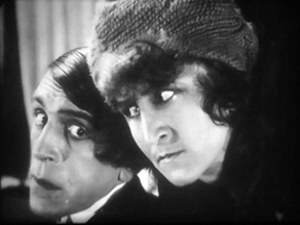
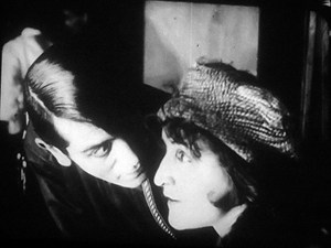
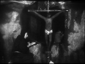
My latest plunge into Weimar cinema yielded other enjoyments. It’s commonly said, for instance, that Germans experimented with expressive lighting effects. So did directors in many other countries, but I did find some striking uses of sparse, stark illumination. One example is the prison cell from Tötet nicht Mehr!: Misericordia (1919), above. Even more daring is this double close-up from I.N.R.I.
Harvey Dent has nothing on the conniving Russian student Alexei, half of whose face seems just scooped away by shadow. The faint shadow cast on the wall tempts us, in a weird Gestalt illusion, to see his head as partly transparent.
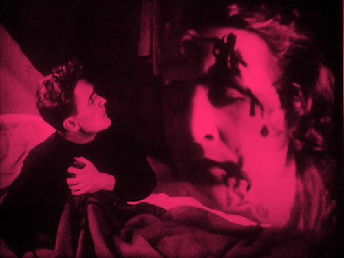
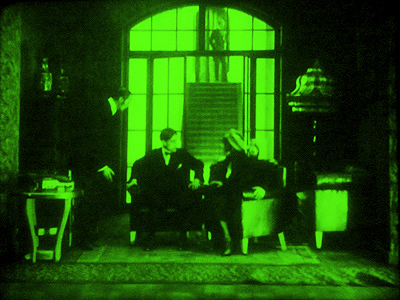
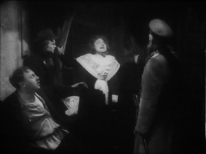
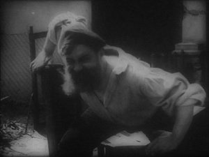
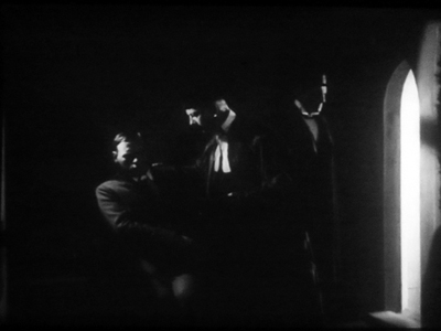
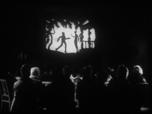
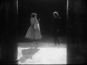
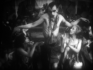
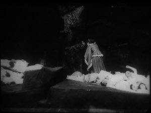
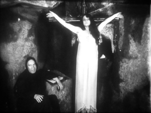
Another area of German expertise was special effects, and I saw plenty of sophisticated double exposures, matte shots, and split-screen tricks. As you’d expect, some of these were used to suggest hallucinations or the supernatural. At the very top of today’s entry is another image from I.N.R.I., which presents the student Dmitri’s fever dream. Below are a couple of nice ones from Lost Shadows (Verlorene Schatten, 1921). A Satanic traveling showman puts on shadow plays, but his cast is drawn from real life: He bargains with people for their shadows, and eventually leaves the hero without one.
What, finally, about what we all yearn for: an extravagantly nutty film? Nothing in this foray matches the work of Robert Reinert (Opium, Nerven), about which I’ve written in Poetics of Cinema and on the DVD restoration of Nerven. Reinert is on another plane of delirium, as mentioned in an earlier entry. Nonetheless, apart from moments in many of those movies already discussed, I found two pervasively peculiar items.
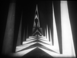
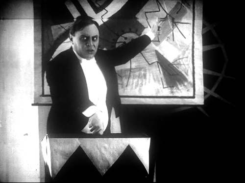
The more well-known is Algol (1920), directed by Hans Werckmeister. The sets, although designed by Walter Reimann of Caligari fame, aren’t cramped and contorted but are instead vast, geometrical, and a bit reminiscent of the Monster-Machine aesthetic of Expressionist theatre.
The plot is your everyday visit from another planet. An alien from Algol visits a coal mine and gives a loutish miner a machine that generates endless energy. (Today the Algolian could take a bribe from an oil company to head back home.) The miner becomes a tycoon controlling the world’s energy supply. This monumental fantasy (big sets, big crowds) is enacted with maniacal gusto by Emil Jannings, who spends his wealth, like all good plutocrats, on bacchanals featuring crazy dancing.
Algol is forthcoming in the Filmmuseum DVD series.
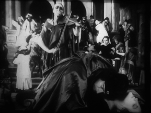
The Plague in Florence (Die Pest in Florenz, 1919) is less famous, although the script is by Fritz Lang. Directed by Otto Rippert (Homunculus, 1916; Totentanz, 1919), this tells of Julia, a woman whose all-powerful sexuality wreaks havoc on the city. Even churchmen lust for her, and eventually Florence sinks into debauchery. What redeems, if that’s the right word, the city is the appearance of a plague that strikes citizens dead in their tracks. Personified as a gaunt woman rising up from the marshes and mournfully playing a violin, the plague eventually kills Julia and her umpteenth lover.
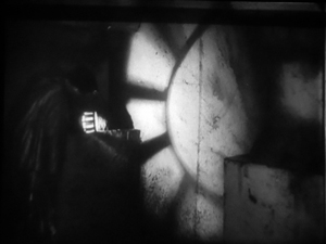
Before this, we’ve had everything I’ve mentioned and more: a couple of fancy tableau sequences, axial cuts, wild mismatches between shots, spectacular lighting effects (e.g., catacombs, below), and hallucinatory sequences. At one point, the mad monk vouchsafes Julia a glimpse of the horrors to come by showing her a river of corpses calmly flowing underground.
Of course the monk isn’t invulnerable to Julia’s charms. Trying to pray away the impulses she arouses in him, he sees her as his Savior. Herr Rippert, Señor Buñuel is on the other line.
Who knew film history could be so surprising? You don’t get this stuff in your usual pop history. But maybe it’s better we don’t share this with the civilians.
My usual heartfelt thanks to the Royal Film Archive of Belgium, its staff (particularly Francis, Bruno, and Vico), and especially its Director, Nicola Mazzanti. Thanks also to Sabine Gross for a translation.
My previous Brussels research visits are chronicled in this blog over the years. A 2007 entry talks about my viewing method and concentrates on Yevgenii Bauer. The following year’s entry is devoted to William S. Hart. An eclectic 2009 one surveys films from Germany, France, Denmark, and even Belgium. In 2010 I went twice, once in January (watching mostly Italian diva films) and as usual in July (but no entry for that visit, consumed as I was with writing about Tintin). The 2011 entry is diverse, covering many national cinemas, and, implausibly, runs even longer than the others.
We have many other entries on film style in the 1910s. One considers how the Hollywood style coalesced in 1917; another talks about Doug Fairbanks. There’s also an entry on 1913, which discusses both Suspense and Ingeborg Holm, and there are discussions of Sjostrom as a master of both the tableau approach and continuity editing. And of course there’s plenty on Feuillade’s staging; you might start here, and perhaps pause over the mini-essay here, which talks about the director’s eventual experiments with editing. Elsewhere on the site there’s an essay on Danish cinema that echoes some points made in today’s entry. (Unlike other countries, neutral Denmark was able to send its films to Germany during the war, so there may have been some influence there.) Broader comparative arguments about this material have been sketched in a lecture I’ve given in various places, “How Motion Pictures Became the Movies.”
Interest in German cinema of the period grew after Pordenone’s Giornate del cinema muto held its trailblazing program published as Before Caligari, ed. Paolo Cherchi Usai and Lorenzo Codelli (University of Wisconsin Press, 1991; now, alas, very rare). See also the valuable collection edited by Thomas Elsaesser, A Second Life: German Cinema’s First Decades (Amsterdam University Press, 1996). Kristin has an essay here on Die Landstrasse (1913), a remarkable instance of the tableau style.
As my research on the 1910s draws to a close, I’m thinking of how to synthesize and present my arguments. Originally I was considering a book, but the number of stills, and the specialized nature of the project, would probably make publishers shudder. At the moment, I’m thinking about creating a series of PowerPoint lectures, with voice-over. These would be freely available for people to use in courses if they wanted. That initiative would be another experiment in using the Web to get information and ideas out there to interested readers.
Professor Bordwell illustrates his views on visual storytelling (Algol).


