The wayward charms of Cinerama
Wednesday | September 26, 2012 open printable version
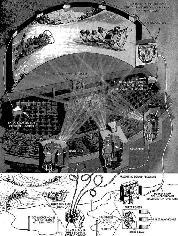
From Cinerama Holiday souvenir book, 1955.
DB here:
Two slumbering potential giants stirred in the last months of 1952, and as 1953 got underway the motion picture industry was faced with the greatest upheaval since sound films revolutionized the industry nearly 26 years ago.
Winfield Andrus, “3-D Finding Its Place,” The 1953 Film Daily Yearbook (New York 1953), 147.
Andrus was referring to 3D and to Cinerama, two technical marvels that promised to revive American filmgoing in the postwar era. In the short term, that didn’t happen. 3D died quickly, and Cinerama remained a novelty before expiring in 1962. But eventually 3D became viable, as the last decade has shown. Moreover, Cinerama’s impact was felt throughout the 1950s. Studios competed with it by introducing other widescreen formats, stereophonic sound, and extravagant roadshow productions. Cinerama, people are starting to point out, was a prototype of what Imax has become. Just as we’re now more interested in classic 3D (see my entry on the reissued Dial M for Murder), we ought to take another look at Cinerama in its more or less pure state.
Devoted aficionados like John Harvey of the New Neon Cinema in Dayton have kept Cinerama alive in theatres, and the challenge has been taken up by other venues. One of the most passionate advocates has been David Frohmaier, whose documentary Cinerama Adventure graced our Wisconsin Film Festival some years back. That documentary showed up on the 2008 DVD release of How the West Was Won, and it’s an essential, affectionate introduction to this most ungainly of film formats.
Now Frohmaier has brought us the 1952 film that started it all. This Is Cinerama has just been released by Flicker Alley, one of our most exacting and adventurous DVD publishers. The whole meticulous package–the film itself, presented in Frohmaier’s Smilebox display, along with an abundance of extras—offers a good chance to think about what Cinerama amounted to.
Cinerama had its ups and downs over a decade. Control of the technology and the venues shifted unpredictably, as did the revenues and profits. But I think that Cinerama’s unique accomplishment lies partly in its unintended consequences. Seeking to become the most realistic form of cinema yet known, Cinerama demonstrates how enjoyably un-realistic, even surrealistic, movies can be.
One hell of a demo
When This Is Cinerama opened at the Broadway Theatre in Manhattan on 30 September 1952, it presented itself as the ultimate package of new entertainment technologies. It was of course in color, which was still something of a rarity in motion pictures. It used stereophonic sound, with five speakers behind the screen and two in the auditorium. The screen itself was a wonder: it was seventy-five feet wide and about 23 feet high, bent in a 146-degree arc. That made the display span fifty feet. Later, some screens would be nearly a hundred feet long and over thirty feet high.
All who saw the film felt that this was an immersive experience. The goal, claimed Cinerama’s inventor Fred Waller, was to approximate what our eyes take in, including peripheral vision. Indeed, Waller claimed that our sense of depth in the world and an image depended on peripheral information. Anyone who has been in a wraparound theme-park attraction can attest to the fact that an image stretching to the edges of sight can provide a pretty compelling illusion, especially if the images carry us forward. You can undergo this illusion in Disney’s Circle-Vision 360°.
Cinerama’s colossal screen size and deep curve dictated a new approach to image-making. No standard 35mm frame could fill such a wide display without losing resolution. The scale of the show demanded three projectors, each trained on one-third of the screen. The image became a triptych, with thin overlaps or “blend lines” demarcating the panels. Naturally, all three had to be exactly aligned and kept in strict synchronization. If one film reel lost frames through a mishap, for future shows projectionists snipped the corresponding frames out of the other two reels.
The projectors were initially housed in separate booths, with a projectionist in charge of each. A fourth booth was given to the sound mixer (off to the right side in the above diagram), who oversaw the multiple track playback at each performance. Yet another staff member was in charge of monitoring the whole performance. Interestingly, the projectors were said to be placed level with the screen, in order to avoid any keystoning distortions of the display. But the diagram above, along with the Cinerama displays I’ve seen, position the projectors fairly high in the auditorium.
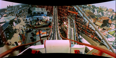
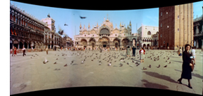 The image looked something like the still on the right. Even in this tiny image you can see slight differences between the panels and vignetting along the joins. Projectionists had to ensure that the three panels yielded comparable illumination and color temperature. Each projector’s gate had a little gadget known as a “jiggolo” that ran rapidly along the edges of the frame to blur the blend lines.
To gain resolution, each frame on the film strip used about twice the image area of conventional film. Surprisingly, the image area wasn’t much wider than normal film but it was 1 1/2 times the normal height (that is, 6 perforations high rather than the usual 4). To allow more frame space, the soundtrack was played on a separate magnetic film reel. The resulting images yielded very high resolution.
These sprawling images came from three cameras interlocked into a single bulky unit. The lenses were angled at 48 degrees to one another, turned inward to cross at a precise focal point. The camera lenses, all purpose-made, had a focal length of 27mm–another factor that would yield some striking pictorial effects. All three lenses shared a common shutter and had interlocked diaphragms to ensure comparable exposure. Because flicker would be disturbing on such a wide display, particularly on the edge panels, the film ran at 26 frames per second rather than the usual 24. The aspect ratio varied between 2.6:1 and 2.77:1.
This Is Cinerama was what we’d today call a demo. Lowell Thomas, one of the backers of the process, noted that if they’d told a story with actors, the emphasis would be taken off Cinerama itself, which was “a major event in the history of entertainment.” “The logical thing,” Thomas remarked, “was to make Cinerama the hero.”
The result was a travelogue (a word Thomas hated). After Thomas’ prologue, the film proper opens with the famous ride on a plunging rollercoaster. Then come episodes devoted to the canals of Venice, some church choral music, Scottish pipers, Viennese boy choristers, Spanish dancers, and an excerpt from Aida performed at La Scala. During the intermission Thomas inserts another demo, this time of the surround-sound effects. (We have to remember that stereophonic sound was a big novelty at that point; stereo LPs came later.) The bulk of the second part is spent at the Cypress Gardens leisure park, providing images of handsome men and women at play and climaxing in some exciting water-skiing. This is sort of double product placement–not only promoting the park but also water skis, another Fred Waller invention. The film ends with an awe-inspiring flight crisscrossing America, from New York and the Pentagon to the Golden Gate Bridge, and back to the rugged terrain of the West and Southwest.
 In an essay for Cahiers du cinéma, the late Chris Marker pointed out that the film amounts to a religious-popular spectacle. For all the globe-trotting of the first part, the last half is a paean to the splendor that is the postwar USA. The last word spoken, or rather sung, in the film is “America.” Indeed, as many have pointed out, the word Cinerama is an anagram for American. I’ve sometimes wondered about the logo, that peculiarly zigzagged string of letters. It suggests a crumpled snippet of film, with squarish frames like our vertical panels, and its bumpiness evokes the ups and downs of a roller coaster. But there’s no mistaking the logo’s recurring color scheme of red, white, and blue.
Party like it’s 1952
As a novelty, This Is Cinerama succeeded, running for over two years in New York. The system was installed in big-city theatres around the country. At a time when the average price of a movie ticket was $.46, the high-end seats for a Cinerama feature cost $2.80, or $24.34 in today’s currency. The Cinerama organization produced four more episodic travel-centered pictures: Cinerama Holiday (1955), The Seven Wonders of the World (1956), Search for Paradise (1957), and Cinerama South Sea Adventure (1958). Another picture made in a rival three-panel technology, Windjammer (1958), wound up in Cinerama venues as well. By 1957, Variety announced, the first three releases had grossed $60 million worldwide.
The problem was that on those grosses, profits came to only $6 million. Eighty percent of the box office take was used up in operation of the theatres.Morever, the complexity and cost of a Cinerama system meant that very few venues existed; by 1959, there were about twenty screens in the US and another eight or ten abroad, and not all were operating. In addition, overall US movie attendance was dropping, from about 47 million weekly in 1954 to 32 million in 1959.
New management succeeded in opening many more Cinerama theatres on a franchise basis, but the company needed fresh product as well. A coproduction deal was struck with MGM to use the process on fictional features. The results were The Wonderful World of the Brothers Grimm (1962) and How the West Was Won (London premiere, 1962; US release, 1963). To expand the audience, these films were also released in anamorphic widescreen to non-Cinerama venues.
Both films won large audiences, but they failed to make a profit. Soon the company’s theatres began exhibiting 70mm film releases under the Cinerama brand. The films were shown on curved screens, but with single-lens projection. The first of these releases was It’s a Mad, Mad, Mad, Mad World (1963); eventually even 2001: A Space Odyssey (1967) would be exhibited in “Cinerama.” In the course of these years, the company was acquired by Pacific Theatres, where it still resides. Classic triptych Cinerama was gone.
I never saw it in its prime.
I did see How the West in its original anamorphic release, and that has stayed with me for a couple of reasons. First, I was moved by it. It’s kitsch in many ways, but there are several exciting and touching scenes. Moreover, even as a squeaky-voiced teen I recognized something genuinely weird about the way it looked. Its imagery haunted me, though I didn’t have ways to understand them. Many years later, writing portions of a book that became The Classical Hollywood Cinema, I couldn’t watch any of the Cinerama travelogues in archives. I had to content myself with watching pink, cropped 16mm anamorphic copies of How the West Was Won. In all, it was very hard to get a sense of what the thing looked like (let alone sounded like).
Not until 2003 did I see both This Is Cinerama and How the West Was Won in the three-panel format, during a conference on widescreen cinema held at the National Media Museum in Bradford, England. That experience was wonderful, and it left me wanting to study the films more closely.
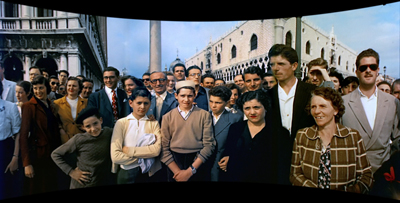
Now I can, and you can too. David Strohmaier has devised a transformation that captures the shape of a Cinerama projection. He calls it the Smilebox. The Flicker Alley DVD of This Is Cinerama is in Smilebox, as you see from my Venetian image above. Warner Bros’ 2008 Blu-ray release of How the West Was Won provides both a Smilebox version and a wider-than-CinemaScope letterbox version.
Through painstaking restoration by Greg Kimble and others, the films look clean and bright. Digital cleanup has regularized the color values from panel to panel and nearly eliminated the blend lines. The result conforms to what the makers would surely have preferred–a greater sense of uniform tonality, light, and space across the frame than surviving Cinerama images have.
For anybody interested in the history of American cinema, the Flicker Alley DVD is essential. It provides a long-missing chapter in the development of widescreen filmmaking. This Is Cinerama is a documentary that is also a document of postwar American pride, of film technology, and of the movie business. But I think it represents even more. For the most part neither Smilebox nor digital restoration has removed the peculiarities that, perhaps perversely, fascinate me about this unique format.
Nice big image you got here. Be a shame if anything happened to it.
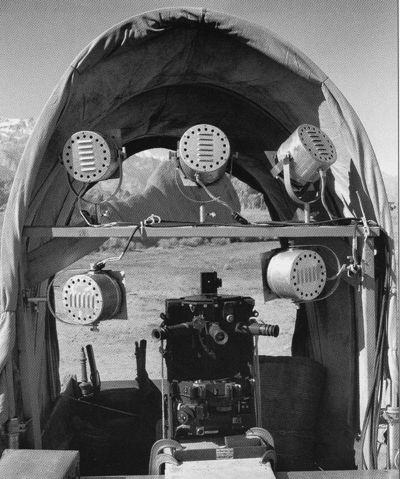
Cinerama camera in a mock covered wagon for How the West Was Won.
Like any picture-making process, Cinerama captures the three-dimensional world on a two-dimensional surface. Unusually in the history of cinema, it does it with a semicircular array of cameras. The images from those cameras are projected on a corresponding semicircular surface, in the hope that they will simulate not only the spatial layout in front of those three lenses but also the way the world looks to us.
Fred Waller thought that his invention provided greater realism, because our vision subtends a horizontal arc wider than that of conventional camera lenses. Fred fell a few degrees short, though. Claiming that we take in about 160 degrees, he thought that 146 degrees was a good approximation, but our visual field is actually a bit wider than 180 degrees. (Without turning our head, we can roll our eyes.) More important, though, is the assumption that a faithful image of the world should try to capture the curvature of the image as it passes through the cornea to the retina. We see a bowed world, many have claimed, so our pictures should present the way things look.
Yet there’s a difference between visual sensation and visual perception. Even if the light from the world hits our photoreceptors in a partial or distorted way, what we see is regular and unified. On our retinas, near things loom large and distant things look tiny, but we’ve evolved to adjust to the distortions in early stages of vision and see things in normal size. A person ten feet away is twice as large on our retina as somebody twenty feet off, but that’s not the way they look. We don’t see our retinal image, any more than we see the wildly misshapen image of the world projected to brain areas. The eye is a part of the brain, and the brain reworks the stimulus–cleans it, enhances it, corrects it, straightens it out, and gives it a stability that isn’t there in the raw input.
For the most part, normal camera lenses approximate the way the world looks to us after our brain has processed visual signals. Most images show straight-edged walls and sidewalks, railroad tracks meeting at the horizon, proportional human beings. When Cinerama or other nonstandard image-making technologies present distortions to our eyes, we take them for what they are: not “what we really see” but rather pictorial displays creating distinct effects of their own.
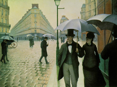
Hence the irregular appeals of Cinerama. Suppose we’re not interested in seeing the world as it registers on our sensory system. Suppose we’re interested in exploring uncommon pictorial effects. If we suppose all that, we can have the sort of fun watching Cinerama that we get from this 1877 picture by Caillebotte (Paris Street, Rainy Day), a virtuoso reworking of geometric space.
Take image sharpness. In the 2003 Bradford shows, I was overwhelmed by just how precisely distant objects registered. This was partly due to the greater resolution of a bigger image area, partly to the use of wide-angle lenses with breathtaking depth of field in brilliant sunlight. I can’t illustrate some of the most dazzling effects here, including the sight of a very distant bathing beauty racing through a crowd and up to the foreground in the Cypress Garden sequence of This Is Cinerama. But if you have a large home theatre monitor or projected display, you might be able to spot her. Here I’ll just mention how the farthest stretches of the famous roller-coaster stand out crisply, and in big-screen projection, the people in the far distance do too.
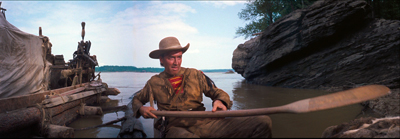
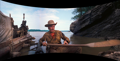
Such short-focal-length lenses distort the visual field in predictable ways. For one thing, they make horizontal lines bow upward or downward. For this reason, Cinerama DPs were at pains to keep the horizon near the center of the shot and to avoid or cover contours parallel to the horizon. Linus Rawling’s canoe oar bends disconcertingly in the central panel even before it hits the blend line and shoots off on its own.
Verticals can get distorted as well. On the edges of each panel, human figures can look bulged, pinched, or oddly torqued.
Cinerama’s triptych format complicates perspective effects by welding three wide-angle images together. When presenting built environments, often each panel displays its own distinct vanishing point–sometimes central, sometimes angular, sometimes both. The results recall the Caillebotte picture, all acute angles and avenues flung out to left and right.
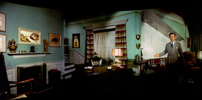
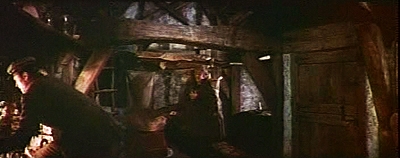
One cinematographer tells us that “special sets had to be built with curves and bends to rectify the false perspective inherent in three-camera systems.” But often we get contorted interiors. Dr. Caligari might feel at home in Lowell Thomas’ office.
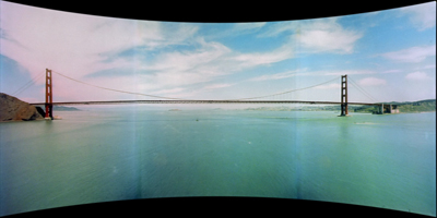
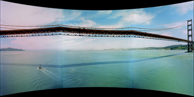
The blend lines add their own constraints. From a distance, the Golden Gate looks very planar, but as our plane swoops nearer, the horizon remains flat while the bridge develops a couple of kinks.
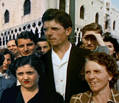
For staged action, veteran cinematographer William Daniels warned that “We invariably consider the blend lines first, then plot and stage the action to suit the camera setup.” Most obviously, directors had to keep people away from the panel joins. We can see the unfortunate result in this image from This Is Cinerama. The gent on the far right is at once pinched and bulged, and the building in the B and C panels gets the Caillebotte treatment. Worse, a young Venetian man’s head on the blend line undergoes an unfortunate warping.
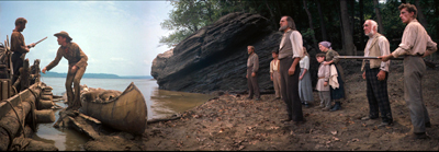
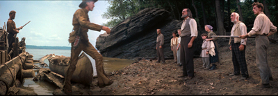
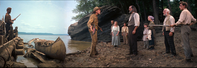
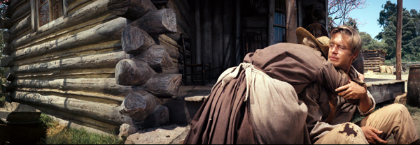
When a figure moves from panel to panel, the wide-angle distortions combine with the panel edges to create a faceted, almost cubistic space. Here’s the first anomaly I spotted when watching How the West Was Won as a kid in 1963.
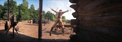
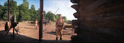
As Linus is walking toward Mr. Prescott, James Stewart seems to stride diagonally forward a bit (in the A panel). After he pivots, he grows very large as he starts to walk straight (the B panel). , then stride diagonally into depth (the third panel). Each wide-angle lens makes people swell or shrink as they come to or from the camera, and with the creases supplied by the blend lines, scenes like this become attractively odd. With the panels ironed out, we see people taking strangely roundabout paths to one another.
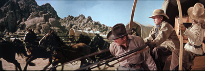
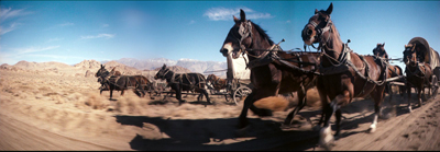
The effect is even more noticeable in big action scenes, when horizontal movements that are really parallel seem to peel off from one another. During the Indian chase, the wagons are fleeing alongside one another, as a back-projection shows. But the more dynamic angle on the wagon teams creates an image that hits you like a cold shower.
To the audience in front of a curved screen, the movement in the second shot would have looked somewhat (but not entirely, I think) more linear. For us, we see a perspective we’ve never seen before, with wagons diverging from one another but neither getting smaller or larger. And how about the dizzy swerve that the pathway in panel C takes when it reappears in panel A?
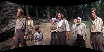
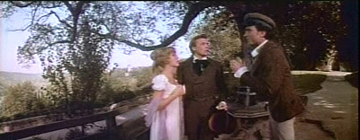
The angled-triptych format obliged actors to adjust their performances in counterintuitive ways. “An actor in a side panel,” wrote Daniels, “cannot look directly at one in the center panel when speaking to him, but must cheat a little–direct his eyes a little behind the one in the center.” Here’s an example from The Wonderful World of the Brothers Grimm that stands out when seen in the flat format. Wilhelm is speaking to Greta from the C panel, but it seems that Laurence Harvey didn’t cheat his body quite enough. He seems to be speaking past her, an effect not helped by the disproportionate size of his body.
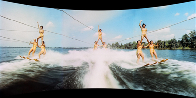
This Is Cinerama is obsessed with centering its action, but sometimes the center seems strangely off-kilter. With the water-skiing women shown earlier, the three cameras create a sort of hollow viewing station. Why do the flanking skiiers seem to be moving at angles to the central trio? Why do the ropes of the central skiiers fly off (jaggedly) to one side, rather than expand directly towards us, like train tracks?
As with the wagon teams, you have to imagine diagonal actions as rotated inward to parallel one another during projection. What you see is not what you’d get in the theatre. But also, what you see is something you’ve never seen in a movie before.
Most of these effects are heightened by the inability of the three-eyed monster to record close-ups. Because of the short focal length, the camera unit sat very near the actors: for a shot from the waist up, the central lens was between one-and-a-half and three feet away. Putting the camera so close necessitated lights being attached to the camera unit. But normally close-ups were avoided, so the human figures never dominate their locales. These movies are, more than most, about space–however buckled and bizarre that space might be.
Because of the panels, panning shots were to be avoided, but certain kinds of camera movement forward were welcomed. The signature Cinerama shot is the shot plunging toward the vanishing point–a boat rushing through the water, an aerial view banking toward the horizon. Even though the blend lines made shapes and edges wrinkle, this gigantic, embracing image streaming toward viewers gave a compelling illusion that they were hurtling forward.
The distortions are less visible from a perfect vantage point in a Cinerama auditorium–presumably, as close as you can get. Distortions on the display edges would be minimized by peripheral vision, which isn’t good at registering detail. Presumably some of the curvilinear shapes, like Linus’ oar, and those kinks across the blend lines, would be less egregious if viewed straight on. Watching from the front row in Bradford, I recall seeing these distortions, but they didn’t seem as vivid.
Naturally, not everybody in the auditorium has a perfect vantage point. In the original screenings, people who had sat on the sides complained that movement on the nearest flanking panel seemed to flow upward. Smilebox, which respects the overall geometry of the display, still yields disparities. Linus’ oar still curves, though not as pronouncedly.
My images here, and yours on your home screen, are unavoidably mapping a curved display onto a flat surface, so there will still be anomalies. If you want to try cutting down on them, sit close to the Smilebox display. I prefer to sit back and enjoy their weirdness.
They’re features, not bugs
What about the films themselves? Arguably no great film was made in the format, but all the releases probably have some admirers. I want to end by talking about the two I find most appealing.
Cinerama’s travelogues were episodic, designed to show off features of the process in different filming situations. The two fiction features had to highlight the process and tell a coherent, engaging story. They too tend toward the episodic, but they handle that option in different ways. And stylistically, both work against the official “rules” of the new format.
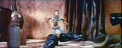
The Wonderful World of the Brothers Grimm, an entertaining family film, employs a frame story. The brothers are assigned to write the family history of the local Duke. Jacob, an expert linguist, does his job dutifully, but Wilhelm plays hooky to find and write up fairy tales he hears. His zeal to collect stories leads to the loss of their commissioned manuscript, and he falls ill, during which several fairy-tale characters come to visit him. Eventually Jacob is honored by the Royal Academy, but it’s Wilhelm who gets enduring glory by being swarmed over by hordes of children anxious to hear his latest tale. Within this overarching plot, three of the stories are enacted using various special effects, including puppet animation. Some of these shots appear to have been shot in a non-Cinerama format and “paneled” afterward.)
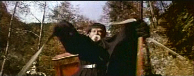
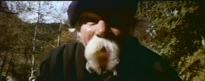
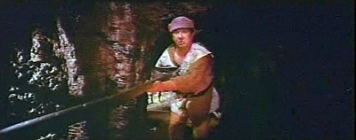
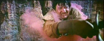
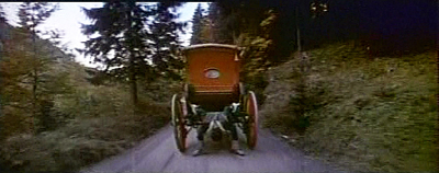
It’s tempting to ascribe the frame story’s direction to Hollywood veteran Henry Levin and the embedded fantasies to co-director George Pal. To the connoisseur of Cinerama, those fantasy passages offer some delights. If anybody told Pal about the rules for shooting in the format, he ignored them. The fairy tales give us whirling camera movements, bumpy subjective shots, and frequent assaults on the audience in the manner of 3D. During a wild coach ride, the coachman hurls himself to and from the camera. Later, a knight’s bumbling servant slays a dragon in lunging close-up.
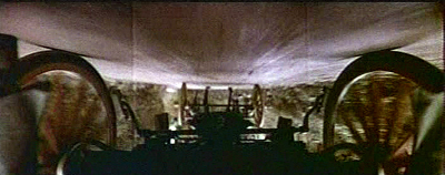
You can even take certain passages as sly parodies of the brand. The Woodsman in the first tale has hitched a ride on the back of the coach, and he stoops to look underneath. Cut to his point-of-view: an upside-down version of a signature Cinerama shot.
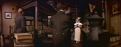
Whoever directed the frame story scenes, however, was fairly bold too, moving his actors in zigzag patterns more flamboyant than the blocking of How the West Was Won. And instead of the small, high sets recommended for the format, Wonderful World shoots in throne rooms and palace salons that seem to stretch on forever. In smaller sets, like the brothers’ cottage, their friend’s bookshop, and especially the lair of a witch, the compositions take advantage of crannies and oddly angled planes that enhance the exaggerated distances.
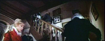
As in German Expressionist cinema, the distortions seem to suit an atmosphere of fantasy. There’s even a massive violation of one of the basic rules of Cinerama: avoid tilting the camera. High and low angles were likely to exaggerate any distortions in the panels. Yet Levin, or Pal, or both occasionally throw in expressive angles, most strikingly a low angle showing Wilhelm’s family and friends ascending to his sickroom.
The Wonderful World of the Brothers Grimm solves the problem of the episode film by giving us a frame story. How the West Was Won solves it by a more threaded structure. A family saga creates branching stories that show three generations of kin participating in the winning of the frontier. The story acknowledges, briefly, the conquest of indigenous peoples–the “liberal Westerns” of the 1950s haven’t been ignored–but slavery doesn’t play a significant role. This is a story of white people.
The Prescott clan sets out on the Erie Canal, but on the rivers all but two of them lose their lives. The warm, slightly romantic Eve settles with the trapper Linus Rawlings on a farm in Ohio, while her sister Lilith ventures west. Eve’s son Zeb joins the Union forces in Civil War and later moves west with the railroad, eventually becoming a marshall. Lilith joins a wagon train, takes up with a gambler, inherits a worthless mine in California, and reunites with her lover on a riverboat. They become entrepreneurs investing in the railroad system. Near the end of the century, Lilith loses her fortune and joins Zeb, now retired, and his wife and children. But before they can settle down on Lilith’s inherited Arizona ranch, Zeb has to settle a score with a bandit who intends to rob a train. The film falls into sections specified in the credits–The Rivers, The Plains, and so on–but not in the film, though the parts usually end with fades.
Marker might note that How the West Was Won revives the piety and chauvinism on display in This Is Cinerama. The Prescott women found a kind of holy family, bound, as one song puts it, “for the Promised Land.” Some writers thumb through the phone book to get names for their characters, but screenwriter James R. Webb seems to have favored the Old Testament. Eve, living up to the positive side of her name, becomes the first woman of the new land. In forcing Linus to become a farmer, she helps turn the wilderness into a garden. Lilith, whose name associates her with sexuality and demonic possession, becomes a dance-hall girl and eventually a millionairess, but she has no children. At the end she returns to her nephew, Zebulon, named for her father; in the Old Testament he is the founder of a tribe. And Zeb has named his daughter Eve. The family abides in an endless cycle, its members replacing one another and its history intertwined with the full flowering of the United States.
The film ends with the sort of God’s-eye views that conclude This Is Cinerama, but emphasizing the modern West, with its dams, roads, cities, even whorls of traffic. Interestingly, in the place of the forward rush of the earlier film, these aerial shots pull us backward, the classic mark of the end of a story. But the finale of the epilogue carries us forward once more, under the Golden Gate Bridge and into a sunburst over the Pacific. Since women have played a central role, no surprise that the final lyrics of the choral accompaniment celebrate heroes as “every mother’s son.” This country has reached its natural limit; beyond is heaven, and the chorus tells us, here at last is the Promised Land.
Most scenes are handled briskly, but with little nuance beyond what the actors bring to the story. The spectacle remains appealing, the music infectious, and the imagery always impressive–especially when it’s a little whacked out, as in my examples above and many other scenes of the film. Like The Wonderful World of the Brothers Grimm, this has shown that Cinerama can be edited rapidly. This Is Cinerama has only a little more than two hundred shots, but Wonderful World has a thousand, and How the West Was Won has over eleven hundred. The chapters of the latter yield some striking results: most average between eight and nine seconds, but John Ford’s Civil War segment averages nearly fifteen seconds, while the climactic Outlaws segment averages about five seconds.
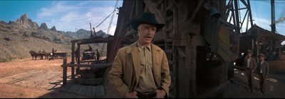
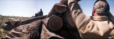
That climactic sequence, directed like most of the film, by Henry Hathaway, makes splendid and varied use of the format. Despite a heavy reliance on back projection and several shots that seem not to have been made in the three-camera process, this monumental remake of The Great Train Robbery is a showcase for how Cinerama could create exciting action through staging and editing. To the advantages of Cinerama–forward drive, looming landscapes, and immersive sound–Hathaway and editor Harold Kress add percussive cuts of logs sliding this way and that, along with painful stunts, including one showing a man flung off a train and into a cactus.
By contrast, the Civil War sequence shows how a director can triumph over an inflexible format by relying on expressive stasis. Ford the pictorialist will carve striking compositions out of the constraints of Cinerama. He exploits the depth of the 27mm lenses, sometimes stationing all his figures in the central zone, as if he’s trying to preserve the 1.37 aspect ratio. At other moments he confines the action to a single flanking panel.
Sometimes Ford simply ignores the triptych format in order to split the frame in half or, say, two-fifths. He also gives his actors postures, props, and gestures that allow them to underplay. With Ford, even fresh-minted junior stars like Carroll Baker and George Peppard can give performances of gravity.
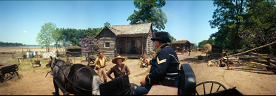
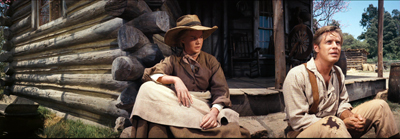
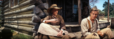
Ford’s creative choices stand out most strongly in two scenes set on the farm. In the first, Linus Rawlings has gone off to battle, and his son Zeb is itching to follow. Eve, now old, accepts with weary sadness that he will have his way. There’s a Griffithian two shot of Eve and Zeb on the porch, her arms dangling wearily and her right hand rising and falling as she asks Zeb about whether he’ll get a uniform. The hell with Cinerama, Pappy seems to say: Just fill up half the frame with the cabin to keep us fastened on the couple.
After a quick embrace, Eve dashes into the house. A porch shot that is virtually a Fordian doorway framing shows Zeb leaping with joy before he turns, sees something in the house, and halts in his tracks. Ford needn’t show us Eve’s grief. This is the most tactful shot in the whole film.
Soon enough Ford will recall this scene. Zeb has left for the war. Eve, kneeling at the family plot, prays to her father before slipping behind the rail. Her face is hidden, but her hands again express her resignation, and prefigure her death. She was never the same, her other son will say, after Zeb left.
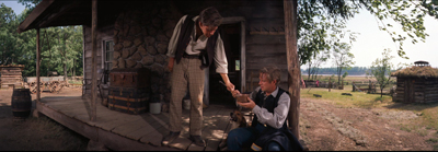
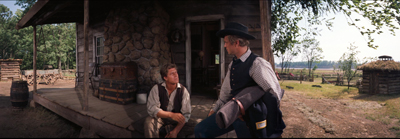
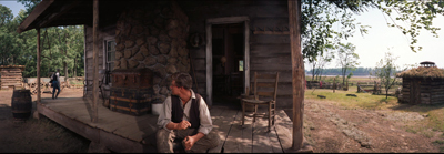
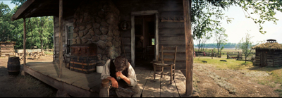
These homestead passages are echoed by a scene at the end of the Civil War segment. Back from the war, Zeb learns of his mother’s death from his brother Jeremiah. The two sit on the porch sharing a dipper of water and recalling their father. Zeb rises to go, they shake hands, and we get another muted Fordian moment. Why move your actors when you can pose them?
Now the old director, a master of depth since the 1910s, bends this newfangled format to his own ends. Zeb leaves the frame, comes back in the far distance, and is finally blocked by the farmhouse, leaving Jeremiah quietly weeping.
That’s how you handle this busy, noisy new contraption, Ford seems to say. Dwell on moments of stillness and pathos. Use handshakes, embraces, a drooping black shawl. Keep the action in a well-defined zone. And treat this as a silent movie.
The most comprehensive account of Cinerama’s development is Thomas Erffmaier’s 1985 Northwestern Ph. D. thesis, The History of Cinerama: A Study of Technological Innovation and Industrial Management. Also invaluable are John Belton’s Widescreen Cinema (Harvard University Press, 1992) and Robert E. Carr and R. M. Hayes’ Wide Screen Movies (McFarland, 1988), usefully supplemented by Daniel J. Sherlock’s emendations here. A good older work is Michael Z. Wysotsky, Wide-Screen Cinema and Stereophonic Sound (Focal Press, 1971). Sheldon Hall and Steve Neale put This Is Cinerama into the context of postwar blockbusters in Epics, Spectacles, and Blockbusters: A Hollywood History (Wayne State University Press, 2010), Chapter 7. On the Web, restorer and cinematographer Greg Kimble provides a thorough and well-illustrated account of Cinerama at In 70mm.
Chris Marker’s “Le Cinérama” appeared in Cahiers du cinéma no. 27 (October 1953): 34-37.
Cinerama grew out of Fred Waller’s experiments with gunnery-training displays during World War II, as Strohmaier documents in Cinerama Adventure. Waller discusses this work in “Cinerama Goes to War,” New Screen Techniques, ed. Martin Quigley, jr. (Quigley, 1953), 119-126. This collection includes other pieces of value on Cinerama, 3D, CinemaScope, and other new technologies. It would be interesting to know if Waller’s efforts influenced, or were influenced by, psychologist J. J. Gibson’s comparable wartime experiments with aerial training films. Gibson’s ideas about how we grasp space through “optical flow” and centered perspective have obvious parallels with the Cinerama process. Waller was said to have been influenced by another psychologist, Adelbert Ames, Jr., one of the founders of 1950s “New Look” psychology. Waller’s belief that our peripheral vision was more important than stereopsis in determining depth echoes Ames’ hypothesis that convergence and binocular disparity were overrated as depth cues.
Greg Kimble provides a thorough overview of the making of How the West Was Won in a 1983 article for American Cinematographer, available here. I’ve drawn as well on William Daniels’ article “Cinerama Goes Dramatic,” American Cinematographer 43, 1 (January 1962): 28-29, 50-54. Also useful was Darrin Scott, “Panavision’s Progress,” American Cinematographer 41, 5 (May 1960): 302, 304, 320-322, 324. My quotation about readjusted sets comes from Scott’s piece.
Three-panel Cinerama features can be seen occasionally today at the Pictureville Cinema in Bradford, the Cinerama Dome in Los Angeles, and the Seattle Cinerama.
Simultaneously with This Is Cinerama, Flicker Alley has published a lavish Smilebox version of Windjammer, also prepared by David Strohmaier. That’s a whole other story.
P.S. 5 October: You never can tell. Jim Emerson forwards me this Indiewire report by Len Maltin on a new short made in three-panel Cinerama.
How the West Was Won.


