Anybody but Griffith
Monday | February 27, 2017 open printable version
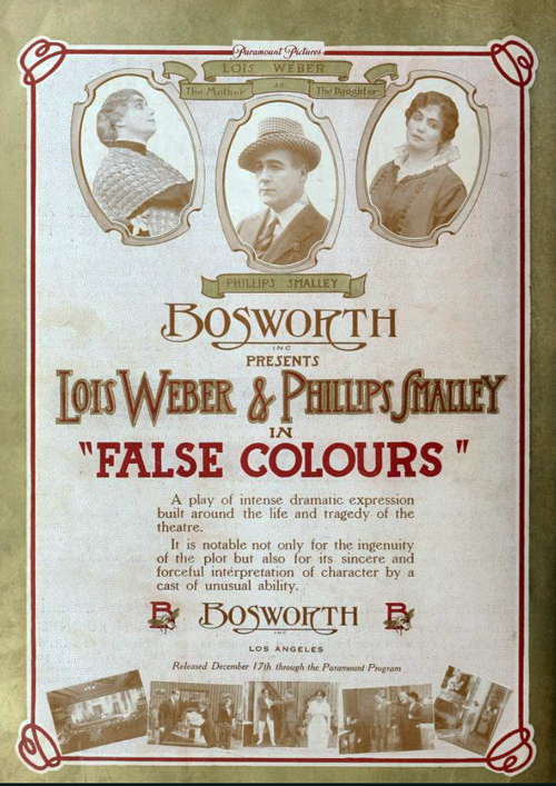
Motion Picture News (19 December 1914), 148.
DB here:
For almost two months, I’ve been in Washington, DC at the Library of Congress. The John W. Kluge Center generously appointed me Kluge Chair in Modern Culture. This honor has enabled me to work with the enormous collection of the Motion Picture, Broadcasting and Recorded Sound Division to sustain my research in American narrative cinema of the 1910s.
I wanted to go more deeply into an area I mapped out in the video lecture, “How Motion Pictures Became the Movies” and in the books On the History of Film Style and Figures Traced in Light. The general question was: How did the norms of storytelling technique develop between 1908 and 1920? More specifically, I hoped to trace out an array of stylistic options emerging for the feature film. What range of choice governed staging, framing, editing, and kindred film techniques?
Theatre, but through a lens; painting, but with movement
If you’ve seen that lecture, or just followed this blog from time to time, you know that I’ve sketched out two broad stylistic trends operating at the period. One, celebrated as a breakthrough for a hundred years, involves the development of continuity editing. That trend was explored by several historians of early film, including Kristin in the book we did with Janet Staiger, The Classical Hollywood Cinema: Film Style and Mode of Production to 1960.
Critics and historians who saw editing as the essence of cinematic technique called the second trend “theatrical” and regressive. Directors in that trend supposedly simply planted the camera in one spot and let it run, recording performances and not bothering to cut up the scene into closer views. This “tableau” tradition was superseded by an editing-based style–and, many thought, a good thing too.
Over the last twenty years, however, scholars have reappraised that apparently static and passive camera. Lea Jacobs and Ben Brewster’s trailblazing book, Theatre to Cinema: Stage Pictorialism and the Early Feature Film (1997) traced film’s many debts to theatrical plotting, set design, and especially performance. In a parallel series of articles, Yuri Tsivian proposed that the “precision staging” of the 1910s had deep affinities with traditions of painting and visual culture. Lea, Ben, and Yuri showed that the tableau tradition offered rich creative choices to filmmakers.
For my part, I was concerned to explore how ensemble staging worked in a moment-by-moment fashion to call the viewer’s attention to key aspects of the action. Editing does that by cutting to closer views. In the tableau method, emphasis arises from composition, movement, and other pictorial strategies.
In light of all this research, it seems clear that during the 1910s the tableau strategy developed into a powerful expressive resource. After Figures Traced in Light (which found the tradition still alive in directors like Angelopoulos and Hou), I continued to collect examples of creative staging at this early period. The results led me to analyze films by Yevgenii Bauer, Danish directors, and other Europeans.
 Evidently the tableau persisted until 1920 or so in Europe, especially Germany, but the editing-centered option had already become dominant in America. But how long, and in what ways, did tableau methods hang on in the US? Or was the switchover quite quick? By 1917, Kristin had posited, continuity editing had crystallized as the primary storytelling style. I thought I’d try some depth soundings of the period.
Since my time was limited, I had to focus. Charlie Keil’s superb Early American Cinema in Transition: Story, Style, and Filmmaking 1907-1913 (2001) analyzed a great many films of that phase in depth, particularly with respect to editing techniques. So I thought I’d start with 1914 and simply try to see as many features from that year as I could. I then would sample items from later years. My only rule was to watch films that aren’t part of the canon–no Griffith, Chaplin, Fairbanks, Pickford, Fatty et al. I did, however, try to see rare things by Lois Weber, Reginald Barker, and other well-regarded filmmakers.
What did I come up with? I’m still watching and thinking, but let me share a few items that excite me. Clearly, despite plenty of audacious editing, the tableau technique was alive and well in America in 1914-1915. And the more I see, the more I’m inclined to rethink the terms under which I value Mr. D. W. Griffith.
Tableau trickery
A simple illustration of how a fairly distant tableau can vividly guide our attention shows up in The Case of Becky (1915), directed by Frank Reicher.
Before an audience, the sinister hypnotist Balsamo hypnotizes Becky. From a deck of cards he has selected the ace of hearts, and in her trance she has to find it. There’s almost no movement in the frame: Balsamo stays frozen, as does Becky, except for her one hand flipping over the cards.
No need for a close-up: With Balsamo as still as a statue, every viewer will be watching that tiny area of the screen occupied by her hands, and we wait for her to find the ace. When she does, Balsamo accentuates her minimal gesture by twisting his arm and freezing into another pose.
Is this, then, simply filmed theatre? Not really. First, many tableau framings, like the Case of Becky instance, put the actors closer to us than stage performers would be.
Just as important, the perspective view of the camera yields a chunk of space very different from that of proscenium theatre. In cinema, for instance, depth is more pronounced, and actors can be shifted around the frame to block or reveal key information. This isn’t pronounced in the Case of Becky example because the two characters are more or less on the same plane and the background is covered by curtains. But consider this shot from The Circus Man (1914), by Oscar C. Apfel.
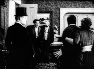
The circus owner Braddock has been sent to prison for murder and attempted robbery, a plot engineered by Colonel Grand. Now Braddock has served his sentence, and in a scene too complex to trace entirely here (but maybe in a later entry), he bursts in past the butler to confront Grand. Here’s what we see.
Such a scene would be inconceivable on the stage because of the audience’s sightlines. People sitting in the left side of the auditorium couldn’t see Braddock’s entrance, because he’d be concealed by Grand, who’s standing in the foreground left. Audience members on the right side of the auditorium couldn’t see Braddock either, because Mrs. Braddock and David are standing on the right foreground.
The shot makes sense from only a very limited number of points, only one of which is occupied by the camera. Maybe a few people in the center of the theatre would have a fairly clear view of such an action, but as we’ve seen with The Case of Becky, they wouldn’t be so close to the players.
The sheer fact of optical projection means that cinematic space is narrow and deep, while stage space is broad and (usually) fairly shallow. On the stage, players tend to be spread out laterally, allowing for many sightlines. Cinematic staging can be deep and diagonal.
On the other hand, the tableau shot isn’t perfectly analogous to a painting. While the lens chops out a perspectival pyramid in three dimensions, the movement in the frame creates a two-dimensional flow–a cascade of planes and edges very different from what we’d get in a painting. This flow can be used to reveal or conceal bits of space as the action develops.
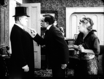
You can see this compositional flow clearly in an earlier phase of the Circus Man sequence. Before Braddock bursts in, David has been arguing with Colonel Grand in the foreground. David’s and Grand’s heads occupy the area that Braddock will soon claim. Just before that entrance, Mrs. Braddock pulls David back a bit to the right, and Grand recoils fractionally to the left. This creates a hole that Braddock can come into (as above).

This sort of slight shifting is akin to what we see in the astonishing poorhouse sequence of Victor Sjöström’s Ingeborg Holm (1913), analyzed here. Clearly the Americans were executing the same sort of choreography as the Europeans, which turns the static image of a painting into something more dynamic, a sort of micro-dance.
Flo and flow
The married couple Lois Weber and Phillips Smalley are responsible for a little masterpiece of early cinema, Suspense (1913), which I’ve discussed here. It’s become a classic largely because its audacious close-ups and cutting seem to anticipate classic Hollywood style. But seeing, or sort of seeing, two other films by Weber and Smalley suggest that they were no less adept at the tableau method.
I say “sort of seeing” because the copy of Sunshine Molly (1915) was so deteriorated that in long stretches only faint outlines of the people and locales were visible. The plot was pretty clear, but the images were so blotchy that only a few furnish clear frames. Still, it would seem to have been quite a good film. With False Colours (aka False Colors, 1914), two or three reels were missing. But what was there was pretty spectacular, and one scene is really striking if you’re interested in staging.
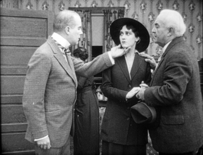
As with The Circus Man, at first glance things look stagebound. Dixie’s long-separated father comes to the foreground where she stands waiting with the theatrical manager. He abandoned her as a baby, and now that she’s found success as an actress she spurns him.
But no stage arrangement could yield the layout we get in this shot. While father and daughter and manager occupy the “forestage,” we see Flo, who has impersonated Dixie in an effort to get the father’s money, step into the gap. (Flo is played by Lois Weber.)
Thanks to the depth of the “cinematic stage,” we get what Charles Barr calls “gradation of emphasis”–not just two layers of space, as in The Circus Man, but action and reaction in depth, as we wait for the foreground action to develop. That action hits its high point when the father touches Dixie’s chin.
This gesture partly masks Flo, who briefly turns away as well. The emphasis falls firmly on the father’s contrition. Dixie still refuses him, and so he says farewell, re-exposing Flo turning in the background.

As he departs, so that we get the full force of his encounter with Flo, Dixie turns from the camera. We must concentrate on the moment in the background when the imposter shows remorse for having won the love of the man she deceived.
At the door
You might object: “But David! Those examples are still very stagebound. The Case of Becky shot is itself on a stage, and the others, despite all their depth, show boxlike rooms from straight on. They seem firmly tied to a proscenium concept. Shouldn’t we expect something more natural?”
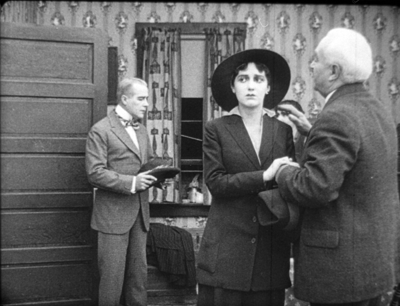
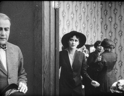
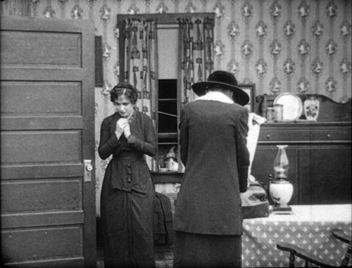
Fair enough, so I submit this earlier phase of the False Colours scene. This time we have a doorway, framed diagonally, that cuts off a lot of playing space. And we see obliquely into a corner of a room, not straight on to a back wall. Yet you still get an interplay of faces and bodies, carrying to a daring extreme the blocking-and-revealing tactics we’ve seen in The Circus Man and in the later phase of the False Colours scene.
Dixie comes to Flo with Flo’s mother. At this point Flo recognizes Dixie as the daughter she’s been impersonating and is deeply ashamed. You won’t be surprised by the dazzling precision of the frontal placement of Flo, no matter how far she is from the camera.
Flo is consoled by her mother, and Dixie shuts the door discreetly.
But why so much empty space on the left of the door? Because now the theatre manager is coming, and the framing shows us what Dixie doesn’t know: Her father is standing there alongside the manager.
There’s a moment of suspense before the father hesitantly steps to the doorway and Dixie sees him for the first time in seventeen years.
He blots out everything but her reaction, until Flo’s face slides into visibility. Cornered, she’s terrified to be confronting the man she has deceived.
The father’s valet has obligingly slid into the left to balance the frame, but he stands as frozen as the hypnotist Balsamo had been, looking patiently downward, to make sure we concentrate on the pitch of drama taking place in the distance. This is as purely “cinematic” a scene as anything involving editing.
And who needs close-ups?
Griffith is a great director, but other filmmakers of his period were exploring cinematic possibilities he didn’t consider. Their editing is often more subtle and careful, and the exponents of the tableau style achieve a pictorial delicacy mostly at variance with his work.
More and more, this Founding Father of Hollywood seems to me an outlier–an eccentric, raw, occasionally clumsy filmmaker who went his own way while others refined a range of stylistic practices. I’m starting to think he favors a brute-force approach, in both physical action and the evocation of sentiment. The result is powerful, but… Well, I’m reluctant to say it, but after my two months of immersion in Anybody But Griffith, he’s starting to seem somewhat crude.
I’m tremendously grateful to the John W. Kluge Center, and particularly its director Ted Widmer, for enabling me to conduct this research under its auspices. A special thanks to Mike Mashon of the Motion Picture Division, and all the colleagues who have been helping me in the Motion Picture and Television Reading Room: Karen Fishman, Rosemary Hanes, Dorinda Hartmann, Zoran Sinobad, and Josie Walters-Johnston.
Ben Brewster and Lea Jacobs’ Theatre to Cinema is available for download here.
For our blog entries relevant to the tableau tradition, go here. Lois Weber made many other important films, notably Hypocrites (1915), Where Are My Children? (1916), Shoes (1916), and The Blot (1921). See the exceptionally detailed Wikipedia entry for more information.
False Colours (1914).


