Bond vs. Chan: Jackie shows how it’s done
Wednesday | September 15, 2010 open printable version
DB here:
During the 1990s several critics began to notice that filmmakers were doing something odd with action scenes.
Directors were consciously, even joyously, sacrificing clarity. When two characters were punching it out, the framing didn’t make it easy to know who was hitting whom, and how. Changes in angle and shot scale were sometimes so abrupt that you had little time to adjust. The cutting pace was so quick that you couldn’t entirely register the movement in shot A before shot B replaced it. Sometimes the spatial layout of the fight was confusing as well: too many close views, too few master shots. Later, the return of handheld shooting made many action scenes even more illegible, blurring and smearing them to the point that sound (as in the Bourne films) had to specify that a body has hit a window or a hand has busted a bottle. Now we have Sylvester Stallone’s The Expendables, which might be a new summit in overbusy, incoherent, inconsequential action.
I wrote about this trend back in the 1990s, and I’ve returned to it on occasion since. Other writers, notably Todd McCarthy of Variety, noticed it too. He referred to the full-throttle editing and “frequently incoherent staging” on display in Armageddon (1998): “Bay’s visual presentation is so frantic and chaotic that one often can’t tell which ship or characters are being shown, or where things are in relation to one another.”
A decade later comes Peter DeBruge’s review of the “muddled execution” of The Expendables: Staging simultaneous fights “might’ve worked had the editors assembled all that footage in such a way that we could tell where characters are in relation to one another or what’s going on.”
The Michael Bay approach has become the principal way in which action scenes are shot. It isn’t absence of craft that leads to these aimless bouts. The filmmakers actively want the action to be hard, even impossible, to follow. Sometimes I think that this blurred bustle is there to secure a PG-13 rating; if you could really see the mayhem, we might be moving toward an R. But filmmakers don’t say that they’re self-censoring. They seem to think that making the action illegible is creative because it promotes realism.
Stallone explains why he scrambled up the fight scenes in The Expendables.
I don’t think many action scenes are shown from the character’s point of view. They are more from the director’s point of view. On Rambo, I thought the most economical and original way to shoot [the action] would be through Rambo’s eyes—if he were directing, what would his style be? But The Expendables is an ensemble picture, so it’s somewhat of a blend. I thought, ‘This is not supposed to hang in the Louvre.’ I wanted it to be disjointed and rough, not choreographed. If you really were filming a big battle with five cameras, [their footage] would not all flow together, so we set up the [cameras] to film the action we’d scripted and told the operators they were on their own. We said, ‘Do the best you can, and we’ll use the interesting shots from the characters’ perspectives.’”
Camera operator Vern Nobles describes shooting the action as “multi-camera craziness.”
You might point out that if somebody were really filming a big fight with five cameras, at least a couple of camera operators would be shot or punched silly. And presumably a few times we’d actually see other cameras.
Realism, as usual, is simply a fig leaf for doing what you want. Virtually any technique can be justified as realistic according to some conception of what’s important in the scene. If you shoot the action cogently, with all the moves evident, that’s realistic because it shows you what’s “really” happening. If you shoot it awkwardly, that presentation is “realistically” reflecting what a participant perceives or feels. If you shoot it as “chaos” (another description that Nobles applies to the Expendables action scenes)—well, action feels chaotic when you’re in it, right?
Forget the realist alibi. What do you want your sequence to do to the viewer? Do you want it to pass along an impression of bustle and flurry? Or do you want to make the viewer wince, recoil, even mildly reenact the movements of the players? Then follow the Hong Kong tradition. Yuen Woo-ping once told me that his goal was to make the viewer “feel the blow.” To convey the effort and strain, the impact and pain: that’s something worth doing.
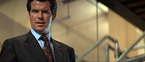
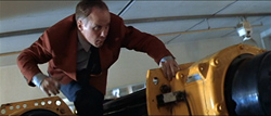
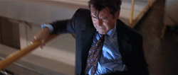
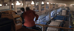
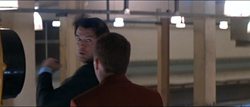
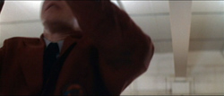
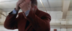
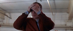
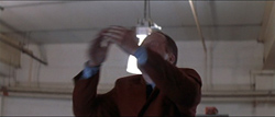
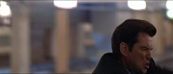
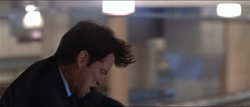
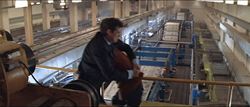
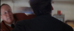
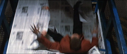
It’s something that the blur-o-vision tussles lack, but even fights that are more carefully filmed are strangely unmoving. In Tomorrow Never Dies (1997), there’s a fistfight on a catwalk above a rotary press line. The presentation is more or less spatially unified, but it lacks drive because of certain creative choices. For instance, when Bond punches a security guard, the man simply drops out of the frame.
Where does he go? He doesn’t fall off the catwalk but seems to grab the railing, so maybe he’ll return for another go-round. But he doesn’t. As Bond falls back, another guard sneaks up on him. The framing and screen direction suggest that he’s approaching Bond from the front.
Actually, he’s sneaking up from the rear.
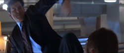
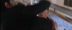
When Bond turns, we don’t see his punch.
In fact, we don’t see much of anything. Although the attacker is erect in one shot, he seems to be kneeling in the next, when Bond kicks him, somewhere below the frameline.
The attacker is standing again in the next shot, and he’s flung backward by the force of Bond’s unseen kick.
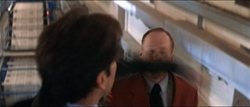
When the man returns, he tries to tackle Bond. At least, I think he does. The maneuver takes place, again, underneath the frameline.
At last we get a wider shot, but this serves mainly to align the fight with the conveyor belt below the men; guess who will fall?
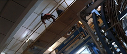
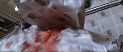
More fighting, with punches and grappling blocked by the men’s bodies, culminates in Bond’s adversary falling into the print run.
Even here, however, we don’t really see what happens to the victim. He plunges through the river of newsprint and the machine starts belching.
Overall, we get a mild impression of what happened in the fight, but the action unfolds vaguely and is hardly stirring. Is this how you earn a PG-13?
The Hong Kong way
Righting Wrongs (1986).
While revising Planet Hong Kong for its web edition, I’ve been revisiting classic Hong Kong action scenes. In 1997-98, when the book was written, I had to rely on laserdiscs, but since then I’ve been able to look at more 35mm prints. (DVDs usually don’t help answer the sort of questions I’m asking, for reasons reviewed here.) Now I have a chance to put some thoughts about these movies online, in this blog and in the upcoming digital update of the book. As a start, here’s a recipe drawn from the best of Hong Kong fury.
First, go for clarity in every way. Not murky earth-toned sets but brightly colored and sharply lit ones; even an alley can dazzle. Put the camera on a tripod; pan if you must, but save your dolly moves for simple emphasis. No handheld.
Second, aim for precision. Stallone’s comments imply that a cameraman captures a preexisting fight, snatching an “interesting” shot here or there. But that’s not the case. Movie action is choreographed and the framing is calibrated to that. The gestures should be legible, favoring crisp and staccato movement, while the image’s composition aims to convey the action cleanly. It’s a pity that the haphazard framing of Stallone and his cameramen have ruined the choreography of Cory Yuen Kwai, Jet Li’s action designer (and a fine director in his own right).
Third, establish a rhythm. This involves not only building the fight. It also involves synchronizing the pace of characters’ movements with that of the cutting. On the whole, the old rule applies: More distant shots should be held longer than closer ones. This doesn’t mean you can’t use fast cutting, only that your fast cutting can be more finely judged when you take shot scale, composition, and speed of movement into account.
Rhythm means sensing a pulse, and for that you need slight pauses. So don’t cut away to something else before a punch or kick is completed. Let the arc of movement, itself perhaps stretched over several shots, come to a point of rest, if only for a couple of frames.
Fourth—and here is where realism is most explicitly abandoned—amplify the expressive qualities of the action. If movement is zigzag or springy or oscillating, stress that. Give emotional qualities not only to facial expressions but also to postures and combat moves. American heroes just grimace while their bodies remain inexpressive, lumpish. The hard guys in The Expendables might as well be made of granite. But in contrast your fighters needn’t wave their arms wildly. Just concentrate energy and emotion in the action. If the hero attacks, let him become as focused as a javelin. If your heroine falls, don’t let her just drop out of frame: Let her land with a thwack, preferably on the spine or neck, and let her body’s recoil send a spasm through the spectator too.
Hong Kong cinema supports Sergei Eisenstein’s belief that expressive human action is “infectious.” He thought that if physical action onscreen is imbued with vivid force it can arouse sympathetic echoes in the spectator’s own body. After a great action scene, such as in many Chang Cheh and Lau Kar-leung films of the 1970s, or in Yuen Kwai’s Righting Wrongs, when a tough guy gets a spittoon in the face, the viewer feels trembling and tired, but in a good way.
Glass story
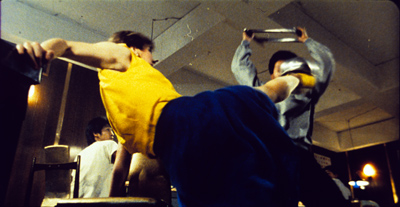
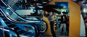
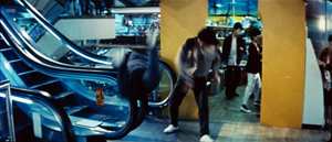
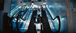
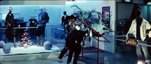
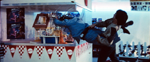
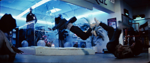
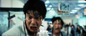
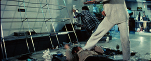
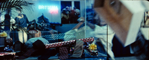
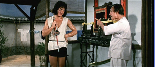
Jackie Chan has become such a beaming, easygoing star that we forget that he was an excellent director of brutal fight scenes. He proved adept at filling anamorphic compositions with dynamic movement, as well as plucking out items of a set and sweeping them into the action. (See the parlor fight in Young Master, 1980, or the shenanigans in the rope factory in Miracles/ Mr. Canton and Lady Rose, 1989). In Police Story (1985), Jackie is trying to rescue Salina and save all the computer records in her briefcase. Koo’s gang is determined to stop him. The fight moves through different areas of a shopping mall.
In each of these locales, Jackie plays a suite of variations on what you can do with escalators, staircases, and, most memorably, glass. I can’t do justice to all the skirmishes, but consider some instances of how he stages and cuts the action for an impact that American movies seldom achieve.
The variations get steadily more elaborate. Early in the sequence, Jackie flings one thug, achingly, across the bottom handrails of an escalator.
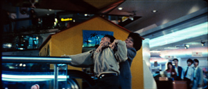
The shot could hardly be more legible. You see everything. Next, Jackie is grabbed from the rear.
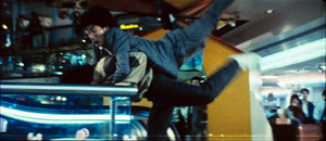
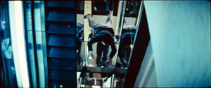
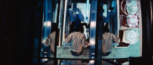
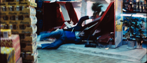
Naturally he has to flip his attacker down to the floor below, rendered in two dynamic shots from directly below and above.
Interestingly, the shots are so clearly composed (even with the fancy mirror effect in the second) that they can be very brief: 26 frames and 16 frames. Down at the bottom, the unfortunate fellow smashes through a display and lands straight on his spine. Unlike the security guards in Tomorrow Never Dies, this thug gets a little commiseration as he rolls over groaning. As in any fight sequences, disposable thugs may come back into action, but at least we’ll clearly see the fates of those who are put permanently out of commission.
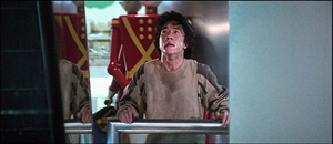
After this burst of action Jackie provides a pause as he abruptly looks up in search of Salina.
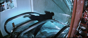
What else can you do with escalators? How about tossing the next thug down the slim gap between two of them?
In a nice touch, we hear a long squeak as he slides down the trough.
Tomorrow Never Dies sets up its conveyor-belt climax straightforwardly, but Jackie’s choreography is more surprising. Audacious and imaginative as the stunts are, however, they are framed and cut in a way that makes the action clear and precise. Through cinematic choices Chan builds up an infectious arousal. This stuff hurts.
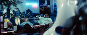
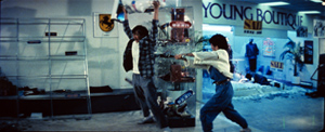
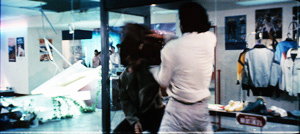
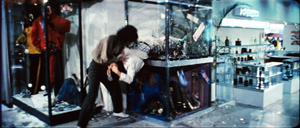
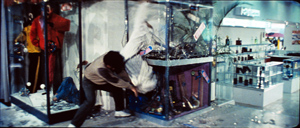
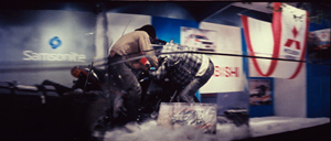
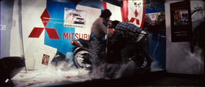
After a set-to in a hallway, Jackie pursues the gang into an area filled with display cases. He takes on the men ferociously, and sets them smashing through the vitrines in another string of variations. Jackie slams down a mirror on one thug, swings another into a display, and sends one spinning through a window. Each shot, of course, is of diagrammatic simplicity, all the better to amplify the expressive dimension and key up the viewer. You can’t watch shots of men hurled into layers of glass without feeling a few palpitations.
Nearly every shot is bound tightly to the next. What will occupy shot B is launched on the fringes of shot A, sometimes for only a few frames. The string of matches on action creates a fluid continuity quite different from the choppiness we often find in American sequences.
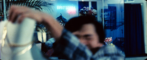
A good instance occurs after Jackie has been pinned under a toppled shelf. In a medium close-up, the gang leader orders his thug into action; behind him the plaid-coated thug moves left.
In long shot, with Jackie at a disadvantage, the thug continues his movement in the background as he grabs a heavy statuette.
In a medium-shot, Mr. Plaid Jacket lifts the statue, but as he moves aside he reveals Salina rushing toward him in the background. Look quick: She appears in the fifteenth frame, and is gone within another fifteen.
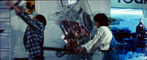
We can only glimpse Salina passing behind the thug, but the next shot shows her clearly: running, baseball bat in hand, toward him. The trajectory could not be clearer, and she swings the bat directly through the vitrine.
The force of the action is multiplied by the simplest cut possible: an axial enlargement, with the action slightly repeated and slowed. The first shot of Salina’s swing lasts seventeen frames, the second exactly twice as long. The arithmetic of the cutting extends the action’s beat.
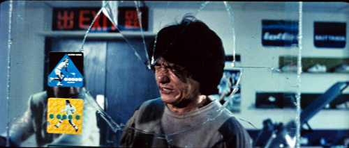
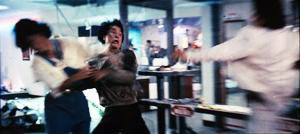
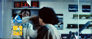
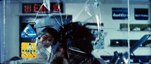
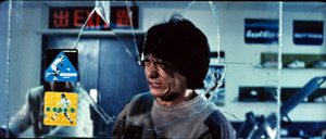
Bursts of glass form the dominant, painful motif of this part of the sequence. (Jackie’s crew suggested he call the film Glass Story.) The shifting dynamic of the fight is rendered through close encounters of the splintery kind. But these are differentiated. Long shots portray the torments of the gang, but Jackie’s first encounter with glass is treated in one simple close shot, just a second long, that usually makes audiences flinch.
Jackie is attacked by the gang leader and he shoves Salina out of the way.
The leader springs forward to whack Jackie with the briefcase.
Cut to the opposite angle, a tight shot of Jackie.
The briefcase continues to be swung, and Jackie’s head smashes the windowpane.
Jackie bounces off the glass and grimaces in agony.
The proximity of the glass shards to his eyes probably triggers some primal revulsion in us, but this is only part of the image’s force. The whole shot lasts only 28 frames. I think that part of its percussive impact comes from the fact that at the start we don’t have time to register that the pane is there. (There are only seven frames before Jackie hits.) When the glass bursts, it’s as startling as if the screen surface has cracked as well, and this amplifies the painful impact of the blow.
For a time Jackie is at the gang’s mercy. But he makes a comeback, and eventually in a kind of summary of his other maneuvers he will bash the leader, body and head, through two glass cases. This phase of the scene concludes with Jackie running Mr. Plaid through a series of cases at the point of a motorcycle. Both crescendos are filmed in clear, smoothly-cut shots—and long shots at that.
We may wince for the fate of these gangsters, but we shuddered when we saw Jackie’s face knocked through a window. Soon Jackie will be flipping the leader down an escalator, a sort of envoi to the scene’s first phase, and he will be sliding down a three-story light pole to catch up with boss Koo himself.
To use Stallone’s comparison, I’d happily hang this splendid sequence in the Louvre.
But what sort of MPAA rating would it receive today? The painful physicality on display is given a staccato force through the framing and cutting. And don’t call it cartoonish. It’s Bond who’s cartoonish, with his unflappable ease and perfectly functioning gadgets and defiance of the laws of gravity and those fights he wins without suffering a scratch. Jackie shows us the sweat. He and his victims fall with painful awkwardness, he gets gashed and bruised, and he’s all too vulnerable to physics (or at least Hong Kong physics). Bond wins through debonair resourcefulness and a lot of luck. Jackie wins by refusing to lose.
He refuses to lose the audience too. In Police Story Jackie’s manic urge to make the scene maximally gripping is itself a little scary. Nonetheless, when a director isn’t afraid of tapping the real power of movies, a fight scene can give us an adrenalin transfusion. Who needs 3-D? Maybe only weak directors.
For other discussions of Hong Kong action scenes, see my “Aesthetics in Action: Kung-Fu, Gunplay, and Cinematic Expression” and “Richness through Imperfection: King Hu and the Glimpse” in Poetics of Cinema. There are some other examples in my online essay on Shaw Brothers. My most ambitious efforts in this direction are in Planet Hong Kong, where I take up the issue of rhythm in more detail than I can here. Alas, many contemporary Hong Kong action scenes have learned bad habits from Hollywood. I’ll talk about the decline of crisp fight staging in the new edition of PHK, due online in early December.
Todd McCarthy’s 1998 review of Armageddon is here. Peter DeBruge’s review of The Expendables is here. Both may lurk behind a paywall. The coverage of The Expendables I mention is Michael Goldman, “War Horses,” American Cinematographer 91, 9 (November 2010), 52-56. The pilot online issue is here.
The Dragon Dynasty version of Police Story includes Bey Logan’s conversation with Brett Ratner. During the commentary, Ratner notes that Jackie holds his shots longer than would an American director, who would be likely to cut on every punch. Incidentally, I’ve found many DD releases of Hong Kong films to be superior in quality to other DVD versions, and Logan’s commentaries are information-packed. His book Hong Kong Action Cinema remains a fine piece of work.
The images from Tomorrow Never Dies are taken from DVD, with all the drawbacks of that format for close analysis. But I don’t think my conclusions would vary if I worked from 35mm. The Police Story frames are analog frame enlargements from a 35mm print and allow accurate frame-by-frame analysis. Even then, Jackie’s pacing is so fast that blurring is inevitable. Thanks to Heather Heckman for her assistance in turning my slides into digital files.
PS 17 September 2010: I forgot to mention that Matt Zoller Seitz has provided two of the most discerning (and hilarious) critiques of the Michael Bay High Rococo Action Style, here and here.
Young Master.


