You the filmmaker: Control, choice, and constraint
Wednesday | June 27, 2012 open printable version
DB here:
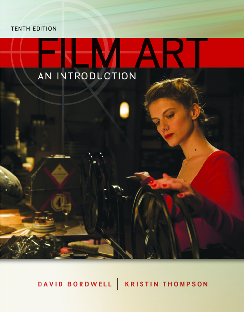
The tenth edition of our textbook, Film Art: An Introduction will be available in early July. It has so many new features that it’s our most extensive revision in at least a decade.
Kristin has already written about one of our major additions: supplemental film extracts from the Criterion Collection, with voice-over commentary and other sorts of analysis. (Go here for a sample.) These will be accessible to professors for incorporation into their syllabi. More of them may also become generally available on the Criterion website.
The text has been extensively rewritten, aiming at maximal clarity and freshness. There are many local changes too, with updated examples from a variety of films both old and new. Regular readers will notice that we have made two replacements: Koyaanisqatsi is now our example of associational form, and Švankmajer’s Dimensions of Dialogue is our example of experimental animation. Regretfully, we had to drop our earlier examples, Bruce Conner’s A Movie and Robert Breer’s Fuji, because they are available only in 16mm, and most teachers and readers don’t have access to them. On the other hand, we enjoyed analyzing the new items and think that they serve their purpose very well.
Today I’m going to point out some of the broader changes, while also considering the book’s overall approach.
Parts and wholes
When Film Art appeared in 1979, it was the first textbook in English written by people who had received Ph.D.s in film studies. Specifically, FA emerged from my teaching a lecture-and-discussion course called “Introduction to Film” to several hundred students each semester for many years.
In the mid-seventies, there were almost no film studies textbooks, and none of them seemed to us to reflect the directions of current research. As a result, the first edition of FA included topics that were emerging in the field, such as narrative theory and conceptions of ideology. It also suggested a coherent, comprehensive view of cinematic art, from avant-garde and documentary cinema to mainstream film and “art cinema.”
The book has changed since then, but its approach has remained consistent in two primary respects. For one thing, it tries to survey the basic techniques of the medium in a systematic fashion. Here the key word is “systematic.” It seemed to us that we might go beyond simple mentioning this or that technique—editing, or acting, or sound—and instead treat each technique in a more logical and thorough way. But film aesthetics wasn’t yet conceived in this way, so to a considerable extent the textbook had to offer some original ideas.
For example, most people thought of editing primarily as a means of advancing the film’s story. That’s certainly accurate up to a point, but we tried to go up a level of abstraction. We suggested that the change from shot to shot had implications for what was represented (the space shown in the shots, the time of the action presented), as well as for the sheer graphic and rhythmic qualities onscreen, independent of what was shown. That created four dimensions that the filmmaker could control, and we illustrated how Hitchcock shaped all of them in a sequence from The Birds.
Nobody before had surveyed editing’s possibilities in this multidimensional way. The result was that we were able to trace out several expressive options. We analyzed the 180-degree system for presenting story space, and Film Art became the first film appreciation textbook to explain this. We also laid out ways in which shots could manipulate the order, duration, and frequency of story action. We also considered sheerly graphic and rhythmic possibilities of editing, not all of which are tied to narrative purposes. Similarly, we tried to show that sound, another familiar technique, could be understood as a bundle of systematic options relating to sound quality, locations in space, relation to time, and other factors.
In sum, very often the array technical options had an inner logic. This urge to cover all bases helped us notice options that usually escaped critics. So by concentrating on the graphic dimension of editing, we noticed that some filmmakers tried to create pictorial carryovers from shot to shot, a device we called the “graphic match.”
A second core principle of the book was the idea that we ought to think about films as wholes. There’s a strong tendency in film criticism, in both print and the net, to fasten on memorable single sequences for study. There’s nothing wrong with this, of course, but we think it needs to be balanced by considering how all the sequences in a film fit together. That led us to consider various types of large-scale form, both narrative and non-narrative.
Again, this was new to the field. We showed students how to divide films into parts and then trace patterns of progression and coherence across them. This is a valuable skill for both intelligent viewers and people who might want to work in filmmaking. We showed how the distinction between story and plot could help explain large-scale narrative construction. We suggested that issues of point-of-view and range of character knowledge exemplified broader principles of narration, the ways films pass information along on a moment-by-moment basis. And although most film courses show narrative films (mine did too), we wanted students to think about other large-scale organizational principles too, such as rhetorical argument and associational form. Again, thinking about these more general possibilities led us to consider creative options that hadn’t been the province of introductory texts, such as rhetorical documentary and poetic experimental cinema.
These two efforts—comprehensive study of techniques and a holistic emphasis on total form—weren’t FA’s only salient points. We tried to incorporate more familiar elements from genre studies and historical research. But they did set the book apart, and do still. I believe that we made contributions to our understanding of film aesthetics. One measure of these contributions is the extent to which FA has been regarded as not only a textbook but an original contribution to film aesthetics. Another sign is the fact that other textbooks have relied, sometimes to a startling degree, upon FA for concepts, organization, and examples.
Categories, categories
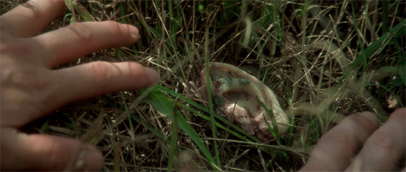
Associational form: Koyaanisqatsi.
Still, we did encounter objections.
Some readers worried that FA’s layout of logical categories took away some of the magic and mystery: Art dies under dissection. Some also protested that filmmakers didn’t use the categories and terms we invoked. These concerns have, I think, waned a bit over the years, but I’ll address them anyhow.
First, as to the need for categories. As a genre, the textbook in art theory has a very old ancestry. Aristotle’s Poetics, a survey of what we’d now call literary art, bristles with categories—drama vs. epic, comedy vs. tragedy, types of plots, etc. In the visual and musical arts, from the Middle Ages into the Renaissance, writers tried to systematically understand the principles of artists’ practice. Leon Battista Alberti’s treatise on painting tried to show that as an activity, painting had many “parts,” such as drawing, color, and light.
This classificatory urge continued through the centuries, and it continues today. Pick up a book on the visual arts today and you’ll see chapters on composition, color, texture, and the like. The same goes for music; an introductory book will survey rhythm, harmony, melody, musical forms, and so on. There’s no escaping some sort of categorizing if we want to understand any subject, and this goes as well for art traditions.
The categories governing centuries-old arts are largely taken for granted. But film is a newish medium, and film studies a still-young academic discipline, so there remains a lot of exploratory thinking to be done. In the late 1970s, Film Art undertook some of that exploration.
A lot of thinking about film employs categories that are very abstract and general (say, “realism” versus “non-realism”). Our frame of reference tries to be more concrete, more fitted to the particularity of what films actually look and sound like. Whenever we could, we incorporated filmmakers’ explicit concepts into our analyses. FA, for instance, was the first appreciation textbook to introduce the principles of continuity editing that were craft routines among directors and cinematographers.
At other times, we tried to synthesize ideas that were circulating in the filmmaking community. For example, for several decades filmmakers and critics have been saying that editing is getting faster, close-ups are getting more prominent, and camera movements are becoming more salient, even aggressive. From studying hundreds of films, we came to the conclusion that these trends are part of a new approach to film style, and we dubbed that “intensified continuity.” That term aims to capture the idea that for the most part these techniques are in accord with traditional continuity editing, but they sharpen and heighten its effect.
Occasionally we tried to clarify concepts. Most notoriously, we borrowed from French film theory the distinction between “diegetic” and “nondiegetic” sound because all the other terms (“source music,” “narrative music,” etc.) seemed to us ambiguous or inexact. As with most categories, individual films can play with or override this distinction, but it’s a plausible point of departure because traditionally the distinction is respected.
Contrary to some objections, then, we often worked with ideas used by practicing filmmakers. Where traditional terminology seemed inadequate to those ideas, we created our own. And some effects we may notice in movies may have no currently accepted names. In some cases, as in the graphic match, the phenomenon may not even have been identified. We haven’t tried to conjure up fancy labels; we’ve just tried to point to the ways some films work. Anyhow, the term doesn’t matter much, but the concept does.
So one way to think about the categories of form and style in FA is to see them as bringing out principles underlying filmmakers’ practical decisions. A director may choose to do something on the basis of intuition, but we can backtrack and reconstruct the choice situation she faced. If we want to survey the possibilities of the medium, one way to do it is to build categories that show the expressive options available, even if filmmakers don’t sit down and brood on each one.
Thinking like a filmmaker
Walt Disney’s Taxi Driver (Bryan Boyce).
Categories are inevitable, and they allow us to consider creative choices systematically. Making this second point explicit is the most important overall revision in the new version of Film Art.
Previous editions took the perspective of the film viewer. This is reasonable: Teachers want to enhance their students’ skills in noticing and appreciating things in the movies. But from the start FA also indicated that the things we discussed also mattered to filmmakers. As the years went by, we incorporated more comments and ideas from screenwriters, cinematographers, sound designers, directors, and other artisans—often as marginal quotes that, we hoped, would reinforce or counter something in the main text.
Now, though, we’ve shifted the perspective more strongly toward the filmmaker—or rather, toward getting the viewer to think like a filmmaker.
Until recently, most of our readers hadn’t tried their hand at making movies. But with the rise of digital media, a great many young people have begun making their own films. Some of these are variants of home movies, records of concerts or parties or a night out. But many of these DIY films are more thoroughly worked over. They’re planned, shot, and cut with considerable care. Posted on YouTube or Vimeo, they exist as creative efforts in cinema no less than the films that get released to theatres or TV. If you doubt it, look at lipdubs, or meticulous mashups like Bryan Boyce’s.
So, we thought, many students are now able to consider film art as practicing filmmakers. For one thing, that means they’re more aware of the techniques we explain. (Probably nothing in Film Art is as tough as mastering Final Cut Pro.) Moreover, the very act of making films has made students sensitive to alternative ways of doing anything. Accordingly, this edition emphasizes that the resources of the film medium that we survey constitute potential creative choices which yield different effects.
Take an example. We can explain the idea of restricted versus unrestricted narration abstractly. Restricted narration ties you to a limited range of knowledge about the story action; unrestricted narration expands that range, often presenting action that no single character could know about. Filmmakers intuitively make choices along this spectrum even if they don’t use the terminology. Then again, sometimes they do. A while back we quoted the director of Cloverfield:
The point of view was so restricted, it felt really fresh. It was one of the things that attracted me [to this project]. You are with this group of people and then this event happens and they do their best to understand it and survive it, and that’s all they know.
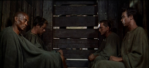
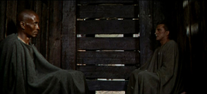
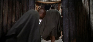
In Stanley Kubrick’s Spartacus, the hero and three other captives are chosen to fight in the arena. They sit sealed in the holding pen while we hear Crassus and his elite colleagues chatting pleasantly about their trivial affairs.
When the combat starts, we’re still confined to the shed. Crixus and Galeno are summoned out, and the door slides shut, leaving Spartacus and Draba alone.
The director has already made several important choices, notably contrasting the carefree chatter of the rulers with the grim prospects of the gladiators (the latter underscored by relentless music). But now there’s a big fork in the road: To show the first combat, or not?
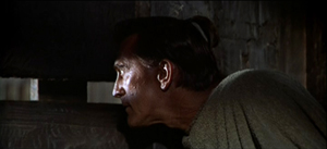
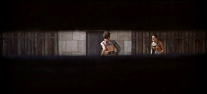
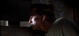
Kubrick chooses not to. We hear the call, “Those who are about to die salute you!” We hear swords clashing, and Spartacus peers outside through the slats. We see only what he sees.
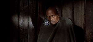
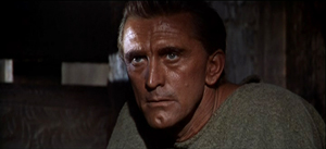
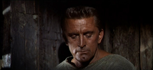
Draba studies Spartacus, who closes his eyes to shut out the spectacle outside.
The two men share a look, but Spartacus turns his gaze away, as if unwilling to confront the cost of killing this man who has done him no harm.
This stretch of the scene is too detailed and varied for me to replay in full, but it’s all confined to the two men in the shed—their reactions to what they hear and what Spartacus sees, and the development of a mix of wary appraisal and desperation. No words are spoken.
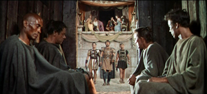
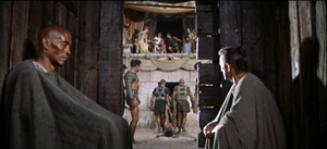
The fight outside concludes, and at the climactic moment Kubrick cuts to a new angle that puts Draba and Spartacus in the same frame, realizing that their time has come. The door slides open again, and the men step out.
The exchange of glances has been just ambiguous enough to make us wonder whether the two will really try to kill one another. Restricting us to the holding pen gives us a moment to watch them pondering their fates and enhances the suspense about the outcome of their fight.
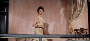
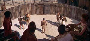
Every instant presents the director with a choice that can shape the viewer’s experience. When the men go out, Kubrick must decide on what to show us next. Most daringly, he could keep us in the shed and let us glimpse the fight from there. But that would be a very unusual option in American commercial cinema. Instead, the next shots expand our range of knowledge by shifting us to a different character’s reaction. Before showing us the arena, we get a shot of Virinia, the slave just bought by Crassus. As a result, she is marked as important before we get a general shot of the arena.
Eventally, a master shot ties together all the characters before we move to the next phase of the scene.
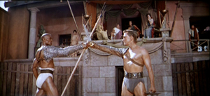
As Darba and Spartacus start their fight, you can argue that the effect of it is even stronger because we haven’t seen the earlier match. Restricted presentation of the first combat, seen only through Spartacus’s eyes, throws the emphasis on this one.
By shifting our attention to filmmakers’ areas of choice, we haven’t really abandoned thinking from the standpoint of the spectator. The two views complement each other. In effect, we’re reverse-engineering: thinking like a filmmaker sharpens our sense of how the spectator’s experience can be shaped. From either perspective, we need concepts, categories, and terminology.
To futz or not to futz?
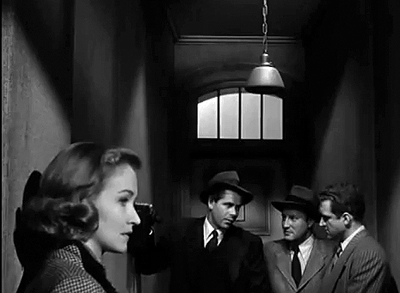
Undercover Man (1949).
Once we notice the concrete results of creative choices by director, cinematographer, editor, and others, we’re inclined to compare how filmmakers have pursued different options, and how these decisions yield different effects. So you might contrast Kubrick’s treatment of the combat with the free-for-all in Ridley Scott’s Gladiator. There the period of waiting is short, and all the emphasis is put on the bloody combat.
Film Art uses the comparative method often, again to illustrate the range of choice available to the filmmaker. Let’s take some instances that have implications for both narration and sound. Telephone conversations are a staple of filmic storytelling. In such a scene, you as a director face a decision tree. Whatever you choose leads to other choices.
Should you show both characters in the conversation, or only one? A passage from The Big Clock presents both options, one after the other.
This illustration suggests that if the character on the other line plays a significant role in the story, you may want to show him or her. Max isn’t as important as Stroud’s wife and son. Once you’ve decided to cut back and forth, you’ll still have to decide when to cut—at what points to show us characters’ reactions. You might want to replay this clip to see how the cutting pattern highlights certain responses.
Alternatively, you can stick with one character and conceal the other party, even if that character is important. Here’s an example from Joseph H. Lewis’s Undercover Man.
Unlike Max in the Big Clock scene, this caller is an important character, a prospective snitch. By not showing him on the other end of the line, Lewis concentrates our attention on the federal agents and builds a little suspense. He goes even further: By not cutting in to Warren as he talks, the direction emphasizes the reactions of Judy, Warren’s wife. Her response is highlighted when she turns slightly into profile, registering her realization that her husband has to leave her on a dangerous mission sooner than she expected.
Sticking with one character triggers another choice about telephone talk: Do you let us hear the other party or not? So far, all our examples have suppressed the voice of the person on the other end of the line. But of course you could let the viewer hear that.
There’s a new problem coming up, though. You need to make it clear that the voice is coming through the receiver, not from someone outside the frame. So a convention has arisen: Words coming through the phone line are distorted, in a process called “futzing.” Here’s an example of subdued futzing from I Walk Alone.
And here’s a case from The Blue Dahlia illustrating the difference between the two sorts of sound even more sharply. Here it’s especially important to let the audience know that what’s being heard is a recording.
This isn’t to say that every choice is absolutely fixed. You can experiment. This is what King Vidor did in H. M. Pulham, Esq. Pulham gets a call, and though we stay with him, the voice isn’t futzed; the effect is a bit unnerving.
Vidor explains:
We were breaking with tradition. When the sound men took over, it became the cliché to put all telephone voices through some sort of filtering device. This made it sound distorted and weird. It occurred to me, why should the audience strain to listen? The person with the receiver up there on the screen doesn’t strain to hear the voice. There isn’t any kind of mechanical distortion. I thought we should just direct it to sound the way it sounded to the person.
The film’s plot concerns Pulham’s regrets about the missed opportunities of his youth. When he gets calls from old friends, their voices seem unusually immediate, more vital and “present” for him than the people in the life he’s leading now.
These creative options show how even small stylistic decisions affect narration and the viewer’s response. Presenting both characters on the phone creates more unrestricted narration, and this allows us to gauge reactions to the action. By showing only one character, you concentrate on that person and the people around them.
If you suppress the words spoken on the other end of the line, you maintain some uncertainty about what’s happening, and you don’t share with us what the listener knows. In contrast, if you let us hear what the listener hears, you tie us to their range of knowledge and perhaps create a bond with them. And as Vidor suggests, you can try to create a deeper subjectivity by letting us hear the speaker as the listener does.
Although Vidor’s experiment wasn’t taken up, directors have continued to try different ways of rendering phone conversations. It would be fun to compare Larry Cohen’s two “phone” scripts, Cellular and Phone Booth, in these terms—not least because of the eerie sound design applied to the mysterious caller harassing the hero of Phone Booth.
Choice and change in history
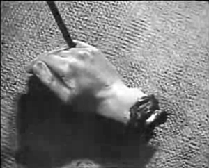
Un Chien andalou (1928); Blue Velvet (1986).
In such ways, the categories we survey can be thought of as a range of possible options facing filmmakers. But all of them aren’t available to every filmmaker. As every filmmaker knows, you choose within constraints, and some of those constraints are the result of history.
As in earlier editions, Film Art concludes with a chapter surveying artistic trends across film history. But now we’ve tried to integrate the idea of thinking like a filmmaker into that section, emphasizing the interplay of choice and constraint. Most obviously, budgets limit choices. Other constraints might be technological; not all filmmakers have been able to film in color, or to use advanced special effects. Some constraints involve matters of fashion: some acting styles and staging methods aren’t widely acceptable today. In our final chapter we show how certain traditions and schools of filmmaking confronted the constraints of their period and place. Sometimes filmmakers worked within those constraints, and sometimes they overcame them by trying something different.
At the same time, we break with our previous editions by weaving recent films into the history chapter. We try to show that the expressive choices made by filmmakers long ago have returned in our time. The earliest short films, based on novelty and surprise events, have successors in YouTube videos. Contemporary filmmakers draw on techniques favored by German Expressionism and French Impressionism. (Recent examples on the blog are here and here.) Current Iranian films owe a good deal to Italian Neorealism, while the Dogme filmmakers tried to revive some of the insolent force of the French New Wave. It isn’t just a matter of influence, either. Contemporary filmmakers face problems of storytelling and style that others have faced before. The choices our filmmakers make often recall those made in the past.
We’re very proud of this edition of Film Art. We hope that the changes will whet the interests of teachers, students, film lovers, and that generic “curious general reader”—who, we persist in believing, isn’t mythical.
Just to be clear: Our Spartacus example doesn’t appear in the book. Our layout of choices about handling phone conversations does, but with different examples. Thanks to Kevin Lee and Jim Emerson for advice on video embedding.
King Vidor’s remarks about H. M. Pulham, Esq. are taken from Nancy Dowd and David Shepard, King Vidor: A Directors Guild of America Oral History (Scarecrow, 1988), 188. A library of futzed sound clips is here. For a more detailed study of how phone conversations may be presented through both sound and image, see Michel Chion’s Film, A Sound Art, trans. Claudia Gorbman (New York: Columbia University Press, 2009), 365-371. (An outline of his typology is here, in French.) Chion’s research is a good example of showing how a systematic set of principles can underlie the practical decisions facing filmmakers.
Alert reader Chris Freitag has steered me to a recent and fine lipdub here. It exemplifies how competition within a genre can spur innovation. More specifically, how to create a new sort of lipdub? Well, how about proposing marriage?
Instructors interested in obtaining a desk copy of Film Art: An Introduction can visit this website.
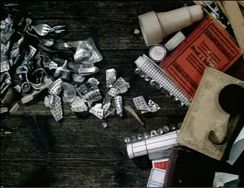
Dimensions of Dialogue (1982).
P.S. 27 June: Some correspondence I’ve just gotten reminds me of two things I neglected to mention in the entry. First, this edition of Film Art contains a great deal more material on digital cinema, from production and postproduction through to distribution and exhibition. We’ve woven digital technology into sections on various techniques, particularly cinematography, and we’ve added material on 3D cinema.
Second, our decision to replace our sections on A Movie and Fuji doesn’t mean that those discussions will vanish forever. For some years we’ve been putting up older Film Art material as pdf files on this wing of the site. Later this summer we’ll be doing the same with the Movie and Fuji sections of the book. Instructors who want their students to read that material are welcome to send them there, where the essays can be downloaded.


