Archive for the 'Directors: Anderson, Paul Thomas' Category
Books worth fondling, if you can lift them: The rise of the Massive Auteur Monograph
DB here:
The fears that electronic publishing would kill off the physical book have abated. Just as home video and theatrical moviegoing managed to coexist, readers seem to have divided their commitment between e-books, to be read on the go or tapped into for certain purposes (cooking, exercise, reference), and books they want to have and to hold.
Publishers have noticed. They’ve realized that sumptuous books have their own appeal, and art books and de luxe editions continue to be printed. With the rise of digital publishing, one editor notes, “Hardback books have to be more beautiful., better produced, and a pleasure to handle. The market for books worth fondling is bigger and expanding.”
This conviction is affirmed by a trend that I’m sure you’ve noticed. We’ve long had fancy picture books devoted to film; the first one I owned was The Movies, by Arthur Mayer and Richard Griffith, from 1957. The Big Movie Picture Book is a long-lived genre, devoted to personalities, periods, and the making of classics like The Wizard of Oz and Gone with the Wind.
But the trend I have in mind is different. It’s the de luxe book dedicated to a director, with documents capturing the creative process and texts written by serious critics. Call it the Massive Auteur Monograph.
Massive because it’s high, wide, and handsome, as well as heavy. Some of these books are monstrously big, and all boast coated paper and production design suitable for a book on any of the fine arts.
Auteur because it pursues the idea, now commonplace, that the director is the central creative figure in much filmmaking.
Monograph because it’s not just an anthology but rather a through-composed argument about the significance of the auteur in question. Even when the book compiles texts by several hands, those texts form part of a coherent “database” sprawling across the big pages.
In art publishing, books like this are a staple, often attached to particular exhibitions or museum collections. And we’ll see that there are some forerunners of these cinematic “art monographs.” But now I think we’re seeing the MAM come into its own.
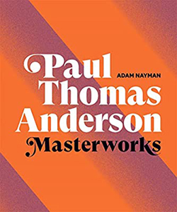
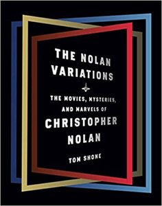
Just this year we’ve had three major additions to the stack: the Taschen boxed set devoted to Jacques Tati, Adam Nayman’s book on Paul Thomas Anderson (Abrams), and Tom Shone’s study of Christopher Nolan (Knopf). Each deserves in-depth discussion, but I can’t do justice to that here. This isn’t a review. Instead, these books set me thinking about how we got here, and what “here” looks like. I want to consider how film criticism seems to have been changed by this genre of publication.
Each director gets a book, maybe several
Start with auteurist criticism itself, as practiced in France and Anglophone countries. Let’s distinguish dossiers from critical appreciations.
A dossier collects documents about the director, while a critical monograph offers an ongoing argument. A dossier can spark ideas and introduce you to new information; a critical book focuses on a line of inquiry and marshals evidence around that. A through-composed book is a multi-course meal, while a dossier is a buffet, and sometimes a meal made of appetizers.
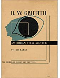
D. W. Griffith: American Film Master, a catalogue of an influential Museum of Modern Art exhibition of 1940, brought together a critical essay by Iris Barry, an interview with Billy Bitzer, and a filmography with commentary by Eileen Bowser. I can’t exaggerate the importance of such dossiers through the decades. Before the internet, these were precious sources of information for cinephiles and academics.
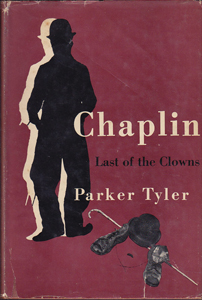
Critical studies of directors, as distinct from biographies and PR flackery, go back fairly far. While biographies like Roy Fuller’s little 1946 book on Orson Welles sometimes included critical discussions, the earliest pure case that occurs to me is Parker Tyler’s Chaplin: Last of the Clowns (1948), a very idiosyncratic reading of Chaplin’s films. André Bazin’s brief, powerful study of Welles appeared in 1950.
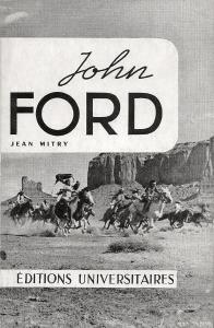
With Cahiers du cinéma and Positif celebrating the director as auteur, several publishers accepted the idea of a director-based book series. The first came from Editions Universitaires in Paris, and it was launched by Jean Mitry’s 1954 monograph on Ford. The books that followed were through-composed critical studies.
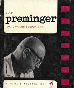
Three other French publishers provided more mixed models. The Seghers “Cinéma d’Aujourd’hui” series of squat, square paperbacks in stiff cardboard covers was a vast accomplishment, starting with Georges Sadoul’s 1961 book on Méliès. In a Seghers book, a critic’s long essay was followed by extracts from the filmmaker’s writings, snippets of reviews and critical commentary, and a fairly detailed filmography and bibliography. Because a substantial essay anchored a Seghers installment, it had some of the focus of a through-written critique.
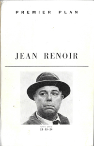
“Premier Plan,” another series, came from Lyon, under the auspices of SERDOC (Société d’Études, de Rechereches, et de Documentation Cinématographique). Premier Plan books were usually flimsier than the Seghers ones. Some were simply filmographies with clip-quotes from reviews, but some, like the plump volume on Renoir, provided a substantial compilation of rare documents. Other entries featured long-form texts by experts like Barthélémy Amengual.
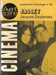
Yet a third series came into existence about the same time. The small-format entries in Anthologie du cinéma were published by L’Avant-scène, a company issuing texts of plays on a bimonthly basis. In 1961 it began publishing film scripts and transcripts as well. The first mini-monograph, Luda and Jean Schnitzler’s 1965 study of Dovzhenko, led to a great many dossiers, some on quite obscure figures.
All three series attracted some of the best critics and researchers. The old guard–Georges Sadoul, Jean Mitry, René Jeanne, Charles Ford–were balanced by the likes of Noël Burch, who wrote a provocative Seghers volume on Marcel L’Herbier, and Francis Lacassin, who contributed titles to both Seghers and Anthologie du cinéma. The 60s and early 70s were the boom years, when cinéphiles like me haunted the Gotham Book Mart, the Larry Edmunds Bookshop, and other specialty niches looking for that rare item on Anthony Mann or Vittorio Cottafavi.
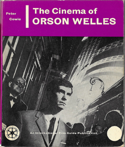
In England, a new generation of critics caught the auteur wave. Peter Cowie modeled his International Film Guide series on the Seghers format, launching it with his monograph Antonioni–Bergman–Resnais in 1963 and following it up with his book on Welles and Robin Wood’s trailblazing Hitchcock’s Films (both 1965). Published by the Tantivy Press and distributed by the distinguished art-book publisher Zwemmer, these were in-depth critical studies. Cowie’s series was pluralistic, focusing not only on directors but on genres and periods. Eventually the series would run to dozens of titles, along with the indispensable International Film Guide, an annual begun in 1963, and a journal, Focus on Film (1970-1977).
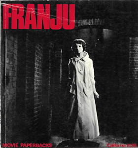
A parallel enterprise was launched by the critics around the important British auteur journal Movie (1962-). Its bold pictorial design, the creation of Ian Cameron, carried over to “Movie Paperbacks,” which launched in 1966. The books published major monographs by Robin Wood, Charles Barr, Raymond Durgnat, Michael Walker, and Cameron and his wife Elisabeth. Many were single-authored, but there were as well important anthologies on Godard and others.
Cinema One, published by Secker and Warburg, was linked to the British Film Institute’s magazine Sight and Sound. Beginning in 1967 with Richard Roud’s book on Godard, that series followed the model of the Movie paperbacks in integrating stills and texts. Cinema One books were either through-composed monographs, like Geoffrey Nowell-Smith’s entry on Visconti (1967), or interview books like the vastly influential Sirk on Sirk (1972).
Probably the highest-impact entry of the Cinema World series wasn’t a director study. Peter Wollen’s Signs and Meaning in the Cinema (1969) introduced a generation to semiology. Such was the sway of auteurism, though, that in one chapter Wollen tried to revamp that critical approach with a structuralist analysis comparing binary themes in John Ford and Howard Hawks.
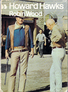
 The 1960s saw an outpouring of auteur studies, along with many other books on film subjects. Because of the much bigger US market, the English series found copublishers and distributors stateside: Tantivy worked with A. S. Barnes, Movie with the University of California Press, and Cinema One with various commercial houses. Needless to say, the possibility of buying these books in local bookstores added joy to my college years. I remember getting Wood’s book on Hawks in Albany in 1968 and reading it immediately. Having already read his book on Hitchcock, I thought, Now we’re getting somewhere.
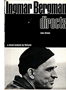
The illustrations in these books tended to be production stills, photos taken on the set during filming. Frame enlargements from the finished film were difficult to obtain, and their quality was questionable. But one American publisher incorporated actual shots from the movie. Under the mysterious imprint “a visual analysis by Halcyon,” Harcourt Brace Jovanovich produced Alexander Walker’s Stanley Kubrick Directs (1971) and John Simon’s Ingmar Bergman Directs (1972) with specific frames enhancing the critics’ interpretations. The quality of the images wasn’t always good (sometimes subtitles were left in), and one can imagine editors pointing to the results as proof that production stills were preferable.
These Halcyon books seem to have had little impact on other publishers, but both showed that heavily illustrated in-depth commentary on an auteur’s work was feasible for a book-length study. Simon’s close reading of Persona remains a remarkable accomplishment, as fine-grained a piece of interpretation as we can find anywhere at the time.
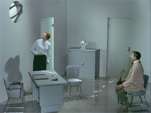
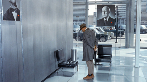
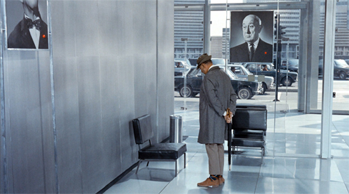
M. Hulot, boxed
Mon Oncle (1958).
None of these books boasted big production values. The only de luxe auteur book of this period I can recall, and probably the prototoype of our Massive projects, was Donald Richie’s gorgeous The Films of Akira Kurosawa (1965). Published by the University of California Press but printed in Japan, it boasted excellent paper stock and authoritative critical interpretation, with Richie drawing on his unique access to personal conversations with Kurosawa. He displayed far more attention to style than most critics of his day, devoting sections of every chapter to cutting and camerawork. Arguably, the handsome interview book Truffaut/Hitchcock (1966) also paved the way for the large-scale auteur study. A little later, in a more obsessive vein, there was Robert Benayoun’s handsome oversize tribute to le fou Jerry, Bonjour, M. Lewis! (1972).
From the 1970s on, more lavish auteur volumes began to appear. Since they were expensive to produce, they were often the result of institutional support, and they tended toward the dossier format.
As the festival circuit expanded, those events hosted retrospectives of periods, genres, national cinemas, and, inevitably, auteurs. So it wasn’t surprising that Venice produced a high-gloss 1980 volume on Mizoguchi, with critical essays, interviews, and a detailed filmography surveying the master’s works, including lost films. For decades thereafter festivals created collectible catalogues based on their screenings. Followers of Hong Kong film, for instance, are forever in the debt of that festival for its in-depth publications on major figures like King Hu.
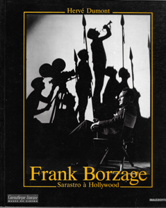
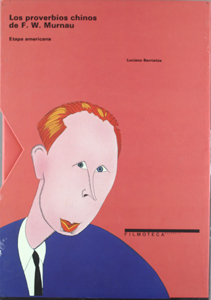
Similarly, just as museums published volumes commemorating major exhibitions, film archives began to finance catalogues derived from their programs. The books might be fairly modest, but some have been coffee-table quality. Usually these have been dossiers, but an important exception is Hervé Dumont’s monumental study Frank Borzage: Sarastro à Hollywood (La Cinémathèque francaise, 1993). The most stupendous dossier-catalogue I know comes from the Filmoteca Espagnola and bears the curious title, Los proverios chinos de F. W. Murnau. Edited by Luciano Berriatúa, this two-volume boxed set (weight: ten pounds) is a feast for the Murnau admirer. Its glossy pages teem with original sketches and plans, frame enlargements, and ancillary information about the films and the director’s life. Its key image, in two color schemes, is also refreshingly unpretentious.
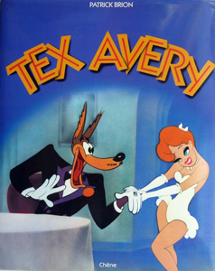
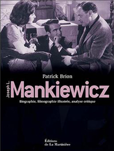
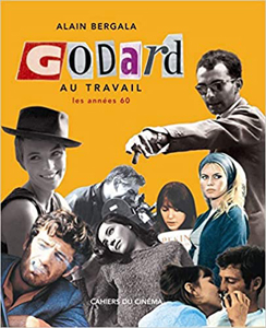
The French, as in other domains, have led the way with the deluxe auteur package. Patrick Brion, for instance, has written several large-scale studies. on animation and on directors like Joseph Mankiewicz (who’s much more deserving of a biopic than his brother, in my view). Cahiers‘ “au travail” albums, some translated into English, survey each director’s creative process by drawing on unpublished working documents.
From the 70s on, art-book publishers saw that there was a new audience among film fans and began to think of offering movie titles. There were quickie books, aimed for remainder markets and built out of publicity stills, but the prime player early on was Taschen, the firm long identified with distinctive books on the visual arts. Taschen, committed to producing books at all price ranges, released some inexpensive image-based movie titles, while also mounting unique limited editions of photography and painting. What else do you expect from a firm that offered as a bonus a stand to support a $25,000 book? (A baby version goes for just $1500.)
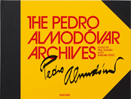
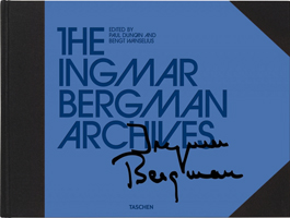
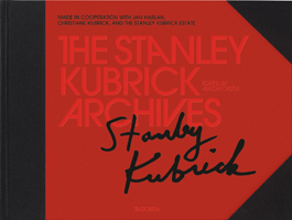
Taschen’s auteur campaign was part of its “Archives” series. Memorabilia and in-depth background from Star Wars, Disney cartoons, and the Bond films. were packed into huge horizontal-format volumes. In the same uniform design and binding came entries devoted to Almodóvar, Bergman, and Kubrick. It’s hard to know how to handle them for casual reading, but I suggest you supply your own table. The Kubrick volume was republished as a thick but more manageable volume; the paving stone became a brick.
But maybe the Archive releases aren’t really designed for normal reading. Like a gallery installation, they are easier to browse than to scrutinize. These books contain valuable primary documents, but a researcher into the subject would still yearn to see all those items that were kept back. One page of a script is interesting, but the scholar wants to see the whole thing. The Taschen volumes, impressive as they are, are high-grade fan compilations. They are stuffed yet tantalizing dossiers doing duty for an entire career: not so much an archive as an exhibition.
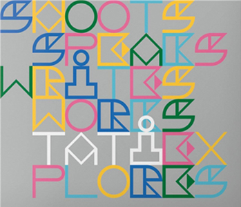
This year Taschen released an item that breaks with the design of the Archives line. The Definitive Jacques Tati, edited by Alison Castle, is is a five-volume boxed set. This homage to one of our most sprightly directors weighs nearly eighteen pounds, but the vaguely Bauhausian font and school-lunchbox packaging aim to lighten the tone. Volume 1, Tati Shoots, consists of production stills of scenes, each one given a separate page, as if it were a painting. Tati Writes offers scripts, reproduced complete (Jour de fête) or in extract pages, with English translations of the entire texts. Two unmade films, The Illusionist and Confusion, are included.
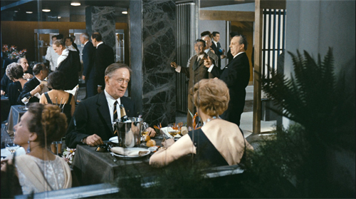
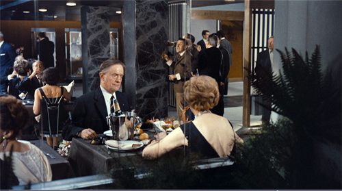
Tati claimed to have shot a film without looking at the script: “I know the film by heart.” The earliest screenplays in the volume are fairly minimal, but when we get to PlayTime, one of the most strenuously dense films of all time, the description of a single shot’s action can run to hundreds of words. The Royal Garden sequence, an hour-long tour de force, was planned in daunting detail, notating gestures, eye movements, and even the virtuoso matches on action.
The screenplay of this sequence is often packed with many more gags and bits of business than are onscreen in the versions we have. For instance, one of my favorite gags takes place when the air conditioning is switched on and we see the skin on a woman’s back ripple. Soon the fan is adjusted and her flesh settles down.
Apart from its sheer audacity (who thinks of a gag like this?), it comments on the flabby patronage of the restaurant. It also recalls the puffy plastic chairs that earlier bewilder Hulot by erasing his presence.
The AC gag is more elaborate in the screenplay; a technician fiddles with the controls, making the undulations vary until the adjustment is right. I don’t find an account of the provenance of the published PlayTime text , but if this is something like a late shooting script, Tati made enormous alterations, usually simplifications, during filming.
Volume 3, Tati Works consists of a biographical chronology and illustrated with family photos, followed by segments devoted to phases of his career, also heavily illustrated. It’s here that we get behind-the-scenes images of Tati at work. There are appreciative essays on the films, filling in background on the production and reception of the films while pointing up some of Tati’s artistic strategies. The writers acquaint readers with the core ideas of Tati criticism: comedy of observation, comments on modern life, deep and decentered composition, ricochet gags, anomalous sound effects. Most of these essays are by Jonathan Rosenbaum, who worked with Tati, while Jacques Kermabon and Alexandrine Dhainaut contribute background on the early films and the unfilmed projects respectively. Quotations from collaborators round out the volume.
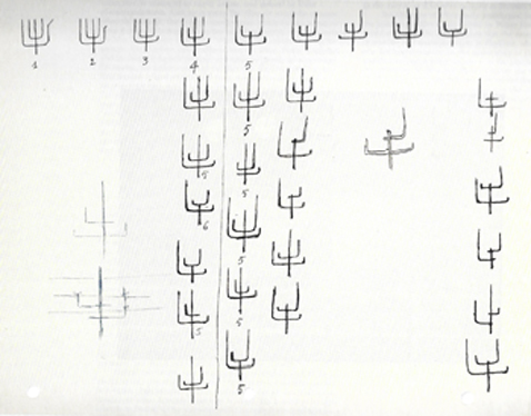
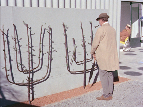
Tati Explores consists of essays on recurring images (vehicles, architecture) and auditory strategies, by a range of French critics. These and the earlier essays are fairly brief and synoptic, in keeping with the general policy of favoring pictures over texts. Still, in volume 4 in particular, documents drawn from the archives often illuminate Tati’s creative process. We can see how the Mon Oncle gag with the spiny foliage was obsessively elaborated in advance.
All this personal material made me think that perhaps we should go beyond treating Tati as an isolated artist, as if the local or global film industry had no impact on him, or him on it. His international standing as both filmmaker and performer was made possible partly by his brilliance as a mime, partly by his charmingly eccentric persona, and partly by subjects and themes that were widely intelligible. It seems to me that his easily grasped satiric targets (old versus new, country versus city, people trapped in routine, overweening technology) enabled him to make formally and stylistically complex movies. He smuggled innovative narrative and style in on the back of clichéd material.
In other words: We can always ask new questions.
The final volume, Tati Speaks, includes more on-set images, along with quotations from interviews. Again, pictures dominate, but there are some longish interviews at the end that allow Tati and his questioners to develop real conversations.
In all, The Definitive Jacques Tati is a kind of ultimate dossier collection, an act of homage that also aims to be a precious object in its own right. You can, up to a point, fondle these bulky volumes. For more hands-on engagement, you can upgrade to a numbered limited edition that includes a miniature set you can assemble yourself. Price $895 until 31 January 2021, thereafter $1000.
Immersed in Wesworld
The whimsicality of the Tati box’s design, so different from the solemn slabs of Taschen’s Archive series, is in keeping with a new direction in the Massive Auteur Monograph. That tendency emerges most vigorously at another publisher, Abrams. Abrams had already embraced film animation as an art form, producing Helen McCarthy’s beautiful volume on Osamu Tezuka.
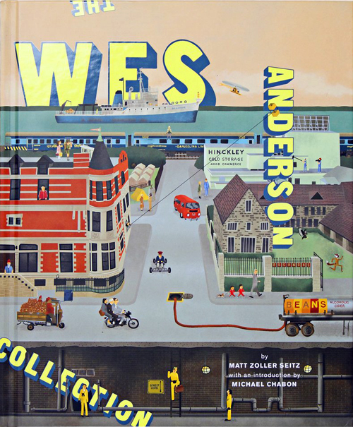
The new auteur bent is especially evident with Matt Zoller Seitz’s The Wes Anderson Collection (2013). It looks like a dossier, but actually I’d argue it’s an unusual critical monograph. Organized chronologically, film by film, it’s called by Seitz “a book-length conversation interspersed with critical essays, photos, and artwork.” As with the Taschen Archives, Seitz’s access to the filmmaker allows him to include working notes and sketches, storyboards and tests.
Ins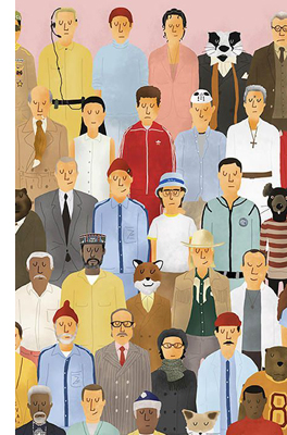 tead of a linear argument, Seitz offers a collage on interwoven themes in and around Anderson’s work, particularly his appetite for both high and low culture. Seitz’s free-range imagination comes up with influences and sources not obvious to an outsider. Who else picked up on Anderson’s debt to Peanuts and Star Wars? And Seitz can discuss these possibilities with the director. The sense of a running dialogue spills over every page, where the captions continue to make connections and send you flipping to other pages. These are a fan’s notes on a Borgesian scale, the print equivalent of hyperlinks.
The biggest breakthrough comes, I think, with a design decision. Instead of through-composing a critical argument, weaving interview quotes and claims about influences into seamless prose, Seitz decided to soak the whole package in Anderson-ness. The slightly tense nerdery, the OCD fixation on lists and details, the deadpan naïveté of the films–all are replicated in the very texture of the book.
Anderson’s vision, which creates childhood worlds filled with adult anxieties, is rendered in a sort of tween book for grownups. Each section is given an absurdly precise annotation (“”The 1,113-Word essay,” “The 7,065-Word Interview”). Each Anderson film invites us into a densely furnished milieu, and the book eagerly assists his near-maniacal worldbuilding. Bonus material includes logos and indicia from the fictional companies, organizations, and texts. Reproducing the yearbook montage from Rushmore, Seitz supplies “activity cards” drawn from shots from the film. A pastiche ad for The Dollar Book Club (in Garden City, of course) offers for a mere $1 the library books Suzy has swiped in Moonrise Kingdom.
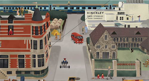
Seitz’s artwork includes color drawings by Max Dalton that reinterpret the inhabitants of Wesworld as wispy cutouts, arms hanging down, as if in a police lineup or a paper-doll sheet. Often with their eyes lowered, they have the awkwardness of exceptionally intelligent people who haven’t yet figured out “self-presentation” and “impression management.” Under Dalton’s hand, a landscape becomes an urbane New Yorker rendering of Grandma Moses.
The real tipoff, I think, comes with the end papers, which consist of a vast grid of characters as imagined by Dalton. This is a book Anderson characters would like to own: geek chic.
Unsympathetic critics who find the films over-cute (I’m trying to avoid the label “twee”) will find this a double dose of it. I, who like the films, find it a fascinating step forward in rethinking what the auteur monograph could be. The sequels devoted to The Grand Budapest Hotel and Isle of Dogs embrace the dossier format, incorporating essays and interviews from others. But the presentational mold was set: each one is a piece of bespoke Andersoniana. Seitz went on to apply the same principle to a very different director, Oliver Stone, and he gave that Abrams book an appropriately tense, smashmouth aesthetic. Interviews are scoured by redactions, illustrations are psychedelic jumbles.
Auteurism on steroids
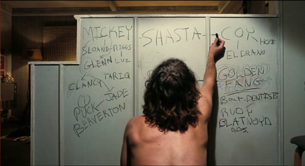
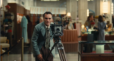
Inherent Vice (2014).
Most recently, Abrams has given us two Massive Auteur Monographs, written by Cinema Scope and Little White Lies critic Adam Nayman. Considering them alongside the Seitz books, we can spell out some conventions of the new model–some inherited from classic auteurism, some in the process of emerging.
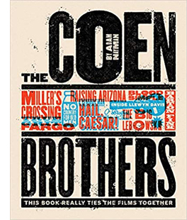 *Deep-dyed Auteurism. The title The Coen Brothers: This Book Really Ties the Films Together (2018) says it all. The director(s) has (have) a unified but nuanced vision, the critic will reveal it, and aficionados will understand the subtitle as both an homage and a meta-reflection on auteurism itself. The Coens have a “comic universe” of rich interconnections. In the same vein, Nayman’s Paul Thomas Anderson Masterworks (2020) cautiously acknowledges Anderson as bearer of “a heroic–indeed, mythic auteurism, bridging past and present, personal and populist.” In an age of blockbusters, “ambitious, challenging American films” will always demand “auteurist approbation.” The critic can uncover the inputs of collaborators and draw out their ideas in interviews, but the director remains at the center: at least a synthesizer, and at most a demiurge transforming everything into something personal.
*A Criticism of enthusiasm. It was a tenet of Cahiers du cinéma that the best reviewer of a film was the critic who most liked it. To critics of a judicial bent, that looked like defection from the role of stern magistrate, but the idea was that the best possible case for a film would be made by an admirer. Nayman is unabashed. Phantom Thread is “a surpassingly funny movie,” Raising Arizona is “fully endearing,” Magnolia is “something to behold.” Enthusiasm doesn’t equal blind worship. Nayman doesn’t find the films flawless. He also grants his changing estimation of Anderson’s career as it developed. Still, these are judgments made within a broader attitude of passionate support.
Arguably, shortcomings are minimized by a Massive book’s sheer footprint. Enthusiasm can come through in a short piece or a small, square book, but The Coen Brothers and Paul Thomas Anderson Masterworks fill about 300 large-format pages apiece and weigh between three and four pounds. Size matters. When packed into the howitzer dimensions of a coffee-table book, the case for the value of the director is strengthened by sheer avoirdupois.
*Personality plus. Andrew Sarris posited “the distinguishable personality of the director” as a central criterion of value for the auteur critic. He didn’t distinguish between the personality of the actual flesh-and-blood filmmaker and the “personality” projected in the work. Modern critics are more careful, but there’s still an impulse to study the works in light of everything we can know about the artist’s life, influences, and obsessions. Hence critics’ continual pursuit of how the private lives of Hitchcock, Welles, and other directors inform their work.
The concentration on the director’s personality led many skeptics to consider auteur criticism as a throwback to Romantic aesthetics, where the all-powerful poet infuses deep feelings and formative experiences into the art work. Part of Wollen’s heresy in Signs and Meaning was to sever the films from the living creators.
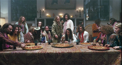
Like Seitz, and indeed like most auteurists since the 1960s, Nayman is sensitive to the director’s transformation of prior material. He will study how an adaptation reweights the original, as when There Will Be Blood trims political contexts from Sinclair’s Oil! More important, he will probe the more tenuous inspirations working under the surface of the finished film. We can’t recover many of those subterranean currents from the days of Hawks or Mizoguchi, but focusing on living filmmakers gives these monographs an advantage. Authors can question the director (Seitz) or track down interviews (Nayman) that bring out a hidden network of intimate inspirations. Seitz discloses Rushmore’s debt to Peanuts, and Nayman links Inherent Vice to the Fabulous Furry Freak Brothers–and Leonardo’s Last Supper.
The personality factor gets magnified in the age of the Massive Auteur Monograph. The scale of the enterprise lifts the film director to the level of a gallery artist, putting idiosyncrasy on display. Moreover, whereas old-style auteurists could signal debts to Pirandello or Picasso by passing references in prose, the big-ass Auteur book can spread out a bounty of iconography: paintings, snapshots, album covers, comics, and virtually anything else. For the Coens we get a cartoon illustration of books that influenced them; for Anderson, there’s an interpolated series, “PTA’s Movie Collection.” This almost philological archaeology is part of the Massive project’s raison d’être.
*Something to say. When I told a friend that I thought Spielberg was an exceptionally skilful filmmaker, she agreed but added: “Too bad he has nothing to say.” An auteur is held to be an artist, not just an artisan, and an artist gives us something meaningful in and through the artwork. Guided by this premise, auteur criticism has traditionally been focused on thematic interpretation. How does the filmmaker’s personal angle of vision transform the thematic material?
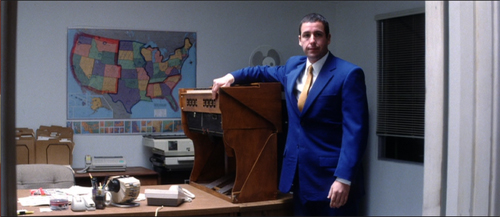
Nayman acknowledges that critics have found a nest of themes typical of his subjects: male inadequacy in the Coens, father/son relationships in Anderson, and more. He develops these and others in his own interpretive commentary, and like Seitz, he has incorporated frame enlargements into his argument, so his claims gain specificity. Shots from Punch-Drunk Love counterpose a map and the abandoned harmonium as evidence for “the desire to travel” set aganst “a symbol of potential order that must be protected and mastered for the character to achieve self-actualization.”
The Massive format allows critical commentary some new opportunities. Interpretive asides can be attached to sidebars or even the stills parked along the main text. Whereas your classic picture book has a neutral caption, the captions in the Abrams books tend to make critical points by hooking the picture to the text or other illustrations. In addition, the urge to fill out the format allows the critic to expand the interpretation through bonus materials. The tabletop landscapes of Wesworld created by Dalton find their counterparts in Nayman’s books in original illustrations that offer artists’ interpretations of the story worlds. In this illustration for There Will Be Blood, George Wylesol provides glimpses of motifs recognizable only if you’ve seen the film.
The movie opens up. Classic auteurism tended toward traditional notions of “variety in unity.” Robin Wood’s Hawks monograph, for instance, is a rigorous argument for a few recurring themes and variations in the director’s most characteristic work. But the sheer expanse of a Massive project–swallowing up all the films, even ephemera like shorts and uncompleted projects–and the search for the most remote and tenous links to books, cultural events, other films, and almost anything else, work against a more austere delineation of the artist’s achievement.
The risk is that the critic’s argument is overshadowed by the bonus materials, the way the vast making-of supplements to The Lord of the Rings DVDs vie for attention with the movie itself. At best, though, the ancillaries pry the film open. The books are large, they contain multitudes, and so do the films. Like a webpage bristling with links and pop-ups, the books invite you to see the films stretching tentacles out in all directions.
*Criticism as creation. However humbly the auteurist approaches the director, criticism remains partly a performance. If the filmmakers stand out as personalities, so too does a critic. Seitz, for instance, emerges from his books as a voracious, encyclopedically knowledgeable pop-culture maven. Nayman strikes a more academic tone, invoking in one page Freud’s oceanic feeling, the idea of structuring absence, and signifiers. Again, from the sixties auteur criticism always straddled belletristic writing (call it haute journalism) and academic studies. (Scads of university press books have taken the auteur line.) Nayman, like many ambitious critics, draws on academic ideas pointillistically, subordinating them to the tasks of appreciation.
 But we’d be selling these books short if we didn’t acknowledge their efforts to treat criticism as a striking creative act in its own right. Nayman revises some norms, as when he foregoes film-by-film chronology in the Anderson volume. More radically, from the full-page cartoons and original illustrations to the bespoke endpapers and the marginal curlicues (tumbleweeds in The Coens, doodles in Anderson Masterworks), the books aim to become supplements to the artist’s achievement. No surface is spared from Auteurist High Concept, as when the back cover of The Coens invokes not only The Big Lebowski but Nayman’s argument that the films play out circular patterns.
Through-composed to the max, each book proposes itself as an art object that, though coming after the fact, has as valid a tie to the oeuvre as the innumerable works that influenced the makers. One venerable publishing tradition, to which both Taschen and Abrams belong, is committed to creating artworks about artworks.
Auteurism can be fun. All this intertextuality might have been solemn in the manner of literary criticism, but it turns out to be almost giddily playful. Tati, the Coens, and Wes Anderson invite a light touch, and more serious auteurs like Stone and Paul Thomas Anderson have their wild sides that can be celebrated in unpretentious new illustrations. With their echoes of books you flopped on the floor and read on your tummy, these publications offer a surprise every time you turn the page. This appeal to the kid in us, always bracketed by our knowledge that we’re deliberately indulging ourselves, gives auteurism something that millennials might latch onto. It carries a bit of that hip knowingness that Thomas Frank in The Conquest of Cool has described as the dominant way many of us consume popular culture.
That knowingness, steeped in authentic love, is central to fandom. Auteurists have always had a fannish streak. If we are all nerds now, then we can see the Massive Auteur Monograph’s emergence as owing something to what’s been called the “fan-favorite” publishing genre. The parallel is obvious: Wes Anderson fans aren’t as numerous as Star Wars fans, but they’re no less devout. (Some proof is here.) With suitable adjustments, the production values of books like The Transformers Vault (2010) could be transferred to The Wes Anderson Collection. Abrams Executive Editor Eric Klopfer explains that some filmmakers, themselves fans, are receptive to such projects. “These types of books are very close to their heart,” Klopfer says. “Many of them were influenced by these books as they were coming up.”
Books like Seitz’s and Nayman’s may make old-guard cinephiles rethink what film criticism can be, and they may introduce young people to auteurism itself. If these books came out when I was fifteen, I’d probably think they were the coolest things I’d ever seen.
Absorbing the lessons of the MAM
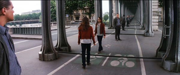
Inception (2010).
In various ways, then, these books are redefining critical writing. We should expect more Massive Auteur Monographs; the next Wes Anderson one has already been announced. But we can see their influence in less obvious ways, and I think Tom Shone’s new book on Christopher Nolan suggests some other intriguing options.
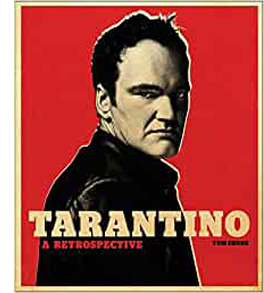 Shone has written one of the best books on post-1970s Hollywood (Blockbuster: How Hollywood Learned to Stop Worrying and Love the Summer, 2004), and a Massive Auteur Monograph (Tarantino: A Retrospective, 2017). His newest project, The Nolan Variations: The Movies, Mysteries, and Marvels of Christopher Nolan, seems at first glance a more traditional effort. Although it’s heavy-duty (2.6 pounds), it doesn’t need a big form factor. In Nolan’s case, the mission of fan pageantry has already been accomplished by James Mottram’s informative and picture-plentiful behind-the-scenes books, authorized by the director.
Shone subscribes to most of the auteur conventions I’ve mentioned, although he’s somewhat more straightforwardly critical of certain films or moments. On the whole, this is a work of auteurist advocacy. Shone presents Nolan as both a craftsman interested in technical problems and a visionary director with a unique perspective on themes of time, identity, and history.
Shone moves chronologically from film to film by means of old-fashioned literary prose. He examines plot, character, visual style, and, in gratifying detail, music. He gives up the choppiness of the dossiers and the centrifugal pressures of the Abrams model. There are no sidebars and little effort to identify the physical book as an extension of the films. Frame enlargements, along with extrinsic visual evidence like storyboards and posters for influential films, are subordinate to the ongoing argument. So are the captions, which aren’t as chatty as we tend to get in the Abrams books. This is a book demanding one-track reading.
Yet it doesn’t sacrifice the intimacy and detail of the Massive ones. Part of its originality lies in the effort to enhance the idea of authorial personality through traditional biographical criticism. Shone suggests that Nolan’s concern with pattern has roots in his youth, particularly his years growing up in a highly regimented boarding school. Shone also provides an intellectual history of Nolan’s philosophical concerns. Kant shows up in the fifth paragraph, and soon enough we encounter Helmholtz and Penrose–names you don’t expect to meet in books about the Coens.
This isn’t showboating. Shone argues that these thinkers shaped Nolan’s art as decisively as did Chariots of Fire and Pulp Fiction. Nolan’s artistry draws from high culture as well as middlebrow and popular sources. Shone traces how philosophical ideas surface in the form and style of the films, from the play with time to Nolan’s concern with the Shepard tone as a model for both music and narrative organization.
Apart from tracing how the films are shaped by Nolan’s reading and thinking, Shone absorbs another level of discourse into his account. He met Nolan on several occasions after 1999. Instead of separating out chunks of their conversation as inserted interviews à la Seitz, he weaves their ongoing discussions into his film-by-film discussion. This gives the book an almost novelistic structure, which traces as a subtheme the progress of the two men’s dialogue.
Early on, Shone does detective work on Nolan’s personal history and proposes some interpretations that Nolan hesitates to grant. (“I was always very resistant to the notion of biography as it applies to criticism.”) Their encounters engender a degree of novelistic suspense when early on Nolan proposes a challenge: In words only, over the telephone, explain the concept of left and right.
Shone’s efforts to solve the problem become a running motif and inject a sting of drama into the book’s final pages. The problem and a couple of solutions are left wobbling at the end, like the top in Inception. No need for a still and a caption: Shone has woven the films’ imagery and structure, his investigation of them, and his conversations with Nolan into such a tight fabric that the reader gets the point. The project becomes, in its final lines, as cryptically reflexive as Nolan’s own work.
Perhaps Shone would have thickened the traditional auteur study in these ways without the existence of the more extroverted Monographs. But I can’t help thinking that The Nolan Variations (itself a reflexive title, with the critic as keyboard performer) has quietly absorbed the lessons of the more flamboyantly virtuoso projects. If they’re like Ives symphonies, this is more Mahlerian. The breaks and discordances are less evident, but the range of ambition remains.
The Tati box aside, these books are generously priced. In an era when a forgettable novel costs about twenty bucks, these books are offered at $40 or less. (The tiny Movie monograph I bought for $1.95 in 1967 would cost over $23 in today’s currency.) And Taschen’s compact Kubrick edition, at $20, reasserts the firm’s willingness to reach a wide audience.
Even if these books weren’t bargains, I think we need to consider them an important development in film culture. Just as the 1960s critical studies responded to the New Waves and Young Cinemas of that period, with their cult of the director, we can see the Massive Auteur Monograph as reacting to a host of cultural forces. There’s the ongoing idea of the celebrity director. There’s the wide availability of classic films to be referenced by both filmmakers and writers. Now we have the ability to scrutinize films on video. There’s the constant demands that modern publishing discover niche audiences. More and more, distributors promote the prestige of the Creatives. And of course the Internet has accustomed people to treating reading as multitasking. The dispersed layout of some of these book pages is like a monitor with many screens open.
Directors like Wes Anderson, the Coens, Nolan, and Paul Thomas Anderson are recasting auteur cinema for our time–not least in their willingness to cooperate on Massive Monographs. And books like these, whether presented as a bristling montage (Seitz, Nayman) or as a spiral tethered to core concerns (Shone), seem to me to revise auteurist criticism from the inside. Which only reasserts the study of directors as an enduring critical perspective.
I should disclose that I’m friends with Matt Zoller Seitz, and I’ve contributed to his volumes on The Grand Budapest Hotel and The French Dispatch of the Liberty, Kansas Evening Sun.. I’ve become acquainted with Adam Nayman, Eric Klopfer, and Tom Shone through friendly email correspondence. Thanks to Adam and Eric for assistance with illustrations, and to Peter Cowie for background on Tantivy.
The “fondling” point is made by David Roberts in “The Changing Face of Publishing,” in Martin Edwards, ed., Howdunit:A Masterclass in Crime Writing by Members of the Detection Club (Collins, 2020), 401. The quotation from Andrew Sarris comes from The Primal Screen: Essays on Film and Related Subjects (Simon & Schuster, 1973), 50. I discuss Sarris’s account of auteurism in “Cinecerity,” Poetics of Cinema, Chapter 8, and in this blog entry.
For a fan-inflected but still carefully researched example of the Massive Monograph that’s devoted to a single film, see Jason Bailey, Pulp Fiction: The Complete Story of Quentin Tarantino’s Masterpiece (Voyageur, 2013). Interestingly, it came out the same year as Seitz’s first Wes Anderson book.
On Tati, for examples of in-depth analyses I’d recommend Malcolm Turvey’s monograph on Tati and comic modernism, or go back to Kristin’s pathbreaking studies of the 1970s and 1980s, reprinted in her Breaking the Glass Armor collection. We have considered Wes Anderson’s films in many blog entries. On Nolan our ideas are presented on this site and in revised form in our book on the director. I discuss some Coen directorial strategies in relation to a scene in The Ballad of Buster Scruggs. On Anderson’s Magnolia as a network narrative, you can check Chapter 7 of Poetics of Cinema.
My 1981 book on Carl Dreyer, which I modeled on Richie’s Kurosawa study, might seem to be a step toward the Massive Auteur Monograph. My 1988 Ozu book might also count. But these are more academic and less freewheeling than the recent developments I’ve considered.
Making Meaning: Inference and Rhetoric in the Interpretation of Cinema proposes an account of thematic criticism as a practice. A recent blog entry on the subject takes The Hunt as an example. If you want to dig deeper, go here.
P.S. Ever-alert reader and high-energy critic Adrian Martin has signaled to me a large-format series I didn’t know about. The Théâtres au cinéma books were published by the now-suspended festival of Bobigny, France. The series is another example of institutional investment in a festival permitting de luxe publishing. Adrian writes that the choice of auteurs includes
Bellocchio, Ruiz, Fassbinder, Jarman, Robert Kramer, Akerman, Parajanov, Rocha, etc. And they are part of a mixed “arts festival event,” nominally a “cinema/theatre” crossover, that combines film retrospectives, theatre and music events, art exhibitions, readings of unproduced screenplays, concerts, etc. . . . There is often remarkable archival work involved: Kramer’s hand-assembled collages, previously unpublished texts by directors, interviewers with collaborators never before sought out by researchers (including, for example, Bellocchio’s psychoanalyst and co-writer for a while!). Even the ‘snippets of criticism’ that fill out the vast filmographies are a great resource.
Adrian praises in particular editor Cyril Béghin for his careful research and the high quality of the critical material he included. Thanks to Adrian for the tip!
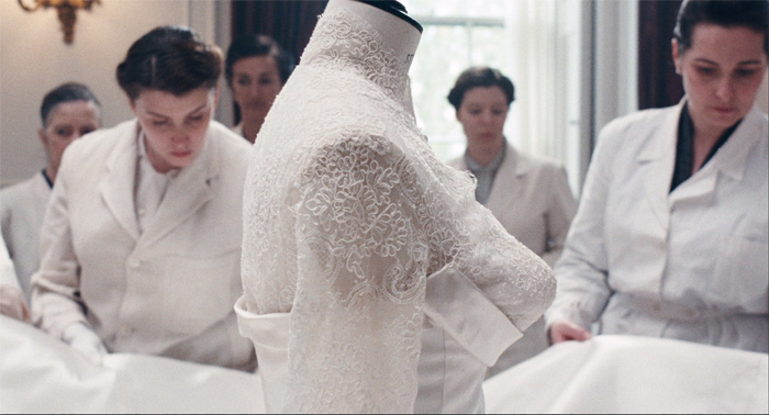
Phantom Thread (2017)
ADD = Analog, digital, dreaming
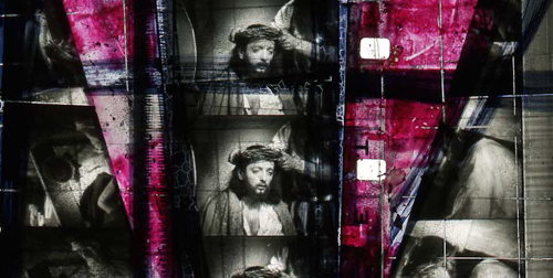
Luther Price, Sorry Horns (handmade glass slide, 2012).
DB here, just back from the Toronto International Film Festival:
It’s commonly said that any substantial-sized film festival is really many festivals. Each viewer carves her way through a large mass of movies, and often no two viewers see any of the same films. But things scale up dramatically when you get to the big boys: Berlin, Cannes, Venice, and Toronto. I’ve never been to the first three, but my first visit to TIFF was like wading into pounding surf and letting the current carry me off.
This is the combinatorial explosion of film festivals: A hefty 450-page catalog listing over 300 films from 60 countries. Moreover, because it’s both an audience festival and an industry festival where movies are bought, sold, and launched, you observe a range of viewing strategies. Although I sit too close to be much bothered, my friends tell me of mavens darting in and out of shows or checking their cellphones during slow stretches of what’s onscreen. The crowds add to the air of electric excitement, as of course do the visits of glamorous celebs.
So I was inundated. How to choose what to see in 3 ½ days for viewing? (I reserved time for industry panels.) I knew that some of the prime titles, such as Kiarostami’s Like Someone in Love or the remarkable-looking Leviathan, would be available for Kristin and me at Vancouver later in the month. And I saw no reason to stand in queues for Looper, Argo, and other movies that I could see in empty Madison, Wisconsin multiplexes during off-peak hours.
I still missed many, many things I wanted to catch. For much wider assessment of major movies, you should go to the coverage offered by the tireless scouts of Cinema Scope and the no less tireless scouts of MUBI. Here I’ll talk just about a few films that made me think about—no surprise—digital vs. analog moviemaking.
Fragments and figments
Mekong Hotel.
Stephen Tung Wai’s Tai Chi 0 (0 as in zero) represents everything we think of when we say that digital production and postproduction have transformed cinema. This kung-fu fantasy from the Chinese mainland (but using Hong Kong talent, including the director) retrofits the genre for the video-game generation. CGI rules. The result is, predictably, monstrous fantasy—a globular iron behemoth, a sort of Steampunk locomotive version of the Death Star—but also screens within screens, GPS swoops, tagged images, Pop-Up bubbles identifying the cast, and other scribbling that turns the movie screen into a multi-windowed computer monitor. One more thing Scott Pilgrim must answer for.
Jang Sun-woo played with similar possibilities in his 2002 Resurrection of the Little Match Girl, inserting character dossiers and creating digital effects mimicking gamescapes. But he sometimes paused to give these images a dreamlike langor. Tai Chi 0 never lingers on anything and instead carries the level of busyness to crazier heights. In a panel at the Asian Film Summit, Fung explained that one scene of the film was inspired by a particular online game. Sammo Hung was playing Fruit Ninja or something similar and Fung decided to include a scene of villagers turning away invading soldiers with a barrage of produce.
Fung said as well that fantasy martial arts remains a blockbuster genre in the PRC (viz. the success of Painted Skin: The Resurrection). Tai Chi 0 ends on a cliff-hanger, the end titles (rolled too fast to read) provide a trailer for part 2, and apparently a third part is in the works. Now China has franchise fever.
The stop-and-start plot is familiar from Hong Kong films of the 70s onward (including over-made-up gwailo villains), but its execution wrecks nearly everything I like about classic kung-fu movies. Clearly though, I’m not in the audience the movie is aimed at. My friend Li Cheuk-to, artistic director of the Hong Kong International Festival, opined that this digital froth could be very appealing to China’s online generation.
Tai Chi 0 exemplifies what academics writing on digital have talked about as the “loss of the real.” As Tom Gunning pointed out back in 2004, though, things aren’t so simple. Digital photography, after all, remains photography. The lens intercepts a sheaf of light rays and fastens their array on a medium. The fact that a shot can be reworked in postproduction doesn’t mean that every digital image must surrender the tangible things of this world.
At TIFF, the power of digital cinema to bear witness was on display in Sion Sono’s Land of Hope. Sono has already documented Japan’s 2011 earthquake and tsunami in Himizu, which I haven’t seen, but in that and Land of Hope, he abandons the wacko bad taste that made Love Exposure and Cold Fish so memorable. This is a sober, traditional drama presented with straightforward economy. It takes place in a fictitious district, Nagashima, but the fact that the name combines “Nagasaki” and “Hiroshima” suggests the gravity of Sono’s approach.
Three couples’ lives are torn apart by the quake, the tsunami, and the collapse of the nearby nuclear power plant. (All of these catastrophes are kept offscreen, glimpsed in TV reportage.) The oldest couple refuses to evacuate, clinging to their farm. Their son and his wife move to a nearby city where they succumb to the fear of radiation affecting their unborn child. And an unmarried couple wander the ruins looking for the girl’s father.
Sono intercuts the three lines of action. The old farmer adroitly manages his wife’s dementia and lets her indulge her fantasy of dancing in a village festival. In a critique of Japanese conformity, the young couple is shown being mocked for their worries about radiation poisoning. (The wife seals their apartment and, in a touch recalling the grotesque side of Sono, takes to wearing a Hazmat suit.) Less sharply developed are the fairly aimless ramblings of the youngest couple, though Sono injects some suspense when they dodge police blockades. At intervals, plaintive Mahler (a Sono weakness) surges up to underscore the futility of their search.
Throughout, government reassurances and the media’s insistence on putting on a happy face are treated with robust skepticism. Instead, Sono celebrates a dogged persistence to get through each day. The young couple’s mantra of “one step, one step” supplies the upbeat tone of the last scenes. As affecting as you’d expect is the footage of areas around the plant, seen as a wintry wasteland. Like Rossellini filming in bombed Berlin in Germany Year Zero, Sono has shot precious footage of ruins that testify to a calamity in which nature conspired with human blunders. And he did it digitally.
You can’t expect something so conventionally dramatic from Apichatpang Weerasethakul, and Mekong Hotel doesn’t supply it. It’s as relaxed as Tai Chi 0 is frenetic, and its central conceit makes it another pendant to Uncle Boonmee. The boy Tong and the girl Phon meet from time to time on the terrace of the hotel overlooking the river. They talk about folk traditions and the flood then besieging Thailand. They also encounter spirits that are as tangible, even mundane as they are; Phon’s dead mother appears in her room occasionally knitting. More shocking are the ghosts called Pobs who seem to possess the characters and make them hunch over and gobble intestines, sometimes in situations that suggest the organs have been torn from another character. All these scenes are handled with the usual Weerasethakul tact: long-take long shots, usually one per scene, that push the everyday and the extraordinary to the same unruffled level.
Mekong Hotel seems to operate on two planes of time. On the image track and in the dialogue, we witness Tong and Phon on the terrace or walking along the river. But the music, snatches of repetitive guitar tunes, seems to come from another time frame. At the start we see a guitarist practicing, and his noodlings run almost constantly under the drama we see. Another motif, fixed and lustrous shots of the Mekong River, yields a visual if not dramatic climax: a slowly paced choreography of Jet-skis crisscrossing the water. Here the digital medium may work to Weerasethakul’s advantage, with the clouds and landscape hanging unmoving over the racing watercraft, as a single, slow ship wades into the middle of their oscillating geometry.
The analog alternative
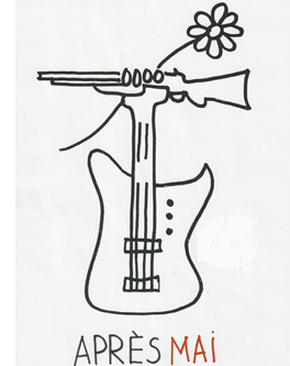
I suspect that Olivier Assayas filmed Something in the Air (originally Après Mai) on film, but even if he didn’t, the movie is a tribute to analog reproduction–mimeograph machines, LPs and turntables, and cinema in its different guises, from exploitation films to agitprop and experimental lyrics. We all know that the 1960s continued well into the 1970s, and here Assayas shows the uneasy carryover with a mixture of sympathy and critical detachment. The film starts with our high-school protagonist Gilles carving a peace symbol into his desk, flagrantly ignoring the teacher’s lecture. The shot encapsulates the film’s tension between political activism and image-making, and Gilles will oscillate between them in the course of the plot.
 The poles come to be represented by two young women—the wealthy and ethereal Laure for whom he makes his paintings and the more hardheaded leftist rebel Christine, who goes out with him and others on nightly graffiti raids. When Laure leaves for London, Gilles continues his painting while leafleting and splashing slogans on walls, with the occasional Molotov cocktail to spice things up. The copains’ rebellion leads to some harm, but they cling to their ideals.
When summer comes, Gilles joins a film collective headed to document workers’ struggles in Italy. He encounters the arguments that made me smile in nostalgia: Shouldn’t revolutionary content have a revolutionary form? But how shall we reach the working class if our films are opaque? Assayas, who grew in this period and was repelled by the Maoist dogmatism of Cahiers du cinéma and Cinéthique, evokes these debates to remind us that the counterculture was about art and political change at one and the same time. Something in the Air chronicles a few years when imagination mattered.
After an early, shocking clash of students pounded down in a police riot, the film adopts a more circumspect rhythm, salting its scenes with books, magazines, record albums, and songs of the time. The plot keeps our interest by delaying exposition about the characters’ family lives until rather late. When we learn that Gilles’ father writes scripts for the celebrated Maigret TV series, we’re invited to see his forays into abstract painting as his form of teen rebellion. The plot doesn’t mind straying a bit from Gilles, as when his friend Alain, another aspiring artist, gets caught up in the fervor and pursues a wispy red-haired American dancer.
Characters meet, work or play together, drift apart, re-converge, and eventually settle into something like grown-up life. But at the end, when Gilles has apparently been absorbed into commercial filmmaking in London, he is granted one last vision of one of his Muses, who reaches out for him from the screen of the Electric Cinema.
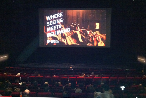
Analog triumphs as well in The Master. Sitting in the front row of Screen 1 at the TIFF Lightbox (see below), I was astonished at the 70mm image before me. Not a scratch, not a speck of dust, not a streak of chemicals, and no grain. So did it have that cold, gleaming purity that digital is supposed to buy us? Not to my eye. The opening shot of a boat’s wake, which will pop up elsewhere in the movie, was of a sonorous blue and creamy white that seemed utterly filmic. Now we know the way to make movies look fabulous: Shoot them on 65.
The Master, as everybody now knows, centers on Freddie Quell, an explosive WWII vet, and his absoption into a spiritual cult run by the flamboyant Lancaster Dodd. Followers of The Cause are encouraged, through gentle but mind-numbingly repetitious exercises, to probe their minds and reveal their pasts. With the air of a charming rogue in the young Orson Welles mold, Dodd seems the soul of sympathy. But like Freddie he’s capable of bursts of rage, especially when his methods are questioned. Freddie becomes a sidekick because of Dodd’s fondness for his moonshine, while he also serves as a test case for the efficacity of The Cause’s “processing” therapies. If you can get this hard-bitten, borderline-sociopath in touch with his spiritual side, you can help, or fleece, anybody.
Like There Will Be Blood, this movie is primarily a character study. That film gained plot propulsion from Daniel Plainview’s oil projects, but many situations worked primarily to reveal facets of his dazzling self-presentation, his repertoire of strategies for dominating others. Something similar happens with Dodd and the ways he charms his congregation. But here the action is more episodic and the point-of-view attachment is dispersed across two characters. Dodd’s counterbalancing figure, the clenched Freddie, is so difficult to grasp psychologically (at least for me) that the film didn’t seem to build to the sort of dramatic, even grotesque peaks we find in other Anderson projects.
This is also a story about an institution, a quasi-church with a pecking order, rules, and roles. I wanted to know more about how The Cause worked, how it recruited people, and how it garnered money. Laura Dern plays a wealthy patron who lets the group stay in her home, and at one point Dodd is arrested for embezzling from the foundation, but the details of his crime aren’t explained. I also wanted to know more about the group’s doctrine, which seems so vague that Scientology need not worry about being targeted. The rapid-fire catechisms between Dodd and his acolytes are gripping enough, as Q & A dialogue usually is, but what system of beliefs lies behind them? The film seems to fall back on the familiar surrogate father/son dynamics at the center of most Anderson movies, but here filled in less concretely.
In short, after one screening I was left thinking the film was somewhat diffuse and flat. But I need to see it again. I thought better of Boogie Nights and Punch-Drunk Love after re-viewing them, so I look forward to trying to sync up with The Master on another occasion. Alas, in Madison, Wisconsin, I won’t have a 70mm image to entice me.
A bit of each, and both
Luther Price, No. 9 (handmade glass slide, 2012).
Analog imagery came into its own on other occasions, notably during the two programs of experimental films gathered under the heading “Wavelengths.” (At one I spotted Michael Snow in the audience.) Expertly curated by Andréa Picard, these programs assembled some strong, provocative films by several young filmmakers. I won’t review each one here–Michael Sicinski provides very useful commentary on nearly all those I saw—but I must mention the striking slide show that served as an overture one evening. The images didn’t move, exactly, but they might as well have.
Luther Price has been making remarkable films on 8mm and 16mm for several years, and one Wavelength program featured his Sorry Horns, a three-minute mix of abstraction and found footage. The same mix was evident in the procession of stunning handmade glass slides. Many, like the one surmounting today’s entry, evoke early cinema, decay, and clichéd Christian imagery: the wounds of film deterioration become cinema’s stigmata. Even the sprocket holes and soundtracks are invaded by festering particles. Arp-like blobs, pockmarked faces, and spliced and sliced movie frames lie under grids as irregular as medieval leaded windows. This is all gloriously analog.
No less captivating is the new, 100% digital work of an even older master of American avant-garde cinema. In one Wavelengths program Ernie Gehr offered us Departure (2012), a train trip playing on optical illusions in the spirit of Structural Film. We all know what it’s like to sit on a stationary train but then feel, when another train passes, as if we’ve started to move. Gehr translates this kinesthetic illusion into optical terms by filming, first upside down and then in judicious framings, several railbeds rushing by, faster and faster.
These layered ribbons sometimes unfurl right, sometimes left, and sometimes simply hover there as fixed, pulsating strips, all but losing the details of rail and tie and spike. Sometimes the one on top moves right, the grass verge beside it moves left, and the bottom track moves right (or left). This creation of flip-flop movement harks back to Side/Walk/Shuttle (1991) and to Gehr’s 1974 exercise in traffic abstraction Shift, which filmed patterns of commuter traffic from a very high angle.
Accompanying Departure was one of nineteen pieces in Gehr’s Auto-Collider series. Most of them contain some recognizable imagery, Gehr explains, but not number XV, the one we saw. In a sense the distilled essence of Departure, that film’s whooshing planes become vibrant, and vibrating, stacks of bold color, a bit like Daniel Buren in a joyous mood.
How did Gehr create the gorgeous Auto-Collider images? He declined to explain. Kristin suggested a plausible means to me, but I’m keeping quiet. In the analog age, when new methods of abstraction required a lot of sweat equity, filmmakers freely explained their painstaking work with lenses, light, and optical printers. But digital video practice flattens the learning curve. Powerful discoveries like Gehr’s or Phil Solomon’s are very easily replicated without much time, toil, or talent. Hell, somebody would make an app for them.
These artists are right to have trade secrets, just as magicians do. We should be satisfied merely to look. What we see reminds us that both analog and digital media harbor possibilities that go beyond the ability to replicate phenomenal reality. Both media can also dazzle us with things we’ve never seen, or imagined.
Digital projection seems to be taking over the festival scene, if TIFF is any indication. Cameron Bailey reports in a tweet that of the 362 films screened, 232 (64%) were in the Digital Cinema Package format and another 79 (21%) were in HDCam. The remainining 51 (15%) were in 16mm, 35mm, and 70mm.
Are the digital items still films? Robert Koehler suggested that maybe we will start calling everything movies. Interestingly, at the Wavelengths screenings, the artists called their artworks (whether on film or on digital video) “pieces.” Me, I still vote for calling films films, even if they’re on video, just as we have books in digital formats (such as, oh, I don’t know, this one). For me, at least these days, a film is a moving-image display big or small, whether it’s on film or some other medium. For some purposes we may want to specify further: Just as e-book and graphic novel indicate a platform or a publishing format, TV movie or video clip tells us more about what kind of film we have.
See also my January entry on festival problems with digital projection.
Thanks to Cameron Bailey, Andréa Picard, and their colleagues for enabling my visit to TIFF.
The industry screening of The Master at TIFF. Photo by M. Dargis.
Watching you watch THERE WILL BE BLOOD
DB here:
Today’s entry is our first guest blog. It follows naturally from the last entry on how our eyes scan and sample images. Tim Smith is a psychological researcher particularly interested in how movie viewers watch. You can follow his work on his blog Continuity Boy and his research site.
I asked Tim to develop some of his ideas for our readers, and he obliged by providing an experiment that takes off from my analysis of staging in one scene of There Will Be Blood, posted here back in 2008. The result is almost unprecedented in film studies, I think: an effort to test a critic’s analysis against measurable effects of a movie. What follows may well change the way you think about visual storytelling.
Tim’s colorful findings also suggest how research into art can benefit from merging humanistic and social-scientific inquiry. Kristin and I thank Tim for his willingness to share his work.
Tim Smith writes:
David’s previous post provided a nice introduction to eye tracking and its possible significance for understanding film viewing. Now it is my job to show you what we can do with it.
Continuity errors: How they escape us
Knowing where a viewer is looking is critical to beginning to understand how a viewer experiences a film. Only the visual information at the centre of attention can be perceived in detail and encoded in memory. Peripheral information is processed in much less detail and mostly contributes to our perception of space, movement and general categorisation and layout of a scene.
The incredibly reductive nature of visual attention explains why large changes can occur in a visual scene without our noticing. Clear examples of this are the glaring continuity errors found in some films. Lighting that changes throughout a scene, cigarettes that never burn down, and drinks that instantly refill plague films and television but we rarely notice them except on repeated or more deliberate viewing. In my PhD thesis I created a taxonomy of continuity errors in feature films and related them to various failings during pre-production, filming, and post-production.
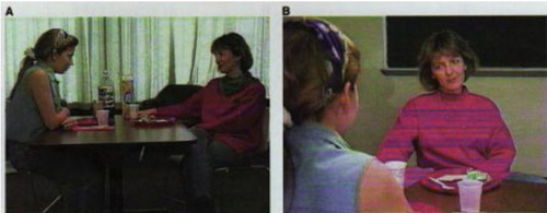
Our inability to detect continuity errors was elegantly demonstrated in a study by Dan Levin and Dan Simons. In their study continuity errors were purposefully introduced into a film sequence of two women conversing across a dinner table. If you haven’t seen it before, watch the video here before continuing, and see how many continuity errors you can spot.
Two frames from the clip used by Levin and Simons (1997). Continuity errors were deliberately inserted across cuts (e.g., the disappearing scarf), and viewers were asked after watching the video whether they noticed any.
The short clip contained nine continuity errors, such as a scarf that changed colour, then disappeared, plates that changed colour and hands that changed position. During the first viewing, viewers were told to pay close attention but were not informed about the continuity errors. When asked afterwards if they noticed anything change, only one participant reported seeing anything and that was a vague sense that the posture of the actors changed. Even during a second viewing in which they were instructed to detect changes, viewers only detected an average of 2 out of the 9 changes and tended to notice changes closest to the actors’ faces such as the scarf.
Although Levin and Simons did not record viewer eye movements, my own experiments investigating gaze behaviour during film viewing indicate that our eyes will mostly be focussed on faces and spend virtually no time on peripheral details. If you as a viewer don’t fixate a peripheral object such as the plate, you are unable to represent the colour of the plate in memory and can, therefore not detect the change in colour when you later refixate it.
Tracking gaze
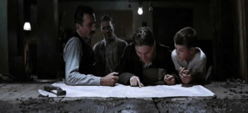
To see how reductive and tightly focused our gaze is whilst watching a film, consider Paul Thomas Anderson’s There Will Be Blood (TWBB; 2007). In an earlier post, David used a scene from this film as an example of how staging can be used to direct viewer attention without the need for editing.
The scene depicts Paul Sunday describing the location of his family farm on a map to Daniel Plainview, his partner Fletcher Hamilton, and his son H.W. The entire scene is treated in a long, static shot (with a slight movement in at the beginning). Most modern film and television productions would use rapid editing and close-up shots to shift attention between the map and the characters within this scene. This frenetic style of filmmaking–which David termed intensified continuity in his book The Way Hollywood Tells It (2006)–breaks a scene down into a succession of many viewpoints, rapidly and forcefully presented to the viewer.
Intensified continuity is in stark contrast to the long-take style used in this scene from TWBB. The long-take style, which was common in the 1910s and recurred at intervals after that period, relies more on staging and compositional techniques to guide viewer attention within a prolonged shot. For example, lighting, colour, and focal depth can guide viewer attention within the frame, prioritising certain parts of the scene over others. However, even without such compositional techniques, the director can still influence viewer attention by co-opting natural biases in our attention: our sensitivity to faces, hands, and movement.
In order to see these biases in action during TWBB we need to record viewer eye movements. In a small pilot study, I recorded the eye movements of 11 adults using an Eyelink 1000 (SR Research) eyetracker. This eyetracker uses an infrared camera to accurately track the viewer’s pupil every millisecond. The movements of the pupil are then analysed to identify fixations, when the eyes are relatively still and visual processing happens; saccadic eye movements (saccades), when the eyes quickly move between locations and visual processing shuts down; smooth pursuit movements, when we process a moving object; and blinks.
Eye movements on their own can be interesting for drawing inferences about cognitive processing, but when thinking about film viewing, where a viewer looks is of most interest. As David demonstrated in his last post, analysing where a viewer looks whilst viewing a static scene, such as Repin’s painting An Unexpected Visitor, is relatively simple. The gaze of a viewer can be plotted on to the static image and the time spent looking at each region, such as a characters face or an object in the scene can be measured.
However, when the scene is moving, it is much more difficult to relate the gaze of a viewer on the screen to objects in the scene. To overcome this difficulty, my colleagues and I developed new visualisation techniques and analysis tools. These efforts were part of a large project investigating eye movement behaviour during film and TV viewing (Dynamic Images and Eye Movements, what we call the DIEM project). These techniques allow us to capture the dynamics of gaze during film viewing and display it in all its fascinating, frenetic glory.
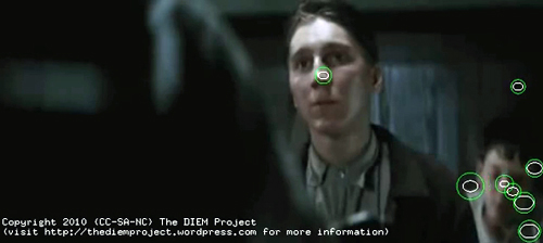
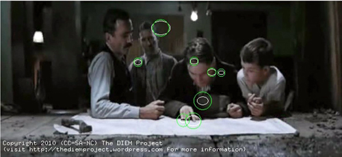
To begin, the gaze location of each viewer is placed as a point on the corresponding frame of the movie. The point is represented as a circle with the size of the circle denoting how long the eyes have remained in the same location, i.e. fixated that location. We then add the gaze location of all viewers on to the same frame. Although the viewers watched the clip at different times, plotting all viewers together allows us to look for similarities and differences between where people look and when they look there. This figure shows the gaze location of 8 viewers at one moment in the scene. (The remaining 3 viewers are blinking at this moment.)
A snapshot of gaze locations of 8 viewers whilst watching the “map” sequence from There Will Be Blood (2007). Each green circle represents the gaze location of one participant, with the size of the circle indicating how long the eyes have been in fixation (bigger equals longer).
You have a roving eye
Plotting static gaze points onto a single frame of the movie allows us to see what viewers were looking at in a particular frame, but we don’t get a true sense of how we watch movies until we animate the gaze on top of the movie as it plays back. Here is a video of the entire sequence from TWBB with superimposed gaze of 11 viewers.
You can also see it here. The main table-top map sequence we are interested begins at 3 minutes, 37 seconds.
The most striking feature of the gaze behaviour when it is animated in this way is the very fast pace at which we shift our eyes around the screen. On average, each fixation is about 300 milliseconds in duration. (A millisecond is a thousandth of a second.) Amazingly, that means that each fixation of the fovea lasts only about 1/3 of a second. These fixations are separated by even briefer saccadic eye movements, taking between 15 and 30 milliseconds!
Looking at these patterns, our gaze may appear unusually busy and erratic, but we’re moving our eyes like this every moment of our waking lives. We are not aware of the frenetic pace of our attention because we are effectively blind every time we saccade between locations. This process is known as saccadic suppression. Our visual system automatically stitches together the information encoded during each fixation to effortlessly create the perception of a constant, stable scene.
In other experiments with static scenes, my colleagues and I have shown that even if the overall scene is hidden 150milliseconds into every fixation, we are still able to move our eyes around and find a desired object. Our visual system is built to deal with such disruptions and perceive a coherent world from fragments of information encoded during each fixation.
The second most striking observation you may have about the video is how coordinated the gaze of multiple viewers is. Most of the time, all viewers are looking in a similar place. This is a phenomenon I have termed Attentional Synchrony. If several viewers examine a static scene like the Repin painting discussed in David’s last post, they will look in similar places, but not at the same time. Yet as soon as the image moves, we get a high degree of attentional synchrony. Something about the dynamics of a moving scene leads to all viewers looking at the same place, at the same time.
The main factors influencing gaze can be divided into bottom-up involuntary control by the visual scene and top-down voluntary control by the viewer’s intentions, desires, and prior experience. As part of the DIEM project we were able to identify the influence of bottom-up factors on gaze during film viewing using computer vision techniques. These techniques allowed us to dissect a sequence of film into its visual constituents such as colour, brightness, edges, and motion. We found that moments of attentional synchrony can be predicted by points of motion within an otherwise static scene (i.e. motion contrast).
You can see this for yourself when you watch the gaze video. Viewers’ gazes are attracted by the sudden appearance of objects, moving hands, heads, and bodies. The greater the motion contrast between the point of motion and the static background, the more likely viewers will look at it. If there is only one point of motion at a particular moment, then all viewers will look at the motion, creating attentional synchrony.
This is a powerful technique for guiding attention through a film. But it’s of course not unique to film. Noticing points of motion is a natural bias which we have evolved by living in the real world. If we were not sensitive to peripheral motion, then the tiger in the bushes might have killed our ancestors before they had chance to pass their genes down to us.
But points of motion do not exist in film without an object executing the movement. This brings us to David’s earlier analysis of the staging of this sequence from TWBB. This might be a good time to go back and read David’s analysis before we begin testing his hypotheses with eyetracking. Is David right in predicting that, even in the absence of other compositional techniques such as lighting, camera movement, and editing, viewer attention during this sequence is tightly controlled by staging?
All together now
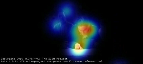
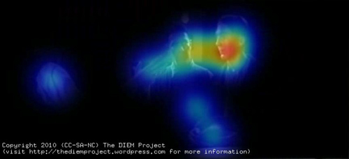
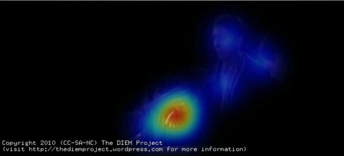
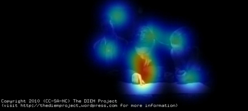
To help us test David’s hypotheses I am going to perform a little visualisation trick. Making sense of where people are looking by observing a swarm of gaze points can often be very tricky. To simplify things we can create a “peekthrough” heatmap. A virtual spotlight is cast around each gaze point. This spotlight casts a cold, blue light on the area around the gaze point. If the gazes of multiple viewers are in the same location their spotlights combine and create a hotter/redder heatmap. Areas of the frame that are unattended remain black. By then removing the gaze points but leaving the heatmap we get a “peekthrough” to the movie which allows us to clearly see which parts of the frame are at the centre of attention, which are ignored and how coordinated viewer gaze is.
Here is the resulting peekthrough video; also available here. The map sequence begins at 3:38.
Here is the image of gaze location I showed above, now matched to the same frame of the peekthrough video.
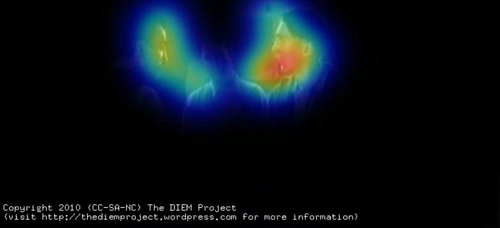
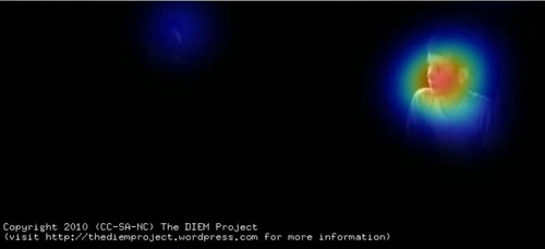
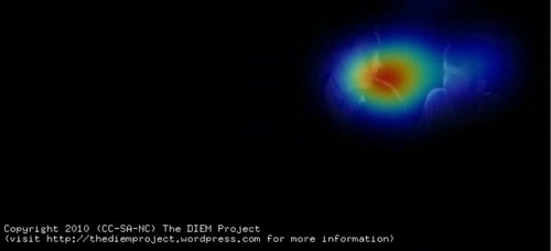
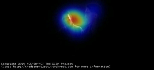
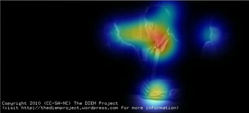
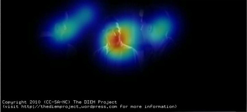
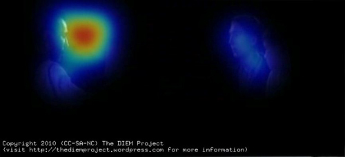
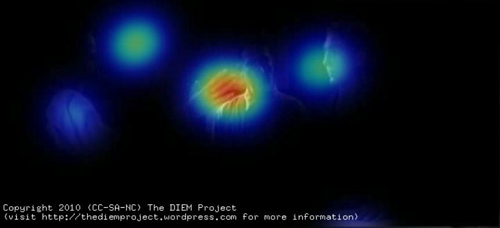
The gaze data from multiple viewers is used to create a “peekthrough” heatmap in which each gaze location shines a virtual spotlight on the film frame. Any part of the frame not attended is black, and the more viewers look in the same location, the hotter the color.
David’s first hypothesis about the map sequence is that the faces and hands of the actors command our attention. This is immediately apparent from the peekthrough video. Most gaze is focused on faces, shifting between them as the conversation switches from one character to another.
The map receives a few brief fixations at the beginning of the scene but the viewers quickly realise that it is devoid of information and spend the remainder of the scene looking at faces. The only time the map is fixated is when one of the characters gestures towards it (as above).
We can see the effect of turn-taking in the conversation on viewer attention by analyzing a few exchanges. The sequence begins with Paul pointing at the map and describing the location of his family farm to Daniel. Most viewers’ gazes are focused on Paul’s face as he talks, with some glances to other faces and the rest of the scene. When Paul points to the map, our gaze is channeled between his face and what he is gazing/pointing at.
Such gaze prompting and gesturing are powerful social cues for attention, directing attention along a person’s sightline to the target of their gaze or gesture. Gaze cues form the basis of a lot of editing conventions such as the match an action, shot/reverse-shot dialogue pairings, and point-of-view shots. However, in this scene gaze cuing is used in its more natural form to cue viewer attention within a single shot rather than across cuts.
As Paul finishes giving directions, Daniel asks him a question which immediately results in all viewers shifting the gaze to Daniel’s face. Gaze then alternates between Daniel and Paul as the conversation passes between them. The viewers are both watching the speaker to see what he is saying and also monitoring the listener’s responses in the form of facial expressions and body movement.
Daniel turns his back to the camera, creating a conflict between where the viewer wants to look (Daniel’s face) and what they can see (the back of his head). As David rightly predicted, by removing the current target of our attention the probability that we attend to other parts of the scene is increased, such as H. W., who up until this point has not played a role in the interaction. Viewers begin glancing towards HW and then quickly shift their gaze to him when he asks Paul how many sisters he has.
Gaze returns to Paul as he responds.
Gaze shifts from Paul to Daniel as he asks a short question, and then moves to Fletcher as he joins the conversation.
The quick exchanges of dialogue ensure that viewers only have enough time to shift their gaze to the speaker and then shift to the respondent. When gaze dwells longer on a speaker, such as during the exchange between Fletcher and Paul, there is an increase in glances away from the speaker to other parts of the scene such as the other silent faces or objects.
An object that receives more fixations as the scene develops is Paul’s hat, which he nervously fiddles with. At one point, when responding to Fletcher’s question about what they grow on the farm, Paul glances down at his hat. This triggers a large shift of viewer gaze, which slides down to the hat. Likewise, a subtle turn of the head creates a highly significant cue for viewers, steering them towards what Paul is looking at while also conveying his uneasiness.
The most subtle gesture of the scene comes soon after as Fletcher asks about water at the farm. Paul states that the water is generally salty and as he speaks Fletcher shifts his eyes slightly in the direction of Daniel. This subtle movement is enough to cue three of the viewers to shift their gaze to Daniel, registering their silent exchange.
This small piece of information seems critical to Daniel and Fletcher’s decision to follow up Paul’s lead, but its significance can be registered by viewers only if they happened to be fixating Fletcher at the time he glanced at Daniel. The majority of viewers are looking at Paul as he speaks and they miss the gesture. For these viewers, the significance of the statement may be lost, or they may have to deduce the significance either from their own understanding of oil prospecting or other information exchanged during the scene.
The final and most significant gesture of the scene is Daniel’s threatening raised hand. As Paul goes to leave, Daniel stalls him by raising his hand centre frame in a confusing gesture hovering midway between a menacing attack and a friendly handshake. In David’s earlier post he predicted that the hand would “command our attention.” Viewer gaze data confirm this prediction. Daniel draws all gazes to him as he abruptly states “Listen….Paul,” and lifts his hand.
Gaze then shifts quickly; the raised hand becomes a stopping off point on the way to Paul’s face. . .
. . . finally following Daniel’s hand down as he grasps Paul’s in a handshake.
We like to watch
The rapid sequence of actions clearly guide our attention around the scene: Daniel – Hand -Paul – Hand. David’s analysis of how the staging in this scene tightly controls viewer attention was spot-on and can be confirmed by eyetracking. At any one moment in the scene there is a principal action signified either by dialogue or motion. By minimising background distractions and staging the scene in a clear sequential manner using basic principles of visual attention, P. T. Anderson has created a scene which commands viewer attention as precisely as a rapidly edited sequence of close-up shots.
The benefit of using a single long shot is the illusion of volition. Viewers think they are free to look where they want but, due to the subtle influence of the director and actors, where they want to look is also where the director wants them to look. A single static long shot also creates a sense of space, clear relationship between the characters, and a calm, slow pace which is critical for the rest of the film. The same scene edited into close-ups would have left the viewer with a completely different interpretation of the scene.
I hope I’ve shown how some questions about film form, style, practice, and spectatorship can be informed by borrowing theory and methods from cognitive psychology. The techniques I have utilised in recording viewer gaze and relating it to the visual content of a film are the same methods I would use if I was conducting an experiment on a seemingly unrelated topic such as visual search. (See this paper for an example.)
The key difference is that the present analysis is exploratory and simply describes the viewing behaviour during an existing clip. What we cannot conclude from such a study is which aspects of the scene are critical for the gaze behaviour we observe. For instance, how important is the dialogue for guiding attention? To investigate the contribution of individual factors such as dialogue we need to manipulate the film and test how gaze behaviour changes when we add or remove a factor. This type of empirical manipulation is critical to furthering our understanding of film cognition and employing all of the tools cognitive psychology has to offer.
But I expect an objection. Isn’t this sort of empirical inquiry too reductive to capture the complexities of film viewing? In some respects, yes. This is what we do. Reducing complex processes down to simple, manageable, and controllable chunks is the main principle of empirical psychology. Understanding a psychological process begins with formalizing what it and its constituent parts are, and then systematically manipulating and testing their effect. If we are to understand something as complex as how we experience film we must apply the same techniques.
As in all empirical psychology the danger is always that we lose sight of the forest whilst measuring the trees. This is why the partnership between film theorists and empiricists like myself is critical. The decades of film theory, analysis, practice and intuition provide the framework and “Big Picture” to which we empiricists contribute. By sharing forces and combining perspectives, we can aid each other’s understanding of the film experience without losing sight of the majesty that drew us to cinema in the first place.
On the importance of foveal detail for memory encoding, see J. M. Findlay, Eye scanning and visual search, in The Interface of Language, Vision, and Action: Eye movements and the visual world, ed. J.M. Henderson and F. Ferreira (New York: Psychology Press, 2004), pp. 134-159. Levin and Simons’ continuity-error experiment is explained in D. T. Levin and D. J. Simons, “Failure to detect changes to attended objects in motion pictures,” Psychonomic Bulletin and Review4 (1997), pp. 501-506.
A note about our equipment and experimental procedure. We presented the film on a 21 inch CRT monitor at a distance of 90cm and a resolution of 720×328, 25fps. Eye movements were recorded using an Eyelink 1000 eyetracker and a chinrest to keep the viewer’s head still. This eye tracker consists of a bank of infrared LEDs used to illuminate the participant’s face and a high-speed infrared camera filming the face. The infrared light reflects of the face but not the pupil, creating a dark spot that the eyetracker follows. The eyetracker also detects the infrared reflecting off the outside of the eye (the cornea) which appears as a “glint”. By analysing how the glint and the centre of the pupil move as the viewer looks around the screen the eyetracker is able to calculate where the viewer is looking every millisecond.
As for the heatmaps, the greater the number of viewers, the more consistent the heatmaps. The present pilot study used gaze from only 11 viewers, which introduces a lot of noise into the visualisations. Compare the scattered nature of the gaze in the TWBB video to a similar scene visualised with the gaze of 48 viewers. We would probably see the same degree of coordination in the TWBB clip if we had used more viewers.
For a comprehensive discussion of attentional synchrony and its cause, see Mital, P.K., Smith, T. J., Hill, R. and Henderson, J. M., “Clustering of gaze during dynamic scene viewing is predicted by motion,” Cognitive Computation (in press). Social cues for attention, like shared looks, are discussed in Langton, S. R. H., Watt, R. J., & Bruce, V., “Do the eyes have it? Cues to the direction of social attention,” Trends in Cognitive Sciences 4, 2, pp. 50-59. For more on our inability to detect small discontinuities, see Smith, T. J. and Henderson, J. M., “Edit Blindness: The relationship between attention and global change blindness in dynamic scenes,” Journal of Eye Movement Research (2008) 2 (2), 6, pp. 1-17.
For further information on the Dynamic Images and Eye Movement project (DIEM) please visit http://thediemproject.wordpress.com/. This research was funded by the Leverhulme Trust (Grant Ref F/00-158/BZ) and the ESRC (RES 062-23-1092). To view more visualisations from the project visit this site. The DIEM project partners are myself, Prof. John M Henderson, Parag Mital, and Dr. Robin Hill. Gaze data and visualisation tools (CARPE: Computational and Algorithmic Representation and Processing of Eye-Movements) can also be downloaded from the website. When using or referring to any of the work from DIEM, please reference the Cognitive Computation paper cited above.
Wonderful work in this area has already been conducted by Dan Levin (Vanderbilt), Gery d’Ydewalle (Leuven), Stephan Schwan (KMRC, Tübingen), and the grandfather of the recent revival in empirical cognitive film theory, Julian Hochberg. I am indebted to their pioneering work and excited about taking this research area forward.
Finally, I would like to thank David and Kristin for inviting me to describe some of my work on their wonderful blog. I have been an avid follower of their work for years and David has been a great supporter of my research.
DB PS 26 February: The response to Tim’s blog has been astonishing and gratifying. Tens of thousands of visitors have read his essay here, and his videos have been viewed over 700,000 times on sites across the Web. I’m very happy that so many non-psychologists–scholars, critics, and filmmakers–have found something of value here. The extended discussion on Jim Emerson’s scanners site, in which I participated a little, is especially worth reading. For more comments and replies from Tim and his team, go to Tim’s Continuity Boy blogpage and the DIEM team’s Vimeo page. At Continuity Boy, Tim will post more videos based on his group’s experimental efforts.
DB PS 18 October: Tim has posted a new, equally interesting experiment on tracking non-visible (!) movement on his blogsite.
Title wave
The very first drafts of the outline always had Cloverfield on them. . . . Cloverfield was what I always wanted to call the movie. . . . It’s a terrible title . . . if you’re trying to sell something, who the hell’s gonna go see that?. . . But it’s cool. There’s a reason. I could state the reason, but it’s very clear it is meant to be obtuse. I believe that the film answers why it is called Cloverfield, I believe that it’s in the film, I believe that you can make that argument. It says exactly what I want it to say. But it’s very clear that we don’t want to explain it.
Screenwriter Drew Goddard, at Creative Screenwriting podcast
DB here:
Don’t think about a movie title too long. Even a familiar one can turn strange before your eyes.
This was brought home to me long ago when I showed Lubitsch’s Lady Windermere’s Fan in a course. Before the film started, a student asked me, “Who is it?” I didn’t understand. “I mean, who is her fan?” It never occurred to me to take the title this way, but actually in the movie Lady W does attract a big fan.
Titles can be explicit, but they’re often metaphorical, associative, and oblique. Sometimes they’re downright obscure. But as Drew Goddard says, they can be cool.
Don’t Worry, We’ll Think of a Title (1966)
The least provocative titles are based on the protagonist’s name: Brubaker, Anthony Adverse, Erin Brockovich, Norma Rae, Speed Racer. One step removed is the title that describes the protagonist’s job or role: Gladiator, Hitman, The Cable Guy, Bob le flambeur, perhaps also The Godfather. Then there are the titles, like The Last Action Hero or Prince of Players or Little Caesar, that characterize the protagonist more figuratively.
If the movie has a pair of protagonists, the title can reflect that, as in David and Bathsheba, Pete’n’Tilly, and Butch Cassidy and the Sundance Kid. When the title elevates a secondary figure, as in Melvin and Howard or Harry and Tonto, it has the effect of making us consider the relationship between the two as central to the action. When there are several main characters, we can get a title characterizing the group, not just Bob & Carol & Ted & Alice but The Professionals and The Breakfast Club.
Things get a little more curious when the title focuses on a character other than the protagonist(s). Rebecca identifies a dead character, but her aura haunts the (unnamed) heroine. Both versions of The Man Who Knew Too Much refer, at least literally, to a minor figure. Why is The Wizard of Oz not called Dorothy Goes to Oz? Why does Mizoguchi’s great Sansho the Bailiff take its title from the name of the villain? It’s not as if Mizoguchi was trying to do an Ian Fleming (Dr. No, Goldfinger).
Perhaps Wizard and Sansho bear their titles because they’re adapted from literary sources that had those titles. But that just pushes the problem back a step: Why do the originals have these titles? And in asking why, I’m not asking for information about what went on in an author’s mind or a story conference. The why question here is about purpose and function. What does the title do in relation to the film’s plot or theme?
For instance, you can argue that the title of The Wizard of Oz works to highlight the seductive world of Oz, so different from Kansas, with the Wizard himself being a figure with one foot in fantasy and one in reality (since the Wizard is actually a prairie mountebank). Similarly, I’m inclined to say that Sansho the Bailiff’s title reminds us of the socially sanctioned cruelty at its center. Zushio and Anju, the fugitive brother and sister, may each escape in a different way, but Sansho’s world remains; it is our world.
Some titles are simply place names, like Casablanca, Macao, Philadelphia, or New York, New York. Others specify dates: 1860, 1900, 1941, 1984. In both strategies, the title often evokes symbolic associations or parallels with the here and now.
The title can refer to the core situation, as with Back to School or Being John Malkovich, or to a key scene, as in Sophie’s Choice and Gunfight at the OK Corral. This can get abstract and metaphorical. Housekeeping features a very offbeat approach to housekeeping. The Birth of a Nation characterizes America reborn after the Civil War. Being There describes more or less all that the cipher-like hero does. The title can even predict the action, as in The Great Escape, A Man Escaped, and Killing of a Chinese Bookie. In these instances we have anomalous suspense: Why and how will an announced action be carried out?
Reaching for the Moon (1917/ 1930/ 1933)
More rarely, the title can refer to the film’s central formal device. Through Different Eyes and Vantage Point announce that they will play with subjective point of view. The Blair Witch Project justifies its title by posing as a dossier of found student footage. The Prestige warns us that a magic trick’s surprise payoff might well be matched by one at the end of this movie. Kristin and I have long assumed that the title of Tati’s Play Time refers not only to the anarchic relaxation unleashed in the Royal Garden restaurant but also to the movie’s own perceptual strategy of making us see amusement in banal incidents.
Hitchcock, the tireless formalist, provided titles that give away his game. Rear Window announces a stationary viewpoint and a limited field of action. More fancifully, you could take Rope as announcing the film’s sinuous long takes. Family Plot is nicely equivocal, referring at once to a communal grave, a conspiracy among kin, and of course the movie’s own mysterious plot of knotty kin relations.
Then there are the generic characterizing titles, usually single-word titles like Notorious or Spellbound or Pushover or Identity or Slacker or Speed or even, probably most generic of all, Conflict (borne by at least five films, from 1916 to 1955). Here again, though, we can find puzzles.
We know why Homicidal is called Homicidal, but what purpose is served by calling a movie Psycho? Again, the source book provides the title, but Robert Bloch’s novel is narrated in the first person and the title gives us a big clue about the sort of mind we’re in. Hitchcock’s film presents the story more objectively, and it begins with Marion Crane’s theft. Those critics who see the film as blurring the boundaries between sanity and insanity would say that Marion, who impulsively commits a crime, and Norman are points on a continuum. People we take to be normal have irrational impulses, a point reinforced by Norman’s line, “We all go a little mad sometimes. Haven’t you?” After their conversation about private traps, Marion seems to recognize herself in his question.
Same old song (1997)
Many titles are citations or quotations, and they usually highlight a thematic element. Both Yankee Doodle Dandy and Born on the Fourth of July are drawn from the same song: both offer portraits of patriotism, but in very different keys. Pennies from Heaven is highly, perhaps heavily, ironic, something you can’t say about Meet Me in St. Louis.
Not all citations are as transparent as these. The Little Foxes explains its title in a prologue, seen above. The Bible verse is then linked to the story we’ll see.
We’re ready to understand the family as creating a milieu that could easily corrupt the tender vine, Xan.
A catch phrase can work too, such as The Sweet Hereafter or It Takes a Thief or It’s a Wonderful Life. You Can’t Take It With You emphasizes pursuing fun rather than riches. Phffft suggests that a couple has split, but how would you explain that outside the U. S.? (The French title is, perhaps surprisingly, Phffft.)
Some catchphrase titles suggest the sort of multiple meanings we saw in Family Plot and Play Time. All That Jazz packs a lot into three words: most basically, a flurry of trivial stuff (pushing our hero into overdrive), but also music and the heights of emotion (being jazzed). You Only Live Once at first suggests seizing the moment, but by the end of the film you begin to think it implies: “Who could bear to live twice?” I especially like The Best Years of Our Lives, which also changes its significance across the film. The bulk of the movie asks: The returning servicemen have given their prime years for us, but how do we reward them? By the end of the movie, the title seems to be suggesting that their best years, of healing and self-understanding and integration into families, lie ahead of them.
I’ve known students, especially from outside the U. S., to have trouble with His Girl Friday. It’s a two-tiered reference. First is Robinson Crusoe’s “man Friday,” his aboriginal servant. But in American slang, a girl Friday is the boss’s closest female assistant, an all-around tough worker and troubleshooter. That’s what Hildy is to Walter Burns, until she decides to marry Bruce and move to Albany. She reverts to her girl Friday role in the course of the film, as the title has predicted she would.
We don’t always know when a quotation is at work. I have always found Some Came Running obscure. The phrase isn’t used in the film, or in the text of the James Jones source novel. But the novel’s epigraph takes a passage from Mark 10: 17:
And when he was gone forth into the way, there came one running, and kneeled to him, and asked him, Good Master, what shall I do that I may inherit eternal life?
This is the passage where Jesus asks the rich man to give all that he has to the poor, apparently as unlikely an event then as now. The problem is that in the Biblical passage, only one came running. The reader has to imagine several characters in the novel as “running” to ask how they will get into heaven. But the citation seems to me a mismatch, since the characters of novel and film aren’t all rich. In any case, without the epigraph tacked to the movie, its significance gets lost. This doesn’t stop me from liking the title, though.
One of my favorite instances of the obscure catchphrase-title is Ozu’s I Was Born, But . . . To decipher it you have to know that during the Depression, Japanese college graduates often couldn’t find work, and the sentence “I graduated, but . . . ,” trailing off, suggesting “. . . I’m unemployed,” was a topical one at the time. Ozu in fact made a film with that title. But then he decided to have fun with it, making a college comedy called I Flunked, But . . . Then came an even sillier extension: When he makes a film about boys, it becomes I Was Born, But . . . [I still have problems…]. Our parallel, I suppose, is the move from Honey, I Shrunk the Kids to Honey, I Blew Up the Kid.
Which reminds me: Titles have a strange habit of speaking for the character. We have I Was a Teenage Werewolf, I Dood It, I Love Melvin, Me and the Colonel, My Favorite Brunette, My Cousin Vinny, Blackmail Is My Life, and so on. This convention points up the difference between literature and film. A book with one of these titles would lead us to expect first-person narration, and it would be strange if it didn’t. A movie with such a title might provide voice-over commentary from the protagonist, as How Green Was My Valley and I Walked with a Zombie do, but more likely it won’t.
For Your Eyes Only (1981)
Many titles seem enigmatic when you first hear them. They create curiosity and build up an urge to check out the film. In most cases, the mystery gets cleared up in the course of the movie. Erik Gunneson’s Milk Punch does this through a bit of action, but more commonly the title is clarified in a line of dialogue or a motif. You have to wait for the very end of They Shoot Horses, Don’t They? or Rio Bravo to get a reference to the title. A good embedded title shifts its meanings, as Best Years does. One scene of Silence of the Lambs explains the title’s relevance to Clarice’s character and shows what drives her to pursue Buffalo Bill. By the end of the film it points toward a moment when her inner pain will start to fade. And the title may reverberate beyond that moment, pointing to larger themes of injured innocence in a world of slaughter.
Sometimes the title is more oblique. Take North by Northwest. Many critics believe that it refers to Hamlet’s confession that “I am but mad North-northwest: When the wind is southerly, I know a hawk from a handsaw.” Roger Thornhill, caught off balance by the espionage game he’s plunged into, could be said to have lost his bearings. But I’ve always thought that the compass-point title logo and the cross-hatched latitude/ longitude array that launch the movie prepare us for travel, in a roughly westerly, then northwesterly direction (New York-Chicago-South Dakota). And when Roger is sent from Chicago to Rapid City, he travels by airliner: He flies north, by Northwest. A Hitchcock joke?
We occasionally encounter a title that isn’t explained in the course of the action, so we are invited to ponder its implications. 8 ½ is a famous example; insiders know Fellini treated it as an opus number (seven features + two shorts + this new feature = 8 ½). American Graffiti can refer to the transitory events of the single night the film shows—the kids have scrawled their dramas on the town in one long summer blast. But I think you can also read the title as referring to the pop tunes that engulf and comment on the action. Americans write their graffiti on the airwaves.
In recent times Hong Kong films have tried to make their English-language titles more comprehensible, but in the golden years there were some delirious ones. We had Banana Cop, Wheels on Meals, Why Wild Girls, Gun Is Law, Tiger on Beat, Devil Fetus, Burning Sensation, Boys?, Kung-Fu vs. Acrobatic, Evil Black Magic, Ghost Punting, Takes Two to Mingle, Vampire’s Breakfast. . . Even Chungking Express and Ashes of Time aren’t straightforward. A real problem in studying Hong Kong films seriously is to explain to people that a movie called Police Story or Naked Killer can be pretty interesting. And if the titles don’t perturb them, the subtitles will.
But most of the Hong Kong titles are inadvertently puzzling, sort of accidental surrealism. Of course Surrealist filmmakers have given us many willfully meaningless titles, such as Emak Bakia and The Andalusian Dog. Arguably Brazil and even A Hard Day’s Night are in this vein (although I think that both of these can be explained in roundabout ways).
Today’s American films seem drawn to recherché titles. I heard Jonathan Caouette remark that he chose the title Tarnation for reasons he couldn’t specify; it just seemed to fit. One catchphrase, “the elephant in the room,” has founded two movies, but in such an abbreviated form—Elephant—that you might not recognize the link. I never thought I’d find synecdoche on a movie credit, since few Americans know how to pronounce it, let alone know what it means. But trust Charlie Kaufman to give it a try. (He also inadvertently stole a pun I’ve been using in film theory courses since the seventies.) But at least I think I get the title’s point, given the protagonist’s obsession to build a miniature city. Other titles are flat-out baffling.
Take Reservoir Dogs. Tarantino says “it’s more of a mood title, it just sums up the movie, don’t ask me why.” (1) I like the title. I just don’t understand why it works so well. Do certain dogs guard reservoirs, as some guard junkyards? Are these guys as vicious as dogs, as dirty as dogs, or doggy in the sense of losers, or what? In other words, why does it seem more fitting than, say, Sump-Pump Ferrets?
Despite the logo showing faces spilling out of a blossom, Magnolia doesn’t explain its title unless you dig around outside the film. During the rain of frogs, the traffic collisions take place on Magnolia Boulevard in the San Fernando Valley. So in a way, Magnolia is one point of convergence for several of the story lines that crisscross the plot. But that’s pretty thin motivation.
What about Syriana? Before I went to the film, I had heard that the title referred to an imaginary, prototypical Middle Eastern territory used in Pentagon war games and computer simulations. But Stephen Gaghan, in another Creative Screenwriting podcast, supplies details:
It was a real term. I heard it for real in a very conservative think-tank, where they said, “We’re going to redraw the map in the Middle East, we’re going to make a new country out of Syria, Iraq, and Iran—the borders of ancient Persia, less Pakistan. We’re going to call it Syriana.” I’m like, “Excuse me? Would you repeat that?” So I shot it, I had William Hurt explaining it. But I didn’t think it helped at the end of the day. We’re not going to make a new country in the Middle East right now.
As he saw the collapse of America’s invasion of Iraq, Gaghan came to believe that explaining the title would date the movie.
I wanted to go for a title that couldn’t be pegged to right now. You notice there’s no reference to Iraq in the movie, there’s just the most passing reference to 9/11, which was an improv thing we did, and there’s no Israel. I wanted the more permanent sense of what it is inside of men, particularly men in the west, that makes them believe that they can remake any region to suit their own purposes. . . . I wanted it to be specific to the film, not to the time. So that if you think about the tone of the film, when you think about what happened in the movie, it would only be Syriana, and Syriana could not skid into some other reference point.
Then there’s Cloverfield, which I’ve discussed earlier this year. Part of the movie’s mystique is that nobody can agree on what the title refers to. The creature? Central Park, where the video camera is found? An exit on California Interstate 10, near where producer J. J. Abrams has his office? On this last option, screenwriter Drew Goddard says no way:
If we would do that, we would be dicks. We would be assholes.
I don’t want to get into the labyrinthine question of the relations of Cloverfield to Lost and to the film’s viral marketing campaign online. What interests me is the fact that part of the fun around, if not exactly in, the film is playing with all these possibilities . . . and waiting to see if a sequel will explain further. Perhaps a teasing title can help get people into theatres for a followup movie.
Finally, Primer. Not only do I not understand the significance of the title; I don’t know how to pronounce it.
I Love a Mystery (1945)
Why have we seen such a rise in cryptic titles in recent years? Several factors seem important. A puzzling title lifts your film above the clutter and creates buzz as people wonder what this movie could be about. This buzz factor is multiplied by the Internet. The title can be researched through Google and discussed endlessly in chatrooms. Filmmakers know that we can revisit a film on video whenever we want, so the movie can be rescanned by eager eyes searching for clues to the title’s meaning. Mystery titles summon up the geek in us.
Which means that the current wave of peculiar titles probably owes a lot to Tarantino. In the interview I already cited, Tarantino stressed that that title of Reservoir Dogs let the audience play with the possibilities.
The main reason that I don’t go on record is because I really believe in what the audience brings. . . . People come up to me and tell me what they think it means and I am constantly astounded by their creativity and ingenuity. As far as I’m concerned, what they come up with is right, they’re 100 percent right. (2)
But then, as Jonathan Walley pointed out to me, cool opacity isn’t confined to movie titles.
Band names have always been evocative: The Rolling Stones weren’t literally rolling stones, The Pixies not literally pixies. But what many of them evoke now strikes me as much more obscure and, to quote Grandpa Simpson, “weird and scary”: System of a Down, Teeth of Lions Rule the Divine, One Day as a Lion, My Morning Jacket, etc. Many of these are alternative bands, and many of the films with these obscure titles are alt/indie films, or at least films with those pretensions, so there’s a parallel there, I’d say. The willful obscurity of title, of band or film, evokes an ironic, think-outside-the-box, you’re-not-meant-to-get-it indie attitude that appeals to the intended audience.
That is, obtuse titles for an acute public.
For comments, suggestions, and memory-jogging, thanks to the Badger Filmies: Susan Antani, Colin Burnett, Andrea Comiskey, Sydney Duncan, Stew Fyfe, Jason Gendler, Doug Gomery, Jonah Horwitz, Tristan Mentz, Jason Mittell, Tim Palmer, John Powers, Brad Schauer, Chris Sieving, and Jonathan Walley.
(1) Quoted in “Reservoir Dogs Press Conference,” in Quentin Tarantino Interviews, ed. Gerald Peary (Oxford: University of Mississippi Press, 1998), 38.
(2) Some writers have hazarded that the title derives from Tarantino’s awkward pronunciation of Au revoir les enfants, coupled with Straw Dogs, but as far as I can tell, this relies on a second-hand source–ie, a former girlfriend–and Tarantino hasn’t confirmed it.


