Archive for April 2007
Funny framings
DB asks: Can a film shot be amusing in itself?
Of course a shot can show us a gag that’s funny. If Jerry Lewis or Adam Sandler is going to fall off a ladder into a Dumpster, we want to see everything clearly. Here the framing can be modestly functional. But can the very choice of lens, angle, scale, or composition play a stronger role? Can camerawork itself provide the gag?
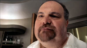
Barry Sonnenfeld, cinematographer for the Coens and now a prominent director, thinks so. He’s remarked that an extreme wide-angle lens is inherently funny. In the commentary for the DVD of RV, he explains, “You just put a big 21mm lens really close to [Will Arnett’s] face and you get comedy without him having to do anything.” I don’t have an RV frame handy, but here’s an example from Big Trouble, with both the wide lens and the low-angle creating the sort of grotesque disproportions that Sonnenfeld finds funny.
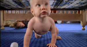
Sonnenfeld got this idea, he claims, by working on the Coens’ early films, which used wide-angle shots for cartoonish exaggeration. In Raising Arizona, the angle and lens length make the wandering baby loom; we’re not used to seeing an infant rampant.
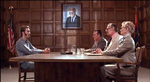
But the Coens had a broader approach to funny framings than Sonnenfeld acknowledges. For instance, they created humor by means of geometrical tableaus. In H. I.’s parole hearing in Raising Arizona, an absurd solemnity is set up by the symmetrical layout of actors. At the apex of the triangle, a portrait of Senator Barry Goldwater blesses the occasion.
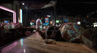
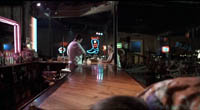
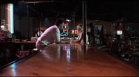
Even more memorable is the forward tracking shot down the bar top in Blood Simple. The camera, encountering a drunk sprawled in its path, simply crawls over him.
The silent comedians knew how to use camera position to build up their gags. Long ago Rudolf Arnheim praised the opening scene of Chaplin’s The Immigrant. As a ship rocks treacherously, we see Charlie from the rear heaving and kicking on the railing. As Arnheim puts it, “Everyone thinks the poor devil is paying his toll to the sea.” (1)
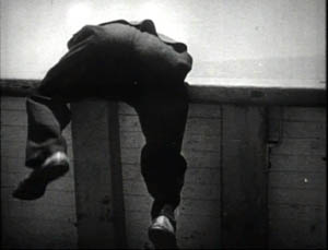
But then Charlie turns toward the camera to reveal he’s been struggling to reel in a fish.
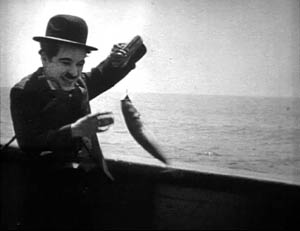
Here the framing creates the gag by what it doesn’t show. “The element of surprise,” Arnheim notes, “exists only when the scene is watched from one particular position.” The camera setup also makes an expressive analogy; we probably never noticed the similarity between vomiting and wrestling a fish.
One of my favorite comic framings occurs in The General. Buster’s train is hurtling along, and a cannon on one car is suddenly trained on him. The first shot gives us the situation with maximum clarity, in a profiled shot. But then Keaton cuts to another angle, showing the cannon in the foreground and Buster trying to escape it.
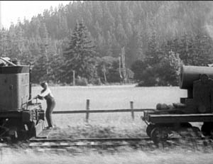
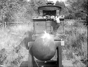
Nothing much has changed in the scene’s action, just the camera setup. But now we get to watch the cannon draw a bead on Buster. Audiences invariably laugh at this shooting-gallery image.
Jacques Tati is in many ways the modern heir of Keaton, and humor in his sequences often stems simply from a juxtaposition of elements in a single frame. An older man ogling a pretty woman on the beach is funny in a standard way, but in M. Hulot’s Holiday, we get more.
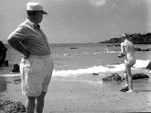
No words are spoken, but Tati’s staging and framing juxtapose the very different bodies in telling ways. We’re invited to note the difference between age and youth, paunchiness and health, passing yearning and its likelihood of fulfillment.
Play Time, Tati’s masterpiece and one of the greatest films ever made, offers an abundance of subtly comic framings. The shot below promotes the film’s theme that modern architecture has homogenized the world. The posters present the same building in different locales, with only stereotyped add-ons to distinguish the US, Hawaii, Mexico, and Stockholm. As one of the ladies on Barbara’s tour says, “I feel at home everywhere I go.”
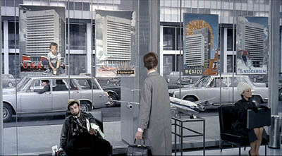
Again, though, a juxtaposition adds to the humor. Throughout Play Time, Tati suggests the disparity between the joy of travel as promoted by our culture and the stress of hustling from place to place. The promise of the posters is undercut by the dazed traveler who’s flopped underneath them, clutching maps and flightplans. And he in turn contrasts with the no-nonsense businesswoman on the far right.
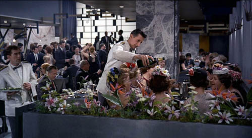
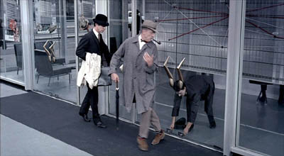
Tati can create comedy by the exact placement of the camera; a foot to the left or right and the gag would vanish. In the image at the start of this entry, the waiter is pouring champagne, but he seems to be watering the ladies’ flowery hats, which mask their champagne glasses. The same sort of exactitude of placement occurs in a shot we use as an illustration in Film Art (p. 195). M. Hulot is leaving an office building when it’s closing. As a guard locks down a doorway, his cap falls off and Hulot is startled: the guard seems to have grown horns.
Can we find funny framings in current films? Yes! I was prompted to write this blog while rewatching Shaun of the Dead. Zombies have overrun London, and two groups of human survivors meet. Shaun is leading one, Yvonne is leading the other. Instead of being presented as a mingling of the two groups, the scene plays out along two lines of people. Have a look.
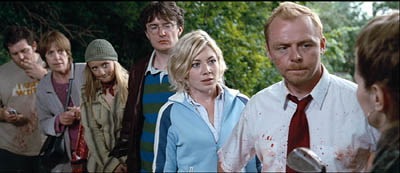
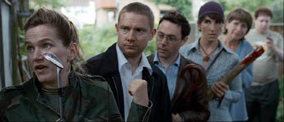
The gag’s premise is that each survivor has a counterpart in the other line. There are two posers in brown leather jackets, two can-do girls, two matrons, and two distracted videogame geeks. I wonder how many first-time viewers catch this? (Kristin did, I didn’t.)
These mirror-image depth shots set up the real gag, which pays off in another clever composition. When the two groups set off on separate paths, each member passes and smiles awkwardly at her/his lookalike, while the framing underscores their likenesses.
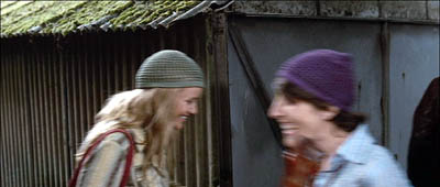
As they walk through the frames, the similarities increase.
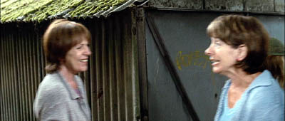
The framing makes a clever point about conformity and social stereotypes. Ending the procession with the two gamers, oblivious to the danger and to one another, tops the topper, as gag writers would say.
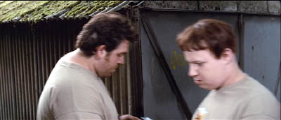
Tati would have loved these shots.
Of course I’ve simplified things for the sake of making my point. It’s not that the camera is somehow capturing a free-standing event by selecting the most amusing view. In all these examples, the staging is calculated to match the camera position. Staging, like camerawork and other film techniques, creates filmic narration. I’m only suggesting that in these scenes, the staging wouldn’t work on its own to create humor, nor would a simply functional framing. Choices of lens, camera position, and the like seem to be critical in making the gags work.
Finally, a borderline case that intrigues me. In last year’s Crank, our hero is in overdrive thanks to a constant intake of drugs. Stepping into an elevator, he faces a man who starts speaking Japanese. Naturally, his line is subtitled.
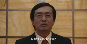
But then we get this:
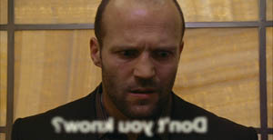
The idea of the head-on reverse angle is carried to comic extremes by reversing the subtitle as well (and blurring it to reaffirm the hero’s muzzy mental state).
I think that aspiring filmmakers can learn a lot from this tradition. Our films need more pictorial creativity, which often doesn’t require fancy CGI. Stylistic handling can add fresh layers to a basic story situation, and astute filmmakers can be alert to the possibilities of comic compositions and funny framings.
(1) Rudolf Arnheim, Film as Art (Berkeley: University of California Press, 1957), p. 36.
PS 4 May: Owen Williams writes to point out that the gag in Crank depends not just on a reverse framing but a play on the idea of lens focus. “The subtitle is fuzzy because it’s supposed to exist in real space (at least in this character’s head), with the letters hanging in mid-air in front of the Japanese man. Therefore in the reverse angle they appear out of focus (fuzzy) because they are closer to the camera. It’s a great gag.” Thanks, Owen.
PPS 8 May: I’ve gotten a lot of correspondence about this blog entry. Here are some nifty supplements:
Kent Jones was reminded of the shot in High Anxiety in which the camera moves to a picture window, with people dining behind it, and then crashes through the glass.
Sam Adams recalled a shot in Killer of Sheep that had something of the same effect, showing men trying to load a car engine onto the bed of a pickup truck. But the context isn’t itself comic. Sam reflects: “Based on the examples you choose, it seems that ‘comic framing’ invariably involves a level of self-consciousness, a feeling that the audience is being deliberately toyed with by the figure behind the camera. We get a sense that the scene has been staged for our amusement, rather than feeling that we must identify emotionally with whatever the characters are going through (which even in comedies is often quite sad).”
Stew Fyfe found a host of in-jokes in the Shaun of the Dead shots:
“Viewers of British television might notice an extra parallel between the shots. The actors playing each of the group leaders, Simon Pegg (Shaun) and Jessica Stevenson (Yvonne), were the leads in the sitcom Spaced (also directed by Edgar Wright, the TV predecessor to Shaun). Also split between the two groups are Lucy Davis (Shaun’s Group, hat) and Tim Freeman (Yvonne’s group, second in line), from original The Office and Dylan Moran (Shaun’s group, glasses) and Tamsin Greig (Yvonne’s group, hat), the leads of the sitcom Black Book. Yvonne’s mum (second matron) is played by Julie Deakin, who played the drunk and desperately lonely/horny landlady in Spaced.”
Thanks also to Bryan Wolf for a note on the same subject.
Finally, this from Jeremy Butler:
“I like your example from The General, but my favorite example of comic framing from Keaton’s work (and one I use in class to illustrate how he was more “cinematic” than Chaplin) is in Sherlock, Jr. Buster runs along the top of a freight train, and is then flushed to the tracks by a spout from a water tank. What makes it funny, I’d suggest, is the choice to frame it from the side, at a right angle to the tracks (much like the first General frame in your example). It minimizes the size of Buster’s body and contrasts him with the size of the train cars. Plus, it emphasizes the movements in opposite directions of his body and the train.
All these elements make it visually funny in a way that would not be apparent if it were filmed from an oblique angle or from behind the train.
But then, maybe I just like to show it because it’s the scene in which Buster literally broke his neck–which he didn’t realize until decades later when being x-rayed for something completely different!”
Thanks to everyone who wrote in with comments and who linked to this entry.
1525 big thumbs up
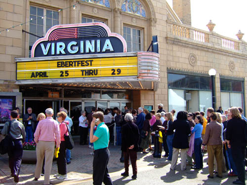
Kristin here—
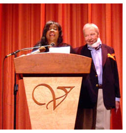 David and I just got back from Roger Ebert’s Overlooked Film Festival. It’s been held under the auspices of the University of Illinois, Roger’s alma mater, in late April for nine years now. This year the event was front-page news because our irrepressible host attended the event while recovering from surgery for salivary-gland cancer and complications last summer.
Roger’s features have changed somewhat and he faces further surgery and rehabilitation. Yet the man’s enthusiasm for movies and movie people has not waned. Most of the audience for Ebertfest (as it will officially be called starting next year) are regulars, and the standing ovations that greeted Roger and his wife Chaz show that the enthusiasm and affection are mutual. For more coverage, go here and here. For the official photoblog, with lots of neat pictures, go here.
If anything, Ebertfest audiences seemed even more cheerful and energetic than usual, happy that Roger has been so determined to avoid canceling this year’s event.
David and I have fond memories of Roger’s last visit to the Wisconsin Film Festival in 2006. There he introduced a restored print of Laura, held a signing at a local bookstore, and appeared at other screenings. People passing him on the street called out, “Hi, Roger,” as if he were an old friend. He graciously allowed me to interview him on the subject of press junkets for my chapter on marketing in The Frodo Franchise. There’s no way just to look up the history of junkets. No one has written one. But Roger is a primary document, having been attending them on and off since the 1960s. I learned a lot from our talk.
We drove down from Madison to Urbana-Champaign on Wednesday, David attending for the fourth year and I for the third. The opening film that evening was Gattaca (1997). With tepid reviews and box-office on its original release, Gattaca definitely counts as an overlooked film. Shown in an excellent print on the giant screen of the vintage Virginia movie palace, the cinematography was stunning and the story absorbing. Not an utter masterpiece, perhaps, but a very good film that deserved revival. As usual, people came from all over America to pack into the restored 1525-seat venue.
Now we’re back…and doing a summary blog. We had little time at the festival, and during our last day the web service at our lodgings conked out, so this stands as a fill-in.
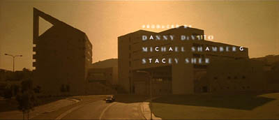
Gattaca.
David’s two bits:
I saw ten films across three days and four nights.
The Virginia theatre did special justice to Gattaca. Writer-director Andrew Niccol used the anamorphic format imaginatively, a bit in the chilly manner of THX-1138, and the framings appeared to full effect on the 56-by-23-foot screen. This time I noticed how much the credit sequence, with only the G-A-T-C letters appearing first, owes to Godard. Like Alphaville, Gattaca uses not artificial sets but actual buildings to evoke the near future.
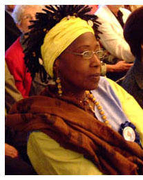 I thought that Moolade held up well on my second viewing, and the post-film discussion with the main performer Fatoumata Coulibaly (right) and Professor Samba Gadjigo was informative. The film’s call for an end to female genital mutilation is typical of Osmane Sembene’s use of controversial material; Professor Gadjigo recalled that Sembene calls his cinema a “night school” for Africa. Ms. Coulibaly said that in production “Papa Sembene” wouldn’t make eye contact with her, but before filming a painful sex scene he told her that she was “doing the scene for future generations.”
Sadie Thompson was still fine, I thought, with Walsh’s skill in cutting and staging exemplifying what Hollywood could do so easily in 1928. Swanson of course is tremendous in the role, using her whole body to tell the story of a woman who’s not as hard-edged as she makes out. The score by Joseph Turrin, conducted by Steve Larsen, was discreet and compelling.
La Dolce Vita seemed to me not to wear so well. I hadn’t seen it in at least twenty years, and its pacing and dramatic point-making appearing at once heavy and unfocused. Still, the film has that patented Fellini verve, and its daring fresco-like structure makes it a remarkable experiment in panoramic storytelling. It’s historically an enormously important film, and Jackie Reich illuminated it in our onstage discussion afterward. She has just published a book on Mastroianni’s career, Beyond the Latin Lover.
Of the items that were new to me:
The Weather Man took me by surprise, not only for its glum tone and antiheroic protagonist but also for its refusal of a tidy happy ending. Of Steve Conrad’s screenplay, Gil Bellows remarked that “one of the things that he can do is make you cringe for a character.” To his credit, Gore Verbinski, of Pirates of the Caribbean fame, found this uneasy domestic drama/ comedy a congenial project.
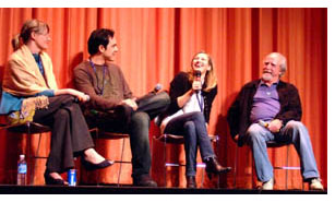 Come Early Morning by Joey Lauren Adams was a clear-eyed character study of an intelligent, flawed woman. Lacking villains and almost lacking heroes, it captures the rhythms of life in a small Arkansas town. Our protagonist, quietly efficient in her job, is caught in family and romance problems as she moves from man to man in a beery stupor. It was tactfully directed by Adams and graced by the underappreciated Ashley Judd. The Weather Man concludes with our hero facing us in close-up, but Come Early Morning ends with the protagonist turned away; in each case, the image feels right. On the left, Lisa Rosman, Eric Byler (Charlotte Sometimes), Joey Lauren Adams, and Scott Wilson (who plays the protagonist’s father).
I must be the last person in North America to see Holes. Its tight plot, clever humor, and easygoing handling of racial matters endeared it to me. As in old Disney fare, familiar actors (Jon Voigt, Sigourney Weaver, Robin Wright Penn, Tim Blake Nelson) are willing to ham it up for the kids, with enjoyable results. And I was startled by the intricate flashback structure on offer; are kids now being trained to follow movies like 21 Grams? Given the interracial love story at the movie’s center, I had a new angle on what Walden Media might be contributing to modern Hollywood, something valuable that escapes cliches about “family-friendly” and “faith-based” entertainment.
Man of Flowers was a crowd-pleaser. I admired Paul Cox’s visuals, though the grainy print probably didn’t do justice to the range of dark tones in the original. An exercise in portraying a wealthy man’s obsessions and their sources in childhood, it moved toward Buñuel’s Archibaldo del Cruz, but it wasn’t prepared to be as lurid or delirious. A bit too dry and tasteful, perhaps. Still, I admire patient, unshowy long takes, and Man of Flowers is full of them. The photo above shows Paul reading a heartfelt tribute to Roger.
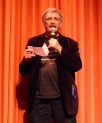
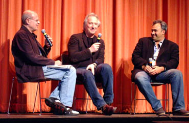
Perfume: The Story of a Murderer was much liked by the audience, and the presence of Alan Rickman made it all the more pungent. I wanted to like it more than I did. Despite my admiration for Tom Tykwer’s other films, particularly Winter Sleepers, The Princess and the Warrior, and Heaven, this one struck me as an overproduced Euro effort at a Big Movie. I thought it overdid the camera tricks (slow-mo, ramping) and the insistence on stuffing every shot with details (e.g., fish, cobwebbed glassware, glistening golden liquids). Above, you see the great actor with Festival Director Nate Kohn and entertainment analyst David Poland.
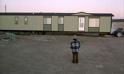
The simple and modest Stroszek was, for me, better at evoking smells—for instance, the stale smoke of the Himmel bar that our hero frequents. The print was faded and weatherbeaten, but the mysterious simplicity of this modern classic came through. The Wisconsin scenes, shot in Plainfield thirty years ago, wouldn’t need much changing today. As usual, I enjoyed the porous, unpredictable plot and Herzog’s willingness to dwell on unfathomable moments like a premature baby with powerful fingers (sleeping, he looks like a wrinkled alien) and the warped imagery of people passing a prison, seen through a hanging water bottle. The dancing chicken became one of the top screen icons of the 1970s.
Now for some quotes I like.
*Gattaca producer Michael Shamberg: “In the pilot scenes of Top Gun, Tom Cruise doesn’t wear his oxygen mask.” Ebertfest blogger Lisa Rosman: “It’s Scientology.”
*“None of the people I write about have friends.” Steven Conrad, screenwriter.
*“The US and Europe are my market. Africa is my public.” Osmane Sembene, quoted by Samba Gadjigo.
*Werner Herzog gave Roger Ebert an early alert about the importance of Anna Nicole Smith in American culture: “The poet must not avert his eyes.”
*“When I pray, I pray to Jesus.” Joey Lauren Adams.
*“Ambiguity in everyday life isn’t exactly celebrated in most movies. . . . It’s great when a big movie celebrates unnameable things.” Alan Rickman on Perfume.
*“Alan, be more subtle—do more.” Ang Lee to Alan Rickman, directing Sense and Sensibility.
*Why did Michael Wiese move to Penzance? “I was in a Witness Protec—oops.”
*“I’ve learned more about directing by working with bad directors than with good ones. And I’ve worked with a lot of bad directors.” Joey Lauren Adams.
*“Sometimes I think I’d like to join another species. . . . They seem to live a more sensible life.” Paul Cox.
*“Our technological civilization is not sustainable on this planet. Nature is going to regulate us very quickly. . . .We’ll be the next ones [to go extinct]. But that’s okay. Let’s enjoy movies and friendship and beer.” Werner Herzog.
*“I saw perhaps three or four films last year. I love cinema, but I’m not a cinephile.” Werner Herzog.
And some portraits of Ebertfest regulars:
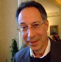
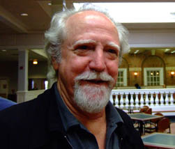
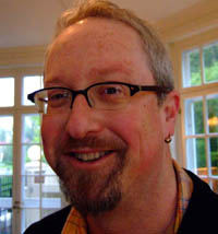
First: Michael Wiese, filmmaker (Hardware Wars, The Sacred Sites of the Dalai Lamas) and publisher of outstanding books on the art and craft of film. Next, actor Scott Wilson (In Cold Blood, Junebug, The Host, and many more). Finally, Jim Emerson, who runs Roger’s website and writes fine film criticism at Scanners.
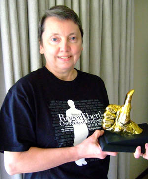
Each year, several guests receive an Ebert Thumb. This year, Kristin was one of the lucky ones.
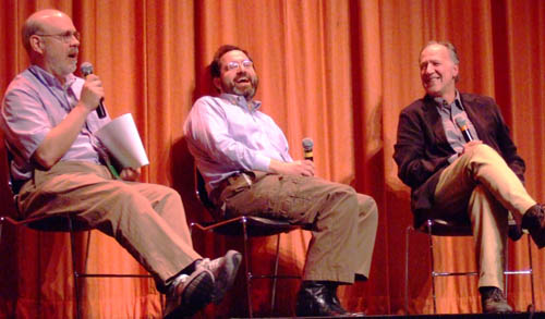
Finally, here I am with Michael Barker, co-president of Sony Pictures Classics, and Werner Herzog. All I said was that I was from Wisconsin….
I plan to blog again soon about Roger and his contributions to filmmaking and film culture. For now, let me just echo Kristin’s opening point that his passion for film is exceeded only by his enjoyment of other people. This weekend’s gathering of top-rank filmmakers, young and old, and the enthusiastic audiences showed that he is probably the most deeply loved film critic whom we have ever had.
Cinema for cheeseheads
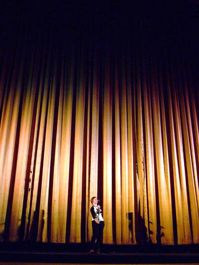
Meg Hamel introducing a film at the gigantic Orpheum Theatre.
DB here:
Today a chatty, catching-up blog filled with peekaboo links. Lots to do, know what I mean? Or do you?
Excuses, excuses
Kristin and I meant to blog about the Wisconsin Film Festival last weekend. We really did. But I missed the first night because my plane from Hong Kong got in late, and on Saturday I felt enough jetlag to mope around in a desultory fashion. I did see Fay Grim, Ten Canoes, Vanaja, and of course Johnnie To’s Exiled (better than ever on that CinemaScope Orpheum screen). Kristin saw several more films than I did, and that was part of the problem: She was too busy watching films to blog about them. By the time she finished, the festival was over and we faced some looming deadlines.
Regrettably, we simply let our festival blog go. Kristin drove off to Toledo for a conference of the American Research Council in Egypt. A fine conference it was too, but preparing for that took away some time for blog duties. To meet our Internets obligations, I pulled out a general essay that was sitting on the shelf. It turned out to be one of our most popular ever.
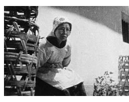 Over the same days I was occupied with two publishing projects. First is the online version of my 1988 book Ozu and the Poetics of Cinema, available here. In the original book, the frames taken from color films were reproduced in black and white. Markus Nornes of the University of Michigan, who first suggested putting the book online, wanted to replace those with color frames. Since virtually all the book’s pictures came out poorly in the pdf scans posted online, we decided to replace the black-and-white images with scans from my original negatives. Kristi Gehring, our stalwart assistant, digitized all the black-and-white stills, and Markus found the color frames. So in the next few months the good folks at the University of Michigan should be replacing the tawdry stills with nicer ones. A bonus: Markus and his colleagues are working on giving the stills a click-to-enlarge feature.
I’ll also be adding a new Foreword to the book. That will reflect on the book’s approach and its reception, and I’ll add corrections and new thoughts. In all, the updated online version should be available in late September. It’s been quite a struggle to revive the old thing, as I’ve chronicled earlier, but several people have taken a lot of trouble to help, and I’m grateful. Because, you see, I believe that Ozu is the greatest filmmaker who ever lived.
The second publishing project is my Poetics of Cinema collection. Delays, endemic in academic publishing, have pushed it past its spring release date. I’ve just gotten page proofs, and indexing should take place in August. So the thing is now slated for October. It’s rather big and expensive: 500 book pages, with about 500 stills. About half the essays are new to the volume. If you want to lay down your plastic before seeing it, you can order it here.
Coming attractions
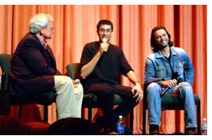 At the moment we’re preparing for Roger Ebert’s Festival of Forgotten and Overlooked Films, which comes up later this week. Previous years’ sessions have been excellent. Alongside, you see a 2006 photo of Roger interviewing Ramin Bahrani and Ahman Razvi, director and principal actor of Man Push Cart. Ramin’s new film, Chop Shop, is now in the Directors’ Fortnight at Cannes.
This year should be lots of fun: a chance to meet Herzog, Alan Rickman, Joey Lauren Adams, and other creative film folk…and to see Roger and Chaz again. The films run the gamut from Holes to Beyond the Valley of the Dolls. Kristin and I will be moderating the screening of Sadie Thompson, with an orchestral score by Joseph Turrin. Another musical event: a performance by Strawberry Alarm Clock. (Now I do feel old.) We hope to post at least one blog, with pix of course. Other blogomanes will be present, notably the audacious David Poland and the hyperenergetic Jim Emerson.
Speaking of festivals: the biggest of them all is coming up, and to celebrate it Turner Classic Movies is running, on 16 May, Richard Schickel’s documentary Welcome to Cannes. It samples the glitz but also affords information about the caste system of screening passes, the role of Cannes in easing films into the world market, and even the harm that a Cannes prize can do to a director. There’s neat footage of Godard and Truffaut preparing to shut down the festival in May of 1968–an event that a couple of interviewees claim was a turning point in the festival’s history. Along with the docu, TCM will screen four Palme d’or nominees/winners: The Big Red One, Blowup, Taxi Driver, and Pale Rider. But one question remains: Why does nobody think of the French as cheeseheads like us?
 When we get back to Madison from Ebertfest, we have just enough time to pack for a month in New Zealand. Brian Boyd has arranged for us to come as guest lecturers to the University of Auckland, under the auspices of the Hood Fellowship.
Kristin will be lecturing mostly from her Lord of the Rings study, The Frodo Franchise (for instance, here), but she also offers a talk on her Amarna research. I’ve got a more varied agenda: talks on CinemaScope, on ShawScope, on the history of cinema style, on the cognitive approach to film theory, and on scene transitions, as well as a visit to the Philosophy department. One or more of these items may materialize as an essay on this site some day. We’ll also be visiting the University of Otago, in Dunedin, for a brief stay and a lecture apiece.
While dwelling among the Kiwis, I hope to write a short online essay reflecting on our 1985 book The Classical Hollywood Cinema, which amazingly still arouses some discussion. I’ll also be thinking about plans for two further books, one on Hong Kong cinema and the other on a new approach to film theory.
We’re planning to maintain our blog while we’re away, recounting our activities down under, and posting some more general pieces that I’ve already prepared.
Just butter, hold the popcorn
But what about our film festival just past? To be blunt: A hell of a time was had by all. We screened 182 films and attracted our biggest audience to date, with 28,700 tickets sold. Not bad for a festival that starts on Thursday night and ends on Sunday night, held in a town of about 240,000. Isthmus, our free arts-and-politics paper, offered an outstanding preview, and other local coverage was enthusiastic, natch. The event earned a glowing first-page write-up from Charlie Olsky in Indiewire. The official wrapup is here. For more on Madison cinephilia, go to our earlier entry.
We know whom to thank. Festival director Meg Hamel, The Boss of It All, is pictured at the top, channeling Judy Garland’s Palladium sessions. Technical supervisors Erik Gunneson and Jared Lewis are the calm and cheerful gents pictured below. We also owe a lot to Tom Yoshikami, Karin Kolb, Stew Fyfe, and a host of volunteers, as well as to several university agencies, notably the Department of Communication Arts and the International Institute.
With Sundance 608 opening in a couple of months, we might be able to spread next year’s fest between the downtown (cozy, near the students, lots of eateries) and the west side (the Borders-Whole Foods demographic). And with our University Cinematheque screening weekly, Madison film culture offers something for everybody.
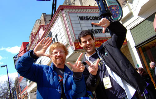
Erik and Jared pay homage to the canted angles of Hartley’s Fay Grim.
But what kind of art?
2046.
From DB:
We don’t have to think of film as an art form. A historian can treat a movie as a document of its time and place. A war buff could scrutinize Eastwood’s Iwo Jima movies for their accuracy, and a chess expert could sieve through Looking for Bobby Fischer to discover, move by move, what matches were dramatized. But most of the time we assume that cinema is an art of some sort.
Not necessarily high art. Cinema is often a popular art, or in Noël Carroll’s phrase, a mass art. From this angle, there’s no split between art and entertainment. Popular songs are undeniably music, and best-selling novels are instances of literature. Similarly, megaplex movies are as much a part of the art of film as are the most esoteric experiments. Whether those movies, or the experiments, are good cinema is another story, but cinema they remain.
So, at least, is our position in Film Art: An Introduction. We draw our examples from documentaries, animated films, avant-garde films, mainstream entertainment vehicles, and films aimed at narrower audiences. In other writing, Kristin has done research on high-art movements like German Expressionism and Soviet Montage (she wrote her dissertation on Ivan the Terrible), but she’s also written about popular cinema from Doug Fairbanks to The Lord of the Rings. I’ve indulged my admiration for Hou and Dreyer but also I’ve tried to tease out the aesthetics of Hong Kong action pictures and contemporary Hollywood blockbusters. Ozu gives us the best of both worlds: one of cinema’s most accomplished artists, he was also a popular commercial filmmaker.
Still, people who look upon cinema as an art don’t necessarily share the same conceptions of what kind of art it is. We have different conceptions of cinema’s artistic dimensions, and we won’t find unanimity of opinion among filmmakers, critics, academics, or audiences.
When we study film theory, this sort of question comes to the fore, and so today’s blog will be a bit more theoretical than most. Don’t let that scare you off, though; I’m trying for clarity, not murk.
Dimensions
People have tended to think of cinema as an art by means of rough analogies to the other arts. After all, film came along at a point when virtually all the other arts had been around for milennia. It’s commonly said that film is the only artform whose historical origins we can determine. So it’s been natural for people to compare this new medium with older arts.
Here are the dimensions that come to my mind:
*Film is a photographic art.
*Film is a narrative art.
*Film is a performing art.
*Film is a pictorial art.
*Film is an audiovisual art.
Let me say off the bat that I think that film is a synthetic medium, in the sense that all these features and more can be found in it. It’s like opera, which is at once narrative, performative, musical, and even pictorial. I mark out these dimensions simply to show some emphases in people’s thinking about cinema. As we’ll see, these ideas can be mixed together in various ways.
Film as a photographic art.
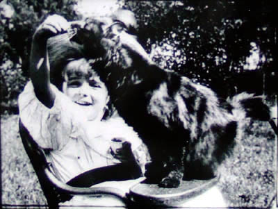
La petite fille et son chat (1900).
For many early filmmakers, such as the Lumière brothers (above), cinema was a means of capturing reality, documenting the visible world. Movies were moving photographs. Naturally, this conception of cinema leads us to treat documentary as the central mode of filmmaking.
It’s an appealing idea. G.W. Bush reading “My Pet Goat” wouldn’t be as revelatory presented as a painting or a theatre performance. On film we can see the event as it occurred and judge it as if we were in the same room. Even in fictional cinema, you can argue, the physicality of the actors, the tangibility of the setting, and the details–a train’s pistons, wind rustling through grass–could not be rendered, or even imagined, so powerfully in a non-photographic medium. In addition, consider Jackie Chan. His stunts are astonishing partly because we know he really did them and the camera photographed them. In an animated film, or a CGI-based one, a character’s acrobatics or brushes with death aren’t so thrilling.
The great film theorist André Bazin claimed that cinema’s photographic basis made it very different from the more traditional arts. By recording the world in all its immediacy, giving us slices of actual space and true duration, film puts us in a position to discover our link to primordial experience. Other arts rely on conventions, Bazin thought, but cinema goes beyond convention to reacquaint us with the concrete reality that surrounds us but that we seldom notice.
I think that Bazin’s idea lies behind our sense that long takes and a static camera are putting us in touch with reality and inviting us to notice details that we usually overlook in everyday life. (I try out this line of argument in relation to the tactility of Sátántangó here.) Moreover, you can argue that in treating cinema as a photographic art the filmmaker surrenders a degree of control over what we see and how we see it. Bazin made this claim about the Italian neorealists and Jean Renoir: creation becomes a matter of an existential collaboration between humans and the concrete world around us.
An example I used in my book Figures Traced in Light pertains to a moment in Hou Hsiao-hsien’s Summer at Grandfather’s, when a tiny toy fan falls between railroad tracks as a locomotive roars past. The fan’s blades stop, then spin in the opposite direction as the train thunders over it. The blades reverse again when the train has gone. (This detail might not be visible on video.) Did Hou know how the fan would behave? Isn’t it just as likely he simply discovered it after the fact, making his shot a kind of experiment in the behavior of things? Conceived as a species of photography, cinema can yield visual discoveries that no other art can.
Interestingly, cinema didn’t have to be photographic. Many early experiments with moving images were made with strips of drawings, such as the Belgian Émile Reynaud’s Praxinoscope. You can argue that recording glimpses of the world photographically simply proved to be the easiest way to obtain a long string of slightly different images that could generate the illusion of movement. Some filmmakers, such as George Lucas, hold that filmmakers are no longer tied to photography, and that the digital revolution will allow cinema to finally realize itself as a painterly art. More on that below.
Film as a narrative art.
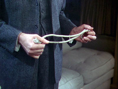
Rope.
This is at the core of Hollywood’s explicit concerns. Producers, directors, crew, and of course screenwriters will agree that Without a good story, the movie fails. Our Indie and Indiewood filmmakers say they’re trying to find fresh stories, the ones that “haven’t been told yet.” Overseas filmmakers dominated by Hollywood tell us, “We have our own stories to tell.” Even the most celebrated arthouse filmmakers often say they’re interested in character as revealed through action. Resnais, Rivette, Fassbinder, Haneke, and all the rest may have told unusual stories, but still they told ’em.
Likewise, many viewers will say that they go to the movies to experience a story. Reviewers online and in the popular press, if they do nothing else, are obliged to sketch out the film’s plot, though they mustn’t give away the ending. Even in academia, most discussions of films focus on what happens in the narrative.
When we consider film genres, we’re usually concentrating on the narrative aspects of them. Most genres display typical characters and plot patterns. The backstage musical features aging stars and young hopefuls, caught up in the process of putting on a show. The horror film typically centers on a monster’s attack on humans, who must fight back. One type of science fiction shows us an overweening scientist striving to go beyond “what is proper for humans to know.” Both fans and scholars discuss other aspects of genre films, but narrative is often central to their concerns.
Historians have traced in great detail how filmmakers employed cinema as a narrative art, but we’re making more discoveries all the time. How, for instance, have films signaled flashbacks? How do they let us know we’re in a character’s mind, or attached to his or her optical point of view? How have they structured their plots? Can we pick out distinct approaches to narrative–in various periods, or genres, or national cinemas? How have narrative conventions changed over the years? Some of the answers Kristin and I have proposed can be found elsewhere on this site, and in our books and articles.
Film as a performing art.
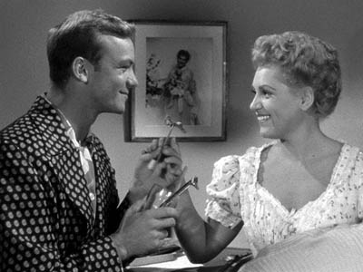
The Marrying Kind.
In the West, since Plato and Aristotle we’ve distinguished between verbal storytelling and dramatic presentation, or performance. Films may be stories, but they’re not exactly told: they’re enacted. At Oscar time, we’re especially conscious of this analogy, for the Actor/ Actress nominees usually garner the most public attention.
Hollywood acknowledged cinema as a performing art in the 1910s, when it created the star system. The Star reminds us that film acting isn’t exactly the same as theatre acting, since an elusive charisma puts the performance across. John Wayne, Marilyn Monroe, Keanu Reeves, and many other “axioms of the cinema” aren’t good actors by stagebound standards, but once they show up on screen, you can’t take your eyes off them. This notion intersects with the photographic premise: we say that the camera seems to love them.
You can argue that Andy Warhol revamped this idea. His superstars weren’t photogenic by ordinary standards but their almost clinical narcissism and exhibitionism, captured by the camera, made them as mesmerizing as any matinee idols. Warhol films like Paul Swann create rather disturbing emotions by putting us in the presence of an awkward performer.
Reviewers place a premium on a movie’s performance dimension. After they’ve told us a bit of the plot , they appraise the job the actors did. Some ambitious critics have written wonderful appreciative essays on acting, as in Andrew Sarris’s “You Ain’t Heard Nothin’ Yet” and the collection OK You Mugs. See also the two collections of articles by Gary Giddins, which I discuss in an earlier blog.
Academic film studies has been slow to study acting systematically, partly because of a bias against considering cinema as a theatrical art, and partly because acting is very hard to analyze. But Charles Affron, Jim Naremore, Roberta Pearson, and Ben Brewster and Lea Jacobs have greatly helped us understand performance practices. They show, among other things, that it isn’t just a matter of the face or the voice: a fluttered hand or a willowy stance can be as powerful as a frown or a line reading.
Film as a pictorial art.
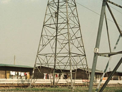
Ohayu (Good Morning).
Progressive opinion in the silent era tended to deny that film was a performing art, since that would make it a form of theatre. No, film had unique capacities. Cinema was essentially moving pictures.
It was a visual art that unfolded in time, so a movie was neither quite the same as a painting (frozen in time) or as a stage play (not pictures but three-dimensional reality). The coming of sound somewhat reduced the appeal of this line of argument, but to a very great extent, students of film technique still emphasize cinema as a visual art.
Theorists argued that the film frame was a pictorial field, not a proscenium stage. Action unfolded in the frame in ways that dynamized space. The choice of angle, camera distance, camera movement, and the like created a visual fluidity that had no equivalent on stage or in other graphic arts. Even cinematic staging was quite different from blocking in a theatrical space. Add to this the ability to join one strip of pictures to another via editing, and we have a unique pictorial artform.
The theorists of the silent era, like Rudolf Arnheim and the Russian montagists, gave us a vocabulary and an orientation to studying visual style, but their legacy hasn’t been fully developed. Journalistic reviewers typically don’t pay that much attention to the way movies look. Nor, surprisingly, do academics. Film studies departments seldom pursue research into visual style and structure.
Here the professors are out of sync with the people whose work they study. Manuals and film schools teach composition, lighting, cutting, camera placement and the like. Professional filmmakers all over the world often think in pictures; they prepare shot lists and storyboards and care very much about the color values and editing patterns of the finished work. We can see their interest in visuals in DVD commentaries and supplements, and as viewers start to absorb bonus materials, perhaps their interest will be whetted too.
Needless to say, a number of avant-garde filmmakers, from Viking Eggeling and Walter Ruttmann to Deren, Brakhage, Ernie Gehr, James Benning, and Nathaniel Dorsky, have also thought of cinema as having the power to refresh, even redeem, our vision. But many of the most important directors aiming at broader audiences are also renowned for their visual styles. To mention just a few: Griffith, Feuillade, Sjostrom, Keaton, De Mille, Murnau, Lang, Dreyer, Lubitsch, and Dovzhenko; Ford, Hitchcock, and von Sternberg; Renoir, Ozu (above), Mizoguchi, and Ophuls; early Bergman, Antonioni, Jancsó, Resnais, Angelopoulos, Tarr, Tarkovsky, Kieślowski, Kiarostami, and Makhmalbaf; Scorsese, Spielberg, Michael Mann, and Tim Burton. Some, like Oshima, Sokurov, and Johnnie To, have been polystylistic, exploring many different visual pathways.
Film as an audiovisual art.
In the 1920s, many theorists feared the coming of synchronized sound, since that would thrust film back toward theatre. The “talkies” would sacrifice visual artistry to Broadway dialogue. This worry was mistaken, but I can sympathize. Probably the mandatory silence of early film pushed filmmakers to find means of visual expression. Would we have Chaplin and the other clowns if they could have spoken at the start?
Yet a great deal of sound cinema wasn’t canned theatre. Film became a synthetic medium blending imagery, the spoken word, sound effects, and music into something that was neither painting nor theatre nor illustrated radio.
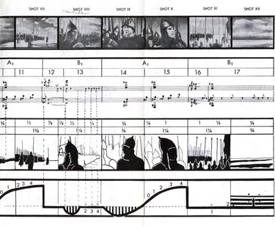
Though he’s thought of as the premiere theorist of editing, Eisenstein actually developed this idea of audio-visual synthesis. He was fascinated by the ways in which images and music worked together, creating an idea or feeling that couldn’t be expressed by either one. If shot A followed by shot B gave us something that wasn’t present in either one, then why couldn’t shot A and sound B yield the same results? He believed that Disney’s 1930s films were the strongest efforts in this direction, as when a peacock fanned out his tail to a rippling melody. Eisenstein called it “synchronization of senses.”
Eisenstein sometimes pushed this idea pretty far. His remarkable analysis of one sequence in Alexander Nevsky (sample above) tried to show how the movement of the viewer’s eye across a suite of shots actually mimicked the movement of the music. He made the case tough for himself because the shots contain almost no movement within them: Eisenstein claimed that we read the compositions from left to right, in time with the musical chords!
Not only Disney but many filmmakers of the 1930s experimented with audiovisual fusion–Kozintsev and Trauberg in Alone, Pudovkin in Deserter, Mamoulian in Love Me Tonight, Renoir in the final danse macabre of Rules of the Game, and Busby Berkeley’s Warners and MGM musicals. Welles made Citizen Kane a feast of audio-visual echoes, as when the wobbly descent of Susan’s singing voice is matched by the flickering of a stage light that finally goes out.
With magnetic and multichannel recording in the 1940s and 1950s, filmmakers could compose very complex sound mixes, and later improvements offered still more possibilities. After Star Wars and Close Encounters of the Third Kind, we expected a movie to be an immersive audiovisual experience, like the light show at a rock concert. Scorsese, especially in Raging Bull and Goodfellas, created powerful mergers of music, sound effects, camera movement, and character movement. So did the Hong Kong kung-fu films of the 1970s and early 1980s. The spellbinding languor of Wong Kar-wai’s films stems largely, I think, from their synchronization of color, slow motion, drifting camerawork, and evocative music.
The avant-garde has pursued more elusive synchronizations of sense modes.The idea of synthesis was floated in the silent era, when experimenters like Oskar Fischinger used musical pieces to anchor their abstract imagery. This tendency has resurfaced in music videos, some of which (Michel Gondry’s in particular) have clear links to the experimental tradition. So too do the shorts and features of Peter Greenaway, especially in his collaborations with composer Michael Nyman. In a film like Prospero’s Books, Greenaway seems to follow Eisenstein in imagining a Wagnerian synthesis of writing, image, and sound.
By contrast, Godard explores all manner of unpredictable junctures between image and sound, with the tracks teasing us but always avoiding a complete coordination. Somewhat similar are the disjunctive image/sound juxtapositions in Peter Kubelka’s Unsere Afrikareise and Bruce Connor’s Report, or the inverse and retrograde organizations of Structural Film soundtracks like Michael Snow’s Wavelength and J. J. Murphy’s Print Generation.
Film academics have begun to analyze image/ sound juxtapositions, studying the development of early talkies and more recent Dolby technology. Arguably, film researchers now pay more attention to music than they pay to imagery. By contrast, most journalistic critics ignore a film’s soundtrack, except occasionally to comment on line readings and pop tunes. As for ordinary audiences, perhaps DVD and home theatre technology have made people more aware of how movies can saturate our senses with audiovisual correspondences.
Three waivers
1. Once I floated these distinctions in a seminar discussion, and a participant mentioned that cinema was also an emotional art. I’d agree that a lot of cinema aims at arousing feelings, but this idea can be found in all the dimensions I traced. Each conception of film favors different means of stirring up emotion.
For example, the photographic approach holds that recording and revealing the world is the most effective way to move spectators, while the narrative approach favors stories as the means to that end. The performance-based approach trusts that we’ll react empathetically to the emotional states displayed by our fellow humans, but the visual-art approach says that cinema can arouse feeling by manipulating pictures in time and space, perhaps even pictures that don’t show any people at all. Eisenstein argued that synchronization of senses was the most powerful form of emotional stimulation, creating in the viewer an “ecstasy” comparable to religious fervor. Beyond these general considerations, it would be worthwhile to tease out the different sorts of emotion that each perspective tends to emphasize.
2. Someone else might ask: What about other analogies? Filmmakers and critics have sometimes compared cinema to music or poetry. Shouldn’t those arts be added to the list?
I think that these comparisons show up principally within the broad idea of film as a pictorial art. The French Impressionist directors of the silent era thought that they were making “visual music,” and Brakhage and Deren’s conceptions of the “film lyric” were mainly pictorial. (See girishshambu for thoughts on the latter.) I’d suggest that filmmakers in the pictorial-art camp have looked to these adjacent arts for models of patterning (meter, rhythm, motif development) and imagery (metaphor and subjective states in lyric verse). Filmmakers are also attracted to the idea that music and poetry tend to be suggestive rather than explicit, conveying powerful feelings in elusive and open-ended ways.
Polemically, filmmakers often conjure up these musical and literary analogies to counter the mainstream cinema’s emphasis on narrative and performance. If we think of film as lyric or rhapsody, story seems less important. The same thing goes, I think, for thinking of film as moving architecture or kinetic sculpture; the analogy again targets film’s pictorial dimension and its non-narrative potential.
3. To think of film as having an affinity with another art form isn’t to say that they’re identical. Thinking of cinema as a performance-based art, for example, doesn’t commit you to saying that film acting is the same as theatrical acting. Instead, thinking along these lines seems to create a first approximation, an initial comparison that lets you move on to notice differences. Once you consider film as a pictorial art, you can then ask in what ways it differs from other pictorial arts, or in what ways this particular movie transforms or reworks the techniques of painting. Ballet Mécanique, which we analyze in Film Art (pp. 358-366), owes a lot to cubism, but its imagery isn’t identical to what Picasso, Braque, and Gris came up with on canvas. All of these analogies seem to work best as frameworks for sensitizing us to both similarities and differences between film and other arts.
And . . . so?
Twin Peaks: Fire Walk with Me.
Each conception of film art harbors a good portion of truth. Each may fail to cover all of cinema, but for certain types of film, or particular movies, some are likely to be more helpful than others.
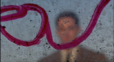
For example, it’s useful to consider David Lynch as making audiovisual works, in which blinking lights or grooves in pine planks seem uncannily synchronized with throbs and hums and Julee Cruise vibrato. Very often story and acting seem to precipitate out of an enveloping pictorial/auditory atmosphere. This isn’t to say that you couldn’t study narrative or performance in Lynch films; it’s just that taking up the audiovisual-mix perspective will throw certain aspects into sharper relief.
You could also argue that the Hollywood studio era blended many of these appeals into a single strong tradition. Story was important, but so was performance. Visual style was often striking, but so too was an expressive soundtrack that went beyond simply recording the dialogue. Sound effects, musical scores, and verbal hooks between scenes created imaginative resonances with the image track. Contrariwise, we can see some avant-garde traditions as taking a purist tack. In several of his films, Brakhage reduces narrative, purges performance, and bans sound: we have to engage wholly and solely with a pictorial experience.
Just as we can distinguish film traditions along these dimensions, we can contrast writers and thinkers. Some critics are very good in pinning down performance qualities, others excel at plot dissection or visual analysis. Arnheim is sensitive to pictorial values but he has little to contribute to understanding storytelling.
Bazin and Eisenstein are attuned to several of the dimensions I’ve traced out. Bazin’s interest in cinema’s photographic basis also alerted him to pictorial possibilities, like deep-focus and camera movement. Eisenstein, famous for his ideas on cinema’s visual dimension, was as I’ve said interested in sound as well. He was no less concerned with film performance, which he conceived as expressive movement (to be synchronized with properties of the image and the soundtrack). But he voiced almost no interest in narrative or photography.
I warned you that this blog would be theoretical, but I hope the takeaway message is clear. Cinema is teeming with artistic possibilities, and each of these frameworks can illuminate certain areas of choice and control. We don’t need to pick a single creed to live by, but we deepen our understanding of film by being sensitive to as many as we can manage.
