Archive for April 2009
Books, an essential part of any stimulus plan
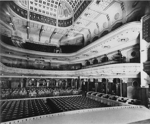
The Pathé Palace theatre, Brussels, designed by Paul Hamesse.
DB here:
Some shamefully brief notes on new publications. Disclaimer: All are by friends. Modified disclaimer: I have excellent taste in friends.
You call me reductive like that’s a bad thing
It’s easy to see why we might tell each other factual stories. We have an appetite for information, and knowing more stuff helps us cope with the social and natural world. We can also imagine why people tell fictitious stories that we think are true. Liars want to gain power by creating false beliefs in others. But now comes the puzzle. Why do we spend so much of our time telling one another stories that neither side believes?
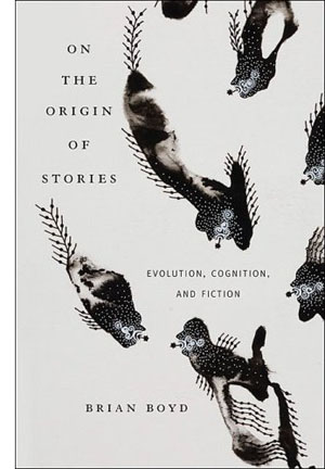 Brian Boyd’s On the Origin of Stories: Evolution, Cognition, and Fiction (Harvard University Press) is the first comprehensive study of how the evolution of humans as a social, adaptively flexible species has shaped our propensity for fictional narrative. The book is a real blockbuster, making use of a huge range of findings in the social and biological sciences. Brian paints a plausible picture, I believe, of the sources of storytelling. Along the way he shows how two specimens of fiction, The Odyssey and Horton Hears a Who, exemplify the richness and value of make-believe stories.
The standard objection to an evolutionary approach to art is that it’s reductive. It supposedly robs an individual artwork of its unique flavor, or it boils art-making down to something it isn’t, something blindly biological. Art is supposed to be really, really special. We want it to be far removed from primate hierarchies, mating behavior, or gossip. For a typical criticism along these lines, see this review of Denis Dutton’s The Art Instinct. Brian has already adroitly responded to this sort of complaint here. See also Joseph Carroll’s examination of reductivism on his site.
It seems to me that all worthwhile explanations are reductive in some way. They simplify and idealize the phenomenon (usually known as “messy reality”) by highlighting certain causes and functions. This doesn’t make such explanations inherently wrong, since some questions can be plausibly answered in such terms. For example, often the literary theorist is asking questions about regularities, those patterns that emerge across a variety of texts. That question already indicates that the researcher isn’t trying to capture reality in all its cacophony. (For me, it’s all about the questions.)
Literary humanists sometimes talk as if they want explanations to be as complex as the thing being explained. But that would be like asking for the map to be as detailed as the territory. In fact, however, humanists tacitly recognize that explanations can’t capture every twitch and bump of the phenomenon. Consider some types of explanations that are common in the humanities: Culture made this happen. Race/ class/ gender / all the above caused that. Whatever the usefulness of these constructs, it’s hard to claim that they’re not “reductive”—that is to say, selective, idealized, and more abstract than the movie or novel being examined. Likewise, when people decry evolutionary aesthetics for its “universalist” impulse, I want to ask: Don’t many academics take culture or the social construction of gender to be universals?
I want to write more about Brian’s remarkable book when I talk about our annual convention of the Society for Cognitive Studies of the Moving Image. For now, I’ll just quote Steven Pinker’s praise for On the Origin of Stories: “This is an insightful, erudite, and thoroughly original work. Aside from illuminating the human love of fiction, it proves that consilience between the humanities and sciences can enrich both fields of knowledge.”
Faded beauties of Belgium
In its day, Brussels played host to some fabulous picture palaces. Now after years of research Isabel Biver has given us a deluxe book, Cinémas de Bruxelles: Portraits et destins. It’s the most comprehensive volume I know on any city’s cinemas.
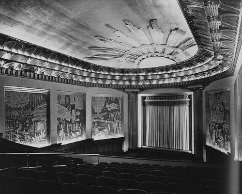
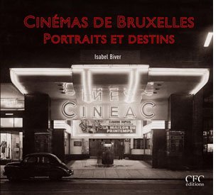 Isabel glides backward from contemporary multiplexes and tiny repertory houses to the grandeur of the picture palaces. The Eldorado was a blend of Art Deco style and quasi-African motifs sculpted in stucco. King Albert graced the opening in 1933. There was the Variétés, a multi-purpose house built in 1937. It had rotating stages, air conditioning, and space for nearly 2000 souls (cut back to a thousand when Cinerama was installed). It was, Isabel claims, the first movie house in the world to be lit entirely by neon.
Then there was the Pathé Palace, shown at the top of this entry. Dating back to 1913, it boasted 2500 places and included cafes and even a garden. This imposing Art Nouveau building was designed by Paul Hamesse, probably the city’s most inspired theatre architect. Hamesse also created the Agora Palace, which opened in 1922. Huge (nearly 3000 seats), the Agora was one of the most luxurious film theatres in Europe.
And we can’t forget the Métropole, the very incarnation of the modern style. Sinuous in its Art Deco lines, it packed in 3000 viewers. When it opened in 1932, it attracted nearly 53,000 spectators during its first week. The neon on the Métropole’s façade lit up the night, and its two-tiered glassed-in mezzanine became as much a spectacle as the films inside. See the still at the bottom of this earlier entry of mine. A ghost of its former self still sits on the Rue Neuve. Local historians consider the failure to preserve the Métropole a scandal in the city’s architectural history.
Cinémas de Bruxelles is a model presentation of local theatres. Not only does it trace the history of the major houses, but it includes a glossary of terms, a large bibliography, and an index of all theatres, both central and suburban. Needless to say, it is gorgeously illustrated. Whether or not you read French, I think you would enjoy this book, for it evokes an age we’re all nostalgic for, even if we didn’t live through it.
A TV interview with Isabel in French is here, with glimpses of what remains of the Métropole. She also gives guided tours of the remaining cinemas in the city center and in the neighborhoods. More information here.
A guy named Joe
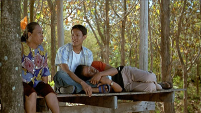
Tropical Malady.
It’s seldom that a young filmmaker gets a hefty book devoted to him. Apichatpong Weerasethakul (aka Joe) will turn forty next year. He comes from Thailand, not a country adept at negotiating world film culture, and he is known chiefly for only four features. Yet he has become one of the most admired filmmakers on the festival circuit. His films are apparently very simple, usually built on parallel narratives. They have a relaxed tempo, exploiting long takes, often shot from a fixed vantage point, and scenes whose story points emerge very gradually. Joe’s movies tease your imagination while captivating your eyes. Each one could earn the title of his first feature: Mysterious Object at Noon.
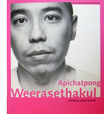 It’s appropriate, then, that the tireless Austrian Film Museum has published a lavish collection of critical studies. Edited by James Quandt, the anthology arrives along with a massive retrospective of the director’s work, which includes many short documentaries and occasional pieces.
James’ introductory essay, as evocative and eloquent as usual, is virtually a monograph, discussing all the features in depth. Alongside it are discerning essays by other old hands. Tony Rayns offers his usual incisive observations, focusing largely on Joe’s short films and the recurring imagery of hospitals, while Benedict Anderson surveys the Thai reception of Tropical Malady. Karen Newman offers precious information and judgments about Joe’s installations. The director himself signs several essays and participates in interviews and exchanges. Even Tilda Swinton has something to say.
I remember when Mysterious Object at Noon played the Brussels festival Cinédécouvertes in 2000. I was baffled. Joe’s movies taught me to watch them, and finally with Syndromes and a Century I got in sync. Its austere lyricism, off-center humor, and patiently unfolding echoes win me over every time I see it. (You can search this blogsite for several mentions, but JJ Murphy has a fuller appreciation of Syndromes here.) Thanks to Alexander Horwath and his colleagues for making this wonderful anthology, decked out with color stills and rich bibliography and filmography, available to us—and in English.
Zap goes the Chazen
Zap, Snarf, Subvert, Young Lust, Tits & Clits, Air Pirates Funnies, Slow Death Funnies, Feds ‘n’ Heads, Corn Fed Comics, Dope Comix, Cocaine Comix, Corporate Crime Comics: The names define the era. The sixties didn’t end until the mid-1970s, and these outrageous cartoon books really came into their own after the election of Nixon in 1968.
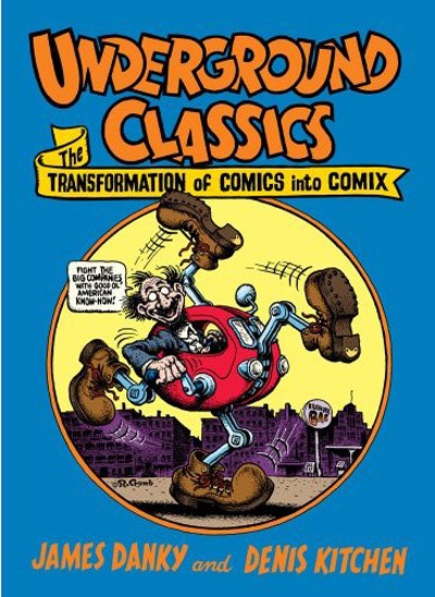
On 2 May, the Chazen Museum on our campus launches its exhibition, Underground Classics: The Transformation of Comics into Comix, 1963-1990. A whirlwind of events, including films and lectures, will revolve around galleries full of imagery from the demented pens of Kim Deitch, Aline Kominsky Crumb, Trina Robbins, Gilbert Shelton, Robert Crumb, Bill Griffith, and many other cartoonists.
 The show was originated by Jim Danky, a scholar of public media from our State Historical Society, and Denis Kitchen, comic artist and the publisher of Kitchen Sink Press here in Wisconsin. Jim has long argued for the archival value of minority and subcultural publications. He started our Center for Print Culture and has been an advocate for gathering print materials by and for children, women, and ethnic minorities. He virtually created the area of “alternative library journalism”—collecting obscure publications from all zones of the political spectrum. I recall his satisfaction in telling me that he had managed to acquire a collection of The War Is Now!, the radical Catholic newsletter published by Hutton Gibson, father of Mel.
For some years Jim has been telling me about his efforts to mount the comix show. It’s no small matter to collect this elusive material and then persuade a museum to show it. Not too many galleries feature talking penises, Jesus visiting a faculty party, or Mickey and Minnie robbed at gunpoint by a dope dealer. Maybe we forget, in the age of the Web and The Onion, just how scabrous these things looked forty years ago. Actually, they still look scabrous. They also look pretty funny, and they’re often well-drawn. As a historical codicil, the exhibition includes 1980s images from artists extending the tradition, such as Drew Friedman and Charles Burns.
The show runs until 12 July 2009. If you can’t get to town, there’s the splendid catalogue. It includes essays by Jim and Denis, Jay Lynch, Patrick Rosenkranz, Trina Robbins, and Paul Buhle. There are free screenings of Fritz the Cat and Crumb at our Cinematheque. And you can read an interview with Jim about the show here.
Remember our motto: Lotsa pictures, lotsa fun.
Up next: Days and nights at Ebertfest.
The Eldorado Cinema, Brussels, designed by Marcel Chabot.
Color, shape, movement . . . and talk
Bonjour Tristesse.
DB here:
Our weekly Film Colloquium is sort of like your old high-school assembly, except that it’s fun. The Film Studies area meets nearly every Thursday afternoon at 4 to hear a paper by a grad student, a faculty member, or a guest. It’s a great forum for ideas and information, and it gives the speaker a chance to try out a talk before taking it to a conference or lecture gig. The local audience is, in my experience, the toughest I’m likely to encounter. And this spring, despite a heavy travel and work schedule, Kristin and I caught two outstanding presentations.
Not in color, but colored
By now we all understand that silent films were most often shown with musical accompaniment, and sometimes sound effects. But we tend to forget that most silent films were in color too.
By the early 1920s, 80% of films were colored in one way or another. There were a few efforts to record the actual colors in a scene, but most often color was added after filming. Areas of the frame might be painted over by stenciling or by freehand. More commonly, the shots were dipped into dyes, yielding images that were tinted (washing over the image and coloring the areas of white, as in the frames below) or toned (coloring the darkest areas and leaving the white areas white). Over the years, film prints were preserved in black and white, partly because color stock was more expensive than today. As a result, even archival prints lost the sense of what audiences actually saw. Today archivists labor to reconstruct what silent films looked like in all their rainbow glory.
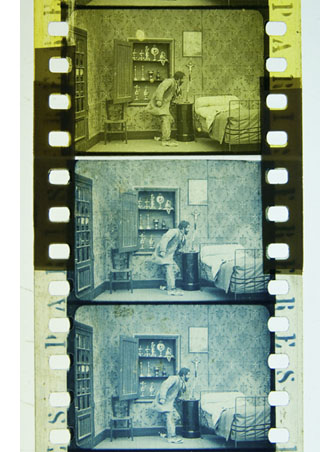 Professor Joshua Yumibe of Oakland University wrote his Ph. D. thesis on early color processes, and his Colloquium talk asked some powerful questions. We know that there was a transition in film artistry from the late 1900s to the early 1910s, a shift toward what Tom Gunning has called the “cinema of narrative integration.” As films became longer and were shown in more or less permanent venues, moviemakers began to tell more complicated stories. How, Josh asks, did this shift away from a cinema of isolated “attractions” affect practices of coloring? Do color processes affect the way stories were told? Do the color processes change how people saw the space on screen? How did the trade press respond to different strategies of coloring?
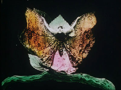
These are fascinating questions, and Josh’s exploration of them was careful and detailed. He has done enormous research on the various color processes, and he was able to trace several lines of development. For instance, he found that writers of the earliest years thought that color enhanced the sensual and emotional effects of the image, even creating an illusion of 3-D. In a shot like that of the butterfly dancer, people seem to have sensed that her multicolored shape was thrusting out of the screen toward them.
Josh argues that with the growing emphasis on narrative, color became more muted. Filmmakers were no longer aiming at momentary stimulation but at ongoing mood. Now tinting and toning came into their own. Color codes developed: blue for night scenes, yellow for sunlight, red for fire, amber for artificial light. Josh also explored the different ways in which European and US companies conceived of color; there seem to have been different color policies at Pathé and at American companies. But this wasn’t the end of change. In the 1920s, with the feature film now at the center of the theatre program, a wide variety of color practices emerged, including those isolated Technicolor sequences we find in films like The Wedding March.
The Q & A was as lively as the talk itself, and afterward, we repaired to a bar and thence to dinner. Josh’s talk was a model of deep, imaginative research and it kept us thinking and talking for a long time afterward. Not to mention his slide show, which regaled us with gorgeous shots that make you realize how much you’re missing when you see an old movie in black and white.
Bass, o profondo!
Another stimulating Colloq session was presided over by our old friend Jan-Christopher Horak, director of the UCLA Film and Television Archive. Chris was in town because our Cinematheque has been showcasing UCLA archival restorations across the semester, and he introduced our screening of The Dark Mirror. But we also got him to give a talk, and that was quite something.
Chris reminded me that we first met thirty years ago, here in Madison, when he came to do research on his dissertation. Since then Chris has been a top-flight scholar and author of many books. His Lovers of Cinema, published by our series at the UW Press, laid the groundwork for the popular film series Unseen Cinema. He’s also been one of the world’s leading film archivists, having supervised collections at Eastman House, the Munich Film Archive, Universal studios, and most recently UCLA.
Chris has long worked at the intersection of film, photography, and the graphic arts. He is one of the world’s experts on the 1920s German avant-garde; one of his early curatorial coups was a 1979 restaging of the pioneering Film und Foto exhibition of 1929. Chris has also long been fascinated by film publicity, having written a book on the subject. So it’s natural that he would gravitate toward studying the film-related work of Saul Bass, one of America’s greatest graphic designers.
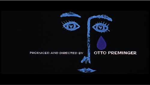
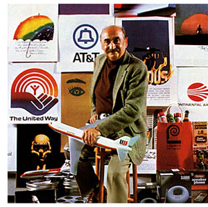 Chris’s talk focused not so much on Bass’s brilliant credit sequences for films by Preminger and Hitchcock as on Bass’s contributions to poster design. Bass turns out to have had a fascinating career, having worked in Manhattan advertising before moving to Los Angeles in 1948. Chris has found at least one early 1950s poster design that Bass probably executed, but he definitely worked for Preminger on publicity for The Moon Is Blue (1953) and Carmen Jones (1954)—the latter yielding to my mind one of the greatest credit sequences in film history. In 1955 Bass founded his own firm.
Throughout, he carried on the ideals of György Kepes, his teacher and a major conduit for Bauhaus ideas into America. Like his European models, Kepes promoted the idea of art as having cognitive value, teaching us to see the world in a new way. Kepes also emphasized that artworks could be of practical utility—an idea that chimed with Bass’s turn toward commercial design.
Chris was able to show that the Bauhaus tradition powerfully influenced Bass’s design principles. Who would have thought that the credits for The Seven Year Itch replayed Paul Klee? Obvious, though, when Chris showed us the images.
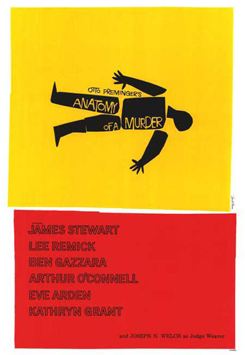
Chris emphasized two further points. First, Bass understood what we now call branding. We have to remember that it up to that time, most film publicity featured images of the stars, either in portraits or caught in typical scenes from the film. Bass’s poster design concealed the stars. Instead, he relied on dynamic geometrical design to capture a film’s mood in a powerful, stylized image. The result was an eye-catching logo, instantly recognizable: the flaming rose of Carmen Jones, the Vertigo whirlpool, the dismembered body of Anatomy of a Murder.
The key image could be repeated in newspaper ads, posters, credits, even the production company’s letterhead. When you saw the teaser trailer for Star Trek (“Under Construction”) dominated by that looming boomerang shape, you saw the heritage of Saul Bass. Who cares who’s in the movie? The very image is intriguing. No accident that Bass also designed many corporate logos, like the ATT bell and the United Way hand.
Chris’s second main point was that Bass was able to flourish because of the rise of independent production in the 1950s. Preminger, Hitchcock, and Wilder, acting as their own producers, could control the publicity for their films to a degree not possible for directors working in the classic studio system. Now films were sold as one-offs, and each film needed to pull itself above the clutter. In addition, Bass’s signature designs could set a director apart. In the 1950s, the Bass look was closely identified with his major clients like Hitchcock and Preminger, to the point that other designers for those directors tried to copy his style. I had always thought that Bass did the title design for Hurry Sundown, but Chris showed that it’s another artist’s pastiche of the master.
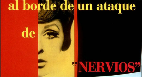
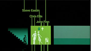 Chris’s talk reminded me that Bass contributed to making the opening credits a major attraction—not merely an overture, but an abstract treatment of the key story idea, a sort of graphic map that teases us into the main story. The opening sequences of Se7en and Catch Me If You Can (left) owe a lot to Bass’s idea that the credits should constitute a little movie, witty or ominous, tantalizing us with sketchy glimpses of what is to come. And Almodóvar’s diverting openings, probably the most sheerly enjoyable credit sequences we have today, are unthinkable without Bass. Synchronized with infectious music, Bass’s credit sequences can be seen as continuing the tradition of Walter Ruttmann and Oskar Fischinger, who back in the 1920s and 1930s made abstract films that advertised consumer goods.
For such reasons, I’m glad I hung around Madison after my retirement. With visiting researchers like Josh and Chris, who wants to go fishing?
Woman on the Verge of a Nervous Breakdown.
Thanks to Joshua Umibe for the silent-film illustrations. The first comes from Gaston Velle, Métamorphoses du Papillon / A Butterfly’s Metamorphosis (Pathé, 1904). Frame enlargement from Discovering Cinema (di. Eric Lange and Serge Bromberg, Lobster Film/Flicker Alley). The second comes from Albert Capellani’s Le Chemineau / The Vagabond (Pathé, 1905; tinted and toned). Frame enlargement Joshua Yumibe, courtesy of the Netherlands Filmmuseum.
Hong Kong wrapup: Places and faces
DB here, just back:
The numbers are pretty staggering. The Hong Kong International Film Festival ran 22 days (the first four incorporating Filmart, the Asian market). In 510 screenings, 279 films from 50 countries were shown. There were 19 world premieres, 17 international premieres, and 33 Asian premieres. Attendance figures are yet to be determined, but so far things look to match the nearly 600,000 tickets sold last year. (*Correction 1 May 2009: The figure of 600,000 refers to an estimate of total attendance at all events, including free screenings, panels, seminars, etc. Total tickets are currently estimated at 100,000. Thanks to Li Cheuk-to for the correction.)
Having stayed for the whole event, I felt some festival fatigue. But the final days of the fest were full of fine movies. I left feeling that all my time was well-spent—not least in seeing old friends and visiting some of the outstanding spots in this adrenaline-fueled city.
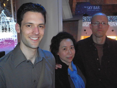
Ken Smith and Joanna Lee are forces of nature in the cultural life of Asia. Working mostly in musical performance, they arrange for performers’ tours, consult with cultural agencies, translate, write, and do damn near everything else as well. Call them global impresarios. They helped coordinate the YouTube Symphony Orchestra, and they played central roles in the creation of the opera The Bonesetter’s Daughter, a collaboration between Amy Tan and Stewart Wallace. This resulted in a 2008 production by the San Francisco Opera. The September premiere was broadcast in Hong Kong last Easter Sunday, and will be available at the RTHK website for playback for the following 365 days. Give it a listen here.
Ken’s engrossing book, Fate! Luck! Chance!, documents the making of the opera and includes a libretto. You can read background on Ken’s book here.
Above, Ken and Joanna take in pudding at a historic hole-in-the-wall eatery. The pudding comes in two varieties, milk and eggyolk-based. Mighty sweet, and as if by chance (or fate, or luck), the stools mimic the main attractions.
Old friends Linda Lai Chiu-han and Hector Rodriguez teach in the digital media and arts program at the City University of Hong Kong.
Linda has just had a film accepted for Oberhausen. She’s on a roll: It’s her second screening in this, the major festival for short films.
The W Hotel, where the Festival was headquartered, was posh to the max. Every time I went in, I expected someone to figure out that I wasn’t well-dressed enough to be there. If you ever wondered what George Segal’s ghostly sculptures would read, you could check out these pale volumes fastened to the shelves along the elevators.
My own hotel was somewhat different. The B. P. in B. P. International House stands for Baden-Powell, and the place was teeming with Boy and Girl Scouts nearly every day. In the modern atrium hangs a reverent portrait of the man himself.
It was pleasant to stay beside Kowloon Park. Headed for the Cultural Centre or the ferry, I could avoid the crowds on Nathan Road by ambling through the park.
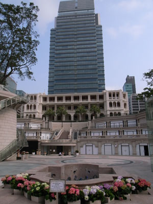
While I was in town, developers put the finishing touches on a neo-retro-colonialist complex at the south end of Canton Road.
You must admit that Hong Kong sorely needs another shopping mall.
Back to the faces: Gary Bettinson (University of Lancaster), Emilie Yeh (Hong Kong Baptist University), and Darrell William Davis (Lingnan University).
Gary writes on contemporary Hong Kong cinema, particularly Wong Kar-wai; most recently, he has an essay on 2046 in Warren Buckland’s anthology on puzzle films. Emilie researches Chinese film, as does her husband Darrell, who started his career working on Japan. I’ve already mentioned their book on Asian media industries in an earlier blog, but also have a look at their fine Taiwanese Film Directors: A Treasure Island. I gave a talk for Emilie and Darrell at HK Baptist, and we had a good discussion among their students and colleagues.
More intellect: This year the festival paid tribute to Ingmar Bergman. A friend of his, Marie Nyreröd, brought her enlightening documentary, Bergman’s Island. Here she’s seen with another Bergman expert, my amigo Paisley Livingston, philosopher and film critic-theorist teaching at Lingnan University.
For over forty years, Erika and Ulrich Gregor have been colossal figures in world film culture–as critics, archivists, and festival programmers. They served on two juries during their stay here.
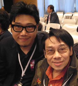
Scan earlier years of my Hong Kong visits and you’ll find these three regulars: King Wei-Chu (FantAsia programmer), Peter Rist (Film prof at Concordia of Montreal), and Yvonne Teh, Hong Kong journalist. After a screening at the Science Museum, it’s wonderful to sit out in a cafe.
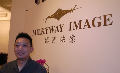
Here are Johnnie To and his right-hand man Shan Ding at To’s magnificent office in Milkyway Headquarters.
The Milkyway team is busy. To’s Vengeance, starring Johnny Hallyday, will open in Paris on 20 May. Mr. To and Shan continue to work with their collaborators on a remake of Melville’s The Red Circle, and they’re preparing a New Year’s comedy as well. Here’s Cheang Soi, one of the most ambitious of the younger HK directors (Love Battlefield, Dog Bite Dog). Soi is finishing Accident, which looks to premiere at the end of the summer.
John Shum (aka Sham) is a legendary figure–a comedian since the 1980s, a producer, and an energetic advocate for local democracy.

Wong Ain-ling has been a critic and festival administrator. Currently she works as Senior Researcher at the Hong Kong Film Archive. She played a crucial role in the restoration of Fei Mu’s Confucius.
Derek Kwok (director of The Pye-Dog) is again collaborating with legendary actor-singer Teddy Robin Kwan.
In all, another wonderful year of food (and food for thought), talk, and above all movies. You won’t find a festival anywhere more dedicated to the power of film in all its variety. So once more my tagline: See you here next year?
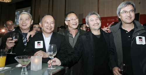
At the Film Workshop party: Lau Siuming, John Woo, Johnnie To, Tsui Hark, and Benny Chan. Thanks to Alvin Tse for the photo.
Passion, mortality, and everyday life
DB, flying back from Hong Kong:
Some of the most important films playing at the Hong Kong International Film Festival were already familiar to me—Still Walking, Il Divo, Gomorrah, Ashes of Time Redux—and some of my discoveries in Hong Kong have been covered in more recent entries.
What remains? Accentuating the positive, I’ll not talk about the disappointing items, some with strong reputations. I hope to blog about others in the months to come, when I’ve had a chance to study DVDs.
In the meantime, Kristin has already touched on Beaches of Agnès, a real charmer. Varda can be whimsical without turning fey; even dressed as a potato she doesn’t seem to be trying to grab attention. The film is a digressive, passionate memoir. The background on her early life is captivating, and her career as a photographer, shooting snaps of Pierre Vilar and Gerard Philippe, furnishes a stab of pathos. A montage of beautiful boys and girls: gone. Soon we get Varda’s straightforward acknowledgment of Demy’s death from AIDS. “All the dead lead me back to Jacques.”
Götz Spielmann’s Revanche, which I’d passed up at other fests, was a very solid psychological thriller. It’s built around two contrasting worlds, the sex trade of Vienna and the placid, churchgoing lifestyle of a village. From the first comes Alex, a man-of-all-work in a brothel. He falls in love with a Ukrainian hooker, and between bouts of cocaine he vows to help her escape the business. In the village live the policeman Robert and his wife Susanne, trying to have a child. Their life is secure and cozy, though Robert is wound a bit tight. The two worlds intersect during a bank robbery, and the rest of the drama plays out in the countryside, with Alex taking refuge on his grandfather’s farm. Alex and Robert become two variants of masculine anxiety, each defined by his way with a pistol, and their decisive confrontation is deftly postponed until the very last moments of the film.
I admire the way that Spielmann uses a spare long-take technique to increase suspense. Each scene usually consists of a single shot, taken from a judiciously chosen angle that unfolds the drama smoothly. There are barely 200 shots in nearly two hours, but the scenes don’t seem stiff because the framing and staging are quietly varied. Shot/ reverse-shot cutting is reserved for two turning points, one in the middle and one at the end. It’s nice to see a movie with no filler material, no passages of people driving in cars or going into the buildings, none of those time-wasting aerial shots of cities.
Some nice sound work too! No Country for Old Men has been rightly praised for its use of offscreen noise, but the Coens look rather showoffish compared to what Spielmann has accomplished here. A shot of Robert and Susanne on their patio is accompanied by the faintest rustle on the right channel: Alex, spying on domestic happiness like a character out of Highsmith or Ruth Rendell, has slipped away.
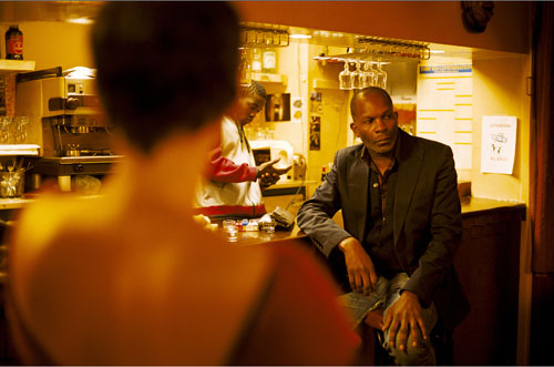
Similarly elegant in its staging and sound work is Claire Denis’ 35 Shots of Rum. The teasing exposition—a man watches commuter trains, a young woman rides one—dares us to imagine scenarios that could involve both. Our speculations turn out to be too wild, since their relationship is the most uncomplicated to be imagined. Based frankly on Ozu’s Late Spring, 35 Shots builds up its drama through daily routines, following its principals and their neighbors in everyday situations until, quite unexpectedly, a quiet crisis blossoms. Soon one scene ends: “We could be like this forever.” Next scene: everything has been overturned, and characters must change their lives. Visually the film is a marvel, with glowing scenes of semidarkness and discreetly out-of-focus details. As in her masterful Beau Travail, Denis supplies a powerful last shot, this time of an object we’ve nearly forgotten.
Two more thoughts: In my discussion of Revanche and 35 Shots, I’ve had to be coy in explaining basic plot situations and character relationships. That’s because these films work elliptically, holding back the sort of expository information that would be given in a concentrated dose early in most classical narratives. This narrational strategy poses no problem for an academic analysis, which tends to assume that the reader has seen the film. But it’s more difficult to handle when you’re writing a review. You don’t want to spoil the viewer’s surprise by explaining a core situation that the filmmaker has chosen to unfold gradually. If reviewers of Hollywood movies can’t give away the ending, the reviewer of an art film probably shouldn’t give away the beginning, or at least the information that it keeps in suspension for some time.
In other respects, though, there isn’t a clear dividing line between the “psychological” drama of international festival cinema and the more “externally driven” action of mainstream entertainment. Popular cinema relies on physical props like clues, souvenirs, messages, and gifts to help drive the plot. So, less obviously, do art films. The two photographs in Revanche deepen the character drama while triggering a major realization. The accidentally discovered letter (a convention of melodrama akin to the overheard conversation) in 35 Shots not only explains past actions but primes us to expect some conflict to come. As Aristotle knew, stories seem to need tokens to drive character revelation and plot reversals. A narrative universal?
Japanorama
Naked of Defenses.
Many of the movies I most enjoyed were Japanese. No surprise there. I know I’m prejudiced in favor, but objectively speaking the Japanese industry has long combined high output with great diversity and depth. I’m inclined to think that across film history, the three most consistently excellent filmmaking nations have been America, France, and Japan.
During Filmart, Yoshizaki Masahiro gave a swift but informative report on the current state of Japan’s “content industry.” It is the currently the world’s second-largest national film market , but it will sooner or later be replaced by China. Currently Japanese films are reclaiming the local audience, sometimes grabbing over half the annual box office. Unfortunately, that audience isn’t growing, and with a plunging birthrate, it’s unlikely to do so. Moreover, Japanese cinema has always been difficult to export, even in Asia. The great exception, of course, is anime, but even that is starting to slump. Anime is largely a television/ video format, yielding about twice in those platforms what it yields in theatrical income. But as advertising dollars have withered in the recession, anime has been cut back.
Despite all this, Japanese companies manage to release a staggering 400 or so films per year. (What counts as a release—theatrical? direct to video?—we leave for another day.) And the variety remains remarkable, judging by what I saw during my stay in Hong Kong. Put another way: Japan makes movies that are sweet, touching, funny, silly, and peculiar to the point of perversity. Not necessarily perversion, but that’s there too. And yes, schoolgirls’ panties are involved.
 Not part of the festival, but playing in town was the diverting comedy Happy Flight. Like Airport and Airplane!, it weaves together various characters involved with a single flight. It concentrates almost completely on the professionals, from gate agents and mechanics to pilots and air hostesses. The one passenger depicted in detail rings true: After being allowed to bring an oversized bag into the cabin, he becomes a browbeating jerk.
The film maintains its infectious pacing, adorning the action with minor-key gags like the airport’s “Somkin Room” for smokers. I also liked the moments of teamwork. When the stewardesses need a cake, they concoct one out of various packaged snacks. A young mechanic, constantly berated by his boss, thinks he’s dropped a wrench into the plane’s engine, and the whole ground crew searches the hangar for it. As with Airplane!, the final credits resolve several plotlines and add a few gags. If you like Waterboys and Swing Girls, also directed by Yaguchi Shinobu, you’d probably enjoy this.
Just as light, but a lot more intricate is Nakamura Yoshihiro’s Fish Story. Another network narrative, this one traces how Japan’s purported first punk song changed the course of history. The plot skips among periods from 1953 to 2012, when a comet is about to incinerate the earth. With many pop-culture in-jokes, from Beatles albums to The Karate Kid, this breezy, off-kilter item gets by on sheer adrenaline and on a cascade of puzzles. Why does the Fish Story song make no sense? Why does it contain a one-minute passage of silence? How are all these stories connected? And how can a song save the world? The narration cleverly withholds the basic relationships among the characters until a dizzying montage at the end wraps everything up.
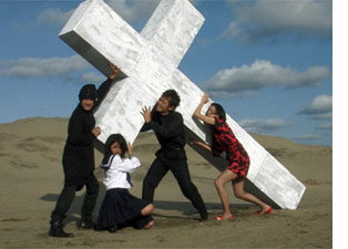 Still further out there on the Nutsometer is Love Exposure, your basic four-hour inquiry into Christianity, cross-dressing, superheroics, and schoolgirl underwear. The story starts with a boy who promises his mother he’ll marry a woman like the Virgin Mary, but thanks to digital photography and an acrobatic approach to filming schoolgirls’ nether regions, he becomes known to his peers as King of the Perverts. Director Sion Sono satirizes cult religions, which seems to include Catholicism (“Your sin is that you can’t remember your own sin”), while devoting some attention to pornographic movies and “Candle in the Wind.” Rambling and digressive, but rapidly paced, Love Exposure proves that nobody beats the Japanese for cheerful dirty fun.
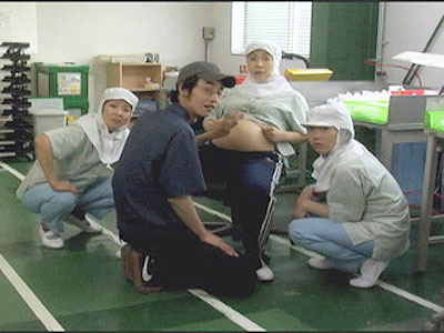
A more straightforward Japanese entry in the Asian Digital competition was Ichii Masahide’s Naked of Defenses (the most awkwardly titled film I saw). Two women work at a factory making plastic parts. Ritsuko, a plain but dogged supervisor, is becoming alienated from her husband after her miscarriage. She envies the pregnant and insouciant new hire Chinatsu, whose marriage is overcoming its problems. Plain and sincere in its technique, Naked of Defenses ends with an astonishing sequence. By all the evidence onscreen, Ichii got a pregnant woman to play Chikatsu and filmed her giving birth. Balancing this powerful ending is the striking performance of Moriya Ayako as a woman sinking into depression but who may be saved by friendship and maternal love.
I took the occasion to catch Departures at a local theatre, since I had missed it at earlier festivals. And I’m happy to report that it’s distributed in the US by Regent Entertainment, run by Wisconsin graduate and old friend Steven Jarchow.
By now you’ve probably seen Departures too. At one level, it’s a good old-fashioned Shochiku movie, mixing tears and good-natured humor. Some decry it as middlebrow sentiment, but I found it a touching, fluent tale. For me, the central attraction is the repertory of gestures. Our two professionals handle the recently deceased tenderly, but that doesn’t preclude a crisp efficiency in flaring out a sleeve. I don’t think I’ll forget the way the undertaker grasps the dead person’s clasped hands and then executes a circular snap. Precise manipulation becomes a sign of respect.
And it isn’t all sunniness. Handling dead bodies is hazardous cultural territory in Japan. It is traditionally a task for the burakumin, a minority group long looked down upon. Although discrimination against the group has apparently diminished, the fact that a big star like Motoki Masahiro could play the role of a corpse-preparer could help dispel a lingering social stigma.
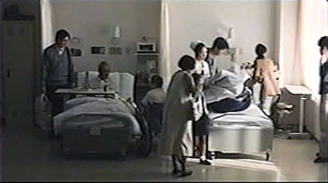
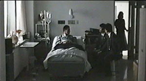
You could almost mount a Japanese film festival about mortality. Some musts would be Ozu’s Brothers and Sisters of the Toda Family and Tokyo Story, Kurosawa’s To Live, and Kore-eda’s After Life. Another required item would be Dying at a Hospital (1993), a rarely seen Ichikawa Jun film screened as part of a tribute to the recently deceased director. It consists of staged episodes showing a few cancer patients in their last months. An elderly husband and wife both have cancer, but must separate and be treated in different hospitals. A widow laments her rotten luck. A lively young man can’t accept the fact that he won’t see his children grow up. A homeless man is brought in, filthy and disoriented, and as he becomes aware of his plight, he still apologizes for accidentally turning up his pocket radio.
These and other cases are accompanied by voice-over narration from the doctor and nurse who treat them. Interspersed with these scenes are rapid documentary montages of people enjoying life—eating, drinking, viewing cherry blossoms, celebrating festivals, just walking down the street. The intimate facial reactions we’re denied in the hospital scenes are supplied in these vérité passages.
Dying at a Hospital is gentle and sympathetic, but its manner of shooting gives it special resonance. The hospital scenes are shot in planimetric fashion, with the camera rigidly facing a row of three beds, or a pair of beds, or only a single one. Everything is played in long shot, with no close-ups or camera movements to enlarge the faces.
Patients, visitors, and hospital staff move through these blocks of space. The lighting effects are particularly subtle, accentuated by very gradual fade-ins and fade-outs, as if dawn were breaking or night were coming on. As the film goes on, Ichikawa introduces variations in scale and new cutting patterns, creating what I called in Narration in the Fiction Film a sparse version of parametric narration. For instance, the spaces become more compact as terminal patients are shifted from a shared room to a private one, which permits nuanced effects of distant depth.
Ichikawa’s dry, physically detached treatment lets the poignancy of each situation emerge without any directorial boosting. The glimpses of daily life outside the hospital, zestful and shot on the fly, generate a powerful contrast: the preciousness of ordinary pleasures, and the dignity that must be accorded everyone about to leave them behind.
For a brief but sensitive appreciation of 35 Shots, see Ryland Walker Knight’s comments here–perhaps best read, for reasons mentioned above, after you’ve seen the film.
Departures.


