Coraline, cornered
Monday | February 23, 2009 open printable version
DB here:
It’s common for academics in one field to borrow ideas from other domains of research. But people outside academe sometimes object when a film scholar talks about movies using a term or idea originating elsewhere. These people usually think of themselves as hard-headed pros. Everything we need to understand film, they think, can be derived from the concepts already used by practitioners.
No doubt, we should be attentive to the ways in which filmmakers think and talk about their work. There’s a lot to be learned from shop talk and insider information–hence the enduring value of interviews, DVD commentaries, and the like. Yet no activity explains itself. Often practitioners do things intuitively, without making their background ideas explicit. We can often illuminate a filmmaker’s creative choices by spelling out the unspoken premises behind the work.
Further, filmmakers themselves have traditionally drawn ideas from other arts and sciences. For example, storytelling techniques referred to as exposition, point of view, or motivation have their origin in theories of literature and drama. Filmmakers have been quite pluralistic in their creative practices; why can’t critics and historians be open to outside influences?
Back in the 1980s I began speculating on how the film image represented space, and I adopted the then-current terminology of perceptual psychology. Researchers spoke of depth cues, those features of the real world that prompt our visual system to make fast inferences about a three-dimensional layout. Classic depth cues are the Gestalters’ figure/ ground relation, da Vinci’s “atmospheric perspective” (the haze that envelops more distant planes), and Helmholtz’s “kinetic depth effect,” the way that when you’re moving, closer objects change at a different rate than more distant ones.
These features can also be invoked in two-dimensional images, as I tried to show in Narration in the Fiction Film. Nowadays, deeper explanations of these effects are available using geometrical or computational approaches to perception. But depth cues remain a useful informal way of studying how artists manipulate images. For this reason, in Film Art: An Introduction, we’ve continued to itemize some depth cues that are important in cinema. These concepts furnish analytical tools for understanding things that filmmakers do spontaneously when they compose or light a shot.
So imagine my happiness when I hear filmmakers talk directly about depth cues.
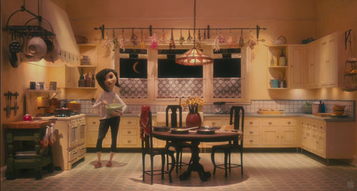
In a fascinating article in American Cinematographer, Pete Kozachik, Director of Photography on Coraline, explains that the filmmakers were very conscious of perceptual factors throughout, and not just in creating the stereoscopic effect. For example, they designed and filmed our heroine’s alternative world in normal perspective, but her boring normal world was designed to seem off-kilter and flat by means of inconsistent depth cues within the shots. “The compositions match in 2-D, but the 3-D depth cues evoke a different feel for each room.”
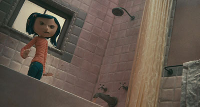
This is hard to illustrate in a two-dimensional medium, but the Coraline trailer offers some examples. Consider this image.
The tiles in the family shower don’t recede into the distance, either across or upward. They are more or less the same size, just arrayed along a diagonal. A degree of recession is supplied by tonality and lighting, but the corner of the shower stall remains somewhat ambiguous. If you try to do a Gestalt flip, you can see the corner as a chimney poking out at you rather than one receding inward. (To see this, try covering the rest of the shot with your hands.)
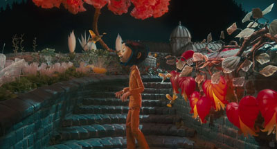
In the garden of the “Good Household,” however, the bricks recede naturalistically in shape and size. The lighting and tonal gradients create a strong sense of depth.
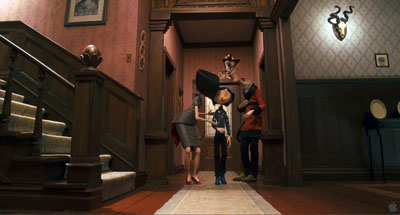
Here is the Good Family’s hallway.
It displays central perspective, with everything receding as it should (as if seen by a wide-angle lens).
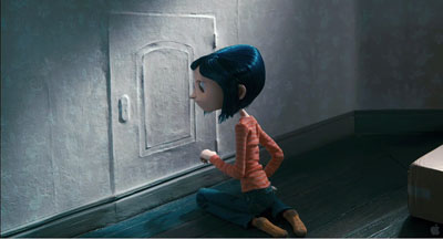
By contrast, here is an oblique shot of Coraline’s real-world bedroom. The doorway’s edges recede pretty steeply, but the baseboard doesn’t taper as it moves toward and past the corner. Instead, it moves in parallel lines. The same thing is happening with the floor planks.
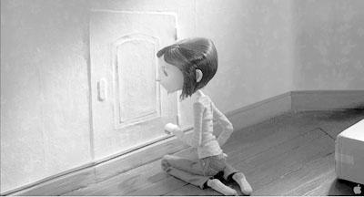
You can see the effect more clearly if we drain the color and lower the contrast. (Sorry, Messrs. Selick and Kozachik.)
Now you can also see the weird, almost cubistic edges of floorboards poking up just behind the carton. Again, lighting and tonality create a sense of depth that the geometry of the edges denies. The depth cues within Coraline’s normal life are inconsistent.
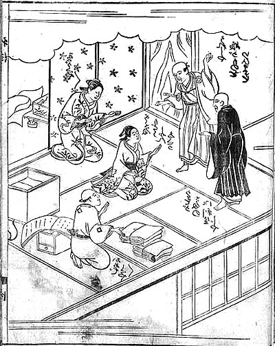
Stare at the rear stretch of the baseboard awhile, and you’ll find that its contours may look a bit wider than those in the foreground. This sort of “parallel perspective” can be found throughout Asian art. Here is a Japanese book illustration from 1713, in which many of the edges run in parallel perspective. Again, instead of meeting in the distance, diagonals seem to be converging out in front of the picture plane, making some areas appear wider in the rear than in the front.
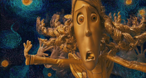
If my invocation of other artistic traditions seems a highfalutin way of talking about an animated movie, check the Van Gogh joke in the Coraline frame at the bottom of this entry.
Kozachik also explains how he spent a lot of time trying to vary the two images’ interocular distance, the distance between our two eyes, in order to give a greater sense of volume. The care paid off, at least for me. Coraline is the best 3D film I’ve seen, as well as the scariest. (For our take on Beowulf see this entry.)
In addition, Coraline helps me push a general point: Cinema is at least partly an affair of perception. Filmmakers are practical psychologists, artists who have mastered the skill of playing with our senses. We can open up their secrets a little by using tools borrowed from the sciences of mind.
For more on Coraline, see Bill Desowitz’s Animation World interview with Tadahiro Uesugi and his interview with Henry Selick. Background on the production is supplied by Thomas J. McLean’s article from last year.
For an overview of spatial perception, see Maurice Hershenson, Visual Space Perception (MIT Press, 1999). A more detailed account is Stephen E. Palmer, Vision Science: Photons to Phenomenology (MIT Press, 1999). A geometrical explanation of the kinetic depth effect is offered in James E. Cutting, Perception with an Eye for Motion (MIT Press, 1986).


