Archive for December 2006
Can they make ’em like they used to? continued

DB here:
In the wake of discussions of The Good German, on this site and elsewhere, the idea of a retro-looking movie has surfaced again. American Cinematographer‘s coverage of Casino Royale is very intriguing.
Phil Méheux, the cinematographer, decided that the opening sequence, a black-and-white passage showing Bond earning his 00 status, would pay homage to 1960s Techniscope. Techniscope was an optical process that produced 2.35:1 images without anamorphic lenses. It allowed great depth of field because it could take advantage of the wide-angle lenses available for non-anamorphic cinematography. The most familiar Techniscope images are probably those in Sergio Leone’s westerns.
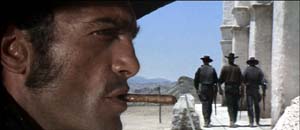 For a Few Dollars More.
Mehaux explains what he wanted for Casino Royale:
With Techniscope, the increased depth of field meant they were able to put things like lampshades and telephone boxes in the foreground, and they didn’t appear amoebic–you could actually see depth in them. In The Ipcress File, there’s a shot where a table lamp is huge in the frame and a man’s face is in the top right-hand corner. I really like that look. Part of the dialogue in our opening sequence was done with very carefully controlled shots that have huge things in the foreground and faces pushed to the corners of the frame. Little things like that echo the Cold War period of spy films.
But, but….
1. In the print of Casino Royale I saw in my local, the opening office scene didn’t really exploit sharp-focus foregrounds. There weren’t that many objects in the foreground, and they weren’t in discernible focus. Of course the cutting was so rapid that it was hard to concentrate on foreground/ background relations.
2. It’s fall of 1965, in Albany, New York. A film geek literally fresh off the farm is in his freshman year of college and goes to every movie in town. He sees The Ipcress File not once but three times. He’s fascinated by its flamboyant technique. He’s just seen Citizen Kane, so he’s impressed by deep staging and big foregrounds in this unheralded spy pic.
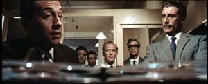
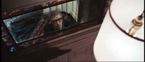
There’s even wilder stuff: a murder victim seen through a hanging lamp, for example.
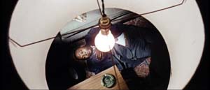
The Geek reads up on long lenses, wide-angle lenses, and so on. Knowing nothing about Techniscope, he wonders how these extravagant shots got made. Just as important, why are they here (apart from looking cool)?
(Spoilers coming up. Skip to 3 if want to retain your innocence.)
After a couple viewings, the Geek begins to get a hunch about what those lampshades are doing there. Throughout the movie, actors are shot in juxtaposition to looming shapes–doors, lecterns, tabletops–which mask large stretches of the set.
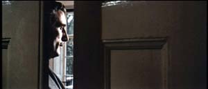
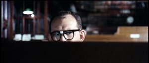
And sometimes those blocking objects are lampshades.

At a climactic moment, our hero escapes from torture and calls his superior officer, who’s framed in the usual off-center way, with a lampshade dominating the shot. It works as a sheer (and pretty) block of solid color.
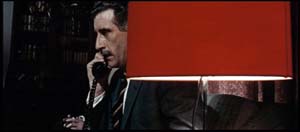
Turns out, however, that this time the shade actually conceals something important. The officer withdraws behind the shade and out pops a guest sitting alongside him.
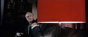
The guest is the arch-villain. Now we know the officer is a traitor.
The Geek dimly realizes three things.
*A movie sets up visual “rules” it will follow or violate. (Later the Geek will call these intrinsic norms.)
*Visual motifs build up across a film, sometimes asking the viewer to notice them.
*A motif can seem gratuitous but that very gratuitousness can be exploited for storytelling purposes. When we see the red lampshade, we assume that it’s another decorative flourish, not a way of hiding information. Earlier sequences suggest that the device is a mannered tic but at the climax it helps spring a surprise. Motifs, the Geek would realize eventually, can fulfill narrational functions–that is, motifs can shape the ongoing flow of story information.
3. Sidney J. Furie was considered a showoffish filmmaker. Michael Caine said he belonged to the look-Ma-I’m-directing school. Certainly the outrageous compositions involving Marlon Brando’s sombrero in The Appaloosa back up that charge.
But like Richard Lester, Ken Russell, and other fancy-pants pictorialists, Furie can at least get us to notice technique. Not bad to cut your cinephile teeth on. Or at least so the Geek thinks, forty years afterward.
4. The AC article also talks about the problem of making poker games interesting. Hong Kong filmmakers figured this out long ago. Martin Campbell, director of the new 007 adventure, should study the crisp card sequences in Wong Jing’s God of Gamblers series. Filmed on a minuscule budget, they put the strained and blandly shot poker scenes of Casino Royale to shame. Incidentally, Wong’s use of diopters yields the sort of nifty depth that Meheux liked in Ipcress.
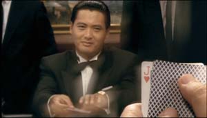 God of Gamblers.
PS: Casino Royale didn’t learn the lessons of the 1960s well enough, in my view. After the sparkling opening credits, it was all downhill. The usual problems: overcut scenes, overcloseupped acting, incoherent chases and fights, uninspired dialogue you recite just before the actor says the line. One landing-strip truck fracas amalgamates Road Warrior, Raiders of the Lost Ark, and Die Hard 2. The makers have indeed updated the Bond franchise. After a series of lame 1970s-looking movies, the franchise has given us a lame contemporary-looking movie.
Granted, I never cared much for the Bond pictures. The Geek liked From Russia and Goldfinger, and Diamonds Are Forever is enjoyable in its wacko way. But for Machiavellian intrigue, Fritz Lang’s Spies remains the gold standard. No one can make ’em like he used to.
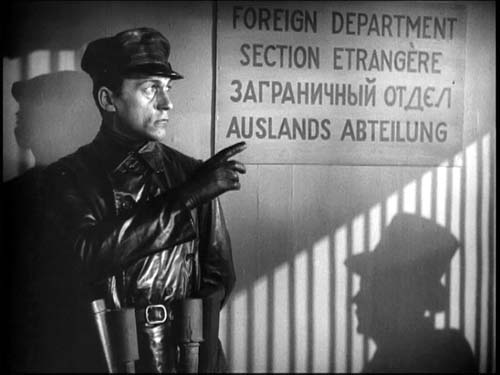 Spies
Spies
Another pebble in your shoe
DB here:
“Life is a Dogme film. It’s hard to hear, but the words are still important.” This is one of the many in-jokes peppering Lars von Trier’s The Boss of It All, his newest feature. I watched it while preparing an essay for the Danish Film Institute, which superbly promotes Danish cinema to the world. But I wasn’t ready for what I saw.
It’s a comedy, of course, with a classic bait-and-switch premise. For shadowy motives, a corporate lawyer entices an idle actor to pretend to be the superboss whom the IT staff has never met. Unfortunately, through emails to the staff, the lawyer has constructed a persona for the boss–in fact, several personae, a different one for every worker. Our actor must play many parts before finally, in a series of reversals, he gets to “find” the real character.
In tone, the film is as mixed as most von Trier works, hovering between sympathy for idealistic underdogs and a sour realization that they will always be victims. It reminded me somewhat of Kaurismaki and the Fassbinder of Fox and His Friends. But the film is a breezy piece of work; nothing really serious faces his innocent here. There’s a lively satire of the corporate world, mocking management catchphrases du jour (not outsourcing, we’re told, but offshoring) and touchy-feely hugging. The hostile incomprehension between Denmark and Iceland provides some good gags too. Von Trier also pokes fun at actors, perhaps invoking his well-publicized feuding with divas like Kidman and Björk. Our hero/loser Kristoffer is a sort of Method man, but he learns that he gets the best results through shameless sentiment.
Here the words are important–it’s a very talky movie–but so are the pictures. Shot in 16mm in available light, The Boss breaks with von Trier’s normal commitment to handheld camerawork. Except for some interpolated crane shots outside the office building, the camera never moves, not even panning. But the image is constantly being refreshed through incessant cutting (there are over 1500 shots). The film boasts more jump cuts than Breathless or Matchstick Men, and each one creates a bump. There’s very little sound overlap between shots–the ambient noise usually drops out for a fraction of a second–and there are often visual mismatches, so (as in The Idiots), nearly every cut feels like an ellipsis. A film, von Trier has said, should be as irritating as a pebble in your shoe, and his abrasive tempo gives his comedy an anxious edge.
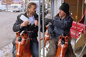
Then there are the very peculiar framings. Here’s a string of three brief shots from the first scene, with continuous dialogue (in gappy duration). The lawyer is trying to persuade the actor to perform as the boss.

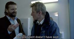

(Yes, these are three separate shots, not three stages of one wobbly shot.)
These cuts break the so-called 30-degree rule, which mandates that if you’re cutting to different angles on the same subject, your second angle should vary by at least 30 degrees from the first. In addition, the later off-center compositions seem gratuitous; why not just sustain the first shot, since the next two hardly vary from it? Sometimes you get results like this.


It turns out that there is method to the madness, although the method, granted, is a bit mad. You can read about Automavision here, if you want to know in advance why the movie looks this way. But if you want to be as startled as I was, refrain. Let’s just say that von Trier’s famous 100-camera technique of Dancer in the Dark has been repurposed in a pretty unexpected way. And don’t believe what he says about surrendering to chance; the cuts are often very careful.
Whether you do your homework in advance or not, you’ll probably enjoy The Boss of It All. After my criticisms of editing in The Departed (which made me seem to be raining on the Scorsese parade) and my comments about classical principles of coverage, I’m happy to report on a film which offers something new and strange. The vivacious Danish film culture makes a space for von Trier to set up creative obstructions, for both himself and his viewers.
Postscript: Since I wrote this, von Trier announced that he’s added more tricks to his bag. Turns out that The Boss of It All employs Lookey, a game that challenges the viewers to spot objects that don’t belong in a scene. “For the casual observer it’s just a glitch or mistake,” he says, “but for the initiated it’s a riddle to be solved.” The purpose is to keep viewers alert and active. Film’s great flaw, he claims, is that “it’s a one-way medium with a passive audience.” Lookey, however whimsical, fits well with the agitating effects of the cut and sound dropouts.
The first viewer in Denmark to identify all the Lookeys correctly wins a cash prize and a chance to be an extra in von Trier’s next film.
PPS: Thanks to Vicki Synott of the Danish Film Institute.
PPPS 28 December: I just discovered a frisky website devoted to Nordic filmmaking, where Mirja Julia Minjares has gathered some interesting quotes from von Trier and his sound recordist Ad Stoop. Von Trier says that the computer program also selects for sound gain and filter. Adds Stoop: “When a computer program chooses the settings for the sound and cinematography between each shot, every edit gets underlined in the finished film.”
PPPS 31 December: Check perceptual psychologist Tim Smith’s blog for more insights into von Trier’s games with continuity editing.
–dB
Unassigned reading
DB here:
Thanks to the digital engineering efforts of Andy Adams, of Flak magazine, some older research articles of mine are now archived on the site. See the list on the left, or click here. The pieces range from discussions of particular filmmakers (Feuillade, Preminger) and film techniques (e.g., jump cuts) to more general questions about film theory, history, and criticism. Also included is Lingua Franca‘s profile of me. I’ve added some supplementary comments to give a little context. Andy will be adding a couple more essays in the week to come.
This spring my Poetics of Cinema collects other previously published essays, all revised. That collection includes several new pieces as well.
Also, I’ve added two new book reports, one on James Mottram’s The Sundance Kids, the other on Joe Eszterhas’s Devil’s Guide to Hollywood.
A great gift for the film fan on your holiday list: The wonderful book by Teruyo Nogami, Waiting on the Weather: Making Movies with Akira Kurosawa, trans. Juliet Winters Carpenter. This is a trip back to a golden era of Japanese cinema.
Ms. Nogami started as a minor functionary at Toho, shifted to Daiei, and then worked as scriptgirl for Kurosawa. As sharp, funny, and moving as any Japanese film of the 1940s and 1950s, her book gives an engrossing account of the social interactions around moviemaking. You get a sense of the desperate energy of Japanese film production in the late 1940s, when Tokyoites scrabbled for food. Film stock was scarce–directors sometimes could afford to make only one take–and people worked around the clock. To keep going during all-night shoots, crew members injected themselves with philopon (aka speed).
Of course Kurosawa stands at stage center, treated reverently but also with keen observation. You’ll want to read about his relations with producers, composers, cameramen, and tigers. But there are other featured players too. As a schoolgirl Ms. Nogami corresponded with the important 1930s director Mansako Itami, and she took sisterly care of his son Juzo, who would grow up to direct Tampopo and A Taxing Woman.
In all, a document of moviemaking’s many dimensions–technical, financial, artistic, and personal. Donald Richie contributes a warm foreword, and we should thank Marty Gross of Marty Gross Films for initiating the translation.
By Annie standards
Kristin here—
Way back in 1979, I published a theoretical essay on animation.* It explored how animation is different from live-action because it can mix types of perspective cues within the same image. That was basically the only original idea I have ever had about animation, and I never followed it up by writing more on the subject.
At that point, animation studies were lagging behind film studies in general. A single essay in the area was enough to brand one as an expert. Ever since people have thought of me as an expert on animation. By now, though, animation studies have grown into a healthy area of scholarship, with its own journals and conferences. There are many people studying animation who know far more about it than I. My only work in this area since 1979 has been to write most of the sections on animation in Film Art and Film History.
Still, that leaves me the resident animation expert on this blog, and since I seem to end up writing about the subject occasionally, we’re adding it as a new category as of this entry.
Among the new films I’ve seen in the past couple of years, I find that a significant proportion are animated. I don’t think that’s because I prefer animated films but because these days they are among the best work being created by the mainstream industry.
Why would that be? There are probably a lot of reasons, but let me offer a few.
Animated films, whether executed with CGI or drawings, demand meticulous planning in a way that live-action films don’t. David has written here about directors’ heavy dependence on coverage in contemporary shooting. Coverage means that many filmmakers don’t really know until they get into the editing room how many shots a scene will contain, which angles will be used, when the cuts will come, and other fairly crucial components of the final style. This is true even despite the fact that filmmakers increasingly have storyboarded their films (mainly for big action scenes) or created animatics using relatively simple computer animation.
People planning animated films don’t have the luxury of lots of coverage, and that’s probably a good thing. Storyboards for animated films mean a lot more, because it’s a big deal to depart from them. Every shot and cut has to be thought out in advance, because whole teams of people have to create images that fit together—and they don’t create coverage. There aren’t many directors in Hollywood who think their scenes out that carefully. Steven Spielberg, yes, and maybe a few others.
A similar thing happens with the soundtrack. In animated films, the voices are recorded before the creation of the images. That’s been true since sound was innovated in the late 1920s. Pre-recording means that images of moving lips can be matched to the dialogue far more precisely than if actors watched finished images and tried to speak at exactly the right time to mesh with their characters’ mouths. The lengthy fiddling possible with ADR isn’t an option. Most stars are used to recording their entire performances within a few days, picking up their fees, and moving on to more time-consuming live-action shooting.
[Added December 11: Jason Mittell, who teaches at Middlebury College, has pointed out to me other factors closely related to the thorough storyboarding of animated films and to the pre-recording of dialogue.
Live-action projects often go into the shooting phase with the script still being tinkered with. The main writers are long gone, script doctors have taken over, and stars may request, nay demand, changes in their dialogue. But for animated films the script, like the editing, is in finished form at the move from preproduction to production.
Jason also points out makers of animated films very carefully distinguish the characters by distinctive dialogue and voices. In contrast, do planners of live-action films think much about the combination of vocal tones that the actors will bring to the project? It’s indicative of the difference, I think, that the Annies have a category for best vocal performance and the Oscars don’t. Ian McKellen has been nominated for an Annie in that category for his contribution of the Toad’s dialogue in Flushed Away–completely tailored to the role and totally unrecognizable from his usual voice.
As Jason concludes, “Live-action filmmakers should try to emulate Pixar’s pre-production strategies to raise the quality bar.”]
In The Way Hollywood Tells It and Film Art, David has briefly discussed the modern vogue for muted tones, usually brown and blue, of many modern features. (Remember what a big deal it was when Dick Tracy used bright, comic-book colors in its sets?) The old vibrant tones of the Technicolor days are largely absent, at least from dramas and thriller. Not so in animated films. Most animated films are full of bright colors. (Some tales, like Tim Burton’s Corpse Bride and Happy Feet, call for the elimination of color, but they’re exceptional.) Think of Monsters, Inc. and, say, any David Fincher film, like Se7en. (Yes, Se7en is dark in its subject matter, but I’ve illustrated the two early getting-ready-for-work scenes in each film, before the nastiness starts in Fincher’s film.) For those of us who like some variety in our movie-going, an animated film can be visually pleasing in ways that few other films are.
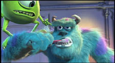

Makers of animated films aren’t obligated to drag in sex scenes or to undress the lead actress. Maybe such scenes in live-action films really do draw in some viewers, but they can be hokey and definitely slow down the action. (Remember Ben Affleck rubbing animal crackers on Liv Tyler’s bare midriff in Armageddon?) Animated films tend to have romances and sometimes even mildly raunchy innuendo, but it doesn’t slow down the plot. The romances in Flushed Away and Cars are very much like the ones in Hollywood comedies of the 1930 and 1940s, flowing along with the narrative in a more logical way.
Animated films don’t have to be tailored to the egos and ambitions of their stars to the degree that many live-action features are. Indeed, often stars bring film projects to studios or produce their own films. The growing number of stars providing voices for mice and penguins and spiders don’t have that sort of investment, emotional or financial.
Some of the best directors working today are in animation. Pixar’s John Lasseter hasn’t let us down in any of his Pixar films, whether he personally directs them or supervises others. Nick Park’s shorts and features, especially Creature Comforts and The Wrong Trousers, are the works of a genius, and other director/animators at Aardman aren’t bad either. Then there’s Hayao Miyazaki (Spirited Away, to mention only one). There aren’t many live-action directors working in commercial cinema today with such track records.
Despite all this, studio executives and commentators continue to debate whether there are now too many CGI films coming out. Indeed, the November 24 issue of Screen International says, “Much has been made this year of the seeming over-saturation of studios’computer-generated titles, with critics and analysts pointing to growing movie-goer apathy.” Of course to most people don’t notice any difference between CGI 3D films and those made with claymation (Parks) or puppets (Burton), so SI’s article talks about the successes and failures among the family-friendly animated films of 2006, including 2D Curious George.
This debate over a possible saturation of the market with CGI films seems bizarre. As a proportion among the total number of films made, CGI’s box-office successes seem fairly high compared to live-action films. Yet one doesn’t see execs and pundits mulling over whether audiences are tired of those.
Certainly success or failure isn’t based on quality. Wallace & Gromit: The Curse of the Were-rabbit, last year’s winner of the Oscar as Best Animated Feature, was a commercial disappointment (in the U.S., not elsewhere). Monster House got a lot of highly favorable reviews, but similarly had a mediocre reception by ticket-buyers.
This week the nominations for the Annie Awards, given out by the International Animated Film Society, were announced. The Best Animated Feature competition is among Cars, Happy Feet, Monster House, Open Season, and Over the Hedge. But in the “what’s the logic behind that?!” world of awards, Cars and Flushed Away got the highest number of individual nominations, nine each, followed by Over the Hedge with eight.
I’ll confess right now that I’ve only seen three CGI-animated films this year, because, as I say, I’m not an animation specialist. I go to animated films for specific reasons. One, Cars, is a Pixar film. Two, Flushed Away, is an Aardman film. Three, Happy Feet, is directed by George (Road Warrior) Miller.
On the other hand, Over the Hedge was advertised as being “from the creators of Shrek.” Shrek was an entertaining film, but I think it has been overrated. Besides, a check through the main credits of Over the Hedge reveals no one who had worked on Shrek. “Creators” here must mean Dreamworks. That, by itself, is not enough to draw me in.
Of the three I’ve seen, I would rate Cars the best, Flushed Away a not too distant second, and Happy Feet a distinct third. (More about Happy Feet later.) So how come Flushed Away didn’t get nominated for Best Animated Feature?
A cynic might point out that, on a list of the ten highest-grossing animated features of 2006, by year’s end the five nominees will end up among the top six. Ice Age: The Meltdown, currently at number two, received four nominations, but not one for best feature. Flushed Away is at number nine and likely to remain so. I’m sure that’s not the only factor, but as with many other awards nominations, hits tend to maintain a high profile through the year. I suspect that Cars will end up becoming the fourth Pixar film to win the Annie for Best Animated Feature during the seven-year period since Toy Story, the first totally CGI feature, won.
Quality apart, though, why do industry people doubt the wide appeal of CGI animation? Why do they think rising above an indeterminate number of such features per year causes CGI-fatigue among moviegoers? They certainly go on releasing far more live-action films than could possibly all become hits.
As I suggested in my earlier entry on Flushed Away, most of companies releasing animated films don’t know how to market them very well. Let me offer a couple of suggestions as to why everyone but Pixar often seems so clueless.
First, although animated features seem like the ideal family-friendly audience, they’re quite different from the family-friendly live-action film. Every studio wants films that appeal “to all ages” (i.e., to everyone but small kids), preferably with a PG-13 rating. Think Pirates of the Caribbean: Dead Man’s Chest, The Lord of the Rings: The Return of the King, and Titanic, in ascending order the three top international grossers of all time (in unadjusted dollars).
With most animated features, however, there’s a big gap in that family audience: teenagers. Animated films (“cartoons”) are still perceived as largely for children. Sure, savvy filmmakers like the people at Pixar and Aardman are putting more sophisticated references and jokes into their films, things that are more entertaining to adults than to children. The assumption is that parents who take their kids to the movies might be more likely to pick a film if they think they’ll have something to engage their attention, as opposed to sitting tolerantly waiting for the thing to be over.
This, by the way, is another reason why some animated films are among the best products of the mainstream film industry these days. They’ve got a wit and visual sophistication that is sorely lacking in many live-action films. (That’s certainly not true of all of them. I thought Madagascar and the first Ice Age had simple plots that would be engaging mainly to small children.)
So the grown-up humor may please the adults, many of whom, like me, go to them without children in tow. Kids, of course, will watch just about anything animated that’s put in front of them. But suppose a bunch of high-school kids on a Saturday are trying to decide which film to attend. Would any of them nominate Cars or Happy Feet? Maybe I’m behind the times, but I find it hard to imagine. Most teen-agers among themselves, after all, would do anything to avoid seeming not to be grown-up, and watching cartoons is just too childish. (Even the CGI film most obviously aimed at teens, Final Fantasy, was a flop.)
This is not to say that teen-agers don’t see or enjoy Cars and Happy Feet, but I’m guessing they probably go with their families on holidays or see them at home on DVD.
The second big problem that stymies the industry when it comes to promoting animated features is that they usually can’t be branded by director or star, the way “regular” films are. Pixar, as usual, is the exception. John Lassetter is sort of the Steven Spielberg of animation—one of the few directors with wide popular name-recognition. Pixar quickly became a brand in the world of animation, even more than Disney was at that point. Now they’re under the same roof. But Dreamworks really isn’t a high-profile brand, and the newer Sony Pictures Animation certainly isn’t. Their films succeed and become franchises in a hit or miss way. “From the people who brought you Shrek” is a feeble way of branding a film. Mostly I think distributors market animated films to kids and hope the adults will be there, too. Maybe they don’t even think about the teenage audience, considering it a lost cause.
More and more famous actors are doing voices for animated films, but that’s far from the same thing as appearing in a live-action one. Hugh Jackman was a big selling point for the X-Men movies, but who would go to see Flushed Away just because he voices the lead character?
So what can the studios do to integrate CGI and other types of animated films into their flow of regular releases, comparable to live-action films?
One solution is obvious: Make the characters into stars. Disney created the prototype with Mickey Mouse. Buzz Lightyear and Woody would be stars with or without Tim Allen’s and Tom Hanks’s voices. Shrek is a star. Wallace and Gromit are beloved stars outside the U.S. It might have occurred to Paramount to lead up to its release of The Curse of the Were-rabbit by circulating a package of the three earlier shorts, in order to familiarize Americans with the duo. (That was done in European theaters years ago.) Roger Ebert’s review of the feature opined that “Wallace and Gromit are arguably the two most delightful characters in the history of animation.” A pity the American public have not yet been given much of a chance to discover that.
Another possibility is doing what Hollywood is slowly doing for live-action films: Publicize award nominations other than the Oscars. More awards ceremonies are being broadcast on TV as time goes by, and audiences seemingly love these contests. Why not tout an animated film’s garnering of Annie nominations?
Of course companies use Oscar nominations in their ads, but under Academy rules, only three animated features can be nominated in any year unless sixteen or more such features are released that year. Then the number of nominations jumps to five, as has happened only once so far–in 2002, for the 2021 releases. It may become more common, as animated films become more common.
One might object that the general public doesn’t know or care about the Annies. But it’s a vicious circle. They don’t know about them because the industry doesn’t bother to publicize them, and the industry doesn’t publicize them … well, you can see where this is going. If the industry promoted the Annies as signs of quality animation, the public might know and possibly care about them. They’ve learned to be interested in the Golden Globes, because those have been increasingly covered by the infotainment section of the media. And the infotainment industry largely covers the “news” that the industry’s publicity departments want it to (star scandals excepted).
And then there’s the Internet, where fans often do a better job (and for free) of publicizing films than their distributors do. Case in point, Lyz’s WallaceAndGromit.net. I can’t get into online publicity here, or this entry would balloon out of control. Still, there seems an obvious link between people who spend time on the internet and those who are interested in CGI animation.
Epilogue: On Happy Feet (Spoilers!)

I went to Happy Feet with high expectations, based both on reviews and on my liking for previous George Miller films like The Road Warrior and Babe: Pig in the City. I saw it under ideal conditions, in an Imax auditorium.
I enjoyed it but was somewhat disappointed. For one thing, much of the time the images seemed to be going by in fast-forward. The swishing movements of figures combined with rapid-fire editing occupied a lot of screen time. The story has its penguin hero, Mumble, shunned by his vast flock as having dancing rather than the conventional singing talents. The plot hinges on Mumble’s two goals: to win the love of talented singer Gloria and to gain respect by finding out why the supply of fish has dwindled recently.
Both of these goals are, however, put on hold for great stretches of the film’s middle. Miller seems so caught up in Mumble’s escape from a seal or his encounters with a nearby troop of Puerto Rican-accented penguin hipsters that the plot gets sidetracked. Once the search for the “aliens” who are decimating the fish supply reveals that they are humans on huge ships, the scenes that resolve that plot-line seem perfunctory.
The animation itself is dazzling, the vocal talent excellent, the ecological message unobjectionable, and the wild mix of musical styles amusing. I just wish I hadn’t spent much of the movie wondering where it was all heading.
*Kristin Thompson, “Implications of the Cel Animation Technique,” in The Cinematic Apparatus, eds., Stephen Heath and Teresa de Lauretis. St. Martin’s Press, 1980, pp. 106-120.


