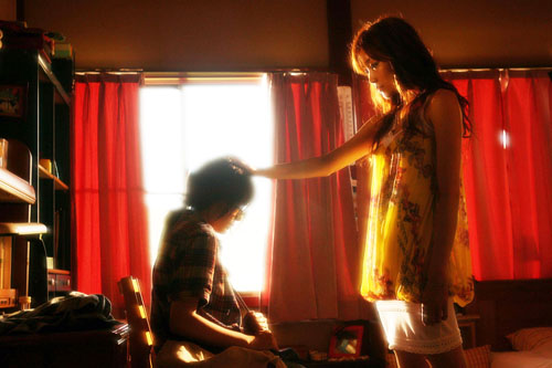
Archive for July 2008
Comic-Con 2008, Part 1: The Con Experience
Kristin here–
From July 23 to 27, I was at Comic-Con for the first time. For the past few years I have contemplated attending, since it is the largest pop-culture fan event in the world. Last year the Con sold out its 125,000 tickets for the first time, and that feat was repeated this year. Comic-Con has become important for the launching of blockbuster fantasy and sci-fi movies. Ian McKellen, on break from playing Gandalf, made a surprise appearance there in 2000 to promote the first X-Men film. Innumerable franchise items for big-budget films have made their debut at the Con.
This year I received an invitation from TheOneRing.net to participate on the site’s first Comic-Con panel in five years (i.e., since 2003, the year of The Return of the King). My fellow panelists were Chris “Calisuri” Pirrotta (co-founder of TORN), Cliff “Quickbeam” Broadway (long-time contributor to the “Green Books” section), and Larry “MrCere” Curtis (contributor to TORN and coordinator of many line parties for the trilogy). That was the extra push that made me decide that this was the year to take the plunge. (See MrCere’s coverage of Comic-Con here, here, and here.)
Coincidentally, pop-culture expert Henry Jenkins was also attending his first Comic-Con. We never spotted each other during the Con itself, but after it ended on Sunday afternoon, we got together for a conversation about our thoughts and reactions. Henry’s now on vacation and wisely not checking email, but I’m going to write up another entry with lengthy excerpts from that conversation. Once I get a chance to run the result past Henry and get his suggestions, probably in a couple of weeks, I’ll be posting that as well. Here I’ll just give an account of my own experiences and what I learned about Comic-Con. I’ll also be blogging specifically about the news-media coverage of the event.
Four-day passes were already sold out by the time our panel was officially accepted (early June), but TORN took care of reserving “Professional” passes for the group. The basic passes seem to be Four-Day, Professional, Press, Exhibitor and One-Day. Eventually I received an email confirmation, complete with barcode to be scanned when I picked up my pass.
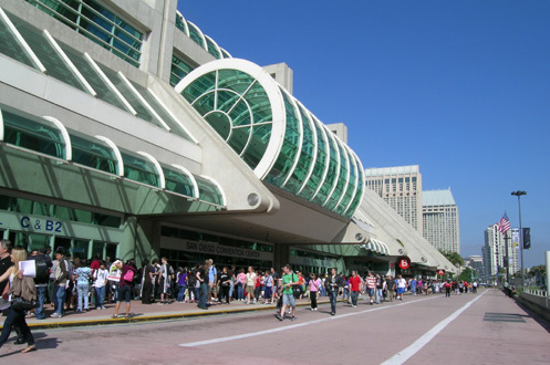
Comic-Con takes place every year at the San Diego Convention Center. There’s no way a photo or even a bunch of photos can convey how big the place is. The space centers around an exhibit hall divided into sections A to H, corresponding to the lobby doors through which one enters. I assume these can be closed off from each other for smaller events, but in this case the entire space apart from Hall H was open. The total exhibition space is 525,701 square feet, with Hall H being 64,842 of that. (More about Hall H later.) David and I live in a large house, but this exhibition hall has about 100 times more floor space.
There’s only one other floor, apart from the mezzanine. The mezzanine was fairly small and taken up by gaming and some small booths which I didn’t investigate. On the second floor are the meeting rooms, varying considerably in size but adding up to 204,114 square feet. The “Sails Pavilion,” a large, column-free open space, is a further 90,000 square feet. That’s where people lined up to get the autographs of major guests, and where the freebies tables and “portfolio review” area were set up. Apart from all that, there are large halls and lobbies where lines form, people socialize, and snack carts sell expensive food and drink. These zones total 284,494 square feet. Rumor has it that after its contract with the Convention Center ends in 2012, Comic-Con may seek an even bigger venue, most likely in Las Vegas or Los Angeles.
Wednesday evening (July 23), there was a three-hour preview for anyone with a pass for the entire event. Arriving at the Convention Center was an overwhelming experience. Thousands of people were heading for the same place, and tens of thousands already there in line. I arrived at the building and saw vast lines on either side of me along the sidewalk. The one to the left seemed to stretch to the horizon; the one to the right looked somewhat less daunting.
Apparently newbies at Comic-Con commonly get into a line, wait until they reach the front, and realize that they were supposed to be in the other one. Luckily I had arrived at about the mid-point of the building and noticed that the big line was for people picking up purchased four-day passes. The other was for professionals and press. After a short hike, I took my place at the end. The wait was enlivened by people constantly pausing and asking which line this was. Occasionally fans in costume passed by, though these represented a much smaller portion of the crowd than the media would lead us to believe.
The wait seemed long but was probably only about 25 minutes. Once I got inside, the registration process 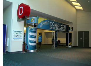 was speedy, with the barcode read and a badge generated and slipped into its plastic case in the blink of an eye. There were no events scheduled that night. It was simply an opportunity to get a look at the exhibition hall, with its thousands of booths and, in the case of the big companies, display areas. Familiar logos were everywhere, and the place stretched out further than one can see.
I mostly spent the evening checking out the companies related to The Lord of the Rings: Weta Workshop, Sideshow Collectibles, and the tiny booth shared by TheOneRing.net andSlave Boy Films (which produces fan-related video, mainly for websites). I was to do three one-hour signings there in the course of the Con, and it became my pied à terre for the duration of the event. (Thanks to producer Justin Sewell and his team for their hospitality!) I also visited the New Line display, but it was mainly there to sell DVDs of Harold and Kumar Escape from Guantanamo Bay. Sure, people could order it online, but the official release date wasn’t until July 29—two whole days after Comic-Con ended.
(I’ve written up an account of LOTR and The Hobbit at Comic-Con on my “Frodo Franchise” blog.)
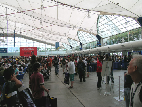
Many types of activities go on simultaneously. There are continuous movie and television previews with stars, directors, and/or writers present. There are autographs to be had, with the most famous people signing in the Sails Pavilion (above) and others at booths in the exhibition hall. (I spotted Marcia Wallace, aka Mrs. Crabapple in The Simpsons, signing at one table.) There are things to be bought, though numerous small promotional items are given away. There are panels and artists’ lectures to attend. There are open spaces in which costumed fans can perform or pose for pictures. Aspiring comics artists can show their profiles to representatives from big publishers like Dark Horse. Gamers can try out previews of forthcoming games. Lots of socializing goes on. After the Harry Potter fandom panel ended, I saw the owners of The Leaky Cauldron meeting ardent fans whom they had only known online up to that point. In short, one cannot possibly do and see more than a small fraction of what happens.
Apart from my signing sessions, I concentrated on panels. I was afraid from the long line that I would get shut out of the “Masters of the Web” panel on Thursday morning, but I got in easily—and indeed, throughout the event I didn’t get shut out of anything, though I didn’t try often to get into the big Hollywood previews. The panels, by the way, start at the civilized hour of 10 am. Those of us taking the shuttle buses from distant hotels could still get up at a reasonable time, get breakfast, and make it to them.
Our TORN panel took place on Friday morning. Not everyone who wanted to attend could get into the 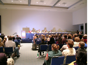 room. Apparently one fan who was shut out got unruly and had to be subdued by security staff! Those who did get in were an enthusiastic bunch, and we spent the session speculating on casting and on possible approaches to adapting The Hobbit and especially to writing the mysterious “Film 2” that is to create a “bridge” covering the sixty-year gap between The Hobbit and The Lord of the Rings. Judging from the applause, Martin Freeman (familiar in this country mainly as Declan in Shaun of the Dead) would be a popular choice for Bilbo. He does look like he would make a plausible hobbit. My suggestion of Mark Ruffalo for Thorin should definitely be taken seriously by the filmmakers.
Other panels I attended involved the Disney “story process,” Sideshow and Marvel toys, and HP fandom. I heard Tolkien artist John Howe’s and comics master Lynda Barry’s talks, definitely two of the highlights of the Con for me. I had long loved John’s Tolkien illustrations and had corresponded with him during the writing of The Frodo Franchise, and it was a huge treat to get to meet him in person—and find that he had read and admired my book. Immediately we were talking like old friends.
Arriving early for Lynda’s talk, I sat through the end of a presentation on an animated series that I had never heard of. During this, Lynda came in and happened to sit down right next to me! (No one who has seen her self-portraits in her comics could fail to recognize her.) I hesitated to ask for her autograph, since some people don’t like to be bothered when they’re about to go onstage. When someone else asked and she didn’t seem to mind, I took my chance. I introduced myself as a fellow Wisconsinite, and she was most charming about signing my program. A good thing, too, since I didn’t figure out her schedule of autograph sessions at the Drawn and Quarterly table until after they were over.
The only disappointing panel was “The Culture of Popular Things: Ethnographic Examination of Comic-Con.” The panelists were a bunch of undergrads (and one grad students) doing a class project which consisted of interviewing exhibitors and fans on various subjects! I’m sure the students are smart and enthusiastic, but they didn’t belong on a panel. If Comic-Con organizers want to add an academic thread—and given the miniscule attendance at these events, I don’t see why they would—they should find some pop-culture experts to make up the panels.
[August 2: I have heard from Dr. Peter Coogan concerning my remarks on the panel “The Culture of Popular Things: Ethnographic Examination of Comic-Con 2008.” He offers some information about the Comic Arts Conference.
The CAC, which has been associated with the Comic-Con since 1992 and a formal part of the Comic-Con since 1998. We run four panels per day for over 20 hours of programming and are one of the largest programming tracks at Comic-Con. Last year the CAC was a small part of the successful argument that the Comic-Con made against San Diego’s attempt to get it reclassified as a for-profit corporation in terms of the rate it would be charged for city services.
Regarding attendance, the CAC was originally located down in room 17 (about 80 seats), but moved up to 7A (about 150 seats) after a few years, and last year to 30AB (about 200 seats). We have consistently filled or overfilled our space, and so have been rewarded with ever larger venues. Attendance was down at CAC panels this year, as it was at many non-media panels across the con. Because of the increased attendance at the con, the lines for the larger Hollywood panels have increased, and attendees, paradoxically, are less free to attend other panels because of all the time they spend waiting in lines.
No doubt I generalized too much on the basis of one panel, for which I apologize. More information on the CAC can be found at its Website.]
The exhibition hall, previews, and panels officially end at 7 pm. Films are screened at night, but I didn’t go to any of them. The main evening events are parties put on by big studios and manufacturers at hotels and screenings held by the studios in local movie theaters. I had a sample of each.
As a member of the TORN panel, I got invited to the Gentle Giant/ Lucasfilm/ Weta/ Sideshow party on Friday evening. I expected that there would be some sort of promotion for upcoming films and products, but there wasn’t anything at the party itself. An adjacent room held a large stack of swag-bags, but I didn’t think I would want to haul home most of what was in them, so I never found out what they contained. I had another chance to talk with John Howe, then briefly with Richard Taylor, and then went off to get a solid eight hours in preparation for the next day.
One of the films being shown in its entirety was Hamlet 2. Our good friend James Shamus of Focus Features got me onto the VIP/Press list, so on Saturday night I was off to the Gaslamp 15 multiplex. The film, which was a hit at Sundance this year, is an amusing and cheerily offensive film which has the potential to be one of this year’s indie sleepers. Director-writer Andrew Fleming, co-writer Pam Brady, and star Steve Coogan were there for a Q&A after the screening. It was definitely a more relaxed and personal session than the one I witnessed for a big studio films, where the guests were tiny dots in the distance and had to be viewed on giant TV screens.
That one preview and Q&A that I witnessed was for Terminator Salvation, which I had sort of assumed that I would miss. I had been avoiding the giant Hall H, where the big studios held their promotional events, because I had heard horror stories about hours waiting in line for one of the 6500 seats. There was plenty to do elsewhere. But I definitely wanted to see the 2:30 Pixar presentation of scenes from upcoming features Bolt and Up. That was at I decided to go early and get in the Pixar line just after Terminator Salvation started at 1:15.
It turned out that there was in fact just one line for Hall H, moving continuously as seats became available. This makes it difficult to gauge when to queue up for a specific event. That line snaked from the entrance across the plaza and made several long loops across the grass. Some people had settled in for lunch. But at about 1:20 we began to move surprisingly quickly. Turned out that the Terminator Salvation show was running a bit late, and I made it just as the preview reel started. It looked like it might be good, though my ears hurt for two days afterward (especially since they showed it again at the end). Director McG and some of the actors held a Q&A afterward—mostly the usual stuff about how wonderful it was to be working with each other. The high point came when a young Asian-American man from the audience asked a question in a perfect “Arnold” voice. He was called up to the stage to help field questions, keeping up the Arnold imitation flawlessly. By the way, Christian Bale (starring as John Connor) wasn’t there, though maybe if he had showed up, he could have avoided a spot of trouble he got into in London a few days earlier.
The Pixar session was a double preview. Co-directors Byron Howard and Chris Williams introduced some lengthy clips from Bolt, to be released November 26. It’s about a dog who plays a super-dog on TV and thinks he really has super powers. The footage cut together storyboard images, unrendered animation, and finished shots, which the audience didn’t seem to mind in the slightest. We’re used to seeing DVD supplements on pre-viz or storyboarding, but to see them all mixed together and edited into sequence, the way the filmmakers themselves see them during post-production, is a rare treat.
Then it was co-director Peter Docter’s turn to introduce Up. This sounds like one of the odder Pixar premises: a 78-year-old man avoids life in a nursing home by tying a giant bunch of helium balloons to his house and flies it to South America, discovering a stowaway boy and ending up in the jungle. The footage shown looked charming. Up is due out May 29. What with WALL-E this summer and these two coming soon, it looks like Pixar is managing to pick up the pace of production to more than one feature per year.
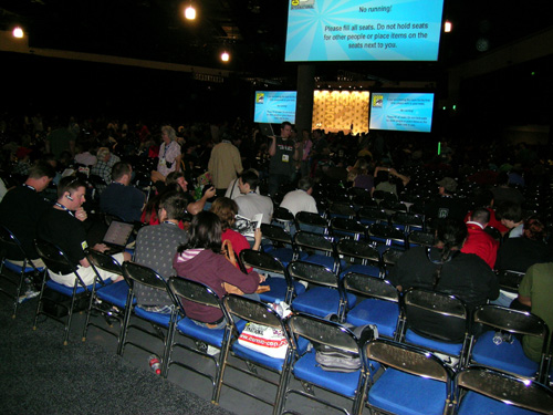
Hall H is essentially impossible to photograph. It’s too dark to shoot without flash, and flash only lights up a small area. To give a sense of scale, though, that orange rectangle near the center of the photo is the stage where the celebrities sit for their sessions. Sitting near the back, I could see them only as small dots, except on the monitors.
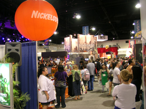
On Sunday I wandered around the exhibition hall, which I hadn’t really explored up to then. It’s divided into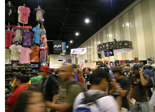 general sections by type of display. There’s an aisle for upcoming video games; that round thing in the photo at the right is the Electronic Arts sign. Gamers crowded it to try out the new titles. Artists’ Alley is where independent artists and aspiring artists can rent small display tables. Despite the proliferation of media publicized and sold at Comic-Con, comics still command a substantial portion of the floor. Dealers may offer old comics, original artwork, animation cels, and posters. Henry was delighted to find and purchase an original newspaper page with a well-preserved Winsor McCay comic-strip on it.
The big studios have large display areas for films and TV shows. Aisles around them seemed always to be choked with people, I gather getting autographs from cast members. I never did get close enough for a good look, but obviously these booths are very popular.
Action and collectible figures are represented, there’s an area for comic and graphic-novel publishers, such as Drawn and Quarterly.
Overall I enjoyed Comic-Con. I don’t think it will be one of those events I long to attend every year, but I would like to go back. Presumably in a year or two publicity for The Hobbit will start showing up at the Con, and that I definitely would like to see.
Summer show and tell
DB here:
I came back from a month in Europe to find a stack of magazines, books, and DVDs waiting. There was Before the Rain, much Cecil B. DeMille, and a mass of Anthony Manns (some discussed on Jonathan Rosenbaum’s blog). How will I ever catch up? I was reconciled to the idea that I’d die before reading every book I owned, but now I have to face the same conclusion about movies on discs.
Herewith some items from my trip to Amsterdam, Bologna, and Brussels that I couldn’t squeeze into earlier blogs. I end with the movie I watched upon my return.
DaViD’s DVD depredations
In Bologna, I learned that Oksana Bulgakowa is at work studying how cinema captured everyday human gestures at earlier points in history. Visit her site, where a DVD is available on her research.
Speaking of DVDs, travel inevitably brings them into your baggage, despite the high prices and the abysmal exchange rate.
*At Bologna our Copenhagen pals gave us the new Danish Film Institute DVD, Danish Experimental Classics 1942-1958. Not quite yet available for sale, it should show up here—as has a third collection of Jørgen Leth movies. While you’re sniffing around the site, eyeball the archive’s new state-of-the-art storage facility.
*Hubert Niogret, indefatigable director of documentaries on Asian cinema, has also produced an excellent collection of interviews, Mémoires du cinéma francais: De la libération à nos jours. Together we sampled an outstanding Bologna specialty, gramigna con salsiccia.
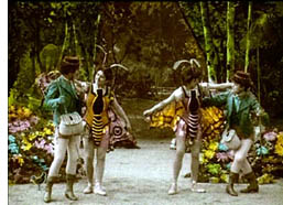 *Isabel Biver passed along the latest installment of Imagination in Context, a series of books and discs about early cinema and Antwerp. Animalomania includes English-language text and some nice films, including a hand-colored fantasy about butterfly collectors who wind up with pretty girls dressed as butterflies.
*At a sale table I found the Index DVD of Ivan Ladislav Galeta’s works, which includes the remarkable Two Times in One Space (1976/1984). I caught up, finally, with the Austrian Film Museum’s reconstruction of Frank Borzage’s The River.
*In Brussels I picked up the StudioCanal collection of Méliès films, which complements the recent Flicker Alley collection. Of course then I had to splurge on Laurent Mannoni’s gorgeous book, L’oeuvre de Georges Méliès.
 *Also snagged a batch of Gosha and Uchida swordplay movies, but in the Japanese line my real finds were a French edition of Night and Fog in Japan, one of Oshima’s finest (also just out in the UK) and the Carlotta set of three 1930s Mizoguchi films: The Downfall of Osen, Oyuki the Virgin, and Poppies. All drawn from 16mm copies, these items vary drastically in quality. Osen is superb, but Oyuki is iffy, and Poppies is a rain of scratches, the worst copy I’ve ever seen.
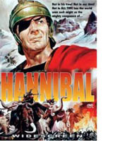
*To top things off, Tom Paulus of the University of Antwerp, bestowed upon me his extra copy of Edgar G. Ulmer’s Hannibal (1960) in SuperCineScope. This is what friends are for.
Interlude: Some Europix, arty and otherwise
My last sigh x 3
Every summer the Arenberg cinema holds a retrospective season, Ecran total, and it helps make Brussels a great film city. This time there were cycles dedicated to Delphine Seyrig, Al Pacino, the Japanese New Wave, and children, as well as a batch of classics. Prints are usually fresh, and the programming is very eclectic. So Saturday, the day before I flew home, I saw three movies at the Arenberg. I liked the West Anderson better than I expected to, though the clash between the overall feyness and a child’s death left me a little stranded emotionally. I had forgotten the Lumet since the initial release; not up to Prince of the City methinks, but a sturdy, earnest piece of work. The Duras proved as mesmeric as ever, and still unthinkable on DVD (even though I have two DVDs of it). All in excellent prints and pinpoint-sharp projection. Cinephilia satisfied: No need to watch anything on the plane home the next day.
No need to eat much either, because of a delicious late meal with our old friend Geneviève van Cauwenberge, head of the film and media program at the University of Liège.
Trafficking
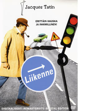 For my avant-birthday, Kristin (a) bought me a beautiful Krazy Kat page; (b) took me out for sushi; and (c) settled in with me to watch the new Criterion disc of Jacques Tati’s Trafic. It’s been one of our favorites for a long time; I saw it on initial release in Paris while researching my dissertation. It’s not as densely loaded as Play Time, nor as structurally rigorous as M. Hulot’s Holiday. (Kristin wrote about both these films in her book Breaking the Glass Armor; my bias aside, her analyses are really illuminating.) Trafic has its own charms, though, and Gary Giddins gets at several of them here. We’ve collected versions on tape and even a Finnish DVD, which calls him Tatin, but the Criterion looks to be the best version yet. (Still, why not anamorphic?)
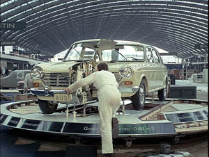
Trafic is definitely odd, with a choppy opening and quickly-cut extreme long shots. This time around I was struck by how much a landscape artist Tati was. Sometimes he built his own massive milieu, as in Play Time, and sometimes he merged his constructed spaces with the real world, as in the houses of Mon Oncle. In Hulot and Trafic he exploited the vastness of real spaces, usually the backdrop for human foibles made minuscule. Trafic gives us a un-picturesque European countryside. Sliced by superhighways, the bland vistas are dotted with rusted cars, empty fields, and forlorn gas stations. Drivers hiking off for fuel or trying to patch up their vehicles dwindle to pathetic dots in the image. Cities are no better, choked with pale cars that advance fitfully. Then there’s the huge convention center housing the auto show. The opening gag of men stepping carefully over stretched strings that we can’t see etches tiny gestures into a monumental frame. Masters of ambivalent vastness: Antonioni, Angelopoulos, Tarr….and Tati?
The setpiece of Trafic is of course the car crash, and it, like Tati’s characteristic running gags (e.g., cheap busts of historical figures as bonuses for gas fillups), reminds us of the follies of the car culture. In a sense, the entirety of Trafic seems an outgrowth of Play Time‘s final sequence, which turns a traffic roundabout into a carousel. But here there’s little sense of a mundane world transformed into a playground. Instead, modern misery remains the norm, as pedestrians zigzag their way through infinite gridlock.
Beyond the satire, which can get fairly caustic, I have always loved Tati for juxtapositions so weird and remote that you wonder if they could count as gags. Then you wonder if you’re the only person to notice them. In Play Time, everybody gets the running gag about the drunk at the bar of the Royal Garden tipping over on his stool. Far less evident is a moment I always find disconcerting. When the air-conditioning at the restaurant is finally switched on, the air vents make the loose skin on one woman’s back ripple. The denunciation of flabby bourgeois comfort comes and goes in a flash, and when I first noticed it in the 1970s I thought: Is it accidental? Did Tati mean for me to see it? Does anybody else notice? And does this count as a gag, or just, well, peculiar?
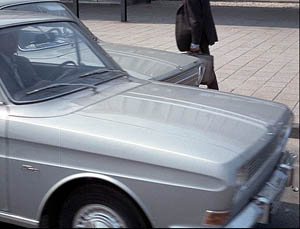
Likewise, in Trafic, Tati can cut from a bisected car on display to a quasi-abstract angle on traffic, with one fender sliding past an identical one.
We’re supposed to notice the purely sculptural analogy of split cars. And we’re supposed to find it at least a little funny. Right? Right?
Whether you agree or not, Tati’s vacant long-shots and unpredictable cutting leave space for such musings. Comedy with a question mark, from one of the dozen or so greatest directors who ever lived.
Kristin is now at Comic-Con, armed with fan-friendly T-shirts and a carrier bag from Lambiek. Her mission: to sell a copy of The Frodo Franchise to each of 125,000 attenders. Expect dispatches from her in the days to come.
P. S. My thanks to the staff of the vaults at the Royal Film Archive of Belgium, who were extremely helpful during my visit. I didn’t manage to photograph everybody, but I owe special gratitude to the supervisor Marianne Winderickx, pictured below.
PPS 24 July: Olli Sulopuisto clears up my Tatin puzzlement: “In Finnish the trailing n is the mark of a possessive, similar to ‘Jacques Tati’s…'” Thanks to Olli.
Rio Jim, in discrete fragments
The first moving-pictures, as I remember them thirty years ago, presented more or less continuous scenes. They were played like ordinary plays, and so one could follow them lazily and at ease. But the modern movie is no such organic whole; it is simply a maddening chaos of discrete fragments. The average scene, if the two shows I attempted were typical, cannot run for more than six or seven seconds. Many are far shorter, and very few are appreciably longer. The result is confusion horribly confounded. How can one work up any rational interest in a fable that changes its locale and its characters ten times a minute?
H. L. Mencken, 1927
DB here:
Between about 1913 and 1920, the way movies looked changed, and we are still living with the results. What were the changes? What brought them about?
I’m just back from Brussels, after a two-week visit to the archive. During earlier trips, I’ve concentrated on examining films from the 1910s that exemplify the tableau tradition. That’s what we might call the stylistic approach that tells the story and achieves its other effects predominantly through staging—by arranging the actors within the frame, forming patterns that reflect what is important at a given moment.
The tableau tradition dominated European cinema of the early and mid-1910s, and it was also on display in the U. S. It is sometimes considered “theatrical” and “uncinematic,” but that’s a shortsighted view. The tableau tradition is one of the great artistic triumphs of film history. For backup on this, consult Ben Brewster and Lea Jacobs’ Theatre to Cinema and my On the History of Film Style and Figures Traced in Light. And you can go here and here on this site.
As the 1910s moved on, the staging-driven approach gave way to one dominated by editing. Roughly speaking, this strategy surfaced at two levels. Directors began to use crosscutting, aka parallel editing, more strenuously. By alternating shots, you could show events taking place at two or more locations. This technique was not used only for last-minute rescues; it was a way of keeping track of all the characters in nearly every sequence, whether they were going to converge or not.
Second, within a single strand of action, 1910s directors exploited analytical editing, breaking down a scene’s space into a host of details. Griffith often gets the credit for this tactic (and he happily claimed to have invented it), but it’s probably most fairly understood as a collective innovation.
Directors in the tableau tradition didn’t entirely avoid crosscutting or analytical editing, but there was a measurable shift of gravity in the second half of the 1910s. In the U.S., many filmmakers pushed editing techniques very hard. You can sense their exhilaration in discovering how editing lets them control pacing, make story points concisely, build suspense, and force the viewer to keep up.
During the 1910s, American movies became breathless. The hurtling pace of Speed Racer or The Dark Knight has its origins here; seen today, The Battle at Elderbush Gulch (1913) and Wild and Woolly (1917) still look mighty rapid-fire. And then as now some observers, like Mencken, complained that it was all too fast and furious.
Over the last thirty years, many scholars have studied this change, but for a glimpse of some supporting data, you can visit the remarkable website Cinemetrics. Yuri Tsivian, Barry Salt, and a corps of volunteer scholars have been measuring Average Shot Lengths in films from all eras. The data from the 1910s are pretty unequivocal. In the US around 1916-1918, movies became editing-dominated, shifting from an ASL of over 10 seconds, sometimes as much as 30 seconds, to 5-6 seconds or less. A 4-6 second average per shot persists in Hollywood through the 1920s, so Mencken’s guess about the “scenes” (as shots were then known) changing ten times a minute was more or less right.
Back in the 1980s, Salt and others, including Kristin and me, picked 1917 as a plausible point of reference for the consolidation of the continuity style. That was the point at which virtually every US film we watched contained at least one example of specific continuity techniques. (Most contained many more instances, of course.) We talk about that magical year in this entry, which you might want to read as an introduction to what follows today.
In just a few years, continuity editing became a coherent, supple means of expression, and it has defined Hollywood film style up to the present. What brought this about? Kristin and Janet Staiger offered an explanation in our 1985 book, The Classical Hollywood Cinema: Film Style and Mode of Production to 1960. They traced out several factors that encouraged and sustained this style. Especially important were the development of longer films, a conception of filmic quality, and the emergence of a specific division of labor.
Lately I’ve been revisiting these early years, chiefly to watch how directors pick up and refine the stylistic schemas that were coming into broader use. I want to know more about the little touches that directors had to control in creating this style. I’ve also been interested in to what extent these techniques were picked up by directors in Europe and Asia. The evidence is pretty clear that continuity cinema became a lingua franca of film style.
So if last year I pondered the minute compositional adjustments of Evgenii Bauer, this year it was all cutting. I focused on three filmmakers, but I’ll save discussion of two of them for a rainy day, or a book. In all, it was a thrill, as ever, to watch a stylistic system coalesce across a batch of films that are seldom mentioned in the history books.
The trail to continuity
The extraordinary films starring William S. Hart typify early American continuity techniques. After a distinguished career on the stage, Hart began as a film actor in 1914, when he was nearly fifty. He was intent on bringing realism to the newly burgeoning Western genre. His films were at first made under the auspices of Thomas Ince, a pioneer of rationalized production techniques, and with his Ince pictures Hart found worldwide success. He followed a rousing feature debut (On the Night Stage, 1915) with many shorter films. In 1917—mark the year—Hart broke with Ince and set up his own firm for The Narrow Trail. He continued to make films into the early 1920s, with Tumbleweeds (1925) marking his farewell to cinema.
Hart often directed his own pictures, though he also had the services of strong directors like Reginald Barker. The films have an assured brio, thanks to careful cutting and some felicitous touches.
They are fast-moving: In the five 1915 Hart films I watched, the ASL ranged from 8 to 11 seconds, but in 1916, the average jumped to 5-6 seconds per shot. The Narrow Trail seems to have an ASL of 3.7 seconds, but I can hardly believe it and I must verify it with another viewing. The 1918 and 1920 films I viewed average between 4.9 and 5.4 seconds per shot.
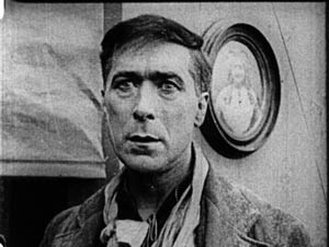
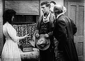
Just as important as the speed of cutting, naturally, is what Hart does with his cuts. In one scene from Between Men (1916), you can see the tableau aesthetic undermined by analytical editing. Gregg is a shifty stock trader, a species we still nurture. He’s trying to destroy Hampton’s fortune because he thinks that when the old man is destitute he’ll force his daughter to marry Gregg. Hampton has asked Bob White (Hart) to help get the goods on the suitor.
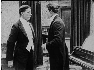
In one scene, the master shot approximates a tableau setup: Bob and Gregg stand in the middle ground, with a room visible behind them.
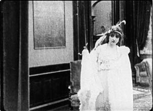
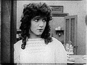
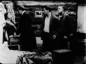
As the men swap increasingly tense challenges, Margaret Hampton enters the adjacent room and stands behind them as they talk. A director in the tableau tradition would have sustained the master shot and shown Margaret approaching in the background and drawing closer, reacting to what the men say. She could easily have been stationed hovering at the curtain on the right.
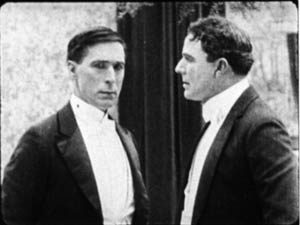
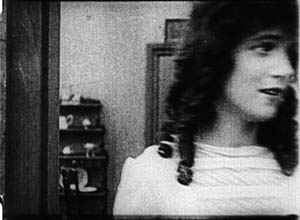
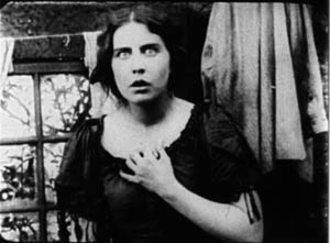
Instead, director C. Gardiner Sullivan has her arrive from another doorway in the adjacent room, one not visible in the master shot of the two men. He then cuts back and forth between the men and Margaret, and he positions her at the left curtain–so that the men block her from our view! The blockage motivates cutting to Margaret for her reactions to what Bob and Gregg say.
Only when she wants to challenge Bob’s suggestion that he might marry her does Margaret come into the same frame as the men, who part to make room for her.
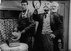
It turns out that this sequence is but a rehearsal for a lengthier passage in which Hampton will come in from the adjacent room (via the door we do see in the background). As with Margaret’s entrance, his arrival will be blocked by Gregg’s body, and Sullivan will cut among the trio in the foreground and Hampton’s approach behind them. That passage, which could also have been handled in a single framing in the tableau style, consists of four distinct setups and eighteen shots!
So even depth-based scenes can be recast as rapid découpage. The passage is probably overcut, but you can sense the filmmakers’ exhilaration in their power to chop up the world into separate, slightly jolting bits, forcing the audience to keep abreast of each item of information.
Managing details
The variety of setups is worth noticing in another film, for here we can see the filmmakers taking pains to show each bit of action most clearly and emphatically. In The Return of Draw Egan (1916), when Egan sees the mayor’s daughter Myrtle he decides to stay on as marshal of Yellow Dog. The first shots show them looking at each other.
The next pair of shots shows the two looking at each other in close-up.
This gradual enlargement of the figures in a reverse-shot sequence would of course become a staple of analytical editing—perhaps it already was in 1916. Cut back to another framing of Egan, as the mayor signals Myrtle to join them. The slightly off-center composition reiterates her position off left.
Cut back to Myrtle, exiting her close-up. The next shot shows her joining the men, to be introduced to Egan.
But this is a different camera position than the one showing the men just previously. The daughter’s entrance has motivated a slightly changed composition. In the 1910s, cutting began to dictate staging, so that each composition had to fit smoothly into the flow of shots.
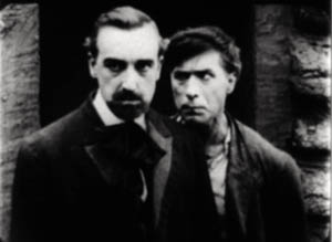
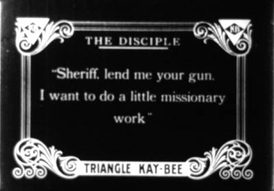
This sequence from Draw Egan doesn’t utilize axial cuts, those cuts that keep to the same angle and move straight in or out. Here the actors are angled to suggest that we are to some degree in between them. Indeed, sometimes the camera will put us directly between the characters. Here is a climactic confrontation from The Disciple (1915). A doctor has cuckolded Hart, but Hart brings him to save his daughter. As the doctor enters, the wife’s shameful look is met by Doc’s anxious expression, with a furious Hart pressing a pistol to his back.
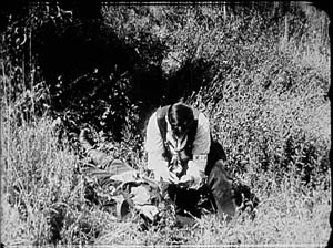
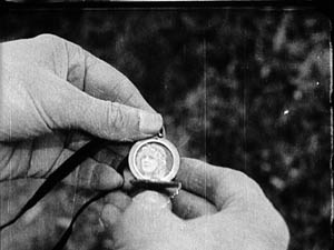
This freedom of camera placement extends to point-of-view cutting. Again, this is an old technique, but like other old techniques, it was revived and refined as part of the synthesis that became the continuity style. So Keno Bates, Liar (1915; a splendid title) can make use of a cameo picture that captivates Bates after a shootout with the man who robbed him.
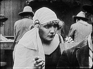
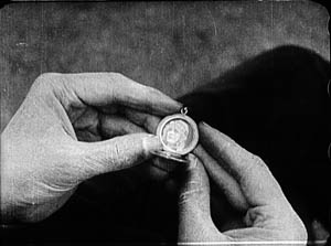
Later, the dance-hall girl catches sight of her rival when Bates muses on the cameo.
The pov framings don’t change much, but the angle chosen easily approximates both Bates’ view and her view over his shoulder. Moreover, the shot of Bates’ hands isn’t the sort of vacuous insert we often see at the period, with a letter or an object isolated against a blank ground. Here, the backgrounds change, so that the first shot is situated naturally in the wild, while the second is consistent with the barroom locale.
Putting the pieces together
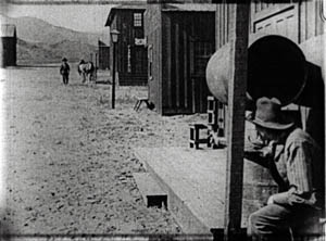
From very early in the history of Westerns, the main street shootout seems to have been a solid convention. Already in The Return of Draw Egan, it’s treated with a vitality and ingenuity that suggests creative reworking of a staple. The climactic shootout also shows just how flexible the new technique could be.
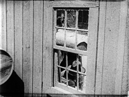
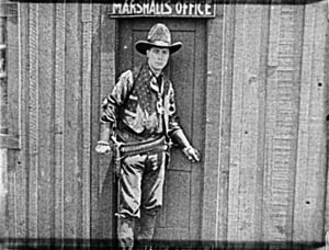
Egan has told his enemy, Arizona Joe, that he’ll meet him when the setting sun’s rays hit the saloon window. So the film crosscuts Egan in his marshal’s office with a nervous Joe, seen in close-up, eyeing the window.
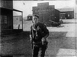
When Joe gets up the nerve to leave, he hides behind a barrel and waits to ambush Egan. When Egan leaves his office, a reverse tracking shot follows him striding toward us.
Then we get an orienting long shot with Joe in the foreground and Egan approaching.
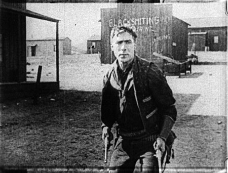
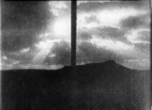
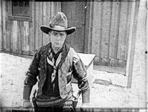
Edging sideways, Egan spots a reflection of Joe’s head in a window. These shots surmount today’s blog entry. You can see Egan’s reflection in the upper left pane.
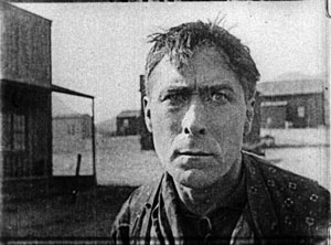
Now aware of Joe’s tactic, Egan steps diagonally forward, coming ominously right up to the camera.
He fires and dispatches Joe. The townsfolk, who have been huddled in a house watching, declare they want Egan to stay on as marshal, despite his outlaw past. Myrtle chimes in, and we get a happy ending. Chaotic fragments? Mencken couldn’t have been more wrong. Or maybe he was just being grumpy.
The trail to Hollywood
There’s plenty more in these films—beautiful, sometimes minuscule matches on action; subtle timing of frame entrances and exits; and even proto-over-the-shoulder reverse shots. And we don’t have to claim that Hart’s films are the only innovative ones. They take their place within a broader, collective achievement that we still haven’t fully grasped.
Editing permitted everyone to act at small scale; the bargirl who sees Bates’ cameo need only lower one fist, tighten the other, and narrow her eyes to express her jealousy. The new style nurtured laconic stars like Hart. His films are full of pathetic situations that demand he display stoicism but also sensitivity. The long shots could emphasize his gestures and stances, while close-ups could display his worn, haunted face and pale eyes. He acts with those eyes, glancing aside to recall a traumatic event or looking downward as he hesitates to break bad news. Often the plot demands that he conceal his feelings or hide the truth behind an event, and the changing shots could penetrate the surface drama and highlight his slightest reactions. Hart could underplay his role because the editing shows us everything he might have said.
Known in France as Rio Jim, Hart was very influential on the Europeans. His pictures, along with De Mille’s The Cheat (1915) and the films of Chaplin and Fairbanks and many others, offered tutorials in the new style. Arguably, the cumulative force of these mainstream releases was greater than the influence of Griffith’s more prestigious output of the moment. There was only one Intolerance (1916), the film by which Griffith was most widely known abroad, but week by week the Westerns and comedies and dramas pouring out of Hollywood flaunted a new, almost frighteningly energetic approach to cinema.
Timing favored the Americans. The style emerged at around the start of World War I, when hostilities gave U. S. films a chance to displace the big French and Danish companies in many markets. Kristin explains how this happened in Exporting Entertainment, and she talks about the exceptional case of Germany in Herr Lubitsch Goes to Hollywood.
Some European directors picked up the new style immediately, others took a bit longer, and a few, like Feuillade, never fully adjusted to it. The principles of the older tableau style never utterly died out, as I try to show in Figures Traced in Light. But the future belonged to the editing-based aesthetic. Canonized, tweaked, updated, dismantled, undermined—however filmmakers reacted to classical continuity, it became the basis of international cinematic storytelling.
My epigraph comes from H. L. Mencken, “Appendix from Moronia: Note on Technic,” from Prejudices: Sixth Series (New York: Alfred A. Knopf, 1927), rep. in Phillip Lopate, ed., American Movie Critics: An Anthology From the Silents Until Now, expanded edition (New York: The Library of America, 2006), 35-36.
Silent film speeds can vary, so shot counts can yield different averages. I saw some of the Harts I mention in projection at last year’s Il Cinema Ritrovato, and they were projected at 18 or 19 frames per second, a common speed for the period. My ASLs are based on the running time. For the titles I saw in Brussels on a flatbed viewer, my basis was the length in meters. From that I’ve calculated running times and averages, assuming 18 frames per second. Projectionists of the time had freedom to screen at different speeds, so it’s possible that late 1910s Hart films were sometimes shown at 20 frames per second, which of course would make their cutting pace even faster.
For more on Hart’s career, see Diane Kaiser Koszarski, The Complete Films of William S. Hart: A Pictorial Record (New York: Dover, 1980). Koszarski devotes space to each film, with credits, excerpts from contemporary reviews, and excellent production stills. She also provides a sensitive critical overview. In William S. Hart: Projecting the American West (Norman: University of Oklahoma Press, 2003) Ronald L. Davis has given us a brief, engrossing biography based on interviews and extensive archival research. Hart’s memoir, My Life East and West (1929, reprint 1994) is of course indispensable.
C is for Cine-discoveries
Funuke, Show Some Love, You Losers!
DB here:
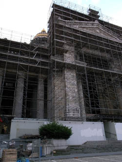
Kristin and I think of Brussels as a gray city—gray skies, gray pavements, gray buildings, even gray, if often fashionable, clothes. It isn’t usually a fair description, though. In the twenty-plus summers we have been visiting, many days have been bright. I suppose our impression comes chiefly from one rainy fall we spent here in 1984, on a Fulbright research grant. Still, the public monuments bear us out, especially the Palais de Justice: except for its gold dome, it is gray, and has been encased in gray scaffolding for as long as we can remember.
Indeed, Brusselians assure us that the scaffolding will never go away because it’s holding the Palais up.
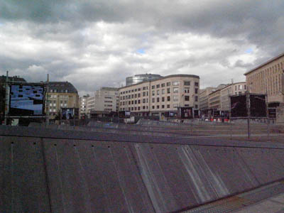
The gray motif continues this summer; during my visit, there have been almost no sunny days, just rain and chill. To prove that Belgians have stayed loyal to their favorite color, I took a shot of a new piece of public architecture near the Central Station: a half-circle of tipped-over pyramids that are, ineluctably, gray.
Still, the movies provide my light and color. I talked about Brussels as one of the great film cities in last year’s entry. I found further proof in a 2003 Marc Crunelle’s Histoire des cinemas bruxellois (in a series announced here), a small book with some fine pictures, one of which you will find at the end of this entry.
As usual, my host was the Royal Film Archive of Belgium. The archive offices remain in their splendid old building, the Hotel Ravenstein, but the new museum complex is still under construction. So the screenings continue to be held in the ex-Shell building, a piece of postwar Europopuluxe that I seem to enjoy more than most of the locals.
During my days, I watch films (very, very slowly) in the archive vaults; more about that project in my next entry. At night the event was Cinédécouvertes, the annual festival of new films that don’t yet have Belgian distribution. That festival, going back decades, has now been attached to a bigger event, the Brussels European Film Festival, which this year began on 28 June. BEFF showed thirty new titles, plus eight older items in open-air screenings, and it gave several prizes.
Kristin and I were in Bologna for Il Cinema Ritrovato and so I missed all of these, including the big Flemish film of 2007, Ben X. But Cinédécouvertes, running on during the BEFF, had its second and final week while I was in town. Films screened were competing for a 10,000-euro prize to be awarded to a distributor that would pick up the film. In addition, the venerable L’Age d’or prize would be awarded to a film that maintained the spirit of Buñuel’s scandalous masterpiece.
Herewith some notes on what I saw, and the prize results. Of course on the day I posted this, the sun came out.
Women, prep school, and manga
Cargo 200.
The two Iranian films in the program were earnest but varying in quality. Unfinished Stories (Pourya Azabayjani) is a network narrative following three women across a single night. A suicidal teenager doesn’t return home; her path crosses with that of a wife cast out by her husband; and she in turn brushes past a young woman who tries to smuggle her newborn baby out of the hospital. The situations are engagingly melodramatic, but the links among them (a footloose soldier, a compassionate taxi driver, an enigmatic old man) seemed to me forced, and as is often the case in these tales, the problem is how to conclude each story line in a satisfying way. The use of sound was very fresh, however. I especially liked the teenager’s obsessive replaying of taped conversations with her boyfriend. Often these “auditory flashbacks” are played over a black screen, and they come to exist as discrete, almost virtual scenes.
I like it when a film begins with a sharp, defining gesture, and Three Women (Manijeh Hekmat) had one. In close-up a car drives up to a tollbooth and the driver’s hand tosses a cellphone into a Charity Box there. Someone is on the run and cutting ties, but we won’t find out more for some time.
The first stretch of the movie concentrates on Minoo, a divorced professor and expert in Persian textiles. A rug dealer has promised to keep a precious carpet in the care of her museum, but he changes his mind and tries to sell it. In a fit of temper she grabs the carpet from its owner and takes it to her car, where her somewhat senile mother waits patiently for a trip to the hospital. Then the old lady vanishes. The emphasis shifts to Minoo’s daughter Pegah, who has set out on her own. The maddening Tehran traffic of the early scenes gives way to the empty quiet of the countryside. In the second half of the film, a favorite theme of Iranian cinema—the urban intellectual confronting rural life—is played out vividly when village elders debate whether to stone a woman who has had an abortion.
Like many of the best Iranian films, Three Women tells its story with dramatic force, offering robust conflicts and a degree of suspense rare in arthouse fare. Manijeh Hekmat, who made her name with Women’s Prison, manages the story threads skilfully, creating a continuous revelation of backstory and hints about how the tale will develop. I especially liked the way Minoo gradually realizes that she has had no idea how her daughter is living. As Alissa Simon points out in her perceptive review, Hekmat can spare time for a subtle composition as well. The ending came as a quiet surprise, deflating some dramatic issues but emphasizing the comparative unimportance of carpets, cellphones, and pop music in the face of the deeper problems facing Iranian women.
Add another woman and you have Adoor Gopalakrishnan’s Four Women. The quartet of stories, all adapted from literature and evidently set in the 1940s and 1950s, shows the fates befalling women in different roles, each identified with a title: The Prostitute, the Virgin, the Housewife, and the Spinster. Not much fun to serve in any of them, it turns out. The film has a sharp eye for details of local life and ceremonies, an ambition helped by the high-definition format: a slow-moving river is off-puttingly scummy. A little didactic and schematic, but it’s enlivened by a long sequence of a husband who methodically and endlessly eats everything put in front of him, with a seriousness he cannot bring to his marriage. The sequence starts in bemusement, moves to humor, and persists to the threshold of nausea.
The Argentine La sangre brota (Pablo Fendrik) was a little reminiscent of City of God in its relentless handheld assault on your senses, with the camera grazing faces and people racing in pursuit of drugs and money, with a beleagured taxi driver trying to do the right thing. La maison jaune (Amor Hakkar), from Algeria, appealed more to me. How much we owe neorealism! Quietly and simply, Hakkar tells of a father learning of his son’s death, fetching the body home for burial, and then trying to find a way to relieve his wife’s grief. So he paints his house yellow. Quiet and moving and not as simple, in story or pictorial technique, as it might sound.
Antonio Campos’ Afterschool (US) is a very assured first feature about drug-overdose deaths in a prep school. The story is told almost completely through the consciousness of Rob, an introspective and awkward freshman who indulges in internet porn. Passive to the point of inertia, Rob remains largely a mystery. This effect is often due to Campos’ bold use of the 2.40 widescreen frame, which often excludes some of the most important dramatic information. People are split by the left or right edge, or are decapitated by the top frameline, so we must strain to listen to the conversation and catch glimpses of the characters. This may sound arbitrary, but Campos finds ways to motivate the lopped-off compositions. One shot, when the parents of dead students record their thoughts on video, is one of the strongest pieces of staging I’ve seen this year. Unlikely to get U. S. theatrical release, if only because of its pacing, Afterschool marks Campos as definitely a director to watch. It won one of the two top Cinédécouvertes prizes.
The other top prizewinner was Yoshida Daihachi’s Funuke, Show Some Love, You Losers! It’s another insane Japanese family movie—that is, the family is insane, and the movie acts the same way, out of sympathy or contagion. After the parents are killed trying to save a cat from an oncoming truck (nice overhead shot of bloody skid marks), a new household takes shape. There’s the phlegmatic brother Shinji, his maniacally cheerful wife, his adolescent sister Kyomi, and his sister Sumika, who comes to stay after failing to make it in Tokyo as an actress. Family secrets emerge. Sumika starts turning tricks and Kyomi draws violent manga inspired by Sumika’s adventures. The comedy turns blacker when Kyomi’s comic books become best-sellers and all the family problems regale the reading public. With some scenes shot in high-contrast video, as if they were TV episodes, and a climax that blends film and manga, panel by panel, the film’s style is as all over the map as the characters and their complexes. Good dirty fun from the title onward.
The L’Age d’or prize went, deservedly, to Cargo 200 from Russia. Another black comedy, but one that gets blacker and less funny as it goes along, it becomes sort of a post-Glasnost’ Last House on the Left. (Seriously, maybe there’s an influence of Saw and Hostel here, with hints of Faulkner’s Sanctuary.) Set in 1984 and stuffed with retro clothes, hairstyles, and music, the plot spins crazy-eights around the corpse of a returning Afghan war hero; a teenager trying to buy homebrew vodka; a bootlegger who keeps a Vietnamese refugee as an assistant; a small-town policeman with a penchant for voyeuristic sex; and a professor of dialectical materialism who wanders, blinking, in and out of the lurid plot twists. Director Alexei Balabanov, who did the pioneering rough genre picture Brother (1997), gives no quarter here.
Strength in simplicity
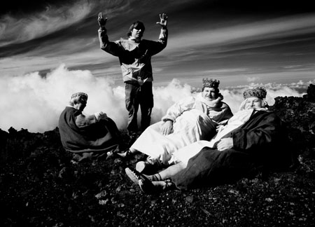
Albert Serra directs the three kings in El cant dels ocells.
My three favorites were all resolutely unfancy. Shultes, a Russian item by Bakur Bakuradze, is a minimalist study of a pickpocket. Shultes lives with his mother, gives some of his loot to his legit brother, and takes up with a boy whom he tutors in thievery. At slightly over 200 shots, the movie is staged, shot, and cut with a precision that reminded me of Apichatpong Weerasethakul (Syndromes and a Century). On the inexpressiveness scale, Shultes, with eyes and mouth too small to fill up much of his face, makes Bresson’s pickpocket look positively other-directed.
 As with all movies about stealing, the pleasure lies in trying to figure out the plan and spot the telltale moves—sort of like the misdirection of a magic act. Here the drama is cunningly contrived. What is Shultes writing in his little brown book? Who is Vasya? What’s his big plan? The plot jumps a level when we realize that all we’ve seen is a flashback, and the ensuing conversation puts things in a startling perspective. Our blankly amoral protagonist even becomes a shade sympathetic. Too rigorous and unemphatic to be an arthouse import, I fear, but ideal for a festival.
Shinji Aoyama is best known for Eureka (2000), which won a prize at an earlier Cinédécouvertes. Sad Vacation is one of those films that try to do justice to the ways in which humans become tangled in relationships based on acquaintance, momentary bits of kindness, and sheer chance. Kenji helps smuggle Chinese workers into Japan, but when one dies, Kenji takes the orphan boy under his wing. Soon characters and connections proliferate. There is the salariman and his dumb pal searching for the runaway Kozue. Kenji cares for a slightly daft girl, and he becomes romantically involved with the bargirl Saeko. Accidentally he finds the mother who deserted him, and he joins her new family, complete with mild-mannered father and rebellious brother. Always hovering around are several men and women who work for the father’s trucking company—people rescued, it’s implied, from crime or neglect.
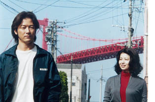 Aoyama manages the crisscrossing relationships delicately, without losing sight of the fact that behind Kenji’s laid-back appearance is a boiling desire to avenge himself on his mother. But she’s his match. A woman of smiling serenity, or smugness, she seems infinitely resilient. The final confrontation of the two, in a prison visiting room, has the giddy sense of one-upmanship of the prison visit in Secret Sunshine. Things turn grim and bleak, yet Sad Vacation manages to feel optimistic without being sentimental; even a flagrantly unrealistic soap bubble at the close seems perfectly in place. I notice that Aoyama has made nearly a film a year since Eureka; why aren’t we (by which I mean, I) seeing them?
Some films, like those of Angelopoulos, seem to spit in the face of video. You can’t say you’ve seen them if you haven’t seen them on the big screen. Such was the case with my favorite of the films, The Song of the Birds (El cant dels ocells, 2008) by the Catalan director Albert Serra. It merges an aesthetic out of Straub/ Huillet—black and white, very long static takes, drifts and wisps of action—with a joyous naivete recalling Rossellini’s Little Flowers of St. Francis. Serra’s film also reminded me of Alain Cuny’s L’Annonce fait à Marie (1991) and one of the greatest of biblical films, From the Manger to the Cross (1912). All make modest simplicity their supreme concern.
We three kings of Orient are . . . well, definitely not riding on camels. We are in fact trudging through all kinds of terrain, scrub forests and watery plains and endless desert, to visit the baby Jesus. We are also quarreling about what direction to go, whether to turn back, and why we have to sleep side by side so tightly that our arms go numb. And in an eight-minute take we are struggling up a sand dune, vanishing down the other side, and then staggering up again in the distance.
The three kings aren’t characterized, and they are sometimes unidentifiable in the long-shot framings; only their body contours help pick them out. Intercut with their non-misadventures are glimpses of an angel (whom they may not see) and stretches featuring Joseph and Mary, who caress a lamb. Eventually the infant Himself puts in an appearance, burbling. When the kings finally arrive, one prostrates himself. The image settles into a tidy, unpretentious classical composition and we hear the film’s first burst of music, Pablo Casals’ cello rendering of the folk tune Song of the Birds.
The kings get a chance to bathe in a scummy pool before returning home. Off they trudge. “We’re like slaves!” one complains. In a final shot that would be sheer murk on a DVD, they swap robes and set off in different directions. Did I see them embrace one another? Did they murmur something? I couldn’t tell for sure. Night was falling and they were far away.
Like Casals’ cantata El Pessebre, The Song of the Birds gives us a Catalan nativity. The simplicity is genuine, not faux-naif, and the humility doesn’t preclude humor. Although the shots are quite complex, the spare surface texture invests a familiar story with a plain, shining dignity. Discovering films like this, which you will never see in a theatre and could not bear to watch on video, makes this ambitious festival such a worthy event. It maintains the heritage of one of the world’s great cinema cities.
Next up: A report on films I’m watching at the archive’s vaults on–no kidding–the Rue Gray.
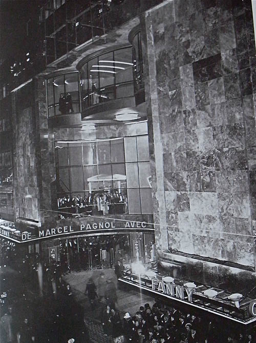
The Metropole, Brussels, 1932.
Thanks to Jean-Paul Dorchain of the Archive for help in finding illustrations. And apologies to readers who came here and found only a stub earlier. An internet gremlin somehow purged the first version of this entry a few hours after it was posted.


