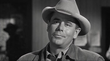
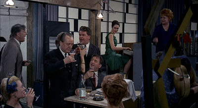
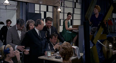
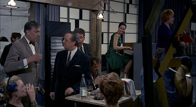
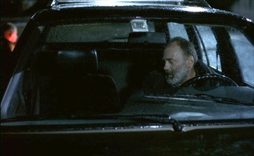
Gradation of emphasis, starring Glenn Ford
Thursday | November 13, 2008 open printable version
DB here:
Charles Barr’s 1963 essay “CinemaScope: Before and After” has become a classic of English-language film criticism. (1) It proffers a lot of intriguing ideas about widescreen film, but one idea that Barr floated has more general relevance. I’ve found it a useful critical tool, and maybe you will too.
Grading on a curve
Barr called the idea gradation of emphasis. Here’s what he says:
The advantage of Scope [the 2.35:1 ratio] over even the wide screen of Hatari! [shot in 1.85:1] is that it enables complex scenes to be covered even more naturally: detail can be integrated, and therefore perceived, in a still more realistic way. If I had to sum up its implications I would say that it gives a greater range for gradation of emphasis. . . The 1:1.33 screen is too much of an abstraction, compared with the way we normally see things, to admit easily the detail which can only be really effective if it is perceived qua casual detail.
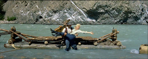
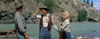
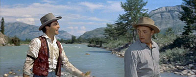
The locus classicus exemplifying this idea comes in River of No Return (1954). When Kay is lifted off the raft, she loses her grip on her wickerwork bag and it’s carried off by the current. (See the frame surmounting this entry.) Kay and her boyfriend Harry are rescued by the farmer Matt. As all three talk in the foreground, the camera catches the bundle drifting off to the right.
Even when the men turn to walk to the cabin, Preminger gives us a chance to see the bundle still drifting downstream, centered in the frame.
The point of this shot, Barr and V. F. Perkins argued, is thematic. As Kay moves from the mining camp to the wilderness, she will lose more and more of her dance-hall trappings and be ready to accept a new life with Matt and Mark. The last shot of the film shows her final traces of her old life cast away.
Cutting in to Kay’s floating bag would have been heavy-handed; if you stress a secondary element too much, it becomes primary. Barr reminds us that any film shot can include the most important information, as well as information of lesser significance. A film can achieve subtle effects by incorporating details in ways that make them subordinate as details and yet noticeable to the viewer. Or at least the alert viewer.
In Poetics of Cinema, I wrote an essay on staging options in early CinemaScope, and Barr’s idea helped me illuminate some of the strategies I discuss. (For earlier comments on Barr on Scope and River of No Return, see my article elsewhere on this site.) Today I want to consider how the notion of gradation of emphasis has a more general usefulness.
Barr contrasts the open, fluid possibilities of CinemaScope with two other stylistic approaches, both found in the squarer 1.33 format. The first approach is the editing-driven one he finds in silent film. This tends to make each shot into a single “word,” and meaning arises only when shots are assembled. Barr associates this approach with Griffith and Eisenstein. The second approach, only alluded to, is that of depth staging and deep-focus shooting, typically associated with sound cinema of the late 1930s and into the 1950s.
Both of these approaches, montage and single-take depth, lack the subtle simplicity of Scope’s gradation of emphasis.
There are innumerable applications of this [technique] (the whole question of significant imagery is affected by it): one quite common one is the scene where two people talk, and a third watches, or just appears in the background unobtrusively—he might be a person who is relevant to the others in some way, or who is affected by what they say, and it is useful for us to be “reminded” of his presence. The simple cutaway shot coarsens the effect by being too obvious a directorial aside (Look who’s watching) and on the smaller [1.33] screen it’s difficult to play off foreground and background within the frame: the detail tends to look too obviously planted. The frame is so closed-in that any detail which is placed there must be deliberate—at some level we both feel this and know it intellectually.
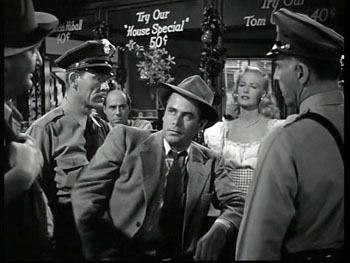
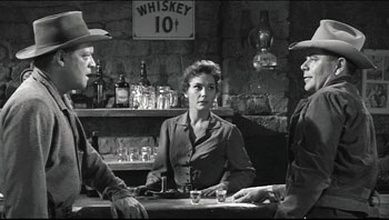
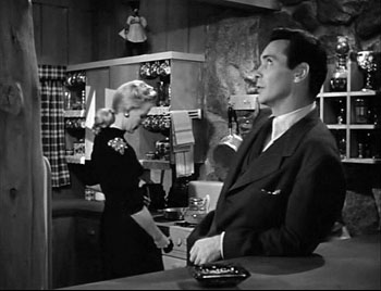
To see Barr’s point, consider a shot like this one from Framed (1947).
The shot, rather typical of 1940s depth staging, displays an almost fussy precision about fitting foreground and background together. That bartender, for instance, stands squeezed into just the right spot. (2) Barr claims that we sense a certain contrivance when primary and secondary centers of interest are jammed into the 1.33 frame like this.
We don’t sense the same contrivance in the widescreen format, he suggests. Barr assumes, I think, that the sheer breadth of any Scope frame will include areas of little consequence, whereas that’s comparatively rare in a 1.33 composition. This is an intriguing hunch, but uninformative patches of the frame may not be intrinsic to the Scope technology. Perhaps the fairly neutral and inexpressive uses of Scope that dominate the early 1950s, the sense of empty and insignificant acreage stretching out on all sides, make us expect that little of importance will be found there. Accordingly, directors can create a sense of discovery when we spot a significant detail in this stretch of real estate.
Anyhow, Barr indicates that if static deep-space staging made the frame too constrained, 1930s and 1940s directors who combined depth with camera movement created more spacious and fluid framings. He suggests that Mizoguchi, Renoir, and others anticipated the possibilities of Scope.
Greater flexibility was achieved long before Scope by certain directors using depth of focus and the moving camera (one of whose main advantages, as Dai Vaughan pointed out in Definition 1, is that it allows points to be made literally “in passing”). Scope as always does not create a new method, it encourages, and refines, an old one (pp. 18-19).
Barr believes that Scope positively encouraged gradation of emphasis, and that widescreen directors of the 1950s and 1960s have made the most fruitful use of the strategy. But he allows directors of all periods utilized gradation of emphasis, even in the standard 1.33 format. This is, I believe, a powerful idea.
Before Scope: Making the grade
Barr’s discussion of silent cinema, relying on notions of editing associated with Griffith and Soviet directors like Eisenstein, is done with a broad brush, but it’s typical of the period in which he was writing. We didn’t know much about silent filmmaking until archivists started to exhume important work in the 1970s. It’s no exaggeration to say that we haven’t really begun to understand the first twenty-five years of cinema until fairly recently.
In a way, the staging-driven tradition of the 1910s, which I’ve often mentioned on this site (here and here and here), exemplifies some things that Barr would approve of. Directors of that period made extraordinary use of the frame and compositional patterning. They staged action laterally, in depth, or both. They let shots ripen slowly or burst with new information. This approach to using the full frame (with only occasionally cut-in elements) has come to be called the tableau style, emphasizing its similarity to composition of a painting—although we shouldn’t forget that these films are moving paintings, and the compositions are constantly changing. The result is that emphasis tends to be modulated and distributed among several points of interest.
Central to this strategy, I think, was camera distance. American directors tended to set the camera moderately close, cutting figures off at the knees or hips, and by taking up more frame space, the foreground actors tended to limit the area available for depth arrangement or for significant detail.
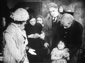
This shot from Thanhouser’s The Cry of the Children (1912) is a rough 1910s equivalent of the crammed shot from Framed above. (See also the tightly composed shots from DeMille’s Kindling (1915) here.)
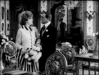
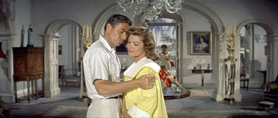
The European directors, by contrast, tended to let the scene play out in more distant shots, creating spacious framings of a sort that would be reinstituted in early CinemaScope. Consider this shot from Holger-Madsen’s Towards the Light (Mod Lyset, 1919) and another from Island in the Sun (1957).
Both, it seems to me, have the type of open composition and the foreground/ background interplay that Barr praises in his article.
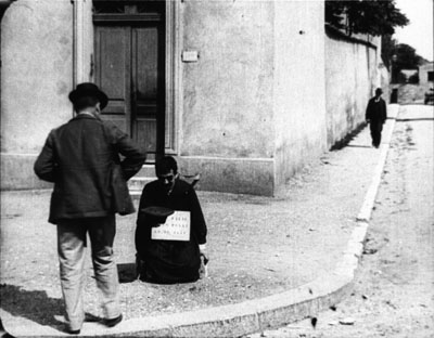
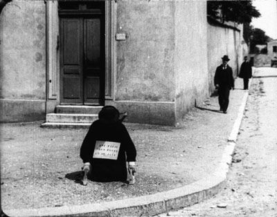
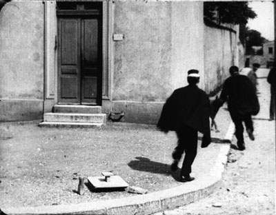
We can go back further. The Lumière brothers’ cameramen made fiction films as well as documentaries, and we occasionally find moments that suggest early efforts at gradation of emphasis. In Le Faux cul-de-jatte (1897), an apparent amputee is begging in the foreground while in the distance a man is walking down the street.
A cop crosses the street from off right and follows the pedestrian.
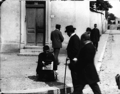
As the foreground fills up, the man we’ve seen in the distance gives the beggar some money.
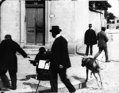
As he goes out left, the cop is still approaching, and a vagrant dog appears.
The cop comes to the beggar, partially blocking the dog, who takes care of other business. (Not everything in this movie is staged.)
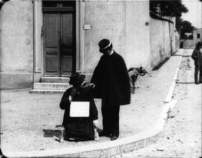
The cop checks the beggar’s papers and finds them to be suspect. The fake amputee jumps up and races off in the distance, with the cop pursuing.
As with many staged Lumière shorts, several figures converge in the foreground in order to create a culminating piece of action. Here the distant man and the cop, both secondary centers of interest, serve as a kind of timer, assuring us that something will happen when they meet at the beggar.
These are just some quick examples. We should continue to study the ways in which, with minimal use of editing, early filmmakers found ingenious ways to create gradation of emphasis. (2)
Some uses of grading
Barr, like most critics writing for the British journal Movie, was sensitive to the ways in which technique has implications for character psychology and broader thematic meanings. Kay’s bundle is one point along a series of changes in her character and her situation. But gradation of emphasis can serve more straightforward narrative purposes as well.
Consider our old friends, surprise and suspense. In the original 3:10 to Yuma (1957) Dan Evans is confronting the ruthless outlaw Ben Wade.
We get a string of reverse shots.
Then in one shot of Wade, without warning, a shadowy figure emerges out of focus in the left background.
Now we realize that Evans has been diverting Wade from the fact that the sheriff’s posse is surrounding him. Now we wait for Wade to discover it; how will he react?
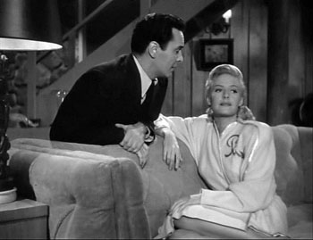
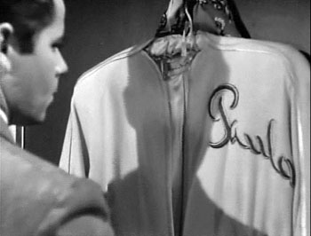
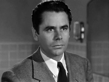
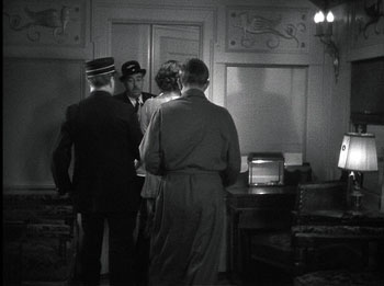
While we’re on Glenn Ford, another nice example occurs in Framed. Mike Lambert has been romancing a woman named Paula, but we know that she and her lover Steve are plotting to fake Steve’s death and substitute Mike’s body.
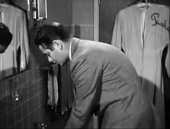
She brings Mike to Steve’s elegant country house, having presented Steve as someone she knows only slightly. When Mike goes into the bathroom to wash up, we notice something important behind him.
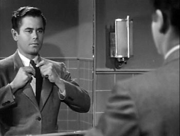
With Mike at the sink, we have plenty of time to recognize Paula’s robe. Director Richard Wallace prolongs the suspense by giving us a new shot of Mike in the mirror, with the robe no longer visible.
But when Mike turns to leave, a pan following him brings him face to face with what we saw, accentuated by a track forward.
We get Mike’s reaction shot, followed by a cut to Steve and Paula downstairs, suspecting nothing. “So far, so good,” says Steve, looking upward at the bathroom.
The rest of the scene will play out with Mike aware that they’re deceiving him. As often happens with suspense, we know more than any one character: We know the couple’s scheme and Mike doesn’t, but they don’t (yet) know that Mike is now on his guard.
This isn’t as subtle a case as River of No Return, but I suspect that it’s more typical of the way Hollywood filmmakers use gradation of emphasis. Paula’s bathrobe is a good example of what I called in The Classical Hollywood Cinema the strategy of priming: planting a subsidiary element in the frame that will take on a major role, even if initially its presence isn’t registered strongly. My example in CHC was a coat rack in the Dean Martin/ Jerry Lewis comedy The Caddy (1953). In effect, the distant pedestrian in the Lumière film is an early example of priming.
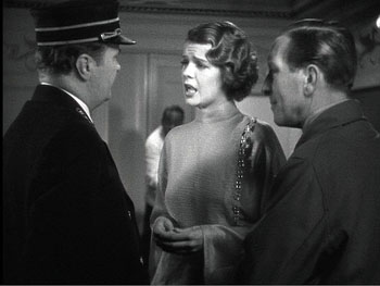
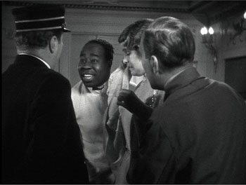
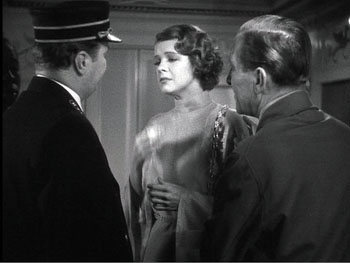
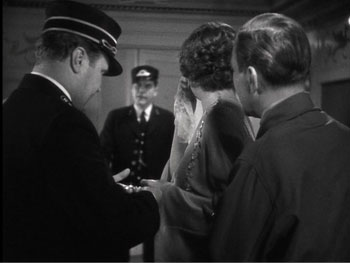
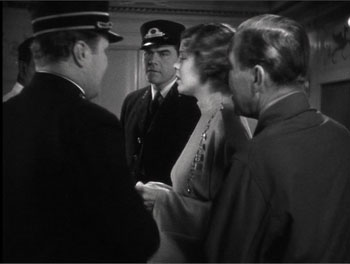
Howard Hawks adopts the Lumière technique in order to sustain a flow of dialogue in Twentieth Century (1934). Here the foreground conversation is accompanied by a procession of people emerging in the distance and stepping up to take part.
The shot concludes, as does the shot of Faux cul-de-jattes, with a retreat from the camera.
The priming of secondary elements here, the summoning of the train attendant and the conductor, obeys Alexander Mackendrick’s dictum that the director ought to construct each shot so as to prepare for what will come next.
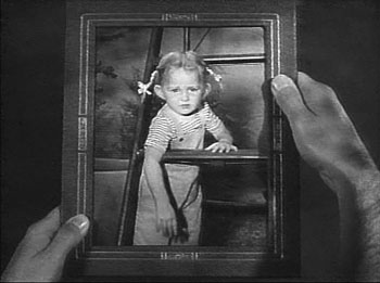
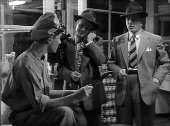
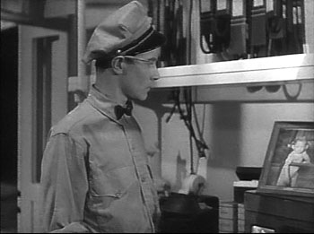
As Barr indicates, the idea of gradation shades insensibly off into general matters of cinematic expression. In The Devil Thumbs a Ride (1947), the bank robber has hitched a ride with an unassuming civilian, and they stop for gas. When the attendant shows a picture of his little girl, the robber gratuitously insults her. (“With those ears she’ll probably fly before she can walk.”)
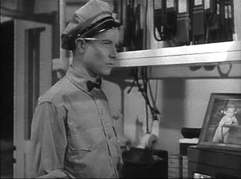
Later, the station attendant hears a radio broadcast describing the fugitive. First he has his head cocked as he listens attentively, but then his gaze drifts to the picture of his little girl.
The attendant is the center of dramatic interest, but when he looks at the picture, so do we (primed by the view of it earlier). Instantly we understand that the attendant’s resolve to call the police springs partly from an urge to get even with the man who insulted his daughter. A minor instance, surely, but it illustrates Barr’s point that the notion of gradation of emphasis leads us to consider “the whole question of significant imagery.”
The more the merrier
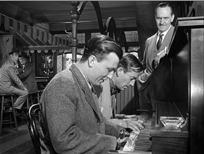
Barr seems to favor a plain style; he prefers Preminger’s quiet framings to the rococo imagery of Aldrich’s Vera Cruz (1954). Presumably the famous shot above from Wyler’s Best Years of Our Lives (1946) would be too obviously composed for Barr’s taste.
But there is merit in considering how a secondary center of interest can vie for supremacy. André Bazin declared Wyler’s shot a bold stroke exactly because its self-conscious precision created a tension between what was primary and what was subordinate. (3) The action in the foreground is of dramatic interest because Homer has learned to play the piano, and this represents a phase of his coming to terms with his wartime disability. Yet the most consequential action is taking place in the distant phone booth, where Fred breaks up with Al’s daughter Peggy. The gradation of emphasis is inverted, and we wait in suspense to find out what happens. Bazin taught us to recognize that what appears to be primary may actually be creatively distracting us from the scene’s principal action. (4)
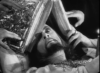
A director can also turn a primary center of interest into something secondary, but powerful. In one sequence of Eisenstein’s Ivan the Terrible I (1944), the apparently dying tsar is being prayed over by churchmen. Ever suspicious, he peers out from under the book, using only one eye.
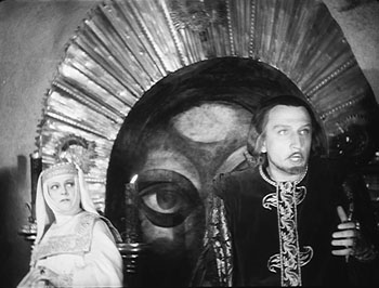
As the scene develops, Prince Kurbsky meets Ivan’s wife and tries to seduce her. In the background an icon’s eye glares out, as if Ivan is watching them.
The single eye, which is a motif we find in other Eisenstein films, becomes a significant one throughout both parts of Ivan. More generally, this device manifests Eisenstein’s conception of polyphonic montage, which explored how the filmmaker can control all the various aspects of his images and make them weave throughout the film—promoting one at one moment, demoting it at another. (5)
Barr’s essay assumes that Eisenstein’s montage stripped each image down to a single meaning. In fact, though, Eisenstein wanted to multiply the sensuous and intellectual implications of each shot by weaving objects, gestures, body parts, musical motifs, and the like into an ongoing stylistic fabric. Each shot’s gradation of emphasis can suggest thematic parallels, deepen the drama, or heighten emotional expression, just as a complex score enhances an operatic scene.
Tati as well likes to create an interplay between primary and subsidiary centers of interest. Or rather, he sometimes abolishes our sense of what is primary and what isn’t. The crowded compositions of Play Time (1967) often bury their gags in a welter of inessential details. During the lengthy scene in the Royal Garden restaurant, a minor running gag involves the dyspeptic manager. He has just mixed some headache medicine with mineral water, but the action is easily lost within the tumultuous image. Even the soundtrack cues us only slightly, with a bit of fizz among the music and crowd noise.
As the manager lowers the glass, Hulot thinks it’s pink champagne being offered to him.
Rolling the stuff in his mouth, Hulot realizes his mistake as he earns a stare from the manager.
There is so much competing sound and activity in the shot that some viewers simply don’t notice this bit at all. In Play Time, gradation of emphasis is often flattened out, leaving us to rummage around the composition for the gag.
Some final notes
Barr was not particularly interested in the mechanics of how we come to notice something in the shot, be it primary or secondary in value. In On the History of Film Style, I suggested that many aspects of technique work to call attention to any element in the field. The filmmaker can put a something in motion, turn it to face us, light it more brightly, make it a vivid color, center it in the frame, have it advance to the foreground, have other characters look at it, and so on. These tactics can work together in a complex choreography. In Figures Traced in Light, I argued that they depend on the fact that we scan the frame actively; the techniques guide our visual exploration. (6)
You can see this guidance at work in most of the examples I’ve mentioned. In River of No Return, we are coaxed into noticing Kay’s bundle because we’re cued by movement (the bundle falls and drifts off), performance (she shouts, “My Things!” and stretches out her arm), music (we hear a chord as the bundle splashes), and framing (Preminger’s camera pans slightly as the trunk drifts away). The critic can refine our sense of the effects that a film arouses, but it’s one task of a poetics of cinema, as I conceive it, to examine the principles and processes that filmmakers activate in achieving those effects.
Finally, we might ask: To what extent do we find gradation of emphasis in current filmmaking? Today’s American cinema relies heavily on editing, using a style I’ve called intensified continuity. Each shot tends to mean just one thing, and once we get it we’re rushed on to the next. The unforced openness of the wide frame that Barr celebrated has been largely banned, in favor of tight singles—even in the 2.40 anamorphic format. It seems that most filmmakers are no longer concerned with gradation of emphasis within their shots.
To find this strategy surviving at its richest, I think we have to look overseas. If you want names: Angelopoulos, Tarr, Kore-eda, Jia, Hou. (7)
(1) It was published in Film Quarterly, vol. 16, no. 4 (Summer, 1963), 4-24. Unfortunately, it’s not available free online, nor is a complete version available in anthologies, so far as I know. If you have access to online journal databases, you can find it. Otherwise, off to the library w’ye!
(2) In the Poetics of Cinema piece (pp. 303-307), I argue that some early uses of Scope tried to approximate such tightly organized composition, despite technological barriers to focusing several planes of action.
(3) See André Bazin, “William Wyler, or the Jansenist of Directing,” in Bazin at Work: Major Essays and Reviews from the Forties and Fifties, ed. Bert Cardullo, trans. Cardullo and Alain Piette (New York: Routledge, 1997), 14-16.
(4) Actually the phone booth is primed for our notice by earlier shots in Butch’s tavern. See On the History of Film Style, 225-228.
(5) For more on Eisenstein’s idea of polyphonic montage, see my Cinema of Eisenstein (New York: Routledge, 2005) and Kristin’s Eisenstein’s Ivan the Terrible: A Neoformalist Analysis (Princeton: Princeton University Press, 1981).
(6) For some empirical evidence of this guided scanning, see the work of Tim Smith at his website and in this entry on this site.
(7) I discuss some of these alternatives in On the History of Film Style and the last chapter of Figures Traced in Light.
Eternity and a Day.
PS 15 Nov. Two more items. First, if the ideas floated here intrigue you, you might want to take a look at an earlier entry on this site, called “Sleeves.”
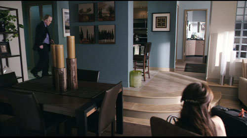
Second, I had planned to include one more example, but forgot it. In Lumet’s Before the Devil Knows You’re Dead, Andy Hanson’s life is unraveling. We follow him back to his apartment, and as he enters on the extreme left, his wife Gina is visible sitting on the extreme right, her back to us.
Gina forms a secondary center of attention, but the key to the upcoming action is revealed in a third point of interest: the black suitcase pressed against the right frame edge. The shot tells us, more obliquely than one showing her leaving the bedroom with the case, that she is planning to leave him. Lumet’s image, reminiscent of the framing of the trunk in River of No Return, shows that gradation of emphasis isn’t completely dead in American cinema. The orange scrap of yarn, knotted to the handle for baggage identification, is a nice touch of realism as well as a welcome color accent that further draws the suitcase to our notice.


