Archive for March 2009
A tale of 2–make that 1 and 1/3–screens
DB here:
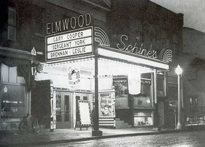
Last week family affairs took me back to my home area, the Finger Lakes region of New York State. About ten miles from our farm lies the village of Penn Yan (short for Pennsylvania Yankees). When I was growing up there in the 1950s and 1960s, Penn Yan boasted about 3500 people—enough to support one movie theatre. That theatre, the Elmwood on Elm Street, was where I saw most of the movies I didn’t see on TV.
The Elmwood was my introduction to film. When my parents went to town, I was embedded with hundreds of other kids in Saturday afternoon matinees of Tarzan and Lone Ranger movies. On Friday nights, I might catch June Allyson, Donald O’Connor, or Martin and Lewis. When I got older I saw Lawrence of Arabia and From Russia with Love. The Elmwood showed a fair number of art films in the 1960s, including The Servant, The L-Shaped Room, and even 8 ½ (dubbed, I think).
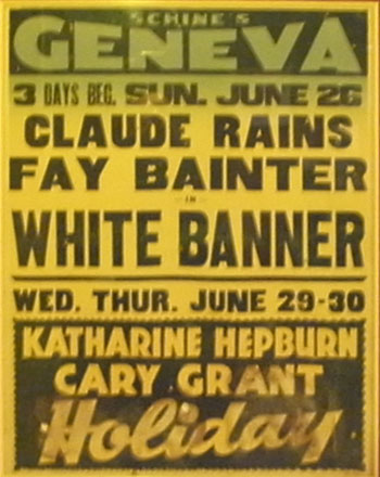
Built in the early 1920s, the Elmwood was acquired by the Schine brothers in 1936. Some towns in our area had two or three Schine theatres. Schine Amusements penetrated Auburn, Bath, Canandaigua, Corning, Cortland, Glens Falls, Gloversville (where it all started), Hamilton, Herkimer, Lockport, Massena, Oneonta, Oswego, Perry, Rochester, Salamanca, Seneca Falls, Syracuse (four houses), Tupper, and Watertown. Clearly, they were leaving the major cities to the big boys. The firm also owned venues in Kentucky and Ohio (none in Cleveland or Cincinnati, but three in Bucyrus). By snapping up screens in the sticks, Meyer and Louie Schine wound up holding nearly a hundred screens in their prime.
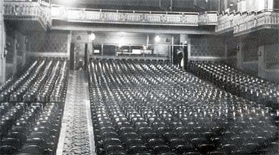
Although the brothers went for the smaller markets, they didn’t forget the amenities. They contracted some of the top theatre architects, notably John Eberson, a fantasist with eclectic tastes. The Elmwood didn’t benefit much from the Schines’ largesse as far as I can tell, but it was a sturdy place, with 838 seats, or one for every four people in town.
The Elmwood passed out of the Schines’ hands and eventually closed in the early 1970s. For awhile it was an indoor tennis court. The village offices now sit on the site. (Photo: Darlene Bordwell.)
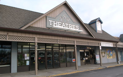
But Penn Yan still has three screens, which I discovered when my sister Diane Verma and I went to Ken Kwapis’ He’s Just Not That Into You. It’s a network narrative like Kwapis’ earlier Sexual Life, and like that (and his Sisterhood of the Traveling Pants) it has some affecting and clever moments. There’s also a nice handling of shot/ reverse-shot when characters are turned away from each other. Mainly, though, I went to see the town’s multiplex, the Lake Street Plaza Theatres.
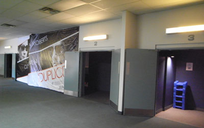
Converted from an exercise club, the LSP houses three screens in a bare-bones design typical of many multiplexes.
A young man, whose father owned the complex, sold the tickets and ran the projectors. A young woman handled the concession stand. Both were friendly and talkative. Diane and I, two of four people in the house, left happy, although the sugar in the Dots may have helped raise our mood.
Earlier that day, Diane, my other sister Darlene, and I were driving around our childhood haunts. The towns here are hollowed out by the big-box stores and the recession. Mall parking lots are full, but the main streets are desolate and many storefronts are empty.
Yet in another lake town we came across a surprise. At first I was puzzled. How could the Geneva Theatre have been replaced by a much older and more dignified building, the Smith Opera House?
The door was ajar.
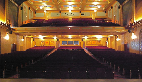
Inside Bruce Purdy, the Technical Director and professional magician, and Sharon Barnes were preparing for a children’s play. They kindly led us on an exploration of this half-hidden jewel. It may have assumed its old name, but the building has regained the delirious splendor that was the Geneva in its heyday.
The Smith Opera House was built in 1894. To its stage came Sousa, Bill Bojangles Robinson, Ellen Terry, and traveling shows mounted by Belasco. The vaudeville programs started including short films during the 1910s, and the Smith was one of thirteen venues in which Edison screened his experiments in talking pictures. The Birth of a Nation played there. Soon the theatre became a movie house, called initially the Strand. It wasn’t the only film theatre in town, and by the late 1920s it had competition. The nearby Regent had already become a picture palace, with about 1000 seats; it screened its first sound picture, John Ford’s Four Sons, in 1928 (presumably in a music-plus-effects version).
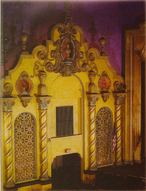
Enter, on cue, the Schines. They bought the Smith, and after playing burlesque there for some months, they decided to revamp it as a picture palace. The process took several years. The interior was stripped; opera seats were sold for a dollar each. What emerged was an “atmospheric,” with the dome displaying shifting clouds that would slowly clear to reveal twinkling stars. The architecture was a fanciful mix of Art Deco, Baroque, Art Nouveau, and Moorish influence. The premise was that you were in a courtyard under the heavens, surrounded by facades of buildings that were implausible but vaguely familiar in their exoticism.
With over 1800 seats, the Geneva Movie Theatre was advertised as the largest movie house in central New York. The first film to play there was Keaton’s Parlor, Bedroom, and Bath in March 1931. The manager, Mr. Gerald Fowler, stayed in charge until 1965.
I didn’t go to the Geneva as often as the Elmwood. Not until I got my Learner’s Permit (a life-changing event to country youth) was I able to drive to Geneva on my own. At the Geneva I saw Mary Poppins, What’s New, Pussycat?, and the CinemaScope version of How the West Was Won. I have no memories of the décor, but by all accounts it was decaying.
Like the Elmwood, the Geneva was closed in the 1970s. Today it looks spanking new. It hosts musical acts (Ani DeFranco is coming up), local and touring stage productions, and on weekends films, “mostly foreign and arthouse,” as Bruce Purdy explained. When we were there the theatre was running a package of Academy Award Best-Picture nominees.
My sisters and I first paused in the lobby, with its fine hanging lamps.
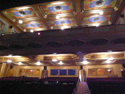
Inside, the auditorium area is of course very impressive, flanked by facades with corkscrew columns.
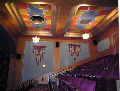
Along the balcony are vaguely ziggurat wall designs.
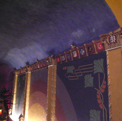
Just in case there was too much empty space, architect Victor Rigamount added some escutcheons.
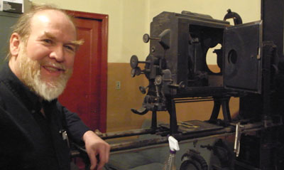
In the projection booth, Bruce showed us the Brenkograph, a marvelous old gadget for projecting lantern slides in dissolving views. The Brenkograph provided the milky clouds cast onto the ceiling: light was pumped through a swirling oil mixture.
In 1946, the year before I was born, US movie attendance reached its peak of about 82 million weekly. The industry had receipts of nearly $1.6 billion. It must have looked like filmgoing would never fall off. But it did, and fast. Enjoying Peter Pan, Moby Dick, and Davy Crockett, I was living through the first major decline in the film industry. By the time I left for college in 1965, weekly US attendance had dropped to 20 million, where it would hover for nearly three decades. Hollywood’s annual box-office receipts were then $927 million (about $657 million in 1947 dollars). In the course of my eighteen years the country had lost 5,000 screens and about 50,000 theatre jobs.
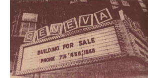 I wish I could go back to see how these old theatres looked then. I wish I could photograph them, inside and out. I wish that I could return to the Elmwood in June 1954 to ask Mr. Norman Williams (unmarried) about the new screen, said to be twenty feet high and 35 feet long—redesigned, of course, for CinemaScope. He was planning to add stereophonic sound, which would, the newspaper story explains, “create the illusion that the sound travels with the movement of actors or objects across the screen.” But until the new system arrived, Mr. Williams said, only Warner Bros’ CinemaScope pictures would be run, because they didn’t require stereo. You mean movies like A Star Is Born and Rebel without a Cause? What wouldn’t I give to see those in their original form, from the front row.
Just before I left the area in 1965, I could have quizzed the managers and staff about the old days. After the war, had they suspected what was coming? What was it like to watch your livelihood shrivel year by year? I didn’t know enough to ask. I didn’t understand what had happened.
In the meantime, we haven’t lost everything. On one screen of the Lake Shore Plaza, you could have seen Watchmen on opening weekend. The projection is very good.
My general information about theatres and attendance is culled from back volumes of The Film Daily Yearbook. The Schine family entered history in another way; see here. Information about CinemaScope at the Elmwood comes from the Penn Yan Chronicle-Express of 10 June 1954, p. 1. My account of the Geneva Theatre is largely derived from two publications, The Smith Opera House (Geneva: n.d.) and Charles McNally’s The Revels in Hand: The First Century of the Smith Opera House, October 1894-October 1994 (Geneva: Finger Lakes Regional Arts Council, 1995). Both are available at the theatre; for contact information go here. The Elmwood photos come from wetlandspy. Check out Darlene’s photo page too.
For a panoramic study of American movie exhibition, see Douglas Gomery’s Shared Pleasures: A History of Movie Presentation in the United States. The first time I met Doug, he asked where I was from. I said Penn Yan. He nodded. “Okay, so you went to a Schine theatre.” The man knows his stuff.
Thanks to Bruce Purdy and Sharon Barnes for their hospitality. And thanks to Ryan Kelly for asking me to clarify the situation with Four Sons.
The eyeline match goes way, way back
Kristin here—
It’s late January as I write this entry, and in about a month, I’m due in Egypt for my annual three weeks of volunteer work on the Amarna Project at Tell el-Amarna, in Middle Egypt. (For the project’s website, see here, and for my part in it, click on “Recent Projects,” then “Material Culture,” and finally “Statuary.”) So as not to leave David with the entire blogging burden during that period, I’m writing this to be posted during my absence.
Given the occasion, I decided to write about a topic that has popped into my mind now and then: a little connection I observed between techniques of ancient Egyptian art and those of continuity film editing. In their reliefs, Egyptian artists were very conscious of the directions of figures’ gazes, and their strove in most cases to match the orientation of the accompanying hieroglyphs to those directions. This topic is not only appropriate, but it gives me a chance to show off my new hieroglyphic font—and to practice composing texts with it.
The connection between eyelines in reliefs and in film editing first occurred to me several years ago when our colleague Noël Carroll was giving a talk in the film-studies colloquium in the Dept. of Communication Arts here at the University of Wisconsin-Madison. He dealt with eyeline matches, or glance/object editing and took a cognitive-studies approach.
Noël’s argument was that such editing is not an arbitrary convention and that it draws upon an “innate perceptual behavior” shared by humans to look not just at other people but also at what those people are looking at. (I’m quoting here from the publication of his talk as “Toward a Theory of Point-of-View Editing: Communication, Emotion, and the Movies,” in his 1996 collection, Theorizing the Moving Image, from Cambridge University Press.) This tendency naturally manifests itself when babies begin at two to three months to follow the directions of their parents’ gazes. He claims that eyeline matching “can function communicatively because it is a representational elaboration of a natural information-gathering behavior” and also that such a link to our everyday perception helps make continuity editing easy to grasp.
If we can find comparable sorts of devices in art of a different era and culture, those devices help support claims about “cultural universals.” These are patterns of perception that all cultures share, though they will manifest themselves in art in different ways. Let’s take a look at a sort of eyeline matching that’s used in Egyptian reliefs. Only here it’s not an eyeline and a seen object being matched. It’s a match between an eyeline and the direction its accompanying hieroglyphs face.
Hieroglyphs and their orientation
First, let me get a pet peeve out of the way. A lot of people these days call hieroglyphs “hieroglyphics.” There is no such word, or shouldn’t be. “Hieroglyphic” is an adjective, as in “hieroglyphic text” or “hieroglyphic inscription.” But don’t just take my word for it; look under Etymology in the Wikipedia entry on hieroglyphs. (I note with annoyance that my spell-checker doesn’t highlight “hieroglyphics,” but it does think “eyeline” is wrong.)
Now, about directions. Egyptian hieroglyphs can be written horizontally or vertically, facing left or right. The default orientation is facing right, to be read right to left. How do you know which direction they’re facing? Even if you can’t read hieroglyphs, just look at the signs representing living things. Birds, people, animals, bugs, with rare exceptions they all face the front of the text.
There are all sorts of complicated exceptions to the rightward orientation. The late Henry George Fischer, curator of Egyptology at the Metropolitan Museum of Art, wrote a large book on the subject: The Orientation of Hieroglyphs, Part 1. Reversals (Alas, he never wrote Part 2.)
As Fischer says at the outset, “It is essential to stress the fact that Egyptian art and writing are interrelated to a degree that is unparalleled in any other culture. For it is from this fact that the orientation of hieroglyphic texts derives its logic.” And Egyptian art, despite its strangeness to many eyes, is intensely logical. Each person, creature, and object portrayed in relief will be shown from its most characteristic, recognizable view, whether that be in profile (such as a person’s face, legs, and stomach) or frontal (that person’s eye and shoulders).
In reliefs, the hieroglyphic texts in reliefs function as labels and descriptions of the things depicted or to quote the words of the people present. Hence, logically, the particular inscription relating to one person, creature, or object depicted will face the same direction as it does.
Two straightforward examples
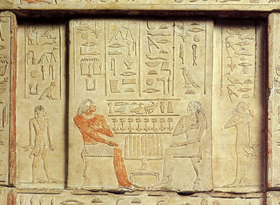
The image below is a detail from a false door (the entrance and exit for the dead person’s soul in a tomb). It comes from an Old Kingdom tomb at Saqqara (5th Dynasty, roughly 2453 BCE). The relief depicts a husband, Nikaure, and wife, Ihat, along with two of their children.
Egyptian Museum, Cairo, inventory CG 1414
The pair sit opposite each other across a table full of offerings: long loaves of bread, portrayed vertically even though they are assumed to lie on the table. The two columns above Nikaure face rightward, as does he. They give his official titles and name. The two above Ihat face left and do the same for her. The son at the left faces right, as does the text above him, and his sister, at the right, faces leftward, as do her hieroglyphs. Despite the fact that this particular door belongs to Ihat, there is a slight male bias here, since the list of offerings above the table face right, as he and his son do—the favored, “stronger” orientation for hieroglyphs and people.
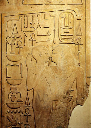 The basic conventions of Egyptian art were amazingly stable for a period of about three thousand years. We find the same principles in the Middle Kingdom. This relief (Egyptian Museum, Cairo, inventory JE 36809) on a column shows Senwosret I (12th Dynasty, reigned 1971-1929 BCE) being embraced by a statue of the god Ptah in its shrine. You wouldn’t think that statues embrace people, but pharaohs were considered divine and could communicate with gods’ statues in temples. The king is at the right, facing left. His name is in the oval cartouche above his head, and the columns of signs at either side of it give some of his titles. All face left.
The rest of the signs face right. They identify Ptah and describe all the things he’s giving the king: life, dominion, stability, health, and happiness. The column at the far left is a direct quotation of the god’s words. As in these two examples, almost any relief where figures are present facing different directions, the orientation of the hieroglyphs will be determined by which one they refer to. Obviously the Egyptians considered this sort of directional consistency very important.
Facing one way, looking the other
Indeed, the directions in which figures’ faces and eyes were turned seems to have been of particular importance. It’s not uncommon for a figure to be facing one way and looking back. In that case, that figure’s hieroglyphs will face backward as well.
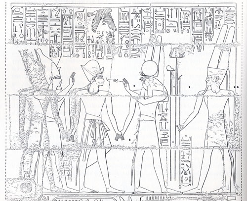
The relief below reveals the logic of this device very well. Two gods, Atum at the right and Montu with the falcon head (not all falcon-headed gods are Horus) are leading Rameses III to the king of the gods, Amen. (I copied this from Fischer’s book, and unfortunately he doesn’t specify where this relief is.) As they proceed, Montu turns back to hold the signs for “life” and “dominion” to the king’s face. The five right-most columns of text above refer to Amen and mimic him in facing leftward; they represent his speech to the king. The next five represent Montu’s speech and, because his eyes look leftward, so do the hieroglyphs. But not the little column of text in front of his stomach and kilt. That describes his action of leading the pharaoh to Amen, so those signs, written beside the part of his body facing right, also face right. Charmingly logical.
That sort of thing is one small part of what makes Egyptian art so appealing to me. Perhaps it gives you a better feel for why Fischer claimed that Egyptian art integrates writing and pictorial representation more thoroughly than that of any other culture. It also bolsters David’s recent entry about how studying the techniques and conventions of an artform enhances one’s enjoyment of individual artworks.
Amarna examples
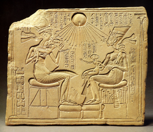
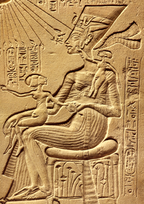
My favorite examples of head-turning reversed hieroglyphs come, not surprisingly, from the period I study, the Amarna era (18th Dynasty, New Kingdom, roughly 1350 BCE). One trait of Amarna art is its relatively casual depiction of the royal family. Previously the king had not been shown “behind the scenes,” playing with his children. Compare the Old Kingdom relief of Nikaure and Ihat, seated stiffly with their children at attention behind them, with the stela at the top of this entry. There the pharaoh Akhenaten lifts his eldest daughter, Meritaten, to kiss her. Opposite him sits his wife Nefertiti, holding the second daughter, Meketaten, on her lap, and balancing her third, Ankhesenpaaten, who stands on her arm or hip, playing with the decoration on Nefertiti’s familiar tall, flat crown. (A repaired crack has destroyed the child’s feet and some other elements of the relief). There’s a similar relief in the Louvre, by the way, where Nefertiti and at least two of the daughters sit on Akhenaten’s lap, but unfortunately only the lower part survives.
This stela is my favorite piece of Amarna art. I must confess that standing back in 1992 in the Ägyptisches Museum in Berlin and studying this sentimental little image (inventory 14145) was what finally suckered me into an obsession with the art of the era. It’s not just the appeal of the family scene, though. There’s an underlying complexity and innovativeness about this piece that makes it unique in the history of Egyptian art. It’s also not just sentimental. Such a stela would have stood in a private chapel in the garden of a rich family. The fecundity and nurturing shown in the image would be seen as indicative of the pharaoh’s protective role toward his country.
As is typical of Egyptian art, each figure has a label identifying him or her. Akhenaten’s and Nefertiti’s names and titles are in the vertical columns at the top, alongside the name and titles of their sole god, the Aten, or globe of the sun, which casts its life-giving rays down upon the group. Literally life-giving, since two of the rays’ little hands hold ankh-signs to the king’s face, and another two do the same for Nefertiti. Each daughter, though, has a label identifying her, all in the very formulaic phrases used on endless reliefs for this purpose.
Here’s a detail of the part of the relief I want to focus on:
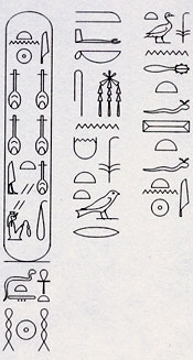
In contrast to the beautiful carving of the figures, the hieroglyphs here are rendered very badly, and it’s partly because they are so formulaic that one can read them all. I’ve used my new font program to lay them out legibly so you can see which way the inscriptions face. (The font couldn’t cram the four nfr-signs that appear side-by-side in Nefertiti’s name into the cartouche, so I settled for putting them on two lines.)
In the text running down the side, the youngest daughter is described: “King’s daughter, Ankhesenpaaten [i.e., “She who lives for the Aten”] of his body [i.e., Akhenaten’s biological offspring], whom he loves, born to the Great Royal Wife, Nefertiti, may she live forever and continuously.” The two other daughters have the same texts with their names substituted.
I’ve analyzed this stela in print, suggesting an interpretation of the brief narrative action that is going on in the scene (“Frontal Shoulders in Amarna Royal Reliefs: Solutions to an Aesthetic Problem,” The Journal of the Society for the Study of Egyptian Antiquities Vol. XXVII [1997, published 2000]: 79-98 and Pls. IV-VII). All I’m concerned with here is the fact that Meketaten has turned her head to look at her mother while pointing across at her father and sister. The short columns of text above her have been reversed accordingly:
There are other Amarna reliefs where a daughter turns her head, including one where the upper part of the princess is missing, and we can only tell she was turning to look at her mother because the few surviving hieroglyphs face the opposite direction from her feet. The reversal isn’t used in every case where a princess turns her head. In more formal offering scenes, where the princesses stand in a group behind their parents, a continuous row of short vertical columns above them gives the name and title for each. With all the rows lined up this way, the reversing of one daughter’s signs would look odd, and so the Egyptian artist kept all the columns facing the same direction. That’s another convention of Egyptian art: keep the graphic layout of the signs neat and pictorially appealing. They’re an important part of the overall image.
Reversed hieroglyphs and eyeline matches
I’m not trying to claim that Egyptian reliefs are just like film because the hieroglyphs are oriented by which was the figures are facing. There’s nothing comparable to an eyeline match in such images, since we see all the figures of a scene present at the same time, always depicted from head to toe. There is no need to match a figure’s eyeline to what he or she is looking at, since that, too, is present in the scene. There is no “offscreen space” in Egyptian reliefs.
Still, the Egyptians matched the orientation of hieroglyphs not just to the general direction a figure was facing but also to the specific eyeline created by head position. There was a logic to this, based on the fact that the direction of the gaze was deemed important and hence could be used to organize important elements of the composition of a scene—a static one in this case rather than one unrolling temporally across separate shots. That a culture so different from our own could come up with an artistic convention reminiscent of a technique in classical filmmaking suggests to me that claims about the naturalistic basis of eyeline matching and shot/reverse shot have merit.
Showing what can’t be filmed
DB, again:
People tend to think that documentary films are typified by two conditions. First, the events we see are unstaged, or at least unstaged by the filmmaker. If you mount a parade, the way that Coppola staged the Corpus Christi procession in The Godfather Part II, then you aren’t making a documentary. But if you go to a town that is holding such a procession and shoot it, you are making a doc—even though the parade was organized to some extent by others. Fiction films stage their events for the camera, but documentaries, we tend to think, capture spontaneous happenings.
Secondly, in a documentary the camera is seizing those events photographically. The great film theorist André Bazin saw cinema’s defining characteristic as its capacity to record the actual unfolding of events with little human intervention. All the other arts rely on human creation at a basic level: the novelist selects words, the painter chooses colors. But the photographer or filmmaker employs a machine that impassively records what is happening in front of it. “All the arts are based on the presence of man,” Bazin writes; “only photography derives an advantage from his absence.” This isn’t to say that cinema can’t be artful, only that it offers a different sort of creativity than we find in the traditional arts. The filmmaker works not with pure imaginings but obstinate chunks of actual time and space.
Given these two intuitions, unstaged events and direct recording of them, it would seem impossible to consider an animated film as a documentary. Animated films consist of almost completely staged tableaus—drawings, miniatures, clay, even food or wood shavings (in the works of Jan Svankmajer). And animated movies offer no recording in Bazin’s sense of capturing the flow of real time and space. These films are made a frame at a time, and the movement we see onscreen doesn’t derive from movement that occurred in reality. And of course you can make an animated film without a camera, for instance by painting directly on film or assembling computer-generated imagery.
Recently, however, we’ve been faced with animated films that claim documentary validity. How is this possible? Maybe we need to rethink our assumptions about what documentary is.
In certain types of documentaries, especially those in the Direct Cinema or cinéma vérité traditions, the assumption that we’re seeing spontaneously occurring events holds good. But a documentary can consist wholly of staged footage. Think back to those grade-school educational shorts showing a tour of a nuclear power plant. Every awkward passage of dialogue recited by the hard-hatted, white-coated supervisor was scripted. The whole show was planned and rehearsed, but that doesn’t detract from the factual content of the film.
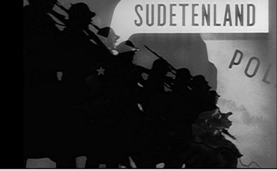
Go further. Recall those attack maps that are shown in war films, tracing the progress of an army through enemy terrain. Now imagine an entire film made of those animated maps. The maps might even be enhanced with a few cartoon images, as in the above shot from one of the Why We Fight films. The film would be entirely designed, presenting no spontaneous reality being captured by the camera. Yet it would plainly be a documentary, telling us that, say, the Germans marched into the Sudetenland in 1938 and proceeded on to Poland. So we don’t need photographic recording of actual events to count a film as a documentary either. Both the staging and the recording conditions don’t have to be present for a film to count as a documentary.
I’m not saying that the claims advanced in my nuclear-power film or my attack-map movie would necessarily be accurate. They might be erroneous or inconclusive or false. But that possibility looms for any documentary. The point is that the films, presented and labeled as documentaries, are thereby asserting that the claims and conclusions are true.
Film theorist Noël Carroll defines documentary as the film of “purported fact.” Carl Plantinga makes a similar point in saying that documentaries take “an assertive stance.” Both these writers argue that we take it for granted that a documentary is claiming something to be true about the world. The persons and actions are to be taken as representing states of affairs that exist, or once existed. This is not something that is presumed by The Gold Rush, Magnificent Obsession, or Speed Racer. These films come to us labeled as fictional, and they do not assert that their events and agents ever existed.
This isn’t just a case of a professor stating something obvious in a fancy way. Once we see documentary films as tacitly asserting a state of affairs to be factual, we can see that no particular sort of images guarantees a film to be a doc.
Take the remarkable documentaries made by Adam Curtis. These are in a way very old-fashioned. Blessed with a voice whose authoritative urgency makes you think that at last the veils are being ripped away, Curtis mounts detailed arguments framed as historical narratives. Freudian theory shaped the emergence of public relations, which was in turn exploited not just by business but by government (Century of the Self). Islamic fundamentalism grew up intertwined with US Neoconservatism, both being reactions to perceptions that the West was becoming heartlessly materialistic (The Power of Nightmares). Mathematical game theory came to form politicians’ dominant conception of human behavior and civic community (The Trap). The almost uninterrupted flow of Curtis’s voice-over commentary could be transcribed and published as a piece of nonfiction. True, there are some interpolated talking heads, but those experts’ statements could be printed as inset quotations.
What’s particularly interesting is that Curtis’ rapid-fire declamation accompanies images that often seem not to illustrate it, or at least not very firmly. Like the found footage in the preacher’s sermon “Puzzling Evidence” in True Stories, Curtis’ images are enigmatic, tangential, or metaphorical.
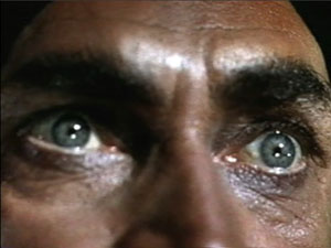
Here are a few seconds from the start of The Power of Nightmares. Eyes are staring upward, as if possessed.
We hear: [Our politicians] say that they will rescue us from dreadful . . .
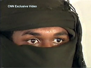
The eyes are replaced by a shot of a man wearing a cowl, and as this image zooms back the commentary continues.
. . . dangers that we cannot see and do not . . .
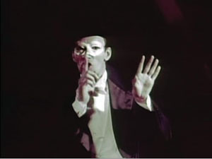
Cut to a magician or mime demanding silence.
. . . understand.
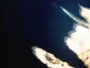
Cut to rockets being fired.
And the greatest danger . . .
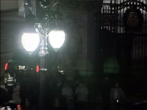
Cut to a procession of cars, seen from above, rounding a corner into a government compound at night.
. . . of all is international terrorism.
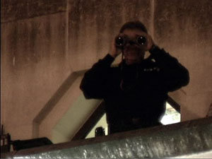
Cut to shot of security agent staring at us.
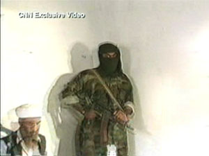
The ominous, not to say paranoid, tenor of the sequence is aided by the unexpected juxtapositions. For instance, you’d think that the shot of the iconic terrorist (anonymous, with automatic weapon) would be synchronized with the final line of the commentary, referring to “international terrorism.” Instead the commentary links the mention of terrorism to an image of government deliberation, and then to an image of surveillance (aimed at us, but also perhaps suggesting the previous high-angle shot was the spy’s POV). The wild-eyed close-up might belong to a terrorist, but is accompanied by claims about rescuing us from fearsome threats, so the eyes could also belong to someone panicked–especially since they contrast immediately with the sober eyes of the gunman in the cowl. Perhaps the first shot represents the fearful public ready to be led by the politicians playing on fear. And the insert shot of the mime becomes sinister but also comic, perhaps debunking the official position that our dangers are unseen and unknowable. In all, the sequence bubbles with associations that are less fixed and more ambiguous than we’re likely to find in a more orthodox documentary, like Jarecki’s Why We Fight.
My point isn’t to analyze the image/ sound relations in Curtis’s work, a task that probably demands a whole book. (This sequence takes a mere eleven seconds.) I simply want to propose that regardless of what pictures Curtis shows, his films are documentaries in virtue of a soundtrack constructed as a discursive argument that makes truth claims. The picture track often works on us less as supporting evidence than as a stream of associations, the way metaphors or analogies give thrust to a persuasive speech.
Just as we could have an account of Germany’s 1938 invasion of Czechoslovakia presented in cartoon form, we could imagine The Power of Nightmares illustrated with political cartoons. Once we’ve pried the image track loose from the assertions on the soundtrack, anything goes.
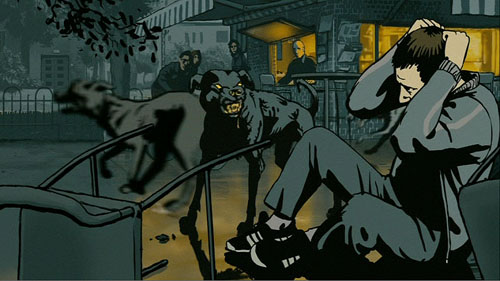
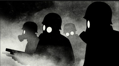
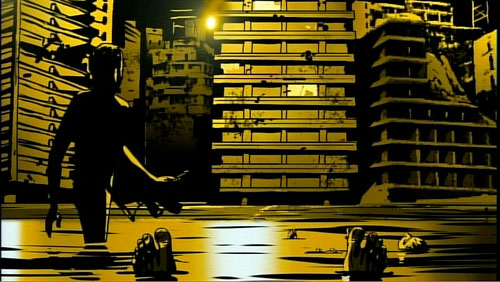
One example much on our minds now is Waltz with Bashir. Ari Folman interviews former Israeli soldiers. But instead of using film footage of their conversations and, say, still photos of the events in Lebanon they took part in, he provides (until the final sequence) drawings a bit in the Eurocomics mold of Tardi or Marc-Antoine Mathieu. The result takes the form of a memoir, admittedly. But in both literature and cinema, memoir is a nonfiction genre.
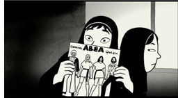 Another memoir supports the point. Marjane Satrapi’s autobiographical graphic novels, Persepolis and Persepolis 2, assert factual claims about her life. The claims are presented as drawings and texts rather than simply as texts, but that doesn’t change the fact that she presents agents and actions purported to have existed. True, on film the people whom she remembers are represented through voice actors speaking lines she wrote. But as with written memoirs (especially those that claim to remember conversations taking place fifty years ago), we can always be skeptical about whether the events presented actually took place.
Turning Satrapi’s published memoir into an animated film did not change its status as a documentary. If we had contrary evidence, we could charge her with fibbing about her family life, her rebelliousness, or her life in Europe. But we’d be questioning the presumptive assertions the film makes, not the fact that it is drawn and dubbed rather than photographed from life.
We’re tempted to see the animation in these films as adding a level of distance from reality. We’re so used to fly-on-the-wall documentaries that we may be suspicious of the cobra-like caricatures of the female teachers in Persepolis or the hallucinatory dawn bombardment in Bashir. Yet animation can show things, like the Israeli veterans’ dreams, that lie outside the reach of photography. And the artificiality doesn’t dilute the claims about what the witnesses say happened any more than does purple prose in an autobiography. In fact, the stylization that animation bestows can intensify our perception of the events, as metaphors and vivid imagery in a written memoir do.
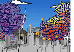 I realize I’m pointing toward a slippery slope here. Strip off the image track from Aardman‘s Creature Comforts and you have impromptu recordings of ordinary people talking about their lives. Those monologues could have been accompanied by documentary-style talking heads. Does that make Creature Comforts a documentary? I’d say not because the film doesn’t come to us labeled that way; it’s presented as comic animation using found soundtracks (like the movie based on the Lenny Bruce routine Thank You Mask Man). Then there are Bob Sabiston‘s rotoscoped films like Waking Life and The Even More Fun Trip, recently released on Wholphin no. 7. The latter (left) takes another documentary form, the home movie, as the basis for its animation. This seems to me an instance where the documentary category has the edge, but it’s a surely a borderline case.
Animated documentaries are likely to remain pretty far from our prototype of the mode. Still, we should be grateful that even imagery that seems to be wholly fictional—animated creatures—can present things that really happen in our world. This mode of filmmaking can bear vibrant witness to things that cameras might not, or could not, or perhaps should not, record on the spot.
André Bazin’s arguments for the documentary basis of cinema are set out in “The Ontology of the Photographic Image,” in What Is Cinema? ed. and trans. Hugh Gray (Berkeley: University of California Press, 1967), 9-16. Noël Carroll’s argument that documentaries are framed as presenting “purported fact” can be found in Theorizing the Moving Image (Cambridge: Cambridge University Press, 1996), 224-259. On the “assertive stance” of documentaries, see Carl Plantinga, Rhetoric and Representation in Nonfiction Film (Cambridge: Cambridge University Press, 1997), 15-25. Errol Morris interviews Adam Curtis here. Thanks to Mike King for pointing me toward The Even More Fun Trip.
PS 10 March: Harvey Deneroff writes:
Very much enjoyed your post on animated documentaries, a topic of some interest to and often discussed in the animation studies community. There was a panel on it during last year’s Society for Animation Studies conference and there will also be one at this year’s as well.
Two recent Oscar recipients for Best Animated Short Subject are also documentaries: Chris Landreth’s wonderful computer animated Ryan (produced by the NFB about animator Ryan Larkin, and features a lot of talking heads) and John Canemaker’s The Moon and the Son: An Imagined Conversation, which is about Canemaker’s father and mixes animation with home movies and photographs.
At least two winners in the Oscar Documentary Short Subject category were largely animated: Chuck Jones’ So Much for So Little (WB, 1949, which I believe was made for the US Public Health Service) and Norman McLaren’s Neighbours. The Story of Time, a 1951 British documentary which featured stop motion animation was nominated in the same category.
Also, the International Leipzig Festival for Documentary and Animated Film includes a section for animated documentary films.
Thanks to Harvey for this. I’m not sure I’d categorize Neighbours as a doc, but it’s a long time since I’ve seen it. On Harvey’s site he also has a note quoting Ari Folman on the difficulty of funding animated docs. And thanks to Ryan Kelly and Pete Porter for reminding me of Winsor McCay’s Sinking of the Lusitania from 1918.


