Archive for November 2009
Seed-beds of style
The Hunt for Red October.
DB here:
Seminar, orig. German (1889): A class that meets for systematic study under the direction of a teacher. From Latin seminarium, “seed-plot.”
I retired from full-time teaching in July of 2005. Since then, while writing and traveling (both chronicled on this website), I’ve done occasional lectures. But this fall I tried something else. At the invitation of Lea Jacobs here at Madison, I collaborated with her on a graduate seminar called Film Stylistics.
It was a good opportunity for me. I had a chance to learn from Lea, Ben Brewster, and the students and sitters-in. The class also enabled me to test and revise some ideas I’d already explored, while garnering new ideas and information. I helped plan the sessions and pick the films, but I had no responsibilities about grading. I hope, though, to read the students’ papers at some point after the term is over.
Our goal was to introduce students to studying style historically and conceptually. We focused on group styles rather than “authorial” ones because we wanted to explore particular concepts. How useful is the concept of group norms in understanding broad stylistic trends? Can we explain stylistic change through conceptions of progress toward some norm? Does the model of problem and solution help explain not only a particular innovation but also the group’s acceptance of it? How viable are notions of influence in explaining change? How much power should we assign to individual innovation? Can we think of filmmaking institutions as not only constraining style (through tradition and conformity) but also enabling certain possibilities—nudging filmmakers in certain directions? Does stylistic study favor a comparative method, one that encourages us to range across major and minor films, as well as different countries and periods?
These are pretty abstract questions, so we wanted some particular cases. Lea and I picked three areas of broad stylistic change: the emergence of widescreen cinema in the 1950s, the arrival of sync-sound filming in the late 1920s, and the development of analytical editing or “scene dissection” in the 1910s and 1920s. We tackled these areas in this order, violating chronology because we wanted to move from somewhat hard problems to the hardest of all: Why did filmmakers in the US, and soon in other countries, move toward what has become the lingua franca of film technique, continuity editing?
The results of our research on these matters will emerge over the next few years, I expect. In the short term, during my final lecture Tuesday I went off on what I hope wasn’t too much of a tangent. I got interested in one particular kind of cut, and it led me to see, once more, how different filmmaking traditions can make varying uses of apparently similar techniques.
More cutting remarks
My concern was the axial cut. That’s a cut that shifts the framing straight along the lens axis. Usually, the cut carries us “straight in” from a long shot to a closer view, but it can also cut “straight back” from a detail. What could be simpler? Yet such an almost primitive device harbors intriguing expressive possibilities.
Axial cuts aren’t all that common nowadays, I think. Today’s filmmakers prefer to change the angle when they cut to a closer or more distant setup. But such wasn’t the case in the cinema of the 1910s and 1920s.
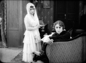
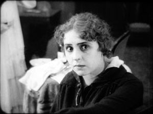
In the heyday of tableau-based staging, 1908-1918 or so, filmmakers seldom cut into the scene at all. European directors especially tended to shape the development of the action by moving actors around the set, shifting them closer to the camera or farther away. The most common cuts were “inserts” of details, mostly printed matter (letters, telegrams) or a photograph. But when tableau scenes did cut into the players, the cuts tended to be axial: the framing moved straight in to enlarge a moment of performance. Here’s an instance from the 1916 Russian film Nelly Raintseva.
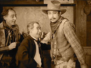
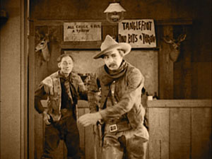
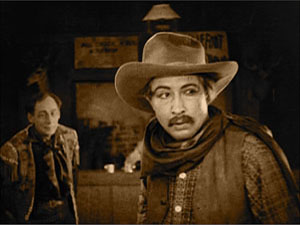
During the mid-1910s, American films moved away from the tableau style toward a more editing-driven technique. This approach often relied on more angled framing and a greater penetration of the playing space, of the kind we’re familiar with today. But axial cuts hung on in American films, even in quickly-cut scenes. Lea pointed out some nice examples in Wild and Woolly (1917), especially those involving movement. In the example below, the first cut carries us backward rather than forward, and the second is a cut-in, but both are along the lens axis.
During the 1920s, axial cuts become a secondary tool of the American filmmaker, who now had many other camera setups available. But Soviet filmmakers of the 1920s, who adopted many American techniques in the name of modernizing their cinema, seemed to see fresh possibilities in the axial cut. For instance, in Dovzhenko’s Arsenal (1929), it becomes a percussive accent. The astonishment of a bureaucrat under siege is conveyed by a string of very fast enlargements.
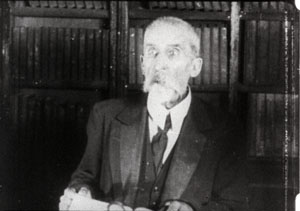
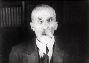
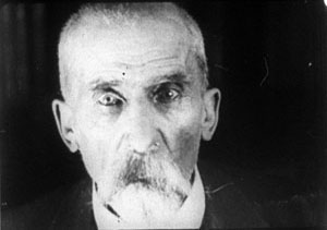
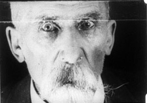
The Soviets called such cuts “concentration cuts,” a good term for the way they make a figure seem to pop out at us. From being a simple enlargement (in tableau cinema) or one among many methods of penetrating the scene’s space (in Hollywood continuity), the axial cut has been given a new force, thanks to adding more shots and making them quite brief.
This aggressive method for seizing our eye—Notice this now!—has appeared in modern filmmaking too, as in this passage from Die Hard (1988).
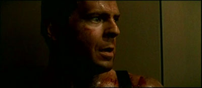
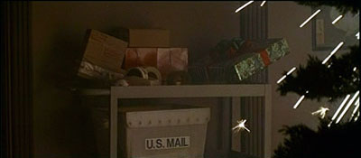


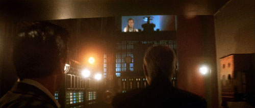
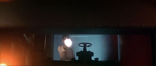
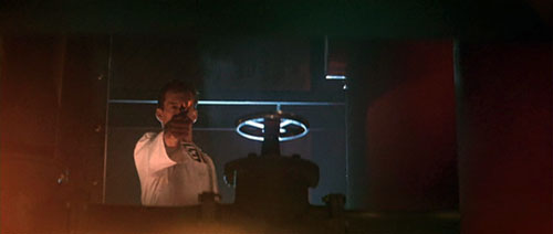
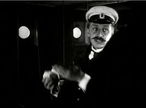
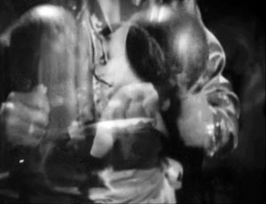
Here the axial cut is clearly subjective, rendering John McClane’s realization that he can use the Christmas wrapping tape in his combat with the thieves. Director John McTiernan employed the device again in The Hunt for Red October (1990). The frames surmounting this entry show the heroes suddenly being fired upon.
It seems likely that many modern directors became aware of this device from seeing Lydia’s discovery of the pecked-up body of farmer Dan in The Birds (1963). Hitchcock knew Soviet montage techniques, so maybe we have a chain of influence here. In any case, the somewhat overbearing aggressiveness of the concentration cut has often been parodied on The Simpsons. Here’s a recent example.


By the law of the camera axis
Axial cutting can be used more pervasively, as a structuring element for an entire scene. This is what Lev Kuleshov does in a climactic moment of By the Law (1926). Edith and her husband have kept the murderer at rifle point for days, and the strain is starting to show. She becomes hysterical, and Kuleshov uses a ragged rhythm of stasis and movement to convey it. First he cuts straight in from a master shot to a medium shot of her. I reproduce the frames from the film strip, for reasons that will become obvious.
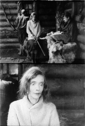
Then Kuleshov cuts straight back to the master setup. Again he cuts in, but to a closer view of Edith as she becomes more frenzied.
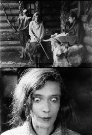
Cut back once more to the long shot, but only for fourteen frames. That shot is interrupted by a shot of Edith already laughing crazily, her head tipped back.
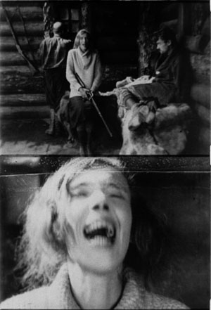
The shot of her laugh lasts only five frames, and this mere glimpse, combined with the blatant mismatch of movement, makes the onset of her spell all the more startling. When we cut back to the long shot her face and position now match.
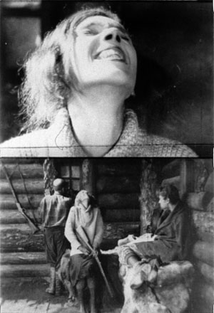
The abrupt quality of her outburst would not have been as striking if Kuleshov had varied his angle. As the earlier examples show, when only shot scale changes and angle remains the same, the cuts can be very harsh, and Kuleshov accentuates this quality with a flagrant mismatch.
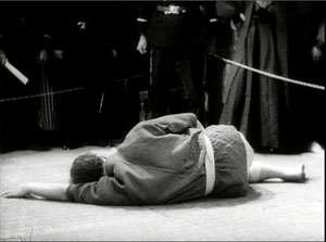
Akira Kurosawa likewise used the concentration cut to provide salient moments throughout his work; it almost became a stylistic fingerprint. At several points in Sugata Sanshiro (1943) he uses the device in the usual popping-forward way. But he varies it during Sanshiro’s combat with old Murai. He reserves dynamic, often elliptical cuts for moments of rapid action, and then he uses axial cuts for moments of stasis or highly repetitive maneuvers. In effect, the moments of peak action happen almost too quickly, while the moments of waiting are emphasized by cut-ins.
So at the start of the match, a series of axial cuts, linked by dissolves, present the fighters in a slow dance. But the ensuing throws are editing briskly. When old Murai is thrown and lies gasping on the mat, axial cuts accentuate his immobility. Kurosawa adds a rhythmic urgency on the soundtrack. After each cut-in, we hear the voice of Murai’s daughter, either offscreen or in his thoughts: “Father will win.” “Father will win.” “Father will surely win.”
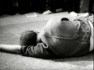
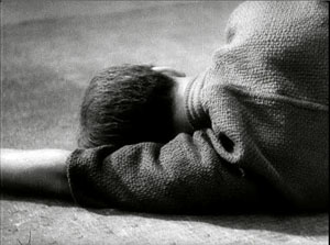
The matching of lines to the editing is at work in the Simpsons parody too, in which the Comic Book Guy’s words are heard in tempo with the concentration cuts. “You. Are. Acceptable.”
Montage and the axial cut

By now it’s easy for us to see that one scene from Alexander Nevsky (1938) opens with a series of axial cuts, out and in.
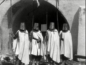
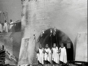
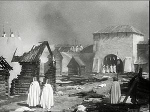
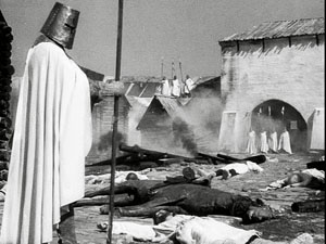
But why would Eisenstein, master of montage, regress to such a primitive device? He had occasionally used axial cuts in his silent films, as when we see Kerensky brooding in the Winter Palace in October (1928).
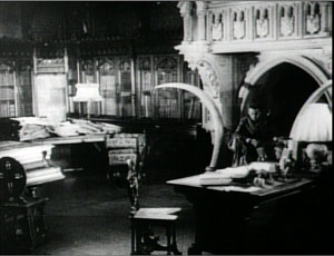
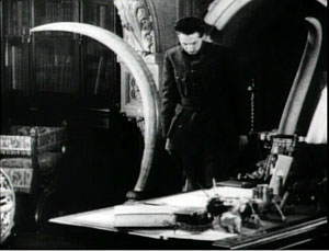
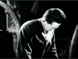
And Potemkin‘s famous cuts in to the Cossack slashing at the camera (that is, the baby, the old lady) are axial. (These cuts are pastiched by Eli Roth and Tarantino in Inglourious Basterds.) At the limit, Eisenstein toyed with the axial cut by moving the figures around during the shot change. In Potemkin, the ship’s officer reports to the captain that the crew has refused to eat. The captain leaves one shot and climbs the stair before Eisenstein cuts in to show him leaving again. The repetition would not be so perceptible if Eisenstein had varied the angle.
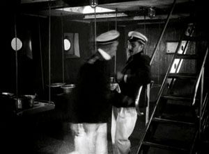
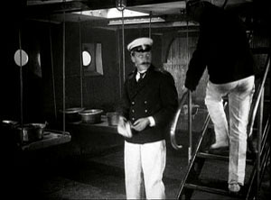
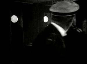
In the 1930s, Eisenstein began thinking about the axial cut as a basic structural element of a scene. In both his theory and practice, he promoted the axial cut to a level of prominence it hadn’t seen since the days of the tableau. Usually the cuts involve static subjects, like most of Kurosawa’s, but he still exploits the cut-ins to create vivid, if spatially impossible effects. At one point our popping in closer to Ivan the Terrible is doubled by him majestically and magically popping out of his tent to meet us, like a thrusting chess piece.
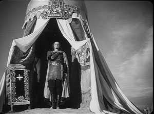
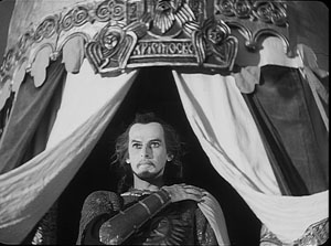
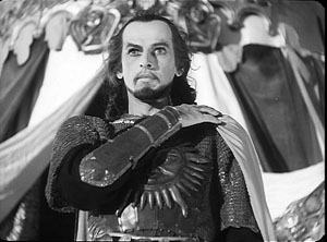
The new primacy of axial cutting comes from Eisenstein’s idea that “montage units” could powerfully organize the space of a scene. He thought that you could imagine filming a scene from only a few general positions, but then varying camera setups within each of these orientations. The montage unit was a cluster of framings taken from roughly the same orientation, as in the Pskov and Ivan scenes.
The idea may derive from his study of Japanese art, shown further above, in which he explored how a single image of a cherry branch could be chopped up into a great variety of compositions. In his course at the Soviet film school, he illustrated with a hypothetical scene of the Haitian revolutionary Dessalines holding his enemies at bay at a banquet. After imagining a master shot from the farthest-back position in the montage unit, Eisenstein proposes a series of dynamic closer views.
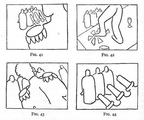
Eisenstein didn’t think that each scene had to be handled in a single montage unit. You could create two or three predominant orientations, with shots from each woven together. Or you could gain a sudden accent when a stream of setups from the same unit was interrupted by one from a very different angle. These ideas he put into practice throughout Nevsky and Ivan the Terrible.
Why? Eisenstein thought that combining shots taken from roughly the same orientation yielded a musical play between constant elements and variation. Each shot shows us something we’ve seen before but also something new, the way a bass line or sustained chords can continue underneath a changing melody. Eisenstein was convinced that this flowing weave of visual elements gave the spectator a deeper involvement in the film as it unfolded—an involvement akin to that found in Wagnerian opera.
The axial cut is a good example of how even a simple stylistic choice harbors rich creative possibilities. It also shows how a technique can change its impact in different filmmaking traditions. In the tableau tradition the axial cut was for the most part an abrupt enlargement heightening a moment of strong acting. In the early days of Hollywood continuity it became one editing option among many, and its power was somewhat muted. For the Soviets, concentration cuts could be multiplied and joined with fast cutting and big close-ups. The result could jolt the viewer by italicizing a face or an object–a purpose that has been taken up by contemporary Hollywood. For Kurosawa, the technique offered a way to contrast extreme movement and extreme stillness. And for Eisenstein, it suggested a global strategy for weaving visual elements into an immersive whole.
The protean functions assumed by this simple device remind us of how much there is yet to discover about film style. Despite all our discoveries over the last three decades, we have only begun. The name is apt: A seminar is where things start.
For more on the staging strategies of the tableau style, see On the History of Film Style and Figures Traced in Light: On Cinematic Staging, as well as blog entries here and here and here and here. You can find examples of emerging Hollywood continuity techniques in this entry on 1917 and this one on William S. Hart and this one on Doug Fairbanks. Sugata Sanshiro is at last available in a good DVD version from Criterion as part of its big Kurosawa box. Eisenstein’s ideas about the axial cut are explained in Vladimir Nizhny, Lessons with Eisenstein, trans. and ed. Ivor Montagu and Jay Leyda (New York: Hill and Wang, 1962), Chapters II and III. In The Cinema of Eisenstein I try to show how these ideas are employed in the Old Man’s late films.
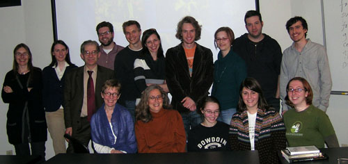
Seated: Leslie Debauche, Lea Jacobs, Rebecca Genauer, Pam Reisel, Amanda McQueen. Standing: Karin Kolb, Andrea Comiskey, Ben Brewster, John Powers, Tristan Mentz, Heather Heckman, Aaron Granat, Jenny Oyallon-Koloski, Jonah Horwitz, and Booth Wilson. Evan Davis had to leave early.
“I am not Carl Dreyer, and I should shut up”
Kristin here:
So says director Guillermo del Toro in his self-deprecating lead-in to his audio commentary on the great Danish filmmaker’s 1932 classic, Vampyr. Fortunately he did not act on his words but goes on to give an erudite, often personal series of insights into the film.
Owners of the Criterion boxed-set edition of Vampyr (2008) may be wondering if their memories are playing them tricks, since its audio commentary was done by our good friend Tony Rayns. Tony’s comments are on the Eureka! edition of the film (also 2008), too, but the British label got del Toro to sit down and record an exclusive second commentary. British websites reviewed the disc, but I suspect that many film fans in other countries are not aware of the existence of del Toro’s commentary.
Early in that commentary, the modest, humorous tone continues, as del Toro says his remarks are “The equivalent of inviting a fat Mexican to your house and feeding him, and then you have to listen, for mercifully a short time, and then disagree, agree, insult, or share any of my opinions.”
From that point on, though, del Toro gets serious. He has worked in the vampire genre himself. His first feature, Cronos, is a vampire tale of sorts, and in June he and co-author Chuck Hogan released The Strain, the first novel of a trilogy that treats vampirism as a fast-spreading virus. Beyond these works, however, del Toro knows an enormous amount about the history of the vampire genre.
For the most part, his comments don’t follow the action on the screen. He begins with a lengthy disquisition on the skull imagery and its creation of a memento mori motif. At times the subject under discussion syncs up briefly with the unfolding narrative. As the protagonist, Allan Gray, watches reflections in a pond that have no visible cause, del Toro discusses the nature of Dreyer’s take on the genre:
In strict terms, it is perhaps one of the few vampire films that have actually gone to the root of the mythos and made the vampire a spirit, not a physical creature. Most of the time you get a living corpse . . . And in the oldest European tradition, in the most antique manuscripts in Eastern Europe and Greek manuscripts about vampirism and so forth, in reality it is a spiritual infection. The vampire is a hungry spirit that will drain the living and will of choice materialize partially and selectively if it needs it, if it serves him so. But essentially a vampire is a shadow and the father or the mother of shadows. It is this hungry shadow that haunts the living and drains them.
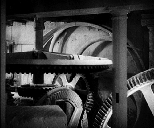
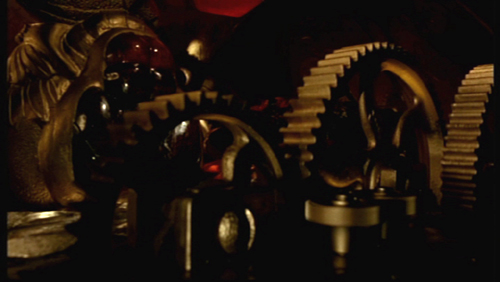
Del Toro clearly loves Vampyr and stresses its influence on him. Seeing Gray as a Christ figure, he named the protagonist of Cronos Jesus Gris (Spanish for “gray”) as an homage. He copied the cracked gravestone of the vampire in Hellboy. In discussing the shots of the gears of the milling machine that kills the villainous doctor at the end of Vampyr (above), he remarks, “I have myself tried to reproduce the beauty of those gears, incessantly and not very fruitfully I may add, but I try for sure.” (See below.)
Del Toro also remarks that there is no reason that characters in vampire stories—or other kinds of stories—must be nuanced. The Academy of Motion Picture Arts and Sciences may prefer to reward actors who play complex characters. Still, he sees no reason why in Vampyr the doctor needs to be anything other than evil, the hero anything other than spiritually pure.
Del Toro refuses to try and interpret the film’s symbolism, saying that decoded symbols become “ciphers.” He continues:
It is foolish to try to decode the symbols in Vampyr. It is important to understand the rhythm and the repetition of them. And it is important to try and talk about them in the most general sense, but one should not foolishly try to assign specific value to them, because in doing that you would asphyxiate the poem, you would asphyxiate the film.
There is relatively little discussion of film style, but at about 49 minutes in del Toro talks about camera movement and how it creates mood rather than strictly serving the narrative. He challenges his auditors to examine films shot at the same time (in 1931-32) and find three or four other films that were experimenting with camerawork in this way. He even gives one of his email addresses so people can write and give him lists of titles that might contradict him. (With The Hobbit script in progress and pre-production already begun, I suspect that del Toro is not checking that particular address—which he reserves for fans—as often as he used to.)
There are other interesting points, as when del Toro suggests that Dreyer was influenced by Un chien andalou. Not that he created a surrealist vampire film but that he felt freed from the necessity to follow a narrative closely. To del Toro, the underlying plot of the film is simple and easily comprehensible, leaving Dreyer free to devote much of his film to a more poetic, evocative style.
The Criterion and Eureka! versions share several of the same supplements, including a 1966 documentary on Dreyer’s career, a “visual essay” by Casper Tybjerg on Vampyr, as well as the original Sheridan Le Fanu story on which the film was loosely based (in pdf form on the disc in the Eureka! version and in a booklet also containing the original screenplay in the Criterion one), and improved English translations. Criterion has included a 1958 radio broadcast of Dreyer reading an essay on filmmaking, while Eureka! provides two deleted scenes that were removed by the German censor before the film’s premiere. These scenes are not entirely unfamiliar, since they remained in the French version. The Criterion rendering of the film seems to have boosted the contrast, perhaps too much. The Eureka! version’s gray, misty visuals look more like those that I’m familiar with from reasonably good 35mm copies.
For a detailed comparison of these two releases and the older Image edition (1998), see DVD Beaver. For a review of the Eureka! disc, supplement by supplement, see DVD Outsider.
As with other Eureka! DVDs, this one is region 2 coded.
Cronos
Get well soon, Richie-san

Donald Richie is in a Tokyo hospital recuperating from pneumonia.
If you’ve read a book on Japanese cinema or listened to a Criterion commentary, you probably know his voice. And if you admire Ozu or Kurosawa or Mizoguchi or Kinoshita or Oshima or virtually any other Japanese director, you have Donald to thank. Many of the films we consider classics would not have been seen in the west had Donald not convinced Japanese companies that there was a worldwide audience eager to know this country and its cinema. Gatekeeper, tastemaker, public intellectual, and memoirist, this exuberant 85-year-old has given us so much pleasure and wisdom that we should remind him how much he means to us.
You can send cards, letters, and well wishes to Donald Richie, c/o KiSMet, 1-2-7-8E Meguro, Meguro-ku, Tokyo Japan 153-0063.
Daisies in the crevices
DB here:
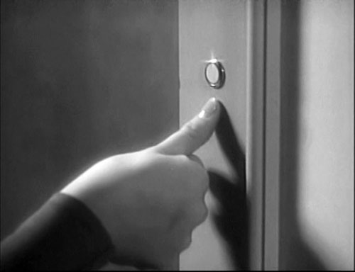
If you wanted a prototype of some unique visual pleasures of 1930s cinema, you could do worse than pick this innocuous image. It’s perfunctory in narrative terms, merely telling us that Sylvia Day is calling on Bill Smith. Beyond its plot function, though, it’s fun to see. We can enjoy the unfussy modern edge of the doorjamb, the curve of the manicured thumb, and soft highlights bringing out the hand and knuckles.
Above all, there is that starry gleam at the top of the doorbell. Who needs it? It’s just a doorbell. Why take so much trouble lighting a throwaway shot?
Add to this that Parole Girl (1933) is a program picture, and from Columbia, no less—the Poverty Row studio that had yet to break through with It Happened One Night (1934). We learn from Bernard F. Dick’s deeply-researched book on Harry Cohn that the budget for Parole Girl would have been about $250,000, when MGM B’s were running about $400,000. Why spend money on a shot like this?
Because that was the standard of good-looking moviemaking at the time. Most problems of converting to talkies had been solved, so films were regaining not only the fluent narration but the sparkling imagery of 1920s cinema. Under Cohn’s leadership, Columbia was trying to compete with the bigger studios’ movies, and looking classy was one way to do it. Recently I spent a day or so watching four titles, and I was reminded how pictorially sophisticated and refreshing low-end Hollywood can be. These movies also offer us an unusual window into what was already characteristic storytelling strategies of classical Hollywood. But there will be spoilers ahead too.
Welcome to 1933
As so often, I have TCM to thank. Since their Jean Arthur tribute of 2007, they have been running a generous number of Columbia titles (all restored by the master hand of Grover Crisp). By including less-known 1930s items along with classics like The Awful Truth and the Capra titles, they continue their mission of serving American film culture every hour.
Lea Jacobs has convinced me that it’s useful to think of studio releases in those days as filling a season running from Labor Day to Memorial Day rather than a calendar year. Studio heads planned budgets and production schedules according to that time frame, like network TV broadcasters now. Unlike today, summer was not a big release period, maybe because of the competition of other leisure activities, maybe because with air-conditioned movie houses people would come watch anything thrown on the screen. In any case, the big pictures were saved for fall, winter, and spring.
So my frame of reference is the 1932-33 season. Columbia ushered in the new year with its best-remembered film of the season, Capra’s Bitter Tea of General Yen (6 January). The studio probably considered Washington Merry-Go-Round (15 October), Virtue (25 October), and No More Orchids (15 November) to be A projects, but the large output of Westerns, the absence of historical pictures, and the relative dearth of stars in this output confirm the studio’s status as a Poverty Row company.
My movies come from the winter and spring of 1933. Each was shot in two to three weeks and each runs about seventy minutes.
Air Hostess (15 January, directed by Albert Rogell) tells of the daughter of a WWI ace who marries a reckless young pilot. Trying to build a new type of plane, he shops his business plans to a rich woman investor, who tries to seduce him.
In Child of Manhattan (4 February, directed by Edward Buzzell), a wealthy widower falls for a taxi dancer and takes her as his mistress. When she becomes pregnant, he marries her. But the baby dies soon after birth and the wife flees to Mexico for a divorce while the husband tries to track her down.
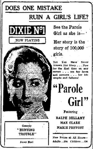
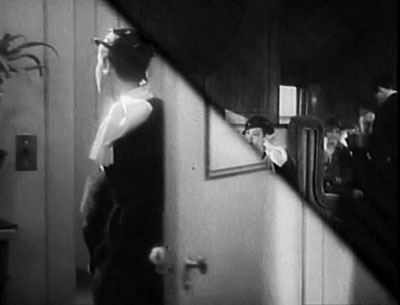
In Parole Girl (4 March, directed by Edward Cline), a department store executive sends a woman con artist to prison. She vows revenge. When she gets out, she seduces the executive, although he’s unaware of who she is.
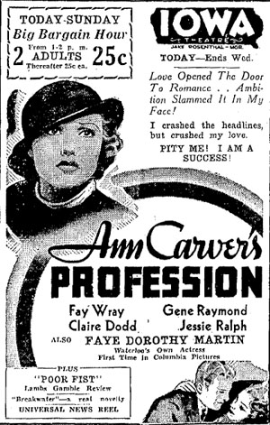
Ann Carver’s Profession (26 May 1933, directed by Buzzell) centers on a couple torn by career rivalry. After being a gridiron hero in college, the husband is failing as an architect. Meanwhile, his wife is becoming a celebrated trial lawyer. Eventually the husband leaves the household and takes up with a floozie, who winds up strangled. His wife must defend him against the murder charge.
For connoisseurs of naughty pre-Code movies, there are the usual attractions of double beds, extramarital sex, peekaboo negligees, and risqué dialogue. Child of Manhattan goes the farthest, perhaps because it’s an adaptation of a Preston Sturges play. “You’re a fascinating little witch,” says the millionaire. “Did you say witch?” the dancer asks. This is the same girl, played by perky Nancy Carroll, who thinks the man is trying to feel her up when he slips a thousand-dollar bill into her garter. Later she recalls her mother’s advice: “Never, ever walk upstairs in front of a gentleman.” And when she confesses to her Texan admirer in her mangled pronunciation, “I’m a courtesian,” he pauses and replies, “Well, religion doesn’t make any difference with me.”
Despite such pleasant moments, and two screenplays credited to Robert Riskin and Norman Krasna, these movies won’t win prizes for imaginative scripting. The tone is often uncertain, with comic banter clashing with scenes of melodramatic sacrifice. The long arm of coincidence becomes elastic. In Parole Girl, the heroine happens to meet the offending executive’s first wife in prison. During the taxi dancer’s stay in Mexico, she runs into the cowpoke who had wooed her aggressively in Manhattan. In Ann Carver’s Profession, the husband’s girlfriend accidentally strangles herself. Yes, you read that correctly.
Still, you have to give points for speed. Only Parole Girl has unusually quick cutting, at an average of 6.6 seconds per shot, but the overall pace of most of the plots is pretty rapid. (The exception is Child of Manhattan, whose lumbering dramatic rhythm is echoed in an average shot length of sixteen seconds.) Playing far-fetched action fast makes it less noticeable and more forgivable. Today any movie that can tell a moderately interesting story in a little more than an hour feels like a triumph. You can watch two of my pictures in the time it takes to groan your way through Funny People. And in these movies, the opening credits flash by in less than fifty seconds. Those were the days when crafts people under contract didn’t have to be acknowledged, and there were no executive producers.
Apart from Capra, whom do we remember as a Columbia director? Probably not my three guys. Albert Rogell, director of Air Hostess, began directing in the early 20s and worked for Columbia, Tiffany, Monogram, RKO, Universal, and Paramount. A prototypical B filmmaker, he signed over a hundred films in twenty-five years. Edward Buzzell was somewhat more prominent. After Ann Carver’s Profession, he left Columbia for Universal and eventually moved to MGM, where he directed (as if that were possible) the Marx Brothers in At the Circus (1939) and Go West (1940), as well as helming Song of the Thin Man (1947). Like Rogell, Edward Cline (Parole Girl) skipped among studios; like Buzzell, he landed on his feet with comedian comedy, steering W. C. Fields through You Can’t Cheat an Honest Man (1939), My Little Chickadee (1940), and other vehicles. In all, studio artisans, yes; auteurs, no.
Two Joes and a Ted
Parole Girl
If you’re interested in how Hollywood tells its tales, there’s a fair amount to chew on in these modest releases. The scripts tend to obey Kristin’s four-part model, adapted to very short running times, with the key turning point taking place midway through the film. Despite the coincidences, the characters’ goals and changes of heart tend to be planted early. In Ann Carver’s Profession, Ann’s intense ambition and Bill’s swaggering overconfidence prepare us for the crisis in their marriage, when each is unwilling to compromise.
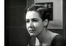 As for performances, perhaps the very speed of production forced actors to play naturally. True, Fay Wray is a bit arch as Ann Carver, but Gene Raymond as her husband moves convincingly from boisterousness to self-doubt. In Child of Manhattan, John Boles, trying to mingle with the little people, can be stiff, but Nancy Carroll has pep, and Buck Jones as her cowboy swain adds a welcome dose of naive gallantry. All three show how important distinct voices had already become: Boles mellifluous, Carroll up and down the scale, Jones slow and sincere. Reliable Columbia regular Ralph Bellamy shows up in Parole Girl, but more memorable is the performance, or rather presence, of Mae Clark. When she comes back from prison bent on vengeance, she’s a glowering figure in her stylishly chopped hairdo.
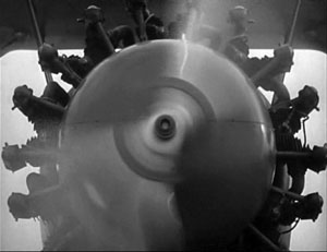
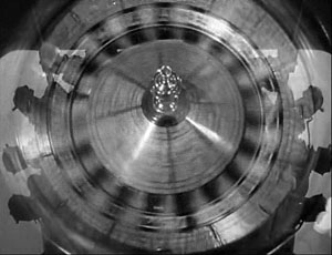
The films make fluent use of storytelling devices that predate the 1930s but are forever associated with that decade. Sequences are linked through headline montages and wipes, recently made possible by the optical printer. There are more elaborate techniques too, particular the visual or auditory hook connecting scenes. We’re not surprised to see commonplace instances, as when a note pad listing an apartment number dissolves to that number on the door. In Air Hostess, however, a spinning propeller gives way to a roulette wheel, and this association does a little more work, linking Ted Hunter’s reckless flying to his gambling and his general tendency to take risks.
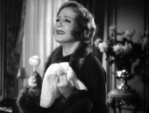
In Child of Manhattan, as Madeleine resolves to leave her husband after the death of her child, she tearfully shakes a baby rattle, and this dissolves to marimbas in a nightclub, swiftly turning her pathos into her effort to start a new life with a Mexican divorce.
But what is perhaps most striking about these films is their photography. Ten minutes into Air Hostess, the first one I watched, we get a lovely sustained track into a sunny airfield, our view guided by the walkway wheeled up to a plane door as passengers step out.
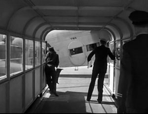
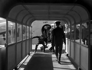
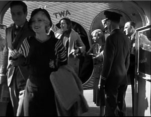
The relaxed play of light and shadow in this geometrical shot yields one of those fugitive visual delights that classic cinema so often supplies.
What’s it doing in a Columbia programmer? This Poverty Row studio realized that they could give their pinched budgets an upscale look with polished cinematography. Accordingly, you can argue that the biggest talents on the Columbia lot were the directors of photography. Our four films were shot by ace DP’s.
Joe August (Parole Girl) was the grand old man. He filmed some of the best-looking hits of the 1910s, including Ince’s Civilization (1916) and a great many William S. Hart movies (including Hell’s Hinges, 1916). In the 1920s and up to 1932 he worked at Fox on films by Ford, Hawks, and Milestone. At Columbia August would shoot Borzage projects like Man’s Castle (1933) before moving to RKO for Sylvia Scarlett (1936), Dance, Girl, Dance (1940), and the flamboyant All That Money Can Buy (aka The Devil and Daniel Webster, 1940).
Another Joe, somewhat younger, was no less gifted. Joseph Walker, the DP of Air Hostess came to Columbia early and soon teamed with Capra; he would shoot twenty movies with the director, including the splendid American Madness (1932), a particular favorite of mine. Walker stayed loyal to Columbia, shooting Only Angels Have Wings (1939), His Girl Friday (1940), Penny Serenade (1941), and on and on—returning to Capra for the independent production It’s a Wonderful Life (1947). Walker also patented an original zoom-lens design.
Ted, sometimes known as Teddy, Tetzlaff was another Columbia loyalist, and he certainly cranked them out. Hawks’ The Criminal Code was one of eleven movies Tetzlaff was credited with in calendar 1931. But by the spring of 1933 he seems already to have become a free lance, eventually working at Paramount on a string of classics (Easy Living, Remember the Night, Road to Zanzibar), then RKO (The Enchanted Cottage, Notorious), and occasional jobs back at Columbia. Tetzlaff became a director as well, remembered chiefly for the cult classic The Window (1949).
No wonder my four films dazzle, even on TV. According to Bob Thomas’s biography King Cohn, Columbia took special care to create a phosphorescent look through careful processing that enhanced the DPs’ efforts. Hence not only the sparkle on a door buzzer but glowing applications of then-standard edge lighting. Hence as well the use of striped shadows to suggest venetian blinds, a convention we associate with the forties but here in precise array (Child of Manhattan, Parole Girl).
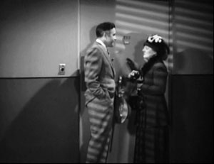
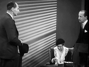
Trust Joe Walker to provide a little of that striped texture with a fuselage.
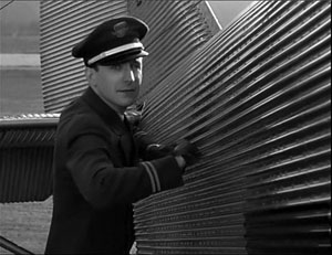
Hence too some striking depth. Here is the next-to-last shot of Walker’s work in Air Hostess, the sort of fancy aperture composition that crops up surprisingly often in the 1930s.
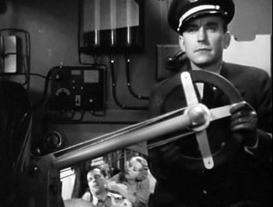
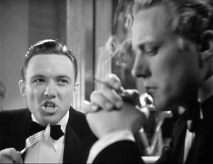
Tetzlaff, first in Child of Manhattan and then Ann Carver’s Profession, seems to be fooling around with faces and elbows.
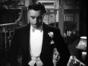
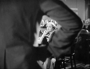
Probably the most visually and narratively complex of my films from spring 1933 is Ann Carver’s Profession. It’s possible that it was Columbia’s equivalent of an A production: Gene Raymond was a mid-range star known for a few Paramount and MGM pictures, and Fay Wray’s King Kong had premiered a week before filming started. Whatever the cause, Ann Carver has more complex plotting and more consistently inventive visuals than the three other titles.
From the very start, when gridiron hero Bill promises to provide for Ann the waitress, we get the sort of offhand flash that I like in 1930s movies. As Bill follows Ann into the kitchen, she’s framed in a swinging door and the camera moves closer to pick up their clinch.

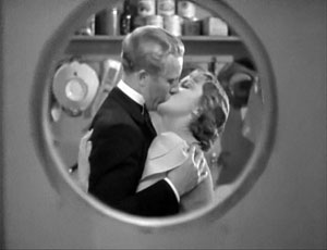
Once they’re married, the circle has become a rectangle, and trouble is on the way.
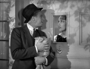
There are fancy mirror shots, pov constructions that lead characters to the wrong inferences, and examples of the big-foreground compositions that would come to prominence in the 1940s.
The trial recesses; crane up to the clock; spin the hands to cover a couple of hours; crane back to the trial resuming. Or start with Bill’s girlfriend, passed out and garroted by the necklace that has snagged on a leering chair carving. Dissolve to Bill’s night on the town, before ending that fuzzy montage with a dissolve back to the chair carving.
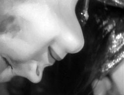
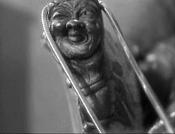
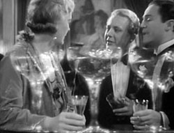
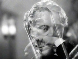
Bill didn’t kill her, but the pictorial logic makes him almost magically responsible, with the carving mocking him for what’s to come.
Above all there is one of the most laconic (and cheaply filmed) courtroom montages I’ve ever seen. A string of witnesses testifies, and after a newspaper pops out the first one, we get a fusillade of extreme close-ups, cut very quickly.
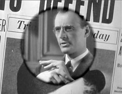
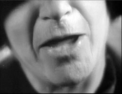
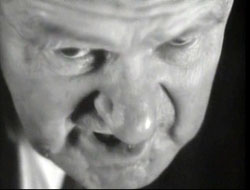
Just as striking is the coordinated sound montage, which reduces the testimony to clipped sentences, then phrases (“”Four-thirty!” “Quarter to five!” “Both of ‘em!”), then single words (“Drunk!” “Drunk!” “Strangulation!”), all damning Bill. Why take us through all the rigamarole—people sworn in and questioned at length—when you can give the essence of it in twenty-eight shots and twenty-five seconds?
My 1933 quartet contains no great film; perhaps none is worth more than one viewing. But what I learned from watching ordinary movies for our Classical Hollywood Cinema book is borne out by my soundings here. We can enjoy seeing a well-honed system steering us through a story, especially when gifted people like Teddy and the two Joes are shifting the gears. We can appreciate the opportunities for grace notes in what some call formula filmmaking. And we can see that this lowly studio, making films ignored in traditional histories, has something to teach filmmakers today: proud modesty. A film can radiate pride in being concise, in exercising a craft, and in telling a story that hurtles forward while shedding moments of casual beauty.
Most critical writing on early 1930s Columbia pictures focuses on Frank Capra, but there is good general background in Bernard F. Dick, The Merchant Prince of Poverty Row: Harry Cohn of Columbia Pictures (Lexington: University Press of Kentucky, 2009). My mention of budget levels comes from his discussion on pp. 119-120. An older, citation-free but still helpful biography is Bob Thomas, King Cohn (Beverly Hills: New Millennium, 2000). In-depth information on Joseph Walker as a Columbia cinematographer is available in Joseph McBride’s excellent biography Frank Capra: The Catastrophe of Success (New York: Simon and Schuster, 1992), 189-215. Walker’s engaging autobiography supplies nothing specific to these films, but he sprinkles technical information among its anecdotes. See Joseph Walker and Juanita Walker, The Light on Her Face (Los Angeles: ASC Press, 1984).
On 1934 as the end of naughtiness, see Tom Doherty’s Pre-Code Hollywood. For a skeptical account of the idea of Hollywood “before the Code,” see Richard Maltby, “More Sinned Against than Sinning [2003],” in Senses of Cinema here, and essays in “Rethinking the Production Code,” a special issue of The Quarterly Review of Film and Video 15, 4 (1995), ed. Lea Jacobs and Richard Maltby.
If you’re interested in more complicated narrative strategies in films of this period, try our entry “Grandmaster Flashback.” For another take on low-budget 1930s films, there’s our entry on Mr. Moto and Charlie Chan.
