Archive for February 2010
Motion-capturing an Oscar
Kristin here:
Six years ago, when The Lord of the Rings: The Return of the King was nominated for eleven Oscars, there was considerable grumbling over the fact that Andy Serkis was absent from the acting categories. Many argued that his pivotal role in creating Gollum, the first convincing human-like computer-generated character, should have qualified him for a nomination.
Now we’re seeing a similar debate over the lack of actor nominations for Avatar, with Zoe Saldana’s performance as Neytiri especially mentioned as unfairly overlooked. An intriguing article on the subject appeared in the Los Angeles Times a few days ago. In it, James Cameron expresses annoyance with both the Screen Actors Guild and the Academy for the lack of nominations for his actors:
I’m not interested in being an animator. . . . That’s what Pixar does. What I do is talk to actors. ‘Here’s a scene. Let’s see what you can come up with,’ and when I walk away at the end of the day, it’s done in my mind. In the actor’s mind, it’s done. There may be a whole team of animators to make sure what we’ve done is preserved, but that’s their problem. Their job is to use the actor’s performance as an absolute template without variance for what comes out the other end.
Because of innovations in the motion-capture process, including a tiny camera hung in front of an actor’s face to capture its every nuance, Cameron insists on calling the new technology “performance capture.” In some sense it may be true that the performance is preserved, but once the film runs through the theater projector, can the audience really tell what that “template” was like? I think not, and that’s why there is a reluctance to nominate these actors.
Where is the elusive boundary?
Don’t get me wrong. I’m not saying that Zoe Saldana and Andy Serkis aren’t fine performers or that their acting did not contribute enormously to the characters they played. Indeed, Serkis’ mo-cap contribution to the creation of Gollum was originally intended to be far more limited than it turned out to be. His facial expressions and gestures were so useful to the special-effects people that he was involved for a much longer period, and techniques to allow him to perform onset with the other actors were developed.
But however fine the original acting and however great the aid it provides to the special-effects team are, the process doesn’t stop there. To a notable degree other factors intervene between the actors’ original performances and the characters’ final appearance on the screen. Let’s do some comparisons, using the publicity images that the studios themselves considered good indications of how close the expressions of original actors were to those of their characters.
Take the widely circulated image of Saldana juxtaposed with Neytiri shown above. There are numerous differences. For a start, the filmmakers obviously needed to make the Na’vi look like an alien species. They didn’t just give them tails and make them blue and really tall. Human as the creatures seem in many ways, their faces have a subtle suggestion of large felines.
The effectiveness of Neytiri’s snarl has a lot to do with the fact that she has been given exaggeratedly long canine teeth. Moreover, given the changes in the shape of the face, the mouth is not as large proportionately to the entire head as Saldana’s is; the tongue is not nearly as prominent or noticeable. Both tongue and lips are blue as well. All of these features allow the teeth stand out more by contrast.
Na’vi ears are pointed, and some of the lobes are apparently pierced with a small dark disk in the hole. Saldana’s ears played no role in her performance, but the laid-back ears in the Neytiri image, mimicking those of an enraged animal, contribute considerably to the shot’s impact. I remember noticing them while watching the film.
The nose and the wrinkles on and above it have been considerably changed. Unlike human noses, those of the Na’vi are smaller at the bottom than at the top, somewhat resembling lions’ noses. The wrinkles seem to be derived from canine or feline faces as well, extending from the inner end of the eye and arcing down toward the tip of the nose. The human frown lines at the lower center of Saldana’s forehead are transformed into larger, longer, curved wrinkles at either side; these start between the eyebrows and move up and to the sides. There they get extended by the curved areas of darker blue that radiate across the upper forehead, so that the lines of anger seem to cover more of the face. I suspect that relatively little of what the actors did with their noses has survived the special-effects processing. (In the image below, even the shape of Saldana’s naso-labial folds has been slightly altered.)
The change in the eyes is particularly important. Saldana’s eyes have dark irises within which the pupil is barely, if at all, visible. Na’vi eyes are much larger, to begin with, and the irises are light in color, a sort of yellowish tan. The irises fill more of the visible part of the eye, so that the whites of Na’vi eyes are minimized. As a result, the black pupil stands out dramatically. In terms of color, the model seems to be cats’ eyes, though the pupils remain round rather than slits, to avoid making the Na’vi too alien looking. Since the nose has been widened at the top, the eyes are also further apart than on human faces. (The norm with humans is for the eyes to be separated by a distance roughly equal to the width of one eye.)
Even in a less dramatic scene, when Neytiri is relaxed and smiling, some of these differences remain. The pointed ear is not laid back, but it sticks out from the side of the head at an angle that draws the spectator’s attention and makes the human-shaped face seem exotic–especially given that the Na’vis’ ears are placed higher on the skull than human ears are: while the human ear canal is about even with the cheekbone, in the Na’vi it opens at mid-temple level. Although the points of the canine teeth are not visible in this image, the teeth remain prominent because of their bright whiteness against the blue skin. Though partially masked by the headgear, the vaguely feline nose still differs considerably from Saldana’s. In keeping with the extraordinary height of these beings, Saldana’s neck has also been lengthened.
Again, I’m not saying that Saldana and the other actors in Avatar did not contribute enormously to the believability of their characters or that they did not aid us to empathize with them. On the contrary, although the big blue creatures did seem very odd in the trailers and posters, I have to admit that they quickly came to seem like real characters. Their design’s balance of human and alien is remarkable. I did not continually think of them as walking combinations of numerous elaborate special effects. The new facial-capture system renders expressions very well, as the frame at the bottom shows.
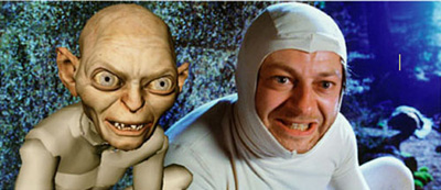
What I’ve pointed out here with relation to Saldana’s contributions to the creation of Neytiri applies as well to Serkis’ earlier contributions to Gollum. In the comparison images below, similar changes were made.
While Serkis’ ears were covered, Gollum’s are pointed and prominent. Here, too, the eyes have been enlarged and made a light blue so that the pupils stand out. Where the actor’s teeth are straight and even, Gollum’s are pointed, crooked, and separated by gaps. The cheeks have been hollowed and the eyebrows arched nearly to a point near their outer ends. Crucially, the body has been made inhumanly skinny, with long bony legs and arms that are not apparent in this image. I suspect that some naive audience members believed that a real actor had played Gollum, but to most the scrawny figure was a guarantee that no human could have performed the role. (The very thin waists of the extraterrestrials in District 9 served as a similar guarantee that these were not just guys in monster suits à la Invaders from Mars.)
With all the kinds of changes that I’ve pointed out, how would Academy members be supposed to judge these performances were they to be nominated in the traditional acting categories? Where is the boundary between acting and special effects? Despite actors’ and directors’ claims to the contrary, the movements and expressions caught by performance capture are changed in many obvious and not so obvious ways. A close inspection of the comparison photos reveals the details of the transformation, but in watching the film, the viewer cannot necessarily gauge what sorts of changes were made. I can well imagine that actors like Meryl Streep or Jeff Bridges would be justified if they objected to competing in the same Oscar category as what are essentially hybrid performances seamlessly combining the original acting and the digital transformation.
Possible new categories
One way I can imagine actors competing for awards would be for the Academy to create a separate category for motion-capture performances. To judge such performances fairly, the members would have to see videos running the original performance side-by-side with the finished film. This method might allow them to make a reasonable assessment of what the actor truly contributed.
At this stage in the history of film technology, such a category seems unlikely. So far, not that many people have been spoken of as deserving an Oscar nomination for a mo-cap performance. Even Bill Nighy, who was widely praised for his turn as Davy Jones in the second Pirates of the Caribbean film, was not touted as a possible nominee—probably because his face was so thickly covered with tentacles and partly because comic fantasy films tend not to be Oscar bait. So far the argument has primarily been made for Serkis and Saldana. Plus if the Academy did take the approach of requiring the sort of comparison film I’ve suggested, it would be a difficult and expensive thing to produce. Who knows whether Academy voters would watch five such films?
Maybe, though, as performance capture becomes less expensive and more widely used, there will be enough actors to make up a separate category. We’ve seen the animated-feature category grow from three to five nominees this year, and the number of such films being made suggests that five will become the norm. Animated films and live-action ones heavily dependent on motion-capture are somewhat similar technically, so a new category makes some sense.
A simpler and more logical alternative might be to create a category specifically for vocal performances. As has been pointed out in relation to animated films, an actor who is heard but never seen onscreen could in principle be nominated. Such a thing has never happened, but it’s not against the rules. (It’s easy to imagine that it could have happened for a performance like Celeste Holm’s unseen narrating character in Letter to Three Wives.) But with animated-feature and motion-captured performances becoming more common, a best-vocals category seems to make sense. After all, Serkis and Saldana and others like them do speak their characters’ lines, and their voices are typically not altered or enhanced very much. The digital manipulation of sound still lags considerably behind that of images.
The idea is not exactly a new one. The Annies, the awards given out each year by the International Animated Film Society, has two “Vocal Acting” categories, one each for film and television.
Very similar motion-capture technology can be used to create films that most people would agree are animated (The Polar Express, A Christmas Carol) and others that embed animated characters in a live-action setting (The Lord of the Rings, Avatar). Creating an Oscar category for vocal acting in animation or motion-captured, effects-based performances would make sense.
If actors are not yet being recognized for motion-captured performances, the Academy has been quick to honor the top scientific and technological innovators of the area of motion capture. In 2004, when The Return of the King won its golden statuettes, the less celebrated Academy technical awards included one to the Weta Digital team for its new approach to the creation of Gollum. (The award was shared with ILM for its similar use of the technique in creating Jar Jar Binks.) This year, on February 20, the Academy honored a team that included one Weta Digital member for “the design and engineering of the Light Stage capture devices and the image-based facial rendering system developed for character relighting in motion pictures” which was used on Avatar and The Curious Case of Benjamin Button.
Despite fears that motion-capture may someday make directly photographed actors obsolete, there seems little chance of that happening. These techniques are fantastically expensive and are likely to remain that way for some time to come. There seems little point to using such elaborate technology to make an actor look like a real person when traditional cameras can do it so much more easily, so motion-capture performances seem suitable primarily for fantasy beings who cannot be as believably created in any other way.
Thanks to Cathy Root for calling my attention to the Los Angeles Times article.
February 25: See also Mark Harris’ essay in Entertainment Weekly. He argues that the ineffable qualities of an actor’s performance simply cannot be conveyed through motion-capture.
December 14, 2011: A member of the special-effects team at Weta Digital who worked on Avatar has sent me a comment on this entry: “Your Avatar article nails it–there were so many daily discussions about secondary ear and tail animation!”
May 18, 2014: Thanks to David Cairns for alerting me to two recent items on Cartoon Brew: Amid Amidi’s “Andy Serkis Does Everything, Animators Do Nothing, Says Andy Serkis,” which comments on an interview with Serkis on io9, and Amidi’s follow-up interview with Lord of the Rings animation supervisor Randall William Cook, which quite convincingly argues that the animators changed and extended Serkis’ performance.
Sticky splices and hairy palms
Venusville (Fred Worden and Chris Langdon, 1973).
DB here:
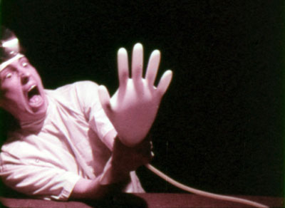
Just as CDs gave us a taste for sterile sound, the DVD has made us prize the clean image. We like sleek, hard-edged frames that look good on computer monitors and home-theatre screens. So who would put up with a shot like the one surmounting today’s entry?
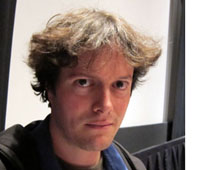 Mark Toscano, for one. He’s a film preservationist for the Academy of Motion Picture Arts and Sciences Film Archive. Among other tasks, he searches out and preserves experimental and avant-garde cinema, particularly work from West Coast filmmakers. And he savors shots like that hairy palm.
We normally think that someone preserving a film must at the minimum do a cleanup—remove all the specks, hairs, rips, and bad splices—before going on to more serious fixing, like correcting faded color. But what if the filmmaker left in the dirt and glue blobs deliberately? Or what if the filmmaker developed a fondness for the wear and tear that the movie accumulated over years of use? What’s a dutiful archivist to do?
The virtues of degradation
Mark is aware that archivists can have a big impact on film culture. By selecting films to save, they expand the canon and invite researchers to consider work that might otherwise be missed. “A curator’s enthusiasm can fuel new scholarship.” So part of Mark’s mission is to bring the inventiveness of lesser-known avant-garde filmmakers to new prominence.
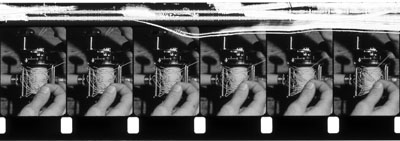
Surprisingly, sometimes the archivist has to convince a filmmaker that work is worth saving. Robert Nelson had decided that most of his films were of little interest and in 1999 began redoing some and even destroying others. The scrapes you see on The Awful Backlash (above), a film about a tangled fishing reel, are the result of Nelson’s decision to rub out parts of the soundtrack.
Above all, a preservationist can widen the audience by programming collections like the one Mark brought to our Cinematheque last week. His Friday program was a feast of LA experimental film from the 1960s and 1970s. The menu ranged from gorgeous abstractions like Fred Worden’s Throbs (1972) and Pat O’Neill’s 7362 (1967) to exercises in dry wit like Morgan Fisher’s Turning Over (1975), about the momentous instant when a car’s odometer flips from 99,999 miles to 100,000. There was Kathy Rose’s Mirror People (1974), a sinister exercise in fairy-tale animation, headcomix-style, and Diana Wilson’s charming stop-frame still life Rose for Red (1980). One of the program’s implications was that on the Left Coast, avant-garde films were less cerebral than the official classics of the East Coast establishment. Films like David Wilson’s Stasis (1976) and Gary Beydler’s indescribable Pasadena Freeway Stills (1974) show that Structural Film could offer sheer entertainment. Mark’s notes on several of these titles can be found here.
The day before the screening, Mark gave a talk to our departmental colloquium called “Print (de)Generation.” He was paying ironic homage to our colleague J. J. Murphy’s 1974 classic, Print Generation (which Mark is restoring). But his title captures as well the problems of preserving films that don’t aim at pristine imagery.
If you assume that your job is to find the best existing form of the film and conserve that, what do you do with experimental work? Sometimes the films are designed to look messy. Sometimes they acquire a wear and tear that is like the patina on a sculpture or piece of furniture, when the signs of time’s passing become part of the texture of the piece.
Mark gave many examples of the decisions he faces in preserving the deliberate roughness of some work. Ben VanMeter (in spirit and approach, Mark feels, the most classically hippie West Coast filmmaker) corrugated the film strip of Acid Mantra; or, Rebirth of a Nation (1968). The legendary but little-seen Maltese Cross Movement (1967) by Keewatin Dewdney is a dazzling exercise in process structure, and the speckling on the images comes from creative choices. Shots were intercut with black frames—not black film frames, but frames dabbed with opaque paint. Inevitably, flakes of paint migrated across nearby footage.
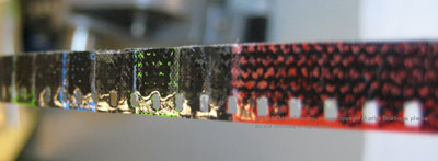
Brakhage’s films call for special delicacy. Mark showed lovely photos of film strips that Brakhage had painted upon, or welded together with thick splices that look like chain mail, as in the fourth reel of 23rd Psalm Branch (1967).
The Garden of Earthly Delights (1981) incorporates bits of grass, ferns, and insect wings.
How do you preserve such a thing? Brakhage endlessly revised some of his work, and came to appreciate the flaws that reprinting shooting and editing introduced into a film. When Mark called him about eradicating a hair that had crept into Flight (1974), Brakhage replied: “That hair is the axis around which the entire film revolves.” [Please see PS at bottom of post.]
Feelthy peectures
Mark’s talk highlighted Chris Langdon, a little-known Cal Arts filmmaker who worked with John Baldessari, Robert Nelson, and Fred Worden. Worden collaborated on Venusville, (1973), a deadpan satire on Structural Film. Shots of a palm tree tremble in front of us, while we hear puzzled comments from offscreen filmmakers. The image gets grubbier as the film proceeds, as if the viewers were looping it in their search for clues.
Langdon’s work vividly displays the West Coast impulse to hold nothing sacred. You would think that the endlessly self-ironizing Warhol was beyond teasing, but Bondage Boy (1973) makes a good try. We see a fellow wrapped in plastic and chains and struggling half-heartedly while assuming some fairly un-erotic postures. The soundtrack is “These Boots Are Made for Walking.” Langdon made fifteen to twenty films per year in a great many styles, and even created trailers for some of them, including Bondage Boy. She also came up with trailers for unmade films, as in Love Hospital Trailer (1975; above).
Mark’s passion and persistence brought Langdon’s films back to notice very recently, at a Redcat retrospective curated by Mark, Steve Anker, and Bérénice Reynaud. “I guess I was just a little incredulous that anyone would remember those films, and a little wary about it, to be honest,” said Langdon, who now prefers to be known as Inga. “But after a while, I thought it was pretty cool.” Scholars will be lining up to write about her work, with its wild humor and ties to Structural and Punk cinema.
You might not expect the Academy to preserve avant-garde cinema, but it’s a great testament to the institution that it cares so much about all kinds of film. Mark generously praised his colleagues Mike Pogorzelski and Joe Lindner (both Wisconsin alums), who support his efforts. In turn, we’re grateful to people like Mark who devote themselves to recovering films in a way that respects filmmakers and their work—especially when that work seems defaced or distressed. He teaches us that imperfections aren’t always faults. Everything in the world spoils eventually. Why shouldn’t artists acknowledge that? No surprise to learn that Mark owns few CDs but hundreds of LPs. He’s a master in bringing the Vinyl Aesthetic to film.
Mark Toscano keeps a blog titled “Preservation Insanity,” with more images of despoiled imagery, here.
Film preservation and restoration have formed a running thread for Kristin and me, from our trips to Bologna’s Cinema Ritrovato to our reportage on visits from archivists like Grover Crisp.
Currently there’s a blogathon on preservation sweeping the Internets. You can read about it at the Self-Styled Siren and Ferdy on Film, both of whom are keeping running tally on the entries. Please consider contributing to the National Film Preservation Foundation.
You can read more about the West Coast experimental tradition in David E. James, The Most Typical Avant-Garde: History and Geography of Minor Cinemas in Los Angeles (Berkeley: University of California Press, 2005) and Chapter 6 of Paul Arthur’s A Line of Sight: American Avant-Garde Film since 1965 (Minneapolis: University of Minnesota Press, 2005).
PS 19 February: Marilyn Brakhage posted this correction to the Frameworks listserv (ellipses in the original):
I’m glad to see Mark’s work getting some more, deserved attention. However, after reading the blog (which I can’t seem to respond to directly) just thought I’d mention — for the sake of historical accuracy — that the comment from David Bordwell that “Brakhage endlessly revised some of his work . . . ” is simply not true. When a work was done, it was done, and he moved on. He did not re-make/re-edit old work like some filmmakers do. . . . Perhaps Mr. Bordwell was thinking of the inevitable problems in print variation coming through the labs over the years (that the filmmaker, of necessity, had to adjust to), or the “translations” that resulted from blowing up 8 mm to 16 mm versions for distribution purposes. But I wouldn’t call that “revising” his work. (I’m sure he wanted the “translations” to be as true as possible to the original.) . . . And the hair that had “crept into Flight” was there from the beginning — accepted and used by Stan when he began to edit the film. It wasn’t something that happened over time.
I regret my misunderstanding of Mark’s remarks on the subject, and I’m grateful to Marilyn for setting the record straight.
Robert Nelson’s painted and resin-sealed cans of film. Another approach to preservation? Images courtesy Mark Toscano.
DVDs for these long winter evenings
Kristin here:
Coming back from a trip has pleasant and unpleasant consequences. Bills piled up, but so did stacks of packages, books and DVDs we forgot we had ordered or ones sent to us out of the blue.
The intrepid companies that rescue and issue silent films on DVD have been busy. All are past winners of awards in the Cinema Ritrovato festival’s annual ceremony, and obviously they are working hard to keep their standards up. (For a pdf listing all the winners since the awards began in 2004, click here.) Two of my favorite directors are represented.
Much More Méliès!
In 2008, Flicker Alley won “Best Box-Set” for its monumental collection “Georges Méliès: First Wizard of Cinema” (five DVDs with 173 films). Amazingly, 26 more films (or fragments, in one case very short) have been discovered since its issue. These will be released in the U.S. on February 16 on a single disc titled “Georges Méliès Encore.”
One of these, Le Manoir du Diables/The Haunted Castle, from 1896, contains something like 26 cuts, all stop-motion effects. I wouldn’t have thought such an elaborate production would have been possible so early in the history of cinema, but here it is. It’s also interesting for having been shot outdoors, with what looks like a flat gravel “floor.” The lighting changes dramatically at one point, with the sun in a different position after an obvious pause in filming, and for a time the shadow of a tree is visible in the right foreground. The set is also quite elaborate for such an early production. Watch for a moment when the actors bump into the set and cause it to wobble alarmingly.
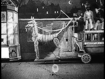
I had long been intrigued by production photos and sketches from a lost Méliès film, L’omnibus des toqués ou Blances et Noirs/Off to Bloomingdale Asylum. (I have no idea why this English title was chosen, since it has nothing to do with the action. “Toqués” would translate roughly as “crazies.”) The thing that intrigued me was a strange, mechanical-looking horse that draws the omnibus of the title. Finally I got to see it, and it was worth the wait. The horse is good, to be sure. It pulls a small coach with five black-face minstrels sitting atop it.
It’s not terribly apparent from the film, but a surviving Méliès sketch makes it obvious that the horse farts, driving the minstrels to jump off. The horse and coach depart, and the four minstrels begin an elaborate game of slapping and kicking each other in rhythm, each blow turning one into a white-clad pierrot figure and then back into a minstrel. It’s another of Méliès’ rapid-fire set of stop-motion substitutions, with the positions of the figures matched with astonishing precision. A tiny masterpiece in one minute and four seconds, counting the title card.
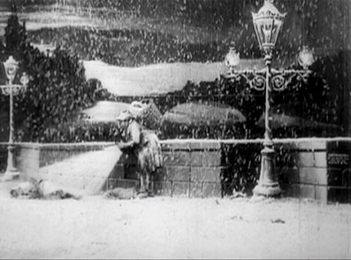
There’s a wide range of genres represented on the disc, including staging of news events, as in Éruption volcanique à la Martinique/ Eruption of Mount Pele (1902); chase films, like Le mariage de Victoire/ How Bridget’s Lover Escaped (1907); and even tear-jerking melodrama, like Détresse et charité/ The Christmas Angel (1904). The latter has an interesting stop-motion effect to add a white-painted stream of light as a rag-picker turns on his lantern to see the little beggar-girl asleep in the snow.
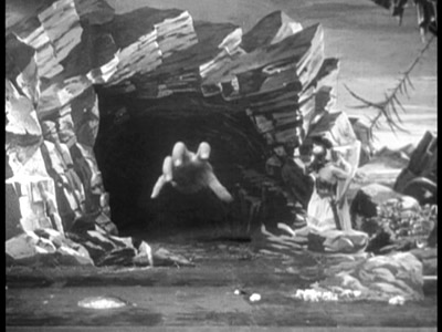
An otherwise surprisingly pedestrian 1905 film, L’ile de Calypso/ The Mysterious Island has one impressive moment, when a giant hand (Polyphemus having been transferred to Calypso’s island) emerges from the dark of a cave to threaten Ulysses (who is a bit hard to see, standing against the rocks at the right of the cave).
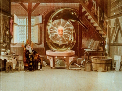
Was Méliès the first filmmaker to realize that leaving a large dark patch in part of set allowed things to be superimposed in that area without looking translucent? The best-known film to use the device is L’Homme à la tête en caoutchouc/ The Man with the Rubber Head (1902), but many other films use it, including some on this disc. A few of the films have hand-coloring, including the early L’hallucination de l’alchimiste/An Hallucinated Alchemist, where the alchemist of the title dreams of a giant spider.
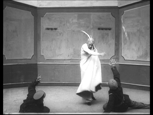
The state of preservation naturally varies enormously. One nearly pristine print is the amusing Satan en prison/Satan in Prison (1907). The title is vital, since the bulk of the action consists of a well-dressed man magically producing a series of items to furnish a bare room, culminating in his summoning up a charming lady to share his meal. Hearing the guards approaching, the man reverses the process, ending with a bare room when the two men enter. Finally he is revealed as one of Méliès’ favorite characters, Satan! (See frame surmounting this entry.)
I suppose we shall never have all of Méliès’ films, but there are now more than twice as many known to survive as when I was in graduate school. I look forward to a second encore.
Lubitsch, Lubitsch, Lubitsch
Another pleasant surprise among the heap of packages was Eureka!’s new boxed set of Ernst Lubitsch films from the years 1918-1921. If that sounds a bit familiar, that’s because this is the third such set to appear in just over three years. I’m not going to make a point-by-point comparison, but I’ll sketch some basic differences.
The German set, confusingly titled in English the “Ernst Lubitsch Collection,” came out in November, 2006 and is PAL, region-2 encoded. It contains five Lubitsch silents: Ich mochte kein Mann sein (1918), Die Austernprinzessin (1919), Sumurun (1920), Anna Boleyn (1921), and Die Bergkatze (1921). Its main bonus is a feature-length documentary, Ernst Lubitsch in Berlin—Von der Schönhauser Allee nach Hollywood. None is subtitled. The set won the Cinema Ritrovato’s prize as Best DVD of 2008.
The set was issued by the Munich company Transit Film, a government-owned 35mm distributor with a library of about 600 titles, drawn from across the history of German cinema. We’ve brought some of their prints to Madison for Cinematheque screenings. The sources of the films are primarily the Friedrich-Wilhelm-Murnau-Foundation and the Bundesarchiv-Filmarchiv. It also produces documentaries like the one on Lubitsch. (The website offers German, English, and French language options.) It has also put out several DVDs under the name “Transit Classics.”
In the U.S., from late 2006 into 2007, Kino Video brought these five titles out as four individual DVDs (pairing Die Austernprinzessin and Ich mochte kein Mann sein on one disc). Apparently, although Transit’s set didn’t include the 1919 comedy Die Puppe, it made it available, and in December 2007, Kino brought it out on a disc with the Ernst Lubitsch in Berlin documentary—and at the same time issued a boxed set of all six features plus the documentary on five DVDs, called “Lubitsch in Berlin.” (All Kino discs are NTSC region 1; given that they were transferred from PAL versions, they probably run about 4% faster than the Transit versions.)
Eureka!’s set is also entitled “Lubitsch in Berlin.” It contains the same set of films, including the documentary, all also licensed from Transit. These are here arranged over six DVDs. Its unique material is relatively slight, consisting mainly of short original sets of liner notes and an original score for Die Puppe. One advantage is that Eureka!, as usual, has retained the German intertitles and added subtitles to them. (The Kino versions, in contrast, replace the original intertitles with English ones, which has been their practice on some, if not all, of their other DVDs.) Some or all of these intertitles may have been replaced, perhaps reconstructed on the basis of censorship records, as is often the case with restorations. Still, many viewers would want access to the German text as well as the English versions. The Eureka! set is PAL, and it doesn’t seem to have region coding.
For those unfamiliar with Lubitsch’s German films, these are a good introduction. The four comedies all hold up well today. The first three are built around Ossi Oswalda, a boisterous blonde comic who seems to have inspired Lubitsch to move away from broad slapstick to a more stylized, eccentric approach. Pola Negri, after acting such roles as Carmen and Madame Dubarry in the director’s costume pictures, revealed her comic talents in Die Bergkatze, his last German comedy.
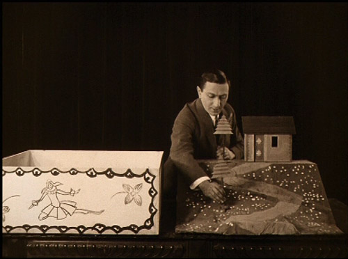
Overall my favorite of the group is Die Puppe, so I’m very glad it’s been added. Some might prefer Die Austernprinzessin, which is indeed hilarious. But it mainly has the wealthy heroine’s home as its comic milieu. Die Puppe seems denser, with more characters and three comedy-generating settings: the rich uncle’s home, the art-nouveau cartoon doll shop, and the monastery where the hero takes refuge. Plus there’s the famous prologue, where Lubitsch himself sets up the premise that the characters themselves are simply dolls brought to life. (See below.)
I chose Ich möchte kein Mann sein as one of the best films of 1918. See here for a brief description and a frame at the bottom of the entry.
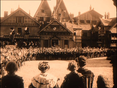
The conspicuous absence from this set is Madame Dubarry, the 1919 historical epic that made Lubitsch famous worldwide. Perhaps it’s not an ingratiating film at first viewing, but I found that it grew on me in repeated screenings. (I talk about some of its best scenes including one impressive long-take scene, in my book Herr Lubitsch Goes to Hollywood.) Anna Boleyn took on British history in an attempt to replicate the success of Madame Dubarry, but I have never been able to warm up to it. That’s probably partly because Henny Porten simply did not bring the vibrancy to the title role that Negri had in Madame Dubarry and perhaps partly because the increased budget let to an overemphasis on huge sets and crowds of extras (above). The characters in Madame Dubarry seem comfortable in their period costumes; the ones in Anna Boleyn don’t.
I chose Die Puppe as one of the best films of 1919. See here for a frame from it, and one that demonstrates why I admire Madame Dubarry. Perhaps restoration work on the latter is going on at this moment, so that another DVD will someday join these on the shelf.
The other film in the collection, Sumurun, is a quasi-Arabian-Nights tale, starring Pola Negri as a seductive member of a traveling troupe of entertainers. Lubitsch plays his last film role as the hunchback clown who dotes hopelessly on her. The performance isn’t all that different from some of his earlier ones, but perhaps seeing his rather exaggerated acting style in the context of a non-comic film led Lubitsch to doubt his own abilities. Given that he was far better as a director than as an actor, his decision to stay behind the camera was a boon to future generations. To me, Sumurun is fascinating because it shows the first real signs of Lubitsch’s awareness of Hollywood continuity editing, a set of techniques he would thoroughly master over the course of his next half-dozen films.
It can’t have been easy to put together a 109-minute documentary on Lubitsch’s life before his move to Hollywood. In working on my book, I discovered how surprisingly few photographs of him at work onset survive. The studios where he worked don’t survive, though there are shots of the giant Ufa Tempelhof sound stages that now stand where those studios were.
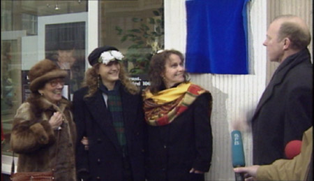
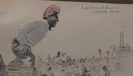
Several prominent historians are interviewed, including archivist Enno Patalas and historian Hans Helmut Prinzler, co-editors of Lubitsch (an extremely useful book, published by the Verlag C. J. Bucher i 1984) and archivist Jan-Christopher Horak (whose master’s thesis was on Lubitsch’s relation to Ufa). Lubitsch’s surviving family members, seen above at the unveiling of a “Lubitsch lived here” plaque, were interviewed: his niece Evy Bettelheim-Bentley (left), granddaughter Amanda Goodpaster (center), and daughter Nicola (right). Lubitsch’s theatrical career is well covered, and generous clips from the pre-1918 era demonstrate his move into comic acting for films. Audio interviews with Henny Porten and Emil Jannings include a charming anecdote she tells about how apologetic Jannings was after the scene in Kohlhiesels Töchter in which his character jerks a bench out from under her–an incident that left her with a bruised rump. In between scenes, directors who have been awarded the Ernst Lubitsch prize, such as Tom Tykwer, discuss the master. Perhaps the most interesting artifact shown is an album Lubitsch’s regular costume designer and friend Ali Hubert made for him, combining drawings with photos of Lubitsch and little poems; below he depicts Lubitsch directing Madame Dubarry. Ultimately Hubert gave it to the director as a gift.
The documentary feels a trifle thin at times, and it makes no real attempt to cover Lubitsch’s Hollywood career, presumably because of the difficulty of getting permission to use clips. But it certainly would be a useful teaching tool for introducing students to Lubitsch’s life before Hollywood.
(Thanks to Ben Brewster for helping determine some of the differences among these three Lubitsch boxes.)
The Man with a Movie Camera before The Man with a Movie Camera
In 2007, the Cinema Ritrovato awarded the “Edition Filmmuseum” series from the Filmmuseum Munchen its DVD award for “Best Series.” We’ve mentioned this series before, in relation to its Walter Ruttmann disc and its DVD of Robert Reinhert’s Nerven.
Now the Filmmuseum has issued a two-disc set offering two of Dziga Vertov’s silent feature documentaries, A Sixth Part of the World (1926) and The Eleventh Year (1928). The former is a poetic look at the various and farflung ethnic groups within the U.S.S.R., the population of which made up one sixth of the world. It was the first of Vertov’s films to be strongly praised, seeming to justify his theory of the Kino-Eye.
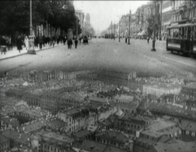
Those expecting anything as experimental as Man with a Movie Camera might be disappointed. There are some of the familiar camera tricks, such as split-screen effects:
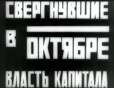
The typography of the intertitles reflects the constructivist style of the 1920s:
The discs have optional English subtitles.
Having seen these films during my research, I haven’t watched the discs in their entirety. The quality looks as good as can be expected. Michael Nyman’s music is certainly not authentic to the period, but what I heard of it sounded strangely appropriate to the images and effective as accompaniment.
The discs also include an interesting bonus, a German propaganda short, Im Schatten der Maschine, by Albrecht Viktor Blum, which used footage from The Eleventh Year to make a film critical of the technical progress which Vertov was praising in his own movie. (Since The Eleventh Year had not yet appeared in Germany, Vertov was actually accused of plagiarizing from Blum rather than the other way round.)
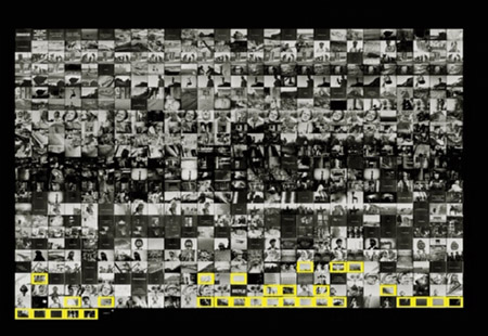
Another bonus is a 14-minute documentary, Vertov in Blum: An Investigation (optional German or English narration). This fascinating short begins by demonstrating that Vertov himself and possibly others almost certainly cannibalized footage from The Eleventh Year for Man with a Movie Camera and other films. It goes on to hypothesize that the final montage in Im Schatten der Maschine may consist of footage that Vertov later removed from The Eleventh Year‘s negative. Side by side comparison of prints using Final Cut Pro revealed matching shots between the two films, highlighted in yellow here:
Blum’s film culls shots and even edited passages primarily from late in Vertov’s film, but it continues beyond the end of the surviving version of The Eleventh Year. Some of those shots have been traced to other, later Vertov films, and the archival sleuths are still comparing prints and looking for the rest. They may have found the missing ending from The Eleventh Year; at least, the evidence makes that idea very plausible. Whether they are right or not, though, the short demonstrates the painstaking work often necessary in the restoration of films.
These companies and archives have certainly not been resting on their laurels. It will be exciting to see what the upcoming Cinema Ritrovato’s awards will highlight.
Light is a law
DB here:
What do we see when we look around us? A world teeming with creatures and things. We tend to ignore what enables us to see all that: light. To a great extent, that bias is wired into our perceptual systems. An orange looks the same color to us in sunshine and in shade. But photograph it, and you’ll see that actually it throws off very different wavelengths in the two situations. We evolved, it seems, to mute all the variations in light we encounter. Psychologists call this “the primacy of object perception.”
It takes an artist to shift from the what to the how, to notice how different patterns of illumination can alter the shape and texture of an object. A painter, a photographer, and a cinematographer must learn to see light itself.
This was the core message of Steven Poster, an outstanding Director of Photography who came to visit Madison last weekend. Steven is probably most famous for working with Richard Kelly on Donnie Darko, Southland Tales, and The Box, but he has shot dozens of feature films, shorts, television movies, and pilots. He also has several Madison connections; he hung around the campus in his college years, saw Jules and Jim for the first time in the Memorial Union, and built a production house in Chicago with Mik Derks, who now works for Wisconsin Public Television.
Steven gave a workshop on cinematography that bristled with energy (five hours with only a brief break) and followed that with a screening of The Box, accompanied by a Q & A. Across a single packed Saturday, he took students and faculty on an adventure in seeing.
Seeing the light
Steven started as a still photographer at about age ten, and his ideas of visual design are very much allied with classic image-making. (He carried a Leica with him on his visit, and a display of his photos is currently mounted in a campus gallery.) He has a modernist bent too. He credits his years as a student at Southern Illinois University with introducing him to the ideas of the Bauhaus. He plunged more deeply into Bauhaus ideas at the Illinois Institute of Technology, where Mies van der Rohe and Moholy-Nagy taught.
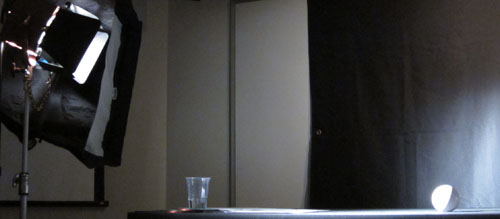
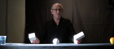
Later in his career, he studied at the Los Angeles Art Center College of Design. A turning point in his understanding came in Charles Potts’ photography course, when Potts began the semester by announcing softly, “Light is a law.” Steven’s talk for us, he explained modestly, was a “profoundly simple subset” of Potts’ course. Put it another way: In the Bauhaus spirit, he showed how simple principles yield subtle results. Armed with only a white ball, a white cube, and a white cylinder, he gave us a tutorial in the delicate modulations of vision.
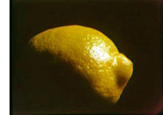 There are, Steven suggested, basically only two kinds of light: direct and indirect (or diffuse). Sunshine yields direct light; a cloudy day yields diffuse light. And when light falls on an object, the encounter has five components. The object gains a highlight, the bright region that suggests the direction of the light source. The object also acquires a shadow area. Between the highlight and the shadow is the boundary, or core—an important hint about the quality of the source light. (If the core has a crisp edge, the light is hard; if the core is a mild transition, the light is softer.) The fourth component is the shadow that the object casts on another surface. Finally, there is the specular or incident highlight, a spot of reflected light within the lit region. A specular highlight is a cue for texture as well as shape and light source. As Steven spoke, I kept thinking about Hollis Frampton’s Lemon (1969), a masterfully simple demonstration of many of these principles: slightly changing light reveals a prototypical shape (what other things have the outline of a lemon?) and a surface that is both shiny and bumpy.
By varying the type of light (direct or indirect) and the angle and distance of the source, Steven showed how these five components can be manipulated to bring out expressive qualities of the object. The cube, for example, can gain sharper contours through sidelong lighting, and illuminating the background can bring out its volume. Likewise, an object’s shadow area can be controlled through fill light—though Steven warned about over-filling, which can work against the precision provided by the key light. Another example is the way in which shooting glass or metal with pinpoint sources yields a scatter of specular reflections. If those aren’t wanted, as in some car commercials, the DP can use broad, diffuse illumination. This “liquid light” brings out contours through a softer gleam.
Of course a shot typically combines many objects, so the task of controlling how light hits them, and how they are arranged in relation to each other, becomes much more complicated. The shapes, textures, and emotional qualities of the elements have to be harmonized. “Elegant” was a word Steven used frequently: the composition, like the light, should be clear and well-defined. Needless to say, the result on screen can be grasped at a glance, but achieving such clarity needs painstaking control.
So seeing the light involves grasping everything around you, from landscapes and furniture to people’s faces and clothing, within the framework of highlights, shadow, core, and the like. This alone is enough to change your visual habits. But there’s more. By and large Steven made his adjustments without checking the monitor displaying what the camera was taking in. Standing almost anywhere, he could shift the light, tune the fill, and “wrap” the object, and on the monitor we could see the effect click into place. That skill demands more than a change in how to look at things. It’s an eye-body coordination that takes years of expert practice, an acquiescence to the law of light.
Behind the scenes
The discussion following this demo ranged across many aspects of cinematography, and Steven filled in abstract points with examples from his experience. My notes run to eleven pages, but this sampling should give you an idea of his stimulating presence.
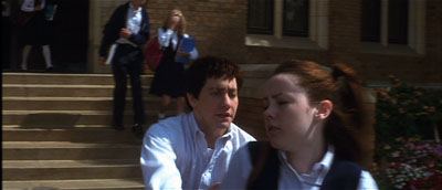
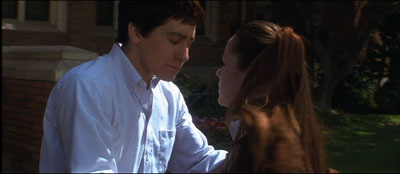
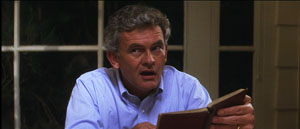
*A problem-solution dynamic emerged in one shot in Donnie Darko, above. We need to see Donnie’s face when he catches up with Gretchen, but the day was sunny and at first the faces display somewhat harsh shadows. But when the couple move toward a kiss, the solution came from their clothes: Donnie’s shirt and Gretchen’s blouse provide softer bounce light on his face.
*Steven stressed the need for complete trust and frankness between director and DP. “I won’t take a job if the director won’t look me in the eye.” Once that bond is established, the DP’s job is to protect the director and work to fulfill his or her vision. “My job is to protect the director.”
*Filmmaking is an intensely physical job, and so two concerns have to be paramount: safety and health. “No film is worth getting somebody hurt,” Steven remarked, so he insists that every crew member is a safety officer, looking out for everyone’s well-being. At the same time, filmmaking demands stamina, discipline, and a clear head, so everyone needs to have a healthy regimen and cultivate a certain “inner life” that keeps job pressures in perspective.
*Steven had much to say about the video assist. He suggested that it has led to directors using more close views, because such shots read better on small monitors. (I made a similar suggestion in The Way Hollywood Tells It.) Steven fights what he calls the “loss of scope” on video displays by presenting the digital dailies in full-size projection, as in the film-based days. “It reminds everybody that we’re making a big movie,” and it encourages directors not to overuse close-ups.
*Steven is happy with the digital intermediate process. As a cinematographer who wants to control all aspects of the image, he welcomes all the adjustments he can make in postproduction, especially thanks to the Lustre grading program. “It’s like being back in the darkroom again.”
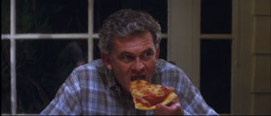
*On Donnie, a low-budget film, Kelly and Steven were forced to shoot the family dinner scenes in a single night. To save time, they used “block shooting.” For each actor, a basic setup was established and all the actor’s lines from both scenes were taken at one time. It was faster to have the actor change clothes for the later scene than to shift the camera position and relight the setups.
*Speaking of table scenes, they pose a lot of problems. Even Steven finds such scenes “the hardest.” “Where’s the [180-degree] line in this situation? I’ve seen fights break out on sets about it.”
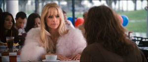
*At one point Steven talked about prominent objects in a scene, such as candelabra and ketchup bottles. If you use symmetrical reverse shots, those objects can jump distractingly from one side of the screen to the other. Steven tries to make sure that such eye-catchers appear in only one of the setups, not both. The coffee cup in this scene of Southland Tales is hidden in the reverse angles.
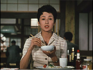
Steven’s point reminded me that Ozu breaks this rule of thumb and playfully lets his objects jump around the frame from cut to cut. Indeed, he often rearranged the props to heighten this peripheral dance. In one scene of Late Autumn, the tabasco sauce bottle pivots consistently, but the French’s mustard jar changes position.
*Steven thinks that 3-D will succeed this time, chiefly because of the push for 3-D television. The technique probably won’t work for all stories, and the format poses some technical problems. But the software is getting better, and filmmakers, such as Cameron in Avatar, are starting to avoid the gimmick of obects thrusting out of the screen. It’s better, Steven thinks, to let the depth recede into the movie’s world, making the screen a window. I recalled that this was the strategy used in Coraline, Up, and other films of last year, so perhaps this will become the dominant way that 3-D will be used.
*Steven urged students to get broad general educations and not become movie nerds. They should study history, political science, art, and literature. He pointed out that Werner Herzog, his friend and neighbor, insists in his Rogue Film School that literary classics are the basis of a film education.
*Steven has long been an advocate of unionization. As President of Local 600 of the International Cinematographers Guild, he explained how the Guild now welcomes members, especially women and people of color. I thought it was salutary to give students a taste of the practicalities of professional life by explaining what the Guild had accomplished.
*Steven did additional photography on Blade Runner, and he learned a great deal while gaining deep respect for Jordan Cronenweth, DP on the movie. Steven rewatches the film often, and each time he finds something new. On the last pass, he saw that in the search of Kowalski’s apartment, flickering streaks of light coming from inside the desk drawer call attention to the newspaper that Deckard finds there.
Back in 1980-1982, when Kristin and I were doing research on The Classical Hollywood Cinema, we found that Charles G. Clarke, Linwood Dunn, William Hornbeck, Stanley Cortez, and other professionals whom we interviewed were intellectuals, eager to explain the ideas informing their creative decisions. Steven Poster’s career is another outstanding example of how theory and practice work together, often unobtrusively, to conjure up the enthralling world on screen. I can’t imagine a film researcher, or just a movie lover, not wanting to know filmmakers’ craft and the principles informing it. Once you’ve visit the kitchen, movies gain a whole new flavor.
This blog has intersected with primary Bauhaus shapes before. I discuss “the dinner-table conundrum” in the first few pages of Figures Traced in Light. One of the best analyses I’ve read on illumination in the visual arts is E. H. Gombrich’s “Light, Form and Texture in Fifteenth-Century Painting North and South of the Alps,” in The Heritage of Apelles: Studies in the Art of the Renaissance (Ithaca: Cornell University Pres, 1976), 19-35. For more on Ozu’s penchant for letting brightly lit objects jump around the composition, see this chapter of my Ozu and the Poetics of Cinema. The Lustre program was devised for The Lord of the Rings, and Kristin discusses its origins and influence in The Frodo Franchise, pp. 280-281.
Special thanks to Steven for his visit, the Wisconsin Union Directorate for arranging it, and Erik Gunneson, Joel Ninmann, Justin Daering, and J. J. Murphy for setting up the workshop.
Blade Runner.


