Archive for July 2010
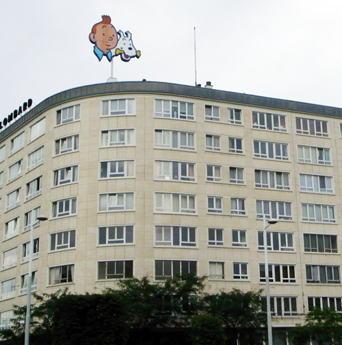
Tintinopolis
Photo by David Bordwell, July 2009. Tous droits réservés.
DB here:
He’s the world’s most famous fictional Belgian, miles ahead of Hercule Poirot. But I ignored him for about sixty years. Tintin wasn’t part of my childhood, and I didn’t get interested in his adventures until recently. Now, though, the scales have fallen from my eyes and I realize that Hergé is a great comics artist. And naturally I see him doing some things that shed light on cinema.
I came to the work obliquely. Since the 1980s Kristin and I have admired the Dutch cartoonist Joost Swarte. When we started to collect his books, lithographs, and CDs back in the 1980s, he was becoming known in the US through Art Spiegelman and Francois Mouly’s Raw. We were much taken with Swarte’s exact drawing style and mordant wit. I then got interested in the crisply drawn “clear line” tradition of French, Belgian, and Dutch cartoon artists stemming from Hergé—Chaland, Floc’h, Goffin, Ted Benoît, etc.—but I still didn’t pay much attention to the master himself.
This spring I gave a talk on La Ligne Claire to Kristin’s reading group, which explores fantasy (especially Tolkien), science fiction, comics, movies, and almost everything else. In preparing that, naturally I had to go back and read Hergé. Now I’m a believer. Some day I may polish that presentation and put it up as a web essay, but for now I just offer some notes, sojourning as I was recently in Tintin’s home town.
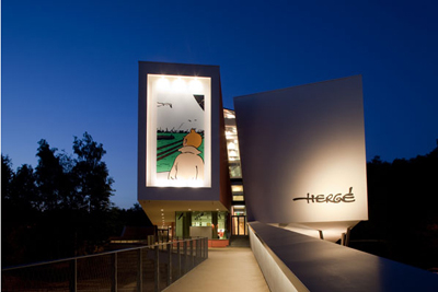
His own museum
Photograph copyright Nicholas Borel; Christian de Portzamparc, architect.
Brussels has its own superb museum of comic art, the Belgian Comic Strip Centre in Rue des Sables. Last year, however, the Musée Hergé opened in Louvain-La-Neuve.
Louvain-La-Neuve is itself an unusual place: a town created more or less from scratch when the Catholic University of Louvain split off from the Dutch-speaking University of Leuven. Originally designed for students, the town now has a population of about 30,000, with many citizens commuting to jobs in Brussels. This planned city has been hailed as a model of urban design; parking and car traffic, for instance, are underground.
Go through the square to a wooded park and soon you’re in the Musée Hergé. It is one those buildings that aim to awe you. There are few right angles, and huge spaces are dominated by pyramids, cylinders, and other three-dimensional solids, all in muted colors and bearing the sorts of squiggles Herge might use for foliage.
Photograph copyright Nicholas Borel; Christian de Portzamparc, architect.
Architect Christian de Portzamparc‘s statement of principles is here.
 The first floor consists of the lobby, rest rooms, a restaurant, and a space for temporary exhibitions. As luck would have it, a tribute to Joost Swarte’s 40-year career was on display, and it was jammed with material. I could easily have spent the whole day here, even though I’d seen much of the material before. Swarte was also the “scenographer” of the Musée, offering ideas on interior design and decoration. The witty museum logo, as well as details like the signage, seem to be Swarte’s creations.
According to the guidebook, 80 % of Herge’s working material survives. This mountain of sketches, layouts, inked pages, color pages, and the like gives the curators a huge amount to pick from. Although the exhibition halls don’t feel stuffed, you quickly realize that you are in for total immersion.
You start at the third floor, and the first room supplies a survey of Hergé’s career. The information on the walls is pretty skimpy; the details are offloaded onto the headset commentary, I suspect. Charles Trenet’s ditty “Boum!” is playing over and over in this room, presumably not as an homage to Toto le héros but as a broad gesture to the interwar period. There are some intriguing Hergé illustrations here, including a 1939 political cartoon showing a Belgian shaking his fist at German planes flying over Brussels and shouting, “Dirty Boches!” before running to hide in his basement.
Another room is devoted to Hergé’s commercial art–posters, magazine advertisements, and book covers (including one for Christ, King of Business, 1929). Also on display are some striking images from less-known Hergé comic series, such as Quick and Flupke, Tom and Millie, and especially Jo, Zette, and Jocko. From here you move to a room devoted to the characters. Each one (except Tintin) gets a vitrine full of imagery. The final room on the floor is devoted to the cinema. The displays trace many of the situations and characters that Hergé borrowed from films of the 1920s and the 1930s. There’s also a filmed biography of Hergé screening on a loop.
The second floor was what held my interest most intently. One room includes a huge display of research materials for each book–not only notes and photos, but artifacts too. There’s also a case showing early Tintin games, toys, apparel, and other merchandise. The next hall gets to the root of my interest, Hergé’s creative process. Several displays trace the progress of a single page from rough layout to final coloring and printing. He was quite explicit about his aesthetic: Color is applied uniformly, with no shading, which yields “une grande lisibilité.” As I’ll suggest below, story legibility is central.
In this display room as well you can see how Hergé designed pages for periodical publication in landscape mode, then redesigned them for the vertical book format. That entailed cutting out panels, drawing new ones, and even changing gags. The books would then sometimes be recast for later editions. All these multiple versions have kept Hergé scholars busy for decades.
At about age 40 Hergé began to take on collaborators, and he eventually created a team of scenarists, lettering specialists, inkers, painters, and the like. In the next display room, you can see a TV documentary touring the studio and interviewing staff. This room also includes some gorgeous black-and-white ink drawings of pages and one-off projects, like Christmas cards. Your tour of the Museé ends with a room devoted to Hergé’s fame, starting with the famous wishes sent by Alain Saint-Ogan, creator of the breakthrough French comic strip Zig et Puce. In here you find praise from Balthus, Philip Pullman, Andy Warhol, and Alain Resnais: “Belgium belongs to the realm of fantasy. I found this out through reading Tintin.”
All in all, an exhilarating place to visit. It is unabashedly a tribute to Hergé and makes no effort to invoke the controversies around the man. I could find no reference to his wartime career and the political controversies that followed, to his divorce, or to the spiritual quest of his later years. This is the modern art museum in wholly celebratory mode. Still, few exhibitions of comic art I’ve seen make such a persuasive case for the enduring quality of an artist’s achievement.
Cinema on the page
I have taken from the current cinema its devices of découpage: once a character becomes important, you show what he’s doing, you vary the shots, you show the same scene from far off and then quite close.
Hergé, 1939
I’m a man of order, you see, even in drawing. I draw orderly things so one can read what I am drawing.
Herge, 1975
All comic strips and books remind us of cinema in one way or another, and many researchers have analyzed the affinities. The panels can simulate cutting, or panning camera movements, or even the fixed frame in which actions unfold over time. (Blondie is a classic example.) Artists have provided unusual angles and dynamic compositions that have a filmic feel. And like films, comics are usually narratives, stories told in pictures, so we can study how different comics artists use point-of-view, plot structures, suspense, and the like. (I did this last year with a recent twist in the Archie series.)
Most commentators on Hergé mention that he was a film fan and drew many situations from movies of the 1920s and 1930s. Like Hollywood studio cinema, his tales put striking technique in the service of fluent storytelling. Pause to study the narrative and you’ll find a surprising richness to the imagery; start by looking at the pictures as pictures, and you’ll see how composition, color, and detail smoothly advance the action. Hergé was well aware that his polished imagery could stand scrutiny in its own right, but he saw it as serving a larger narrative dynamic. He noted (my emphasis added):
I don’t try only to tell a story, but rather I try above all to tell a story. There’s a slight difference.
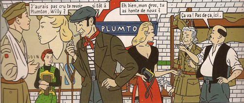
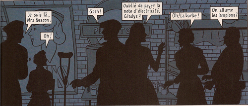
We can get a sense of this approach by contrasting it with one of the best Clear Line followers. Jean-Claude Floc’h’s albums are retro studies of a cozy, more or less imaginary England of the 1920s through the 1950s. He has provided his main characters, Francis Albany and Olivia Sturgess, with fake biographies that tie them to real artistic circles of the period. A series of books set in wartime (Blitz, 1983; Underground, 1996; Black Out, 2010) presents gorgeous tableaux. Here are two panels from facing pages of Underground. Londoners are huddling during a Nazi bombing run.
The images are designed to be compared in detail; we’re to note the slight changes in figures’ position. The story halts while you study the panels (and admire the artist’s finesse). This is technique calculated to dazzle.
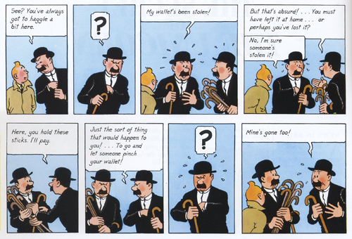
Hergé’s pages warrant the same sort of scrutiny, but you aren’t invited to dwell on them through a flagrantly overdesigned layout. The echoes and rhymes in this passage of the final English-language version of The Secret of the Unicorn are at least as intricate as Floch’s, but they’re at the service of symmetrical gags nestled in a broader comic buildup. Thompson and Thomson have had their pockets picked in a street market.
Hergé erases the background detail to allow us to concentrate on the graphic play of the black-suited figures (“spotting blacks,” as it’s called in the trade). The second panel reverses Thom(p)son’s attitude in the first, and both find a neat mate in the next-to-last panel. The third panel on top is rhymed with the last panel on the bottom. In between, the interplay of the two detectives is given in slightly varied compositions, with the extra walking sticks shifting around in their own patterns. The gag is a variant of the basic premise of Thompson and Thomson’s existence: they are mirror-images in all they do and say.
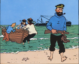
Given this play of variations, how does Hergé achieve narrative flow? One factor is the width of the panels, expanded or pinched according to the information in each and coordinated rhythmically across the page. Hergé also avoids gesture lines. Instead, one panel presents a point of motion as if captured by snapshot, and then the next panel provides the next phase of the movement. We might notice as well how the left-to-right propulsion of his drawings lays out narrative elements concisely. He declared this panel, from Red Rackham’s Treasure, one of two images that gave him most satisfaction:
Solely through the drawing, which shows the captain striding onto the beach with naked feet while his companions haul their boat onto shore, the viewer-reader [spectateur lecteur] mentally reconstructs everything that has already happened: The Sirius was put at anchor, the rowboat was lowered, Tintin and his companions set out; they have rowed to arrive at the island, where the captain climbed out. . . Everything that preceded the action shown in the drawing is expressed by a single composition.
Here’s another subtle technique Hergé used to make his stories flow. Psychologists speak of the “priming” effect. You’ll notice something faster if it chimes with something you’ve recently encountered. The classic experiment uses a string of words. If you’re first shown the word yellow, you’ll identify the word banana faster than if the trigger word is red.
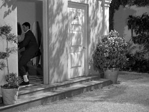
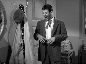
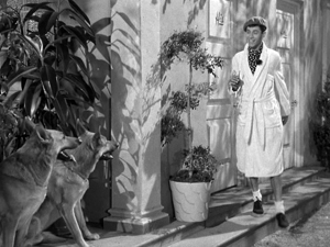
Priming is a basic filmmaking resource. What the screenwriter calls “planting”–the pistol on the mantelpiece in Act I–is a type of longer-range priming. On a smaller scale, one purpose of an establishing shot is to prime certain areas of a locale for future action. Here’s a simple example from Norman Taurog’s The Caddy (1953). Jerry Lewis is fleeing from a pair of German Shepherds and he takes refuge in a men’s changing room.
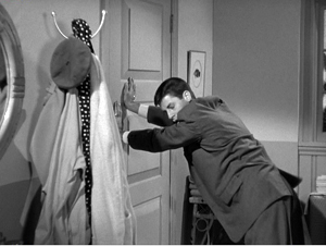
A new shot shows him closing the door, and it makes prominent the coat rack nearby. Eventually Jerry notices it and expresses happiness as only Jerry can.
Using the robe and beret hanging there, he tries to disguise himself.
A close look at my first frame shows that the coat rack was (subliminally?) primed in that shot too; you can glimpse it when Jerry opens the door. This reminds us that the filmmaker can prime our response by including a little something at the end of one shot that ties it to the next. Both Spielberg and Johnnie To are skilful at this; see earlier blog entries (here and here) for examples.
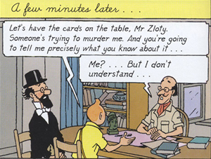
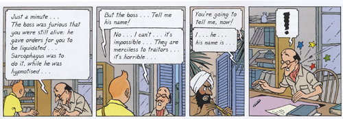
It seems to me that Hergé makes use of fine-grained priming in the flow of his panels. Here’s an example from the final English-language version of Cigars of the Pharaoh. The “establishing shot” shows Tintin and Sarcophagus consulting Zloty. The composition is simple and balanced, with Tintin as the fulcrum. The window behind Zloty is unobtrusively primed.
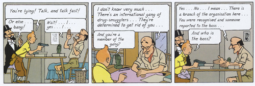
The next stretch of panels breaks this overall layout down into two sorts of shots: a profile view and an over-the-shoulder view of Zloty.
The first and the third panels are variants, with the framing getting closer as we proceed. Hergé often propels his story through these tighter framings, as if to ratchet up the tension in a filmic way. The more compressed array of figures at the end of the series also allows for more spacious speech balloons, always a major consideration in the Tintin saga. Hergé didn’t reiterate the window in every framing; only the middle panel re-primes it through our angled view of Zloty.
Now the framing will get even tighter on Tintin and Zloty, losing Sarcophagus altogether, and the window will become more salient, even though it’s still a minor element of each design.
The massive balloon at the top of the first frame in this series obliges Hergé to push his figures quite low, but he compensates by letting them lean on the bottom edge as if it were the desktop. (Hergé likewise often makes his characters stand directly on the frameline.) The first panel retains the window frame. The second, another over-the-shoulder shot but even tighter than the first, introduces the shutters in a prominent position behind Zloty. These shutters prime the third frame. They now anchor a crucial action: the Fakir is lurking outside those shutters.
The final panel provides the payoff. The open window frame that seemed at first just a realistic detail becomes necessary to understanding the action. It could have been established in a wider shot, but in keeping with his urge for economy Hergé has primed it in the most compact way possible–as a peripheral element, in the background or on the frame edge. (Compare Taurog’s thrusting the coat rack under our noses.) You have to wonder if such economy of expression will be on display in the Spielberg-Jackson Tintin movie project.
I know, I know: David, it’s just a window. Or: David, it’s just a comic strip. But as film students we ought to be interested in how images shape our experience, and we can learn from any craftsmanship as precise and engaging as Hergé’s.
For more on the Clear Line style, see the series of articles at Paul Gravett’s excellent site.
The official Tintin website is available in an English version here. Since photography is not permitted in the Musée, for illustrative purposes I have drawn on the official images on the building’s website, with copyright and credit as noted in the captions. Bart Beaty, expert on Eurocomics, provides a carefully considered report on his trip through the galleries. The Musée’s catalogue is a trilingual survey of major items on display, although it neglects to illustrate changes in layouts across different editions.
On the aesthetics of comics and cinema, see Manuel Kolp, Le Langage cinématographique en bande dessinée (Brussels, 1992). Principles of page composition, including spotting blacks, are explained in Gary Spencer Millidge, Comic Book Design: The Essential Guide to Designing Great Comics and Graphic Novels.
The best general introductions to Hergé’s artistry seem to me to be Benoît Peeters’ Tintin and the World of Hergé and Michael Farr’s Tintin: The Complete Companion. Both offer occasional comparisons of different editions of the books. See as well Philippe Goddin’s multi-volume set of primary materials. Goddin supplies a shorter sampling of the artist’s creative process in his charming but now rare Comment naît une bande dessinée: Par-dessus l’épaule d’Hergé. For an example of in-depth inquiry into the various changes that a tale underwent from one edition to another, see Étienne Pollet, Dossier Tintin: L’Isle noir: Les Tribulations d’une aventure.
My first and fourth Hergé quotations come from Bob Garcia’s Hergé et le 7ème art, pp. 6 and 9. My second quotation is taken from the English edition of the Musée Hergé guidebook (Moulinsart, 2009), p. 48; I don’t find it to be available for purchase online. My third quotation comes from Numa Sadoul’s Entretiens avec Hergé: Tintin et moi, p. 46. According to Harry Thompson in another good introduction, Tintin: Hergé and His Creation, the young Hergé wanted to be a film director (p. 26).
A very extensive web resource on Floc’h is here. As for Archie’s wedding: It did turn out to be one of those parallel-universe stories. It has developed over seven issues since last September in a “mini-series.” Abrams will be publishing a special collector’s edition, according to the press release, “for the Archie fan in all of us.”
This is probably as good a place as any to mention that Intellect Press has just launched a new journal, Studies in Comics. Details, as well as downloadable essays from the first issue, are here.
PS 24 January 2011: This essay was named one of the best pieces of online comics criticism of 2010 in an exercise conducted by The Hooded Utilitarian of The Comics Journal. What an honor! Thanks to the judges, and congratulations to the other writers who earned places on the list.
Les dessins, textes et symboles extraits de l’oeuvre de Hergé cités dans ce essai sont la propriété exclusive de © Moulinsart S. A. ou © Hergé ou © Casterman et sont montrés à titre de référence et d’exemple.
Photo, uncredited, from this site.
Research you can bid on
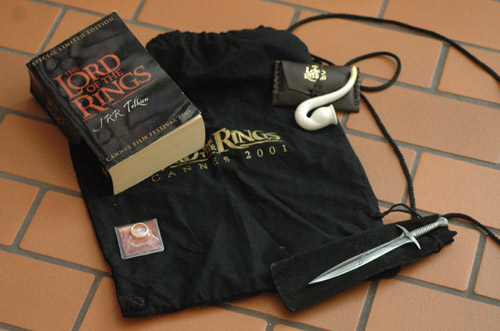
Gift bag from the New Line Cannes party of 2001
Kristin here:
Two days after I returned from “Il Cinema Ritrovato” in Bologna, the “On, Archives!” symposium began here in Madison. The Wisconsin Center for Film and Theater Research turned fifty this year, and this was its celebration. It was held in conjunction with “The Symposium on Broadcasting in the 1930s.” I didn’t attend the whole event, but I dropped in to hear several of the film-related papers.
Among these was Susan Ohmer’s “The Archive in the Age of eBay.” Susan’s an old friend of ours. She wrote a book on the Gallup organization in Hollywood, studies animation, teaches and is an associate provost at Notre Dame, and is married to another old friend and colleague, Don Crafton.
Her topic intrigued me, since I first made my way onto eBay looking for items related to the Lord of the Rings film franchise, which I was researching at the time. It was tremendously useful, and I wanted to hear what 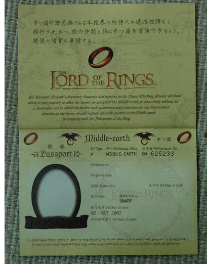 Susan had to say.
She started by acknowledging how exciting it can be to work in archives, handling original documents and sometimes finding that smoking-gun piece of evidence you could never get from published sources. Plus for those of us who love books and libraries, just being in an archive can be very pleasant (apart from that darned “pencils only” rule and the occasional snippy archivist).
But, as she pointed out, going to archives can be expensive, given the travel and lodging involved. Moreover, one doesn’t always have the time to study the documents to the extent that one would want to. For some types of evidence, one solution is to acquire the documents yourself.
In Susan’s case, it was Big Little Books, and specifically those based on Walt Disney films and comic books. There were lots of these, but although some archives collect them, most have only a few of the titles. Susan realized that she could actually save herself money by buying them and be able to study them to her heart’s content. Since then she has acquired around ninety on eBay, and I’ll bet she really has saved money in comparison with what the research would have cost. (Moreover, if she eventually sells them for around what she paid, they research would have cost nothing beyond the time and trouble of following auctions, bidding, and paying.)
There’s more to this tactic than just saving money. As Susan said, there’s a pleasure in owning these objects and having the sense of having one’s own little private archive. Very responsibly, she has even invested in archival boxes to store her treasures.
Private collectors, of course, have always been played a valuable service in preserving rare or unique objects. Every painting or ancient artifact that we see in a museum with a “gift of” note on its label probably was enjoyed for years by its owners in their own home. Many a film has been preserved because some people collect old nitrate films. (Yes, nitrate prints do occasionally show up on eBay.) The same is probably true of just about any kind of cultural artifact.
For a long time I had vaguely thought of blogging on the topic of eBay and scholarly research, but I never sat down and thought the subject through. Susan’s paper spurred me to create a rough typology of ways in which one can find what one needs online.
1) The real things
Every now and then an old, original document that really should be in an archive surfaces on eBay. That’s usually because it’s signed by a celebrity.
I remember a few years ago running across a couple of letters from Fritz Lang. I don’t remember what they were about, but they were from the late 1940s and had to do with his work for producer Walter Wanger. I alerted our friend Matthew Bernstein, who had written an important biography of Wanger. He decided not to buy the letters, which as I recall were going for over a thousand dollars each. Devotion to research only goes so far.
Maybe some rich archive like the Harry Ransom Research Center at the University of Texas bought those letters. I suppose archivists keep track of such listings on eBay. If such an institution didn’t buy them, they’re presumably in a private collection somewhere. Similarly, I ran across a letter signed by Buster Keaton; something about renewing his MGM contract, I think. I’m sure such things happen fairly frequently. If an item with really important, unknown contents came online, including material that fit directly into someone’s research, he or she might decide it was worth buying.
But the point is, there are archival-quality historical documents sold on eBay.
2) eBay evidence
Even if one doesn’t want to buy such a document, one can read the contents and make a print-out or take notes. That has to be done quickly, since sometimes these things don’t stay around for long.
I’m working on a book on J. R. R. Tolkien’s novels. There was an excellent volume of Tolkien’s letters published in the 1970s, but it doesn’t contain nearly everything that exists. Such letters come up for sale now and then, always at a high price. It’s fine by me if collectors wind up with these, but I want to get the information before they do. I have tried to make copies of every one I find, unless it’s just a polite reply to a fan. I’ve got a dozen now, two or three of which contain passages relevant to my project.
Sellers tend to make copying difficult, since they superimpose words or logos on the image of the item. They also make the image rather poor in quality. All these stratagems are reasonable, since sellers don’t want people to use these documents to concoct fakes. Still, I have found that with a bit of work with the brightness and contrast in Photoshop, one can usually get legible images. They wouldn’t look good framed, but they’re sufficient for extracting information, though it may take patience and some squinting.
3) Cutting edge
If you’re researching a contemporary subject, the relevant materials might make their way into archives, but not soon enough. When I was writing The Frodo Franchise, I planned a chapter on new methods of studio publicity. Most studios promote big-budget the film through free or cheap means like like brand partnering and press junkets, but I wanted to study how New Line controlled the form that such publicity for The Lord of the Rings took.
One section of the chapter was devoted to the Electronic Press Kit (EPK), which has largely replaced the traditional kit that consisted of printed material, photos, and slides. Some archives hold such traditional kits; the WCFTR has many from old Warner Bros. films. I hope somewhere there are archives collecting today’s EPKs. But even if there are, they wouldn’t have had the ones from The Lord of the Rings yet.
I wanted to analyze the contents of an EPK from one of the franchise installments, and there were only two ways to do that. One option was to get the kit directly from New Line’s publicity department. I did obtain the EPK for The Two Towers from the film’s unit publicist during my first research trip to New Zealand. There weren’t any copies of the Fellowship one left, which may show just how ephemeral these things are. Maybe the Return one wasn’t finished yet.
Fortunately the EPKs for all three parts showed up on eBay, if not frequently, at least often enough that I was able to buy the other two without much of a wait. My analysis in the book was based on the Towers one, since that was the only one I already had by the time I began writing.
(These weren’t the only EPKs put out for the film. There were separate discs issued with additional photography, as well as promotional ones put out to herald each DVD release and to boost the films for Oscar nominations. An archivist’s nightmare. I’m sure I don’t have them all, but all the ones I have except the Towers one came from eBay.)
4) Doesn’t fit in an archival box
Then there are the things public archives don’t collect, as far as I know. From my personal experience, those would include the huge number of franchise products and publicity objects that get made around any big franchise or blockbuster films these days. I needed to see some of these for my work on the Rings franchise. People who study fan culture, like Henry Jenkins, presumably also look at such material.
With luck, the corporate archives of the studios are keeping one copy of everything generated for each film they make. Disney certainly has its own archive, currently closed to outside researchers. I presume a whole run of those Big Little Books exists there.
But for the researcher, finding a cooperative collector or starting a bit of a collection oneself is the only way to see this stuff. So I joined eBay, got myself a PayPal account, and learned the ways of online bidding. I got pretty good at it, if I do say so myself.
I particularly needed Rings items because I assumed I would use some of them as illustrations for the book. As it turned out, I didn’t have space in the book to include very many of the licensed products, especially since I was mainly concentrating on how digital technology has changed franchise products. So there was a chapter on DVDs and one on video games, but not much on things like action figures and board games.
I did run across some very odd items from around the world, some of which I purchased. One of the oddest was this series of Rings-decorated model trucks, sold only in Germany. There are twenty in all, but I thought two would do:
I also bought a small number of franchise items related to the book, many of them pre-dating the film project. The point was to show that the success of the Tolkien’s novel in the 1960s led to a franchise of its own, with action figures, calendars, posters, puzzles, and even early video games. I used a group of these as an illustration. It didn’t include the Toby Bell Gandalf (above left), a 1983 item from the book franchise that I acquired later.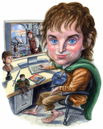
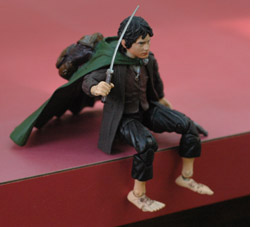 Other franchise goods that I bought ended up being very useful as models for the wonderful caricaturist, Victor Juhasz, when he agreed to do the illustration for the front cover. I had thought about the cover for quite some time as I worked on the book, since a franchise is not exactly an easy thing to convey with one image. I settled on the idea of Frodo playing a video game with himself on the screen, surrounded by franchise items of him: a Sideshow Weta bust, a Toy Biz action figure, and a DVD on the chain around his neck, in place of the Ring. I shipped the bust and action figures to Victor, along with a few of the tie-in books with pictures of Elijah Wood in costume. I also sent one of the video-game strategy books, so that Victor could choose a picture to copy for the monitor screen. He came up with exactly the illustration I had in mind.
So now I have a fairly decent collection of Rings-film-related stuff. Maybe someday I’ll offer it to an archive, if any will take it. But my collection is far, far from complete. I don’t know if anyone has absolutely everything, every British lottery ticket with Frodo’s face on it, every paper plate, every mouse pad. But I did meet someone on eBay who probably has come as close as anyone to achieving that goal.
Springlering Lord of the Rings Virtual Museum and Shop
I mentioned that private collections often serve as archives, and this is especially important when it comes to ephemeral items. I first met Melinda Burnett (aka Springlering) online when I bought some items from her. I mentioned my book project, and she sent me information about buying on eBay, who the major collectors were, and so on.
I recommend this, by the way. If ever you buy something on eBay related to research, mention your project to the seller when you pay. There’s always a little box where you can write messages about special shipping instructions or whatever. By telling sellers about my book, I got lots of information, plus an offer from a bookstore owner in Queenstown, New Zealand, to hold a signing of my book in his shop. (Alas, I never did book signings in New Zealand.) These people are often friendly and even excited at the idea that something you purchase from them might end up in a book. Several of them asked me to notify them when the book came out. I emailed these people when it did. Some of them probably bought copies.
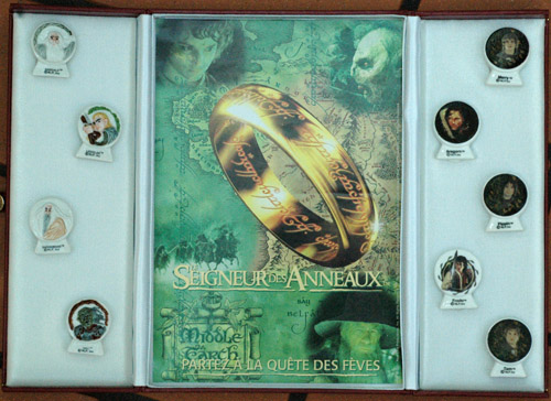
But back to Springlering. She herself is one of the major Rings collectors, going far beyond the ordinary T-shirts, action figures, and cardboard standees. She has the four Japanese promotional “Middle-earth passports” (see the dwarf one, above right), the French fèves (literally, “beans,” little ceramic prizes hidden inside bakery goods; see below), the Polish Nutella drinking glasses, the 2004 Mardi Gras Elijah Wood medallion, and so much more. Basically she sells her duplicates in order to be able to afford new items (or at least that was still the case when the trilogy was still current).
Not only is she a collector, but she has photographed many of the items in her 6000+ collection and put them on the internet as a virtual museum. She’s still adding to it. I just wish she had had it up when I was researching my book. There must be other enthusiasts in other fandoms who do similar things.
Springlering has left eBay (and gives her reasons in the blog on her site) and now sells directly in her online shop, where you, too, can buy fèves while supplies last. According to the “about” page, she has given talks on collectibles at fan events. If I had been doing more with the licensed Rings products, I would have been wise to interview her.
I should note that this post doesn’t just apply to eBay. There are other online auctions or sellers. The stores that sell on the American Book Exchange, for example, sometimes have original letters, drawings, and other sorts of film memorabilia on offer.
May 3, 2017: These and other items I obtained while preparing The Frodo Franchise now reside in the Raynor Memorial Libraries of Marquette University, Milwaukee. The comprise the “Kristin Thompson Tolkien Fandom Collection,” a subset of the much larger “J. R. R. Tolkien Collection.” Thanks to Archivist William Fliss and his team for recognizing the value of collecting these kinds of peripheral objects and for allowing my collection to reside in the shadow of the Master.
A display case for fèves: “Depart on the quest for fèves” (“A delight for both collectors and dentists!” as Springlering says)
The long right wall explained
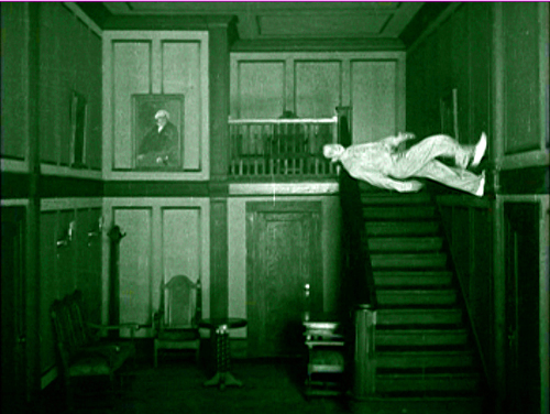
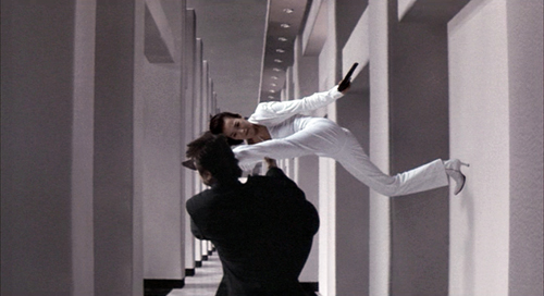
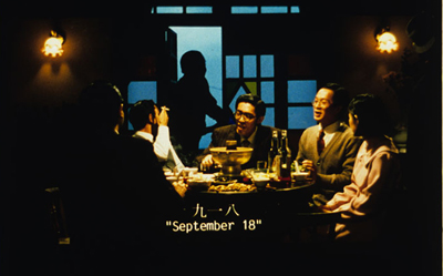
When the Clouds Roll By (Victor Fleming, 1919); So Close (Yuen Kwai, 2002).
DB here:
Kristin will be posting a new entry in the next couple of days, but in the meantime, here’s news of another enhancement of this site. It’s the very lengthy list of categories you see on the right.
The blog will be four years old this fall, and we’ve written nearly 360 entries. Some of those are brief and ephemeral, like this one, but many are big. Several entries range over many topics or various periods of film history. Likewise, our festival reports often sweep across a range of directors, genres, and national cinemas. So we thought it was time to expand the categories pertaining to our posts.
We also thought that a finer-grained set of categories would let you see the scope of topics we’ve considered over the years. Maybe you didn’t know that Harold Lloyd or American indies or New Zealand cinema were some of our recurring concerns. In addition, the long right wall makes it easier to dig up older posts when a new film is released. For example, readers interested in Inception (about which I hope to write soon) can have a look at two substantial entries on other films by Christopher Nolan.
The result is the extensive, we hope not daunting, list of categories. These categories apply only to sustained discussions. If we merely mention Ford or screenwriting in passing, that doesn’t qualify for inclusion. Even if a director’s film earned a couple of paragraphs in one entry, we didn’t create a category for that person. That would have made the list enormous and cumbersome. What we have are the names and topics that frequently crisscross the blog entries. But of course the Search function enables you to locate every mention of any person, idea, or film you’re interested in.
We hope that this new wrinkle makes our blog more intriguing and helpful for our readers, whom we thank for their continuing support.
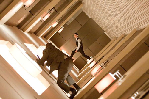
Inception (Christopher Nolan, 2010).
Ledoux’s legacy
DB here:
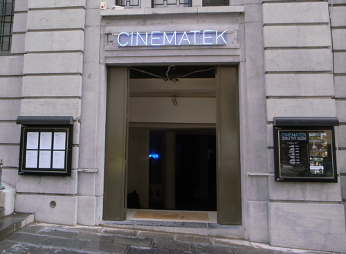
Every summer Brussels hosts one of the world’s most unusual film festivals. By global standards it’s a small event: it showcases only twenty or so titles, each screened twice. The films are on the whole unknown. The prizes are minuscule by the million-plus benchmarks set by Dubai and Abu Dhabi. The venue stands behind an inconspicuous doorway. Yet for me it’s an unmissable event, a crucial influence on my thinking about film and my search for cinematic satisfaction.
Jacques the gentle
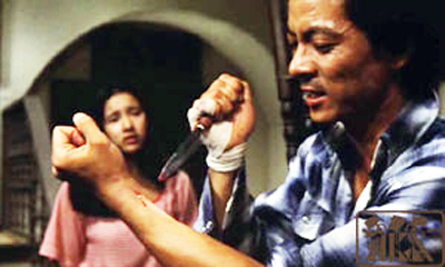
Young Murderer (Seishun no satsujin sha, 1976).
Between 1948 and his death in 1988, Jacques Ledoux was the curator of the Royal Film Archive of Belgium. He made it into one of the cinema’s legendary places, at once Mecca and Aladdin’s cave. On remarkably small budgets, he assembled broad and deep collections. He bought many titles for distribution to local cinemas and schools. He created a public screening program that for decades has shown five different films (two of them silents), every day of the year. The year Ledoux died he received an Erasmus Prize for his services to European culture.
His early life could have come out of an East European movie. Born in Poland in 1921, he fled to Belgium to escape the German onslaught. He hid in several places, including a monastery. There the abbot gave him work publishing Benedictine books. In the abbey’s screening room Ledoux discovered a copy of Nanook of the North. He offered it to the just-started Belgian Cinémathèque, and its supervisor, the filmmaker Henri Storck, offered Ledoux a job. Finding film archivery more appealing than studying science and medicine, he stayed with the Cinémathèque. Interestingly, “Jacques Ledoux” was a pseudonym; one translation is Jacques the Gentle.
Not always gentle Jacques in his scraps with other archivists and local politicians, Ledoux pledged himself to filmmakers, audiences, and—a rarity at the time—overseas film scholars. New Wave directors and Parisian critics made railway pilgrimages to Brussels to see films unavailable in France. When Kristin and I started doing research in the archive in the 1979, Ledoux welcomed us and guided us to treasures we hadn’t known existed.
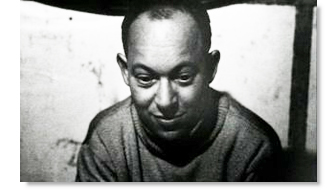 Unlike the very public Henri Langlois, Ledoux worked best behind the scenes. Probably most cinephiles today know him only from his brief appearance as one of the sinister experimentalists in La Jetée (1961). He resisted being photographed, and he refused to wear a necktie. Unsurprisingly, he admired directors who strayed from the beaten path. He created the first festival of experimental cinema at Knokke-le-Zoute, in 1949.
His desire to widen everyone’s knowledge of cinema found another outlet when he created the Prix l’Age d’or/ Prijs l’Age d’or in 1958. It was aimed to reward, as Ledoux put it, “a film that, by questioning taken-for-granted values, recalls the revolutionary and poetic film of Luis Buñuel, L’Age d’or.” Ledoux wanted to encourage a cinema that was subversive in both content and form.
The first prizes were given within the framework of the Knokke event: in 1958, to Kenneth Anger; in 1963, to Claes Oldenberg; in 1967 to Martin Scorsese (for The Big Shave). In 1973, the prize assumed something close to its current form. Several films were screened for the public, and the award, now in the form of cash, was decided by a jury system. The first winners were W. R.: Mysteries of the Organism (in 1973); Borowczyk’s Immoral Tales (1974); Raul Ruiz’s Expropriation (1975); Angelopoulos’ Traveling Players (1976); Hasegawa Kazuhiko’s Young Murderer (1977); and Antoni Padros’ Shirley Temple Story (1978).
The winners emerged from a vast and powerful field of competition. In 1973, the first formal year of L’Age d’or, there were sixty-nine films screened, including Aguirre, the Wrath of God, Oshima’s Ceremonies, Paul Morrissey’s Heat, Tout va bien, and works by Rosa von Praunheim, Wim Wenders, and Miklós Jancsó. There was even The Discreet Charm of the Bourgeoisie, but Buñuel didn’t win a prize named after his own film! The number of titles dropped a little as the years passed, but it’s good to know that in 1978 Assault on Precinct 13, Eraserhead, Perceval le Gallois, and films by Ruiz, Littín, and Schroeter were in the competition.
Ciné-Discoveries
City of Sadness (Hou Hsiao-hsien, 1989); screened at Cinedécouvertes 1990.
Things changed a bit after 1979. The L’Age d’or criteria were modified to identify “films that by their originality, the singularity of their viewpoint, and their style [ecriture] deliberately break from cinematic conformity.” For whatever reasons, hard-edged subversive cinema was harder to come by. In the meantime, the Prix was absorbed into a broader festival Ledoux launched in 1979, Cinédécouvertes.
Cinédécouvertes became a “festival of festivals.” It culled its selection from films that had been screened at Rotterdam, Berlin, Cannes, Venice, and other events. What set Cinédécouvertes apart was its determination to expand film culture. All the films on the program had no Belgian distribution. Each cash award (today, two of 10,000 euros each) would go not to the filmmaker but to a distributor willing to pick up the film. This is a very tangible way to help films of quality find a local audience.
Over the last ten years, Cinédécouvertes has awarded prizes to Audition, Chunhyang, Werckmeister Harmonies, Oasis, Tropical Malady, Day Night Day Night, Mogari no Mori, Afterschool, and Police, Adjective. The L’Age d’or prize has been given to Aoyama’s Eureka, Reygadas’ Japón, Encina’s Hamaca Paraguay, Balabanov’s Cargo 200, and several others. Not every film has been picked up for local distribution, but the impulse to elevate films that go beyond the obvious festival favorites has continued. Ledoux’s successor as curator, Gabrielle Claes, has maintained the legacy of L’Age d’or and Cinédécouvertes. The July festival flourishes in the Cinematek’s newly rebuilt complex and in its other venue, the lovely postwar-moderne building in the Flagey neighborhood.
The annual Brussels event helped me find my way through modern cinema. There I saw my first Kiarostami (Where is My Friend’s Home?), my first Tarr (Perdition), my first Hou (Summer at Grandpa’s), my first Oliveira (No; or, the Vainglory of the Commander), my first Sokurov (The Second Circle), my first Kore-eda (Maborosi), my first Panahi (The Mirror), my first Jia (Xiao Wu). The Cinematek’s talent-spotters were quick to find many of the most important filmmakers of the 1980s and 1990s, and I’ll be forever grateful for their acumen. After I saw these films and many others here, my ideas about cinema got more cogent and complicated. My life got better, too.
Now most of these filmmakers find commercial distribution in Belgium, so Gabrielle’s scouts must scan new horizons. This year as usual Cinédécouvertes boasted some familiar names like Iosseliani, Wiseman, Guzman, and the eternal troublemaker Godard. But there are also filmmakers from Costa Rica, Sri Lanka, Ireland, Peru, Colombia, and Ukraine. The landscape of film is vast, as Ledoux always reminded us, and a small festival can nonetheless open windows wide.
Mind games, or just games
Elbowroom.
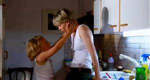
Psychology is at the center of festival cinema. Deprived of car chases and exploding buildings, arthouse filmmakers try to track elusive feelings and confused states of mind. That this can be dramatically engaging in quite a traditional way, as was shown by one of the Cinédécouvertes winners, How I Ended This Summer.
Director Aleksei Popogrebsky puts two men on a desolately beautiful island in the Arctic. They’re initially characterized by the way they execute the routines of measuring weather conditions. Sergei, the stolid older one, is soaked in the ambience of the place, enjoying fishing and boating while insisting on exactness in the log. Pasha is a summer intern, a little careless because he’s exhilarated by the atmosphere: he’s introduced first taking a Geiger-counter reading but then hopping and racing along a cliff edge to the beat of his iPod.
Soon, though, Pasha must give Sergei a piece of bad news that comes in over the radio. Out of awkwardness, fear, refusal of responsibility, and other impulses, he avoids telling his mentor. The consequences are unhappy for each. The film takes on the suspense of a thriller, with conflicts surfacing in a cat-and-mouse game at the climax. Yet before that, more subtly, we have watched several tense long takes of Pasha’s face as he tries to cover up his failures. Not surprisingly, How I Ended This Summer won one of the two Cinédécouvertes prizes. It is an engrossing case for character-driven, locale-sensitive cinema.
Elbowroom tackles psychology from a more opaque and disturbing angle. With no exposition or backstory, we’re plunged into an institution for the handicapped. During the first ten minutes, without dialogue, a handheld camera lurks over the shoulder of a young woman who tries with twisted fingers to apply lipstick. Soon she is preparing to have sex with another inmate, and after their liaison she is whacking her feeble roommates, who sob under her blows. Eventually we’ll recognize this introduction as a summary of her days: fighting with others, being coaxed or berated by staff, meeting her lover, and taking up cleaning tasks. Only far into the film will we learn about how she got here and what her fate will be.
Soohee, stricken with cerebral palsy, is played by a young woman with a milder disease. Very often the camera doesn’t let us see her face, fastening instead on a ¾ view from behind. This seems to me partly a matter of tact, but its ultimate effect is to force us to infer Soohee’s state of mind from her behavior. The visual narration remains resolutely outside the character. Psychology gets reduced to gestures— spasmodic smearing of lipstick, the clasping of a necklace, the seizure of a baby doll (with which she’s bribed). Only at the end does a long held close-up of Soohee’s twitching, smiling face give us fairly direct access to her feelings. Despite the smile—which can be read as a sort of perverse victory for her—Soohee isn’t the noble victim; we’ve seen her petty and selfish side already.
This trip into a world most of us haven’t seen before is presented without conventional pieties, and it’s unsettling. Elbowroom, Ham Kyoung-Rock’s first feature, offers the sort of challenge to aesthetic and moral conventions that the L’Age d’or Prize was designed to encourage. The film won it.
 Characters’ psychological developments can also be brought out by parallel construction. A willful little girl and a scientist cross paths in Paz Fábrega’s Cold Water of the Sea. Karina is on a beach holiday with her family and insists on wandering off at intervals. Marianne is a medical researcher, here for a vacation with her boyfriend. When Marianne finds Karina asleep along the road one night, the girl claims that her parents are dead and that her uncle abuses her. But next morning she’s gone, and fears for her safety are only the first of several anxieties that haunt Marianne’s holiday. While Karina incessantly bedevils her mother and makes mischief with other kids, Marianne descends into ennui as she watches her boyfriend devote his time to selling a piece of family property.
Once more Rossellini’s Voyage to Italy proves to be a template for festival cinema. What is wrong with Marianne goes beyond her diabetes: she feels bored and useless. But while Rossellini adhered primarily to the viewpoints of his dissolving couple, Fabrega opens out the portrayal of upper-class anomie by intercutting episodes from the lives of working-class families. The film has two fully-developed protagonists, with Karina’s verve balancing Marianne’s increasing torper. Splitting his story allows Fabrega to make some social points (the family camps on the beach, the couple stays in a motel with a scummed-over swimming pool) and to suggest secret affinities between the little girl and the professional woman. Cold Water of the Sea seemed to me an honorable effort to let some air into the premises of the standard portrayal of a cosmopolitan couple’s ennui.
Parallels likewise form the core of Otar Iosseliani’s Chantrapas, another of his celebrations of shirkers, layabouts, con artists, and free spirits. The title is Russian slang for a disreputable outsider (derived from the French ne chantera pas, “won’t sing”). Here the outsider is Kolya, a young Georgian director who turns in a movie that can’t pass the censors. He emigrates to Paris, where he finds an aging producer (played by Pierre Etaix) eager to tap his talent. But the new project’s backers try to take over the project in scenes deliberately echoing the ones of Party interference.
Chantrapas lacks the shaggy intricacy of Iosseliani’s “network narratives” like Chasing Butterflies (1992) and Favorites of the Moon (1984), the latter of which I enjoyed analyzing in Poetics of Cinema. When we’re given a single protagonist, as in Monday Morning (2002), Iosseliani’s characteristic refusal of motivation, exposition, and introspection creates a more plodding pace. No mind games here. In earlier films, his favorite shot—panning to follow people walking—creates convergences and near-misses and comic comparisons in the vein of Tati. Here the pans serve as merely functional devices, almost time-fillers, and comedy is largely lacking. Still, Iosseliani avoids the easy traps. A Soviet censor bans Kolya’s film, then congratulates him on making such a good movie. When the Parisian preview audience flees the theatre, we can’t call them philistines. Kolya’s movie, despite its stylistic debt to Iosseliani’s own films, looks awful. In the end, even cinema seems less important than smoking, drinking, eating, and, above all, loafing.
It was a documentary, Nostalgia de la Luz by Patricio Guzmán, that won the second Cinédécouvertes prize. It starts as a memoir of Guzmán’s fascination with astronomy, explaining that the unusually clear skies of Chile have attracted researchers who want to probe the cosmos. Because the light from heavenly bodies takes a long time to reach us, Guzmán casts his observers as archeologists and historians: “The past is the astronomer’s main tool.” This is the pivot to the film’s main subject, the search for the disappeared under the US-installed dictator Pinochet.
The analogies rush over us. The enormity of the universe is paralleled by the immensity of Pinochet’s oppression of his country. Captives in desert concentration camps learned astronomy, but eventually they were forced inside at night; the skies’ hint of freedom threatened the regime. Some of the astronomers are friends or relations of the disappeared and see research as therapeutic, putting their personal sufferings in a much more vast cycle of change. Above all there are the old women who patiently scour the desert for traces of their loved ones. A woman tells of finding her brother’s foot, still encased in sock and shoe. “I spent all morning with my brother’s foot. We were reunited.” Scientists try to know the history of the cosmos, and ordinary people tirelessly challenge their government’s efforts to conceal crimes. Both groups, Guzmán suggests, acquire nobility through their respect for the past.
Taking some chances
More formally daring was Totó. This was the first Peter Schreiner film I’ve seen, and on the basis of this I’d say his high reputation as a documentarist is well-deserved. Without benefit of voice-over explanations, we follow Totó from his day job at the Vienna Concert Hall (is he a guard or usher?) to his hometown in Calabria. The film is an impressionistic flow registering his musings, his train travel, and his conversations with old friends, many of the items juggled out of chronological order.
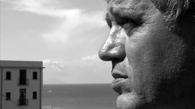
Schreiner avoids the usual cinéma-vérité approach to shooting. Instead the camera is locked down, the framing is often cropped unexpectedly, and the digital video supplies close-ups that recall Yousuf Karsh in their clinical detail. We see pores, nose hair, follicles at the hairline; the seams of sagging eyelids tremble like paramecia. In addition—though I won’t swear that Schreiner controlled this—the subtitles hop about the frame, sometimes centered, sometimes tucked into a corner of the shot, usually with the purpose of never covering the gigantic mouths of the people speaking. All in all, a documentary that balances its human story with an almost surgical curiosity about the faces of its subjects. The Jean Epstein of Finis Terrae would, I think, admire Totó.
I had to miss some of the offerings, notably Oliveira’s Strange Case of Angelica. (Fingers crossed that it shows up in Vancouver.) Eugène Green’s Portuguese Nun was screened, but I’ve already mentioned it on this site. Other things I saw didn’t arouse my passion or my thinking, so they go unmentioned here. Of the remainders, two stood out above the rest for me.
My Joy (Schastye moe), by Sergei Loznitsa, is a daring piece of work. After a harsh prologue, it spends the first hour or so on Georgy, a trucker whose effort to make a simple delivery takes him into the predatory world of the new Eastern Europe. He meets corrupt cops, a teenage hooker, and most dangerously a trio of ragged men bent on stealing his load. After an anticlimactic confrontation, the film introduces a fresh cast of characters, including a mysterious Dostoevskian seer. The film becomes steadily more despairing, culminating in a shocking burst of violence at a roadside checkpoint.
At moments, My Joy flirts with the idea of network narrative. When Georgy turns away from a traffic snarl, the camera dwells on roadside hookers long enough to make you think that they will now become protagonists. One character does bind the stories together: an old man who fought in World War II and who now helps the seer at a moment of crisis. The sidelong digressions, slightly larger-than-life situations, and the floating time periods suggest a sort of Eastern European magic realism. But the whole is intensely realized, at once fascinating and dreadful. After one viewing, I wanted to see it again.
My favorite, as you might expect, was Godard’s Film Socialisme. There are the usual moments of self-conscious cuteness (the zoom to the cover of Balzac’s Lost Illusions, for instance), but on the whole it’s pretty splendid.
Contrary to what a lot of people claim, I don’t think Godard is an “essayist” in most of his films. (Perhaps in Histoire(s) du cinema, but rarely elsewhere.) He tells stories. Granted, they are elliptical, fragmentary, occulted stories, free of expository background and flagrantly unrealistic in their unfolding. Into these stories he inserts citations, interruptions, digressions: associational form gnaws away at narrative. But stories they remain.
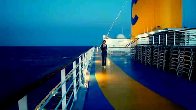
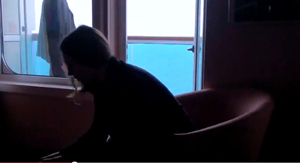
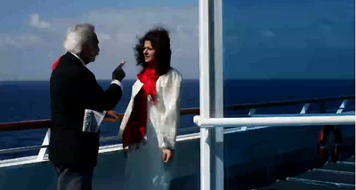
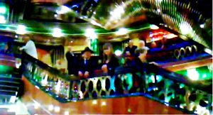
The first part of Film Socialisme takes place on a cruise ship. As it visits various ports on the Mediterannean, some passengers learn that a likely war criminal is on board. Then, like Loznitsa, Godard shifts to a new plot. In the French countryside, a garage-owner’s family is invaded by a TV crew. (As far as I can tell from the untranslated dialogue, the son and daughter are purportedly running for elective office.) Finally, in the last eighteen minutes or so, we get pure associational cinema—not an essay, I think, but something like a collage-poem: a busy montage of clips seeking (or so it seems to me) to ask what sort of European politics is possible after the death of socialism.
Andréa Picard has already written a superb commentary on the film, and it would be useless for me, after only two viewings, to try to go much beyond her account. I’d just say that the first two stories show the same sort of ripe visual imagination we have come to expect from late Godard. The images are oblique and opaque, framed precisely but denying us much in the way of story information. Who are these people? Who’s related to whom? (Who are the women apparently linked with the mysterious Goldberg?) More concretely, who’s talking to whom?
Godard cuts among images of varying degrees of definition in a manner reminiscent of Eloge de l’amour, but here color is paramount. We get saturated blocks of blue sky and blue/ turquoise/ charcoal sea. See the image further above, or this one, which is virtually a perceptual experiment on the ways that color changes with light and texture.
Anybody with eyes in their head should recognize that such shots show what light, shape, and color can accomplish without aid of CGI. They aren’t simply pretty; they’re gorgeous in a unique way. No other filmmaker I know can achieve images like them. We also get entrancing scatters of light in low-rez shots in the ship’s central areas and discotheque.
Just as noteworthy from my front-row seat was Godard’s almost Protestant severity in sound mixing. For the first twenty minutes or so, the sound is segregated on the extreme right and extreme left tracks, leaving nothing for the center channel. We hear music on the left channel and sound effects on the right, or ambient sound on one side and dialogue on the other. The result is a strange displacement: characters centered in the screen have their dialogue issuing from a side channel. Sometimes a sound will drift from one channel to another and back again, but not in a way motivated by character movement (“sound panning”). Having accustomed us to this schizophrenic non-mix, Godard then starts dropping a few bits into the center channel. But for the bulk of the shipboard story, that region is largely unused.
We leave the ship with a title, “Quo Vadis Europa,” and now we’re in Martin’s garage, listening to him being interviewed by an offscreen woman. His voice squarely occupies the central channel, with offscreen traffic sliding around the side channels. The same central zone is assigned to the wife and the kids. Would it be too much to say that the working people have taken control of the soundtrack? In any case, although the side channels are very active, the sound remains centered during a permutational cluster of family scenes (parents and children alone, father with daughter, mother with son, boy with father, daughter with mother).
This section ends with a final confrontation with the nosy reporters. The overall episode can be seen as a revisiting of Numero deux (1975), another uneasy family romance and one of Godard’s first forays into video.
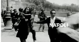
The rapid-fire finale would require the sort of parsing that Histoire(s) du cinema has invited. Through footage swiped from many other filmmakers, Godard revisits the cruise ship’s ports of call, investing each with a symbolic role in the history of the West. Egypt and Greece get considerable emphasis, but so do Palestine and Israel. This history is, naturally, filtered through cinema: not just footage of the Spanish Civil War but clips from fiction films like The Four Days of Naples (1962). After glimpses of Eisenstein’s Odessa Steps massacre, we get shots of today’s kids standing on the steps declaring they have never heard of Battleship Potemkin.
Exasperating and exhilarating, Film Socialisme shows no flagging of its maker’s vision. “He’s a poet who thinks he’s a philosopher,” a friend remarked. Or perhaps he’s a filmmaker who thinks he’s a painter and composer. In any case, Film Socialisme will be remembered long after most films of 2010 have been forgotten. More intransigent than most of his other late features, and unlikely to be distributed theatrically outside France, if there, it shows why we need “little” festivals like Cinédécouvertes now more than ever.
The home page of the Cinematek is here. A complete list of L’Age d’or and Cinédécouvertes winners is here. Last year, between research and preparing for Summer Movie Camp, I had no time to blog about the festival. But you can go to my earlier coverage for 2007 and 2008.
As one who cares about Godard’s aspect ratios, it pains me to use illustrations from online sources, which are notably wider than the version I saw projected in Brussels. When I can get my hands on a proper DVD version, I will replace these images with ones of the right proportions.
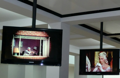
Seeing movie seeing: Display monitors in the reception area of the Cinematek.


