Archive for December 2010
Ratio-cination
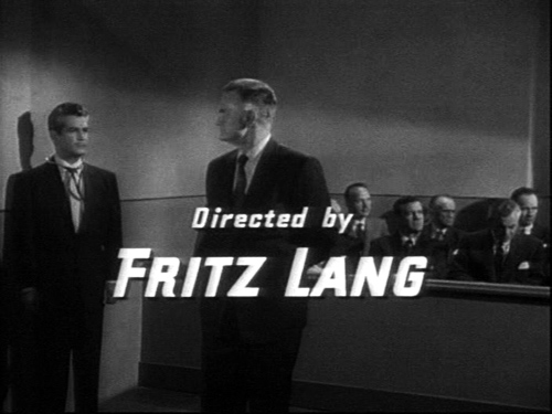
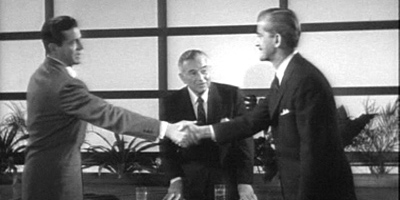
Beyond a Reasonable Doubt.
DB here:
Good timing. Just as I was about to enable more aspect-ratio fetishism, I got news of the publication of Widescreen Worldwide, from John Libbey. Edited by John Belton, Sheldon Hall, and Steve Neale, it has its distant origins in a 2003 conference at the National Media Museum in Bradford, England. Widescreen Worldwide will be a very useful volume, with material on little-studied U. S. systems and a lot of information on formats in Japan, France, Italy, and Russia, even Norway. 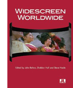 Most studies of widescreen technology seldom discuss the creative uses to which it was put. But this collection features several essays focusing on the artistry of the wide formats, emphasizing the work of Preminger, Peckinpah, Okamoto, Suzuki, et al. As the publisher’s blurb puts it:
The book documents how the aesthetic strategies explored during the first wave of American widescreen films underwent revision in Europe and Asia as filmmakers brought their own idiolect to the language of widescreen mise-en-scène, editing, and sound practices. As a global phenomenon, widescreen cinema thus presents the opportunity to examine how different cultures appropriate the technology to advance extremely different cultural and aesthetic agendas.
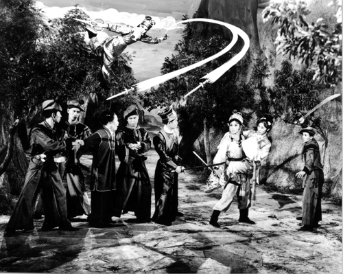
I have an essay included on the Shaw Brothers directors, and I’m happy to be in such distinguished company in this major publication. My essay is available on this site. The paper I gave at the conference, on Hou Hsiao-hsien’s early anamorphic films, is also posted here.
Speaking of widescreen: Today, we go back to While the City Sleeps and SuperScope, thanks to some correspondents and further fooling around on my part.
Ratio decidendi
The story so far: SuperScope was a widescreen system devised by Irving and Joseph Tushinsky for RKO . It extracted a wide image from the 1.37 standard frame and printed it as a squeezed anamorphic frame, to be unsqueezed at a ratio of 2.0 to 1. (A later version allowed for a 2.35 stretch.) In principle, it’s an early version of what Super 35 does now. Some RKO films, notably Invasion of the Body Snatchers (1956), were shot in knowledge that they would be given the SuperScope treatment; others were SuperScoped after the fact.
The question before the jury was: Do SuperScope prints of Lang’s While the City Sleep (1956) faithfully reflect his intentions? The answer I settled on was: Probably not. A Variety story indicated that the SuperScope prints were made for European distribution, though perhaps some sneaked into the US theatrical market or the 16mm aftermarket.
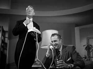
Now for a little more on Lang’s compositions. Several viewers have commented on all the headroom visible in the full frame. The ‘Scope print I examined displayed some as well, but not as much, as my illustrations for the earlier entry indicate. More likely the film was masked in the US to something like 1.66 or 1.75. I reproduced some frames from a 1.75 laserdisc version, and they look reasonably good. Overall, I suggested that City’s fairly open compositions suggest that Lang was expecting the film to be masked somewhat in projection, but not to the full 2.0:1 ratio we get with SuperScope.
Although for most of its length, While the City Sleeps seems quite okay at 2.0, I found one shot that would be quite awkward in full SuperScope. Alas, I didn’t photograph it from the 35mm European print I examined, but I’ve used my stills from the print to guide my cropping of the 1.37 frame in this instance. The results are, as the lawyers say, probative.
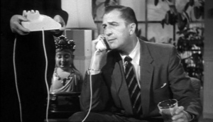
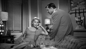
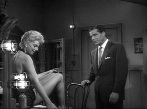
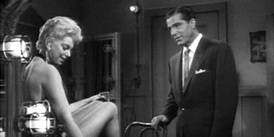
The scene is mundane: Walter Kyle gets a phone call from his errant wife Dorothy. She’s carrying on an affair with Harry, the art director of the newspaper Walter runs. Walter talks with her, and Lang cuts to her responding. I show you the 1.75 versions.
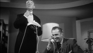
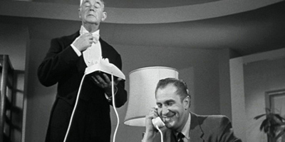
When Lang cuts back to Walter, he provides a new camera setup featuring the butler Steven. This is to prepare us for a joke: Walter says he’ll have Steven meet Dorothy at the front door in his underwear. Steven reacts with embarrassment. Given that a lot of the film plays on the sexual rapacity of men, the humor is a shade sick.
A narrative convention: The stuffy, puritanical butler. But notice that in the 1.75 frame, Steven’s full face is quite visible. Of course it’s even more visible in the full-frame version. (Fussy Lang, or fussy somebody, seems to have aligned the face with the swoop of the ceiling.)
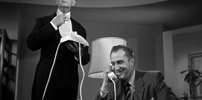
But the composition would look more awkward if chopped in the SuperScope 2.0:1 version. Here’s one framing, using the cropping points typical of other anamorphic shots in the European 35mm print.
In addition, since the crop slices more off the bottom region than the top, Walter’s body is also lost in the anamorphic version. But this is still probably the best compromise. Some frames in the 35mm S’Scope version favor the lower region of the original shot. But in this shot that option would be disastrous.
It’s hard to imagine that the director of the painstakingly composed Moonfleet (1955) would have wanted to saw Steven’s skull in half.
Mors ultima ratio
So Lang didn’t shoot the film expecting it to be SuperScoped. Nevertheless, things that escape directors’ intentions can have their own impact on viewers. In the codicil to the earlier blog entry, I wondered if French critics’ admiration for While the City Sleeps might have been based on their seeing wider prints than Americans did—in effect, gathering Lang into the cohort of skilled anamorphic filmmakers that included Ray, Preminger, Minnelli, et al. Samuel Bréan wrote to tell me that one critic, Jacques Lourcelles, raised this issue explicitly. Lourcelles writes:
For both this film and Lang’s next film, Beyond a Reasonable Doubt, the format poses a thorny problem that can be resolved only by considering aesthetic matters. The film, not shot in CinemaScope, was exhibited in Superscope (a wide format used at RKO and created through laboratory processes), and then in a normal format. Which is better? In my opinion, the wider one. Only there, for instance, do the camera movements and the newspaper-office set have their true impact. Even if the Superscope version was “manufactured” in the lab, Lang knew that the film would be seen on the wide screen and his direction was conceived as a function of that. The same goes for Beyond a Reasonable Doubt; to cite just one instance, the first sequence showing the condemned man walking toward the electric chair is obviously conceived for the wider format.
This does lead to some intriguing speculation on how “misreadings” of films can have positive consequences. The French celebration of Lang’s 1950s films led American and British critics to reevaluate them.
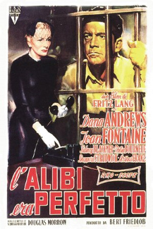
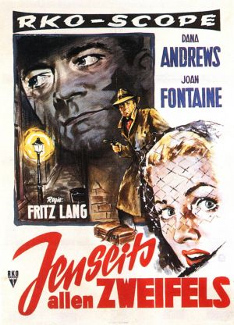
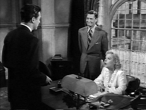
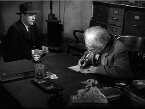
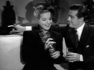
The case of Beyond a Reasonable Doubt is quite parallel to that of While the City Sleeps. Released in September 1956, it too was reviewed in Variety as a non-anamorphic picture. Its U. S. publicity makes no reference to a widescreen format. But its overseas posters claim that it is in “RKO-Scope.” Huh?
By the end of 1956, the Tushinskys had split from RKO and were selling SuperScope generally. So in November 1956 RKO simply announced that it had developed “a new widescreen, anamorphic process” that would carry a ratio of 2.0:1. Historians of widescreen have assumed that this is SuperScope by another name. The same publicity announced that soon all the studio’s films would be in RKO-Scope. But RKO ceased making movies on 1 January 1957. Universal took over distributing the remaining pictures.
Again, on the basis of the posters and Lourcelles’ comments we can be confident that Beyond a Reasonable Doubt was shown in a 2.0:1 aspect ratio in some overseas markets. As airless a movie as Lang ever made, with disconcertingly generic sets and severe framings and camera movements, it engendered a fascination in French critics. The story itself is a model of Langian guilty conscience. A reporter looking for a new book to write agrees to a hoax that will attack capital punishment. He’ll plant clues indicating that he’s a murderer in order to prove that an innocent man can be convicted. Lang’s narration offers his customary feints and ellipses. Smooth hooks, verbal and visual, carry us across scenes. Casual details are dropped in, or a sudden cutaway appears, and we’re misled into thinking we’re ahead of the plot. We are in fact behind it. Crucial story information is skipped over, but we’re not aware of what has been deleted until much later. We should have noticed.
Appearing in the same year as Around the World in 80 Days, The King and I, Lust for Life, Giant, Anastasia, War and Peace, and other sweeping spectacles, Beyond a Reasonable Doubt was a bare-bones programmer. Lang’s last American film doesn’t waste its energy on the pictorial flourishes of budget-strapped directors like Siegel or Fuller. Other B-films could whip up visual flair with chiaroscuro, close-ups, and fast cutting, but Lang’s images seem disconcertingly banal; yet their simplicity gives them an odd purity. In an influential review, Jacques Rivette declared that Lang was, in effect, filming concepts.
I don’t find any shots in Beyond with a vertical bias comparable to the shot featuring Steven the butler in City. The 1.37 frame shots are very empty up top. So here’s an experiment in reconstructing an approximation of what Europeans saw.
Dux vitae ratio
As I suggested in the earlier blog, for decades Lang composed his frames carefully, balancing figures in dynamic patterns and sometimes putting important elements along the sides or in a corner. Here are some examples from one of his most beautiful films, The Ministry of Fear. He likes triangular compositions that tuck heads into corners, as well as camera angles that let foreground items anchor the faces and bodies.
When the frame is unbalanced, it’s for a reason, such as purse-rifling.
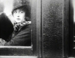
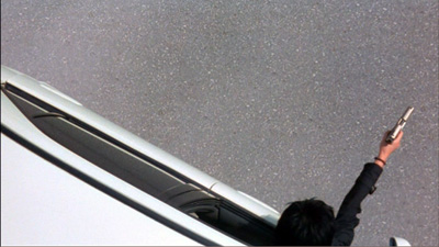
A director so committed (like Ozu) to putting heads high in the shot must have felt annoyed when he had to hang inexpressive space over his players, as in the shot at the very top of today’s entry. When he left headroom in earlier films, it served an exacting compositional purpose, as you see below. Those wedge-formations of tapers, backing up threatening cobras, look back to the decor of his German films.
I suspect that it pained him to accept the more open framing demanded by non-anamorphic ratios. In CinemaScope you could count, more or less, on the proportions of your image being respected. But shooting flat, could you really be sure what would stay in the shot? Projectionists could mask it to 1.66, 1.75, 1.85, and even wider. These ratios were so imprecise, and this is one precise director. Lang “shot to protect,” as they say, but he couldn’t protect what was already gone: his compact, quietly masterful compositions.
John Belton wrote to me to echo the idea that Lang would probably have realized that While the City Sleeps would be cropped to as much as 1.75.
Certainly every director after 1954 composed for wide screen projection. As for SuperScope, why didn’t they just project it flat with a 2:1 matte in the aperture? It certainly would have looked sharper. Maybe the answer lies in the relative abundance of CinemaScope installations overseas?
Good question for further research. Another interesting sidelight: Who was the SuperScope representative for Europe? For a time, apparently none other than Edgar G. Ulmer! Ulmer is identified as a SuperScope representative in “Tushinsky’s Teuton Deal,” Variety, 7 September 1956, p. 5. Michael Campi wrote to inform me that in Australia he too saw a 2.0:1 print of While the City Sleeps.
RKO’s announcement of RKO-Scope can be found in “And Now–RKO-Scope,” Variety, 30 November 1956, p. 1. More background on the winding down of the studio is provided in Richard B. Jewell and Vernon Harbin, The RKO Story (London: Octopus, 1982), pp. 242-245.
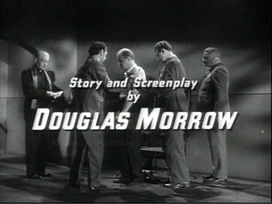
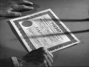
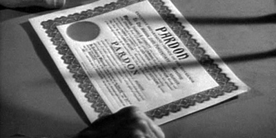
The Jacques Lourcelles comment appears in his Dictionnaire du cinéma vol. 3 (Paris: Laffont, 1992), p. 294. I’m grateful to Samuel Bréan for calling my attention to it. Rivette’s 1957 essay on Beyond a Reasonable Doubt, “The Hand,” is available in Cahiers du cinéma: The 1950s: Neo-Realism, Hollywood, New Wave, ed. Jim Hillier (Cambridge: Harvard University Press, 1985), pp. 140-144. It has been included in a site devoted to Jacques Rivette, Order of the Exile. (The hand Rivette refers to is that in the shot of the warrant above; had Rivette not seen the RKO-Scope print, he might have had to title the essay, “The Hands.”) The poster images for Beyond a Reasonable Doubt come from the ever-generous DVD Beaver, and its review of a Spanish disc.
The Ministry of Fear.
Back to the vaults, and over the edge
Unstoppable? Not really. The Juggernaut (1915).
DB here:
A few weeks ago, I praised Variety for making its back issues available digitally. The result is a magnificent vault of information. I also expressed frustration that the recent makeover of The Hollywood Reporter neglected to offer access to its original online archive, which indexed issues across the last twenty years. On the last point, some news.
First, my inquiry to the address listed on the HR website eventually yielded this blue note.
Good Morning,
We apologize for the delayed response.
I do not think there is a way to go back to prior to the changeover.
You would need to contact the publisher about that, as we do not handle the website directly.
Here is a phone number for you 323-525-2150.
Thank you.
I called the number, which handles only subscriptions, and the person answering had no idea what I was asking about.
But all is not lost. My first efforts to access the archive turned up very little for 2010, but shortly afterward I was able to access items from most of this year. Now, if you type a search term into the Search box of the HR site, it brings up items from as far back as 2008. This is an improvement over earlier attempts I made. It seems that THR is gradually adding old material to their archive, in reverse order.
Unfortunately, the search mechanism is quite indiscriminate. Searching “Johnnie To,” with and without quotation marks, yielded 290 hits, but I could find no articles about Johnnie To. Instead, the items with highest relevancy concerned Johnny Depp, Johnny English, John McCain, and the new Narnia movie.
The best news of all came from alert reader David Fristrom of Boston University. He advises me that the old HR archives are still available through LexisNexis. So I tried there with Johnnie To, and I got 338 references, stretching back to 1992. The ones at the top of the relevancy scale were indeed about Mr. To, including a Cannes piece called “Fest’s Red Carpet Flows with Blood.”
Accessing the archive isn’t straightforward, but you don’t need a subscription to HR if your library has purchased access to LexisNexis. I append David’s instructions at the end of this entry. Thanks to him for sorting this out for me.
Now, back into the Variety vaults.
This one’s a real train wreck
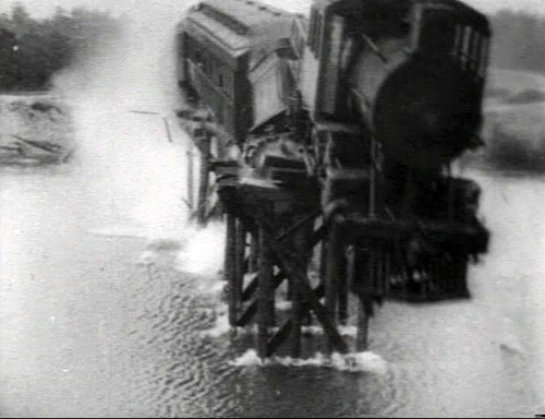
On 12 March 1915, Variety reviewed The Birth of a Nation. Alongside that review sits one of The Juggernaut, a Vitagraph feature directed by Ralph Ince. The reviewer, “Simc.,” dwells almost entirely on what he calls “the train-through-the-bridge thing.” The producers bought an old locomotive and some passenger cars, built a flimsy bridge, and ran their train off into what appeared to be a river.
The review exhibits some Variety touches that are still with us. Take the (quite reasonable) idea that nearly every movie is too long. “If this five-reeler were cut down to three reels, which could easily be done, the Vitagraph would have a real thriller.” There’s also the notion that people who come to the see the movie should be aware of its main attraction. “If the audience knows a train will go through a bridge at the finish, it won’t mind the fiddling about in the first four reels before that scene is reached. But if the audience doesn’t know what is to come, there may be many walk-outs.” At the beginning of Unstoppable we’ll sit through all the union and non-union wrangling and alpha-male preening if we’re sure we’re going to see a train that is certifiably unstoppable, except that it’s likely to be stopped by our heroes.
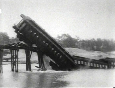
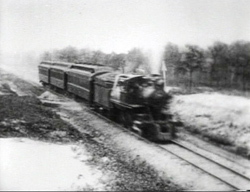
The Juggernaut does give us a pretty spectacular train wreck, as you see above. The entire film may not survive, but we have a version of the last reel (perhaps because a collector thought it worth saving). Train or no train, the film is of interest in showing what Griffith’s rivals were up to.
The plot centers on a crooked railroad magnate, Philip Hardin, and his college friend John Ballard. In the reel we have, Hardin’s daughter Louise, who loves John, sets out on an errand. When her car stalls she boards an express train. A track-walker finds worn ties on a bridge and warns the company, but too late. As Hardin races to stop Louise’s train, it arrives at the bridge and he watches it topple into the water. The sight kills him on the spot. John arrives and swims out to rescue Louise.
That’s when things get dicey. According to the Variety review and other sources, Louise dies in the wreck. Simc again:
The leading woman of the film, Anita Stewart, is discovered dead, lying against one of the windows, with particular pains taken that her features shall be clearly visible. . . . Anita is carried to shore and lain alongside of her father, who had died of heart failure (on land) a few moments before.
In the version available on DVD, John does bring her body ashore, but she revives, lifts herself up, and embraces him. The print ends there. Why the varying ending? Perhaps this is a version made at the time for a different market or in response to censorship, or it might be a rerelease using alternative footage. Or perhaps the press reviews were based on a synopsis supplied by Vitagraph, and the studio made modifications in the print before release.
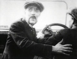
The Juggernaut is also intriguing stylistically. By this point, crosscutting and scene analysis were common techniques in U. S. films. To set up the perilous situation, the cutting alternates shots of the track-walker, of Hardin, and of Louise. Once Hardin discovers that Louise is on the train headed for the dilapidated trestle, we are set up for a last-minute rescue–which fails. A particularly interesting series of shots shows Hardin’s trajectory converging with the train’s path. Riding in a power boat, Hardin looks back and we get a shot of the train in the distance, suggesting that he can see it.
From this we cut to a shot of Louise, confirming that she’s on board and showing her innocent lack of awareness. Then we get a repeated framing of the train rushing toward the bridge.
After another long shot of the train, we get a shot of Hardin in his powerboat with the train whizzing by in the background. This confirms that he was indeed watching it approach off screen left in the earlier shot, and it shows that he isn’t likely to catch up.
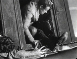
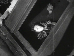
Once the train has toppled into the stream, there are some striking shots of people trapped inside or scrambling to escape. We see Louise raise one hand and then freeze, as if dying.
Earlier, there’s some emphatic “classical” cutting when Hardin learns that Louise is in danger. An enlarged framing (via an axial cut) underscores his reaction to the telegram.
Most striking is a series of shots of the dead-or-not Louise; the abrupt enlargement of her face has something of the force that Kurosawa would channel in his axial cuts.
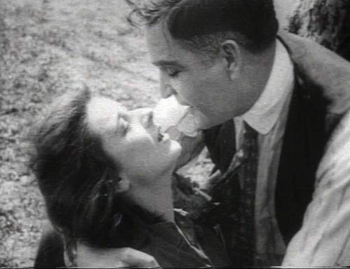
Soon Ralph Ince cuts back along the same camera axis, and inward again as the couple embrace.
I can’t recall a comparable stretch of “concertina” cutting in the intimate scenes of Birth, and no such tight views of faces either. Griffith sometimes gives us “close-ups within medium-shots” by means of irising and vignetting.
Other directors (e.g., Dreyer) liked to use the serrated surround to highlight faces, but the American norm eventually became the unadorned closer view, as in the shot of Louise in The Juggernaut. Such shots probably saved production time as well. We’re confronted with the familiar situation that sometimes non-Griffith films from 1915 (e.g., The Cheat, Regeneration) look somewhat more “modern” than does Birth.
Going back to the train-through-the-bridge thing, the staging of the scene in late September 1914 elicited a lot of publicity. For one thing, the cost was played up; I’ve seen stories claiming $20,000, $30,000, and $50,000. The New York Times wrote up the shoot twice; the second of these could well be a publicity release from Vitagraph. According to the Times, the “river” was actually a flooded quarry. Before the shoot, buzz leaked out and crowds reported as numbering thousands showed up to watch. The crew spent hours herding them out of camera range. Actors were freezing in the water by the time cameramen got to take their shots. The Times also claims that the crash was filmed by fifteen (or twenty-five) cameras, a stupendously implausible number, especially in light of the footage we have. Worse, according to the second NYT story, Ince decided that the first pass didn’t work and they would have to start all over with a new train! A retake is not mentioned in Variety’s coverage, which does report some studio rivalry:
The ink on the New York dailies telling of the Vita’s big wreck stunt in the cameraing of “The Juggernaut” had hardly dried when the Universal sent over camera men posthaste Sunday to take views of what was left of the wreck. [Vitagraph studio manager Victor Smith], getting a hunch, got on the ground ahead of them and with a sturdy band of Vita “protectors” nipped the U’s little scheme in the bud.
One can only imagine how the “protectors” dealt with the Universal boys. Once more, the Variety Vault gives us the flavor, and perhaps sometimes the facts, of heroic times.
How to access the Hollywood Reporter archive, courtesy David Fristrom:
Once you are in LexisNexis, it can be a little tricky to search in The Hollywood Reporter (for some reason it doesn’t show up if you type “Hollywood Reporter” into the “Source Title” box), but you can follow these steps:
1. Click on “Power Search” in the upper-left corner.
2. On the “Power Search” page, find the “Select Source” box (near the bottom) and click on the “Find Sources” link.
3. On the “Find Sources” page, type “Hollywood Reporter” into the “Keyword” box and press enter.
4. At the top of the results should be “The Hollywood Reporter.”
Check the box next to it, then click on the “Ok-Continue” button that appears in the upper right corner.
5. You are now ready to search in the Hollywood Reporter archives –just type your search terms into the search box.
Thanks again to David!
The Variety review of The Juggernaut appears in the issue of 12 March 1915, p. 23. The story about Universal staff trying to shoot the wreckage is “Vita Putting It Over,” Variety, 10 October 1914, p. 23. The New York Times articles are “Film Train Wreck Almost a Tragedy,” NYT, 28 September 1914, p. 13, and “Tossing Dollars Around As If They Were Pennies,” NYT, 18 October 1914, p. X7. For more on Vitagraph, see Anthony Slide, The Big V: A History of the Vitagraph Company, rev. ed. (Metuchen: Scarecrow, 1987); Tony provides some production background on The Juggernaut on pp. 64-65.
The Juggernaut excerpt is available on Nickelodia 2, a DVD collection from Unknown Video. Oddly, the snapcase doesn’t list the reel as included on the disc, nor does the product information on the Unknown Video site or Amazon. I’d welcome more information about The Juggernaut‘s plot resolution if anybody out there has any.
The Juggernaut (1915).
Revisiting Planet Hong Kong
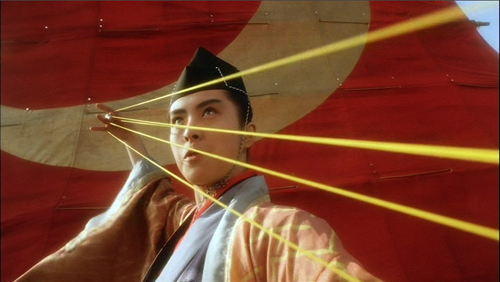
The East Is Red (1993).
DB here:
In about two weeks, we try something new here. It’s an experiment in self-publishing, like everything on this site, but this time we offer a new version of an oldish book.
Planet Hong Kong was published in 2000. It sold pretty well for an academic book, shifting about 7000 copies through 2007. It was translated into Chinese twice, once in Hong Kong and once on the mainland. It also got encouraging reviews; I’ve put up links at the end of this entry.
At some point in 2008, Harvard University Press took the book out of print, a decision I learned about accidentally in spring of 2009. The story is here.
Since then, the book has become rather scarce; only about twenty copies are currently offered on Amazon. Rather than letting the poor thing fade away, I considered revising it for the web. The more I thought about it, the better the prospect looked. I could add as much to the text as I wanted. The text could be corrected, updated, and supplemented in the future. I could add photos, lots of them, and they could be in color. The text would be searchable. And instead of waiting nine to thirteen months to see the result, I could see it in weeks.
Moreover, readers could use the book as they liked. If it was presented as a pdf download, they could read it on a computer or on several models of e-book readers. They could also print out all or part of it. Interestingly, when I asked students and faculty if they’d use the book, nearly all said they’d print it, or let a facility like Kinko’s do it. All in all, it looked like an experiment worth trying.
[Insert montage of fluttering calendar pages here]
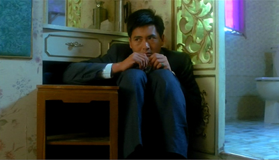
God of Gamblers (1989).
Since July I’ve spent virtually all my time on the book, with a break to go to the unmissable Vancouver film fest. Reworking the manuscript, watching and rewatching films, and preparing new material kept me from writing other things I had planned. No blog for Godard’s eightieth birthday, aiming to defend Film Socialisme as an intelligible part of his career. No web entry on the remarkable films of Kon Satoshi, creator of Perfect Blue, Millennium Actress, and The Girl Who Leaped through Time. No discussion of the 1950s-1960s art-cinema canon in the light of Tino Balio’s fine new book on that period in U. S. film culture. No speculations on the psychological processes aroused by a movie’s opening scenes. Maybe next year.
Instead, apart from two quick entries provoked by Inception, I was absorbed in Hong Kong movies on film and DVD, notes from ten years of film festivals and conferences, and plenty of books and websites. Two blog entries, one on coincidence and the other on Jackie Chan’s Police Story, were chips from the workbench. As for my seeing recent releases, The Social Network and Megamind have been about it.
Now, after a month of fourteen-hour days, Planet Hong Kong redux is close to ready. I hope to make it available on this site during the week of 20 December.
The beast has grown in captivity. The first edition ran about 130,000 words; the new version adds 40,000 words. (In defense, I remind you of Adorno explaining why The Authoritarian Personality turned out so long: “We didn’t have enough time to make it short.”) There are over 150 new stills, all in color and many from 35mm prints. But no clips! These films are too beautiful to be reduced to those wretched mutants you get on YouTube. Besides, I don’t have the rights.
Planet Hong Kong 2.0 will not be free. My Ozu and the Poetics of Cinema and Kristin’s Exporting Entertainment are free online, but neither of those was revised, and we absorbed comparatively little of the costs of production. By contrast, the digital PHK is the fruit of a lot of paid labor. Heather Heckman and Mark Minett did excellent scanning and Photoshop tweaking, and Meg Hamel, our web tsarina, designed the book and is making it web-ready. I’m still reckoning the cost of the e-book, but it will be $20 or less. Payment will be rendered unto Caesar, aka Caesar Bordwell, via PayPal.
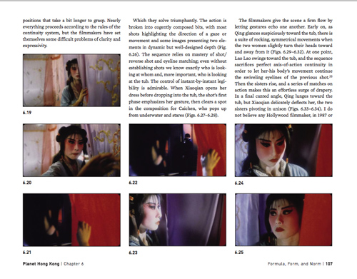
Here’s a sample page from our beta version. I’m still fiddling with the text, but the design looks to me like a nice compromise between the stability of a book page and the flow of a website. The file I’m using here is low-resolution, and this frame from it is a paltry 72 dpi jpeg, but the final pdf page should look very sharp. For curious boffins, the 35mm frame stills were scanned at 2000 dpi and reduced to 300 dpi for insertion. We don’t know yet how big the whole book’s file will be, but of course Meg will optimize it for downloading.
By the way: No, Wong Kar-wai did not invent the luscious image of the yearning woman.
Once the book is up, I plan to add a Hong Kong picture gallery to this site. It will include snapshots of celebs and fans from across the years 1995-2010.
ISNAQs (Infrequently, Sometimes Never, Asked Questions)
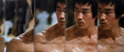
Enter the Dragon (1973).
PHK isn’t a comprehensive history of Hong Kong filmmaking; for that you must turn to Stephen Teo’s Hong Kong Cinema: The Extra Dimensions. Nor is it a fan’s guide to the wild and crazy side of this local cinema. Stefan Hammond’s two books handle that task nicely, and there are many similar handbooks since. Most strikingly, the fanboys have been usurped by the professors. A geyser of academic books and articles about Hong Kong cinema burst in the new millennium, along with invaluable documentation from the Hong Kong Film Archive and the Hong Kong International Film Festival. My book doesn’t rival these.
What does this book do, then?
I try to design my books in layers, with different implications and possibly different readerships, at each level. The first and founding layer of Planet Hong Kong is my effort to convey the sheer pleasure offered by this filmmaking tradition. I write as an enthusiast for other enthusiasts, and for potential converts. In this respect, PHK is an academic dressup of a noble gonzo tradition. Hong Kong cinema has benefited from the gusto of admirers like Ross Chen, Lisa Morton, Stephen Cremin, Grady Hendrix, Stefan Hammond, Chuck Stephens, Richard Corliss, David Chute, Howard Hampton, and other lively writers. This cinema inspires dazzling, sometimes headbanging appreciations from critics.
Next there’s a historical layer. Hong Kong cinema is, I’m convinced, an important “national school” in world film history. It shaped global popular culture to a degree matched only by the westerns and gangster films turned out by the Hollywood studios. Every video game that includes martial arts, every American action movie, and every comic book showing a sword-wielding superhero owe a lot to Bruce Lee and the cinema he springs from. Less obviously, Hong Kong innovated approaches to film form and style that remain striking today. When I wrote the book, this artistic heritage was almost completely unappreciated, by both general audiences and specialized film scholars. The situation is a little better now, but the case always needs restating. Through close analyses of many films and sequences, the book tries to show the originality and force of the Hong Kong touch.
Another layer up, the book asks how popular cinema works. The clichéd split between “art” and “business” isn’t much help in understanding mass-entertainment film. The business relies on artistic traditions, and those traditions in turn are born from and shaped by industrial factors–not just constraints but also enabling opportunities. Hong Kong film provides a case study in how a mass-entertainment movie builds its effects on genre, star appeal, storytelling strategies, and stylistic tactics. It shows vividly how a media industry relies on conventions, and how artists tap those, stretch them, and sometimes twist them out of recognition. My interviews with several writers, directors, choreographers, and actors helped me understand the ways that creativity could be fostered by craft traditions.
At the most general level, PHK is a small-scale demo of an approach to asking questions about cinema. It shows how we might systematically study the principles of construction informing popular filmmmaking. Stealth poetics, in other words.
The old and the new
Leave Me Alone (2004).
The big changes in Asian cinema of the last decade make the original book something of a historical artifact itself. I did the research across the 1990s and wrote nearly all of it in 1998. Its emphases reflect issues circulating in fan and academic culture at that time. DVDs, introduced in 1997, had not become widespread, and VCDs were unwatchable. (Still are.) Most of the films that mattered had to be studied on film copies, although laserdiscs offered a passable backup in some cases. VHS tapes were seldom letterboxed, but laserdiscs often were.
The biggest constraint on the book was the scant availability of Shaw Brothers films on any format. Thanks to the Hong Kong International Film Festival, trips to archives, and the film collector’s market, I was able to see quite a few, but nothing like what’s available now in the massive and restored Shaw DVD library. Consequently, apart from the work of King Hu, Chang Cheh, and Lau Kar-leong, PHK doesn’t deal with the very interesting output of the territory’s most famous company. Fortunately, Shaws has been carefully studied in the years since my book, in a massive volume from the Hong Kong Film Archive and in Poshek Fu’s China Forever: The Shaw Brothers and Diasporic Cinema. For my part, this web essay and these blog entries try to make amends.
I could have recast PHK top to bottom, but I wasn’t convinced that I could come up something as pointed as the original. The text has been corrected, of course, and patches have been recast for greater clarity. It has also been enhanced by a few more examples, film sequences I referred to in passing but could not illustrate because I couldn’t find a print or couldn’t include color images. The chief updating is a series of sections added to the back end.
So here is what the book now looks like.
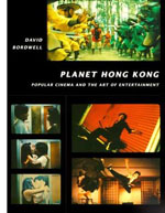 The first chapter broaches the general idea of an aesthetic of popular cinema. There follows an interlude comparing Hong Kong and Hollywood, focusing on The Untouchables and Gun Men. Instead of launching into a general history of local cinema, Chapter 2 sketches some general features of the territory’s film culture, concentrating on its audiences and its critics. The following interlude,”Two Dragons,” talks about Bruce Lee and Jackie Chan, the two most famous Hong Kong heroes. Chapter 3 provides a condensed history of Hong Kong filmmaking up to 1997. The next chapter, “Once Upon a Time in the West,” traces how Hong Kong film attracted fans and festival prestige. There’s an interlude devoted to John Woo, then the fanboys’ demigod.
Chapter 5 surveys the industry, with emphasis on filmmakers’ craft traditions (how stories are planned, scenes are cut, and so on). The interlude that follows takes Tsui Hark as an instance of a director who creatively reworked such traditions. Chapters 6 and 7 go into the most detail about the aesthetics of Hong Kong film, surveying the dynamics of genre, the star system, visual style, and plot construction. Between these two chapters is sandwiched an interlude devoted to Wong Jing, the most disreputable major filmmaker in the territory. The longest chapter, the eighth, explores the distinctive aesthetic of action pictures, from martial arts to contemporary crime movies. The interlude that follows discusses three outstanding directors in the martial-arts tradition: Chang Cheh, Lau Kar-leung, and King Hu. The final chapter of the original book considers how the premises of popular cinema can be adapted to create “art films.” The principal, but not sole, example is the work of Wong Kar-wai. The original book concluded with an analysis of Chungking Express.
The new material in this edition starts with a chapter on changes in the film industry since 1997. That’s followed by an interlude focusing on the Infernal Affairs trilogy, which was as you know the source for The Departed. The next chapter considers how the artistic trends surveyed in the first edition have changed over the last ten years or so. While discussing developments in genre, storytelling, technology, and style, the chapter includes sections on Stephen Chow (particularly Shaolin Soccer and Kung-Fu Hustle), Wong Kar-wai (In the Mood for Love and 2046), and Johnnie To Kei-fung. The final interlude is a more in-depth discussion of To’s crime films and their relation to the indigenous action-movie tradition. At the very end is a new bibliography and endnote citations.
Readers not drawn to Hong Kong cinema might find my more general arguments of interest. For example, I suggest that Hong Kong shows us how important regional and diasporan networks are in creating and maintaining a film culture. To the claim that films reflect their societies, I reply that Hong Kong films suggest a different way to think about such a dynamic, using the model of cultural conversation. Readers interested in fandom should find something intriguing in the story of how cultists around the world helped establish Hong Kong film as a cool thing in the early 1990s. I also argue against the tendency in film studies to assume that when a film tradition doesn’t follow the rules of classical plot construction it must be based on something called “spectacle.” I suggest instead that we need to study principles of episodic plotting, which are probably quite common in popular art generally. In these and other areas, I wanted to use this cinema as a way into thinking about popular moviemaking as a whole.
After World War II, a tailor shop in Hong Kong put up a sign: “Reopening soon. Sooner if possible.” The same goes for me: Planet Hong Kong Redux is coming soon. Sooner if possible.
Here are some reviews of Planet Hong Kong by Richard Corliss in Time Asia (said I typed in my shorts with a beer at my elbow), Paul F. Duke in Variety (liked the book, worried that I talked like a Marxist), an anonymous writer in The Economist (said I’m a scholar who writes as a fan), Steve Erickson in Senses of Cinema (noticed my appreciation of stars), Mina Shin for Framework (developed my suggestions about festival culture), Leon Hunt in Scope (liked book, called me an empiricist, which tickles me down to my sense data), and Shelly Kraicer at chinesecinemas.org (as usual, more generous than he should be).
The most unexpected mention of the book seems to have vanished from the web. A New York critic who is surprisingly easy to outrage made an interesting attempt to charge me with synergistic marketing. He proposed, in the midst of a pan of Tsui Hark’s Time and Tide, that PHK was a covert attempt to promote Crouching Tiger, Hidden Dragon, which had just won acclaim at Cannes. I wrote James Schamus, writer-producer of CTHD: “Now that we’ve been found out, we have to abandon our scheme to reprint my Dreyer book so as to coincide with Ang’s remake of Ordet.”
My quotation from Adorno may be apocryphal.
P.S. 13 December: Thanks to Daniel Erdman, I’ve now got the synergistic review mentioned above. It’s here. Thanks as well to Antti Alanen, who writes from Finland:
About ‘no time to be short’: quite possibly Adorno said so, and you are in good company:
Blaise Pascal: “Je n’ai fait celle-ci plus longue que parce que n’ai pas eu le loisir de la faire plus courte” (The Provincial Letters). J.W. von Goethe: »Da ich keine Zeit habe, dir einen kurzen Brief zu schreiben, schreibe ich dir einen langen« (letter to his sister Cornelia, but Goethe had apparently learned this from Cato and Cicero).
And soon after that came from Antti, Philippe Theophanidis wrote to point out the Pascal source as well. Once more I pay for the lack of a classical education!
Golden Scissors Part I (1963). Famous martial-arts choreographer and director Lau Kar-leung is on the far right. Source: Hong Kong Film Archive.
The ten best films of … 1920
High and Dizzy
Kristin here:
Three years ago, we saluted the ninetieth anniversary of what was arguably the year when the classical Hollywood cinema emerged in its full form. The stylistic guidelines that had been slowly formulated over the past decade or so gelled in 1917. We included a list of what we thought were the ten best surviving films of that year.
In 2008 we again posted another ten-best list, again for ninety years ago. This annual feature has become our alternative to the ubiquitous 10-best-films-of-2010 lists that print and online journalist love to publish at year’s end. It’s fun, and readers and teachers seem to find our lists a helpful guide for choosing unfamiliar films for personal viewing or for teaching cinema history. (The 1919 entry is here.)
There were many wonderful films released in 1920, but, as with 1918, I’ve had a little trouble coming up with the ten most outstanding ones. Some choices are obvious. I’ve known all along that Maurice Tourneur’s The Last of the Mohicans (finished by Clarence Brown when Tourneur was injured) would figure prominently here. There are old warhorses like Das Cabinet des Dr. Caligari and Way Down East that couldn’t be left off—not that I would want to.
But after coming up with seven titles (eight, really, since I’ve snuck in two William C. de Mille films), I was left with a bunch of others that didn’t quite seem up to the same level. Sure, John Ford’s Just Pals is a charming film, but a world-class masterpiece? A few directors made some of their lesser films in 1920, as with Dreyer’s The Parson’s Widow or Lubitsch’s Sumurun. Seeing Frank Borzage’s legendary Humoresque for the first time, I was disappointed—especially when comparing it with the marvelous Lazy Bones of 1924. (Assuming we continue these annual lists, expect Borzage to show up a lot.) Chaplin didn’t release a film in 1920, and Keaton and Lloyd were still making shorts, albeit inspired shorts. Mary Pickford’s only film of the year, the clever and touching Suds, is a worthy also-ran. Choosing Barrabas over The Parson’s Widow or Why Change Your Wife? over Sumurun has a certain flip-of-the-coin arbitrariness, but we wanted to keep the list manageable. But they all repay watching.
The year 1920 can be thought of as a sort of calm before the storm. In Hollywood a new generation was about to come to prominence. Griffith would decline (Way Down East may be his last film to figure on our lists). Borzage will soon reach his prime, as will Ford. Howard Hawks will launch his career, and King Vidor will become a major director. The great three comics, Chaplin, Keaton, and Lloyd will move into features. In other countries, an enormous flowering of new talent will appear or gain a higher profile: Murnau, Lang, Pabst, Eisenstein, Pudovkin, Dozhenko, Kuleshov, Vertov, Ozu, Mizoguchi, Jean Epstein, Pabst, Hitchcock, and others. The experimental cinema will be invented, and Lotte Reiniger will devise her own distinctive form of animation. Watch for them all in future lists, which will be increasingly difficult to concoct
In the meantime, here’s this year’s ten (with two smuggled in). Unfortunately, some of these films are not available on DVD. They should be.
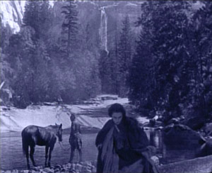
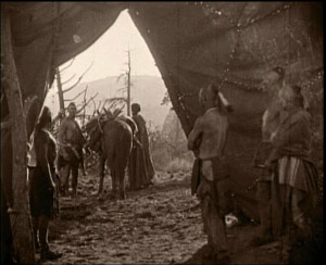
The great French emigré director Maurice Tourneur figured here last year for his 1919 film Victory. The Last of the Mohicans is just as good, if not better. I haven’t read the Cooper novel, set during the French and Indian War, but it’s obvious that Tourneur has pared down and changed the plot considerably. The sister, Alice, is made a less important character, with the plot focusing on two threads: the Indian attack on the British population as they leave their surrendered fort and on the virtually unspoken attraction between the heroine Cora and the Mohican Indian Uncas. The seemingly impassive gazes between these characters, forced to conceal their attraction, convey more passion than many more effusive performances of the silent period. The actress playing Cora also wore less makeup than was conventional, de-glamorizing her and making her a more convincing frontier heroine.
The film is remarkable for its gorgeous photography, with spectacular location landscapes, some apparently shot in Yosemite (below left). Tourneur’s signature compositional technique of shooting through a foreground doorway or cave opening or other aperture appears frequently (below right). (Brown’s account of the filming in Kevin Brownlow’s The Parade’s Gone By makes it sound as though he shot most of the picture, but in watching the film I find this hard to believe.)
Finally, the film stands out from most Hollywood films of its day for its uncompromising depiction of the ruthless violence of the conflict between the British and those Indians allied with the French. The scene in which the inhabitants of the fort leave under an assumed truce and are massacred can still create considerable suspense today, and the outcome puts paid to the notion that all Hollywood films end happily.
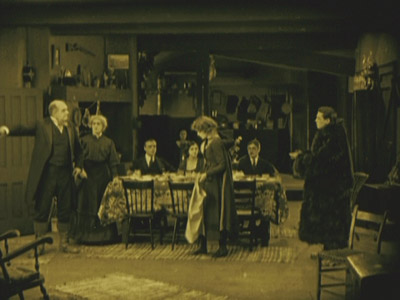
The word melodrama gets tossed around a lot, and many would think of much of D. W. Griffith’s output as consisting of little besides melodramas. But Way Down East is the quintessential film melodrama. An innocent young woman (Lillian Gish) is lured into a mock marriage and ends up deserted and with a baby. The baby dies and she finds a place as a servant to a large country family, where the son (Richard Barthelmess) falls in love with her. Her sinful status as an unwed mother leads the family patriarch to order her out, literally into the stormy night. She ends up on an ice flow, headed toward a waterfall. Along the way there’s comic relief from some country bumpkins and a naive professor who falls for the hero’s sister. It all works, partly because Griffith treats the main plot with dead seriousness and partly because Gish elicits considerable sympathy for her character.
Not only is it a great film, but it provides a window into the past, preserving a popular nineteenth-century play and giving insight into the drama of that era. It’s hard to think of another feature film that conveys such a genuine record of the Victorian theater, directed by a man who had made his start on the stage of the same period. (Unfortunately the film does not survive complete. The Kino version linked above is from the Museum of Modern Art’s restoration, which provides intertitles to explain what happens during missing scenes.)
Way Down East displayed a conservative attitude toward sex that was rapidly receding into the past–at least as far as the movies were concerned. The same year saw two films that set the tone for the Roaring ’20s in their more risqué depiction of romantic relationships: Cecil B. De Mille’s Why Change Your Wife? and Mauritz Stiller’s frankly titled Swedish comedy Erotikon.
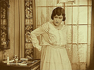
De Mille has featured on our previous lists, for Old Wives for New in 1918 and Male and Female in 1919. Why Change Your Wife? ramped up the sexual aspect of the plot, however, as a Photoplay reviewer made clear: “”Having achieved a reputation as the great modern concocter of the sex stew by adding a piquant dash here and there to Don’t Change Your Husband, and a little more to Male and Female, he spills the spice box into Why Change Your Wife?” The plot is not nearly as daring as this suggests. Gloria Swanson plays a wife who is straight-laced and intellectual, driving her husband to spend time with a stylish woman who tries to seduce him. Yet he flees after one kiss, and after his wife divorces him on the assumption that he has cheated on her, he marries the seductress. The heroine discovers the error of her ways and becomes sexy in her dress and behavior. As a result the husband regains his old love for her, and they remarry. No actual adultery occurs, and the first marriage is affirmed with a happy ending.
Why Change Your Wife? may have seemed more daring because De Mille here externalizes the shifting relationships through the costumes to the point where no viewer could miss the implications. Initially the wife’s demure dresses mark her as prudish, while the woman who lures her husband away is dressed like a vamp. Once the wife lets go, she dons similar revealing, expensive designer clothes. As a result, the male members of the audience might revel in a fantasy of their ideal wife, and the women would delight in displays of fashions most of them could never own in reality. It proved a successful combination. We tend to forget it now, but the 1920s was full of variants and imitations of Why Change Your Wife?, often featuring a fashion-show scene that was nothing but a parade of models in outlandish clothes. (Early Technicolor was sometimes shone off in such sequences.) Top designers like Erté were recruited to bring their talents to such films.
Fashion as a selling point in films remains with us. The glossy new version of The Hollywood Reporter, recently decried by David, now has a regular “Hollywood Style” section. The November 24 issue ran “Costumes of The King’s Speech,” and the December 1 issue describes “Fashions of The Tourist,” with photos of Angelina Jolie in her various costumes. In addition to shots of the stars, both articles feature enticing close-ups of lipstick, shoes, jewelry,and purses.
A double feature of Why Change Your Wife? and Erotikon would provide a vivid sense of the differing moral outlooks of mainstream America and Europe in the post-war years. In Erotikon, the situation is reversed. An absent-minded entomologist neglects 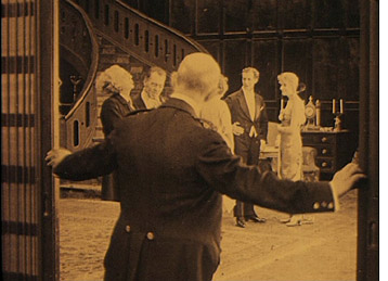 his sexy wife, who is having an affair with a nobleman. She is in love, however, with a sculptor, who is having an affair with his model. The sculptor returns her love, but eventually becomes jealous, not of her husband, who is his best friend, but of her lover. When the husband finds out that his wife has been unfaithful, he is mildly upset, but he settles down happily with his cheerful young niece, who pampers his taste for plain cooking and an undemanding home life. About the only thing these two films have in common is that they view divorce, which was still quite a controversial issue in the 1920s, as sometimes benefiting the people involved. Adultery actually occurs rather than being hinted at but avoided, though faithful monogamy is ultimately put forth as the ideal.
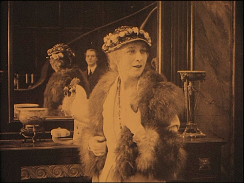
Erotikon reflects some of the influences from Hollywood that were seeping into European films after the war. Sets are larger, cuts more frequent (though not always respecting the axis of action), and three-point lighting crops up occasionally. Yet Stiller maintains the strengths of the Scandinavian cinema of the 1910s, with skillful depth staging (left) and a dramatic use of a mirror. In the opening of a crucial scene where the sculptor confronts the wife with her adultery, tension builds because she does not know he is watching her until she sees him in the mirror (see bottom). Still, apart from its European sophistication, Erotikon could pass for an American film of the same era. Stiller and lead actor Lars Hansen would both be working in Hollywood by the mid-1920s.
I can’t allow the nearly unknown director William C. de Mille to take up two slots this year, though it’s tempting. William’s career was shorter than that of his much better-known brother Cecil. It peaked in 1920 and 1921, though, and I still look back fondly on the films by him that were shown in “La Giornate del Cinema Muto” festival of 1991. That year saw a large retrospective of Cecil’s films, and the organizers wisely decided to include a 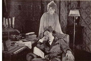 sampling of William’s surviving work.
The two men’s approaches were markedly different. Where Cecil by this point was setting his films among the rich and using visual means like costumes to make the action crystal-clear to the audience, William was more likely to favor middle-class settings with small dramas laced with humor and presented with restrained acting and small props. Despite William’s skill as a director and his ability to create sympathy for his characters, he never gained much prominence, especially compared to his brother. He retired from filmmaking in 1932, at the relatively young age of 54. Yet obviously he was attuned to his brother’s style, having written the script for Why Change Your Wife? It may be characteristic of the two that Cecil capitalized the De in De Mille, while William didn’t.
Relatively few of William’s films survive, but these include two excellent films from 1920, Jack Straw and Conrad in Quest of His Youth. I don’t remember Jack Straw well enough to describe it. It involved the hero’s falling in love with a woman when they both live in the same Harlem apartment building. When her family becomes rich, Straw disguises himself as the Archduke of Pomerania in order to woo her. Sort of a Ruritanian romance but played out in the U.S.
I remember Conrad in Quest of His Youth better. The hero returns from serving as a soldier in India. He feels old and decides to try and recover his youth. The first attempt comes when he and three cousins agree to return to their childhood home and indulge themselves in the simple pleasures of their youth. Eating porridge for breakfast is a treasured memory, but the group discovers that this and other delights are no longer enjoyable to them as adults. Conrad goes on to seek romance elsewhere and eventually finds a woman who makes him feel young again. The film’s poignant early section manages in a way that I’ve never see in any other film to convey both nostalgia for the joys of childhood and the sad impossibility of recapturing them.
Neither film is available on DVD. Indeed, I couldn’t find an image from either to use as an illustration. The only picture I located is a rather uninformative one from Conrad in Quest of His Youth, above right, which I scanned from William C.’s autobiography (Hollywood Saga, 1939). It’s no doubt an indicator of William’s modesty that the frontispiece of this book is a picture of his brother directing a film.
Maybe this entry will serve as a hint to one of the DVD companies specializing in silent movies that these two titles deserve to be made available. They’re high on my list of films I would love to see again.
Most people who study film history see Das Cabinet des Dr. Caligari very early on, though they probably push it to the backs of their minds later on. I have a special fondness for Caligari precisely because I did see it early on. I took my first film course, a survey history of cinema, during my junior year. Maybe I would have gotten hooked and gone on to graduate school in cinema studies anyway, but it was Caligari that initially fascinated me. It was simply so different from any other films I had seen in what I suddenly realized was my limited movie-going experience. It inspired me to go to the library to look up more about it, a tiny exercise in film research.
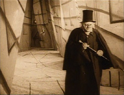
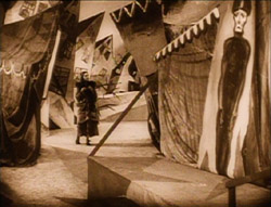
Some may condemn it as stage-bound or static. Despite its painted canvas sets and heavy makeup, however, it’s not really like a stage play. Many of the sets are conceived of as representing deep space, though often only with a false perspective achieved by those painted sets:
Still, in an era when experimental cinema was largely unknown, Caligari was a bold attempt to bring a modernist movement from the other arts, Expressionism, into the cinema. It succeeded, too, and inaugurated a stylistic movement that we still study today.
I haven’t watched Caligari in years (I think I know it by heart), but I’m still fond of it. The plot is clever grand guignol. It has three of the great actors of the Expressionist cinema, Werner Krauss, Conrad Veidt, and Lil Dagover, demonstrating just what this new performance style should look like. The frame story retains the ability to start arguments. The set designs area dramatically original, and muted versions of them have shown up in the occasional film ever since 1920. Even if you don’t like it, Caligari can lay claim to being the most stylistically innovative film of its year.
As I did for our 1918 ten-best, I’m cheating a bit by filling one slot of the ten with a pair of shorts by two of the great comics of the silent period. Both have matured considerably in the intervening two years. In 1918, Harold Lloyd was still working out his “glasses” character. By this point he is much closer to working with his more familiar persona. Similarly, in 1918, Buster Keaton was still playing a somewhat subordinate role in partnership with Fatty Arbuckle. In 1920, he made his first five solo shorts, co-directing them with Eddy Cline.
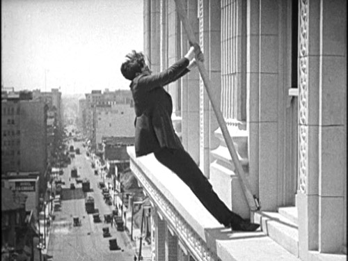
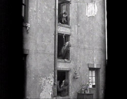
The Lloyd film I’ve chosen is High and Dizzy, the second short in which he went for “thrill comedy” by staging part of the action high up on the side of a building. (See the image at the top.) Four years later he would build a feature-length plot around a climb up such a building in Safety Last, one of his most popular films. In High and Dizzy, Harold is not quite the brash (or shy) young man he would soon settle on as the two variants his basic persona. The opening shows him as a young doctor in need of patients. He soon falls in love with the heroine, and through a drunken adventure, ends up in the same building where she lies asleep. She sleepwalks along a ledge outside her window, and when Harold goes out to rescue her, she returns to her bedroom and unwittingly locks him out on the ledge. The film is included in the essential “Harold Lloyd Comedy Collection” box-set, or on one of the two discs in Kino’s “The Harold Lloyd Collection,” Vol. 2.”
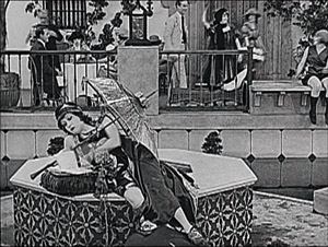
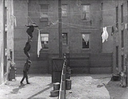
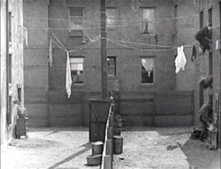
Neighbors was the fifth of the five Keaton/Cline shorts made in 1920. (It was actually released in early 1921, but I’ll cheat a little more here; there are other Keaton films to come in next year’s list.) It’s a Romeo and Juliet story of Keaton as a boy in one working-class apartment house who loves a girl in a mirror-image house opposite it. Two bare, flat yards with a board fence running exactly halfway between them separate the lovers. Naturally the two sets of parents are enemies.
Lots of good comedy goes on inside the apartment blocks, but the symmetrical backyards and the fence inspire Keaton. We soon realize that his instinctive ability to spread his action up the screen as well as across it was already at play. The action is often observed straight-on from a camera position directly above the fence, so that we–but usually not the characters–can see what’s happening on both sides. For one extended scene involving policemen, Keaton perches unseen high above them, hidden. Even though we can’t see him, the directors keep the framing far enough back that the place where we know he’s lurking is at the top of the frame as we watch the action unfold. The playful treatment of the yard culminates in an astonishingly acrobatic gag that brings in Keaton’s early music-hall talents.
The boy and girl have just tried to get married, but her irate father has dragged her home and imprisoned her in a third-floor room. She signals to Keaton, across from her in an identical third-floor window. A scene follows in which two men appear from first- and second-story windows below Keaton, and he climbs onto the shoulders of the two men below. This human tower crosses the yard several times, attempting to rescue the girl; each time they reach the other side, they hide by diving through their respective windows:
They perform similar acrobatics on the return trips to the left side, carrying the bride’s suitcase or fleeing after her father suddenly appears.
Neighbors is included as one of two shorts accompanying Seven Chances in the Kino series of Keaton DVDs, available as a group in a box-set.
Our final two films lie more in David’s areas of expertise than mine, so at this point I turn this entry over to him.
DB here:
With Barrabas Feuillade says farewell to the crime serial. Now the mysterious gang is more respectable, hiding its chicanery behind a commercial bank. Sounds familiar today. As Brecht asked: What is robbing a bank compared with founding a bank?
Over it all towers another mastermind, the purported banker Rudolph Strelitz. In his preparatory notes Feuillade called him “a sort of sadistic madman, a virtuoso of crime . . . a dilettante of evil.” Against Strelitz and his Barrabas network are aligned the lawyer Jacques Varèse, the journalist Raoul de Nérac (played by reliable Édouard Mathé), and the inevitable comic sidekick, once again Biscot (so perky in Tih Minh).
The film’s seven-plus hours (or more, depending on the projection rate) run through the usual abductions, murders, impersonations, coded messages, and chases. But there’s little sense of the adventurous larking one finds in Tih Minh (1919), in which the hapless villains keep losing to our heroes. The tone of Barrabas is set early on, when Strelitz forces an ex-convict into murder, using the letters of the man’s dead son as bait. The man is guillotined. The epilogue rounds things off with a series of happily-ever-afters in the manner of Tih Minh, but these don’t dispel, at least for me, the grim schemes that Strelitz looses on a society devastated by the war. Add a whiff of anti-Semitism (the Prologue is called “The Wandering Jew’s Mistress”), and the film can hardly seem vivacious.
According to Jacques Champreux, Barrabas was the first installment film for which Feuillade prepared something like a complete scenario, although it evidently seldom described shots in detail. The film has a quick editing pace (the Prologue averages about three seconds per shot), but that is largely due to the numerous dialogue titles that interrupt continuous takes. With nearly twenty characters playing significant roles and some flashbacks to provide backstory, there’s a lot of information to communicate.
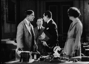
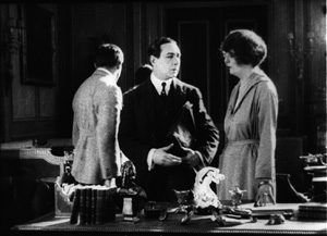
Of stylistic interest is Feuillade’s movement away from the commanding use of depth we find in Fantômas and other of his previous masterworks. Here the staging is mostly lateral, stretching actors across the frame. Very often characters are simply captured in two-shot and the titles do the work, as if Feuillade were making talking pictures without sound. Once in a while we do get concise shifting and rebalancing of figures, usually around doorways. Here Jacques vows to go to Cannes and tell the police of the kidnapping of his sister. As Raoul and Biscot start to leave, Jacques pivots and says goodbye to Noëlle, creating a simple but touching moment of stasis to cap the scene.
Full of incident but rather joyless, Barrabas will never achieve the popularity among cinephiles of the more delirious installment-films, but it remains a remarkable achievement. The ciné-romans that would follow until Feuillade’s death in 1925 would lack its whiff of brimstone. They would mostly be melodramatic Dickensian tales of lost children, secret parents, strayed messages, and faithful lovers. Barrabas is not available on DVD.
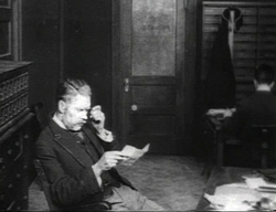
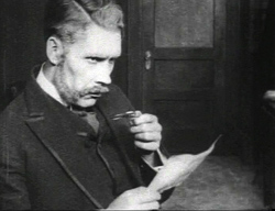
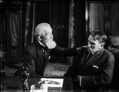
You might think that a movie that opens with a frowning old man studying a skeleton would also be somewhat unhappy fare. Such isn’t actually the case with Victor Sjöström’s generous-hearted Mästerman, a story of a village pawnbroker obliged to take a young woman as a housekeeper. With his stovepipe hat and air of sour disdain, Samuel Eneman, known to the village as Mästerman, is a ripe candidate for rehabilitation. Once Tora is installed and has put a birdcage (that silent-cinema icon of trapped womanhood) on the window sill, the scene is set for Mästerman’s return to fellow feeling. But she is there merely to cover the debts and crime of her sailor boyfriend, and eventually Eneman realizes he must make way for young love. The drama is played out in front of the townspeople, and as often happens in Nordic cinema (e.g., Day of Wrath, Breaking the Waves) the community plays a central role in judging, or misjudging, the vicissitudes of passion.
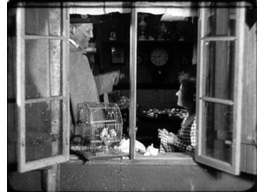 As a director Sjöström is a marvel. His finesse in handling the 1910s “tableau style” shines forth in Ingeborg Holm (1913), but unlike Feuillade and most of his contemporaries, he immediately grasped the emerging trend of analytical editing. His The Girl from the Marsh Croft (1917) and Sons of Ingmar (1918-1919) show a mastery of graded shot-scale, eyeline matching, and the timing of cuts. In Mästerman he continued to use brisk editing and close-ups to suggest the undercurrents of the drama. He moves people effortlessly through adjacent rooms, and his long-held passages of intercut glances recall von Stroheim. On all levels, Mästerman deserves to be more widely known–an ideal opportunity for an enterprising DVD company.
For a valuable source on Feuillade’s preparation for Barrabas and other of his works see Jacques Champreux, “Les Films à episodes de Louis Feuillade,” in 1895 (October 2000), special issue on Feuillade, pp. 160-165. I discuss Feuillade’s adoption of editing elsewhere on this site.
Tom Gunning provides an in-depth discussion of Sjöström’s style at this period in “‘A Dangerous Pledge’: Victor Sjöström’s Unknown Masterpiece, Mästerman,” in Nordic Explorations: Film Before 1930, ed. John Fullerton and Jan Olsson (Sydney: John Libbey, 1999), pp.204-231. For more on some of the directors discussed in this entry, check the category list on the right.
Erotikon.


