More work for the eyes
Sunday | February 27, 2011 open printable version
DB here:
While in NYC I’ve been catching up with old friends, eating too much, and seeing movies. In my next entry I hope to write about movies and some venues showing same.
In an earlier blog, I wrote about research into the ways our eyes scan pictures. In his blockbuster follow-up Tim Smith shared his current research into tracking viewers’ eye movements when they watch a movie scene. Today, I go back to still images, inspired by a couple of visits to the place where Kristin is finishing up her fellowship, the Metropolitan Museum of Art.
3D or 2D?
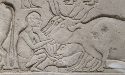
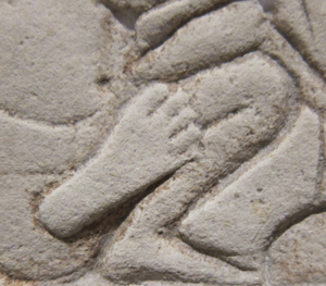
Sculpture, we say, is three-dimensional and painting is two-dimensional. That’s mostly true, but in the case of relief carving we have something in between. Consider the above nifty Egyptian shallow relief from the mid-fourteenth century BCE, the Amarna period, discovered in Memphis. A servant is force-feeding some cattle. As an effect of the lighting and the carving, his foot protrudes a bit from the overlapping surfaces behind him.
On a lesser scale, the same thing can happen with paintings. We commonly say that paintings are flat, relying on pictorial cues to suggest depth. But paint applied to a surface has its own thickness, a quality that is largely lost in reproductions. One of the virtues of seeing a painting in the flesh is that you can study (at least as closely as the guard ropes allow) the subtle ways in which even a little dab of paint can give the painting a tangible depth, sort of 2D plus.
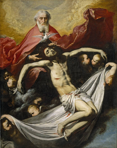
I first noticed this, I think, when I saw José de Ribera’s Holy Trinity (1636) in the Prado many years ago.
The painting wasn’t under glass, so I could see that Ribera had made Christ’s wound horrifying by laying a scab of paint on the picture surface. It was as if the canvas itself were bleeding. (More generally, that trip to the Prado convinced me that Dali’s work, and the Andalusian Dog film, made a lot more sense after you saw Spanish baroque art.)
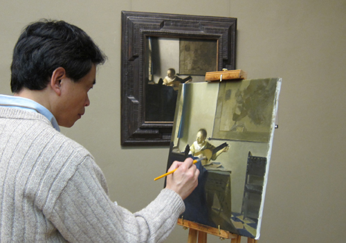
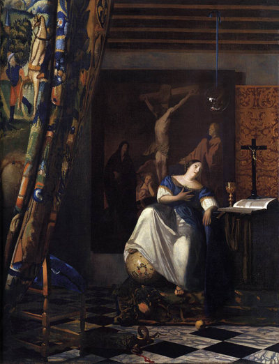
So at the Met last week I was inclined to keep my eye out for bits of paint that seem to lie on top of other patches. I was rewarded initially when I visited Vermeer’s great Allegory of the Faith (1670-1672). This has provoked many questions as to whether Vermeer used a camera obscura in planning, drawing, or even painting his images. Some claim to find the camera booth reflected in the crystal ball hanging over the lady’s head.
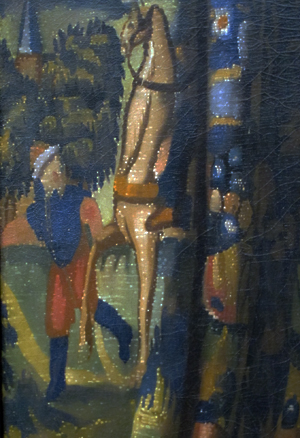
Peering at the tapestry curtain on the far left edge, I was gratified to find white speckles dappling it.
Some scholars propose that these stipples are the specular reflections that an optical instrument like the camera obscura create. Robert Huerta proposes, though, that these signature devices are used in a variety of ways in Vermeer’s paintings, often suggesting surface texture. Here, they are present only on the fabric, not in other areas of the painting; they stop at the curtain’s edge. Are they then Vermeer’s effort to represent needlework, slight bumps on the surface of the curtain? I have to leave it to experts.
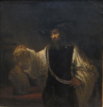
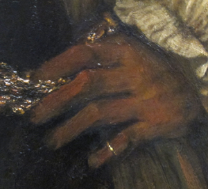
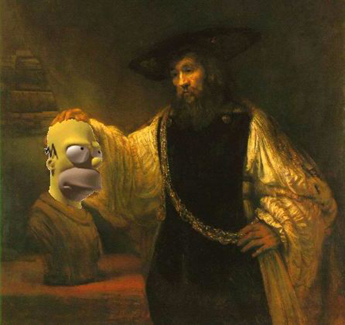
I’m more confident about what I saw in looking at Rembrandt’s Aristotle with a Bust of Homer (1653).
It’s a very big picture, nearly six feet high, but again my eye was caught by a detail. While Aristotle’s left hand rests against his elaborate belt, his pinky ring, a sharp, highlighted strip of paint, seems to protrude from the canvas.
The slight pop-out effect probably comes partly from the hard-edged ring set against the sketchy hand. Still, as far as I could tell, the dabs of paint sit on top, a thin layer of golden light. The ring’s gleam lights up the bottom corner of the picture. It works better than many 3D movie effects I’ve seen.
Misdirection
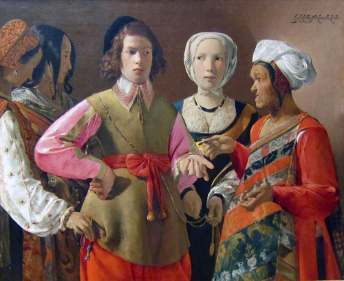
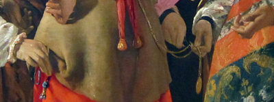
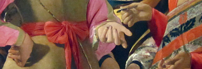
More amateur art appreciation, this time tied to our earlier theme of where you look in an image. There’s plenty of detail to study in Georges de La Tour’s The Fortune Teller (probably 1630s). 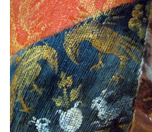 For one thing, we get a powerfully illusionistic representation of brocade in the sash of the wizened fortune-teller (right). However, what grabbed me was the composition of the drama. A somewhat condescending young man is paying the old woman, stereotyped as a gypsy, to have his fortune told. But the women surrounding him are her confederates. One woman is stealing his purse, the other is snipping off a medallion. The theft might be more evident to you looking at this tiny image, but the picture is so large (about 40 inches by 48 inches) that a gallery visitor must scan it in great saccadic sweeps. So I’d hypothesize that in front of the picture you don’t spot the grift right away.
I think that the painter has engineered a pretty game of misdirection. He has used cues that draw our eyes to one area of the frame and so one aspect of the drama, the exchange of glances, before letting us explore the frame to detect the pocket-picking. Several bottom-up, stimulus-driven cues work together to draw us toward the top half of the picture.
Framing is a major cue. When a picture cuts off the human body at the thigh or crotch we’re steered to the upper area of the frame. That’s where the action is likely to be; knees aren’t usually as expressive as heads.
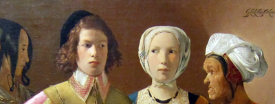
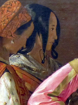
Faces, as Tim’s analysis shows, are magnets for our attention, and the painter exploits this. The two women’s heads on the far left are played down: one is turned away, the other, with a neutral expression, is in profile and semidarkness. Her glance directs us to study the slightly suspicious expression of the youth and the edgy gaze of the central woman, and then imagine a drama played out. The head positions of the two central figures represent a compromise between readability (frontality is a strong attention-getter) and realism (people do share gazes). But the painter profits from the compromise by letting man and woman, facing front, move their eyes shiftily, raising the atmosphere of suspicion. The almost grotesque face of the fortune teller, a richer brown than those near her, also attracts our notice.
Another powerful cue is horizon-line isocephaly. The term is a mouthful, but the idea is worth knowing about. This common Renaissance technique places several heads, regardless of their distance from us or one another, along the same plane. It’s especially marked here because even the eyes of three figures fall almost exactly on the same line.
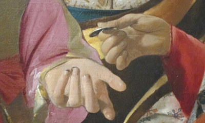
Centering in the picture format works to make the gesture of exchanging money very important. With the expressive hand gestures, we seem to have a complete story: The skeptical youth, dirt under his fingernails, has just paid the fortune-teller, who may be crossing his palm with silver in the course of her predictions.
There are other cues that keep our eyes exploring the upper half of the frame, such as the streak highlighting the hot-pink blouse. But all are merely decoys delaying our noticing the covert action in the bottom half of the image, the activity carried out entirely by hands.
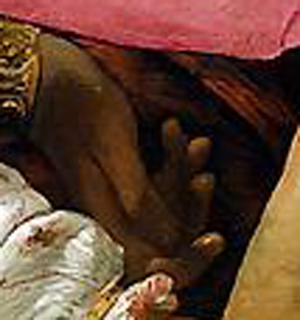
Hands are normally areas of high information content, second only to faces, I suppose. But the michievous hands of the pickpockets are low in the frame, one is in shadow, and both are subordinated not only to the faces but also to the more expressive hands just above: one on a hip, two gesturing around the coin.
It’s as if there are three layers: the heads, the hands executing the business transaction, and the hands underneath doing the real business. The third level harbors something still more covert. Only on several passes did I notice that the second, profiled woman on the left has her hand ready to receive the purse from the woman lifting it.
There’s a lot else to admire here, not least the way that the two women on the left seem to merge into one two-headed pickpocket, thanks to the shared contours, their orange vests, and the angle of the first woman’s arm.
I wish Tim or someone would try eye-scanning on this picture. In what order do viewers sample the layout? Do some viewers never look below and realize what’s going on?
In any case, my example shows the importance of top-down thinking. Recently preoccupied with eyes (in The Social Network) and visual scanning, I’d naturally be drawn to this image. I wouldn’t even care if it was the fake it’s sometimes claimed to be. But even that speculation involves top-down conceptual testing! If we entertain the prospect that The Fortune Teller was painted in the 1920s, then we might be inclined to see its cunning misdirection, and perhaps even the “cubistic” merger of the two women on the left, as influenced by modern art’s spatial ambiguities.
Bottom-up and top-down perception work smoothly together. The eye is sensitive to both stimuli and stored concepts; it’s driven by the environment and by the brain. The interplay of the two should fascinate anyone interested in cinema, which is at least partly a visual art.
PS 1 March: Tim Smith, our guest blogger last month, writes to remind me that the book I discussed in an earlier post, Land and Tatler’s Looking and Acting, makes reference to another famous de La Tour painting, The Cheat, and an eyescan study of it by Iain Gilchrist. The zigzag pattern of fixations suggests that people did indeed start with the faces of the players before discovering the cheating that’s going on. Eyescans of the painting are analyzed in John M. Findlay and Iain Gilchrist’s Active Vision: The Psychology of Looking and Seeing. Gilchrist discusses the painting in a fascinating illustrated lecture.
Some readers of my entry above have wondered if eyescan experiments could study how magicians misdirect us. Tim recommends Gustav Kuhn’s work on this problem, to which I can add this article: Peter Lamont, John M. Henderson, and Tim J. Smith, “Where Science and Magic Meet: The Illusion of a ‘Science of Magic,'” Review of General Psychology 14, 10 (2010), 16-21.


