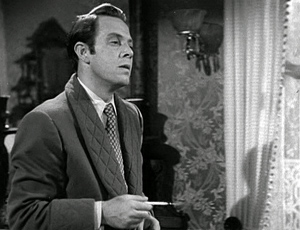
Archive for May 2011
Madison calling Budapest: Can you read me?
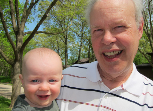
Can you look at this picture without smiling? I think it’s hard, for reasons that relate to one thread of the essay here. Thanks to Levi Buchhuber, age eight months, and Jim Cortada, grandpa.
DB here:
Next week several dozen bright, energetic researchers will be crowding into conference rooms at Elte University in Budapest for the annual meeting of the Society for Cognitive Studies of the Moving Image. Full details on the event are here. As usual, I expect that a hell of a time will be had by all.
I’ve discussed the purposes and projects of the members of this dynamic bunch on earlier occasions. If you want a rundown, I’d suggest reading the items in chronological order:
*I sketch out the SCSMI project in this entry. There are more ruminations in two run-ups to the 2008 Madison SCSMI get-together (here and here), and one a year later summing up that event.
*For a report on the wonderful 2009 Copenhagen convention, go here.
*I try to sum up the wide-ranging 2010 Roanoke powwow here, while a recent blog, “Molly Wanted More,” can be considered an echo of that event.
*For an utterly fun introduction to some of the research on display at SCSMI, head to one of our most popular entries, the guest blog by Tim Smith called “Watching you watch THERE WILL BE BLOOD.”
This year’s paper line-up is especially enticing, and the prospect of seeing so many old friends is even more thrilling. Alas, for reasons beyond our control, Kristin and I aren’t able to attend. As the date draws near, my need to stay home saddens me more than I had expected it would. I must content myself with directing you, with all the fervor I can muster, to the event. Many of our members have told me that their first visit was life-changing, providing them a whole new social network that would encourage their research. Moreover, I notice that every year several participants tell me that they think this one was the best session yet. We’re just getting better, and we’re not going away! I should also alert you to the likelihood that many of the papers will be published in the SCSMI-affiliated journal Projections.
I thought, though, that I might participate a little at long range. So I’ve posted a web essay that sets out, in less technical terms, what my proposed paper for the convention would have tried to say. The essay, “Common Sense + Film Theory = Common-Sense Film Theory?,” reflects an effort to rethink ideas about filmic comprehension that I set out in Narration in the Fiction Film in 1985. This book was one of the first efforts to explore how findings in cognitive science might help us make progress in understanding cinematic storytelling.
I’d stand by much of what I argued there, but in the light of further thinking and later research (much of it conducted by SCSMI members), I wanted to float some ideas that recast and correct my arguments in the book. (Yes, I hope I’ve learned something in twenty-five years.) Some of my more recent notions are available in Poetics of Cinema and under the Film theory: Cognitivism category on this blogsite, but the conference provided a good occasion to submit to the sort of friendly but pointed critique at which my SCSMI colleagues excel.
Of course, give me another twenty-five years and I’ll probably find fault with what I say now. Others won’t need so much time.
Start with this question, which I think is one of the most fascinating we can ask:
What enables us to understand films?
Continue reading here.
To my SCSMI cohort: I wish you a superb gathering. See you next year, at Sarah Lawrence!
Joe Anderson, co-founder of the Society for Cognitive Studies of the Moving Image, opens the 2010 session at Roanoke.
Graphic content ahead
Kristin here:
Recently I received the June issue of Empire magazine. After the shock of realizing that, Ack! It really is almost June, I turned to the letters to the editor. I received an even worse shock when I read this one:
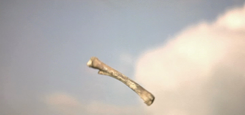
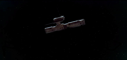
I recently discussed 2001: A Space Odyssey with my Film Studies teacher (I’m an A-level student), and mentioned (what the back of the DVD case says): “One of the most mind-blowing jump cuts ever conceived.” He told me the bone to satellite scene is actually a match cut. I then read issue 262 of Empire, and was very happy to see a Stanley Kubrick special. I noticed you also called it a “stunning jump cut”. After being told what a jump cut and what a match cut is and seeing a few examples (the jump cut at the start of Don’t Look Now, and then the match cut in 2001: A Space Odyssey), I am now confused as to why the DVD and Empire would call it a jump cut when it is a match cut.
Robby Burke, via email
It is a match cut. The offending writer has been put into a small room with only Eisenstein films for company. The moral of this story is always listen to your teachers, kids. And good luck to Owen Robinson on your Kubrick Film Studies unit. This is turning into hospital radio.
No wonder Mr. Burke is confused. His teacher and Empire both gave him answers that I would consider wrong, or at best imprecise to the point of vagueness. This rather surprised me. I enjoy reading Empire, which has somehow managed to keep itself fat and glossy when magazines like Entertainment Weekly have shrunk to the size of brochures. It even has occasional useful articles, like its retrospective section on Back to the Future in the April, 2010 issue. (As far as I can tell, this section has never made its way to the Empire website.)
The term “match cut” is, out of context, virtually meaningless. There are different kinds of match cuts, and not specifying which type one is referring to will leave Mr. Burke and the rest of us clueless as to what the teacher and the unnamed staff member for Empire mean.
Thinking I was missing something about the term “match cut,” I looked it up on Wikipedia and discovered that the teacher and the Empire staff member might have gotten their misinformation from the entry on that phrase. Its definition of a “match cut” is:
A match cut, also called a graphic match, is a cut in film editing between either two different objects, two different spaces, or two different compositions in which an object in the two shots graphically match, often helping to establish a strong continuity of action and linking the two shots metaphorically.
While the Empire use of “match cut” was only vague, this definition is simply inaccurate. The author goes on to say:
Match cuts form the basis for continuity editing, such as the ubiquitous use of match on action. Continuity editing smoothes over the inherent discontinuity of shot changes to establish a logical coherence between shots. Even within continuity editing, though, the match cut is a contrast both with cross-cutting between actions in two different locations that are occurring simultaneously, and with parallel editing, which draws parallels or contrasts between two different time-space locations.
I’ll agree that continuity editing is designed to smooth over the potentially disruptive quality of cuts. Matching anything within a scene is definitely different from cutting from an action in one place to a different action in a different place. But graphic matches are neither synonymous with “match cuts” nor the basis for continuity editing.
I also discovered that the “Further Reading” list at the bottom included two items, one of which was Film Art: An Introduction. One of those good news/bad news situations. The good news is, if you read the book, you will find out what graphic matches, and matches in general, really are. The bad news is, if you don’t, you might blame us for the contents of the Wikipedia entry.
A little detour into history
Most people don’t realize this, but David and I invented the term “graphic match.” As we recall, this happened in 1975. David was teaching a course that involved screening Yasujiro Ozu’s second color film, Ohayu (1959), a wonderful comedy about television, farting, and small talk. We had never seen the film before and were watching a 16mm print of it.
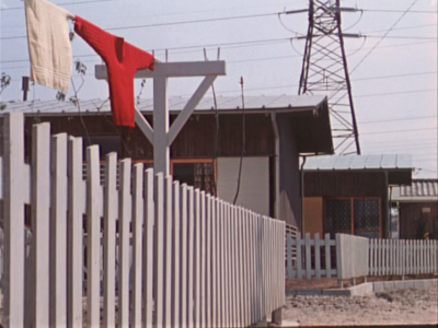
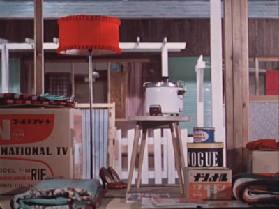
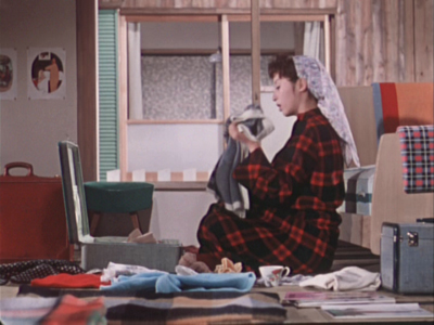
When the two shots below passed before our eyes, we both gasped and lunged for the projector. We ran the film back and watched the cut again. There was no doubt that Ozu had deliberately placed a bright red sweater in the upper left quadrant of the frame in one shot and a bright red lamp in the same basic position in the next shot. We didn’t know what to call this technique, so we dubbed it a “graphic match.” Two years later, when we started writing Film Art: An Introduction, we included the term as one technique of film editing and used Ozu’s match on red as one example. By now “graphic match” has been picked up to the point where we occasionally see it used in print.
If people, however, are tossing that term and “match cut” around so inaccurately–and even equating the two–then some definitions and examples seem in order.
Matcharama
“Match” as applied to editing simply means that some element is carried over from one shot to the next. That doesn’t necessarily mean that this element creates a sense of continuity.
In general, “continuity” means that a coherent space and time are continuing over the cut, so that the spectator’s understanding of a story isn’t disturbed by a sense that bits of time have been left out or that characters have changed positions at the cut. Most people watching a mainstream narrative film probably aren’t even aware of the editing, especially in conventional conversation scenes.
More specifically, “continuity” means a set of guidelines or loose “rules” that American filmmakers devised, mostly during the 1910s, to allow them to help create that clarity of narrative action in time and space. Within a scene, the most basic of these is the 180-degree rule or “axis of action,” the invisible line that runs through the scene perpendicular to the camera. If the camera stays on one side of that line, characters will stay in a consistent spatial relation to each other. Character A will be on the left in every shot, Character B on the right—unless one of them walks to a different part of the setting. In other words, the axis creates consistent screen direction.
The most basic kinds of matches are on appearance, position, action, and eyelines. Everyone knows that if a character is wearing a blue hat, showing her wearing a red one after the cut is a continuity error. Her appearance has not been matched. The same is true if she is resting her cheek on her hand in one shot, but has both hands flat on the table after the cut. If she is walking in one shot, she should not be running or standing still in the next. Even if the shots are made with a single camera and the actress repeats her actions, her position and movement should ideally be repeated so precisely that her action appears continuous. That’s a match on action, one of the most common continuity devices.
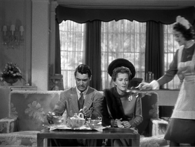
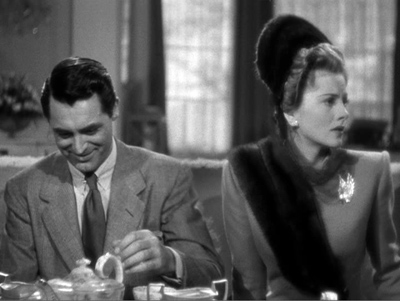
Smooth matches on action are difficult, especially if, as often happened in classic studio filmmaking, the two shots are made hours or even days apart. Even a supreme technician like Hitchcock can err. Here is a flagrantly mismatched passage from Suspicion. In the long shot, Johnnie (Cary Grant) reaches for the teapot with his left hand and starts to pour.
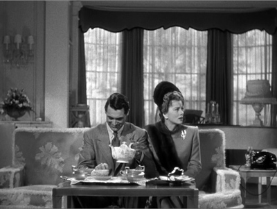
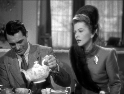
But then Hitchcock cuts in axially, the teapot is back where it was, and Johnnie once more reaches for it. By the time he’s pouring now, Lina has turned to watch him.
Editors traditionally like an overlap of 2-4 frames when they’re matching action on cuts, but this is a much longer overlap, something on the order of four seconds. Why we don’t usually notice such things is a source of considerable discussion in film circles.
The eyeline match is also very common. If a character looks at something offscreen, a cut shows us something in a different space, and we tend to assume that the character is looking at what we now see. Screen direction is important here, since if the character looks off right, when the next shot appears, we assume he is now offscreen left.
Not all continuity devices involve matches of these kinds. Crosscutting and flashbacks may move the action away from the space and even the time of a scene, but there are other cues that help us keep track of the ways in which these new spaces relate to the storyline.
None of this requires what we would consider a graphic match. Of course, if we see the same characters in the same setting from shot to shot, there will be an overall graphic consistency. They’re wearing the same costumes, and the background colors probably won’t shift greatly. But precisely because of that general consistency, we probably won’t notice the graphic qualities of the scene as being that important as elements of the editing. We’re busy following the story.
Graphic matches precise enough to be noticed as such tend to jolt us a little out of our smooth concentration on the story action. They are not the basic of continuity, as the Wikipedia definition claims. On the contrary, they often appear in films outside the continuity tradition. Abstract films often play on the graphic similarities (matches) or contrasts (mismatches) among shapes from shot to shot. Such abstract play is, in effect, their subject, and we pay attention to the pictorial flow as we would pay attention to story in a conventional narrative film.
When close graphic matches or jolting graphic contrasts appear in narrative films, they may or may not play a narrative role. The famous bone/spaceship cut in 2001 is a graphic match. It’s not a match on action, since two different objects in completely different times and places are shown. It’s not a jump cut for the same reasons.
Here the graphic match is not really very close. The sky is bright and blue behind the bone, while it is dark behind the spaceship. Similarly, the bone is light in color, while the spaceship is initially dark, though it does brighten slightly as it moves. The only graphic element matched is the general shape and motion of the two objects.
The function, I assume, is to jolt the audience with the dramatic transition across millions of years and from earth into space. Thus here the graphic match has a narrative function, though it does not create the smooth movement from one scene to another that classical films tend to have. It’s more like what is sometimes called a “shock cut,” one which startles the viewer. The cut to the screeching cockatoo in Citizen Kane is one of the most famous examples, though it primarily involves sound and a strong graphic contrast.
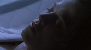
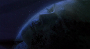
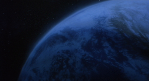
A transition somewhat similar to the one in 2001 occurs early in Aliens, an example which we use in recent editions of Film Art. A dissolve moves from a close-up of Ripley’s sleeping face to a view of part of the earth seen from space. Again there is a passage through time and space, though the interval is presumably only a few months. Here the graphic match is much closer than in the 2001 transition, with the colors as well as the shapes being kept fairly consistent. This graphic similarity and the dissolve that emphasizes it ease us from one scene to another rather than jolting and surprising us.
In the hands of an experimental filmmaker or of an unconventional director like Ozu, who avoids obeying Hollywood’s continuity guidelines, graphic matches don’t necessarily play a narrative role. They are included as an extra layer of engagement for the viewer. We don’t, or at least shouldn’t, expect to be able to interpret them. I would contend that the link between the red sweater and the red lampshade is there for pure pleasure. You can come up with an interpretation of the graphic match if you try hard enough—but if you do, please don’t tell me about it. I suspect it would interfere with my enjoyment of that scene when I next watch Ohayu.
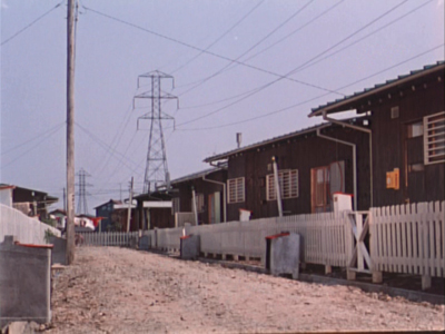
I don’t think the cut serves even so modest a function as establishing space at the beginning of a scene. Here’s the shot that actually begins the scene and leads to the sweater and lampshade shots:
And here’s the one that follows the lampshade shot:
The woman is a minor character. She and her husband live in the suburban housing complex where the much of the action is set. They are more modern in their habits than their neighbors, wearing western clothes rather than kimonos and owning the only TV in the complex. They function primarily to introduce the two young boys in the central family of the story to TV, since they hospitably let the local kids visit them to watch it. The scene following the graphic match shows the wife packing to move. Their absence will precipitate a crisis when the boys demand that their parents buy them a television. The strife among the family members forms the basis for much of the rest of the action.
So the packing scene is important. Yet Ozu uses two shots that he wouldn’t need, thus delaying the scene’s beginning. The extreme long shot of the housing complex doesn’t tell us which house will form the setting for the upcoming scene. The red sweater is in the distance, but barely visible. We certainly wouldn’t notice it or get any clues about the narrative from it. Yet Ozu cuts to a closer view of the sweater and a towel. The houses in the background are all identical, and we don’t know which one belongs to which characters or which we will enter in the next shot.
The first interior view would be a logical establishing shot for the scene. The modern furnishings and especially the television box let us know where we are, and the boxes might hint that the inhabitants are packing to leave. So we are not surprised when we see the modern wife in the subsequent shot. But Ozu puts in the other two as part of his typical series of transitional shots that show the spaces between locales where action occurs.
The graphic match, I would suggest, is simply part of Ozu’s distinctive style. It’s playful and fits in with the general graphic beauty of his films, which includes bright splashes of color, careful compositions using the lines of the sets, and precise placements of props.
Returning to the Wikipedia entry for “match cut,” there is a section that mentions several examples, including the one that inspired Mr. Burke’s letter:
Stanley Kubrick’s 2001: A Space Odyssey contains a famous example of a match cut. After an ape discovers the use of bones as a tool and a weapon, there is a match cut to a spacecraft or satellite in orbit. The match cut helps draw a connection between the two objects as exemplars of primitive and advanced tools respectively.
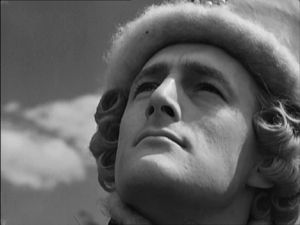
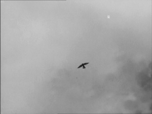
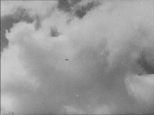
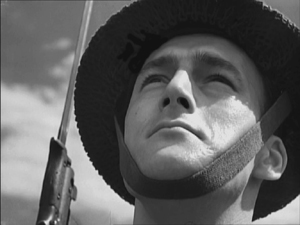
Michael Powell and Emeric Pressburger’s A Canterbury Tale contains the influence for the 2001: A Space Odyssey match cut in which a fourteenth century falcon cuts to a World War II aeroplane. The sense of time passing but nothing changing is emphasised by having the same actor, in different costumes, looking at both the falcon and the aeroplane.
An early example comes from Orson Welles’s Citizen Kane which opens with a series of match dissolves that keeps the lit window of C.F. Kane’s in the same part of the frame while the cuts take us around his dilapidated Xanadu estate, before a final match dissolve takes us from the outside to the inside where Kane is about to die.
Another match cut comes from Lawrence of Arabia (David Lean, 1962) where an edit cuts together Lawrence blowing out a lit match with the desert sun rising from the horizon. Director David Lean credits inspiration for the edit to the experimental French New Wave. The edit was later praised by Steven Spielberg as inspiration for his own work.
How the author knows that A Canterbury Tale (see below) influenced 2001 is not clear. The site footnoted (here) simply says that the cut (below) “anticipated” Kubrick’s scene in 2001. The film was released in the U.S. in early 1949, so possibly Kubrick saw it and remembered the scene nearly twenty years later. By the way, Powell and Pressburger create a double graphic echo, roughly matching the two similar dark objects against a light sky and making the two shots of the men looking upward strongly resemble each other as well.
The Citizen Kane opening, with its precise placements of the one lit window from shot to shot, is a good example of graphic matches. I am not going to touch the question of what a “match dissolve” is.
The cut from the match to the Jordanian desert horizon in Lawrence of Arabia is a trickier case. The match is placed in the left half of the anamorphic widescreen frame, while the sun rises in the right half. Moreover, the match shot is very bright, while the desert scene is fairly dark, with the sun only beginning to glow above the horizon a short way into the shot. Graphically there is not much to link them, though I think the spectator does get a strong sense of a connection between the match and sun. I’d say it’s a conceptual link, not a graphic one. It’s a link that we make on the basis of two bright objects that are not compositionally or spatially matched but simply juxtaposed.
Mr. Burke, your inquiry was perfectly reasonable, and I hope I have helped clear up your confusion.
We supply two flagrant examples of mismatched action, figure placement, and setting in Bringing Up Baby in this blog entry. Interestingly, probably no one but a professional notices them, because the relative positions of the major figures are consistent, as are the overall compositions of the shots. But then, as Dan Levin points out, we are not that sensitive to continuity disruptions in the real world either!
A Canterbury Tale.
Alignment, allegiance, and murder
House by the River (1950).
DB here:
“Point of view” is one of those terms that we can’t seem to do without, but it’s rather vague. The clearest application of the term would be to shots that conform more or less to what a character sees, presenting what we might call optical point of view.
But sometimes we’re given access to what a character sees, hears, and knows less narrowly. Without any optical pov shots, we might still be restricted to a character’s range of knowledge. This happens in detective films like The Big Sleep, which confines us almost completely to what Philip Marlowe knows. We follow him into scenes, stay with him as the action plays out, and then leave the scene when he does. We’re “with” him, but not via optical point of view.
In his book Engaging Characters, Murray Smith calls this sort of restriction to character knowledge alignment. He points out that it has both objective and subjective sides. Objectively, we’re spatially attached to a character in the course of a scene or several scenes. Subjectively, we may get access to the character’s thoughts, memories, dreams, or immediate perceptions (as with a POV shot). Spatial attachment refers to the limited range of our knowledge; subjective access refers to the depth of knowledge about the character’s inner experience.
But what about our emotional engagement with the characters? We usually call this “identification,” but Smith shows that this is a misleading way to think about what happens. Identification seems to imply taking on another’s state of being, but we don’t necessarily mimic a character’s emotions. We might pity a grieving widow, but she isn’t feeling pity, she’s feeling grief. Smith talks instead of allegiance, the extending of our sympathy and other emotions to characters on the basis of their emotional states. Allegiance, Smith maintains, depends partly on the moral evaluations we make about the character’s actions and personality.
Alignment and allegiance don’t necessarily involve us with only one character in the course of a film. Cases like The Big Sleep, which put us “with” Marlowe all the way through, are rare. Often a filmmaker shifts our alignment and allegiance away from one character to another, perhaps in the course of a single scene. That may involve some careful choices about staging, framing, sound, and cutting.
I offer you an example from Fritz Lang’s marvelously perverse House by the River. I’m afraid I can’t avoid spoilers, but at least I don’t give away the ending.
At the point of a nail file
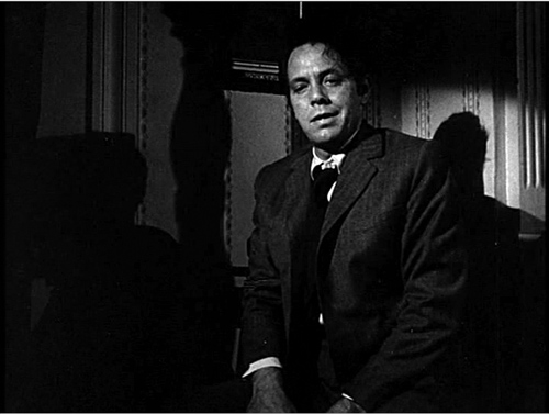
Stephen Byrne, a struggling but well-to-do writer is married to the lovely Marjorie. But this doesn’t stop him from trying to seduce their maid Emily. While struggling with Emily, Stephen strangles her. With the help of his brother John, he stuffs Emily’s body into a large sack and deposits it in the river. Stephen’s crime has stirred something in him, and he begins writing a new book, Death on the River, with its plot based on what he has done. Meanwhile, an inquest into Emily’s disappearance casts suspicion on John as her killer.
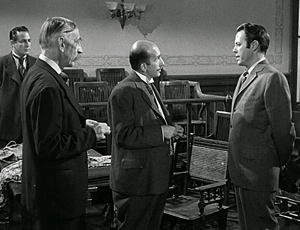
The very end of the inquest scene has shown the prosecutor and chief inspector confronting Stephen, who says he won’t do anything to incriminate his brother. Since neither John nor Marjorie knows of this conversation, we’re aligned with Stephen. He now has precious information: the police are likely to be watching his brother, not him.
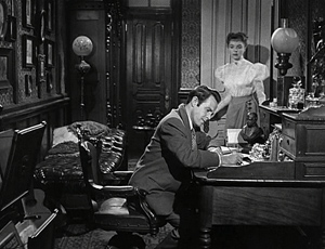
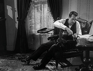
Our alignment with Stephen continues at the start of the next scene, which shows him at work on his manuscript. Marjorie comes in and asks to talk with him about Inspector Sarten.
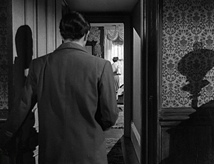
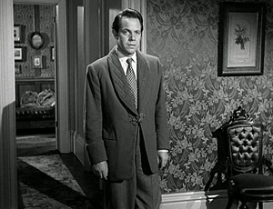
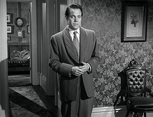
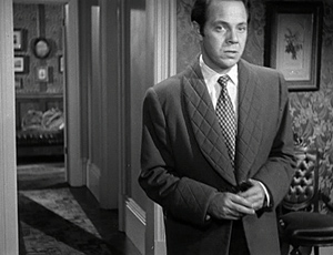
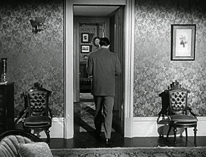
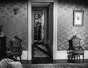
After a pause to consider, Stephen reluctantly follows her into her bedroom. Lang’s camera, angled along the corridor, puts us strongly with him.
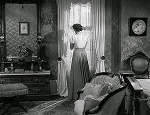
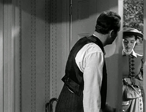
As Stephen enters the bedroom, Lang continues to favor him. Stephen comes into a knees-up shot facing front, but the answering shot of Marjorie weeping at the window is more distant, approximating his optical point of view.
Often filmmakers give us slightly stronger alignment with one character than another by framing one more closely than another. That happens here, I think, for Lang repeats these camera setups several times as Stephen apologies for being snappish and asks Marjorie what she wants to tell him. We know he’s being pleasant only because he wants information.
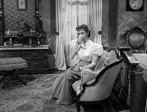
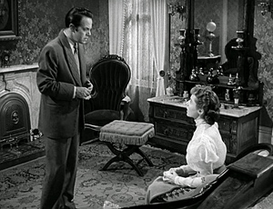
She comes forward and sits, reporting that she has seen the detective following her. Now we can see her expression more clearly and she is less remote from our concerns.
Again the setups repeat for a bit, with the framings still making Stephen more salient. Aligned with him, and to some extent allied as well, we are able to share his sense that danger is approaching. Stephen comes forward and steps into a more neutral and balanced framing. I’d argue that our sense of being “with” him now begins to taper off.
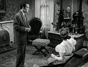
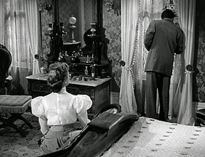
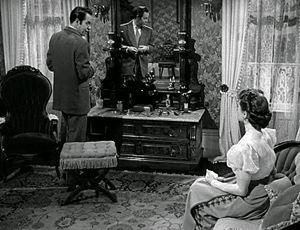
Marjorie points to the window (in one of Lang’s compositionally accented gestures) and suggests that an officer may be watching the house. Stephen goes to look out.
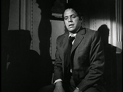
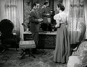
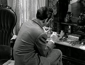
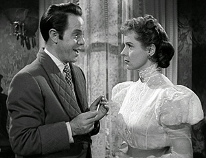
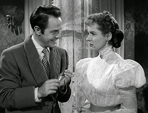
Stephen suggests that the police should be targeting John, since he’s acted suspiciously after the inquest. As Stepehn talks, he saunters to the dressing table and uses the file there to smooth his nails. He suggests that John may very well have had an affair with Emily. Although the framing is in long shot, we can see Stephen’s expression clearly, and it’s duplicated in the mirror. By contrast, when Marjorie rises indignantly and upbraids him, her back is mostly to us.
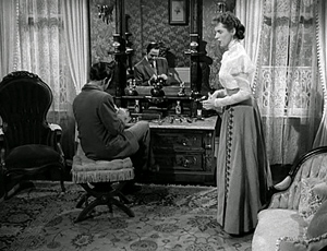
Stephen sits, remarking, “There’s a limit to this business of being brothers, Marjorie.” She turns slightly, saying, “Stephen, you’re insane.” This line prompts a cut to Stephen, still smoothing his nails but turned from us.
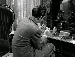
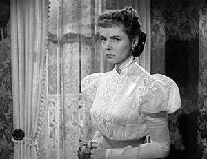
His face turned away and no longer visible in the mirror, Stephen says casually, “You’re very fond of him, aren’t you?” Now we’re more aligned with Marjorie, seeing more or less what she could see. Lang could have staged this phase of the scene to give us more information about Stephen’s expression (say a low-angle depth shot with his face in the foreground), but the opaque shot we get is balanced by a close, clear view of Marjorie for the first time in the scene–another step toward alignment and allegiance with her. The turned-away shot of Stephen also highlights his gesture of filing his nails, important in what will come next.
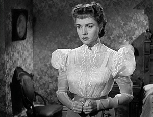
Cut to a medium shot of Marjorie’s reaction. “You know that.” Back to Stephen: “Are you in love with him?”
Stephen doesn’t see her reaction, which confirms his guess about her feelings for John, but we do. More important, our allegiance shifts toward her too. We know that Stephen is lustful (he’s seeing women in town every night), but Marjorie is suppressing her fondness for John for the sake of her marriage vows. She has the moral edge.
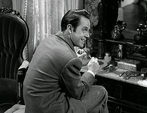
He questions her further, finally turning to her and grinning: “Don’t think I haven’t been aware of it.” Cut back to her: “You have a filthy mind”—something we know to be true. Her moral scheme fits ours, and sympathy for her builds.
This riposte wipes the smile from his face and he walks slowly toward her, the nail file extended like a knife, but also waggling jauntily in his hand. He recovers his flippancy and assures her he doesn’t feel any jealousy toward John because he no longer finds Marjorie attractive.
After he says he finds cheap perfume exciting, she calls him a swine. He resumes filing his nails. Stephen leaves the shot but, crucially, Lang’s camera dwells on Marjorie, glaring after him.
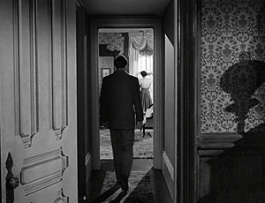
The scene’s final shot shows Stephen strolling down the corridor, and it ends with him smiling and slamming his door. It is a kind of symmetrical reply to the early shot of him going to her room.
This point-of-view shot anchors us with Marjorie, both perceptually and morally. She now realizes that she is the only ally John has.
Marjorie doesn’t know that Stephen is the killer and that John helped him dispose of the body. As often happens in films, we know more than any one character. As a result, we can register suspense when Stephen approaches with the nail file (we know he’s capable of stabbing her), but she evidently doesn’t feel herself in danger. To put it more generally, a string of scenes which restricts us to one character after another gives us a moderately unrestricted knowledge of the overall narrative.
Still, moment by moment, the director can use film technique to weight one character’s reaction more than another’s. We can balance those short-term reactions against our wider compass of knowledge. Our sympathies can shift as we register characters’ changing awareness of their situation, however partial their awareness may be.
Interestingly, the end of this scene, emphasizing Marjorie’s new understanding of Stephen’s turpitude, links to the next scene rather neatly. We see John at home, drinking with grim determination, but when he answers the door he finds Marjorie there.
The segue to Marjorie as a center of consciousness in the bedroom scene prepares for her going to comfort John.
More broadly, the shift initiates a new phase of the film in which Stephen must further cover up his crime. For nearly all of the film’s first half-hour, we’re restricted to Stephen’s ken, when he commits and covers up his crime. After that, the film’s narration alternates between scenes organized around Stephen and ones organized around John, with two brief ones centering on Marjorie. The inquest, at twelve minutes the longest sequence in the film, gathers together all the characters and functions as something of a neutral and objective reset.
That scene is followed by the one I’ve examined, in which we return to Stephen writing a manuscript, as we saw him at the start of the film. The new scene’s narrational weight briefly shifts, as we’ve just seen, from him to Marjorie. After she leaves John’s house, however, the film will build suspense by attaching itself almost wholly to Stephen as he plots to kill both his brother and his wife.
Smith points out throughout his book that alignment and allegiance are complicated matters. It sometimes happens that we have sympathy for the devil–someone who’s acted immorally but whom we might root for to some degree. Bruno in Strangers on a Train is a classic example. And we can think of instances of villains who engender some sympathy because they have some admirable features or because they are treated unfairly.
So I don’t want to leave you with the impression that Lang hasn’t toyed with our allegiances more severely in other stretches of House by the River. At the start, Stephen is at best a bounder, but who doesn’t want him to succeed initially in hiding his crime? (For one thing, if he didn’t try, the story would be over too soon.) And there may be something admirable in his cleverness and bravado as he tries to palm the guilt off on John. My discussion of this scene simply wants to show that the fluctuations of alignment and allegiance can be quite small-scale, and they often depend on niceties of directorial technique.
Craftiness
Artistry depends on craft, and craft is something both cinephile critics and academics have neglected.
Coming across that sentence in a recent essay in Film Comment, you might have a question. What is craft, and how is it different from artistry?
Some thinkers, most famously R. G. Collingwood, saw a sharp line dividing the two. I’m more inclined to see them on a continuum, at least in certain art traditions. In film, I’d suggest that craft consists in fulfilling the task at hand with skill and efficiency.
Craft implies a set of norms, a default or standard that any competent artisan should be able to fulfill. Artistry then, we might say, becomes a plus. It goes beyond the task’s narrow purpose. Ozu’s establishing shots, for example, do more than establish the locale of the upcoming scene. They create intricate plays with compositional motifs that recur through the entire film. Artistry may not necessarily add complexity, though; it can also compress and concentrate. Bresson eliminates establishing shots and providing environmental information through glimpses of background or information on the soundtrack.
Sometimes artistry adds a psychological complexity not apparent in the bare-bones task. This might be given through performance and/or the way the scene is shot. This is what I think happens in the House by the River scene. It’s not a flamboyant job of direction. We need to take a little effort to see how Lang has set up the master shot to allow Stephen to go to the window, then to the dressing-table; and to see how Lang has reserved the closer shots of the couple for a new level of conflict.
But so much might have been done by any solid artisan. And you could imagine other ways to shoot the scene. Someone like Preminger might have presented the entire encounter in a few balanced two-shots. Lang’s extras—the discreet use of optical point of view, the analogous corridor shots, and the subtle variation in shot scale between Stephen and Marjorie, not to mention Stephen’s playful waggling of the nail file—build subtle attitudes toward the characters.
Call it artistry, or cunning craft. Either way, it shows how directors can shape our experience by adjusting the range and depth of our knowledge, sometimes in small but powerful ways.
The distinction between range and depth of information in cinematic narration is presented in Film Art: An Introduction, Chapter 3 and in my Narration in the Fiction Film. For more on these concepts, see Meir Sternberg’s Expositional Modes and Temporal Ordering in Fiction. Murray Smith’s Engaging Characters refines these and other distinctions in order to understand how we grasp character in film.
Tom Gunning’s The Films of Fritz Lang offers a detailed, fascinating commentary on House by the River, concentrating especially on motifs of writing, mirroring, and filth.
For other entries on the craft of staging dialogue scenes, go here and here and here and here elsewhere on this site. For more on niceties of direction, from a director seldom credited with such, try here.
House by the River (1950).
Another quick one
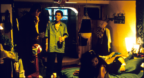
Goodbye South, Goodbye: Kao confronts Flathead while the women tune out.
DB here:
The newest issue of Film Comment includes an essay I wrote on the relations between academic film studies and cinephile criticism. It’s online at the Film Comment site.
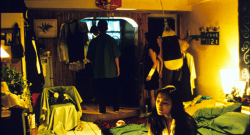
Two things: The header (“Never the twain shall meet”) risks misleading you. The essay argues that the twain can and should meet. Secondly, the essay refers to stages of a long take in Hou Hsiao-hsien’s Goodbye South, Goodbye, but neither the Web version nor the print version uses the images I suggested as illustrations. So here, in frames from a 35mm print, I present two phases of this gloriously dense scene. I discuss Hou’s staging principles in Chapter 5 of Figures Traced in Light, with comments on this passage on pp. 234-236.
As a followup, and weirder: The Way Hollywood Tells It is now available as an audio book. How it handles the pictures I don’t know. But you can listen to a sample here.
If the scene has a climax, this is probably it. As the punching bag swings, Flathead wriggles out the window.


