Archive for July 2011
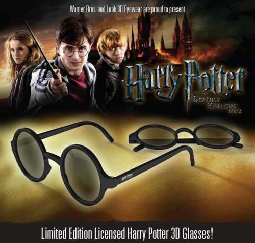
Do not forget to return your 3D glasses
(Yours for $11 in theaters equipped with RealD systems, but you don’t get the pouch they came in at the opening midnight screenings)
Kristin here:
As 3D really took hold in the wake of the release of Avatar in December 2009, we got used to hearing that roughly 60% of a blockbuster’s income came from 3D. This summer the figure has hovered around 40%. Both figures are highly misleading. How much does 3D really bring in?
Yes, 40% of the total amount for almost all big 3D films this summer was for tickets sold for 3D screenings. But looked at another, more realistic way, 3D films as such made far less than that for their makers and the theaters that showed them.
That’s because a lot of the people buying tickets to see a film in 3D probably would have gone to see it if it had been strictly 2D. That, is, 3D itself is probably not luring in many new viewers. If every person buying a 3D ticket would refuse to see the film in 2D, then, yes, the figure would be 40%. I’m sure a small percentage of people are lured to see a given title only because it is in 3D. There’s no way to know how many, however, so let’s stick to the facts we do know.
The basic fact is that the money brought in by a film made in 3D only amounts to the supplement paid by the spectator beyond what he or she would have paid if the film were in 2D. Let’s assume that the supplement is $3 and that a 3D admission costs $12 and a 2D one $9. Let’s also assume for the sake of argument that everyone who saw the film in 3D for $12 would pay $9 to see the same film if it were only available in 2D. (In reality, there’s also evidence that 3D keeps some people away from a film altogether if they don’t have access to 2D screenings. I’ll assume these two groups, the 3D enthusiasts and the 2D hold-outs, cancel each other out.) Removing the $3 supplement takes away 25% of the ticket price. So what the 3D process as such really adds to the box-office total is 10% (that’s 25% of 40%). To put it another way, $9 of the $12 for the ticket is just for the film qua film, the rest is for its being in 3D.
In addition, the costs for the glasses and any extra labor they entail have to come out of that $3. I don’t know what such costs are, so I’ll leave those expenses out of the calculations.
Consider the opening weekend of Captain America, which grossed $65.7 million, 40% of which came from theaters equipped with 3D. But it’s really 10% by my reasoning, so it’s not $26.3 million that 3D generated, but $6.57 million. Assuming further that it costs about $30 million to make a film in 3D or convert it to 3D in post-production, Captain America would have to run in the U.S. market for around four weeks with no decline in attendance to break even on 3D. But most films decline on their second weekend, unless they open in more theaters or have terrific word of mouth. Even The Lord of the Rings: The Fellowship of the Ring, which had lots of repeat business, declined 19% on its second weekend.
Of course, the popularity of 3D films is holding up better abroad than in the domestic market–so far. Still, we have to remember that only about half of the worldwide box-office receipts make their way back to the studios. That seems to imply that a film would have to gross $600 million internationally to break even on the addition of costs for 3D. ($300 million going to the studios, roughly 10% of which is paid for by 3D supplements=$30 million.) Some films do gross that much. Pirates of the Caribbean: On Stranger Tides, Transformers: Dark of the Moon, the final Harry Potter installment have passed that mark this year. It’s not common, though.
Naturally if a film takes in as much as 60% of its box-office from 3D screens, as Transformers: Dark of the Moon did, 15% of the costs of 3D will be paid for by the process.
How consistent is the trend?
Let’s look at the major 3D films out so far this year in terms of percentages of gross vs. percentages of theaters:
Film: Release Date (% of BO from 3D / % of locations showing 3D)
Green Hornet: January 14 (69% / 75%)
Gnomeo and Juliet: February 11 (58% / 60%)
Rio: April 15 ( 58% / 68%)
Thor: May 6 (60% / 69%)
Pirates of the Caribbean: 4: May 20 (46% / 66%)
Kung Fu Panda: 2 May 26 (45% / 69%)
Green Lantern: June 17 (45% / 71%)
Cars 2: June 24 (37% / 61%)
Transformers: Dark of the Moon: 3 July (60% / 70%)
Captain America: July 22 (40% / 68%)
Opening weekend only : Harry Potter and the Deathly Hallows: Part 2: July 15 (68% / 71%)
[Added July 31: The opening weekend for The Smurfs followed a similar pattern. The July 29 release made 45% of its gross from 3D engagements; 60% of its venues showed 3D. As Box Office Mojo points out, on the same weekend in 2009, G-Force made 56% of its opening-weekend gross in 3D, which showed in only 43% of theaters.]
(Granted, there is a problem with such figures. The percentage of locations showing 3D is based on theaters, not screens. Any multiplex showing 3D counts as 1, even though it may have 3 screens showing 3D and 2 showing 2D. Whether those two 2D screens would be credited to the venues showing 3D or 2D is not stated. Unfortunately, the way box-office figures are reported, there is no way to calculate by numbers of screens. We’ll do what we can with what we’ve got. In addition, venues without 3D tend to be one- or two-screen theaters in small towns. That 2D now brings in more than half the gross income for most 3D films is all the more impressive.)
Now for the list of films. There are interesting patterns here. First, the drop in 3D percentages came at about the time when the summer-movie season began, and with one exception is has proven surprisingly consistent, hovering in the 40-45% range. Second, the greater the gap between the percentage of income and the percentage of theaters, the less well 3D would presumably be performing for each release. Thus although Transformers: Dark of the Moon brought in a higher percentage of 3D income, it performed proportionately no better than, say, Rio. Third, as long as the percentage of income is less than the percentage of theaters, it should be the case that the average per theater for 2D showings should be higher than those for 3D—which is true for every film.
More theaters, fewer tickets
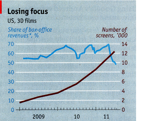
The decline in 3D’s contribution to film grosses has come despite the fact that the number of screens in the U.S. equipped to show 3D has gone up roughly six-fold since the beginning of 2009: from under 2,000 to over 12,000. Take a look at this graph from The Economist (derived from information supplied by BTIG Research and Screen Digest). The point where the lines cross is May, 2011:
 Kvetching about 3D as a process and as a method of purse-gouging has declined somewhat, or at least that’s my impression. It’s not gone, though. Take a look at Mark Harris’ smart piece, “Honk If You’re Sick of 3-D!” in the June 24 Entertainment Weekly. Justin Chang’s Variety review of Harry Potter and the Deathly Hallows: Part 2, while generally very favorable, concludes: “D[irector of].p.[hotography] Eduardo Serra’s brooding, beautiful work gains little, however, from the underwhelming stereoscopic conversion; this is the first Potter film to be released entirely in 3D as well as 2D, and on this count, at least, one can be grateful that it will be the last.” “The “entirely in 3D” phrase refers to earlier episodes which have had a few scenes in 3D.)
There was also the controversy back in late May over whether 3D lenses, which notoriously cast dim images of 3D films, were being left on movie projectors for 2D screenings, thereby dimming the light getting to the screen for them as well. I don’t have the space to trace that discussion, but you can read about it in the original Boston Globe article, Roger Ebert’s indignant follow-up, and an expert projectionist’s assessment of the situation. Here the problems were being discussed largely in relation to 2D screenings.
But for quite some time now the larger 3D-equals-dim-images notion got wide coverage, and the topic had featured in many articles and postings critical of 3D. All that must have had some impact. In June Variety announced that for Transformers: Dark of the Moon Paramount would take “the unprecedented step of releasing a special digital print aimed at delivering almost twice the brightness of standard 3D projection.” These special prints, however, only went to about 2,000 theaters, those with RealD systems. But would prospective ticket purchasers know which cinemas had these prints? As Variety pointed out, “Exhibs may want to avoid planting the notion that some 3D screens are better than others when there’s no price distinction between the screens.” Given that it’s almost impossible these days to call a movie theater and ask a question, I doubt whether many moviegoers who attended Transformers knew which version they saw. Paramount’s move was obviously a desirable one, but it can’t account for the relatively high percentage of the film’s 3D income. (The New York Times also covered Michael Bay’s and Paramount’s efforts to promote screen brightness for the film.)
All in all, evidence seems to show that many theater owners are losing business by showing 3D films. Of Captain America’s total gross income, 40% came from the theaters showing 3D, which amounted to 68% of all venues (2511 locations out of 3715). Flip the figures, and the 32% of the theaters showing the film in 2D brought in 60% of the gross. On average, if you were an exhibitor playing the film, you made more money if you showed it in 2D. A lot more. Even not being able to charge $3 extra.
Box Office Mojo’s report on Captain America‘s first weekend confirmed that attendance was not dropping for the film as a whole, but that a greater proportion of people were opting for 2D: “While the gross difference was a sliver, Captain had eight percent greater estimated attendance than Thor, which received more bolstering from 3D (and had IMAX): Captain‘s 3D share was 40 percent at 2,511 3D locations, compared to Thor‘s 60 percent at 2,737.
Industry spokespeople are putting a good face on all this. Rob Moore, vice-chairman of Paramount, seized upon Transformers: Dark of the Moon’s 60% 3D opening-weekend share to boost the format to Variety: “‘There are so many 3D releases, audiences now are going to pick and choose which films to see in 3D,’ Moore said, before adding that the format has become a tool more for event filmmaking. ‘If the 3D is good, audiences are going to pay for it.'” But of course, most theater-goers don’t know whether the 3D is good until they have already paid for it. They go for other reasons, whether star, director, or genre. Or maybe it’s what their date or friends or family want to see. If it has those factors and it’s in 3D, it might seem worth the extra $3.
The opening weekend for Deathly Hallows might tend to confirm Moore’s claim, but the 3D share of the gross was still slightly below the percentage of 3D theaters, if not by much, and included an unusually large number of Imax locations (274)–which charge an even larger fee for 3D. Given the fans’ frenzy to see Deathly Hallows on its first weekend, they probably bought tickets for whichever screening they could, not much swayed by whether they would be seeing it in 3D or 2D.
Another point before I move on. Consider The Hangover Part II: $80 million dollars announced budget, $562.9 million worldwide gross and still in distribution. No 3D.
Anti-3D sentiment
Some people just don’t like 3D, supplement or no supplement. I went to some of the early releases to keep up with developments in the industry. It’s part of my job, after all. But after I got a sense of what it was like, I gave it up. I think the last 3D film I saw, apart from Werner Herzog’s wonderful Cave of Forgotten Dreams in February, was Avatar in December, 2009, and the one before that Up, in the summer of that year. I just saw Cars 2 the other day, 2D and on 35mm film, a treat that we must savor before release prints on film disappear over the next few years. By the way, Cave of Forgotten Dreams is the only exception to my new avoid-3D rule, and it also happens, proportionate to its budget, to be the most successful 3D film so far this year.
I’ve seen the two Pixar films made since Up only in 2D, and I don’t miss the 3D at all—despite the fact that Pixar’s films are probably the best that have been made during the latest vogue for 3D. Cars 2 naturally had quite a few shots with depth in the set design and staging. It occurred to me when I saw them that I actually might be getting a stronger sense of depth watching them in 2D than in 3D. The human mind has all sorts of ways of reading depth cues in a flat image. 3D tends to exploit only one of them, binocularity, which I suspect minimizes the others. I have no scientific evidence for that, just my own impression formed while watching the film.
I’m far from alone in avoiding 3D. The other day I participated in an online exchange on the subject. Sean Axmaker, contributor to the Parallax View website, wrote on his Facebook page that he had just seen Deathly Hallows 2 on film, in 2D and added, “I’d see “Captain America” here too, but it’s only in 3D and I just don’t see the need to see it with an extra pair of glasses on.”
The issue of studios and theaters switching entirely from 35mm release prints to digital projection would require a whole additional entry. But in late May Variety ran a long story, “Studios must revisit d-cinema,” with people from within the industry recounting dismal experience viewing both 3D and 2D films with digital projection. One 3D system cuts fully half the light from the projector. Cinematographer Roger Bailey is quoted: “It’s unbelievable that in an age when we think we have unbelievable technology, and the studios are talking about eliminating 35mm film prints in the next 18 months, that they haven’t begun to sort out the problems that have been caused by digital projection.”
The Economist ended its recent article, the one that contained the above graph, on a sour note:
Richard Gelfond, the boss of IMAX, reckons customers have become picky. “People used to see something just because it was in 3D,” he says. Now they ask how much pleasure the glasses will add. The explosive “Transformers 3” did well in 3D; perhaps the 2D version was not sufficiently headache-inducing. The key to three-dimensional projects, then, is to put out hugely popular films with extraordinary special effects. Easy.
Speaking of headaches, a small study conducted at the University of California-Berkeley seems to indicate that 3D glasses can cause eyestrain and discomfort. For those who want the full scientific text, it’s here. For a brief summary, go here. The main point is that the eyes naturally try to focus on the screen (the focal distance). The vergence point is where the imaginary lines going out from the 2 slightly separated 3D lenses come together. If it’s in front of or “behind” the screen, eyestrain can occur, since one is trying to focus on two different planes in depth simultaneously. The problem turns out to be worse the further you sit from the screen.
I myself have not noticed eyestrain or headaches caused by watching 3D movies with the current generation of glasses. I could imagine that since eyestrain is cumulative, those who watch large doses of television or spend hours at a 3D gaming console would have greater problems with the glasses.
Whether we want it or not
Business types seem to think people want 3D inserted into their lives. Note the 3D Webcam, pictured at the bottom. The accompanying text says, “The Minoru 3D Dual lens web camera is still at proof of concept stage atm but it can create stereoscopic 3D video which needs those cool blue and red 3D glasses to view.” (Note: “atm” means “at the moment,” not “go withdraw some money to buy one.”) I also ran across the 3D drawing pad pictured below left. It is available from the Perpetual Kid website, which explains: “Each page is a stereographic background for your writing or drawing. Put on these ultra cool (come on…you know you look good in them!) 3D specs and see your lines float above the page!” Why do people promoting such things seem to think that we can be convinced these glasses are cool?
 Right now there’s a big push to sell 3D mobile phones and other handheld gadgets. On July 25, Roger Cheng posted a skeptical article on the subject of the Thrill 4G model, by LG:
But it’s unclear if consumers are ready to grab hold of it yet.
3D is the latest feature to be crammed in the increasingly Swiss Army-knife-like smartphone. Like with televisions, the feature is getting aggressive marketing support. But despite the marketing campaigns, the feature has been little more than a gimmick. And like 3D televisions, there’s been tepid interest.
“3D is just one of an onslaught of features that end up on a phone even if people don’t ask for it,” said Maribel Lopez, an analyst at Lopez Research.
Sam Biddell over on Gizmodo, did not hold back in commenting on the HTC Evo 3D phone:
The EVO 3D is the first phone to ever literally hurt my face. The 4.3-inch 3D screen’s glasses-free, of course, which means it uses the same auto-stereoscopic method as the Nintendo 3DS. Well, not the same—the 3DS is a joy to use and view, while looking at 3D stuff on the Evo felt like I was having my eyes gouged out, Oedipus-style. It gave me a headache. I wanted to look away. And for what? A 3D effect that just isn’t very good. To pull off a 3D picture of video that has any ‘pop’ whatsoever, you need to use framing so contrived as to render the whole thing pointless.
This, mind you, despite the fact that you don’t need glasses to see a 3D image on phones.
What’s next for theatrical 3d?
In my original “Has 3D already failed?” I wrote that it
depends on how one defines success. If you’re Jeffrey Katzenberg and want every theater in the world now showing 35mm films to convert to digital 3-D, then the answer is probably yes. That goal is unlikely to be met within the next few decades, by which time the equipment now being installed will almost certainly have been replaced by something else […] But it also seems possible that the powers that be will decide that 3-D has reached a saturation point, or nearly so. 3-D films are now a regular but very minority product in Hollywood. They justify their existence by bringing in more at the box-office than do 2-D versions of the same films. Maybe the films that wouldn’t really benefit from 3-D, like Julie & Julia, will continue to be made in 2-D. 3-D is an add-on to a digital projector, so theaters can remove it to show 2-D films. Or a multiplex might reserve two or three of its theaters for 3-D and use the rest for traditional screenings.
If for the rest of this year blockbuster films continue to bring in 40% of their gross revenues in 3D-equipped venues and those venues continue to be around 70% of the total locales, then I would think that the saturation point I mentioned has been exceeded. Some theater owners might decide that they could make more money with less hassle by showing 2D. That would drive 3D devotees to the reduced number of 3D houses, making their revenue go up. Which in turn would presumably make some of the exhibitors who had given up 3D go back to it, and the balancing act would continue until the precise saturation point is finally attained. But at this point, adding more 3D screens to a multiplex or converting a mom-and-pop theater in a small town would probably just worsen the problem. I think what I predicted is coming true, that multiplexes will reserve a small number of their screens for 3D and keep the rest flat. Maybe the studios will decide that $30 million is not a great investment.
The more important news is that digital projection will continue to spread. Some theaters have installed it already to save costs. Wanting to play 3D films (which mostly can only be shown digitally) has undoubtedly been a factor in exhibitors’ purchases of digital projectors, but it will probably become less so now. The studios, however, want to give up 35mm release prints, which cost a lot for both lab work and shipping. They’ll pressure the theaters until it finally happens.
Stifel Nicolaus analyst Ben Mogil downgraded box-office projections for the second half of the year and lowered his target for the company’s stock price to $27, from $32. His report came a week after similar predictions were made by Merriman Capital. The stock was trading at $25.33 late Monday.
“We believe that estimates for IMAX for [second half 2011] are too optimistic given that the [fourth quarter 2011] slate has three kids’ films, a genre which this year has seen considerably lower 3D share this year compared to last,” Mogil wrote.
Most, but not all, Imax movies play in 3-D, a technology that has been dropping in popularity among domestic movie audiences.
These downgrades came partly as a result of the fact that IMAX has had three straight quarters where income fell short of its own predictions.
This story was updated later the same day: “Imax Chief Executive Richard Gelfond said, ‘We have a diversified slate based on blockbuster films in 2D and 3D, for families and fanboys. We think it’s way too premature to predict how the slate will perform for the year.'”
As I read this, Gelfond is assuring investors that there are quite a few 2D films mixed in among the 3D films, so that the latter’s decline will not hurt the firm’s overall income.
On July 26, Variety ran a long story with Jeffrey Katzenberg giving an elaborate explanation of how Kung Fu Panda 2 underperformed in the U.S. because it opened the same weekend as The Hangover: Part 2. There’s no indication as to how a raunchy, R-rated film could run roughshod over a kid-oriented animated movie. All those older brothers refusing to take their younger siblings to the movies? Usually it’s called “counter-programming” and often it works.
According to Variety:
Katzenberg is also still high on 3D, at least overseas, where “the marketplace couldn’t be stronger,” he said. “Outside of North America, the performance of 3D continues to be very strong across many different films. We see continued interest in it and appeal for it and growth over these next 12 to 24 months. There’s still a pretty decent way for it to expand meaningfully internationally.”
Domestically, the exec admitted to being partly to blame for some of the extremely optimistic views of 3D’s revenue potential. At the same time, the pessimism of its longevity is also on an extreme level, he said.
For DWA [Dreamworks Animation], at least, 3D remains one of the best returns on investment for the company, after it was able to shave off the costs to produce its pics in the format.
Two years ago, DWA spent $15 million per pic to deliver a 3D version. Today, the cost is half that, Katzenberg said. The studio now has nine 3D films in production.
If executives keep offering rationalizations and suggestions that we look to the future instead of the past, maybe we can conclude that 3D is officially in a slump.
As seen on Gadgettastic.com
Looking different today?
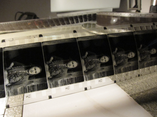
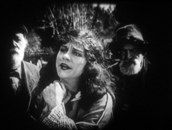
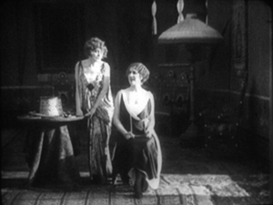
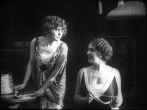
Johan (1921).
DB here:
Earlier this month Manohla Dargis wrote a New York Times article on how we watch, or should watch, films that some audiences consider slow and boring. She suggested that appreciating such films requires us to cultivate fresh ways of seeing. Her article and my interests coincide on this matter, so I wrote an entry developing some ideas about viewing strategies and skills. This piece also, happily, brought new readers to Tim Smith’s experiment in tracking viewers’ scanning of a scene in There Will Be Blood.
Today I explore another angle on the problem of how to watch movies that aren’t the normal fare. But this time what’s abnormal for us was once normal for everybody. I look at the pictorial possibilities that emerged in the 1910s. Those possibilities are of interest if we want to fully understand film history, but they offer some mysteries as well. If viewing movies involves skills, did people a century ago have the ones we have? Or did they employ different viewing habits, ones that we have to learn?
Editing, your imaginary friend
I write from my annual research trip to the Royal Film Archive of Belgium, now known as the Cinematek. For some years, I’ve been looking into feature filmmaking of the 1910s. On every visit I’ve found rich material, movies off the beaten path that give me a sense of the immense creativity of that early period. (See the bottom of this post for links.) The official classics of these years, by Chaplin and Griffith and Fairbanks and Bauer and Gance and Sjõström and Feuillade, remain remarkable, and Kristin’s latest entry makes a case that Alberto Capellani belongs among this heroic company. But you can also find extraordinary moments in ordinary movies. Even the most banal film has something to teach me about what choices faced the era’s filmmakers.
One of those teachable elements involves the ways in which directors guide our attention. We know that editing serves to shift our attention from one part of a scene to another, but so does judicious staging. This is one of the great lessons of the cinema of the 1910s. Watching films from that period convinced me that the craftsmanship of Anderson in There Will Be Blood, and of other directors reliant on long-take ensemble staging, has deep roots in filmmaking tradition. But the golden age of cinematic staging was relatively brief, and it was eclipsed by an approach based largely on editing. That approach is, essentially, still with us.
Let’s start by appreciating the technique that became most prominent. By the late 1910s, Hollywood filmmakers had more or less perfected what we’ve come to call the classic continuity editing system. The camera could penetrate the most intimate exchange, breaking it up into intelligible bits. Here, in a minor Metro film called False Evidence (1919), Madelon tries to persuade her father that she, not her boyfriend, is responsible for a crime.
After giving us father and daughter close together in profile, the camera has somehow squirmed in between them, showing each one in a tight 3/4 view. Or rather, the cutting has forced the staging to pull the characters a bit apart so that each one can have a frame to him- or herself. Spatial plausibility gives way to dramatic urgency; what we care about are clear views of their emotional responses. As long as the spatial relations remain clear, they can be just approximately consistent.
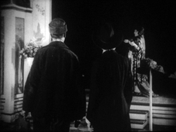
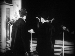
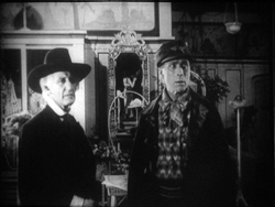
For a little more finesse, we can look–as usual–to Rio Jim. William S. Hart’s films are among the most visually elegant and ambitious of this period, and even his less-known items seldom disappoint. John Petticoats (1919) gives us “Hardwood” John Haynes, a rough-edged logger who finds he has inherited a New Orleans dressmaking shop. His comic introduction to the place, in the company of a new friend he’s made, uses editing to tease us. The two gents come in, with John bewildered by a feminine world he’s never known. They pause before a model sashaying on the stage, and when she pauses, she’s blocked by the Judge’s body.
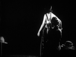
We’re left without the revelation of her appearance, but when her dresser comes forward to peel off her wrap, we cut, in effect, “through” the Judge to get a clear view of the disrobing. The blocked shot teased us, but the cut pays us off.
Now that the model bares a lot more than before, the biggest tease begins. How will John react? The answer is given in the next shot, a nearly 180-degree shift from the earlier framing of the men that incorporates a mirror in the background to keep the model onscreen.
Thanks to a cut, action and reaction are given in the same shot–in fact in the same zone of the frame, the center.
A pass, a pat, a squeeze
Fabiola (1918).
Many European directors were moving in the same direction as Lambert Hillyer in John Petticoats. Although they might not use as many shots or as many different angles as their American counterparts, they were confidently breaking their scenes up into closer views, often through axial cuts that take us straight into or out of the action, along the lens axis.
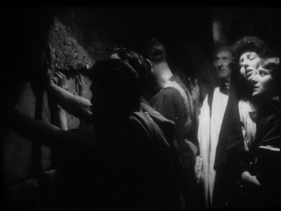
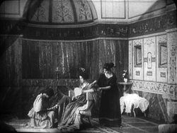
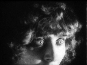
Take Enrico Guazzoni’s Fabiola (1918), henceforth known to me as Fabulosa. Normally I consider the Roman oppression of Christianity one of the least fertile topics for a good movie, but Fabiola proves me wrong. For one thing, the title names a rather unpleasant woman who barely figures in the action until the climax. For another, Guazzoni proves an adept filmmaker. I was struck by those immense sets that distinguish the Italian costume drama, the dazzling lighting (see above), and the skilful editing.
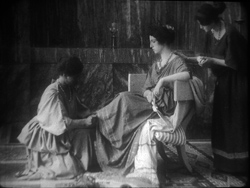
Our introduction to Fabiola comes as she sits disdainfully in her household, attended by servants. After a long shot showing off the set, an axial cut takes us closer to her.
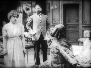
She turns as her tardy servant Sira comes in. Having stretched her elegant neck, Fabiola tips her head forward slightly, in a bob of disdain.
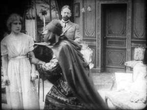
Another axial cut takes us still closer to her. And in a few frames her gesture, at once haughty and angry, is repeated. (The streak across the first image below is the splice, so this is the very first frame of the next shot.)
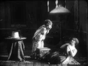
This, I think, is no mistake. The matches on action elsewhere in the film are quite precise, and indeed earlier Italian films have shown that directors used this device skilfully. Guazzoni wanted to stress Fabiola’s head movement, and he used the same tactic, the overlapped action match, that some Americans would use and that many Soviet directors drew on later. This slight accentuation of Fabiola’s gesture is a vivid way to introduce the character, caught in a characteristically scowling moment. Very soon, in a fit of pique she’ll jab Sira with a hatpin.
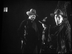
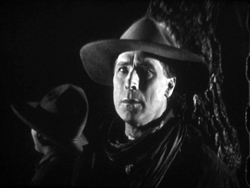
On the whole, keeping the setups close to the camera axis is the default value in Fabiola. For the Americans, though, cutting made the camera almost ubiquitous. A year after John Petticoats, O’Malley of the Mounted (1920), lets Lambert Hillyer again resort to intelligible shifts of setups. O’Malley, played by Hart, has gone undercover to track a killer. Posing as a robber, he has joined an outlaw gang, but they’ve discovered he’s betrayed them and plan to hang him at sunup. He’s lashed to a tree and guarded by his enemy, the brutal Big Judson. But Rose Lanier, who has drifted along with the gang, is going to help O’Malley escape. The cutting will show us exactly how she does it, and why.
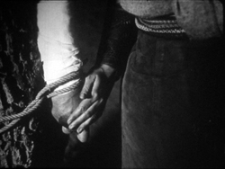
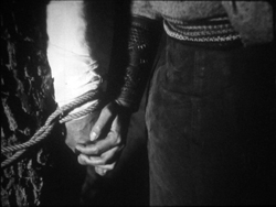
Rose interposes herself between Big and O’Malley, chatting up the thug. A cut of about 180 degrees takes us to the opposite side of the tree and shows her slipping a knife toward O’Malley’s hand. We’re so familiar with this sort of insert that we’re likely to forget that once it was fresh.
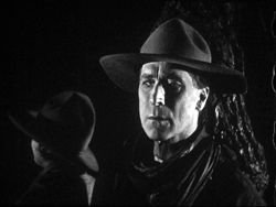
O’Malley starts, then shifts his gaze toward Big.
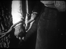
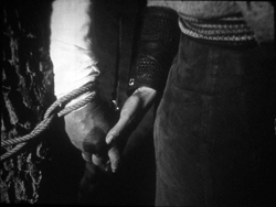
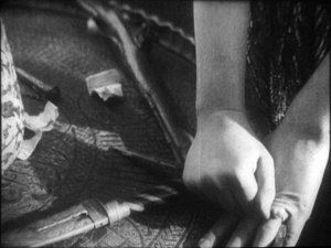
Then comes a simple, remarkable shot. Rose slips the knife to O’Malley. Then she pats his hand. Then she gives it a squeeze.
Mystery and charm of the American cinema, as Godard would say: a single cut-in of hands can give us a lot. First there’s the narrative information (I’m passing you the knife), then Rose’s expression of support (Good luck!), capped by a burst of affection (I love you). The whole thing takes less time than I’ve used to tell it. Surely this ability to invest plot-driven detail shots with heartfelt emotion helped American cinema conquer the world. I’m tempted to say that we could sum up of the power of Hollywood, in its laconic prime, with that formula: the pass, the pat, the squeeze.
This shot is as compact in its expression as the previous one. It’s impossible to capture here all the emotions that flit across O’Malley’s face: hope of eluding death, realization that Rose loves him, anxiety that surviving will make him choose between love and duty. Rose’s brother is the killer he’s been tracking, and in a perversely honorable way O’Malley had looked forward to being hanged. That would have spared him arresting the boy. Now he must live, enforce the law, and lose the woman who has saved him.
I saw some European films that absorbed such continuity tactics quite deeply. Above all, Mauritz Stiller’s Song of the Scarlet Flower (Sangen om den Eldroda Blomman, 1919) and Johan (1921) relied heavily on analytical editing in the American fashion, including angled shot/ reverse shot. As in Fabiola, some of the discontinuous cuts have their own logic. I wish I had time to explore those Stiller films in more detail–particularly their use of turbulent rivers as dynamic plot elements, not mere landscapes. Maybe in some future entry….
Four-quadrant style
Before they adopted the analytical editing characteristic of American cinema, directors were still able to guide our attention. The so-called “tableau” style, about which I’ve waxed enthusiastic on this site before, became a rich tradition in the 1910s. Editing within the scene is minimized. (Apparently most European directors didn’t consider it a creative option in its own right until later in the decade.) The drama is carried by performance and ensemble staging. Relying on movement, acting, and composition, the director controls where we look and when we look at it
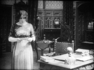
To take a straightforward example, consider the rather ordinary melodrama Le Calvaire de Mignon (Mignon’s Calvary, 1917). The scheming and dissolute Dénis de Kerouan wants to wreak misery on his brother Robert. While Robert is out of the country, Dénis hires a forger to fabricate a letter indicating that Robert has a mistress. Dénis leaves the letter on the desk for Robert’s wife to find.
Dénis has exited through the central entryway, and into the empty study comes Robert’s wife. She discovers the letter.
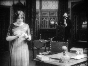
She moves to the left foreground and starts examining it. At this point Dénis’ face peeps out from behind the central curtain. The director makes it easy for us to notice him because nothing else is happening in the set, and Denis’ face is rather close to the wife’s. It’s almost as if he’s looking over her shoulder.
Once we register Dénis’ presence, the director can proceed to balance the shot. All that empty real estate on the right of the frame asks to be filled, and that’s what happens.
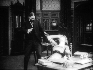
When the wife reads the damning letter, she collapses rightward into the chair, just as Dénis rushes forward to take charge of the situation.
This move exemplifies the staging technique known as the Cross, which motivates the switching of characters’ positions in the frame.
Simple as it is, this portion of the prologue of Le Calvaire de Mignon shows how, without cutting, a director can steer us to one or another zone of the shot through such cues as faces, centering, proximity to points of emphasis, and movement. Something similar happens in one, more striking moment of another fairly unexceptional movie from the period.
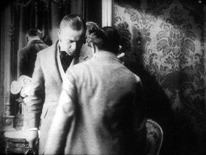
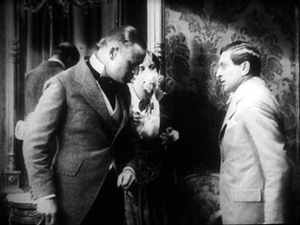
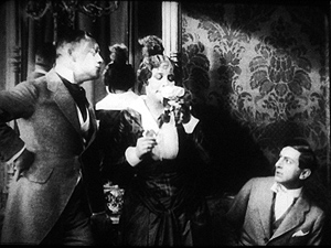
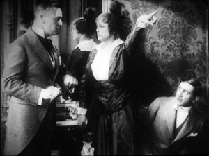
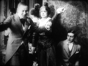
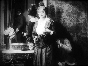
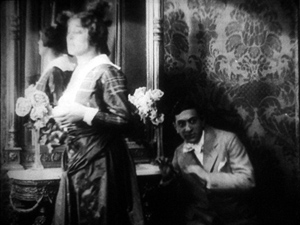
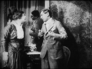
Nobody will claim Der Stoltz der Firma (The Boss of the Firm, 1914) is a masterpiece, or its director Carl Wilhelm is a master. It’s one of the many comedies in which Ernst Lubitsch starred before becoming a director. Here he’s Siegismund, a bumbling young provincial with more aspirations than abilities, who simply lucks into marrying the boss’s daughter. On the way to the happy ending, he wins the patronage of a fashion designer, Lilly, whose husband finds her flirtation with the young parvenu none too innocent.
Wilhelm’s use of the tableau approach isn’t especially dynamic in most of the film, but there’s one flashy scene. Wilhelm gets us to watch a very small, tight area of the frame and then gently swings our attention to a wider swath of action. As usual, everything depends on a sort of task-commitment on our part: Watch what’s likely to forward or enrich the ongoing narrative.
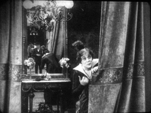
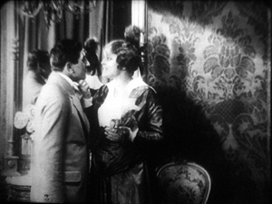
Lilly lures Siegismund into a changing room, with the composition showing him reflected in a mirror behind her. This sets up an item of setting that will be central to the scene.
Once inside, he coyly presents her with a flower and they draw close together. Since we tend to concentrate on faces, the small area encompassing their two profiles is likely to draw our attention. Nonetheless, the shot is notably unbalanced, as if anticipating something coming in from the right side.
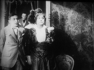
Abruptly Siegismund and Lilly draw apart, and the space between them, in the mirror, is filled by the face of Lilly’s husband, coming through the curtain.
I’d bet that a Tim Smith experiment would find that nearly every spectator is already watching this small zone in the upper left quadrant of the shot. Faces, especially frontally positioned ones, command our notice, and thanks to the mirror we here have three of them. Moreover, movement is an attention-getter too, and all three faces are in motion. Mr. Maas’s face, in fact, gets notably bigger and clearer. His wrathful expression is another reason to watch him.
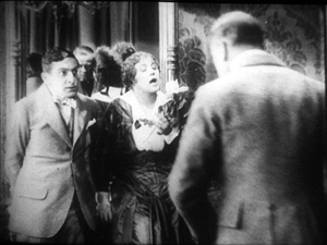
The husband’s body enters to fill the frame, then presses into the center of the shot, blotting out Lilly as he faces down Siegismund.
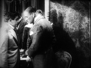
Now the director controls the speed of our gaze quite precisely. Maas slowly rotates, forcing Siegismund to swing from left to right, as if he were attached to the bigger man by a rod. This yields, again, that nice sense of refreshing the frame that we always get from a Cross.
Siegismund collapses into the lower right of the frame, flinching from the fight that’s about to start. Lilly soon shoves aside her husband’s chastisement and melodramatically tells him to leave. “We’re divorcing!” the following intertitle says.
Mr. Maas takes it in stride, shrugging and spreading his arms. He leaves, and thanks to the helpful mirror we can see him chortling as he glances back and passes through the curtain.
If we hadn’t already noticed Siegismund cowering behind Lilly in the lower right quadrant, we will now. Lilly angrily flounces to our left (the Cross again). Siegismund rises to explain he hadn’t meant to cause a rift in the marriage.
We’re back to something like the initial setup, but now with Siegismund centered, the couple further apart, and a less unbalanced frame. The drama, which now consists of Lilly inviting him to tea tomorrow, can proceed from here.
A different way of seeing?
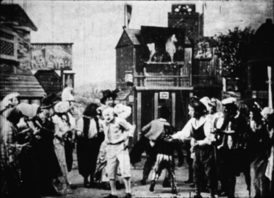
Tom Tom the Piper’s Son (1905).
We’ve become used to editing-driven storytelling, and I’m convinced that we can learn to notice the staging niceties of the tableau alternative. But what if early filmmakers explored some other ways of looking that are far more unfamiliar to us today?
Noël Burch, in his 1990 book Life to Those Shadows, argued that in the first dozen years or so of cinema, movies solicited viewing skills that we lack today. He suggested that early filmmakers often refused to center figures and crammed their frames with so much activity that to our eyes the shots look confused and disorganized. In Tom, Tom, the Piper’s Son (1905), Burch notes, the bustle of the fair, the reliance on an extreme long shot, and the absence of any cutting make the central event, Tom’s swiping of the pig, difficult to catch. In the frame surmounting this section, Tom is making off with the pig in an area just right of center, but the antics of the clown and the response of the crowd may well distract us from the main action.
The result, says Burch, is a mode of filmmaking that demanded
a topographical reading by the spectator, a reading that could gather signs from all corners of the screen in their quasi-simultaneity, often without very clear or distinctive indices immediately appearing to hierarchise them, to bring to the fore “what counts,” to relegate to the background “what doesn’t count” (p. 154).
Later developments linearized this field of competing attractions, creating a smooth narrative flow “harnessing the spectator’s eye.” Among these developments were the presence of a lecturer at many screenings (telling people what to watch) and, of course, the growth of the continuity editing system. But Burch suggests that the “primitive mode” hung on until about 1914.
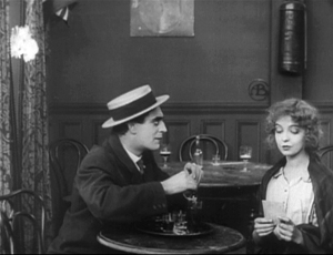
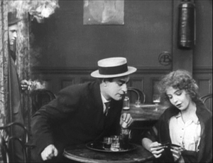
A famous example is a shot from Griffith’s Musketeers of Pig Alley (1912). The gangster has lured the Little Lady (Lillian Gish) into a back room and distracts her with a photograph while he tries to dope her drink, in a precursor of date-rape drugging. But the Snapper Kid, another gangster, has been keeping an eye on her and follows. As the gangster starts to pour the drug out, the Kid’s entry is presaged by a whiff of cigarette smoke.
At the crucial moment, we have three things to notice: the Little Lady’s obliviousness, the gangster’s pouring the drug, and the full entrance of the Snapper Kid.
Today’s director would likely resort to editing that shows the doping, then the Kid arriving, then the doping again, and leaving us to infer a vague sense that they’re happening at the same time. Griffith’s choice gives us genuine simultaneity, but at a cost. Two cues compete for our attention: central composition for the drink, major motion on the edge for the Kid’s entry. In my experience, viewers tend to notice the appearance of the Kid, but to miss the business with the drink. (Another passage for Tim Smith to test!) By today’s standards, Griffith has failed as a director, but Burch’s view suggests that 1912 viewers, more sensitive to “all-over” composition, could have registered both actions, perhaps by rapidly scanning back and forth.
During my trip I found a fascinating example of this issue, as well as an apt counterexample. Both involve daggers.
In Maman Poupée (1919), a remarkable Italian film directed by Carmine Gallone, a devoted, somewhat infantile wife learns of her husband’s affair with a society woman. Susetta confronts the mistress and begs her to break off the affair. The woman laughs in her face. What happens next is given in several shots, mostly through axial cuts.
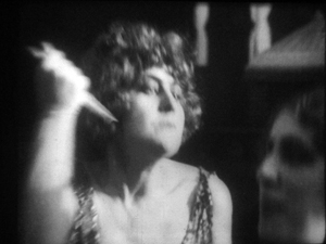
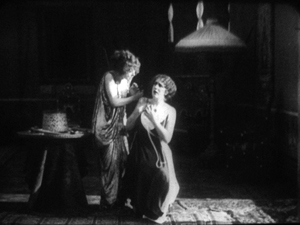
The linear editing, as Burch indicates, lays everything out for us step by step. The close-ups accentuate what is important at each moment: Susetta seizing the dagger, stabbing her rival, and–in a remarkably modern-looking extreme close-up–registering her horror at what she has done.
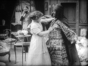
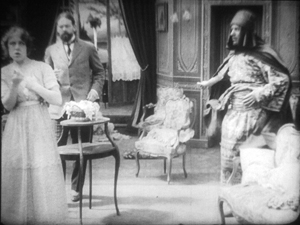
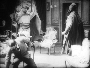
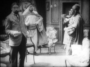
Two years before, Marcel Simon, the (Belgian!) director of Calvaire de Mignon, handled a similar situation rather differently. The diabolical Dénis, whom we met earlier, has succeeded in destroying his brother’s life. It remains only for him to force Robert’s niece Mignon to marry the Algerian Emir Kalid. Kalid is at first humble, beseeching Mignon to become his bride, but then he gets rough. We might note already that Mignon, while fairly near the camera, hovers close to the left frame edge.
In their tussle, Mignon snatches something from Kalid’s waistband and flings him far away to the right.
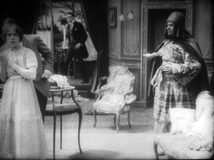
What’s up? Mignon has grabbed the Emir’s dagger and stands poised with it pressed to her heart. But we haven’t been able to see that dagger very clearly (no cut-in close-up here, as in Maman Poupée) and she’s returned to her position far off-center. It’s likely that a viewer today wouldn’t understand that she’s holding the men at bay by threatening suicide. Would a 1917 viewer be as uncertain? Would the situation, plus her posture and the men’s hesitation, be enough to get the point across?
Moreover, this moment goes by very quickly. Scarcely has Mignon struck her pose when her true love, René, bursts in behind her–frontal, fairly centered, and moving fast. Meanwhile, Dénis is sneaking up on her, hugging the left frame. Mignon makes a break for René, dropping the still almost indiscernible dagger.
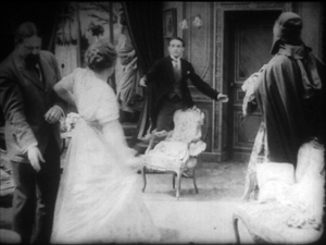
While Mignon and Rene embrace in the right rear doorway, blocked from our view by Kalid, Dénis stoops over. It’s a timely adjustment, giving us full view of the benevolent Le Maire sweeping into the room.
As the two men confront one another–the climax of the scene–director Simon has the effrontery to let Dénis steal the show. He picks up the dagger, which now can be seen more or less plainly, weighs it in his hand, and looks out for a brief, pondering moment.
We seem to have a late example of the Snapper Kid Effect, in which important actions compete for our attention. Is it clumsy direction to perch Mignon on the frame edge as René rushes in, and to let Dénis recover the dagger while we’re supposed to concentrate on the face-off between the two powerful men? Or would audiences have tracked all the strands of action and enjoyed their simultaneity?
On this site and elsewhere, I’ve assumed that directors in the 1910s structured their compositions for what Charles Barr calls “gradation of emphasis,” a fluid pattern of primary and secondary points of attention. I’ve argued as well that Burch exaggerates the decentered, nonlinear compositions of even the earliest years. Many of the films staged by Lumière cameramen are designed cogently, and so are many films from the 1900s. (Tom, Tom might be the exception rather than the norm.) Yet every so often, you get a later case, like Musketeers of Pig Alley or Le Calvaire de Mignon, that suggests that some viewers might have been more adept at tracking simultaneous events than we are.
A still broader question remains. Let’s assume that people were able to follow and enjoy films in the tableau style, even when that style pushed toward illegibility. What enabled people to adapt, and so quickly, to continuity-based movies? Some scholars and filmmakers argue that continuity editing achieved its power and worldwide acceptance because it mimics our natural mode of perception. At any moment, we’re concentrating on just a small portion of our surroundings, and this is like what editing does for us in a scene. On the other side, Burch and others would argue that continuity filmmaking is only one style among others, with no special purchase on our normal proclivities. On this view, classical continuity’s apparent naturalness hides all the artifice that goes into it, and this concealment makes its work somewhat insidious. I’ve offered some thoughts on this problem elsewhere, but I bet I tackle it again on this site some time.
In any case, we need to study films that seem odd or difficult, whether they’re recent or from the distant past. We’re guaranteed to find some striking and unpredictable things that provoke us into thinking. That’s one of the pleasures of exploring the history of film as an art.
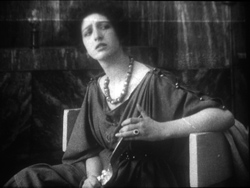
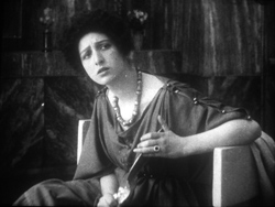
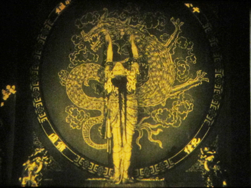
For earlier studies of the tableau style on this site, see this entry on Bauer, this one on 1913 films, this one on Feuillade, and this one on Danish classics. This entry discusses the emergence of Hollywood-style continuity, and this one explores the exemplary editing in William S. Hart films. I go into more detail in two books, On the History of Film Style (chapters four and six) and Figures Traced in Light (chapter two) and in the essay, “Convention, Construction, and Cinematic Vision” in Poetics of Cinema. The last-named piece tries to stake out a middle position on the “naturalness” of continuity editing. Kristin has analyzed Alberto Capellani’s films as instances of the tableau trend, last year here and just last week here. She also weighs in on the debate about whether viewers of his time were better prepared to grasp the action than we are. More generally, Capellani’s career exemplifies the major and swift stylistic changes of the 1910s. When he went to America, he became pretty adept at the emerging continuity style, as the Nazimova vehicle The Red Lantern (1919) indicates. Of course that’s got some striking single images too.
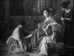
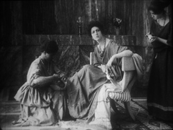
The Red Lantern (1919).
If it’s Tuesday, this must be Belgium, if it’s July
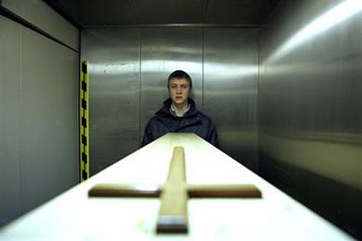
The entrance to the Brussels Cinematek screening rooms. No cellphones, no drinks, and above all no frites.
DB here:
As every year, I’m spending time in Brussels doing research at the Royal Film Archive, and as usual every two years, I’m preparing to go to the Flemish Film Foundation’s Summer Film College, this time in Antwerp. My stay was timed, also as usual, to the Cinédécouvertes festival sponsored by the Cinematek.
Cinédécouvertes is a partly a festival of festivals, gathering most of its titles from Venice, Rotterdam, Berlin, and Cannes. It’s a good way for me to catch up with several top-flight films unlikely to come to the US, or at least any time soon. (See the links at the bottom of this entry for my earlier observations.) In screening only films that have not been bought for Belgian distribution, Cinédécouvertes’ record shows a keen talent-spotter’s eye. Just in the last ten years, its winners have included Japón, Oasis, Shara, Tropical Malady, Day Night Day Night, How I Ended This Summer, and Police, Adjective. The year 2000 was remarkable, with prizes given to four films: Miike’s Audition, Im’s Chunhyang, Kurosawa’s Barren Illusion, and Tarr’s Werckmeister Harmonies. My affection for this modest but robust festival goes back to the 1980s; it introduced me to films by Hou, Kitano, and Kiarostami when they were genuine cine-discoveries.
This year Bruno Dumont’s Hors Satan took the L’Age d’or prize, the one reserved for films that seek to disturb us in the vein of Buñuel’s classic. That prize consists of 5000 euros given to the filmmaker. The two other awards aim to support local distribution of the best work. The Austrian entry Atmen (Breathing) by Karl Markovics and Alejandro Landes’ Porfirio, set in Colombia, won the prizes. If either is picked up for Belgian release, the distributor will receive 10,000 euros to help cover costs. Shouldn’t other festivals imitate this strategy for getting films onto screens?
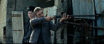
My lecture preparations for Antwerp kept me away from many festival offerings, but I did see two of the prizewinners. Atmen and Hors Satan reminded me that a lot of European art films, despite their reputation for being slow, have a crisp, laconic style. Abrupt cuts open and end scenes, while an unexpected close-up can accentuate a moment. This sort of precision meshes with other conventions of this tradition: delayed exposition, long scenes without dialogue or music, routines that structure the plot, and a demand that we let things unfold at a rhythm different from that of the goal-driven Hollywood cinema. Early on, the scruffy idler of Hors Satan shoots down a man while the vaguely punkish girl with him doesn’t bat an eye. What registers is the bare, brute act, no more and no less.
Eventually we’ll learn some causes and reasons, but in this mode of cinema, a gesture is given heft by coming out of nowhere, without benefit of much preparation. What we can count on is the repetition of a routine, such as the man’s praying or his receiving a piece of bread each day from an (initially) unseen donor. Sooner or later, something will emerge–a pattern of activity, if not a straightforward plot.
Similarly, we know almost nothing about the young man who gets dressed at the start of Atmen. Only gradually will his routines reveal his work-release from a juvenile prison and his growing awareness of his responsibility for the crime that put him there. In this unvarnished tale, which sends young Vogler to work assisting a mortician, we get nothing like the mixture of humor and poignancy we find in Takita’s Departures. Everything here is cool, even curt, with each shot providing a bit of action that we have to fit into the personality lurking behind Vogler’s guardedly blank expression.
That personality becomes clear, in a rather conventional way, when Vogler sets out to find the mother who abandoned him. Things are much more opaque in Hors Satan, in which miracles and near-miracles are performed with a grimy physicality suited to provincial life lived among marshes and rocky hillsides. If Atmen pulls into focus as a fairly clear-cut psychological drama, Dumont’s film tries for something grander and less committed to personality. It seems to me to aim for a sense of flinty, rough-hewn holiness that is beyond conventional piety. In The Tree of Life, faith bathes the lovely faithful in a glow–hell, it can make them levitate–but here faith, if that’s what’s involved, is irredeemably coarse, even ugly. (Hors Satan reminded Cinédécouvertes judge Charles Tatum of Abel Ferrara.) Like Atmen, though, Hors Satan gets to its destination through a storytelling technique that we can trace back to neorealism and its respect for dawdling exposition and the undramatic singular detail. Some cinematic traditions are endlessly fertile.
Earnest Goes to Summer Movie Camp
The Last of the Mohicans (1920).
This year’s July film college is woven of three strands. One is called “Masterpieces in Context,” and it includes films by De Sica, Ford, Flaherty, and others. The primary strand is devoted to film and the visual arts, and given my interests it looks exciting. Steven Jacobs will present lectures related to his new book, Framing Pictures, to be published during our event. Steven will survey a range of relationships between cinema and painting, including films about artists (e.g., Caravaggio) and scenes set in museums. Wouter Hessels, the incoming Director of the Cinematek, will discuss work by André Delvaux and other Belgian filmmakers. Lisa Colpaert will talk on “Noir Portraits.” And Tom Paulus will survey instances of the influence of painting and photography on directors’ visual style, ranging from Tourneur to Tarkovsky. Films include The Last of the Mohicans (1920), Spirit of the Beehive (1973), and Arsenal (1929). I’ll throw in my $.02 with a lecture called “Seeking and Seeing: Lessons from E. H. Gombrich,” which hopes to show how Gombrich’s approach to art history can help us study film history.
My main contribution, though, is to a third strand called “Dark Passages: Storytelling in 1940s Hollywood.” Through screenings of Suspicion (1941), Daisy Kenyon (1947), Laura (1944), A Letter to Three Wives (1948), and six other movies, I’ll survey some narrative innovations of this remarkable era. Our main attractions are A pictures, but I’ve pulled some clips and stills from B’s, which are no less intriguing in their flashbacks, dreams, hallucinations, splits in point-of-view, and treatments of mystery and suspense.
I’m still working on the talks, but what’s emerging is one unorthodox premise. As an experiment in counterfactual history, let’s pretend that World War II hadn’t happened. Would the storytelling choices (as opposed to the subjects, themes, and iconography) be that much different?In other words, if Pearl Harbor hadn’t been attacked, would we not have Double Indemnity (1944) or The Strange Affair of Uncle Harry (1945)? Only after playing with this outrageous possibility do I find that, as often happens, Sarris got there first: “The most interesting films of the forties were completely unrelated to the War and the Peace that followed.” Sheer overstatement, but back-pedal a little, and I think you find something intriguing.
Some lectures are in English, some in Dutch. All screenings are 35mm, with live accompaniment for the silent films. There will also be an excursion to Antwerp’s gorgeous, widely praised new museum, the MAS. It’s open until 11 on weeknights and until midnight on weekends, an admirable idea. I’ll be sure to take photos of the skull-mosaic terrace.
More on the summer film school after I’ve done it. In the meantime, coming up blog-wise: ideas about how people might have watched movies a hundred or so years ago.
I first explained my research in the film archive here. For previous years’ notes on the Cinematek’s annual festival, you can go to the category here. On the Cinephile Summer Camp, here is the report on the 2007 gathering and here’s the one on 2009. Sarris’ scandalous claim (yes, I too thought about The Best Years of Our Lives, They Were Expendable, Ministry of Fear, etc. etc.) is in the introductory essay, “Toward a Theory of Film History,” in his classic book The American Cinema (New York: Dutton, 1968), 25.
I especially believe the “with all present” part. This is apparently the table to get at Au Vieux St. Martin, Brussels. In reflection is Nicola Mazzanti of the Royal Film Archive.
Capellani trionfante
Quatre-vingt-treize (1914)
Kristin here:
The early films of Albert Capellani are probably the most significant of all the discoveries of the Hundred Years Ago series.
Mariann Lewinsky
During the recent Il Cinema Ritrovato, I was somewhat surprised at the relatively small audiences for the programs that included films by Albert Capellani. Those films formed the second half of a large Capellani retrospective that began during the 2010 festival. Last year’s program was a revelation to me, and this year’s only confirmed my sense that here is a truly major discovery from the period before World War I. No doubt the addition of a fourth venue and the appeal of the Boris Barnet and early Howard Hawks retrospectives drew some attendees away.
As I wrote in my first Capellani entry, his significance has only slowly become apparent over several of the festivals. Initially his films were few and scattered through the annual “Cento Anni Fa” seasons of movies made one hundred years earlier. (The first “Cento Anni Fa” program in 2003 was curated by Tom Gunning; those since have been curated by Mariann Lewinsky.)
My first entry was handicapped by the fact that almost none of the films was available on DVD, and few of them had ever been accessible for researchers to view in archives–Germinal being the main exception. For illustrations, I mostly resorted to online versions of a few of the films, mediocre in visual quality and covered with bugs and time read-outs. The situation has changed enormously in the intervening year. Many more films have been restored; many of the archival notes at the beginning of this year’s prints were dated 2011. Moreover, in May Pathé brought out the Coffret Albert Capellani, a four-disc set with seven of the best-preserved films of 1906, as well as L’Assomoir and three major features from 1913 and 1914. Filling in the gaps to a considerable extent is the Albert Capellani: Un Cinema di Grandeur disc, from the Cineteca di Bologna, released just in time for the festival; it contains twelve films from 1905 to 1911. Between them these releases contain 23 films, plus some fragments. (The contents are more extensive than it might appear, since the three features alone add up to about seven hours.) Booklets accompanying the DVDs provide much up-to-date information on Capellani. It’s hard to think of an early filmmaker whose work has gone from such scarcity to such abundance in a single year. Once again, a driving force behind this dramatic improvement has been Mariann, working with La Fondation Jerôme-Seydoux-Pathé and the archives that provided print material.
I have taken advantage of this new availability to return to my earlier entry and add illustrations to descriptions of such important films as L’Arlésienne and L’Épouvante, which I could only summarize verbally when I first wrote it. This entry takes up where that one left off, with comments on several of the newly revealed films, or in one case, a new version.
For a list of all the Capellani films so far shown at Bologna and their availability on DVD, see the end of this entry.
An artist of the 19th Century meets a new art form
Those festival guests who missed the Capellani films missed, in my opinion, the rewriting of early film history. He is not simply another important silent filmmaker to be placed in the pantheon. Film by film, this year and last, I kept comparing what I was watching with what D. W. Griffith had made that same year. In each case, Capellani’s film seemed more sophisticated, more engaging, and more polished. Overall Capellani may not have been a better director than Griffith, but for the period of the French films, I believe it would not be exaggerating to say that he was: L’Arlésienne (1908) compared with anything Griffith did that year or L’Assomoir (1909) versus The Lonely Villa or even The Country Doctor. Capellani’s L’Épouvante (1911) was shown again this year; I had to shake my head in amazement that it was made the same year as another woman-in-danger film, The Lonedale Operator. Nothing in Griffith’s pre-war career comes close to Les Misérables or Germinal.
Both Griffith and Capellani came from the theatre, though the French director had already had a much more successful career there than had the American. Both had a strong bent toward melodrama and historical epics. But their styles developed along different lines. Undoubtedly Griffith’s pioneering work in editing sets him apart; Capellani never ventured far in that area. Capellani’s strengths were in the tableau style, with lengthy takes and intricately staged action. (For David’s thoughts on the tableau style, see here and here.) Rather, his strengths were in his elaborate staging of scenes, whether with one actor or a crowd. Perhaps because of his theatrical success, from early on Pathé must have given him generous budgets, for his settings are more opulent than Griffith’s, and he frequently went on location to the spectacular and picturesque landscapes and buildings of France. For example, he could simply take his team into old streets in Paris and create a more realistic impression of the city in the French Revolutionary era than Griffith could manage with the sets of Orphans of the Storm eight years later. (See left, Le Chevalier de Maison-Rouge, 1914; note how close Capellani places the camera to the wall at the left, exaggerating at once the sense of depth and of narrowness.)
There is no doubt that in the long run, Griffith’s editing-based approach won out and helped establish the norms that remain with us to this day. It has been all too easy to trace the history of cinema as, at least implicitly, a history of innovations in editing. The great directors were those who fit into that specific history. Although Griffith never entirely mastered the classical Hollywood style the way Allan Dwan or Rex Ingram or Maurice Tourneur did, the continuity editing system undoubtedly grew in part out of techniques he popularized. In an historiographic approach based on editing, those who did not contribute to its development are likely to be passed over. Capellani uses every technique but editing with great artistry, and hence his films may be easy to dismiss as theatrical or old-fashioned. Moreover, many of them are based on 19th-Century classics, especially by Zola and Dumas, even when they deal with an older period, notably the French Revolution in his last two surviving French features, Le Chevalier de Maison-Rouge and Quatre-Vingt-Treize.
Yes, as Mariann wrote in last year’s catalogue, “Capellani’s profile made him the target of a film historical trend–now long discredited–which criticised ‘the theatrical’ and promoted ‘the filmic.’ This is perhaps why he was so underestimated.” I am not sure that the contrast between theatrical and filmic cinema has entirely disappeared even today, but if we assume that all film techniques are equal, we can better appreciate Capellani in the context of his era.
I admit that, to a film historian or buff who learned early cinema from seeing Griffith and Chaplin and perhaps Hart and Feuillade, Capellani’s films may at first take some getting used to before their virtues become apparent. A feeling for Victorian narrative art, both written and visual, would help. At first, the acting might seem histrionic, and there are probably few, if any other directors’ films that so well preserve the stage conventions of the previous century. But for the most part, the acting in Capellani’s films is quite brilliant. The lack of editing might be a hurdle for some. Capellani also entirely avoided dialogue titles, and the expository titles are few. Characters are constantly writing and reading letters, which substitute for intertitles. It’s a convention one must simply accept, and it forces the viewer to concentrate fiercely on the actors’ faces and gestures, which carry the narrative information. For me, all this simply adds up to gripping filmmaking.
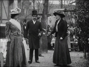
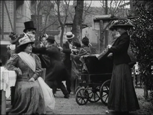
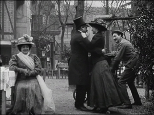
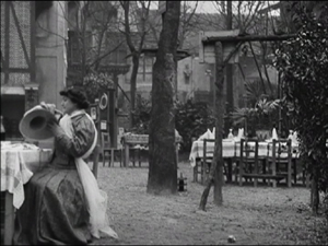
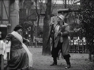
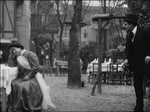
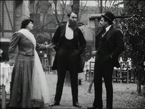
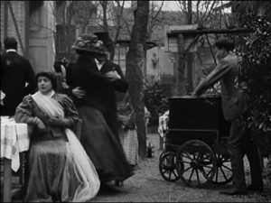
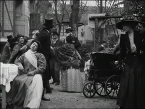
Take L’Assomoir, the earliest undeniable masterpiece from among the films so far shown at Bologna (though L’Homme aux gants blancs and L’Arlésienne come close). It is full of lengthy takes with intricate choreography. In all his films, Capellani clearly gave precise movements and business to each actor present, no matter how insignificant, and their faces, stances, and gestures, often fairly broad, make up for the almost entire lack of cut-ins. Take the scene where Gervaise and her new fiancé Copeau celebrate their engagement in an open-air café, with the proceedings interrupted at intervals by Gervaise’s former lover Lantier and the vengeful Virginie, with whom Lantier has taken up. The scene is done in a single two-minute shot, with the fluid action moving forward and back, in and out.
The ten frames below show phases of the action:
(1) Lantier in the foreground and Virginie in the middle ground watch the engagement party guests arrive. (2) Virginie speaks to Gervaise as Copeau comes forward.
(3) The guests begin to dance, with an organ-grinder coming in from the right. (4) The dancers move out left, and Copeau and Virginie begin to dance.
(5) They move out left with the organ-grinder, leaving Gervaise alone. (6) A comic friend who is continually eating comes back in to speak to Gervaise and then leaves.
(7) Lantier comes in from the right and starts bullying Gervaise. (8) Another friend comes in and drives him away out right.
(9) The dancers and organ-grinder return, with Virginie still dancing with Copeau. (10) The scene ends as Gervaise sits disconsolately while Virginie moves to Lantier and the pair watch Gervaise menacingly from the extreme right edge of the frame.
Similarly complex scenes, notably a celebration of Gervaise’s birthday, follow, culminating in a final shot that runs 6:45 minutes, out of a 35:46 minute film! (There is a pair of titles in Flemish and French that interrupt the shot early on, but the take was clearly continuous, and the titles seem likely to have been added by the exhibitor in whose collection the sole known surviving print was discovered.)
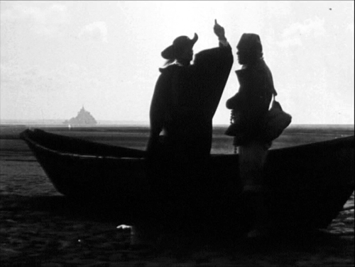
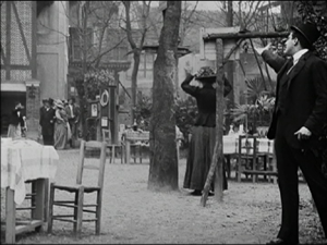
As Mariann also points out, one can find “filmic” elements in Capellani, including “the sheer photographic beauty of exterior shots, which is not to be found in the work of any of his contemporaries.” The frame at the top of this entry, made in 1914, is striking enough. (Mont St. Michel appears only in this fashion, as a tiny shape in the backgrounds of a few shots to establish that the characters have landed on the Normandy coast, but otherwise does not figure in the film.) But I suspect few would guess that the shot illustrated at the bottom was made as early as 1906.
The temptation is to go on and on about Germinal and make a long entry even longer. But Germinal has been the most familiar of Capellani’s films, and I mentioned some writings on it in my first entry. I’ll just make a few remarks about it here.
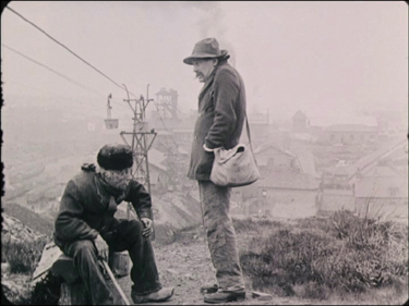
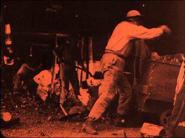
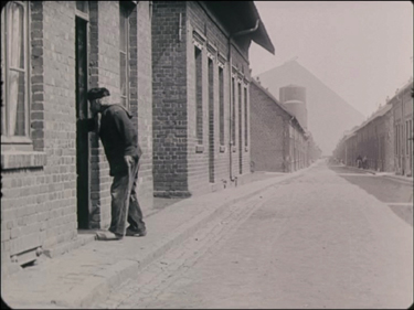
First, Capellani does a remarkably good job of capturing the naturalism of the Zola novel, as the first frame below suggests. Second, the scenes in the mine convincingly convey a sense of cramped working spaces, despite the need to shoot on sets (second frame below).
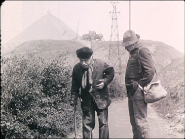
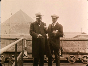
The film also makes highly effective use of the giant slag heaps behind the coal fields, placing them in the backgrounds of shots in various locales:
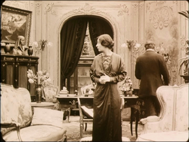
Clearly the resemblance of these neatly squared-off heaps to pyramids did not escape Capellani. (Compare the Red Pyramid at Dashur, above.) I think he intended this to be noticed and to be part of a motif linked to the decor of the mine owner’s study:
Like many rich men in the movies of this era, the owner is characterized as a collector of antiquities and of modern statuary with ancient motifs. (One film shown this year, I forget which, showed a rich man buying such pieces.) A case in the hallway beyond the study presumably houses his real ancient pieces, while his desk sports a small modern statue of a samurai, and the mantelpiece holds a modern Egyptianizing bust of a woman. Capellani was probably intentionally comparing the mine owner to a pharaoh and his workers to the “slaves” who built the pyramids. (This was the view of the time, though the pyramids were in fact built with paid labor.) Such a conceptual use of motifs again marks the sophistication Capellani’s films had reached by the “anna mirabilis” of 1913.
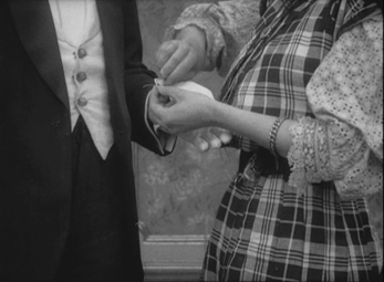
A major step forward since last year is the fact that we now have a reasonably complete print of L’Homme aux gants blancs. As it demonstrates, Capellani can cut in on those rare occasions when it’s necessary (first frame below). Here we need to see the detail of the seamstress fixing a loose button on the new gloves, not just for its own sake but because those gloves will later be lost, found by a thief, and deliberately dropped beside the body of a woman whom the thief kills. The seamstress’ identification of the repaired glove leads to the arrest of the wrong man. In the final shot (second below), the devil-may-care thief, witnessing the arrest, enjoys the irony by holding the door open for a police inspector and handing him his dropped cane. The ending is grim, since the paddy-wagon departs, leaving us to assume that the wrong man will be punished.
I can’t mention all the films shown this year, but two I particularly enjoyed were La Bohème (1911) and Le Signalement (1912), neither of which I can illustrate.
Firstly, this year Capellani’s brother Paul, whom we have seen in smaller roles in previous years, emerged as a fine actor, with perhaps his best work being as Rodolphe in La Bohème. (He played the same role opposite Alice Brady in Capellani’s American feature based on the same story, La Vie de Bohème, in 1916; there the more restrained acting style favored in the U.S. by that point makes his performance less dynamic and affecting.) The familiar tale is compressed but movingly told.
Le Signalement (“The Description”) in some ways echoes the remarkable dramatic twist of the previous year’s L’Épouvante. There a burglar ends by gaining our sympathy, and the suspense during the later part of the film centers not around the frightened heroine but around whether the terrified man will fall to his death. The heroine’s compassion makes for a moving resolution. In Le Signalement, Capellani raises the stakes. A shoemaker and his daughter (granddaughter?) Jeanette, played by the excellent child actor Maria Fromet, live in a French village. The police circulate a flyer describing a child murderer who has escaped from a nearby insane asylum. While delivering some boots, the cobbler is lured to linger in a tavern, and the murderer comes to the house. In characteristic fashion, Capellani lets most of the length of the killer’s time in the house play out in a single take into depth; the camera faces diagonally across the room toward the open door, the only place where help might appear.
When the escapee arrives, Jeannette innocently invites him in and offers him some food, including a dangerous-looking knife to cut a piece of pie. Tempted to kill and yet overwhelmed by the child’s kindness, the man sits and eats. Capellani ups the ante when Jeannette lifts a crying baby, whose presence we had not previously noticed, out of a basket to comfort it, even handing it to the man to rock. During all this we are left in suspense as to whether he will give in to his murderous obsession or resist it. At last the pair hear the police outside, and Jeannette realizes that her visitor is the killer–yet she helps him to escape out the window. Again we are torn, not wanting the child’s generous gesture to be thwarted and yet not wanting a child murderer to run loose! The plot solves the dilemma in a neat and dramatic fashion. Overall, like L’Homme aux gants blanc and L’Épouvante, Le Signalement packs conflicting emotions into a single reel.
Such density of narration is one characteristic of Capellani’s work. As Mariann wrote in the program last year: “Capellani’s speciality as a director is the broad scope of his narratives, connecting different locations and characters, which invests even short films with grandeur and space, to such an extent that the film lengths, given in either metres or minutes, often seem unbelievable. What? Can L’Épouvante really only be 11 minutes long? And Pauvre mère and Mortelle Idylle only 6 minutes each?”
Two final French features
Apparently Capellani made eight films in 1914, but as far as I know, only two survive. Both happen to deal with the French Revolution, and both are based on 19th-Century novels: Le Chevalier de Maison-Rouge (Dumas) and Quatre-Vingt-Treize (Hugo).
Last year I suggested that Le Chevalier might be a bit of a let-down after the heights of Les Misérables and Germinal. But it would be hard to match Germinal, and I have to admit that upon seeing Le Chevalier again on DVD, it kind of grew on me. The main problem, I think, is that Capellani doesn’t take much trouble to give the characters traits and make them sympathetic. They seem more like game pieces in service to the plot. But as always the staging and acting are marvelous, and both locations and sets, as I suggested above, give a vivid sense of revolutionary Paris.
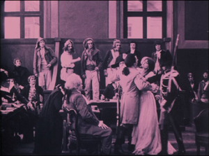
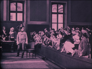
Oddly, though, for the first time there are signs that Capellani is being influenced by cinematic trends of the day and is trying to expand his style in a somewhat tentative way. Clearly, like so many filmmakers, he has seen Cabiria and been impressed by its lumbering tracking shots. The tribunal near the end where the young lovers, Maurice and Geneviève, are condemned uses such a tracking movement well, pulling out from the lovers and the court to include the crowd that welcomes the death sentences:
In a few scenes Capellani also explores offscreen space in a way that I haven’t seen in his other films. Most dramatically, when Maurice sneaks up to the house where he hopes to see Geneviève, he appears small in the distance, disappears out the bottom of the high-angle framing, and suddenly reappears very close in the foreground, having somehow climbed up to a window:
In one scene Capellani even cuts in for a closer view and a different angle during a letter-writing scene. It’s a bit clumsy, with a mismatch on the man’s position–though not one that is worse than many attempted matches in European cinema of the 1910s:
The cut-in isn’t really necessary, though, and one would expect Capellani not to use it. This is one of the few moments in all the films shown where briefly Capellani seems truly old-fashioned, catching up with a technique that had already been in use for a few years. Here I wish he had stuck to his accustomed long shots, for it’s a sign of things to come. The next year Capellani would be working in the U.S. and making a smooth transition into continuity editing.
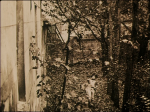
Capellani’s last film in France was Quatre-Vingt-Treize. With the outbreak of World War I, the subject matter, French fighting against French during the Revolution, was considered too provocative in a fervently patriotic context, and the film was banned. Capellani did not finish it but went immediately to the U.S. After the war, it was completed by his fellow theatre/film director André Antoine and finally released in 1921. There is no sign of any of the footage being by a different hand or done at a later time. It appears that Antoine simply edited the footage, perhaps to a script or shot list from the director, since the result on the screen is pure Capellani. It eschews the mild experiments of Le Chevalier and returns to a concentration on acting and a wonderful use of locations. At one point, in a single take, a troupe of Revolutionary soldiers marches past in a woodland setting. After they exit, there is a brief pause, and a man rises up from behind the foreground rocks in the path, signaling. Suddenly counter-revolutionary soldiers pop up all over the frame from the undergrowth and follow their foes stealthily in a seemingly unending stream:
In this film the characters are assigned more traits than in Le Chevalier, and the result, even at 165 minutes, is a rattling good tale.
(I mentioned that Capellani avoided dialogue intertitles. This films has some, but it may be that Antoine added those on his own.)
Despite dealing with the same historical period, the two films say nothing about Capellani’s politics, since in Quatre-Vingt-Treize the sympathies are clearly with the Revolutionaries, and in Le Chevalier, they lie with the group, including the title character, who are plotting to rescue Marie Antoinette from prison.
The American period
Given Capellani’s expertise in and long use of the tableau style of filmmaking, it is remarkable how easily he adapted to Hollywood. Only a few of his films from the early years in Hollywood survive, and His La Vie de Bohème (1916), a pleasant, well-made film, is not nearly as lively and absorbing as the French version, La Bohème (1912). I enjoyed the other features shown, Camille (1915, starring Clara Kimball Young) and The Virtuous Model (1919, starring Dolores Cassinelli), but I couldn’t help missing the French Capellani. It is hard to imagine how his career would have developed had he stayed in France. Perhaps, like Victor Sjöström and Ernst Lubitsch, he could have waited until after the war to move smoothly from the tableau style to adopt continuity editing. Perhaps, like them, he could have remained one of the top filmmakers of the silent period. (He returned from Hollywood to France after directing the 1922 Marion Davies vehicle The Young Diana. He did not direct again and died in 1931.) Good though the Hollywood features are, however, for me they inspire none of the sense of discovery and excitement that the films of the 1908 to 1914 period do.
Wishful thinking
By the 2011 festival, most of the known Capellani films have been restored. Some have improved before our eyes. In 2008 and again in 2010, the older restoration of L’homme aux gants blancs (1908) was shown. The newer, more complete restoration combines images derived from a 35mm print and a 28 mm one. A new restoration of Germinal with toning based on original color indications was shown this year.
There were also some fragments, which were saved for the seventh and final program in the series, “Borders and Blind Dates (A Workshop).” There is a version of Le Belle et la bête, for example, that is badly deteriorated, even within most of the footage retained by the restorers. What little remains suggests that the film must have been quite charming; the fragment is included among the extras on the Cineteca di Bologna DVD. There were also some films that were considered as possible Capellanis. According to the booklet accompanying the same DVD, Capellani is thought to have made anywhere from 70 to 80 films from 1905 to 1912. The number is uncertain, due to problems of attribution. Of these, about half survive, less than a third of them from the 1910-1912 period.
La loi du pardon, a 1906 melodrama of the type Capellani frequently made, is listed in the festival catalogue as “Ferdinand Zecca? Albert Capellani?” It could be Capellani, but to me most of his films of the 1906-07 years, though excellent, are not distinctive enough to be attributed to him without any documentation. Manon Lescaut (1912 or 1914; it is listed as both in the program on pages 128 and 129) was more tantalizing. An adaptation from a classic French novel, made by Pathe’s prestigious S.C.A.G.L. unit, would seem exactly Capellani’s sort of project. The first scene, set in an open-air café, seemed plausible as his work, but the rest of the film has little or nothing of his style about it. Instead there is a lack of long-held, intricately staged shots, one completely unnecessary cut-in, and too many old-fashioned painted sets. Compared to the location work in Germinal or just about any of the big films from the immediate pre-war years, these looked crude. Plus, as Caspar Tyberg pointed out to me, the action was staged more quickly than one would expect from Capellani, who often lets situations develop gradually, with many details in the gestures and facial expressions. There are some of his films in archives but apparently as yet unrestored. (According to the booklet accompanying the Coffret Albert Capellani, the Cinémathèque Française has a negative of a 1909 version of Manon Lescaut.) Otherwise I fear we must count on future discoveries in the archives for more Capellani films. Surely some will be forthcoming, now that archivists are aware of the importance of this newly revealed master. “Cento Anni Fa” will move on into 1912, 1913, and 1914, and perhaps the Capellani retrospective will resurface occasionally.
With the end of the main retrospective, however, it is safe to say that from now on anyone who claims to know early film history will need to be familiar with Capellani’s work. If you live outside Europe and don’t already have a multi-region DVD player, this might be the time to invest in one. It would be worth it just to see these new DVDs.
Capellani films shown at Bologna and their availability on DVD
Symbols used in the list:
* A film on the Coffret Albert Capellani, (La Cinémathèque Française, La Fondation Jérôme Seydoux-Pathé), Pathé, two four discs with booklet, Region 2 Pal. 36-page booklet in French. There is a bare-bones filmography, with titles and dates, on page 35, but this no doubt will be revised as research continues.
** A film on Albert Capellani: Un Cinema di Grandeur 1905-1911 (La Fondation Jérôme Seydoux-Pathé, the Cineteca Bologna) Il Cinema Ritrovato, 1 disc with booklet, Region 2 Pal. Intertitles in various languages; optional subtitles in Italian, French, and English. 55-page booklet in Italian, French, and English.
+ The titles I would most like to see on a future DVD!
In last year’s entry, I expressed the hope that some films from previous years could be repeated. Whether or not that hope influenced the programming, some were.
[Added July 19: Mariann tells me that she is now convinced that La Loi du pardon is genuinely a Capellani film. I find that quite plausible.]
2005
*Le Chemineau (1905)
2006
**La Fille du sonneur (1906)
2007
*Les Deux soeurs (1907)
*Le Pied de mouton (1907)
**Amour d’esclave (1907)
2008
Don Juan (1908)
La Vestale (1908)
*Mortelle idylle (1908)
Corso tragique (1908)
Samson (1908)
**L’Homme aux gants blancs (1908)
Marie Stuart (1908)
2009
*L’Assomoir (1909)
**La Mort du Duc d’Enghien (1909)
2010
Dans l’Hellade (1909)
**Le Pain des petits oiseaux (1911)
*La Fille du sonneur (1906) (Repeated from 2006)
Notre-Dame de Paris (1911)
+Les Miserables (1912)
**Le Chemineau (1905) (Repeated from 2005)
*La Femme du lutteur (1906)
**L’Arlésienne (1908)
Eternal amour (1914)
**L’homme au gants blancs (1908) (Repeated from 2008)
**L’Épouvante (1911)
*Pauvre mère (1906)
**L’Intrigante (1910-11)
La Mariée du château maudit (1910)
**Cendrillon ou la pantoufle merveilleuse (1907)
Samson (1908) (Repeated from 2008)
*Le Chevalier de Maison-Rouge (1914)
*Drame passionel (1906)
**Le Pied de mouton (1907) (Repeated from 2007)
**La Mort du Duc d’Enghien (1909) (Repeated from 2009)
La Fin de Robespierre (1912)
+La Glu (1913)
The Red Lantern (USA, 1919)
*Mortelle idylle (1906)
+L’Évade des Tuileries (1910)
2011
La Belle au bois dormant (1908)
Le Courrier de Lyon ou l’attaque de la malle poste (1911)
+La Bohème (1912)
La Vie de Bohème (USA, 1916)
*Quatre-vingt-treize (1914, released 1921)
**[Amour d’esclave (1907) Not shown for lack of time]
+Le Signalement (1912)
*L’Âge du Coeur (1906)
**Les Deux soeur (1907) (Repeated from 2007)
Camille (USA, 1915)
*Germinal (1913)
**L’Homme aux gants blancs (1908, more complete restoration)
Le Visiteur (1911)
Marie Stuart (1908) (Repeated from 2008)
Le Luthier de Crémone (1909)
The Feast of Life (USA, 1916)
**La Belle et la bête (1908, fragment) In “Extras” on DVD
Foulard magique (1908, fragment)
Béatrix Cenci (1909, incomplete)
**La Loi du pardon (1909) By Capellani or Ferdinand Zecca
La Legend de Polichinelle (1907)
[August 13, 2012: Roland-François Lack has recently added a post on Capellani on his website, The Cine-Tourist. He gives an extraordinarily detailed run-down of the Parisian (and Vincennes) locales used by Capellani (such as the one below), with many frames from the films and both current and vintage photos of the places, as well as a few maps and some engravings and other graphics. Well worth a look!]
La Fille du sonneur (1906)


