FILM ART: AN INTRODUCTION reaches a milestone, with help from the Criterion Collection
Friday | March 16, 2012 open printable version
[UPDATE, March 8, 2016: Film Art has now appeared in its eleventh edition, which, among other things, includes additional online Connect Film examples based on the partnership with the Criterion Collection mentioned below. For more information, see here.]
Somehow round numbers seem significant. This summer, Film Art: An Introduction is due to be published in its tenth edition.
We first set out to write the book in 1977, and it appeared in 1979. We’ve been gratified that it has retained an audience of teachers, students, and general readers over the ensuing decades. During that period, we’ve revised it to keep up with changes in filmmaking, in film studies, and in our own sense of what makes cinema a distinct artistic medium. At the outset we wanted to represent many eras of film history, a wide range of international films, and such important categories as documentary, experimental, and animated films. Our revisions over the years have tried to keep these goals in mind. At the same time, we realize that one way to engage students with ideas about film is to pay some attention to films they know, to enable them to look and listen to familiar movies in new ways.
We think we’ve stayed loyal to these purposes across nine editions. But with the fateful number ten we think we’ve stepped up to a new level. We’ve made many changes to the book that we find exciting; more about these below. The most dramatic development, however, comes through our new online partnership with The Criterion Collection.
Most teachers are familiar with Criterion and its high-end series of DVD and Blu-ray releases of classic and important contemporary films. In 1984, Criterion pioneered the genre of supplements, working at the time with laserdiscs. The team are 100% cinephiles, and they continue to set the standard for a rich array of bonus materials, all the making-of films, interviews, and documents that are of such interest to fans, scholars, students, and aspiring filmmakers. Now, with Criterion’s kind cooperation, we have produced a series of online examples tied to Film Art that will use scenes from several of their classics.
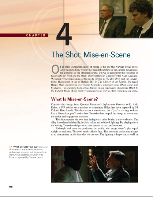
Film Art was the first introductory film textbook to use frame enlargements rather than publicity photographs as illustrations. Other textbooks have since imitated this approach, since it’s a vital tool when teaching students to analyze films. Nevertheless, even whole pages full of frames can’t fully convey the effects of techniques such as camera movement, graphic matches, staging in depth, and sound. The next logical step would be to use examples with scenes from movies, adding graphics and voiceover commentaries to clarify the points being made.
Problems of clearing rights and questions concerning the limits of fair use have made it difficult for textbook authors to supply adequate, high-quality moving-image examples on DVDs or online. The Criterion Collection has allowed us to make this big next step. We’re extremely proud of this new partnership, and we’re grateful to Peter Becker, Kim Hendrikson, Tyson Kubota, Giles Sherwood, and the rest of the Criterion Collection team for their generosity and help. Peter has written a blog about the new arrangement.
Online examples using clips from Criterion Collection films
The result is an hour-long set of twenty examples called Connect Film. Seventeen of these center around excerpts from film classics from the 1930s to the 1980s. David and I wrote the scripts and recorded the commentary tracks. The production, direction, editing, and special graphics were done professionally by Erik Gunneson, a filmmaker and Faculty Associate here at the University of Wisconsin-Madison.The Criterion scenes are presented as moving images rather than still frames; it’s as if the sort of examples we use in Film Art have sprung to life. Erik has also produced three original demonstration videos laying out basics of lighting, camera lens length and movement, and continuity editing.
So why not check out one of our examples? Criterion has posted “”Elliptical Editing in Vagabond (1985),” in its entirety, on its YouTube page. Go here or watch it at the bottom of this post.
Chapter 4 Mise-en-scene
Film Lighting Demonstration This video clearly contrasts the results of side-, back-, and other types of light, as well as the principles of the three-point lighting system.
Light sources in Ashes and Diamonds (1958) The three sources of the light in the opening of the famous church scene are described and also indicated by colored arrows.
Available Lighting in Breathless (1960) This example starts with an extract from an interview with cinematographer Raoul Coutard, produced by the Criterion Collection. Coutard describes shooting without supplemental light in the lengthy bedroom scene, followed by an illustrative clip.
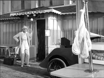
Staging in Depth in M. Hulot’s Holiday (1953; above) A scene of M. Hulot nervously watching a descending lump of saltwater taffy. The clip is run, then repeated with commentary discussing the comic possibilities of deep-space staging.
Color Motifs in The Spirit of the Beehive (1973) Yellow is associated with the bees in this film, but also with the malaise of Spain in the wake of its Civil War. The scene in which the color comes to be associated with the bees is shown, with still frames and commentary discussing other shots where yellow is prominent.
Chapter 5 Cinematography
Lens Length and Camera Movement Demonstration video contrasting the effects of long, medium, and short lenses. Erik also illustrates different types of camera movement.
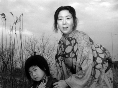
Tracking Shots Structure a Scene in Ugetsu (1953; above) A wife and son bid farewell to a departing boat. Using a split-screen technique, we lay out the shots and show how camera movements are used to add to the ominous, poignant effect of the scene.
Tracking Shot to Reveal in The 400 Blows (1959) While the tracking shots in the Ugetsu example follow the characters’ movements, a scene from The 400 Blows shows how the camera can create other effects by moving on its own.
Style Creates Parallelism in Day of Wrath (1943) Similar camera movements prompt us to compare two scenes.
Staging and Camera Movement in a Long Take from The Rules of the Game (1939) In a scene that is rarely examined in this much-analyzed film, we trace out how a busy scene in a hallway, as guests head for their bedrooms, lays out the setting and highlights minor characters.
Chapter 6 Editing
Editing with Graphic Matches in Seven Samurai (1954) We use this example in discussing graphic matches in Film Art, but it’s hard to get a sense of the patterning from stills, So this clip shows the scene in its context and then replays the series of matches, freezing and laying them out across the screen.
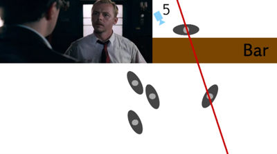
Shifting the Axis of Action in Shaun of the Dead (2004; above) Erik uses stills and overhead diagrams to show how the axis of action can be shifted when characters turn their heads and when new characters join the conversation.
Crossing the Axis of Action in Early Summer (1951) A friendly argument between Noriko and two of her friends employs cuts that consistently move back and forth across the axis of action. An overhead diagram marks the camera positions shot by shot.
Crosscutting in M (1930) Through a first run-through and then a replay with freeze-frames, we study how editing compares gangsters meeting and police meeting.
Elliptical Editing in Vagabond (1985) The enigmatic heroine lives her nomadic life, moving from place to place and meeting a variety of people, rich and poor. In a scene depicting her hitchhiking from near a convent to arrive in a barn, we show how the editing propels our interest but leaves out items of narrative information that increases the mystery of her character.
Jump Cuts in Breathless (1960) Some of the most familiar jump cuts from Breathless are illustrated in Film Art. This example uses a later scene in a cab which uses an unusually large number of such cuts. How many? Let’s count and see.
Chapter 7 Sound
Sound Mixing in Seven Samurai (1954) Our text describes the rich sound mix of the final battle of Seven Samurai, with rain, horses’ hoof-beats, men’s shouts, and other sound effects–all without music. Description, though, goes only so far. Now we can let readers listen for themselves.
Contrasting Rhythms of Sound and Image in M. Hulot’s Holiday (1953) Jacques Tati manages to create a double joke when musical tempo clashes with figure movement.
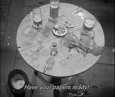
Offscreen Sound in M (1931; above) Even at the dawn of sound, Fritz Lang found inventive ways to avoid static dialogue scenes. Police raid a basement tavern, and even when there’s little movement onscreen we hear bustling activity outside the frame. Some shots, like this one, recall camera angles from earlier scenes.
Chapter 10 Animation
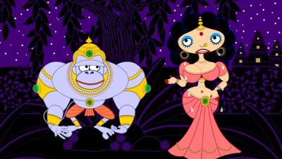
What Comes Out Must Go in: 2D Computer Animation Most of us are curious about computer animation, not least because it offers tools that amateurs and would-be filmmakers can learn to use. We show how independent filmmakers can get high-quality results in My Dog Tulip (Paul and Sandra Fierlinger, 2010) and Sita Sings the Blues (Nina Paley, 2008; above).
Instructors can stream any of these items in their classes, or students can watch them on their own.
Decisions, decisions
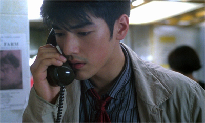
Chungking Express: To hear the voice on the line, or not?
Central as the Criterion extracts are, we’ve made other changes. We’ve done a top-to-bottom rewrite of the text, trying to make it more conversational, more like our blogging. We’ve updated our account of digital filmmaking and we’ve incorporated new information on digital distribution and exhibition–the sort of matters you can find in more detail in David’s Pandora series (which started here).
We’ve tried to make film art tangible for students by asking them to imagine alternative approaches to storytelling and technique. In keeping with this angle of approach, we’ve highlighted decision-making processes: the concrete choices faced by directors, cinematographers, editors, and other creative workers. One of the salient features of Film Art since the beginning has been its effort to blend the point of view of the critic or analyst with the point of view of the filmmaker. Here’s a passage from the first chapter.
Films are designed to create experiences for viewers. To gain an understanding of film as an art, we should ask why a film is designed the way it is. When a scene frightens or excites us, when an ending makes us laugh or cry, we can ask how the filmmakers have achieved those effects.
It helps to imagine that we’re filmmakers too. Throughout this book, we’ll be asking you to put yourself in the filmmaker’s shoes. This shouldn’t be a great stretch. You’ve taken still photos with a camera or a mobile phone. Very likely you’ve made some videos, perhaps just to record a moment in your life—a party, a wedding, your cat creeping into a paper bag. And central to filmmaking is the act of choice. You may not have realized it at the moment, but every time you framed a shot, shifted your position, told people not to blink, or tried to keep up with a dog chasing a Frisbee, you were making choices.
If you take the next step and make a more ambitious, more controlled film, you’re doing the same thing. You might compile clips into a YouTube video, or document your friend’s musical performance. Again, at every stage you make design decisions, based on how you think this image or that sound will affect your viewers’ experience. What if you start your music video with a black screen that gradually brightens as the music fades in? That will have a different effect than starting it with a sudden cut to a bright screen and a blast of music.
At each instant, the filmmaker can’t avoid making creative decisions about how viewers will respond. Every moviemaker is also a movie viewer, and the choices are considered from the standpoint of the end user. Filmmakers constantly ask themselves: If I do this, as opposed to that, how will viewers react?
Even if the reader never makes a movie, we think that getting comfortable with this framework can sensitize us to the power of cinema as an art form.
Of course, we also want to understand the finished film. We need to look at how the choices coalesce into patterns of meaning and effect. This is the holistic bent that the book has always had: we try to understand the choices in the context of the whole film and its purposes. To a large extent film form and film style are the terms we as analysts apply to the patterns of choices that shape our experience.
That emphasis on pattern is something that carries through all of our Film Art editions. It’s valuable to notice techniques or story twists in isolation, but we gain as well from seeing them as parts of larger patterns of organization. Such patterns and processes are highlighted in the case-study analyses in each chapter, as well as in the collection of analyses in Chapter 11. Likewise, Chapter 12 tries to trace some major strategies of form and style across history. The variety of films we consider allows us to spotlight some traditions that are less widely known than the Hollywood one–from France, Italy, Germany, Japan, Hong Kong, and other territories. Cinema is a global art, and we try to recognize that.
Over forty years we’ve learned a great deal about cinema from films and the people who make them. For this reason it’s been stirring to meet many filmmakers from North America, Europe, Asia, and the Middle East who tell us that they have learned something from Film Art. We offer the new edition in that spirit of common learning: to better understand a medium that we all love.


