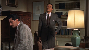
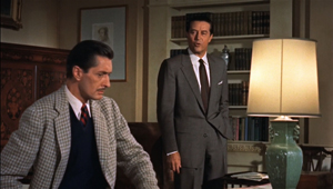
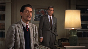
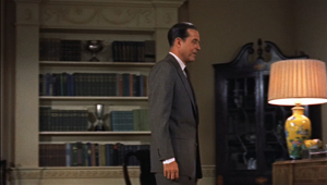
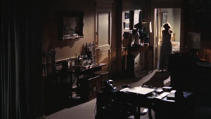
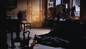
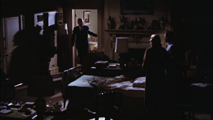
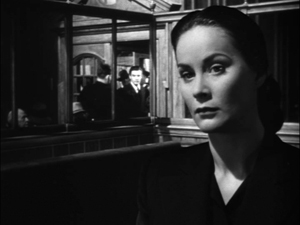
DIAL M FOR MURDER: Hitchcock frets not at his narrow room
Friday | September 7, 2012 open printable version
Dial M for Murder (1954).
DB here:
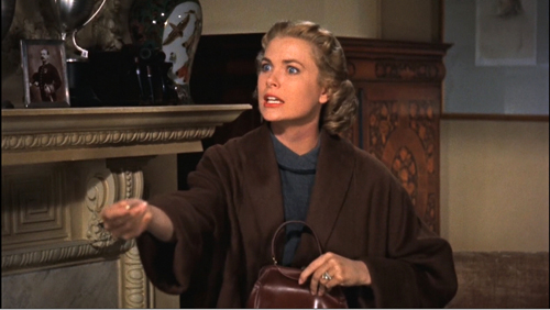
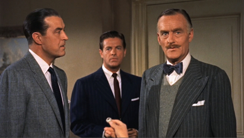
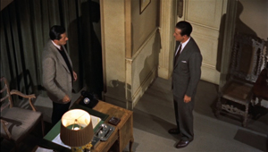
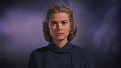
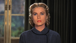
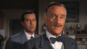
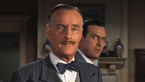
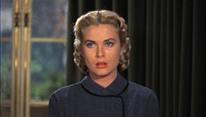
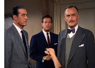
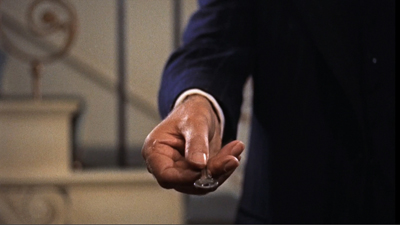
This cut makes you say: Huh? Margo’s hand is shamelessly out of proportion and, judging by the men’s stares, we’re somehow looking through her torso.
Yet does anybody notice it? The cut reminds us that Hitchcock can get away with murder, cinematically speaking. Probably you didn’t need reminding, but even an inveterate Hitchcock watcher (I saw Dial M for Murder when I was about seven years old) can still be shocked by the old guy’s sheer bravado.
In 1979, Dial M was revived, and a restored version began a tour as a re-release, playing in 3D around the US and Europe. It ran in New York’s 8th Street Playhouse in 1981, and Kristin and I caught it in London at about that time. Most relevant to today’s entry, in September of 1981, it screened in a 3D retrospective at what was then called the Festival of Festivals, the earlier incarnation of the Toronto International Film Festival. According to Variety, the late-night show turned away a thousand people.
It’s good to report, then, that about thirty years later it returns to what has become one of the most important festivals in the world. Last night Dial M, muscled up in a digital restoration, screened to a sold-out house at TIFF. Preparing some remarks to introduce it, I found myself captivated once again by this curious project. Overshadowed by Rear Window, which was released later the same year, it now seems quite a daring movie, and not just because of this brazen cut. This newest restoration is very welcome, for it gives us an occasion to see what Sir Alfred can sneak past us.
Naturally, there are spoilers ahead, so if you haven’t seen the film you probably shouldn’t read past the next couple of sections.
3D: Device, demand, decline
During the 3D boom of early 1953, Warner Bros. was an enthusiastic participant. House of Wax, released in April, had proven a huge success; ultimately it would earn $9.5 million and become the top 3D release of the period. Jack Warner halted production from April through early July in order to retool the studio for the new process. Jack announced several pictures going into stereoscopic production, including Lucky Me, Helen of Troy, Them, and A Star Is Born. None of these wound up in the new format, but two others, Hondo and Dial M for Murder, did.
At summer’s end, 3D was starting to flag, largely, it seems, because screening the films posed so many problems. No system had been standardized, and different studios embraced various formats. Late in 1953, some interest perked up, chiefly because of Hondo and MGM’s Kiss Me Kate, but very soon the fad was over. In early 1954 most 3D releases played in their flat forms, and some were released only that way. In April, a month before Dial M opened, Variety ran a story headlined “3-D Looks Dead In United States.”
Dial M had been shot in summer of 1953. According to Bill Krohn, Warners was obliged by contract to wait until the original play had concluded its run, so the release was delayed until May 1954. By then even Jack had lost faith in the format. Dial M was the first Warners 3D picture that the studio permitted to be shown flat in first run, and most exhibitors took that option. 3D, Hitchcock reflected, was a nine-day wonder, “and I came in on the ninth day.” The picture still did reasonably well, earning $3.5 million–but Rear Window returned nearly three times that to Hitchcock’s new home, Paramount.
Wider, deeper, in color
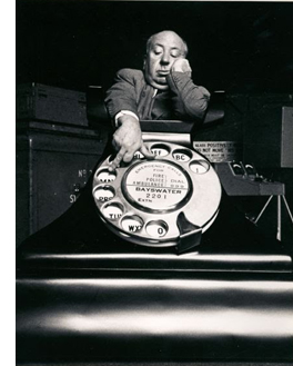 Dial M for Murder confronted Hitchcock with three new technical challenges. Most obviously, the demand that the film be shot in 3D created problems with the bulky camera (“the size of a room,” Grace Kelly remembered, with some exaggeration). It couldn’t focus some shots as closely as Hitchcock would have preferred. The extreme close-up of Tony Wendice dialing, like the shot that starts the opening credits, had to be made with a giant telephone and a big fake finger, a piece of effects work that Hitchcock happily publicized.
Moreover, cinematographers were still figuring out how to judge each shot’s best convergence point (roughly, the way the two lenses defined the location of the screen’s surface) and interocular distance (the distance between the two lenses, mimicking the spacing of our eyes). Misjudging these factors could lead to distortions, such as making actors look closer together or farther apart than intended. Hitchcock worried about the “waste space” around his players in the initial footage the crew shot. In addition, directors had to be careful when the convergence point was set beyond foreground figures. If the figure was cut off by the frameline, a partial torso could be floating out at the audience. (The same threat can arise in today’s 3D films.) Interestingly, there are very few shots in the film’s first half that use a vertical frameline to bisect a character, and almost no over-the-shoulder reverse angles, which were, according to one cinematographer, risky.
Hitchcock’s concern for too much empty space might have been aggravated by the studio’s demand that the film be in widescreen. With the rise of CinemaScope, most studios had decided to release films in wide formats, and Warners was no exception. Dial M was released in 1.85:1.
Finally, although Hitchcock had shot in color before, this was his first outing with Eastman Color, a single-strip emulsion that eliminated the need for three-strip Technicolor. (Indeed, Eastman Color made several new processes, like 3D and CinemaScope, feasible.) But the new stock was somewhat less sensitive to light than Technicolor, and one advantage of shooting single-strip—the fact that you no longer needed the big Technicolor camera—was lost because of the 3D apparatus.
Faced with these obstacles, Dial M can look like a step backward. In Hitchcock’s interview with Truffaut, he agreed, claiming to have been “coasting, playing it safe. . . . I was running for cover again.” He had been planning a more personal project that fell through, and it was Warners that suggested he do Dial M, a property they’d acquired. After seeing the play, he agreed, but even while shooting, Grace Kelly recalled, he was already planning Rear Window.
At first glance, Dial M for Murder seems like the epitome of photographed theatre. Nearly all the action unfolds in the apartment of Tony and Margot Wendice, mainly in their living room. We get brief views of the bedroom, the terrace, and the hallway outside. Only about five minutes, or about 6 %, of the film take place on the street or in Tony’s club.
Both Frederick Knott, author of the play and screenplay, and Hitchcock failed “to take full advantage of the screen’s expansive powers,” opined Brog. of Variety. “As a result, ‘Dial M’ is more of a filmed play than a motion picture.” In talking with Truffaut, Hitchcock seemed to agree. “I just did my job, using cinematic means to narrate a story taken from a stage play.” In another interview he elaborated:
I think that’s the job of any craftsman, setting the camera up and photographing people acting. That’s what I call most films today: photographs of people talking. It’s no effort to me to make a film like Dial M for Murder because there’s nothing there to do.
Actually, I think there was a lot there to do, and Hitch did it.
Acknowledging the source
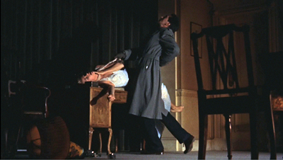
We could counter Hitchcock’s just-a-job-of-work argument easily by citing what he did with the famous attempted strangulation. Swann, alias Lesgate, has slipped out from behind the curtain. After waiting tensely for Margot to lower the phone, he wraps the scarf tightly around her neck and thrusts her onto the desk. She squirms, frantically grabs a pair of scissors, and stabs him in the back. Next, according to Knott’s stage directions:
Lesgate slumps over her and then very slowly rolls over the left side of the desk, landing on his back with a strangled grunt.
No viewer will ever forget the far more hideous death that the would-be killer suffers onscreen. After flopping over Margot, apparently dead, he snaps back to life spasmodically, as if jolted by bursts of electricity. His body yanks itself erect, his arms twisting helplessly as he tries to withdraw the blades, before he turns over and hits the floor . The impact drives the scissor blades further into his back. Hitchcock celebrates the moment with an Eisensteinian overlapping cut to a close-up of the scissors. He had a special pit dug, he proudly told a reporter, to make the lens flush with the floor.
So much for just setting up the camera and photographing the people acting. We could point to other alterations from the play, such as the strained drawing-room courtesies that frame the whole story. “Let me get you another drink,” is the film’s first line, as Margot and Mark pull out of a passionate clinch. At the end, nabbed, Tony offers to pour his wife and her lover a drink, and then asks the detective: “I suppose you’re still on duty, Inspector?” There’s also the peculiar mustache motif. The play text and the film dialogue mock Lesgate/ Swann slightly for growing one, but the film adds the mini-gag of self-satisfied Inspector Hubbard calmly combing his own mustache.
Fine as these isolated moments are, Hitchcock’s treatment is more thoroughgoing. He does, as he tells us, use cinematic means “to narrate a story taken from a stage play.” But those means are unusual and instructive.
Hitchcock had already experimented with plots confined to tight quarters–a lifeboat (Lifeboat, 1944) or a parlor and hallway (Rope, 1948). It’s plausible, as many critics have noted, that he tried the same thing with Dial M. But those earlier films seem more technically radical. You couldn’t ask for a much more cramped space than a lifeboat, unless you wanted a phone booth (which Hitchcock did consider for a film). Similarly, Rope‘s experiment with very long takes (it has only 11 shots) made it extraordinary for its day. From this perspective, Dial M can look like a retreat. It expands its range of action in modest ways, and it doesn’t try for a consistent long-take look. There are nearly seven hundred shots, and the average runs a little under ten seconds, quite normal for the period.
Yet limiting the action largely to the apartment wasn’t exactly taking the line of least resistance. In adapting a play, there’s always a temptation to open things up. Most plays include a great deal of action that takes place before the play’s opening scene, or in other locales offstage. In other words, the plot of the piece is highly selective and concentrated in both space and time, while the broader story—the sum of all the incidents that contribute to the action—is recounted or suggested on stage. Most film adaptations “ventilate” the original by dramatizing these scenes, as Brog. apparently would have preferred.
Hitchcock resisted the temptation to open out the play. Showing scenes that take place before the stage action (perhaps the theft of Margot’s handbag, or Tony’s stalking of the shady Swann/ Lesgate) would have lost the tight focus of the original. Moreover, we can gain an extra layer of interest when action is recounted rather than dramatized: we get both past events and present attitudes toward them. (In other words, sometimes we should tell rather than show.) Most intriguing, though, is Hitchcock’s comment to Truffaut that opening up a play “overlooks the fact that the basic quality of any play is precisely its confinement within the proscenium.” Hitchcock wanted “to emphasize the theatrical aspects.”
Hitchcock wasn’t alone. In the 1940s, several filmmakers were rethinking the problem of filming theatre, and they were exploring ways to bring out the “theatrical aspects” of the material. In a brilliant 1951 essay, André Bazin pointed out that filmmakers were now confident enough in their creative choices to adapt plays while acknowledging the pleasure of purely theatrical conventions. These films, he suggests, engage us by acknowledging the theatricality of theatre.
Bazin pointed to Olivier’s Henry V (1944), which begins in an Elizabethan playhouse and gradually moves its scenes to realistic settings. He mentioned as well Cocteau’s Les Parents terribles (1948), which, somewhat in the manner of Dial M, finds an equivalent for the play’s single-room set by expanding the film’s locale just slightly to take in an entire apartment. Other examples would include Welles’ Macbeth (1948), Melville’s Les Enfants Terribles (1950), and H. C. Potter’s The Time of Your Life (1948). Earlier in the decade, the obviously artificial sets and to-camera addresses of Our Town (1940) and Wyler’s handling of the parlor and staircase in The Little Foxes (1941) suggest a sort of para-theatre, cinema that supplements or amplifies stage conventions rather than trying to escape them.
That Hitchcock should join this trend toward new forms of filmed theatre is surprising. Earlier in his career, as a director nurtured by the silent movies and particularly American and German films, he had been an advocate of “pure cinema.” That meant, above all, editing and pictorial storytelling. Talky scenes were anathema. He wrote in 1937:
If I have to shoot a long scene continuously I always feel I am losing grip on it, from a cinematic point of view. . . . What I like to do always is to photograph just the little bits of a scene that I really need for building up a visual sequence. I want to put my film together on the screen, not simply to photograph something that has been put together already in the form of a long piece of stage acting.
Yet in 1948, he explained that he had yearned to film scenes in long takes.
Until Rope came along, I had been unable to give full rein to my notion that a camera could photograph one complete reel at a time, gobbling up 11 pages of dialogue on each shot, devouring action like a giant steam shovel. As I see it, there’s nothing like a continuous action to sustain the mood of actors, particularly in a suspense story.
He took much the same approach in Under Capricorn (1949).
Why does the montage-oriented director ten years later make two of the showiest long-take films in Hollywood history? I’ve suggested in an essay in Poetics of Cinema that there was something of a long-take contest among American directors in the decade after Citizen Kane. The competition was propelled partly by new equipment that permitted long, flowing camera movements. This “fluid camera” trend, as it was called in American Cinematographer, pushed ambitious directors toward shots that might run several minutes. Welles, Preminger, Minnelli, Cukor, Ophuls, Siodmak, Joseph H. Lewis, and several other directors tried their hands at virtuoso long takes, and in some cases those were applied to stage adaptations. Welles stretched one shot in Macbeth to the length of a whole camera reel.
With Dial M, Hitchcock largely gave up the long take (though a few shots run a minute or so), but he tried something else. He offered a form of filmed theatre that has its roots in silent moviemaking, and he explored ways to transpose it to 3D cinema.
A chamber play
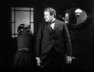
Sylvester (1924).
In fall of 1924 Hitchcock went to Germany, where he toured the magnificent Ufa facility and became acquainted with the work of the industry’s outstanding creators, especially Lang and Murnau. Most writers have emphasized his acquaintance with the Expressionist films of the early 1920s, and he sometimes mentioned his admiration for The Cabinet of Dr. Caligari. But he also praised Lubitsch, who was no Expressionist, and when asked about his major influences, he answered, “The Germans. The Germans.” It’s not farfetched to assume he was aware of another trend in local production, the one known as Kammerspiel.
The Kammerspiel, or “chamber play,” emerged in German theatre, and the film equivalents appeared in the early 1920s. The Kammerspiel film typically confined itself to a few settings and emphasized psychological conflicts among a small cast of characters. Surprisingly, the major instances, such as Shattered (Scherben, 1921), Backstairs (Hintertreppe, 1921), and Sylvester (aka New Year’s Eve, 1924), weren’t adapted from plays but were original scripts by Carl Mayer. The most famous Kammerspiel film, which Hitchcock would likely have seen during his visit, was Der letze mann (aka The Last Laugh, released December 1924), directed by F. W. Murnau. Extensive tracking shots were rare in most silent movies, but Murnau built his film around them. He and Mayer, who had scripted Der letzte Mann, came to America and there made Sunrise (1927), famous for its elaborate camera movements.
Another major director pursued the chamber aesthetic well beyond the silent cinema. Carl Dreyer had made a Kammerspiel film, Michael (released September 1924), and he carried the lesson of the trend back to his native Denmark with The Master of the House (1925), an adaptation of a popular play. Like Dial M, the film concentrates on one locale—a family’s apartment, built out of hundreds of detailed shots of the actors and sets, with almost no camera movements. Later, Dreyer would apply the Kammerspiel aesthetic to other play adaptations, Ordet (1955) and Gertrud (1964), but presented in long, gradually unfolding tracking shots.
With a Kammerspiel aesthetic, you get something fairly distinct from what we think of as filmed theatre. The baseline prototype of filmed theatre is the PBS/ Metropolitan Opera model: a live performance captured by several cameras. The cameras don’t really penetrate the space; they give us different angles and shot scales (usually thanks to different lens lengths), but we don’t have a sense that the camera is in the thick of things. A more flexible form of filmed theatre occasionally inserts the camera among the performers, as with certain shots of Wenders’ Pina. But for Hitchcock, Dreyer, and the chamber-film aesthetic, the space of the “stage” becomes completely permeable. The actors are stuck in the set, but the camera can go anywhere there. The camera can scan the space, jump below or above it, even rotate. The result feels both theatrical and cinematic—a concentrated stage piece heightened by the tools of cinema.
Locked inside these four walls
Films in the Kammerspiel mode find drama in intimacy and routine. Sometimes called “doorknob cinema,” these films draw suspense out of prosaic activities: crossing a room or simply waiting for someone to come through a doorway can become major turning points. Dial M is doorknob cinema par excellence; a latch comes close to being a character. But the director’s problem is to dynamize this enclosed space, to make furniture and entryways and trips back and forth across a parlor engrossing. So it’s a question of how to film it all.
The proscenium tradition of Western theatre pretends that the setting’s fourth wall has been removed. We look through it to the action. PBS-style canned performances preserve this convention, keeping us on the auditorium side. But Kammerspiel-style filming doesn’t adhere to this. Not only does the camera shoot from angles that would be unavailable to a spectator in a playhouse, but it may show all four walls of the set. Dreyer’s Master of the House does this, freely cutting from one side of the action to another, so rigorously that we could sketch a complete floorplan of the rooms.
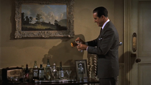
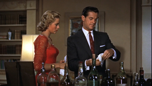
Dial M does much the same. Consider that bar table against one wall. It’s shown straight on in many shots, but at least once the drinks are shown in the foreground (with striking 3D saliency) and behind Margot and Mark we see the other wall behind them, the one “through which” we’ve seen action before.
Why go to the trouble of showing the fourth wall? It supplies visual variety while expanding the play in a way that is at once “theatrical” (the space is still enclosed) and “cinematic” (the camera can go anywhere). Allowing a fourth wall also permits more complex staging effects. Characters can now make a circuit around the entire set. This is notable in Dreyer’s late films, when the character’s walk is covered in a single tracking shot, as if the set’s four walls have been ironed out on the screen.
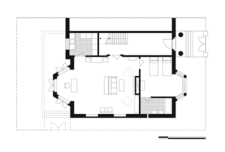
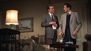
Hitchcock does the same sort of thing through cuts. In one scene, we follow Tony as he finally takes control over Swann, convincing him to kill Margot. Here the showing of the fourth wall can mark off a privileged portion of the scene. To get a sense of how this happens, we can look at a plan of the apartment provided by Steven Jacobs in his stimulating book The Wrong House.
The living room is the biggest space, with the kitchen (never shown) and hallway above it. To the right of the living room are the bathroom (never shown) and the bedroom. The street is at the far right of the diagram, the terrace and garden at the far left.
The living room is the main arena of action. In the left area are the French windows, with Tony’s desk and desk chair in the alcove. The drinks bar, flanked by two chairs, stands along the uppermost wall. Adjacent to the right chair is the crucial main doorway. In the center of the room, facing the fireplace at the right, is the sofa and coffee table, with a narrow table running behind the sofa. Two wingback armchairs are angled alongside the fireplace. On the long bottom wall are bookshelves, hanging pictures, two chairs, and a china cabinet (not pictured).
During most of the film, we are oriented to the apartment from camera positions facing the wall with the drinks bar and the doorway (the top area of the floor plan). At a crucial passage, however, Hitchcock takes us around the entire living room, clockwise.
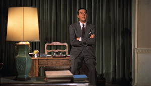
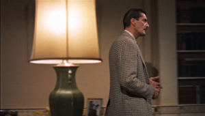
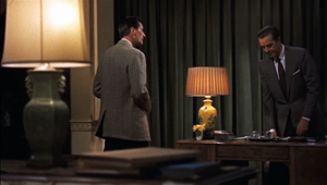
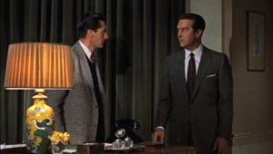
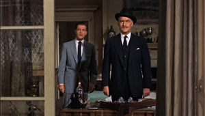
Tony has been unveiling how much he knows about Swann’s crimes. In this movie, the desk is the place of power, where both the phone and Tony’s account book are. Starting at the desk, Tony builds up the pressure. He moves along the familiar side of the room to confront Swann as he wipes the glasses.
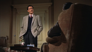
He controls their conversation, even when he pauses to sit down and face a looming Swann.
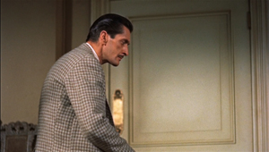
These shots get Tony to a midway resting point. He explains that he’s already framed Swann as the man blackmailing Margot. This pushes Swann into an angry sulk. Hitchcock uses Swann’s static profile as a pivot, in order to switch camera positions 180 degrees. As Tony continues to squeeze Swann, we see a corner of the fourth wall we just more or less occupied.
Call this the “stick” part of the sequence. When Tony proposes a carrot—a thousand pounds in exchange for killing Margot—we follow him from the new side we’re on. Swann turns uneasily away, and a slight change of angle accentuates his shift.
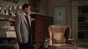
As Swann edges to the fireplace, Tony strolls rightward, passing a bookcase and the china cabinet. When he gets to his desk, he reaches into a drawer.
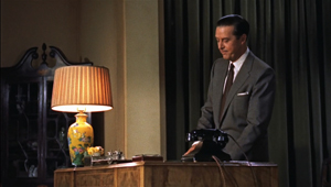
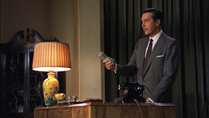
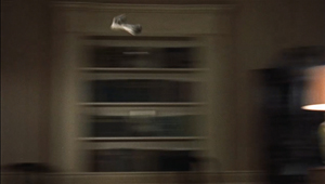
“You can take this hundred pounds on account.” He tosses the money across the room, and the camera pans with it across the fourth wall. The sheaf of bills lands in the wingback chair Tony had relaxed in earlier.
Swann doesn’t touch the money but advances to the desk to check Tony’s claim that the bills can’t be traced. So we make another half-circuit of the room.
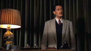
Now we’re back in the zone in which the shot started. When Tony says that the murder will take place “approximately where you’re standing now,” Hitchcock cuts to a low-angle shot of Swann, starting. (This is one of many examples gainsaying the idea that a low angle confers power on an individual.)
This entire passage, the culmination of Tony’s efforts to recruit Swann to his cause, is rendered in a series of fairly short shots, not long tracking movements. And indeed the “wild wall” with the bookcase would have been much more difficult to manage in a single take. Probably that’s one reason Rope doesn’t show us its fourth wall.
After this patient, quietly bravura passage, Hitchcock starts a new one, this time from a high angle.
The orientation, one we haven’t seen before in the film, marks a fresh phase of the action: it’s the first of many rehearsals and replays of the killing. This section of the scene gains force by its contrast with earlier low-angle shots and the steady circuit we’ve made of the living room.
Echoing frames
Naturally, Hitchcock dynamizes Knott’s play by means that we’ve seen in other of his films. There are passages of subjective cutting, in which we’re given the optical point-of-view of a character. Early in the film POV shots are assigned to Tony, but as Margot gets drawn into his trap, Hitchcock gives her subjective shots too. The pivot comes when during Hubbard’s questioning. Tony steps out from behind the Inspector and her glance flicks to check his expression. She’s telling the lie he coached her to tell. Our alliance starts to shift to her–and to Hubbard, through whose eyes we’ll see what happens in front of the house at the climax.
At the climax, when Inspector Hubbard brings Margot out of prison to solve the case, a comparable peekaboo dance takes place through her vision, with Tony replaced by Mark.
There’s also the remarkable passage of mental subjectivity reminiscent of 1940s montage sequences, in which Margot’s trial and condemnation are compressed into abstract shots showing her as if facing the judge (above). These images again at once open up the play a bit and keep faith with the tightly circumscribed premises of the film. As Hitchcock explained to Truffaut, he handled the court proceedings in such a stylized fashion because shifting the action to another concretely defined space would have destroyed what he’d built up. “People would have started to cough restlessly, thinking, ‘Now they’re starting a second picture.'” The passage also reinforces our emotional attachment to Margo that was initiated during Swann’s attack.
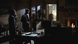
Keeping the action within one set also allows Hitchcock to exploit a tactic that’s common to Hollywood films but that seldom gets such a workout—the repeated setup that carries echoes of earlier actions. I’ve supplied examples in an earlier entry, on Nolan’s The Prestige, but needless to say Hitchcock gives us a master class in reiterated or rhyming setups. The several tours of the apartment activate different props and zones while also highlighting key areas, such as the desk and the door that will come back later. When you have only a few sets, you can layer the audience’s sense of the scene’s progress by calibrating your camera positions to evoke earlier shots of the same bit of space.
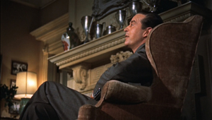
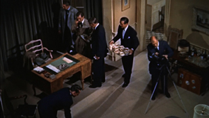
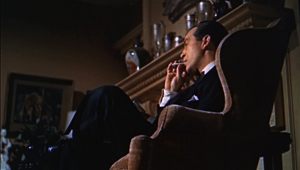
For example, when the police are investigating Swann’s death, a high angle ironically echoes Tony’s rehearsal of the murder plot (above). Another straightforward instance is seen in the low angle on Tony in the wingback chair. We first see it when Tony offers his purring explanation of how he’ll frame Swann (above). That shot is recalled quite precisely when, after having adjusted to Swann’s death, he relaxes in the chair after setting up the framing of Margot.
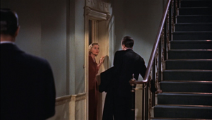
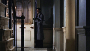
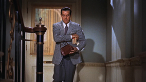
The hallway area receives more prolonged development, with the carpeted stairs becoming more prominent as the film proceeds.
In the second shot above, Hitchcock denies us what any other director would show: a closer view of Tony slipping the key under the carpet as he’s talking casually to Margot. It’s a token of respect for our intelligence, I think. He knows we’re watching Tony’s hand, even in long shot.
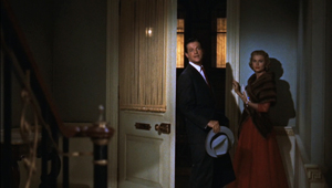
Not until Swann arrives do we get the variant of the framing that will be modified at the climax, when Tony comes back from the police station.
Both of these shots play out as parallels and variants, as each man reaches for the key under the stair carpet.
A similar framing presents the grisly aftermath of the murder attempt, contradicting Tony’s confident patter about the plan.
Later, the key framing shows Inspector Hubbard setting the trap for Tony, in a shot recalling the trap Tony set for Margot. When Tony is caught and tries to escape, Hitchcock cuts to the prime orientation to show his path barred.
Of course, filming several shots from the same general setups can save time during production, but shrewd directors turn those repetitions to narrative advantage. In this case, they let Hitchcock have his cake and eat it too: he can stay concentrated on a single set, but he can create a web of associations among different phases of the action. The narrow rooms of Knott’s play are transformed by cinema.
Superflat?
The widescreen format forced upon Hitchcock may have been another source of his worry about “waste space.” He used lampshades and other items of furniture to balance the 1.85 compositions. More important, his use of 3D has long seemed rather conservative. Is it?
There are almost no instances of objects popping out from the screen surface; the famous example is Margot’s hand plunged out and toward the scissors on the desk during Swann’s attack. The space is discreetly layered, as when the bottles on the bar table or the bedstead moved to the living room command the foreground of shots. On the whole, Hitchcock follows both advice and custom in using the frame as a window: the depth is on the other side of the screen, tapering toward the distance. This was recommended practice at the time, and still is today.
More important, 3D Westerns like Fort Ti and Hondo and 3D musicals like Kiss Me Kate have settings stretching into the far distance, so you can show an extreme range of depth behind the screen/window. But if you’re shooting an apartment set, you don’t have much distance to play with. The result is a “shallow depth” that is at odds with a central trend of 1940s cinema and many 3D productions of the day.
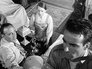
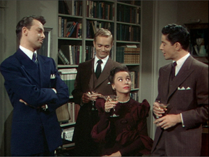
Like other directors working in the 1940s and early 1950s, Hitchcock sometimes embraced tight depth compositions with big foreground heads or objects. Here are shots from The Paradine Case (1947) and I Confess (1953).
Color filming made shots like these more difficult, as the film speed didn’t allow the lenses to be stopped down so far. Accordingly, for Rope and Under Capricorn, Hitchcock either spread his actors out clothesline-fashion or kept the foreground far enough from the lens so that the depth of field could be managed.
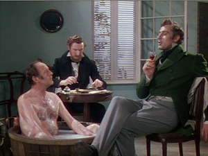
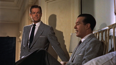
3D added more constraints. Fox cinematographer Charles G. Clarke recommending putting nothing very close to the camera and relying on 50mm lenses for medium shots (rather than the wider 35mm ones common in 2D black-and-white filming). Hitchcock’s cinematographer Robert Burks had shot Hondo and is said to have worked uncredited on House of Wax, so he was aware of the emerging 3D conventions. But the relatively flat spaces of Dial M yielded depth shots that don’t spread its faces across great distances. In many of the shots shown above, you can see that when figures are arrayed in some depth, the foreground is fairly far away from the lens. We have a convenient comparison in the opening of Shadow of a Doubt (1942) and a late scene in Dial M.
In the later film, Milland in the foreground is further from the lens, and Cummings is closer to him than the landlady is to Joseph Cotten. In most shots in Dial M, the space of the set is shallower, and the characters are typically packed closer together, than in the deep-focus films of the 1940s.
Paradoxically, then, it was harder to get aggressive depth compositions in 3D films than in 2D ones. But Hitchcock seems to have taken advantage of the shallow space of the Wendice apartment to concentrate on his actors, often isolated in single shots rather than the jammed frames of the 1940s. Given the wider frame, his compositions may seem bland, and sometimes they display the waste space he deplored. Still, his approach throws nearly all the emphasis onto the “theatrical” features of line readings, postures, gestures, and facial expressions.
Moreover, seeing the 3D screening at Toronto right after seeing digital 2D copies, I was struck by how many planes are out of focus in the 3D version. Presumably the 2D transfers have always been taken from one or the other of the dual-camera negatives. The result is a harder-edged image than what 3D creates with its staggered overlap of images.
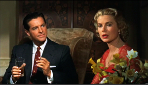
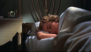
Focus is extremely selective in the 3D version, with often only a face or even a cheek crisp and everything else significantly softer. For example, it’s not easy to discern in the 2D versions that in 3D, Margo’s face is the only plane in focus in the first shot below; both the bouquet and Mark, as well as everything else, is not as sharp. Later, Hitchcock makes the bedside clock salient by letting it be the only item fully in focus, but I don’t think you’d know that from the harder-edged image on display on the DVD and the download version.
Unlike the 1940s deep-focus style, then, Dial M‘s color 3D puts very few planes in focus, accentuating the shallowness of the space of the scene. The foreground furniture and lamps would be distracting if they were in focus (as, say, they tend to be in The Ipcress File). Like a silent-film director practicing the “soft style” of the 1920s, Hitchcock uses 3D to surround his characters with cushiony, vaguely defined planes.
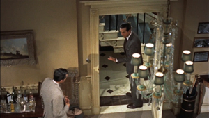
I’m tempted to see Hitchcock flaunting shallow space in one of the more remarkable moments in Tony’s murder rehearsal. As we’ve seen, high angles trace Tony’s path around the parlor. They also highlight the suitcase that hasn’t been visible in earlier shots, what with all the low angles. But when it’s necessary for Tony to show Swann where he’ll hide the key, we get something quite unlike the rest of the film.
Most directors would either shoot the scene from inside the apartment, framing it in the doorway (as the set is filmed when Hubbard reveals the lost key), or from some vantage point in the hall, probably from rather close to the carpet. Instead we get a cut from the master-shot high angle straight in to another high angle, but taken with a much longer lens.
Peering through the chandelier at Tony’s ploy, riveting our attention on the key, this shot emphasizes depth in a way that few other shots in the film do. Yet the long lens has the effect of squeezing the planes together, negating the effect of 3D and relying on monocular depth cues like distance and the out-of-focus chandelier. It might as well be an axial cut out of Kurosawa.
This image, like the two shots I started with, the implausible and underhanded cut showing Margot displaying her key to the three men, reminds us that Hitchcock is always ready to tell stories of the unexpected, in unexpected ways. And these ways celebrate the ability of film to transform whatever it touches.
Years after Dial M, Hitchcock may have soured on the theatre-driven phase of his career. Yet Wordsworth’s sonnet in praise of sonnets celebrates what you can accomplish within a “scanty plot of ground.” By embracing the theatrical trappings of Dial M for Murder, Sir Alfred does more than tell a suspenseful tale. He fastidiously demonstrates that cinema’s power is unpredictable.
At Toronto, the digital version of Dial M was shown in the original 1.85:1 aspect ratio. The 2004 DVD employs a 4:3 ratio. The version circulating on iTunes HD rental and the 3D Blu-ray disc announced for October, are in 1.77. I’m drawing my frames from the 1.77 version, the closest I can get to the original release.
The 4:3 DVD is not the full-frame film that was recorded in camera. The 1.77 version of Dial M that I worked from includes more material on the sides than can be seen in the DVD release. Correspondingly, a little is trimmed from the top of the 1.77 shots and more is cut from the bottom, and these portions are visible on the DVD. For those who want to study Hitchcock’s visuals, the forthcoming 1.77 Blu-ray is probably to be preferred. But the 1.33 version offers a chance to see how that shot of Margo’s hand was made. Some lady was apparently kneeling underneath the camera.
Speaking of cameras, initial publicity for Warners’ switch to 3D refers to the creation of an “All-Media Camera” that could shoot any aspect ratio and either 2D or 3D. There is evidence that Hondo and subsequent releases were shot on this device; its workings are explained here.
The 1981 Toronto Festival of Festivals’ screening of Dial M is covered in Sid Adilman, “‘Chariots’ Races to Most Popular Film Nod At Toronto Fest,” Variety (22 September 1981), 6. Variety‘s original review of the film is available in the 27 April 1954 issue, p. 3.
Thanks to Steven Jacobs for permission to reproduce his floor plan of the apartment. It originally appeared in his The Wrong House: The Architecture of Alfred Hitchcock (010 Publishers, 2007). Wesley Aelbrecht executed the drawing. Steven analyzes the use of the set on pp. 101-109.
Information on 3D during 1952-1954 comes from three standard sources, Adrian Cornwell-Clyne’s 3-D Kinematography and New Screen Techniques (Hutchinson, 1954); New Screen Techniques, ed. Martin Quigley, Jr. (Quigley, 1953); and R. M. Hayes, 3-D Movies: A History and Filmography of Stereoscopic Cinema (Scarecrow, 1989). See also Thomas M. Pryor, “Warners Reviving Full Film Output,” New York Times (25 June 1953), 23, and “3-D Looks Dead In United States,” Variety (26 May 1954), 1. Some rules for shooting 3D are formulated in Charles G. Clarke, “Practical Filming Techniques for Three-Dimension and Wide-Screen Motion Pictures,” American Cinematographer 34, 3 (March 1953), 107, 128-129, 138.
3-D Film Archive, an invaluable website stuffed with rare images, is run by Bob Furmanek. Particularly helpful entries are here and here. Also check the Home Theatre Forum for posts by Bob.
Hithcock’s remark about 3D creating “waste space” is quoted by Barbara Berch Jamison in “3-D Spells ‘Murder’ for Alfred Hitchcock,” New York Times (11 October 1953), X5. The passage is somewhat opaque, though, and Hitchcock might instead, or also, be referring to the widescreen format. Other quotations come from François Truffaut, Hitchcock (Simon and Schuster, 1967), pp. 156-159 and the 1963 interview “Hitchcock” by Ian Cameron and V. F. Perkins in Alfred Hitchcock Interviews, ed. Sidney Gottlieb (University Press of Mississippi, 2003), p. 51.
Hitch’s comments on editing versus long takes come from two essays, “Direction,” from 1937, and “My Most Exciting Picture,” from 1948, a transcribed interview. Both are available in Hitchcock on Hitchcock: Selected Writings and Interviews, ed. Sidney Gottlieb (University of California Press, 1995), pp. 253-261 and 275-284.
For information on Hitchcock’s career, I’ve drawn on Patrick McGilligan’s Alfred Hitchcock: A Life in Darkness and Light (HarperCollins, 2003) and Donald Spoto’s The Dark Side of Genius: The Life of Alfred Hitchcock (Little, Brown, 1983). See also Bill Krohn, Hitchcock at Work (Phaedon, 2000), p. 130.
Bazin’s essay, “Theater and Cinema,” is available in What Is Cinema? vol. 1, ed. and trans. Hugh Gray (University of California Press, 1967), pp. 76-124. My quotation of the stage directions from Knott’s play come from Frederick Knott, Dial “M” for Murder (Dramatists Play Service, 1954), p. 37. You can read Wordsworth’s “Nuns Fret Not at Their Convent’s Narrow Room” here.
Kristin discusses German Kammerspiel films in our Film History: An Introduction, pp. 95-96. Her remarks on the genre and on Backstairs can be found on Antti Alanen’s blog. I consider Dreyer’s treatment of kammerspiel conventions in The Films of Carl-Theodor Dreyer (University of California Press, 1981). The first essay in my Poetics of Cinema connects Rope with 1940s trends in long-take shooting and the “fluid camera.” See as well Herb A. Lightman, “The Fluid Camera,” American Cinematographer 27, 3 (March 1946), 82, 102-103, and “‘Fluid’ Camera Gives Dramatic Emphasis to Cinematography,” American Cinematographer 34, 2 (February 1953), 63, 76-77. Some of these ideas are discussed in our blog entry, “Bergman, Antonioni, and the Stubborn Stylists.”
I’m grateful to Cameron Bailey, Jesse Wente, Andrew McIntosh, and Brad Deane for enabling me to participate in the screening.
P.S. 12 Sept 2012: Richard Allen of NYU points out to me that John Orr, in his book Hitchcock and Twentieth Century Cinema explores Hitchcock’s Kammerspiel affinities in Dial M and other films. “It is Hitchcock, not Lang,” Orr writes, “who renews the European Kammerspiel tradition in the age of sound and Hollywood colour” (p. 63). I regret that I haven’t read that book, but now I intend to! Excerpts available on Google books suggest that my arguments go in different directions than Orr’s. In any event, Orr is a distinguished film scholar whose work always rewards attention.
P.P.S. 16 Sept 2012: I should also have referenced the special 3-D issue of Film History 16, 3 (2004), which includes articles by William Paul and John Belton, among others. In another essay, Sheldon Hall discusses Dial M, concentrating on manipulations of point-of-view, with other material on the film’s relation to the play. The whole issue is well worth reading, and I regret not recalling it when writing this entry.
P.P.P.S. 11 Oct 2012: At Twitchfilm, Jason Gorber provides thoughts on the digital restoration and an interview with Jesse Wente, who supervised the programming of Dial M for TIFF.
P.P.P.P.S. 11 Oct 2012: At 3Dfilmarchive.com, Bob Furmanek and Greg Kintz provide a dazzling consideration of the new restoration and the Blu-ray release, along with detailed production background and many original documents. Using production documents and photographs, Bob indicates that the Warners All-Media Camera was used on Dial M, and my entry has been revised to reflect the likelihood that this was the case. I’d appreciate further information from interested readers on that gadget, beyond the usually cited passages from John Wayne’s Hondo correspondence. A minority opinion claims that the machine was unworkable and Warners films were shot in the Natural Vision system, but I’ve seen no evidence that would support this. Thanks again to Bob for keeping me in the loop.


