Archive for December 2012
The ten best films of … 1922
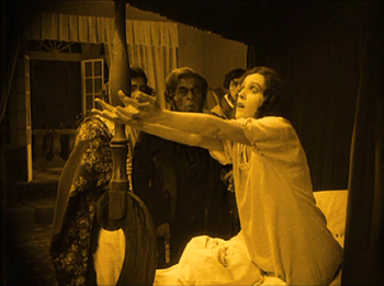
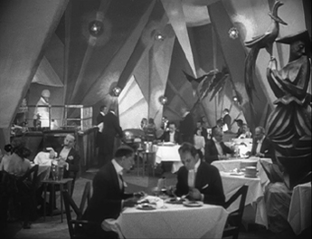
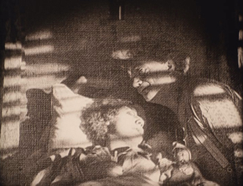
Dr. Mabuse, der Spieler, Part 1.
Kristin here:
As the end of the year approaches and critics are posting their ten-best lists for the year, David and I once again fail to follow that tradition. Instead, we follow our own custom, now six years old, and turn our historians’ eyes back ninety years to offer ten great films from 1922. Of course, there are many films from the silent era that are lurking in archives, waiting to be discovered. Still, pointing to some noteworthy films we do have may help viewers to explore that rich period of cinema’s past.
Our previous lists can be found here, for 1917, 1918, 1919, 1920, and 1921.
For the past two years, I’ve noted that it was difficult to fill out the list of ten masterpieces. I keep thinking that I’ll get to a year where I won’t have to say that, but 1922 turns out not to be that year. Some titles were obvious, but the last one or two took some hunting.
As usual, one problem is that so many films are lost. Not one of John Ford’s three films of 1922 survives. In other cases great directors made lesser films. Important though Das Weib des Pharao was in Ernst Lubitsch’s career, partly because it shows him quickly picking up influences from Hollywood films, I can’t rank it among his first-rate titles. The same is true of Victor Sjöström, whose Vem dömer isn’t up to the level of other films like The Outlaw and His Wife.
Some of the films here, then, we consider classics but not masterpieces. Still, they have been influential and are well-regarded by other critics and historians. We’ll just call attention to them and let people form their own opinions.
Germany rules
But here are two full-fledged masterpieces, both from the German Expressionist movement. They demonstrate the potential for popular genres—here the horror and master-criminal genres—to achieve the highest level of filmmaking.
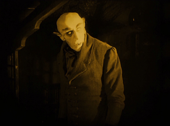
Few of F. W. Murnau’s early films survive, but there’s no doubt that he hit his stride in or before 1922. He made two outstanding films that year, Der brennende Acker (“The Burning Earth”) and Phantom, along with one of his very finest, Nosferatu. It is the earliest surviving film adaptation of Bram Stoker’s Dracula. (“Nosferatu” is Rumanian for “vampire.”)
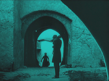
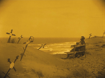
Nosferatu is generally considered an Expressionist film, though there are only a few of the stylized sets that we tend to think of as vital to that artistic movement. Murnau instead mostly uses a combination of staging and framing in real locales to create echoes of shapes between characters and their surroundings, something usually accomplished through more painterly means in films like Das Cabinet des Dr. Caligari and Die Nibelungen. The nested arches in the left image frame Hutter’s arms, while Ellen’s forlorn slump on the bench as she awaits her husband’s return is juxtaposed with the leaning crosses that hint at fruitless vigils in the past.
One of my favorite moments in Nosferatu comes during the scene where Count Orlock is about to attack Hutter in one of the bedrooms in his castle. Ellen, at home in Wisburg, somehow senses this and in a panic throws out her arms in a desperate appeal for mercy. Orlock turns and looks away from Hutter, and the next shot again shows Ellen’s appeal.
It is a classic shot/reverse-shot situation, and yet the two are in different countries, many miles apart. The situation is ambiguous. Does Orlock sense Ellen’s appeal? Does he somehow magically see her from afar? Whichever is the case, he does leave Hutter’s room, and the clear implication is that her gesture has caused that withdrawal. Such a treatment of space is unusual, to say the least.
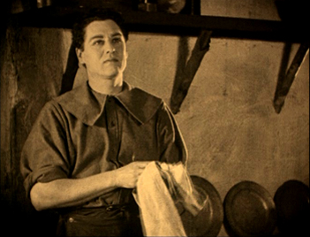
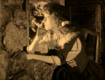
“False” eyeline matches or shot/reverse-shot passages linking distant characters were already fairly conventional. Hoping to put another of Maurice Tourneur’s films on our ten-best list, I watched his 1922 Lorna Doone. Though it has some marvelous passages, especially in the final battle, I couldn’t justify including it. Still, it provided a more conventional version of the false shot/reverse shot. In a scene where the hero thinks of Lorna, looking off front right, the following shot shows her thinking of him and looking off left.
They are in houses on neighboring estates, but they certainly cannot see each other. Moreover, there’s no indication that either suspects the other one is thinking of him/her. There is no ambiguity. Clearly the lovers are simply daydreaming about each other. The Nosferatu scene is more puzzling and evocative.
There is much more that once could say about Nosferatu—especially the experimentation with fast motion, negative footage, and pixillation to render the supernatural nature of the vampire—but I leave that for the reader to discover. There are a number of DVD versions available, but the Kino one contains the restored print and a documentary about the film’s production; the restoration is also available in the UK from Eureka!.
If this blog is still functioning in ten years, our list will definitely include a second great vampire film, Carl Dreyer’s Vampyr.
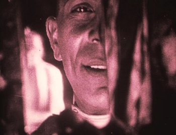
While Nosferatu plays on exotic, historic fantasy, Fritz Lang’s Dr. Mabuse, der Spieler (“Dr. Mabuse, the Gambler”) places its bizarre crime story squarely in contemporary Berlin. Mabuse (the incomparable Rudolf Klein-Rogge) is a master criminal with hypnotic powers, a man of innumerable disguises who lures his victims into gambling, whether in casinos or on the stock exchange. He also steals crucial documents to manipulate stock prices and controls the lives of many of the main characters. Throughout the lengthy plot, Detective von Wenk follows Mabuse’s trail, himself eventually falling under the criminal’s spell before exposing Mabuse’s identity.
Unlike with Murnau, we now have all of Lang’s early films and can judge his entire career. Arguably his first great film was Der müde Tod, which was on last year’s list. The first of his three Dr. Mabuse films (the others being Das Testament des Dr. Mabuse, 1933, and his last film, Die tausend Augen des Dr. Mabuse, 1960) was a step upward. It was made as a two-part serial: Der grosse Spieler—Ein Bild der Zeit (“The Great Gambler—A Picture of the Time”) and Inferno: Ein Spiel von Menschen unserer Zeit (“Inferno: A Play about People of Our Time”); together the parts run about four and a half hours.
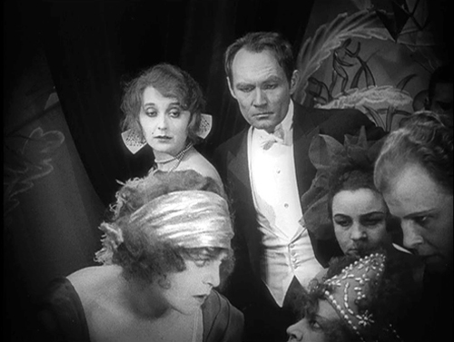
The plot of Dr. Mabuse, der Spieler is very complicated and demonstrates Lang’s extraordinary ability to present a narrative visually. His sets, lighting, and staging are impeccable and already recognizably Langian. Consider the frame at the top of this entry.
In a gambling den, von Wenk, at the center top, and two important female characters, Countess Told, beside von Wenk, and Cara Carozza, left foreground, are staring at a rich old lady who has just gambled away a huge amount of money, caught by Mabuse’s spell. Her loss is the central action, yet she is placed so low in the frame as to be recognizable primarily by her silly beaded hat. Her gigolo, partly offscreen at the right, considers his position in the light of this disaster. Cara reacts with horror, the Countess and von Wenk with distress and sympathy. The other woman is an onlooker.
The tableau style of staging, keeping all the significant characters onscreen and moving them by slight increments to stress each character in turn, is still in play here, but the camera is closer to the actors, and they don’t move much. This isn’t just a tiny moment caught in the midst of a shifting composition. This is the composition. It looks remarkably modern. Each character, in his or her own way, is wondering, as we are, what has brought this minor character to such a pass. And she is tucked into a corner of the frame, as Lang will do in later films.
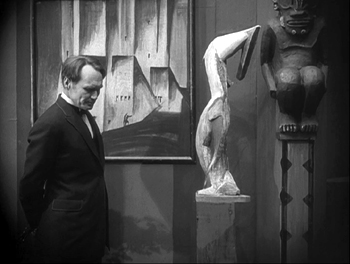
Dr. Mabuse‘s stress on “Our Time,” contemporary Weimar Germany, brings in the film’s Expressionistic elements. Expressionism here isn’t an all-encompassing filmic treatment that reflects a fantasy world or the psychological extremes of the characters. Instead, it is a tangible decorative impulse pervading the modern city. Below, von Wenk responds with distaste upon first viewing Count Told’s collection of modern art; yet in another scene, he calmly dines with an associate in a thoroughly Expressionist restaurant:
The bits of set visible in the background of this entry’s top frame indicate that the casino is another Expressionist locale.
The restored two-part film is available from Kino in the USA and in “The Complete Fritz Lang Dr. Mabuse Box Set” and from Eureka!’s “Masters of Cinema” series in the UK.
The grandiose and the modest as French Impressionism defines itself
The French Impressionist film movement can be said to have begun in 1918 with Abel Gance’s La Dixième Symphonie, though it has relatively few moments of the sort that came to define the style. It primarily uses superimpositions and split screen to convey a sense of the composer’s musical performances. Films by critic and theorist Louis Delluc followed, and Marcel L’Herbier explored pictorial and poetic effects in his early films. Highly subjective uses of film technique, which we think of as crucial to Impressionism, appeared in a really consistent way in El Dorado (1921), which was the first film of the movement to appear on our ten-best lists.
In 1922, the movement gained momentum with Gance’s monumental La roue. Many critics and historians consider this and Gance’s Napoléon masterpieces. I consider them more uneven, with brilliant stretches mixed in with melodramatic, sentimental, even occasionally maudlin scenes mixed in. Few people have seen all the surviving footage from La roue. The shorter versions available tend to eliminate the sentimental bits, which often run on and on. I’ve already voiced my opinions, favorable and less so, in the entry “An old-fashioned, sentimental avant-garde film,” posted when the longest version available on DVD was released by Flicker Alley.
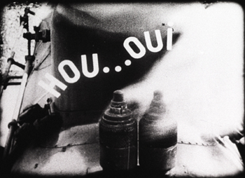
I mentioned there that the footage cut from the shorter versions of the film seemed to be some of the sentimental moments. One such scene seems to me unintentionally risible. The hero, Sisif, is a veteran train engineer; he has suffered an injury that is slowly causing him to go blind. Unable to face turning his beloved engine over to a rival engineer, he ponders destroying it. Sitting on the engine, he asks whether it would not prefer being wrecked to being turned over to another driver. The replies to his questions are given as titles superimposed over the train:
This is, I think, representing Sisif’s delusion that the engine speaks to him, but I’m afraid it comes across as if the train is suddenly talking out loud. In a sound film it’s easy to understand that a sound can originate subjectively in the mind of a character. People don’t, however, tend to imagine sounds as written words!
There’s no question that La roue has some extraordinary scenes. The opening train wreck and its aftermath are justly famous, as is the accelerating editing in the scene in which Sisif drives his stepdaughter Norma, with whom he is secretly in love, into the city to marry another man; his agitation and thoughts of crashing the train are reflected by the increasingly shorter shots. And although it’s dangerous to make claims about any film having the first use of a given technique (usually someone will find an earlier one), Gance seems to have been the first to use stretches of single-frame editing. These occur at a moment when one character in a crisis situation (trying to avoid spoilers here) recalls a cluster of scenes from his past. Maybe the Soviet Montage directors would have come up with that idea on their own—but maybe not. Along with El Dorado, La roue helped define what were to be the main traits of Impressionism.
One thing I didn’t mention in my entry on La roue is the striking contrast between the romance plot and the many scenes shot around the train-yard, which were shot on location. They add a gritty realism that does much to make up for the melodrama—a realism that largely disappears in the final portion, when Sisif is transferred to a mountain location to run a funicular train.
Most of the French Impressionist directors, and particularly Gance, L’Herbier, and Delluc, were concerned to prove that cinema was an art form. Their films tended to be serious, poetic, and based more on in-depth psychological portraits than on the more action-oriented films of Hollywood. They were also clearly made by Artists with a capital A. Gance and L’Herbier liked to start their films with close-ups of themselves staring into the lens with artistic fervor. L’Herbier’s photos included autographs. The films were designed to appeal to an intellectual crowd, though Gance’s were also highly successful at the box-office. Other directors’ films weren’t hits, however, and as the decade progressed more of them played only in the ciné-clubs and art theaters that sprang up.
Another Impressionist film of 1922, Jacques Feyder’s Crainquebille, took a very different tack. I remember seeing Crainquebille decades ago and not thinking much of it, though it has long been considered a classic. Now, however, watching the 2005 restoration by Lenny Borger and Lobster Films, I think it’s much more interesting. That’s not surprising, given that the print I originally saw was probably the 50-minute American release version, and the restoration adds half again as much footage, bringing it to 76 minutes. (The Internet Movie Data Base lists the original Belgian release print as 90 minutes, so presumably what we have is still not complete.)
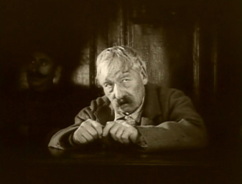
Crainquebille has been admired for its realism and for the performance of a well-known stage actor of the day, Maurice de Féraudy in the title role. Jérôme Crainquebille is an elderly vegetable peddler, and much of the film was shot in the streets and markets of Paris, sometimes using long lenses to capture scenes of crowds and passers-by, unaware of the camera’s presence. But what struck me upon seeing it again is that Feyder was trying to make an Impressionist film for ordinary cinema-goers, perhaps the working-class people who could relate best to Crainquebille’s situation and milieu.
True, the film has a prestigious pedigree, being an adaptation of an Anatole France novel and starring a famous theater actor. Yet the story is simple and told in a relatively straightforward manner. Most of the action arises from a misunderstanding: A gendarme, thinking Crainquebille has insulted him, arrests him. A leisurely scene shows the protagonist enjoying the unusual luxury of his prison cell: a comfy bed, free meals, a toasty radiator, hot and cold water in a pristine sink, and a floor clean enough to eat off. A working-class audience would probably find this wryly amusing.
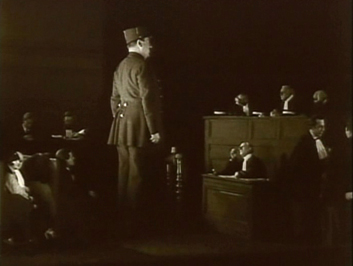
More telling, though, is the fact that when the typical camera techniques of Impressionism are used, Feyder inserts explanatory intertitles just before the subjective shots occur. This particularly happens in the long central trial scene. When the gendarme steps up to testify, a title informs us, “In Crainquebille’s eyes the Constable looked as important as his testimony.” We see Crainquebille gazing forlornly off right front and then his point-of-view of the witness, looming like a giant over the courtroom:
Subsequently a passerby from the scene of the “crime,” Dr. Mathieu, testifies on Crainquebille’s behalf. A title informs us, “To Crainquebille this testimony seemed to carry little weight.” We see a similar pair of shots, with the witness a tiny figure in the midst of the court. Naturally Crainquebille is found guilty and goes off to two further weeks of free room and board.
The next scene begins with an intertitle, “Dr. Mathieu’s Nightmare.” We see Mathieu in bed and then are taken into his nightmare, which depicts the court as a stylized, hellish place with the judges fearsome figures who leap onto their desk in extreme slow motion. (I have no way of knowing what the source of these intertitles is, so I must simply assume here that they reflect what was in the original film.)
Such heavily signaled experiments wouldn’t in themselves make Crainquebille a real masterpiece, but at a time when Impressionism was just gelling as a recognizable style, it seems a laudable attempt to find a non-elitist way to use it. In addition, the shots of the market where Crainquebille goes each morning are quite lovely, taken from neighboring rooftops with telephoto lenses.
As to what was restored in this version, there is remarkably little information on the internet. My notes from an archive viewing of the shorter version in 1984 suggests that the entire opening sequence in the restored version is “new.” It consists of Crainquebille and other vegetable peddlers pushing their carts across Paris to the main market. They pass through a wealthy district, which is characterized with vignettes of rich people’s decadence. The peddlers then pass through a high-crime district, with police rounding up criminals and prostitutes. (The inclusion of prostitutes suggests why this scene was cut for the American version.) The shorter version begins with the market scene and leads quickly to a scene in which Crainquebille rescues a poor newsboy from bullies, and the the scene where he is arrested follows. The entire character of Dr. Mathieu, the sympathetic witness, was cut, so the short version has a briefer trial scene and no nightmare. The action that follows Crainquebille’s release from prison is the same as in the restored version.
Crainquebille is available as part of a set, “Rediscover Jacques Feyder French Film Master,” along with restored versions of two of his other major films of the period, L’Atlantide (as “Queen of Atlantis,” 1921) and Visages d’enfants (as “Faces of Children,” 1925).
Hollywood dramas: The somewhat old and the somewhat new
The two Hollywood films on this year’s list are very familiar Hollywood classics, so I won’t spend much time introducing them.
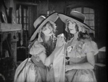
D. W. Griffith probably appears for the last time in our 90-year-ago lists with his historical epic, Orphans of the Storm. This tale of the French Revolution featured the last appearances for Griffith of Lillian and Dorothy Gish, whose first film roles had been in his American Biograph short, An Unseen Enemy, in 1912. They play apparent sisters, Henriette and Louise (though Louise is in fact adopted) living in a Normandy village. Louise becomes blind, but Henriette takes her to Paris in the hope of finding someone who can restore her sight. Upon arriving, they are separated and victimized, Henriette by the decadent nobility, Louise by the dishonest poor. Eventually they are caught up in the Revolution, and Henriette is nearly executed at the guillotine.
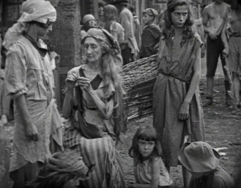
As in his best features, Griffith combines an ability to represent melodramatic stories of idealized, virginal heroines alongside naturalistic, convincing images of the poor:
Orphans of the Storm represents the lingering influence of the Victorian theater on Griffith. The slightly later Naturalistic strains of nineteenth-century literature are evident in the cynical narratives of Erich von Stroheim. His first film, and the most completely preserved, was Blind Husbands, featured in our 1919 ten-best list. As I said there, Blind Husbands is my favorite von Stroheim film, with its relative light take on attempted seduction, near marital infidelity, and retribution. Foolish Wives took the theme much further, with the director again playing the heartless rake, Count Wladislaw Sergius Karamzin. Rather than pursuing one vulnerable wife, he seduces every woman in sight, including a hotel maid and an invalid, bedridden girl (above whose bed a crucifix hangs, to make sure we grasp the sinfulness of Karamzin’s lust).
Von Stroheim famously reconstructed the casino and surrounding buildings of Monte Carlo, resulting in a budget overrun. Universal made the best of his profligacy by advertising Foolish Wives as the first million-dollar movie ever. (Whether it really was or not we shall probably never know.)
Although much of the film is fairly conventional, with shot/reverse-shot conversations, von Stroheim experimented occasionally. At the left below, he shoots into a small mirror as Karamzin secretly ogles the heroine, who is behind him, as she undresses. In a number of shots von Stroheim films through a scrim to give a canvas-like effect to a composition. Here the invalid girl whom the villain eventually tries to rape is seen with her doting father.
As with all of von Stroheim’s films after Blind Husbands, Foolish Wives was taken out of his hands by the studio and shortened considerably. Much of this was done by trimming the lengths of individual shots. The original film apparently does not survive, so it is impossible to assess the director’s style thoroughly, especially when it comes to editing. The revisions were not nearly as great, however, as with his 1924 film Greed, which was cut by well over half. Thus of all von Stroheim’s 1920s films, Foolish Wives is probably closer to what he intended than most. The standard version of the film (restored by the American Film Institute but not of sterling visual quality) is available from Kino in an edition that includes a 78-minute documentary, The Man You Loved to Hate, written by von Stroheim expert Richard Koszarski.
Hollywood silent comedy
Every year our list visits the great three slapstick comedians: Chaplin, Keaton, Lloyd. Sometimes it’s all three, sometimes two. They have all been working their way through shorts to the great features of the 1920s. Chaplin made it there last year with The Kid. In 1922 he had a light year, reverting to two-reelers with The Idle Class and Pay Day, so we’ll skip him here and pick him up again later.
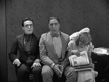
In 1922 it was Harold Lloyd who moved up to features with Grandma’s Boy. Not on a level with some of his later films, like Girl Shy (sure to be high on our 2014/1924 list), but a real charmer with some classic Lloyd routines.
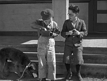
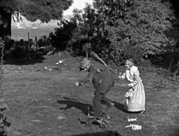
Lloyd is undoubtedly best known for his “thrill” comedies like Safety Last (1923 and heavily favored to feature on this list next year), where he climbs a skyscraper. Still, his more typical roles in the features show him beginning as a timid or socially inept young man who gains courage or skill in the course of the narrative. In Grandma’s Boy, an amusing and touching scene introduces the hero as a perpetually frightened child, unable to stand up even to littler boys who steal his lunch. Once he has grown up, his diminutive grandmother manages to chase off an intruding hobo with her broom after the Boy (none of the characters is named) has failed do so:
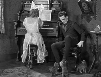
Despite his timidity, the Boy has managed to attract a Girl, and a Lloydian string of gags occurs when she invites him and his thuggish Rival to visit her at home. Grandma polishes the Boy’s shoes with goose grease and dresses him in an antiquated suit with mothballs in the pockets. Once at the Girl’s house, the Boy attracts the unwanted attentions of a litter of kittens determined to lick his shoes. When the Girl reacts badly to the mothball-scented suit, the Boy hides the balls in a box of candy. This leads to a hilarious scene in which he and the Rival both accept some “candy” from the Girl and end up grimacing in sync and trying to smile every time the Girl glances at them.
As with many good classical films, almost exactly halfway comes a turning point: the sinister hobo has robbed a jewelry store and shot a man. The film’s second half becomes an extended chase in which the reluctant Boy is enlisted as a deputy. Thanks to a little psychological trick played by the Grandmother, he wins out.
Grandma’s Boy is available in the indispensable “The Harold Lloyd Collection,” one of New Line Home Entertainment’s finest achievements, or separately with some other features as Volume 2 of the same set, or even more separately with seven shorts from Kino.
Buster Keaton was still making shorts in 1922, but this doesn’t put him at a disadvantage in our list. Experts agree that of Keaton’s twenty starring shorts (after his work as sidekick to Fatty Arbuckle), the best are The Boat (1921) and Cops (1922). Both are strongly touched by the streak of surrealism that frequently shows up in Keaton’s work—as in the dream-within-a-film scene that forms the bulk of Sherlock Junior (1924).
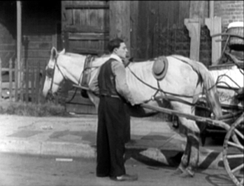
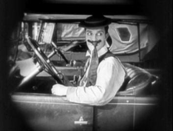
In Cops, Keaton plays a young man trying to impress his beloved by making good in some fashion. He is duped by a crook pretending to be evicted, who sells him the furniture of a family moving house, along with the horse and wagon that has come to transport it. Taking off through the city with the furniture he intends to resell at a profit, Keaton finds himself in the midst of a police parade and innocently accused of throwing a bomb actually lobbed by an anarchist. Chaos breaks loose. No matter where our hero runs, everyone he encounters turns out to be a cop—including his sweetheart’s father and the owner of the furniture.
The film is full of wonderful sight gags. Keaton hangs his hat on the protruding hip bone of a scrawny horse, and he tries to make a mustache disguise out of a clip-on tie.
Cops is available in Kino’s collection of Keaton shorts and in its collection of most of the features and shorts. Also available in the UK in the Eureka! “Masters of Cinema” box set of all Keaton’s shorts.
Next year, Our Hospitality!
Documentary and storytelling
Although we’re not overwhelmed with admiration for our final two films, they demanded inclusion because they are recognized as canonical classics.
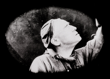
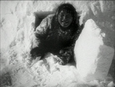
Nanook of the North has frequently been described as the first feature-length documentary. Here’s an example where it was dangerous to call something first. There is in fact at least one earlier, filmed at the opposite end of the Earth: Frank Hurley’s South (1919), a record of Ernest Shackleton’s famous shipwrecked expedition to the Antarctic. But Nanook found a much wider public and became a classic, while South disappeared until 1998, when it was restored by the British Film Institute.
Nanook also had the advantage of a charismatic central figure and his attractive family, a picturesque depiction of Inuit life, and a carefully scripted story that included moments of danger during a walrus hunt and humor during a visit to a trading post.
Still, the film has drawn criticism for its extensive manipulation of reality. “Nanook” was in fact an Inuk named Allakariallak, and the woman represented as his wife was not married to him. Scenes were staged, as when an already-dead seal was used in a hunt. Nanook expresses amazement at a phonograph, though he was already familiar with such devices. The Inuit had already adopted firearms for hunting by the time Flaherty filmed them, but he requested that they use spears instead.
As has been pointed out, however, Flaherty was trying to present a slightly earlier phase of the Inuit culture, preserving a lifestyle that was rapidly changing. Moreover, the documentary mode had previously consisted largely of actualities and travelogues, and there was little precedent for what Flaherty was doing. For decades after Nanook (originally subtitled A Story of Life and Love in the Actual Arctic), documentaries tended to be structured fairly explicitly as tales with entertainment value. In the wake of cinéma vérité, the issue of filmmakers interfering with their subjects and staging scenes has become controversial, but it was not a great concern in the 1920s.
If we accept the notion that this is a documentary with considerable manipulation, we can credit the film with conveying a good deal of information about the Inuit of a slightly earlier period. The igloo-building scene is interesting and informative, even if we know that the interior shots had to be made in an igloo actually open on one side to provide light for the camera.
Nanook of the North was restored and released by the Criterion Collection in 1999.
Although it also appeared in 1922, Benjamin Christensen’s Häxan tends not to get equal credit as the supposed first feature-length documentary. Perhaps that is because it barely qualifies as a documentary. It’s not clear what other genre or mode it belongs to, though it tends to be admired mostly by fans of horror films.
Häxan purports to be a lecture on the history of witchcraft. Its English title is Witchcraft through the Ages, though the original title means simply “Witches.” The first reel consists of a series of images from books both scholarly and sensational, showing ancient images of supposed witches or witch-like creatures. The claim is that witchcraft has been a universal concept in cultures throughout history. Whether this is true I can’t say, but the images shown of ancient Egyptian deities are not witches but protective figures.
In the second reel, Christensen begins to illustrate the points being made with staged scenes of witches, surrounded by animal skeletons and other macabre items, many of them used in potions. Gradually the staged scenes develop into a narrative set in the Medieval or early Renaissance era, with one old woman being accused of witchcraft and tortured. She finally admits to being a witch and names her accusers as witches, and the imprisonment and torture spread. Like Dreyer in Leaves from Satan’s Book and Day of Wrath, Christensen condemns the very notion of witch-hunting and the hypocrisy and cruelty of the Church. Yet he shows a considerable fascination with torture methods—although in place of graphic scenes he presents static shots of contorted limbs and exhausted victims.
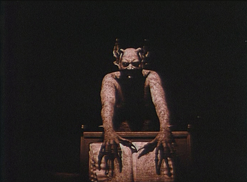
The true strangeness of the film, however, comes from its visualization of demons and devils as real beings. They conducting orgies, fly on broomsticks, and attempt to seduce people into evil and madness. Perhaps we are to take these images as what the Church assumes is happening, but there is no indication of that. One has to suspect that ultimately the educational “lecture” premise of the film, which is handled in a perfunctory way, is an excuse for staging scenes that range from quite powerful (see below) to merely cartoon-like, with people dressed up in crudely made costumes.
At the end the lecture mode returns, with an unconvincing series of comparisons of witchcraft with modern-day activities.
Whatever one thinks of the subject matter and its treatment, the film’s cinematography is extraordinarily beautiful.
Häxan has been restored by the Svenska Filminstitutet and was released on DVD with optional English subtitles. The restoration is available in the USA from the Criterion Collection, but I haven’t seen it or its extras. The Criterion package includes a version of the film narrated by William S. Burroughs. I haven’t seen it, but according to David’s memory of the croaky, world-weary voice-over, it adds another layer of weirdness to the proceedings.
For many years Häxan, as the only film by Christensen that was available for viewing outside archives, gave a rather distorted view of this director. Then his two earlier films, Det hemmelighedsfulde X (“The Mysterious X,” 1914) and Hævnens Nat (“Night of Revenge,” 1916) became more widely available. They were revelations—beautifully shot, tightly scripted, exciting movies. Those who don’t like Häxan should definitely watch these; they are quite different. Both are available on a single DVD from the Danske Filminstitut. The DVD has English intertitles, and the online shop is bilingual, Danish and English.
Häxan
A dose of DOS: Trade secrets from Selznick
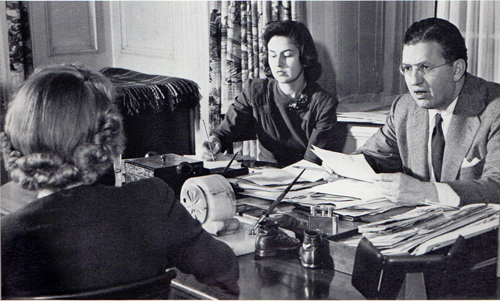
David O. Selznick dictating a memo in 1941. Secretaries are Virginia Olds (back to camera) and Frances Inglis.
DB here:
Tucked neatly within over 4500 archive boxes in Austin, Texas, are tens of thousands of items of information about how the Hollywood studio system worked. The trick is to find the ones you’re looking for…and the ones you didn’t know you should be looking for.
Those archive boxes are housed at the Harry Ransom Research Center at the University of Texas. This magnificent research library holds cultural records of inestimable value, from Whitman and Poe manuscripts to the papers of David Foster Wallace. Among the Center’s impressive film collections, the jewel in the crown is the David O. Selznick papers—a vast trove of material related to the career of the man who produced, some would say over-produced, Gone with the Wind, Rebecca, Spellbound, Duel in the Sun, and other classics of the Hollywood system.
Selznick has been studied from many angles, partly because his collection provides exceptionally full accounts of his activities. He kept, it seems, nearly everything, most famously memoranda. While chainsmoking cigarettes, swallowing amphetamines, writing amateur poetry, and revising scripts and visiting sets and critiquing rehearsals and watching rushes and retaking scenes and checking on rivals’ films, Selznick found time to dictate a blizzard of memos.
From his youth he loved to write memos–“I could sell an idea much better in written form than I could verbally”–and he became adept at dictating them. The results were precise, punchy, and often eloquent. Usually signed DOS (the O being a middle initial he bestowed upon himself), these communiqués could be lapidary (a one-liner asking if the cast is protected from sunburn) or epic. After getting Selznick’s dense, eight-page telegram explaining why Since You Went Away’s nearly three hours could not be reduced, a colleague replied: IF I WERE YOU I WOULD MAKE NO FURTHER CUTS IN SYWA. YOU MIGHT TAKE ABOUT TEN MINUTES OUT OF YOUR TELEGRAM.
In his later years Selznick contemplated publishing a collection called Memo Strikes Back. After he died in 1965, his son encouraged film historian Rudy Behlmer to make a compilation. The result, Memo from David O. Selznick (1972), is a superb collage portrait of the man’s personality and creative years. In the 1980s, the Ransom Center acquired the papers that Behlmer worked through, along with physical artifacts, including costumes from GWTW.
Me-mos, they were called by many, since they seemed to reflect the compulsive micromanaging of their creator. Directors and staff smarted under Selznick’s insistence that he control every creative decision. But for those of us coming afterward, Selznick’s criticisms, complaints, demands, reminiscences, agonies of frustration, and I-told-you-sos help us grasp the concrete problems of filmmaking.
Last week I went to Austin hoping to get some information about how Hollywood creators of the 1940s regarded the task of storytelling. DOS delivered as he did on the screen: splashily.
Paper traces
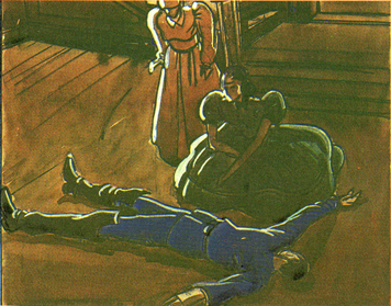
William Cameron Menzies production sketch for Gone with the Wind.
Most commentary on movies stops with the films as we find them. Critics who concentrate on producing interpretations are particularly inclined to play down primary-document research. “We already know,” a famous English critic once told me, “all we need to know.”
In my youth I mostly agreed. Criticism starts with watching and listening closely to what’s happening on the screen. But it doesn’t have to end there. That’s because doing systematic research into film depends on asking questions. And if we’re going beyond a single movie and asking questions about craft, norms, preferred practices, and regulative principles shaping a filmic tradition–in short, questions of film poetics–evidence from practitioners can help a lot.
Hollywood, for instance, has produced a rich array of published materials–interviews, trade coverage, promotion, technical papers–that offer evidence of what filmmakers thought they were doing. You have to read them with a jaundiced eye and be alert for rhetoric, but there’s still a lot to be found in Hollywood’s public presentation of its doings. There’s an even richer lode of unpublished script drafts, production memos, correspondence, transcripts of meetings, court cases, and the like. Mountains of such material remain locked up in studio files. This is what makes the paper collections at major universities, at the Margaret Herrick Library of the Academy, at the Museum of Modern Art, and at other institutions precious to those of us studying film history.
Collections like these are grist for the perpetual flow of celebrity biographies and accounts of Hollywood as a business. What, though, can they tell us about the history of film form and style?
Like some published material, these items can suggest how aware filmmakers were of their creative choices. When I was teaching, and the class focused on details of framing or cutting, some students were skeptical. “This is reading too much in,” they’d say. “The director couldn’t have intended that!” And it’s true that sometimes things we think were carefully planned came about through accident or sudden inspiration. Still, in other cases a document shows that filmmakers were consciously aiming at fine-grained effects.
Moreover, archive documents can indicate the array of creative options available—the extent to which one artistic choice is preferred over alternatives that wouldn’t work as well. If filmmaking is problem-solving, we learn about the costs and benefits of competing solutions. We gain a better sense of what can and can’t be done within a tradition when we glimpse filmmakers struggling to decide between expressive possibilities.
Yet another benefit of paging through archival documents is the recognition that we can’t neatly separate filmmaking as business from filmaking as an art. We commonly imagine a studio producer ordering a director to take the cheapest option, to trim costs in every way. Surely this happened a lot. Surprisingly often, though, the suits did and still do invest a lot in artistic effects, even innovative ones. When writing our book The Classical Hollywood Cinema: Film Style and Mode of Production to 1960, we were struck by the power of the idea of the “quality film,” that mixture of novelty, showmanship, and high production values that justifies time and resources. A flamboyant crane shot, a complicated lighting scheme, a gorgeous musical score, flashy special effects—in the Hollywood tradition and others, these are appeals worth paying for, even if not every viewer appreciates them.
Perhaps above all, studying records can call our attention to aspects of the film that your initial impression didn’t pick out. A critic can’t notice everything. Examining collections such as Selznick’s, or those housed in our Wisconsin Center for Film and Theater Research, have taught me that what appears effortless or perfunctory on the screen can be the product of intense thought, protracted debate, and hours of hard work. Once you re-tune your attention, even minor moments can be worth thinking about, if only because the filmmakers labored patiently over them.
Getting what you pay for
Since You Went Away (1944).
Selnick was a fussbudget on a scale that makes Schulz’s Lucy look laid-back. He sought control over every aspect of the film, from purchase of material through production, post-production, publicity, and distribution. Gone with the Wind’s volcanic success seemed to confirm the wisdom of his endless tracking of every detail. Because that tracking is made explicit, not to say vehement, in his memos and other correspondence, we get glimpses of Hollywood’s artistic strategies large and small.
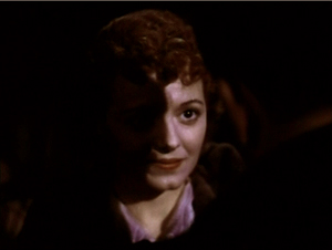
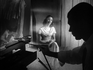
Start small. In The Classical Hollywood Cinema: Film Style and Mode of Production, I wrote about the “rule of three”–the guideline that presses filmmakers to state important story information three times, preferably with variations (serious/ funny/ pathetic). I gleaned that precept from reading published work, and I could check it by studying the films. Still, further evidence is always welcome, so it’s nice to see a transcript of a story conference during the prolonged rewriting of Portrait of Jennie (1949). The hero, the painter Eben Adams, comes to a coastal town in search of his dream-girl, and DOS suggests:
In every scene he is to ask: “Do you remember a girl named Jennie Appleton?” Use rule of three–two [townfolk] do not remember her–the third one does. . . “Remember her well. . . pretty young thing with dark hair.”
More recently, I’ve been wondering whether studio screenwriters of the 1930s and 1940s were consciously adhering to something like today’s notion of a three-act structure. I’ve found scattered evidence from memos elsewhere that refer to a movie’s “first act” or “last act,” but nothing that indicates a commitment to an overarching three-part layout.
I haven’t found clear-cut evidence in DOS’s papers either, but in another story conference on Jennie, Broadway showman Jed Harris is reported as saying: “The second act–he must get the picture back because that’s all he’ll ever have of her.” In the finished film, Eben doesn’t search for the portrait, but Harris’s remark indicates that he had some sort of multiple-act structure in the back of his mind. He adds later: “The picture at this point is about 1/3 gone, and from here you have the machinery of trying to stop what is impossible to stop.” Far from definitive evidence, but teasing.
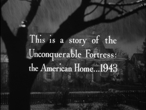
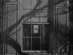
Now consider a medium-size example. Kristin and I have argued that many Hollywood films have a symmetrical opening-and-closing structure, often presented as an epilogue that mirrors the beginning. More recently I suggested that this bookend structure often displays an advance/ retreat pattern. At the start, the camera may move into a space or a character may come toward us; at the end, the camera may retreat and/or the characters may turn away or walk into the distance. On Since You Went Away (1944), Selznick sweated over ways to frame this panorama of the American home front. Early on he decided to start his film with an exterior view of the Hilton family home. This image dissolves to a closer view showing a star in the window, which indicates that a member of the family is in the armed forces.
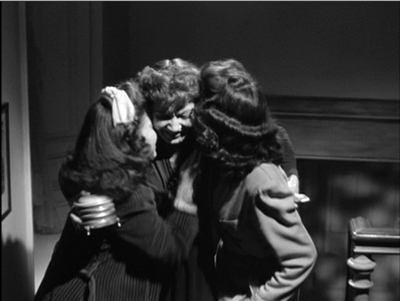
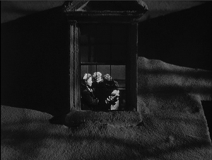
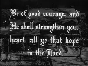
Eventually Selznick decided to end the film by pulling back from a miniature of the house, with a single camera movement replacing the two unmoving shots that started things off. Anne is joyfully embracing her two daughters; they’re inserted as a matte into the upstairs window.
Selznick considered redoing the opening as a slow camera movement in to the window, but only if the miniature was good enough. Perhaps it wasn’t. And at one point he wanted the final shot to start with the star in the window, at least for purposes of the preview screening, “to parallel that at the beginning of the picture.” Again, that wasn’t accomplished, but his playing with possibilities reflects his tradition’s commitment to symmetrical openings and closings.
It would have been far cheaper simply to have ended the film on the three-shot of the women, shown at the top of this section. But Selznick wanted “a nice rounded feeling” in his epilogue, and he was prepared to pay for it. True, he was exceptionally finicky, but going to a lot of trouble and expense to get this formal rhyme was not unusual in studio practice. The hardheaded film business is willing to invest in vivid, emotionally gripping artistry identified with quality moviemaking.
Stylistic trends
Portrait of Jennie (1949).
In broad terms, it’s fair to say that American studio films of the 1940s display a more self-conscious use of long takes, sustained camera movements, and deep-focus cinematography than we find in other eras. (Actually, it’s a trend we find throughout the world at the time, for reasons that aren’t well understood.) But these new techniques didn’t replace traditional analytical editing. They worked within it. Continuity cutting, established in America in the late 1910s, remained the dominant stylistic framework for filmmakers.
Citizen Kane‘s fixed single-shot scenes in depth were very unusual in cinema of the period. More commonly, deep-focus shots, like moving-camera shots, served as establishing framings or otherwise became part of conventionally edited sequences. This middling or compromise style can be found in dozens of films of the forties, and Selznick seems to have more or less consciously gone along with it.
He worried about what he called “cuttiness,” the tendency to break every scene into brief single shots of the players. Often, he suggested, a well-handled two-shot would work better. He told his editor on Since You Went Away to avoid “the conventional treatment of close-ups and reactions.”
It most definitely is not necessary always to treat every one of our scenes with dead center close-ups, and direct cuts or over-the-shoulder angles, when an intimate scene is played between two people.
He goes on to tell a second-unit director that a scene of a couple in a car could be played in one or two setups, perhaps in a single shot “if we could get an interesting composition on the two of them rather than a dead center two-shot on individuals.”
Selznick saw Hitchcock as an editing-biased director and so after signing him to make Rebecca (1940), he warned him and other members of the team to avoid over-cutting. Again, the preference was for a tight two-shot.
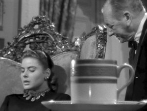
The new scene between the girl and Mrs. Danvers on the arrival at Manderley (Script Scenes 130A, 130N and 131) may be very cutty as described in the script, and perhaps ought to be protected in a close two-shot of ‘I’ [the heroine] and Mrs. Danvers, or some other angle that will keep us from playing it in too many short cuts.
In most cases, however, Selznick gave himself an out by treating faster cutting as an alternative. He consistently wanted coverage, as he indicates immediately for the Rebecca scene just mentioned.
However, I suggest we make the short cuts also, as this may be the best way of playing it after all. If we use the camera to move up to Mrs. Danvers for the finish, which is the way I think it should be used, then perhaps the first shot of her should be retaken also.
As the last sentence indicates, Selznick sometimes opts for camera movement to avoid cuttiness. Perhaps the American Hitchcock’s interest in tracking shots that follow characters, particularly glamorous women, through the set stemmed from Selznick’s belief in the power of occasional camera movements. He notes that a tracking shot introducing Alida Valli in The Paradine Case (1948) is too bumpy, asking why the staff couldn’t manage “something as simple as going up to a woman’s face, and then pulling back from it across a set, without the camera shaking in the manner of early silent pictures.”
Yet these longish takes aren’t to be the dominant stylistic approach. Sustained takes often block off choices in post-production. Producers, then and now, want coverage, and you didn’t have to be a micromanager like Selznick to want your directors to give you options for rebuilding scenes in the cutting room. We see this when Selznick objects to John Cromwell’s playing entire scenes in lengthy shots.
This is of course nonsense, since as often as not an incomplete take is better than the identical portion of a complete take. . . . It seems folly to spend hours getting a complete scene instead of just picking up those sections of the beginning or middle or end that have been fluffed.
Some directors resisted by shooting long takes without coverage. Hitchcock did this in one sequence of The Paradine Case and then promoted this “three and a half-minute take” to the Hollywood community, perhaps to make it harder for Selznick to change it. Nonetheless, Selznick cut the scene up. Once freed from Selznick, of course, Hitchcock was able to pursue the long-take option to extremes with Rope (1948) and Under Capricorn (1949).
Despite wanting flexibility in editing, producers can be seduced by the prospect of “pre-cutting” a film–planning the shots so exactly that the film can be “pre-visualized.” The director can thus avoid taking shots that won’t be used. Selznick was proud of William Cameron Menzies’ precise production planning on Gone with the Wind, and this made him believe in the power of the storyboard. When he rewrote a script, which was often, he was inclined to have artists immediately prepare fresh drawings of sets and shots.
Hitchcock had promoted himself as someone who drafted a film on paper so thoroughly that shooting became efficient and predictable. Selznick was therefore startled when Hitchcock proposed a long shooting schedule for Rebecca. “In view of the many speeches he has made to me about how he pre-cuts a script, so as to shoot only necessary angles, it is a mystery to me as to how he could spend even 42 days.”
During shooting, DOS became furious with the pace of production, declaring Hitchcock “the slowest director we have had.” Hitchcock, he believed, was spending more time getting his few angles than directors who shot in normal fashion. Yet Selznick remained susceptible to the dream of pre-cutting. Some years later, he predicted that Since You Went Away wouldn’t take much time in the editing room because the scenes “will be camera-cut to an extra-ordinary degree, and putting it together should take no time at all.” The film’s editing occupied several months.
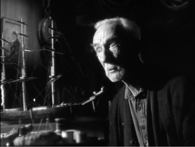
Selznick, then, was attracted to current trends of longish takes and the fluid camera, but like nearly all his peers he saw these as subordinate to the overarching demands of analytical editing, whether through traditional protection coverage or through “pre-cutting.” Something similar seems to have governed his interest in depth staging and deep-focus cinematography. Peppered throughout the memos I examined are his concern for “foreground pieces,” props that can enliven a shot. A miniature sailing ship in Portrait of Jennie, he suggests, is too big for its placement in the shots as taken. “It would have been a far better foreground piece for another angle.” So it became such a piece, as the still surmounting this section indicates.
Of Since You Went Away DOS notes:
I think that lately we have been overlooking chances for good foreground and background planes in our set-ups. I don’t want to over-do this but of a lot of our shots could be much more interesting in this regard.
In particular he emphasizes the bronzed baby shoes introduced in the film’s opening, as the camera glides through the Hilton family parlor picking up traces of the departed father. A later scene, in which Anne writes a letter to her husband Tim, seemed the ideal chance to re-use that prop. “Photographically, I thought it would be much more interesting with the shadow of the shoes, or using the shoes as foreground pieces.” This composition, if it was shot, didn’t appear in the final film, but it shows once again that filmmakers can be aware of broader trends of their period, and that they’re willing to go to considerable trouble to join them.
A striking example of the insistence on participating in the deep-focus trend appears in the files around Spellbound. After arriving in America, Hitchcock occasionally produced some big-foreground depth images, as below in Shadow of a Doubt (1943), and in Notorious (1946).
Such compositions were rare in most films Hitchcock did under Selznick, but in Spellbound Selznick realized the value of keeping up-to-date. The most famous big foreground in the film (and in all Hitch’s work) is seen at the climax, when Dr. Murchison trains his revolver on Constance as she edges out of his office.
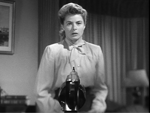
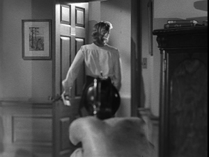
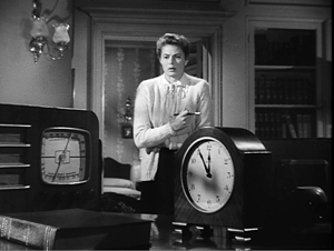
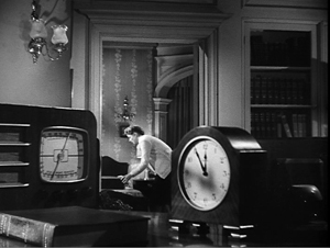
This bizarre shot is somewhat anticipated by a less aggressive setup. Constance hears over the radio that the police have tracked J. B. to Manhattan, and she goes into the next room to pack to follow him. The action is handled in a canonical post-Kane composition.
The production records make me wonder whether this shot (presumably using a larger-than-life clock and radio) was filmed under Hitchcock’s supervision. It may have replaced an even more complex shot that cinematographer George Barnes objected to. (I’m still gathering information on this.) In any event, Selznick realized that a minor transitional scene could be dynamized by a flamboyant, difficult-to-achieve image: a throwaway mark of quality.
Pendulum swings of innovation
Since You Went Away.
I’ll save other things I found for future work. Let me finish by talking about how Selznick’s “directing at a distance” shows a craftsman’s concern for novelty and pictorial storytelling.
Hitchcock famously shot the Old Bailey scenes of The Paradine Case with several cameras in an immense set. Selznick may have okayed this tactic on this occasion because it would speed up Hitchcock’s schedule. (Selznick had hoped it would take only one day; it took three for principal photography and several more for pick-up inserts.) But both before and after Paradine, Selznick was interested in extending multiple-camera shooting beyond its normal uses.
Multiple-camera coverage of ordinary scenes had a heyday in the early years of sound, but afterward it was usually reserved for unrepeatable action (fires, stunts, cars going off cliffs) or very big scenes. Selznick had deployed several cameras, including the lightweight Eyemos, during the dance at the airplane hangar in Since You Went Away. Like Welles, he also considered using the tactic for ordinary dramatic scenes. He writes in 1947:
I have long felt that sooner or later, probably when economic necessity dictates, this method of shooting will come into vogue, with far more time spent on rehearsal, far less time on shooting, enormous savings and better quality. I know that for years I have been discussing with Hitchcock my feeling that we could take a film of a particular type, thoroughly rehearse it, and shoot it in a week–and this is just what Hitch is planning to do on The Rope [sic].
Selznick anticipated the practice of multiple-camera television production. It’s intriguing to think of Hitchcock taking this idea and simply substituting one camera for many, creating another technical stunt that could be publicized.
DOS was sensitive to conventions and often sought to refresh them. For one back-projected scene of Portrait of Jennie, he advises Dieterle “to avoid the awful-looking, head-on, two-shot process setups and angle camera in different ways: perhaps with lower cameras, one shooting across Adams at Spinney and the other shooting across Spinney at Adams.” This echoes his concern for finding unusual angles on the process arrangement in Since You Went Away‘s driving scene. He likewise encouraged unusual staging, recalling
the love scene between Freddie March and Janet Gaynor in A Star Is Born, the one in which he takes her home the first night, after the kitchen scene, where the entire scene is played on Freddie’s back; and the love scene in Nothing Sacred in the crate after Carole Lombard has fished Freddie March out of the river. Both of these treatments enormously enhanced the value of these scenes, which shot conventionally would not have been necessarily so effective.
In the first instance, the conversation is handled by an unusually prolonged over-the-shoulder shot that doesn’t show March replying to Gaynor. In the second, the romantic dialogue is emphasized by the darkness of the crate and our inability to see either actor clearly.
Yet Selznick worried about becoming too “arty” as well. During the filming of Since You Went Away he confessed:
I feel that I am at least partially responsible for our increasing tendency to play scenes on people’s backs. . . . In Jane’s attack upon the colonel after the breakfast scene, we are on neither one principal nor the other, but on the colonel’s back and Jane’s back . . . In the church scene there has been talk of playing it on the three backs, but I have tried in the script to indicate that we should not do this.
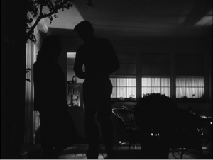
Stark lighting is of course common in 1940s cinema generally, but Selznick favored it in the 1930s as well, in the shots above and more famously in Gone with the Wind. By the 1940s, Since You Went Away and Portrait of Jennie include scenes steeped in rich shadow areas, cast shadows, and silhouettes.
But here, as elsewhere, DOS’s urge for innovation was curbed by anxiety about going too far. In a memo to Cromwell on Since You Went Away, he wrote that “all of us (mostly myself) are overdoing the silhouette business. . . . Let’s from now on all use this silhouette effect very sparingly, and only when it’s absolutely indispensable to our mood.”
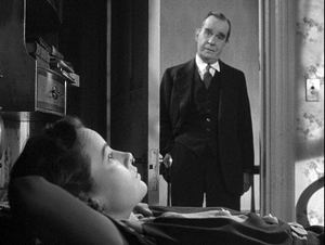
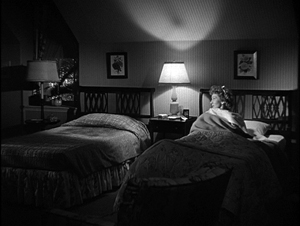
Perhaps what I’ve called his middle-of-the road approach was less a balance and more of a pendulum swing between extremes. He could sometimes foreswear the grand, almost monumental look of many scenes and demand something quieter. At the end of the day when Anne’s husband has left for war, she looks at his unmade bed.
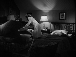
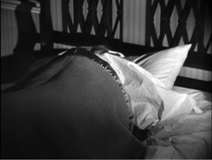
She leaps up and wriggles into it, covering her face with the blankets, and starts to cry.
Commentators often fasten on the twin-beds convention as an example of the naive timidity of studio-era Hollywood. Yet every convention offers opportunities for expression. When Anne rises, the sight of one rumpled bed and one pristine one brings home the husband’s absence in a simple, powerful image, and her plunging into it directly conveys her longing to be in his arms.
I’m absolutely positive that this gag will not get over unless we see the two beds in the clear, one made up and one not made up, before she hops into the other bed. I think these two beds constitute good storytelling.
When the hard-bitten Ben Hecht saw Since You Went Away, he cabled Selznick: “It made me cry like a fool.”
You can certainly argue that Selznick the fussbudget was his own worst enemy. His micromanagement raised his budgets and drove away his collaborators. As the production values grew more inflated, it was hard to recoup costs, let alone turn big profits. Ten years after Gone with the Wind premiered, Selznick’s fiefdom lay in ruins. He withdrew from production, millions of dollars in debt. He wrote in a confidential 1948 memo:
In the final analysis it is my fault for two reasons: (1) my production methods; (2) my tolerance through the years of the wastefulness. . . . The most successful series of pictures ever made in the history of the business has produced profits which are perhaps not more than twenty per cent of what they should be.
Ideas matter in any domain, even in studying Hollywood. And not just the ideas of critics, historians, and theorists. The practicing artisans of the studio system had rich ideas about preferred ways to build plots, to shoot and cut scenes, to mix sound and add music. These norms were seldom stated outright. Were Selznick less interfering, less prone to hesitate between alternatives, less obsessed with minute details, we would not know as much about the workings of the system he sought to rule. He distilled into typescript and double carbons many notions that ordinarily went unstated. His plump files teem with ideas about how films were made, and how their creator thought they should affect audiences. Thanks to institutions like the Ransom Center, his work is preserved to enlighten us about filmmakers’ secrets, even the secrets they don’t know they know.
I’m very grateful to Emilio Banda and the rest of the staff at the Harry Ransom Center, who helped me during my visit. Thanks also to Steve Wilson, Curator of Film there, for advice. And of course thanks to my family–Diane, Darlene, Kewal, Kamini, Megan, and Sanjeev–who made our trip to Austin so enjoyable.
My quotations come from the memos I examined, as well as from other items in Rudy Behlmer’s Memo from David O. Selznick. I also drew on Ronald Haver’s David O. Selznick’s Hollywood (Knopf, 1980), the initial edition of which is surely the most gorgeous book ever published about the American film industry. Haver’s study is not only spectacularly illustrated but deeply researched, and it, like Behlmer’s, is indispensable for the study of the studio system. The Menzies production sketch is taken from the Haver volume.
No less indispensable is Leonard J. Leff’s Hitchcock & Selznick (Weidenfeld and Nicolson, 1987). After sifting through both the Selznick collection in Austin and the Hitchcock collection at the Academy’s Margaret Herrick Library, Leff produced a detailed account of the two men’s creative work. Hitchcock’s long take in The Paradine Case is promoted in Bart Sheridan, “Three and a Half Minute Take…,” American Cinematographer 27, 9 (September 1948), 304-305, 314.
Paul Ramaeker offers a subtle account of Portrait of Jennie as a “supernatural romantic melodrama” at The Third Meaning.
For more on 1940s stylistic norms, see The Classical Hollywood Cinema, chapter 27, and On the History of Film Style, chapter 6. The first essay in my Poetics of Cinema discusses Hitchcock in relation to trends of the period, concentrating on Rope and long-take options. On Citizen Kane and rationales for deep-focus cinematography, you can go here. I mention a bit about the fashion for the “fluid camera” in 1940s Hollywood in this entry.
William Cameron Menzies served as art director and more for Gone with the Wind, and he and was pressed into service ad hoc for later DOS projects. I think he may have influenced the shadow-drenched style of Since You Went Away and Portrait of Jennie. I wrote about Menzies’ work, and again about deep-space work in 1940s Hollywood, here and here. See also David Cairns’ enlightening essay in The Believer.
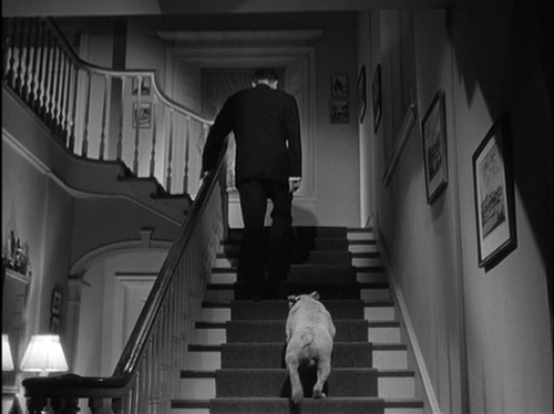
Since You Went Away: “I think that Miss Keon had better start preparing a script of retakes and additional scenes. I think we missed a wonderful opportunity in the Christmas scene in not having a shot from the angle of the family, or from the bottom of the stairs, of the Colonel going up the stars with Soda behind him.”
Germany in autumn, in style
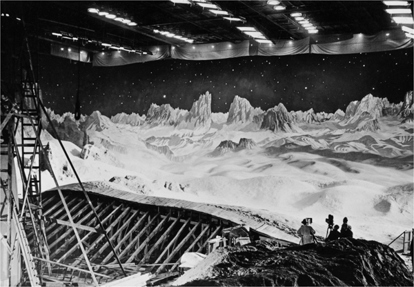
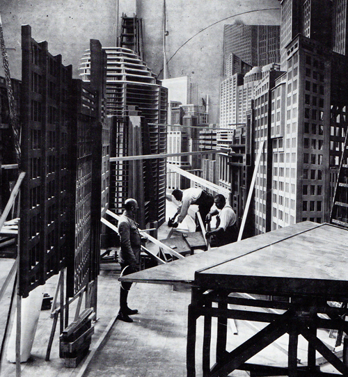
Shooting Frau im Mond (1929) at Neubabelsberg studio, Potsdam.
DB here:
Friends say that Berlin is now the most exciting city in Europe–a little too exciting, others say. I can’t prove either claim, but I can declare that I had a fine time last month during my second visit to Germany this year. Part of the fun was, as usual on many of our trips, finding tangible traces of film history.
Stylin’
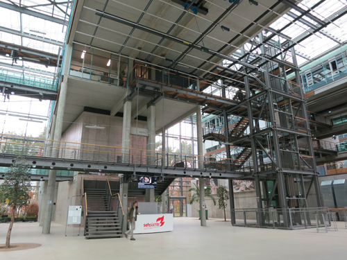
Lobby space, Konrad Wolf Film School.
With Michael Wedel, I re-saw Hong Sang-soo film’s Turning Gate in the wonderful Arsenal theatre, part of the Deutsche Kinemathek. The Arsenal is run by Milena Gregor, another old friend (who happens to be Michael’s wife). On another night I also had a delicious dinner with filmmaker Christine Noll Brinckman and other friends. Then there was a pleasant lunch with another filmmaker, Carlos Bustamante (below), in his picturesque neighborhood.
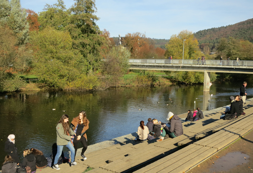
But Berlin literally wasn’t the half of it. I visited Philipps Universität in Marburg, a charming university town. Part of the campus fronts onto the Lahn River, and it makes a charming place to relax.
After my lecture on 1940s Hollywood, my hosts Malte Hagener and Dietmar Kammerer took me out to dinner with their lively colleagues.
Most of my visit was spent in Potsdam, where I’d been invited by the Netzwerk Filmstil. This is a research team composed of several young professors teaching in German-language universities around Europe. Their focus is the exploration of style in audiovisual media–centrally film, but not ignoring television, video games, Internet pieces, and even surveillance and security videos. The two and a half days of the seminar were very stimulating. Michael Wedel, Chris Wahl, Malte, Dietmar, and Kristina Kohler gave illuminating papers on (respectively) digital sound, superimpositions, split screen, freeze-frames, and dance in silent film. The participants offered me good criticisms of my presentation, which explored how E. H. Gombrich’s explanations for stylistic change in visual art might apply (or not) to cinema.
Our seminar sessions were held in the remarkable Konrad Wolf Film School, a towering building crisscrossed by staircases and walkways. I visited it once before some years ago, and once more I admired its airy yet rectilinear architecture.
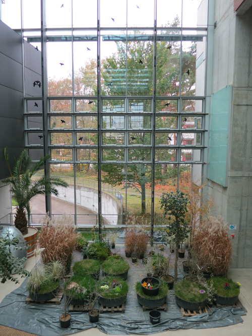
The stripped-metal look is offset by lots of glass–the light pours in from all directions–and a corner with plenty of plant life. As in our house back home, winged silhouettes on the windows keep bird-brains from flying into the glass.
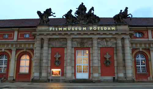
I also gave a talk on film style during the 1910s at the monumental Filmmuseum Potsdam.
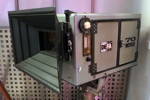
The museum holds a fine screening space and a fascinating collection of historic materials, including a Soviet-era 70mm camera.
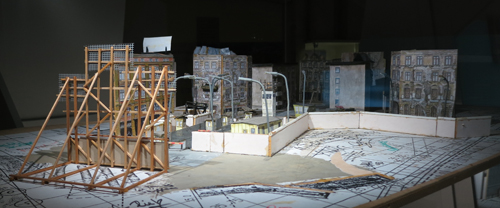
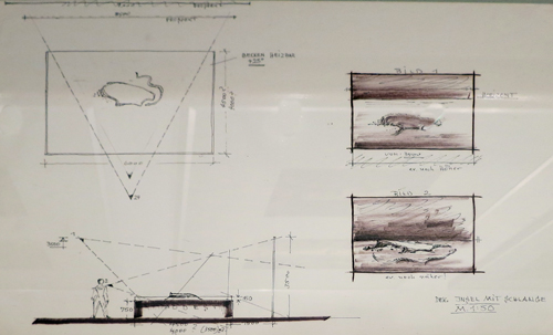
The current exhibition was devoted to the rise of the film studio Babelsberg, not far away. The displays included scripts, set photos, production sketches, photos, and maquettes.
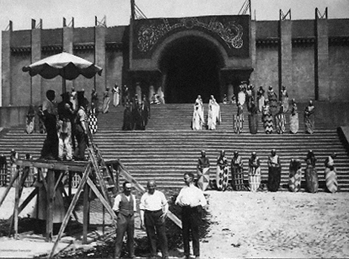
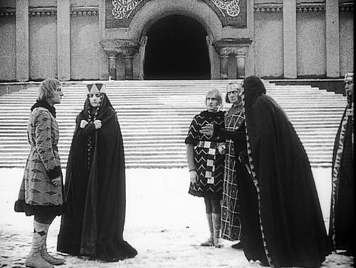
Have you seen this still of the great Cathedral set from the Nibelungen?
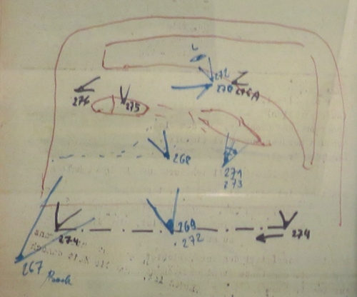
The tradition of fastidious planning created during the silent era persisted into the period of the German Democratic Republic. Each set design was marked up to show camera positions (numbered), lens lengths, and special-effects elements.
The Filmmuseum’s collection was only one reminder of the towering importance of Babelsberg, now celebrating its hundredth anniversary year. Luckily the studio was an easy walk from the Konrad Wolf school. One sunny day our host Michael Wedel took the Style Network on an insider’s tour.
Babelsberg’s birthday
The 1910s and 1920s saw many production facilities spring up in Germany. Films were made in Munich, Frankfurt, and other major cities, and the area around Berlin boasted a number of studios. But the Potsdam facility, initially called Neubabelsberg, became the most well-known, something like Europe’s answer to Hollywood.
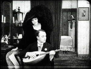
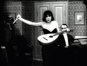
Founded by the Deutsche Bioscop company, the studio began production in 1911 and released its first film, Totentanz (The Dance to Death), in 1912. That starred Asta Nielsen, whose popularity had already enriched Bioscop. In this story she’s attracted to a rather louche composer, as we see below. (Yes, that mass of black is mostly her hat.) Later, she slices the guitar strings in a fit of passion and glares out defiantly at us. As if our attention might wander.
Neubabelsberg was home to such classics as The Student of Prague (1913), the Homunculus series (1916-1917), Madame Dubarry (1919), The Cabinet of Dr. Caligari (1920), The Golem (1920), and Genuine (1920). Fairly soon Bioscop merged with Erich Pommer’s Decla, and in 1921 the big company Ufa took over the facility and the resident firms. Ufa also had a studio in Tempelhof, a Berlin suburb, but the attention-grabber was Neubabelsberg, which became a sprawling complex of 350,000 square meters–the biggest studio in Europe.
Here Murnau shot Phantom (1922), as well as portions of The Last Laugh (1924). E. A. Dupont filmed some of Variety (1925) here, and Pabst shot all of The Loves of Jeanne Ney (1927) on its stages. Above all, Neubabelsberg helped sustain one of cinema’s great hot hands, the string of films Fritz Lang made in the 1920s: Destiny (1921), the Mabuse duo (19221-22), the Nibelungen saga (1924), Metropolis (1927), Spies (1928), and Woman in the Moon (1929).
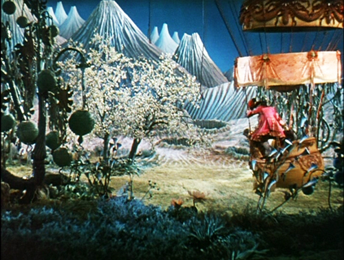
The studio remained a powerful force across the next two decades, from The Blue Angel (1930) to the epic color production The Adventures of Baron Munchausen (1943).
The partitioning of Germany after World War II put it the studio the eastern sector, and the new state-sponsored film company, DEFA (Deutsche-Film-A. G.), took over the facility in 1953. That made it what Ralf Schenk calls “the exlusive site of feature cinema production in the GDR until 1990.”
After the Wall came down, the Babelsberg studio revived itself as a facility for international productions. It has hosted films by Polanski (The Pianist, The Ghost Writer) and Tarantino (Inglourious Basterds; below, a set on the Babelsberg backlot). The Wachowskis have been loyal supporters, with Speed Racer, V for Vendetta, and most recently Cloud Atlas using the facility.
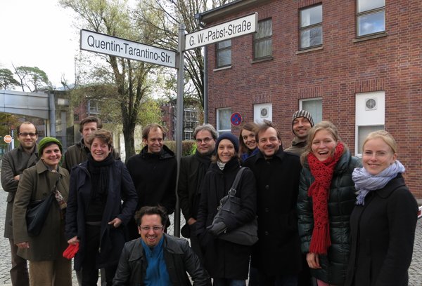
You can get a sense of the studio today by visiting the website, which presents it as a modern resource for world filmmaking. But its early years matter more to me. To walk these quiet pavements and to imagine following in the steps of Lang, Jannings, Dietrich, and other legends ought to thrill any cinephile. Seeing some streets named for the greats, Tarantino requested a street in his name. It’s apparently a dead end.
A new Babylon
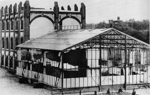
In the cold winter of 1911-1912, Deutsche Bioscop built its first studio, a 45 x 60 foot “glass house”at Babelsberg.
Michael Wedel explains:
Not only was a special cement-less glazing developed for the glass, but even the supporting beams of the infrastructure had to be installed outside of the studio, so as not to spoil the sunlight. . . . In contrast to already existing glasshouse studios that had been “set up” in Berlin and Munich in multi-level apartment blocks and office buildings, the ground-level location of the new Bioscop building at Babelsberg had the advantage of trucks with props and sets being able to be driven through a sliding door directly into the glass studio. . . .
Michael again:
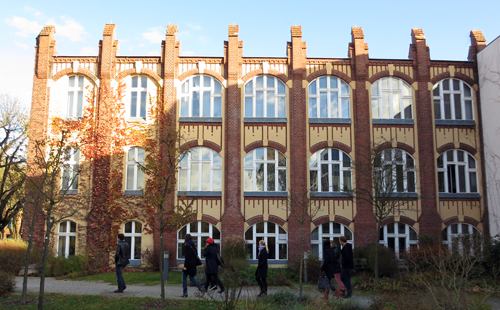
The ground floor of the immediately adjacent factory building accommodated wardrobe and prop rooms, a woodshop, art studio, and a canteen. On the first floor, the production company’s office, as well as the laboratory for developing negatives and positives, were set up. On the floor above was where one found the dry drums for developed film material, the room in which the films were edited, and the rooms where intertitles were prepared. Except for the costume department, which would be built systematically a few years later, Bioscop oversaw a completely integrated film studio, which made it possible to perform most stages of film production on-site.
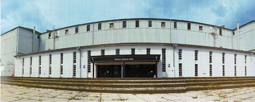
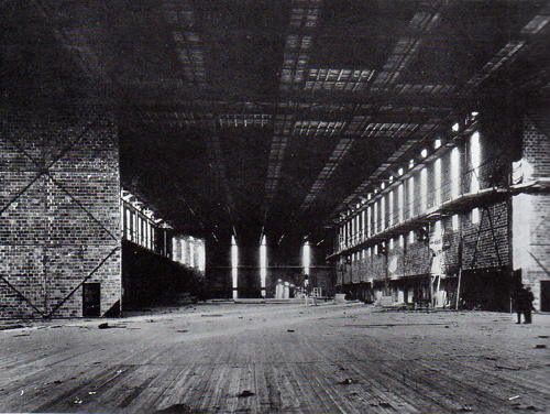
Later in the 1910s Guido Seeber, the cinematographer and all-around creative genius who had planned the Babelsberg plant, began to use supplemental artificial light. But this glass house and its bigger brother, built later, were relied upon throughout the silent era. A closed unit lit entirely by artificial light wasn’t built until 1926. Appropriately huge, it was called the Great Hall and eventually renamed the Marlene Dietrich Stage.
The Frau im Mond production shot atop today’s entry was taken in the Great Hall. Here’s another picture of the interior in the late 1920s. In both shots, those little figures on the far right are men.
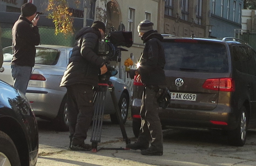
On our stroll we caught glimpses of some filming taking place in a parking lot.
Not quite as glamorous as the behind-the-scenes action on–oh, let’s say Metropolis.
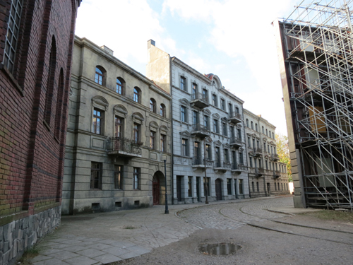
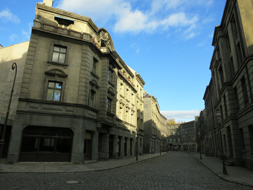
We ended our unofficial tour with a quick look at the backlot, which can be redressed to be almost any European city you like.
Movie magic, the Dream Factory: the rationalist side of me rejects these catchphrases as mere mystification. Filmmaking is hard thinking and hard work. But it’s tough to be purely rationalist when you’re facing an illusion machine that has thrilled audiences worldwide for a hundred years. If you see Hansel & Gretel: Witch Hunters, spare a thought for the tradition of Germanic lore that made it possible–and the hard work of the thousands of men and women who built a cinematic metropolis here.
Thanks to all my hosts and colleagues for making my trip to Germany, however short, intense and enjoyable.
Noll Brinckmann’s films and writings are available, at least in part, in this edition. A sample of Carlos Bustamante’s recent work is available online here.
For a fairly detailed timeline of Babelsberg’s history, see this page of the Filmmuseum site. When spring comes, you can take a studio tour (German language only) or visit the nearby theme park.
My quotations come from Michael Wedel, ChrisWahl, and Ralf Schenk, 100 Years Studio Babelsberg: The Art of Filmmaking (teNeues, 2012). This is that rare coffee-table book whose historical texts (footnotes included) are as valuable as the luxurious photos. The book, in an English/German edition, is available from the Filmmuseum and from Amazon.de.
This post gathers information from Hans-Michael Bock and Michael Töteberg’s encyclopedic Das Ufa-Buch (Zweitausendeins, 1992). Also helpful was Klaus Kreimeier’s The Ufa Story: A History of Germany’s Greatest Film Company, 1918-1945 (Hill and Wang, 1996).
We hadn’t planned it this way, but Kristin’s previous entry discusses several recent DVD releases of German classics. I wrote a little bit about Totentanz (1912) here.
My lecture at Potsdam, “How Motion Pictures Became the Movies,” was a new version of a talk I’ve been giving for the last couple years to whatever audiences of innocents that fate has flung my way. Alert filmmaker Erik Gunneson, who prepared our video essay on constructive editing, is currently turning this talk into a video lecture. We hope to put it up on this site early in 2013.
The stylish Film Style Mafia, Neubabelsberg, November 2012.
10 Dec 2012: Thanks to Antti Alanen for two spelling corrections!


