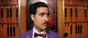
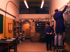
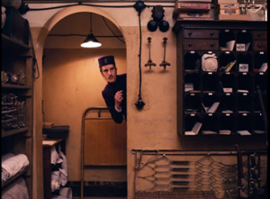
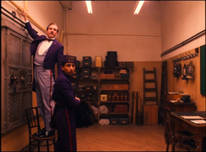
Archive for March 2014
Back in THE Place
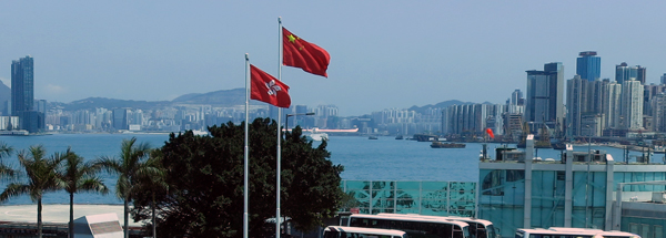
View of Hong Kong harbor from the Convention and Exhibition Centre. Above, the flag of the People’s Republic of China; below, the Hong Kong flag bearing the Bauhinia emblem. According to official protocol the national flag must be larger and be mounted more prominently.
“For us, Hong Kong will always be the place.”
Chuck Norris, The Octagon (1980)
DB here:
After missing two editions because of some minor health problems, I’m back in Hong Kong for their annual festival. As customary, it kicked off with the Filmart, now the biggest film market in Asia. It gathers producers, distributors, and financiers for discussions and dealmaking. There are panels, equipment demos, and displays of media items for sale. There’s the Hongkong-Asia Film Financing Forum, a competition that funds planned projects. (This year’s winners are here.)
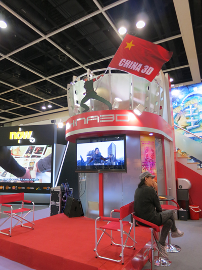
Some booths are huge. The TVB display was towering, dwarfing the TV chat show being shot underneath.
Since its founding in 1997, Filmart has been so successful that it spawned an umbrella event. The Hong Kong Entertainment Expo, now in its tenth year, is a jamboree for the international entertainment industry, including music and digital entertainment of all sorts.
Filmart is now very big. This year it packed in over 760 exhibitor stalls from over 30 countries (including Brunei and Malta). It attracted over 6500 attendees, and most, unlike me, were there to buy and/or sell films, TV shows, and video games.
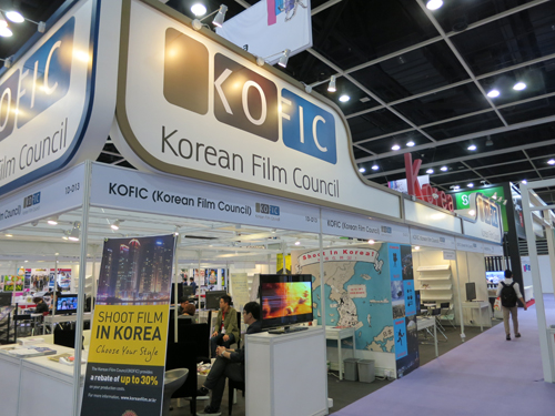
National film organizations use Filmart to coax production into their territory. Government agencies like KOFIC can put producers in touch with prime locations and service firms.
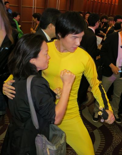
The opening reception was graced by Chief Executive C. Y. Leung, who while extolling the rule of law in the territory did not mention the recent violent attack on a major journalist. A characteristically blank-faced Leon Lai looked on. In the crowd, you might also meet Bruce Lee, or at least his avatar.
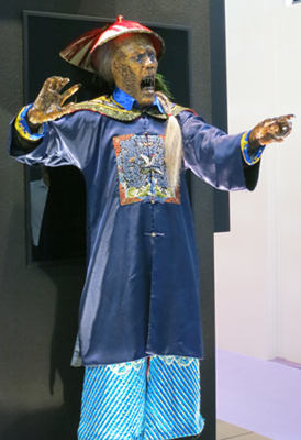
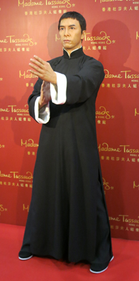
On the market floor, a Chinese vampire squared off against Donnie Yen, immortalized by Madame Tussaud.
Who would win in a face-off? The movie is probably being shot as we speak.
China ahead
Out of Inferno (2013).
The big news this year was, as ever, mainland China. By any measure it just keeps growing. Back in 2012 it became the world’s second-biggest market, yielding $2.74 billion in box-office grosses. (US and Canada were at $10.8 billion.) In 2013 Chinese grosses were $3.6 billion, a growth of 25%. (North American grosses grew only about 3%.) In tandem, the number of exhibition sites expanded hugely. China added over 5,000 screens in 900 new multiplexes, yielding a total of 18,195 screens. That is still remarkably few for such a populous country; North America has over twice that number. So we can expect still further growth. More generally, another sign of the times was that last year Asia-Pacific became the most lucrative region outside North America, and of course China is the centerpiece of that.
You see the China syndrome in the films as well. For several years Hong Kong producers and directors have partnered with mainland talent and business groups. Two of last year’s best Hong Kong films, Johnnie To Kei-fung’s Drug War and Wong Kar-wai’s Grandmaster, epitomize cross-border initiatives, mixing HK and PRC stars in stories that hold appeal for both audiences.
A new wrinkle: Now even films that might seem purely of Hong Kong interest credit major Chinese companies as coproducers, and they may feature mainland stars. Tim Youngs, local HK film expert, suggests that because some big-budget Chinese films haven’t succeeded in Hong Kong, mainland investors may be interested in financing small films that will catch on in the territory.
Yet some films persist without mainland financing. An example I saw at Filmart is the modest indie Dot 2 Dot, by first-time director Amos Why.
The story is rooted in local history and geography. Chung, returning from Canada to take a job in a design firm, recalls how much he enjoyed connect-the-dots puzzles as a boy. Now he discreetly puts up speckles on walls, marking sites that were significant to him and his city. Xue, a young teacher, discovers them, puzzles them out, and draws out the abstract patterns that Chung embedded in them. When he spots her graceful graffiti he determines to find who has cracked his code. What gives the story contemporary currency is the fact that Xue has emigrated from the mainland and is teaching Mandarin to Hong Kongers, and she is played by Meng Tingyi.
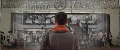
Dot 2 Dot interrupts its lovers-at-a-distance plot with images from Hong Kong’s past. Xue’s supervisor, an elderly teacher, and Chung, a nostalgia buff who treasures his childhood comics, recall moments in local history, such as when the Daimaru department store closed after a gas explosion. The émigré Xue, in finding her way around this imposing city, comes to appreciate its past. Eventually we learn through a degrees-of-separation device that both Chung and Xue have shared Hong Kong kid culture–two dots, in effect, waiting to be connected in adulthood. Those interested in allegory could see here a claim that for decades, China’s modern popular culture has been imported from Hong Kong, and that fact fosters cross-border bonds.
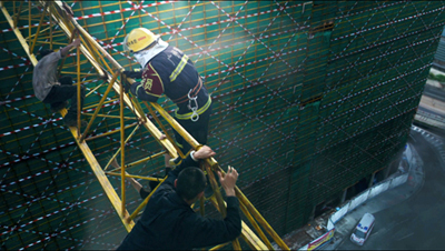
On a bigger budget there are other more or less “pure” Hong Kong films–in tone and genre, despite mainland backing–being made. Even the cockeyed English title Out of Inferno (2013) brings back the 1980s and 1990s, as does the premise. Two brothers dedicated to firefighting fall out; one (Lau Ching-wan) becomes obsessed with his job, the other (Louis Koo) leaves to form a company specializing in modern fire-protection equipment. When a skyscraper catches fire during a party demonstrating the equipment, Koo and Lau’s pregnant wife, along with many others, are trapped inside. The brothers must reconcile, inside and outside, to save innocent lives. In short: Towering Inferno + Backdraft + Johnnie To’s Lifeline. Indeed, certain shots and the very presence of Lau Ching-wan, recall To’s genre masterpiece. So what’s new? Well, it’s set in Guangzhou and it’s in 3D.
Out of Inferno comes to us co-funded by the HK company Universe and the mainland company Bona. It grossed about US$2.6 million in Hong Kong and over $20 million in China, which says all you need to know about the relative power of the two markets.
Nobody I respect seems to like this movie. Most critics have written off the directors, the brothers Danny and Oxide Pang, as hacks. Kozo’s review at LoveHKFilm states the case against. Granted, the film is routine in many ways and can’t match Lifeline, but I enjoyed its almost unceasing bursts of clear, cogent action. I began to realize that one benefit of a firefighting movie is that rooms can explode, ceilings and floors can collapse, and elevators can stop or plunge–at any time, whenever you something to goose a scene. After all, it’s a fire, right? Who can predict what a fire will do? In 3D, many shots were splendid, and I will watch Lau Ching-wan doing sullen integrity in nearly anything. Still, Tim Youngs alerts me (so I alert you) to another action-filled firefighter movie, As the Light Goes Out–not screened at Filmart, not yet available on disc, and with more admirers, at least in my vicinity, than Out of Inferno.
A future for Retro
The White Storm (2013).
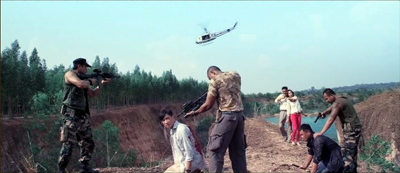
Universe and Bona, who seem to team up for blockbusters, offered a more delirious example of the Hong Kong flavor in The White Storm, which also screened at the Filmart. It’s another exercise in mixing. We have Bullet in the Head: three boyhood friends undergo a harrowing trip to wilder Asia, expending much sweat and tears, and even more blood. We have Infernal Affairs too, with the deadly game of undercover work and the possibility that a Triad mole has infiltrated the police. The three buddies consist of the familiar pairing of Lau Ching-wan and Louis Koo, along with the ever-dependable Nick Cheung as the apparently weakest member of the trio.
Unusually long at nearly 140 minutes, The White Storm (the title refers to the heroin plague that has descended on Hong Kong) is really three movies in one. The first centers on Koo in the now-familiar role of the cop who wants to come in from the cold. After a frantic drug bust gone wrong, he’s forced to return to the underworld and lead his comrades to a Thai kingpin. The second stretch takes place in Thailand. There after a savage assault on the dealer’s compound, our three are captured. The dramatic weight shifts to Lau, who must choose to kill either Koo or Cheung. His decision gains complexity because we know something he doesn’t about his partners’ loyalty. The film’s last portion returns to Hong Kong, with a few surprises and a bloody casino finale.
While building suspense in the Infernal Affairs mode–will the gang discover the mole in their midst?–director Benny Chan also tries to recover the searing romanticism of Woo’s heroic bloodshed films. As far back as The Big Bullet (1996) he showed a flair for shocking, precise action, and his Jackie Chan vehicle New Police Story (2004) is an exhilarating piece of work. Benny Chan shows his skill in each of the three sections’ violent set-pieces. Add in the 1980s-1990s Hong Kong excess–bodies thrown into pools of crocodiles, a sexy transsexual, outrageous haircuts–and you have an almost purely retro exercise.
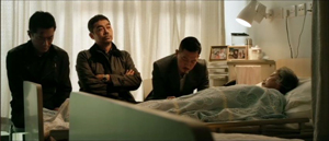
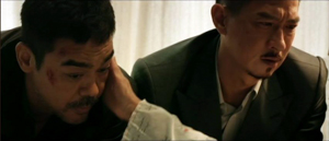
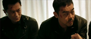
Another throwback is the shameless but stirring tear-jerking moment in which the three men comfort Cheung’s dying mother. She thinks that Lau is her son, back from study abroad with his buddies. They spontaneously accept her delusion, each pretending to be another member of the trio. The film’s play with false identities turns melancholy, and in comforting her the men apologize, obliquely, to one another. Chan’s use of singles and two-shots deftly traces out the flow of feeling, as the men exchange glances and Cheung starts to weep in shame.
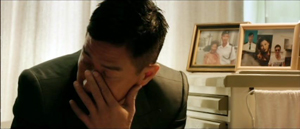
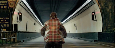
The old Hong Kong cinematic energy resurfaced in another, stranger film, Fruit Chan’s new release The Midnight After. It’s based on a popular internet novel by Pizza (yes, you read that right). The premise is apocalypse, the time is now. A minibus driving from downtown Hong Kong to the New Territories passes through a tunnel and emerges into an urban landscape from which everyone seems to have vanished. A mass extinction? An evacuation? A time warp? The mystery deepens after we get an occasional glimpse of dark figures in protective gear monitoring the frantic efforts of the survivors to make sense of their fate. Some of the passengers die–crumbling to bits, suffering giant boils, bursting into flame. Even a compassionate bicyclist is drawn into the desperate struggle for survival.
A Hong Kong director often asks us to take his or her film as reflecting a general mood in the territory. Fruit Chan says:
It feels as though Hong Kong is suffering the worst of times. People’s lives, people’s businesses and the political climate are all seriously depressed. The impact hit us harder than anything else in the past century. Through The Midnight After I’d like to tell the est of the world something about the problems that Hong Kong faces in this period of social upheaval.
The tone, as well as the plethora of familiar landmarks, may give the film some local resonance. More broadly, the film also joins a tradition of horror-fantasy that hearkens back to classic Hong Kong movies about the supernatural and even dystopian exercises like The Wicked City (1992). The latter was rendered with typical Tsui Hark brio, though, and The Midnight After is more sober and straightforward, at times perilously close to flat. Nor does it have the conciseness and growing creepiness of Chan’s Dumplings (2004).
I didn’t find The Midnight After particularly compelling. The characters are viewed from the outside and don’t solicit much sympathy; they’re mostly collections of types and tics, including a mysterious young woman who is given I-may-be-a-demon treatment by the expedient of momentarily billowing hair. As usual when a Cantonese film doesn’t know what else to do, it sets its characters screeching, quarreling, running around, and punching. Moreover, I couldn’t figure out what made the unfortunate victims die in different ways. And what’s behind the mysterious watchers? My friends say: “There aren’t any rules.” Maybe they’re right. But it’s fairly easy to pile on mysteries in your plot; the task is to tie them up in the end.
To be fair, we don’t really have the end. The film adapts only the first part of Pizza’s cybernovel, so perhaps everything will get straightened out in a sequel. What matters, for better and worse, is that many Hong Kong filmmakers still resort to Reboot mode.
You can read the trade papers’ Filmart daily publications here. Also visit Film Business Asia for many articles on deals announced at Filmart. Peter Martin reports on a panel on the Asian industry at Twitchfilm. Perhaps most important, Patrick Frater of Variety signals an important upcoming change in PRC distribution policy.
My information on the 2013 growth in Chinese screens is gleaned from David Hancock’s survey in of world exhibition in IHS Media and Technology Digest no. 504 (September 2013), 9-12. Additional information comes from Jeremy Kay’s CinemaCon report in Screen International and Patrick Frater’s account of screen expansion in Variety. Derek Elley offers a very thorough analysis of the contemporary Chinese industry in “Mainland Cinema’s New Maturity,” in Film Business Asia.
The trailer for Dot 2 Dot is here. Kozo, as you’d expect, has a nuanced review of The White Storm.
In other welcome news related to The Place, Grady Hendrix is back with Kaiju Shakedown. The inital entry is a full-blooded overview of the career of mystery auteur Jeff Lau.
P.S. 1 April 2014 (HK time): This entry has been revised to correct my original claim that Dot 2 Dot had some financing from the mainland. Director Amos Why wrote to explain that despite the credited participation of two companies based in Beijing, there was no investment from Chinese sources; the funding came entirely from Hong Kong. I thank Amos for the correction.
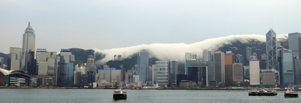
Smoke from a towering inferno? The creeping miasma of The Midnight After? No, just a low-lying cloud settling on Central after a rainstorm.
THE GRAND BUDAPEST HOTEL: Wes Anderson takes the 4:3 challenge
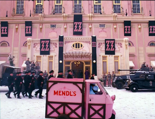
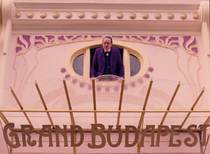
The Grand Budapest Hotel (2014).
DB here:
Be shot-conscious! I urged in a blog entry some years ago. I illustrated the point with a tradition of staging and shooting that seemed simple and modest but was actually quite flashy, and even fashionable. Although many filmmakers resorted to it, either often or occasionally, critics hadn’t attended to it. Wes Anderson’s work yielded one of many examples of what I called (swiping from art historian Heinrich Wölfflin) a “planimetric” style.
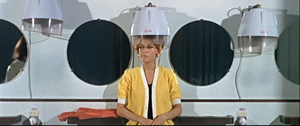
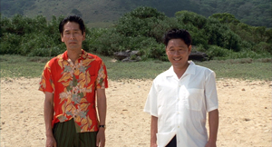
Ideally, you should look at that entry before reading this one. (To encourage you, I link it again. Not for the last time.) Very briefly, this style involves a frontal presentation of the action. You frame people against a perpendicular background, as if they were in a police line-up. Usually you face them to camera, as in this shot from Godard’s Made in USA.
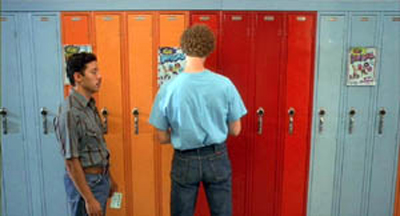
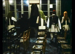
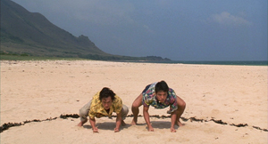
As we’ll see, sometimes you can frame the characters at right angles to the camera, or turned directly away from the camera. Here are examples from Napoleon Dynamite and from Angelopoulos’ The Traveling Players. (Is this the first time these two movies have been mentioned together?)
The key idea is that the people and the setting aren’t observed from an oblique angle; if the background is perpendicular, the people will stand or sit at 90 or 180 degrees to that.
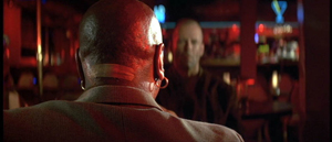
You can arrange them in some depth too, but again, they are stacked in perpendicular fashion, making each area a pretty strict plane. Here’s an example from Pulp Fiction.
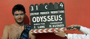
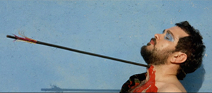
One point of my earlier entry is that this is a surprisingly old strategy; Keaton used it occasionally, and Godard was using it heavily fifty years ago. Here are two shots from Contempt (Le Mépris, 1963).
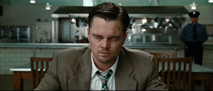
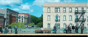
It has endured in some surprising places. It’s now a go-to option for one-off effects in mainstream cinema. Here are examples from Shutter Island and The Secret Life of Walter Mitty (2013 version).
A few filmmakers make it the basis of an entire film, as I indicate in this entry on Oliveira’s Gebo and the Shadow. And since I wrote the original entry, I’ve drawn on other examples from time to time, particularly from directors who are pastiching Ozu to some degree or another.
Still, Anderson is today the most widely visible example of the style, partly because while others use it sporadically, he is single-minded about it. He has made people shot-conscious (at least when they watch his movies). So after seeing his newest film, I thought it would be fun to think about what distinguishes his approach.
Playing with planes
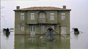
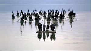
With the release of The Grand Budapest Hotel, several bloggers have pointed to recurring compositional features, most obviously bilateral symmetry. I’d just add that such symmetry is often used by practitioners of the planimetric approach, with results that sometimes exceed Anderson’s. Here are two shots from Angelopoulos’ Weeping Meadow.
When you think about it, it takes a brave filmmaker (e.g., Godard) to use this approach and not deploy symmetry.
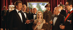
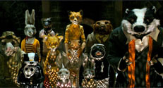
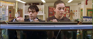
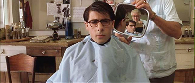
Anderson has used the planimetric approach more extensively in recent years, and he modifies it some distinctive ways. I think particularly of his habit of crowding people together in layers rather than stretching them along a single line. He makes some images look like group portraits or over-posed highschool yearbook shots (The Royal Tenenbaums; Fantastic Mr. Fox).
By employing the planimetric strategy, Anderson gains a somewhat awkward formality, a sense that we are looking from a distance into an enclosed world that sometimes looks back at us. There are as well the sort of comic possibilities that Keaton recognized in Neighbors and The General. A rigid perpendicular angle can endow action with an absurd geometry.
These apparently simple framings often evoke a world of childhood. Just as Kitano Takeshi shows us gangsters behaving like little boys, Anderson’s dollhouse-room frames make adults seem to be toy people arranged just so–like items laid out in a Joseph Cornell box. It’s a style suitable for magical-realist premises like The Life Aquatic with Steve Zissou, and in Moonrise Kingdom it finds its echo in children’s illustrated books.
All in all, then, I have to salute an American filmmaker who thinks about his images carefully and has incited sensitive viewers to notice them. I think we should go further, though. We can ask: How does Anderson, staying loyal to this tradition, vary the look of the shots? And how does he cut them together?
Cutting around
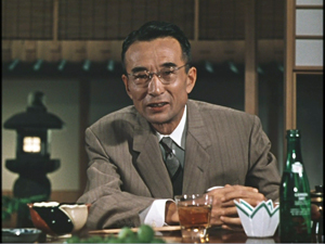
Consider the editing option first. Unless every scene is to consist of only one shot, the question comes up: How do you maintain the style while cutting? Either you make all your cuts axial, straight in or straight back.; or you create a sort of compass-point editing. This can involve cutting 180 degrees, to what’s “behind” the camera in the initial shot. So if characters are confronting one another, the camera is in effect sitting between them as each looks over or through the lens at the other (Ozu’s Late Autumn).
In effect, this option respects the classic 180-degree line, or axis of action, between the characters. It’s just that the camera sits right on that line. Parking the camera on the axis is a common tactic for subjective cutting, showing us first a person looking, more or less at the camera, then what she or he sees from their vantage point. Our example in Film Art: An Introduction comes from Rear Window.
Ozu used this 180-degree reversal often, but not absolutely; he had a more complicated way of conceiving space, and the 180-degree frontal cuts were only part of it. Kitano made a simpler variant central to his early films.
When I asked Kitano why he did it, he explained that it was exactly the way people saw each other in ordinary life. We face each other. He then added that he was such a naive director when he started that it was the only way he knew to set up scenes. We get kindred images in Terence Davies’ work; his frontality may owe something to the Hollywood musical.
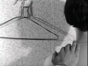
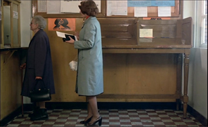
Compass-point editing offers another possibility, that of cutting at 90-degree angles to the background plane or the figures’ position. Chantal Akerman does it throughout Jeanne Dielman 23 Quai du Commerce 1080 Bruxelles (1975).
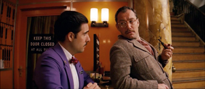
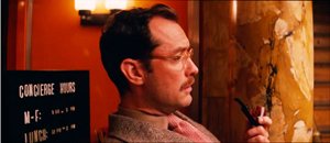
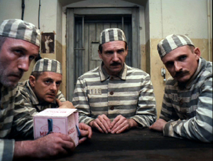
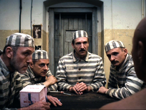
Anderson exercises all these cutting options inThe Grand Budapest Hotel. Here a planimetric profile 2-shot yields two frontal shots; we shift 90 degrees and then 180 degrees.
Now here’s a 90-degree shift for the reverse shot.
In the passage below, the first cut rotates 90 degrees, and the second cuts in right on the lens axis. In this tradition, an axial cut respects the perpendicular layout of the space.
In such cutting patterns, the compositions keep the action in the same upper zone of the frame from shot to shot. As a result, our eye doesn’t wander much. In long shots, Anderson sometimes follows the classic Hollywood practice of allowing some decentering, as long as the cuts balance one off-center composition against another. Here the changing angles obey the compass-point principle across three shots, and they crisply shift the emphasis from the right side of the frame to the center to the left.
Someone who wanted to deflate Anderson’s visual ambitions could say that his shots are monotonous. Having imposed a big constraint on himself, he’s now obliged to show us that this approach can be varied–in obvious or subtle ways.
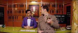
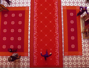
One way is through lens length. Most planimetric filmmakers use long lenses, which flatten the space even more. The figures can look like clothes hanging on a line. But Anderson favors quite wide-angle lenses (often 40mm). These make horizontal lines bulge, as in early CinemaScope films (Rushmore, The Life Aquatic).
You can see similar distortions in the straight-on shots of the hotel desk in Grand Budapest, above.
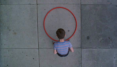
Another way Anderson varies his images is by departing from straight-on angles. As long as the framing maintains a planimetric geometry, we can look down or up at the action. In this passage, again the camera makes 180-degree reverses. This contrasts with the more orthodox shot/reverse shot framings in a comparable scene in The Little Foxes.
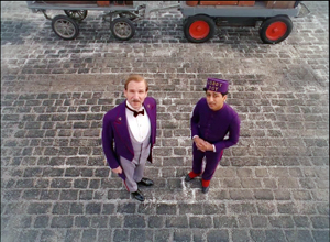
In this spirit, Anderson can give us bird’s-eye views, as Matt Zoller Seitz points out in his sumptuous book-length interview with the director. It’s rare, but there are precedents, as in the work of the Coens. In one shot of The Hudsucker Proxy, a movie with an inordinate number of straight-down angles, the inflexible framing creates a joke.
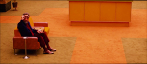
Grand Budapest Hotel has room for some classically funny framings. If you want somebody to look lonely, common practice says, frame the figure off center in a long shot. Here Anderson seems to be having a joke on the convention. He presents it as a POV, although presumably if the Writer were looking at the mysterious man he would put the object of attention in the center of his field of vision.
I think that Anderson’s earliest films weren’t quite so strict in obeying the planimetric and compass-point strategies. Those options were often slipped in as alternatives to more orthodox framing and cutting. But as he’s become more rigorous about using them, he has found ways to put his stamp on some common techniques. Like Ozu incorporating devices of classical continuity into his unique stylistic system, Anderson can recruit certain conventions while staying faithful to his basic approach.
For instance, Anderson sneakily brings in the OTS–the over-the-shoulder framing standard in shot/ reverse-shot dialogue scenes. In one prison scene, Harvey Keitel’s Ludwig is granted an OTS that varies subtly from the more purely straight-on views.
Much the same thing happens with in the punching scene at the reading of the will, when frontal characters are assaulted by fists coming in as if in reverse angles.
Anderson has figured out another way to vary his compositions. I learned this before I saw the movie, thanks to some comments by the cinematographer Robert Yeoman (great name).
High or wide, and handsome
Rushmore (1998).
To get the criticky part of this entry out of the way: The Grand Budapest Hotel has all the charm, fussiness, and intricate whimsy typical of Anderson’s work. As often in his films, it cuts its preciosity with moments of offhand brutality (sliced-off fingers) and flashes of naughty sexuality (fellatio, the lesbian painting). With its ensemble cast, sometimes deployed in cameos, it suggests a PoMo remake of those sprawling, self-congratulatory spoofs of the 1960s like The Great Race, Those Magnificent Men in Their Flying Machines, and It’s a Mad, Mad, Mad, Mad World. (The film’s title evokes those all-star films set in hotels, like Grand Hotel and Hotel Berlin.) It’s much better than those, partly because it engages in an oblique way with history, creating a comic-pathetic alternative account of Nazi imperialism. It imagines the collapse of Europe in operetta terms, filtered through Anderson’s pawky humor and distinctive style. I admired the film but don’t feel able to analyze it much after only one viewing. Fortunately for me if not you, its stylistic aspects fit today’s sermonette.
The Grand Budapest Hotel is set in several time periods, and they’re presented via The Blog’s old friend, the device of flashbacks within flashbacks. One character recalls the past or tells a story, and inside that line of action another character recalls or recounts a story, and so on. In Grand Budapest Hotel we move from the present, more or less, to events in the 1980s, then the 1960s, and eventually the 1930s, which constitute the central episodes.
Anderson has shot the frame stories in different aspect ratios. It’s 1.85 for the near present and the 1980s, when the Author recounts meeting the hotel owner. That meeting, set in the 1960s, is shown in 2.40, the anamorphic aspect ratio. The central story, taking place in the 1930s, is presented in classic 1.37, or 4:3 imagery. With typical Anderson butterfly-collector wit, each era gets a ratio that could have been used in a movie at the time. It’s remarkable that Anderson could persuade Fox Searchlight to let him do this.
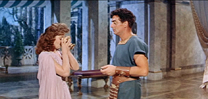
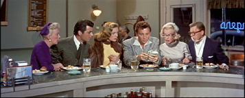
Most commercial releases in the 1950s and afterward were filmed in some widescreen ratio. In the early days, a popular option was a sort of clothesline staging, centering a single character or balancing others around the central axis: two side by side, three across, four as a pair of pairs, and so on. These shots are from Demetrius and the Gladiators and How to Marry a Millionaire.
Thanks to the widening of the frame, there is less air above the characters and less ground below them. The empty spaces are typically on the sides, particularly in the anamorphic 2.40 ratio. The problem of filling that up was solved, at least for some directors, by moving the camera very close to the actors. Spielberg remarked that he began shooting more close-ups when he filmed in anamorphic.
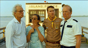
If you’re inclined to the planimetric approach, it fits the wider format nicely. Anderson wasn’t worried by the extra acreage; he just used the set or empty areas to balance one side against the other. Shots of only one character could be centered, as if posed, and shots of groups could be arranged more or less symmetrically, as in this passage from Moonrise Kingdom. Central perspective helps drive your eye to the main items.
In Grand Budapest, Anderson’s signature framings fit snugly into the scenes shot in 1.85 and 2.40. (The latter has been his favored ratio over the years.) But what about the 1.37 scenes? This brings me to Mr. Yeoman’s remark.
Explaining why he and Anderson watched a lot of films from the 1930s, especially by Lubitsch, Yeoman notes:
We looked at those more to familiarize ourselves with the 1.37:1 aspect ratio, which Wes wanted to use for the 1930s sequences. This aspect ratio opens up some interesting compositional possibilities; we often gave people a lot more headroom than is customary. A two-shot tends to be a little wider than the same shot in anamorphic. It was a format I’d never used before on a movie, and it was a fun departure. You can get accustomed to 1.85 or 2.40 to the point that the shots become more predictable.
Put it another way: Anderson’s penchant for centering and symmetry inclines him toward widescreen compositions that could be simply cropped right and left to fit the 1.37 ratio. His single characters and huddled groups could remain much as before. But in more distant framings you might get a lot of extra space at top and bottom–areas that simply aren’t there in the wide ratios. In other words, Anderson’s multi-format strategy gave him a new problem in maintaining his signature style.
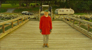
How did he solve it? Many Budapest Hotel shots do leave considerable headroom, as you see in most of the 1.37 examples above. But other shots show Anderson filling his 4:3 frame in varied and engaging ways.
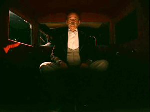
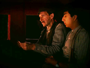
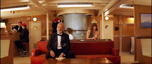
As Ozu showed, for instance, the planimetric option can fill the frame’s upper area when the camera height is below eye level. During the conversation in the car, above, Anderson gets the head of M. Ivan (Bill Murray) in the top of the frame thanks to a low angle. Here are two more examples of filling the upper reaches of the format by use of a lowish camera position.
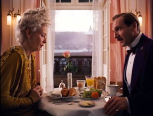
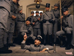
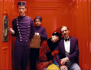
In the elevator shot, the headroom becomes comic, with M. Gustave and Madame D. seated on the right, the morose bellboy filling the vertical area on the left, and Zero in the middle. The empty space above the couple creates a lively imbalance emphasizing them in a way different from the very balanced framing that centers Henckel among his men.
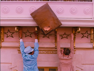
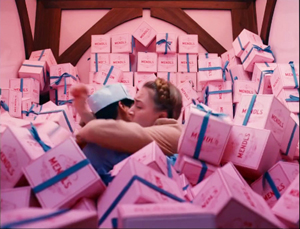
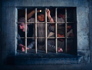
The set can cooperate. In the first shot below, Zero’s and Agatha’s centered embrace leaves lots of headroom, but the slightly disheveled stack of pastry boxes in the upper background contributes to the sense that they’re engulfed. In the second shot below, part of its humor comes from the rigid geometry of the grid and the way M. Gustave and his colleagues fill in the matrix with their intent faces and busy hands.
In all, Anderson seems to me to find intringuing ways to create visual interest in the 4:3 format. But as with any severe style, you wonder about what’s been lost.
Most obviously, Anderson loses some of the intimacy that comes with more angular and less strict approaches to the classic ratio. We like to see people from 3/4 views too. We also like depth shots that plunge us into a dynamic, diagonal playing space. Here’s a shot from John Huston’s In This Our Life, as precious in its own way as Anderson’s imagery.
As Hogarth pointed out, with the serpentine line in painting and drawing, such shots can lead our eye on “a wanton kind of chase.”
Because directors of the 1920s-1940s accepted a wider range of compositional options than Anderson embraces, headroom simply wasn’t an important problem, as in the Huston shot. Even in simpler shots, classical uses of the 4:3 ratio permitted a flexible organization of figures.
Centered symmetry against a flat ground is a fairly easy compositional strategy, after all. It wasn’t used much in the mainstream tradition because it looks artificial; perhaps only with the rise of art cinema was this sort of self-conscious composition welcomed. In any case, sticking with symmetry sacrifices the more delicate spotting of figures and faces around the frame.
A lot of visual art tries for more supple and subtle twists, torsions, and counterbalancing. Apart from organizing your space along the horizontal and vertical axes, you can try to set figures in delicate array along diagonals. This is why some old-time cinematographers argued that the 4:3 ratio was the best suited to the human body: it can flatter it from any angle.
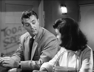
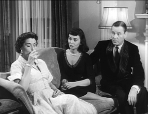
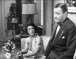
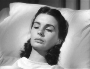
To get a sense of these possibilities, I’ve compiled a little collection of images from a film that doesn’t boast any outrageously pretty shots: Otto Preminger’s Angel Face (1953). It’s typical of the unassertive approach we find in Preminger’s work of the 1940s and 1950s. He avoids the flashy depth of the post-Kane directors and offers something less aggressive but no less fascinating. Composition and staging integrate expressions, posture, glances, and gestures to create a smooth flow of action. My samples also indicate how rare straight-on views of faces and bodies are in American studio cinema. The 3/4 angle rules.
As with the American films of Lang, Preminger’s work displays a style that’s tough to analyze because the technique isn’t obvious. There’s a marvelous variety in the ways that the 4:3 ratio can render a single figure or two figures, or three, shifting them not around the perfect center of the picture format but around curves and diagonal axes–that yield interest in their own right.
This last comparison isn’t a slam on Anderson. I think well of many of his films, particularly the most recent ones, and I appreciate anyone who takes on a challenge of narrowing his range of creative choices. Once you narrow that range, it turns out there’s a host of new possibilities that pop out. Call it the Ozu strategy: refine your means and you discover nuances nobody else notices.
Still, in art as in life, every choice is a trade-off. It’s worth remembering what one loses by pursuing a particular path. By sticking to his signature look in working with 4:3, Anderson gave himself a problem that didn’t exist for directors of an earlier time, the problem of maintaining a frontal style in a squarish format. I’m glad he faced it and solved it. But I’m also glad that classical filmmakers, quite intuitively, showed how much you could do with an alternative option.
Without any conspiring between us, Matt Zoller Seitz, top expert on Wes Anderson, has just urged critics to write more about film form–to be, among other things, shot-conscious.
Iain Stasukevich’s American Cinematographer article on the making of The Grand Budapest Hotel is well worth your attention beyond the technical matter I latched onto.
The Huston image came to hand because of the previous entry. Go there for more instances of the sort of framing and staging that Anderson and his planimetric colleagues don’t aim at.
I survey the planimetric style in On the History of Film Style and in Figures Traced in Light. A search of this blog’s archive will bring other instances to light. I analyze Ozu’s style in Ozu and the Poetics of Cinema, available as a pdf here. For more on CinemaScope, you can visit my online lecture.
P.S. 27 March (Hong Kong time): Jonah Horwitz writes with a useful point:
One thing I would add to your summary is that as early as Rushmore, most notably in The Darjeeling Limited, Anderson purposely inserts into his limited stylistic palette selected, isolated “foreign” devices like loose framings, handheld camera, and relatively aimless zooms (as opposed to his more common precise shock-zooms). In some cases, as in the drama-club staging of “Serpico” in Rushmore, these devices serve as citations, in that case to “realist” New Hollywood cinematography. But they also feel very much like the exceptions that prove the rule: they stand out from his usual stylistic register so much that they effectively reinforce the latter. I’m looking forward to seeing Grand Budapest to see if this continues, or if he emphasizes instead a further refinement of his typical gestures.
I agree with Jonah that importing foreign devices often throws into relief a filmmaker’s signature style–a matter of a film’s intrinsic norm getting reinforced by some marked deviation from it. I think of Ozu’s pans or tracking shots, which occur in all his black and white films, and which often just remind us how narrow the style is in the rest of the movie. And sometimes, as in The Flavor of Green Tea over Rice, those camera movements are hybrids or compromises with with his static style. Thanks to Jonah for corresponding.
P.P.S. 27 March: This entry has been revised to eliminate an error. Originally I had said that the play with aspect ratios in the film wouldn’t have been possible before digital projection. Bryce Utting wrote to point out that it was indeed possible on film, since Peter Greenaway’s Pillow Book used both 1.85 and anamorphic widescreen. I had even seen the film and forgotten that! Thanks to Bryce for the correction.
P.P.P.S. 30 March (Hong Kong time): Jim Healy, impresario of our Wisconsin Cinematheque, writes to point out several other films that mix aspect ratios:
The first hour of Redford’s The Horse Whisperer, the urban-set part, is in 1.85. When the characters make it to the open horse country, the image widens to ‘scope. . . . The 2002 Disney animated feature Brother Bear (which isn’t so bad) is 1.85 for about the first 20 minutes and when the principal Inuit character (voiced by Joaquin Phoenix) is transformed into a bear, the picture goes to Scope.
The Grand Budapest Hotel (2014).
Manny Farber 2: Space man
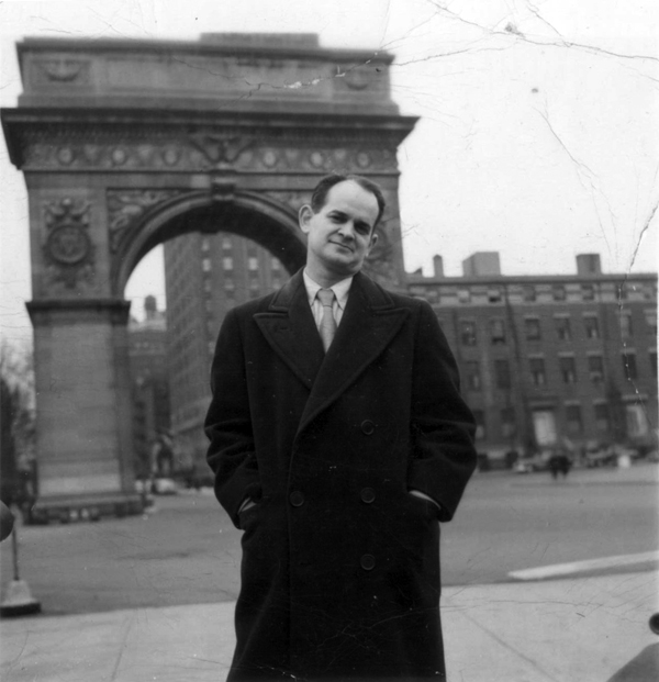
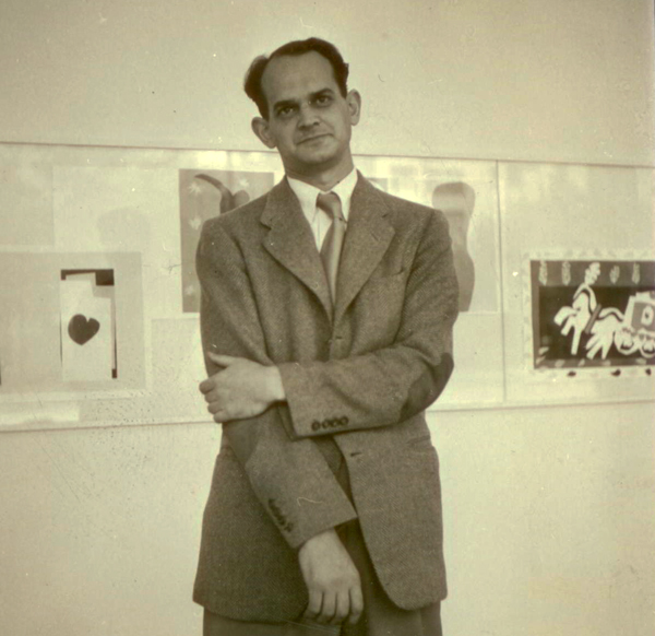
Manny Farber, undated photo. Courtesy of Patricia Patterson.
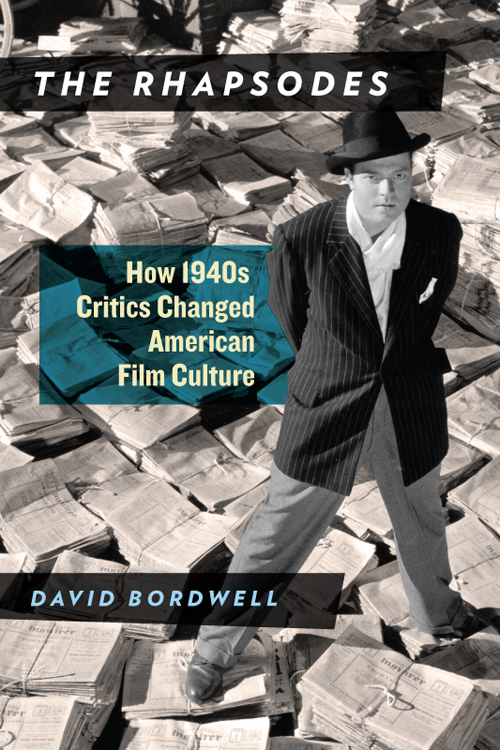
The original entry at this URL, published 23 March 2014, has been removed. Revised and expanded, it forms a chapter in the book The Rhapsodes: How 1940s Critics Changed American Film Culture, to be published by the University of Chicago Press in spring 2016.
I explain the development of the book in this entry.
You can find more information on the book here and here.
Thank you for your interest!
Manny Farber 1: Color commentary
Manny Farber, undated photo. Courtesy of Patricia Patterson.
The original entry at this URL, published 17 March 2014, has been removed. Revised and expanded, it forms a chapter in the book The Rhapsodes: How 1940s Critics Changed American Film Culture, to be published by the University of Chicago Press in spring 2016.
You can find more information on the book here and here.
I explain the development of the book in this entry.
Thank you for your interest!


