Archive for December 2014
The ten best films of … 1924
Die Nibelungen: Siegfried
Kristin here:
For a seventh year running, we skip ranking the current year’s films and instead hark back 90 years.
We started out with a list that was essentially an appendix to an entry, but soon we were dedicating whole entries just to the list. Our entries for past years are here: 1917, 1918, 1919, 1920, 1921, 1922, and 1923.
These lists are our way of calling attention to important silent films that some readers may have overlooked. In one case here we point out a largely forgotten film that deserves to be better known, in the hope that an archive will take the hint. With the proliferation of silent-film festivals, of DVD and Blu-ray releases with restored prints and supplemental material, and of TCM’s eclectic screenings of foreign and silent titles, there seems to be considerably more interest in these early classics. Herewith our choices for 1924.
For the last few years I’ve struggled to fill out the full list of ten films with truly deserving items. But as I’ve been predicting, the 1924 choices fell easily into place. As usual, some of these are obvious picks, already famous to most readers. Others are less obvious, and a few are unknown except to specialists. Some, though very important historically and artistically, are not currently available on DVD, which is a real shame.
At last, the USSR
Films in the Soviet Montage style make up one of the most important cinema movements of all times. The key filmmakers of the movement, Eisenstein, Pukovkin, Dovzhenko, Kuleshov, Kozintzev and Trauberg, and others began their work later than the German Expressionist and French Impressionist directors. But at last one joins our list, with Lev Kuleshov’s The Extraordinary Adventures of Mr. West in the Land of the Bolsheviks.
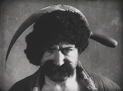
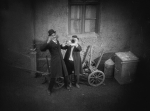
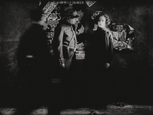
Although Kuleshov’s work has become more widely available, his most familiar work is still By the Law (1926), a grim tale of two members of a gold-prospecting team agonizing over how to bring to justice a colleague who has committed a terrible crime. Mr. West couldn’t be more different. This hilarious and grotesque comedy satirizes American perceptions of the new Soviet Union, as Mr. West, president of the YMCA, comes to for a visit, his faithful cowboy friend Jeddie in tow. They’re terrified of the barbaric land they expect to encounter, and a gang of thieves dupe Mr. West by dressing up in outfits that caricature West’s images of Bolsheviks (above).
In making the film, Kuleshov and his team drew upon the experiments they had been doing in his classes he ran of the early 1920s. Film stock was scarce and all he and his students could do was practice staging scenes and make short editing experiments. They explored the possibilities of “biomechanical acting,” a style based more on gymnastic control and energy than on psychological subtleties of facial expression.
Once the group did get the resources to make a feature, their delight is evident in the lively editing and the exuberant performances. Alexandra Khokhlova, a gangly woman who was married to Kuleshov and starred in most of his films, plays a vamp who tries to lure Mr. West into her toils. Pudovkin, who studied with Kuleshov before going into directing himself, is the well-dressed gang leader who pretends to guide Mr. West away from danger. Boris Barnet, also to become a major director, performs feats of derring-do as Jeddie tries to save Mr. West.
Mr. West is not only a satire on Western fears of post-Revolutionary Russia but also a parody of American serials. (The latter was something Barnet soon tried in an actual serial, his 1926 Miss Mend.)
Mr. West is available on DVD in Flicker Alley’s set, “Landmarks of Early Soviet Film.”
German Expressionism begins to wind down
Last year I was hard put to pick a film to represent the German Expressionist movement in the top ten. I chose Erdgeist but mentioned Schatten and Raskolnikow as runners-up. By 1924 there were fewer Expressionist films released, though the movement would linger on until 1927, mainly carried on by the two greatest directors who had worked in the Expressionist movement: F. W. Murnau and Fritz Lang. Each of these contributed a classic film in 1924: Murnau’s The Last Laugh and Lang’s two-part epic: Die Nibelungen: Siegfried and Kriemhild’s Revenge).
The Last Laugh isn’t really Expressionist. The sets are mildly in the style, but what really fascinated Murnau at this point was the freedom of camera movement introduced by French Impressionism. He set out to make a character study. Emil Jannings plays a doorman in a large hotel (none of the characters’ names are given). His regal bearing and fancy uniform bring him respect among his fellow employees and from relatives and neighbors in the lower-middle-class neighborhood where he lives. He has aged to the point where he carry large luggage and is abruptly demoted to work as a rest-room attendant.
Murnau introduced what came to be known in Germany as the entfesselte Kamera, the “unfastened camera,” beginning in the opening shot where an elevator with a grill descends, carrying the camera and dramatically revealing the lobby. Murnau may have been directly influenced by one of last year’s top-10, Cœur fidèle, where Epstein put his camera on a spinning-swings carnival ride. Murnau saw other uses for the device. Like the Impressionists, he conveyed drunkenness through moving camera, though in this case he put the actor and camera on a turntable, so that the room spins past behind Jannings, conveying the dizzy happiness of the doorman at a party (above).
Using more imagination, Murnau follows sound with his camera. As the party ends, musicians exit to the apartment-block courtyard, and one plays a final tune under the window. Starting with a close-up, the camera “cranes” diagonally up and backward until the men are in long shot. A cut takes us to the doorman inside, happily listening.
Actually the camera was not on a crane. Murnau and cinematographer Karl Freund affixed a track over the courtyard with a small metal elevator underneath, so that the camera could move both back and forth and up and down. The camera was not literally unfastened in these cases, but it looked like it was.
Murnau wanted to end the film on a grim note with the protagonist seated alone in the hotel rest room. Commercial considerations led to a happier ending, however, with him unexpectedly becoming wealthy. The twist was so outrageous that Carl Mayer, the scenarist, considered it a comment on Hollywood’s insistence on happy outcomes. Hence the English title The Last Laugh. The original German means “The Last Man.”
The Last Laugh got distribution in the USA, but it was not a success. Hollywood practitioners studied it, though, and started hanging cameras from tracks themselves and trying other tricks. The track backward above a long, laden banqueting table soon became a cliché of Hollywood cinema.
Murnau would make two more mildly Expressionist films, Tartuffe (1925) and Faust (1926) before heading to Hollywood to make the ultimate hanging-camera film, Sunrise (1927)
The Last Laugh is available from Kino in the USA and Eureka! in the UK.
One of my favorite films of the 1920s is Lang’s two-parter, Die Nibelungen: Siegfried and Die Nibelungen: Kriemhilds Rache (Kriemhild’s Revenge). An adaptation of the ancient German myth, it mostly proceeds at a stately pace until the final battle scene. Some may find it slow, especially when compared with the lively, suspenseful Dr. Mabuse der Spieler (1922) and Spione (1928). Yet its leisurely presentation is appropriate to the subject matter. Equally important, lingering over images allows us to notice the details of the extraordinary settings and costumes, with their busy decorated surfaces and their startling arrangements within the shot.
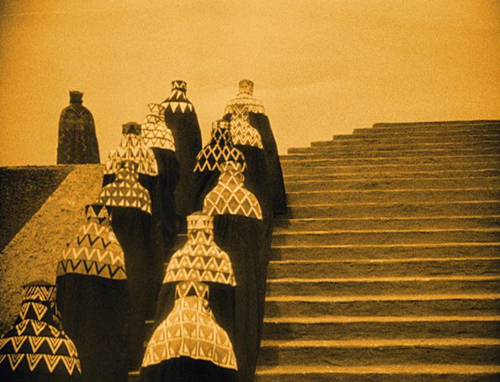
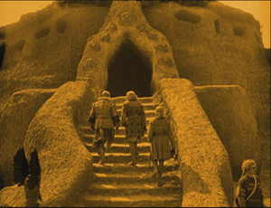
Take the image at the top of this entry. Brunhilde, having been forced to marry King Gunther against her will, envies her sister-in-law Kriemhild, who has married Siegfried, the man Brunhilde loves. In this shot, Brunhilde mounts the steps of Worms Cathedral to confront Kriemhild and assert her right to enter the cathedral first. We see her from behind and then at the upper left as her ladies follow her, wrapped in their patterned hoods and black cloaks, creating an almost abstract composition. Lang build the enormous stairway outside the cathedral in two stages and then used the set imaginatively to stage several ceremonies and dramatic conflicts.
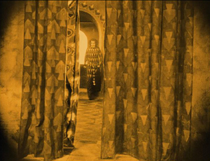
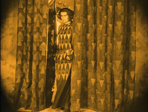
What makes this film Expressionist, I would argue, is the way the actors and settings interact, as in this moment when Brunhilde pauses by her window and then comes forward through the slightly parted curtain, exiting left. She pauses in the opening, her dress seemingly becoming part of the curtains for a moment.
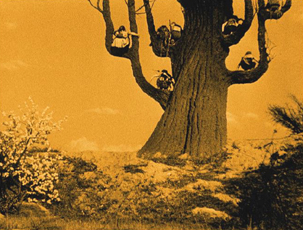
The similarity and the pause have no narrative function, but it’s a very Expressionist composition. Insistent symmetry and acting also contribute to the style. In the second plot, the Hunnish King Etzel asks for Krienhild’s hand in marriage. She agrees on the condition that he will aid her in exacting her revenge on Siegfried’s killers. Upon her move to the land of the Huns, the style becomes a more familiar sort of Expressionism, with distorted trees and buildings that looks like they were built of mud that settled oddly before drying:
The elements of the German tales are all here: love, betrayal, suicide, revenge, presented in images worth savoring.
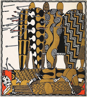
Lang was inspired in his approach to the film’s visuals by some illustrations by Carl Otto Czeschka for a 1909 retelling of Die Nibelungen published in 1909. The heavy decoration on the knight’s shields and many other surfaces in the film somewhat resemble this image, for example:
Yet the resemblance is far from exact. Clearly Lang used elements from these illustrations and took them off in his own direction.
The film has recently been restored and looks great on Blu-ray. Kino in the US and Eureka! in England have brought it out. Both have DVD editions as well.
Scandinavia’s golden age drawing to a close
During the first half of the 1920s, the Swedish cinema was a victim of its own success. Victor Sjöstrom (who has figured in these lists in 1918 and 1921, as well as in our “Lucky ’13” entry), had headed to MGM, becoming Victor Seastrom. In 1924 he released his first two films in 1924: Name the Man and He Who Gets Slapped. The latter was the newly formed MGM’s first in-house production to be released. It was a huge success, no doubt in large part due to the growing stardom of Lon Chaney, and it put the studio on the map and allowed Seastrom to stay in Hollywood, notably for The Scarlet Letter (1926) and The Wind (1928).
Mauritz Stiller (also a previous top-10 choice) was about to head for Hollywood as well, but his final Swedish film is one of his finest. Gösta Berlings Saga, a epic adaptation of Selma Lagerlöf’s novel, was made in two parts lasting over three hours. Many people will know it as the debut film of Greta Garbo. Fans should be forewarned that she is an important character and appears in the early and late scenes but disappears for a long stretch in the middle.
[December 30: As our friend Antti Alanen points out, Garbo had already acted in a comedy, Luffar-Petter (Peter the Tramp, 1922) and in some short advertisements.]
The film begins with Berling, a drunken pastor in a small town, being relieved of his duties. He ends up being taken in the “Chevaliers” at Ekeby the country estate of Margaretha Samzelius, a tough middle-aged woman who runs a group of foundries she has inherited from a lover. The Chevaliers are a group of hangers-0n, men who can drink and laze about most of the time but who must be charming and entertaining at Samzelius’ many dinner parties. Berling has a number of chances to redeem himself but ends up harming the people around him and sinking lower into despair. He is finally redeemed by the love of the Garbo character, Elizabeth, the new bride of a wealthy neighbor, to whom, it turns out through a technicality–and happy coincidence–she is not actually married.
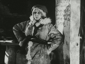
Hansen and Garbo make a gorgeous couple (below left), but they are upstaged by the great Swedish stage actress Gerde Lundequist as Samzelius:
As usual, the film contains lovely scenes in the Swedish landscapes. There are some impressive night sleigh rides, including a famous scene in which Berling and Elizabeth are chased across a frozen lake by wolves. There is also one of the most impressive fire scenes I can recall from the silent era, as Samzelius’ efforts to smoke the Chevaliers out of the guest house where they live and inadvertently sets fire to the big main house as well.
Unfortunately the film was cut down into a single feature for its release outside Scandinavia. The Story of Gosta Berling was the main version that circulated for many years. The Swedish Film Institute restored it in stages as more footage was found, but the current print, at 183 minutes, is still missing some footage.
Beware picking up an older video release with the truncated film. The restored version was released on DVD in the USA by Kino. The original Svensk Filmindustri release (with English, French, Portuguese, German, and Spanish subtitles), is available here. The same DVD comes in a box set of six Swedish silent classics, which is widely available from the usual online sources.
Carl Dreyer has popped up on this blog several times, usually in passing. Not surprising, since David wrote a book about him way back 1981. Here he makes his second appearance on our ten-best lists (the first having been for his first feature, The President, in 1919) with Michael.
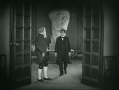
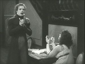
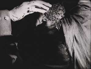
The film centers around a wealthy, aging artist, Claude Zoret. The main room of his house is decorated with several eye-catching pieces of sculpture, notably a mysterious battered head that looms in the background of many shots. Is it one of Zoret’s own works? Is it part of a collection of ancient statues? Much of the action takes place here, which has led some historians to place Michael in the tradition of the Kammerspiel. David calls it a borderline case. There are certainly scenes that leave Zoret’s studio, most notably one in a large theater set.
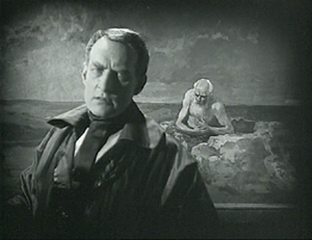
The film has been hailed as an early treatment of homosexuality. Although there is nothing overtly expressed, it is hard not to read such a subtext into the action. Zoret, wonderfully played by Danish director Benjamin Christensen, has many guests and admirers visit him, creating a little all-male coterie. He has taken in a young protegé, a very beautiful and very young Walter Slezak. Zoret refers figuratively to Michael as his son, but there seems to be another tie between the two. Moreover, there may be a hint that Charles Switt, a journalist apparently writing a biography of Zoret (at the center of the frame above), feels some jealousy toward the young man.
Trouble begins when a princess comes to commission a portrait from Zoret. Although he usually doesn’t do commissions, he is intrigued by her face and agrees. During her visits to the studio to pose, she meet Michael, who is immediately smitten. The affair continues as Michael becomes increasingly inconsiderate to Zoret,borrowing money to continue the affair and missing an important showing of his work. In contrast, Zoret shows unwavering generosity to Michael, despite being devastated by his desertion.
Ultimately Zoret paints his last work, showing an elderly, lonely man against a barren seascape. It is hailed as a masterpiece at a party which Michael does not attend.
The character study proceeds at Dreyer’s usual formal pace, and yet it is never dull. As much as any of his silent films, it looks forward in tone to his later sound ones.
A very nice print of Michael is available in the UK from Eureka! (not deliverable to the USA); Kino released what I assume is the same print in the USA.
She was nothing but a poor flower-maker
Every now and then I want to put a film on the list which is impossible to see unless you happen to live near one of the archives that has a print and they happen to program it. Still, in the hope of inspiring someone to restore it and make it available, I proceed.
The film is Jean Epstein’s L’Affiche (“The Poster”). Epstein first made our list last year for the much better known Cœur fidèle. L’Affiche is a bit like the earlier film, a simple melodrama made in the French Impressionist style. Its situation is highly conventional, and its plot depends on a massive coincidence.
The heroine is introduced as Marie, one of several women making artificial flowers. On her lunch break she thinks back to a romantic day she spent in the country. There she meets a young man, Richard. The couple go to an expensive restaurant, and Richard seduces Marie, and then abandons her, driving away alone the next morning.
Three years pass, and Marie has a small child, also named Richard. She enters him in a contest for the most beautiful child, with a cash prize, offered by an insurance company that wants to put the winner on their advertising posters. The boy wins, and Marie signs a 10-year contract for the rights to use little Richard’s image.
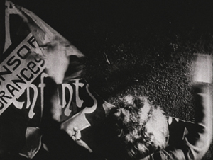
The child dies, however, and Marie visits his grave. As she leaves, she sees a huge poster with his image. The campaign has begun. Everywhere in Paris she goes, she sees the poster and finally begs the insurance company to end the campaign. The boss, however, refuses. Marie begins tearing down the posters, and she is soon arrested. Epstein handles the arrest scene without an establishing shot but builds it up through close-ups.
Initially we see only the back of Marie’s head and her arms tearing down a poster. There a cut-in to slightly closer framing as a policeman’s hand comes into the shot and touches her shoulder. A third shot shows her turning to the officer and staring in a way that suggests she is becoming mentally unbalanced. Finally a long shot establishes the scene as a second policemen enters to help arrest her.
It’s the sort of gradual revelation of space that Kuleshov was working with at the same time.
The boss of the insurance company is informed of this and sends his son to file a complaint against her. New copies of the poster are being put up all over town. The son is none other than the Richard who seduced Marie years before. Hearing her tale, he asks her forgiveness and takes her home to his parents. The father forbids their marriage, they marry anyway, and eventually (after his own younger child dies!), the boss blesses the marriage and agrees to take down the posters.
Summarized baldly, it sounds like an impossible plot to take seriously, but Epstein’s delicate, understated approach in presenting it and Nathalie Lissenko’s affecting performance as Marie manage to make it a great film. It’s full of Impressionist moments: Marie’s memory of her romantic day with Richard, a dance scene with rhythmic editing, a dream sequence, and plenty of gauzy shots and fancy wipes at transitions.
Earlier this year I complained because L’Affiche was not included in the big new box set of Epstein’s work, despite almost everything else from the period being there. It’s also not on the box set of films made at the Russian emigré studio, Albatros, even though Epstein’s other three Albatros films are there. I don’t whether there are rights problems or there simply isn’t a good enough print.
At least one streaming service claims to have L’Affiche available, but a search turns up numerous complaints about the site.
I should make mention of one other Impressionist film that came out in 1924. Perhaps it should be on the list rather than L’Affiche. It’s Marcel L’Herbier’s L’Inhumaine. L’Herbier appeared on our 1921 list for El Dorado, and even then I expressed reservations. Most of his films seem cold and by-the-numbers to me, not to mention a bit pretentious. But his films were historically important, and L’Inhumaine was influential in its use of art deco sets. At one time the film was available on DVD, but it seems to be out of print.
Three funny men …
And no, it’s not Chaplin, Keaton, and Lloyd this time. Chaplin didn’t release a film in 1924. His next would be what many would consider his funniest feature, The Gold Rush.
Over the years I’ve stressed that during the 1910s, the three great comics were working in shorts, honing their filmmaking and working up to their great series of features. By 1923 they had fully made the transition: Lloyd made Safety Last and Keaton Our Hospitality. Safety Last had a simpler plot, structured mainly by the stages of the hero’s climb up a building. Keaton went further with a complex story of a romance blooming between members of feuding families, using multiple locations, a developing causal line, and clever motifs. (We analyze it in Chapter 4 of Film Art: An Introduction.)
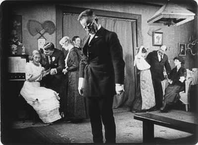
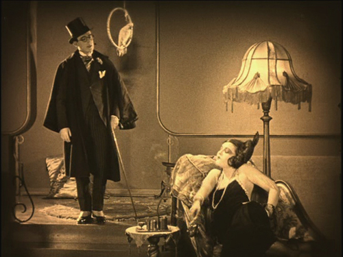
In 1924, Lloyd achieved a similar complexity with Girl Shy, one of his greatest films. He plays a bashful young tailor’s assistant who is terrified of women. Yet in secret he writes a guide for seducers, taking on the narrational persona of a jaded man of the world. Clearly he has taken his inspiration from movies of the day. The imaginary scenes from his book dramatize his success in gaining the love of a vamp (see bottom) and a flapper. The publishers decide that the book is so over the top that they will publish it as a comic story. During all this Harold develops a relationship with Mary, a quiet young woman from a wealthy family. When her father tries to buy Harold off, he pretends to spurn Mary. She is about to marry a rich man, but Harold determines to stop the wedding.
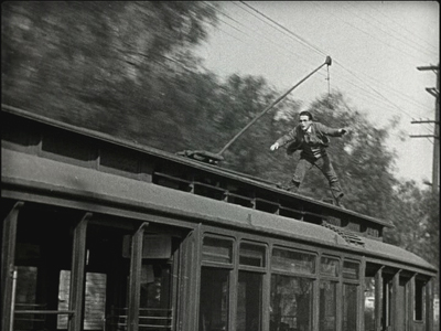
There develops one of the most epic chase scenes in all silent comedy, and indeed all cinema, as Harold commandeers all manner of vehicles, from cars and wagons to a firetruck and a speeding trolley (above).
Even Keaton never outdid that one. But from 1923 to 1927, these two each created a string of innovative, carefully crafted, hilarious films.
Girl Shy used to be available in a 3-DVD set from New Line, but that is no longer available–though one optimistic third-party seller offers it, still sealed in plastic, for $399.99). Now the individual releases of each DVD seem to be slipping out of print as well. Volume 1, which contains Girl Shy, is definitely out of print. Be forewarned: Volume 2, which includes the wonderful 1927 film The Kid Brother (look for it on a future list) seems like it’s not long for this world, and the same is true of Volume 3, with For Heaven’s Sake (1926).
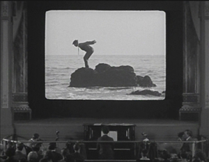
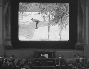
It was difficult to choose between Keaton’s two major releases of 1924, Sherlock Jr. and The Navigator. I chose the former mainly because of its perpetually astonishing transition from the frame story of a small-town projectionist unlucky in love to his dream of himself as a sophisticated detective. His dream takes the form of a movie, and the sleeping projectionist walks through the theater and into the onscreen action. With extraordinary precision, Keaton maintains a long-take framing of the pianist and audience in the auditorium while the hero onscreen undergoes a series of unexpected shot changes. In each he is in the same pose and position within the screen, but the backgrounds change arbitrarily, as when he begins to dive from a rock into the ocean and finds himself landing in a snowdrift:
The result is a marvelously convincing technical feat, giving the illusion of being a single shot as far as the theater is concerned and on the movie screen a character wandering through an appropriately dream-like series of edited shots. In general, Keaton was the most adept of the three great comics at using cinema technology to create gags, and this is his most elaborate attempt. (Though see also his short, The Playhouse, in which multiple exposures, flawlessly managed in-camera, create Keaton clones that play all the roles.)
The plot of the dream emerges after this virtuoso transition, and it remains hilarious throughout. The chase, while not quite as dazzling as the one in Girl Shy, has considerable variety of vehicles (one wonders if the two comics were consciously trying to best each other), including a passage where the hero rides the handlebars of a speeding motorcycle, unaware that the driver has fallen off.
Kino has packaged Sherlock Jr. together with Keaton’s early feature, The Three Ages (1923), and released them both on DVD and Blu-ray.
The third funny man was Ernst Lubitsch. The Marriage Circle was his second Hollywood film, and one of his best. Lubitsch had started out as a comic in silent shorts in Germany, but unlike the famous Americans, he entirely gave up acting to direct. Not that he directed only comedies, but his best films, including Lady Windermere’s Fan, Trouble in Paradise, and The Shop around the Corner, fall into that category.
The Marriage Circle is a light romantic comedy, following a chain of flirtations and misunderstandings. Prof. Stock has realized that his pretty young wife Mizzi has begun to neglect and nag him. She is soon attracted a newlywed, Dr. Braun. Mizzi happens to be an old friend of Braun’s wife Charlotte, which gives her opportunities to flirt aggressively with Braun. Charlotte is in turn admired by Braun’s medical partner, Dr. Mueller, though she laughs off his attempts to woo her.
It has often been pointed out that Lubitsch is a director of doorways. That’s not always true, but The Marriage Circle is built around visits. The five characters visit each other in various combinations, and the string of attempted seductions and jealousies builds. Stock encourages Mizzi’s pursuit of Braun, since he wants an excuse for a divorce. Charlotte naively pushes Braun into visiting Mizzi at home when she plays sick.
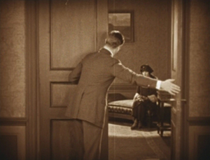
The sets and especially the doorways play a big role. Characters pause in doorways to take in a compromising situation they have interrupted. At one point Mizzi comes to Braun’s office. Mueller spots them in an embrace, but Braun claims he’s hugging his wife. Eager to alienate Charlotte from her husband, he opens the office door to reveal Charlotte in the waiting room:
This is the first film where one can see the “Lubitsch touch” in action. It’s an ability to use film techniques to hint at something naughty. Here the innuendos are aimed at the characters. We know more than any of them does, and the humor arises from watching them misinterpret what they see and hear. When they finally learn of their mistakes, they end the “circle” of the title.
The Marriage Circle is available to rent or buy in digital form on Amazon. I know nothing about the source or the quality. The only DVD easily available is a region 2 French one under the rather blah title Comédiennes. The print is distinctly soft (as the frame above suggests) but acceptable until a better one becomes available.
… and one not so funny
Greed is often spoken of as the film that historians and buffs would most like to see rediscovered. Part of it survives, of course–about two hours out of the original eight or so. Its producer, MGM, had it was edited down into a reasonably coherent feature, mainly by cutting out a number of characters and their subplots. I won’t say much about the film here, since it is already quite well-known.
The film is an adaptation of Frank Norris’ novel McTeague done in a naturalistic style, which was unusual for Hollywood films of that or any other day. It follows McTeague, an unlicensed dentist, who steals his friend Marcus’ girlfriend, Trina, and marries her. Their luck fluctuates, as Trina wins a lottery and McTeague is thrown out of work for not having a license. Trina becomes an obsessive miser, and McTeague, by now an alcoholic, murders her and flees to Death Valley with her money.
I find a lot of Greed heavy-handed and obvious. (I prefer the simpler Blind Husbands, which made our ten-best list for 1919.) It has an interesting style, however, with a lot of proto-Wellesian deep focus and low angles, complete with, in the case of the frame above, a hint of a ceiling. The final sequence in Death Valley is also very effective.
Apart from being 75% lost, Greed has never been released on DVD. (See Indiewire for comments on this.) In 1999 Turner Classic Movies edited a four-hour version, inserting production stills to suggest the missing scenes. This was reasonably effective, but it seems impossible to find a print of it that is not washed out and fuzzy. We’ve tried taping off TCM, as well as buying the VHS and laserdisc releases of that version. They all verge on unwatchable. I hope that the situation is not left where it is and that a true restoration is eventually done. My frame above comes from an archival 35mm print, so clearly better material exists.
The lost film that I would most like to see discovered is Lubitsch’s Kiss Me Again (1925). Given that it was made right before Lady Windermere’s Fan, there’s a good chance that it’s a masterpiece.
One of a kind
Last year I put Man Ray’s experimental short, La retour à la raison, on the list. Comparing experimental shorts to fiction features, though, seems unfair. This year I’m separating out the experimental category and will try to choose at least one film each year.
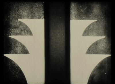
This year it’s Walter Ruttmann’s Opus 3, the third of his four films done with abstract animation.
All of the Opus films plus other Ruttmann shorts are available on a DVD set with Berlin, die Sinfonie der Grossstadt and Melodie der Welt. If you want to sample just Opus 3, which is about four minutes long, it has been posted multiple times on YouTube. Although a bit dark, this is the best copy I’ve found, and it has a nice, appropriate score by Hanns Eisler.
Bernard Eisenschitz made the connection between Lang and Czeschka in his massive Fritz Lang au travail (Cahiers du Cinéma, 2012) , pp. 38 and 42. Czeschka’s Nibelungen illustrations can be see along with the entire book on the Museum of Modern Art’s website, with a page-turning feature and the ability to enlarge the pages considerably. Individual illustrations can be found with a Google Images search on “Czeschka” and “Nibelungen.”
Thanks to Jonah Horwitz for a correction.
Girl Shy
Shameful or shameless self-promotion? YOU decide!
This just in:
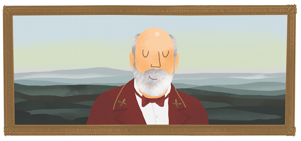
All the authors of pieces in Matt Zoller Seitz’s forthcoming Grand Budapest Hotel book are given the Max Dalton treatment, in the vein of The Wes Anderson Collection. Herewith, the contributor portrait of your obedient servant. And in CinemaScope!
Yes, I am happy. Yes, it’s a credible likeness. Yes, said book is due out on 10 February from Abrams. No, I will not be getting a tattoo of it.
Thanks to Matt and Eric Klopfer of Abrams.
Rebooking at THE GRAND BUDAPEST HOTEL
DB here:
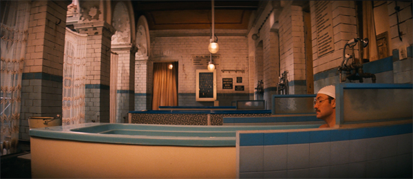
I didn’t plan it, but this has been the year of Wes Anderson on our blog.
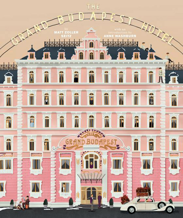
After an entry on The Grand Budapest Hotel and its play with aspect ratios, I posted an analysis of Moonrise Kingdom (my favorite Anderson movie). Now comes a book from the indefatigable Matt Zoller Seitz that continues the work of his splendiferous Wes Anderson Collection.
Matt provides critical commentary, natch, along with many interviews with Anderson and his creative team. Some critics have a look-in as well. I add my $.02.
You can read more on Vulture here. Available from Abrams on 10 February–too late for the December holidays, but well ahead of Valentine’s Day.
Visual storytelling: Is that all?
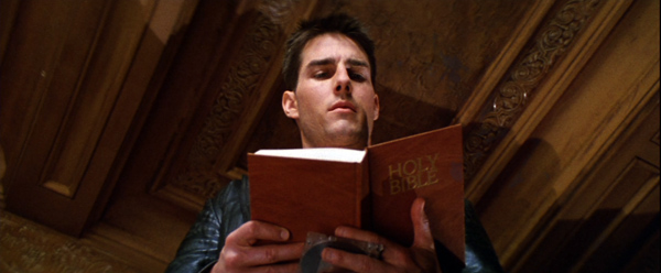
Mission: Impossible (1996).
DB here:
The phrase “visual storytelling” is a very modern invention. It seems to be unknown before the mid-1940s, and it doesn’t really become common until the 1990s. It applies to film, of course, but it also refers to comic strips and other media. Sometimes it carries a prescriptive edge: In a pictorial medium, you should tell your stories visually—rather than, say, through lots of talk. The motto is sometimes summarized as Show, don’t tell.
Elsewhere on this site, I’ve argued that sometimes that advice should be ignored. A monologue about incidents in the past can sometimes be more powerful than a flashback depicting them. That power often owes something to the actors’ performances—which are, after all, no less visual than the story action being told us.
Similarly, who would attack great films like His Girl Friday for being too talky? An essential pleasure of American cinema from the 1930s on is the way that some scenes let dialogue take the lead. And it’s not just the words but how, and how fast, they are spoken.
Still, I do enjoy scenes that cut the gab and give us a flow of pictures that coax us to follow a story. My pantheon of great filmmakers includes Eisenstein, Keaton, Griffith, Lang, and many other silent masters. But mentioning them reminds me of something else that needs to be said.
Visual storytelling is seldom purely visual. In film, it needs concepts and music and noises and even dialogue to work most fully. We can learn a lot, I think, by starting with “purely visual” passages and see how they’re reinforced by other inputs.
Pictures, plus
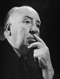
Take the most vociferous defender of visual storytelling, Sir Alfred Hitchcock.
I want to put my film together on the screen, not simply to photograph something that has been put together already in the form of a long piece of stage acting. This is what gives an effect of life to a picture—the feeling that when you see it on the screen you are watching something that has been conceived and brought to birth directly in visual terms.
Yet Hitch needed words and music throughout his career. Put aside the talkathons that are Lifeboat, Rope, Under Capricorn, and Dial M for Murder. His silent films, including The Lodger and others, need written intertitles (dialogue-based, expository) to present the drama. The brilliant Albert Hall sequence in the first Man Who Knew Too Much (run here, analyzed here) would lose much of its power without the tight synchronization of shot-changes with the musical score. I yield to no one in my admiration for the climax of Notorious, which cuts rhythmically as the main characters gather in a knot and step slowly down a staircase. But the progress of the drama needs the snatches of dialogue no less than the close-up glances and POV shots, and they get integrated into the implacable beat of descent.
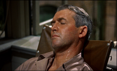
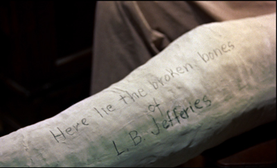
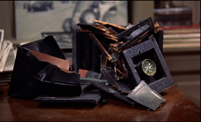
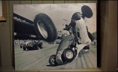
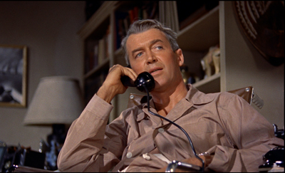
Then there’s Rear Window, which has a fascinating double opening. The first uses imagery, music, and sound effects to present the situation of Jeff laid up in his apartment over the courtyard. After a tour of the neighbors’ flats, seen from a distance, we’re shown why Jeff is lying there in a sweat.
But during the next scene Jeff gets on the phone with his editor. Now much of the information we got visually is reiterated in dialogue.
Jeff’s optical POV cuts during the phone conversation also recapitulate the neighbors’ routines that we’ve seen in the first sequence. By the end of this second scene, image and sound have explained his situation wholly, thanks to a division of labor. The first, wordless sequence is a kind of test for the viewer, and the second serves as the answer key.
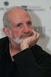
Which brings me to Brian De Palma, Hitch’s self-conscious heir. Of the 1970s generation, he was the most explicit in defending the purity of the pictures in motion pictures.
1973: I always have very precise visual ideas and then try to construct a story around them as opposed to writing a story and then trying to figure out how I’m going to shoot it. . . . As far as I’m concerned, you are dealing with pure cinema—that is, with what is right on the screen—and you should try to think what it will look like.
1984: Images run through my brain all the time. Lately I’ve been thinking about rearview mirrors. You can see people in the next car out your rearview mirror. They’re always doing the most personal things—putting on makeup, fighting, kissing, whatever. I want to put that in a movie. Someone could see a murder in their rearview mirror.
1992: Do you really want to go to work every day and shoot two-shots of people talking to each other? Is that directing?
2002: I’ve been obsessed with this kind of visual storytelling for quite a while, and I try to create material that allows me to explore it. I did quite a lot of it in Femme Fatale. And it put me on a course of, “How can I find visual ideas and work them into the stories I want to tell?” That’s something that haunts me all the time.
Hence the famous De Palma set pieces. Usually scenes of violence, they’re handled through elaborate crosscutting, optical POV, steep high and low angles, slow-motion, bravura camera moves, and extreme deep focus (often with a split-focus diopter). We think of the murders in Sisters and Dressed to Kill, the stalking of Nancy Allen in Blow Out, the baby carriage in Union Station in The Untouchables, and the outrageous Cannes festival opening of Femme Fatale.
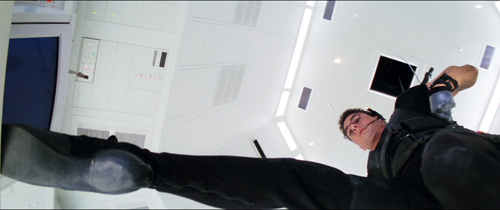
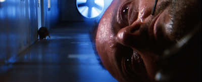
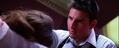
Then there’s the invasion of CIA headquarters by Ethan Hunt’s scratch team in Mission: Impossible (1996). In the director’s search for pure cinema, this might be the purest of all.
From here on in
The invasion sequence runs an astonishing eighteen minutes and, as typical of a film’s Development section, constitutes almost pure delay. You can imagine doing it in a couple of minutes, or a lot more.
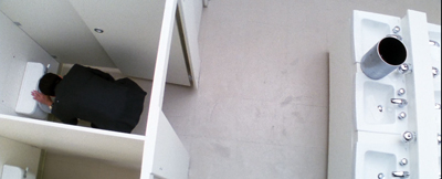
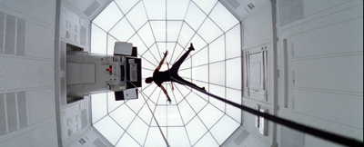
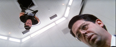
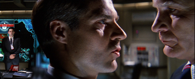
The main portion of the sequence crosscuts several lines of action. The hacker Luther crouches over his monitor in the firetruck, tracking the parties in the building. Inside Claire tags and dopes the analyst Donloe. From the air duct the venal Krieger suspends Ethan on a rope as he drops down into the black vault (which is white). Ethan must dangle above the computer keyboard extracting the NOC list of agents. We also get occasional glimpses of Kittridge, Ethan’s nemesis, in a central control room.
These lines of action are conveyed through several striking visual ideas. We get the geometry of De Palma’s beloved bird’s-eye camera positions.
There’s extreme depth, jamming two dramatic elements into sharp relationships: Ethan and Donloe, Krieger and the rat approaching him from behind.
Even the rather perfunctory tag, the firing of poor Donloe (“Mail him his clothes”), is rendered in a flashy split-focus shot.
Compared to what we expect from a blockbuster, this sequence depends to a remarkable degree on a quiet flow of visual information. David Koepp, one of the screenwriters, explains De Palma’s plan:
He had another great idea, which was a reaction to the current state of summer movies at the time. He was tired of all the noise, of the bigger bigger bigger noisier noisier noisier setpieces, and desperately wanted to come up with one that used silence instead. He cackled at the idea of a big summer movie set piece that was predicated on silence.
The result is nice case study in visual storytelling. It also indicates how even a pure instance needs non-visual elements to be understood.
Top among those elements is genre. We know a heist situation when we see one, and that knowledge forms a kind of hollow form, a schema into which we slot the elements that generate suspense. What elements? There’s the need for silence and concealment. There’s Donloe, the oblivious analyst who comes in and out of the vault; he must be distracted, but he may still return at the wrong moment. There are unexpected obstacles—a suspicious guard, a curious rat, and a drop of sweat. There’s the risk of a telltale detail that may betray the invaders, such as Krieger’s dagger, dropped onto an arm rest. Over it all hovers a deadline, so that the heist becomes a race against time. (Not only is there a clock in the room, but a digital readout warns us of the rising temperature in the room, another potential giveaway.) Visual storytelling is enormously helped when we bring so much prior knowledge about the type of situation we confront.
“From here on in,” Ethan warns the team, “absolute silence.” For them, maybe, but not for us. The music continues a bit before subsiding for about ten minutes. Even then, the silence isn’t absolute. We hear the hum of the vault, the scratchy patter of the rat approaching Krieger in the ductwork, and the squeaking of the rope as Krieger pays it out and strains to keep Ethan poised above the floor.
Clearly, in his concern for visual storytelling De Palma isn’t ruling out noise and music. What he’s opposed to is talk. But there is talk, however discreet, here too. In M:I, I count about two dozen lines of dialogue once Krieger and Ethan get positioned above the vault. These chiefly involve Luther whispering information to Ethan about Donloe’s whereabouts. Granted, many of his lines are very terse (“He’s in the bathroom,” “Check,” “Good”). Still, dialogue serves as a good redundancy factor, accentuating the suspense of the situation and at one moment giving us access to Luther’s reaction, when he discovers that what Ethan has nabbed is the precious NOC list.
Just as important, our experience of the full suspense of the scene depends on talk we’ve heard earlier. Ethan has gathered his team on the train and is explaining how the security system at Langley works. Using a strategy that goes back to Lang’s M, M:I presents Ethan’s verbal walk-through of the procedures as a voice-over for footage of Donloe executing them. The sequence introduces us to Donloe, familiarizes us with the constraints of the heist, and maps out the normal going-and-coming rhythm that Donloe’s spasmodic upchucking will disrupt.
So the vault break-in can rely on relative silence partly because the situation has been given fully by Ethan’s verbiage. In a way, it’s the reverse order of the Rear Window tutorial: dialogue first, then images to give it dramatic impact.
Drop by drop
Let me close today’s entry with a less obvious but still nifty passage of (audio-) visual storytelling. It comes at the start of Mission: Impossible.
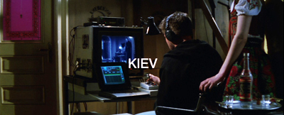
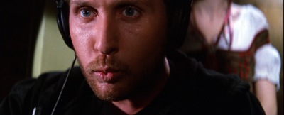
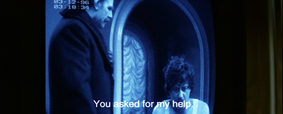
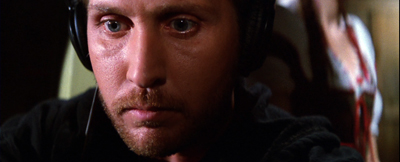
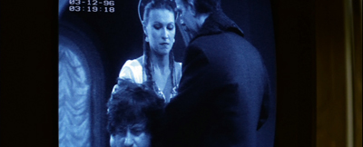
Instead of the usual and wasteful extreme long shots of the city we’re in, taken from a distance or coasting high above the streets, we start immediately, in the closet where Jack Harmon is bent over a monitor. Already we have two things to watch: the sting operation captured by a hidden camera, and the reactions of Jack as he watches.
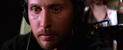
Correction: Three things to watch. There’s also the owner of the feminine arm on the frame edge of the opening setup. The camera’s track-in eliminates it, but the reverse angle on Jack reminds us that some woman is there, in the right background and out of focus. The script calls her a “whorehouse waitress,” but that’s not apparent from what we see in the film.
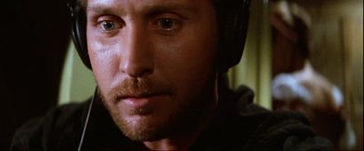
Cutting back and forth between Jack and the monitor not only gives us his reaction, but reminds us of the woman, who changes position in the shots.
Once the official Kasimov has given the name Ethan needs, the team’s goal is achieved and Jack can search it on his computer. In the meantime, Kasimov needs to be dragged off without fuss, and so must be given a drugged drink. That, we now understand, is the task of the woman hovering in the background of Jack’s shots. We’ve also been primed by the tray with bottle and glasses in the first shot.
One option would be to pan or cut to the woman behind Jack and show her doping the drink. (This is what the shooting script seems to call for.) We might even see the woman’s face as she does it, but even if we don’t, a shot emphasizing her would give us a lot of other inessential information about the room.
De Palma makes another choice. This woman is important only in terms of what she does. Panning to her, or supplying a separate shot, and showing her face might make her seem as important a character as Jack, Ethan, or Claire. She’s not. So De Palma reduces her to her function: doping the drink. And for economy, she does it in the same setup previously devoted to Jack’s reaction. She’s kept in the background.
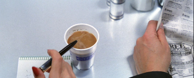
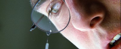
But the problem now is making sure the audience sees the gesture. De Palma could presumably have given us one of his split-focus shots, but here he does something more daring. The woman’s hand is above the upper frame edge, so all we see is the eyedropper in action. As it squeezes dope into the glass, all sound except Jack’s typing is cut from the track. We hear the drops very loudly, in what Jean Epstein called a “sonic close-up.” The precision of the sound compensates for the fact that the gesture is out of focus.
The bit ends when she slips out of the room in the background….
…and enters the scene shown on the monitor to serve the drink.
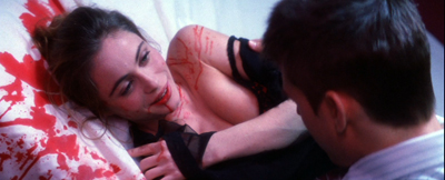
This is a tidy piece of classic continuity. If we don’t understand what’s happening, it’s not De Palma’s fault. Now that we see the serving woman more clearly, as one among several functionaries, there’s no reason for us to think she’ll be important in the action to come. By contrast, as Ethan revives Claire, we get tight reverse shots of them—not only underscoring their importance but setting up the quasi-affair that will be important in the plot ahead.
As often happens, the scene conforms to an action schema we have about crime and spy skullduggery: drugging your adversary’s drink. Here the schema is actualized in a way we don’t normally see, but the essential cues are present. And even this gesture has a larger purpose. We can expect the M:I team to drug somebody else, as indeed they will in the Langley exploit. Then we can get a proper close-up to understand that Claire’s task is accomplished. And of course drops will become pretty important when Ethan is dangling just above the vault floor.
I wish I had time to consider other examples of visual storytelling in Mission: Impossible. There’s the credits sequence, for instance. In reviving the TV series’ original glimpses of the episode to come, the sequence yields something that is very rare in feature film: anticipations of particular things we’ll see. TV network programming gave us bumpers that offered teasing previews of high points in the next show up. Did M:I, like I Spy, swallow up such “flashforwards” into its credit sequences? And how much did these TV credits owe to the anticipatory images in the credits of Goldfinger?
Above all, I’d like to spare time for the very clever flashbacks that, at the climax, show us how the initial murder of the team actually went. I call them clever because it’s not at that moment certain whether they are flashbacks constructed solely for us, to tip us off to the betrayal, or whether they also represent Ethan’s new understanding of that early bloodbath. But of course those quick flashbacks depend on nonvisual information as well, especially the voice-over that accompanies them.
Still, I hope I’ve said enough to suggest that “visual storytelling” in film needs both sound and more impalpable factors—context, familiar situations, genre conventions—to work. And those factors in turn depend on our knowledge of conceptual structures (schemas) that the film prompts us to lock in. As usual, narrative movies provide the audience an instruction kit, coaxing us to apply our knowledge to a fresh instance. In other words, the eye is part of the brain.
Many thanks to David Koepp for information about the production of Mission: Impossible. For some of David’s ideas about visual storytelling go here. The shooting script is available online here. Watch for David’s next directorial effort, the 60s-style intrigue comedy Mortdecai, coming 23 January!
My Hitchcock quotation comes from his 1937 essay, “Direction.” The version of that piece I’ve used is in Hitchcock on Hitchcock, ed. Sidney Gottlieb (University of California Press, 1995), 256. The De Palma quotations are all from Brian De Palma Interviews, ed. Laurence F. Knapp (University Press of Mississippi, 2003), 12, 84, 131, 177.
Why do Development sections tend to include delays? See Kristin’s blog entry here and her Storytelling in the New Hollywood. I discuss her layout of plot parts in another Mission: Impossible installment in “Anatomy of the Action Picture.” On the imagery of Dial M for Murder, there’s this blog entry.
Mission: Impossible.


