Visual storytelling: Is that all?
Sunday | December 7, 2014 open printable version
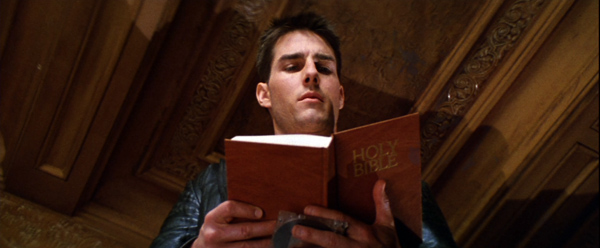
Mission: Impossible (1996).
DB here:
The phrase “visual storytelling” is a very modern invention. It seems to be unknown before the mid-1940s, and it doesn’t really become common until the 1990s. It applies to film, of course, but it also refers to comic strips and other media. Sometimes it carries a prescriptive edge: In a pictorial medium, you should tell your stories visually—rather than, say, through lots of talk. The motto is sometimes summarized as Show, don’t tell.
Elsewhere on this site, I’ve argued that sometimes that advice should be ignored. A monologue about incidents in the past can sometimes be more powerful than a flashback depicting them. That power often owes something to the actors’ performances—which are, after all, no less visual than the story action being told us.
Similarly, who would attack great films like His Girl Friday for being too talky? An essential pleasure of American cinema from the 1930s on is the way that some scenes let dialogue take the lead. And it’s not just the words but how, and how fast, they are spoken.
Still, I do enjoy scenes that cut the gab and give us a flow of pictures that coax us to follow a story. My pantheon of great filmmakers includes Eisenstein, Keaton, Griffith, Lang, and many other silent masters. But mentioning them reminds me of something else that needs to be said.
Visual storytelling is seldom purely visual. In film, it needs concepts and music and noises and even dialogue to work most fully. We can learn a lot, I think, by starting with “purely visual” passages and see how they’re reinforced by other inputs.
Pictures, plus
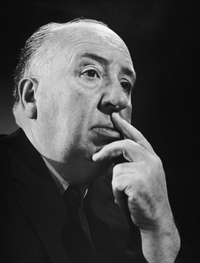
Take the most vociferous defender of visual storytelling, Sir Alfred Hitchcock.
I want to put my film together on the screen, not simply to photograph something that has been put together already in the form of a long piece of stage acting. This is what gives an effect of life to a picture—the feeling that when you see it on the screen you are watching something that has been conceived and brought to birth directly in visual terms.
Yet Hitch needed words and music throughout his career. Put aside the talkathons that are Lifeboat, Rope, Under Capricorn, and Dial M for Murder. His silent films, including The Lodger and others, need written intertitles (dialogue-based, expository) to present the drama. The brilliant Albert Hall sequence in the first Man Who Knew Too Much (run here, analyzed here) would lose much of its power without the tight synchronization of shot-changes with the musical score. I yield to no one in my admiration for the climax of Notorious, which cuts rhythmically as the main characters gather in a knot and step slowly down a staircase. But the progress of the drama needs the snatches of dialogue no less than the close-up glances and POV shots, and they get integrated into the implacable beat of descent.
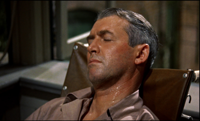
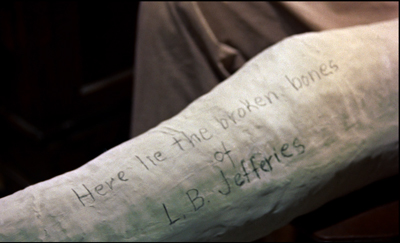
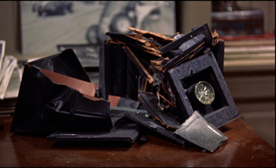
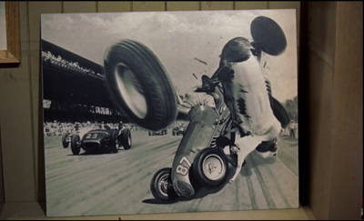
Then there’s Rear Window, which has a fascinating double opening. The first uses imagery, music, and sound effects to present the situation of Jeff laid up in his apartment over the courtyard. After a tour of the neighbors’ flats, seen from a distance, we’re shown why Jeff is lying there in a sweat.
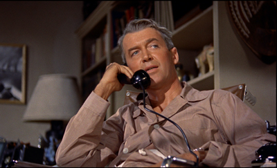
But during the next scene Jeff gets on the phone with his editor. Now much of the information we got visually is reiterated in dialogue.
Jeff’s optical POV cuts during the phone conversation also recapitulate the neighbors’ routines that we’ve seen in the first sequence. By the end of this second scene, image and sound have explained his situation wholly, thanks to a division of labor. The first, wordless sequence is a kind of test for the viewer, and the second serves as the answer key.
Which brings me to Brian De Palma, Hitch’s self-conscious heir. Of the 1970s generation, he was the most explicit in defending the purity of the pictures in motion pictures.
1973: I always have very precise visual ideas and then try to construct a story around them as opposed to writing a story and then trying to figure out how I’m going to shoot it. . . . As far as I’m concerned, you are dealing with pure cinema—that is, with what is right on the screen—and you should try to think what it will look like.
1984: Images run through my brain all the time. Lately I’ve been thinking about rearview mirrors. You can see people in the next car out your rearview mirror. They’re always doing the most personal things—putting on makeup, fighting, kissing, whatever. I want to put that in a movie. Someone could see a murder in their rearview mirror.
1992: Do you really want to go to work every day and shoot two-shots of people talking to each other? Is that directing?
2002: I’ve been obsessed with this kind of visual storytelling for quite a while, and I try to create material that allows me to explore it. I did quite a lot of it in Femme Fatale. And it put me on a course of, “How can I find visual ideas and work them into the stories I want to tell?” That’s something that haunts me all the time.
Hence the famous De Palma set pieces. Usually scenes of violence, they’re handled through elaborate crosscutting, optical POV, steep high and low angles, slow-motion, bravura camera moves, and extreme deep focus (often with a split-focus diopter). We think of the murders in Sisters and Dressed to Kill, the stalking of Nancy Allen in Blow Out, the baby carriage in Union Station in The Untouchables, and the outrageous Cannes festival opening of Femme Fatale.
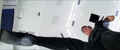
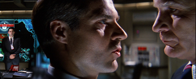
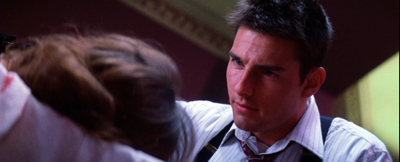
Then there’s the invasion of CIA headquarters by Ethan Hunt’s scratch team in Mission: Impossible (1996). In the director’s search for pure cinema, this might be the purest of all.
From here on in
The invasion sequence runs an astonishing eighteen minutes and, as typical of a film’s Development section, constitutes almost pure delay. You can imagine doing it in a couple of minutes, or a lot more.
The main portion of the sequence crosscuts several lines of action. The hacker Luther crouches over his monitor in the firetruck, tracking the parties in the building. Inside Claire tags and dopes the analyst Donloe. From the air duct the venal Krieger suspends Ethan on a rope as he drops down into the black vault (which is white). Ethan must dangle above the computer keyboard extracting the NOC list of agents. We also get occasional glimpses of Kittridge, Ethan’s nemesis, in a central control room.
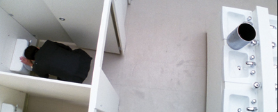
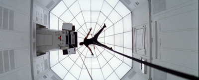
These lines of action are conveyed through several striking visual ideas. We get the geometry of De Palma’s beloved bird’s-eye camera positions.
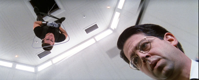
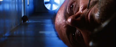
There’s extreme depth, jamming two dramatic elements into sharp relationships: Ethan and Donloe, Krieger and the rat approaching him from behind.
Even the rather perfunctory tag, the firing of poor Donloe (“Mail him his clothes”), is rendered in a flashy split-focus shot.
Compared to what we expect from a blockbuster, this sequence depends to a remarkable degree on a quiet flow of visual information. David Koepp, one of the screenwriters, explains De Palma’s plan:
He had another great idea, which was a reaction to the current state of summer movies at the time. He was tired of all the noise, of the bigger bigger bigger noisier noisier noisier setpieces, and desperately wanted to come up with one that used silence instead. He cackled at the idea of a big summer movie set piece that was predicated on silence.
The result is nice case study in visual storytelling. It also indicates how even a pure instance needs non-visual elements to be understood.
Top among those elements is genre. We know a heist situation when we see one, and that knowledge forms a kind of hollow form, a schema into which we slot the elements that generate suspense. What elements? There’s the need for silence and concealment. There’s Donloe, the oblivious analyst who comes in and out of the vault; he must be distracted, but he may still return at the wrong moment. There are unexpected obstacles—a suspicious guard, a curious rat, and a drop of sweat. There’s the risk of a telltale detail that may betray the invaders, such as Krieger’s dagger, dropped onto an arm rest. Over it all hovers a deadline, so that the heist becomes a race against time. (Not only is there a clock in the room, but a digital readout warns us of the rising temperature in the room, another potential giveaway.) Visual storytelling is enormously helped when we bring so much prior knowledge about the type of situation we confront.
“From here on in,” Ethan warns the team, “absolute silence.” For them, maybe, but not for us. The music continues a bit before subsiding for about ten minutes. Even then, the silence isn’t absolute. We hear the hum of the vault, the scratchy patter of the rat approaching Krieger in the ductwork, and the squeaking of the rope as Krieger pays it out and strains to keep Ethan poised above the floor.
Clearly, in his concern for visual storytelling De Palma isn’t ruling out noise and music. What he’s opposed to is talk. But there is talk, however discreet, here too. In M:I, I count about two dozen lines of dialogue once Krieger and Ethan get positioned above the vault. These chiefly involve Luther whispering information to Ethan about Donloe’s whereabouts. Granted, many of his lines are very terse (“He’s in the bathroom,” “Check,” “Good”). Still, dialogue serves as a good redundancy factor, accentuating the suspense of the situation and at one moment giving us access to Luther’s reaction, when he discovers that what Ethan has nabbed is the precious NOC list.
Just as important, our experience of the full suspense of the scene depends on talk we’ve heard earlier. Ethan has gathered his team on the train and is explaining how the security system at Langley works. Using a strategy that goes back to Lang’s M, M:I presents Ethan’s verbal walk-through of the procedures as a voice-over for footage of Donloe executing them. The sequence introduces us to Donloe, familiarizes us with the constraints of the heist, and maps out the normal going-and-coming rhythm that Donloe’s spasmodic upchucking will disrupt.
So the vault break-in can rely on relative silence partly because the situation has been given fully by Ethan’s verbiage. In a way, it’s the reverse order of the Rear Window tutorial: dialogue first, then images to give it dramatic impact.
Drop by drop
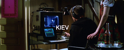
Let me close today’s entry with a less obvious but still nifty passage of (audio-) visual storytelling. It comes at the start of Mission: Impossible.
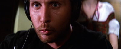
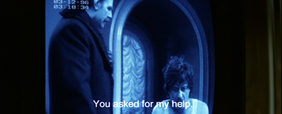
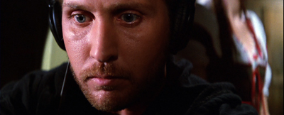
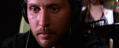
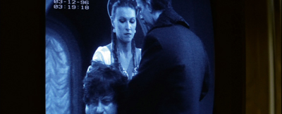
Instead of the usual and wasteful extreme long shots of the city we’re in, taken from a distance or coasting high above the streets, we start immediately, in the closet where Jack Harmon is bent over a monitor. Already we have two things to watch: the sting operation captured by a hidden camera, and the reactions of Jack as he watches.
Correction: Three things to watch. There’s also the owner of the feminine arm on the frame edge of the opening setup. The camera’s track-in eliminates it, but the reverse angle on Jack reminds us that some woman is there, in the right background and out of focus. The script calls her a “whorehouse waitress,” but that’s not apparent from what we see in the film.
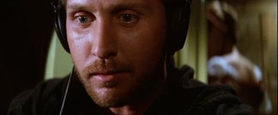
Cutting back and forth between Jack and the monitor not only gives us his reaction, but reminds us of the woman, who changes position in the shots.
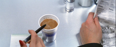
Once the official Kasimov has given the name Ethan needs, the team’s goal is achieved and Jack can search it on his computer. In the meantime, Kasimov needs to be dragged off without fuss, and so must be given a drugged drink. That, we now understand, is the task of the woman hovering in the background of Jack’s shots. We’ve also been primed by the tray with bottle and glasses in the first shot.
One option would be to pan or cut to the woman behind Jack and show her doping the drink. (This is what the shooting script seems to call for.) We might even see the woman’s face as she does it, but even if we don’t, a shot emphasizing her would give us a lot of other inessential information about the room.
De Palma makes another choice. This woman is important only in terms of what she does. Panning to her, or supplying a separate shot, and showing her face might make her seem as important a character as Jack, Ethan, or Claire. She’s not. So De Palma reduces her to her function: doping the drink. And for economy, she does it in the same setup previously devoted to Jack’s reaction. She’s kept in the background.
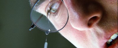
But the problem now is making sure the audience sees the gesture. De Palma could presumably have given us one of his split-focus shots, but here he does something more daring. The woman’s hand is above the upper frame edge, so all we see is the eyedropper in action. As it squeezes dope into the glass, all sound except Jack’s typing is cut from the track. We hear the drops very loudly, in what Jean Epstein called a “sonic close-up.” The precision of the sound compensates for the fact that the gesture is out of focus.
The bit ends when she slips out of the room in the background….
…and enters the scene shown on the monitor to serve the drink.
This is a tidy piece of classic continuity. If we don’t understand what’s happening, it’s not De Palma’s fault. Now that we see the serving woman more clearly, as one among several functionaries, there’s no reason for us to think she’ll be important in the action to come. By contrast, as Ethan revives Claire, we get tight reverse shots of them—not only underscoring their importance but setting up the quasi-affair that will be important in the plot ahead.
As often happens, the scene conforms to an action schema we have about crime and spy skullduggery: drugging your adversary’s drink. Here the schema is actualized in a way we don’t normally see, but the essential cues are present. And even this gesture has a larger purpose. We can expect the M:I team to drug somebody else, as indeed they will in the Langley exploit. Then we can get a proper close-up to understand that Claire’s task is accomplished. And of course drops will become pretty important when Ethan is dangling just above the vault floor.
I wish I had time to consider other examples of visual storytelling in Mission: Impossible. There’s the credits sequence, for instance. In reviving the TV series’ original glimpses of the episode to come, the sequence yields something that is very rare in feature film: anticipations of particular things we’ll see. TV network programming gave us bumpers that offered teasing previews of high points in the next show up. Did M:I, like I Spy, swallow up such “flashforwards” into its credit sequences? And how much did these TV credits owe to the anticipatory images in the credits of Goldfinger?
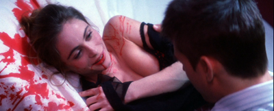
Above all, I’d like to spare time for the very clever flashbacks that, at the climax, show us how the initial murder of the team actually went. I call them clever because it’s not at that moment certain whether they are flashbacks constructed solely for us, to tip us off to the betrayal, or whether they also represent Ethan’s new understanding of that early bloodbath. But of course those quick flashbacks depend on nonvisual information as well, especially the voice-over that accompanies them.
Still, I hope I’ve said enough to suggest that “visual storytelling” in film needs both sound and more impalpable factors—context, familiar situations, genre conventions—to work. And those factors in turn depend on our knowledge of conceptual structures (schemas) that the film prompts us to lock in. As usual, narrative movies provide the audience an instruction kit, coaxing us to apply our knowledge to a fresh instance. In other words, the eye is part of the brain.
Many thanks to David Koepp for information about the production of Mission: Impossible. For some of David’s ideas about visual storytelling go here. The shooting script is available online here. Watch for David’s next directorial effort, the 60s-style intrigue comedy Mortdecai, coming 23 January!
My Hitchcock quotation comes from his 1937 essay, “Direction.” The version of that piece I’ve used is in Hitchcock on Hitchcock, ed. Sidney Gottlieb (University of California Press, 1995), 256. The De Palma quotations are all from Brian De Palma Interviews, ed. Laurence F. Knapp (University Press of Mississippi, 2003), 12, 84, 131, 177.
Why do Development sections tend to include delays? See Kristin’s blog entry here and her Storytelling in the New Hollywood. I discuss her layout of plot parts in another Mission: Impossible installment in “Anatomy of the Action Picture.” On the imagery of Dial M for Murder, there’s this blog entry.
Mission: Impossible.


