Archive for January 2015
Filling the box: The Never-Ending Pan & Scan Story
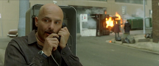
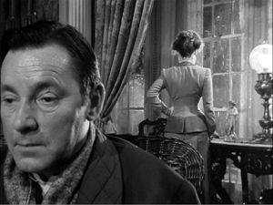
The Limey (1999).
DB here:
Here’s a story, so far not finished.
Chapter 1: You can’t put ten pounds of mud in a five-pound sack (Dolly Parton)
Once upon a time, before home video and cable, movies were broadcast on television. They might be drawn from local TV stations’ 16mm collections or transmitted from the networks on “movie of the week” shows. When the film was a widescreen film, especially in anamorphic processes, it was adjusted, as we now say, “to fit your screen.”
That TV screen was in an aspect ratio of about 1.33:1 (4 x 3), like pre-1950s commercial films. But the film to be shown might be 1.75, 1.85, or 2.35. How to show it?
You could retain the whole original frame with letterboxing at top and bottom. This was done more often in Europe than in the US, I believe. Our TV system had 100 fewer lines, so the tiny picture area became quite degraded. And then (as now) there were people who persisted in believing that those black bars at top and bottom were somehow taking away part of the movie.
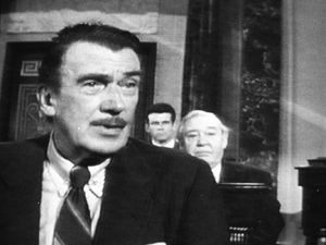
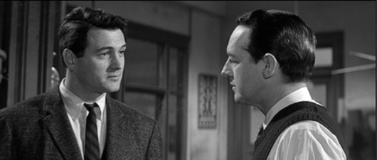
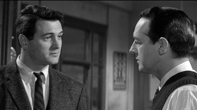
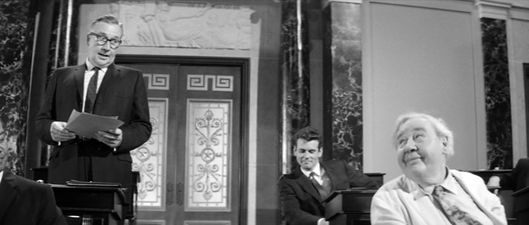
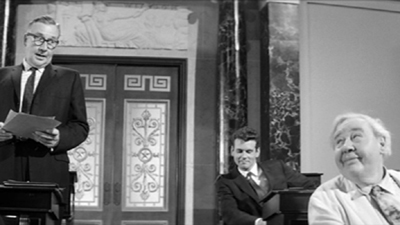
Far more common was the tactic of somehow making the wider image fill the box. This tactic came to be called “pan and scan.” It gained the name because in preparing the TV version, an engineer would sometimes swivel the TV frame across the original image, carving into it and sliding to and fro. The term pan and scan covered another tactic, simply making two shots out of one. We might call it “cut and scan.” Here’s an instance from an old VHS tape of Advise and Consent, one of the most daring American widescreen films. The slightly fatter faces are due to the distortion of the CRT monitor I shot from.
Sometimes there was neither scanning nor cutting, just simple cropping. The engineer would find a 4×3 chunk and extract it from the bigger image. To keep things simple, that chunk was usually around the center. This “center-cutting,” as it was called, could yield some funny results, as in the protruding nose in a 16mm TV print of Tarnished Angels.
Chapter 2: Shoot, protect, screw up
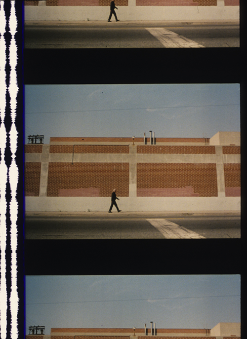
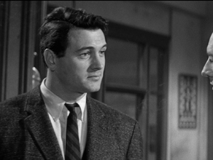
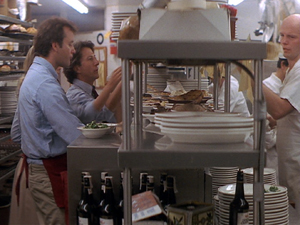
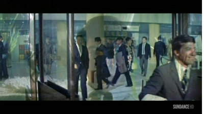
Some widescreen processes from the 1950s onward didn’t frame the image wide during filming. The image would be captured “full frame.” The result might later be “hard matted,” or letterboxed, during printing, as in the shot from The Limey surmounting today’s entry.
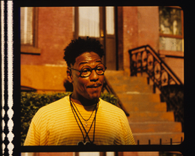
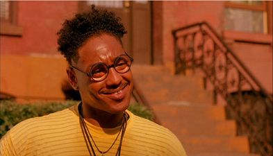
Sometimes, the 35mm theatrical prints would retain a 4:3 image, or something even squarer. The frames in a 35mm print of Do the Right Thing are about 1.19:1. Note the extensive headroom in the left image, from a 35mm print. For screenings the projectionist would mask the image to the proper proportions—typically 1.85. Here’s the version on the Criterion DVD, at 1.75 for widescreen monitors.
The full-frame image was available for cropping to 4:3 TV viewing. Many cinematographers used the “shoot and protect method” by composing for both 1.85 and 1.33.
There were problems with this “open matte” process in theatres. I recall a mis-framed version of Jerry Maguire in which the locker-room scene showed more of Cuba Gooding’s goodies than was intended. And a full-frame print of Godfather II reveals the duct-taped marks on the set floor (as if Pacino would ever hit them).
The same problem would appear in full-frame TV versions that were carelessly transferred from film. Microphones, unfinished stretches of the set, and other production elements might jut in. Some cinematographers didn’t consider TV versions important enough to worry about. “Fuck TV,” was heard occasionally.
More basically, the full-frame result wasn’t faithful to the “original” theatrical version, which was designed to be shown wide. Purists objected that TV versions, even if shot full-frame, didn’t fulfill the intention of the director.
Chapter 3: 16 into 9 won’t go
 In the 1990s there came laserdiscs and DVDs. These offered properly letterboxed framings. Cinephiles cheered. It seemed that the days of pan and scan were over.
Actually, pan-and-scan hung on quite a bit. Many laserdisc editions weren’t letterboxed. Airline versions offered cropped images, and still do. (Those tiny screens, after all.) Some DVDs were released in pan-and-scan versions, while others offered a letterboxed version of the film on one side of the disc and a full-frame version on the other. But serious cinephiles could assume that the general public was starting to understand that films intended to be seen at a certain ratio should be shown that way.
As the new disc formats emerged, so did a plan to standardize High Definition video for a 16 x 9 display. The European Union promoted it during the mid-1990s, and over the next twenty years it became accepted for both computer monitors and video displays. The new format developed in sync with the gradual replacement of analog broadcasting by HD transmission.
The problem is that 16:9 is a ratio of 1.77:1, close enough to 1.85 for most purposes but far off the ratio of 2.20:1 (many 70mm films) and 2.40 (anamorphic widescreen after about 1970). Yet maybe this isn’t a problem. Why not just letterbox those wider images within the 16:9 format?
If only things were so simple.
Chapter 4: Slightly off, and more
Today, at least 77% of US households have HD monitors. (Surprisingly, 41% of TVs still in use are Standard Definition, many presumably comforting children and old people.) Broadcasters make concessions to the 4:3 ratio by keeping the key action centered and cropping the 16:9 image.
Nature abhors a vacuum, and TV monitors apparently can’t bear blank space. So some purveyors of movies on video have updated pan-and-scan for the HD age. Cable, for instance.
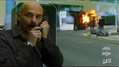
It’s been years since I clicked my cable remote to the Sundance Channel and the Independent Film Channel, now known as IFC. Seeing them a couple of weeks ago was a mild shock. Now each boasted a bug in the lower right corner, and swarming over the image were lots of texts plugging other programs. Worse, there were commercials for weight-loss scams, Burger King, and Portlandia. More to the point here, these services give us a new version of pan-and-scan.
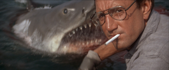
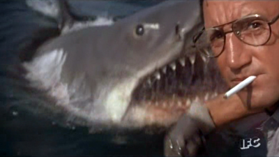
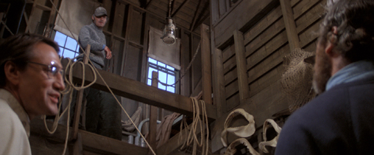
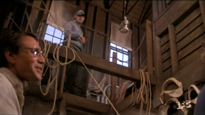
Thanks to the center-cutting method, I found plenty of examples of anamorphic 2.40 films sliced up to fit our monitor. Here are a couple of examples from IFC’s version of Jaws. In the first pair, the wider image gives Bruce room to move, and Brody is more salient. In the second pair, Hooper is speaking, but in the IFC image he’s even more peripheral than Mr. Nose in Tarnished Angels.
In rare cases, IFC seems to run full-scope prints; I spotted one of Chinatown. But it doesn’t seem to be the norm. Maybe IFC’s New Age pan-and-scan is trying to live up to the channel’s slogan: “Always on. Slightly off.”
Many films of the early widescreen era are compromised even at 16:9. The nose shot from Tarnished Angels would be a bit cramped in a 1.77 format, and many other shots would suffer as well.
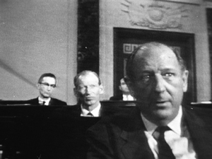
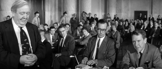
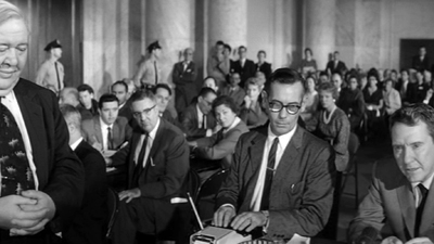
When the wide format was still new, filmmakers were exploring what they could do it, and that included scattering important information throughout the frame. Preminger was all over the place in the Senate and Committee-Room scenes of Advise and Consent. What would you do to fit these shots into 16:9? I make a silly stab at center-cutting.
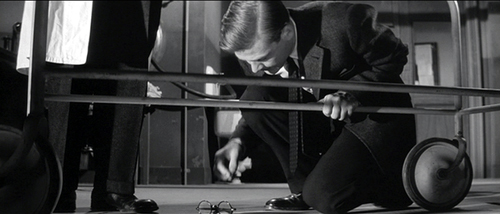
Films like this remind you of how the technology of home video has made our filmmakers less daring in their compositions. Would anyone today risk the bold composition that Richard Fleischer uses in the mortuary scene of Compulsion? As you can see from the image at the end of the entry, the crucial pair of eyeglasses rests on the lower frameline, as if on a shelf. ‘Scope nudged some directors toward quite intricate shot designs.
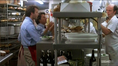
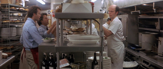
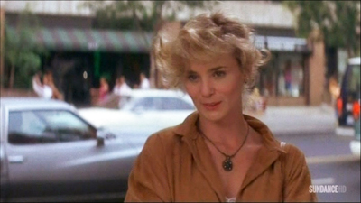
By the time Tootsie was made, with home video on the rise, filmmakers were pressed to shoot and protect better. So here there’s plenty of unused space on the sides, and most action will fit into any old frame proportions. In the shot below, the 1.33 version (available on the flip side of the DVD) is extracted from the Scope version (and slightly squeezed as well). The 1.77 version I grabbed from the Sundance Channel is also extracted from the wider framing. Both reframe the image to emphasize Michael and Jeff, the comic duo. The original 2.35 image centers the food counter and for some reason gives equal space to the inconsequential aisle and stove on the right.
Obviously, composition isn’t particularly important here. Solid as Tootsie is at the level of writing and performance (“Oh, God, I begged you to get some therapy”), we wouldn’t point to it as a model of pictorial finesse.
Moreover, pan-and-scan isn’t just a matter of retaining the action in different framings. Recasting the image changes the scale of the things in it. Old TV pan-and-scan, as in my first Advise and Consent example, makes the figures chopped out of the composition seem closer to us. Sometimes today’s pan-and-scan makes the figures seem smaller. That’s because the full-frame original image offers a bit more space at the top or bottom than we see in the anamorphic version, and that gets incorporated into the 1.77 or 1.33 version. (You can see it in the Jaws example above, with the space above Quint’s head.)
The push-pull of different versions is particularly noticeable in close views. The center-cut (and perhaps slightly squeezed) IFC version of The Matrix keeps Cypher prominent in the foreground, with the car crash in the rear. Yet do you see him and the crash as closer to us in the wide original? I do. Maybe it’s because both Cypher and the background plane are larger in the second frame.
By contrast, several shots in the IFC version of The Matrix have areas at the top and bottom not visible in a wider-frame DVD. In any case, extracting from an anamorphic frame or here, pulling the 1.77 version out of a full frame, can subtly alter the scale and perspective relations within the shot.
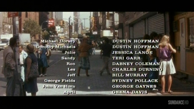
In the old TV days, networks would show credit sequences in full widescreen, as they were obliged to make all the contributors’ names visible. So you often had the odd situation of a widescreen credits sequence that would end a movie shown in 4:3. Sundance has updated the technique. Tootsie’s penultimate shot of Julie is at 1.77, but as she and Michael walk off, we cut immediately to a final shot at 2.35 letterboxed, over which the credits roll.
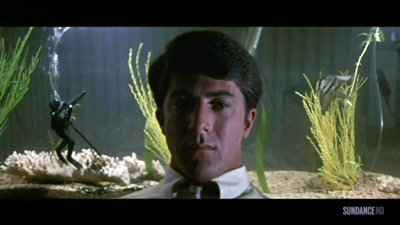
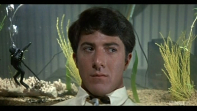
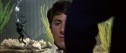
Another old trick has been revived. Back in 1960s TV, you’d have an obligatory widescreen image with credits information, but the shot might go on to show story action. Then the TV framing would close in on the wide image and gradually fill the screen with a 4:3 composition. Damned if I didn’t find the same thing happening last weekend on Sundance. The opening credits for The Graduate were in full ‘scope. That shot dissolved to the famous shot of Benjamin sitting in front of his aquarium, blankly facing the camera.
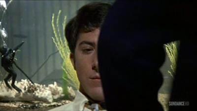
To retain the credits and keep the dissolve smooth, the engineer slowly enlarged the original shot to 16:9 proportions as Ben’s father comes in. (You can see the Sundance bug lift slowly into the lower right of the image.)
The result is a camera movement, a zoom in, that isn’t in the original film. In the original framing below, the shot scale on Ben isn’t much different, but the little scuba diver remains prominent in a way he isn’t in the 16×9 image.
Chapter 5: VOD = Variants On Demand
On cable TV we Americans can go to TCM for a purer experience of widescreen from the old days. But the more recent films shown on IFC, Sundance, Pivot, and other cable channels are likely to be hacked up in the new way. In this respect as well as others, cable has become the network TV of the new age. We get shows of all types, not just sports and movies but original series, except that now we get to pay to watch commercials.
Surely things are better with streaming?
In the spot-checking I did on Amazon and Hulu Plus, I didn’t find instances of cropping. In particular, the Criterion films I checked retain their proper aspect ratios. Netflix is another story. At this point we must thank the anonymous genius behind What Netflix Does. This site exposes a great many ways that the most popular streaming service has relied on pan-and-scan, with different crops for different markets.
In fairness, once the anonymous genius contacted Netflix, some deficient versions were replaced by proper ones. But several of the more recent examples have not been changed. Who knows how many others remain panned and scanned because the alterations haven’t yet been detected?
In the light of all this, I’m wondering if filmmakers have been protesting this mangling of their work. During the early days of TV broadcasts, directors complained about cuts and commercials, and in more recent years we’ve learned that directors were won over to digital projection in theatres because then “the film would be shown exactly as the director intended.” With many more people seeing the film on video platforms than see it in theatres, you’d think we’d have heard more from the creative community. Once more their movies are being jammed and lopped to fit whatever box they’re put in.
I’m tempted to say that when we want to get the movie in a form close to the ways its makers wanted it to be seen, we need to see it in a theatre or get it on DVD/Blu-ray. There are exceptions, of course. Theatres can botch aspect ratios today just as they have in earlier decades, chiefly by using the wrong masking. And we have filmmakers who alter the aspect ratio on DVD, usually to expand the field from 2.35:1 to 1..77 in hopes (vain) of evoking the Imax effect (Tron: Legacy, The Hunger Games: Catching Fire).
Without getting into technicalities, some of the 1.77 versions you’ll see have a bit more area at the top and the bottom of the frame than we find in the full anamorphic image. In many cases, like the shot of Cypher in The Matrix, it’s because the film was shot in Super-35. This very full-frame capture format allowed filmmakers to extract a 2.40-proportioned image, or a 4:3 image, or images in other aspect ratios. The Wikipedia entry on Super-35 is very helpful on this and other aspect ratios, both for cinema screens and TV. Some shots in the IFC Jaws had a little more vertical area as well. I assume that’s because the ‘scope image on the DVD cropped a tad off the top and bottom of the full-frame image on the film.
Thanks to Jonah Horwitz for pointing me toward the site What Netflix Does. More general thanks to James Quandt for our long-running conversation about aspect ratios. Other entries on aspect ratio on this site involve Fritz Lang, Jean-Luc Godard, and Wes Anderson. I set out some ideas on CinemaScope aesthetics in this video lecture.
P.S. 28 January: Thomas Zorthian was ahead of the curve on this. Back in 2011 he noticed the Netflix pan-and-scan.
Your article hit home for me as I have been trying to bring attention to this problem for a while. I even wrote Roger Ebert hoping he could use his influence. He was kind enough to publish my letter: http://www.rogerebert.com/letters/netflix-stream-sometimes-overflows-the-banks. I have also written to HBO and am considering a petition to ask them to show movies in the proper ratio before HBO GO becomes a standalone service. This would enhance the value of this new service.
Thanks to Thomas for corresponding!
Compulsion (1959).
Pure hits of storytelling: Westlake, Oswalt, Brackett
To Each His Own (1946).
DB bere:
Old friend and student, and proficient blogger, Paul Ramaeker writes:
I’m in the middle of Slayground now. In his Stark guise, Westlake as a writer really is as fearsomely directed and effective as Parker himself. I was thinking about the particular narrative pleasures here, like the way that delayed exposition works with the perspective switches between different sections. There is such precision to the way he builds certain effects in a systematic way, the way that we see Parker making plans, going around Fun Island doing things, but Stark not telling us what, exactly. I really did not get the logic of painting white circles in the house of mirrors–I thought of them as targets. Then, [spoiler excised] it makes so much sense, and becomes such a pure hit of storytelling, producing such a rush of pleasure in the reading.
That’s the way Donald E. Westlake worked. With Elmore Leonard and Ed McBain, he was one of the top crime-action writers to emerge in the postwar boom in paperback originals. He wrote a huge number of novels and some screenplays (The Grifters, The Stepfather). Several films, notably Point Blank, The Outfit, The Ax, and Made in USA, were taken from his books.
I’ve paid tribute to Westlake’s prose in this entry, but why not another Richard Stark passage to show how it’s done? Many of the novels start with a “When” clause, and upon relaunching the series in 1997, Westlake picked a dilly:
When the angel opened the door, Parker stepped first past the threshold into the darkness of the cinder block corridor beneath the stage.
The “When” clause hooks you in firmly, with the last word of the sentence locking in a framework that explains the opening. Here’s a simpler prototype Westlake himself picked, from Flashfire:
Parker looked at the money, and it wasn’t enough.
Anybody else would have cut the and and put in a period. This is better, I think because it quietly leads us to expect something more: a piece of action, a demand for more money. Anyhow, once we’re arguing about whether to put in an and, we’re talking about a real writer.
Slayground is one of those nifty experiments Westlake tried, this time putting two books in a divided POV arrangement. Both Slayground and The Black Bird begin with the same action, a getaway described almost identically in each one. Parker and his sidekick Grofield separate. One book follows Parker’s fate and other follows Grofield’s. I want to read both right now.
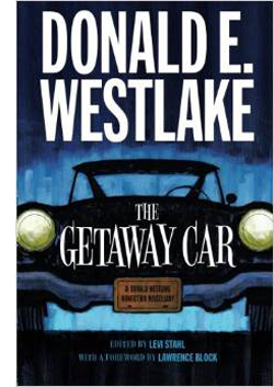 Before I do, though, I must signal (a) the University of Chicago Press’s brilliant idea of reprinting all the Stark novels; and (b) Levi Stahl’s wonderful compilation The Getaway Car: A Donald Westlake Nonfiction Miscellany. This consists of essays, memoirs, and interviews, running from 1960 into the 2000s. There’s even a recipe for tuna casserole contributed by Dortmunder’s girlfriend May.
You learn a lot about Westlake’s life, of course; for one thing, you learn how Made in USA became unseen in USA for several years. A career-survey interview with a convicted bank robber is alone worth the price of admission. Stahl adds in fragments from an autobiography (“I was born in Brooklyn, New York, on July 12, 1933, and I couldn’t digest milk”).
Westlake was a thoughtful observer of his tradition, and he offers historical surveys and close readings of his hardboiled predecessors. He compares the prose of Black Mask writers Hammett and Carroll John Daly, and calls Raymond Chandler “a bookish, English-educated mama’s boy whose raw material was not the truth but the first decade of the fiction. This is not to denigrate Chandler, or at least not to denigrate him very much.” He praises Richard S. Prather for his “bonkers” style (“She was as nude as a noodle”) and registers his admiration for lesser-known contemporaries like Peter Rabe. He offers the best analysis of George V. Higgins I know, and his appreciation of Rex Stout warms the heart. Acknowledging the cunning ways that Stout hides plot gaffes under Archie’s patter, Westlake notes that perhaps Stout had “an affinity with those Indian tribes who deliberately include a flaw in their designs so as not to compete with the perfection of the gods.”
You also learn about the market. Westlake was a “fee reader” for Scott Meredith literary agency, one of the most prestigious around. He became a self-supporting writer in 1959, when he churned out over half a million words, all published. Writing an Avon paperback in 1960 would earn you $350, or $2800 in today’s money, but writing a serial for a magazine like Analog could net $450 for only 18,000 words. There’s a marvelous letter from that year in which a twenty-seven-year-old Westlake complains to a top publisher that he can’t get his best science fiction accepted, and that specific editors traduce the work of writers he knows. Stahl calls it “one of the most spectacular acts of bridge burning in the history of publishing.” Again, the author’s gesture recalls Parker’s chilly recklessness, but with jokes.
Popcorn and Red Vines
In his recent interview with the New York Times, Patton Oswalt included the Stark/Westlake Man with the Getaway Face as one of his favorite books of all time. It comes as no surprise that this gremlin polymath gets Stark/ Westlake. Those who know his fine Zombie Spaceship Wasteland will find more of the same in Silver Screen Fiend: Learning about Life from an Addiction to Film. As ZSW traced his early standup career and its intertwined relation to nerd culture, this quasi-memoir traces his early years in LA, writing for MadTV by day, honing his comedy act by night, and watching movies obsessively at all other times.
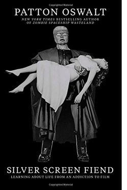 Despite his fondness for sitting far back (I’m down front) and mixing popcorn and Red Vines (I’ve been a Dots man for sixty years), Oswalt has left us the best memoir I know of being a sheer headbanging movie geek. A sort of nonfiction Moviegoer (Walker Percy), or a prose version of Cinemania, that disconcerting documentary in which everything reminds you of you, Silver Screen Fiend takes us into hard-core hell-for-leather filmgoing.
Filmgoing is the operative idea, not just film viewing. The book is set on the cusp of the DVD revolution, when the big-screen experience was so much better in contrast with VHS. There are descriptions of favorite theatres and fetishized experiences like Cocteau’s Beauty and the Beast and a Hammer movie marathon. At the same time, this “sprocket fiend” was also a “stage ghoul,” trying to out-kill the other standup comics at the Largo. The two obsessions fed each other, as when Oswalt arranged public readings of the script for Jerry Lewis’ legendary Day the Clown Cried.
Throughout, the movie madness emerges as another channel for the explosive energy of a young man burning with ambition. At the theatre the splendid lunacy might be onscreen, or in the row behind you, where Lawrence Tierney was talking loudly back to Citizen Kane. The moment pulsates because Oswalt wanted to be in movies too, maybe as a character actor.
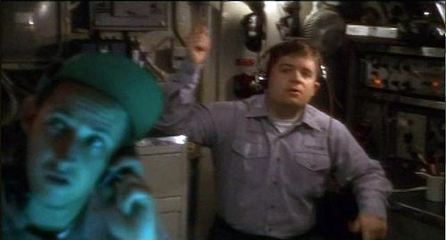
The book hits one of its high points in telling of his big break, in Down Periscope (1996), where he utters one line as the camera sweeps past him. He describes the process of filmmaking as hammering slowly away at the movie that isn’t there yet. It’s like “blasting a tunnel through a mountain. Or brushing every grain of sand off of a fossil. You attacked it relentlessly.” Oswalt squeezes pages of entertainment out of brooding over how to deliver “There’s a call for you, sir. Admiral Graham.”
Rest assured that every movie you see where an actor delivers just one line? They’ve put this kind of thought into it. Sometimes you can see it. Sometimes they can hide it. But everyone who gets in front of that lens has this inner conversation. I was having mine now. I was about to speak on film.
The moviegoing spiral ends on 20 May 1999, when Oswalt sees Star Wars: The Phantom Menace. The postmortem at a dinner marks the moment when the addiction subsides. “It hits me, sitting there with my friends, that for all of our bluster and detailed, exotic knowledge about film, we aren’t contributing anything to film.” He realizes that film should be one ingredient in the fuel for your life. “But the engine of your life should be your life.”
The epiphany is movingly described. (I wish I could say I’ve learned the same lesson.) Oswalt implies that film frenzy was a phase he went through, and now he’s grown up. (I wish I could say the same for me.) Yet I’m encouraged that Oswalt has not gone cold turkey. He’s passed from gourmand to gourmet. “My love of movies has turned into a love of savoring them.” And he can’t resist movie comparisons when describing that day-and-date release sometimes called Life. “Faces are scenes. People are films.”
In the back of Silver Screen Fiend are thirty-three pages listing all the films Oswalt saw across four years, along with the theatres where he saw them (New Beverly, Nuart, Tales Café et al.). Plenty of pure storytelling hits there. Far from makeweight, these pages create a new list of the kind he obsessed over in Danny Peary’s books. How many twenty somethings will start checking off the titles here?
The team
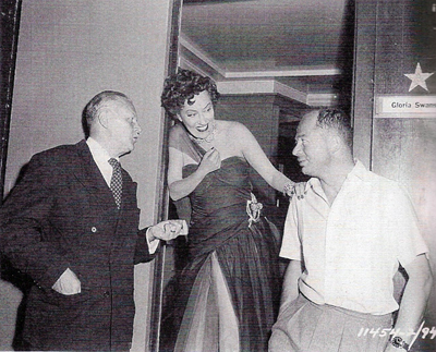
Charles Brackett, Gloria Swanson, and Billy Wilder.
On his very first night at the New Beverly, Patton Oswalt caught, and was caught by, Sunset Blvd. and Ace in the Hole. He mentions they were “co-written and directed” by Billy Wilder. He doesn’t identify the other half of the co-.
Nor do most people. In the case of Sunset Blvd., that fellow was Charles Brackett, who now stands revealed as not only a gifted writer but the Samuel Pepys of classic Hollywood. “It’s the Pictures That Got Small,” edited by Anthony Slide, is an absorbing chronicle of a tempestuous collaboration and the lifestyles of an era. A Harvard-educated WASP from Saratoga Springs, Brackett became a novelist, was made drama critic for The New Yorker, and sat at the Round Table with the likes of Woollcott and Parker. After some of his fiction was adapted to film, he moved to Los Angeles.
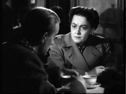
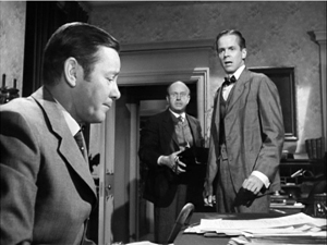
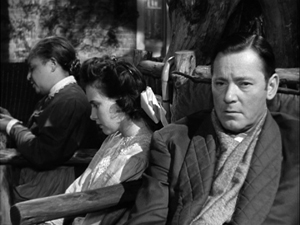
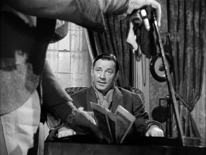
Brackett’s early work seems to have been undistinguished, though I’d defend at least Picadilly Jim (1936). Eventually he wound up at Paramount partnering with Wilder, and under the aegis of Lubitsch they clicked for Bluebeard’s Eighth Wife (1938) and Ninotchka (1939). There followed Midnight (1939) and Hold Back the Dawn (1941) for Leisen, and Ball of Fire (1941) for Hawks–an early title of which, we learn here, was Dust on the Heart. Then came Wilder’s directed pictures, from The Major and the Minor (1942) to Sunset Blvd. (1950). Brackett was active in the Screenwriters Guild, became a producer, and continued to write scripts for his producing projects, including the delirious Niagara (1953) and the insufficiently delirious Journey to the Center of the Earth (1959). The Uninvited (1944), Brackett’s first solo production, remains charming, and To Each His Own (1946) is an interesting wartime weepie, with Olivia de Havilland massively frumped up. Miss Tatlock’s Millions (1948) also has its defenders.
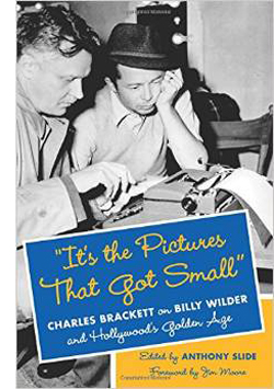 “It’s the Pictures That Got Small” is a plump album packed with tiny but revealing snapshots. Although Brackett wrote entries nearly every day, he often made do with very brief mentions. Slide has edited them judiciously and arranged them chronologically, with some stitching to fill in events. A 1936 entry strikes a warm chord:
I am to be teamed with Billy Wilder, a young Austrian I’ve seen about for a year or two and like very much. I accepted the job joyfully.
By 1943, Brackett is recording something much more rankling:
My consciousness that, after years of partnership, his first free act was to stab me in the back…my conviction that he’s turned into a second-rate director…my knowledge of the awful thinness of his mind, his stupidly limited interests. Alas, alas. And my knowledge that I am as little stimulating for him as he is for me.
During this supposed phase of creative drought, they were working on The Lost Weekend.
Apart from charting this bumpy collaboration, Brackett gives us a lot of information about how films got made. We learn about studio differences (Paramount less disciplined than MGM) and the importance of telling stories to others, face to face. I found plenty to feed my act-structure appetite. I was happy to find how often moviemakers went to the movies. Brackett attends dozens, both premieres and regular shows, and he records how easily screenwriters could summon up an older picture to be screened, even at a rival studio. This from 1947:
In the afternoon Billy and I saw Mr. Deeds at Columbia to check on certain similar situations in The Hon. Phoebe. It proved helpful and an excellent picture despite curious non-sequiturs and at least one horrible scene, Cooper absolutely charming. I could see some loathsome Capra characters beginning to unfold, but still in the lovely promising bud stage.
As a writer, Brackett is no less captivating than Westlake or Oswalt. We can rejoice in his Algonquin acidity.
Chaplin seems to me as repellant a human being as I’ve ever been in the room with—a thin, reedy voice, a show-off-hog face, and hysterical protestations of liberalism.
Jean Arthur called us, worried about the fact that there’s another woman in the picture [A Foreign Affair]. “I have sex appeal,” she said calmly, but inaccurately.
Greeted at the office by a nasty little note from Charles Jackson [author of the novel The Lost Weekend]. I had addressed him as “Birdbrain” in a telegram, something I could do to any friend—but an unsafe term to use to a man five feet tall.
And there are flat-out funny stories. Here’s just one, reported by Wilder.
[Von Stroheim] has always thought Swanson too young and desirable for the role of Norma. “Look at her,” he said. “I would like to fuck her now.” “I,” said Billy, “would rather fuck you.” “You have,” von Stroheim retorted.
If it didn’t happen, I want it to have.
In short, three more items for your shelf—repositories of good stories in themselves, prods and teases for your own thinking about story-making.
The University of Chicago Press has mounted a fine infographic on Westlake/Stark’s Parker novels here.
P.S. 19 January 2014: Thanks to David Cairns for correcting a slip. My original entry said that Brackett co-wrote Ace in the Hole with Wilder. Actually, the collaborators on Ace were Lesser Samuels and Walter Newman. Be sure to check David’s excellent Shadowplay site.
Down Periscope (1996).
EXODUS: GODS AND KINGS and the myth of authenticity
Kristin here:
Back in the early 1990s I got interested in ancient Egypt and particularly the Amarna period. I started reading, attending conferences, giving papers at conferences, and eventually publishing scholarly articles. In 2000 I was invited to join the expedition at Amarna, registering statuary fragments. That work quickly grew into matching pieces, reconstructing a considerable portion of an important statue, researching in museums around the world, and now working on a large book on Amarna royal statuary. (You can read a bit about my work in this page of our website–badly in need of updating.)
So I watched Exodus: Gods and Kings with a somewhat different attitude than that of most other viewers. Now I don’t expect all films set in ancient cultures to be 100% authentic in their design and their depiction of events. Considerations of spectacle and general visual appeal take precedence at times. But Exodus goes a bit over the top. Even a one-time tourist to Egypt who was paying the slightest attention to the guide would spot some laugh-out-loud moments here.
The departure from historical reality here led me to think, as I often do, about the ways in which the makers of fiction films set in ancient Egypt and other early cultures tend to try and lend an air of authenticity by hiring an expert consultant who is listed in the final credits.
Something similar happens in educational documentaries of the type shown on The Learning Channel or The History Channel. There several experts may appear in talking-head segments, and additional scholars will be credited at the end as consultants.
My experience, however, is that in at least some cases, consultants’ advice is ignored, even in the documentaries. Filmmakers tend to do what they think will be most appealing to the viewer, and then credit the consultants anyway, as if they had actually guided the filmmakers throughout. I know this partly because several of my teammates and other Egyptologists have complained that it is not uncommon for their suggestions to be dismissed. I have been filmed a couple of times, though I ended up on the cutting room floor in both cases. My chunks of broken sculpture, which tell me a great deal and in some cases are very unusual and important historically, just aren’t visually interesting enough for the public–or so the assumption is. On one of these occasions I pointed out to the filmmakers that one object was more relevant to the point being made than the one they wanted to use. I was told that the one they wanted to and did use would look more attractive. I’m sure a lot of consultants more expert than I hear the same thing.
Too much history
One has to sympathize with filmmakers tackling a tale set in ancient Egypt. Its history just goes on and on.
The date for the unification of Egypt under a single ruler and the invention of the hieroglyphic writing system that made its centralized administration possible keeps getting pushed back as more discoveries are made. Now it’s at about 3100 BC. Pharaonic Egypt ended in 30 BC with the death of Cleopatra VII Philopator (yes, that Cleopatra) when she committed suicide, reportedly using a poisonous snake. To give a vivid indication of how long pharaonic Egypt lasted, Cleopatra lived distinctly closer in time to us (just over 2000 years) than she did to the building of the Great Pyramids of Giza (about 2600 years earlier). And those pyramids were built about 500 years after that unification I mentioned.
The challenge for filmmakers is that many of the things we think of as most emblematic of ancient Egypt happened far apart in time. The Great Pyramids of Giza were built around 2600. The introduction of horses and chariots was–well, nobody knows exactly, but perhaps some time in the 1640 to 1550 BC range. Yet filmmakers cannot resist the temptation to have people dashing about in chariots as they supervise the building of the Great Pyramids. Howard Hawks’s Land of the Pharaoh does it. Exodus: Gods and Kings does it. It looks good, but in modern terms it would be sort of like William the Conqueror checking his email to see how preparations for his invasion of Britain were going.
Apart from the problem of Egyptian history, Exodus mixes two different genres of story. The Exodus story is a myth based solely on texts, with no archaeological evidence to confirm it. Ancient Egyptian history really happened. That history can be portrayed authentically, while the Exodus story can be portrayed faithfully. There’s a difference. Moreover, even people who believe that the Exodus really happened can’t agree at what point in that history it occurred. Probably the most popular choice for the Pharaoh of the Exodus is Ramses II, and the filmmakers have settled on that. He’s not called “Ramses the Second” in the film, and indeed ancient Egyptians didn’t think of their kings as numbered. Still, the fact that his father is Sety indicates that the Ramses in the movie is the second of the eleven Ramses that sat on the throne of Egypt over the years.
Absolute chronology is impossible to determine for ancient Egypt, but best estimate is that Ramses II reigned from 1290 to 1224 BC. (He lived to be 97.) That’s Nineteenth Dynasty, New Kingdom. The period I study is roughly 1353 to 1335, the reign of Akhenaten, who is Eighteenth Dynasty, New Kingdom, so not all that far apart by Egyptian standards. The late Eighteenth Dynasty and early Nineteenth were the pinnacle of Egyptian power and wealth: perfect for a sword-and-sandal spectacle.
Yet in making Exodus, the filmmakers have not solved the problems I’ve just mentioned. Time and space are oddly warped, and design concerns have trumped authenticity to a considerable degree.
Egypt compressed
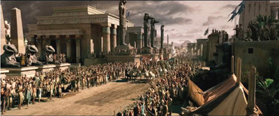
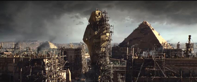
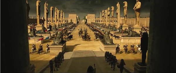
Perhaps the strangest aspect of Exodus: Gods and Kings is how it mashes together not only things from different periods but also localities that are actually many miles apart. The early part of the action is set in Memphis, which was genuinely the administrative capital of Egypt during much of its history. See the image at the top, which gives the best view of the city’s layout. The earliest pyramid ever built, the Step Pyramid of Djoser (constructed somewhere around 2630 BC and probably the one over on the left in the image), is part of the necropolis of Memphis, but it’s up on the high desert, well away from the city, which is down in the cultivated area. And what is that other step pyramid doing on the other side of the river? There was only the one step pyramid, and all the pyramids built as tombs for the pharaoh were on the same side of the river, the west. The pointed pyramid in the distance has been transported from Giza to Memphis. Admittedly, that’s only a distance of about fifteen miles.
But the pyramid is also shown under construction. Ramses II would not have built a pyramid for his own tomb, since long before that point pharaohs had started using rock-cut tombs in what is now known as the Valley of the Kings. That’s where he was interred.
In the film, the palace of Sety and later of Ramses is modeled on the temple of Amun at Karnak, way down in Luxor (about 350 miles away). The massive columns of the hypostyle hall, one of the most familiar tourist sights in the country, were indeed built by Sety and Ramses, but it’s a temple, not a palace. Temples were built largely or entirely of stone in this period, while palaces were mainly built of mudbrick and painted mud plaster. We don’t know nearly as much about palaces as we do about temples, because they tend not to survive very well. Pharaohs tended to travel around, staying in palaces built for specific purposes, rather than to erect one giant one to call home.
The road running out from the palace down which Moses, Ramses, and other leaders of the army depart is lined with criosphinxes, sphinxes with the heads in the form of a ram, the sacred animal of Amun (see bottom). These are copied from the criosphinxes that line the sacred ways leading up to Karnak from the west and south. These criosphinxes didn’t have colossal statues of gods standing in between them, though the filmmakers may have added them to give a hint at the multiple gods of the ancient Egyptians. Given the film’s title, one might expect a little more exposition on the gods of Egypt, to create a contrast with Moses’ monotheistic religion. Instead we get almost nothing relating to gods except entrail-reading, which was not practiced in ancient Egypt.
The choice of Memphis as the main city setting is a dubious one. Sety I founded a new city east of the Delta, and Ramses II built it up into the new main royal residence and capital of the country, Piramesse. I mention this not to be nitpicky. In fact, at the beginning of his reign, as he is in the film, Ramses quite possibly was still primarily residing in Memphis. The point really is that the Bible specifies that the Exodus began with the Israelites leaving “Rameses” (spelled thus in the King James translation, “Exodus” Chapter 12, 37). It’s not absolutely certain that this Rameses is identical with Piramesse, but no other candidate has been discovered, and it seems likely. Piramesse lies well north of the Red Sea and due west from the land bridge from Egypt to the Sinai peninsula. Heading straight for Canaan, the Israelites shouldn’t have had to deal with the Red Sea or any parting thereof to get where they wanted to go. Still, it makes a vivid story.
Piramesse is also quite far from any pyramids or other spectacular, familiar Egyptian structures, and out in the flat lands north of the beginning of the Delta. Plus a lot more people have heard of ancient Memphis than Piramesse, so one can understand the filmmakers’ choice of cities.
Familiar and not so familiar mistakes
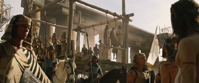
Another thing that film designers of stories set in ancient Egypt invariably do is to put many of the male characters and even extras in the striped headcloth called the nemes. That’s the one that forms a sort of triangle on either side of the face. Guards, overseers, officials, all wear the nemes. In this hanging scene, for example, the chap at the far left in the frame below has one, as has the man in the middle ground, just to the right of the scaffolding. So do the men lined up at the back of the scaffold. But the nemes was a royal headdress. Only the king could wear it. The royal uraeus, the rearing protective cobra worn above the forehead, was also confined to the king, and during some periods his wife. We see Moses wearing one when going into battle, which would not have been allowed.
And speaking of this scene, hanging was not a method of execution used in ancient Egypt. In fact, execution as such was fairly rare, but someone who rebelled against the state or the gods might be burned alive or impaled. On the whole, 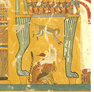 severe punishments involved loss of property or hard labor, like being sent to the pharaoh’s quarries or mines–likely to be a death sentence in itself.
In two or three shots of the palace, we see peacocks wandering around. There were no peacocks in Egypt at this point. I suppose the designers thought that these showy birds would add to the spectacle and the sense of vaguely decadent luxury. There were, however, other options. For example, ancient Egyptian royals and nobility loved monkeys and kept them as pets. They are frequently depicted in reliefs and paintings, mainly in tombs, sitting under their owners’ chairs, though favorite dogs or cats often occupy that spot instead. A particularly lively monkey appears in the image to the left, from the tomb of a prominent Eighteenth Dynasty official, Anen, on the west bank at Luxor. The monkey is leaping under the chair of Queen Tiye, and beneath it is what appears to be a cat embracing a duck in a friendly fashion (left). That seems pretty visually interesting to me.
In the film, Ramses’ army includes cavalry, but ancient Egyptians didn’t ride horses into battle. The troops were either in chariots or on foot. The horses originally introduce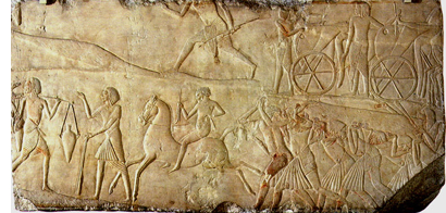 d into Egypt were too small to be ridden by someone fully astride their backs. Consequently saddles were unknown in Ramses’ era. The rider had to sit well back on the rump, as Egyptians still do today when they ride donkeys. In the Memphite tomb of Horemheb (last pharaoh of the Eighteenth Dynasty or first of the Nineteenth, depending on whom you ask), there’s a rare depiction of a man riding a horse in exactly this fashion (right). He’s probably a groom, taking a horse from one of the chariots visible at the upper right to tend to it elsewhere.
Exodus: Gods and Kings also dusts off that Hollywood cliché of showing legions of Israelite slaves laboring under the lash to built the Great Pyramids. The main sources of this notion are Herodotus (writing about 2200 years after the event) and the book of Exodus in the Bible (perhaps written close to 3000 years after their construction).
In fact the Great Pyramids were built by paid laborers. Many of these were part of a permanent workforce who lived in a village near the plateau. Others might have been part-timers, such as farmers whose fields were under the inundation for four months out of every year.
The claim in the film is that the Israelites have been enslaved in Egypt for four hundred years. Four hundred years before Ramses II’s reign, Egypt was falling apart, with the Thirteenth and Fourteenth Dynasty pharaohs fighting for control. The country was declining into the Second Intermediate Period, with part of the land controlled by the Hyksos, a foreign group of rulers. There were probably few if any slaves being brought into Egypt at the time, let alone a huge group like the one posited.
Slavery in ancient Egypt is still not fully understood, but clearly it was a more complex and flexible system than the sort of slavery that we think of today. There weren’t all that many slaves in the Old Kingdom when the pyramids were built. The big influx came with the expansion of the empire in the Eighteenth and Nineteenth Dynasties, when Egypt conquered southward into Nubia and northeastward into the Levant. At that point prisoners of war became the main source of slaves. They would either serve the pharaoh and his institutions or be awarded to the military officers who had served well in combat. Slavery didn’t become the basis of the national economy, ironically, until the Greeks took over.
Slavery took a variety of forms. It could be a punishment for wrongdoers, but it could also be a way of going bankrupt, working off debts by serving the creditor. There is evidence that slaves had legal rights, such as owning property. There are recorded cases, perhaps exceptional, of slaves gaining training in professional skills, including writing. Some could rise to management positions, even supervising freemen in their masters’ estates. In some instances, slaves married or were adopted into the families they served. Slavery covered a wide range of circumstances, but it didn’t extend to the sort of mass oppression portrayed in Exodus: Gods and Kings.
I could go on, but a few more brief examples should suffice. The Great Sphinx, which is located in front of the central pyramid at Giza, is placed out in the desert instead. Colossal statues of Ramses were not built of individual small blocks of stone. Even his collapsed colossus at his mortuary temple, which weighed about 1000 tons when intact, was made of a single giant piece of granite. Huge sphinxes would not be built in the middle of residential areas, let alone slave dwellings, as are the ones we glimpse in the film.
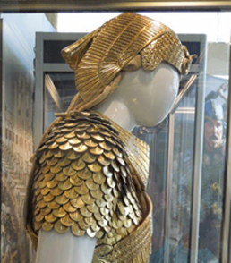
And finally, the golden helmet that Ramses wears into battle is based on a queen’s protective vulture crown. His wife, Nefertari, would have been the one to wear such a crown. The real Nefertari is shown wearing several embellished ones, including this one with large plumes and a sun disk, in her spectacular painted tomb. The vulture’s head acts as a uraeus in this case, though it has rather bizarrely been replaced by a snake on the version given to Ramses.
Don’t get me started on the camels.
Research with a little twist
To be fair, the publicity surrounding Exodus didn’t make a lot of big claims to authenticity. There was some attempt, however, to promote its faithfulness to historical fact. The Hollywood Reporter ran one brief paragraph in a piece on possible Oscar nominees for best production design.
Arthur Max, production designer
Before creating ancient Egypt’s Royal Palace of Memphis, Max took a research trip up the Nile to visit the Luxor Temple and the Temple of Amun [i.e., Karnak]. He also made stops at the British Museum, the Petrie Museum, the Metropolitan Museum of Art and the Egyptian Museum of Turin. The $150 million production spent 16 weeks building large sets at Pinewood Studios, and CG was used to extend their monumental scale. “Each column is 10 feet in diameter and about 70 feet high,” says Max. “All the furniture is hand-built–there’s not a lot of ancient Egyptian furniture around. All the murals are hand-painted in traditional pigments. They even re-created period sculptures like a 42-foot high head of Ramses the Great.
Some of the other design people, however, freely admitted to a concern with flashiness over authenticity. Variety ran a story on the costumes:
Those who have seen Janty Yates’ work with Ridley Scott in period epics like “Gladiator” and “Kingdom of Heaven” know they can expect a feast for the eyes that’s grounded in research, but also offers what she called “a little twist.” Translation? A bit of extra sheen in a metal breastplate, or, in the case of Scott’s biblical saga, “Exodus: Gods and Kings,” dressing Ramses entirely in gold, or making T-shaped garments for the plebes that look “quite hot,” per Yates.
Another Variety story of the same type is very misleadingly entitled “Making It All Look Real” (in the print edition; the online title is “Artisans on Making ‘Exodus: Gods and Kings’ Look Authentic”). In fact, the piece is about how authenticity was sacrificed to design considerations.
Filmmakers strive for period authenticity–up to a point.
Take Ridley Scott’s “Exodus: Gods and Kings.” Set decorator Celia Bobak said she took certain liberties. For example, tables in ancient Egypt were low to the ground–a look that she felt contemporary audiences might find laughable.
Similarly, cinematographer Dariusz Wolski requested the use of silk fabrics to enhance the film’s warm, golden-color palette, even though linen and wool were more period-specific.
Bobak added that materials used for creating the furniture “were anything but authentic,” but were made to look so by a team of painters who paid attention to surface decoration and detail.
Working with production designer Arthur Max, a frequent Scott collaborator, Bobak researched the period by visiting the Cairo Museum and Egyptian archives in Europe. Once the duo established the look of each set, prop makers, graphic designers and carpenters brought everything to life.
Why modern audiences would laugh at low tables is unclear. I suspect that decision had more to do with staging the scene where Ramses threatens to cut off the hand of Moses’ “sister,” which he is holding down on a table top. That certainly would have looked silly with the characters bending over a low table.
Yes, there was an expert consultant
With this sort of personal research and devil-may-care attitude, combined with the highly selective use of actual historical fact, you might assume that the Exodus project didn’t hire an expert consultant. In fact, they did. They didn’t flaunt their consultant in the credits, though, as such films tend to do. I scanned the credits for the name Alan Lloyd, but I didn’t spot it. It must be there somewhere, since it’s listed on the imdb Full Cast and Crew for the film. There it’s way down at the bottom, under Other Crew:
Dr. Lloyd is listed as “technical advisor (Doctor),” which might convey the impression that he was on the medical team. I don’t know why the filmmakers buried him in this fashion, since Dr. Alan Lloyd is an actual, reputable Egyptologist. He’s currently the president of the Egypt Exploration Society, which has been a major British institution fostering Egyptological work since 1882. He retired from the University of Swansea in 2006, with a substantial record of publication and other scholarly activities. His specialties include Herodotus, the Graeco-Roman period in Egypt, and ancient warfare.
Dr. Lloyd also is a big film fan and admires Ridley Scott, as an interview with him on the writing studio site reveals. There he expresses enthusiasm for the film and the experience of working on it. In particular he speaks of the care taken concerning texts:
One particularly clear indication of this was that they continually came back to me to provide them with copy for Egyptian texts, and this was sometimes hieroglyphs, and this I provided them with, and indeed they used it.
They also, at times, wanted material in hieratic, which was the script that was normally used for letters and documents, and I produced that material for them.
Particularly interestingly, and I don’t know how many people in the world would pick up on this, or even whether it was used, but they wanted text of the Ten Commandments, but not in English.
They wanted it in Hebrew and I gave them the Hebrew text written in the old Hebrew alphabet, not the one that everyone is familiar with. It is the proto-Hebrew alphabet, which is very different.
All the texts in the film flitted by so fast that even an expert couldn’t judge them, but I assume they were accurate. We get one glimpse of Moses writing the Commandments on a tablet, but the view is from opposite him and we see the writing upside down. (By the way, in the Bible, didn’t the Lord himself write these?)
Oddly, toward the end of the production, the filmmakers showed Dr. Lloyd only selected sequences from the film. The same interview continues: “Professor Lloyd has seen footage from the film and says that some of the sequences he watched, including the Battle of Kadesh and the plagues visited on ancient Egypt by an angry God, are ‘brilliantly’ realized.”
To be sure, the long montage sequence of the plagues is probably the best thing in the film. Moreover, given Dr. Lloyd’s expertise in ancient warfare, it seems likely that he was consulted particularly on the battle scene. It’s certainly more authentic than most of the film’s other scenes. Six-spoked chariot wheels, yes. Plumes on the royal horses’ heads, yes. Bows and arrows, yes. The chariots themselves look fairly close to surviving ones from the New Kingdom. My guess is that Dr. Lloyd pointed out that cavalry was not used in that period but was told that showing warriors riding horses (with saddles) was more visually interesting than mere foot soldiers.
Perhaps Dr. Lloyd was not shown the entire film because of all the inaccuracies in the other scenes. Or perhaps I am being too suspicious.
Hollywood remains in an ambiguous position in regard to historical authenticity, especially in spectacular tales set in ancient times. It plays well in the publicity, but when the designers come up with their visions, it’s awfully easy to dismiss it.
A final comment
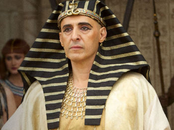
There has been much criticism of the filmmakers for using white males for the lead roles. True, it’s hard to think of Christian Bale and especially Joel Edgerton as an ancient Canaanite or Egyptian. But to give the film some credit, the moment I saw John Turturro as Sety I, my unexpected reaction was, Wow, he looks like a Ramesside pharaoh. Specifically, like Sety I.
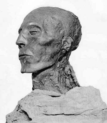
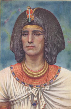
How can we know? For a start, Sety’s mummy happens to be one of the best-preserved that has come down to us. Even so, it’s hard to tell from a mummy what the man looked like, though he obviously had a beaky nose, a long chin, and prominent, high cheekbones. In the early 20th Century, artist Winifred Brunton studied Egyptology alongside her husband. They worked in Egypt, and during that time she painted a set of portraits of the pharaohs and their families, based on paintings, sculptures, and mummies. They’re actually fairly plausible as conceptual paintings. Although they’re not scientific evidence, they’re still held in some regard by Egyptologists–though obviously the depiction of the skin color of the ancients does look too European. Her portrait of Sety I is at the right below. She shows the pharaoh as a younger man, but to me the resemblance is there.
The only source I could turn to for frames from the film was the set of online trailers. I can’t be entirely sure that all of my illustrations are in the final film, since occasionally shots from the trailer get dropped.
The photo of Ramses’ helmet was one of many of his golden costume taken by blogger Jason in Hollywood during the current “23rd Annual Art of Motion Picture Costume Design” exhibition, which takes place in the pre-Oscar period.
For those interested in birds in ancient Egypt, a catalogue of a recent exhibition at the Oriental Institute in Chicago is available as a pdf online for free. No peacocks, but storks, pelicans, hoopoes, geese, and many more, as beautifully rendered in tomb paintings and other ancient artworks.
Anyone visiting Bologna, whether for Il Cinema Ritrovato or any other purpose, can wander over to the Museo Civico Archeologico, just off the Piazza Maggiore, and see the original of the relief of the horse-riding groom and other magnificent scenes from the tomb of Horemheb.
For a good, brief Associated Press summary of evidence against the Great Pyramids being built with slave labor, see here. For a longer but accessible account of the work of Mark Lehner, who has long excavated at Giza and discovered the village of the pyramid workmen, see here.
Winifred Brunton’s portrait of Sety I appears in her Kings and Queens of Ancient Egypt (London: Hodder and Stoughton, 1926).
Problems, problems: Wyler’s workaround
The Little Foxes (1941).
DB here:
For me, shooting is a struggle where you only get to be happy for five minutes before you start thinking about the next problem to solve.
Ruben Ostlund, on Force Majeure
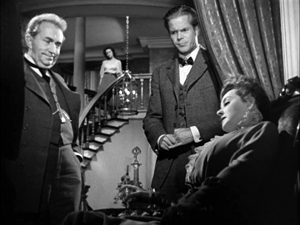
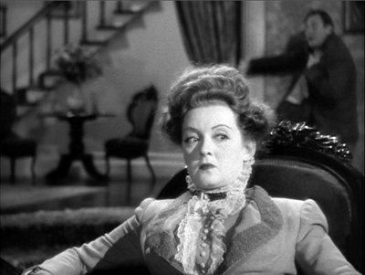
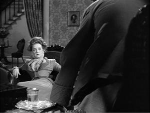
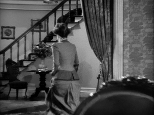
One of the most famous shots in American cinema occurs at a climactic moment in The Little Foxes (1941). Regina Giddens has just learned that her sickly husband Horace has let her brothers get away with a business deal that double-crosses her. They will reap all the rewards of bringing a factory to town, while she, who engineered the deal and expected Horace to fall in line, will get nothing. Horace is already not far from death, and their quarrel in the parlor precipitates a heart attack. He spills his bottle of medicine and needs some from his upstairs supply.
Regina refuses to go fetch it, and instead Horace must stagger up and out. While she sits, fiercely waiting, on the sofa, he tries to pull himself upstairs, but he collapses on the steps. Once he has fallen, and perhaps died, she stirs to action and rouses the household.
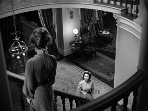
Lillian Hellman’s original play had been a Broadway success, and this was one of the most notable scenes. How did Wyler stage it? Very oddly, as the frame up top suggests. We can’t really see Horace’s struggle on the stair. Not only does the camera put Regina in the foreground, but Horace is out of focus in the rear, at least until she rises whirling and runs to the background, the damage done.
Why did Wyler stage it this way? It depends, as Bill Clinton might say, on what your definition of why is.
Deeper, closer
1941 was the breakout year of deep-focus filmmaking in Hollywood. Citizen Kane, The Maltese Falcon, Kings Row, Ball of Fire, I Wake Up Screaming, How Green Was My Valley, and several other films set the pace for a new stylistic option. In this style, the action is staged in depth rather than perpendicular to the camera, as most scenes in Hollywood cinema were. And the camera lens creates depth of field, in which even fairly close foreground planes are just as sharp as the action in the rear. Such images weren’t unknown before; we can find them in silent cinema. But from 1941 on, depth staging accompanied by depth of focus would be increasingly common in Hollywood dramas, from thrillers and melodramas to film-noir exercises. Not all shots would be designed for maximal depth; continuity editing and closer views would still be used. But we do find such imagery becoming more common, particularly at moments of tension.
Cinematographer Gregg Toland is usually cited as a main source of this trend, and his work on Kane and Ball of Fire, as well as Ford’s Grapes of Wrath (1940) and The Long Voyage Home (1940), became models of the new look. Toland also worked with Wyler on several films, including The Little Foxes. But even without Toland, Wyler had in some films cultivated a deep-focus look (as had Ford). Coming when it did, The Little Foxes proved a powerful demonstration of the deep-focus style.
Three aspects stand out. First, there’s a certain economy of presentation. As Wyler and others pointed out, depth imagery permits directors to minimize editing. Instead of cutting from action to reaction, we see both at the same time.
Wyler suggested in publicity of the period that this gave the viewer more freedom of where to look, and André Bazin seized upon this rationale as part of his aesthetic of realism. Just as in the real world, in some films we must choose what to pay attention to.
But The Little Foxes went beyond the moderate deep focus of Stagecoach and other films to create very aggressive images. This is the film’s second novelty. Several shots place the foreground very close to the camera. As a result, we get looming faces or objects in the front plane, and we still see well-focused dramatic elements behind.
A third source of power is less noted. In The Little Foxes, Wyler found ways to make deep shots comment upon the plot. For instance, the action offers Regina’s daughter Alexandra, usually called Zan, a choice of being more like her mother (tough and vicious) or her father (tolerant and gentle). At other points Zan is paralleled to her ineffectual, alcoholic aunt Birdie. At one point, Birdie has predicted that Zan may wind up like her.
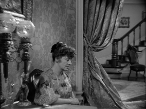
In a theatre production, there would be many staging strategies that would create these parallels, but Wyler uses a particularly striking one. One evening, while Regina and her brothers plot their scheme, Birdie has been relegated to a chair far from the discussion.
The composition diagrams Birdie’s situation in the scene and her place in the family. Then Wyler cuts in to her.
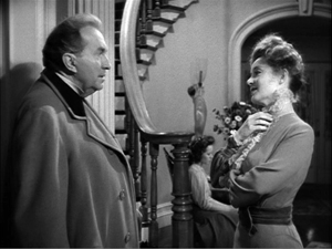
This might be seen as a bit of heavy-handed emphasis, but actually he’s doing two things. He’s making manifest her reaction, a numb resignation to being excluded. He’s also setting up, thanks to another depth composition, the chair in the hallway by the staircase. At the climax, it’s Zan, as beaten down as Birdie, who slumps in that chair.
Thanks to depth staging and deep-focus cinematography, the second image emphasizes Birdie’s solitude and prophesies Zan’s.
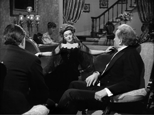
Which only makes my first question more pressing. Some shots of the quarrel leading up to Horace’s collapse on the stair exhibit flagrant deep focus.
We know from other shots in the film, like the Birdie/Zan comparison, that Wyler could have simply shown us Regina on the sofa in the foreground, in long shot or medium shot, while keeping Horace in focus in the background. In fact, Wyler tells us that Toland said, “I can have him sharp, or both of them sharp.” Why opt for shallow focus that makes Horace’s staircase seizure blurry and hard to see?
Fun with functions
Asking why? about something in an artwork actually veils two different questions.
The first is: How did it get there? The answer is a causal story about how the element came to be included.
The second sense of why is: What’s it doing there? That’s not a question of causes but of functions. How does the element contribute to the other parts and the artwork as a whole?
Take the second question first. You can imagine many functional reasons for Wyler’s choice. Exactly because the rest of the film keeps image planes sharp, this moment gains a unique emphasis. Horace’s collapse is marked as a major turning point in the plot. In an ordinary film, we wouldn’t notice an out-of-focus background. Here, by reverting to the more traditional choice, Wyler makes shallow focus stylistically prominent. For once in a film, a dramatic high point isn’t given to us with maximum visibility.
Another function is character revelation. In the film as a whole, we haven’t been consistently restricted to any one character. Here, Wyler could have concentrated on either Horace or Regina, or he could have given them equal treatment. An obvious choice would have been intercutting shots of Horace crawling up the steps with shots of Regina, impassively turned from him. Probably most directors would have done it that way.
Alternatively, we might have been attached to Horace, letting us see Regina in the distance. That would have diminished her reaction and played up Horace’s suffering.
Wyler’s choice puts the emphasis not on the action—thanks to the distant framing, Horace’s collapse can almost be taken for granted—but Regina’s reactions, or rather non-reactions, moment by moment. We’re made to see her turning slightly to listen to his struggles, while her staring eyes suggest that she’s visualizing the action with a horrified fascination. It’s as if her denying him the medicine was an experiment in seeing how far she could go. Now she knows. Her straining face is virtually willing her husband to die.
Keeping both this monstrous woman and her victim in focus would have divided our attention, then, and Wyler wants it squarely on Regina. He seems to have said as much in interviews.
We said we’ve got to stay on Bette all the time and just see this thing in the background, see him going in the background, but never lose her.
I wanted audiences to feel they were seeing something they were not supposed to see. Seeing the husband in the background made you squint, but what you were seeing was her face.
The second remark suggests another functional result of Wyler’s choice. By making the collapse almost indiscernible, we become very aware of what we can’t see. Thanks to selective focus, Bazin remarked, “The viewer feels an extra anxiety and almost wants to push the immobile Bette Davis aside to get a better look.” The dramatic tension of the scene finds its counterpart in our frustration to see what any other film would show us.
Finally, we should note that the staircase is an essential element in the film’s drama. Horace’s collapse is only one major incident taking place around and on it. Significantly, when Zan finally breaks free of Regina and the rest of the family, the matriarch learns of it standing on the stairs. Having all but murdered her husband there, now she sees her daughter abandon her.
Shoot my good side
The Bishop’s Wife (1948).
There are other functions we, as good critics, might seek out. For all of them, there is probably a loose causal story we’re relying on: Wyler and his colleagues made some choices that bore fruit. Some of those choices may have aimed at fulfilling the functions we notice. Other functions we notice may come along as bonuses—unintended but still benefiting the scene. Unintended consequences, good or bad, come up in art as elsewhere.
There remains the other implication of why-did-they-do-it questions: the one that seeks out quite specific causes that govern the scene. How do we tackle that?
In my book On the History of Film Style, from which some of these Little Foxes observations are drawn, I argued that we can make stretches of stylistic history intelligible by thinking in terms of problems and solutions. Art historians have done this for a long while. Assuming that you want to suggest that something in the picture is farther away than something else, how do you do it? One way is through overlap, as in Egyptian art. Here the fishermen overlap the background, their legs overlap each other’s, and the strings of fish that one is carrying overlap some legs.
Later image-makers suggest variable distances through size variations, placement in the format (a little bit of that here, with the river above/behind the men), tonal contrast, atmospheric perspective, linear perspective, and other techniques. These can be considered solutions, available to artists of different times and places, to the problem of suggesting three dimensions on a flat surface.
A problem/solution way of thinking can clarify some developments in the history of filmmaking too. If you have to represent two actions taking place simultaneously, how can you do it? Crosscutting, as Griffith and others showed in the 1910s, solves that problem. It offers spillover benefits too, such as controlling pace. Similarly, there’s the problem of representing spoken dialogue. Silent films solved this in various ways—through a commenter in the theatre (the benshi in Japan), through actors voicing the roles behind the screen, and most commonly through intertitles. Later, synchronized sound solved the problem in a more thoroughgoing way.
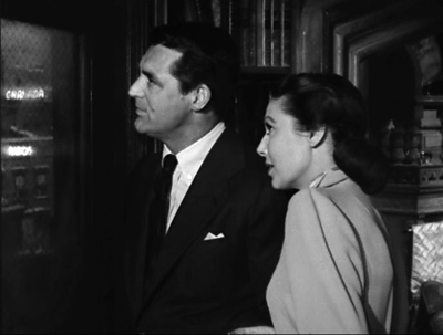
These are very general answers to the how-did-it-get-there question. Occasionally we get more concrete information about problems and solution. For example, some Hollywood stars believed that one side of their faces was more appealing than the other. The stars with the most power could insist on being filmed on their good side, which led directors to make particular staging choices. (Claudette Colbert insisted her left side was her good side, so she’s usually positioned on screen right, with her face turned toward screen left.) David Butler knew that Edward G. Robinson likewise favored his left side, so Butler needed to stage Robinson’s one appearance in It’s a Great Feeling (1949) with him entering a scene from right to left and playing in that position.
One vain star is problem enough, but what happens when you have two who prefer being shot from the same side? According to Henry Koster, the demands of Cary Grant and Loretta Young led to the staging of the scene shown at the top of this section. (For my reservations, see the codicil to this entry.)
The Little Foxes production provides evidence of another very specific problem. In staging the staircase collapse, Wyler faced an unusual difficulty. The actor playing Horace, Herbert Marshall, had a prosthetic leg.
Marshall lost his right leg, from the hip down, in World War I. Through practice he managed to stroll quite smoothly nonetheless, and he became a significant star and featured player in theatre and films. He doesn’t need to walk much in The Little Foxes because his character is rolled around in a wheelchair. But the parlor-and-staircase scene was very demanding. As Wyler explains:
Now there was another problem involved with that, and that was the fact that Herbert Marshall has a wooden leg and couldn’t make the stairs, you see. This is a trade secret. I had him stagger in the background, get behind her and just for a moment when he gets to the stairs he had to go to a landing over there, and just for a moment went out of the picture. And a double came in and went up the stairs, staggered way behind out of focus.
Here you can see Marshall leave the foreground.
An axial cut in to Regina shows him stumbling behind her and going out of shot in the distance. This much Marshall could manage.
At that point the double stumbles into the frame and starts to crawl up the staircase.
Regina leaps up and runs to the rear, and the camera racks focus to the stair, but by now the double’s face is out of frame.
So the director solved the problem of the actor’s disability by a combination of deep staging, the use of a double, and shallow focus. This “trade secret” yielded a range of effects that, I think most viewers would agree, were vivid and exciting.
But there’s always more than one way to do anything. Given the constraint of Marshall’s artificial leg, or a player’s insistence on being shot from one side, or the leading lady’s overnight pimple, a director can work around it in several ways. One of the few critics to notice the implications of Wyler’s choice was Raymond Durgnat, a critic very sensitive to style.
Given a “pimple” or a “wooden leg,” different stylists will find different solutions. One changes the camera-angle; another introduces a last-minute panning shot; another will retain the original set-up, but throw heavy shadows to conceal the offending detail; another will interpose a pot of flowers or a table-cloth to conceal the trouble spot from the camera. The director has ample opportunity to maintain his style in the face of “accident.” And it’s no exaggeration to say that such stylists as Dreyer and Bresson would imperturbably maintain their characteristic style even if the entire cast suddenly turned up with pimples and wooden legs.
I’d add only that the director’s choices are further constrained. Beyond the immediate problem, the broader pressure of norms will kick in. The norms of classical studio lighting, cutting, and performance limit the ways Toland and Wyler can cover up Marshall’s infirmity. The norms of quality A-picture American filmmaking of the period militate against, say, editing the scene so that a dummy is substituted for Marshall on the stair. (We might get that in a serial, though.)
There are also the intrinsic norms set up in The Little Foxes as a formal whole. These favor handling the scene in depth in some way. Wyler reports the decision: “We said we’ve got to stay on Bette all the time and just see this thing in the background, see him going in the background, but never lose her.” Wyler’s earlier choices in the film created a kind of path-dependence for this critical moment. Deep-space staging could stay in tune with the rest of the film; but because of his actor’s infirmity, he could give up deep-focus cinematography. This solution created a vivid variant on the film’s intrinsic norm.
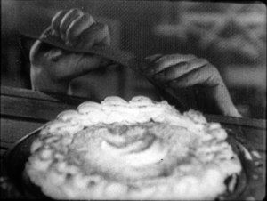
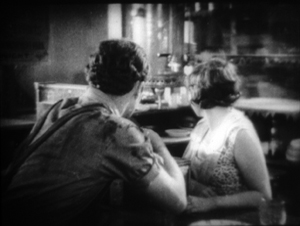
You can also argue that by deciding to call our attention to a distant plane in soft focus, Wyler fell back on something he had tried before. In the extraordinary late silent The Shakedown (1929), he showed a pie being stolen in a diner. First, there’s a close-up, then a shot of the main couple looking to the background. In the center, out of focus underneath the coffee urn, the pie is slipping away.
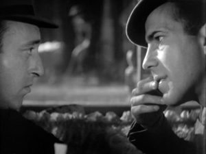
The action isn’t very discernible in my image, which is from a 35mm print; but the scene is shot quite soft anyway. I think audiences notice the gesture, slight as it is, because it’s centered and nothing else is moving in the frame. More visible is the background action in a shot Wyler and Toland used in Dead End (1937). Two gangsters are sitting in a bar debating kidnapping a child. In the out-of-focus background,we can discern a woman wheeling a baby carriage along the sidewalk. She isn’t the target, just a sort of reminder of children’s vulnerability. As in The Little Foxes, a centered background action attracts our attention and makes us strain to identify it.
Faced with a similar problem in The Little Foxes, Wyler had the chance to dramatize a soft-focus background to a much greater extent than in these films.
One more causal factor might have shaped Wyler’s decision. Lillian Hellman’s original play takes place wholly in the Giddens’ parlor and the hallway behind. The play text indicates that the staircase is in the rear of the set, with a landing offstage. The furniture sits downstage, closer to the audience. The foreground/background interaction in Wyler’s staging is already there, in a rougher form, in the play’s set arrangement.
And how does the play handle the moment of Horace’s collapse? When Horace’s medicine bottle breaks, Regina doesn’t move. Calling for Addie the maid, Horace leaves and staggers to the rear playing area.
He makes a sudden, furious spring from the chair to the stairs, taking the first few steps as if he were a desperate runner. Then he slips, gasps, grasps the rail, makes a great effort to reach the landing. When he reaches the landing, he is on his knees. His knees give way, he falls on the landing, out of view. Regina has not turned during his climb up the stairs. Now she waits a second. Then she goes below the landing, speaks up.
REGINA: Horace, Horace.
The foreground/background dynamic, as well as the frozen indifference in Regina’s performance, are written into the scene’s stage directions. Hellman’s instructions yield a further hint: Horace “falls on the landing, out of view.” Within the norms of the deep-focus aesthetic, Wyler and Toland found a cinematic equivalent for this barely-offstage action–one appropriate for their film’s particular style. They make Horace present, but he’s “out of view.”
Somebody may say: “See? You don’t need all this fancy analysis. At bottom, Wyler was forced to shoot the scene this way because of Marshall’s bum leg.” This retort assumes that causal factors always trump functional ones. Instead, I think that by considering causal factors, insofar as we can know them, alongside functional ones, we can better understand filmic creativity in history.
Durgnat’s point shows us how. Even when contingent circumstances “force” a filmmaker to change course, there are always several ways to do that. Picking any option brings in a cascade of other constraints and opportunities. Once Wyler has decided to double Marshall and sustain the take on Davis, soft focus is more or less necessary so we don’t spot the stand-in. But the soft-focus provides a nifty opportunity to create the sorts of functions and effects we’ve already noticed.
Like everybody else, filmmakers choose within constraints—some apparent, some less visible, many just taken for granted. Those constraints limit what can be done, but they also enable other things to happen, perhaps things that the filmmaker couldn’t have planned in advance. Once other filmmakers realize the results, they can plan in advance. A moviemaker today can try out Wyler’s solution, free of the pressures that drove him to it. A significant part of filmmaking’s traditions may consist of workarounds.
The Ostlund epigraph, apparently not available online, is taken from Hollywood Reporter’s December awards issue, p. 13. My Egyptian picture comes from the Metropolitan Museum of Art. It’s called Fish Preparation and Net Making, from the Tomb of Amenhotep (1479-1458 BCE), as rendered by Nina de Garis Davies. I draw the stage directions in The Little Foxes from Lillian Hellman, The Collected Plays (Little, Brown, 1971), 195.
My quotations about It’s a Great Feeling and The Bishop’s Wife come, respectively from two books by Irene Kahn Atkins, David Butler (Scarecrow, 1993), 227; and Henry Koster (Scarecrow, 1987), 87. Koster’s memory fails him in his account of the Bishop’s Wife window scene. It seems likely that Loretta Young favored her left side, which is her dominant orientation throughout the film. But there’s no evidence in the film that Cary Grant favored that side of his face too. The scene at the window is too brief to count as an instance of much of anything.
When I wrote On the History of Film Style in the mid-1990s, I had the nagging memory that Marshall’s artificial leg played a role in Wyler’s staging, but I put it down as legend. (It’s a pity I didn’t pursue it, because the information would have fitted snugly into my sixth chapter.) Only when I discovered a 1972 interview with Wyler, with the “trade secret” mentioned above, did I realize there was something to the story. That interview was once online, but seems to have vanished. It’s available at Columbia University. Durgnat’s discussion is in Films and Feelings (MIT Press, 1967), 41. My other quotations from Wyler come from Axel Madsen, William Wyler (Crowell, 1973), 209.
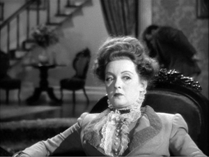
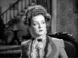
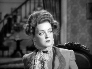
Otis Ferguson reported on the filming of a different scene in The Little Foxes; I discuss that here. More generally, on the Bazin-Wyler connection, see this entry. Other Wyler-related entries can be canvassed here. For more on Hollywood’s development of deep staging and deep focus, see not only On the History of Film Style but also Chapter 27 of The Classical Hollywood Cinema: Film Style and Mode of Production to 1960. As for Bette Davis’s eyelids, much in evidence here, there’s this entry.


