Filling the box: The Never-Ending Pan & Scan Story
Sunday | January 25, 2015 open printable version
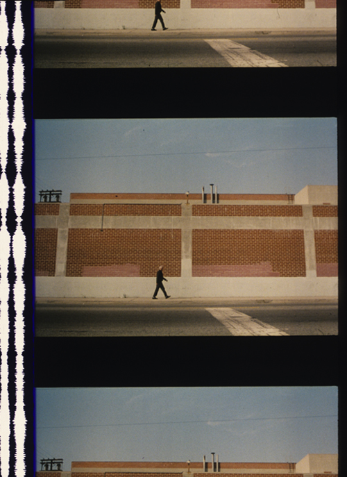
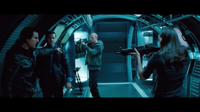
The Limey (1999).
DB here:
Here’s a story, so far not finished.
Chapter 1: You can’t put ten pounds of mud in a five-pound sack (Dolly Parton)
Once upon a time, before home video and cable, movies were broadcast on television. They might be drawn from local TV stations’ 16mm collections or transmitted from the networks on “movie of the week” shows. When the film was a widescreen film, especially in anamorphic processes, it was adjusted, as we now say, “to fit your screen.”
That TV screen was in an aspect ratio of about 1.33:1 (4 x 3), like pre-1950s commercial films. But the film to be shown might be 1.75, 1.85, or 2.35. How to show it?
You could retain the whole original frame with letterboxing at top and bottom. This was done more often in Europe than in the US, I believe. Our TV system had 100 fewer lines, so the tiny picture area became quite degraded. And then (as now) there were people who persisted in believing that those black bars at top and bottom were somehow taking away part of the movie.
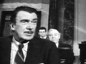
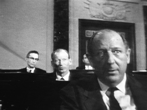
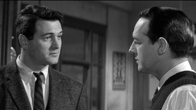
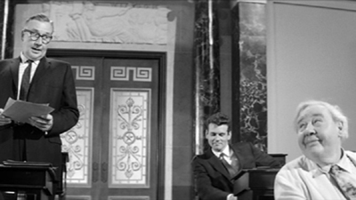
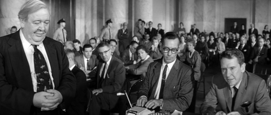
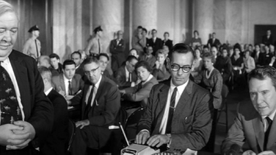
Far more common was the tactic of somehow making the wider image fill the box. This tactic came to be called “pan and scan.” It gained the name because in preparing the TV version, an engineer would sometimes swivel the TV frame across the original image, carving into it and sliding to and fro. The term pan and scan covered another tactic, simply making two shots out of one. We might call it “cut and scan.” Here’s an instance from an old VHS tape of Advise and Consent, one of the most daring American widescreen films. The slightly fatter faces are due to the distortion of the CRT monitor I shot from.
Sometimes there was neither scanning nor cutting, just simple cropping. The engineer would find a 4×3 chunk and extract it from the bigger image. To keep things simple, that chunk was usually around the center. This “center-cutting,” as it was called, could yield some funny results, as in the protruding nose in a 16mm TV print of Tarnished Angels.
Chapter 2: Shoot, protect, screw up
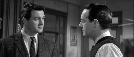
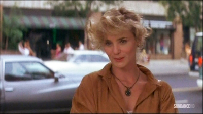
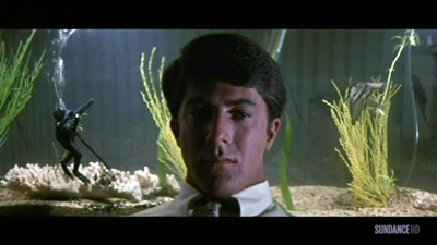
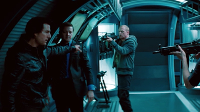
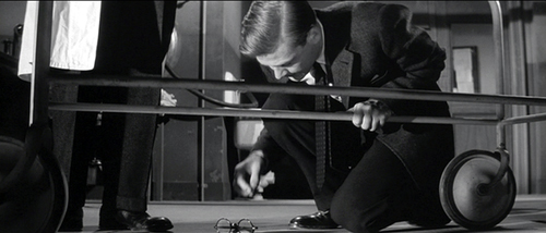
Some widescreen processes from the 1950s onward didn’t frame the image wide during filming. The image would be captured “full frame.” The result might later be “hard matted,” or letterboxed, during printing, as in the shot from The Limey surmounting today’s entry.
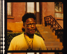
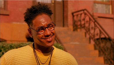
Sometimes, the 35mm theatrical prints would retain a 4:3 image, or something even squarer. The frames in a 35mm print of Do the Right Thing are about 1.19:1. Note the extensive headroom in the left image, from a 35mm print. For screenings the projectionist would mask the image to the proper proportions—typically 1.85. Here’s the version on the Criterion DVD, at 1.75 for widescreen monitors.
The full-frame image was available for cropping to 4:3 TV viewing. Many cinematographers used the “shoot and protect method” by composing for both 1.85 and 1.33.
There were problems with this “open matte” process in theatres. I recall a mis-framed version of Jerry Maguire in which the locker-room scene showed more of Cuba Gooding’s goodies than was intended. And a full-frame print of Godfather II reveals the duct-taped marks on the set floor (as if Pacino would ever hit them).
The same problem would appear in full-frame TV versions that were carelessly transferred from film. Microphones, unfinished stretches of the set, and other production elements might jut in. Some cinematographers didn’t consider TV versions important enough to worry about. “Fuck TV,” was heard occasionally.
More basically, the full-frame result wasn’t faithful to the “original” theatrical version, which was designed to be shown wide. Purists objected that TV versions, even if shot full-frame, didn’t fulfill the intention of the director.
Chapter 3: 16 into 9 won’t go
 In the 1990s there came laserdiscs and DVDs. These offered properly letterboxed framings. Cinephiles cheered. It seemed that the days of pan and scan were over.
Actually, pan-and-scan hung on quite a bit. Many laserdisc editions weren’t letterboxed. Airline versions offered cropped images, and still do. (Those tiny screens, after all.) Some DVDs were released in pan-and-scan versions, while others offered a letterboxed version of the film on one side of the disc and a full-frame version on the other. But serious cinephiles could assume that the general public was starting to understand that films intended to be seen at a certain ratio should be shown that way.
As the new disc formats emerged, so did a plan to standardize High Definition video for a 16 x 9 display. The European Union promoted it during the mid-1990s, and over the next twenty years it became accepted for both computer monitors and video displays. The new format developed in sync with the gradual replacement of analog broadcasting by HD transmission.
The problem is that 16:9 is a ratio of 1.77:1, close enough to 1.85 for most purposes but far off the ratio of 2.20:1 (many 70mm films) and 2.40 (anamorphic widescreen after about 1970). Yet maybe this isn’t a problem. Why not just letterbox those wider images within the 16:9 format?
If only things were so simple.
Chapter 4: Slightly off, and more
Today, at least 77% of US households have HD monitors. (Surprisingly, 41% of TVs still in use are Standard Definition, many presumably comforting children and old people.) Broadcasters make concessions to the 4:3 ratio by keeping the key action centered and cropping the 16:9 image.
Nature abhors a vacuum, and TV monitors apparently can’t bear blank space. So some purveyors of movies on video have updated pan-and-scan for the HD age. Cable, for instance.
It’s been years since I clicked my cable remote to the Sundance Channel and the Independent Film Channel, now known as IFC. Seeing them a couple of weeks ago was a mild shock. Now each boasted a bug in the lower right corner, and swarming over the image were lots of texts plugging other programs. Worse, there were commercials for weight-loss scams, Burger King, and Portlandia. More to the point here, these services give us a new version of pan-and-scan.
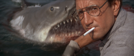
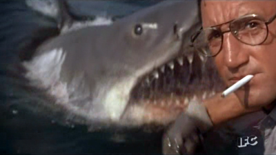
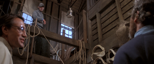
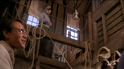
Thanks to the center-cutting method, I found plenty of examples of anamorphic 2.40 films sliced up to fit our monitor. Here are a couple of examples from IFC’s version of Jaws. In the first pair, the wider image gives Bruce room to move, and Brody is more salient. In the second pair, Hooper is speaking, but in the IFC image he’s even more peripheral than Mr. Nose in Tarnished Angels.
In rare cases, IFC seems to run full-scope prints; I spotted one of Chinatown. But it doesn’t seem to be the norm. Maybe IFC’s New Age pan-and-scan is trying to live up to the channel’s slogan: “Always on. Slightly off.”
Many films of the early widescreen era are compromised even at 16:9. The nose shot from Tarnished Angels would be a bit cramped in a 1.77 format, and many other shots would suffer as well.
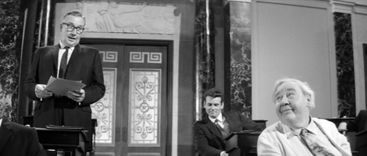
When the wide format was still new, filmmakers were exploring what they could do it, and that included scattering important information throughout the frame. Preminger was all over the place in the Senate and Committee-Room scenes of Advise and Consent. What would you do to fit these shots into 16:9? I make a silly stab at center-cutting.
Films like this remind you of how the technology of home video has made our filmmakers less daring in their compositions. Would anyone today risk the bold composition that Richard Fleischer uses in the mortuary scene of Compulsion? As you can see from the image at the end of the entry, the crucial pair of eyeglasses rests on the lower frameline, as if on a shelf. ‘Scope nudged some directors toward quite intricate shot designs.
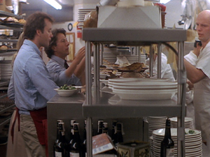
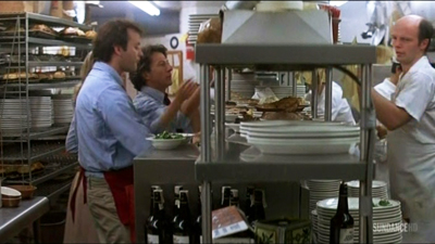
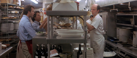
By the time Tootsie was made, with home video on the rise, filmmakers were pressed to shoot and protect better. So here there’s plenty of unused space on the sides, and most action will fit into any old frame proportions. In the shot below, the 1.33 version (available on the flip side of the DVD) is extracted from the Scope version (and slightly squeezed as well). The 1.77 version I grabbed from the Sundance Channel is also extracted from the wider framing. Both reframe the image to emphasize Michael and Jeff, the comic duo. The original 2.35 image centers the food counter and for some reason gives equal space to the inconsequential aisle and stove on the right.
Obviously, composition isn’t particularly important here. Solid as Tootsie is at the level of writing and performance (“Oh, God, I begged you to get some therapy”), we wouldn’t point to it as a model of pictorial finesse.
Moreover, pan-and-scan isn’t just a matter of retaining the action in different framings. Recasting the image changes the scale of the things in it. Old TV pan-and-scan, as in my first Advise and Consent example, makes the figures chopped out of the composition seem closer to us. Sometimes today’s pan-and-scan makes the figures seem smaller. That’s because the full-frame original image offers a bit more space at the top or bottom than we see in the anamorphic version, and that gets incorporated into the 1.77 or 1.33 version. (You can see it in the Jaws example above, with the space above Quint’s head.)
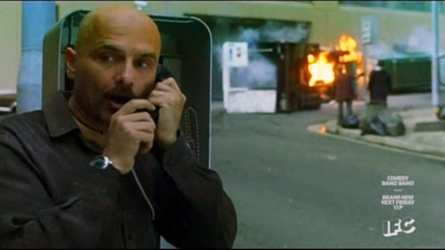
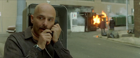
The push-pull of different versions is particularly noticeable in close views. The center-cut (and perhaps slightly squeezed) IFC version of The Matrix keeps Cypher prominent in the foreground, with the car crash in the rear. Yet do you see him and the crash as closer to us in the wide original? I do. Maybe it’s because both Cypher and the background plane are larger in the second frame.
By contrast, several shots in the IFC version of The Matrix have areas at the top and bottom not visible in a wider-frame DVD. In any case, extracting from an anamorphic frame or here, pulling the 1.77 version out of a full frame, can subtly alter the scale and perspective relations within the shot.
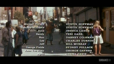
In the old TV days, networks would show credit sequences in full widescreen, as they were obliged to make all the contributors’ names visible. So you often had the odd situation of a widescreen credits sequence that would end a movie shown in 4:3. Sundance has updated the technique. Tootsie’s penultimate shot of Julie is at 1.77, but as she and Michael walk off, we cut immediately to a final shot at 2.35 letterboxed, over which the credits roll.
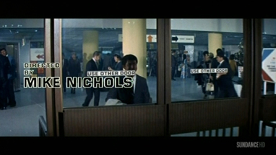
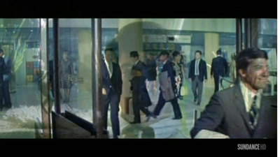
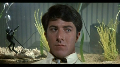
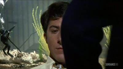
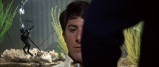
Another old trick has been revived. Back in 1960s TV, you’d have an obligatory widescreen image with credits information, but the shot might go on to show story action. Then the TV framing would close in on the wide image and gradually fill the screen with a 4:3 composition. Damned if I didn’t find the same thing happening last weekend on Sundance. The opening credits for The Graduate were in full ‘scope. That shot dissolved to the famous shot of Benjamin sitting in front of his aquarium, blankly facing the camera.
To retain the credits and keep the dissolve smooth, the engineer slowly enlarged the original shot to 16:9 proportions as Ben’s father comes in. (You can see the Sundance bug lift slowly into the lower right of the image.)
The result is a camera movement, a zoom in, that isn’t in the original film. In the original framing below, the shot scale on Ben isn’t much different, but the little scuba diver remains prominent in a way he isn’t in the 16×9 image.
Chapter 5: VOD = Variants On Demand
On cable TV we Americans can go to TCM for a purer experience of widescreen from the old days. But the more recent films shown on IFC, Sundance, Pivot, and other cable channels are likely to be hacked up in the new way. In this respect as well as others, cable has become the network TV of the new age. We get shows of all types, not just sports and movies but original series, except that now we get to pay to watch commercials.
Surely things are better with streaming?
In the spot-checking I did on Amazon and Hulu Plus, I didn’t find instances of cropping. In particular, the Criterion films I checked retain their proper aspect ratios. Netflix is another story. At this point we must thank the anonymous genius behind What Netflix Does. This site exposes a great many ways that the most popular streaming service has relied on pan-and-scan, with different crops for different markets.
In fairness, once the anonymous genius contacted Netflix, some deficient versions were replaced by proper ones. But several of the more recent examples have not been changed. Who knows how many others remain panned and scanned because the alterations haven’t yet been detected?
In the light of all this, I’m wondering if filmmakers have been protesting this mangling of their work. During the early days of TV broadcasts, directors complained about cuts and commercials, and in more recent years we’ve learned that directors were won over to digital projection in theatres because then “the film would be shown exactly as the director intended.” With many more people seeing the film on video platforms than see it in theatres, you’d think we’d have heard more from the creative community. Once more their movies are being jammed and lopped to fit whatever box they’re put in.
I’m tempted to say that when we want to get the movie in a form close to the ways its makers wanted it to be seen, we need to see it in a theatre or get it on DVD/Blu-ray. There are exceptions, of course. Theatres can botch aspect ratios today just as they have in earlier decades, chiefly by using the wrong masking. And we have filmmakers who alter the aspect ratio on DVD, usually to expand the field from 2.35:1 to 1..77 in hopes (vain) of evoking the Imax effect (Tron: Legacy, The Hunger Games: Catching Fire).
Without getting into technicalities, some of the 1.77 versions you’ll see have a bit more area at the top and the bottom of the frame than we find in the full anamorphic image. In many cases, like the shot of Cypher in The Matrix, it’s because the film was shot in Super-35. This very full-frame capture format allowed filmmakers to extract a 2.40-proportioned image, or a 4:3 image, or images in other aspect ratios. The Wikipedia entry on Super-35 is very helpful on this and other aspect ratios, both for cinema screens and TV. Some shots in the IFC Jaws had a little more vertical area as well. I assume that’s because the ‘scope image on the DVD cropped a tad off the top and bottom of the full-frame image on the film.
Thanks to Jonah Horwitz for pointing me toward the site What Netflix Does. More general thanks to James Quandt for our long-running conversation about aspect ratios. Other entries on aspect ratio on this site involve Fritz Lang, Jean-Luc Godard, and Wes Anderson. I set out some ideas on CinemaScope aesthetics in this video lecture.
P.S. 28 January: Thomas Zorthian was ahead of the curve on this. Back in 2011 he noticed the Netflix pan-and-scan.
Your article hit home for me as I have been trying to bring attention to this problem for a while. I even wrote Roger Ebert hoping he could use his influence. He was kind enough to publish my letter: http://www.rogerebert.com/letters/netflix-stream-sometimes-overflows-the-banks. I have also written to HBO and am considering a petition to ask them to show movies in the proper ratio before HBO GO becomes a standalone service. This would enhance the value of this new service.
Thanks to Thomas for corresponding!
Compulsion (1959).


