Modest virtuosity: A plea to filmmakers, old and young
Sunday | December 13, 2015 open printable version
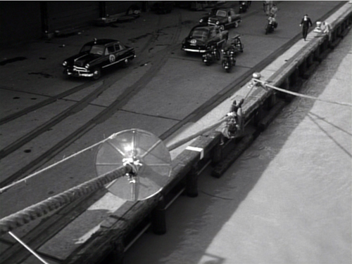
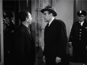
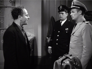
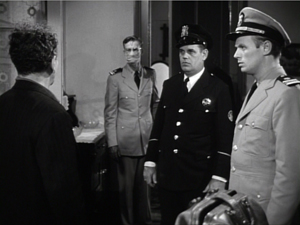
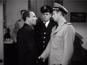
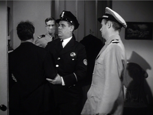
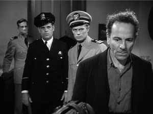
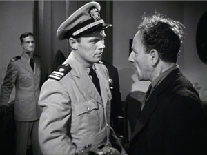
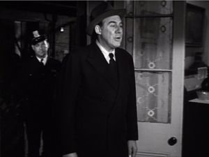
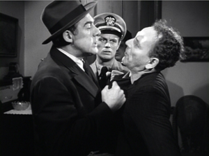
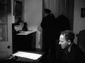
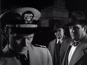
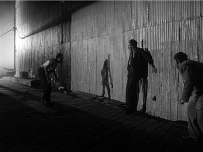
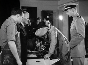
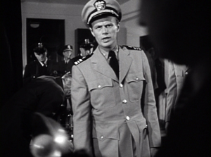
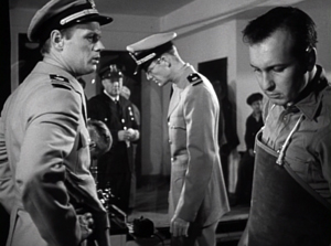
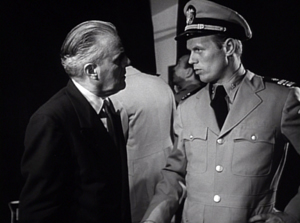
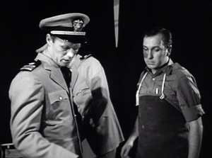
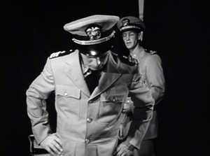
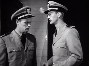
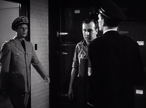
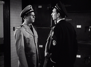
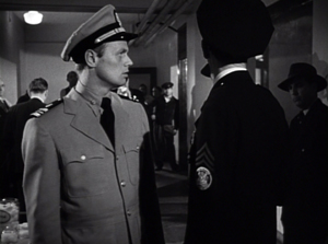
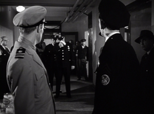
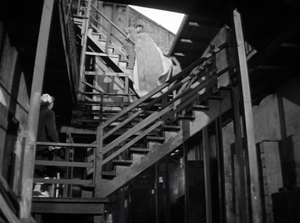
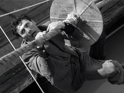
Panic in the Streets (1950).
“It’s where you put the camera and what’s in front of you [that’s important],” Deakins said. “There’s too much obsession these days about digital film…it’s becoming so technically-orientated, and that’s just distracting from what’s actually being put in front of the lens.”
DB here:
Every now and then I get worried by the repetitive look of recent films. I want to beg filmmakers (young ones especially) to try something else.
What could they do? Start with what to avoid. They could suspend the walk-and-talk, the tendency to rely on singles, the bumpy handheld takes, the swoopy crane shots, and the urge to cut on every line of dialogue. They could back off, in other words, from intensified continuity and go for something more daring and original.
More positively, there are some relatively unexplored areas of film style that yield results that are forceful and graceful. Today’s example: ensemble staging that minimizes camera movement and cutting. Minor spoilers.
Some basics
It’s a demanding technique. Essentially the filmmaker has to shape a scene among several actors in ways that guide our attention to the key pieces of information. That guidance is done through performance, framing, lighting, and other tactics. Beyond highlighting the major points of the scene, staging can create what critic Charles Barr called “gradation of emphasis.” Because several elements of the action are all visible at once, some can become primary, some secondary; and this interplay enriches our understanding of the scene.
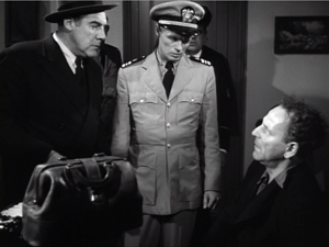
So take this scene from Elia Kazan’s Panic in the Streets (1950). A dead man has been found to carry the Bubonic plague virus, and Dr. Clinton Reed is investigating people who have come in contact with him. A restaurant owner and his wife have denied knowing the victim, but now Reed and Police Captain Warren have learned that the wife has come down with the plague. They visit the apartment, too late to save her. Her husband Mefaris comes in and learns that she has died—and that she might have lived had the couple told the truth.
The two-minute scene plays out in just two shots, both with slight panning movements. The scene’s impact owes a lot to the performances: the line readings, facial expressions, and gestures, including the wonderful way that Richard Widmark rips off his surgical mask in angry frustration. But the scene also benefits from small but significant rearrangements of the actors in the frame. This staging ties together the performance elements in a smoothly rising flow.
Here’s the scene. I’ll try to indicate some practical directing principles at work.
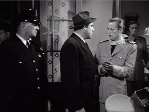
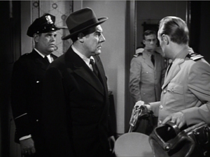
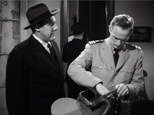
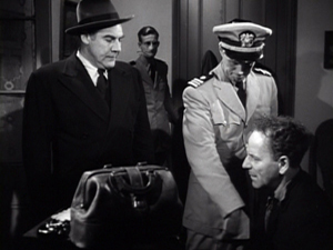
After Captain Warren has sent his men to find the husband, we have our principal players in the middle ground in a framing from the knees up (the plan-américain). As is common in 1940s dramas, the scene will be given added depth, not only by the patrolman behind Warren but by the junior officer Paul behind Reed, coming out of the sickroom. That depth is activated when Reed comes forward to pack his briefcase and orders Paul to burn the bedding, and Warren orders the patrolman to close the bedroom door.
The opening and closing of the door becomes an important pictorial element, but for now it simply clears the background for the two-shot involving Warren and Reed talking of the death certificate. Noise from offscreen motivates the camera’s pan left to follow Warren as he meets the husband, Mefaris, coming in.
Mefaris confronts Reed and demands to know what’s happening. When he calls his wife, Paul steps out, guiding our attention to him as a sign of death. Mefaris begins to guess. The phlegmatic patrolman, who’ll feature throughout the scene, is there to keep Mefaris under control.
The risk is that we’ll watch that centrally place cop and miss something else, so Kazan takes care to make him impassive. Later, he’ll be more distant, in shadow, and out of focus. More generally, such ancillary characters need to keep still and stare at what we’re supposed to be watching.
Mefaris comes closer to Reed, blocking our view of Paul. Reed tells him his wife is dead. Mefaris tries to go to her room, but the patrolman shows his value by restraining him—and opening up a slot for us to see Paul, who confirms Reed: “She’s dead, mister.”
This sort of unnoticeable blocking and revealing through slight shifts in actors’ position goes back to 1910s cinema but is seldom used today.
Finally accepting the grim news, Mefaris ponders and comes forward. Without cutting, Kazan has brought him and Reed into closer visibility. As ever, a Cross refreshes the composition. And as Reed asks questions, his head blocks the patrolman so that we can concentrate on Mefaris’ indignant reaction.
Mefaris’ refusal to talk is the climax of the shot. We cut to Warren at the door and the camera pans with him to confront Mefaris angrily.
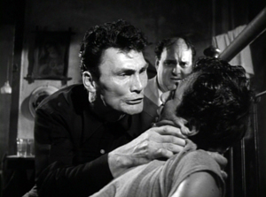
Now only Reed is visible in the background, squeezed between the two faces. Mefaris finally identifies Poldi as the man they need to find. Warren shoves him down and the space, quite clenched just a moment before, opens up. As gradation of emphasis, we get Reed brushing at Mefaris’ lapel after Warren’s meaty hands have crumpled it. After Warren’s outburst, Reed’s anger at Mefaris seems to have turned into a flicker of compassion.
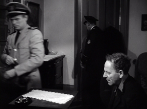
Warren and Reed depart, just as Paul returns to the death room and the patrolman closes the door. The final framing leaves nothing to distract us from Mefaris, brought low by grief and his fatal failure to cooperate.
Kazan is, we might say, a “post-Welles” director in that he, like many others, adopted the vigorous use of depth staging and wide-angle cinematography made famous in Citizen Kane. It’s not hard to find elsewhere in Panic in the Streets some more flagrant instances of in-your-face deep focus, with big heads and exaggerated distant points.
In the scene above, the depth is nothing like so aggressive. It is, we might say, modestly virtuoso—a clean, unnoticeable, but well-calibrated piece of staging that unfolds the action so that we always know where to look.
Why not?
I anticipate some objections from a skeptical filmmaker.
“This scene isn’t cinematic. There isn’t enough cutting and it’s lacking close-ups.”
Today, though, everybody acknowledges that cutting isn’t the be-all and end-all of cinema. Directors get lots of credit for sustaining their shots, if it’s done with a self-congratulatory virtuosity. (See Gravity, Birdman, the opening sequence of Spectre.) In particular, a lengthy walk-and-talk shot is greeted as a bold stroke. So clearly the absence of cutting is okay if you make a big deal of it.
Close-ups are important, but maybe not as much as we think. Today’s style often relies too much on close-ups, partly because people think they won’t read well on small monitors and other displays. But those displays are getting bigger and sharper. I suspect that you’d find the Blu-ray edition of Panic in the Streets plenty okay for home viewing.
“Put it another way. This is too theatrical.”
Too reliant on actors, then? But what mainstream cinema isn’t? And isn’t today’s standard style, bombarding us with facial close-ups, quite “theatrical” in making the actor—and not even the body, just the face—the center of our attention?
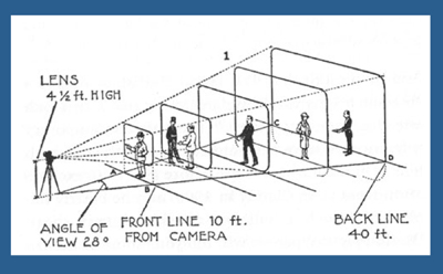
Moreover, as I’ve argued here and elsewhere, the space of a shot is the opposite of the space onstage. Theatrical space is wide and rectangular, and actors tend to arrange themselves laterally, across the stage. Cinematic space–the space captured by the camera–constitutes a pyramid, extending narrowly away from the lens, and so it favors depth. (See the diagram above.) Theatrical space is calculated for the sightlines throughout the auditorium; cinematic space is calculated for one sightline, that of the camera. Accordingly, a film can have staging in depth that wouldn’t work onstage. You couldn’t arrange the Panic scene this way in live theatre; some people couldn’t see the background action clearly, because the foreground figures would mask it.
If “theatrical” also means “too tied to the proscenium,” that objection fails too. Granted, this is a scene that suggests a missing fourth wall. The camera doesn’t penetrate the space enough to suggest the entire room. Shortly, though, I’ll show you that this approach can be more immersive, activating areas behind the camera (and so behind us).
“It’s not realistic. People don’t stand and talk that way.”
Cinema ≠ reality.
“It’s too risky. Too much can go wrong with all that shifting in one shot.”
You need skillful actors who can time their lines, hit their marks, and coordinate with one another. If one thing goes wrong, you have to start again. Shrinking from this, directors opt for plenty of coverage to adjust pacing and select the best performances during editing. “The important thing for the editor is coverage,” notes Ridley Scott. “That’s why I always have multiple cameras, so I can shorten the scene.”
So, yes, it’s risky. But risk is celebrated in the noisy virtuosity of the flamboyant long takes. Why not take risks in this more unusual way?
“It’s too hard! I never learned how to do these things.”
Once upon a time, every director knew how to stage scenes like this. The “tableau cinema” of the 1910s cultivated a rich set of creative choices about staging, and directors proved very versatile in exploring them. With the arrival of continuity editing in the 1910s, a degree of de-skilling took place, but directors still retained some sense of dynamic staging. We see it in 1930s and 1940s films too.
Now, much later, this sense is all but gone. Is ensemble staging taught in film schools? Could even our best directors of today—Wes Anderson, Paul Thomas Anderson, Quentin Tarantino, et al.—pull off a scene in this manner? Soderbergh couldn’t do it when he tried in The Good German. (I look forward to seeing if Todd Haynes makes the effort in Carol.)
On the whole, though, I agree: It’s hard today. Neither directors nor actors nor DPs are, I think, well-versed in what’s necessary to stage scenes this way. Most directors, and nearly all viewers, have simply forgotten that this rich menu of expressive techniques ever existed. So why not revive it?
Post-grad work
One other objection occurs to me.
“Ensemble staging of this sort is too modest. In an age of directorial bravura, where every filmmaker tries to punch above his weight, nobody will notice if I direct scenes this way. And getting the next job demands that my contribution get noticed. I’m competing with a lot of eye candy out there.”
I’d agree. But there is a lot of leeway in this approach for more self-conscious effects. Maybe most viewers and even filmmakers wouldn’t notice the robust delicacy of the scene above. But how about offering something more audacious that stays within the parameters of this style?
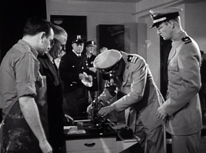
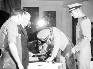
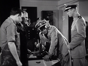
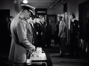
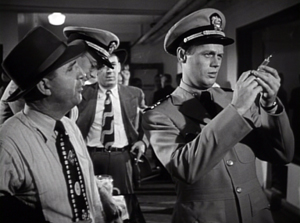
Try this earlier scene from Panic in the Streets. Reed, his assistant Paul, and local officials are now identifying the plague virus and are beginning to figure out how to deal with it. I hope I’ve primed you to notice the less-quiet virtuosity on display here.
A director today might have shown us the body, the reporters photographing it, and the medical team in one vast shot, perhaps from a high angle that craned in. Or perhaps we’d have gotten a long walk-and-talk taking Reed through a hospital corridor as he snaps out orders to all the staff involved.
Instead, Kazan leaves a lot of this material offscreen, to be inferred through details. The plaguey corpse lies just outside the lower frame line, but we won’t realize this for a while. And the reporters are offscreen, “behind us.” So we’re inside the proscenium. Part of the interest of the scene is not just following the ongoing drama but figuring out what’s going around us.
In this more complex scene, Kazan threads characters through the space, making some more prominent and then letting them fall back. He obeys Alexander Mackendrick’s dictum:
Composing in depth isn’t simply a matter of pictorial richness. It has value in the narrative of the action, the pacing of the scene. Within the same frame, the director can organize the action so that preparation for what will happen next is seen in the background of what is happening now.
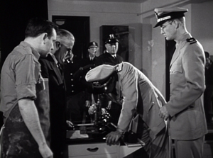
We start with Reed and his team bent over the microscope. In the background a patrolman passes. For an instant the frame flares up.
Reed looks up, slightly annoyed, but when it happens again we can see that it’s the result of a photographer’s flash. In the distance, after Reed bends over, we can see the patrolman blowing his nose. Because we know that the plague is loose, that simple gesture becomes a warning. And on the big screen you can now notice the vague reflection of the photographer in the window between Reed and Paul. The second fading flashbulb tells us where to find this man’s phantom image.
So the action develops in three zones.: the cops in the distance, the team at the microscope, and the offscreen police photographers behind us. Two of these zones get closed off when the photographers leave and Reed orders the curtains drawn.
The space goes shallow as we get a succession of two-shots, the first with the health officer who comes forward and learns that he must cremate the corpse, the second with the morgue supervisor.
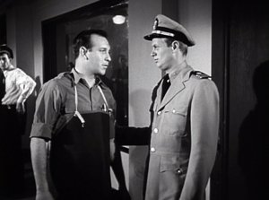
Now we get a pause. Reed, isolated against the curtains, stares down at the corpse, trying to work out a plan. As in the earlier scene, a simple pan brings Paul to him for a final two-shot. The serum has arrived, and this sets up the second phase of the scene.
The scene has developed around two nodes: the microscope bench in the middle ground and the still-unseen corpse in the foreground. This use of depth has fulfilled Mackendrick’s dictum, as the action around the ‘scope has prepared us for the series of one-on-one instructions Reed issues to his team. As in the earlier scene, this shot ends with the figures closer to the camera than they were at the start.
As in the earlier example, we get a cut. (Critics have often talked about single-shot scenes. What about studying two-shot scenes? I suggest we start with Mizoguchi.) Reed heads outside for another encounter, this time with a police official, who gets emphasized not through cutting but by letting his head block that of the morgue supervisor.
We pan with Reed as he goes to the corridor and the gathering group. More blocking and revealing: As Reed asks the cop about people who’ve been in contact with the corpse, he pivots and the composition frames the sniffling cop in the vanishing point.
Today a filmmaker might give us a big close-up of this poor guy, playing up his misery. But that would suggest that he’ll become an important story factor. He’s actually not in danger, so his minor status in the frame is completely appropriate.
For similar reasons, no need to cut in to Reed addressing the assemblage of men; none will prove significant. Instead, the action moves back to the foreground. First, Reed thanks the morgue attendant.
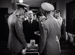
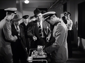
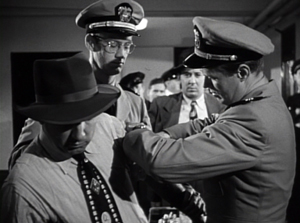
More important, and more virtuoso, is the way that the key dramatic elements in what follows are framed in a tight space between Paul and Reed in the foreground. First it’s the official in charge of cremation, then it’s the two skeptics.
Once more a shot ends in the closest framings so far. As a complaining civilian quarrels with Reed, both advance to the camera and Reed obliges him to take his medicine. The shot ends with the man wincing and lowering his head as the needle goes in; not such a tough guy after all.
Far from being simply of casual interest, these reluctant ne’er-do-wells anticipate the stubbornness and stupidity that Reed will encounter when he ventures into the city among the populace.
It seems to me that this sequence, with the flashbulbs and the curtain and the line-up for the vaccine, provides a self-assured command of craft that is as exuberant as anything in today’s flashy direction. If you can be flashy in a quiet way, this scene manages it.
This kind of staging can give cuts extra force. In the first scene, the cut to Warren ratcheted up the tension: Reed’s persuasion failed to win over Mefaris, so brute force is the next step. In the mortuary scene, the cut to the corridor as Reed passes through is more perfunctory, but it at least maintains the fluidity of the action.
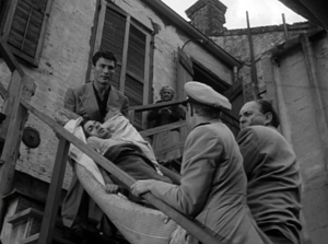
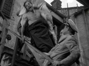
A more dramatic instance of saving your cut for maximum impact comes near the climax, when Poldi is carried down a precarious staircase and his crooked boss Blackie flings his body over the railing. The cut to the extreme long-shot shocks you with how far he must fall.
There is much else to admire in Panic in the Streets; it’s a fine instance of Joe MacDonald’s location cinematography as well. I use it as simply an example of how much classical cinema has to teach us. It’s a pity that our filmmakers have unlearned some of its lessons, but it’s not too late—especially for brave young filmmakers—to relearn them.
For an example of lateral, rather than depth-based, ensemble staging, see our most popular entry, “Watching you watch There Will Be Blood.” Use the category tableau staging to access entries on the principles I’ve mentioned. The whole subject is discussed in more detail in Chapter Six of On the History of Film Style and in Figures Traced in Light: On Cinematic Staging. It’s also treated in my video lectures How Motion Pictures Became the Movies and CinemaScope: The Modern Miracle You See without Glasses. The diagram of the visual pyramid is from Ben Brewster and Lea Jacobs, Theatre to Cinema: Stage Pictorialism and the Early Feature Film (Oxford University Press, 1997), 170.
Panic in the Streets.


