

Archive for 2016
A well-deserved honor for Criterion and Janus
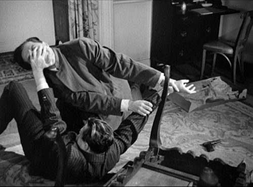
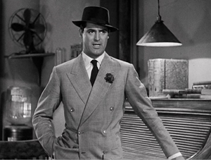
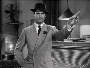
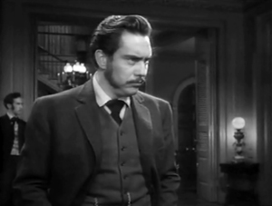
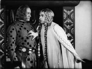
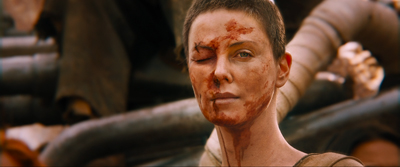
Blood Simple (1984).
We were delighted to learn that our friends at sister companies The Criterion Collection and Janus Films will be receiving an award at the upcoming San Francisco International Film Festival (April 21-May 5). It’s the Mel Novikoff Award, named for an important San Francisco art-house exhibitor. (The article linked above has a full list of past winners.)
The award will be given to the heads of the two companies, Peter Becker (Criterion) and Jonathan Turell (Janus), by Joel and Ethan Coen on April 30, when a restored version of their debut feature, Blood Simple, will be shown. Before the screening, the Coens, along with Amazon Studios executive Scott Foundas, will have an onstage discussion with the two honorees. (Tickets available here.)
For more on Criterion/Janus and our links with them, see our report on Peter and Jonathan’s 2013 appearance at Il Cinema Ritrovato and our discussion of our latest edition of Film Art: An Introduction.
P.S. 8 March: Thanks to Geoff Gardner for a correction.
Off-center 2: This one in the corner pocket
DB here, again:
We got a keen response to my entry on widescreen composition in Mad Max: Fury Road. Thanks! So it seemed worthwhile to look at composition in the older format of 4:3, good old 1.33:1–or rather, in sound cinema, 1.37: 1.
The problem for filmmakers in CinemaScope and other very wide processes is handling human bodies in conversations and other encounters (such as stomping somebody’s butt in an an action scene). You can more or less center the figures, and have all that extra space wasted. Or you can find ways to spread them out across the frame, which can lead to problems of guiding the viewer’s eye to the main points. If humans were lizards or Chevy Impalas, our bodies would fit the frame nicely, but as mostly vertical creatures, we aren’t well suited for the wide format. I suppose that’s why a lot of painted and photographed portraits are vertical.
By contrast, the squarer 4:3 frame is pretty well-suited to the human body. Since feet and legs aren’t usually as expressive as the upper part of the body, you can exclude the lower reaches and fit the rest of the torso snugly into the rectangle. That way you can get a lot of mileage out of faces, hands and arms. The classic filmmakers, I think, found ingenious ways to quietly and gracefully fill the frame while letting the actors act with body parts.
Since I’m watching (and rewatching) a fair number of Forties films these days, I’ll draw most of my examples from them. after a brief glance backward. I hope to suggest some creative choices that filmmakers might consider today, even though nearly everybody works in ratios wider than 4:3. I’ll also remind us that although the central area of the frame remains crucial, shifts away from it and back to it can yield a powerful pictorial dynamism.
Movies on the margins
Early years of silent cinema often featured bright, edge-to-edge imagery, and occasionally filmmakers put important story elements on the sides or in the corners. Louis Feuillade wasn’t hesitant about yanking our attention to an upper corner when a bell summons Moche in Fantômas (1913). A famous scene in Musketeers of Pig Alley (1912) shows Griffith trying something trickier. He divides our attention by having the Snapper Kid’s puff of cigarette smoke burst into the frame just as the rival gangster is doping the Little Lady’s drink. She doesn’t notice either event, as she’s distracted by the picture the thug has shown her, but there’s a chance we miss the doping because of the abrupt entry of the smoke.
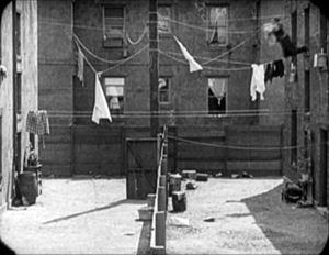
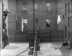
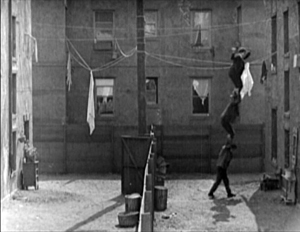
In Keaton’s maniacally geometrical Neighbors (1920), the backyard scenes make bold (and hilarious) use of the upper zones. Buster and the woman he loves try to communicate three floors up. Early on we see him leaning on the fence pining for her, while she stands on the balcony in the upper right. Later, he’ll escape from her house on a clothesline stretched across the yard. At the climax, he stacks up two friends to carry him up to her window.
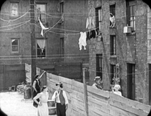

Thankfully, the Keaton set from Masters of Cinema preserves some of the full original frames, complete with the curved corners seen up top. It’s also important to appreciate that in those days there was no reflex viewing, and so the DP couldn’t see exactly what the lens was getting. Framing these complex compositions required delicate judgment and plenty of experience.
Later filmmakers mostly stayed away from corners and edges. You couldn’t be sure that things put there would register on different image platforms. When films were destined chiefly for theatres, you couldn’t be absolutely sure that local screens would be masked correctly. Many projectors had a hot spot as well, rendering off-center items less bright. And any film transferred to 16mm (a strong market from the 1920s on) might be cropped somewhat. Accordingly, one trend in 1920s and 1930s cinematography was to darken the sides and edges a bit, acknowledging that the brighter central zone was more worth concentrating on.
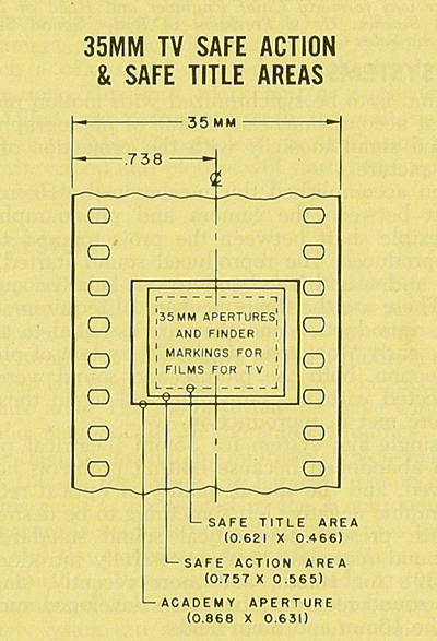
That tactic came in handy with the emergence of television, which established a “safe area” within the film frame for video transmission. TV cropped films quite considerably; cinematographers were advised in 1950 that
All main action should be held within about two-thirds of the picture. This prevents cut-off and tube edge distortion in television home receivers.
Older readers will remember how small and bulging those early CRT screens were.
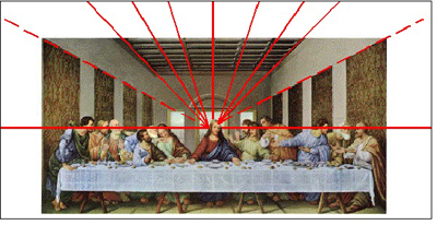
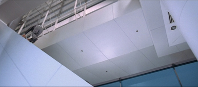
By 1960, when it was evident that most films would eventually appear on TV, DP’s and engineers established the “safe areas” for both titles and story action. (See diagram surmounting this section.) Within the camera’s aperture area, which wouldn’t be fully shown on screen, the safe action area determined what would be seen in 35mm projection. “All significant action should take place within this portion of the frame,” says the American Cinematographer Manual.
Studio contracts required that TV screenings had to retain all credit titles, without chopping off anything. This is why credit sequences of widescreen films appear in widescreen even in cropped prints. So the safe title area was marked as what would be seen on a standard home TV monitor. If you do the math, the safe title area is indeed 67.7 % of the safe action area.
These framing constraints, etched on camera viewfinders, would certainly inhibit filmmakers from framing on the edges or the corners of the film shot. And when we see video versions of films from the 1.37 era (and frames like mine coming up) we have to recall that there was a bit more all around the edges than we have now.
All-over framing, and acting
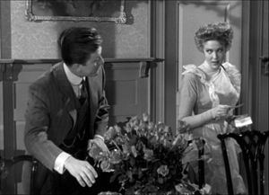
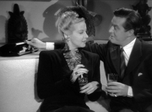
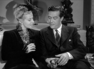
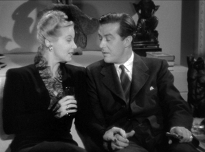
Yet before TV, filmmakers in the 40s did exploit off-center zones in various ways. Often the tactic involved actors’ hands–crucial performance tools that become compositional factors. In His Girl Friday (1940), Walter Burns commands his frame centrally, yet when he makes his imperious gesture (“Get out!”) Hawks and DP Joseph Walker (genius) have left just enough room for the left arm to strike a new diagonal.
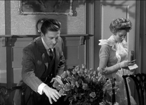
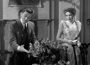
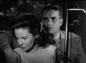
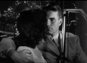
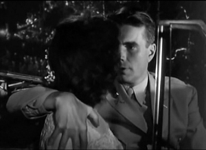
The framing of a long take in The Walls of Jericho (1948) lets Kirk Douglas steal a scene from Linda Darnell. As she pumps him for information, his hand sneaks out of frame to snatch bits of food from the buffet.
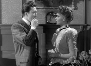
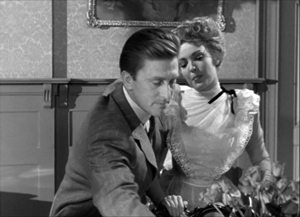
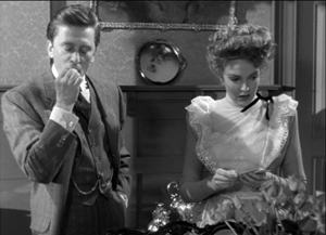
As the camera backs up, John Stahl and Arthur Miller (another genius) give us a chance to watch Kirk’s fingers hovering over the buffet. When Linda stops him with a frown, he shrugs, so to speak, with his hands. (A nice little piece of hand jive.)
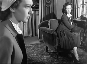
The urge to work off-center is still more evident in films that exploit vigorous depth staging and deep-focus cinematography. Dynamic depth was a hallmark of 1940s American studio cinematography. If you’re going to have a strong foreground, you will probably put that element off to one side and balance it with something further back. This tendency is likely to empty out the geometrical center of the shot, especially if only two characters are involved. In addition, 1940s depth techniques often relied on high or low angles, and these framings are likely to make corner areas more significant. Here are examples from My Foolish Heart (1950): a big-head foreground typical of the period, and a slightly high angle that yields a diagonal composition.
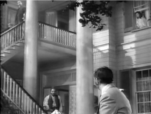
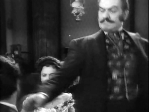
Things can get pretty baroque. For Another Part of the Forest (1948), a prequel to The Little Foxes (1941), Michael Gordon carried Wyler’s depth style somewhat further. The Hubbard mansion has a huge terrace and a big parlor. Using the very top and very bottom of the frame, a sort of Advent-calendar framing allows Gordon to chart Ben’s hostile takeover of the household, replacing the patriarch Marcus at the climax. The fearsome Regina appears in the upper right window of the first frame, the lower doorway of the second.
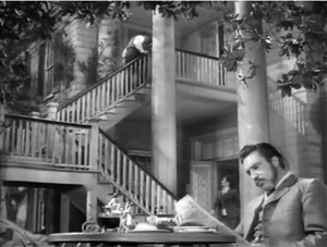
In group scenes, several Forties directors like to crowd in faces, arms, and hands, all spread out in depth. I’ve analyzed this tendency in Panic in the Streets (1950), but we see it in Another Part of the Forest too. Again, character movement can reveal peripheral elements of the drama.
At the dinner, Birdie innocently thanks Ben for trying to help her family with their money problems and bolts from the room, going out behind Ben’s back. The reframing brings in at the left margin a minor character, a musician hired to entertain for the evening. But in a later phase of the scene he will–still in the distance–protest Marcus’s cruelty, so this shot primes him for his future role.
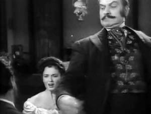
At one high point, the center area is emptied out boldly and the corners get a real workout. On the staircase, the callow son Oscar begs Marcus for money to enable him to run off with his girlfriend. (As in Little Foxes, the family staircase is very important–as it is in Lillian Hellman’s original plays.) Ben watches warily from the bottom frame edge. Nobody occupies the geomentrical center.
Later, on the same staircase, Ben steps up to confront his father while Regina approaches. It’s an odd confrontation, though, because Ben is perched in the left corner, mostly turned from us and handily edge-lit. Marcus turns, jammed into the upper right. Goaded by Ben’s taunts, he slaps Ben hard. Here’s the brief extract.
The key action takes place on the fringes of the frame, while the lower center is saved for Regina’s reaction–for once, a more or less normal human one. Even allowing for the cropping induced by the video safe-title area, this is pretty intense staging.
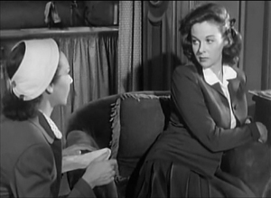
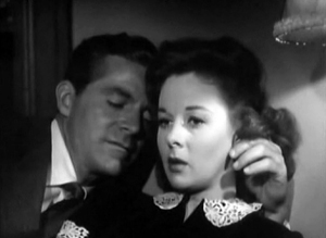
The corners can be activated in less flagrant ways. Take this scene from My Foolish Heart. Eloise has learned that her lover has been killed in air maneuvers. Pregnant but unmarried, she goes to a dance, where an old flame, Lew asks her to go on a drive. They park by the ocean, and she succumbs to him. Here’s the sequence as directed by Mark Robson and shot by Lee Garmes (another genius).
In the fairly conventional shot/ reverse-shot, the lower left corner is primed by Eloise’s looking down at the water and Lew’s hand stealing around her.
Later, when Lew pulls her close, (a) we can’t see her; (b) his expression doesn’t change and is only partly visible; so that (c) his emotion is registered by the passionate twist of his grip on her shoulder. Lew’s hand comes out from the corner pocket.
Perhaps Eloise is recalling another piece of hand jive, this time from her lost love.
For many directors, then, every zone of the screen could be used, thanks to the good old 4:3 ratio. It’s body-friendly, human-sized, and can be packed with action, big or small.
Mabuse directs
In other entries (here and here) I’ve mentioned one of the supreme masters of off-center framing, Fritz Lang. Superimpose these two frames and watch Kriemhilde point to the atomic apple in Cloak and Dagger (1946).
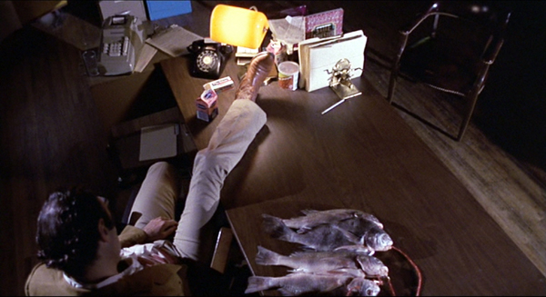
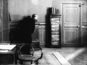
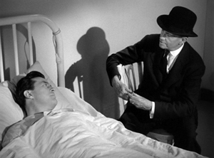
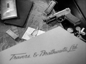
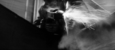
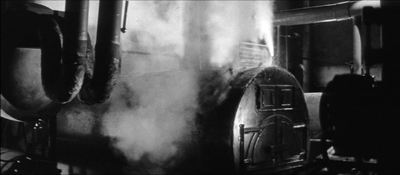
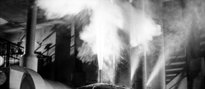
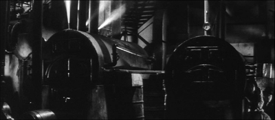
From the very start of Ministry of Fear (1944), the visual field comes alive with pouches, crannies, and bolt-holes. The first image of the film is a clock, but when the credits end the camera pulls back and tucks it into the corner as the asylum superintendant enters. (The shot is at the end of today’s entry.) Here and elsewhere, Lang uses slight high angles to create diagonals and corner-based compositions.
In the course of the film, pistols circulate. Neale lifts one from Mrs. Bellane (strongly primed, upper left), keeps her from appropriating it (lower center), and secures it nuzzling his left knee (lower right).
Later, Neale’s POV primes the placement of a pistol on the desktop (naturally, off-center), so that we’re trained to spot it in a more distant shot, perilously close to the hand of the treacherous Willi.
Amid so many through-composed frames, an abrupt reframing calls us to attention. Unlike Hawks and Walker’s handling of Walter in His Girl Friday, Lang and his DP Henry Sharp (great name for a DP, like Theodore Sparkuhl and Frank Planer) gives things a sharp snap when Willi raises his hand.
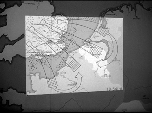
Lang drew all his images in advance himself, not trusting the task to a storyboarder. Avoiding the flashy deep-focus of Wyler and company, he created a sober pictorial flow that can calmly swirl information into any area of the frame. It’s hard not to see the stolen attack maps, surmounting today’s entry, as laying bare Lang’s centripetal vectors of movement. No wonder in the second frame up top, as Willi and Neale struggle in a wrenching diagonal mimicking the map’s arrows, that damn pistol strays off on its own.
Sometimes film technology improves over time. For instance, digital cinema today is better in many respects than it was in 1999. But not all changes are for the better. The arrival of widescreen cinema was also a loss. Changing the proportions of the frame blocked some of the creative options that had been explored in the 4:3 format. Occasionally, those options could be modified for CinemaScope and other wide-image formats; I trace some examples in this video lecture. But the open-sided framings in most widescreen films today suggest that most filmmakers haven’t explored the wide format to the degree that classical directors did with the squarish one.
More generally, it’s worth remembering that the film frame is a basic tool, creating not only a window on a three-dimensional scene but also a two-dimensional surface that requires composition–either standardized or more novel. Instead of being a dead-on target, the center can be an axis around which pictorial forces push and pull, drift away and bounce around. After all, we’re talking about moving pictures.
Thanks to Paul Rayton, movie tech guru, for information on 16mm cropping.
My image of the safe areas and the second quotation about them is taken from American Cinematographer Manual 1st ed., ed. Joseph C. Mascelli (Hollywood: ASC, 1960), 329-331. The older quotation about cropping for television comes from American Cinematographer Handbook and Reference Guide 7th ed., ed. Jackson J. Rose (Hollywood: ASC, 1950), 210.
I hope you noticed that I admirably refrained from quoting Lang, who famously said that CinemaScope was good only for…well, you can finish it. Of course he says it in Godard’s Contempt (1963), but he told Peter Bogdanovich that he agreed.
[In ‘Scope] it was very hard to show somebody standing at a table, because either you couldn’t show the table or the person had to be back too far. And you had empty spaces on both sides which you had to fill with something. When you have two people you can fill it up with walking around, taking something someplace, so on. But when you have only one person, there’s a big head and right and left you have nothing (Who the Devil Made It (Knopf, 1997), 224).
For more on the stylistics and technology of depth in 1940s American film, see The Classical Hollywood Cinema: Film Style and Mode of Production to 1960 (Columbia University Press, 1985), which Kristin and I wrote with Janet Staiger, Chapter 27, and my On the History of Film Style (Harvard University Press, 1997), Chapter 6. Many blog entries on this site are relevant to today’s post; search “deep-focus cinematography” and “depth staging.” If you want just one for a quick summary, try “Problems, problems: Wyler’s workarounds.” Some of the issues discussed here, about densely packing the frame, are considered more generally in “You are my density,” which includes an analysis of a scene in Lang’s Hangmen Also Die (1943).
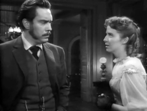
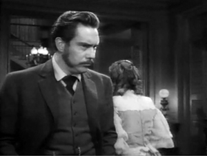
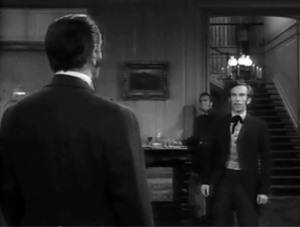
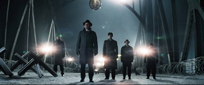
Ministry of Fear (1944).
Oscar’s siren song 2: Jeff Smith on the music nominations
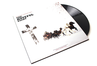
The Hateful Eight (2015).
DB here: Jeff Smith, our collaborator on the new edition of Film Art, is an expert on film sound. He has written earlier entries on Atmos and Trumbo.
The Academy Awards ceremony is upon us. Once again this year, I offer an overview of the two music categories: Best Original Song and Best Original Score. For the songs and some score cues I’ve provided links, so you can listen as you read.
This year’s nominees showcase music written in an array of musical styles for a wide range of narrative contexts. The composers and songwriters recognized for their work include some newcomers, some savvy veterans, and a pair of legends who have helped to define the modern film score.
As always, this preview is offered for non-sporting purposes. Anyone seeking insights for wagers or even the office Oscar pool is duly cautioned that they assume their own financial risks for any information they use. And since I was only half-right with last year’s prognostications, you might seek predictions from insiders at Variety and Entertainment Weekly.
Diversity in numbers: Best Original Song
Fifty Shades of Grey (2015).
When the Oscars were announced a few weeks ago, they made headlines for all the wrong reasons. Noting the lack of racial diversity among the acting nominees, social media exploded, creating #OscarsSoWhite as a popular Twitter handle to draw attention to the situation. After a cacophony of tweets and retweets, several celebrities weighed in. Will Smith and others suggested that they planned to boycott the ceremonies.
The nominees for Best Original Song, though, are a pretty significant exception to the OscarsSoWhite meme. Both the performers of these five songs and the topics they address reveal that Oscar voters haven’t entirely ignored the fact that films can be a force for social change.
The Weeknd’s breakout year on the pop charts has continued with an Oscar nomination for “Earned It” from Universal’s hit of last spring, Fifty Shades of Grey. The Weeknd’s “Can’t Feel My Face” has enlivened playlists all year long, but “Earned It” is a slow-burn soul ballad that accompanies Christian and Anastasia’s ride home after his mother interrupts their morning tryst. The song was co-written by the Weeknd, Belly, Jason “Daheala” Quenneville, and Stephan Moccio, and features a simple two-chord pattern on the piano that eventually builds toward a more harmonically adventurous string passage. According to Moccio, the song was intended to reflect a male perspective, hinting at the darkness lurking underneath Christian’s sexual peccadillos.
The Weeknd, Quenneville, and Belly are all Canadian. But considering that the Weeknd and Quenneville are of African descent and that Belly is of Palestinian heritage, their nomination offers a modest riposte to the criticism leveled at the Oscars for their lack of racial diversity. However, since their song appears in one of the more critically reviled films to receive a nomination, it seems unlikely that “Earned It” will take home the prize next Sunday.
Tuning up nonfiction films: Nominated songs from docs

Racing Extinction (2015).
Two other nominations come from recent documentary films, continuing a trend begun with last year’s nod to Glen Campbell: I’ll Be Me. The first is for J. Ralph and Antony Hegarty’s “Manta Ray” from Racing Extinction, which examines the threat man poses to the survival of several bird species, amphibians, and marine animals.
Hegarty is only the second openly transgender person to receive a nomination, a quite pleasant surprise for fans of her work as a singer and songwriter. Hegarty initially made a splash in 2000 with the release of her band’s debut album, Antony and the Johnsons. Her breakthrough, though, came with the 2005 release I Am a Bird Now, which topped several critics’ year-end lists and won Britain’s prestigious Mercury Prize.
“Manta Ray” is a delicate waltz based upon a central theme from J. Ralph’s score for Racing Extinction. Although the song itself appears only over the closing credits, Ralph’s theme threads through the film, introduced during a key scene when a member of the filmmaking team removes a hook and fishing line from a manta ray’s dorsal fin. After the SARS outbreak in the early 2000s, commercial fishermen increasingly targeted manta rays since their gills were thought to have curative powers among practitioners of Chinese folk medicine.
Anchored by her soft, tremulous voice, Hegarty’s music has always exuded sensitivity and melancholy in almost equal measure. With Hegarty’s ethereal tones floating over Ralph’s simple piano accompaniment, “Manta Ray” not only captures the animal’s grace and beauty, but also hints at the tragedy of their steady decline.
Racing Extinction is not Hegarty’s first brush with Hollywood. Previously, her music was featured in James McTeigue’s V for Vendetta and in Todd Haynes’s I’m Not There. But given all the media attention to the Oscars, Sunday night will offer Hegarty a much bigger stage and a chance for the world to see her extraordinary gifts.
The other nominated song from a documentary is “Til It Happens to You,” which was written for Kirby Dick’s searing documentary on campus rape, The Hunting Ground. The film not only exposes college administrators’ efforts to cover up incidents of sexual assault, but also shows how two University of North Carolina rape survivors used Title IX legislation to draw attention to the problem.
“Til It Happens to You” brought Lady Gaga her first nomination and Diane Warren her eighth. Beyond the sheer star power brought by the pair, Gaga and Warren both have discussed their own experience as rape victims.
According to Variety, Gaga worried that the gravity of the film’s subject matter might not square with her outlandish diva persona: “I was very concerned that people would not take me seriously or that I would somehow add a stigma to it.” But her concerns appear to be unfounded. Warren reports that other survivors have reached out to her saying that the song and film is “making people feel less alone.”
Some of this reaction undoubtedly derives from the emotional gut punch delivered by the song’s lyrics. They not only describe the feelings of devastation felt by rape victims. They also express the difficulty of dealing with unfeeling bureaucrats and callous peers. The refrain of “Til It Happens to You” conveys the sense of isolation created by others’ inability to fully know what it’s like to walk in the victim’s shoes.
Licensed to Trill: The Spectre of Youth
Spectre (2015).
Jimmy Napes and Sam Smith’s “Writing’s On the Wall” from Spectre adds another notch to James Bond’s gunbelt. Four previous Bond films have received nominations for Best Original Song. And in 2013, British chanteuse Adele took home a golden statuette for the title track of Skyfall.
For me, the piece is well crafted, but falls somewhere in the middle of the Bond music pantheon. Not quite the peaks of Shirley Bassey’s “Goldfinger” or Paul McCartney’s “Live and Let Die.” But also not the dregs of Rita Coolidge’s “All-Time High” or A-ha’s “The Living Daylights.” “Writing’s On the Wall” is vaguely Bond-ish in much the same way that Smith’s smash hit, “Stay With Me,” contained strong echoes of Tom Petty’s “I Won’t Back Down.”
The last nominee is “Simple Song #3” from Youth. Of all the nominees, David Lang’s piece is the one most firmly integrated into the film’s narrative. “Simple Song #3” is featured at the end of Youth, performed onscreen by singer Sumi Jo, violinist Viktoria Mullova, and the BBC Concert Orchestra.
The song is a classic “Adagio” structured around a repeated descending string figure. Gradually, other instruments are added, creating patterns of shifting harmony that surge beneath Jo’s vocal line.
Although “Simple Song #3” doesn’t appear till the end, the song is mentioned at several earlier moments as the work of the film’s protagonist, Fred Ballinger (Michael Caine). Ballinger is a retired composer and conductor lured back to the stage by an invitation from the Queen to perform for Prince Philip’s birthday. According to Lang, the piece offers a window into Ballinger’s psychology. It balances both the aspirations of his youth with the melancholy of a life lived apart from the woman he loved.
Placed in the film’s climax, Ballinger’s work provides an emotional capstone that operates at several levels. Given the complexity of its narrative function, “Simple Song #3” is not so simple.
Prediction: As a longtime Antony and the Johnsons fan, I would be delighted to see Hegarty and Ralph making their acceptance speech on Sunday night. But it seems to be Lady Gaga’s year so far. After winning a Golden Globe for her work on American Horror Story: Hotel, singing the national anthem at the Super Bowl, and performing a tribute to David Bowie at the Grammys, Gaga will cap off a stellar start to the new year by walking home with Oscar on her arm. It will also provide career recognition to Diane Warren, whose music has graced more than 200 different films and television shows. After last year’s disappointment, Warren finally will get the opportunity to be forever “Grateful.”
Old White Men and Even Older White Men: Best Original Score
Sicario (2015).
The nominees for Best Original Score are a group of seasoned craftsmen who collectively have received more than seventy Oscar nominations and have written music for more than seven hundred feature films. At age 46, Jóhann Jóhannsson is the youngster of the group. Carter Burwell and Thomas Newman both turned sixty late last year. And John Williams and Ennio Morricone are both octogenarians.
Jóhannsson is nominated for his score for Denis Villeneuve’s drug war thriller Sicario. The Icelandic composer received a nod last year for The Theory of Everying, but lost out to Alexandre Desplat’s charming Euro-pudding score for The Grand Budapest Hotel.
The score for Sicario, though, couldn’t be more different than that for The Theory of Everything. Where Everything’s music was lilting and lyrical, Sicario’s is tense and ominous, emphasizing rhythm, timbre, and texture over more conventional structures of melody and harmony. Several cues are organized around pounding drum patterns punctuated by sustained, dissonant blasts of strings and low brass. In an interview, Jóhannsson recalled, “I think the the percussion came first, and then I started to weave the orchestra into it. Very early on I decided to focus on the low end of the spectrum—focus on basses, contrabasses, low woodwinds, contrabassoon, contrabass clarinets and contrabass saxophone.”
Other cues also emphasize percussive textures, but with the instrument sounds processed so that they sound driven to the point of distortion. Even a more restrained cue like “Melancholia” still maintains a quiet intensity, structured around a cyclic harmonic pattern played on acoustic guitar in a vaguely flamenco style. The score is brutally effective in capturing the mood of Sicario’s taut action scenes. In fact, for me, Jóhannsson’s score was, without question, the best thing in the film.
The Old Hands: Carter Burwell and Thomas Newman
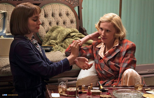
Carol (2015).
Carter Burwell received his first Oscar nomination this January for his score for Todd Haynes’ Carol. Burwell got his start on the Coen brothers’ debut, Blood Simple (1984), and has been a regular collaborator ever since. He has also worked regularly with a number of other filmmakers, such as Charlie Kaufman, Spike Jonze, and Bill Condon. Given the rather quirky and absurdist tone found in many of their projects, Burwell’s great gift is to provide music that emotionally grounds the characters, finding notes of lyricism, melancholy, and pathos in the strange stories of lovelorn puppeteers, sex researchers, and bumbling kidnappers.
For Carol, Burwell tried to capture the peculiar mixture of passion and distance that characterizes Therèse’s initial attraction to Carol. Because Carol comes across as both elegant and a bit aloof, Burwell not only utilized ambiguous harmonies, but also “cool” instruments, such as piano, clarinet, and vibes.
On his website, Burwell identifies three main musical themes in his score for Carol. The first is a love theme introduced in the film’s opening city scene. It presages the relationship even before we’ve been introduced to the characters. The second theme underscores Therèse’s fascination with Carol. Says Burwell, “This is basically a cloud of piano notes, not unlike the clouded glass through which Todd Haynes and Ed Lachman occasionally shoot the characters.” The third theme captures the characters’ sense of loss when they are separated. Knowing that Cate Blanchett and Rooney Mara would convey the characters’ pain in their performances, Burwell opted instead to use open harmonies (fourths, fifths, and ninths) to communicate their sense of emptiness.
Burwell orchestrated the music for chamber-size ensembles to maintain the sense of intimacy between the characters. Some cues feature as few as four instruments while others were performed by as many as 17 musicians.
Burwell’s spare, modest score is a departure from the style Haynes explored in his previous foray into this territory: his Douglas Sirk homage, Far From Heaven (2002). Elmer Bernstein’s score for that film was lush and emotionally expansive, aping Frank Skinner’s musical stylings in films like Magnificent Obsession (1954) and All That Heaven Allows (1955). Burwell wrote only 38 minutes of music. Yet it all is beautifully attuned to the film’s mood of quiet desperation.
Thomas Newman earned his thirteenth nomination for Bridge of Spies. (Insert Susan Lucci joke here.) Newman, of course, descends from film composing royalty as the son of the renowned classical Hollywood tuner, Alfred Newman. Yet, despite Newman the Younger’s distinguished career in Tinseltown, Newman the Younger has a long way to go to catch his pops. Alfred won nine Oscars and accrued more than forty nominations.
Newman’s music has graced some of the most beloved American films of the past three decades, such as The Shawshank Redemption, American Beauty, Finding Nemo, and Wall-E. Although he is known for his versatility, an NPR story on his score for Bridge of Spies notes that Newman has become known for passages that incorporate “quirky, layered piano writing and jagged string motifs.”
Newman and Spielberg save the score’s biggest moments for the film’s climax and epilogue. Indeed, more than half of the film’s score is backloaded into its last three cues, which together account for about 25 minutes of music. Displaying Newman’s full emotional range, “Glienicke Bridge” anxiously underscores the tense prisoner exchange that delivers Rudolf Abel back into Soviet hands. “Homecoming” features solo trumpet and oboe to convey James B. Donovan’s sense of validation now that his fellow commuters’ scowls of disapproval have turned to smiles of patriotic pride.
Newman’s score for Bridge of Spies is a very solid piece of work evincing the craft and refinement displayed by earlier masters like Jerry Goldsmith and John Barry. Yet the music’s modesty and conventionality make it the kind of score all too easy to overlook.
The Legends: John Williams and Ennio Morricone
Star Wars: The Force Awakens (2015).
Oddsmakers have tabbed our final two nominees, John Williams and Ennio Morricone, as the most likely to take home the big prize. The former is nominated for Star Wars: The Force Awakens, the seventh film in George Lucas’s series and the seventh scored by Williams. Coming 48 years after the composer’s Oscar win for the first Star Wars film, Williams’s music updates the neo-Romantic style he helped to revive in the 1970s. It also adds new themes for key new characters, such as Rey and Kylo Ren.
Williams wrote a massive amount of music for The Force Awakens. (Indeed, the 102-minute score is more than double that of Newman’s score for Bridge of Spies.) But very little of it simply replicates materials from the previous films. By Williams’s own count, only seven minutes of the score function as “obligatory” references to his own immediately recognizable themes.
As in his previous work, Williams shows enormous skill in juggling the various leitmotifs that are attached to the film’s dramatic personae, often moving a motif through different instrument combinations in order to vary the color and timbre of each cue. And Williams’s sure touch with this material undoubtedly enhances J.J. Abrams’ everything-old-is-new-again approach to The Force Awakens, a strategy that seems to have satisfied long-time fans, many of whom probably have dusty old compact discs of the composer’s earlier Star Wars scores.
The score for The Force Awakens earned Williams’s his fiftieth nomination and it is a fine addition to his already considerable oeuvre. Still, considering that Williams has won Oscars on five previous occasions and the been-there- done-that aspect of the enterprise, it is hard to believe that this score will bring the composer his sixth statuette. Thankfully for him, Williams’s reputation as one of the greatest composers to work in the film medium is already firmly secured.
That leaves just Ennio Morricone, the equally legendary Italian composer whose collaborations with Sergio Leone redefined the sound of the Western. Nearly fifty years after Morricone’s theme from The Good, the Bad, and the Ugly topped U.S. record charts, Morricone garnered his sixth Best Original Score nomination for Quentin Tarantino’s The Hateful Eight.
The film marked Morricone’s return to the genre after several decades of avoiding it. According to the composer, most directors who approached him simply wanted him to replicate the sound of his great Spaghetti Western scores. Morricone preferred to pursue projects that let him stretch in other directions.
Tarantino gave the Maestro a free hand in developing the score of The Hateful Eight, and Morricone responded with one of his best scores in decades. Aside from his characteristic use of vocal chants as rhythmic accents, the score for The Hateful Eight largely avoids the sort of psychedelic touches and extravagant tone colors found in his Spaghetti Western scores. Gone are the electric guitar, ocarina, whistles, and coyote yelps that established Morricone as a kind of musical meme. Substituted instead are much more conventional orchestral colors with the strings and wind sections taking prominent roles in The Hateful Eight.
Perhaps one reason for this move back to classical Hollywood convention is due to the hybrid qualities of Tarantino’s story. As Peter Debruge noted in his Variety review, The Hateful Eight is “a salty hothouse whodunit that owes as much to Agatha Christie as it does to Anthony Mann.” Morricone himself seems to concur. In an interview with Rolling Stone, the composer added, “Quentin Tarantino considers this film a Western; for me, this is not a Western. I wanted to do something that was totally different from any Western music I had composed in the past.”
Morricone’s score has a “theme and variations” structure that shows him adeptly changing his tempo, texture, and instrumentation to adapt his main theme to new dramatic contexts. His Overture provides the basic template for the score. The low strings and winds play a sustained minor chord that sneaks into the soundtrack. After a few seconds, the upper voices enter playing chords on the first and third beats of each measure to outline the basic harmonic progression of the main theme. Eventually an oboe will enter playing a repeated interval as a counterrhythm over the top of this pattern.
This gives way to the strings, which intone a serpentine diatonic melody that provides the spine for the rest of the cue. Gradually, Morricone introduces more instruments, such as vibes and brass, to vary the tone color and even adds a simple bridge section that consists of a series of soft, chromatically descending chords. After a brief restatement of the main melody, the cue finishes with a series of long sustained chords marked by shifting harmonies in the inner voices. The clarinet plays a fragment of the main theme before it eventually fades out. The cue never comes to the kind of climax that a traditional cadential structure would provide. Instead it simply unwinds itself.
The central theme is probably given its most elaborate treatment in the main title, “L’Ultima Diligenza di Red Rock – Version Integrale.” A steady timpani pulse and a sustained pitch in the strings provide a pedal tone against which a new melody is introduced in the contrabassoon’s low register. This musical figure has a serpentine quality like the other, and it has been written to function as counterpoint to its predecessor at later moments when the two will be interleaved. Morricone gradually introduces more instruments to thicken the texture and even adds brass and pizzicato accents as embroidery atop the main theme. A hi-hat cymbal adds some rhythmic variety to the basic pulse of the timpani.
After a brief detour into some transitional material, the main melody returns, but now played by strings, xylophone, and muted brass instruments. The main musical figure continues to be restated with new ideas simply piled on top. As the music grows in both volume and intensity, Morricone adds trills and furious agitato string runs to create a cacophonous, but organized musical chaos. The cue climaxes with the melody played fortissimo in octaves by the violin section, soaring toward a sudden and abrupt stop. After a short pause, the contrabassoon quietly returns to play a brief musical coda that eventually fades to silence.
Morricone has long been a master of this type of musical structure. He’ll start with a simple musical idea, but then adds different countermelodies or obbligatos to vary its mood and tone. The ongoing accretion of elements creates the effect of a long crescendo that eventually finds release in silence. (For an earlier example of this kind of technique, see his cue for “The Desert” on The Good, the Bad, and the Ugly soundtrack.)
Beyond its purely musical effectiveness, though, “L’Ultima Diligenza di Red Rock” exudes a roiling tumult that fittingly captures the sense of deception and distrust that will pervade Minnie’s Haberdashery. The musical mood remains mostly dark and ominous throughout, leavened only by the bright solo trumpet fanfare that underscores Sheriff Chris Mannix’s reading of Major Warren’s Lincoln letter.
Tarantino’s trust in the Maestro was amply rewarded. This is a score that no one but Morricone could produce. As was the case with Jóhann Jóhannsson’s score for Sicario, it seems to be the best thing about The Hateful Eight. Tarantino wanted a soundtrack album for one of his own films that he could proudly place alongside other Morricone albums in his collection. He got it and then some.
Prediction: The Maestro finally gets his due! Although Morricone received an honorary Oscar in 2007 for his “magnificent and multifaceted contributions to the art of film music,” none of his individual scores have received awards from the Academy. I expect that to change next Sunday night. In fact, betting odds put Morricone’s chances of winning an Oscar for Best Original Score at 1 to 5. That means that a five dollar bet will net you one dollar profit if you win. That is about as close to a sure thing as you are likely to find in the gambling world. And even I’m not dumb enough to buck that trend.
In truth, I would be happy to see any of these composers take home the Oscar. I’ve enjoyed their contributions to the art of film music for much of my adult life. But, for me, the only real question is this: How long will the standing ovation be as Ennio Morricone prepares to give his acceptance speech? I put the over/under at 65 seconds.
Variety offers overviews of the nominees for Best Original Song here and Best Original Score here. Both pieces include comments from the composers and songwriters competing for this year’s awards.
You can find interviews with nearly all of the nominees for Best Original Score: Morricone, Williams (here and here), Newman, and Johannsson. Carter Burwell’s notes on Carol can be found on his website.
Emilio Audissino’s book on John Williams offers a terrific overview of the composer’s career. For a study of Morricone’s compositional techniques and style, see Charles Leinberger’s monograph on The Good, the Bad, and the Ugly in Scarecrow Press’s series of Film Score Guides. My book The Sounds of Commerce includes a chapter on Morricone’s spaghetti western scores.
More on Morricone: The Maestro weighs in on the film scoring process in Composing for the Cinema: Theory and Practice of Music in Film, which is coauthored with Sergio Miceli. You can listen to the opening cue of the score for The Hateful Eight here.
P.S. 25 February 2016: Thanks to Peter Brandon for a correction concerning the Canadian identity of The Weeknd, Quenneville, and Belly.
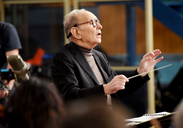
LONDON, ENGLAND – DECEMBER 08: Composer Ennio Morricone is seen during a Live Recording for the H8ful Eight Soundtrack at Abbey Road Studios on December 8, 2015 in London, England. (Photo by Kevin Mazur/Getty Images for Universal Music)
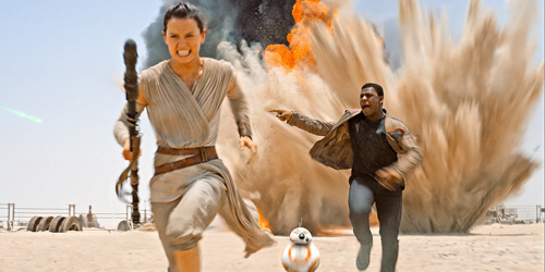
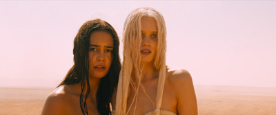
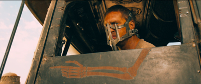
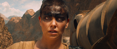
Off-center: MAD MAX’s headroom
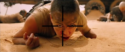
From Mad Max: Center Framed, by Vashi Nedomansky.
DB here:
If you’re a filmmaker, how do you frame the action you’re shooting? Put aside documentary shooting, which doesn’t allow you as many options as staged filming does. A lot of your compositional decisions depend on the aspect ratio of the image.
After the mid-1910s, filmmakers relied heavily on close views—framing typically two or three people, or even just one. These “portrait” framings were well-suited to the 4:3 format that was standardized in the silent era. But what happens when filmmakers must compose in wider frames, especially the 2.35:1 format that became common with CinemaScope?
Too much scope in ‘Scope?
In classic Western painting and other traditions as well, a horizontal format is associated with fairly distant views of groups or landscapes.

Early ‘Scope filmmakers did sometimes favor distant, spread-out ensemble staging, with greater or less depth. (Below: Island in the Sun; Bad Day at Black Rock.)
I try to track some of those early options in this online lecture.
But as technology improved, filmmakers managed to shoot medium- and close shots in the wide format. They “tamed” ‘Scope to a more traditional continuity. And as there were pressures toward “intensified continuity,” filmmakers adapted those tenets to ‘Scope. They gave us close-ups, fast cutting, and roaming camera movements within the widescreen array.
Like all solutions, this involved trade-offs. The 4:3 format was well-suited to the human body, and even a tight facial close-up could fill it fairly well. But a single or even a two-shot, in anamorphic widescreen, can leave a lot of the frame vacant or relatively unimportant.
Cinematographer Boris Kaufman objected to the extra real estate. In traditional arts, the design should fit snugly into the format, with all areas contributing to the image’s effect:
The space within the frame should be entirely used up in composition.
But close views in widescreen typically leave a lot of dead space. If you put the figure in the center, that dead space can be on the sides.
The bilateral symmetry of Wes Anderson’s frames is achieved on the premise that the figure is facing straight out at the viewer, so Anderson has the problem of filling up the flanking areas.
Or the dead space can be bigger on one side of the frame than the other. In that case, the figure, even a close one, is placed off-center in the 2.35/2.40 frame. This can suggest that the object of attention is somewhere beyond the empty zone.
To avoid sheer dead space, you can try to settle something in the background. If it’s dramatically important, you can generate some nice compositional tension, in the manner of the wide-angle, deep-focus look of the 1940s.
So as with most creative options, making a choice involves (a) tradeoffs and (b) further choices, some of them fairly forced. Go with widescreen, and you have to fill the frame somehow. Make one choice, and you have some dead areas, but you can control the viewer’s attention. If you fill the areas with significant action, you need to find some dynamic compositions. But you divide the viewer’s attention. You now have to make people look where you want and when you want.
Cuts for composition
Now add in cutting. How do you cut widescreen shots together, say in a conversation scene?
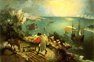
Go back to painting. Sometimes the most important item sits in the geometrical center of the picture format. Rudolf Arnheim points out that often the exact center is vacant and items are grouped around it. The result is a pictorial tension, with elements balanced, either symmetrically or in more complex patterns. In Bruegel’s Fall of Icarus, the major action is split–a dramatic splashdown, a world that doesn’t notice. The fall takes place somewhat off right of center, in a bright but far-offf area. It’s still almost indiscernible. The indifference of the peasants is given in the very composition of the image.
So too with cinema. In a single image, when the main point of interest isn’t dead center, there can be either symmetry, or important items grouped around the center.
Going beyond the single image, we find that editing can create a fairly gentle seesawing around the central area. A common tactic is shot/ reverse-shot, with over-the-shoulder framings. In widescreen, that option tends to make the center fairly empty.

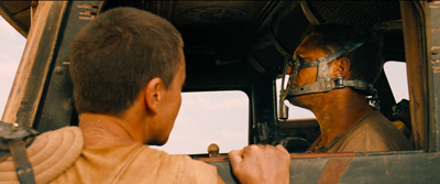
Or you can try “compensatory” shot/ reverse-shot cutting, so that the empty area of the first shot is filled by the corresponding figure or action in the next shot.
This second isn’t a bad solution, since the two shots together satisfy Kaufman’s dictum in a roundabout way. They become a “cinematic” way of filling the horizontal format, but in time rather than purely in space. And in this instance the main characters’ angled eye levels fit together snugly, in the upper center.
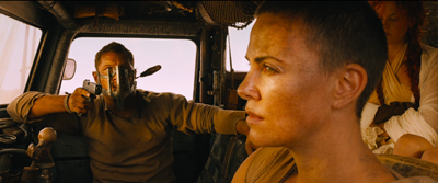
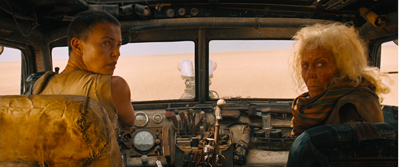
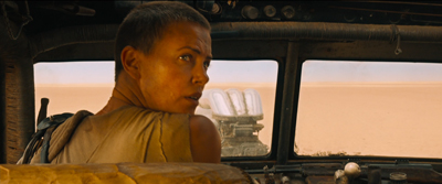
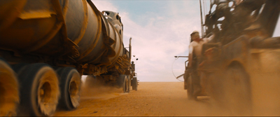
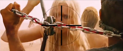
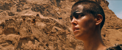
There can be a certain suspense added, as the second frame slowly fills up to reveal the item. When Furiosa looks off right, we cut to a shot of what’s caught her attention–an attack vehicle drawing into the frame on the right.
Assume, as most people do, that our attention fastens on certain aspects of the frame—typically those that attract us perceptually (brightness, movement, color, sound source, etc.) and that provide ongoing story information. So now you have to consider: How closely do you want your second shot to pick up on the crucial area of the first shot? That is, is the smoothest cut the one that starts the next shot with the viewer’s eye in the same part of the frame?
Some editors argue for this sort of continuity. “If the eye is led to one side of the screen,” notes one primer, “the action of character in the next shot might be located on that side also. Again, the purpose of the cut is to allow the eye to follow the movement.”
We’re back with our old friend the guided saccades, the fast, jerky eye movements that sample our environment. We’ve seen saccades at work in a single shot, thanks to staging that guides our attention. (Go here for a first-pass analysis, here for the eye-tracking evidence.) What about the cuts? The research of psychologist Tim Smith suggests that many editors intuitively try to match the point of interest across cuts. This is especially evident in the default zone, the geometrical center.
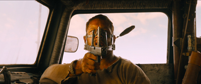
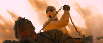
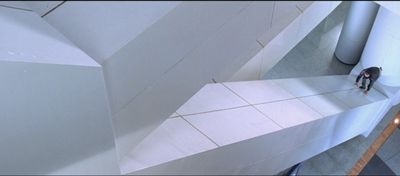
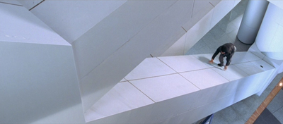
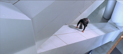
Keeping the viewer’s attention fastened on one area of the screen across the cut could be of great value in fast-cut action scenes. That way the viewer couldn’t miss the most important thing—a face, a gesture, a prop. This was the aim of George Miller in certain scenes of Mad Max: Fury Road. According to cinematographer John Seale, the centered compositions make it easier for the viewer to follow the action.
Your eye won’t have to shift…to find the next subject when you’ve only got 1.8 seconds of time to do that.
Vashi Nedomansky has created a striking video, complete with centered crosshairs, that shows the strictness of framing and composition during one action scene. Both long shots and fairly close ones are center-framed.
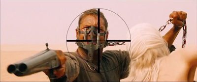
Vashi notes that Michael Bay and other directors seem to rely on fast cutting without due concern for where the viewer’s eye lands at the end of each shot. Combined with very short shots, compositional confusion can flummox us. We don’t know where we should be looking.
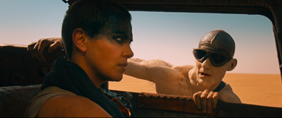
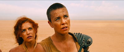
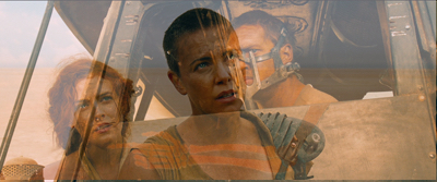
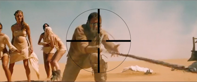
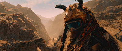
Miller uses a greater variety of compositions in other stretches of the film, as my illustrations above indicate. At times he applies his “matching zone system” to more off-center layouts. Furiosa is shown waiting for the biker gang to complete the deal, and she’s center framed.
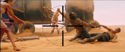
We cut to one biker surveying the scene. He (she?) is positioned off-center, so that we get a certain foreground/background dynamic between him (her?) and the truck far in the background. Now cut to Furiosa, who’s now in the same area of her frame; the empty space on the left seems to confirm what her eyeline suggested about the biker’s position above the canyon. (Interestingly, Miller slightly breaks the axis of action to get this smooth graphic cut.)
Still, you can argue that for fast-cut scenes it’s better to adopt a brute-force simplicity of composition, favoring the center. (While of course assuming that ordinary continuity principles, such as matching of movement, screen direction, eyelines, and so on, are obeyed.) Tim Smith’s experiments have shown that all other things being equal, our eyes drift to the center of the format from shot to shot–a point that Arnheim also makes about “the power of the center” in all images. This visual habit is challenged by so-called empty-center painting of the 1960s and 1970s, as seen in Kenneth Noland’s Shadow on the Earth and Larry Zox’s Decorah.
Mad Max: Fury Road seems to me a superbly directed film in its chosen style, but we can find alternatives. What about fast cutting that tries, as a part of an action scene’s kinetic drive, to shuttle or bounce the viewer’s attention more widely across the frame? This option wouldn’t be helter-skelter in the Bay manner; it’s calculated, and engenders its own pictorial excitement.
Not exactly a picture scroll, but kind of
We can find many examples in the Asian action tradition. Take for example one of the extended pursuits in Benny Chan’s New Police Story, a 2004 Jackie Chan vehicle. Jackie is clambering up along an angled beam of the Hong Kong Convention Center, and the framing puts him far to the right, emphasizing the distance and steepness of the climb.
As he scrambles up, he seems not to notice that his pistol falls out of his pocket. But we do, because it stands out against the pale cladding as it slides down to the bottom of the slope. Miller would have given us a separate, centered shot of this crucial action, but here it becomes an instance of that “gradation of emphasis” that widescreen encourages.
Before Jackie can hit frame center, there’s a cut that reverses the design of the first shot. A low angle puts him at the far left corner of the frame as he reaches the top. We never really see Jackie in the center of the frame in either shot.
The two shots are cut fast (about 3 seconds each), but there’s no problem grasping the action. Hong Kong filmmakers realized that you could cut long shots quickly if the composition and lines of movement were very clear. There is, it turns out, enough time for the eye to catch up to the main point of the composition, but it does ask us to exercise.
A more percussive cut comes when Frank, also unarmed, searches out Joe, the gang leader, in a toy department. A snap-movement of the kind HK filmmakers love shows an off-center empty slot; Frank pops in from screen right.

Cut to Joe stalking Frank, seen in another slot. It’s an optical POV shot, but it’s also off-center, balancing the composition of the first shot. A cut back to Frank closes the POV pattern. Perhaps the oscillation around the frame center can prime us for the next shot.
To get a sense of this “all-over” frame composition, have a look at this sequence from Yuen Kwai’s Ninja in the Dragon’s Den (1982). The combat swiftly passes from the center to the sides or to a corner. Thanks partly to the architecture of the cabin and the mill wheel, and partly to the judicious framing, there’s a sense that Kaufman might be satisfied that the space in the frame is “entirely used up”–not in a single shot, but in the totality of shots. (I’ve left in the English dubbing so subtitles don’t distract your eye.)
Hong Kong filmmakers mastered dynamic compositions during fights, but they were seldom as eccentric as their Japanese colleagues. Once anamorphic widescreen became common in Japan, directors pushed points of interest to frame edges and exploited unusual framing.
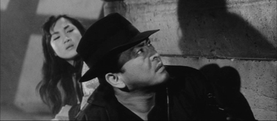
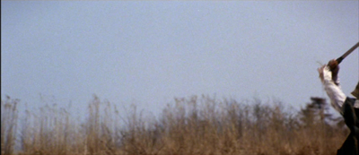
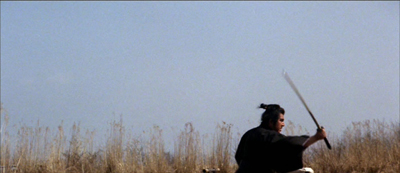
Consider the shootout at the climax of Suzuki Seijin’s Underworld Beauty (1958). A gang has trapped the protagonist Miyamoto and a young woman in a boiler room and is subjecting them to some heavy ordnance. In one series of shots, we see a gunman fire to the right, and as a result of his strafing, one boiler starts to blow.
The progression of boiler shots shifts us more or less rightward across the basement, and the empty area on the far left of shot 3 suggests that the gunman remains offscreen in the upper left. Now we get a sort of establishing shot showing the two boilers of shot 2 more fully.
I think we’re inclined to place the offscreen gunman still in the upper left. The spraying boiler we’ve seen is now on frame left. What’s surprising is that Miyamoto and the woman are crouching way down in the lower right corner. As you watch the shot, you might not notice them at first, but Suzuki has them change position after a moment so their movement attracts our eye. In addition, the shot is fairly prolonged as the boss calls out to his prey, so viewers have time to discover them. This is, I think you’ll agree, a pretty bold use of the anamorphic frame.
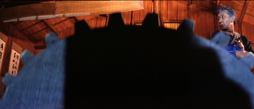
Once we’ve noticed them, how does Suzuki cut closer to the couple? Unpredictably.
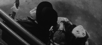
I feel a bump here every time I see it, because it’s hard to read the facial expressions from this angle. Instead, we get an almost abstract composition spread in a diagonal across the frame. Again, the geometrical center is less important than the shapes, edges, and tones that cross it.
At last we get something like an orthodox framing of the couple, eased by a match on action as the woman tips her head.
So the passage ends with a center-framed image. As often happens, decentering registers as an accent, a transitory departure from the baseline, the centered image. Not only will most action pass through the center, but we can be yanked to other regions in confidence that we’ll eventually return to it.
The shots in Underworld Beauty aren’t especially fast-cut, but I’ll close with another extract that is. This is the opening of Baby Cart at the River Styx (in the Lone Wolf and Cub series; dir. Misumi Kenji, 1972). Again, I’ve disabled the subtitles. (NB: Probably not best for children to see this.)
In a burst of shots, we get centered images, off-center ones, and radically off-center ones.
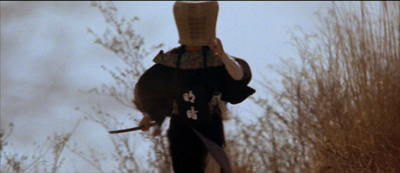
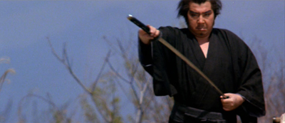
Continuity rules are respected and the camera is angled properly; but the compositions bounce from perfectly readable to perversely indiscernible. Some shots keep us in suspense about what’s about to happen, yet at no point is the action unclear. Again, the impact comes partly from simply composed, but highly varied, images.
George Miller’s strict target-framing is very powerful, but there are other options, even in fast-cut sequences. The idea of leading our attention across areas of the screen goes back to Eisenstein, the theorist-director who enjoyed zigzag graphic designs and the pictorial clatter created by a cut. One lesson: Every bit of the frame can be used, if only to jolt the viewer’s eye. All the action on the screen isn’t just in the story.
My quotation from Boris Kaufman is taken from Edward L. de Laurot and Jonas Mekas, “An Interview With Boris Kaufman,” Film Culture 1, no. 4 (Summer 1955): 5. The quotation about matching screen zones comes from Steven E. Browne, Video Editing: A Postproduction Primer, 3d ed. (Focal Press, 1997), 147. Bruce Block discusses “affinity continuums” from shot to shot in Chapter 7 of The Visual Story: Seeing the Structure of Film, TV and New Media, 2d ed. (Focal Press, 2013).
The Rudolf Arnheim book I’ve mentioned is The Power of the Center: A Study of Composition in the Visual Arts: The New Version (University of California Press, 1988). “Empty-center” painting is discussed by Thomas B. Hess in the essay of that title in New York (2 April 1973), 64-65 and in “Olitsky without Flattery,” New York (1 October 1973), 76-77. Hess describes paintings in which “the picture plane is stretched like a trampoline, with lots of spring action at its quivering edges.”
Tim Smith’s eye-tracking research is relevant to the framing principles I’ve been considering. Although he has yet to consider the more complicated cases of dispersed points of attention, he has found strong evidence that the default area remains the geometrical center of the screen. See his “Watching You Watch Movies: Using Eye Tracking to Inform Cognitive Film Theory,” in Psychocinematics: Exploring Cognition at the Movies, ed. Arthur P. Shimamura (Oxford, 22013), 170-171; the relevant video, with a heatmap of viewers’ attention, is here. Tim’s website is full of other examples from his research. Thanks to Tim for correspondence on this point.
Thanks also to Patrick Keating for email discussion of some of these matters.
I discuss principles of early widescreen shooting and staging in the online chapter “CinemaScope: The Modern Miracle You See Without Glasses.” See also the video lecture of the same name. For another example of radical decentering during a fast-cut combat, though put to different uses than in the Japanese examples here, see my entry on a King Hu jump cut.
Incidentally, we might wonder whether the centered compositions in Mad Max: Fury Road aren’t also acknowledging that on some displays (cable, streaming, airlines) these images will be cropped. To put important material too close to the frame edge risks losing it on downstream platforms. See “Filling the Box: The Never-Ending Pan-and-Scan Story.”
Ninja in the Dragon’s Den.
P.S. 1 March 2016: There’s a sequel to this entry here.