Off-center 2: This one in the corner pocket
Tuesday | March 1, 2016 open printable version
DB here, again:
We got a keen response to my entry on widescreen composition in Mad Max: Fury Road. Thanks! So it seemed worthwhile to look at composition in the older format of 4:3, good old 1.33:1–or rather, in sound cinema, 1.37: 1.
The problem for filmmakers in CinemaScope and other very wide processes is handling human bodies in conversations and other encounters (such as stomping somebody’s butt in an an action scene). You can more or less center the figures, and have all that extra space wasted. Or you can find ways to spread them out across the frame, which can lead to problems of guiding the viewer’s eye to the main points. If humans were lizards or Chevy Impalas, our bodies would fit the frame nicely, but as mostly vertical creatures, we aren’t well suited for the wide format. I suppose that’s why a lot of painted and photographed portraits are vertical.
By contrast, the squarer 4:3 frame is pretty well-suited to the human body. Since feet and legs aren’t usually as expressive as the upper part of the body, you can exclude the lower reaches and fit the rest of the torso snugly into the rectangle. That way you can get a lot of mileage out of faces, hands and arms. The classic filmmakers, I think, found ingenious ways to quietly and gracefully fill the frame while letting the actors act with body parts.
Since I’m watching (and rewatching) a fair number of Forties films these days, I’ll draw most of my examples from them. after a brief glance backward. I hope to suggest some creative choices that filmmakers might consider today, even though nearly everybody works in ratios wider than 4:3. I’ll also remind us that although the central area of the frame remains crucial, shifts away from it and back to it can yield a powerful pictorial dynamism.
Movies on the margins
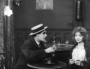
Early years of silent cinema often featured bright, edge-to-edge imagery, and occasionally filmmakers put important story elements on the sides or in the corners. Louis Feuillade wasn’t hesitant about yanking our attention to an upper corner when a bell summons Moche in Fantômas (1913). A famous scene in Musketeers of Pig Alley (1912) shows Griffith trying something trickier. He divides our attention by having the Snapper Kid’s puff of cigarette smoke burst into the frame just as the rival gangster is doping the Little Lady’s drink. She doesn’t notice either event, as she’s distracted by the picture the thug has shown her, but there’s a chance we miss the doping because of the abrupt entry of the smoke.
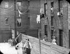
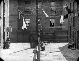
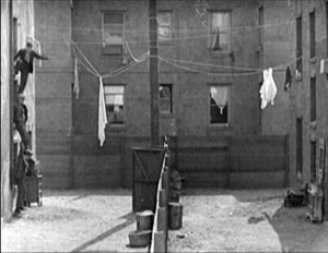
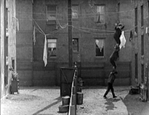
In Keaton’s maniacally geometrical Neighbors (1920), the backyard scenes make bold (and hilarious) use of the upper zones. Buster and the woman he loves try to communicate three floors up. Early on we see him leaning on the fence pining for her, while she stands on the balcony in the upper right. Later, he’ll escape from her house on a clothesline stretched across the yard. At the climax, he stacks up two friends to carry him up to her window.
Thankfully, the Keaton set from Masters of Cinema preserves some of the full original frames, complete with the curved corners seen up top. It’s also important to appreciate that in those days there was no reflex viewing, and so the DP couldn’t see exactly what the lens was getting. Framing these complex compositions required delicate judgment and plenty of experience.
Later filmmakers mostly stayed away from corners and edges. You couldn’t be sure that things put there would register on different image platforms. When films were destined chiefly for theatres, you couldn’t be absolutely sure that local screens would be masked correctly. Many projectors had a hot spot as well, rendering off-center items less bright. And any film transferred to 16mm (a strong market from the 1920s on) might be cropped somewhat. Accordingly, one trend in 1920s and 1930s cinematography was to darken the sides and edges a bit, acknowledging that the brighter central zone was more worth concentrating on.
That tactic came in handy with the emergence of television, which established a “safe area” within the film frame for video transmission. TV cropped films quite considerably; cinematographers were advised in 1950 that
All main action should be held within about two-thirds of the picture. This prevents cut-off and tube edge distortion in television home receivers.
Older readers will remember how small and bulging those early CRT screens were.
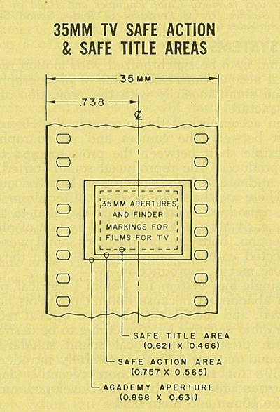
By 1960, when it was evident that most films would eventually appear on TV, DP’s and engineers established the “safe areas” for both titles and story action. (See diagram surmounting this section.) Within the camera’s aperture area, which wouldn’t be fully shown on screen, the safe action area determined what would be seen in 35mm projection. “All significant action should take place within this portion of the frame,” says the American Cinematographer Manual.
Studio contracts required that TV screenings had to retain all credit titles, without chopping off anything. This is why credit sequences of widescreen films appear in widescreen even in cropped prints. So the safe title area was marked as what would be seen on a standard home TV monitor. If you do the math, the safe title area is indeed 67.7 % of the safe action area.
These framing constraints, etched on camera viewfinders, would certainly inhibit filmmakers from framing on the edges or the corners of the film shot. And when we see video versions of films from the 1.37 era (and frames like mine coming up) we have to recall that there was a bit more all around the edges than we have now.
All-over framing, and acting
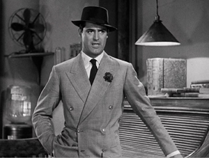
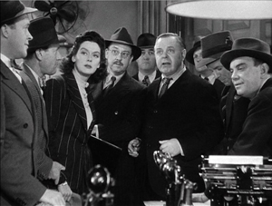
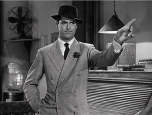
Yet before TV, filmmakers in the 40s did exploit off-center zones in various ways. Often the tactic involved actors’ hands–crucial performance tools that become compositional factors. In His Girl Friday (1940), Walter Burns commands his frame centrally, yet when he makes his imperious gesture (“Get out!”) Hawks and DP Joseph Walker (genius) have left just enough room for the left arm to strike a new diagonal.
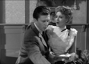
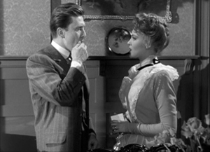
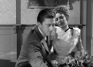
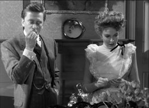
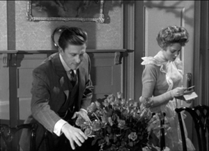
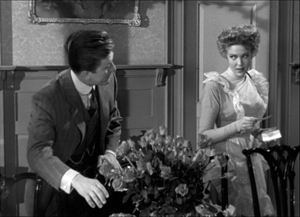
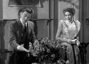
The framing of a long take in The Walls of Jericho (1948) lets Kirk Douglas steal a scene from Linda Darnell. As she pumps him for information, his hand sneaks out of frame to snatch bits of food from the buffet.
As the camera backs up, John Stahl and Arthur Miller (another genius) give us a chance to watch Kirk’s fingers hovering over the buffet. When Linda stops him with a frown, he shrugs, so to speak, with his hands. (A nice little piece of hand jive.)
The urge to work off-center is still more evident in films that exploit vigorous depth staging and deep-focus cinematography. Dynamic depth was a hallmark of 1940s American studio cinematography. If you’re going to have a strong foreground, you will probably put that element off to one side and balance it with something further back. This tendency is likely to empty out the geometrical center of the shot, especially if only two characters are involved. In addition, 1940s depth techniques often relied on high or low angles, and these framings are likely to make corner areas more significant. Here are examples from My Foolish Heart (1950): a big-head foreground typical of the period, and a slightly high angle that yields a diagonal composition.
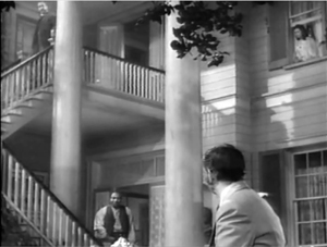
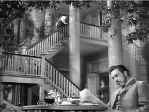
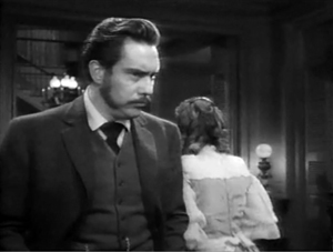
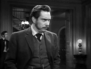
Things can get pretty baroque. For Another Part of the Forest (1948), a prequel to The Little Foxes (1941), Michael Gordon carried Wyler’s depth style somewhat further. The Hubbard mansion has a huge terrace and a big parlor. Using the very top and very bottom of the frame, a sort of Advent-calendar framing allows Gordon to chart Ben’s hostile takeover of the household, replacing the patriarch Marcus at the climax. The fearsome Regina appears in the upper right window of the first frame, the lower doorway of the second.
In group scenes, several Forties directors like to crowd in faces, arms, and hands, all spread out in depth. I’ve analyzed this tendency in Panic in the Streets (1950), but we see it in Another Part of the Forest too. Again, character movement can reveal peripheral elements of the drama.
At the dinner, Birdie innocently thanks Ben for trying to help her family with their money problems and bolts from the room, going out behind Ben’s back. The reframing brings in at the left margin a minor character, a musician hired to entertain for the evening. But in a later phase of the scene he will–still in the distance–protest Marcus’s cruelty, so this shot primes him for his future role.
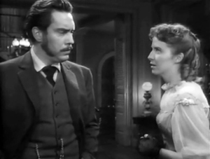
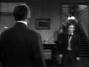
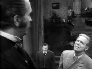
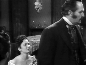
At one high point, the center area is emptied out boldly and the corners get a real workout. On the staircase, the callow son Oscar begs Marcus for money to enable him to run off with his girlfriend. (As in Little Foxes, the family staircase is very important–as it is in Lillian Hellman’s original plays.) Ben watches warily from the bottom frame edge. Nobody occupies the geomentrical center.
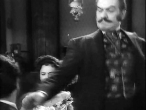
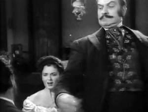
Later, on the same staircase, Ben steps up to confront his father while Regina approaches. It’s an odd confrontation, though, because Ben is perched in the left corner, mostly turned from us and handily edge-lit. Marcus turns, jammed into the upper right. Goaded by Ben’s taunts, he slaps Ben hard. Here’s the brief extract.
The key action takes place on the fringes of the frame, while the lower center is saved for Regina’s reaction–for once, a more or less normal human one. Even allowing for the cropping induced by the video safe-title area, this is pretty intense staging.
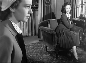
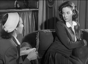
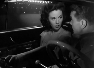
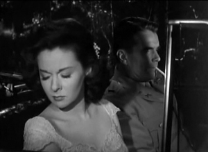
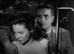
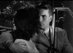
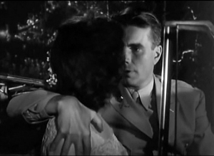
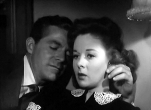
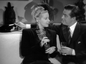
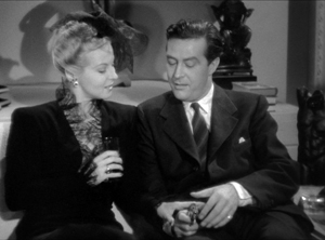
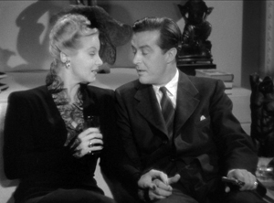
The corners can be activated in less flagrant ways. Take this scene from My Foolish Heart. Eloise has learned that her lover has been killed in air maneuvers. Pregnant but unmarried, she goes to a dance, where an old flame, Lew asks her to go on a drive. They park by the ocean, and she succumbs to him. Here’s the sequence as directed by Mark Robson and shot by Lee Garmes (another genius).
In the fairly conventional shot/ reverse-shot, the lower left corner is primed by Eloise’s looking down at the water and Lew’s hand stealing around her.
Later, when Lew pulls her close, (a) we can’t see her; (b) his expression doesn’t change and is only partly visible; so that (c) his emotion is registered by the passionate twist of his grip on her shoulder. Lew’s hand comes out from the corner pocket.
Perhaps Eloise is recalling another piece of hand jive, this time from her lost love.
For many directors, then, every zone of the screen could be used, thanks to the good old 4:3 ratio. It’s body-friendly, human-sized, and can be packed with action, big or small.
Mabuse directs
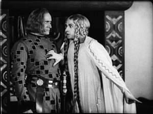
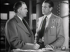
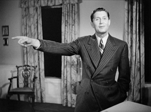
In other entries (here and here) I’ve mentioned one of the supreme masters of off-center framing, Fritz Lang. Superimpose these two frames and watch Kriemhilde point to the atomic apple in Cloak and Dagger (1946).
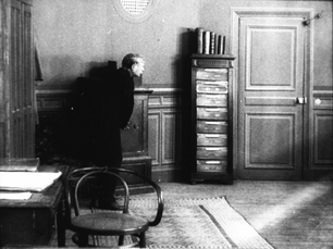
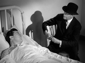
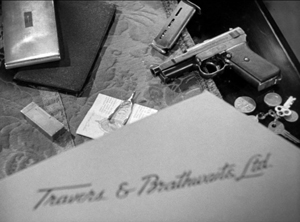
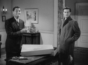
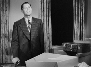
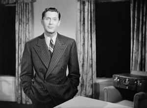
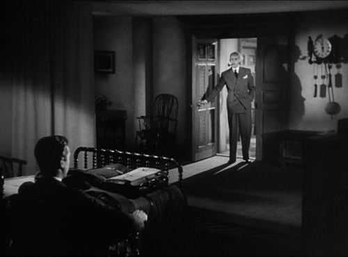
From the very start of Ministry of Fear (1944), the visual field comes alive with pouches, crannies, and bolt-holes. The first image of the film is a clock, but when the credits end the camera pulls back and tucks it into the corner as the asylum superintendant enters. (The shot is at the end of today’s entry.) Here and elsewhere, Lang uses slight high angles to create diagonals and corner-based compositions.
In the course of the film, pistols circulate. Neale lifts one from Mrs. Bellane (strongly primed, upper left), keeps her from appropriating it (lower center), and secures it nuzzling his left knee (lower right).
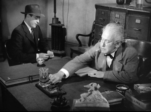
Later, Neale’s POV primes the placement of a pistol on the desktop (naturally, off-center), so that we’re trained to spot it in a more distant shot, perilously close to the hand of the treacherous Willi.
Amid so many through-composed frames, an abrupt reframing calls us to attention. Unlike Hawks and Walker’s handling of Walter in His Girl Friday, Lang and his DP Henry Sharp (great name for a DP, like Theodore Sparkuhl and Frank Planer) gives things a sharp snap when Willi raises his hand.
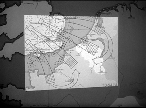
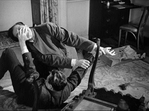
Lang drew all his images in advance himself, not trusting the task to a storyboarder. Avoiding the flashy deep-focus of Wyler and company, he created a sober pictorial flow that can calmly swirl information into any area of the frame. It’s hard not to see the stolen attack maps, surmounting today’s entry, as laying bare Lang’s centripetal vectors of movement. No wonder in the second frame up top, as Willi and Neale struggle in a wrenching diagonal mimicking the map’s arrows, that damn pistol strays off on its own.
Sometimes film technology improves over time. For instance, digital cinema today is better in many respects than it was in 1999. But not all changes are for the better. The arrival of widescreen cinema was also a loss. Changing the proportions of the frame blocked some of the creative options that had been explored in the 4:3 format. Occasionally, those options could be modified for CinemaScope and other wide-image formats; I trace some examples in this video lecture. But the open-sided framings in most widescreen films today suggest that most filmmakers haven’t explored the wide format to the degree that classical directors did with the squarish one.
More generally, it’s worth remembering that the film frame is a basic tool, creating not only a window on a three-dimensional scene but also a two-dimensional surface that requires composition–either standardized or more novel. Instead of being a dead-on target, the center can be an axis around which pictorial forces push and pull, drift away and bounce around. After all, we’re talking about moving pictures.
Thanks to Paul Rayton, movie tech guru, for information on 16mm cropping.
My image of the safe areas and the second quotation about them is taken from American Cinematographer Manual 1st ed., ed. Joseph C. Mascelli (Hollywood: ASC, 1960), 329-331. The older quotation about cropping for television comes from American Cinematographer Handbook and Reference Guide 7th ed., ed. Jackson J. Rose (Hollywood: ASC, 1950), 210.
I hope you noticed that I admirably refrained from quoting Lang, who famously said that CinemaScope was good only for…well, you can finish it. Of course he says it in Godard’s Contempt (1963), but he told Peter Bogdanovich that he agreed.
[In ‘Scope] it was very hard to show somebody standing at a table, because either you couldn’t show the table or the person had to be back too far. And you had empty spaces on both sides which you had to fill with something. When you have two people you can fill it up with walking around, taking something someplace, so on. But when you have only one person, there’s a big head and right and left you have nothing (Who the Devil Made It (Knopf, 1997), 224).
For more on the stylistics and technology of depth in 1940s American film, see The Classical Hollywood Cinema: Film Style and Mode of Production to 1960 (Columbia University Press, 1985), which Kristin and I wrote with Janet Staiger, Chapter 27, and my On the History of Film Style (Harvard University Press, 1997), Chapter 6. Many blog entries on this site are relevant to today’s post; search “deep-focus cinematography” and “depth staging.” If you want just one for a quick summary, try “Problems, problems: Wyler’s workarounds.” Some of the issues discussed here, about densely packing the frame, are considered more generally in “You are my density,” which includes an analysis of a scene in Lang’s Hangmen Also Die (1943).
Ministry of Fear (1944).


