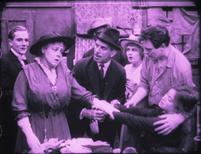
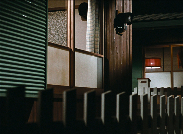
Archive for 2017
Three women of Cannes: A guest entry by Kelley Conway
Visages Villages (2017).
DB here:
Kelley Conway, friend and colleague here at Madison, has just made her first trip to the Cannes festival. All her adventures won’t fit on one entry, so she focuses this report on encounters with three outstanding women in French film culture: Agnès Varda, Laetitia Dosch, and Nathalie Coste-Cerdan. Kelley is the author of several books and articles on French film. Her recent book is on Varda, which we reviewed here. She wrote for us earlier this year on La La Land, and last year on French films at Vancouver.
Sneakers or heels?
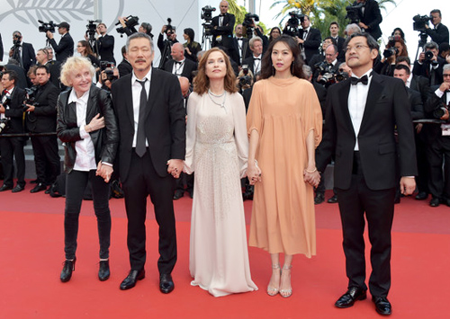
On the red carpet, Claire’s Camera creatives: Claire Denis, Hong Sangsoo, Isabelle Huppert, Kim Minheet, and Jeong Jinyoung.
The red carpet, replaced every day, is the epicenter. Standing on the edge, you’re mesmerized by the ritualized movement of humans across it. First, ordinary invitation-holders cross the carpet and move up the stairs and into the Grand Théâtre Lumière.
Once the mortals have taken their seats, the actors, directors, and L’Oréal models arrive. Women dressed in evening gowns pause and pose for the photographers while fans watch hungrily from beyond barriers and heavy security.
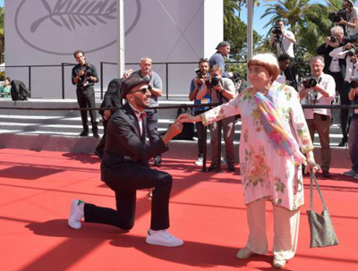
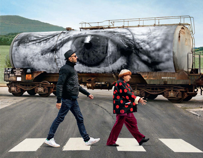
There are different styles of traversing the carpet. Dior-clad Rihanna took her time, striking vampy poses worthy of Theda Bara and apparently savoring every minute of the experience. No-nonsense legend Claire Denis moved briskly toward the stairs wearing a simple black pantsuit. Agnès Varda and JR, the photographer/muralist and co-director of Visages Villages, clowned it up.
Sometimes, in a gesture that is oddly moving, the director and actors who worked together on a film link arms, pose collectively, and stride the red carpet as one.
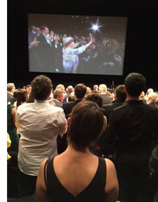 The videographers track the stars right into the theater. Once you get in and find a seat, you can follow other celebrities’ carpet progress thanks to a live feed. We watch them sit down and then we stand up, treating them to a standing ovation before and after the projection.
The whole thing seemed a little overwrought and absurd until I saw tears in eyes of Hong Sang-soo, Agnès Varda, and Laetitia Dosch, an actress you will soon adore. Cannes is a huge promotional machine and a herculean feat of event management, but flashes of humanity shine through.
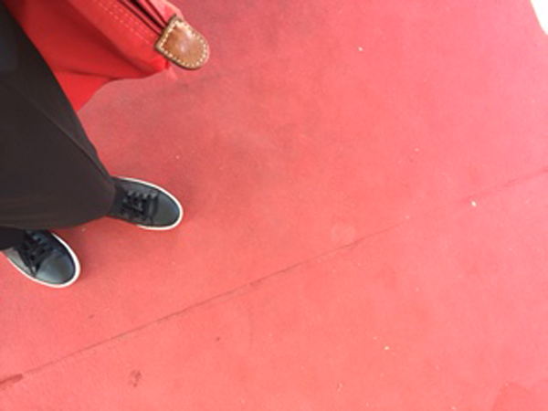
Even bystanders are subject to a dress code. For afternoon screenings, I was allowed to wear my sneakers. For the evening screenings of the films in competition, heels are de rigueur for women. Men are allowed to retain their sneakers, but I set aside this injustice and contemplate other elements of the Cannes experience.
The mise-en-scène of women on the red carpet can make Cannes appear fatally retrograde; one must look to the screen and behind the scenes for evidence of the modern woman. Let’s take a look at three women (and there are many more, of course) who deserve a kind of scrutiny that exceeds the red carpet défilé: Agnès Varda, Laetitia Dosch, and Nathalie Coste-Cerdan. What have these women, a director, an actress, and an educational executive, contributed to Cannes?
The Director: Through the Eyes of Varda and JR in Visages Villages
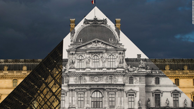
Visages Villages, which just won the Golden Eye Documentary prize at Cannes, is ostensibly a portrait of several small French villages. But it’s mainly a chronicle of a journey, an artistic collaboration, and a friendship between 30-something JR and 80-something Agnès Varda. JR is the hugely talented street artist and Instagram sensation, well known for his photographs and installations, notably his transformation of I.M. Pei’s glass pyramid at the Louvre in 2015.
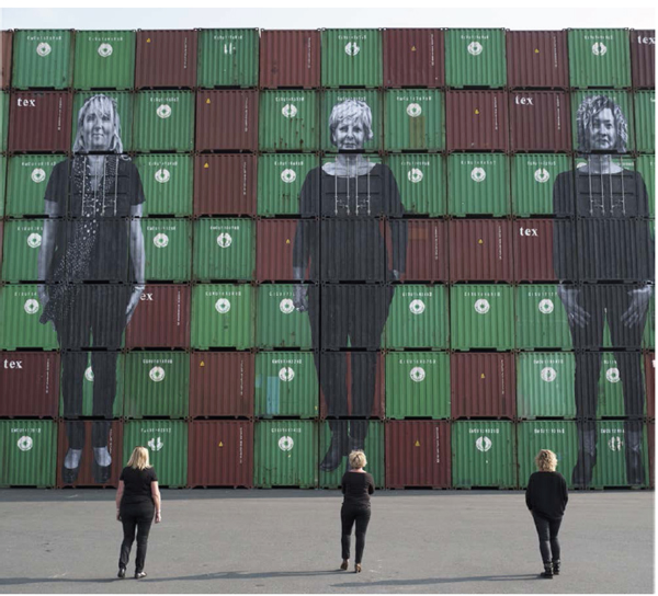
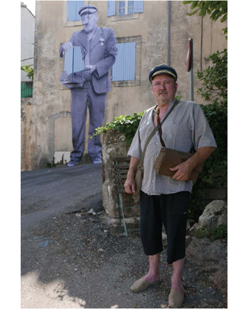 As with Varda’s Les Glaneurs et la glaneuse and Les Plages d’Agnès, we accompany the filmmaker, this time with her new collaborator in their “photo truck,” as they travel through France, gleaning ideas and experiences. We meet retired coal miners, cheese makers, factory workers, a mail carrier, a waitress, and the stalwart wives of three dockers in Le Havre, and we watch Varda and JR create and display epic photographs of them. The resulting images render ordinary humans and their remote communities extraordinary.
As in her past work, Varda urges us to take a good look at people and places we have previously overlooked, exercising her extraordinary gift for making us care about strangers. But the film is not merely an empathetic social document on rural France. Visages Villages affirms the allure of art and art-making, or rather the “power of the imagination,” as Varda describes the focus of their film. We witness the various stages in the duo’s collaboration: planning, considerable horsing around, execution, and discussion of the outcome.
The film reminds me of Chronique d’un été (1961), which also sought to document the lives of ordinary people while chronicling a collaboration (between Jean Rouch, Edgar Morin and their friends). In Visages Villages the result of the collaboration is, typically, the creation of a monumental photograph of a person placed in an unlikely setting: the wall of a decaying building in an isolated village, a container at the port of Le Havre, a barn on a lonely farm. As Varda did with Mona in Vagabond, the lonely single mother of Documenteur, and the widows of Noirmoutier, Varda and JR imbue their subjects with dignity, while maintaining a respectful distance.
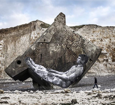
Visages Villages models a way of seeing and a way of being. JR and Varda laboriously plan and execute an installation consisting of a photo Agnès made in 1954 of the late photographer Guy Bourdin. JR and his crew construct a scaffold and paste the photo on the side of a massive bunker from W.W.II that had fallen from a cliff onto a Normandy beach.
We watch the whole thing come together beautifully via time lapse, only to learn that it was washed away by the tide within 24 hours. Instead of grieving the short life of the work of art, the pair move on, ready for their next adventure, which is how Varda has lived her whole life, fearlessly seeking new projects, curiosity and generosity intact.The human eyes and the spectre of Jean-Luc Godard are important motifs and Varda finds a way to merge them. A visit to Varda’s ophthalmologist, where she receives an injection to treat her macular degeneration, results in JR pasting a close-up of her eye on the cylindrical body of a gas truck.
JR propels Varda through the Louvre in a wheelchair, paying homage to Godard’s Bande à part and reminding us that looking at art has always been one of Varda’s passions. Near the end of the film, JR consoles Varda in Rolle after her old friend Godard callously stands her up, by finally offering her (but not us!) a glimpse of his eyes liberated from his habitual sunglasses.
In the hands of anyone else, this portrait of provincial people and an unlikely friendship might have resulted something thin and inconsequential. Instead, it’s a poetic window into the process of creation, an ode to the elevation of the ordinary, and a primer on the way to live.
The Actress: Jeune femme (aka Montparnasse Bienvenue, directed by Léonor Sérraille with Laetitia Dosch)
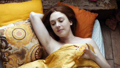
Two moments of stunning direct address bookend this beautifully acted, droll and moving film about a 31-year old woman on the verge of a nervous breakdown. The film opens with a scene of Paula (Laetitia Dosch) pounding furiously, first with her fists and then with her head, on the door of her unresponsive ex. While getting bandaged at a clinic, she rants extravagantly in direct address: “I was everything to him and now I’m nothing.” The final shot of the film reveals Paula staring directly at the camera again, this time calm and resolute, restored to a position of strength and hard-earned wisdom. Jeune femme is about a woman who comes to Paris to track down her ex, only to find a better version of herself.
I spoke with actress Laetitia Dosch about what it was like to create the role of Paula. Dosch worked in French boulevard theater and attended the prestigious two-year “Classe Libre” program of the acting school Cours Florent before enrolling at the Swiss National Conservatory, where she received a classical and avant-garde formation. Director Léonor Sérraille had recently won a screenwriting grant from the CNC and was looking for an actress to play the role of Paula when she saw footage of Dosch on YouTube. She wrote Dosch a letter and they soon began working together. Sérraille was busy during the day, but the two women found time to meet nearly every evening for six weeks. They discussed the character, explored Paris together, and saw films.
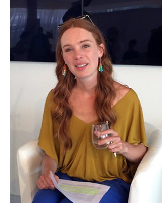 Dosch’s explosive performance in Jeune Femme, which is both highly verbal and often idiosyncratically physical, might lead one to assume that significant improvisation occurred during the shoot, but no. Sérraille’s script was meticulously written, even “écrit au millimetre,” Dosch said, which she appreciated, because it helped her “figure out how the character thinks.” The film charts the transformation of a slightly manic, spurned woman into a person who realizes she’s better off without her older, famous, photographer boyfriend, for whom she was a muse.
Our flawed protagonist leads a precarious existence. Essentially homeless at the beginning of the film, she benefits from the generosity of a lovely woman she meets on the subway by failing to correct the woman’s mistaken impression that Paula is her long-lost childhood friend from Lyon. She confiscates her ex-boyfriend’s cat and eventually abandons it at a vet clinic. But she cobbles together a life, babysitting a depressed little girl whose existence she brightens with cotton candy and aria singing; making repeated attempts to reconnect with her estranged mother; selling lingerie at a mall in Montparnasse, and making new friends, notably a single dad from Senegal with a degree in economics who works as a security guard at the mall. When circumstances force her to make some big decisions, she surprises us. As Dosch described her character, “This is the story of a muse who stopped being a muse, or rather became her own muse.”
It’s worth contemplating Jeune femme’s conditions of production. The crew was comprised mainly of women, most of whom graduated from France’s prestigious national film school, Fémis. The film was awarded an avance sur recettes by the CNC (Centre National du cinéma et de l’image animée), which afforded Sérraille the time to write the screenplay. Institutions such as Fémis and the CNC are the backbone of France’s celebrated cinema ecosystem. A portion of each film ticket sold goes to the CNC, which in turn, distributes the funds to nourish the entire system of film education, production, and exhibition.
Here, more than anywhere else in the world, state resources flow in the support of screenwriters, directors, and even exhibitors who make and show films that might not exist or thrive without aid. In 2016, for example, the French art et essai (art house) exhibition sector accounted for 22.4% of all film attendance in France and benefited from nearly 15 million euros in aid from the CNC. French films retain a relatively high local market share. They attract 35.8% of admissions, while 52.9 % go to American releases.
The Education Executive: Nathalie Coste-Cerdan
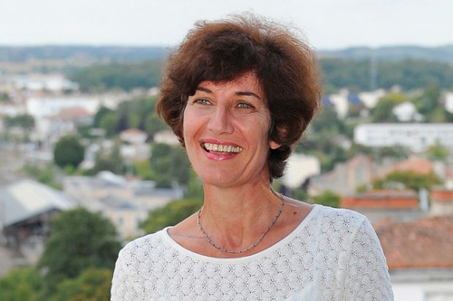
Fémis is an important part of the system. Nathalie Coste-Cerdan, until recently the Director of Canal +, is now the General Director of Fémis. Created as IDHEC in 1945, Fémis was restructured and renamed in 1986. The school, which graduates fifty students each year, is funded by the CNC and supervised by the French Ministry of Culture and Media and the Ministry of Higher Education. The current president of the school is Raoul Peck, who directed most recently I am Not Your Negro. Prestigious grads include Noémi Lvovsky, Arnaud Desplechin, François Ozon, Céline Sciamma, Marina de Van, and Rebecca Zlotowski.
Because the school is supported by the CNC, French students pay next to nothing (433 euros per year) for this four-year education. Foreigners must pay 10,670 euros per year, but this is still a bargain by American standards. Students must have a B.A. or M.A. before entering one of the six main programs at Fémis, which are directing, producing, screenwriting, sound, cinematography, and editing.
The school keeps adding programs. A new two-year program trains people who want to work in distribution and exhibition. Another new program, La Résidence, trains recent high school graduates in film production for one year and is aimed at enhancing diversity at the school. Yet another new program, also lasting one year, was created to train students in the writing of television series because “ambitious television series are not so common in France,” admitted Coste-Cerdan.
I attended a panel organized by the CNC at its beachfront headquarters at the Cannes Film Festival to hear about film education in France and elsewhere. Representatives from Fémis, Ciné-Fabrique in Lyon, and films schools in Poland and Argentina compared their schools’ structures, fees, curricular goals, and, especially, their efforts to support international exchanges. Coste-Cerdan asserted, “It’s impossible to be a national film school today without being international.” In line with this trend, Fémis accords 10% of its spots to foreign students, creates special programs for foreign students, and runs exchange programs with film schools in other countries.
Seeking to “encourage international co-productions, be on the cutting edge of the industry, and open students’ minds to other points of view,” the school sends each and every Fémis student abroad to study in a partner institution. Fémis students study screenwriting at Columbia University, documentary film at the Beijing Film Academy in China, or sound design at VGIK in Russia. Fémis sends students to, and accepts students from, CalArts, Tokyo University of the Arts, INSAS in Bruxelles, the Universidad del Cinea in Buenos Aires, and the Korean Academy of Film Arts in Seoul, among others.
One Fémis program, linked with the Filmakademie of Baden-Württemberg, offers a one-year course designed for aspiring producers. The training takes place in France, Germany, and England and includes sessions at the Cannes, Berlin, and Angers film festivals.
Fémis also offers yet another innovative tactic, a three-week program for European documentary filmmakers who wish to develop a documentary film based on archival material. Here, aspiring documentary makers get help with re-writing, the preparation of a dossier for financiers, tips for dealing with producers and broadcasters, and pitching skills.
The results have been encouraging. The “Gulf Summer University” at Fémis has had luck attracting nine students from the Gulf region for its 5-week training program. Recently, a young Chinese woman from the Beijing Film Academy came to Paris and made a “poetic, philosophical” documentary about the Chinese community in Belleville. Coste-Cerdan characterized the exchange programs as, among other things, an exercise in “soft power,” designed to export the ideals of French film system elsewhere and also to challenge French students by exposing them to other cultures.
Cannes is a mecca of glamour and an enforcer of hierarchies, of course, but it’s also a place where one can have a serious conversation about now to improve international film education. It’s a place where one can see comedies like Noah Baumbach’s The Meyerowitz Stories (New and Selected), which is really good, by the way, but also films like Abbas Kiarostami’s gorgeous 24 Frames and Karim Moussaoui’s En attendant les hirondelles, a superb Algerian film. It’s also a place where one can see director John Cameron Mitchell, whose How to Talk to Girls played at Cannes this year to mixed reviews, serve as DJ and perform with a punk band at the “Queer Party.” It’s also a place where a taxi driver raved about the dialogue in the films of Michel Audiard and color design in Pedro Almodóvar.
I’d like to come back here some day, but I want to wear my sneakers on the red carpet, even at night.
Thanks to Agnès Varda, Laetitia Dosch, Françoise Pams, Pierre-Emmanuel Lecerf, and Nathalie Coste-Cerdan for their kind cooperation.
The 1162 French film theaters categorized as art et essai received, on average, 12,820 euros each in 2016. See “La Réforme de l’art et essai,” Le Courrier art et essai, n. 256, May 2017, 12.
Red carpet photos by Zimbio and Pascal Le Segretain/Getty Images; Coste-Cerdan photo from Times Higher Education Supplement. Other photos by Kelley Conway.
P.S. 28 May 2017: Jeune Femme won the Caméra d’Or prize for best first film.
Ladies at all levels
La cigarette (1919)
Kristin here:
Earlier this month Flicker Alley released another of its ambitious collections of historic films, Early Women Filmmakers: An International Anthology. The dual-format edition contains three discs DVDs and three Blu-ray discs. Its ambitions are reflected in part by the volume of material included (652 minutes) and in part by the range of its contents, from well-known classics to obscure titles.
The collection was one of the last projects curated and produced by the late David Shephard. As with many of Flicker Alley’s releases, it was a joint project with Film Preservation Associates (Blackhawk Films) and Lobster Films of Paris, working with several film archives. The films are arranged chronologically, with the earliest being Les chiens savants (1902), a music-hall dog act attributed to Alice Guy Blaché, and the latest Maya Deren’s classic experimental film, Meshes of the Afternoon (1943).
The publicity for the collection emphasizes that “More women worked in film during its first two decades than at any time since” (from the slipcase text). I would be interested in how such a claim was arrived at. It seems unlikely to me, if only because the film industries of the major producing countries have grown enormously since the silent and early sound periods. Still, despite this claim, the notes in the accompanying booklet (written by Kate Saccone, Manager of the Women Film Pioneers Project) describe how the DVD/Blu-ray release “reclaims that stature of ‘woman director’ and celebrates it in all its glory.” (One film included, Discontent [1916], is listed as “by Lois Weber”; in this case she wrote the screenplay, which was directed by Allen Siegler.) Thus the program does not survey the range of filmmaking work women performed–but such a survey would be essentially impossible. The lack of detailed credits on early films makes it difficult to determine even the director of a given film.
The silent films
It is not really possible to discuss all the films, but I’ll mention some and link to earlier entries where we’ve discussed some of them.
Of the 25 titles on the three discs, fourteen are silent. Six of these give an overview of work of Blaché, with three French films and three made after her move to the US.
Lois Weber is represented by three films, starting with perhaps her best-known work, Suspense (1913). With its unusual angles (see above), elaborate split-screen phone conversations, and action shown in the rear-view mirror of a speeding car, this is one of those films you show people to demonstrate how wonderfully inventive directors around the world became in that incredible year. I am also very fond of her feature, The Blot (1921).
The third Weber film, Discontent (1916), may surprise those familiar with her socially conscious features. In the mid-1910s Weber worked in a variety of genres. While David was doing research recently at the Library of Congress, he watched some incomplete or deteriorated Weber films that haven’t been seen widely. He wrote about False Colors here and here. Discontent is a comedy with a moral. An elderly man is living in a home for retirees, but he envies his well-to-do family. Finally they invite him to live with them, and naturally everyone ends up annoyed by the situation–including the protagonist, who winds up returning to the home and his friends.
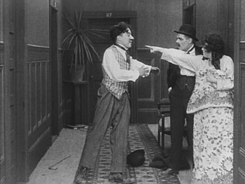
Mabel Normand apparently directed quite a number of her films for Mack Sennett, and Mabel’s Strange Predicament (1914) is one of them. Its cast also includes Charles Chaplin and was his third film to be released, although it was the second shot and the first one in which he wore a version of his Little Tramp costume. Not surprisingly, he steals every scene he’s in. Normand even plays second fiddle to him, with her character forced for a stretch of the action to hide under a bed, where she is barely visible while Chaplin performs some funny business in the same room. (The print seems to have been assembled from two different copies, the bulk of the film being in mediocre condition with the ending abruptly switching to a much clearer image.)
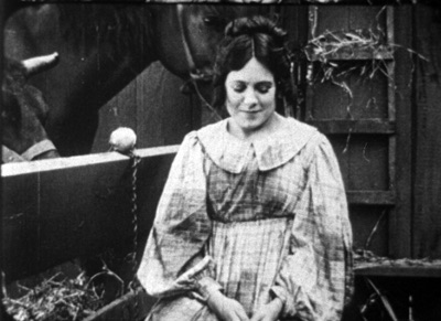
One curious item in the program is Madeline Brandeis’ The Star Prince (1918). According to her page on the Women Film Pioneer’s Project, Brandeis was a wealthy woman who made films, mainly centering around children, as a hobby. Some of these were apparently intended for educational use. The Star Prince, her first film, is clearly aimed at children. A few of its adult characters are played by young adults, while children play both children and adults. This becomes a bit disconcerting when we assume for a long time that the prince and princess are perhaps seven or eight, until they fall in love and become engaged.
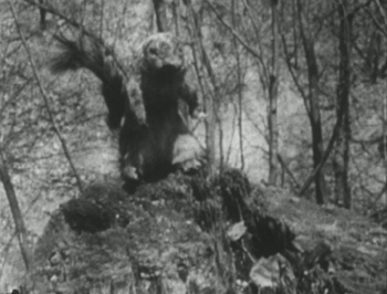
Despite the amateur filmmaking, there are some attempts at superimpositions and other special effects to convey the fantasy, as well as an charmingly clumsy pixillation of a squirrel puppet, the position of which is changed far too much between exposures.
This is the sort of local production, made outside the mainstream industry, that so seldom survives, and it is a welcome balance to the more sophisticated works that make up the bulk of this collection.
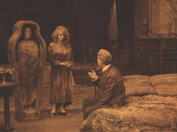
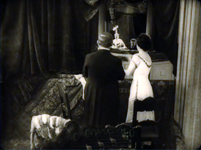
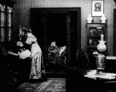
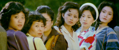
Speaking of which, the next part of the program consists of two features by one of the best-known female directors, Germain Dulac. The first, La cigarette, appeared in 1919. It’s melodrama about an fifty-ish Egyptologist, who has just acquired the mummy of a young princess who was unfaithful to her older husband. The professor begins to imagine that he is suffering a similar fate when his young and beautiful wife (see top) begins spending time with an athletic young fellow.
I remember seeing this film nearly forty years ago and thinking it was pretty weak. Luckily I have seen many films from this era since and know better how to watch them. Seeing it again I liked it quite a bit. It’s beautifully shot and well acted, and its sympathetic depiction of the doubting husband and the clever and resourceful wife is more subtle, in my opinion, than that of the marriage in The Smiling Madame Beudet (which is also included in this set). I was glad to have a chance to see the film again and recognize it as being among Dulac’s best work.
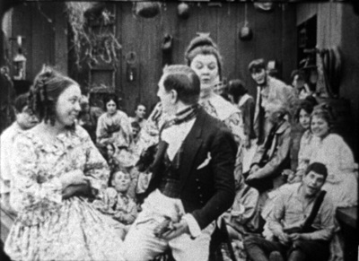
The silent section of the program ends with Olga Preobrazhenskaia’s The Peasant Women of Ryazan (1927). The title emphasizes that Preobrazhenskaia’s film is set in a provincial area. Ryazan, the capitol, is about 120 miles southeast of Moscow, so it is not one of the far-flung regions of the USSR. Still, it would have been distant enough at the time to have its own distinctive culture. Peasant Women gives us plenty of local costumes and customs without giving the sense of this being ethnography first and narrative second. Exotic though it may seem to us, this would have been recent history to Russians when it first came out.
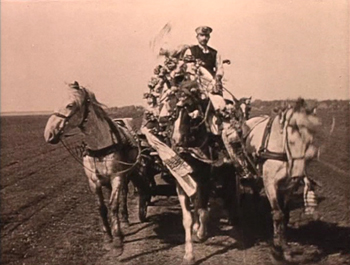
Although most synopses claim that the story runs from 1916 to 1918, it actually begins shortly before World War I, probably in 1914, as the heroine Anna marries Ivan in a lively wedding scene including a carriage ride for the bridal couple (below). Shortly thereafter news of the war comes, and Ivan reluctantly departs for to serve in it. Anna is left in the household of her lecherous father-in-law, who rapes and impregnates her. The war goes on and ends, with the Revolution taking place entirely off-screen.
The second woman of the title is Wassilissa, a tougher sort, who applies to convert a decaying local mansion (we are left to assume that it was confiscated in the wake of the Revolution). She is seen at the end as being the prototype of the new Soviet woman, though Preobrazhenskaia throughout avoids hitting us over the head with overt propaganda.
The sound films
Perhaps not surprisingly, most of the directors on the third disc, devoted to sound films, are likely to be more familiar to modern viewers. Nevertheless, Marie-Louise Iribe and her film Le Roi des Aulnes (1920), were completely unknown to me. She was the niece of designer Paul Iribe and worked primarily an actress during the 1920s, and this seems to have been her only solo directorial effort. (IMDb lists her as the co-director of the 1928 version of Hara-Kiri, which she also starred in.)
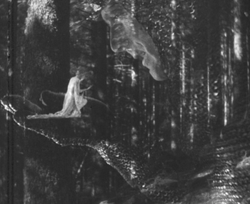
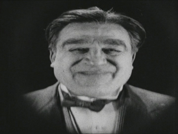
Le Roi des Aulnes is one of the musically based movies that were popular in the early sound era, being based on both Goethe’s and Schubert’s versions of “Der Erlkönig.” It’s nicely photographed, and the part of the father is played by Otto Gebühr, known for being trapped by his resemblance to Friederick der Grosse into playing that role time after time from 1921 to 1941. He’s predictably excellent here, though the stretching of the short poem into a 45-minute film forces him to register worry and eventually grief throughout. Indeed, despite extrapolated incidents, such as the injury of the father’s horse and the need to procure a new one, a great deal of repetition occurs: lots of riding through marshes and menacing appearances by the Erlkönig, who is portrayed as a large man in chain-mail.
The special effects are the most impressive thing about the film, using double superimpositions in widely different scales, with the giant king holding a small fairy on his palm.
Despite its problems, the film is a valuable addition to our examples of this mildly avant-garde trend that flourished for a short time.
Most of the rest of the directors are well-known and can be mentioned more briefly.
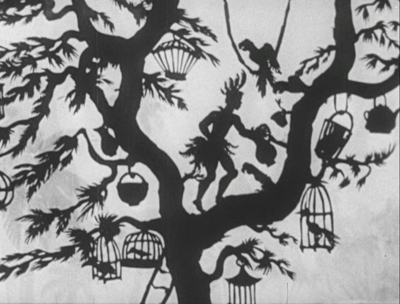
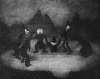
The great animator and innovator of silhouette animation Lotte Reiniger is represented by three short films: Harlequin (1931), The Stolen Heart (1934), and Papageno (1935). I have written about Reiniger’s complex compositions, including her subtly shaded backgrounds. Of the directors represented here, she is the one who enjoyed the longest career, from 1916, when she would have been 17, to 1980, when she was 81. I discuss a BFI boxed set of some of her 1950s films here. I haven’t been able to find a complete filmography, but William Moritz estimates that she made “nearly 70 films.”
Alexandre Alexeieff and Claire Parker’s A Night on Bald Mountain is similarly familiar. Like Iribe’s Le Roi des Aulnes, it falls into the genre of illustrations of existing musical pieces, being an illustration of a piece of the same name by Modest Mussorgsky, as arranged by Nikolay Rimsky-Korsakov. It was created by manipulating hundreds of pins on a large frame called a pinboard, invented by Alexeieff, his first wife Alexandra Grinevsky-Alexeieff (whom he divorced in order to marry Parker in 1940), and Parker. The textured effect is quite unlike that of any other type of animation.
Dorothy Davenport was a prolific actress from 1910 to 1934. She is perhaps most remembered as the widow of Wallace Reid, a star who died from the effects of morphine in 1923. She directed seven films over the next decade, ending with the film in this set, The Woman Condemned (1934), mostly either uncredited or signing herself Mrs. Wallace Reid.
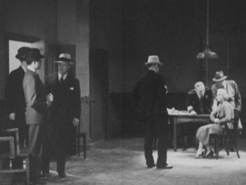
The Woman Condemned is a B picture, produced independently and distributed through the states’ rights system. It’s a competently done murder mystery that gains some interest by withholding a great deal of information from the audience. There are two main female characters, the victim and the accused (seen below in an interrogation scene), and we have very little idea of their motives and goals until the climax of the film. The revelations involve a twist on the same level of groan-worthiness as “and then she woke up.” But again, having a little-known B picture adds to the wide variety of films presented here.
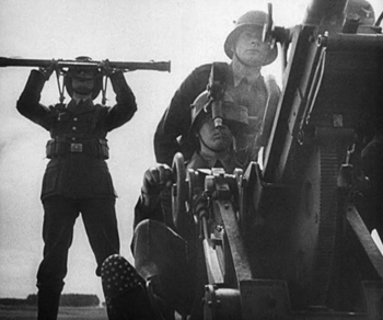
One can hardly study early women directors and skip over the favored documentarist of the Third Reich, Leni Riefenstahl. Day of Freedom (1935) is a good choice for inclusion, occupying only 17 minutes of screen time and amply demonstrating Riefenstahl’s undeniable gift for creating gorgeous images from ominous subjects.
Experimental animator Mary Ellen Bute is represented by two contrasting abstract shorts, the lovely black-and-white ballet of shapes, Parabola (1937) and the vibrant and humorous Spook Sport (1939), the latter (below) made with the collaboration of Norman McLaren.
Dorothy Arzner, the only woman to direct mainstream Hollywood A films from the 1930s to the and 1940s, is introduced via a clip from one of her most famous films, Dance, Girl, Dance (1940). In the scene, Maureen O’Hara’s character interrupts her dance routine to tell off an audience of mostly men who are cat-calling her.
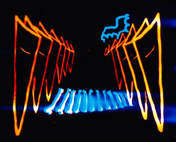
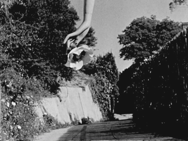
Maya Deren’s first film, Meshes of the Afternoon (1943) ends the program (see bottom). It is a happy choice, since of all the films in the program, it has undoubtedly had the greatest influence on the cinema. Much of the subsequent avant-garde cinema has turned away from music-inspired abstraction and opted for ambiguity, psychological mystery, and impossible time, space, and causality.
Valuable though this collection is, I cannot help but think that some of the directors represented have been oversold. Saccone sums them up:
Together, these 14 early women director have produced bodies of work that are inspiring, controversial, challenging, invigorating, and thought provoking. These women were technically and stylistically innovative, pushing narrative, aesthetic, and genre boundaries.
Surely not all of them meet these criteria. We would hardly expect one hundred per cent of the male directors of the same era to be “technically and stylistically innovative,” so why should we expect all of the work by fourteen varied female directors to be so? Saccone quotes Tami Williams’ book, Germaine Dulac: A Cinema of Sensations. on how the director searched “for new techniques that, in the light of official discourse of governmental and social conservatism, and the modernity of the new medium, were capable of expressing her progressive, antibourgeois, nonconformist, and feminist social vision.” Saccone sees this search in The Smiling Madame Beudet, where “Dulac utilizes cinema-specific techniques such as irises, slow motion, distortion, and superimposition, as well as associative editing, to give visibility to the inner experiences and fantasies of an unhappily married woman …”
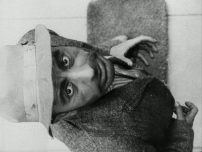
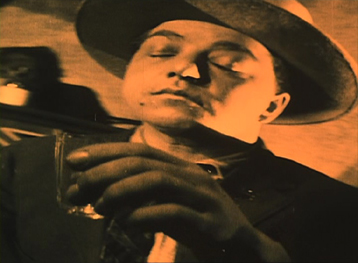
Readers might infer that Dulac innovated these techniques. Yet they had already been established as conventions of French Impressionist cinema, notably in Abel Gance’s J’accuse (1919) and La roue (1922) and Marcel L’Herbier’s El Dorado (1921). For example, Dulac surely derived the distorted image of Beudet that conveys his wife’s disgust (below left) from a similar shot of a drunken man in El Dorado (right).
This is not to say Dulac isn’t a fine filmmaker or that she had no new ideas of her own. Only that she didn’t single-handed discover these techniques, but rather she turned the emerging repertoire of Impressionist techniques toward portraying a woman’s experience.
In some cases films that were co-directed by these women are presented as their sole efforts. Lois Weber’s Suspense was directed, as were many of her early shorts, with her husband, Phillips Smalley. Quotations from interviews with both Weber and Smalley make this clear. In 1914, Smalley said of his wife, “She is as much the director and even more the constructor of Rex pictures than I.” “Even more” because Weber often wrote the screenplays for their films and in at least some cases edited them. Weber later described how Smalley worked from her scripts: “Mr. Smalley got my idea. He painted the scenery, played the leading role and helped direct the cameraman.” Directing the cameraman is part of the job of a director.
The list of films in the booklet attributes Night on Bald Mountain entirely to Claire Parker, though on the backs of the disc cases the credit is to Claire Parker and Alexandre Alexeieff. Alexander Hackenschmied (aka Hammid) is not mentioned in the list of films, and the booklet refers to him as having a “close collaboration ” with Deren, even though he and Deren are both listed as directors on the original credits of Meshes of the Afternoon.
Still, if the collection does not make the case that all of the women represented were wildly talented and innovative, it does show the variety of ways in which women managed to work both in and out of the mainstream industry. It’s valuable collection of historical examples and should be welcomed by anyone interested in the silent and early sound eras.
It is worth noting in closing that viewers should not expect all of these films to be presented in the usual beautiful restorations we are used to from Flicker Alley. Some of these films are indeed gorgeous, including the two Mary Ellen Bute shorts, Peasant Women of Ryazan, Day of Freedom, Meshes of the Afternoon, and La cigarette (though the latter has some small stretches of severe nitrate decomposition). Other prints are quite good or at least acceptable. A few of the films simply do not survive in any but battered or faded prints, notably Discontent and The Star Prince. But we are lucky to have them at all.
The quotations from the Smalley and Weber interviews are from Shelley Stamp’s Lois Weber in Early Hollywood (University of California Press, 2015), pp. 26-27.
[May 23] Many thanks to Manfred Polak, who has drawn my attention to a higher estimate of Reiniger’s lifetime production of silhouette films. Her friend and executor, Alfred Happ, put the figure at about 80. The source is an exhibition catalog from the Stadtmuseum Tübingen, which houses Reiniger’s archived material: Lotte Reiniger, Carl Koch, Jean Renoir. Szenen einer Freundschaft. Die gemeinsamen Filme. ed. Heiner Gassen and Claudine Pachnicke (Stadtmuseum Tübingen, 1994).
Carl Koch was Reiniger’s husband and collaborator; Reiniger created an animated sequence for her supporter and friend Jean Renoir’s La Marseillaise. According to Manfred, “Alfred Happ and his wife Helga were Reiniger’s closest friends and caretakers in her last years in Dettenhausen (near Tübingen, Germany). After Reiniger’s death, Alfred Happ was the administrator of her estate. If you ever come to Tübingen, visit the Stadtmuseum (City Museum), where her estate is hosted now. A part of it is shown in a permanent exhibition.” He also provided a link to a touching account of Reiniger’s friendship with the Happs.
Meshes of the Afternoon (1943)
Wayward ways and roads not taken
DB here:
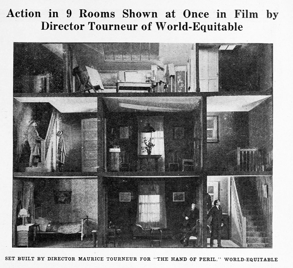
The Hand of Peril (1916) was trumpeted as something new in movie storytelling. It avoided the “cut-back”—that is, crosscutting between different lines of action. In this film, according to the Motion Picture News story above, “nine rooms of a house are shown, with action occurring in each room simultaneously. . . . The action occurring in one room . . . would have to be ‘flashed back’ were the nine rooms not shown.”
Variety found the innovation valuable for pacing. The movie “unfolds in the first four reels with the speed of a race horse. The suspense is constant and there isn’t any let-up whatever until the last few hundred feet.” It’s not clear whether the whole action took place in the house, but for the scenes that did, it appears that the cutaway set served a reference point, a sort of macro-establishing shot. This view gave way to cut-in closer views of the scenes in specific rooms.
Another trade journal noted: “The experiment is quite novel and attractive and fits in admirably in the story, but if it will prove of general worth cannot be told yet.” Now we can tell. This was a road not taken. Crosscutting remained in force, being far more cheap and flexible than dollhouse sets.
No copies of The Hand of Peril are known to have survived. Yet the fact that it was made suggests just how energetic the 1910s were in raising striking creative possibilities—some of which became conventional, some of which fell by the wayside. Seeing this sifting and winnowing at work was a constant delight during my recent stay in the Kluge Center at the Library of Congress. Watching nearly a hundred American features from 1914-1918 drove home to me how excitingly strange movies can sometimes be.
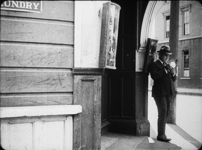
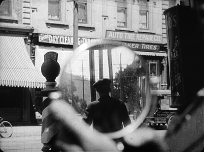
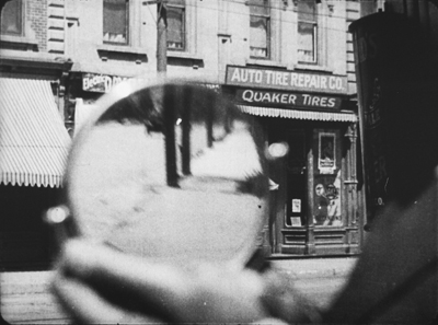
On the one hand, the conformist side of the films was there in abundance. Most of what I encountered were variants of an emerging “classical Hollywood cinema,” as they (we) say. Some efforts were crude, some smooth, but you could tell what the filmmakers were going for, and it was a thrill to see obscure films effortlessly exploiting schemas that would become central to our films. What a kick to see, in The Sign of the Spade (1916), a detective using a hand mirror to trail a suspect, with beautiful control of POV, frame composition, and rack-focus.
Hitchcock, eat your heart out. Well, wait until you start making films.
Yet looking for norms sensitized me to non-normative things—not merely clumsy efforts, but genuine attempts to try something different. Different and, to our eyes, often odd. American features of the 1910s include cuts and framings and camera moves and lighting choices and performance bits that no one now could imagine using.
My viewing companion James Cutting compared the week’s worth of films he saw to the Cambrian explosion in evolution, a period where all manner of organisms burst forth in profusion—before selection pressures wiped many out. While filmmakers were mastering classical plotting and continuity style, lots of other stuff was going on.
Have a look. Actually, several looks.
Widescreen, no. Tallscreen, yes.
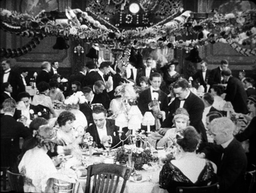
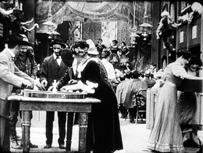
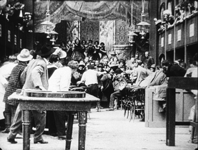
Ready Money (1914).
In this shot, the story action is taking place at the nightclub table, but the society types gathered there are overwhelmed by all the hubbub around and above them. And we aren’t given closer views to help us sort it all out.
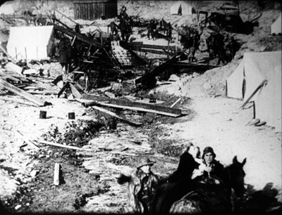
In all periods of film history, directors usually tried to center the action. Yet in early years, they sometimes favored framings that would today be considered strangely decentered. One of my favorite tactics from the ‘teens involves putting important elements in the bottom of the frame, notably in extreme long shots. In The Spoilers (1914), Cherry flops back in her saddle when she sees the devastated mining camp.
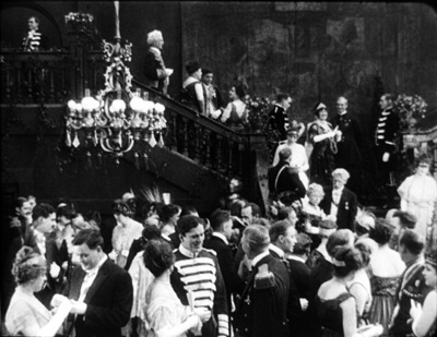
At the big reception in The Sowers (1916), a modern director would have put Paul and the dignitaries he greets in the foreground, and let Princess Tanya descend in the distance. But William C. de Mille creates a vast vertical composition, setting Paul in his braided uniform in the lower third of the frame and putting Tanya far back on the staircase.
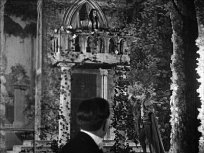
Such top-heavy shots look odd to us, but they have a sort of grandeur, and the taste for them can be acquired. You can see a more intimate example in the fine recent release of Thanhouser films restored by the Library of Congress. The opening sequence of The Picture of Dorian Gray (1915) shows Dorian at the theatre, in a box in the foreground with Romeo and Juliet playing onstage behind him.
Even in the teens, I think this is an outlier. Most theatre scenes are handled with cutting to reverse angles of the audience and the onstage players. When there’s a box in the foreground, it’s usually anchored as such, as in Feuillade’s Fantômas (1913) or Willliam Wauer’s Der Tunnel (1915).
The strange symmetry of the Dorian Gray composition, aided by putting Dorian’s head along the vertical axis rather than off to the side, and by putting the object of his attention, the actress, directly above him, is really startling. The all-over quality of these compositions usefully remind us that every inch of frame space is there to be used if you have the imagination. We’ll see this hypersaturation of the frame in some later examples, but eventually the tactic would go away. Shots would put the human figures in the center of the format, or in long shots place them gracefully on foreground right or left.
Scene + insert
Both European and American directors of the 1910s employed what I’ve called the tableau approach. Within a fixed camera setup and fairly distant framing, the viewer’s attention is controlled through staging, either lateral or in depth. I’ve given plenty of examples elsewhere of how flexible and precise this style can be. A beautiful example occurs in Lois Weber’s False Colours, which I’ve already analyzed along these lines.
During the years I examined, directors were already discarding this approach in favor of cutting-based ways of guiding our eye. Some freely put the camera at various points around a set or an outdoor scene. (In all national cinemas of the period, we find more variety of camera placement on location than in sets, for obvious reasons.) More common was the tendency toward what was called the “scene-insert” method. A master shot of middle range (the “scene”) would be followed by a closer view of something within that space (the “insert”). Very often that cut would be an axial one—that is, a setup straight along the camera axis. Although sometimes decried as a mistake, the axial cut has been used by filmmakers of all eras.
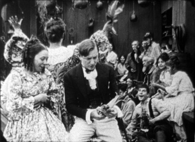
The corn-husking bee in The Hoosier Schoolmaster (1914) illustrates how a basic tactic of the tableau style may be integrated with the scene-insert method. The new schoolteacher is boarding with Mrs. Means, who’s trying to get him to marry her daughter. As the community gathers (that corn won’t husk itself), Mrs. Means forces her daughter on him. The teacher, though, is more attracted to the demure town outcast Hannah. First, Mrs. Means stands behind the schoolmaster and her daughter. Back to us, she addresses the hayseeds.
She moves away to show Hannah in the background. In the tableau approach, this blocking-and-revealing action is usually repeated throughout the shot, but here it’s a one-off device. As soon as it happens, the schoolmaster turns to look back.
Now comes an axial cut to Hannah in the background.
Simple and efficient, this is a good example of the scene-insert method, here enabled by a bit of depth staging. Later stretches of the scene will use the blocking-and-revealing tactic in conjunction with further axial editing.
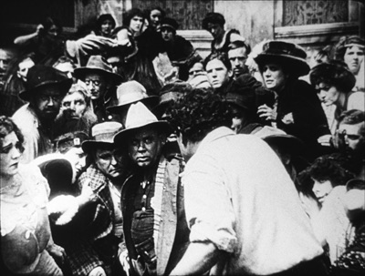
Sometimes the “insert” phase takes a turn that doesn’t look so simple. Consider this shot from The Spoilers (1914). In another wildly decentered framing, the hero Roy Glenister has jumped down from a balcony (upper right) to land on the floor of a big dance hall as seedy as anything in Deadwood. He lands and faces the crowd in the far distance, while the foreground area of gamblers clears away in a panic, so we can see him a bit better.
This is a very distant framing, so we get an axial cut in to him crouching before the surly crowd.
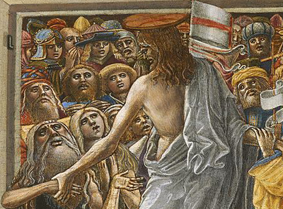
This is a striking insert because in order to give a sense of the massed crowd Roy faces, the director has apparently stacked people up—by height, and perhaps on risers of some sort—so that a welter of faces appear piled up against him. The showgirls at the very top of the frame are on the stage, but the people in the middle were on the same floor as Roy in the master shot. The technique is reminiscent of the stacking of crowds we find in classic Western painting. Here’s a detail from one of the weirdest pictures I saw in the National Gallery, Christ in Limbo by Benvenuto di Giovanni (ca. 1436).
Later filmmakers would presumably have used a high angle to let us see the faces; but then we’d lose the looming effect of Roy’s back in the foreground. Artistic choices are always trade-offs, and here, for the sake of a strong expressive effect, director Colin Campbell has sacrificed spatial realism in a way that probably wouldn’t occur to a contemporary filmmaker.
The shift from long shot to a closer view here is pretty extreme. At several points in my viewing I noticed that when using the scene-insert method, filmmakers often didn’t try for a smooth gradation of shot scales. The old triumvirate long shot/ medium shot/ close-up aims to lead the viewer gradually to the heart of the action, but in the 1910s directors seemed almost impatient to get to the meat of things.
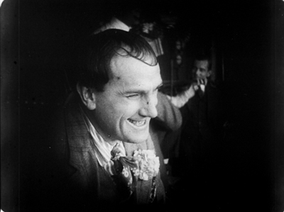
So, for instance, in William Desmond Taylor’s Pasquale (1916), the good-hearted hero is trying to keep up appearances at the wedding of the woman he loves. We get a cut from a very long shot to a tight close-up, accentuated by the vignetting that isolates Pasquale’s face. No medium-shot eases the transition.
For modern audiences, I think this is a bit of a bump–but nothing compared to the scene-insert leap we get in Vanity Fair (1915). In what is everybody’s idea of what those old movies look like, Becky is exploring the parlor. It’s a very distant shot, atypical for an interior of this scale. And the abrupt jump to a very close insert shows not Becky but the photograph she studies.
This is quite odd. Even stranger, the camera stays back from Becky throughout the film.
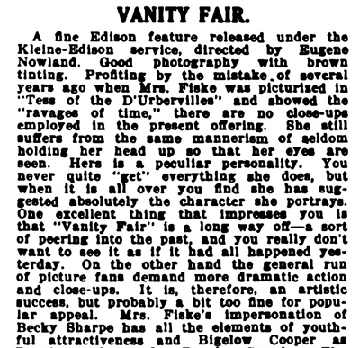
It’s unusual for an American movie of 1915 to avoid inserts, especially since Becky is played by the famous Minnie Maddern Fiske, who had popularized the part on stage. Where are the star close-ups, as in Pasquale? Are we dealing with simple incompetence? Apparently not, Variety suggests.
This seems plausible. By shooting most scenes in anachronistic long shots, the director could play down the fifty-something performer portraying a young girl. In the process he could associate the classic story with pre-teens photodramas, which seldom used close-ups. This deliberate anachronism suggests that filmmakers were already aware of the choices of shot scale they now had, and what the scene-insert method committed them to.
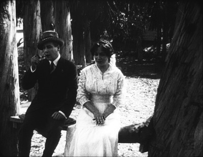
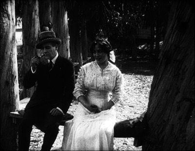
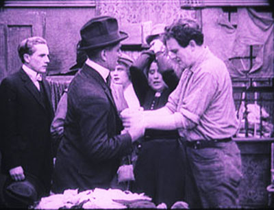
What survives of Weber’s marvelous False Colours offers a great many lessons in the range of 1910s techniques, but one sequence flaunts the all-over long shot and the jolting insert. The conman Bert has persuaded his wife Flo to pose as the missing daughter of the wealthy actor Lloyd Phillips. In this scene, Flo and Phillips have retreated to a park bench to get better acquainted. Bert hides behind a tree to watch them.
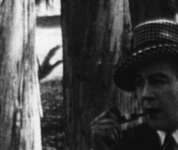
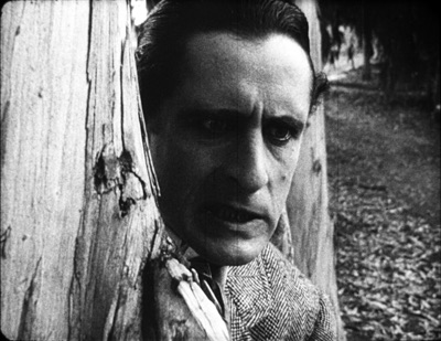
This is a pretty standard situation, but it’s handled in an eccentric way. As the couple sit in awkward silence on the bench, in the far left background Bert creeps in. Problem is, you can barely see him: only his hand, on the far, far left center, is visible in silhouette as it approaches the tree, followed by a dark blot. Thanks to Photoshop, I give you the insert that Weber denies us.
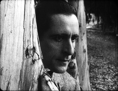
Who would see this? Maybe a viewer from the time, trained in different viewing skills–someone used to the frame’s being packed full? I consider this possibility in an older entry. And there’s certainly a slice of light space left vacant to allow for the hand, creating an extreme case of aperture framing. Anyhow, Weber then does what Taylor did with Pasquale. She cuts from the fairly distant shot to a big close-up of Bert peering out from the tree.
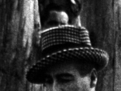
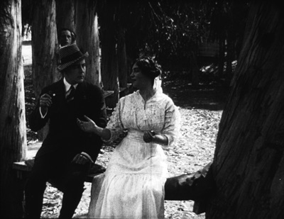
Compared to the bare hint of his arrival with the fugitive hand, this strenuous shot is overcompensation. All we needed was a sort of medium shot of him listening, preferably with the couple in the foreground to orient us. That shot comes, but again in an eccentric way. At first, Phillips blocks our view of Bert, so the actor in the rear has to raise his head–creating the impression of floating just above Phillips’ hat. Again, I supply a blow-up.
And when Flo, lying, says in a dialogue title that her mother talks of Phillips constantly, Bert’s head jerks up angrily. He’s still stuck atop Phillips’ hat. Another huge close-up reinforces his reaction.
Maybe it’s all a mistake? Did Weber screw up a simple scene? Why not just settle Flo and Phillips a little more to the right on the bench, leaving plenty of space on the distant left for Bert to creep behind the tree and peer out, perfectly visible to us throughout? Then, if you insist, you could have the big close-ups of Bert’s reaction? Or did the DP not allow for Phillips’ blocking Bert? (Remember, they didn’t have reflex viewing back then; the viewfinder didn’t show exactly what the lens took in.)
I can’t say. Maybe this is bold, maybe just a botch. But scenes like this in False Colours demonstrate the far-reaching possibilities that people were trying out in the Cambrian explosion of film style.
Jam sessions
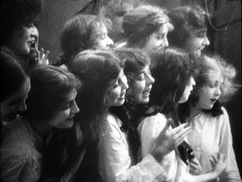
Liberty Belles (1914).
In Ready Money, The Spoilers, and other instances we’ve already seen a penchant for stuffing the frame with figures, props, and items of setting. People at the time apparently noticed it too. Charlie Keil, in his indispensable survey of film style from 1907-1913, writes:
Critics advised against “crowded groupings” for numerous reasons: first, if a massing of characters seemed unnaturally pressed together, it would expose the limits of the shooting conditions and destroy the illusionism that cinema was meant to sustain; second, such unnatural staging would violate the standard of composition derived primary from photography, which stressed balance and order; and third, overly compressed staging might obscure the central narrative action and create problems of comprehension for the viewer.
Widescreen, as I’ve mentioned before, poses problems. How do you fit in the human body? How do you fill up the lateral expanse, or do you leave it empty? The squarer rectangle of the 1.33 (or even narrower) frame of early cinema allowed bodies to be packed in, and we’ve seen a surprising vertical dimension to the compositions. Filmmakers found ingenious ways to jam in their figures, especially when they began moving them closer to the camera. By 1914, with the “American foreground,” the front line of action might get pretty crowded.
The climax of Kindling (1915) shows that Cecil B. DeMille was no slouch at filling up the midshot space and then developing the scene through small gestures and changes of posture. It’s far too long for me to run through here, but I think you get the idea.
The blocking and revealing, the slight changes that hide or unmask someone behind someone else, the tendency for actors to freeze so that one performer’s movement draws our eye: all these tactics of long-shot tableau staging are played out in small compass. Call it a jam session.
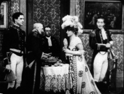
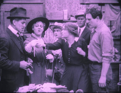
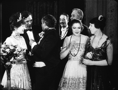
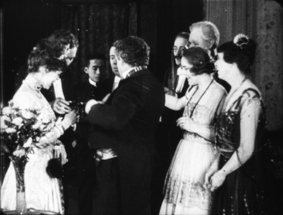
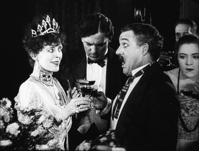
Cecil’s brother William followed suit in a film of the following year, The Heir to the Hoorah (1916). This comedy of class differences centers on three newly rich gold miners, all bachelors. The roughnecks Bud and Bill urge Joe to marry Geraldine so that there will be an heir to their fortunes. Geraldine’s mother, Mrs. Kent, invites the men to a dinner with her swanky friends. For once, the rich folks aren’t snobs but are good-natured folks–and they have to be, for the clumsy ways of Bud and Bill would outrage anyone less tolerant.
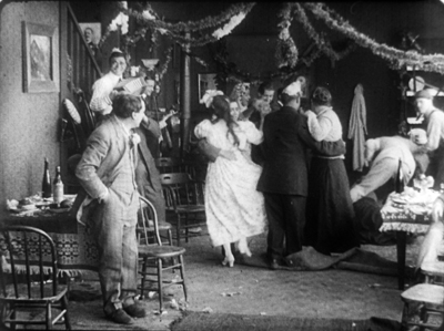
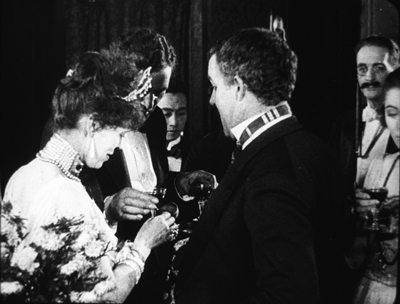
William C. de Mille often avoided long shots and instead covered scenes in fairly tight medium shots and plans américains. Just before the guests go into dinner, they’re huddled together in just such a composition. On the left, Bud is chatting with Joe and a fancy lady. On the right, Geraldine and her mother watch. Behind them are the lady’s husband and Bill. At first the action is on the right, as Mrs. Kent frets about the deplorables Geraldine has brought into the house.
Faces now get diced and sliced, masked and shifted. The gag is set up by servants emerging out of distant darkness. A small aperture opens up so we can see Bud and the others on the left picking up their drinks from a tray.
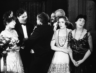
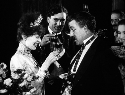
The insert is a surprisingly tight long-lens shot of the group on the left, though with others hovering around the right frame edge. Drinks are taken, a toast proposed.
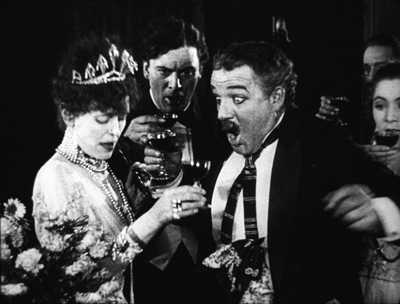
And Bud proceeds to spill his drink on the lady, who responds without rancor.
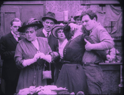
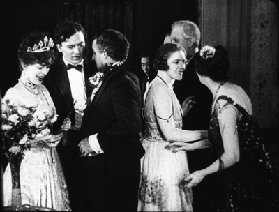
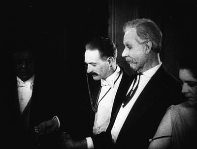
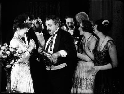
Another insert shows a reaction shot of Bill and the lady’s husband, also unflapped, before cutting back to the full “scene.” By now, with waiters coming out from behind foreground figures, there are nine characters crammed into the shot.
There’s more to come when Bud’s spur gets caught in the lady’s gown, but you get the idea. Axial cuts carve into this mob and shove bits and pieces of faces, bodies, and gestures out at us. The principles of tableau staging are squeezed down into medium shots. William C. de Mille was a pioneer of multiple-camera shooting for ordinary scenes, and he may well have used a separate camera for the long-lens shots (even though the position of Geraldine on the right is wildly cheated between shots 2 and 3 and 3 and 4).
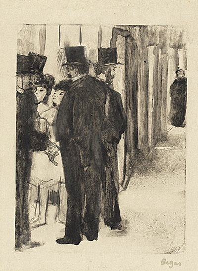
Later Hollywood filmmakers would favor much cleaner images of groups, with heads evenly spaced out across the frame. But visual artists had long explored the bunched-faces option. Here, for instance, is Degas’ daringly unbalanced and crowded Pauline et Virginie of 1876.
Yet these somewhat wild experiments weren’t dead ends. They remained artistic possibilities to be explored more, when other filmmakers hit upon them. Altman’s and Jancsó’s crowded telephoto shots revive the packed frames we see in the 1910s, and other filmmakers found artistic rewards in fanning out figures as in the lovely frame above from Liberty Belles. Those cute girls come back to life in Hou’s Cute Girl (1981) and Millennium Mambo (2001).
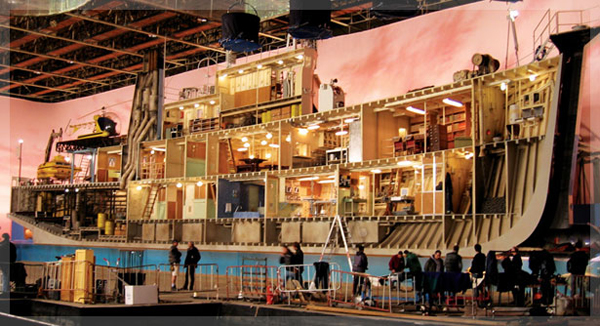
Even The Hand of Peril‘s dollhouse set didn’t go absolutely extinct, as admirers of Jerry Lewis (The Lady’s Man), Godard (Tout va bien), and Wes Anderson (The Life Aquatic with Steve Zissou) know. Film style, it seems, knows few dead ends, only detours.
There’s a tendency to think that the history of style constitutes an ever-expanding menu of options. Today, you can cut the way Griffith or Eisenstein or Godard did, right? A similar case has been made for technological change. For decades it was much harder to make a color film than a black-and-white one, but now filmmakers can pursue either option. Most filmmakers in the silent era couldn’t make a talkie, but today’s filmmakers can go silent if they want.
Yet it’s proven surprisingly hard to make a contemporary film look and sound like one from an earlier era. On the sheerly technological front, it’s not easy to recapture the tonal range of orthochromatic nitrate, or the sound texture of early talkies, or the saturation of Technicolor. As for style—how you stage, how you cut, how you frame, and so on—again certain things are hard to recapture. It seems that certain stylistic possibilities, like purely technological ones, have been taken off the menu.
Why is style so hard to recapture? Some elusive nuances of lighting and color depend on technological factors we can’t recreate. IB Tech can’t easily be mimicked with a dropdown menu. On other dimensions, the range of creative options in earlier eras just doesn’t come easily to today’s filmmakers. But maybe by looking at those films we can reconstruct that range. We might also encourage filmmakers to take the sort of chances people did at the very beginning of what we have come to call Hollywood.
This is, I think, my last post for a while on my 1910s adventures at the Library of Congress. I must move on to other projects. As ever, I’m tremendously grateful to the John W. Kluge Center, and particularly its director Ted Widmer, for enabling me to conduct this research under its auspices. A special thanks to Mike Mashon of the Motion Picture Division, and all the colleagues who have been helping me in the Motion Picture and Television Reading Room: Karen Fishman, Alan Gevinson, Rosemary Hanes, Dorinda Hartmann, Zoran Sinobad, and Josie Walters-Johnston. Thanks as well to James Cutting for enjoyable discussion as we watched old movies together.
The new collection of Thanhouser films that includes The Picture of Dorian Gray also provides an enjoyable tour of the LoC Culpeper facility I blogged about in the spring.
I’m grateful to Charlie Keil for ideas and help with sources. The passage I’ve cited from him is in Early American Cinema in Transition: Story, Style, and Filmmaking, 1907-1913 (University of Wisconsin Press, 2001), 134-135.
The quotations from Variety come from anonymous reviews of The Hand of Peril (24 March 1916), 24, and Vanity Fair (29 October 1915), 22.
Other entries about my DC viewing are Anybody but Griffith, Movies in the mountain, and on the machine, Film noir, a hundred years ago, and When we dead awaken: William Desmond Taylor made movies too. More generally, see the category of entries on Tableau staging and my books On the History of Film Style and Figures Traced in Light: On Cinematic Staging. The relation of the tableau style to Hou’s work is considered in the latter, as well as here.
On the difficulty of replicating older film styles, see our blog entries on The Good German and forging a film.
Building the set for The Life Aquatic (Wes Anderson, 2004).
Good morning from Ozuland
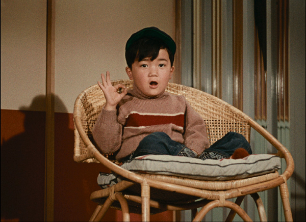
Ohayo (Good Morning, 1959).
DB here:
Ohayo (Good Morning, 1959) was the first Ozu film Criterion released on DVD, back in 2000. The DVD format, launched in 1997, really took off only after The Matrix disc was released in September 1999. So it’s not surprising to find the Ohayo edition quite sparse. No extras, no booklet, just a brief appreciation by Rick Prelinger (which can be read here). One note is charming: “To switch between the menus and the movie, use the menu key on your remote. Use the arrow keys to cycle through menu selections. Press enter/select to activate the selection.”
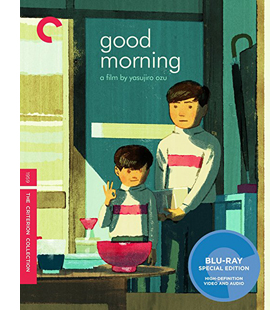 That early edition wasn’t bad, but now Criterion has given us a brand-new one. It’s derived from a 4K digital restoration and looks like a million bucks. Included with it is a pristine edition of I Was Born, But… (1932), Ozu’s first indisputable masterpiece (though I’d put Tokyo Chorus of 1931 very close), and what scraps remain of A Straightforward Boy (1929). So we have three of Ozu’s kid movies in one neat package, available in standard DVD or Blu-Ray.
The disc includes a shrewd and funny video essay by Shadowplay‘s David Cairns about Ozu’s humor. I’m there too, in an illustrated interview called “Ozuland.” The title derives from my suggestion that like Bresson, Tati, Mizoguchi, and a few other ambitious directors, Ozu created his own distinct artistic realm. That realm touches recognizable real life at many points, but it has been purified–maybe decanted would be a better word–by means of cinematic form and style.
My enjoyable talk with Elizabeth Pauker ranged on a lot of topics across two hours. We talked about the film’s themes, chiefly the role of language in easing day-to-day human interaction. We discussed Ozu’s distinctive camera positions (yes, there are more than one), his compass-point cutting (360-degree space, 180-degree reverse shots), and his use of adjacent spaces and rhyming compositions. We talked about his narrative strategies too, particularly his oscillation between nuclear-family plots like I Was Born, But… and extended-family ones like Brothers and Sisters of the Toda Family (1941, another masterpiece) and Tokyo Story (1953, ditto).
I emphasized both the film’s humor and its status as an unexpectedly experimental work; Ozu was setting himself new problems. How do you treat a neighborhood as an extended family? How do you shoot families living jammed together? How do you accentuate comic misunderstandings, and create gags through composition and color?
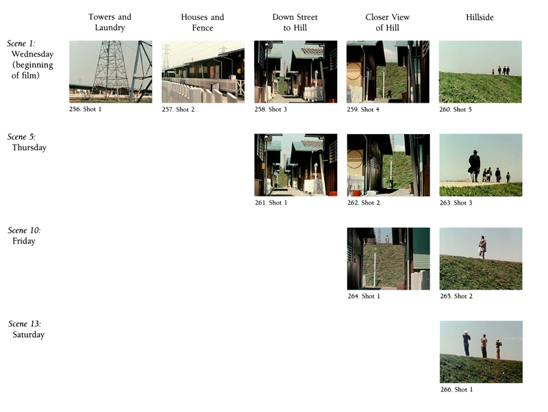
And how do you structure a film around a landscape, days of the week, and neighborhood routines? Ozu’s answer: Through echoic camera positions and compositions. Here’s an anatomy, showing the first four days’ scene openings.
Not all of our conversation could be included in the final cut, of course. For more on these and other matters, you can download my book Ozu and the Poetics of Cinema. (The pattern shown above completes itself on p. 353.)
The title of that book resonates in a couple of ways. Most obviously it’s meant to show that a systematic approach to form, style, and theme (the stuff of a poetics of any artform) can illuminate what Ozu’s up to. The title also has personal meaning, because it was Ozu who taught me just how deeply cinematic patterning could penetrate the texture of a movie. Without sacrificing any emotional power, Ozu created films that are marvels of organization, from large-scale story construction to the smallest detail of image and sound.
I remember distinctly when I realized the grain of this work. One night back in the mid-’70s, Kristin, Ed Branigan, and I were watching Ohayo for the first time, on a 16mm New Yorker print. We came to a simple transitional passage and we all gasped. I dove back to the projector and ran the cut backward and forward again.
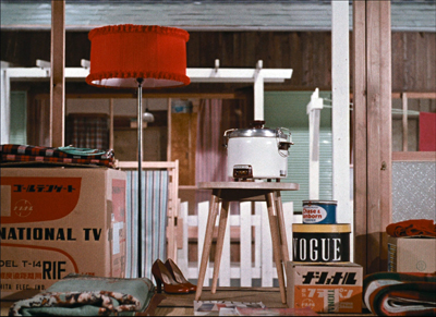
Apart from shifting us to a new space, as required by the plot, and apart from giving us two exquisite compositions, Ozu added a grace note: the red accent that appears in the same area of the two shots, linking shirt and lampshade. This discovery led Kristin and me to formulate the idea of the “graphic match,” a term for what happens when patterns of line or mass or color coincide from shot to shot.
Some directors, from Lubitsch to Brakhage, had employed graphic matches. Eisenstein had formulated the idea theoretically. But Ozu gave us a demo en passant, in the course of just “following his story.” His match isn’t necessary for the action, but like a rhyme in a narrative poem or a decorative trill in an operatic aria, it adds a sparkle to the moment.
By rewarding minute attention, Ozu made me realize that even ordinary movies teem with pictorial possibilities. There’s potentially so much going on within any shot or cut that scrutiny is often worth your time. True, studying Ozu makes most filmmakers look wasteful. They miss opportunities to enrich all the dimensions of cinema they present, to load every rift with ore.
But if we want to know how films work and work on us, we need to make the effort of looking closely. You’ll almost always find something interesting. When I consulted several books on 1910s directors like DeMille and Taylor, I found that nobody talked about things that popped out at me. As Yogi Berra said, “You can observe a lot by watching.”
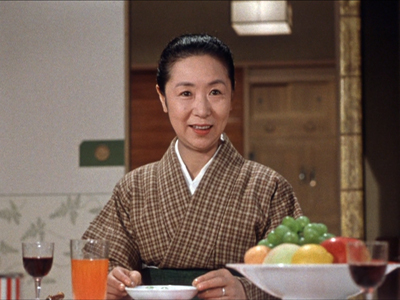
Just how cunning was this guy? The more I looked, the more I began to hallucinate that he had made his movies just for me. When he returned to a scene’s master shot, I found that he had cunningly shifted the framing a little, or rearranged tiny elements of the set (often a beer bottle). He must have known I’d take frame enlargements (in that analog age) to check one image against another. I’d notice that in what seemed a perfectly orthodox reverse-angle sequence, things in the background had been slightly shifted to create a variant composition. That red lamp in Ohayo appears teasingly in the distance, out of focus, when other things are going on. Then you have the fact that people in these films like to keep their drinks at the same level of fill, no matter how big the glasses are or how close they are to the camera. Color seems to have inspired him to try these tricks, as in his first color film Equinox Flower (1958):
As with the shirt and the lampshade, there seemed to be Easter Eggs designed not just for my “critical method” but for me, the obsessive analyst. Why? Why would a grown man put these in his movies?
For fun. This tendency isn’t the punishing pursuit of structure at all costs we find in, say, Peter Greenaway. It’s the realization that you can play with patterning cinematic techniques, using them to accessorize your plot, the way musical motifs deepen the dialogue of an opera. And so what if nobody much notices? As I tell my skeptical students: If you thought of it, you’d do it too, just to get away with it.
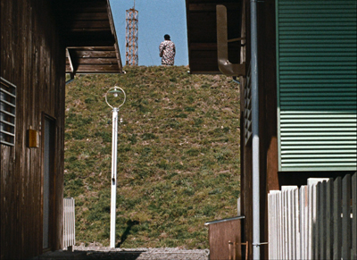
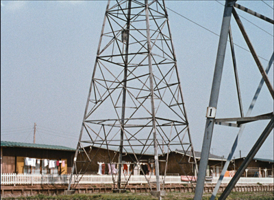
Ohayo has another of my favorite examples. Throughout the film, the power lines near the neighborhood become a pictorial motif. At one point, the elderly Mrs.Haraguchi seems to be praying to a tower in the distance.
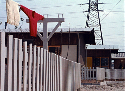
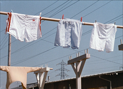
The film starts with a long shot of the neighborhood, its rooftops and fence and washlines in the distance, all dominated by a tower. The film ends with a shot of wash on a line, paying off the gag of the boy who constantly shits his underwear. But the angle of the shot constitutes a reverse angle of the very first shot, since the towers are now in the distance.
Given Ozu’s penchant for 180-degree shifts, and the rigorous patterning of his transitional spaces in the film, I stubbornly, maybe foolishly, maintain that he found this a neat way to give spatial closure to his movie, independent of the underpants gag in the foreground.
Ozu provided me bonus materials in his movies. Some are perhaps visible only to someone as persnickety as he was. And maybe they don’t matter. Ozu gives us so much to enjoy that to ask for more would be churlish. Yet he gives us that more without our asking. His films are generous to their characters and to us, but also to the art of cinema. His absurdly “restricted” approach opened onto vistas of possibility that promise more enjoyment than we have a right to expect.
He had an engineer’s mind, a painter’s eye, and a novelist’s human empathy. And he accomplished it all within one of the most flagrantly capitalistic film industries, which populated Ozuland with stars and stories. Taken all in all, I bet he’s the greatest filmmaker who ever lived.
Thanks to Elizabeth Pauker, who produced “Ozuland,” and as ever Peter Becker and Kim Hendrickson. They have done themselves and Criterion proud with this wonderful package.
The fussbudget in me can’t resist correcting something that comes up in the promotional materials and in some reviews. Ohayo wasn’t filmed in Technicolor. Ozu used what was called “Agfa-Shochikucolor.” I believe that’s just Agfa film with Shochiku adding its brand name, the way “Metrocolor” was MGM’s Eastmancolor. Why Agfa? Ozu explains: “Red turns out magnificently on Agfa film.”
I supplied a feature-length commentary for another Criterion trip to Ozuland, An Autumn Afternoon (1962). If you decide to download Ozu and the Poetics of Cinema, be patient. It’s a big file. Lots of pictures.
Ohayo (Good Morning).
P.S. 30 May: An extract from my interview, focusing of course on farts, is on Criterion’s YouTube channel.


