Archive for 2017
Venice 2017: Martel’s drama of expectations
Kristin here:
Lucrecia Martel’s Zama (pronounced “sama”) happened to be only the third film we saw at the Venice International Film Festival, on the evening of its first day. As the credits faded, David asked, “Have we just seen a masterpiece?” Neither of us doubted that we had, and we suspected that we had also watched the best film we would see during the entire festival. Of course, we haven’t seen every title on offer here, but having just come back from my twenty-fourth and final film, I don’t doubt that it is.
It is also a challenging film, which we watched a second time to try and grasp the basics of what plot there is. Those of us who admired Martel’s earlier work, particularly The Headless Woman (which we also felt compelled to watch twice, this time at the Vancouver International Film Festival in 2009 and wrote about here), had looked forward to her follow-up film. It was eight years in coming, and it is quite different from her earlier films in several ways.
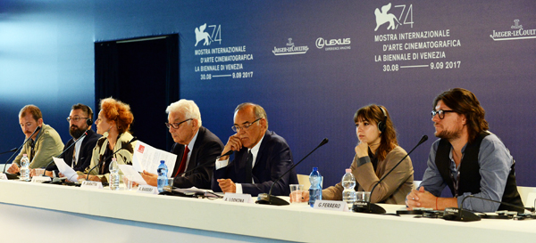
First, while the three earlier features are set set in modern middle-class milieus, Zama is a period piece. The others had original screenplays, written or co-written by Martel, but Zama is based on a 1956 novel by Antonio Di Benedetto (translated into English in 2016). Martel was also working with a higher budget here, one which required patching together many sources of financing. The result is a co-production involving, Argentina, Spain, France, the Netherlands, the USA, Brazil, Mexico, Portugal, Lebanon, and Switzerland and a patchwork of sixteen companies. At the press conference (below) Martel said that the long gap between films was not occupied with making all these arrangements and with shooting the film, which was actually a reasonably short process. She did make a few short films during this time and was ill enough to cease working for a while.
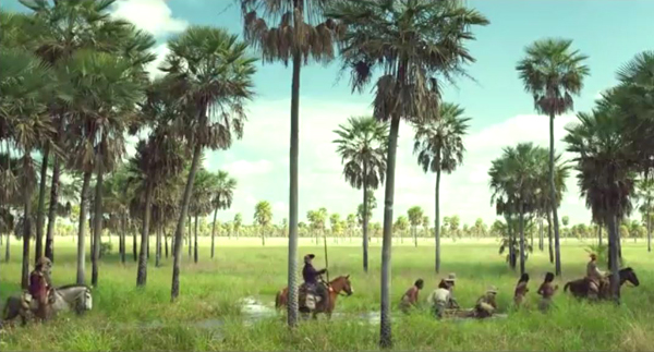
The result of the film’s elaborate production situation is not a typical historical epic. There are impressive landscape shots in some scenes, but no uniformed crowds and grand buildings. No vast battles take place; instead there are a few small skirmishes. The bulk of the action takes place in a ramshackle group of buildings thrown up to house the Spanish colonial government of the provincial town of Asunción, already in decline by the 1790s. The money clearly was spent on creating authentic costumes and furnishings, as well as transporting the cast and crew to locations in Paraguay.
Frustrations of a colonial bureaucrat
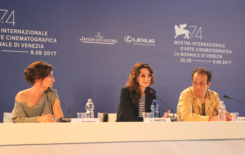
Lola Dueñas (Luciana), Lucretia Martel, and Daniel Giménez Cacho (Zama).
We quickly learn the story’s basic premise, that Don Diego de Zama is an official stationed in this backwater town and that he fervently longs to be transferred to a more important city–ideally where his wife and children live. He is not in charge of this outpost but serves under a governor whose request to the Spanish crown is necessary for such a transfer.
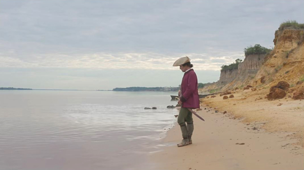
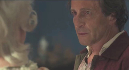
We are certainly not invited to like Zama when we first meet him. The first shot shows him standing and looking down the river (see top). We later learn that he was probably watching for the boat carrying mail, which he hopes will include a letter from his wife or some official news concerning his situation. He spies on some naked indigenous women smearing themselves with mud, and when they taunt and chase him, he turns on one and slaps her viciously. In the second scene he presides over the torture of a young man who refuses to divulge some unspecified information the governor needs.
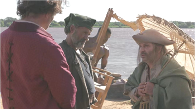
As the action proceeds, however, we witness the countless little frustrations, embarrassments, bafflements, slights, and misfortunes that Zama seems to experience constantly. A brandy merchant who arrives with his wares, seemingly one of Zama’s few friends (below), dies suddenly of the plague. Luciana, a wealthy local beauty, teases him with suggestive conversation but ultimately takes a younger man as a lover. A new governor’s arrival hints that Zama is back to square one as far as his hopes for a transfer are concerned. The man takes over Zama’s modest home and office, leaving him to haul his sparse furnishings to a barely habitable inn. When no letter from his wife arrives, Zama imagines a conversation with her in which they lament the long delay in their reunion, though we must suspect that her failure to correspond means that she has given up on him. Through all this we come to sympathize with him. We never learn how long he has been in this posting, but when someone asks he replies glumly, “a long time,” and we believe him.
Zama might seem at first to be the epitome of a goal-oriented protagonist, but he is hardly the striving, active Hollywood-style hero. There is nothing he can do to better his current situation or to further his desire for escape. Instead, the action consists of one new, often bizarre challenge after another, creating situations that simply play out, usually to no conclusion. None of these situations furthers Zama’s cause. Gradually we become aware that he is actually losing ground, as when the new governor reveals that he must write not one but two letters to the king, a process that could take a year or two. The final portion of the film takes him in a radically new direction as he tries one desperate bid to gain stature and perhaps his long-delayed transfer, a bid that only leads to worse troubles for him.
There is little sense of how much times passes in the course of this accretion of frustrating incidents. During the press conference (above), the cinematographer Rui Poças and Martel said that they sought a visual way to convey a sense of Zama’s agonizing wait, a way to give “the sensation of time that has stopped,” as Martel put it. They deliberately avoided some of the conventions of historical films. One of these was to eliminate fires and candles. Martel added, “In order to be able to think, you must be deprived of things.” This rule was strictly obeyed, with one shot that turned out to contain a candle flame in the background being eliminated. When one thinks about it, lamps, candles, and fireplaces tend to figure quite prominently in suggesting the past in films, which became particularly evident, for example, when a great deal of fuss was made about the new ability to shoot dark scenes only by candlelight in Kubrick’s Barry Lyndon (1975).
Thinking, being deprived of things
As Martel also pointed out, the original novel was told in the first person by Zama, with few descriptions of locales or nature. The film opens the tale out with the occasional landscape views in the early portions and a move into a savanna setting for its last stretch of action (see bottom). For much of the film, however, Martel uses the style I described in The Headless Woman, ” shooting largely in tight shots filmed with highly selective focus.” We stay almost exclusively with Diego, scanning his face for his reactions, so that the film becomes a psychological study, though the title character is a man who manages to carry on by keeping his thoughts and emotions well hidden.
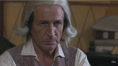
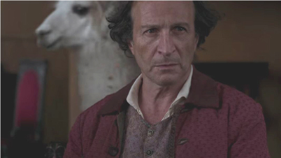
Mexican actor Daniel Giménez Cacho gives a remarkable performance as Zama. We soon realize that the character has very little understanding of the bizarre things that happen around him and of the attitudes that other people have toward him. At times he adopts the faintest of smiles, ready in case what is being said to him is supposed to be amusing. More often he looks mildly worried, as if expecting another mocking remark or revelation of some new indignity to be offered. In his court his face could be taken to convey an appropriate dignity and wisdom (below), but it might just as well be puzzlement over the case before him. With Luciana he seems passive, but his face conveys hints of lust, hope, and an anticipation of ultimate rejection. In a meeting with a superior official, he struggles to ignore the ludicrous presence of a llama (which we had seen outside when he arrived) wandering around the office behind him as he pleads his case.
All in all, despite the fact that Cacho’s craggy, earnest face seems to suggest competence, we emerge from the film with no real sense of whether Zama is in fact competent and unfairly treated or simply a man out of his depth who deservedly remains stuck where he is.
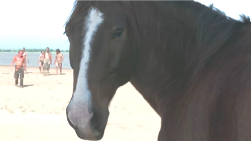
One extraordinary moment which I cannot resist mentioning comes late in the film when a horse in the foreground of a scene turns and looks directly into the lens (top of this section). Its stare is even more enigmatic than Zama’s face, just another little mystery that Martel provides.
It is not surprising that Zama was the first in a series of three novels that have come to be called Di Benedetto’s “Trilogy of Expectations.” The second, El silenciero (1964), and third, Los suidicas (1969), share no plot elements with Zama but are thematically linked to it. It is also not surprising to learn that the novelist first read Kafka in 1954, just before writing Zama.
Guy Lodge, in his enthusiastic review for Variety, refers to Zama‘s “unjust placement in a non-competition slot at Venice.” It has garnered quite a few reviews as laudatory as Lodge’s, as well as a few which dismissed it as cryptic and not engaging. A good summary of the coverage, regularly updated, is provided by David Hudson. The film deserves to gain a higher profile in its upcoming screenings at the Toronto and New York festivals. Perhaps it will also pick up a North American distributor. Somehow it should be made available on home video (Criterion, perhaps?), since this is going to be considered a classic.
The most detailed account of Di Benedetto’s life and work available online is an essay by the translator of the English-language version, Esther Allen.
Again, we are grateful to the Mostra and those who serve it, particularly Alberto Barbera and Michela Nazzarin. Thanks as well to Peter Cowie and David’s colleagues on the Biennale College Cinema panel, who have all been good company.
[October 1, 2017: Argentina has chosen Zama as its nomination for best-foreign-language Oscar. I doubt it will make it into the final five, given how challenging it is. Still, maybe it will, and in any case, it’s good to see Martel getting respect in her home country.]
[October 16, 2017: Strand Releasing picked up the North American distribution rights for Zama last month, shortly before its American premiere at the New York Film Festival. It plans a theatrical release in early 2018.]
Venice 2017: College days
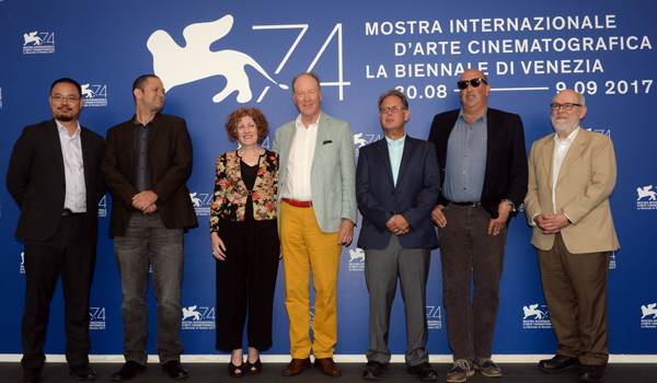
At the College press conference: Pedro Costa, Mazen Khaled, Savina Neirotti, Paolo Baratta, Alberto Barbera, Alena Lodkina, and Giorgio Ferrero. © La Biennale di Venezia – foto ASAC .
DB here:
I came to this year’s Venice Film Festival at the invitation of Peter Cowie, who has for years run panels of critics and filmmakers at the Mostra. In recent sessions he’s assembled gaggles of critics to respond to films made under the auspices of the Biennale College Cinema.
 The College supports creative teams making micro-budgeted first or second features. On the basis of treatments and video presentations, the selectors pick out projects that seem feasible and bring twelve teams to fall workshops, where they work with 18 tutors and trainers. This year’s filmmakers all attest to the strong, provocative challenges they got in the workshops. After three or four weeks, each team submits a draft project. On the basis of the drafts, three projects are picked for final support.
Past films that have emerged on the international scene from the competition include Memphis (2014) and The Fits (2015). Last year, explained Sabine Neirotti, coordinator of the initiative, there were 1400 applications. This year, each selected project project got 150,000 euros funding.
As Peter’s statement puts it, the College exists to “support the making of low-budget films in a period of global recession” and to “find youthful auteurs if the cinema is to be reinvigorated.” The purpose of the panel is to give feedback to the filmmakers, particularly about how their work might fit into the world cinema market.
This year’s panel gave me a chance to make some new friends: Ty Burr of the Boston Globe, Glenn Kenny of the New York Times and Some Came Running, Chris Vognar of the Dallas Morning News, and Stephanie Zacharek of Time. Kristin and I had already known Justin Chang of the Los Angeles Times. Doing a festival is fun, but doing it with peppy cinephiles like these is even better.
So what about the films? All seemed to me quite good, and each had some very strong moments. All were clearly personal expressions, but each also wanted to communicate vividly with the viewer. All have ripe prospects at festivals and what might lie beyond–home video, streaming, specialty theatrical. And all struck me as having roots in powerful traditions in film history.
Gleams at Lightning Ridge
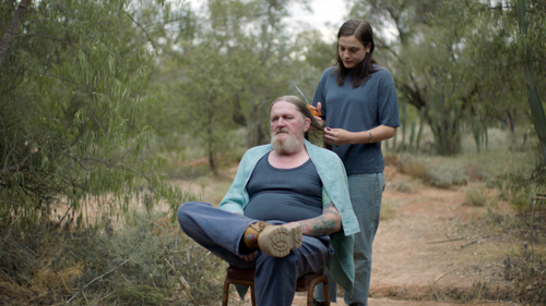
Strange Colours (2017).
Strange Colours, directed by Alena Lodkina, is somewhat akin to American indie regionalism. In the Australian Outback, miners dig for opals, and they live isolated, hard-edged lives. Lean and raggedy coots gripping cans of light beer from dawn to bedtime, shuffling along and muttering through overgrown beards, they might seem an alien tribe. Many confess they came here as a last resort and stayed because they liked the solitude. Eventually, the contours of a genuine, robust community come into focus through the visit of Milena, an outsider who has come on a family mission.
Taking a break from university, Milena is in Lightning Ridge because her father Max has had a heart attack. Lodkina’s script avoids those traumatic flashbacks that often supply backstory. Instead, we get gradual exposition about the past, with some patches left sketchy or unfilled. I infer that Milena left her father very young, so that both he and his world come as a revelation to her, and us.
Plainly Max can’t express affection spontaneously; when Milena arrives at his hospital bed, he berates her. On her off hours, she tries to settle into his ramshackle home, and she meets a younger miner, Frank, with whom she strikes up a tentative friendship. When Max comes out of the hospital, he gruffly explores rebuilding his relationship with Milena. He even reveals he has kept an item from her childhood as an heirloom.
Like the other College films, Strange Colours decorates its main line with poetic asides. The gleaming opals contrast with the flinty lives of the men who harvest them, while cutaway shots of the starry sky resemble the gems embedded in the labyrinths of the mines. Unexpectedly, Max points Milena to the constellation of Orion; this man who seems so much of the earth is sensitive to the stars as well.
The film is full of incident, but without the plotty propulsion of a conventional family-problems movie. A thief is stealing opals from miners’ claims, but this never creates conventional suspense. The thief meets his fate offscreen. Like her father, Milena is taciturn, and a lot of the film involves her pacing through ever-changing landscapes and encountering characters who reveal themselves in quick strokes.
In a way, Strange Colours carries on the tradition of Neorealism, when as Dwight Macdonald remarked, “The talkies became the walkies.” A character explores an environment at a deliberate pace, and we’re invited along. Lodkina mentioned to me that one inspiration for her was Stromboli, hinging as it does on the idea of a woman plunged into an utterly unfamiliar milieu. Neorealism gave film history a new model of cinematic narrative, and it’s bracing to see young filmmakers continuing to see what that model can yield–or rather, refreshing it for new times and places.
Bodies of water
Martyr (2017).
“Our bodies are smarter than our brains,” remarked Mazen Khaled during our panel session. He was referring to his College project, Martyr. At its core is a fait divers: at the Beirut waterfront, a young unemployed man dives off a treacherously high balustrade and drowns. Around this incident Khaled’s team created a sensuous, poignant study of men among men.
An American like me might take the title to refer to a young man caught up in jihad, but it turns out that Islam counts death by drowning as a form of martyrdom as well. This is hinted at in the film’s opening: lyrical imagery of the protagonist Hamad facing the camera, flexing his fingers, and finally floating underwater. The camera probes the textures and edges of his body, both in an abstract space and in the rippling water. Hamad wakes up, suggesting that this has been only a dream, but as Peter Cowie pointed out, it’s more of a prologue, giving us a preview of both the film’s method–patient scrutiny of male bodies–and the plot’s crisis point.
Promising his parents he’ll look for work, Hamad sets out but soon he’s joining his friends at the waterfront. They stretch out, swim, make jokes, and talk of the big dive from the balustrade. Hamad decides to try it, against the warning of his pal. The film enters a zone of floating time, where the moments before, during, and after the dive are gently rearranged and replayed. When he takes the plunge and doesn’t come up, the casual brushing of bodies during sunbathing becomes a desperate, straining mass of grappling arms and bent backs. The twisting torsos of the young men, in images immaculately composed, resemble a sunlit Caravaggio. The homosocial becomes, in death, homoerotic.
What follows is a long cinematic threnody, treating the reactions of Hamad’s family, the preparation of the body, and abstract images on a theatre stage, where figures we’ve seen reenact their roles. Time continues to shift, as images of sun, water, and bodies in space get replayed and reshuffled. Perhaps most vivid is the way that the friends’ patient washing of Hamad’s corpse recalls not only the prologue but strokes and pats we have seen earlier, executed by Hamad and by others.
Martyr is an excellent example of how film form and style reshape the physical realm to create a visual poetry. Thematically, Khaled explains that he wanted to treat this seemingly sorrowful event is a kind of liberation from a life of hopelessness and strife: suspended in water, Hamad seems finally free. At the same time, I saw the film as joining the tradition of Kenneth Anger’s Fireworks, Willard Maas’s Geography of the Body, and Stan Brakhage’s Flesh of Morning–a cinematic exploration of the human body as a landscape, bearing traces of how humans live in and through it.
Fantasia on petroleum byproducts
Beautiful Things (2017).
If Strange Colours resembles a Chekhov play and Martyr suggests a luxuriant lyric poem, Beautiful Things is a sort of symphony. The director, Giorgio Ferrero, is a composer for films and theatre pieces, and he has directed commercials and photo shoots for Nike, Condé Nast, and other companies. His College project has the sleek professionalism you’d expect of someone with this resumé, yet it’s also a monumental four-part critique of the global cycle of commodities, from production and distribution to disposal. The whole thing is staged, shot, and cut with operatic flair and is given, as you’d expect, a galvanizing soundtrack.
The first part, Petrollio, is about oil and is narrated by a driller. Oil is in most products, he tells us; it’s “the blood of the earth” but also the lifeblood of consumers’ lifestyle. Part two, Cargo, is narrated by a worker on a container ship, and he gives us a tour of the vast spaces he works in. Metro (“Meter,” as in music, but also “Measurement,” I suppose) centers on a researcher into anechoic acoustics, probing the sounds that are latent within every manufactured product.
The connections among parts become associative and metaphorical: the researcher’s “coffin” recalls the containers, and his treatment of sounds as acoustic objects runs parallel to the clang of oil drilling and the hum of the ship. A final part, Cenere (“Ashes”), takes us to a recycling plant where a man who designed slot machines now oversees the waste-to-energy chambers. He has learned that “We must burn our own shit.” We see the spidery claw scrunch up all the detritus of capitalism and carry its dangling burden to the flames.
Intercut with these four men are arresting images of their surroundings, treated as abstract landscapes and industrial sculpture. And threaded through each section are scenes of a household stuffed with toys, games, furniture, and the other consumer durables. The couple has gloried in accumulation, and the results are choking them. At the climax, the whole ensemble is blended when a boy (the oil man as a child) treats wrenches as a xylophone, and sounds pile on ferociously, spiraling up to an ethereal audiovisual cadenza. It’s cut off by an epilogue in which our couple dances and play-fights their way through a mall–in search of more beautiful things?
Like any good symphonist, Ferrero knows the power of silence; the soundtrack makes room for dead spots that suggest a world scraped clean of all the clutter. In its knowing combination of movement, color, composition, and musical rhythms and harmonies, Beautiful Things looks back to the “machine music” of Walter Ruttmann’s Melodie der Welt (1929) and other experiments, when the cinematic avant-garde could imagine that films could integrate sound without becoming talkies. This aesthetic surfaced not only in the abstract films of Fischinger but also in Disney’s cartoons, celebrated as the apotheosis of a genuine audiovisual aesthetic. Ferrero is in this tradition. Like an animator, he scripted his soundtrack before shooting his film, timing shots to notes, and he took his inspiration, he tells us, from Fantasia.
All three films have a bright future ahead of them. Actually, the future starts now. You can stream all of them, along with other festival features, at the Venice Sala Web, for a small fee, until 19 September. The next 12 submissions have already been picked, and the beat goes on.
Participating in the College was a wonderful experience, and I’m grateful to the Mostra and those who serve it, particularly Alberto Barbera, Michela Nazzarin, and Luca Fabris. Thanks as well, of course, to Peter Cowie and my colleagues on the panel.
For more on the audiovisual aesthetic of early sound cinema, see Lea Jacobs’ Film Rhythm after Sound and our review here.
P.S. 8 Sept 2017: Thanks to Peter Hourigan for a spelling correction.
Justin Chang, Chris Vognar, Stephanie Zacharek, Peter Cowie, Ty Burr, Glenn Kenny, and DB. © La Biennale di Venezia – foto ASAC.
Venice 2017: Hunting Golden Lions
The Shape of Water.
Kristin here:
Much attention is generated each year around the Hollywood films that premiere at the big late-summer and autumn festivals, starting with Venice. This year several such films have been launched here in competition for the Leone d’Oro. David has already mentioned Downsizing, and I discuss two more below.
The Shape of Water will be released in the US on December 8, and Three Billboards outside Ebbing, Missouri on November 10. I’ve avoided giving away the endings, but there are definite SPOILERS below–though no bigger than those already present in reviews already published.
As I finish this entry, I am seated in the press room of the festival, surrounded by perhaps a couple of hundred others, all typing away like mad on their computers and tablets and turning out a great deal of coverage of the festival. The press room is a large, extremely high hall in the Casino , the second largest of the 1930s-era buildings used by the festival. It no longer functions as a casino, though there is still a pattern of clubs, hearts, diamonds, and spades on the ceiling in the press-conference room. When the festival is not on, these buildings are usually shut up and left to wait for the next year.
[September 9: Both films bagged one: The Shape of Water has just won the Golden Lion as best picture, and Three Billboards outside Ebbing, Missouri won Best Screenplay.]
The Shape of Water
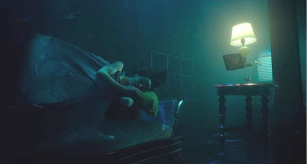
The pre-credits opening of Guillermo del Toro’s The Shape of Water shows the heroine Elisa calmly asleep, floating above a sofa in a somewhat shabbily furnished room entirely underwater (top). We hear a narrator wondering how to tell the story of “the princess without voice.” Elisa, who is a mute cleaning lady employed at a top-secret government lab in the cold-war early 1960s, is not and never becomes a princess in any literal sense. But the phrase marks the film as a fairy story in which the heroine and her true love will rescue each other. (Del Toro avoids the more obvious “Once upon a time …”)
The voice turns out to be that of Giles, a gay down-at-heels artist who is Elisa’s best friend and neighbor. He could not possibly know everything that happens, especially at the end, when his voice similarly describes the outcome. But such narrating figures are common enough, and we must make allowances in a fairy tale.
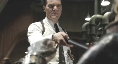
The other genres that del Toro draws upon are horror and science fiction, but both are definitely subservient to the fairy tale. The source of the horror is reversed here. The amphibious Creature who is brought to the lab and who becomes Elisa’s friend and eventual romantic partner is modeled on the Creature from the Black Lagoon, as del Toro readily admits, but here he is the victim, not the menace. The true monster is Richard Strickland, an agent who picked up “The Asset,” as he and the scientists at the lab call the creature, and he is determined to have him vivisected and disposed of–but not before he has adequate opportunity to torture the Creature with an electric cattle prod. This pastime loses Strickland two fingers, which are grafted back on but gradually go gangrenous, making him seem to degenerate into something monstrous.
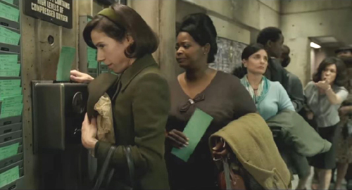
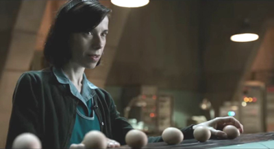
The script of The Shape of Water is elegantly crafted, with motifs wending through it, most obviously the water imagery that pervades the film, from the opening to the skittering drops of water that Elisa traces on the exterior of the bus window. Del Toro also sets up important plot points subtly and clearly. The routine of Elisa and Zelda punching in and out of work at a time clock (top of section) seems mainly a device for showing their friendship and Elisa’s somewhat loose attitude toward rigid deadlines. Later, however, the time on the punched cards ends up providing an important alibi during the investigation of the Creature’s mysterious disappearance from the lab.
Similarly, a comic scene in which janitors and cleaning ladies sneak a smoke while clustered in the blind spot of a nearby surveillance camera motivates Elisa’s later manipulation of such a camera to hide her activities during the rescue scene. The early scene of her boiling eggs to take in her brown-bag lunch leads to the episodes of her offering first a single egg and then multiple eggs to the Creature as she tries to make friends.
Despite all this, I found it implausible that Elisa, Zelda, and Giles, with a little help from the sympathetic scientist Hofstetler, could remove a major item from a top-secret lab. Here the fairy tale bumps up against the fact that it is set in a sci-fi world. Presumably we must simply assume that in a fairy tale such things can happen.
The music of the film is crucial to the fairy-tale atmosphere. It is entirely evocative of the late 1950s-early 1960s era, and not just in the brief scenes from real Hollywood musicals that would have been showing on TV at the time. At the press conference Alexandre Desplat (who also scored Suburbicon, competing here in Venice) said he wanted to emphasize emotions even while creating a musical flow like water, without emphatic moments. When del Toro, working as usual very quickly, showed Desplat a rough-cut of The Shape of Water a week after shooting ended, the composer referred to Nino Rota and Georges Delerue, two masters from the era of the story who were skilled at creating overtly charming soundtracks. The result is a buoyancy (to continue the water theme) that helps counteract the grimness and threat in many of the scenes.
Much has been made of the fact that del Toro has returned to his low-budget roots after Pacific Rim (at a reported $190 million budget) and Crimson Peak (mid-budget at around $55 million). The Shape of Water, according to del Toro, cost around $20 million–a remarkable figure, considering the quality of the CGI and the production design. This feat was achieved in part by the director foregoing his salary and paying for some of the conceptual artwork. (It seems likely that the cast took lower than usual fees in order to work with del Toro.)
Comparing The Shape of Water to del Toro’s masterpiece, Pan’s Labyrinth (made for a reported $19 million), is nearly universal among reviewers, and one can hardly avoid it, even though the earlier film is ultimately far darker. Perhaps it is closer to fairy tales in their original grim forms. As del Toro pointed out at the press conference, fairy tales often originated in times of war, famine, and pestilence and have been softened for modern readers. The Shape of Water never achieves the depths of queasy horror that some scenes of Pan’s Labyrinth contain. Still, it was assigned an R rating by the MPAA and is definitely a fairy tale for adults.
Three Billboards outside Ebbing, Missouri
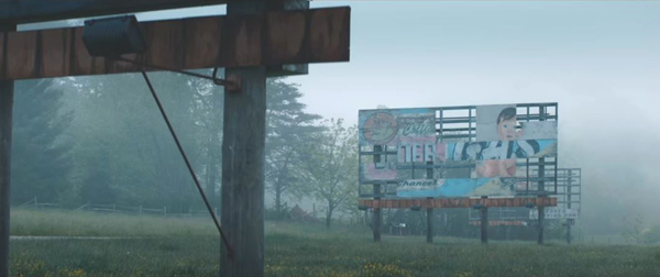
The sharp dialogue in Martin McDonagh’s third feature is funny and poignant by turns. Frances’s McDormand’s tough, vengeful mother Mildred Hayes delivers much of it and drew applause a number of times during the press screening. She begins by hiring the three billboards of the title, seen in a dilapidated state in the foggy opening shots (see bottom). Her simple message appears in three parts: “Raped while dying/And still no arrests/Why, Chief Willoughby?”
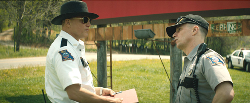
As Jason Dixon, a racist, violent, dim-witted police officer (in a scene-stealing performance by Sam Rockwell, above, with Woody Harrelson as Willoughby) observes as he drives by, this is a declaration of war. Mildred spends much of the film badgering, berating, and ultimately attacking the police for what she considers their neglect in investigating the months-old case of her daughter’s rape and murder. Most of the townspeople condemn her billboards tactic and side instead with the likeable, sensible Chief Willoughby, who is especially sympathetic given the fact that he is dying of cancer.
The “war” serves to give us yet another unsavory view of a southern town. Apart from Willoughby, who turns out not to be as inactive concerning the case or unsympathetic toward Mildred’s plight as we might think, most of the characters are unsympathetic to some degree. The other cops do little to stifle Dixon’s outbursts of violence, and Mildred’s ex-husband, who had beaten her and taken up with a pretty nineteen-year-old, disapproves of the billboard tactic. Her son just wants to put his sister’s death behind him.
Mildred herself has been pushed beyond reason by her grief, rejecting Willoughby’s protestation that his investigation has simply failed to turn up any clues, including any DNA matches among local men. Mildred’s response is to demand that he DNA test every male over eight in the town, the county, the state, the country, if necessary. When something is thrown at her car as she drops off her son at school, she actually attacks some kids who claim not to have seen who did it. Willoughby becomes the stabilizing force, and he’s not around long enough to help stave off the escalating conflict.
Three Billboards is a thoroughly entertaining film, but I think there is at least one problem involving the motivation for the presence of a mysterious stranger who becomes a suspect. On the whole the story works well, with some unexpected changes of heart among the characters and an ending that suggests the possibility of healing within the town. Perhaps this is also suggested by the choice of “Ebbing” for the fictitious Missouri town (which was represented by Sylva, Ashville, and other areas in North Carolina).
For those interested in Oscar buzz, I would not be surprised to see Frances McDormand and Sally Hawkins competing again each other in the Best Actress category. You probably did not hear that here first.
Many thanks to Peter Cowie, Alberto Barbera, Michela Lazzarin, and all of their colleagues for inviting and assisting us at this year’s Mostra.
Three Billboards outside Ebbing, Missouri.
Venice 2017: Sensory Saturday; or, what puts the Virtual in VR?
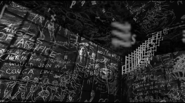
La Camera Insabbiata (2017) by Laurie Anderson and Hsin-chien Huang.
DB here (still at the Mostra):
Kristin and I are Virtual Reality novices, so when we got a chance to sample some pieces at Venice VR, we jumped. The demand was great for the 22 pieces on display, and you had to book each encounter separately in advance. The event was held on its own island, Lazzaretto Vecchio, which was startling in itself; the facility was once a hospital for plague victims.
We took in four pieces in one afternoon and may go back to see some others. We didn’t see exactly the same ones, so my report and speculations are limited to mine. Apart from being fairly wild, sometimes creepy, sensory experiences, they set me thinking about how VR seems to work as a medium.
Angels of artifice
My quartet was a varied assortment, each somewhat parallel to a film genre or narrative prototype. The first was Greenland Melting, by Catherine Upin, Julia Cort, Nonny de la Peña, and Raney Aronson-Rath. It’s part of a Frontline documentary series, and it follows the format, but with immersion. Presenters addressed the camera (me) and took me via helicopter to the glaciers so I could watch them heaving themselves into the sea.

The camera took me underwater as well, and I experimented with voluntarily bobbing under and above the waterline; it worked. Again, as in a film, the transitions between shots was managed through quick dissolves.
La Camera Isabbiata, by Laurie Anderson and Hsin-Chin Huang, is an installation running 20 minutes. It presents a fantasy landscape that you can move through. With two controllers, one in each hand, you choose one of several virtual domains to explore. As far as I could tell, all of them were based on cavernous arrays of blackboards chalked with graffiti. (See the image surmounting today’s entry.)
I first chose the sound domain, which asked me to speak. My words were not only played back to me, but then assumed vase or candy-bowl shapes of gleaming color.
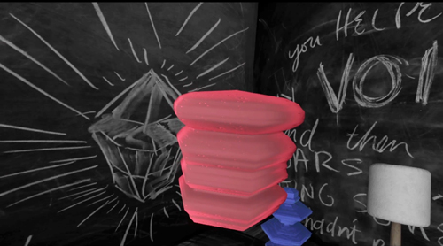
Getting bored with hearing myself and seeing my words made solid, I switched to flying.
Flying was most excellent. Once I figured out how the remotes governed direction, speed, and angle, I could steer a swift path through, over, and around those huge black surfaces. The sense of self-initiated optical flow was powerful, although there were no other cues (e.g., balance, air pressure) to mimic actual flight. But I could have fun playing with this a long time. This was pure subjective POV cinema, or first-person gameplay if you like, and everything was one single shot.
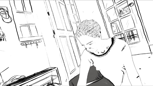
If La Camera Isabbiata put the onus on the user to initiate everything, Draw Me Close: A Memoir by Jordan Tannahill, made me respond to a situation. Once the goggles went on, I was guided to a black-and-white broken-line image of a woman on her sickbed. The artist’s voice-over presented the situation of his mother, dying of cancer, and me-as-him visiting her. Unseen by me, except as her avatar in the goggles, a performer filled the role of the mother, occasionally taking my hand and responding to my responses with more or less scripted comments.
I made my way to a cartoon bed and actually sat on it. The illustrated woman spoke to me, with Tannahill’s voice-over responding. On instructions, I went outside to fetch her paper, but coming back in I moved into a flashback of Tannahill (me) as a little boy playing with Mum. She chatted with me and I feebly responded, and followed her instructions to make colored marks on paper stretched out on the floor.
Later that night Tannahill’s narration guided me to a more unpleasant memory, one reminiscent of Terence Davies’ Distant Voice, Still Lives. It was a minimal narrative to match the images, but I could fill it thanks to the familiarity of the scenario and the tactility of furnishings (bed, door) and physical human contact.
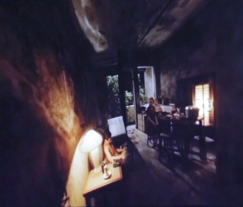
The Deserted, a 55-minute piece, was frankly billed as “a film by Tsai Ming-liang.” A series of fixed long-shots joined by cuts shows a typical Tsai situation: a young man and his mother live in a ruined temple. He apparently administers electrotherapy to his back and chest; he floats in his bath with a fish; it rains in buckets and water comes seeping in to where you’re hovering. A woman in white, perhaps a ghost, appears at times, once in the man’s bathtub.
You make the choices in La Camera Isabbiata, and you role-play in Draw Me Close, but in The Deserted you’re locked down as a witness. No images from the piece seem to be available, but this, from a shot of a camera monitor, roughly indicates the film’s first shot (which isn’t as distorted as this looks).
You can’t move to another spot, and you can’t even crane your neck to peek around corners. You can swivel your head to look 360 degrees horizontally and vertically. But nothing much happens behind your back or over your head. All the action, such as it is, takes place squarely in front of you. Given Tsai’s penchant for static long takes and deep areas of space, The Deserted isn’t putting you inside a real or virtual space; it’s putting you inside a Tsai film.
Reality has the most bandwidth
Since I’m no expert on VR, all I have are initial observations based on this sampling and on a bit of reading.
First observation: VR doesn’t have to be photorealistic to engage you. The image in Draw Me Close is quite impoverished in terms of real-world cues, and the shots of The Deserted are almost shockingly fuzzy. (Tsai, a fan of razor-sharp focus, would never let them in one of his film films.) Other pieces in Venice VR, visible on monitors while users were getting the full dose, are often quite cartoonish. Why are they then so compelling?
E. H. Gombrich suggested long ago that illusion can rely more on stimulation than simulation. That is, choose just a few sensory triggers and you’ll be aroused even if the image isn’t particularly lifelike. Baby geese can, if primed properly, take a box for their mothers, and frogs can snap at anything floating in a fly-ish sort of way around their heads. Outlines, it seems, are central for creatures like us, but they don’t have to be detailed. We also respond, fast and stupidly, to configurations that suggest faces.
Try not to see Jesus, or Janis Joplin, in the tortilla, or a stare on the wings of a Caligo butterfly.
As caricaturists and camouflagers know, a few distinctive features can suffice to summon up the target, and the same goes for the partial and degraded input we see in Draw Me Close and The Deserted. In addition, concepts play a role; our ideas about what to expect in certain surroundings, such as a household, help the illusion cohere. And the information needs to be consistent. When I turn my head in Tsai’s temple, nothing I see contradicts the other cues.
A second point: The VR experiences subtract on some channels of input and compensate on others. Normally, perceptual reality is massively redundant. Our sensory systems reinforce one another. Tilting your head sends signals about balance and vision, while sight and sound and touch and muscular activity offer mutually confirming information. And when things are uncertain, you can always test your environment by moving around.
But the VR systems I encountered impoverish the input on certain channels. Standing in the helicopter of Greenland Melting, I saw the passenger seat beside me as vividly three-dimensional, but when I tried to grab it for support, nothing was there. In The Deserted, I looked down and didn’t see my feet; in fact I was an eye in a bubble floating midway up the wall, where the camera was. And in neither of these pieces could I move voluntarily to poke around much in the space.
I could do that in La Camera Insabbiata, but it was an impoverished environment along other parameters. I could fly, but not touch any of the surfaces–which were without color or shadow, beyond a spotlight that shifted to follow my attention (presumably guided by eye-tracking software). I couldn’t land atop one one of the monoliths, or bump into an edge.
Reciprocally, Draw Me Close provided other sensory inputs: locomotion (though not wholly voluntary), touch (initiated by the performer playing Mum, and by the prop bed and door), and an array of skimpy visual-spatial cues. In principle, smell could have been included. Why not, then, go the whole hog and use a photorealistic rendering of the space and Tannahill’s mother? Perhaps a very faithful representation of Mum and the household would have raised the problem of the Uncanny Valley.
Just as important, we might ask: Since a performer is always required for the piece, why not simply play out the scenes with her and the user? Just go for reality, not virtual reality. I’m guessing that the move toward drawn imagery marks the project as stylized enough to be a media artifact, rather than a piece of interactive theatre. (Though it is partly that.) Here, I’m thinking, the impoverishment of information on certain channels was a deliberate aesthetic choice, rather than being obligated by computer processing power, though that would probably have been a factor too.
One of the biggest compensations for what’s missing in some channels would seem to be good old peripheral vision. This is a very strong cue to immersion, and it can override inputs that contradict it. I remember being in one of the Disney World attractions back in the 1980s, a wraparound theatre that put visitors at the center of a travelogue. Even though there were plenty of cues that you weren’t in front of Buckingham Palace–such as your awareness of people around you looking in different directions–if you concentrated on the filmed display, there was a compelling illusion that you were riding down the street toward the Palace.
Peripheral vision would seem to be a powerful sensory trigger for creatures like us. This was the insight that drove widescreen cinema and the curved screen of Cinerama. But efforts to activate peripheral vision maximally come at a cost. You lose the frame and thus a sense of significantly composed imagery. The Disney display had, as I recall, borders at top and bottom, but in modern VR those too are abolished. VR gives with one hand and takes away with the other, so to speak: Greater immersion yields less of the pictorial structuring that’s inherent in framing. Tsai’s film somewhat overcomes this problem by making the surrounding space neutral and fairly uninformative, but the result still loses the sharp dynamic of offscreen and onscreen space we find in his feature films.
One more thought, which seems more solid than the others. Some have asked whether VR can accommodate narrative. I had presumed so theoretically, but now I’m convinced. Greenland Melting told a real-world story, an alarming one at that. Draw Me Close had emotion-laden scenes, a crisis and climax, and a flashback. The Deserted presented a typical Tsai scenario of humid stasis–a thin narrative, but a narrative. (As often in Tsai, what we miss in psychology and causal density we get in slight spatial changes and pictorial surprises.) It wouldn’t be hard to “narrativize” the Camera Insabbiata soaring, either, say by prodding me to go on a cosmic scavenger hunt. I conclude that of course VR can deal with narrative.
John Landis worried that VR was too wedded to long takes to suit cinematic storytelling. That worry was in turn tied to the assumption that narratives must guide your attention. True! But it’s wrong to assume that only continuity editing can shape a film story. Our attention can be precisely guided through long takes. Indeed, to a degree the sort of open and exploratory attitude some find in VR was already there in locked-down long-take directors like Mizoguchi, Akerman, Hou, and Tsai. And they told stories, plenty of good ones.
Many thanks to Peter Cowie, Alberto Barbera, Michela Lazzarin, and all of their colleagues for inviting and assisting us. Special thanks to Andrea Vesentini for guiding us through the array of events at Venice VR.
For details on Venice VR, go here. Variety covers the Venice event in articles by Elsa Keslassy and Nick Vivarelli. Patrick Frater interviews Tsai on The Deserted here. I found this Wired piece a good VR primer, and Ty Burr offers an update in MIT Technology Review.
Gombrich’s key essay on simulation and stimulation is “Illusion and Art,” available without illustrations here. In full form it appeats in Illusion in Nature and Art, edited by Gombrich and Richard L. Gregory (Scribners, 1973), 193-243.
For discussions of how storytelling cinema guides attention within the shot, see the categories Film Technique: Staging and Tableau Staging.
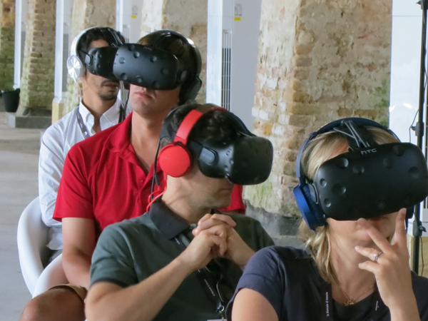
Better than a cellphone? Viewers at Venice VR.


