Archive for August 2018
Venice 2018: First impressions, FIRST MAN
DB here:
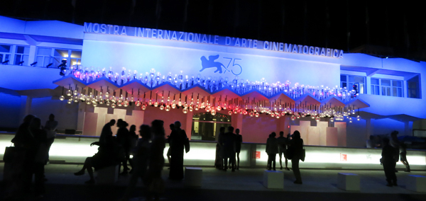
Kristin and I are back at the Venice International Film Festival, because once more I’m on the panel for the festival’s Biennale College Cinema projects. A future post will take up those films, as well as Kristin’s comments on the restored Der Golem (1920), which screened the night before the festival’s official opening. For now, a quick report while we’re between screenings. And feel free to check in with our new Instagram page for rolling photo updates as the days go by.
First man, fourth feature
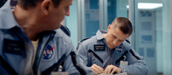
Kristin and I are admirers of Damien Chazelle’s work, so you’d expect that we were keen to see First Man, his Neil Armstrong film. It’s not exactly a biopic, as it concentrates on a fairly brief period of his life. It treats his career as an astronaut as partly a mechanism for coping with the death of his young daughter. The familiar Hollywood double plot–personal life versus professional life–is filled out by ongoing tensions with Armstrong’s wife Janet (Claire Foy) and by NASA’s efforts to beat the Russians to the moon.
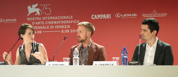
The domestic scenes are steeped in mild melancholy, as the workaholic, buttoned-up Armstrong seems a good candidate for clinical depression. One powerful moment involves Janet’s insistence that he open up to his sons and admit that he might not return from the moon launch. His deep affection for his daughter, sketched quickly in the opening portions, suggests why he’s more stiff and distant with his sons later; it’s as if he doesn’t want to risk strong love again. Ryan Gosling’s performance handles this well, I think; after we’ve seen him caress his daughter’s hair early on, we watch his fingers closely. Even in long shots, his hands betray him, as when he nervously twists his wedding ring. (Below, Foy, Gosling, and Chazelle at the press conference.)
The moon mission becomes a kind of catharsis that lets Armstrong regain a dimension of his humanity. The professional plot, crystallized around a series of subgoals leading to the moon shot, renders him as tenacious and dedicated. Pointedly contrasted to showboating Buzz Aldrin, Armstrong’s laconic manner reflects not only a confidence in his abilities but a quiet, stubborn professionalism. This too is shaken by death; the incineration of his friends in a test not only stresses the danger of space flight but the fact that he is increasingly alone. Throughout his adversities, Armstrong must show both physical endurance and resourceful intelligence. He’s admirably swottish, but he uses it as a shield for emotions.
From its very opening frames First Man has a galvanizing immediacy. Chazelle has given up the smooth, locked-down camera technique of La La Land in favor of a looser handheld approach that recalls Guy and Madeline on a Park Bench. The film’s over 2000 shots create an impressionistic nervousness that suits not only the suspense of the NASA mission but the anxieties of the protagonist. DP Linus Sandgren filmed many of the tighter shots in Super-16mm, and the same gauge, applied to flashback images of Armstrong’s daughter, yield almost Kodachrome bursts of color. By contrast, the culminating scenes on the lunar surface, shot in Imax, contrast with the rest of the film’s texture by being rigorously stable, awe-inspiring framings.
In filming Armstrong’s tests and missions, Chazelle tackles what we might call the Raging Bull problem. Scorsese sought to distinguish each of Jake LaMotta’s prizefights through different techniques (slow-motion, optical POV, and the like). Chazelle does much the same. The film’s harrowing opening sequence is rendered in convulsive imagery from Armstrong’s point of view, trapping us in the cockpit with him as he manages to salvage a test flight. Later aerial sequences take us briefly outside spacecraft in varying angles, but I think the most majestic external views are saved for the climactic moon shot.
Paralleling this pattern, in the most claustrophobic passages thrashing grinding sounds rip through the theatre. By contrast, the moon landing is accompanied by Justin Hurwitz’s quietly triumphant waltz. This is definitely a film to be seen and heard on the biggest screen you can find.
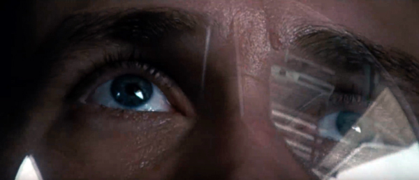
As one measure of Chazelle’s interest in fine-grain detail, consider his powerful use of reflections. The astronauts’ helmets become both distorting windows and reflecting masks that capture the world outside. There’s striking imagery in the opening sequence of the horizon’s curvature bouncing off Armstrong’s helmet, while when we get to the moon, the landscape becomes a wraparound image blotting out the First Man’s face. At one point earlier in the film, I swear I saw the reflection of the moon in the iris of Armstrong’s eye. In any case, the final shot (no spoilers here) takes this pictorial motif to a new emotional pitch.
I want to write more about First Man, after I’ve seen it again and thought about it more; I hope as well to bring you information from Linus Sandgren about the cinematography. Still, I hope these notes convey my immediate appreciation for what Chazelle and his team have accomplished. First Man seems to me another exciting achievement by one of the most ambitious directors working today.
Revisit us for more blogging, We’ll be writing about Cuarón’s Roma, which we saw this morning, and The Other Side of the Wind, which we’re seeing in a few hours. I make these promises as partly a way to ensure that we actually do it!
Thanks to Paolo Baratta, Alberto Barbera, Peter Cowie, Michela Lazzarin, and all their colleagues for their warm welcome of us to this year’s Biennale.
Earlier entries devoted to Chazelle are here.
Grrr! DB in the wingéd lions’ den: They have several of these beasts on hand. This and press conference photo by Kristin.
Is there a blog in this class? 2018
24 Frames (2017)
Kristin here:
David and I started this blog way back in 2006 largely as a way to offer teachers who use Film Art: An Introduction supplementary material that might tie in with the book. It immediately became something more informal, as we wrote about topics that interested us and events in our lives, like campus visits by filmmakers and festivals we attended. Few of the entries actually relate explicitly to the content of Film Art, and yet many of them might be relevant.
Every year shortly before the autumn semester begins, we offer this list of suggestions of posts that might be useful in classes, either as assignments or recommendations. Those who aren’t teaching or being taught might find the following round-up a handy way of catching up with entries they might have missed. After all, we are pushing 900 posts, and despite our excellent search engine and many categories of tags, a little guidance through this flood of texts and images might be useful to some.
This list starts after last August’s post. For past lists, see 2007, 2008, 2009, 2010, 2011, 2012, 2013, 2014, 2015, 2016, and 2017.
This year for the first time I’ll be including the video pieces that our collaborator Jeff Smith and we have since November, 2016, been posting monthly on the Criterion Channel of the streaming service FilmStruck. In them we briefly discuss (most run around 10 to 14 minutes) topics relating to movies streaming on FilmStruck. For teachers whose school subscribes to FilmStruck there is the possibility of showing them in classes. The series of videos is also called “Observations on Film Art,” because it was in a way conceived as an extension of this blog, though it’s more closely keyed to topics discussed in Film Art. As of now there are 21 videos available, with more in the can. I won’t put in a link for each individual entry, but you can find a complete index of our videos here. Since I didn’t include our early entries in my 2017 round-up, I’ll do so here.
As always, I’ll go chapter by chapter, with a few items at the end that don’t fit in but might be useful.
[July 21, 2019: In late November, 2018, the Filmstruck streaming service ceased operation. On April 8, 2019, it was replaced by The Criterion Channel, the streaming service of The Criterion Collection. All the Filmstruck videos listed below appear, with the same titles and numbers, in the “Observations on Film Art” series on the new service. Teachers are welcome to stream these for their classes with a subscription.]
Chapter 3 Narrative Form
David writes on the persistence of classical Hollywood storytelling in contemporary films: “Everything new is old again: Stories from 2017.”
In FilmStruck #5, I look at the effects of using a child as one of the main point-of-view figures in Victor Erice’s masterpiece: “The Spirit of the Beehive–A Child’s Point of View”
In FilmStruck #13, I deal with “Flashbacks in The Phantom Carriage.”
FilmStruck #14 features David discussing classical narrative structure in “Girl Shy—Harold Lloyd Meets Classical Hollywood.” His blog entry, “The Boy’s life: Harold Lloyd’s GIRL SHY on the Criterion Channel” elaborates on Lloyd’s move from simple slapstick into classical filmmaking in his early features. (It could also be used in relation to acting in Chapter 4.)
In FilmStruck #17, David examines “Narrative Symmetry in Chungking Express.”
Chapter 4 The Shot: Mise-en-Scene
In choosing films for our FilmStruck videos, we try occasionally to highlight little-known titles that deserve a lot more attention. In FilmStruck #16 I looks at the unusual lighting in Raymond Bernard’s early 1930s classic: “The Darkness of War in Wooden Crosses.”
FilmStruck #3: Abbas Kiarostami is noted for his expressive use of landscapes. I examine that aspect of his style in Where Is My Friend’s Home? and The Taste of Cherry: “Abbas Kiarostami–The Character of Landscape, the Landscape of Character.”
Teachers often request more on acting. Performances are difficult to analyze, but being able to use multiple clips helps lot. David has taken advantage of that three times so far.
In FilmStruck #4, “The Restrain of L’avventura,” he looks at how staging helps create the enigmatic quality of Antonionni’s narrative.
In FilmStruck #7, I deal with Renoir’s complex orchestration of action in depth: “Staging in The Rules of the Game.”
FilmStruck #10, features David on details of acting: “Performance in Brute Force.”
In Filmstruck #18, David analyses performance style: “Staging and Performance in Ivan the Terrible Part II.” He expands on it in “Eisenstein makes a scene: IVAN THE TERRIBLE Part 2 on the Criterion Channel.”
FilmStruck #19, by me, examines the narrative functions of “Color Motifs in Black Narcissus.”
Chapter 5 The Shot: Cinematography
A basic function of cinematography is framing–choosing a camera setup, deciding what to include or exclude from the shot. David discusses Lubitsch’s cunning play with framing in Rosita and Lady Windermere’s Fan in “Lubitsch redoes Lubitsch.”
In FilmStruck #6, Jeff shows how cinematography creates parallelism: “Camera Movement in Three Colors: Red.”
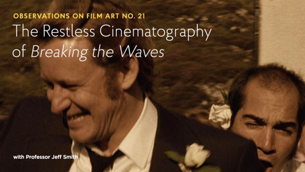
In FilmStruck 21 Jeff looks at a very different use of the camera: “The Restless Cinematography of Breaking the Waves.”
Chapter 6 The Relation of Shot to Shot: Editing
David on multiple-camera shooting and its effects on editing in an early Frank Capra sound film: “The quietest talkie: THE DONOVAN AFFAIR (1929).”
In Filmstruck #2, David discusses Kurosawa’s fast cutting in “Quicker Than the Eye—Editing in Sanjuro Sugata.”
In FilmStruck #20 Jeff lays out “Continuity Editing in The Devil and Daniel Webster.” He follows up on it with a blog entry: “FilmStruck goes to THE DEVIL”,
Chapter 7 Sound in the Cinema
In 2017, we were lucky enough to see the premiere of the restored print of Ernst Lubitsch’s Rosita (1923) at the Venice International Film Festival in 2017. My entry “Lubitsch and Pickford, finally together again,” gives some sense of the complexities of reconstructing the original musical score for the film.
In FilmStruck #1, Jeff Smith discusses “Musical Motifs in Foreign Correspondent.”
Filmstruck #8 features Jeff explaining Chabrol’s use of “Offscreen Sound in La cérémonie.”
In FilmStruck #11, I discuss Fritz Lang’s extraordinary facility with the new sound technology in his first talkie: “Mastering a New Medium—Sound in M.”
Chapter 8 Summary: Style and Film Form
David analyzes narrative patterning and lighting Casablanca in “You must remember this, even though I sort of didn’t.”
In FilmStruck #10, Jeff examines how Fassbender’s style helps accentuate social divisions: “The Stripped-Down Style of Ali Fear Eats the Soul.”
Chapter 9 Film Genres
David tackles a subset of the crime genre in “One last big job: How heist movies tell their stories.”
He also discusses a subset of the thriller genre in “The eyewitness plot and the drama of doubt.”
FilmStruck #9 has David exploring Chaplin’s departures from the conventions of his familiar comedies of the past to get serious in Monsieur Verdoux: “Chaplin’s Comedy of Murders.” He followed up with a blog entry, “MONSIEUR VERDOUX: Lethal Lothario.”
In Filmstruck entry #15, “Genre Play in The Player,” Jeff discusses the conventions of two genres, the crime thriller and movies about Hollywood filmmaking, in Robert Altman’s film. He elaborates on his analysis in his blog entry, “Who got played?”
Chapter 10 Documentary, Experimental, and Animated Films
I analyse Bill Morrison’s documentary on the history of Dawson City, where a cache of lost silent films was discovered, in “Bill Morrison’s lyrical tale of loss, destruction and (sometimes) recovery.”
David takes a close look at Abbas Kiarostami’s experimental final film in “Barely moving pictures: Kiarostami’s 24 FRAMES.”
Chapter 11 Film Criticism: Sample Analyses
We blogged from the Venice International Film Festival last year, offering analyses of some of the films we saw. These are much shorter than the ones in Chapter 11, but they show how even a brief report (of the type students might be assigned to write) can go beyond description and quick evaluation.
The first entry deals with the world premieres of The Shape of Water and Three Billboards outside Ebbing, Missouri and is based on single viewings. The second was based on two viewings of Argentine director Lucretia Martel’s marvelous and complex Zama. The third covers films by three major Asian directors: Kore-eda Hirokazu, John Woo, and Takeshi Kitano.
Chapter 12 Historical Changes in Film Art: Conventions and Choices, Traditions and Trends
My usual list of the ten best films of 90 years ago deals with great classics from 1927, some famous, some not so much so.
David discusses stylistic conventions and inventions in some rare 1910s American films in “Something familiar, something peculiar, something for everyone: The 1910s tonight.”
I give a rundown on the restoration of a silent Hollywood classic long available only in a truncated version: The Lost World (1925).
In teaching modern Hollywood and especially superhero blockbusters like Thor Ragnarok, my “Taika Waititi: The very model of a modern movie-maker” might prove useful.
Etc.
If you’re planning to show a film by Damien Chazelle in your class, for whatever chapter, David provides a run-down of his career and comments on his feature films in “New colors to sing: Damien Chazelle on films and filmmaking.” This complements entries from last year on La La Land: “How LA LA LAND is made” and “Singin’ in the sun,” a guest post featuring discussion by Kelley Conway, Eric Dienstfrey, and Amanda McQueen.
Our blog is not just of use for Film Art, of course. It contains a lot about film history that could be useful in teaching with our other textbook. In particular, this past year saw the publication of David’s Reinventing Hollywood: How 1940s Filmmakers Changed Hollywood Storytelling. His entry “REINVENTING HOLLYWOOD: Out of the past” discusses how it was written, and several entries, recent and older, bear on the book’s arguments. See the category “1940s Hollywood.”
Finally, we don’t deal with Virtual Reality artworks in Film Art, but if you include it in your class or are just interested in the subject, our entry “Venice 2017: Sensory Saturday; or what puts the Virtual in VR” might be of interest. It reports on four VR pieces shown at the Venice International Film Festival, the first major film festival to include VR and award prizes.
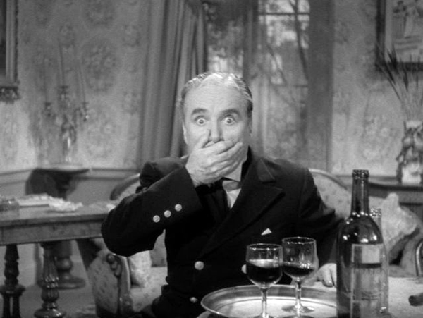
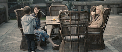
Monsieur Verdoux (1947)
The camera as perpetual motion machine: Jeff Smith on BREAKING THE WAVES
Jeff Smith’s analysis of von Trier’s film has been posted on our series on the Criterion Channel of FilmStruck. Here, as is his custom, he offers more insights into this extraordinary work.
I still remember the shock I felt watching Lars von Trier’s Breaking the Waves for the first time. Some of it was undoubtedly a response to the film’s emotionally unsettling narrative. Yet I also wasn’t quite prepared for the caught-on-the-fly quality of Robby Müller’s handheld cinematography.
Was this the same director who had created such striking, high-contrast, black and white images for Zentropa?
Was this the same Robby Müller who composed the austere, yet stylish landscapes shots in Kings of the Road, Paris, Texas, and Down by Law?
In contrast to the very controlled look of those titles, the prologue to Breaking the Waves establishes a more muted visual style. Interior spaces look washed-out and the color is drained from the beautiful Scottish landscape. This effect was created by shooting on 35mm, scanning the negative to video, and transferring the altered footage back to film.
The camera also moves constantly. It anxiously follows action as it unfolds to capture a sense of both intimacy and immediacy. In Zentropa, the actors mostly were subsumed into the overall visual design of the image. In Breaking the Waves, the specific choices in editing and cinematography were subordinated to the actors’ performances. For Trier, this choice was partly dictated by the material. He wanted to preserve a sense of existential mystery about the film’s events. The decision to shoot in a raw, naturalistic style was necessary to keep the film believable.
Breaking the Waves also laid down a marker in terms of von Trier’s commitment to the dictates of the Dogme 95 manifesto. Although the film departs from those principles in significant ways, it previews the even nervier approach von Trier takes in The Idiots.
Yet elements of pictorial stylization are retained in Breaking the Waves, and they foreshadow the formal tensions that characterize much of von Trier’s later work. In Dancer in the Dark, the juxtaposition of stylization and naturalism is evident in the way Bjork’s musical numbers provide escape from the grim misery of Selma’s daily existence. Antichrist opens with luminous black and white imagery in super-slow -motion that directly contrasts with the slightly more desaturated color seen in the rest of the film.
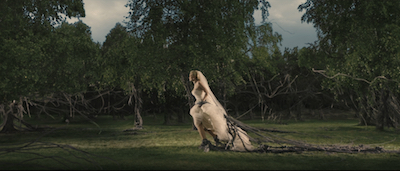
Melancholia begins with fantastic, colorful, almost still tableaux accompanied by an excerpt from Wagner’s Tristan and Isolde. This differs markedly from the rest of the film which is shot in the semi-documentary style seen in Trier’s Dogme work.
In what follows, I trace the way Breaking the Waves’ dialectic between naturalism and stylization is expressed in particular visual motifs. I also show how these techniques reinforce some of von Trier’s larger thematic concerns. Warning: some spoilers ahead.
Camera playing catchup
Robby Müller’s handheld cinematography in Breaking the Waves fulfills a number of different objectives. First and foremost, the constant, restless movement adds a visual dynamism that contrasts with the locked-down camera frequently seen in “slow cinema.” Secondly, the association of this style with documentary adds a jolt of authenticity to the scenes of Jan aboard ship and the various emergencies that occur at the hospital. Lastly, the “caught on the fly” quality of the images lends a sense of intimacy and immediacy to the character’s interactions.
Breaking the Waves’ most common technique involves the use of rapid pans to convey a feeling of imminence–the sense of pushing us toward what is just about to happen in the scene. Those anticipatory pans pans serve a number of storytelling functions.
They’re often used during dialogue scenes as a variant of more conventional shot/reverse shot techniques. In the hospital, when Bess and Dodo discuss Jan’s sick fantasies, the camera swivels between the two speakers some eight times.
The entire conversation is handled in five longish takes instead of the dozen or so shots we’d get if von Trier had used shot/reverse shot.
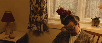
More commonly, von Trier’s dialogue scenes use quick pans to capture another character’s reaction before then cutting back to the other speaker. Near the midpoint of Breaking the Waves, we see Richardson rifling through the pages of Bess’s file. Richardson asks Bess about her care under another doctor. The camera swings swiftly over to Bess who professes ignorance of this prior episode.
The camera then pans back to Richardson.
He acknowledges that her treatment was related to her brother’s death before von Trier eventually cuts back to Bess. Given the emphasis on performance during shooting, these panning movements keep the actors in the moment, enhancing the impression of dramatic intimacy and visual energy. But the style also enables Trier to shoot coverage so that he can select between different takes during editing.
In some instances, these rapid shifts from one character to another preserve the interactions of the ensemble within a single take. This occurs, for example, as the wedding party reacts to the sudden appearance of rain. We see it again later when Jan and his buddies pass around a flask of booze.
In still other cases, these rapid pans enhance the dramatic impact of eyeline matches. The viewer is often cued to these moments by a character’s glance offscreen and their facial expression. The camera then pivots to reveal what is in the offscreen space. A fairly early instance of this is when Dodo returns to Bess’s house to find her sitting quietly and Bess’s mother asleep.
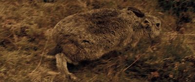
Later Trier uses Bess’s glance offscreen to cut during a whip pan to a rabbit on the side of the road.
The moment serves as counterpoint to what we’ve just seen. Bess has vomited in disgust after a sexual encounter on a bus. The way she wrinkles her nose at the bunny reminds us of her childlike naiveté.
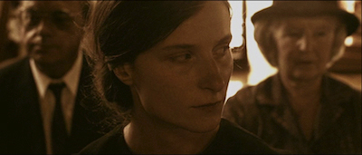
The panning motif pays off during the inquest into Bess’s death. Dr. Richardson testifies that Bess died because of her inherent goodness. Unsurprisingly, this claim is met with skepticism from the magistrate presiding over the hearing. Von Trier then cuts to a close-up of Dodo.
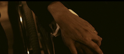
The camera tilts down and pans right as she grasps someone’s hand. It then tilts back up, to reveal Jan seated next to her.
The revelation comes as a bit of surprise because Trier has omitted the narrative action that connects the hospital scenes to the hearing. As mysterious as Bess’s death is, Jan’s recovery prompts even deeper questions. How is it that Jan survived when it appeared that his own death was imminent? More pertinent, how was his paralysis cured? In exploring the nature of the miraculous as part of the everyday, von Trier presents us with an enigma that he refuses to explain. It is here that we first begin to grasp the meaning of Bess’ religious faith and the impact of her self-sacrifice.
Are you there, God? It’s me, Bess.
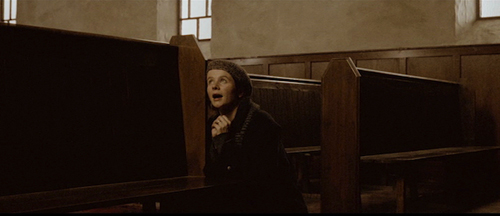
Another important visual motif involves the long takes used for Bess’ talks with God. For the most part, Breaking the Waves’ average shot length is relatively short. But Trier sets off these moments of prayer by shooting them in a markedly different style.
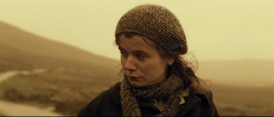
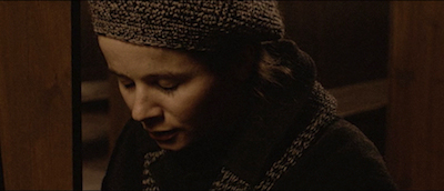
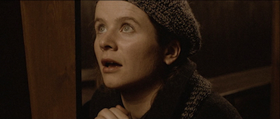
More often than not, Müller’s camera photographs Bess in close-up or medium close-up to focus our attention on her face. Emily Watson uses the simplest of means to indicate the two sides of her dialogues with God. She shifts her gaze either upward or downward and changes her style of speech. Notably, in a suggestion of the degree to which Bess has internalized the church’s doctrines, her vocal impersonation of God sounds uncannily like one of the church elders.
These shots of prayer often unfold in real time lasting a minute or more. Their duration and more static framing convey both a sense of intimacy and important information about Bess’ motivation. Her imagined conversations with the heavenly father help to explain her actions in what would otherwise seem like wildly improbable changes in character.
These scenes also invite the viewer to consider Bess’ mental stability. Because of her childlike nature, Bess’ belief that God talks directly to her initially seems delusional. Yet, as the film goes on, Bess’ devotion to both God and her husband introduces the possibility that her actions are divinely inspired. By demonstrating her selfless love for Jan above all else, including her own safety, von Trier suggests that Bess’ sacrifice might be the reason for Jan’s recovery.
Or it could all just be a coincidence. Jan’s recuperation might not have any explicable cause, either physical or spiritual.
An energetic but casual style: raw immediacy as studied nonchalance
Throughout much of Breaking the Waves’ running time, von Trier’s narration seems to be rather communicative. The relentless camera movement and frequent cutting suggest a desire to capture the story as it unfolds and to transmit the most narratively salient material.
At key moments, however, the film’s visual techniques prove surprisingly reticent. Significant plot developments are sometimes handled in an offhand fashion. This strategy seems to be an extension of von Trier’s interest in making the film’s melodramatic narrative seem plausible. (Indeed, Breaking the Waves plays as a sort of Magnificent Obsession for the art film crowd.) More than that, though, this restraint also encourages viewers to form their own conclusions about the events depicted.
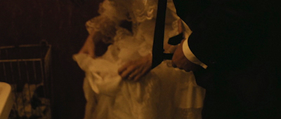
Consider Jan’s observation that Bess has blood on her wedding dress after consummating their marriage in the bathroom of the reception hall.
Another director would likely cut to an insert from Bess’s pov to underscore this image. It would serve as a symbol of her loss of innocence and as a grim foreshadowing of her ultimate fate (i.e. love as a form of blood sacrifice). But Trier refuses to force that interpretation on the viewer. Instead, by showing Bess calmly rinsing out the stain, von Trier allows the moment to resonate more organically.
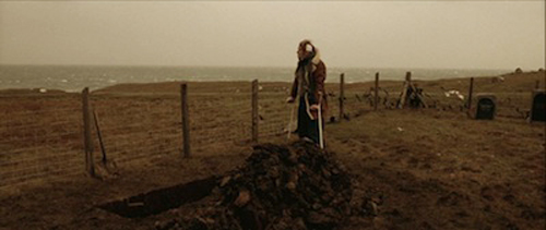
This motif reaches a kind of apotheosis in the shot of Jan standing on crutches at Bess’s gravesite. The whole story has built toward this moment. Yet Trier treats it in a pointedly cursory fashion. Jan is photographed in long shot. The camera’s distance mollifies the character’s evident grief and refuses the viewer the kind of emotional catharsis we commonly associate with such rituals.
Jan’s silence also preserves the sense of mystery about how this turn of events occurred. Is Jan’s ability to walk evidence of the hand of God? Perhaps. Yet it might also be seen as a kind of cosmic joke, proof that humanity’s existence is ruled by forces of Kierkegaardian absurdism.
Rendering the kitsch sublime
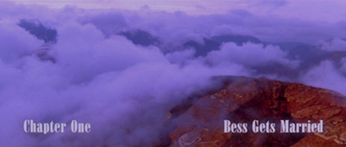
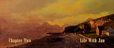
Breaking the Waves’ most striking shots appear in the film’s chapter titles. Von Trier worked with the artist Per Kirkeby to create these images using fairly simple computer animation tools. Early in the production, they were described as merely panorama shots. But as the work developed, Trier described them as natural landscapes that evoked the Romantic tradition. This picture-postcard imagery is simultaneously both beautiful and banal, sublime and kitschy.
These more conventionally picturesque shots are further differentiated by Trier’s use of music. Each chapter title is accompanied by a different seventies classic: Elton John’s “Goodbye Yellow Brick Road,” Mott the Hoople’s “All the Way to Memphis,” Procol Harum’s “A Whiter Shade of Pale,” and David Bowie’s “Life on Mars.” The combination of music and saturated color enable these proleptic titles to function as the antithesis of the film’s handheld camerawork. As Kirkeby himself explained, they contrasted with Müller’s “tropistic intimacy.”
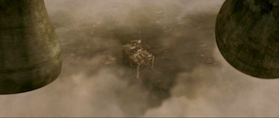
By using these titles to structure the narrative, von Trier preserves the opposition between naturalism and stylization until Breaking the Waves’ final shot. After Jan and his pals give Bess an impromptu burial at sea, they awaken the next morning to the sounds of bells ringing. We know from the scenes of Jan and Bess’ wedding that the source of the sound can’t be the church. Rather miraculously, the bells ring in the clouds unmoored from any terrestrial structure.
Von Trier denies us narrative closure by refusing to explain the meaning of Bess’ actions. But he gives us a kind of formal closure by synthesizing within a single image the different styles of cinematography seen throughout Breaking the Waves.
A riddle, wrapped in a mystery, inside an enigma
Breaking the Waves has always fascinated me as a study in contradictions. The film is about a miracle, but it is rendered in a style that seems wholly naturalistic. The cast was encouraged to improvise to create the desired sense of spontaneity. Yet Stellan Skarsgård reported that the actors mostly stuck to the script because the dialogue was so good as written. The plot hinges on an answered prayer, but the outcome is such a cruel twist of fate that it leads the viewer to doubt the nature of divinity entirely.
Even the central characters are defined by contradictions. Jan is a worldly outsider whose passions and joie de vivre raise the hackles of the strict Calvinist community where the principal actions take place. Bess was raised inside this overtly patriarchal structure, but she displays such childlike innocence that the inherently sinful nature of humanity somehow eludes her. Only von Trier would make a film in which a character’s adultery and debauchery are construed as holy acts of spiritual self-sacrifice. Bess might seem like a secular saint. But her sainthood is achieved by almost completely abasing herself.
This sense of contrast and contradiction also extends to Trier’s sources for Breaking the Waves. Much of the inspiration for Bess came from a children’s book entitled Gold Heart. The title character is a young girl who enters the woods with bread and other foodstuffs in her pockets. By the end of her journey, she is left naked and empty-handed. Her innate goodness and generosity makes her vulnerable, almost to the point of self-destruction. To quote von Trier, “Gold Heart is Bess in the film. She is goodness in its most absolute gestalt.”
At the other end of the cultural spectrum, though, von Trier incorporates ideas drawn from the films of his Danish predecessor, Carl Theodor Dreyer. The original title of Breaking the Waves was “Love is Everything,” the aphorism that Gertrud’s protagonist wanted as her epitaph. The basic dramatic situation is also reminiscent of Ordet. Like Inger, Jan is bedridden and near death. Like Johannes, Bess is the holy fool whose insistence on faith acts as a counter to science and rationality. And as in Dreyer’s work (La Passion de Jeanne d’Arc, Day of Wrath) a woman’s decisive actions put her at odds with a community steeped in religious dogma.
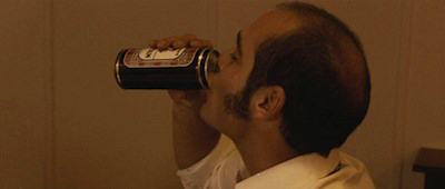
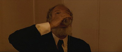
Breaking the Waves accent on contrasts is perhaps best epitomized in one of the film’s lighter moments. During Jan and Bess’s wedding reception, Terry and the Chairman of the church elders chug their beverages.
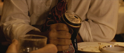
A close-up shows Terry crushing his beer can in an homage to a similar contest of machismo in Jaws.
It takes a rather dark turn, however, when the Chairman breaks the glass he’s holding with his bare hand.
Although the scene is a bit of a throwaway, it in many ways epitomizes the tonal shifts that mark von Trier’s work as a whole. All of his films contain moments of bleak humor, episodes where laughter slightly obscures the stories’ violent undertones and dark menace. To quote the spirit animals in Antichrist, “Chaos reigns” in the von Trier universe. And whether it is death, nightmare visions, or the literal end of the world, the prototypical von Trier hero confronts this chaos mindful of the immense absurdity of the inexplicable.
Thanks to Kim Hendrickson, Grant Delin, Peter Becker, and the whole Criterion team for their superb work on the video. A complete list of our FilmStruck installments is here.
Several different editions of Breaking the Waves have been released on home video. I recommend the Criterion dual-format edition. As one would expect, it contains lots of goodies in the extra features. These include deleted and extended scenes, interviews with Emily Watson and Stellan Skarsgård, and selected-audio commentary by von Trier, editor Anders Refn, and location scout Anthony Dod Mantle.
The published screenplay from Faber & Faber includes introductory essays by von Trier, artist Per Kirkeby, and Swedish film critic Stig Björkman.
Collections of interviews with Denmark’s enfant terrible can be found here and here. There’s also a good online interview with von Trier about Breaking the Waves.
The quote from Stellan Skarsgård can be found at Mental Floss.
I also want to thank the film faculty at the University of Copenhagen and Lars von Trier himself. I had the rare privilege of hearing the director discuss his work after a special screening of Antichrist that was arranged for attendees of the Society for Cognitive Studies of the Moving Image conference in 2009. I learned a lot from the experience, especially about von Trier’s fondness for mixed pictorial styles within his films.
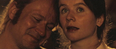
Breaking the Waves (1996).
10 million thanks
DB here:
On Tuesday 7 August, at some point midway through the morning (CST), somebody–in Key West, or Singapore, or Yale, I can’t be sure–logged onto this site and executed our ten millionth pageload.
No, prizes are not involved.
This site began counting pageloads, along with visits and other data, on 26 September 2006, when we started the blog. Those first entries were embarrassingly basic affairs. It would be months before we figured out how to include pictures, and years before we started to embed clips.
Since 2006 we have posted 876 entries (including this one) and run up many millions of words. We’ve hosted some roundtables and several guest posters: Tim Smith, Leslie Midkiff DeBauche, Rory Kelly, Nicola Mazzanti, Matthew Bernstein, Kelley Conway, Eric Dienstfrey, Amanda McQueen, Jim Udden, and our collaborator Jeff Smith. We’ve recorded encounters with Nina Paley, David Koepp, Joe Dante, Damien Chazelle, Phil Solomon, and other filmmakers. Mostly, though, this stuff has been churned out by Kristin and me.
We thought of the site as a supplement to Film Art, but it’s gone far beyond that. We’ve used it to provide access to published essays and books (Ozu and the Poetics of Cinema, Exporting Entertainment), to report on film festivals and conferences, to support other writers’ work, to jump into some current flaps both academic and journalistic, and to revisit research questions that obsess us. We’ve used it to set up video lectures, and to announce new books, by us and by others. Hell, some entries became books (Minding Movies, The Rhapsodes, Pandora’s Digital Box, Christopher Nolan: A Labyrinth of Linkages).
We’ve commented on trends in the film industry, such as 3D and global marketing. We’ve also tried to stir up enthusiasm for activities we think worthwhile, such as cognitive film studies, ambitious DVD publishing initiatives, and the FilmStruck streaming service.
It has been a ton of fun, and we don’t expect to stop any time soon. We busy ourselves with other things as well–writing for print publication, lecturing and visiting festivals, mounting our monthly Criterion Channel installments (which bear the same title as the blog). But the website has been a uniquely rewarding part of our lives. Through it we’ve made dozens of new friends and been exposed to fresh opinions and ideas.
I’m still surprised that we’ve drawn so many readers, since we decided at the start not to include Comments. We didn’t, and don’t, have time to monitor them. We’re stubbornly stuck in Web 1.5, treating this as essentially a personal, self-published magazine. But email responses, including corrections, are welcome.
We can’t yet imagine stopping. We’re delighted that in the age of Twitter, which oversimplifies every scrap of human affairs, and faced with the decline of blogs in general, thousands of people remain willing to click on, and maybe read, longish, para-academic efforts in film criticism and history.
So thanks to all our readers for encouraging us. And watch for our coverage of the upcoming Venice International Film Festival starting the end of the month!
We remain eternally grateful to our web tsarina Meg Hamel and our stalwart IT caballero Peter Sengstock.
The illustration up top comes, of course, from that exhilarating chronicle of human folly FailArmy.
P.S. 3 March 2019: This entry has been corrected. Originally it claimed ten million visits, not pageloads. Actually there were about seven million visits. I apologize for the error.
KT and DB, Venice International Film Festival, 2017.


