Archive for November 2019
Women in charge: Highlights from Torino
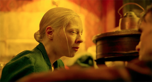
Beanpole (2019).
DB here:
Every day we’ve spent at the Torino Film Festival has yielded us fine and sometimes superb film experiences. Herewith some examples, all probably coming to a screen (large, small) near you.
Extracurricular melodrama
Wet Season (2019).
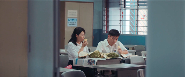
From Anthony Chen (Ilo Ilo, 2013) comes a woman’s drama of professional and personal travail. Ling is a Malaysian teacher working in a Singapore boys’ school. She’s trying to get pregnant through in vitro fertilization , although her husband is reluctant. She takes care of her elderly father-in-law while pressing her mostly indifferent students to pass their Chinese examinations. Things take a drastic turn when, just as Ling’s husband drifts away from her, one boy becomes violently infatuated with her.
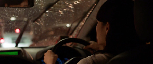
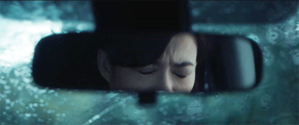
Poised and mild-mannered, Wet Season handles its melodramatic material with restraint. For instance, there’s the careful use of Ling’s car. She and her husband are introduced driving to work together, but the shots don’t show their faces. It’s an effective expression of their empty marriage. Similar shots recur throughout the film.
Denying us the standard view forces us to pay attention to the dialogue. Lest this be thought a simply byproduct of production constraints (it’s easier to shoot a rainy drive from the back seat), later we see Ling in a more standard angle.
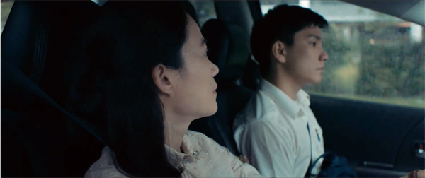
The new framing allows us to see her accusing glance at Wei Lun.
Still other uses of the car enable Chen to stress Ling’s reactions to developments in the drama.
Here, as so often in film, simple but shrewd production choices can build strong emotional impact. By the end, when the typhoon has finally blown over, Ling can confront the future with some hope.
Horror diva
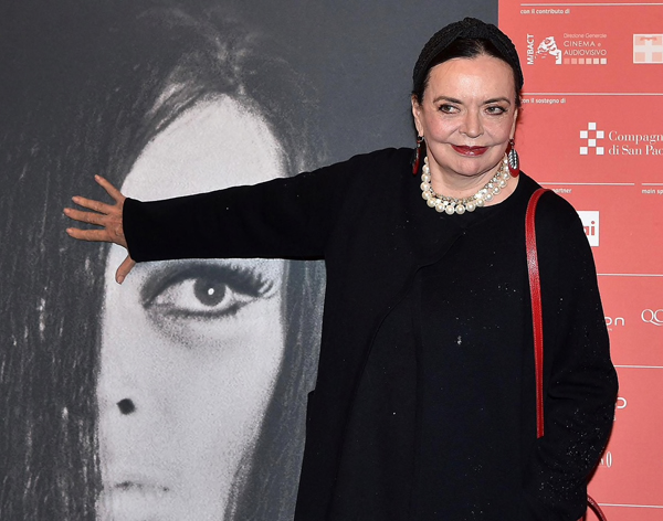
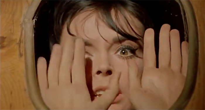
As indicated in our previous entry, the guest of honor for Torino’s horror retrospective was the star of 1960s Italian (and other) frightfests, Barbara Steele. She received the Gran Primio Torino during the festival. Several of her films were shown, reminding me of the delirious ways that Italian filmmakers revised the genre. Take the two features I saw.
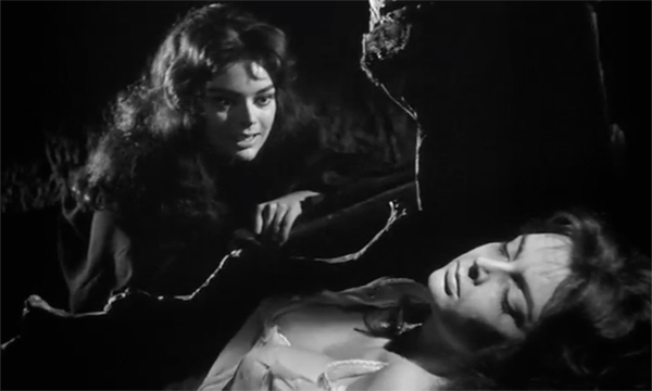
Mario Bava’s Black Sunday (La maschera del demonio, 1960), which came out the same year as Psycho, is in some ways more shocking. The opening, in which a spike-studded iron mask is pounded bloodily into the face of a witch still makes you jump. What follows is essentially an old-dark-house plot, with one character after another prowling around a castle and getting killed off by the undead witch Asa and her brother. Asa targets her descendant, the beautiful Katia, in the belief that taking her blood will grant her immorality.
Barbara, with bat-wing eyelashes and magnificently tousled hair, plays both Asa and Katia. In a bravura image, Bava uses visual effects to give us the two women in a fine widescreen composition.
The film’s endless play of highlights and shadow is really something. Although I’ve seen it before, I never appreciated its visual splendor until I encountered this DCP restoration. Kristin pointed out that we can see how the eyelights on Asa are flicked on and off so that she seems throbbing with supernatural energy.
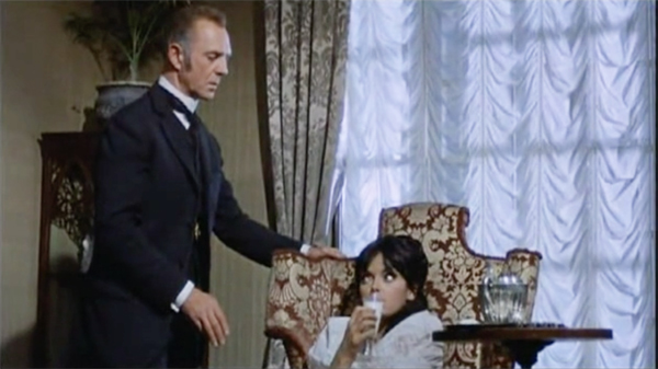
Two years later, Barbara made for director Riccardo Freda The Horrible Dr. Hichcock (L’Orribile Segreto del Dr. Hichcock). It’s close to 1940s Hollywood Gothics in centering on uxoricide. But in a typical giallo fantastic twist, the husband who dispatches one wife accidentally tries to kill a second to revive the first. There are 1940s motifs such as the sinister housekeeper (Rebecca), the dominating portraits of Wife #1, the efforts to gaslight Wife #2, and even a glowing glass of milk (Suspicion) with which Dr. H hopes to dispatch his new wife–played, of course, by Ms Steele.
Freda has recourse to the fog and sinister noises of Black Sunday, but Bava’s labyrinthine secret passages and torture chambers are replaced by rooms stuffed with sinister chachkies. And Hichcock is in Technicolor, so Freda gives the dank Victorian parlors a subdued color design. Barbara is right at home here too, rolling her eyes apprehensively as she’s given the poisoned milk.
In all, the Torino horror retrospective was a bracing reminder of a genre that has shaped popular cinema to this day. The presence of Ms Steele was a wonderful bonus.
Cops, moles, and femmes fatales
The Whistlers (La Gomera, 2019).
When a film is grounded in a basic genre formula, much of your enjoyment comes from seeing not only fresh twists of plot but also felicities of sound and image. That was my response to Corneliu Porumboiu’s The Whistlers (La Gomera), a quietly flashy neo-noir.
Everything is there. We have the intricate schemes of cops, crooks, and everybody in between in pursuit of mattresses stuffed with cash. There’s the tired, seen-too-much cop who works for the gang, not least because of the wiles of a stupendously gorgeous femme fatale. There are the Eurotrash thugs and heavies supervised by a calculating boss, and flashbacks that lead you to wonder who exactly is conning whom.
But Porumboiu tinkers with the familiar narrative mechanics. In an age of cellphones and video surveillance, the crooks must communicate in a frankly analog code: they whistle their messages, disguised as birdsong. The tough supervisor who suspects our protagonist is a mole isn’t the usual overbearing male, but rather a woman with her own femme fatale streak. She’s as suspicious of surveillance as the crooks, stepping outside her bugged office to negotiate extralegal stings with her staff.
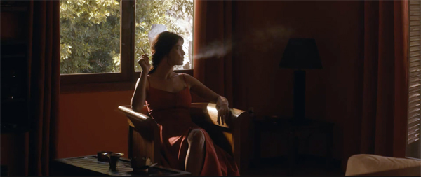
Likewise, Porumboiu gives up the “free-camera” straying and fumblings that we see in so many films these days. He locks down his camera to create precise, radiant images. Here’s Gilda, yes, you heard that right, smoking and waiting for trouble.
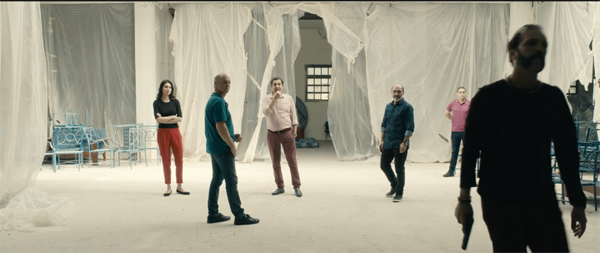
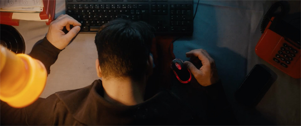
It’s a pleasure to see crisp frame entrances and exits, along with tracking shots reserved for climactic moments, as when the gang steps into a police ambush mounted on a disused film set. A well-judged sense of framing enables an overhead shot in which the dark blood of a dead man at a work station flows into the mouse and lights it up in a discreet crimson flash.
The Whistlers isn’t as rich, I think, as the director’s earlier policier, Police, Adjective, but it’s a satisfying genre exercise. It yields dry wit (sleek fashionista gangsters struggling to load mattresses into a small car) and surprise twists–not least the epilogue, which brings back the coded whistles in an amusing sound gag.
Women at war
Beanpole (2019).
Another way to put it: The Whistlers is that rarity today, the thoroughly “designed” film. Here all the stylistic and narrative choices stand sharply revealed as part of what we are to notice, and enjoy. (Other instances: the Coens, Almodóvar.) Another example at Torino is the already widely-praised Russian drama by Kantemir Balagov, Beanpole.
Leningrad: World War II has recently ended, and two women must face the postwar world. Iya and Masha have been gunners at the front. Iya was invalided out because of episodes of “freezing,” seizing up in a sort of paralyzed trance and making clicking sounds until the spasm eventually passes. Now she works in a hospital patching up wounded soldiers and taking care of Masha’s child, born at the front. Masha eventually returns and takes a job at the hospital as well.
But their friendship suffers through a horrific accident that plunges the towering and slender Iya, the beanpole (dilda, “tall girl”) of the title, into shame and depression. Masha, more aggressive in remaking herself as the war ends, drives the second half of the film. She begins a pragmatic relationship with the weak soldier Sasha. When he brings her home to meet his parents, proud members of the Bolshevik bourgeoisie, she supplies all her backstory about life on the front that fills in crucial gaps.
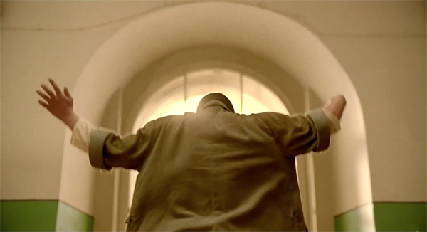
Beanpole‘s few characters–the two women, Sasha, and a weary doctor supervising the clinic–throb with a Dostoevksian intensity. With her paralysis and quiet mournfulness, Iya recalls Prince Myshkin; some shots virtually sanctify her.
As in Dostoevsky’s novels, nearly every scene is worked up to a furious emotional pitch. The nosebleed that seems to pass contagiously among characters is virtually a sign of passions under pressure.
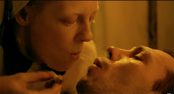
The tension is carried through lengthy, often silent stares shared between characters thrusting themselves at one another. Balagov relies on close-ups and tight two-shots running very long; there are about 325 shots in the film’s 131 minutes. Here Iya helps a dying soldier to smoke in a perfectly composed two-shot in the wide format.
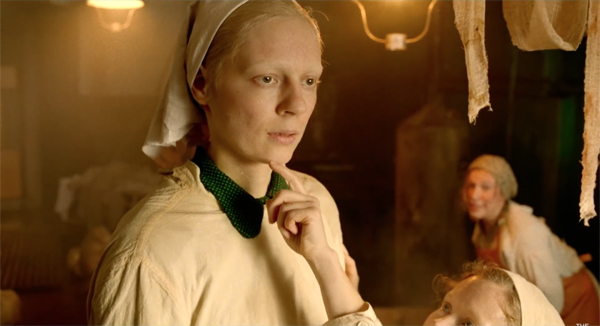
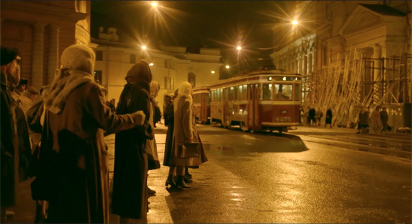
Without prettifying Leningrad during and after the siege, the film’s pictorial design is ravishing. The main sets are designed to complement one another. The hospital is bathed in a creamy light, while the night streets radiate a dark golden glow.
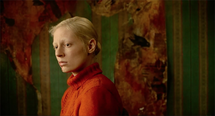
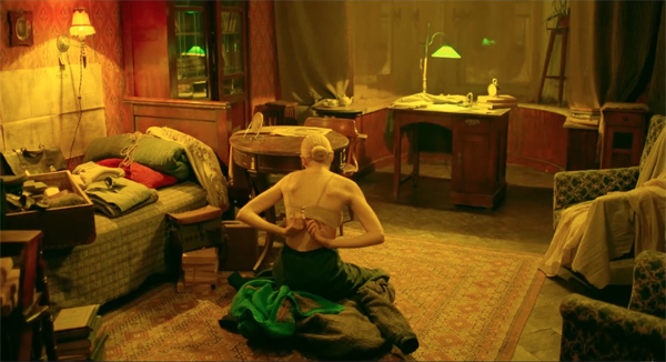
The apartment Iya and Masha share is ripe in dark greens and reds, the result of years of tearing away layers of wallpaper. (See our top image.) The doctor’s apartment offers a warmer, less distraught balance of reds and greens.
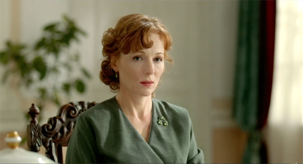
The palatial home of Sasha’s parents yields another register, one of tidy, frosty elegance.
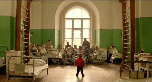
And the clinic is given a dose of red and green by the painted walls and the presence of little Pashka.
The pictorial harmonies and modulations are just one part of this gripping, exhilarating film. Beanpole will be distributed by Kino Lorber in the US and Mubi in the UK.
We wish to thank Jim Healy, Emanuela Martini, Giaime Alonge, Silvia Saitta, Lucrezia Viti, Helleana Grussu, and all their colleagues for their kind help with our visit.
Thanks as well to David Vandenbossche for a correction of a movie title.
For more Torino images, visit our Instagram page.
Cynthia Hichcock (Barbara Steele), trapped in a coffin by her husband, in The Horrible Dr. Hichcock (1962).
Torino images, preparing for the festival
DB here:
If you’re not a hardcore horror fan, you may not recognize the image that adorns this year’s Torino Film Festival publicity, but I bet you’re fascinated by it anyway. Barbara Steele, the diva supreme of 1960s scary cinema, is a fitting emblem for this year’s broad and deep retrospective of the horror genre. From The Cabinet of Dr. Caligari (1920) to Dr. Jekyll and Sister Hyde (1971), thirty-six films are on display, often in 35mm prints. Emanuela Martin, the curator of the series and director of the festival, has created a book devoted to her program. And the festival has welcomed the iconic Ms Steele as a guest.
In-depth commitment to a retrospective is typical of this enterprising festival. Kristin and I had been hearing about it for years from our friend, Wisconsin Cinematheque honcho Jim Healy, who has long been a contributing programmer here. Previous editions focused on “Amerikana,” De Palma, dystopian SF, Powell & Pressburger, and Miike Takashi.
Still, at Torino as elsewhere, the emphasis falls on new work. Dozens of films are screened both in and out of competition. Kristin and I are still assimilating items to report on in forthcoming blog entries. But we’ve already sampled the charms of this city, not least its monumental temple to film, its Museo del Cinema. But first, another municipal tribute to picture-making.
Pictures, some puzzling
The Galleria Sabauda in the Palazzo Reale teems with masterpieces, mostly from the collection of the Savoy dynasty. The non-masterpieces are worth studying too, and some, even in their weirdness, can prompt thinking about cinema (of course).
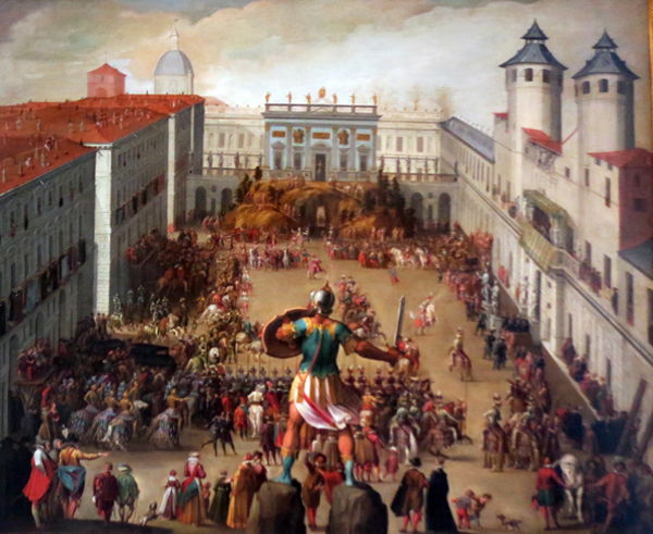
For instance, there’s this Antonio Tempesta painting, Torneo nella Piazza del Castello (1620), showing an aristocratic wedding procession in a Turin plaza. I liked its steep perspective with the commanding figure of the warrior in the foreground. Close observation, which the Sabauda permits, reveals tiny figures on the rooftop at the left.
Evidently the paining yields a lot of information about architectural projects of the day. All I could think of is what a swell film shot it would be.
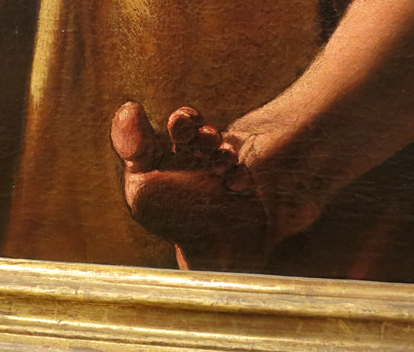
Instead of Testa’s high angle, which yields a centered and stable composition, consider Varallo’s punchier Saints Peter and Mark, from the same period (1626).
The low viewing angle on the two saints makes their muscular gestures dominate the middle of the format. That axis calls to their incredibly distended fingers caught in the act of dictating and writing. The angle also lets us enjoy the casually crossed leg of Mark and his tense, splayed toes, which seem to poke against the picture surface.
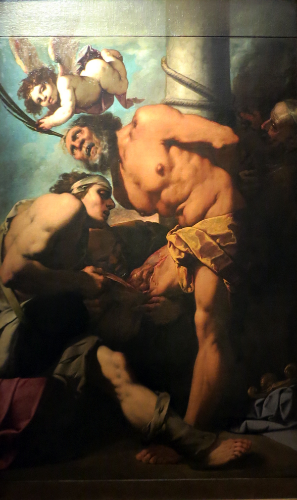
Angles again: This unidentified painting of the savage martyrdom of Saint Bartholomew (ca. 1635) grabbed me because of its even steeper low angle.
Apart from the Caravaggio spotlight effect (overexposed in my shot; I can’t find an image online), it reminded me of one of my fussier concerns.
Cinema lets us separate planes because of constant overlap, one layer of space moving against another. Painting can’t let us detect contours from movement, so when painters want to shove figures together they need to mark off overlapping planes in other ways, such as color or edge lighting.
Alternatively, painters can pack figures but leave little holes that let bits of background show through but still give a sense of movement. In the St. Bartholomew painting, the contours that specify the figures nearly graze each other.
I especially like the way that the brow and nose of Bartholomew’s tormentor fit like a puzzle-piece into the twist of the saint’s shoulder. Good old figure/ground technique, but pushed to a kind of minimal limit.
When these little gaps aren’t left, and only overlap and colors pick out planes, you can get some striking effects. The most mind-bending thing of this sort I saw at the Galleria was this Resurrection, perhaps by Antonio Campi, from around 1660. At the bottom of the picture a soldier is prodding a sleeping guard beside the sepulcher.
The soldier on the right is one strange creature. You can work it out that he’s wearing a thick, ribbed yellow doublet with a beast’s head attached at the shoulder. But the effect of the overlapping planes and the compositional contours is of a duck/rabbit shift, as if the beast is bent over the soldier.
The effect is enhanced by the sinewy leg of the soldier behind, which seems at first glance to be the right arm of the stooped beast. The absence of spacing between the foot and the spear helps the effect of a limb continuing the arc of the bent back.
Enough of amateur art appreciation. Turin houses another magnificent repository of artifacts, this one dedicated to our own obsessions.
Film history on a grand scale
Mole Antonelliana, Turin.
The Museo Nazionale di Cinema is housed in the Mole Antonelliana, a fascinating elongated building that towers over the city. An elevator shoots people up to a fancy spire with a panoramic view.
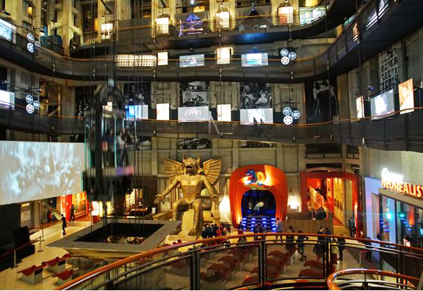
Pictures can’t do justice to the Museo inside. You enter through the biggest and most engaging collection of pre-cinema materials I’ve ever seen. Nearly every gadget, from the magic lantern to Edison’s Kinetoscope, is offered for you to tinker with. (An interactive sampling is here.) Once you’ve seen the entire archaeology of film, you step into a gigantic hall with a spiral ramp leading to level after level.
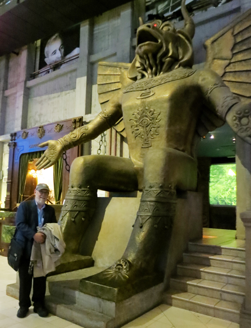
Nearly the first thing you meet is the god Moloch from Cabiria (1914), a film made when Turin was a major national production center. Not quite as big as in the film, he was enough to intimidate me.
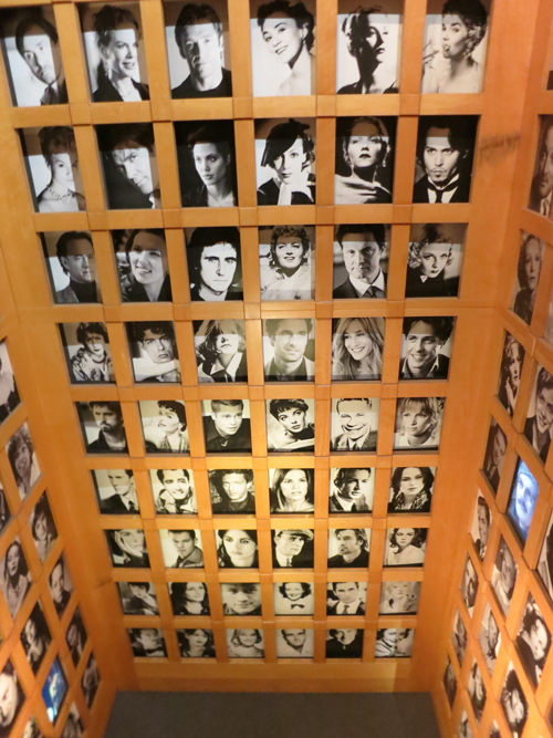
Various floors take you to theme areas. There’s one on film production with some classic cameras, another displaying a vast gallery of posters, and several devoted to changing exhibitions. (The current one was on facial expression in cinema, hooking to a big show of Lombroso’s physiognomic studies.) You can see a script page from Psycho or Citizen Kane, and stare in awe at a two-story display of star portraits.
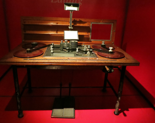
Kristin and I visited a shrine to the beautiful Prevost editing table. (This is a 1930s one.)
There’s so much here that more than one visit is probably demanded. In all, the Museo makes a splendid anchoring point for the film festival. We’ll tell you more about that in upcoming entries.
We wish to thank Jim Healy, Emanuela Martini, Giaime Alonge, Silvia Saitta, Lucrezia Viti, Helleana Grussu, and all their colleagues for their kind help with our visit.
For more Torino images, visit our Instagram page.
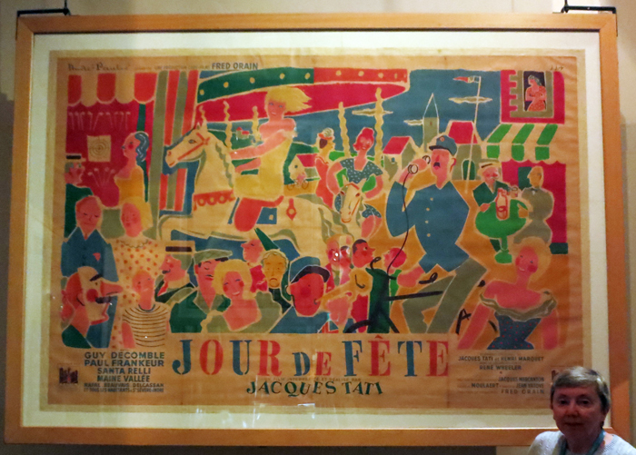
Kristin and a big poster for Tati’s Jour de fête.
Captain Cinephilia: Scorsese strikes back
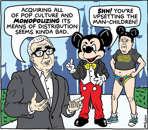
Brian McFadden, No One Is Safe: Martin Scorsese Roasts Your Fandom.”
DB here:
It started with a brief, almost offhand remark.
“I don’t see them,” [Scorsese] says of the MCU [Marvel Cinematic Universe]. “I tried, you know? But that’s not cinema. Honestly, the closest I can think of them, as well-made as they are, with actors doing the best they can under the circumstances, is theme parks. It isn’t the cinema of human beings trying to convey emotional, psychological experiences to another human being.”
When I learned about this interview (Empire, November issue), I took it as simply a roundabout statement of personal taste. Scorsese doesn’t find Marvel movies, and perhaps other comic-book sagas of superheroes, to his taste. He gave them a fair shot, but he now no longer sees them. He considers them visceral stimulation, like carnivals or theme parks. They’re not cinema, if you consider cinema as emotional expression of psychological conflicts.
In the massive responses to Scorsese, people pointed out that viewers often respond emotionally to superhero films. They root for certain characters, they’re amused or thrilled by certain situations, and many claim to be deeply moved by the heroes and villains (Loki, even Thanos). In fact, it’s exactly the “emotional, psychological experiences” embedded in the Marvel and DC plots that some fans say distinguish them from crude comic-book movies that went before. Much the same could be said of the Bond films, which became more humanized with Quantum of Solace, though intermittently before.
As for the claim that the superhero films “aren’t cinema,” I wasn’t really upset. Over the decades we’ve heard that 1910s films “aren’t cinema” (too theatrical), or that adaptations of novels or plays “aren’t cinema” (too literary or stagebound), or that narrative films “aren’t cinema” (usually proposed by avant-gardists). When the claim relies on a notion of some cinematic essence (editing, or pure visual form) that’s missing from this or that movie, you might be able to have a productive conversation. But if “This isn’t cinema” comes down to “I don’t like films like this,” we’re back to personal taste.
On other occasions Scorsese went on to say a lot more. The ultimate result was a 7 November article in the New York Times. I think we should take this as his most thoroughgoing effort to explain his thinking. We can supplement that with some remarks he made in interviews and Q & A sessions.
Herewith my attempts to figure out Scorsese’s argument. Trying to sort this out might teach us some important things about film now.
Scorsese in defense of Cinema
Scorsese’s Times article, “I Said Marvel Movies Aren’t Cinema. Let Me Explain,” begins by disclaiming any hatred for Marvel movies as such. “The fact that the films themselves don’t interest me is a matter of personal taste and temperament.”
But everyone’s taste gets shaped by their moviegoing experience, and in his youth Scorsese was attracted to films from America and Europe. These yielded “revelation—aesthetic, emotional, and spiritual revelation.” The films were, he felt, about characters who were complex, sometimes contradictory in their minds and behavior.
Moreover, these films showed that cinema was an art form, one existing in both commercial and more experimental spheres. Hollywood studio output (Ford Westerns, Hitchcock thrillers), European imports (Bergman, Godard), and avant-garde work (Scorpio Rising)—all these showed that cinema had powers equal to those of music, dance, and literature. These films were technically accomplished, sometimes virtuoso, but at their hearts were intense, complex emotional appeals that assured that they would be watched for decades later.
Today the Marvel pictures, often skillfully made, lack “revelation, mystery, or genuine emotional danger.” They are repetitive, adhering to a basic formula, “defined as variations on a finite number of themes.” By contrast, the films of Paul Thomas Anderson, Claire Denis, Wes Anderson, and other directors offer new and unpredictable experiences, and they expand the possibilities of the art form. “The unifying vision of an individual artist” is essential to cinema.
It’s exactly the exploratory filmmakers who are being stifled by the Marvel releases, and indeed all the franchises. These more personal films aren’t just constrained by lower budgets; they can’t get much exposure on theatre screens either. “Around the world, franchise films are now your primary choice if you want to see something on the big screen.” Most filmmakers design their films for that scale and that communal experience, but the blockbuster films are pushing smaller pictures into streaming outlets.
The franchise mentality is a corporate one. The products are “market-researched, audience-tested, vetted, modified, revetted and remodified until they’re ready for consumption.” As often happens, the business constrains the art. But you might say, what about the old studio system? Wasn’t that as mercenary as today’s franchise juggernaut? No, because the studios set up a creative tension between the business end and the artistic end that yielded outstanding works, even masterpieces. Today’s franchise producers are indifferent to art and hold a view of film history that is both “dismissive and proprietary.”
As a result we have two domains: worldwide audiovisual entertainment vs. cinema. They overlap less and less, and it seems likely that the financial power of one will dominate and belittle the other.
I think that some of these arguments are plausible, while others deserve more probing.
Film art: Who’s the artist?
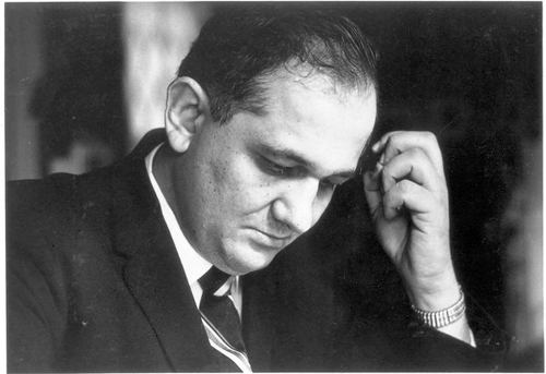
Andrew Sarris.
During the 1950s and 1960s, this general argument was promulgated by the so-called auteur critics around Cahiers du cinéma and was developed and promoted by Andrew Sarris in the US and Movie magazine in the UK. Scorsese was deeply influenced by these ideas. He was one of many cinephile directors-in-training who assumed that the best films bore the “unifying vision of the individual artist,” who was the auteur (author) of the film.
What was considered the “auteur theory” is too complicated to explore fully here. Minimally, it’s the idea that, all other things being equal, in many movies (often the best ones) the director can be considered the source of the film’s distinctive artistic qualities. The director may achieve this by exercising near-total control (e.g., Chaplin), or working with close collaborators (Powell and Pressburger, Donen and Kelly) or serving as a “filter” for the offerings of various contributors (probably most filmmakers).
This is the minimal case. The maximal one rests on the idea that once we make the director the central power, we then discover a “unifying vision.” At this level the distinctive features of form, style, and theme coalesce into a personal conception of human life. For Ford, that might include the value of traditions and the costs they demand of those subscribing to them. Hitchcock’s recurring concern, Robin Wood famously argued, is the realization that complacency, a trust in social order, is vulnerable to disruption.
The difference between the two versions I’m sketching isn’t hard and fast. Still, it often holds good. A friend, for instance, grants that Tony Scott is a distinctive filmmaker. “He just has nothing to say.” The idea that an auteur has something consistent and personal to “say,” deliberately or unconsciously, from film to film, is a hallmark of auteur criticism at its most ambitious. And the greatest auteurs, perhaps, show development in what they say across their careers. John Ford’s attitude toward the frontier can be said to change from The Iron Horse (1924) to Cheyenne Autumn (1964).
The minimalist auteur concept isn’t new. From the 1920s on, historians and critics often attributed creative authority to Griffith, Chaplin, De Mille, Hitchcock, and European and Soviet directors. And in most film industries, executives recognized that the director had the most responsibility for the film’s look and feel.
One revolutionary edge of auteur criticism was to discover auteurs nobody had noticed before–largely unknown filmmakers working alongside humbler folk. And the critics went further, suggesting that some of these filmmakers could be considered auteurs to the max.
Typically auteur critics didn’t examine the concrete context of production to determine who did what in particular cases. They inferred directorial expression by watching lots of films and tracing recurring strategies of style and theme. Sometimes they backed their conclusions up by interviews with–who else?–the director.
Minimal versions of the auteur idea are central to film culture now. Festivals promote directors, as do studio marketers. Movie lists in reference books and search sites give directors the pride of place. Variety and Hollywood Reporter reviews usually don’t name producers, cinematographers, and other contributors, but the director is always mentioned (and blamed or praised for the film). Academics and cinephile critics ascribe more maximalist “personal visions” to directors around the world, from David Lynch and Spike Lee to Wes Anderson to Wong Kar-wai and Jane Campion.
Auteur +genre = ?
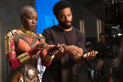
Black Panther: Danai Gurira (Okoye), Ryan Coogler on the set.
Despite the prominence of some directors, they’re usually not what draws audiences. In most countries, the mass-market cinema is dominated by genres that are populated by well-known stars.
Sarris and others assumed that auteurs built upon the foundations provided by genre conventions and star images. Ford gave the Western a new force not only through his images and use of music but also by redefining the star personas of John Wayne and Henry Fonda. Hitchcock and Lang worked with and against the conventions of the thriller, while Ophuls gave the melodrama a melancholic elegance. Or so goes auteur gospel.
The 1970s New Hollywood auteurs embraced genre filmmaking as well. Bogdanovich, Coppola, Altman, Woody Allen, and others tested themselves in a variety of genres. Even Scorsese tried a “woman’s picture” (Alice Doesn’t Live Here Anymore), a musical (New York, New York), and a biopic (Raging Bull). They are only roughly parallel to today’s indie filmmaker who, after a breakthrough project at Sundance or SxSW, signs on to make a franchise picture.
As a generous and enthusiastic cinephile, Scorsese has long subscribed to a version of auteurism. Perhaps one source of his misgivings about Marvel and its counterparts is that he can’t detect auteurs in these movies. Does that mean they aren’t there? Is today’s studio cinema largely a genre cinema, minus the classic bonus of high-end auteur expression?
One of his comments has attracted little notice. Scorsese remarks of the theme-park picture:
The technique is very well done but there is only one Spielberg, there is only one Lucas, James Cameron. It’s a different thing now.
This implies that even the franchise genres could sustain some degree of what Sarris called “directorial personality.” Admirers of Taika Waititi’s Thor: Ragnarock, James Gunn’s Guardians of the Galaxy, Ryan Coogler’s Black Panther, or Patty Jenkins’ Wonder Woman might agree. This has been one line of defense in the pushback to Scorsese’s comments.
Or maybe we should attribute whiffs of personal expression today to the producers (Bruckheimer, Kathleen Kennedy, Kevin Feige). Even in Hollywood’s heyday, we sense Gone with the Wind and Duel in the Sun as Selznick productions. Then there’s Walt Disney, surely a producer as auteur. I suspect that Scorsese finds these old films more inspiring than today’s behemoths.
Closing the drawbridge on Fort Multiplex
Avengers: Endgame (2019).
A genre can rise and fall in popularity. As the Western and the musical declined in the 1970s, horror and science-fiction gained traction as both programmers and A-list blockbusters. Add in the rise of fantasy, crystallized in the prestige accorded the Lord of the Rings installments. Oddly, as comic book sales declined, comic-book movies came to be a central contemporary genre. The superhero film proved a powerful blend of all these trends.
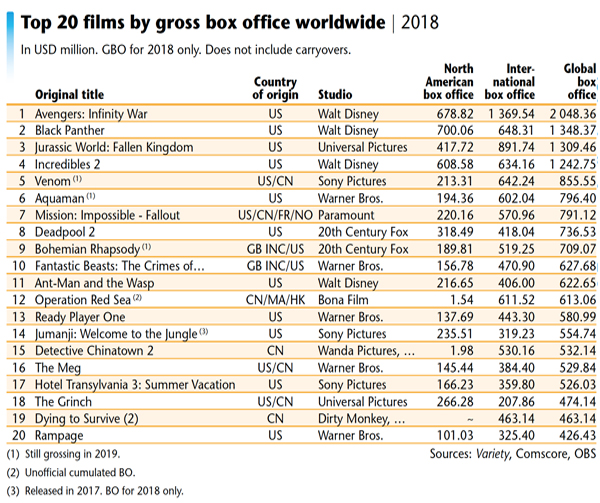
Today, the stifling presence of the fantasy/SF/comic-book franchises seems obvious. Look at two snapshots.
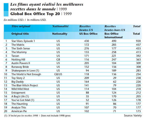
In 1999, the world’s top-grossing film was Star Wars: Episode 1. Among the twenty top hits were fantasy/SF blockbusters The Matrix and The Mummy, as well as a Bond entry. But there were also lower-budget horror films (The Sixth Sense, The Blair Witch Project). Most surprisingly, the top twenty include many comedies, mostly star-driven.
Now consider the 2018 situation.
Five of the global top ten were superhero films. The big winner was Avengers: Infinity War, which earned over two billion dollars globally–nearly twice as much as second-place Black Panther. Among the top ten are Venom, Aquaman, and Deadpool 2. Add The Incredibles as a sixth superhero film if you want. At 11 is Ant-Man and the Wasp. Most of the remaining titles are also franchise entries. There’s also the fantasy/SF blend Ready Player One, the monster movie Rampage, and the action thriller The Meg. Only China is offering live-action comedy (Detective Chinatown 2) and drama (Dying to Survive).
Of course nobody knows better than Scorsese that the big-budget fantasy/SF film has long been with us. His New York, New York (1977) came out the same year as Star Wars and Close Encounters of the Third Kind, while 1980 saw the release of both Raging Bull and The Empire Strikes Back. But in those years straight-up genre films had a fighting chance. Smokey and the Bandit, The Goodbye Girl, 9 to 5, Airplane!, and others won big box-office.
Scorsese films have landed in the top twenty occasionally (e.g., The Color of Money and The Wolf of Wall Street). On the whole, though, I’m not suggesting that Scorsese now sees himself as competing with the biggest grossers. He’s surely right that today’s superhero films dominate the landscape. But do they squeeze out other films to the degree he suggests?
In some venues, probably yes. Small towns with one or two multiplexes may not have space for the minor-key movie. But bigger towns and midsize cities can be quite hospitable to them. In one week, alongside the big releases, multiplexes in my town of Madison, Wisconsin (pop. about 250,000) played Motherless Brooklyn, Jojo Rabbit, Parasite, The Lighthouse, The Current War, Brittany Runs a Marathon, and documentaries on Molly Ivins and Miles Davis. At least some of these qualify as original vehicles. At its widest release, The Lighthouse played on nearly 1000 US screens, and Jojo Rabbit arrived at over 800.
These are merely data points, not systematic samplings. And you might argue that we’re in the middle of Oscar qualifying season, so more offbeat films are numerous now. Okay, go back to July, the most competitive month for domestic releases. Nationally, the big pictures didn’t prevent the release of Yesterday, Midsommar, Late Night, The Last Black Man in San Francisco, Booksmart, The Dead Don’t Die, The Biggest Little Farm, The Farewell, The Art of Self-Defense, Amazing Grace, and Once Upon a Time…in Hollywood.
Again, not all of these count as auteur vehicles, and several failed domestically, but they still squeezed into multiplexes. The Tarantino film obviously commanded a wide release, but many of the titles I mentioned played on between 1000 and 2000 screens. Booksmart opened on over 2500, Midsommar on 2700.
The industry doesn’t depend on the smaller or more personal titles, but then it seldom has. The biggest box-office successes in the heyday of the studio system were almost never auteur classics. Variety reported that the top domestic hits of 1943 were For Whom the Bell Tolls, Song of Bernadette, This Is the Army, Stage Door Canteen, Random Harvest, Hitler’s Children, Casablanca, Madame Curie, Star Spangled Rhythm, and Coney Island. True, Frank Borzage struck gold with Stage Door Canteen, but it’s not typical of his work. Lubitsch (Heaven Can Wait) and Hitchcock ( Shadow of a Doubt) were far down the list, bested by the likes of Sam Wood, Clarence Brown, and Henry King.
Or take 1952, ruled by The Greatest Show on Earth (De Mille), Quo Vadis, Ivanhoe, The Snows of Kilimanjaro, Sailor Beware, The African Queen (Huston), Jumping Jacks, High Noon (Zinneman), and Singin’ in the Rain (Donen/Kelly). True, The Quiet Man hit number 12, and Mann’s Bend in the River number 13. But of the top hundred the only other auteur pictures seem to be Pat and Mike (no. 39), Monkey Business (no, 47), Carrie (no. 54), The Lusty Men (no. 76), and Five Fingers (no. 85).
It seems plausible, then, that in Hollywood “audiovisual entertainment” has overwhelmingly dominated the market for decades. Auteurs seldom win the biggest grosses. But again Scorsese’s career history may have influenced his judgment.
There was a moment, the Holy 1970s, when genre cinema with a personal-vision inflection was occasionally lucrative. The Godfather, One Flew over the Cuckoo’s Nest, American Graffiti, Blazing Saddles, Alien, Apocalypse Now, The Shining, and other notably original productions did earn money and awards. Yet in retrospect that seems an interregnum. The top rentals of the following decade, the 1980s, were dominated by Spielberg and Zemeckis. Then there were the usual array of star-driven comedies and action pictures. Genres came back strong, and auteurs had to work within them, or around the edges.
Such is pretty much the case right now. At the top end, perhaps the superhero films are roughly equivalent to the biblical sagas, historical pageants, and theatrical adaptations that roadshowed throughout the 1950s and 1960s. Now as then, a number of auteur films are still getting theatrical releases. The blockbusters keep the lights on and the popcorn moving so that theatres can afford to wedge straight-up genre pictures and offbeat indies into their week. It seems that you can’t run Avengers: Endgame on all 22 screens.
Art vs. craft?
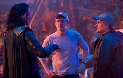
Anthony and Joe Russo directing Avengers: Endgame.
But maybe we shouldn’t think of the big pictures as “audiovisual entertainment.” What’s opposed to that? “Cinema,” Scorsese said. I’d propose that this formulation means “artistic cinema.” Which is to say that we’re in the realm of the classic distinction between art and entertainment.
This has given an opening to the people riled up by Scorsese’s remarks. Admirers of Marvel, DC, and comparable pictures can say that they find them as emotional, revelatory, inspiring, etc. as anything he finds in Bergman or Sam Fuller. They feel it in their bones. And who’s to gainsay that? Scorsese doesn’t have their bones, and neither do you or I.
On more objective grounds, I suggest that Scorsese has floated another distinction. Forget calling some things “cinema” and some things not. I think that he’s distinguishing craft from art.
Let’s say provisionally that craft is the skillful manipulation of the medium to produce the desired effects. Art, on this understanding, can be considered something more. It’s usually grounded in craft, but not always. It’s also formally and emotionally complex, original in its relation to what came before, and offering new experiences on repeated exposure (rather than replays of the original response). Many, like Kareem Abdul-Jabbar, would add that art induces reflection on ourselves and the world, making us wiser and deepening our humanity.
From this angle, Scorsese’s recognition of the “talent and artistry” of franchise films can be seen as a nod to craft competence. “The technique,” he says, “is very well done.” Our blockbusters are comparable to many of those anonymous hits of the studio era, turned out by skillful but impersonal artisans.
In response, the MCU advocates would need to show that the films go beyond craft. For example, some advocates find in these films the kind of character complexity Scorsese attributes to Hitchcock. He finds that Roger Thornhill in North by Northwest suffers “painful emotions” and an “absolute lostness.” Marvel fans will say something like this about moments in the stories of Tony Stark, Captain Marvel, Captain America, and the Winter Soldier.
Scorsese might reply that these are not complex characters. Yet for many years people said the same about the work of Hitchcock and other Hollywood auteurs. When people started to study them, we saw things differently. Only closer analysis of the comic-book films can give us better grounds to argue about whether their characters exhibit the “contradictory and sometimes paradoxical natures” Scorsese champions.
Realism and its rivals
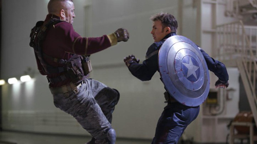
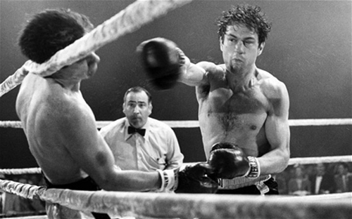
Captain America: The Winter Soldier (2014); Raging Bull (1980).
A few scattered speculations and I’m done.
I don’t know that we’ve fully recognized that these SF and fantasy franchises descend from earlier forms. Silent crime serials and installment films featuring Dr. Gar el-Hama and Judex had the same reliance on secret identities and world-threatening master villains. Chinese wuxia films gave their knight-errants the power to soar into the air (the “weightless leap”) and emit blasts of energy (“palm power”). The bullet ballets of Hong Kong films have obviously influenced Hollywood action pictures, but we haven’t acknowledged how our comic-book movies incorporate fantasy martial arts techniques. Hollywood owes Asian action cinema more than we usually admit.
But the silent policiers and the fantasy wuxia are flagrantly unrealistic. And Scorsese, more than many of his colleagues, is committed to realism. He couldn’t, I think, make Big Trouble in Little China or Kill Bill. I’d suggest he’s intrinsically out of sympathy with quasi-supernatural action. (Hugo is a historical film, and it’s about a sacred era of Cinema past.) Superhero dramaturgy, I hazard, rubs him the wrong way, and not just because it lacks psychological depth.
I’ve argued elsewhere on this blog that Scorsese makes forays into expressionist and impressionist technique, but they usually issue from a base of harsh realism. His commitment to realism may make it hard for him to engage with the more outrageous narrative conventions of the superhero film.
Here another classic dichotomy suggests itself. If you have to choose between basing your story on plot or character, Scorsese will choose character. In fantasy films, though, character motive and reaction are based on elaborate plot machinations. These films depend a lot on elaborate fake identities, as well as recognitions of hidden kinship. She’s my sister! He’s my father! Such devices serve to provide intricate genealogies and networks of relationships for fan homework.
Likewise, theatrical melodrama and adventure fiction from the nineteenth century supply superhero sagas with orphans of mysterious parentage, duels, hairbreadth escapes, family secrets, coded documents, precious but mysterious objects, and other franchise conventions. These are woven into complex schemes and counter-schemes of the sort found in the silent crime serials. But all these features run counter to the psychological conflicts that animate Scorsese’s plots.
Recognitions of kinship rely in turn on a plot strategy that’s worth discussing a little more; I suspect it yields much of the emotional resonance that fans enjoy. These films rely on courtship and romantic rivalries throughout, of course, as well as friendships forged and broken. These are standard for most American genres. But I’ve been surprised at how often family relations are developed in complicated ways.
It’s not just Star Wars. The Marvel Universe relies heavily on kinship to sustain its plots, as well as its pathos. Tony Stark and Pepper Potts have a daughter, as does Scott Lang. Hawkeye has a family, as does T’Challa, whose cousin N’Jadaka becomes a prime adversary. Nebula and Gamora are pressured to be dutiful daughters to Thanos. Thor and Loki share a mother, Frigga. You can argue that Tony Stark becomes a father-figure for Peter Parker. Other characters are more isolated, but for some of them, notably Natasha and Bucky, the Avengers team constitutes a surrogate family.
Marvel’s focus on the family asks us to exercise the skills we must bring to classic mythology, nineteenth-century novels, and TV soap operas. We need to keep track of who’s related to whom, and what in their past encounters can arouse obligations and conflicts. I don’t think that plots resting on such dense kinship relations are of great appeal to Scorsese; his families, when they’re present at all, are pretty small-scale (Raging Bull, Cape Fear, Shutter Island, The Age of Innocence).
Most of all, when Scorsese speaks of these films shying away from risk, I suspect he’d include their avoidance of narrative risk. In fantasy and SF, nobody need really die. Hero, villain, love interest, and sidekick can return in a parallel world, or they can be resuscitated through a new gadget. The worst outcome need not be the worst, as when Avengers: Endgame uses nanotech and time travel to rewrite the past. Plot mechanics again. Despite all the assurances that Tony Stark is really, really gone, we could find a way to bring him back if Downey wanted to sign on again. (Black Widow is being resurrected for a prequel adventure.) But there’s no bringing back Sport from Taxi Driver or Rodrigues from Silence—except in a prequel, another convention that Scorsese would likely disdain.
I’m just spitballing here, but for Scorsese and other stylized realists like Michael Mann, the comic-book convention of eternal return might seem merely juvenile wish fulfillment. Something really has to be at stake, and ultimates must be faced’ Danger and death are real. This is grown-up drama.
I’m not intrinsically opposed to the conventions ruling comic-book movies myself. In general, I think that plot is as underrated as character is overrated. (I’d rather give up the distinction altogether, but that’s another story.) Superhero films are mostly not to my taste, but I think they’re worth studying as intriguing contributions to trends in modern cinema. My point is just that the personal aesthetic of Scorsese, as both cinephile and cineaste, doesn’t fit very well with the elaborate, ever-changing rules of the magical MCU. He finds enough magic in a sinuous tracking shot, or a carefully synced doo-wop song, or an unexpected angle, or a wiseguy shouting match. That is Cinema.
There are other questions we might ask about Scorsese’s remarks. For instance, when he celebrates the thrill of communal moviegoing as a central feature of Cinema, he seems to ignore the fact that the franchise pictures are our prime multiplex attractions. Many viewers slot the more “personal films” into a future Netflix queue, but they commit themselves to seeing the big films on the big screen. That choice can yield contemporary viewers some of the electricity that Scorsese found at a screening of Rear Window. And when they’re not checking their text messages or chatting loudly with their pals, they might even give themselves up to laughs, screams, and applause, just as in the old days.
Since I wrote this, though, something much more draconian than superhero pictures may threaten non-franchise pictures. On Monday, Assistant Attorney General Makan Delrahim said that the Department of Justice is moving to end the consent decrees that have governed Hollywood studio conduct since 1948. (See here and here.)
The implications of this are staggering. We may see the return of block and blind booking, the prospect that a studio could own a theatre chain (and give favored place to its own pictures), and the decline of independent producers and art houses that favor smaller films. Nonsensically, Delrahim quoted an earlier Scorsese remark about his craft: “Cinema is a matter of what’s in the frame and what’s out.” Delrahim went on: “Antitrust enforcers, however, were not cast to decide in perpetuity what’s in and what’s out with respect to innovation in an industry.” Thus the ideology of predatory “disrupters” goes on, and even auteurs are unwillingly recruited to the enterprise.
Thanks to Jim Danky for calling my attention to the McFadden comic, and to Jeff Smith for discussions of Scorsese’s arguments. Thanks as well to Colin Burnett for discussion of the Bond saga.
My lists of top-twenty films come from the European Audiovisual Observatory’s publications Focus 1999 and Focus 2019.
I’ve left aside other writers’ analyses of Scorsese’s views. I benefited from reading Ben Child and Helen O’Hara in The Guardian, Christopher Orr’s older review in The Atlantic, and Zachary Zahos at Playback. Also pretty forceful is Kevin Feige’s defense of the MCU, which I discovered only after writing this entry. He argues for Marvel films’ value on several grounds, including their display of positive social values. And just before I posted this, the Russo brothers weighed in.
Here are other Scorsese comments made before the New York Times piece appeared. After his BAFTA David Lean lecture on 12 October, he reiterated his view.
Theatres have become amusement parks. That is all fine and good but don’t invade everything else in that sense. That is fine and good for those who enjoy that type of film and, by the way, knowing what goes into them now, I admire what they do. It’s not my kind of thing, it simply is not. It’s creating another kind of audience that thinks cinema is that. If you have a child and the child wants to see the picture, what are you going to do? It’s up to you. The audience that sees them now, the fans that see those pictures now, they were raised on pictures like that.
The technique is very well done, but there is only one Spielberg, only one Lucas, James Cameron, it’s a different thing now. It’s an invasion, so to speak, in the theatre. . . .
We are in a moment not only of evolution but of revolution, in pretty much the whole world, everything we know, the old political systems, it’s almost as if the 21st century is beginning now and technology has gone with it and that means cinema goes with it.
Yes, see a movie in a theatre, it’s the best with an audience, but the actual concept of cinema has become something that is not definable. Something can play as a hologram, something can play as virtual reality, maybe there is going to be an extraordinary epic in virtual reality at some point. We have to start expanding what we think of as narrative, music, literature, art and particularly the visual image.
Granted, this whole passage is a bit baffling. It’s not completely clarified in a press conference the next day at the BFI London Film Festival. The relevant section starts at 16:26.
It’s also interesting that Benedict Cumberbatch (aka Dr. Strange) defends the need for auteurs.
Some comments on Sarris’s career and the vagaries of auteur theory are here. I discuss Black Panther and its debt to classical Hollywood storytelling here.
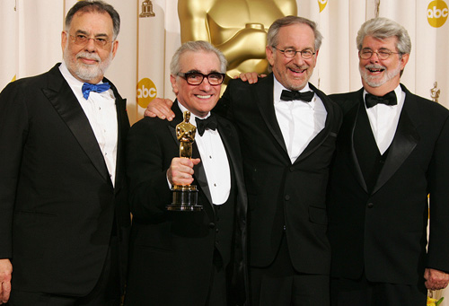
Francis Ford Coppola, Martin Scorsese, Steven Spielberg, George Lucas (2007).
THE LIGHTHOUSE: A period film with period style
Kristin here:
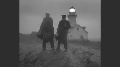
David and I first saw Robert Eggers’ The Lighthouse at the Vancouver International Film Festival, and he wrote briefly about it at the time. About halfway through the screening or less, I realized that what I was watching was a modern combination of two important historical trends of 1920s German cinema: Expressionism and the Kammerspiel.
I am partial to German silent cinema, particularly Expressionist films, for their daring stylization. The movement gave rise to some great films by two masters, F. W. Murnau and Fritz Lang. I’m even fond of the leisurely pacing that characterizes so many Expressionist and Kammerspiel films. At times some scenes resemble the slow cinema of recent decades.
Kammerspiel was a larger trend in the theater of the day, and it has its equivalent in English and American drama, the chamber play. Most of the Kammerspiel films in Germany were written by the great scenarist Carl Mayer, also responsible for many of the Expressionist classics from Das Cabinet des Dr. Caligari on. Kammerspiel films include most notably Hintertreppe (Backstairs, Leopold Jessner, 1921), Sylvester (1923) and Scherben (1923). Some would consider Murnau’s The Last Laugh (1924) to be a Kammerspiel. Carl Dreyer also made one in Germany, Michael (1924, with a scenario by Thea von Harbou) and one in Denmark, The Master of the House (1925). Such films typically involve a small cast of characters who come into conflict in various ways, invariably ending badly, typically with death, suicide, murder, and/or imprisonment. The Lighthouse clearly qualifies.
The Lighthouse is also a horror film, or at least a lot of critics think so. Thus it fits cozily into the Expressionist movement, of which several Expressionist films are now considered early classics of the horror genre: Caligari, Nosferatu, Der Golem, Warning Shadows, Die müde Tod and other less well-known films.
Critics did not fail to notice The Lighthouse‘s links to silent cinema, and in particular Expressionism. Richard Newby’s review in The Hollywood Reporter remarks on: “The filmmaker’s decision to shoot the film in black-and-white and in the aspect ratio of 1.19:1, giving The Lighthouse the appearance of a silent film born of German Expressionism.” He also calls it, “Equal parts Lovecraftian horror story and existential chamber piece in the vein of Jean-Paul Sartre’s No Exit.”
Screen Daily reviewer Lee Marshall caught both the Expressionist and Kammerspiel aspects:
Shot in an expressionist black and white that harks back to cinema’s earliest years, The Lighthouse provides a marvellous chamber-drama platform for two actors, Robert Pattinson and Willem Dafoe, who seize the opportunity with gusto.
[…]
Referencing everything from German expressionist cinema of the 1920s to US silent comedy, the photography of Edward Weston and the from-the-ground-up perspective in the paintings of Andrew Wyeth, Jarin Blaschke’s photography is starkly compelling.
Manohla Dargis’ review in The New York Times explicitly notes German Expressionist cinema:
With control and precision, expressionist lighting and an old-fashioned square film frame that adds to the claustrophobia, Eggers seamlessly blurs the lines between physical space and head space.
The film’s more sustained pleasures, though, are its form and style, its presumptive influences (von Stroheim’s “Greed,” German Expressionism), the frowning curve of Winslow’s mustache, the whites of eyes rolled back in terror.
One might add that the dreams and hallucinations, shown from Winslow’s viewpoint, reflect the innovations of French Impressionist cinema of the 1920s. This sort of stylistic subjectivity, however, was highly influential and has been widely used ever since. It was quickly picked up in German cinema of the 1920s, and some of the classics of the day, especially The Last Laugh (1924) and Variety (1925), are more noted for their subjective camerawork than are the earlier French films that originated the practice. Overall, The Lighthouse has the flavor of a German film from the 1920s.
Lots of filmmakers have attempted to imitate silent cinema, and often they succeed to a degree. They shoot in black-and-white (but don’t add tinting and toning), put just music and maybe some sound effects on the track, and have some exaggerated acting. Perhaps they set the story in the past, as Michel Hazanavicius does with The Artist (2011). A more careful attempt is Blancanieves (2013).
No matter how careful the combination of such elements is, the result usually doesn’t really look like an old film. The Lighthouse really does look like a silent film, in the sense that it looks as if it were shot using the film stock available in that era. It does not, however, pretend to be a silent film, as The Artist does. The Lighthouse doesn’t eliminate the dialogue. Its narrative and tone bear distinct resemblances to those of German and French films of the 1920s, but its story is presented with more overt sexual content and extreme violence than mainstream silent movies would have included.
It helps that Eggers is clearly a cinephile and has watched a wide variety of films from many periods. Cinematographer Jarin Blaschke has also worked as a still photographer and also knows a great deal about older film stocks and lenses. They both knew a lot about films of all periods.
When asked in an interview for American Cinematographer what were the team’s “references” (films shown to crew members as models), Blaschke responded:
A bit of Béla Tarr for tonal dreariness and patient use of camera. Bergman’s camera language, as always. [Eggers’ liked the strong night lighting of In Cold Blood. There were some nautical silent films, including Flaherty’s Man of Aran, [which was shot] on orthochromatic stock with strong, direct close-ups. [The influence of] Eisenstein was there for montage, and bold, hard cuts. Optically, the films we watched from the ‘20s and ‘30s were very appealing in their subtle fringe distortions and the way highlights would shimmer. [p. 63]
In the end, the most influential references were M—an inspirational and modern film in terms of visual language—and Bresson’s Pickpocket, which influenced [our] use of close-ups, especially actions with hands. These helped steer The Lighthouse away from the purist confines of the turn of the century, and more toward early modernism.” [pp. 63-64]
M seems rather an odd choice, but Blaschke describes its inspiration in an interview for Kodak:
Watching that, I found a very modern film with surprising camera movement but more importantly: a modern, creative mastery in how visual information was withheld from the audience, how information was rewarded, and when,” says Blaschke. “With this new inspiration, I felt there was a highly-effective framework for me to express myself visually. Stepping away from a mere 19th-century emulation, we were on to something more surprising and layered.
In a DGA podcast interview, Eggers discusses the nearly-square aspect ratio:
And then, the boxy aspect ratio, we were shooting in 1:19.1, early-sound aspect ratio. There’s a Pabst film, Kamaradschaft, that takes place in a mine, which is probably the only other film that makes sense to use this aspect ratio, because Pabst is shooting vertical objects, like the smokestacks, and we have our lighthouse tower, and then the cramped mineshafts, and then the cramped interiors of this thing. Because we’re using spherical lenses, it’s actually taller, so it’s a great aspect ratio for these close-ups. You don’t need flab on the side. You just have Robert Pattison’s cheekbones, Willem Dafoe’s cheekbones in all their glory on these old lenses.
Who knows what other films are these two are familiar with? But one can assume that they watched some of the classic German films of the 1920s, both Expressionist and Kammerspiel.
The Lighthouse and German Silents
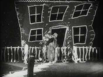
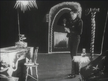
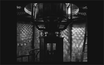
Early German Expressionist films often used jagged, abstract sets, more like paintings than like actual buildings or landscapes. Caligari is the most familiar instance, but here are a couple of examples from Von Morgens bis Mitternachts (1921, Karlheinz Martin).
The second image demonstrates particularly well how light was often represented by streaks of paint. The overhead hanging lamp at the upper left is a fringe of spikes, and the flames on the huge candlestick at the left are five wisps of paint. Highlights from these “lights” are painted on the desk and chair at the lower left.
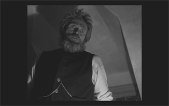
Hollywood films have seldom used distorted sets of this kind. They appear occasionally, as in Son of Frankenstein (1939, Rowland V. Lee) and Beetlejuice (1988, Tim Burton). Most of the time, though, when people speak of expressionist style in films noir or horror films, they’re talking about graphic effects created by lighting. That lighting is not created by streaks of paint but by fancy lighting effects. That’s mostly the case in The Lighthouse. The lighthouse tower and the service buildings around it were designed to be authentic copies of features in real historical lighthouses. The distorted stylization comes from lighting effects, from simple underlighting to patterns created by patterned holes in the lighthouse interior.
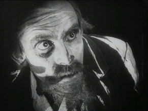
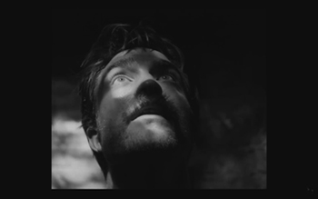
The same is true of acting. In German Expressionist films, actors’ faces were often painted, especially with dark patches around the eyes and pasty white skin. Compare this close-up of Ernst Deutsch’s face, as the Cashier in Von Morgens bis Mitternachts, with that of Robert Pattinson, where the distortions are created by light and shadow.
Most of the classic German Expressionist and Kammerspiel films were studio-created. Sets were built either in studios or on extensive backlots. In contrast, Eggers wanted to use an authentic lighthouse. Scouting failed to turn up one with adequate access roads, so the lighthouse and service buildings were built, with faithful adherence to period locales, near the tip of the Cape Forchu Lighthouse peninsula (down the road from a modern lighthouse).
This location is far from from isolated, but the film manages to create a sense of loneliness and dread nonetheless. The huge crashing waves and storms were not generated digitally but were practical effects. According to the Kodak story, “Most of the water work was shot in a large, emergency-responder’s training pool, capable of generating waves in varying sizes and patterns, located near Halifax.” The film contains a few digital effects, mainly to turn the peninsula into an island.
Eggers seems to share the sensibility of the German silent directors: “In a perfect world, I would have liked to have built every single building, for control, control, control, control, control.” (From the DGA interview)
As to Kammerspiel films, The Lighthouse reminds me most of Scherben, which deals with a man who works as a linesman for a railroad. He, his wife, and their daughter live in isolation in some woods and live a stultifyingly dull existence. The intrusion of a railroad inspector who seduces the daughter leads to drama as the linesman gradually becomes enraged and kills him. The style of the film is quite different from that of The Lighthouse, but the dynamics of conflict and gradual deterioration of the central character are somewhat similar–if more restrained in his slow burn and stolid demeanor.
Scherben only became generally available earlier this year, when I wrote about its Filmmuseum Edition DVD release. I have no idea whether Eggers ever saw it at an archive screening or in somewhere else. He more likely saw Hintertreppe, which has long been the only one of the classic Kammerspiele commonly accessible.
Bringing back orthochromatic, sort of
In the DGA interview, Eggers discusses the choice of film stocks:
We thought orthochromatic film stock would really be the way to go, which, among other things, the main thing about orthochromatic film stock is that it’s not sensitive to red, so red is rendered black. So the rosy skin tones on a Caucasian renders darker. So Eisenstein, that’s why all those Russian faces look so tan, and in Hollywood they’re wearing white pancake makeup to compensate for the orthochromatic stock [….] So we liked Double-X negative. The blacks bottom out suddenly in a way that’s very satisfying, as we remember it from watching old movies.
Apparently Eggers and Blaschke investigated having orthochromatic 35mm stock custom-manufactured for them, but the expense was too great. A cheaper way had to be found.
In the American Cinematographer interview, Blaschke describes testing Kodak’s Double-X 5222 35mm film, color 35mm negative film, and digital capture with an Arri Alexa: “In addition to much larger grain, the Double-X has more ‘tooth.’ Even if you match the overall contrast in the DI [digital intermediate], the Double-X had more ‘local’ or ‘micro’ contrast, which emphasizes texture and better differentiates similar tones” [p. 61]. (Double-X 5222 was introduced in 1959 and has been used on such films as Raging Bull [1980] and Schindler’s List [1993].)
Despite these advantages, however, Double-X is a panchromatic stock, with sensitivity to the entire visible spectrum. To solve this “problem,” Blaschke ordered a custom-made filter that would eliminate the red-to-mid-yellow end of the spectrum, thus simulating orthochromatic film effectively [AC, pp. 66-7].
The choice of lenses was also done with an eye to maintaining the artificial orthochromatic look. Blaschke tested many vintage lenses and settled on Baltars, designed in 1930s. The two used in the film were made in 1941 and 1944. In the Kodak interview, he says, “The vintage Baltars were the most shimmery of the bunch I tested, and really were the most stunning portrait lenses I have ever seen,” he says. “The highlights really glowed, but stopped just short of heavy-handedness. Optics like these could add a layer of complexity on top of our hard, orthochromatic look to pull people into the world of the film.” A rehoused 1905 50mm lens was used for some flashback images, and some replicas of 1840 Petzval lens designs were used in flashbacks and “heightened moments”[AC, p. 64]. Blaschke describes the effect in an interview on the Motion Picture Association website: “Blaschke says that for those more “out there sequences,” he had a special lens designed—called a petzval—that contains a lot of aberrations. “It creates a very squirrely look. The background almost falls out of focus, like a globe, and you get this very swirly effect.”
Lighting The Lighthouse
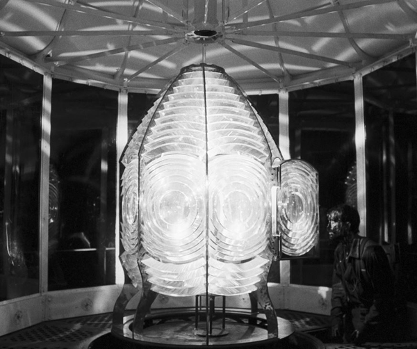
Those swirling light patterns you see on Pattinson’s face in the movie are a real phenomenon—we found ourselves just wanting to gaze into the Fresnel lens. We could have stayed all night staring into the light.
Robert Eggers, Cannes Press Release
Apparently the decision to set the film in the 1890s arose during the search for the ideal lighthouse. In an interview with Eggers in Architectural Digest, he remarks, “‘I wanted there to be a mystery in the light. Inside the beacon. So we knew we needed to set it in a period where we would have a Fresnel lens,’ he explains. Not many lighthouses still have functional ones today. ‘They look like Art Deco spaceships, and they are very magical and jewel-like. So we knew that was going to place us in the second half of the 19th century.'” (See the bottom for an image of the film’s custom-made Fresnel lens mesmerizing Winslow in the climactic scene.)
The decision to imitate orthochromatic film had a considerable impact on the lighting used. Ironically, it meant that a great deal of light from modern lamps, had to be used. Eggers admits as much in the DGA interview.
Obviously we weren’t lighting it like an old movie. We were lighting it using our practical fixtures, but of course, if this were an old movie, you would see the flame of the kerosene lamp and there would be a movie light lighting the scene. But what we did was we had a 600W halogen bulb on a flicker dimmer in all those scenes. And it was really, coming from Alexa and fast film stock, it was so bright. People were wearing sunglasses when we were doing night interiors.
Double-X is slow, even slower than color negative stocks. Modern digital cameras can typically shoot with less light than shooting on film requires. Putting together slow film stock, a filter (albeit one that cut down the light availability by less than one stop), and older, slower lenses meant that the cinematography crew had to use huge amounts of light, as a Variety interview with Blaschke explains:
Blaschke says he prefers to model his lighting in a real-life way, which was tricky on “The Lighthouse.” He and gaffer Ken Leblanc worked with Kodak Double-X stock — Blaschke calls it the only practical black-and-white film left after Plus-X was discontinued in 2011 — which is much less sensitive to light than even color film stock. Between the optics, the film stock and the filtration, Blaschke and Leblanc had to use about 15 to 20 times more light on set to get the look they wanted than on “The Witch,” which was shot on an Alexa.
“Even though it’s a very dark movie, the sets were actually blindingly bright,” says Blaschke. “We’d put 500- to 800-watt halogen bulbs in the lanterns that would flicker and were only a few feet from an actor’s face. The way we make movies now, people have gotten used to a very low light level; it’s trendy to shoot wide open, digitally at 800 or even 2,000 ASA. Our actors talked about how they couldn’t see each other sometimes, which I felt bad about.”
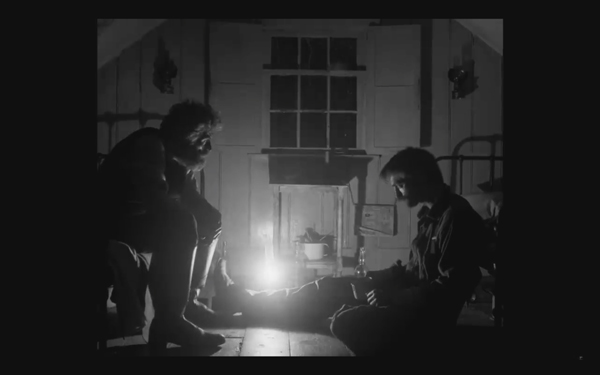
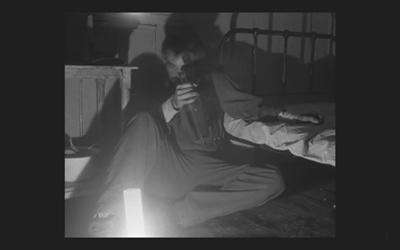
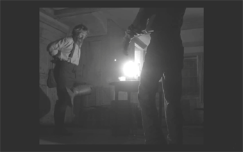
This halogen light is used in the night interiors, such as the scene of the drunken dance, below, and the later scene of the pair drinking in their shared bedroom, at the top of this section and the entry.
This combination of a very bright lamp with slow film and a filter cutting down part of the spectrum of light entering the lens meant that the light fell off very quickly away from the lantern. That effect is also very evident in these scenes. Backgrounds are dimly visible, and the actors often become silhouettes.
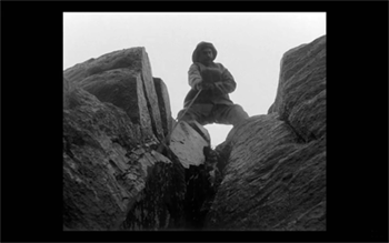
The result is a heightened sense of the two main characters being trapped together in small islands of light surrounded by blackness. We have no sense of how many lanterns the house contains, but we never see more than one at a time. At one point Winslow is seen in bed with a book, and the dim light from the window above him makes it hard to believe that he can see well enough to read. Even the daytime scenes are gloomy and gray. A low angle with the blank, light sky as rendered by the “orthochromatic” film makes Winslow and the dark rocks around him look nearly black.
Few silent films shot on orthochromatic film look this consistently dark, and it’s clear that the filmmakers were not simply trying to replicate the look of an old film. Blaschke admits as much in yet another of the many interviews on the film’s techniques: “It wasn’t about trying to make it look like older films but rather choosing a frame that lends itself to the tall and narrow sets and helps you visually withhold information from the audience. It also had a secondary effect of evoking compositions of 20th century modernist photography,”
In the DGA interview, after describing the various technical details of design, setting, and cinematography, Eggers explains:
This is fussy and it’s nerdy and it’s fun to talk about in this forum, but why do this? One, it says the movie’s old; it takes place in a time when black-and-white photography existed. But two, this is a bleak, austere story, and I feel like black-and-white is the best way to tell this story, and color is only going to mar things. Again, with this orthochromatic filter, it knocks our blue skies, which if we have them—which we really did—into something white and bleak and stark and harsh.
To get really nerdy about it, panchromatic film stock had largely replaced orthochromatic by the late 1920s and early 1930s, the only period in which a nearly square aspect ratio was standardly used. Moreover, the Baltar lenses were invented in the 1930s. Halogen lamps are a comparatively recent innovation in film lighting. So the combination of the ortho and the boxy look and the rest of it aren’t “authentic” in any strict sense. The filmmakers were not using lighting equipment of the 1920s or any modern equivalent. In short, they weren’t trying to replicate the look of any one specific type of old film. As a way of creating the illusion of an old film, as well as an appropriately grim tone, it works better than anything else I’ve seen.
A few final notes
First, I have seen The Lighthouse’s budget given as $4 million. That’s in the film’s Wikipedia entry, which cites an AP release from May 2019 that says only that the film’s budget was larger than that of The Witch but still modest. The New York Times ran a story about the film’s trailer in July, noting that the budget for The Witch had been $4 million, which Box Office Mojo also gives as the cost of the earlier film.
I have not been able to find a reliable figure for The Lighthouse’s budget, but clearly it was distinctly more than $4 million.
Second, according to Eggers in the DGA interview linked above, that’s real dirt (sifted to rid it of the odd pebble) that Winslow shovels down onto Wake in the climactic scene–not some namby-pamby ground chocolate. Not to mention that the puddle he’s lying in was frigid. Even the Expressionist actors didn’t go so far. The Academy should give Dafoe his Oscar already.
Third, watching The Lighthouse with a sell-out crowd in the biggest venue at the Vancouver International Film Festival, The Centre for the Performing Arts, was one thing. There people were eager to see this film, which had premiered in the Directors’ Fortnight thread at Cannes in May. It won the International Federation of Film Critics (FIPRESCI)’s prize for best film. It was quite another thing to watch it by myself during its run at a local multiplex.
The Lighthouse played at three multiplexes in Madison, with full-day schedules at each. It’s still playing at one of them, twice a day. I was alone when I saw it a few days ago at a 10:25 am screening. After being in a crowded festival audience, the second experience made me wonder how in the world such a challenging film made it into such wide release and how a more mainstream audience would react to it. (It maxed out at 958 theaters November 1-6 and has been falling since. Its gross through November 10 is $8,915,216 domestically; Box Office Mojo so far has no figures for foreign markets.)
The frames from The Lighthouse have mostly been taken from trailers. I have not cropped the frames reproduced above to their 1.19:1 format, since on theatrical screens, the audience sees the image as window-boxed, with black stretches on either side. (The exception is the bottom image, a press image released by distributor A24; it is either a frame with the black sides cropped or possibly a production still.) Perhaps Eggers and Blaschke’s idea would have been for theaters to move the screen’s masking to the edges of their images. Given the realities of modern exhibition, however, such versatility is not part of the screening technology. I found that the window-boxing on the big screen was a constant, subtle way to call attention to the unusual compositional results. What The Lighthouse will look like on various formats for streaming is hard to imagine.
Speaking of the aspect ratio, a number of critics have called 1.19:1 a silent-film format. In fact it was only used in the early sound era, when room had to be made on the filmstrip for the optical soundtrack; later the image was shrunk slightly into the classic Academy ratio of roughly 4:3. During the silent period there was no absolute standard ratio, though the image was in usually not far from the Academy ratio.
The American Cinematographer article cited is Patricia Thomson, “Stormy Isle,” AC (Nov 2019): 60-67.
In one of the quotations above, Blaschke says that Man of Aran (1934) was shot on orthochromatic film. This seems unlikely, given that Flaherty had made one of the first American features to use the new panchromatic film stock, Moana (1926). Kodak stopped making ortho in 1930. Possibly Flaherty, who started work on the film in 1931, did revert to ortho for it, but it seems unlikely.
Ernst Deutsch, who plays the Cashier in Von Morgens bis Mitternachts, was one of the great Expressionist actors of stage and screen. I have mentioned him before, for his role in Der Golem; when Von Morgens bis Mitternachts was released on DVD; and for his role in the non-Expressionist Das alte Gesetz, released on Blu-ray by Flicker Alley last year.
On horror and fantasy in German silent films, see my “Im Angang war …: Some Links between German Fantasy Films of the Teens and the Twenties,” in Paolo Cherchi Usai and Lorenzo Codelli, eds., Before Caligari: German Cinema, 1895-1920 (Pordenone: Edizioni Biblioteca dell-Immagine, 1990), pp. 138-161.
Baschke mentions Eisenstein as an influence in the editing, but presumably neither he nor Eggers had read Eisenstein’s essay arguing in favor of a square aspect ratio. His belief was that such a frame would give equal compositional weight to the horizontal and vertical dimensions of the screen. (“The Dynamic Square,” Jay Leyda, ed., Film Essays and a Lecture [New York: Praeger, 1970], pp. 48-65.
The photograph of the lighthouse set on Cape Forchu is by Dan Robichaud and appears in Carla Allen’s story on the filming in the local Digby Courier. A search for “Cape Forchu Lighthouse” on Google Maps yields many photos of the area and reveals the very rocky terrain over which Winslow pushed his wheelbarrow. The modern lighthouse is a popular tourist attraction, in case you ever visit Yarmouth in Nova Scotia. There is even a restaurant inside it. (Appropriately enough, “The grilled lobster and cheese sandwich was amazing,” according to one visitor.)
[January 13, 2020. Blaschke has been nominated for an Oscar in the Best Cinematography category. Unfortunately the film was not nominated in any other category, as it deserved to be.
February 8, 2020. Blaschke has won a number of awards for the film, most notably the American Society of Cinematographers Spotlight Award, and, just today, the Film Independent Spirit Award for best cinematography.]


