Archive for April 2020
Brains, bodies, and movies: Ways of thinking about the psychology of cinema
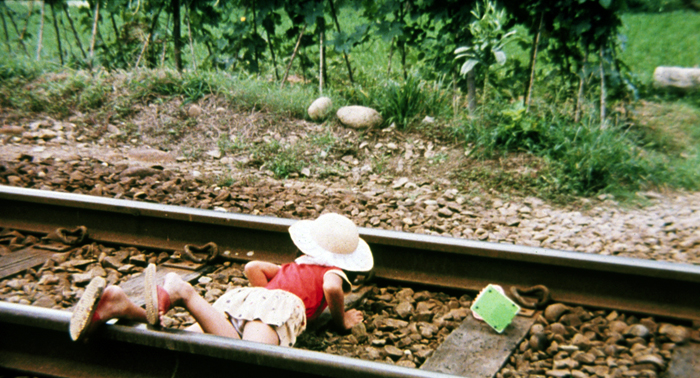
Summer at Grandpa’s (Hou, 1984).
DB here:
This is another phantom entry I posted as Private for the seminar I’ve been teaching this term. I’ve opened it up for a wider audience because some readers have written to ask for access to the ideas. These are comments based on assigned reading for the course. Just as important, this entry serves as an introduction to a guest post coming up next week from Malcolm Turvey.
An earlier phantom entry, which considers how critics interpret a movie’s themes, intersects with this one. This is no less wonkish than that was.
The course has been an examination of the theory and practice of a particular perspective on studying film, the poetics of cinema. A poetics of any medium tries to study the principles undergirding the craft (technê) of artistic work in that medium. These principles may be explicit rules, or guidelines steering the makers’ decisions. But poetics can also reasonably try to trace how those principles and practices are designed to shape effects on perceivers. (For film, let’s call them spectators, but they of course listen as well as watch.) What are some fruitful ways to think about effects?
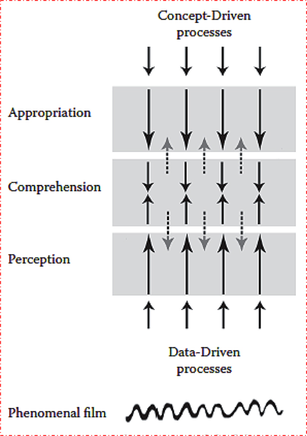
My initial stab at this was the bottom-up/top-down diagram of viewer activity.
To recap: As viewers we have capacities that are data-driven (bottom-up); these yield what we normally call perception. That’s already a huge range of activities, carried out mostly below the level of consciousness. (You can’t watch yourself registering color wavelengths.) In film viewing, perception runs from very fast, encapsulated, specialized, and “dumb” systems, like the phi phenomenon and apparent motion, to somewhat slower (but still fast and involuntary) ones like object recognition, speech recognition, and the like.
The top-down processes, which I called appropriation, are concept-driven, more voluntary, more deliberative, and more extensively funded by experience. A prototypical case would be judging a movie good or bad, or picking a clip to show in class. Interpretation, which I considered in this entry, is a common act of appropriation in the film-viewing community.
In the middle zone are what I called activities of comprehension. A prototypical example is following a story. It’s data-dependent (I can’t make Jackie Chan into James Bond) but it’s also concept-dependent (I can identify the conflicts and combats in a martial-arts film because they make the plot advance in a conventional manner). In non-narrative filmmaking, other comprehension skills come into play, drawing on knowledge bases, heuristics, and the like. You need some experience of art and life to follow the poetic fishing documentary Leviathan.
I wanted to allow feedback too, so the dotted lines in the middle try to suggest how comprehension can fund certain aspects of perception. We recognize Jackie Chan as likely to be the hero, and this concept helps steer our attention to him in his shots. Comprehension of course also funds appropriation, as when after grasping the film’s story we pick it apart in analysis.
One implication, already touched on in the interpretation entry, is this: As we go up from perception to appropriation, the filmmaker’s control wanes and the viewer’s control increases. Spielberg structures Raiders of the Lost Ark the way he wants, but you can appropriate his movie as a piece of imperialist ideology and he can’t do a damn thing about it. In the middle, it’s a negotiation: He steers you to construct the story a certain way, but you can also fill it out with your own inferences, or claim he hasn’t given you enough cues to do so. (Does Marion really love Indy? How much?)
And emotion is involved at all stages of the process, from the jolt of jump scares to the high-level social satisfactions of fandom.
Functions and inferences
 This model was an attempt to be naturalistic—that is, in accord with what the special sciences currently know about how viewers’ minds work—but minimally so. This is an important point. This is a functionalist account. That is, it’s largely indifferent to how the processes are manifested in physical mechanisms.
Think of all the vending machines you’ve encountered in your life. Each one yielded you those tasty snack treats in a predictable way, but there are different designs and materials. There are those drop-down machines that usually clamp your wrists when you try to reach into their pilfer-proof trenches. There are the little-window ones, which rotate the goodies into place (sometimes). There are even ones that use claws or turntables. And the bits and pieces can be made of plastic or metal, while the gearing and electronics and the machinery for grabbing your money (and denying your change) can be widely varied. But all in all, they have the same basic function and purpose: to take your payment and give you something deliciously unwholesome.
In the same way, my model of the spectator is agnostic about how the processes are instantiated in physical stuff. Doubtless retinas and neurons and inner ears and the nervous system are involved, but I’m not providing the details. I have no idea how to do so. Maybe we should think of the mind as having a core-periphery topography with outward-facing systems (the senses) as discrete modules picking up data while “central systems” supply the top-down treatment. Or maybe the mind is just a tangle of wetware, wires running all over the place, with “higher” functions jammed against, or crisscrossing “lower” ones.
I leave sorting all that out to the experts. But in terms of functions, I think it’s fair to say that most psychologists let the bottom-up/top-down metaphor capture distinct sorts of activities, however they are manifested in our senses, brains, and nervous systems.
More controversial is my argument that these activities are inferential in nature. This signals my commitment to New Look thinking, the early cognitive trend launched by Jerome Bruner, R. L. Gregory, Noam Chomsky et al. Computational models of mind emerged from this research. Nobody doubts that in the comprehension and appropriation phases, inferences are involved. Understanding a story or interpreting a movie as sexist clearly relies on inferences, “going beyond the information given.” The tougher controversy comes with perception.
Following Helmholtz, who believed that perception was “unconscious inference,” the information-processing perspective holds that perception is inference-like. It is defeasible. My eyes can fool me, as with mirages and the bent-looking stick in the pond. This is one reason New Look psychology is interested in illusions.
Moreover, perception operates with assumptions, just as inferences do. Many perceptual assumptions may not be learned but rather “innately specified” to some degree–that is, as presets. It seems, for instance, that we are evolutionarily “wired” to expect light to come from above. It’s also very advantageous for us to be able to separate figure from ground and tell living things from nonliving ones. These basic perceptual acts are funded not only by experience but by presets that steer us in a certain direction. No blank slate here; lots of veins and grooves. And given that we enter a structured ecosystem at birth, rich and flexible innate dispositions can be tuned to information pickup during a critical period. Babies learn fast because they’re primed to set the switches.
This perspective is usually contrasted with the view that holds that perception is “direct.” Most famously, J. J Gibson held that “the information is in the light.” Thanks to evolution and our mobility as creatures, we don’t need any elaborate inferential activity. The input is so redundant that we reliably detect the features of the environment automatically.
I think that the Embodied Cognition theorists are somewhat akin to Gibson in their belief in minimally mediated sensory pickup. Admittedly, though, as Gregory Hickok suggests in The Myth of Mirror Neurons, the Embodied Cognitivists do seem to have a computational side in treating mirror neurons as supplying “representations.” And one strain of Embodied Cognition, identified with George Lakoff and Mark Johnson, denies the inferential and computational model but still adheres to conceptual schemes (like metaphors) as representations of bodily experience. So some categorical, mediating inferences seem to play a role.
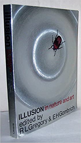
The next section discusses how New Look thinking can help us understand visual arts. My comments target two essays in the 1973 collection Illusion and Nature and Art: R. L. Gregeory’s “The Confounded Eye” and E. H. Gombrich’s “Illusion and Art.”
Gregory, Gombrich, and art
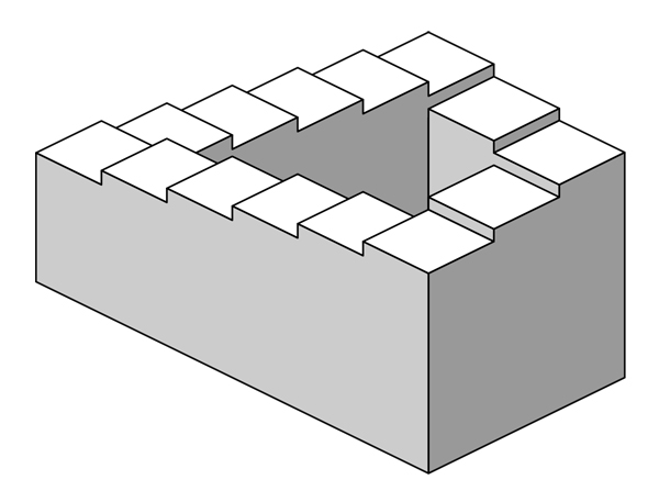
The Penrose steps.
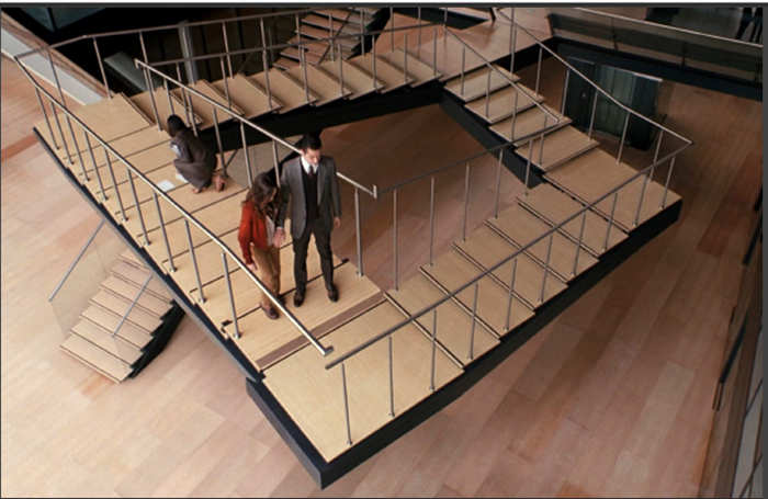
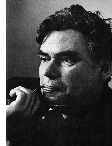
New Look psychologist Sir Richard Gregory (lower right) was a passionate connoisseur of illusions like the Penrose stairsteps. He was famous for pushing the cognitive model of inference-making very far, deep into the basics of perception. He saw perceptions as the usually reliable results of assumptions and hypotheses, in a process significantly similar to what scientists do when they launch hypotheses and check for confirmation. For a career overview, go here.
I take it that he’s trying to answer the question: What perceptual processes generate visual illusions? We evolved to pick up accurate information from the environment, and normally our perception is accurate. The obvious problem with illusions is that they yield false information. What has fooled our eye?
 Gregory’s essay “The Confounded Eye” offers a detailed set of explanations, divided between mechanism failures and misplaced strategies. In cinema, a clear mechanism failure would be apparent motion. Movies trade on a failure of our visual system to detect single frames that are still images. As we didn’t evolve to watch movies, and as we don’t encounter this sort of intermittent illusory motion in a state of nature, inventors found a way to trick our eye and create the impression of movement.
As for perceptual strategies, perhaps in film we could cite special effects and green-screen backgrounds, where perspective, lighting, focus and so on are calculated to suggest space that isn’t really in front of the camera. Our visual system assumes regularities of space that aren’t justified; we usually can’t force ourselves to see these backgrounds as flat.
Some controversies dog Gregory’s theory, chiefly in his reliance on prior experience. He thinks that even pretty low-level outputs depend on knowledge of some sort, if only about our world of discrete edges and solid shapes. He doesn’t seem to treat evolution as shaping many of our perceptual proclivities. In this essay “The Confounded Eye,” he appeals to classical conditioning (p. 66) to get the system off the ground.
But crucial are the ideas we also find in the work of E. H. Gombrich. Gregory assumes an active perceiver, one who takes fragmentary stimuli as cues for building up a perceptual conclusion, through a process of hypothesis-testing. Expectation, assumptions, and probabilities all play a role. Perception is inferential because it can be wrong.
In addition, Gregory reminds us of the importance of habituation (sometimes confusingly called “adaptation”). This means simply resetting the threshold of your sensory input. At first the coffee shop seems noisy, but soon enough you’re paying no attention to it and completely sensitive to your partner’s whisper. People can even adjust to wearing eyeglasses that turn the world upside down! Habituation is perhaps the most robust finding in all of psychology—and something that, when it becomes all-powerful, Victor Shklovsky deplores. (“Habitualization devours works, clothes, furniture, one’s wife, and the fear of war.”)
Gregory’s last book, the cleverly titled Seeing through Illusions (2009), published a year before his death, is a detailed expansion of these ideas. He classifies dozens of illusions according to a richer scheme than the one laid out in his 1973 article.
There’s a lot more in Gregory’s essay, not least the homunculus argument which has been broached against a lot of cognitive theorizing (mine included). But now let’s look at Gombrich’s essay “Illusion and Art.” He was a friend of Gregory’s and he borrowed heavily from New Look psychology.
Despite the book’s title, Gombrich’s magnum opus Art and Illusion doesn’t center on illusion as such. In trying to answer the question Why does [European representational] art have a history? he had to confront “illusionistic” styles, but that issue was secondary to the larger issue of continuity and change in representational traditions. So with an essay called “Illusion and Art,” Gombrich offers a more explicit and careful account of illusion.
I take it that his guiding research question is something like How may we explain the artistic and psychological processes that generate illusion in the visual arts? Not surprisingly, he will make use of some of Gregory’s ideas.
What seem to me crucial here are Gombrich’s reflections on animal perception. Far more than in A & I, he posits a continuum of sensory appeals and so a sort of spectrum of degrees of illusion. To a considerable degree, he has turned my vertical diagram into a horizontal one.
There are automatic, involuntary processes he calls “sensory triggers.” Moving along the spectrum, there are more elaborate strategies for conjuring up illusion, but these will rely on more deliberative processes. Throughout, we never lose the sense that we are watching a representation, however realistic it looks.
Moreover, Gombrich attributes the fast and mandatory illusions, the ones Plato called “lower reaches of the soul,” to evolution. He posits that just like other creatures, we have sensory systems that respond to “triggers” automatically, and sometimes we can be deceived–as predators are fooled by the camouflage of their prey.
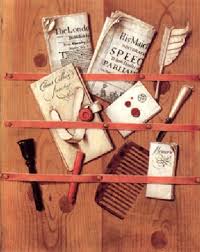
So what about illusions? At one end is pure delusion, as with say counterfeit money. Trompe l’oeil is a little further along; you really have to get close to detect the difference. Flat objects, like letters tacked to a board, are good for this trickery, as are fictitious postage stamps like those of Donald Evans.
These cues are very realistic, but crucially the trigger need not be a close replica of what it represents. Approximation can work. The duckling can follow a moving brown box if it moseys like its mother; the box doesn’t look like Mom, it just triggers the Mom-response. Stickleback fish will strike a red cloth that doesn’t look much like another fish’s belly–except in being a moving patch of red. Recall as well the Frog Multiplex. These critters are slaves to innate “action programs.”
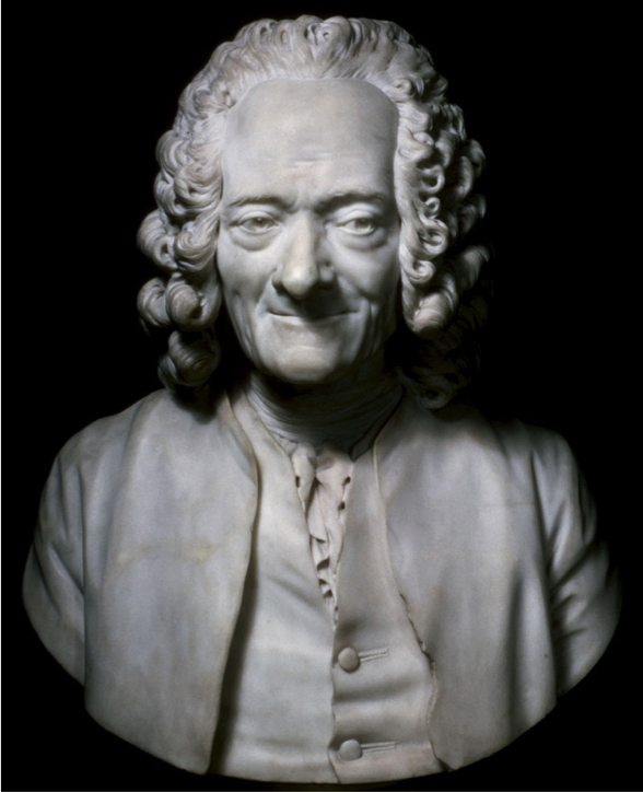
A flat, impoverished display of a wiggling worm is enough to get the right (wrong) reaction. And note a fascinating Gombrich example, Houdon’s bust of Voltaire, where the sparkle in the eye is actually a tiny lump protruding from the surface. You couldn’t get farther from a non-realistic device for depicting a gleam of light.
Hence a typical Gombrich formulation: What matters most is stimulation, not simulation. Images at whatever degree of realism rely on key features that trigger our automatic systems. The big transaction isn’t resemblance. The link is not between image and object but between the activities involved in processing the image and those processing the object. The image has hitched a free ride on perceptual habits, or faults, that we already have and cannot always see beyond.
Further along the spectrum, our response can be more flexible, less data-driven. We can learn to control and use the illusion, appreciating it. We can consciously factor in context, prior experience, interpretative possibilities. We can shift mental sets and adjust our expectations, we can test projections by trial and error. We’re now in my realms of comprehension and appropriation–comparatively self-conscious film experiences. But we couldn’t go so far and wide without anchoring our response in the fast, mandatory “lower reaches of the soul,” whose powers derive from evolution.
 You can see how all this fits Gregory’s hypothesis-testing account of shape perception and object identification. We are already expecting to see something, either because of prior experience or some wayback presets. We don’t need much of a cue to lock in a grasp of what’s there–even if it turns out not to be really there. That’s the case with “phantom percepts,” those imaginary objects that mimes conjure up.
Gombrich’s essay also emphasizes time more than Art and Illusion had. The sequential nature of perceptual activity–scanning an image–doesn’t occupy him much, but I think it’s quite important. I’ll give an example later on. But he’s right to stress the pressure of time in an evolutionary context. Fight-or-flight decisions have to be made fast, and so creatures with oversensitive mechanisms had a better chance of surviving, even if they sometimes wasted effort in avoiding harmless things. This time dimension takes Gombrich to movies, of course, as well as to flight simulators.
The last main point I’d stress is Gombrich’s insistence that we’re always after meaning. In Art and Illusion he proposes that we never see space as such, but rather medium-size objects in an environment. Representing “space” is tough, but people can provide convincing information about the spatial layout of people, places, and things. Mapmakers do it, technical illustrators do it, we make stabs at it, and painters do it with precision, delicacy, and force. Ditto textures, lighting, and other features of the world.
The “effort after meaning” flows from the inferential, seeking nature of perception. In a memorable formulation Gombrich says we don’t see people’s eyes as such: “We see them looking.” We are geared to meaningful objects, actions, and implications, not purely physical metrics. Again, this makes evolutionary sense. Creatures who focus on measuring the distance between a tiger’s eyes aren’t going to leave as many offspring as creatures sensitive to gaze direction and threatening sounds.
Perceptual psychologists will debate whether the New Look/inferential model or the Direct Perception model of Gibson et al. is better for explaining real-life perception. But as my concerns are in studying art, particularly cinema, I think the inferential perspective is better suited to analyze what concerns me. For one thing, it grants that grasping art is active and skilled, something that I think we all acknowledge. Your and my skills of noticing, understanding, and responding complement the skills of the ‘poet’ or maker. We complete the artwork.
Moreover, artworks offer simplified, streamlined displays very different from the blooming, buzzing confusion of the world. Gibson’s perceiver has to hack through a lot of distractions to extract the texture gradients and optical flow that will specify the layout. Art works already do that for us. Art works, films included, are designed with precision to trip our inferential engines at all levels. As a result, an inferential model tracks more closely the critical analysis we want to conduct on films. I’ll try to give two examples at the end.
A personal detour: Monkey see, David do
The Chinese Feast (Tsui Hark, 1995).
In the 1980s, as I was studying narrative and style in Hollywood films, I was struck by the ways in which the films’ designs seemed to aim for particular responses from spectators. I wondered whether the norms in place were coaxing us to perform particular mental acts: assuming, trusting, hypothesizing, anticipating, and so on. A lot of what we see and hear in a film sets up “intrinsic norms” that in effect teach us how to comprehend the story.
This led me to float an approach to spectatorship based on then-current premises of cognitive psychology. I tried to work it out in Narration in the Fiction Film (1985) and later work. Other researchers found this intriguing (to use a Kristin word) and developed well beyond it. Over the years an entire subfield emerged, with its own journal, conferences, and academic network.
The psychological findings I found most useful for my research questions were rather robust, well-confirmed ones involving informal reasoning: the use of schemas, heuristics (quick and dirty inferential routines), prototypes, and other concepts. I call these findings robust because they’re fairly well-replicated phenomena that different theoretical paradigms have tried to explain. They’re especially useful tools for us as students of the arts, for they bear directly on matters of narrative–plot, characterization, causal connections, and the like. They map fairly comfortably onto our analytical categories.
The broad point is that just as visual illusions exploit deficits in our visual system, narrative often plays to biases and shortcuts in more elaborated inferences. We’re good at tracking cause and effect, but the principles we use are “folk psychology,” not the principles of physics. In real life, we may attribute Oscar’s grumpiness to his just having a bad day, but Oscar is a film character and is introduced to us grumpy, we’re inclined to take him as a permanent grouch. (This is called the fundamental attribution error.) This example also trades on the primacy effect, also known as anchoring, which lets the first instance we encounter shape our pickup of information encountered later.
A prime instance of a robust finding was research into eye-tracking.
Film theorists have long considered that attention is central to filmic effects. Once eye-tracking devices became easy to use, researchers could use them to study how people scanned movie images. The pioneering work here was done by Tim Smith. I survey the research program here, and Tim did a powerful guest blog to follow up. His entry, probably the most popular post we ever had, earned him press coverage and a guest visit to film companies to present his research!
For more discussion of these middle-level findings, you can see this reader-friendly version.
Many of these activities are accessible to us, if only in retrospect. In following a narrative, if we pause the movie, we can think about what we’ve noticed and what we expect. As the years went by, though, I began to realize that probably a lot of what engaged us in films wasn’t so easy to tap consciously. Plato’s “lower reaches of the soul” invoked by Gombrich played an important role.
So in the 2000s, when research into mirror neurons was emerging, I drew two lessons. One was that certain primates could respond to film images much as we do–recognize objects, track movements, and so on. I thought, and still think, that this is an exciting piece of information. What was methodology for the researchers is a substantive finding for us. If macaques can recognize what a movie shows, it’s hard to argue that pickup depends on cultural codes.
Second, I thought that the prospect of mirror neurons held promise for carrying inference/computation down into the wiring level. Given all the presets supplied by evolution, isn’t it conceivable that social primates may have evolved to “resonate” to actions, expressions, and even emotions displayed by their conspecifics? It would be another part of a natural endowment that, suitably tuned by the social environment during the critical period of growth, could bootstrap a broader set of skills–such as following stories.
Hence the remarks I made in my 2008 “Poetics of Cinema” essay, where I took the view that “it seems we have a powerful, dedicated system moving swiftly from the perception of action to empathic mind-reading.”
Fairly soon mirror neurons became absorbed into a larger trend toward neuroscientific examination of film viewing. I’m not sufficiently expert to appraise that work, but I do have thoughts about what it can, and can’t, tell us about understanding film.
Mirror, mirror in your head
As I understand it, the Embodied Cognition research program aims to answer this sort of question: What role do automatic, low-level visual processes play in enabling spectators to respond to film? More specifically, do the processes enable us to understand and empathize with action, agents’ intentions, and agents’ emotional states? I think that the general answer proposed is yes.
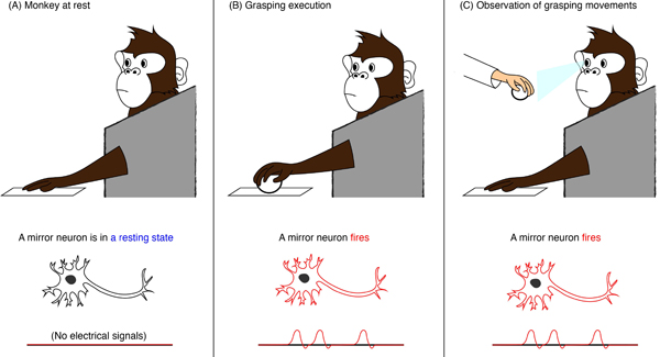
Mirror neurons play a role in this process. They were first discovered in macaque monkeys, and there is some evidence that they exist in humans. The hypothesis is that when we see a piece of action, in life or in cinema, we spontaneously mimic, in the pattern of cell firings in our brain tissue, the sensory and motor processes that create it. Our brain mimics or “resonates with” the action we perceive. We don’t just “understand” that the man is lifting a glass; in a weakened form we are repeating the experience of his doing so. Of course we may not be holding a glass, but to a degree the sensory and motor cells in our brain tissue rehearse the lifting gesture. Because we’ve executed similar actions, the cell firings are marked out through electrochemical patterns.
This argument takes us into the specialized areas of brain science. A useful account of the general scientific debate is here. The appended articles quickly turn technical, though. An easier read is this piece in Wired. For film, the fullest account of this view is provided by Vittorio Gallese and Michele Guerra in their recent book, The Empathic Screen: Cinema and Neuroscience.
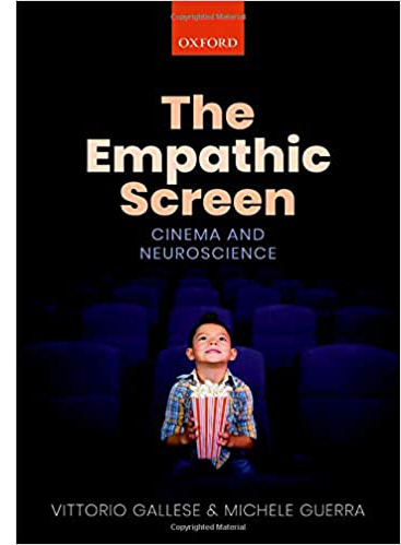 The reach of Gallese and Guerra’s theory is quite ambitious. They want to explain our understanding of actions (and “from the inside”), our “immersion” in a film, our ascribing intentions to agents, and our “identifying” with or empathizing with those agents.
In our next blog entry, a guest post, Malcolm Turvey will offer an analysis and critique of that book’s arguments. As a pendant to that, I’m just going to signal my reservations about the project and its results. In the last section of this entry I also want to make a point that Malcolm will explore conceptually: How much specificity does a “psychology of cinema” need for us to say useful and unusual things about film?
My first general comment: What the authors mean by understanding, or “involvement,” or the “from the inside” part of experience could do with more specifying. Malcolm will explore this question in detail. In addition, I wonder whether concepts like “identification” and “immersion” fruitfully characterize our engagement with all films, or even those we find exciting.
Camera movement occupies a privileged place in Gallese and Guerra’s scheme. “The involvement of the average spectator is directly proportional to the intensity of camera movements.” Yet what about the first thirty years of cinema, in which camera movement is quite rare? Tableau cinema, as discussed in many entries hereabouts, was presumably quite effective in moving audiences. If camera movement automatically steps up engagement, why didn’t it become more common sooner? And are we talking only about camera movements forward, which are the privileged examples cited from Notorious, The Spiral Staircase, and other 1940s films?
The only effects of the nonmoving camera noted by Gallese and Guerra are expressive ones. “In the absence of movement the editing and arrangement of figures and spaces within a shot can produce a feeling of oppression.” Well, editing and staging within a fixed shot can indeed produce that effect, as we see in Antonioni, but it need not. This makes especially curious the authors’ claim that Dreyer’s La Passion of Jeanne d’Arc, with its close-ups, is a static film evoking through editing “the violent shades of power and persecution.” But of course from start to finish Jeanne d’Arc contains many camera movements.
And are we to assume a “progressivist” conception of history, so that the Steadicam is a step toward “better” (=more engaging) filmmaking? Would all those spectators aroused by crosscut last-minute rescues, from Griffith to Black Panther, have been even more carried away if there had been more camera movements?
Gallese and Guerra don’t assert that every shot would be improved, immersion-wise, by adding camera movement. We also need, they claim, more calm and stable orienting shots so that camera movements can create “peak moments” for maximum impact. Yet, to revert to their favorite director, Hitchcock created quite a peak moment in a certain shower scene wholly through editing. Again, would a flurry of camera movements have made it even more visceral? In fact, the leave-taking camera movement that ends this scene serves as the calm after the perceptual onslaught of cuts.
Of course Gallese and Guerra realize that camera movements aren’t the be-all and end-all of cinematic technique. Yet their discussion of editing seems to me rather unrevealing. Their experiment in varying camera angle through cutting yields the conclusions that “we use the same processes that we employ in our visual perception of the real world” and that our brains register violations of continuity rules to some degree. I am not surprised, though it’s good to have confirmation.
Malcolm will take up several other areas of inquiry in his followup entry. I want to end with a couple of examples to set us thinking about the difference between the neuroscientific arguments and those from a poetics perspective. Here’s a chance to weigh research questions against one another, to see the sort of ideas and information each can yield.
Direction and misdirection: Delicacy via precision
Let’s ask a poetics-weighted question: How can viewers understand the construction of shots designed for perceptual force and narrative comprehension? At the least, we should expect that the pictorial design will solicit attention and emphasis. Deploying these ideas enables us to talk about deflected attention and gradation of emphasis. And we need not assume that the camera is a surrogate for us.
In Summer at Grandpa’s, Hou Hsiao-hsien gives us a somewhat episodic tale of kids sent to live with their grandparents while their mother is hospitalized. In the village they play with the local children and have minor brushups with their stiff grandfather. They’re exposed to aspects of life and death that the modern city has shielded them from. One of those is a madwoman who wanders through the countryside keening.
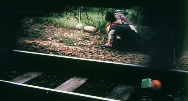
The boys won’t play with the little girl Ting Ting. So, bearing the toy fan she always carries, she wanders to the railroad tracks and stumbles in the path of a train.
The madwoman’s rescue of Ting Ting is a harrowing, gripping moment. (No need to be energized by camera movement.) The pounding rush of the train, very loud, is an assault on us. The narrowness of her escape is emphasized by glimpses of the two huddling on the other side of the tracks. No need for camera movement to amp up this jolting moment.
But Hou has introduced something else, the fallen fan that tips over and just barely escapes being crushed by the train wheels. Its childishness–pink and orange and green, tipped over by the rush of the wheels–is a kind of stand-in for Ting Ting. It also, by virtue of color and the absence of anything else to look at, rivets our attention.
No less striking is this: When the train has passed, the fan’s blades reverse direction and spin the other way! This tiny bit of movement, visible on a big screen if not here in miniature, provides a kind of coda for the shocking action. This exemplifies, for me, Gombrich’s “visual discovery through art.” We see wind power in miniature, in a natural experiment in the sheer physics of a situation.
All of which proceeds from careful craft decisions. Hou has stretched the norms of framing and staging in fresh ways to achieve a powerful effect. Nothing I see in the mirror-neurons story could address, much less functionally explain, what’s on display here.
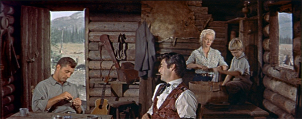
Similarly, the Embodied Cognitivist position seems to me too coarse-grained to capture the rather different range of artistic effects in a sequence from River of No Return. Matt Calder and his son Mark help rescue Kay and Harry from their clumsy efforts to raft their way to town. Preminger films the rescue in shots that exploit the CinemaScope ratio. Many critics have noticed how Kay’s wicker trunk of clothes falls into the current and remains visible far into the distance as the dialogue in the foreground develops.
Since the arc of Kay’s character traces the gradual stripping away of her past life as a dance-hall entertainer, this phase of her change is made visible in a soft-pedaled way. Attention and emphasis are played down. Preminger prepares us to watch for secondary and tertiary areas of importance–what Charles Barr has called gradations of emphasis. Alert viewers may notice the drifting basket, others not, but for those who do some inferences will be forthcoming. For one thing, What might be the significance of this basket?
Turns out that this was practice for using our eyes. Having prepped us at the riverside, Preminger again plays with graded emphasis. Before the rescue scene, Matt and Mark share coffee before going out for target practice.
Few of us will notice the rifle in its long holster there on the back wall until Matt takes it down.
Now compare this later scene.
Sparse as it looks, the main shot is busy. The men were decoys but the holster was waiting there to be used at just the right moment. We could have noticed it at any time. Maybe some folks did.
When the rifle pokes into the shot, stressed by Harry’s line, it probably surprises us. But those of us who may have noticed the empty holster earlier may experience suspense rather than surprise: Where did the gun go? We have to wait and see.
This sort of multilayered visual effect seems to lie beyond the sort of responses that G & G attribute to aggressive camera movements. We may not be “immersed,” but we are definitely engaged–albeit coolly. The image is a visual display we search, not a space we imagine ourselves interacting with.
You may say that this sequence is so atypical it’s unfair to use it as a counterexample. But I think it’s just an extreme instance of what filmmakers are doing all the time. Preminger uses classic cues: the holster is isolated, it’s sitting near the center of the picture format, and it’s well-lit. On the big screen in a 1954 movie house, it would be very evident, in principle. And we’ve seen it used before in a very similar camera setup.
But Preminger has steered us away from what’s important by creating competing centers of attention. There are the men’s faces and gestures, the words spoken the dynamically unfolding drama, the woman and the boy executing repetitive actions (what Gombrich in Art and Illusion calls the “etc.,” take-as-read principle). Attention and emphasis are led by lines of least resistance; you’d have to be pretty stubborn to study that holster.
Of course there is a neurological story behind attention and eye tracking. And perhaps Matt’s gesture of reaching and seizing the rifle may “resonate” with our neural circuitry. But for the artistic effect Preminger prompts, it’s surely less salient than our acts of following, scanning, noticing, and registering all that’s going on in this misleadingly muted visual, auditory, and dramatic array. Our neural circuitry isn’t available to us for inspection, but we can bring to awareness the way that directors direct–direct our attention, weight various areas of the shot–usually to supply information, sometimes to suppress it.
In bringing this scene’s constant flow of information and withholding to light, we’re homing in on an uncommon but precise craft decision that has distinct artistic effects on us. This is, I think, an instance of analytical poetics–analyzing a particular film by using the norms and practices we reconstruct on the basis of historical research.
I lay my cards on the table. If our research question asks about the fine-grained principles of cinematic craft, its creation and consequences, its norms and options, we are likely to have little need for generalizations about how all traveling shots may mimic cell firings. Functional explanations can be enlightening when we don’t know about the mechanics. We can attend to precise, often delicate, effects as results of weighted choices from a historically available menu of options. After all, artists are achieving these effects in other media. Even if neuroscientists don’t care about these things, filmmakers do. We should.
So much other bibliography I could suggest! Good introductory overviews are Michael Morgan, The Space between Our Ears: How he Brain Represents Visual Space (2003) and Jennifer M. Groh, Making Space: How the Brain Knows Where Things Are (2014). Both have clear, nontechnical accounts of fascinating experiments. More advanced, but a trailblazing study, is Jerry Fodor’s The Modularity of Mind (1983), a fun read.
I hijack the Frog Multiplex for a discussion of cinematic coding. For more on gradation of emphasis, see this long-ago entry in homage to Charles Barr. I discuss ‘Scope aesthetics from the standpoint of poetics in this online video. I consider Hou’s staging strategies in my book, Figures Traced in Light.
During the current health crisis, Berghahn has made all issues of Projections: The Journal of Movies and Mind freely available. Several articles over the years debate issues around cognitive film theory and brain-based explanations of media effects. My version of cognitivism is discussed in the June 2016 issue. For still more, there’s this web essay and this broad overview.
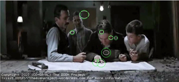
Inception (2010).
THE GRAND BUDAPEST HOTEL as fetish object
DB here:
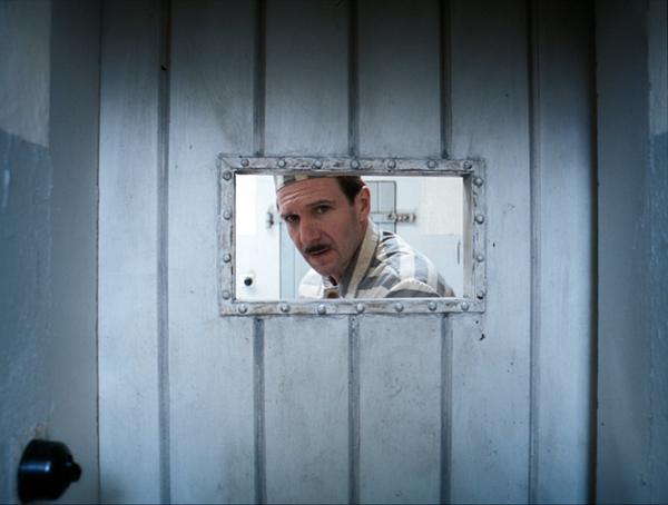
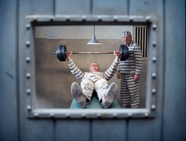
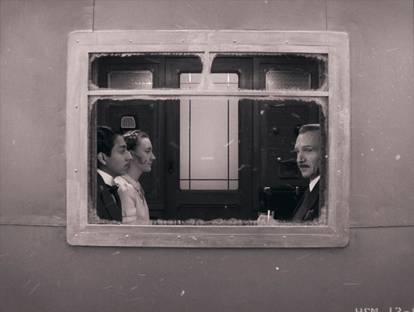
Question: Why is the window in the cell door a different shape in different shots?
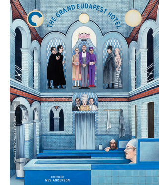
An answer, and other observations, can be found in my video essay included in the new Criterion edition of Wes Anderson’s Grand Budapest Hotel. It hits the streets, as they say, tomorrow. Criterion offers a 30% discount through the end of this month.
My contribution is a small part of a packed release, lovingly–obsessively?–assembled by producer Susan Arosteguy. On the disc you’ll find a 2K digital transfer supervised by Anderson and a new audio commentary with Anderson, screenwriter Roman Coppola, Jeff Goldblum, and critic/filmmaker Kent Jones. There are storyboard animatics, a new documentary about the film, new interviews with the cast and crew, and behind-the-scenes, special-effects, and test materials.
An erudite liner-notes essay by Richard Brody considers the film’s relation to Stefan Zweig’s literary work. Matt Zoller Seitz, who has championed Anderson’s work from the beginning (see his overpowering books on Anderson’s career and Grand Budapest), contributes a video essay from 2015. There’s also an essay by Mark Twain on European hotel porters.
Not to mention tchotchkes: a pretty collectible poster and a mini-scrapbook collaging Romantic Poetry and news clippings. The booklet is a gift from Z to A.
Studying the film again renewed my conviction that it’s an extraordinary movie. My piece extends and, I hope, enriches my original blog post by bringing in many other Anderson films and offering more ideas about his pictorial style.
Thanks, as ever, to the Criterion team: Susan, Peter Becker, Kim Hendrickson, Grant Delin, and all their in-house technical wizards, who found images which superbly illustrate my points. Local filmmaker Erik Gunneson and Teleprompter tsarina Gina Varilek were indispensable as well. And thanks to all the readers who continue to visit our several pages devoted to Anderson’s work.
Just the thing for bingeing today: a film offering courage, dignity, and tradition as a resistance to authoritarian aggression. It’s a movie proving, as Godard once said, that only two things matter in life: work and love.
The Grand Budapest Hotel (2014).
Hollywood starts here, or hereabouts
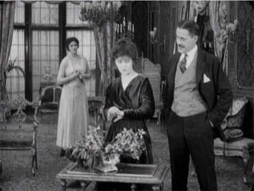
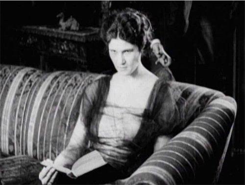
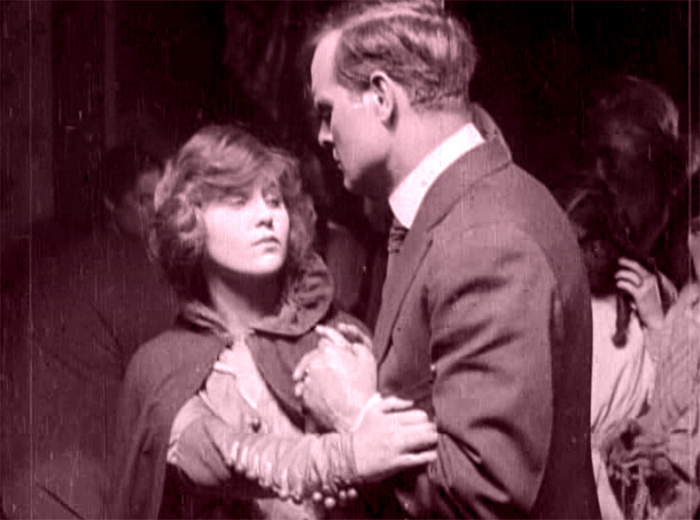
The Woman in White (1917). Toning by DB.
DB here:
Do you know Wilkie Collins’ The Woman in White? I hope so.
The traps set by this novel of mystery and suspense–a prototype of what was called “sensation fiction”–are still ensnaring audiences. Serialized in 1859-1860, it became one of the best-selling books of the nineteenth century. Merchandisers pounced on it, offering Woman in White cloaks, bonnets, perfumes, and songs. Stage and film adaptations followed. The Brits, always eager to mine classics, have created no fewer than three TV versions (1982, 1997, and 2018). There’s a pretty good Warners “nervous A” picture from 1948, with Sydney Greenstreet as the deadly, jovial Count Fosco.
The 1917 version from the Thanhouser studio is, lucky us, currently streaming on Vimeo for free. It’s also available on DVD, as part of the excellent series of Thanhouser films. The print is a 1920 re-release, but nothing significant seems missing or altered.
Apart from its entertainment value, the Thanhouser Woman in White can teach us a lot about film history. Why? Because it sums up very forcefully what American narrative cinema could do in that crucial year 1917. Forget your Griffith, leave aside (regretfully, just a moment) your Webers and Harts and Fords and Fairbankses. The mostly unheralded team of screenwriter Lloyd Lonergan and director Ernest C. Warde have given us a concise demonstration of the power harbored by classical Hollywood from the start. The storytelling tools assembled in that era remain with us still.
Women in peril
The novel’s plot is a tale of–well, plots. Counterplots too.
Collins’ book is hugely complicated, swirling together secrets, hidden identities, abduction, impersonations, illegitimate birth, bigamy, insanity, forged records, fake tombstones, assorted hugger-mugger, and timetables that even the author had trouble keeping straight. The intricacy is magnified by Collins’ decision to adopt a “casebook” structure, in which participants and onlookers write up their accounts of what they witnessed. Each piece of testimony is restricted wholly to one character’s viewpoint, and the writers are forbidden to fill in material they learned later. “As the Judge might once have heard it, so the Reader shall hear it now.” This stricture isn’t fully observed, though, because at least one witness sneaks looks at what counterparts have written.
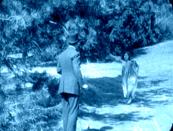
The book’s key image is, of course, the apparition that greets Walter Hartright on the road one sultry night.
There, in the middle of the broad, bright high-road–there, as if it had that moment sprung out of the earth or dropped from the heaven–stood the figure of a solitary Woman, dressed from head to foot in white garments; her face bent in grave inquiry on mine, her hand pointing to the dark cloud over London as I faced her.
Recovering his senses (“It was like a dream”), Hartright listens to her gap-filled story and helps her find a cab. But soon he sees two bravos halt their carriage and hail a policeman. They ask: Has he seen a woman in white? No. Why does it matter? What has she done?
“Done! She has escaped from my Asylum. Don’t forget: a woman in white. Drive on.”
The first installment ends here, and the adolescent window opens a little wider.
The main plot centers on Laura Fairlie and her half-sister Marian. Hartright is engaged as Laura’s drawing teacher and they fall in love. But Laura’s father has promised her to Sir Perceval Glyde, an apparently upright aristo. (Collins was opposed to marriage as an institution. His class hatred comes out as well, though perhaps not as scathingly as it does in his other masterpiece, The Moonstone.) Once the marriage takes place, Glyde introduces into the household Count Fosco, a suave “doctor” with the habit of letting his pet mice scamper around his waistcoat. It doesn’t take long for Marian to realize that Glyde has a Secret, and she must turn detective to protect Laura from him.
Without pressing into spoilers, you can already tell that this lays down a template for the sort of story Hollywood would later love to tell. The Woman in White is a prototype for the woman-in-peril plot that we’ll find in Suspicion (1941), Shadow of a Doubt (1943), The Spiral Staircase (1946), The Two Mrs. Carrolls (1947), Sleep My Love (1948), and many 1940s classics. These in turn rely on literary works in Collins’ wake by Mary Roberts Rinehart, Mignon Eberhart, and other women authors who updated Gothic and sensation-fiction conventions for the twentieth century.
Lloyd Lonergan was said to have suggested reducing the eight-reel cut of The Woman in White to only six. It’s indeed a tightly coiled presentation of Collins’ sprawling plot. Swathes of backstory are dropped. Instead of Collins’ multiple narrators we get an omniscient narration that shifts freely across various intrigues. Fairly quickly we learn that Glyde and Dr. Cumeo (the Fosco of the novel) are scheming to switch Laura with her lookalike Anne, the woman in white. We also realize that Marian, as an obstacle to the plan, is in mortal danger. Thanks to crosscutting, we’re aware of several lines of action unfolding at once, and in a film full of spying and eavesdropping, compositions tell us who’s snooping on whom.
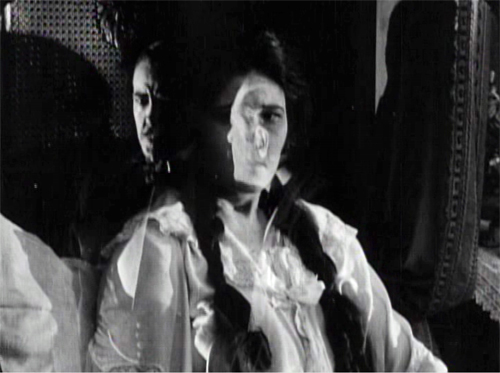
Still, some revelations are saved for the end, notably one that looks forward to the flashback-heavy 1940s. When Laura and Marian discover Glyde’s secret, their informant gives them the crucial information in a flashback, which precipitates a fiery climax. The flashback device was previewed when Marian, recovering from her collapse, recalled the plans she heard on the patio between Glyde and Cumeo; a nearly Surrealist dissolve superimposes that earlier scene.
In preferring to give us a lot of information, favoring suspense over surprise, this Woman in White is typical of Hollywood scriptwriting of the classical years. In particular, the film employs strategies later elaborated by Hitchcock (discussed here and here and here). One scene in particular displays the Hitchcock touch, years before Sir Alfred took up filmmaking. Even more specifically, let’s note that the basic situation looks forward to Notorious: a woman imprisoned by her husband and a confederate is slowly softened up for disposal.
Choreography, cutting, and showing us the door
Anyone who has viewed films with critical attention must be aware that in a film we are constantly, and without knowing it, being directed what to look at. In a stage play you may be looking at one moment at the actor who is speaking; at another moment watching the face of the person addressed, or observing the behaviour of other characters on the stage. If you go repeatedly to the same play, you may choose to look at different actors in a different order, for you certainly cannot observe everybody and everything simultaneously. But in a film, the lens of the camera is constantly telling you wha to look at–it may be a close-up of the actor’s hand, by the movement of which he betrays the emotion not visible in his face.
T. S. Eliot, 1951
The 1910s were an exciting era in cinema because, as I try to show in this video lecture, the foundations of “our cinema” were laid then. The film business, movie culture, and mass audiences settled into patterns that would hold for over a hundred years.
Just as important, the forms and styles of film craft were put in place. Among those changes was a transition from a style that relied on performance and staging to an approach more reliant on editing, on breaking scenes into many shots. The dominance of editing as a principle of guiding attention is evident from the Eliot quotation; he can’t conceive that staging, lighting, and other “theatrical” techniques could steer us to the important parts of the action.
The earlier, “tableau” approach to scenes was perfectly capable of funneling attention too, but editing had many advantages, both economic and aesthetic. By 1917, as Kristin and Janet Staiger and I argued in The Classical Hollywood Cinema, the editing-based approach had coalesced into the dominant style. The Woman in White is a nifty illustration of what an ordinary film from that year could accomplish with cutting–while still retaining vestiges of the tableau style.
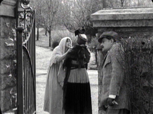
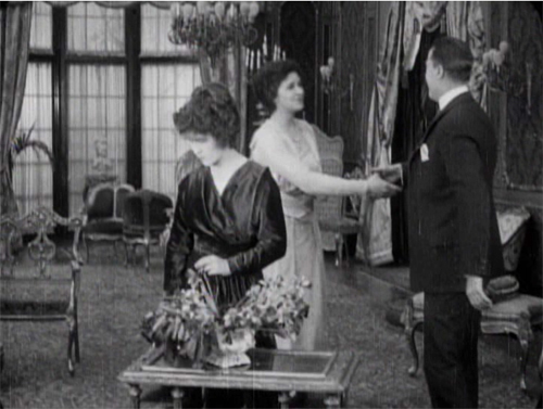
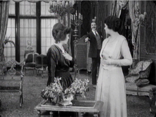
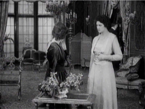
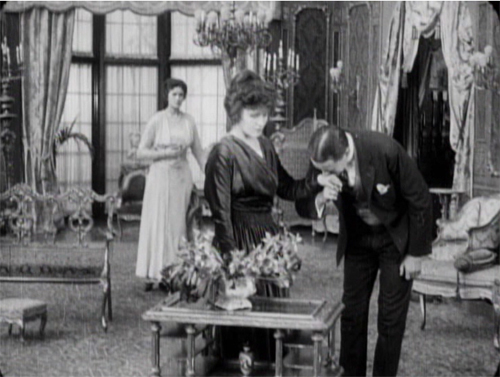
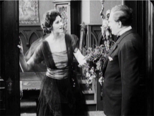
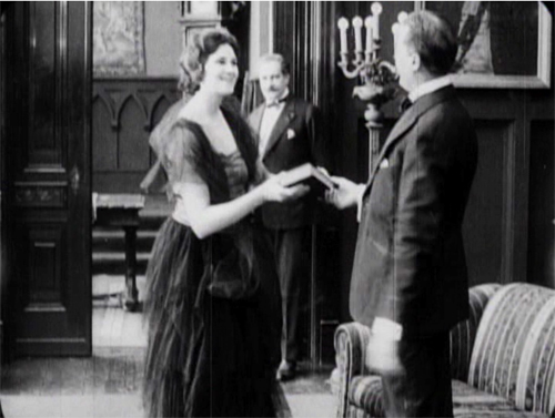
A simple example of the tableau technique comes when Sir Perceval Glyde calls on Laura and Marian. He has just kissed Laura’s unwilling hand, and Marian comes up from the rear of the shot to him. As she moves forward, Laura shifts aside slightly to clear our view of the others. This choreography doesn’t seem stilted because it expresses Laura’s withdrawal from her fiancé.
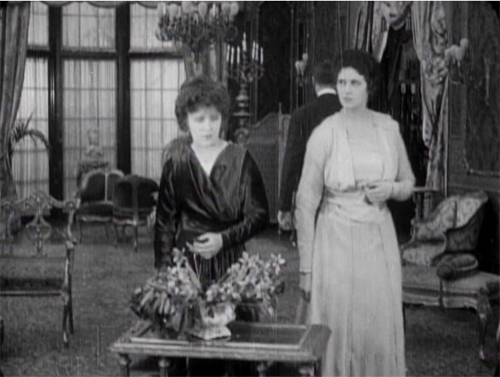
This is an example of the Cross, the staging technique that coordinates actors’ switching positions in the frame. Marian moves from frame left to frame right as Laura shifts to the left.
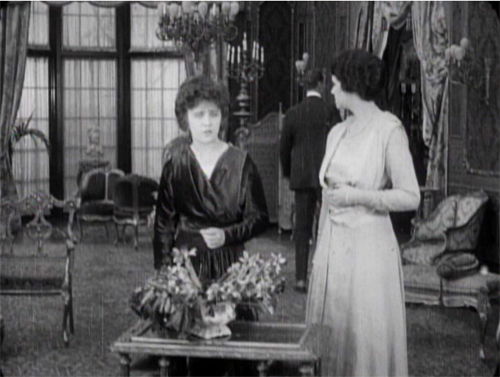
The tableau approach often plays between a lateral arrangement of characters in the foreground and a more diagonal array of figures packed into depth. As the shot unfolds, Marian is given a beat to take notice of Laura’s reaction as Glyde retreats to the background. She conveniently blocks his departure as she looks warily back at him.
But Glyde steps back into visibility in the distance as he says goodbye, with the women turning away from us so that we’re sure to concentrate on him. Then as the women turn back to react, he can be glimpsed leaving on the far right.
Doorways in the distance, characters advancing to and retreating from the camera, figures spreading themselves out horizontally but also blocking our view of things behind them, only to reveal them at the right moment–these tactics of the tableau became supple and subtle during the late 1900s and throughout the 1910s.
Eliot need not have worried that our attention would stray. Centering, frontality, movement vs. stasis, lighting, gesture, and other creative choices push us to notice the important elements of the scene. And these factors aren’t equivalent to what we see on the theatre stage; the optical properties of the camera lens create a very different playing space. (See here and here.)
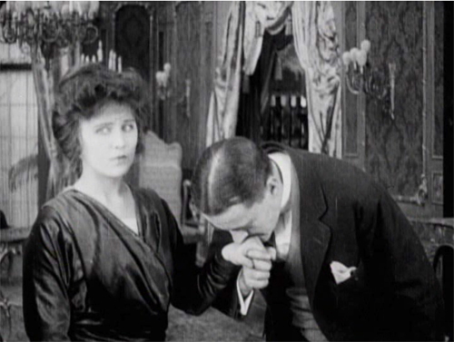
Tableau staging hung on in editing-driven cinema, but it tended to be relegated to the role of an establishing shot. The first part of this scene consists of another tableau setup broken by a cut when the slimy Glyde kisses Laura’s hand.
Here the closer view underscores his gesture while isolating Laura’s concern.
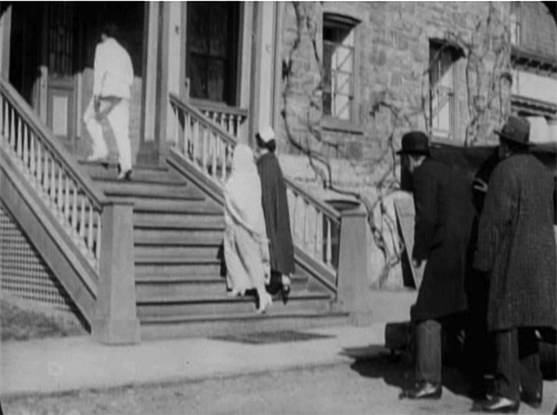
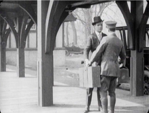
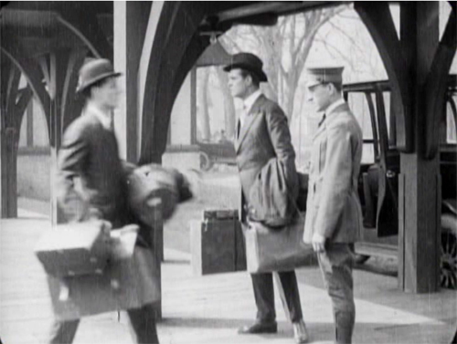
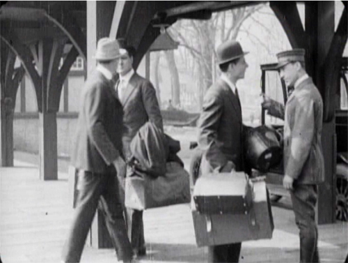
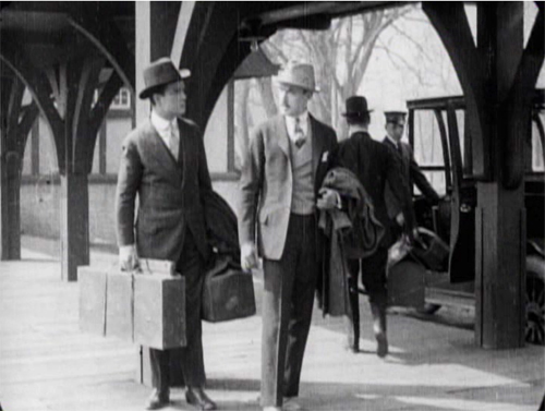
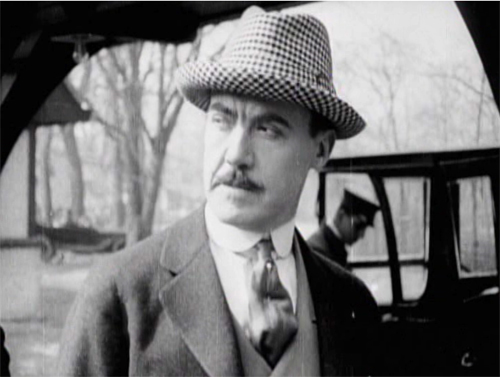
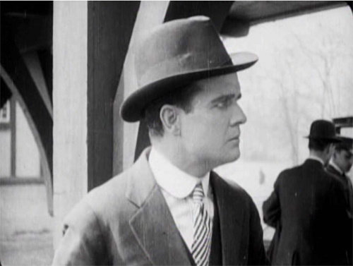
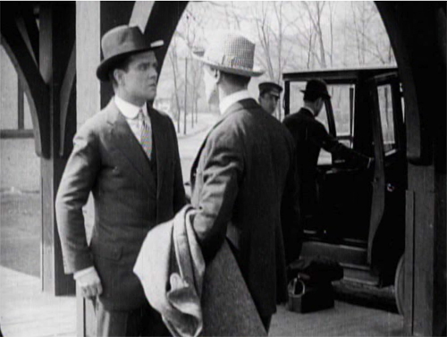
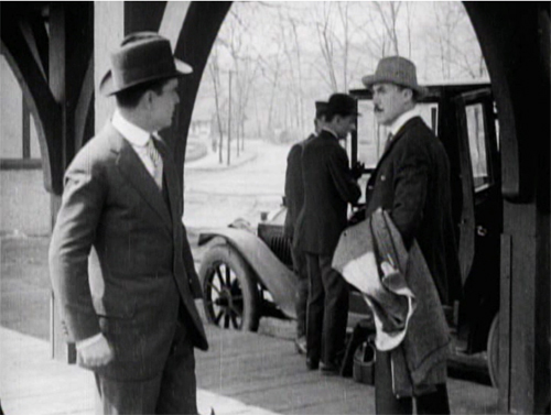
The coordination of staging and cutting is nicely shown when Walter Hartright, having resigned from his post as Laura’s teacher, accidentallly encounters Glyde at the train station. Glyde is coming to arrange his marriage to Laura, so the plot needs to establish the friction between the two men early on. As they confront each other, Glyde’s assistant loads his luggage into the cab in the background.
The first phase of the scene choreographs the men’s encounter through the Cross.
Then close views underscore the significance of the encounter.
Cut back to a two-shot that reorients us.
The fact that it’s not the same framing as we saw at the start indicates the reliance of the style on editing; even the full view is re-calibrated in light of changing shot scales. And during the shot of Walter, Glyde’s position has changed from his orientation in his medium shot. That’s the sort of flexibility editing gives you. The new arrangement heightens the clash of the two men. (Typical of the 1910s emphasis on depth, Glyde’s assistant and the driver continue to load the cab in the background.)
Glyde’s enlarged hand kiss and the inserts of the two men in the station scene exemplify the axial cut. This is a cut made along the lens axis of the camera–a straightforward enlargement of a chunk of space. It’s very common in 1910s cinema, and it’s still around, though it’s not as common as it was. Editors came to prefer analytical cuts that were more angular, yielding less the sense of a sudden enlargement. Sometimes you’ll see claims that cut-ins or cut-backs should shift the angle by 30 degrees. Yet Kurosawa and Eisenstein made powerful use of the axial cut, and it’s sometimes used as a self-conscious device. During the 1910s, some directors began using the over-the-shoulder (OTS) framing as a way to assure distinct angle changes.
The cut to Glyde’s creepy kiss is also a match on action, smoothly linking Glyde’s gesture across the shot change. This too emerged in the 1910s and became a mainstay of classic editing technique, to this day. (See my earlier post on Watchmen for contemporary examples.)
The Woman in White has several adroit matches on action, which shows that the learning curve among directors was more or less complete by 1917. When Walter first encounters the mysterious woman on the road, his striking a match is carried across a cut, with the second shot introducing her coming toward in him n the distance.
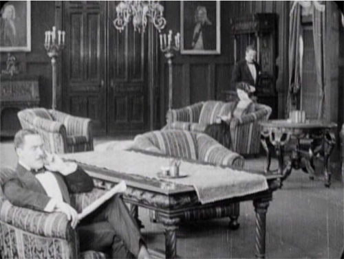
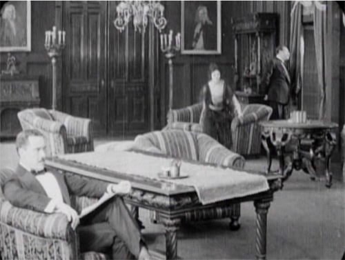
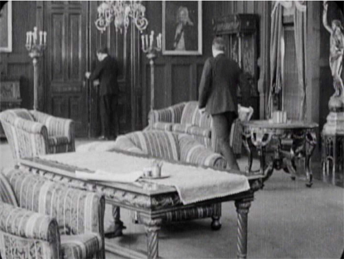
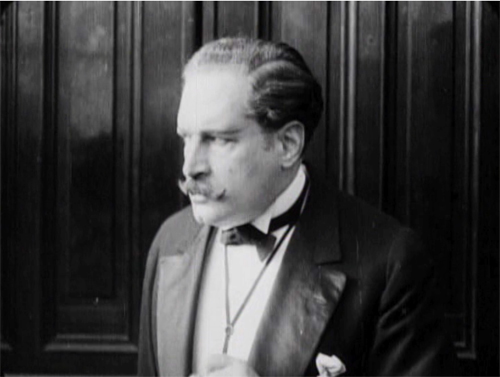
One of the most common editing devices of classical continuity is the eyeline match, and filmmakers were mastering this from quite early on. By 1917, it was part of every director’s tool kit. We can see how it works together with the other techniques in a fine, smooth scene that leads up to a crucial turning point in the action. Glyde and Dr. Cuneo are in the library, where Marian is uneasily reading a novel. Cuneo moseys over behind her, softly threatening, and an axial cut matching his movement lets us know she notices.
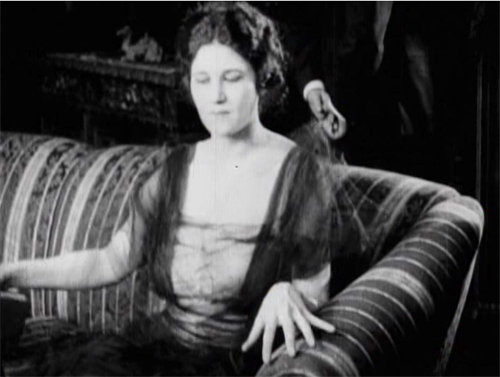
Another match on action brings her off the sofa. Love those delicately splayed fingers.
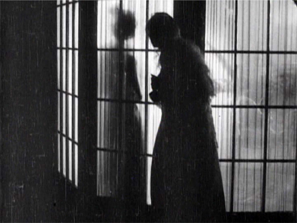
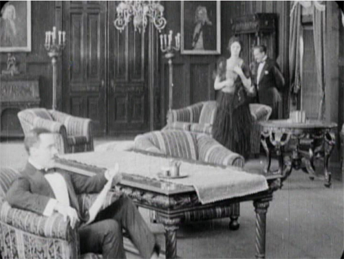
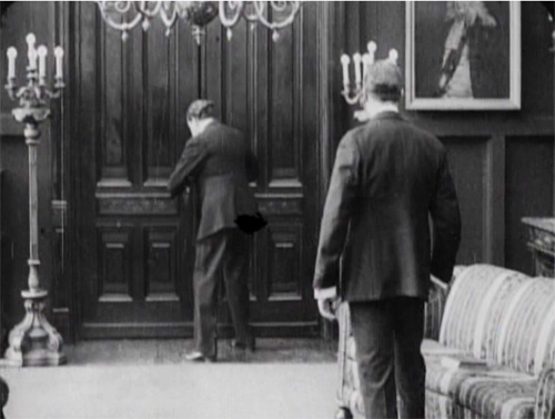
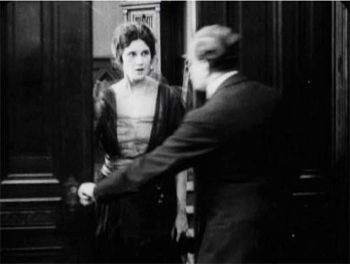
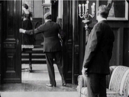
As she starts to leave, we get the Cross, as Glyde rises from his armchair and goes frame right. We now get the start of a major piece of business: Cuneo’s byplay with the sliding doors.
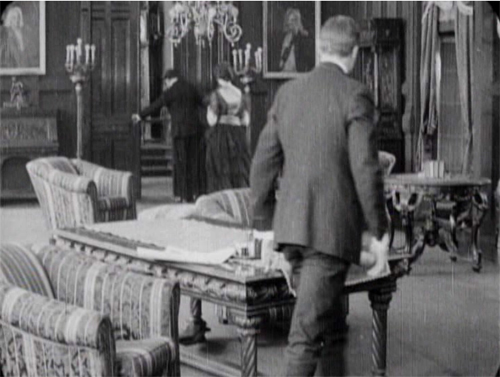
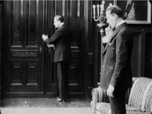
Securing their privacy, Cuneo prepares to consult with Glyde about their skulduggery. But a match on action, carried by a powerful axial cut–a huge enlargement from the extreme long shot setup–alerts us. He’s listening.
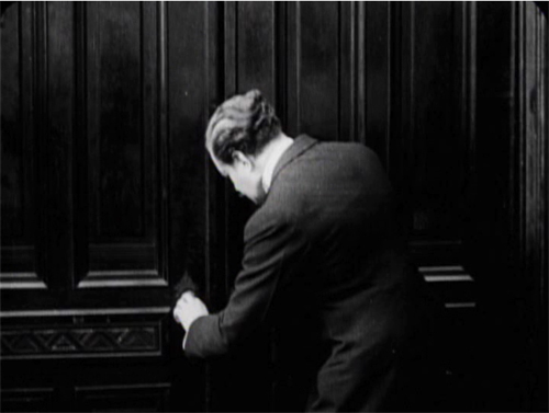
Another match on action as he busies himself with the door. A new diagonal composition prepares us for a shot of Glyde to come shortly. And yet again Cuneo is matched as he opens the door.
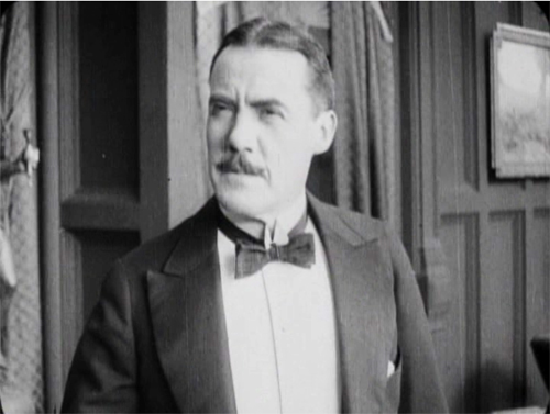
The payoff: Cuneo has detected Marian outside listening. She bluffs, saying she left her novel behind.
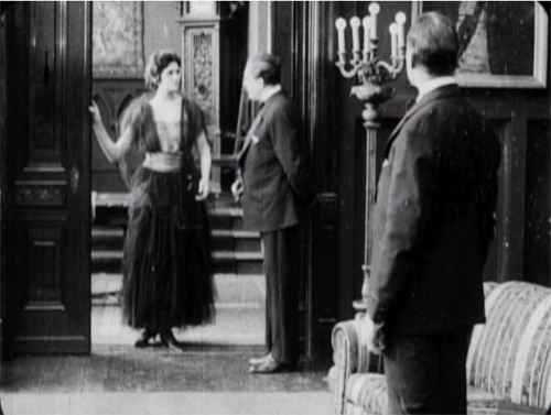
Now comes the shot that was prepared for by the over-the-shoulder long shot above. It’s not an axial cut, but a genuine reverse angle on Glyde, who’s suspicious about Marian’s return.
This is a killer shot because the camera can assume a drastically new position. It has put us in between the characters in a way we weren’t in the station scene. In effect, there’s an axis of action running from Glyde to the doctor and Marian at the door. The reverse angle is a one-off technique at this moment, but the possibility of penetrating the dramatic space in this way will be central to continuity cutting.
Now tableau principles can kick in. Marian comes forward and gets the book while Cuneo watches warily in the background.
In the course of the shot, Marian leaves, and this time, thanks to deep staging, we and the plotters can see she’s not eavesdropping. As she goes upstairs, Cuneo closes the door and the men can settle down to scheming.
Five matches on action, a striking eyeline match, restrained but pointed performances, and a cogent staging of the action have yielded a vigorous, engaging scene. By 1917, classical screen storytelling is well established in even a run-of-the-mill production. But there’s nothing run-of-the-mill about the suspense that follows this trim tension-builder.
1910s noir rides again
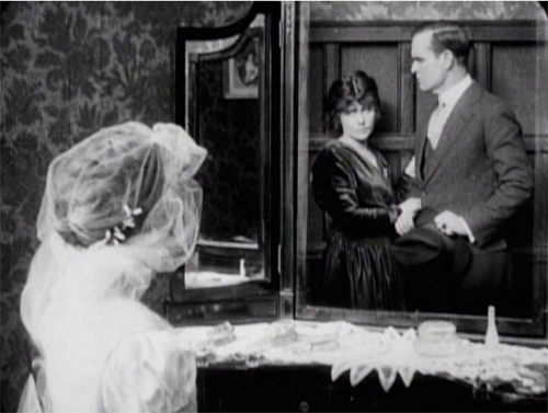
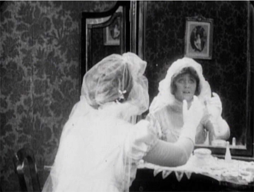
The Woman in White illustrates a lot of other 1910s innovations in pictorial storytelling. There are, for instance, some concise special effects, as when on Laura’s wedding day she sees herself and Walter in her vanity mirror.
There are also dramatic lighting effects, motivated by firelight, single lamps, and eventually lightning flashes.
But more audacious is a sustained experiment in “1910s noir.” At that period filmmakers began associating crime and mystery with shadows and stark lighting. (See this entry.) When Glyde and Dr. Cuneo adjourn to the terrace to discuss their scheme, we get a remarkable instance. I won’t indulge my impulse to shower you with images, but I’ll try to suggest why you should try to see the sequence for yourself.
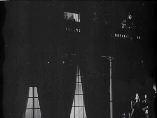
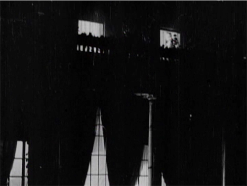
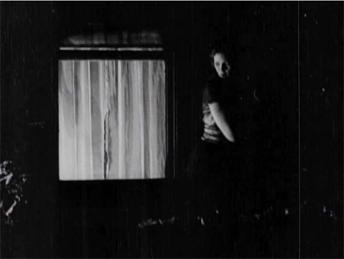
While the men smoke and talk outside, Marian has seen to the sleeping Laura before going to her own bedroom. (A sign of the film’s tidiness is the way it establishes the main characters’ rooms in the upstairs hallway. This geography becomes important when Glyde and Cuneo exchange Anne for Laura.) Opening her window, Marian hears the men outside and ventures onto the balcony above them. This yields a remarkable extreme long shot: She eavesdrops from above.
It’s a difficult shot by later standards. The main action is wildly decentered, set off on the right. But at least this framing has the virtue of preparing us for the later development of the scene, which will involve Marian sneaking along the balcony back to her room, where the light comes from.
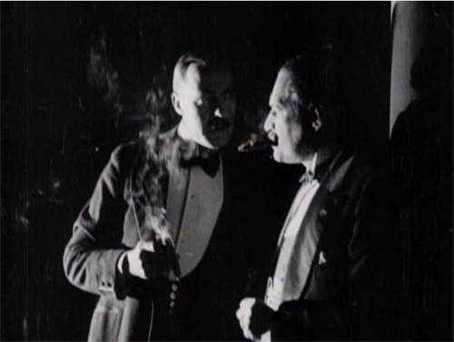
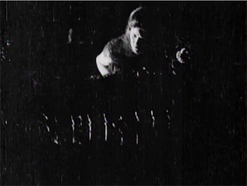
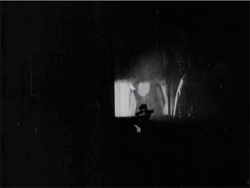
The vertical layout of the action is immediately clarified by two closer shots, a lovely chiaroscuro image of the men and the other of Marian listening.
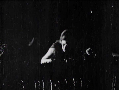
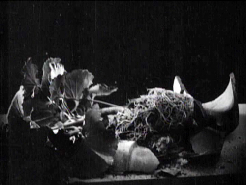
She hears just enough to suggest the men’s scheme before complications ensue. Glyde goes inside and upstairs, where he might discover her. Meanwhile, a rainstorm starts, and Marian dislodges a potted plant. Cuneo turns, in a new setup that emphasizes the railing in the right foreground, so that we can see the fallen plant. The shattered pot is given a close-up more or less from Cuneo’s viewpoint. His reaction supplies a moment of suspicion.
Marian, now drenched by rain, seems trapped between her two adversaries. Will one or both discover her?
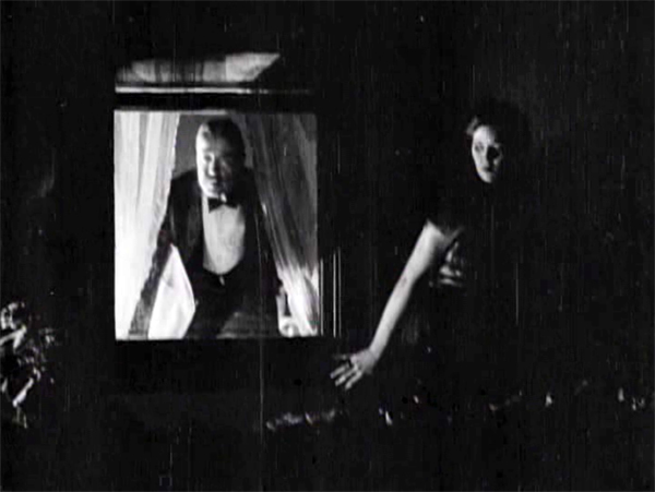
Glyde who has gone to Laura’s window and is looking around outside. We’re reoriented through a new master shot of the house, a framing that varies from the original setup. The shot shows both Laura’s and Marian’s windows lit. There follows a dark passage in which Marian creeps up to Laura’s window. That action takes place in the shot I’ve put up above.
An extra twist: Glyde looks out, but then pulls the shade. Little things mean a lot. A soaked Marian manages to crawl back through her window.
Apart from its virtuosity in handling cutting and lighting, the sequence is crucial for the plot. Marian collapses from her exposure to the storm, and her illness provides a pretext for Cuneo to isolate her while he and Glyde proceed with their plan.
I invoke Hitchcock because this long passage of suspense depends on our knowing all the relevant factors in the situation, and the possibility of a giveaway–the smashed plant–drives up the tension. What I’m really saying, I guess, is that Hitchcock expanded and deepened story mechanics that were already in place in the silent era. Apart from refining them, he managed to brand them as his own.
No film from 1917 or thereabouts is faultless in executing the new editing-based style. The Woman in White has its share of mismatches. Then again, so do movies from the 1920s to the present. (Don’t get me started on the mismatched cuts in The Irishman, 2019.) The crucial point is that the system of Hollywood storytelling and style is in place, and not in a crude form. Talk all you want about post-classical cinema, chaos cinema, post-cinema–whatever. The variations we detect today arise against a background of stable norms that remain a lingua franca of world filmmaking, and they’re headed well into their next century.
Thanks to Ned Thanhouser for years of faithful service to the studio’s legacy. Now is an ideal time to visit his site for background on this remarkable company and the efforts to preserve its output. A staggering 132 Thanouser films are available for streaming on Ned’s Vimeo channel.
To find out more about what preceded this crystallization of techniques, see Charlie Keil’s Early American Cinema in Transition: Story, Style, and Filmmaking 1907-1913 (University of Wisconsin Press, 2002).
An excellent survey of Collins’ place in the history of dossier novels is A. B. Emrys, Wilkie Collins, Vera Caspary and the Evolution of the Casebook Novel (McFarland, 2011). Her treatment of Caspary and Laura, both favorites of this blog, is just as valuable. My quotation from T. S. Eliot comes from “Poetry and Film: Mr. T. S. Eliot’s Views,” in The Complete Prose of T. S. Eliot: The Critical Edition, vol. 4: A European Society, 1947-1953, ed. Iman Javadi and Ronald Schuchard (Johns Hopkins University Press, 2018), 581.
For lots more on 1910s storytelling, see the categories 1910s Cinema and Tableau Staging. Flashbacks, the woman-in-peril plot, and other conventions that coalesce in the 1940s are discussed in my Reinventing Hollywood: How 1940s Filmmakers Changed Movie Storytelling.
The Woman in White (1917). Toning by DB.
Quality bingeing
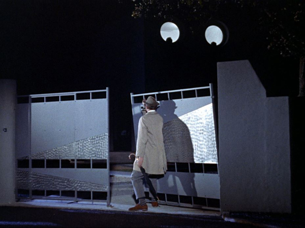
Mon Oncle (1958)
Kristin here:
Or binging, if you prefer. Either is an acceptable spelling.
Streaming entertainment is one of the things that are saving our sanity as we sit in our homes. With the theaters closed and new movies either delayed or sent straight to streaming, movie critics, other journalists, and movie buffs are now making best-films-to-stream-during-the-pandemic lists a new and common genre across the internet.
Maybe you’ve been streaming a lot of TV series, even ones you’ve already seen, and are feeling a bit guilty about that. Maybe you’re longing for something more worthwhile to watch but wishing that that something would take up more time than your average feature film.
For those people, I offer a list of films to binge. These are either long in themselves or are split up into many parts that can be binged just like TV series. Others are stand-alones but can be grouped in meaningful ways.
My experience is that online disc orders are taking longer than usual. With Amazon prioritizing health and work-at-home supplies, Blu-rays are taking around two weeks rather than two days. (David and I, of course, count Blu-rays and streaming as part of our work-at-home requirements.) While you’re waiting, I’ll bet many of you have some of these discs on your shelves already and have always meant to make time for them. That time, lots of it, has arrived.
Serials
Many fine serials were made in the silent era, but Louis Feuillade remains the director that most of us think of first in relation to this format. His three great serials of the 1910s (not including, alas, the fine Tih Minh [1918]) are available on home video.
Fantômas (1912). 5 episodes, 337 minutes. Fantômas is available in Blu-ray and DVD from Kino Lorber. David wrote a viewer’s guide to it here.
Les Vampires (1915). 10 episodes, 417 minutes. Les Vampires is available on Blu-ray and DVD from Kino Lorber. As far as I can tell, it is streaming only on Kanopy (apart from unwatchable public domain pre-restoration prints).
Judex (1917). 12 episodes, 315 minutes. Judex is ordinarily available from Flicker Alley, though it is currently listed as out of stock. Amazon has 5 left. For maximum bingeing opportunities, watch all three serials in a row and then stretch them out with Georges Franju’s charming remake, Judex (1963) for an extra 98 minutes (it’s $2.99 to stream it on Amazon Prime).
Miss Mend (Boris Barnet, 1926). Three episodes, 235 minutes. The only American-style serial from the Soviet Union that I know of, or at least the only one easily available. I wrote about it briefly when it first came out from Flicker Alley. You can still get it from Flicker Alley or Amazon. We wrote briefly about it here.
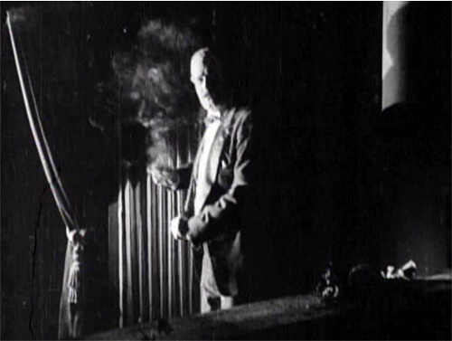
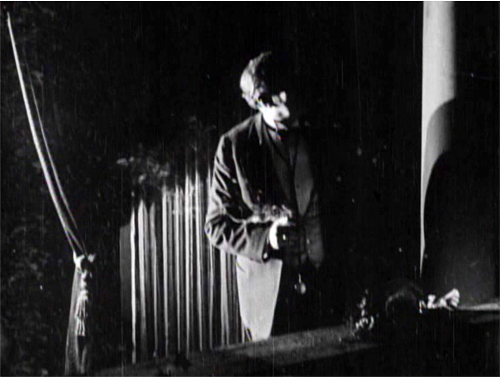
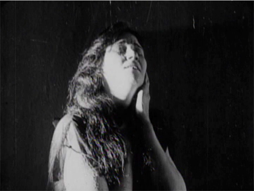
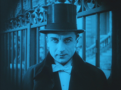
Le Maison de mystère (Alexandre Volkoff, 1923). 10 episodes, 383 minutes. I’ve already written in some detail about this long-lost serial. It’s probably not as good as Feuillade’s best, but it’s good fun and beautifully photographed (see top of section) and acted–and long enough to require a meal break. Fans of the great Ivan Mosjoukine (as he spelled his name after emigrating from Russia to France) will especially want to see this one. Available from Flicker Alley
Berlin Alexanderplatz (Rainer Werner Fassbender, 1980) 13 episodes and an epilogue. 15 hours, 31 minutes. Back when it first came out, this was treated more as a film than a TV series. It showed in 16mm at arthouses and archives. David and I drove to Chicago to see the whole thing in batches over a single weekend at The Film Center (now the Gene Siskel Film Center). It’s available on either DVD or Blu-ray as a Criterion Collection set (#411 for you Criterion number-lovers). It’s also streaming on the Channel. Both have a batch of supplements, even the 1931 German film of the novel, so you can stretch the experience out even longer.
Silent serials may work for some families, if the kids have been introduced to silents already through the more obvious route of films with Buster Keaton, Charlie Chaplin, and the other great comics of the era. If not, families can fill their time with more recent films in episodes with continuing stories.
The serial format has had a comeback in recent decades, partly due to the influence of the first Star Wars trilogy and partly to the need for ever expanding amounts of moving-image content in the era of home-video, cable, and internet services. For those who want to binge Star Wars, you don’t need my guidance. Anyway, I gave up after the first of the recent series, the one where Adam Driver took over as the villain. (Not that I have anything against Adam Driver. It was the film.) Even daily life in a pandemic is too short for more.
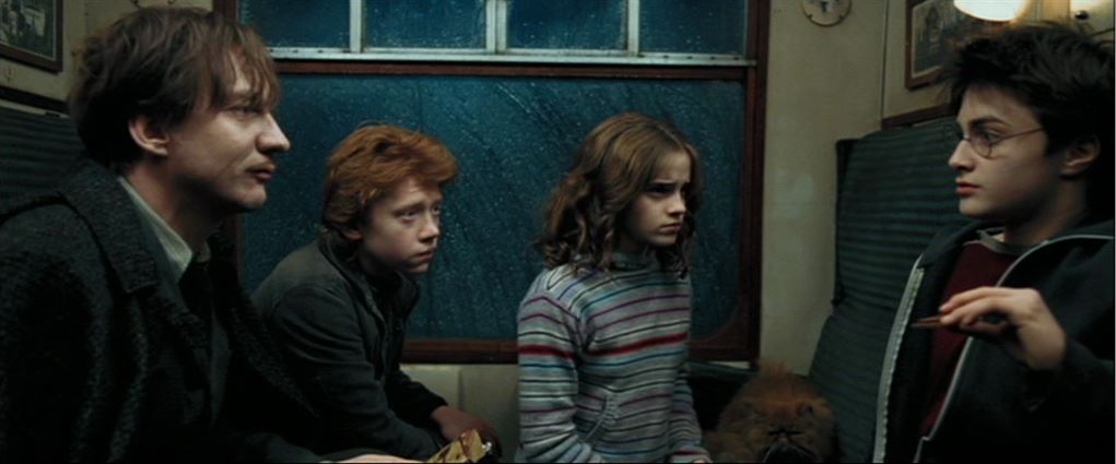
The Harry Potter series. (2001-2011) Eight episodes, 990 minutes, or 16.5 hours. This series is not high art, but it’s pretty good, highly entertaining (to some, at least), and even has one episode, number three, directed by Alfonso Cuarón, HP and the Prisoner of Askaban (above). The others are HP and the Sorcerer’s Stone (or Philosopher’s Stone in the UK and elsewhere; Chris Columbus), HP and the Chamber of Secrets (Chris Columbus), HP and the Goblet of Fire (Mike Newell), HP and the Order of the Phoenix, HP and the Half-Blood Prince, HP and the Deathly Hallows: Part I, and HP and the Deathly Hallows: Part II (the last four, David Yates). These films are, of course, available in multiple versions, on disc and streaming. As far as I can tell, none of the complete boxed sets have the two last parts in 3D; those have to be purchased separately. Having seen the last film in a theater in 3D, I can say that it doesn’t seem to be one of those films that is much improved if one sees it that way (unlike Mad Max: Fury Road, in the section below).
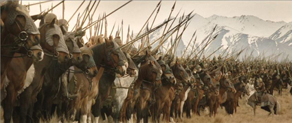
The Hobbit and The Lord of the Rings extended editions: An Unexpected Journey (2012), The Desolation of Smaug (2013), The Battle of the Five Armies (2014), The Fellowship of the Ring (2001), The Two Towers (2002), and The Return of the King (2003, above). 6 episodes, 1218 minutes, or 20 hours, 18 min. Yes, for sheer length this serial tops them all. Plus there are lots of supplements. Each part of the Hobbit films has one commentary track and a bunch of making-ofs, adding up to 40 hours, 5 1/2 minutes. This pales, however, in comparison with the LOTR extended editions, which have four commentary tracks, totaling 45 hours, 44 minutes. The making-ofs are hard to get exact figures for, but I estimate about 22 hours for all three films. That’s about 68 hours of audio and visual supplements.
To top that off, the Blu-ray set contains the three feature-length documentaries by Costa Botes: The Fellowship of the Rings: Behind the Scenes, The Two Towers: Behind the Scenes, and The Return of the King: Behind the Scenes, all adding another 5 hours, 2 1/2 minutes. (Botes’s films were also included in a “Limited Edition” reissue of the theatrical versions of the LOTR films in 2006.) In toto, if one watches every single item and listens to all the commentaries, one could escape 133 hours and 10 minutes of isolation boredom–and possibly go mad in the process. But treating the bingeing as an eight-hour-a-day job, it would come to 16 1/2 days.
All this does not include the supplements accompanying the theatrical-version discs. These are charming but more oriented toward introducing complete neophytes to the universe of Middle-earth than toward giving filmmaking information.
Series
Series, as opposed to serials, usually involve continuing characters but self-contained stories. Most of the series below could be watched out of order without suffering much. It would help to watch Mad Max first, since it’s an origin story. The Apu Trilogy should be watched in order because it’s about the central character’s stages of life. Each of the M. Hulot films bears the traces of the contemporary culture in which it is set, but one can understand each fine out of order. I saw Traffic first, in first run, and then saw the others.
Mad Max (1979), Mad Max 2, aka The Road Warrior (1981), Mad Max Beyond Thunderdome (1985), and Mad Max: Fury Road (2015) add up to 411 minutes, or 6 hours and 51 minutes. You know them, you love them–but have you ever watched them straight through? We’ve written about Fury Road (here and here). That’s a film where the 3D really does play an active role.
Jacques Tati’s Monsieur Hulot films: Mr. Hulot’s Holiday (1953), Mon Oncle (1958, see top), Play Time (1967), and Traffic (1971). They add up to 7 hours and 4 minutes. Or add his non-Hulot films, Jour de fête (1949) and Parade (1974) for just under an additional 3 hours of hilarity. You can buy all of Tati’s films at The Criterion Collection or stream them at The Criterion Channel. Throw in my “Observations on Film Art” segment on Parade for an extra 12 minutes. And check out Malcolm Turvey’s new book, Play Time: Jacques Tati and Comedic Modernism, soon to be discussed in a portmanteau books blog here.
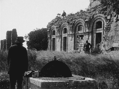
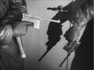
Dr. Mabuse films plus Spione: Dr. Mabuse, der Spieler (1922), Spione (1928, frame above), The Testament of Dr. Mabuse (1933) and The Thousand Eyes of Dr. Mabuse (1960), adding up to 610 minutes, or 6 hours and 10 minutes. Few if any directors have extended a series over such a stretch of time, and the Mabuse films are quite different from each other (including having different actors play the master criminal). I throw Spione into the mix because the premise and tone are so similar to the first Mabuse film. Haghi is basically Mabuse as a master spy instead of a gambler and general creator of chaos; given that he’s played by Rudolf Klein-Rogge, who was the first Mabuse, the comparison is almost inevitable. One can almost imagine Haghi as just another of Mabuse’s disguises and it fits right into the series. I’ve linked the streaming sources to the titles above.
Kino Lorber has the restored version of Der Spieler on DVD and Blu-ray, Eureka has the restored version of Spione on DVD and Blu-ray (note: Region 2 coding) The Criterion Collection offers a DVD of Testament, and Sinister Cinema has a DVD of The 1,000 Eyes. (For those who want to dig deeper, there a Blu-ray set of all of Lang’s silents, from Kino Classics and based on the F. W. Murnau Stiftung restorations. That totals 1894 minutes, or about 31 and a half hours. I don’t know if that counts the supplements, but there are lots of them.)
Apu Trilogy: Pather Panchali (“Song of the Little Road,” but nobody calls it that, 1955), Aparajito (1956), and The World of Apu (1959). 341 minutes. Satyajit Ray’s trilogy may seem like a serial, in that it follows the life of the main character, Apu. Yet Ray had not planned a sequel until Pather Panchali achieved international success, and the films have big time gaps in between, with no dangling causes. These are three of the most beautiful, touching films ever made, and the stunning restoration from a damaged negative and other materials is little short of a miracle. If you have never seen these or saw them before the restoration, do yourself a favor and binge them. Have some tissues handy, and I don’t mean for stifling coughs and sneezes. Available on disc from The Criterion Collection and streaming on The Criterion Collection here, here, and here.
Now I briefly cede the keyboard to David for his recommendations of Hong Kong series.
Triads vs. cops, Triads vs. Triads
Infernal Affairs (2003).
There are many delightful Hong Kong series. I enjoy the silly Aces Go Places franchise (1982-1989) and the pulse-pounding Once Upon a Time in China saga (1991-1997). Alas, almost none of these installments entries are represented on streaming. I could find only the weakest OUATIC title, Once Upon a Time in China and America (1997) on Amazon Prime, Vudu, and iTunes.
If you want to go for samples, there are two diversions from the ever-lively Fong Sai-yuk series. The Legend (US title of the first entry, a bit pricy from Prime). The more reasonably priced Legend II, the US version of the second entry, has a fantastically funny martial-arts climax featuring Josephine Siao Fong-fong as Jet Li’s mom. This is available from several streamers. Older kids won’t find either one too rough, I think.
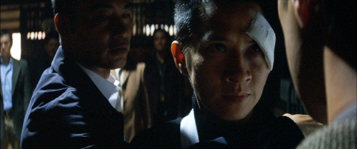
There are two outstanding series more suitable for adult bingeing. Infernal Affairs (2003-2004) was made famous by Scorsese’s remake The Departed (2006), but the original is better, and the follow-ups are loopier. The first entry offers solid, suspenseful plotting and meticulous performances by top HK stars Tony Leung Chui-wai and Andy Lau Tak-wah, supported by a rogues’ gallery of unforgettable character actors. Parts two and three spin off variations on the first one, tracing out before-and-after incidents and throwing in some quite strange narrative contortions. The whole thing provides an engrossing five and a half hours of entertainment. Available from several services.
In my book Planet Hong Kong I analyze the trilogy as an example of how directors Andrew Lau and Alan Mak Siu-fai created a more subdued thriller than is usual in their tradition. Bonus material: In the spirit of providing free stuff during the crisis, here in downloadable pdf form is my little chapter on the trilogy: Infernal Affairs interlude.
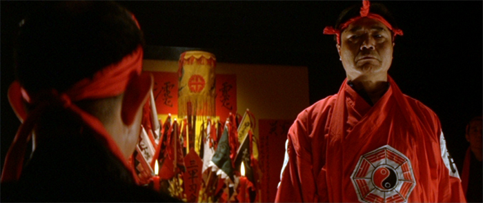
Also subdued, even subtle, is Johnnie To Kei-fung’s Election (2005) and Election 2 (aka Triad Election, 2006). These films dared to show secret gang rituals that other filmmakers shied away from. The first part plays out ruthless competition among rival Triad leaders, including strikingly unusual methods of punishing one’s adversary. The second entry, even more audacious, suggests that Hong Kong Triad power is intimately tied up with mainland Chinese gangs, backed up by political authority.
Johnnie To’s pictorialism, so feverish in The Longest Nite (1998), A Hero Never Dies (1998), The Mission (1999), and other films, gets a nice workout here as well. Infernal Affairs is agreeably moody, but the Election films are black, black noir.
The pair add up to three hours and a quarter. The first film is apparently available only on disc but the second is streaming from several sources.
Of course, to get into the real Hong Kong at-home experience, some viewers will find all these films easily and cost-free on the Darknet.
Thematic combos
Flicker Alley’s Albatros films. 5 films, 664 minutes, or 11 hours and 4 minutes. I wrote about the DVD set, “French Masterworks: Russian Émigrés in Paris 1923-1929” when it first came out. It’s still available here. The Albatros company made some of the key films of the 1920s, most of which are still too little known, including Ivan Mosjoukine’s Le brasier ardent (1923, above). If this is still a gap in your viewing of French films, here’s a chance to fill it.
Yasujiro Ozu: The Criterion Collection has released a helpful thematic grouping of some of Ozu’s early films. One is “The Silent Ozu: Three Family Comedies” (DVD and streaming), including I Was Born, but …, Tokyo Chorus, and Passing Fancy, adding up to 281 minutes. The British Film Institute has gone further along the same lines, releasing “The Gangster Films,” also three silents: Walk Cheerfully (1930), That Night’s Wife (1930), and the wonderful Dragnet Girl (1933); they add up to 259 minutes. The BFI has also put out “The Student Films,” (listed as out of stock at the moment) yet more silents: Ozu’s earliest complete surviving film, Days of Youth (1929), I Flunked, But … (1930), The Lady and the Beard (1931) , and Where Now Are the Dreams of Youth? (1932), adding up to 251 minutes.
David has recorded an entry on Ozu’s Passing Fancy for our sister series, “Observations on Film Art,” on the Criterion Channel; it should go online there sometime this year.
Or watch all the “season” films in a row: Late Spring (1949), Early Summer (1951), Early Spring ((1956), Equinox Flower (1958), Late Autumn (1960), End of Summer (1961), and An Autumn Afternoon (1962), for a grand total of 840, or 14 hours. Including An Autumn Afternoon is cheating a bit, since the original title means “The Taste of Mackerel.” Still, it’s so much like the earlier films in equating a season with a stage of life that the English title seems perfect. The early films equate the seasons with the young people, about to marry or recently married, while in the later films, and especially the last three, the seasons refer to the older generation, lending an elegiac tone to the end of Ozu’s career. David has done commentary for the DVD of An Autumn Afternoon.
All of these (except for Days of Youth) and many other Ozu films can be streamed on The Criterion Channel, which also has a bunch of supplements on this master director.
Or just watch The Criterion Channel’s Kurosawa films in chronological order, or Bresson’s or Godard’s or Bergman’s or …
Or watch all of Hideo Miyazaki’s films in chronological order, with or without the company of kids.
Just really long films
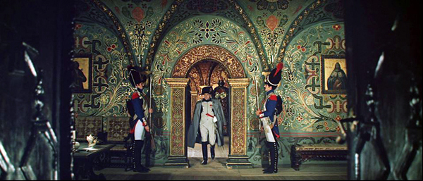
War and Peace (Sergei Bondarchuk, 1965-1967, above) 4 parts: 7 hours, 3 minutes, 44 seconds. I suppose this is technically a serial, since the parts were released over three years. Still, the idea presumably was that it ultimately should be seen as one film, and the running time would permit it being seen in one day fairly easily. I have not seen this restored version, only the considerably cut-down American release back when it first came out. I remember it as being quite conventional, but on a huge scale in terms of design, cinematography, and crowds of extras. Seeing it in its original version would no doubt be impressive (see above). Available on disc at The Criterion Collection and streaming on The Criterion Channel. The supplements total 175 minutes and four seconds, pushing the total up to nearly 10 hours.
Satan’s Tango (Béla Tarr, 1994) 450 minutes, or 7 hours 30 minutes. Film at Lincoln Center has just made Tarr’s epic available for streaming; you can rent it for 72 hours and support a fine institution. As to owning it, the DVDs seem to be out of print. There is, however, a Blu-ray coming from Curzon Artificial Eye on April 27 in the UK. Pre-order it here. Obviously many of us will still be stuck inside by the time it arrives. Or if you have it on the shelf and never quite got around to watching it, here’s your chance. Derek Elley’s Variety review sums up its pleasures. Our local Cinematheque has shown it twice, once in 35mm and more recently on DCP (see here, with the news buried at the bottom of the story). David reported on that first showing, and later he wrote a general entry about Tarr’s work on the occasion of having met the man himself.
Shoah (Claude Lanzmann, 1985) 550 minutes, or 9 hours and 10 minutes. The Holocaust examined through modern interviews with a broad range of people involved. Available in a restored version on disc from The Criterion Collection. It does not seem to be available currently for streaming.
Unclassifiable
Then there’s Dau (2020-), a biopic of a Soviet scientist that is perhaps the most ambitious filmmaking venture ever.
Shot on 35mm over three years in a real working town with 400 characters played by actors who remained in character and costume round the clock the whole time. Few have seen these, though two showed at the Berlin festival this year. We haven’t seen them but plan to give it a go, since they have just shown up online. Here’s a helpful summary of the project. At the Dau Cinema website, you can stream the first two films for $3 each: Dau. Natasha (2:17:53) and Dau. Degeneration, (6:09:06) adding up to 8 hours and 27 minutes. Twelve more films are announced for future release, with no timings given. Clearly not suitable for family viewing.
I have not attempted to add up all these timings, but if you can track most of them down, they might get you through much of the isolation period. Stay safe!
Election (2005).


