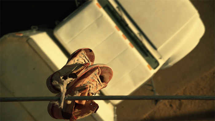
Calm that camera!
Sunday | April 30, 2023 open printable version
Succession (2023).
DB here:
Thanks to our Wisconsin Film Festival, Ken Kwapis paid us a visit. Director of The Sisterhood of the Traveling Pants and many other features, Ken also has experience directing TV, notably The Office. He’s a generous filmmaker, and he radiates enthusiasm for his vocation. I took the opportunity to talk with him about camera movement in contemporary media. He taught me a lot, and what I’ve come away with I share with you.
Camera ubiquity, with a vengeance
In the early silent era, fiction filmmakers around the world discovered what we might call camera ubiquity—the possibility that the camera could film its subject from any point in space. This resource was more evident in exterior filming than in a studio set, so early films often display a greater freedom of camera placement when the scene is shot on location.
At the same time, filmmakers began realizing the power of editing. This technique offered the possibility of cutting together two shots taken from radically different points in space. Yet an infinity of choices is threatening, and some filmmakers, mostly in the US, constrained their choices by confining the camera to only one side of the “axis of action,” the line connecting the major figures in the scene. Different shots could cut together smoothly if they were all taken from the same side of the 180-degree line. The result was the development of classical continuity editing. The director was expected to provide “coverage” of the basic story action from a variety of angles, but all from the same side of the line. Classical continuity was in force for American films by 1920 and was quickly adopted in other national cinemas.
The one-side-of-the-action constraint was encouraged by the fact that much filming of staged action took place on a set, designed according to the theatrical model. The camera side of the space was behind an invisible fourth wall, like that in proscenium theatre. To some extent directors compensated for the limitation on camera position by fluidly moving actors around the frame, from side to side and into depth or toward the viewer. Still, the “bias” in choosing setups was reinforced by the increasing weight of the camera in the sound era, which made it hard to maneuver within both interior and exterior settings. Camera movement in a more or less wraparound space was possible, but it was usually very difficult. It commonly required a dolly or crane on tracks to prevent bumps.
Technicolor filming, with its monstrously big camera units, reinforced the bias toward proscenium sets, 180-degree space, and a rigid camera. So did the postwar vogue for widescreen cinema. But in the 1950s filmmakers were also exploring the possibility of lighter, more flexible cameras. The body-braced cameras often produced bumpy, slightly disorienting images but yielded a more “immersive” space that gave the story action immediacy and spontaneity. By the early 1960s, handheld camerawork was being seen in both documentaries and fiction films. At the same time, fiction filmmakers were gravitating toward more location filming. In addition shooting on location with portable cameras promised greater savings on budgets, an attractive option for both independent and mainstream directors.
Handheld shooting was becoming more common in the 1970s, when its problems were overcome by the invention of the Steadicam, first displayed to audiences in Bound for Glory (1976). This stabilizer permits the operator to move smoothly through a space.
The new device was more than simply a substitute for a camera on a dolly and tracks. Ken pointed out to me that the Steadicam encouraged the increasing use of the walk-and-talk shot showing two or more characters striding toward a constantly retreating camera. This proved to be an efficient way of covering pages of dialogue. Beyond that, the Steadicam became an all-purpose camera for filming any sort of scene.
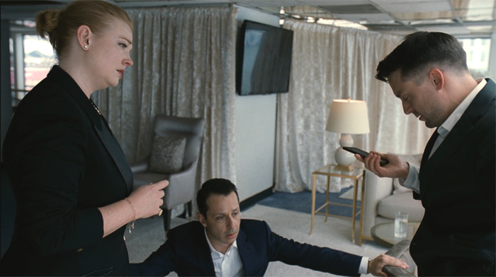
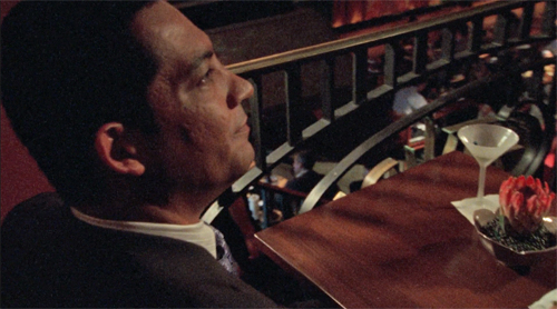
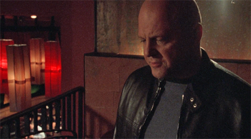
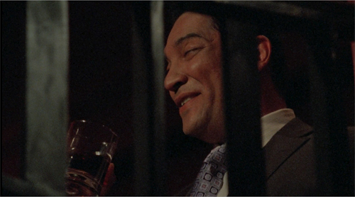
Over the same years, directors embraced multiple-camera shooting—originally aimed at handling complex stunts—for every scene, and they recruited A and B cameras, often mounted on Steadicams, for ordinary dialogue scenes. In most cases, the B camera was mounted alongside the A, but with the B camera in other spots there was a certain erosion of the axis of action. Now a conversation may be captured from a greater variety of angles than classical coverage would favor. Filmmakers have replaced 180-degree staging and shooting with what’s called 250-degree coverage. In The Way Hollywood Tells It I drew an example from Homicide: Life on the Streets. A free approach to the axis of action is common today, as in this example from Succession (2023).
A rough sense of the axis of action is maintained, and there are matches on action, but our vantage “jumps the line” as well. Moreover, the camera is constantly moving within the shots. It’s panning to follow or reframe the characters, sometimes circling them or abruptly zooming, and always wavering a bit, as if trembling. What some Europeans call the “free camera” is very common nowadays, and Ken and I talked mostly about this creative option.
Eye candy
By now, many filmmakers have chosen to make nearly every shot display some camera movement independent of following moving characters. This tactic was noted and recommended in a manual by Gil Bettman (First Time Director, 2003). (Readers of The Blog know of my fondness for manuals.) “To make it as a director in today’s film business, you must move your camera” (p. 54). The risk is making the audience more aware of the camerawork than of the story, so Bettman adds:
A good objective for any first time director would be to move his camera as much as possible to look as hip and MTV-wise as he can, right up to the point where the audience would actually take notice and say, ‘Look at that cool camera move.”
Like cinematographers in the classical tradition, Bettman declares that the camerawork should be “invisible” (p. 55). By now, you could argue, the predominance of camera movement has made it somewhat unnoticeable. Ordinary viewers have probably adapted to it.
One factor that aids the “invisibility” of camera moves is the speed of cutting. If the shots are short, the viewer registers the camera movement but probably doesn’t have time to notice whether it’s distracting or not. The effect of this isn’t restricted to action scenes. Even dialogue scenes may catch conversations up in a paroxysm of character reactions, camera movement, and swift editing. Creating these rapid-fire impressions, it seems to me, is what a lot of modern filmmaking seeks to do, at least since the early 2000s. It’s sometimes called “run and gun” shooting. Here’s an instance from The Shield (2003), with sixteen shots in less than a minute.
Arguably, Hill Street Blues (1981-1987) popularized this look for the police procedural genre, when DP Robert Butler urged his team to “Make it look messy.”
This sequence and the Succession passage points up another factor. Knowing that their films would ultimately be displayed on TV, some directors began “shooting for the box” by using tighter shots and closer views. TV directors such as Jack Webb were already working in this vein of “intensified continuity,” and many others had started their careers in broadcast drama and accepted the impulse toward forceful technique. Television has long demanded that the image seize and hold viewers, likely sitting in living rooms and prey to many distractions. Fast cutting and constant camera movements keep the viewer’s eye engaged. No surprise, then, that our TV programs present a fusillade of images that make it hard to look away.
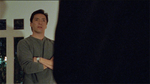
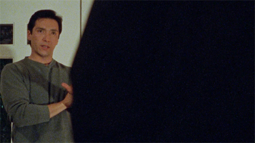
Constant camera movement has another benefit. Many camera movements tease us. The start of a shot suggests that the camera will bring us new information, so we must wait for the end. Filmmakers love a “reveal,” and even a small reframing can suggest the camera is probing for something new to see. By now, however, filmmakers can play with us and use camera movement to flirt with our attention: the shot can begin with a clear image but drift away to conceal the main subject. I first noticed this almost maddening stylistic tic in The Bourne Ultimatum (2007), but it crops up occasionally elsewhere. In one scene of The Shield (2006), the camera slides behind a character, finds nothing to see, and slides back.
The peekaboo reframing would seem to throw the viewer out of the story in just the way that worries Bettman. I’m inclined, though, to think that it is part of a general, and fairly recent, expansion of viewers’ tastes. Self-conscious technical virtuosity has long been an attraction of mainstream filmmaking, and audiences have responded with appreciation. Think of Busby Berkeley or Fred Astaire dance numbers, or the railroad junction scene in Gone with the Wind. I suspect that many members of today’s audiences now happily say, “Look at that cool camera move” and don’t mind being pulled out of the story. (I’d say, though, that they aren’t being pulled out of the film, but that’s matter for another blog entry.)
This tendency would accord with what Bettman calls the taste for eye candy. For him, this seems to consist of bursts of light or color, usually produced by camera movement. More generally, I think audiences would consider impressive sets, striking costumes, and good-looking people to be eye candy. And now, I suspect, flashy camera work counts as eye candy too. The case is obvious with the showboating following shots in Scorsese and De Palma, but I think it applies to the jagged, in-your-face techniques seen in run-and-gun sequences. Advocates of the silent film as a distinct art never tired of insisting that cinema was above all pictorial. “The time of the image has come!” thundered Abel Gance. It took a while, but now that people compete for bigger home screens we have to admit, for better or worse, that everybody acknowledges that film is a visual art.
Many flies on many walls
Most moving shots today don’t utilize the Steadicam, whose usage needs to be budgeted and scheduled separately. The run-and-gun look is well served by modern cameras designed to be handheld. DPs and operators know that a wavering, even rough shot is acceptable to most modern audiences, and filmmakers seem to assume that handheld images lend a documentary “fly-on-the-wall” immediacy to the scene. In addition, wayward pans, swish pans, and abrupt zooms are felt to enhance that sense that we’re seeing something immediate and authentic. (Flies are easily distracted.)
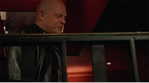
Problem is, this approach is far from what a real documentary film looks like. True, the individual images might be rough, but their relation to one another is quite different from those in a documentary. For one thing, they occupy positions that documentary shots can’t achieve. Shot B may be taken from a spot we’ve just seen to be empty in shot A, as in the sequence from Succession. As Ken put it, “There’s no such thing as a reverse angle in a documentary.” Or shot B may be taken from a very high or low angle, where a camera is unlikely to perch, as in this passage of The Shield (2007) which hangs the camera in space peering through a railing.
Sometimes shot B will represent the optical viewpoint of a character, which is unlikely in an unstaged documentary. Putting it awkwardly, the free-camera style achieves a greater degree of camera ubiquity than we can find in a standard documentary. (Years ago, I made this point in relation to The Office.)
For another thing, the flow of run-and-gun shots always captures the salient story points. A documentarist, with one or two cameras following an action, is still likely to miss something significant (and to cover the omission with elliptical editing and continuous sound). But the modern method offers its own rough-edged equivalent of classical coverage. The action remains comprehensible. Sometimes the camera will even wander off on its own to frame something the characters aren’t aware of, providing a modern equivalent of classical “omniscient” narration.
What we have, I think, is a modern variant of the one-point-per-shot mandate of traditional editing, but featuring shots of that evoke greater “rawness” than studio filming did. And maybe it’s not as modern as we think. Here’s a sequence from Faces (1968), complete with walk-and-talk, or rather stagger-and-talk, as well as camera ubiquity and matches on action that would be difficult in a documentary.
I’d argue that John Cassavetes, much admired by filmmakers who followed, supplied the prototype for today’s run-and-gun look. Admittedly, it’s been stepped up; I suggested in The Way Hollywood Tells It that intensified continuity has been further intensified.
Nervous energy
Intensified how? Apart from all the swishes and zooms and focus changes, some bells and whistles aim to enhance the sense of “energy” attributed to the style. The peekaboo framings I mentioned would be one instance. Here are some others.
The shot, distant or close, which simply trembles. Let’s call it the wobblecam. It suggests the handheld shot, but it’s brief and seems shaky just to evoke a sort of vague tension. Wobblecam shots are so common now that entire scenes are built out of them, as in the Succession clip.
The arc: In filming TV talk shows, how do you keep viewers glued to the screen? One option is what a 1970 manual calls the arc. Here the camera travels in a slow partial circle that refreshes the image gradually. The framing reveals constantly changing aspects of the panelists and is a nice change from master shot/ insert editing. I remember this as common in 1950s programs.
 The “roundy-round” (thanks, Ken): This extends the arc to 360 degrees, circling around one or more characters, urging us to watch for bits of action or dialogue—usually timed for maximum visibility. It’s also used to convey a character at a loss, say mystified by which way to turn, or characters embracing (whoopee). The technique can be found sporadically before the 1990s, when it becomes quite common. Ken pointed out that the roundy-round was extensively used on E. R. to underscore time slipping away during life-and-death surgery.
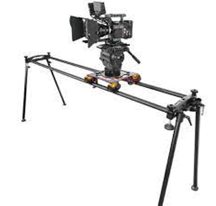
The slider: The enhancement I find most distracting is the camera’s slow leftward or rightward drift while filming static action. Usually it’s a master shot, but it doesn’t have to be, and it can sometimes interrupt a series of close views. Unlike the wobblecam, this is more teasing because we’re used to such a shot revealing something. It doesn’t, but I think it holds out the promise and keeps us watching.
Writing The Classical Hollywood Cinema I came to realize that supply companies created lighting and camera devices designed to meet the developing needs of filmmakers. Thanks to Ken, I learn that this tradition continues. You can buy or rent gear that will enable arcs, roundy-rounds, and the slider (right). Both in technique and technology today’s Hollywood is a continuation of yesterday’s.
If a director constantly relies on camera movement, there’s no reason to object. The elegant moves of Ophuls or Mizoguchi or of McTiernan in Die Hard provide the sort of continuous engagement and ultimate pictorial payoffs that justify the technique. My examples illustrate more gratuitous camera moves, choices that “add energy” but once they’ve become conventional, seem wasteful. Usually, they reveal nothing and end up minimizing the power of a gradual reveal when it comes along.
But who am I to complain? Film styles change under production pressures and artistic inclinations. As a student of film history, I have to study what’s out there. Still, run-and-gun remains only one option. There are still lots of films and shows, like Tär and The Woman King and Barry, that rely on rigid camera setups and discreetly motivated movements. (Ken’s Dunston Checks In (1996), shown to an appreciative crowd at the festival, is a good example.) Another alternative is providing precise shot breakdowns that feature unusual “eye-candy” angles, as in Better Call Saul’s views from inside mailboxes and gas tanks. That trend constitutes another way to expand options within camera ubiquity. There are also the long-take films in which complicated camera moves preserve the patterns and emphases of classic continuity. (See the discussion of Birdman.) And then there’s the effort by Wes Anderson to go in the other direction, to submit to constraints far more severe than classical shooting—an austere refusal of camera ubiquity.
I must ask Ken about all these options too. Next time, I hope.
Thanks to Ken Kwapis, who enormously expanded my sense of the practical choices available to the filmmaker.
The TV production manual discussing the arcing shot is Colby Lewis, The TV Director/Interpreter (New York: Hastings, 1970), 131-132. Other mobile framings are reviewed in the same chapter.
For examples of filmmakers believing that the rough-edged style is like documentary shooting, see remarks on Succession in Zoe Mutter, “Fury in the Family,” British Cinematographer and Jason Hellerman, “How Does the ‘Succession’ Cinematography Accentuate the Story?” at No Film School. Butler’s comments on Hill Street Blues are quoted in Todd Gitlin, “’Make It Look Messy,’” American Film (September 1981) available here.
You can feel the thrill of silent-era creators and critics in realizing the possibility of camera ubiquity. Dziga-Vertov celebrated the power of the Kino-Eye to go anywhere, while Rudolf Arnheim saluted cinema’s ability to provide unusual angles that bring out expressive qualities of the world. What would they make of a shot like this below?
Better Call Saul (2015): Extremes of camera ubiquity.


