Can they make ’em like they used to? continued
Thursday | December 14, 2006 open printable version

DB here:
In the wake of discussions of The Good German, on this site and elsewhere, the idea of a retro-looking movie has surfaced again. American Cinematographer‘s coverage of Casino Royale is very intriguing.
Phil Méheux, the cinematographer, decided that the opening sequence, a black-and-white passage showing Bond earning his 00 status, would pay homage to 1960s Techniscope. Techniscope was an optical process that produced 2.35:1 images without anamorphic lenses. It allowed great depth of field because it could take advantage of the wide-angle lenses available for non-anamorphic cinematography. The most familiar Techniscope images are probably those in Sergio Leone’s westerns.
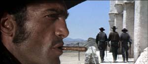 For a Few Dollars More.
Mehaux explains what he wanted for Casino Royale:
With Techniscope, the increased depth of field meant they were able to put things like lampshades and telephone boxes in the foreground, and they didn’t appear amoebic–you could actually see depth in them. In The Ipcress File, there’s a shot where a table lamp is huge in the frame and a man’s face is in the top right-hand corner. I really like that look. Part of the dialogue in our opening sequence was done with very carefully controlled shots that have huge things in the foreground and faces pushed to the corners of the frame. Little things like that echo the Cold War period of spy films.
But, but….
1. In the print of Casino Royale I saw in my local, the opening office scene didn’t really exploit sharp-focus foregrounds. There weren’t that many objects in the foreground, and they weren’t in discernible focus. Of course the cutting was so rapid that it was hard to concentrate on foreground/ background relations.
2. It’s fall of 1965, in Albany, New York. A film geek literally fresh off the farm is in his freshman year of college and goes to every movie in town. He sees The Ipcress File not once but three times. He’s fascinated by its flamboyant technique. He’s just seen Citizen Kane, so he’s impressed by deep staging and big foregrounds in this unheralded spy pic.
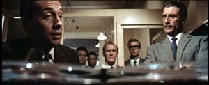
There’s even wilder stuff: a murder victim seen through a hanging lamp, for example.
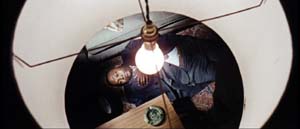
The Geek reads up on long lenses, wide-angle lenses, and so on. Knowing nothing about Techniscope, he wonders how these extravagant shots got made. Just as important, why are they here (apart from looking cool)?
(Spoilers coming up. Skip to 3 if want to retain your innocence.)
After a couple viewings, the Geek begins to get a hunch about what those lampshades are doing there. Throughout the movie, actors are shot in juxtaposition to looming shapes–doors, lecterns, tabletops–which mask large stretches of the set.
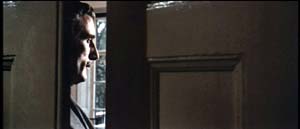
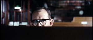
And sometimes those blocking objects are lampshades.
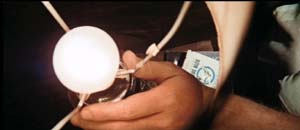
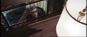
At a climactic moment, our hero escapes from torture and calls his superior officer, who’s framed in the usual off-center way, with a lampshade dominating the shot. It works as a sheer (and pretty) block of solid color.
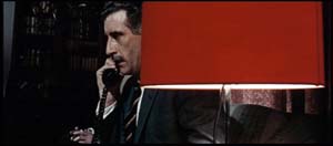
Turns out, however, that this time the shade actually conceals something important. The officer withdraws behind the shade and out pops a guest sitting alongside him.
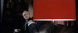
The guest is the arch-villain. Now we know the officer is a traitor.
The Geek dimly realizes three things.
*A movie sets up visual “rules” it will follow or violate. (Later the Geek will call these intrinsic norms.)
*Visual motifs build up across a film, sometimes asking the viewer to notice them.
*A motif can seem gratuitous but that very gratuitousness can be exploited for storytelling purposes. When we see the red lampshade, we assume that it’s another decorative flourish, not a way of hiding information. Earlier sequences suggest that the device is a mannered tic but at the climax it helps spring a surprise. Motifs, the Geek would realize eventually, can fulfill narrational functions–that is, motifs can shape the ongoing flow of story information.
3. Sidney J. Furie was considered a showoffish filmmaker. Michael Caine said he belonged to the look-Ma-I’m-directing school. Certainly the outrageous compositions involving Marlon Brando’s sombrero in The Appaloosa back up that charge.
But like Richard Lester, Ken Russell, and other fancy-pants pictorialists, Furie can at least get us to notice technique. Not bad to cut your cinephile teeth on. Or at least so the Geek thinks, forty years afterward.
4. The AC article also talks about the problem of making poker games interesting. Hong Kong filmmakers figured this out long ago. Martin Campbell, director of the new 007 adventure, should study the crisp card sequences in Wong Jing’s God of Gamblers series. Filmed on a minuscule budget, they put the strained and blandly shot poker scenes of Casino Royale to shame. Incidentally, Wong’s use of diopters yields the sort of nifty depth that Meheux liked in Ipcress.
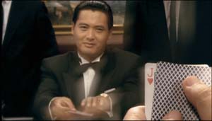 God of Gamblers.
PS: Casino Royale didn’t learn the lessons of the 1960s well enough, in my view. After the sparkling opening credits, it was all downhill. The usual problems: overcut scenes, overcloseupped acting, incoherent chases and fights, uninspired dialogue you recite just before the actor says the line. One landing-strip truck fracas amalgamates Road Warrior, Raiders of the Lost Ark, and Die Hard 2. The makers have indeed updated the Bond franchise. After a series of lame 1970s-looking movies, the franchise has given us a lame contemporary-looking movie.
Granted, I never cared much for the Bond pictures. The Geek liked From Russia and Goldfinger, and Diamonds Are Forever is enjoyable in its wacko way. But for Machiavellian intrigue, Fritz Lang’s Spies remains the gold standard. No one can make ’em like he used to.
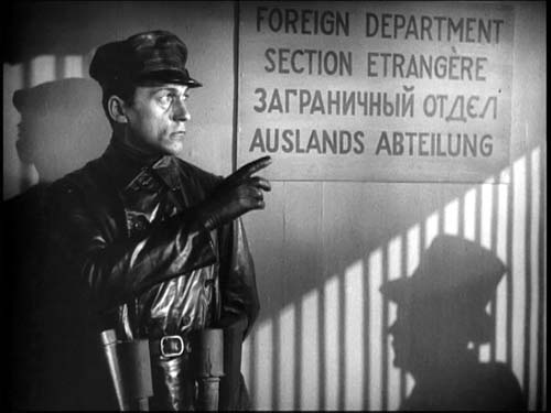 Spies
Spies


