Scorsese, ‘pressionist
Wednesday | April 21, 2010 open printable version
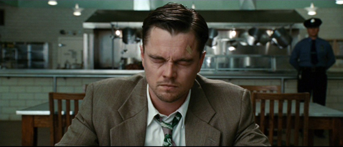
Shutter Island.
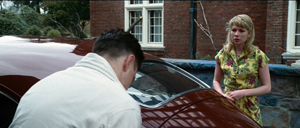
I was interested in the way she presented herself at that moment. Later on I figured out that as she gets up from the chair we should do it in three cuts, three separate close-ups, because I think he’ll never forget that moment the rest of his life. He’ll play it back many times. . . . It’s just his perception, his memory of what it’s going to be like. . . . We shot it very quickly, two takes each, one at 24 frames, one at 36, and one 48.
Martin Scorsese, on filming The Age of Innocence.
DB here:
Few directors think so carefully about how a film looks and sounds. Sensitive to technique in the work of classic filmmakers, Martin Scorsese has always tried to give each picture a vivid visual and auditory profile. Although he’s often praised for his realism (usually prefaced by the adjective “gritty”), Scorsese is often a subjectively oriented director. This quality goes beyond the justly celebrated performances of his actors. He is unafraid to use unusual cinematic techniques to thrust us boldly into the characters’ minds and emotions. In this effort he joins some great cinematic traditions. No surprise there: He has an immediate sense that film history hovers over every choice a director makes.
Spoilers loom out of the mist ahead.
Inside out, outside in
Raskolnikov.
Once American filmmakers developed a model of visual storytelling in the late 1910s, filmmakers elsewhere were surprisingly quick to push it in more subjective directions. There emerged something like an international division of techniques.
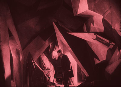
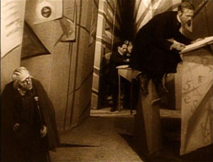
To convey inner experience, German directors of the 1910s and 1920s worked principally on aspects of mise-en-scene—performance, staging, setting, lighting, costume, make-up, and the like. The classic example is The Cabinet of Dr. Caligari (1920), in which the cutting and camerawork are fairly conservative, but the setting and acting seek to convey a madman’s vision of the world.
Caligari “subjectivizes” the characters’ surroundings, a process signaled through warped perspectives and fantastically distorted settings.
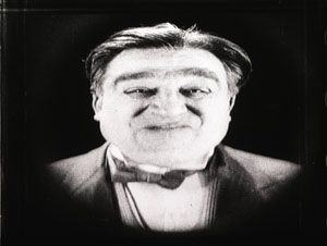
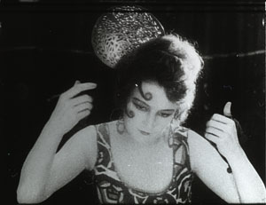
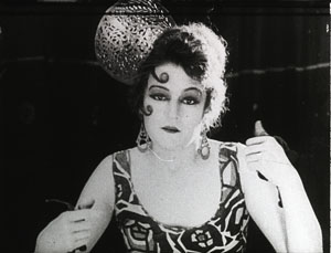
This brand of visual contortion became the hallmark of what was called German Expressionist cinema. Scholars argue about exactly what films belong under that rubric, but Caligari, along with From Morn to Midnight (1920) and Raskolnikov (1923, above), are pretty uncontroversial examples of making the external world reflect the characters’ psychic turmoil.
At the same period, French directors were also experimenting with subjective cinema. But they tended to concentrate less on mise-en-scene and more on what the camera could do to suggest both optical and mental point of view. In the so-called “French Impressionist” school, we find framings, angles, distorting lenses, changes of focus, slow-motion, and other cinematographic techniques used to suggest characters’ mental states. Thus in Germaine Dulac’s Smiling Madam Beudet (1923), the downtrodden wife sees her husband as monstrous.
In El Dorado (1921) Marcel L’Herbier uses a gauzy filter to suggest that his heroine is distracted, before pulling it aside and letting her face come into focus.
A little later, leading Soviet filmmakers made editing, not mise-en-scene or camerawork, their most salient technique. They experimented with graphic and rhythmic montage, as well as cuts that sacrificed spatial and temporal continuity to eye-smiting impact.
Of course this three-way division of technical labor is too neat. You find some camera experimentation in German Expressionism, as with the fast motion in Nosferatu (1922). The French were using rapid cutting even before the Soviets, as Gance’s La Roue (1923) shows. And some Soviets, such as Eisenstein and the FEKS directors, explored unusual lighting and camera angles. It should be said, though, that these shared techniques often serve different purposes. Fast cutting in Impressionist films tends to suggest the heightened experience of the characters, rather than serving, as in the Soviet case, to dynamize a historical situation for the viewer. The quick cutting in the carnival ride in Jean Epstein’s Coeur fidèle (1923) simulates the chaotic burst of “impressions” felt by the characters, but the quick cutting in the street riot of Strike (1925) doesn’t mimic the characters’ states but aims to arouse shock and suspense in us.
In any case, my technical division remains only a first approximation toward understanding pretty complicated historical trends. The main point is that both the German Expressionist and the French Impressionist filmmakers of the 1920s were seeking to use particular film techniques to give the audience a deeper sense of the characters’ sensory experience and emotional states.
American cinema selectively adopted some of these tactics of lighting and set design. In a blog entry and a web essay, I’ve written about William Cameron Menzies as one importer of the German approach. You can see Expressionist touches in Fox’s Mr. Moto movies. Likewise, 1940s films particularly enjoyed mimicking Impressionist camera tricks to signal drunkenness, delirium, hallucination, and other altered states. Hitchcock’s Spellbound (1945) and Wilder’s Lost Weekend (1945) are famous examples. Typically such Expressionist and Impressionist touches were associated with crime, craziness, or genre stylization. Much of this flagrant irrealism went out of A-pictures in the 1950s, but it survived in horror and, interestingly, in the US avant-garde cinema of Deren, Markopoulos, and others.
One of Scorsese’s contributions to the 1970s, I think, was to revive and consolidate this legacy. While we were celebrating his films as victories for urban realism and neo-Method acting, many of the movies were also charged exercises in subjective cinema.
Making streets mean, and meaningful
Taxi Driver.
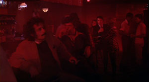
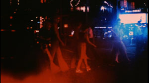
From Mean Streets (1973) everyone remembers the aura of street-punk camaraderie, the harsh turns of mood (usually triggered by Johnny Boy’s recklessness), and the vibrancy of the neighborhood, with its social hierarchy and rituals of bullying and bluff and negotiation. Alongside these tokens of realism we find breathless grace notes, as when Charlie glides through the club, a visual equivalent of his joy in being among pals and sexy women. (The shot was made by having Keitel ride the dolly instead of walking in front of it.)
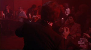
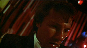
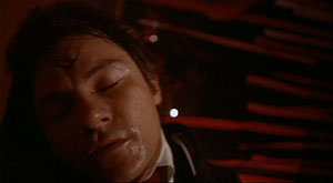
This euphoria of this neo-Impressionist shot is counterbalanced later by the Rubber Biscuit song, with Charlie now thoroughly drunk and floating in grotesque frontal close-up before the floor rises up to kiss his head.
Charlie has come in to the club announcing himself as Jesus, a pious man to create order. Now this shot charts his fall from drunken exuberance into queasiness and mounting anxiety about Johnny Boy’s debt.
More generally, Tony’s club is given heavily unrealistic treatment through slow-motion and faked slow-motion, along with character movement synchronized with the music. If the camerawork mimics Charlie’s mental states in Impressionist fashion, the ruby-red club lighting suggests his erotic inflammation in a mildly Expressionist one.
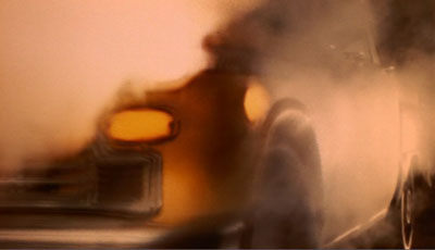
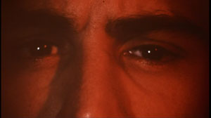
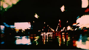
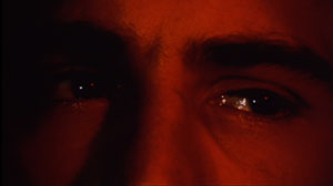
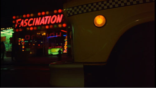
Taxi Driver (1976) is Scorsese’s most famous venture into subjectivity. From the first shot of the cab heaving through wafting vapor—steam? smoke? sulfur fumes?—we cut to a man’s eyes, and then to dissolving views of the city through a rainy windshield.
From the start Scorsese announces one of his most basic strategies: a realistic motivation for expressionist effects. It’s only rain, but shooting it through the windshield and adding slow motion gives the streets an otherworldly shimmer. As the neon dribbles down the glass, and we see pedestrians moving through tinted clouds like hesitant ghosts, the man’s face becomes bathed in a red glow—vaguely motivated as reflected from the traffic light, but unrealistically saturated, as in the Mean Streets club.
We see the real New York, but filtered through the eyes of a man who considers it an open sewer. The plot will soon lock us into his consciousness more explicitly, through restricted point of view and voice-over diary extracts and crisp montages of the cruising cab. In addition, the motifs introduced here, particularly purifying water and blips of light, will become elaborated in the course of the movie. The general point, however, is that Scorsese has updated Impressionist and Expressionist tactics in order to reveal a man’s mind through images.
Qui tollis peccata mundi
Bringing Out the Dead.
In some films Scorsese plays things straighter, invoking subjectivity only briefly. There are the prizefights and the visions of Vicki in Raging Bull (1980), and the slipperier passages of fantasy in The King of Comedy (1982). But other films plunge us deeply into subjectivity, forcing the world through the filter of a driven character’s sensibility.
For thoroughgoing efforts in this direction we can look to Bringing Out the Dead (1999). In this movie about a paramedic haunted by spirits of those unfortunates he might have saved, Scorsese along with cinematographer Robert Richardson and production designer Dante Ferretti reinvoke the nightmarish qualities of Taxi Driver. The exhilaration Frank Pierce gets from saving lives is offset by his despair at gambling with death every night. The result is another exercise in neo-Impressionism and –Expressionism.
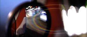
Once again rain and light, objectively out there in the urban world, become projections of the character’s tormented psyche, thanks to camera angle and framing. The windshield gives Frank’s face phantom tears.
Once again concrete shapes and colors, filtered through a moving vehicle, are distorted to suggest the protagonist’s anxieties.
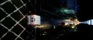
To measure Frank’s descent into desperation, the camera even follows the ambulance upside down, or sideways.
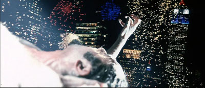
Scorsese ventures into full-blown Expressionism as well. There are naturally dream sequences, but we also get the unforgettable image of the drug dealer Sy, impaled on a fence rail and reaching toward skyscrapers as fireworks (real fireworks?) consecrate his gesture. Later, hurtling through the city and moving closer to mental breakdown, Frank starts to see every woman on the street as Rosa, the woman he could not rescue. How the Germans would have loved having CGI available for such a hallucination.
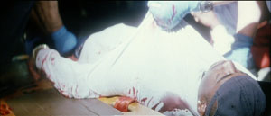
Perhaps the subtlest touches are the patches of blown-out white. At first they seem a signal of death, gleaming off the bodies of Mary’s father and the young man found on the street.
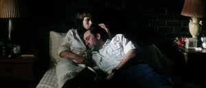
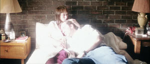
In the final scene, Frank tells Mary of her father’s death (and sees her as Rosa). She invites him in and eventually he falls asleep in her arms. The final shot quietly shifts from a normal, rather dark texture, to one endowing his shirt with a blinding glow.
This change in lighting and exposure, unmotivated by any realistic source, suggests that Frank feels he has found a bit of peace, while also hinting that a spiritual radiance has entered this unhappy world through a tortured secular saint.
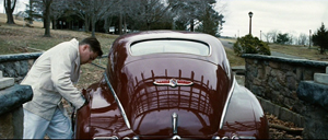
Shutter Island caters to the ‘pressionist side of Scorsese’s vision. It hovers between realism and subjectivity: parts of what we see are really happening in the fiction, while other parts are wholly in Teddy/ Edward’s mind. The difference is that here the balance tips strongly toward expressionism. Apart from the dream sequences, certain hallucinations are rendered in undistorted terms. So, for instance, scenes like the cave conversation with the second Rachel Solando are wholly Teddy’s mental projections. Other scenes oscillate between subjectivity and objectivity, as when Teddy is preparing to set fire to Cawley’s car and talks with his wife Dolores–although the next shot confirms she’s not really there.
I find all this less resourceful than the virtuosic ways in which Scorsese subjectivizes the neighborhoods of New York. The Gothic trappings of the hospital, the cagelike wards, and the rainswept island offer less opportunity for novel stylization than an urban landscape. Moreover, I think that the creaky gimmick ruling the plot of Shutter Island relies on farfetched explanations and leaves too many loose ends. If the storm didn’t really occur, as Dr. Cawley tells us, then did the storm-tossed dialogues with Chuck not occur either? Why are the doctors talking about the prospects of a (nonexistent) flood before Teddy even comes into the room? And could the inmates be relied upon to execute the physicians’ complex role-playing game? A second viewing left me in the dark about matters that a Shyamalan would have tidied up.
But I did have to admire the way in which Scorsese uses Teddy’s breakdown as an alibi for the mismatched cuts I’ve objected to before. (Some legerdemain with a water glass is particularly clever.) And the ending supplies one further twist that somewhat ennobles the whole loopy contraption.
Cranking it up
Crank 2: High Voltage.
You can argue that Scorsese’s talent was well suited to this project: We don’t notice the plot problems because his stylistic assurance carries us along smoothly. That assurance allows me to raise my final point.
I’ve argued elsewhere, in books and on this site, that Hollywood storytelling techniques have been overhauled in recent decades. Over the last forty years or so, filmmakers have amped up the “continuity style” forged in the 1910s. They have cut faster, sometimes averaging 2-3 seconds per shot across a film. They have relied more heavily on singles (shots of one character), and these singles are often fairly large close-ups. Directors have also embraced extremes in lens lengths—very long lenses (for that perspective-flattening effect) and very wide-angle ones (often yielding flagrant distortions). Filmmakers have also relied a great deal on camera movement, frequently tracking in or out or even circling around the characters as they speak. The basic premises of continuity cinema aren’t violated, but the result is more aggressive visuals. Hence my label “intensified continuity.”
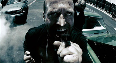
I think that intensified continuity became the new baseline for popular filmmaking both in the US and overseas. Over this style, however, some filmmakers have laid lots of fancy filigree. Many flashy techniques fill our movies. We get slow-motion, fast-motion, reverse-motion, ramping, and freeze-frames. There are brutal jump cuts, ragged shifts between color and monochrome, deliberately awkward framings, abrupt overhead compositions, slippery focus, and jerky handheld shooting. On the soundtrack we get ominous rumblings, metallic crashes, and noisy transitions. The Bourne films and The Hurt Locker (2009) offer moderate examples, but edging toward the extreme you have Crank 2: High Voltage (2009). Here intensified continuity has itself been intensified to a height of frenzied artifice. “Over the top” doesn’t capture it. There is, it seems, no longer a top to go over.
This swaggering style takes classical space and time as its basis—we still have analytical cutting, over-the-shoulder shots, and the like—but it pushes beyond the modest demands of simply laying out dramatic elements for easy comprehension. The intensified approach, itself trying for punch, has been raised to a new level of shock and awe. This trend, I’d speculate, is an escalation of tendencies seen in 1970s-1980s filmmakers like Brian De Palma, Ken Russell, Nicholas Roeg, Ridley Scott, and Scorsese.
Scorsese’s stylistic élan proved enormously influential, I think; Mean Streets is virtually a compendium of the new techniques. But unlike some others, he explored the emerging style in order to probe characters’ feelings and moods. Many of today’s amped-up techniques come off as merely eye candy, or prods for visual arousal, or pieces of narrational subterfuge (as often in De Palma). Scorsese has sought to make these decorative techniques more operatic—perhaps in the tradition of Visconti, Michael Powell, and other filmmakers he admires. The images (and of course the music) swirl around the action, providing cadenzas that bring out feelings which his men often can’t articulate. Sometimes the stylistic accompaniment becomes bombastic, as I think Shutter Island largely is. Yet the finest of Scorsese’s pictures contribute to a rich tradition in which the cinema, normally committed to objective realism, makes palpable what goes on inside us.
Scorsese’s remarks on The Age of Innocence come from a Film Comment interview with Gavin Smith reprinted in Martin Scorsese Interviews, ed. Peter Brunette (Jackson: University Press of Mississippi, 1999), 200. For more on Expressionist and Impressionist silent cinema, see our Film History: An Introduction, Chapters 4 and 5. By the end of the 1920s, these tendencies and Soviet Montage were blending into a sort of international style, a development considered in Chapter 8.
Taxi Driver.
PS 24 April: Filmmaker Max Jacoby writes:
I just read your blog entry on Scorsese’s style. You point out the glowing light which appears in some scenes of Bringing out the Dead. That is actually a signature lighting effect of cinematographer Bob Richardson. He has used this before he came into contact with Scorsese. You can already see it in some of the Oliver Stone films that he shot, such as JFK. This glowing effect is achieved by combining an overexposed toplight (several stops over key) with a diffusion filter (such as a White Pro Mist) in front of the lens or a net behind the lens. You can actually see the pattern of the net in question on the close-up of Nic Cage that you picked; it clearly stands out from the out-of-focus highlights in the background.
The net is more than likely a Christian Dior Denier 10 stocking, made of silk. They are very sought after and hard to find nowadays, because Dior stopped making these some years ago and switched to nylon instead. Once that became known, you had plenty of cinematographers invading women’s underwear stores to buy up the last remaining stock!
Max’s point helpfully indicates how a director can give a DP’s preferred choice a particular function. It seems to me that Scorsese’s patterned usage of the glowing white patches creates a significant motif in the movie–especially when it dominates the last shot, always a crucial moment. Thanks to Max for this, and for a followup reference to Eric Rudolph’s article, “Urban Gothic” in American Cinematographer 80, 11 (November 1999), 30-41; available here. In it Richardson discusses the flaring whites I mention in the blog entry.


