Archive for the '1910s cinema' Category
A hundred years, plus a few thousand more, in a day
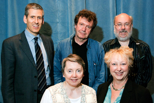
Charlie Keil, Yuri Tsivian, Henry Jenkins, Kristin Thompson, and Janet Staiger. Photo by Joel Ninmann.
Last Saturday we held the symposium “Movies, Media, and Methods” in honor of Kristin’s arrival at age sixty. Four distinguished scholars, all professors from major universities, presented top-flight talks. As a bonus, Kristin gave The Film People a glimpse into her Egyptological work. I report on this very full day in the hope of giving a sense of how stimulating we found it.
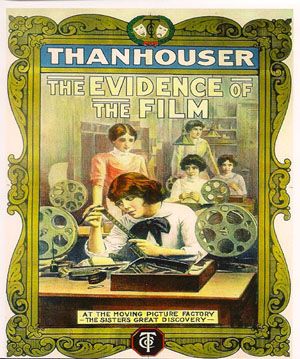
Thanhouser was an American film company that flourished between 1909 and 1917. It has been overshadowed by Biograph because that firm put out more films and, not incidentally, employed D. W. Griffith. But Ned Thanhouser has been diligently gathering his family company’s output from archives around the world and releasing it in informative DVD editions. The most famous Thanhouser production is probably Cry of the Children (1912), a powerful attack on child labor. You could also try the thriller The Woman in White (1917), adapted from Wilkie Collins’ masterful novel. A study in sadism, and more subtle than The Girl with the Dragon Tattoo.
Charlie Keil, an expert in 1910s US film from the University of Toronto, examined Thanhouser’s films with two questions in mind. Did the studio have a “distinctive personality” in its products? And does its output reflect the development of film style across the crucial transitional years of the early 1910s? Borrowing a method that Kristin had applied to Vitagraph films in an essay, Charlie took one film from 1911, one from 1912, and one from 1913. Charlie wasn’t ready to conclude that these specimens displayed a unique studio style, but it was clear that across just three years, big changes in storytelling were taking place.
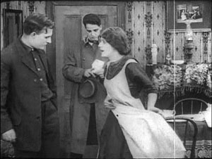
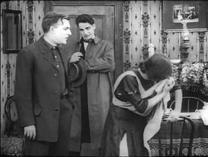
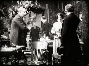
The plot of Get Rich Quick (1911) involves a man who joins a business that is scamming innocent investors. The film uses only five locales and plays scenes in long takes. The Little Girl Next Door (1912) has a more complex plot, with two distinct lines of action that converge on a child’s drowning. It uses many more locales and an ellipsis of a year to trace the changes in a family’s fortunes. It also incorporates cut-in close views and point-of-view editing. The Elusive Diamond (1913) is less psychology-driven than The Little Girl Next Door, but its intrigue relies almost completely on dialogue titles and it includes many close-ups and variation of camera setups.
Three films and three years: A vivid cross-section of the rapid development of what soon became classical visual storytelling. Moving from 18 shots to 53 shots to 74 shots, the films became less dependent on staging and more dependent on editing. At the same time, Charlie didn’t fail to notice how the long takes in Get Rich Quick allow some felicities of performance, particularly the way that the wife’s handling of her apron charts her psychological states. She brushes it aside to show how poor they are, then she uses it as a giant hankie.
Like all good papers, Charlie’s left a lot to be discussed. People asked about how much pre-planning was done at Thanhouser, about the directors and screenwriters on staff, about the division of labor. We were left with a sense that here was another mostly unknown region that would reward further study.
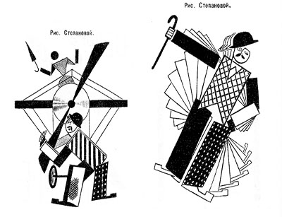
Fernand Léger, Cubist Charlot (1923).
Yuri Tsivian of the University of Chicago carried us into the twenties with an in-depth examination of early Russian reactions to Charlie Chaplin. The paper held many surprises. Chaplin was popular in many countries from 1915 onward, and very soon after he was celebrated by European intellectuals. But Russia lagged behind; there’s no concrete evidence that any Chaplin films were shown there until 1922. Yet the Soviet avant-garde embraced him. How and why?
Instead of looking for a dual relationship—Chaplin directly influencing Russian artists—Yuri postulated a “triangular” relationship, in which Chaplin’s image was mediated through other European sources. For instance, Léger’s numerous images of a fragmented Chaplin led Futurists and Constructivists to declare Charlie “one of us.” They loved the idea of man as a machine executing precisely articulated movement, and what they heard of Chaplin’s pantomime and gags led them to praise him. Chaplin, said Lev Kuleshov, is “our first teacher” because he knows bio-mechanical premises better than anyone. According to the photographer and graphic designer Rodchenko Chaplin instructs viewers in how to walk or put on a hat in the most perfect manner.
So strong was this “virtual” image that artists could read Chaplin into the slapstick comedians they did see. Yuri showed that Varvara Stepanova’s striking rendition of Chaplin as an airplane propeller derived from a film he wasn’t in!
Perhaps she didn’t care: Nikolai Foregger suggested that Chaplin himself was unimportant, that the crucial fact was that he created a whole school of comedians within what Yuri called “a collaborative research community”—that is, Hollywood!
Yuri’s paper, in homage to the Russian Formalists, invoked the “law of fortuity” in art. This refers to the possibility that artistic borrowings, blendings, and crossovers are not determined by any broader social processes, as the Marxists were arguing, but are merely contingent. “Life interferes with art from below.” Accidents and unforeseen intersections, such as the Chaplin craze meeting the Constructivist movement, allow artists to seize on whatever is around them for new material. Yuri’s reference was to Kristin’s revival of Formalist methods in her “neoformalist” studies of Eisenstein, Tati, and other filmmakers.
Janet Staiger of the University of Texas at Austin collaborated with us on The Classical Hollywood Cinema, and she has for several years been the leading scholar of reception studies in film and television. In looking at the Indiana Jones series, her paper nodded to Kristin’s work on the Lord of the Rings franchise and her study of fans’ responses to the films.
“Nuking the fridge,” Janet explained, has become fan jargon for an outrageous plot twist. The phrase comes from a notorious moment in Indiana Jones and the Kingdom of the Crystal Skull (2008), in which Professor Jones escapes an atomic blast by diving into a lead-lined refrigerator. The moment becomes a crux for clashing fan judgments: This is totally unrealistic vs. Realism doesn’t matter. Janet went on to show how these and other fan responses, entwined in IMDB commentary threads, utilized several different interpretive frames.
One was authorship. Like academics and journalists, fan are auteurists. They assign the director responsibility for major aspects of the film. But this doesn’t mean that they agree in how to use this frame. In the case of Crystal Skull, a certain Kid Mogul asked if Spielberg’s willingness to reinvigorate the franchise was purely mercenary: “Is it just about the money?” Others took a more career-survey approach, noting that after prestige pictures like Schindler’s List Spielberg recalibrated his popcorn movies, particularly by handling violence more gingerly.
Another frame was story-based “lit talk.” Fans disparaging the film found it clumsily plotted and lacking in character development. Several were quite sensitive to narrative coherence, one-off gags (such as nuking the fridge), and pacing. Those defending the film appealed to the emotional burst of the final chase scenes.
Janet’s third frame of reference was what she called “formula dissonance.” She sought to capture what seeing the film would be like for those who knew Indy’s story only through the TV series or video versions of the earlier installments in the franchise. She suggested that the formula was by 2008 quite abstracted and idealized for many fans. Their sense of the franchise was thus tested by the extraterrestrial twist that resolved the Crystal Skull plot. Does it reframe the whole series in a cosmic context, or is it a violation of the premises of the Indy universe?
Janet’s survey of these types of responses made me notice that the assumptions of academic film studies and of journalistic criticism overlap with fan conversation. Fans who liked the film tried to make everything fit by appeal to organic unity, technical proficiency, emotional intensity, and other familiar criteria. It made me suspect yet another reason why “amateur” and “professional” film criticism seem to be merging: Perhaps their conceptual frames of reference aren’t so far apart. But their tastes and their degrees of commitment surely are.
You might have expected Henry Jenkins of the Annenberg School at the University of Southern California to talk about fans too. After all, he practically invented the modern study of media fandom with his book Textual Poachers, and his work influenced Kristin’s study of fan promotion of The Lord of the Rings. Instead he turned to a survey of an artist’s oeuvre. He showed how Kim Deitch’s vast output of stories appropriate imagery from nineteenth and twentieth century mass media and present highly personal versions of the history of popular culture.
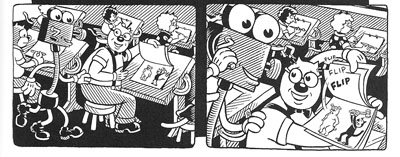
In a way, though, Henry’s talk involved fandom because Deitch is himself a prototypical fanman. He’s an obsessive collector, likely to turn his search for a rare toy or drawing into a Byzantine odyssey on the page. Fascinated by Hollywood scandal, he has constructed a phantasmagoric history of mass media through fictional characters (e.g., fake movie stars) who confront real people (e.g., Fatty Arbuckle). He’s particularly concerned about what he takes to be the warping of animated film by the influences of the mass market, epitomized by the Disney empire. The emblematic moment in Boulevard of Broken Dreams comes when Deitch’s Winsor McKay stand-in addresses torpid animators at a tribute dinner and denounces them for selling out.
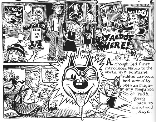
Deitch’s most famous character is Waldo the cat, and Henry traced the powerful connotations of this emblematic figure. Waldo recalls Felix, the most heavily merchandised comics figure before Mickey, as well as the black cat as a figure of deception, witchcraft, and even African-American minstrelsy. Through Waldo, Deitch could hop across the history of film and comics, from McKay to Mighty Mouse and 1940s abstract films. In Alias the Cat!, Deitch finds in the 1910s everything that we associate with media today: serial narrative, stories shifting across different media platforms, an uncertain line between publicity and self-expression, and a mixing of news and sensational fiction.
Henry situated Deitch in a broader trend of comic artists trying to find a new history of their medium, one that dislodges superheroes from a central role. Deitch’s themes of old-fashioned craftsmanship, lovably antiquated technology, adult dread and degeneracy lurking behind children’s stories, and the commodity demands of comic art link him to contemporaries like Chris Ware and Art Spigelman.
Henry’s talk spurred a lot of discussion, including the question of whether we can treat an artist as offering a history that is comparable to academic research. Can Deitch’s hallucinatory vision of American media be a plausible basis for understanding what really happened? On the whole we don’t expect an artist to offer rigorous arguments. An artwork appropriates history for its own end. (Not all the Greek philosophers actually gathered together in the way Raphael depicts them in the School of Athens painting.) How cogent you find Deitch’s critique probably also depends on whether you share his disdain for Disney. His floppy-limbed denizens fuse headcomix grotesquerie with the 1930s animation that most prestige studios abandoned. As in Sally Cruikshank’s sprightly cartoon Quasi at the Quackadero, Deitch’s rubbery frames revive a style in which everything seems to throb and shimmy.
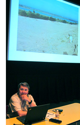
Kristin’s talk, “How I Spend My Winter Vacations: The Amarna Statuary Project and Techniques of Visual Analysis,” had two parts. In the second part, she reviewed her recent work in assembling statues out of tiny bits that had been dumped by archaeologists decades ago. You can read some of this story here. The side of her work most intriguing to students of film, I think, involves her attraction to Egyptian art in the first place.
Egyptian art is often thought of as unrealistic, but during his reign in the fourteenth century BCE the pharaoh Akhenaten introduced a peculiar sort of stylization into it. When he instituted a monotheistic religion centered on the sun god Ra (embodied in the Aten), he also demanded a new pictorial style. Thus the Aten is depicted as a disc shedding rays, a symbol of life and dominion. In addition, the royal family displays biggish hips and thighs, which fit the fecundity theme. More strikingly to our eye, Akhenaten’s family were represented as somewhat distorted, with long and narrow faces, hands, and feet. The ruler’s crown is elongated as well. Several aspects of the new style are present in Kristin’s favorite scene, a beautiful relief carving known as the Berlin family stela.
You can see the Aten’s rays ending in little hands holding ankh signs to the royal couple’s noses. But just as important is the human dimension of the scene, and two sorts of action displayed there: swiveled shoulders and pointing hands.
Unlike the flat, frontal portrayal we associate with Egyptian art, the family members are caught in twisting postures that bring one shoulder forward. Kristin explained:
Akhenaten is lifting his daughter, his foreground arm moving backward to hold her legs, the other moving forward to support her body as he kisses her. She reaches with her rear arm to chuck him affectionately under the chin, while her other arm moves backward in a pointing gesture. On the opposite site, Nefertiti’s foreground arm is held bent and backward to steady the youngest daughter of the three present, who is standing on her thigh and reaching up rather precariously to grab a golden decoration hanging from her mother’s crown. Nefertiti’s rear hand goes forward to steady the second daughter, who is also pointing, this time with her rear arm as she twists to look at her mother. These kinds of gestures can be found again and again in such scenes.
The twisting movement wasn’t unknown among images of workers and private individuals; Amarna artists, presumably encouraged by Akhenaten, applied the device to portraying the royal family.
Just as significant are the pointing gestures we find in the stela. Some scholars have interpreted them as protective gestures, which are found in other images. But Kristin points out:
 In those cases, the protecting figures hold their arms straight, they stare in the direction of the thing to be protected (as one presumably would in reciting a spell), and there is something dangerous present. None of this applies in the scene in the stela.
After pondering this scene quite a lot, it occurred to me that it looked like a really early film, a short scene, perhaps 30 seconds long, that we were to interpret as a tiny narrative. The pointing gestures seemed comparable to pantomime, where one has to interpret movements in the absence of intertitles.
Given that so much Amarna art is about displaying the royal couple as having created life by giving birth to their daughters and as sustaining that life, it seems to me that this stela is full of indications of nurturing. The columns and roof indicate that the parents have their kids in a little shelter to keep them out of the hot sun. The rows of pots behind Akhenaten’s stool are no doubt filled with cool drinks for them. Nefertiti carefully holds onto the two children on her lap while Akhenaten kisses the eldest. My interpretation is that the eldest is saying something like, why don’t you kiss sister, too?” and the one opposite is pointing out the kiss to her mother and saying something like, “Look, daddy’s kissing sister; I want a kiss too.”
This may not sound like the sort of thing kids would say, but the circulation of affectionate gestures among the family members in these casual scenes is nearly universal. The chucking under the chin gesture used by Meretaten here shows up again and again, as do embraces and kisses.
Despite all the stylization, then, Kristin concludes that the stela depicts a scene of intimate affection, complete with a child toying with a mother’s ornament. This homely realism chimes with other realistic tendencies in Amarna art, such as the differentiation of right and left feet and the presentation of plants and animals in non-stereotyped ways. In sum, Kristin’s ability to look closely at film style helped her make discoveries about visual narrative in a completely different domain.
So our Saturday talks included cinema-related material from 1911 to about 2010, and with Kristin’s lecture we flashed back about 3300 years. Every talk was crisp and lucid. We were spared the juggling of empty abstractions, the free-associative rambling, and the self-congratulatory cleverness that plague the humanities. We got knowledge and opinion presented with enthusiasm, modesty, and good humor.
Kristin and I are grateful to our presenters, as well to all the friends old and new who showed up: Leslie Midkiff Debauche from Stevens Point, Carl Plantinga from Michigan, Peter Rist from Montreal, Brenda Benthien from Cleveland, Virginia Wright Wexman from Chicago, Vicente José Benet from Spain (via Chicago) and many others. In all, a day to remember.
For more information on Kristin’s research see my earlier entry. For other cinematic implications of the Berlin stela of Akhenaten’s family , see Kristin’s blog entry here. Her article, “Frontal Shoulders in Amarna Royal Reliefs: Solutions to an Aesthetic Problem,” is available in The Journal of the Society for the Study of Egyptian Antiquities 27 (1997, published 2000).
All of our speakers are represented on the Web: Henry here, Charlie here, Janet here, and Yuri here (and of course on Cinemetrics). For more on Janet’s study of online critics and the frames they inherit, see her essay, “The Revenge of the Film Education Movement.”
Kim Deitch, Boulevard of Broken Dreams.
Paris-Berlin-Brussels express
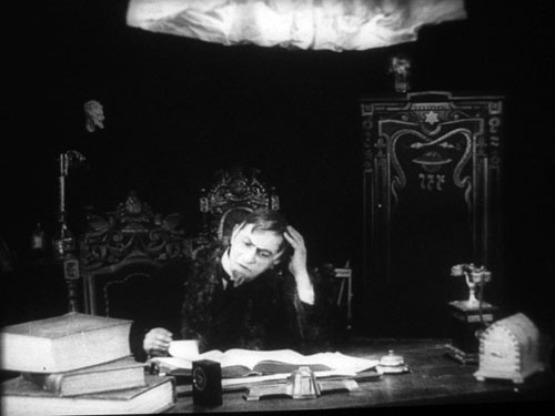
Doktor Satansohn.
Our trip to Europe has come to an end, and so we finish with a post scanning some highlights.
The magic lantern learns new tricks
DB here:
What am I seeing? Many avant-garde films pose this question. Mainstream fiction film and documentary cinema have mostly relied on the idea that the image should be recognizable as “what it is.” But one strain of experimental film has worked to delay or even prevent us from making out what’s in front of the camera.
Sometimes we lose our bearings only briefly, as when we eventually identify pot lids in Ballet Mécanique or bits of sunlit linoleum in Brakhage films. Sometimes language points out what’s really there. The titles of Joris Ivens’ Rain and the Eames’ Blacktop: The Washing of a School Play Yard allow us to enjoy the ways that ordinary sights can yield unexpected abstraction. Sometimes we toggle back and forth, as when in Ken Jacobs’ Tom, Tom, the Piper’s Son recognizable human figures, however grainy, jump into sheer blotchiness and then back into something like legibility. But other times we can’t ever tell what we’re seeing. Brakhage’s Fire of Waters offers one of the best examples I know, with its jagged bursts of light in a smoky void.
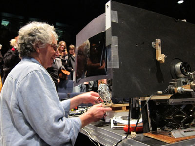
What am I seeing? The uncertainty was doubled during my visit to Ken Jacobs’ Nervous Magic Lantern performance at the Cinémathèque Française. I say “doubled” because at least with Fire of Waters and Tom, Tom I knew I was watching a film. With this display, What am I seeing? started as a question about the format itself. Was it a film, a video, or something else?
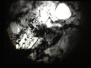
Then the question became the customary one. Off-white textures—pebbly, dribbly, stalagmite-like—swim in and out of focus. Some are viscous and globular, some are like tangled foliage. They seem to spiral, but actually (I put up a finger to measure) they barely move. The effect of movement is given by pulsations of pure black, breaking the lyrical effect of the surfaces with a harshness that becomes aggressive. Aggressive as well is the soundtrack, blocks of sound from subway platforms and traffic and kitsch Latin percussion, all played at high volume. The surfaces just keep shifting and not shifting, sort of rotating while jabbing out at us, lovely and anxiety-inducing at the same time.
At the end of the performance, people crowded around the cardboard booth in the middle of the theatre. As Ken and Flo Jacobs packed up, they showed how they had generated the effects. What had I been seeing? Neither a film nor a video but a true magic-lantern display, assembled on the spot. But what had I been seeing? Something created with home-made equipment of a startling simplicity. (Strapping tape was involved.) Our magicians explained their tricks, like magic-lantern operators of earlier centuries explaining the science behind their shows. But I think it’s best that you not know until after you have a chance to see what they create.
In earlier entries (here and here) Kristin and I have praised Jacobs’ films for showing how very slight adjustments in technique or technology can create disturbing cinematic illusions. In this vein, the first item on the Cinémathèque program, a video called Gift of Fire, turned Louis Le Prince’s brief 1888 street scene into a 3D movie. (The homage was appropriate because Le Prince experimented with multiple-lens cameras.) The Nervous Magic Lantern performance generated a different sort of illusion, one conjuring up micro-landscapes and otherworldly vortices. In all, Jacobs makes us realize how many evocative effects are still to be discovered by tinkering with images thrown on a screen.
Detour to Berlin
KT here:
As David mentioned in last week’s entry, I took a week in the middle of our visit to Europe for research at the Ägyptisches Museum in Berlin. The staff there welcomed me into their storerooms, and I spent the days looking at fragments and the records of their discovery and the nights downloading and backing up my photos. No time for filmgoing. The most I managed was a trip to the well-stocked arts bookshop Bücherbogen, which has one of the best selections of film books to be found in Germany. Our old friend, experimental filmmaker Carlos Bustamente, met me there, and we had a quick cup of tea–most welcome on a cold morning when the results of the biggest snowfall in decades were still blanketing many sidewalks and roads.
I did note one film-related phenomenon, however. Every day I took the S-Bahn from Savignyplatz to Friedrichstrasse. The tracks pass directly across the street from the Theater des Westens (that is, the western part of Berlin). It was playing Der Schuh des Manitu, a musical version of the 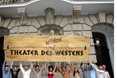 highly successful 2001 German film of the same name. (I hope the publicity photo at the left was taken in warmer weather than I experienced.) I mentioned the film here, in reference to the fact that every major producing country, and some minor ones as well, turn out their own local comedies, films that don’t travel well but are very popular locally.
By now it’s a familiar phenomenon in the U.S. for successful Hollywood films to be turned into stage musicals. It wasn’t always so. Back in the 1950s and 1960s, films were made of popular musicals, sometimes successfully, as with My Fair Lady, and sometimes not, as with Mame. But now the trend is the other way, with everything from Shrek to Hairspray getting the Broadway treatment.
It’s interesting to know that the same thing goes on abroad, though I’m not sure how prevalent such adaptations are. Der Schuh des Manitu, directed by Michael “Bully” Herbig, remains the highest grossing German film. Herbig doesn’t act in the stage play, as he did in the film, but he served as a creative advisor. The musical is a hit, having premiered on December 7, 2008 and it is expected to continue until at least the autumn of this year. There are several clips from both the film and the musical on YouTube. This one, at 8 minutes, gives a generous dose of the show. There are no subtitles.
I had only a couple of days back in Paris before we headed for Brussels for the final week of our trip. The German theme continued, since a few of the 1910s films David needed to see at the Cinematek here were German. The one I most wanted to see was Edmund Edel’s 1916 feature, Doktor Satansohn. Its main claim to fame is probably the fact that Ernst Lubitsch plays the title role. My book with Lubitsch started with his 1918 move to features, when he began to concentrate more on directing and less on acting. By 1920, with Sumurun, he appeared onscreen for the last time; being discontented with his performance as the tragic clown, he decided it was time to move behind the camera for good.
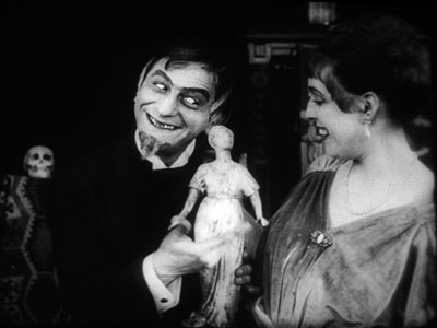
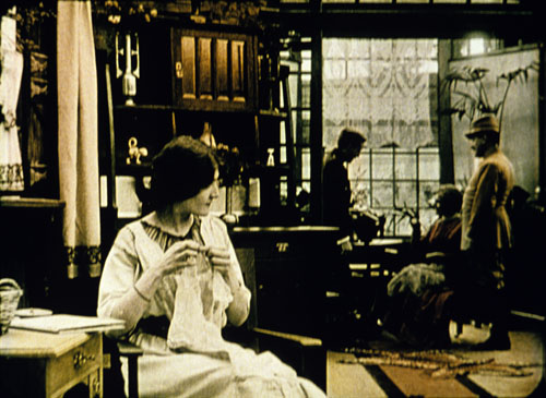
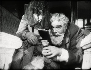
In the short films he starred in before 1918, Lubitsch often played a brash, ambitious Jewish youth, as in Der Stoltz der Firma (“The Pride of the Firm,” 1914). In Doktor Satansohn he’s a physician with a magical machine that transforms older women into beautiful young ones. We’re first introduced to a couple and the wife’s mother. When the latter makes a pass at her son-in-law and is rejected, she seeks the doctor’s help. His machine works by capturing the wife’s essence in a statuette and making the mother look like her daughter. Problem is, every time she’s about to kiss the husband, the doctor pops up with his devilish leer, visible only to the “wife.” David and I decided that the film is a comedy, though perhaps one only Germans of the day would find truly amusing. For one thing, the title character is clearly a Jewish caricature, one played to the hilt by Lubitsch. He decorates his machine with the Star of David and a Hebrew inscription (not to mention vipers and an image of Saturn).
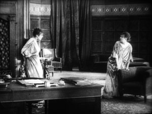
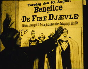
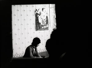
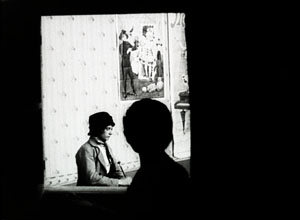
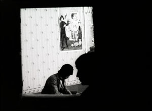
Stylistically it’s a fairly conventional film for its day, though the black background of the doctor’s office, with its stylized youth machine and satyr-like bust, gives a hint of Expressionism to come. (See our topmost image.) Inevitably near the end there comes the moment beloved of historians of pre-World War II German cinema. The real daughter, released from her imprisonment in the statuette, confronts her double in the doctor’s waiting room. The Doppelgänger motif strikes again.
I wonder if German films actually have more Doppelgängers in them than appear in other national cinemas. Do they really reflect the disturbed soul of the nation? Or did the possibilities of filmic special effects draw moviemakers to try and multiply single figures? Georges Méliès and Buster Keaton used in-camera techniques to multiple their own figures in virtuoso displays. I recall being impressed by The Parent Trap‘s duplication of Hayley Mills when I saw it as a kid, and the whole notion of a single actor playing twins and other lookalike relations is a common enough convention. In Doktor Satanssohn, the doubled figure appears only in this one shot, and it’s the leering Lubitsch, delighted with his own nastiness, who walks off with the picture.
The 1910s, again, and still
DB again:
We saw Doktor Satansohn while I was studying staging and cutting strategies of the 1910s, thanks to the remarkable holdings of the Royal Film Archive of Belgium, also known as the Cinematek. My comments on last summer’s visit are here.
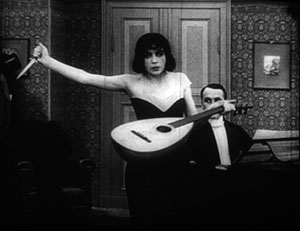
Another German film, in a choppy Russian print, vouchsafed a new glimpse of Asta Nielsen. In Totentanz (Urban Gad, 1912), she plays a guitarist-dancer who must take to the stage to support her infirm husband. She attracts the devotion of a composer, and soon she feels attracted to him. Torn between desire and duty, she snaps during a rehearsal of his latest piece, “Totentanz.” In a chilling gesture, she uses his dagger to slice her lute strings.
Soon the two are locked in a violent erotic struggle, and a stabbing ensues. In all, melodrama as ripe as one could want.
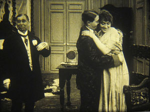
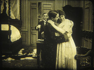
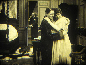
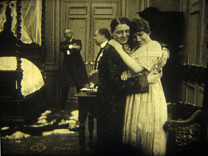
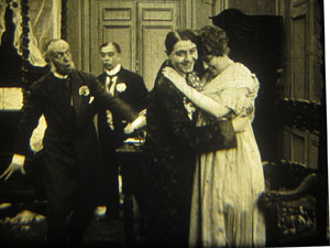
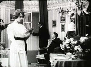
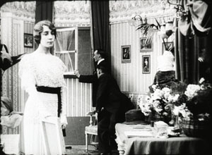
As ever, I was happy to have my hypotheses about tableau staging confirmed by several of the titles I saw. A minor French bedroom farce, Le Paradis (M. G. Leprieur, 1914 or 1915), had a brief passage of the sort of blocking and revealing we find in many films of the period. The painter Raphael Delacroix (no kidding) is pretending to be the lover of Claire Taupin to deflect the advances of randy M. Pontbichot. But Claire is actually the mistress of M. Grésillon. . . .
First, very frontal staging strings out Pontbichot, Raphael, and Claire. The older man relents in his pursuit of her.
In the vivid depth characteristic of the tableau tradition, Pontbichot withdraws. But his position accentuates that central door, which starts to open.
Most remarkably, Pontbichot ducks almost entirely behind the couple, giving pride of place to M. Grésillon’s arrival in the center of the shot.
Pontbichot slides out in time to register Grésillon’s outraged reaction to finding his mistress in another man’s arms.
Grésillon rushes to the frontal plane, furious. As ever, a thrust to the foreground creates a major spatial/ dramatic event.
Although the Le Paradis passage is ABC compared to the emotionally powerful patterns of staging we find in Ingeborg Holm (1913), it illustrates how even average films could resort to the blocking/ revealing tactic within the deep-space geometry of the tableau.
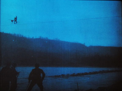
More flamboyant was Il Jockey della Morte (1915), an Italian circus film made by the Dane Alfred Lind. Its bold lighting and varied angles on the Big Top recalled the Danish films of a few years before. Halfway through, Lind launches a dazzling chase that features leaps from a tall bridge and bicycling stunts on a cable stretched across a river.
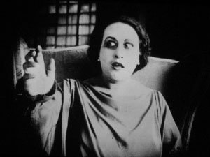
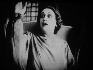
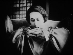
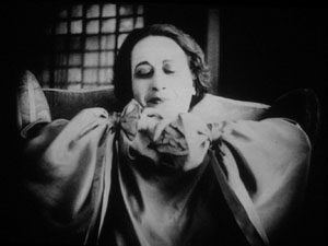
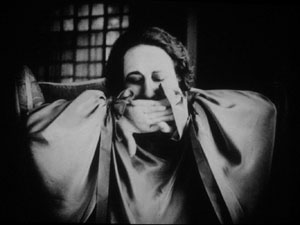
Another Italian film, this time a diva vehicle, suggests that by 1917 1923 (see below) the tableau style was already giving way had given way to scenes organized around close shots. (See below.) L’Ombra (Mario Almirante) starred Italia Almirante Manzini as a lively, trusting wife who becomes paralyzed. While her husband betrays her with her younger protégée, she gradually recovers bodily movement. Yes, a paralyzed diva seems a contradiction in terms, but one small-scale scene shows a remarkable range of emotions. Berta’s hands start twitching, one lifts up, and she stares wildly, as if it were an alien being.
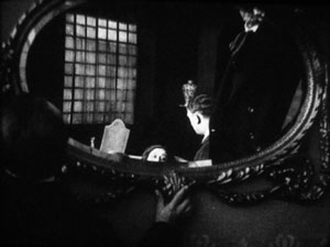
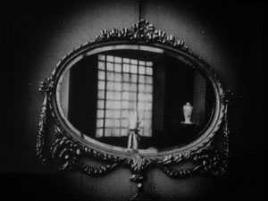
In an earlier scene, Berta had asked that a mirror facing her be tipped upward so that she would never see herself sitting immobile. This shot pays off now, when the hand ascends almost magically into the bit of reflection she can see.
When the hand descends, her astonishment turns into joy. She experimentally shoves the hands together, as if asserting her control.
In the end, she kisses her hands as if they were pampered children.
Manzini runs through many more micro-emotions than I’ve indicated here, but this sample is typical of the ways in which L’Ombra avoides the long-shot choreography of only a few years before and builds a performance out of face, body, and arms in a close framing. The mirror-shot motif shows that fairly careful filmic construction was emerging at this point too.
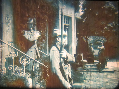
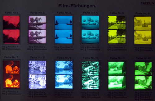
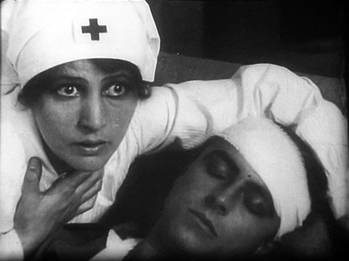
During my stay, I learned more about tinting and toning from the ever-helpful Noël Desmet. On the seldom-seen World War I drama L’Empreinte de la patrie (M. Dumeny, 1915), some images had curious oscillating patches of rusty brown. Noël explained that when Prussian Blue toning was combined with rose tinting, the chemicals eventually reacted to alter the pink cast. An example is shown at the top of this section, though the blue is more saturated in the original.
Once we get back to Madison, I’ll have to sort out all that I’ve learned from these movies. Onward and upward with the 1910s!
For more on Jacobs’ Nervous Magic Lantern, see Scott Foundas’ interview here. The Youtube clip doesn’t do the spectacle justice. If you must know something of Jacobs’ tools, the Dailymotion video from the performance I saw offers some clues. My notions about 1910s staging are laid out in On the History of Film Style and Figures Traced in Light. You can also find several discussions in earlier entries on this site. Just execute a search on tableau.
Now is a good time to thank Noël Desmet and Marianne Winderickx, both of whom are retiring from the archive in March. The research that Kristin and I have done over the years owes an enormous lot to them, and of course to the Director of the Cinematek Gabrielle Claes.
P.S. 15 November 2013: Ivo Blom has pointed out that the version of L’Ombra I saw wasn’t from 1917 but rather from 1923. Hence the corrections above. Thanks very much to Ivo! Go here for his blog and information about his newest publication on silent Italian cinema.
A tinting and toning sample card from the early 1920s. Courtesy Noël Desmet.
Seed-beds of style
The Hunt for Red October.
DB here:
Seminar, orig. German (1889): A class that meets for systematic study under the direction of a teacher. From Latin seminarium, “seed-plot.”
I retired from full-time teaching in July of 2005. Since then, while writing and traveling (both chronicled on this website), I’ve done occasional lectures. But this fall I tried something else. At the invitation of Lea Jacobs here at Madison, I collaborated with her on a graduate seminar called Film Stylistics.
It was a good opportunity for me. I had a chance to learn from Lea, Ben Brewster, and the students and sitters-in. The class also enabled me to test and revise some ideas I’d already explored, while garnering new ideas and information. I helped plan the sessions and pick the films, but I had no responsibilities about grading. I hope, though, to read the students’ papers at some point after the term is over.
Our goal was to introduce students to studying style historically and conceptually. We focused on group styles rather than “authorial” ones because we wanted to explore particular concepts. How useful is the concept of group norms in understanding broad stylistic trends? Can we explain stylistic change through conceptions of progress toward some norm? Does the model of problem and solution help explain not only a particular innovation but also the group’s acceptance of it? How viable are notions of influence in explaining change? How much power should we assign to individual innovation? Can we think of filmmaking institutions as not only constraining style (through tradition and conformity) but also enabling certain possibilities—nudging filmmakers in certain directions? Does stylistic study favor a comparative method, one that encourages us to range across major and minor films, as well as different countries and periods?
These are pretty abstract questions, so we wanted some particular cases. Lea and I picked three areas of broad stylistic change: the emergence of widescreen cinema in the 1950s, the arrival of sync-sound filming in the late 1920s, and the development of analytical editing or “scene dissection” in the 1910s and 1920s. We tackled these areas in this order, violating chronology because we wanted to move from somewhat hard problems to the hardest of all: Why did filmmakers in the US, and soon in other countries, move toward what has become the lingua franca of film technique, continuity editing?
The results of our research on these matters will emerge over the next few years, I expect. In the short term, during my final lecture Tuesday I went off on what I hope wasn’t too much of a tangent. I got interested in one particular kind of cut, and it led me to see, once more, how different filmmaking traditions can make varying uses of apparently similar techniques.
More cutting remarks
My concern was the axial cut. That’s a cut that shifts the framing straight along the lens axis. Usually, the cut carries us “straight in” from a long shot to a closer view, but it can also cut “straight back” from a detail. What could be simpler? Yet such an almost primitive device harbors intriguing expressive possibilities.
Axial cuts aren’t all that common nowadays, I think. Today’s filmmakers prefer to change the angle when they cut to a closer or more distant setup. But such wasn’t the case in the cinema of the 1910s and 1920s.
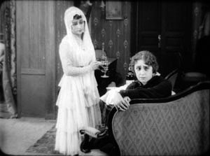
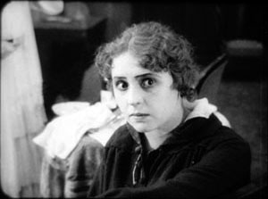
In the heyday of tableau-based staging, 1908-1918 or so, filmmakers seldom cut into the scene at all. European directors especially tended to shape the development of the action by moving actors around the set, shifting them closer to the camera or farther away. The most common cuts were “inserts” of details, mostly printed matter (letters, telegrams) or a photograph. But when tableau scenes did cut into the players, the cuts tended to be axial: the framing moved straight in to enlarge a moment of performance. Here’s an instance from the 1916 Russian film Nelly Raintseva.
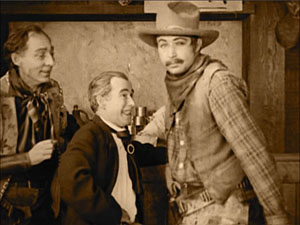
During the mid-1910s, American films moved away from the tableau style toward a more editing-driven technique. This approach often relied on more angled framing and a greater penetration of the playing space, of the kind we’re familiar with today. But axial cuts hung on in American films, even in quickly-cut scenes. Lea pointed out some nice examples in Wild and Woolly (1917), especially those involving movement. In the example below, the first cut carries us backward rather than forward, and the second is a cut-in, but both are along the lens axis.
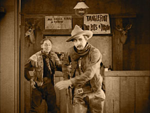
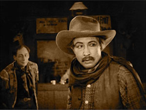
During the 1920s, axial cuts become a secondary tool of the American filmmaker, who now had many other camera setups available. But Soviet filmmakers of the 1920s, who adopted many American techniques in the name of modernizing their cinema, seemed to see fresh possibilities in the axial cut. For instance, in Dovzhenko’s Arsenal (1929), it becomes a percussive accent. The astonishment of a bureaucrat under siege is conveyed by a string of very fast enlargements.
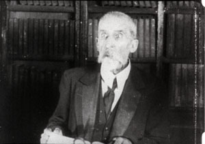
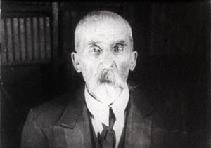
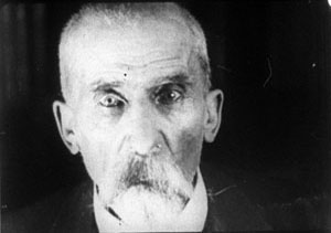
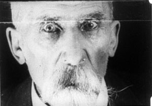
The Soviets called such cuts “concentration cuts,” a good term for the way they make a figure seem to pop out at us. From being a simple enlargement (in tableau cinema) or one among many methods of penetrating the scene’s space (in Hollywood continuity), the axial cut has been given a new force, thanks to adding more shots and making them quite brief.
This aggressive method for seizing our eye—Notice this now!—has appeared in modern filmmaking too, as in this passage from Die Hard (1988).
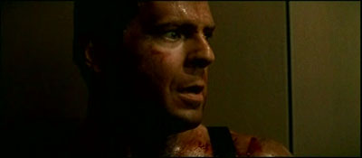
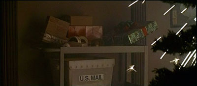
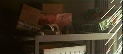
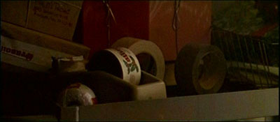
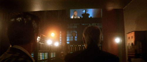
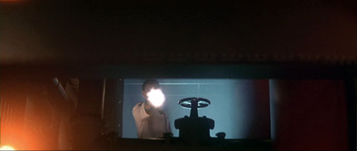
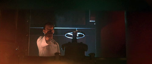
Here the axial cut is clearly subjective, rendering John McClane’s realization that he can use the Christmas wrapping tape in his combat with the thieves. Director John McTiernan employed the device again in The Hunt for Red October (1990). The frames surmounting this entry show the heroes suddenly being fired upon.
It seems likely that many modern directors became aware of this device from seeing Lydia’s discovery of the pecked-up body of farmer Dan in The Birds (1963). Hitchcock knew Soviet montage techniques, so maybe we have a chain of influence here. In any case, the somewhat overbearing aggressiveness of the concentration cut has often been parodied on The Simpsons. Here’s a recent example.


By the law of the camera axis
Axial cutting can be used more pervasively, as a structuring element for an entire scene. This is what Lev Kuleshov does in a climactic moment of By the Law (1926). Edith and her husband have kept the murderer at rifle point for days, and the strain is starting to show. She becomes hysterical, and Kuleshov uses a ragged rhythm of stasis and movement to convey it. First he cuts straight in from a master shot to a medium shot of her. I reproduce the frames from the film strip, for reasons that will become obvious.
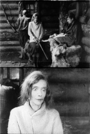
Then Kuleshov cuts straight back to the master setup. Again he cuts in, but to a closer view of Edith as she becomes more frenzied.
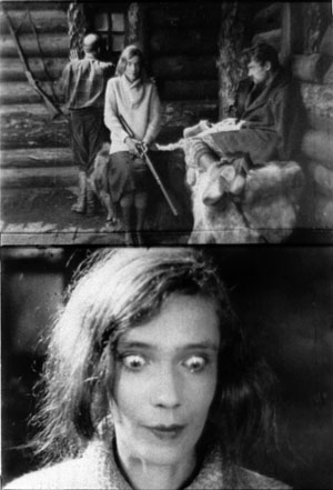
Cut back once more to the long shot, but only for fourteen frames. That shot is interrupted by a shot of Edith already laughing crazily, her head tipped back.
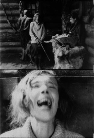
The shot of her laugh lasts only five frames, and this mere glimpse, combined with the blatant mismatch of movement, makes the onset of her spell all the more startling. When we cut back to the long shot her face and position now match.
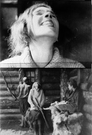
The abrupt quality of her outburst would not have been as striking if Kuleshov had varied his angle. As the earlier examples show, when only shot scale changes and angle remains the same, the cuts can be very harsh, and Kuleshov accentuates this quality with a flagrant mismatch.
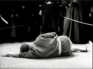
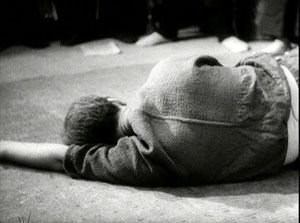
Akira Kurosawa likewise used the concentration cut to provide salient moments throughout his work; it almost became a stylistic fingerprint. At several points in Sugata Sanshiro (1943) he uses the device in the usual popping-forward way. But he varies it during Sanshiro’s combat with old Murai. He reserves dynamic, often elliptical cuts for moments of rapid action, and then he uses axial cuts for moments of stasis or highly repetitive maneuvers. In effect, the moments of peak action happen almost too quickly, while the moments of waiting are emphasized by cut-ins.
So at the start of the match, a series of axial cuts, linked by dissolves, present the fighters in a slow dance. But the ensuing throws are editing briskly. When old Murai is thrown and lies gasping on the mat, axial cuts accentuate his immobility. Kurosawa adds a rhythmic urgency on the soundtrack. After each cut-in, we hear the voice of Murai’s daughter, either offscreen or in his thoughts: “Father will win.” “Father will win.” “Father will surely win.”
The matching of lines to the editing is at work in the Simpsons parody too, in which the Comic Book Guy’s words are heard in tempo with the concentration cuts. “You. Are. Acceptable.”
Montage and the axial cut

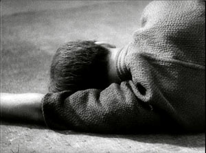
By now it’s easy for us to see that one scene from Alexander Nevsky (1938) opens with a series of axial cuts, out and in.
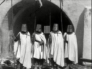
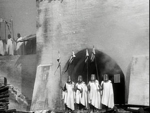
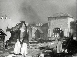
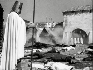
But why would Eisenstein, master of montage, regress to such a primitive device? He had occasionally used axial cuts in his silent films, as when we see Kerensky brooding in the Winter Palace in October (1928).
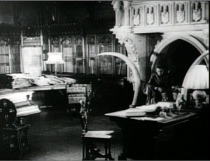
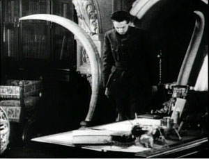
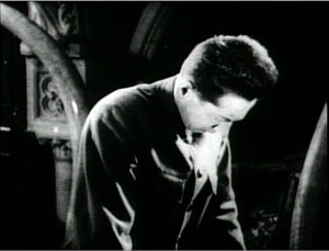
And Potemkin‘s famous cuts in to the Cossack slashing at the camera (that is, the baby, the old lady) are axial. (These cuts are pastiched by Eli Roth and Tarantino in Inglourious Basterds.) At the limit, Eisenstein toyed with the axial cut by moving the figures around during the shot change. In Potemkin, the ship’s officer reports to the captain that the crew has refused to eat. The captain leaves one shot and climbs the stair before Eisenstein cuts in to show him leaving again. The repetition would not be so perceptible if Eisenstein had varied the angle.
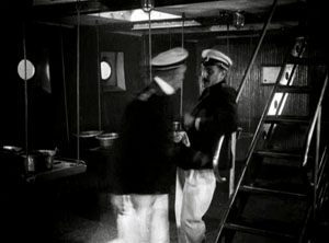
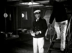
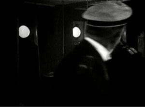
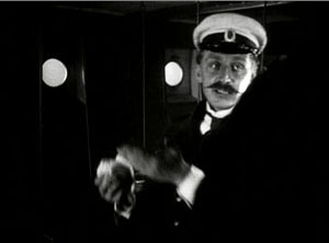
In the 1930s, Eisenstein began thinking about the axial cut as a basic structural element of a scene. In both his theory and practice, he promoted the axial cut to a level of prominence it hadn’t seen since the days of the tableau. Usually the cuts involve static subjects, like most of Kurosawa’s, but he still exploits the cut-ins to create vivid, if spatially impossible effects. At one point our popping in closer to Ivan the Terrible is doubled by him majestically and magically popping out of his tent to meet us, like a thrusting chess piece.
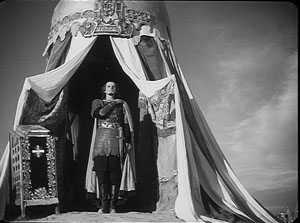
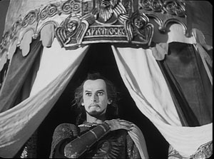
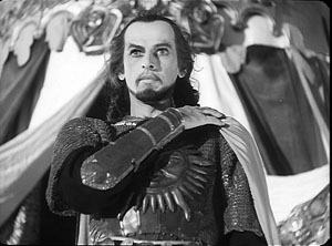
The new primacy of axial cutting comes from Eisenstein’s idea that “montage units” could powerfully organize the space of a scene. He thought that you could imagine filming a scene from only a few general positions, but then varying camera setups within each of these orientations. The montage unit was a cluster of framings taken from roughly the same orientation, as in the Pskov and Ivan scenes.
The idea may derive from his study of Japanese art, shown further above, in which he explored how a single image of a cherry branch could be chopped up into a great variety of compositions. In his course at the Soviet film school, he illustrated with a hypothetical scene of the Haitian revolutionary Dessalines holding his enemies at bay at a banquet. After imagining a master shot from the farthest-back position in the montage unit, Eisenstein proposes a series of dynamic closer views.
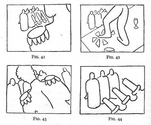
Eisenstein didn’t think that each scene had to be handled in a single montage unit. You could create two or three predominant orientations, with shots from each woven together. Or you could gain a sudden accent when a stream of setups from the same unit was interrupted by one from a very different angle. These ideas he put into practice throughout Nevsky and Ivan the Terrible.
Why? Eisenstein thought that combining shots taken from roughly the same orientation yielded a musical play between constant elements and variation. Each shot shows us something we’ve seen before but also something new, the way a bass line or sustained chords can continue underneath a changing melody. Eisenstein was convinced that this flowing weave of visual elements gave the spectator a deeper involvement in the film as it unfolded—an involvement akin to that found in Wagnerian opera.
The axial cut is a good example of how even a simple stylistic choice harbors rich creative possibilities. It also shows how a technique can change its impact in different filmmaking traditions. In the tableau tradition the axial cut was for the most part an abrupt enlargement heightening a moment of strong acting. In the early days of Hollywood continuity it became one editing option among many, and its power was somewhat muted. For the Soviets, concentration cuts could be multiplied and joined with fast cutting and big close-ups. The result could jolt the viewer by italicizing a face or an object–a purpose that has been taken up by contemporary Hollywood. For Kurosawa, the technique offered a way to contrast extreme movement and extreme stillness. And for Eisenstein, it suggested a global strategy for weaving visual elements into an immersive whole.
The protean functions assumed by this simple device remind us of how much there is yet to discover about film style. Despite all our discoveries over the last three decades, we have only begun. The name is apt: A seminar is where things start.
For more on the staging strategies of the tableau style, see On the History of Film Style and Figures Traced in Light: On Cinematic Staging, as well as blog entries here and here and here and here. You can find examples of emerging Hollywood continuity techniques in this entry on 1917 and this one on William S. Hart and this one on Doug Fairbanks. Sugata Sanshiro is at last available in a good DVD version from Criterion as part of its big Kurosawa box. Eisenstein’s ideas about the axial cut are explained in Vladimir Nizhny, Lessons with Eisenstein, trans. and ed. Ivor Montagu and Jay Leyda (New York: Hill and Wang, 1962), Chapters II and III. In The Cinema of Eisenstein I try to show how these ideas are employed in the Old Man’s late films.
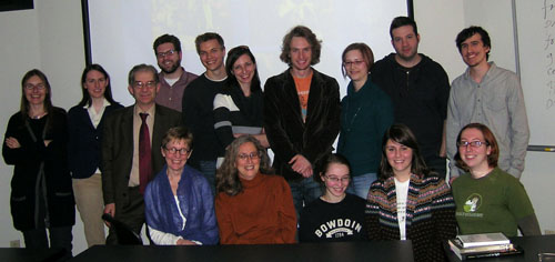
Seated: Leslie Debauche, Lea Jacobs, Rebecca Genauer, Pam Reisel, Amanda McQueen. Standing: Karin Kolb, Andrea Comiskey, Ben Brewster, John Powers, Tristan Mentz, Heather Heckman, Aaron Granat, Jenny Oyallon-Koloski, Jonah Horwitz, and Booth Wilson. Evan Davis had to leave early.
Searching for surprises, and frites
DB here:
Studying film history ought to be continually surprising. Yes, you often find your hunches and assumptions confirmed (which often means it’s time to check them again). But sometimes you find stuff coming out of left field that you had never expected. It would be too pompous to call these items breakthroughs, but every historian knows the little burst of pleasure that comes from seeing something that makes you say: How odd. I didn’t expect that. You might even allow yourself a Wow! now and then.
I was saying wow a fair amount during my two weeks in Brussels this summer. I go regularly, and not just for the moules, frites, and stoemp. I go to the Royal Film Archive, where I study old films. This time I was continuing to pursue some research questions that drove me in 2007 and 2008. What staging and editing strategies are at work in films of the crucial years 1910-1917? How might we explain the continuities and changes we find? I’m a long way from answering these questions fully, but I found some fresh and intriguing instances. One surprise is worth half a dozen confirmations.
Divas on parade
This year I concentrated on European movies. One of the most prominent genres of Italian cinema was the diva film, the movie whose dominant attraction was a beautiful, often fiery, somewhat otherworldly female star.The mesmeric charms of the genre have been celebrated in Peter Delpeut’s anthology film Diva Dolorosa, but the films really need to be seen in their entirety. The most comprehensive book on the subject is Angela Dalle Vacche’s Diva: Defiance and Passion in Early Italian Cinema, while my Wisconsin colleague Lea Jacobs has published detailed analyses of diva performance in Theatre to Cinema and here on the web.
In the 1910s, American cinema was turning out fast-paced films, but the diva films I saw provided less complex plots and remarkably protracted acting. An emblematic instance is the climax of Rapsodia Satanica (1917), starring Lyda Borelli. Alba has sold her soul to Mephisto in order to recover her youthful beauty. She toys with two men’s affections, and one kills himself (mysteriously leaving a scar on her face). The plot more or less halts.
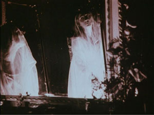
Alba retreats into her chateau and wanders the grounds. She glides forlornly through her garden, idles at the piano keys, and drapes herself along a bridge. She strews flowers on the floor and even dresses herself up as a priestess. Most strikingly, she floats into a cluster of mirrors and drapes herself in layers of veils, creating a gauzy shroud.
Run at 16 frames per second, this cadenza of apparitions consumes nearly a minute and a half. Such an exercise in atmospherics might be considered wasteful in an American film of the time, but it enhances the expression of Alba’s late-blooming spirituality—just before Satan comes to claim his pledge.
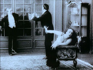
The same sort of languid choreography can involve other players. The diva’s performance, as Jacobs has shown, is often closer to dance than to orthodox acting, and she can weave arabesques around her more or less stationary suitors. At times the diva is a virtual acrobat. If you can call a contortion graceful, we can find it in the angular wrist maneuvers of Borelli in La Donna Nuda (1914).
The diva’s divagations are usually shot from a distance, and often there are big sets that are cleared of other actors to allow the actress maximum freedom and minimum distraction.At key moments, there might be a straight cut-in to the diva in medium-shot, but the visual narration keeps our attention fixed on a single arresting figure.
This tendency varies from the sort of ensemble staging that I’ve studied in more detail in On the History of Film Style and Figures Traced in Light. The staging is based upon the diva’s decorative elaboration of her emotional states, rather than in the shifting configuration of several actors. This difference reflects a variation in pace as well: The diva’s subtle changes of expression and posture emerge gradually, but the behavior of actors in ensemble scenes tend to accelerate the flow of action and reaction.
The spotlighting of the diva was not a big surprise, perhaps, but at least a reminder that there are always several tendencies at work in film in any period. More unexpected was the opening sequence of Il Fuoco (1915), in which the heroine visits a lake for a sketching session. As she sits down, a painter arrives to do some painting of his own. There follows a sequence of fourteen shots taken from eleven camera setups, some quite close to the actors. The sequence displays the sort of orthodox continuity that we associate with American films of the same year (The Birth of a Nation, Regeneration, The Cheat).
Granted, European films of the 1910s display freer camera setups in exterior settings than in interior sets. Still, the director of Il Fuoco, Giovanni Pastrone, shows an intuitive mastery of angled shot reverse-shots and consistent eyelines. It makes me eager to see whether other European filmmakers were developing a tradition of continuity editing akin to the American one.
Asta Nielsen was, so to speak, a Danish-German diva. A beanpole with a long face and a slash of a mouth, she might seem an unpromising vessel for languid eroticism. Yet Die Asta became an icon of silent film after her sultry dance in Urban Gad’s Afgrunden (The Abyss, 1910) won her an international audience. In Germany she turned out a vast number of dramas and comedies, with her as undisputed main attraction. Lest we think that the term “star” is a modern one, the title card for S1 (1913) is already playing a coy game.
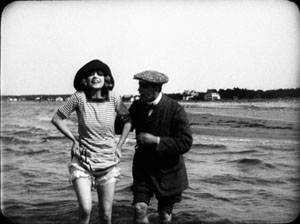
Again, with the spotlight on the heroine, the director’s decision can be simple. Evacuate the set and bring her closer to the camera, or if the set is cluttered, cut in to let Asta act.But she’s refreshingly unethereal, with changes of expression that are fleeting and unpredictable. At a lake with her lover, she flashes her legs at the camera and gives us a grin.
But a few frames later, her grimace becomes downright grotesque as she picks her way to shore. You can easily imagine her fear of losing her balance or stepping on a sharp stone.
Strong-willed and resourceful, Asta projects a wary intelligence. This, of course, doesn’t keep her from falling in love with worthless men.
Colorforms
Today’s archivists are determined to restore silent films to their original beauty, which includes the gorgeous colors achieved by tinting, toning, stencil coloring, and other techniques. Earlier this year Josh Yumibe came to our campus with a splendid collection of frames illustrating the range of possibilities. I saw several colored prints during my Brussels stay, including some original nitrate copies. Two from 1911 were films now acknowledged as “specialist classics.”
The Four Devils, directed by Robert Dinesen, is one in a cycle of circus films that was popular in Denmark at the period. A team of trapeze artists includes two men and two women; one couple has a steady romance, the other is fractured by the man’s attraction to a rich woman. Once Aimée is convinced of Fritz’s infidelity, she decides to kill him during a performance. The climactic “death leap” is rendered in about thirty shots, including one of an empty trapeze bar swinging. Under the big top, the compositions are full of detail and yet clearly laid out. And Dinesen reveals Aimée’s plan in one of the most ominous shots in silent Danish film.
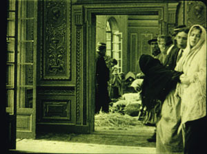
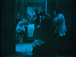
Even more visually remarkable is Victorin Jasset’s Au pays de ténébres (In the Land of Shadows, 1911), a grim naturalistic drama set among coal miners. The film occasionally displays principles of depth staging that would be elaborated in some of the masterpieces of 1913. In one scene, the miners’ families gather in an anteroom. As they wait to identify the men killed in a cave-in, the bodies are barely discernible in the distance.
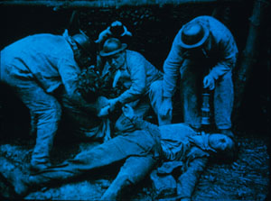
Au pays de ténébres illustrates a sort of structural usage of color. In scenes like the one above, the color is, in orthodox fashion, denoting a daylight interior. By contrast, the scenes in the mine are tinted blue, the standard hue for night and darkness.
But in the final scenes of the bodies assembled in the room of the dead, the color retains a blue cast, recalling the mine.
Thanks to the tinting, the living find themselves in the land of shadows.
Early auteurs
In the 1910s, we can find some distinct directorial approaches. One auteur is the German Franz Hofer, who liked to frame his actors in symmetrical architecture. Rectangular geometries are given a comic cast in Fraulein Piccolo (1915), a story about flirtatious officers and a schoolgirl forced to be both maid and bellboy. Here, two servants open doorways to watch a soldier starting to seduce the heroine.
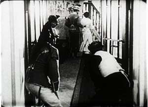
I hadn’t expected to find surprises in Henri Pouctal’s Chantecoq, a two-part French feature from 1916. Yet this espionage drama was consistently engaging, and not just because the popular comedian Pougaud played the deceptively naïve hero. Pouctal unrolls his scenes in an unusual variety of setups, including an astonishing low-angle view of two spies grappling with Chantecoq on the floor of a train compartment. The image recalls Anthony Mann’s steep railway compositions in The Tall Target.
Alfred Machin was Belgium’s preeminent director of the 1910s. He never seems to have seen a windmill he didn’t want to film, then burn down or blow up. Machin enjoyed recording Belgian folk culture, particularly village dancers, as is evident in classic one-reelers like Le Moulin maudit (The Accursed Mill, 1909), and he had a fondness for jungle cats like Mimur the leopard.
Each of the Machin features I saw shed light on my research questions. Le Diamant noir (The Black Diamond) confirmed that the European tableau style was by 1913 achieving considerable intricacy. In this film, Luc, a rich man’s secretary, is accused of stealing the daughter’s bracelet. The scene of the police interrogation is a muted ballet of figures retreating, advancing, blocking, and revealing.
The servant in the far distance returns to visibility when he’s needed to show the cops to Luc’s room.
In Machin’s La Fille de Delft (The Girl from Delft, 1914), the tableau depth cooperates with some muted cutting. Kate is a famous dancer, visited by Jef, the young shepherd who has loved her since she was a girl. In her dressing room, while stage-door roués wait to take her out for dinner, she gets a message from him.
As she lowers the note, she makes her two playboy admirers more visible; we can see them opening the window.
They peer out, and we get an over-the-shoulder shot of Jef waiting outside.
When we cut back to the master shot, the men are mocking him and Kate is deciding whether or not to admit him. She goes to the window herself and looks outside. Again we get the over-the-shoulder framing, but in two beats: Kate looking, then Kate looking away.
The poignant framing lets us linger on her moment of decision. When she closes the window, we know that she has decided to abandon her childhood friend.
Simpler in its drama and staging is Machin’s official classic, Maudite soit la guerre (Cursed Be War, 1914). Adolphe, a young man from a country suspiciously similar to Germany comes to Belgium, or a place like Belgium, to learn aviation. Adolphe falls in love with his host’s daughter Lidia, but soon war breaks out between their countries and they must part. The rest of the film, which includes some spectacular aerial scenes (and, naturally, a burning windmill), pleads for peace and brotherhood. Released in May of 1914, Machin’s anti-war film now seems a futile warning.
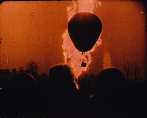
The Archive has restored the original’s Pathécolor, creating images of great loveliness. Some scenes show stenciled color, which helps articulate the planes of shots arrayed in depth. An example surmounts this blog entry. At other moments, deep red tinting enhances the battle scenes, notably one of an exploding dirigible.
In all, this outstanding restoration of Maudite soit la guerre reminds us of what audiences actually saw—films of deeply felt emotion, often accentuated by spectacular action like that on display today, and employing color with both intensity and delicacy.
The restorer’s art
During my stay, I particularly enjoyed the time I spent with Noël Desmet, supervisor of restorations at the Belgian Film Archive. Noël invented the most robust method of recovering silent film color. Around the world, archivists have adopted the Desmet system.
Noël is scheduled to retire in April of next year. His research will be continued by his colleagues, and he will enjoy some well-earned time among his orchids. Film culture rests upon the shoulders of committed archivists like him. Noël Desmet and his peers are the guardians of treasures, the patient preservers of the secrets and surprises harbored by the twentieth century’s most powerful art form.
For more on tableau staging in Europe and the US, see the entries linked above, as well as my notes from this summer’s visit to the Danish Film Archive, some comments on acting styles, my discussion of Charles Barr’s idea of gradation of emphasis, and an entry on hands and faces around a table. The most thorough analyses of these and other staging principles are in On the History of Film Style, Figures Traced in Light, and certain chapters of Poetics of Cinema.
For more information on Machin and Mimur, see the bilingual book edited by Eric de Kuyper, Alfred Machin Cinéaste/ Film-maker (Brussels: Royal Film Archive, 1995).The Diva Dolorosa disc contains extracts from major films, but unfortunately they aren’t specifically identified, and the original cutting patterns aren’t always respected. The difficulty with such celebratory appropriations of silent films is that they are unreliable as historical evidence. Worse, in today’s commercial market, such compilations make it unlikely that other video producers will launch complete DVD versions of the films.
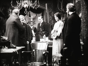
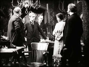
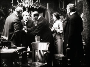
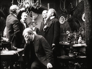
Tagebuch des Dr. Hart (Dr. Hart’s Diary, Paul Leni, 1916)
PS 18 August: Thanks to Armin Jäger for a name correction!


