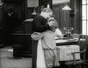
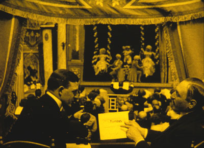
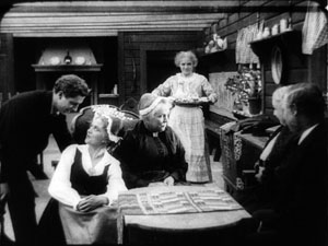
Archive for the '1910s cinema' Category
His majesty the American, leaping for the moon
DB here:
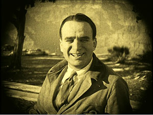
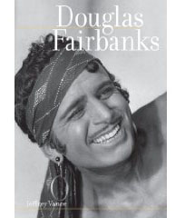 Douglas Fairbanks is remembered today as the nimble, insouciant hero of a string of swashbuckling films: The Mark of Zorro (1920), The Three Musketeers (1921), Robin Hood (1922), The Thief of Baghdad (1924), Don Q Son of Zorro (1925), and The Black Pirate (1926). He is the primary subject of a gorgeously illustrated, solidly researched new biography by Jeffrey Vance with Tony Maietta. Proceeding film by film, the authors interweave his life story with production data and summaries of critical reception. While tracing his career, they make an intriguing case that Fairbanks’ 1920s features more or less founded the modern film of action and adventure.
In the five years before The Mark of Zorro, Fairbanks made twenty-nine features and shorts. Vance and Maietta are enlightening on this period, but they treat it as prologue to the more spectacular work. Now, as if to counterbalance their book, comes a new Flicker Alley DVD collection, Douglas Fairbanks: A Modern Musketeer, gathering ten of the early films along with a very pretty copy of The Mark of Zorro and Fairbanks’ last modern-day movie, The Nut (1921), made because he wasn’t sure that Zorro would be a hit. (It was.) To the DVD package Vance and Maietta have contributed an informative booklet and they offer enlightening conversation in a commentary track for A Modern Musketeer (1917).
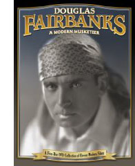 Kristin and I have long been fans of the pre-Zorro titles. Kristin wrote an appreciation of the early films for a Pordenone catalogue, and I studied Wild and Woolly (1917) as an early prototype of Hollywood narration. (1) There’s no denying that the 1920s costume pictures offer dashing spectacle and derring-do. But the 1915-1920 films are something special—lively, lilting, and unexpectedly peculiar. (2)
Before he became Fairbanks, he was Doug, the relentlessly cheerful American optimist. This star image was created very quickly, in films and in public events that made him seem the nicest guy in the country. His manic energy came to incarnate the new pace of American cinema, and his films helped shape the emerging precepts of Hollywood storytelling.
Doug
Consider his contemporaries. William S. Hart keeps his distance; perhaps his severe remoteness comes from secret pain. The result is a man you respect and admire but can hardly love. Mary Pickford, though, is lovable, and so is Chapin, although his cruel streak complicates things. But Doug is quintessentially likable. His early films present us with a brash youth who is all pep and pluck, bouncing with barely contained energy, unselfconscious in his engulfing enthusiasm for life. Today he could be elected President, the ultimate guy to have a beer with. (In real life Fairbanks was a teetotaler.)
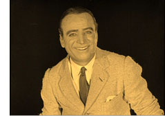 There is no guile in him, no hidden agenda. When he’s brimming with delight, as he often is, he flings his arms out wide. In another actor this would be hamminess, but for Doug it’s simply an effort to embrace the world. Any social embarrassments he commits—and they are plenty—he acknowledges with a puzzled frown before flicking on an incandescent grin. Who else makes movies with titles like The Habit of Happiness (1916) and He Comes Up Smiling (1918)?
But how can such a genial fellow yield any drama? Give him an idée fixe, a cockeyed hobby or life philosophy into which he can pour his adrenaline. Now add a goal, something that his obsession blocks or unexpectedly helps him attain. Toss in the staples of romantic comedy: a good-humored maiden uncertain how to tame this creature of nature, a few old fogeys, some unscrupulous rivals. Hardened crooks may make an appearance as well. Be sure to include some tables, chairs, sofas, or horses for him to vault over, as well as some perches near the ceiling or on the roof; Doug feels most comfortable lounging high up. Add windows, for his inevitable defenestration. (In a poem about him, Jean Epstein wrote, “Windows are the only doors.”) There should also be chases. Other comedy stars run because they must. Doug’s joy in flat-out sprinting suggests that he welcomes the chance to flush a little hyperactivity out of his system. At the story’s climax he must save the day, taming his obsession and achieving his purpose while acceding to the claims of the practical world.
An early example is His Picture in the Papers (1916). In this satire on vegetarianism and the American lust for publicity, Doug works for his father’s health-food firm, even though he prefers thick steaks. But he’s full of ideas for promoting the product. Doug needs money to marry his equally carnivorous girlfriend, but his father will give him the dough only if Doug can pitch their line of dietary supplements. Doug vows to get his picture in every newspaper in town. While he launches a series of high-profile stunts—wrecking his car, entering a prizefight, brawling on an Atlantic City beach—his sweetheart’s father is pursued by a gang called the Weazels, who try to extort money from him.
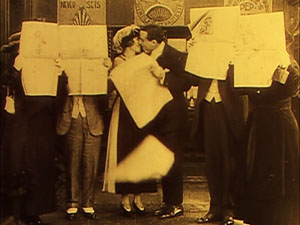
The two plotlines converge, with Doug stopping a train wreck and winning a place on the front pages. (In a sly dig at the press, each news story contradicts the others.) The movie is a little disjointed, but several scenes are remarkable, not least a boxing match in an actual athletic club before an audience of cheering Fairbanks pals. And there is more than one funny framing, notably a nice planimetric one showing all our principals lined up and reading different newspapers celebrating Doug’s triumph.
As the title indicates, in The Matrimaniac (1916) Doug’s goal is elopement, which he pursues obsessively. He evades a rival suitor, his girlfriend’s father, a sheriff, and a posse of city officials in order to tie the knot in a gag that must have looked radically up-to-date. Reaching for the Moon gives us a more philosophical Doug, a naive disciple of self-help books that urge him to strive, to concentrate, and above all to keep his eye on the most supreme goal he can imagine. He ends up in New Jersey.
Wild and Woolly (1917) casts Doug as the son of a railroad tycoon. Although he lives in Manhattan, he dreams of being a cowboy. His bedroom boasts a teepee, and he practices his roping skills on the butler. Sent out to Bitter Creek to investigate a deal, he encounters the rugged frontier of his dreams, complete with shootouts, town dances, and hard-drinking cowpokes. But all of this is a show, staged by the locals to make him look favorably on a railroad spur. In another twist, a crooked Indian agent uses the charade to rob the bank and stir up an Indian settlement. Now Doug’s obsessions prove really useful, as his cowboy skills rescue the town.
Wild and Woolly is among the very best of the surviving early Fairbanks titles, and its adroit storytelling is still admirable today. The best-known version was a very poor print, salvaged from the Czech archives and still circulating on barely visible VHS and public-domain DVD copies. Forget those. On the Flicker Alley collection the image quality, while not perfect, allows this trim little masterpiece to be appreciated. (3)
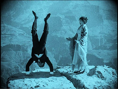
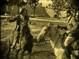
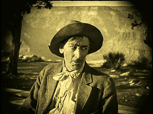
“Always chivalrous, always misunderstood,” reads one intertitle in another gem, A Modern Musketeer. Here Doug is possessed by the spirit of D’Artagnan, simply because while he was in the womb his mother was reading The Three Musketeers. He manages to live up to his heritage as he overcomes a philandering rival and a bloodthirsty Indian. The climactic chase takes place at the Grand Canyon, affording Doug a chance to shinny up and down cliffs and do handstands along a precipice.
Doug never does things by halves. In Flirting with Fate, he is a starving artist, out of money and apparently unloved by his girl. The logical solution is to hire a killer to end his misery. Of course Doug’s fortunes instantly change, and life becomes worth living, but then he must somehow find his assassin and call off the hit.
Many of the early films show the protagonist fully formed as a cross between a cheerleader and a track star. But Fairbanks made a big success on stage playing a sissy. The task in such a plot is to turn him into a red-blooded man. His first film, The Lamb replayed this lamb-into-lion plot, which also served as the basis for Buster Keaton’s first feature, The Saphead (1920).
In the Flicker Alley collection, this strain of Doug’s work is represented by The Mollycoddle (1920). Doug is the descendant of hard-bitten westerners, but growing up in England has made him a fop. Coming to America with a batch of wealthy Yanks, he is a continual figure of fun, waving his monocle and cigarette holder. Once in Arizona, however, he’s confronted with a diamond-smuggling racket. He starts to channel his ancestors and turns into a hell-for-leather hero. He allies with a tribe of exploited Indians to capture the gang, in the process indulging in leaps, falls, canyon-scaling, and fistfights in raging rapids.
The titles often invoke craziness, vide the Matrimaniac, The Nut, and Manhattan Madness (1916). But this motif is carried to an extreme in one of the strangest pictures of the still-emerging Hollywood cinema. When the Clouds Roll By (1919) crams in enough gimmicks for three Doug stories. First, our hero is neurotically superstitious. He will climb over a building to avoid letting a black cat cross his path. He meets a girl who is as superstitious as he is, so after a session at the Ouija board, they seem a good match.
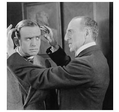 At the same time, however, a psychiatrist is making Doug the subject of a demonic experiment: Can one drive a person to madness and suicide? Through bribes and surveillance, Dr. Metz turns Doug’s life into hell—botching his romance, getting him disowned by his father, and even inducing nightmares. As if all this weren’t enough, the last reel jams in a train crash, a bursting dam, and a flood. Before this overwhelming climax, When the Clouds Roll By isn’t so much funny as eerily paranoiac. The way Dr. Metz’s Mabuse-like scheme enfolds everyone is as anxiety-provoking as anything in a film noir. This dreamlike movie ends on a surrealist note: Doug and his sweetheart get married when flood waters carry a church past them.
Across these films, in fact, the Fairbanks persona starts to disintegrate. Somewhat like those naïve Capra heroes of the 1930s (Mr. Deeds, Mr. Smith) who turn into melancholy victims in Meet John Doe and It’s a Wonderful Life, Doug becomes more brooding and helpless. In Reaching for the Moon, his absurd dream of glory is revealed as just that, a dream. When the Clouds Roll By saves itself from despair through splashy last-minute rescues.
Fairbanks was evidently becoming uncomfortable in cosmopolitan comedy. His taste for large-scale stunts and tests of prowess led him to the costume sagas of the 1920s. In the process, as Vance and Maietta point out, he cleared the way for Keaton and Harold Lloyd. Both comics would sometimes play obtuse idlers in the Lamb mode, and both would take thrill comedy to new heights. But avoiding Fairbanks’ ebullient optimism, Keaton brought a perplexity to every situation, along with an angular athleticism and a geometrical conception of plotting and shot composition. Lloyd frankly presented a hero lacking social intelligence, afflicted with a stammer or shyness or even cowardice, always desperate to fit in. Both men deepened the possibilities of modern-day comedy, thriving in the niche vacated by Fairbanks.
Bug and Mr. E
For nine of the early films, Fairbanks had the help of John Emerson and Anita Loos. All three worked on the stories, with Emerson usually directing and Loos writing the scripts and intertitles. The collaboration lasted only about two years, but it yielded some definitive moments in the creation of the Doug mystique.
Emerson found his first success acting and directing on the New York stage. Under Griffith’s supervision he started filmmaking in 1914, with an adaptation of his own successful play, The Conspiracy. I haven’t seen this or most of his other early work, but his 1915 Ibsen adaptation Ghosts, codirected with George Nichols, betrays little of the dynamism that would run through his Fairbanks projects (although The Social Secretary of 1916, without Doug, is lively enough). Emerson continued to direct films and New York stage productions until his death in 1936, at the age of fifty-eight.
Loos was a tiny prodigy. She sold her first scripts at age nineteen, with the third, The New York Hat (1913), directed by Griffith, earning her twenty-five dollars. (Her punctilious account book is reprinted in her 1974 autobiography Kiss Hollywood Goodbye.) After writing scores of shorts, she moved into features in 1916, when, she claims, Emerson discovered her script for His Picture in the Papers. Clearing the project with Griffith and casting Doug Fairbanks, the team proceeded. This, Fairbanks’ third feature, proved a great success and solidified important aspects of his star persona.
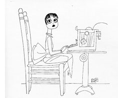 Loos married Emerson, whom she recalled as having “perfected that charisma, which even a bad actor has, of being able to charm his off-stage public.” (4) He called her Bug, she called him Mr. E., and they became a Hollywood couple. They kept themselves before the public eye with interviews and books like How to Write Photo Plays (1920) and Breaking into the Movies (1921). These are full of information about the filmmaking practices of the day.
Why did Emerson and Loos split from Fairbanks? Loos says that that Doug had become somewhat jealous of her notoriety. (5) Further, the couple yearned to return to New York. There Loos would hobnob with the Algonquin club crowd and write Gentlemen Prefer Blondes, a successful serial, book, play, and silent film. Eventually she would write plays and return to Hollywood as an MGM screenwriter.
Although they remained married and collaborated on plays and films, the pair eventually lived apart, the better to ease Emerson’s philandering. “Mr. E.’s devotion was largely affected by the amount of money I earned,” Loos recalled. (6) By her own testimony, she earned plenty. She writes in 1921:
The highest paid workers in the movies today are the continuity writers, who put the stories into scenario form and write the “titles” or written inserts. The income of some of these writers runs into hundreds of thousands of dollars a year . . . . Scenario writing does not require great genius. (7)
Loos is largely credited with bringing the witty intertitle into its own. Expository “inserts” were often neutral descriptions of the action or pseudo-literary ruminations. Loos created intertitles that were amusing in themselves. When Jeff, the hero of Wild and Woolly, comes to Bitter Creek he’s delighted to find a rugged life matching the one he mimicked in his East Coast mansion. So naturally Loos’ title reads, “All the discomforts of home.”
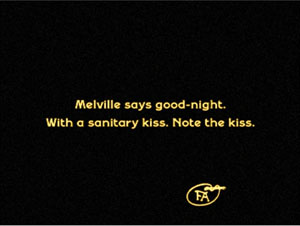
She wedged in puns, satiric jabs, and asides to the audience. The vegetarianism portrayed in His Picture in the Papers makes for anemic romance. Loos’ title prepares us:
The young suitor and Christine kiss by tapping each other’s cheek with their fingertips.
Later the intertitle stresses the more robust wooing program launched by Doug.
By the time Loos and Emerson left Fairbanks, the look and feel of their contributions had been mastered by others, notably director Allan Dwan, and smart-alec intertitles continued to grace Fairbanks’ modern comedies. Throughout the 1920s, most comedies would strive, not always successfully, for the cleverness Loos brought to the task. My own favorite in her vein comes in the Lloyd vehicle For Heaven’s Sake (1926). Harold is a millionaire courting a girl working in her father’s mission house in the slums, and one of the titles refers to “The man with a mansion and the miss with a mission.” Such niceties largely vanished when movies started to talk.
Cutting edge
We can learn a lot about the history of Hollywood from these films too. In the 1910s, narrative techniques were being put in place: the goal-oriented hero, the multiple lines of action, the need to prepare what will happen later, the use of motifs as running gags. At the start of The Matrimaniac, we see Doug sneaking into a garage and letting the air out of a car’s tires. Only later, after he has eloped with the daughter of the household, do we realize that this was a way to keep her father from pursuing them. In the course of the same film, the elopement is aided by passersby, and Doug keeps scribbling IOUs to pay them. At the end, the parson who has helped the couple the most is rewarded by the biggest payoff, with Doug shoveling bills at him.
The same years saw the consolidation of the “American style” of staging, shooting, and cutting scenes. (For more on this trend, see our earlier entries here and here.) Fairbanks’ films from 1916 to 1920 display a growing mastery of continuity techniques; the style coalesces under our eyes.
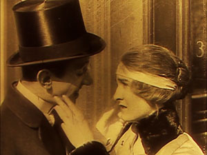
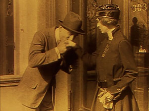
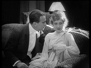
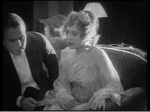
The system depended on breaking up master shots into many closer views. This practice was less common among European directors of the time, who might supply inserts of printed matter like letters but did not usually dissect the scene into shots of different scales. In His Picture in the Papers, for instance, we get a master shot (nearer than it would be in a European picture) of Melville paying court to Christine, followed immediately by closer views that show their expressions.
This is a minimal case. Not only are the shots all taken from the same side of the line of action (the famous 180-system) but they are taken from approximately the same angle. Filmmakers sometimes varied the angle more, usually to indicate a character’s point of view but sometimes to bring out different aspects of the action. (See here for examples from William S. Hart.)
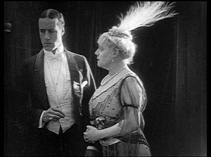
Very quickly directors realized that you didn’t need a master shot if you planned your shots carefully. In Flirting with Fate, the artist Augy is chatting with Gladys, while her mother and her rich suitor watch from another part of the room. No long shot presents both pairs.
The mother summons Gladys, and when she and Augy rise, director Christy Cabanne cuts to another shot of them, moving into the frame.
This is a very rare option in most national cinemas of the period, which would simply frame the couple in a way that allowed them to rise into the top of the same shot. Now Gladys hurries out, crossing the frame line. This exit matches her entrance on frame left, meeting her mother.
Such a scene is obvious by today’s standards, but a revelation at the time—a way of lending even static dialogue scenes a throbbing rhythm that absorbed viewers. Around the world, notably in the Soviet Union, young directors saw this as the cutting-edge approach to visual storytelling. The new style was as probably as exciting to them as the powers of the Internet are in our time.
Because of analytical editing, the cutting pace of American films of the late 1910s is remarkable, and the Fairbanks films, with their strenuous tempo, are fair examples; the average shot length in these films ranges between 4 seconds and 6.6 seconds. With so many shots, production procedures emerged to keep track of them. To a certain extent shots were written into the scenarios Loos refers to, but directors also broke the action up spontaneously during filming. The cameraman, and later a “script girl,” would log the shots during shooting so that they could be assembled correctly in the editing phase.
Directors were still refining the system, though, as we can see from an awkward passage of shot/ reverse shot in A Modern Musketeer.
The eyelines are a bit out of whack, but odder still are the identical backgrounds of the two shots. Evidently director Allan Dwan made these shots quickly and closer to the canyon rim, in the expectation that nobody would notice the disparity.
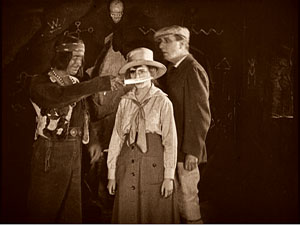
Point-of-view shots were easier to manage, and they could intensify the drama. Later in A Modern Musketeer, the rapacious Chin-de-dah tells the white tourists he’s getting married. To whom? asks Elsie. Instead of answering, “You,” he holds up his knife.
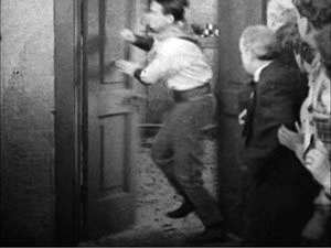
Sometimes you suspect that filmmakers were multiplying shots just for the fun of it. The early Fairbanks films are vigorous to the point of choppiness; action scenes spray out a hail of images, some offering merely glimpses of what’s happening. Wild and Woolly is especially frantic, with the final sequences of kidnapping, gunplay, and a ride to the rescue breathless in their pace. In the course of it, Emerson realizes that fast action needs some overlapping cuts to assure clarity. Doug bursts through a locked door in one shot, and from another angle, we see the door start to open again.
Only a few frames are repeated, but the movement gains a percussive force. Doubtless the Russians studied cuts like this; Eisenstein made the overlapping cut part of his signature style.
By contrast, The Mark of Zorro and its successors have calmer pacing. Doug’s acting got more restrained too, with his bounciness largely confined to the action scenes. Already in 1920, high-end pictures were finding a more academic look, a polished and measured style. Dialogue titles became more numerous, and big sets and other production values were highlighted.
I’ve been able to sample only a few points of interest in the early Fairbanks output. I haven’t talked about Fairbanks’ foray into Sennett-style farce, the cocaine-fueled Mystery of the Leaping Fish (1916), or the bold experimentation of the cinematography in the dream sequence of When the Clouds Roll By. My point is just to note that these films radiate exuberance—not only in their hero but in their very texture. Scene by scene, shot by shot, Doug’s energy is caught by an efficient, pulsating style that was an engaging variant of what would soon become the lingua franca of cinematic storytelling.
For other reading on Fairbanks, you can consult Alastair Cooke’s Douglas Fairbanks: The Making of a Screen Character (New York: Museum of Modern Art, 1940), one of the earliest and still most thought-provoking studies; John C. Tibbetts and James M. Welsh’s His Majesty the American: The Films of Douglas Fairbanks, Sr. (South Brunswick, NJ: A. S. Barnes, 1977), which is wide-ranging and strong on the early films; Booton Herndon’s Mary Pickford and Douglas Fairbanks (New York: Norton, 1977); and Douglas Fairbanks: In His Own Words (Lincoln, NE: iUniverse, 2006), a collection of interviews and essays signed (but probably mostly not written) by the star. I’ve also been enlightened by Lea Jacobs’ essay “The Talmadge Sisters,” forthcoming in Star Decades: The 1920s, ed. Patrice Petro (Brunswick: Rutgers University Press, forthcoming). Online, there is much information at the Douglas Fairbanks Museum site.
(1) Kristin Thompson, “Fairbanks without the Mustache: A Case for the Early Films,” in Sulla via di Hollywood, ed. Paolo Cherchi Usai and Lorenzo Codelli (Pordenone: Biblioteca dell’Immagine, 1988), 156-193; David Bordwell, Narration in the Fiction Film (Madison: University of Wisconsin Press, 1985), 166-168, 201-204.
(2) This set is very well chosen, but there are enough other films surviving from this period to warrant another box. It could include The Lamb (1915), Double Trouble (1915), The Good Bad Man (1916), Manhattan Madness (1916), The Americano (1916), Down to Earth (1917), The Man from Painted Post (1917), His Majesty the American (1919), and The Half Breed (1916), in which Fairbanks plays a biracial hero. On the matter of race, the films in the collection aren’t free of condescension and stereotyping, but there are also moments of affection between Fairbanks and Native Americans. He had extraordinarily dark skin, a fact he apparently took in his stride.
(3) I believe that this print is from a different version than the one I’ve known before; a few shots seem to show slightly different angles. (Perhaps the earlier one was from a foreign negative?) An informative page of the Flicker Alley booklet signals the provenance of the prints. While I’m on the subject, I should mention that occasionally the framing seems a bit cropped, but that could be due to the source material.
(4) Loos, Kiss Hollywood Goodbye (New York: Ballantine, 1974), 2.
(5) Loos’ account of the break with Fairbanks can be found in her memoir, A Girl Like I (New York, 1966), 178. You have to admire a book that ends with the line, “Miss Loos, you sure are flypaper for pimps!”
(6) Loos, Kiss Hollywood Goodbye, 14.
(7) Emerson and Loos, Breaking into the Movies (Philadelphia: Jacobs, 1921), 43.
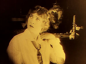
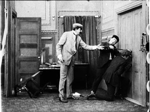
When the Clouds Roll By.
PS 30 Nov: Internets problems and a memory lapse kept me from mentioning two other important books on Anita Loos: Gary Carey’s lively biography Anita Loos (Knopf, 1988) and Anita Loos Rediscovered: Film Treatments and Fiction, ed. and annotated by Cari Beauchamp and Mary Anita Loos (University of California Press, 2003). Both Carey and Beauchamp echo Loos’ claims that the couple split from Fairbanks because he was somewhat envious of the attention they received, while Carey adds that Fairbanks wanted to break out of the “boobish” parts Loos wrote for him (p. 50).
PPS 8 Dec: Mea culpa again. I overlooked Richard Schickel’s book-length essay, His Picture in the Papers: A Speculation on Celebrity in America, Based on the Life of Douglas Fairbanks, Sr. (New York: Charterhouse, 1973). It’s a lively and thoughtful argument that Doug was one of the very first modern celebrities, and one who enjoyed his role as such.
Lucky ’13
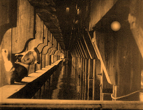
The Mysterious X (1913).
Each film is interlocked with so many other films. You can’t get away. Whatever you do now that you think is new was already done in 1913.
Martin Scorsese, quoted in Scorsese by Ebert (University of Chicago Press, 2008), 219.
DB here:
Most historical events don’t abide by clocks and calendars. Seldom does a trend begin neatly on one date and end, full stop, on another. Changes have vague origins and diffuse destinies. When Kristin and I, along with others, argued for 1917 as the best point to date the consolidation of the Hollywood style of storytelling, we realized that it’s a useful approximation but not as exact as a Tokyo subway timetable.
It’s just as hard to argue that a year constitutes a meaningful unit in itself. Who expects anything but tax laws to change drastically at midnight on 31 December? Yet evidently our minds need benchmarks. Film historians, while being aware that trends are slippery and dating is approximate, have long spotlighted certain years as particularly significant.
Take 1939, which has become a sort of emblem of the peak achievements of Hollywood’s Golden Age. We had Gone with the Wind, The Wizard of Oz, Only Angels Have Wings, Stagecoach, Gunga Din, Wuthering Heights, Dark Victory, Young Mr. Lincoln, Beau Geste, Mr. Smith Goes to Washington, Ninotchka, The Roaring ‘20s, and Destry Rides Again. I’d watch any of those, except Gone with the Wind, right now—something I find it hard to say about most Hollywood movies I’ve seen in 2008.
Another strong year is 1960, with La Dolce Vita, L’Avventura, Rocco and His Brothers, The Apartment, Elmer Gantry, Spartacus, Psycho, Exodus, The Magnificent Seven, Shadows, Late Autumn (Ozu), and The Bad Sleep Well (Kurosawa). Arguably, 1960 was owned by the French, who gave us Breathless, Shoot the Piano Player, Paris nous appartient, Les Bonnes femmes, Le Trou (Becker), Moi un noir (Rouch), and Letter from Siberia (Marker). (See Postscript.)
Let’s go back still further. Researchers sometimes split the silent-film period in two, with the first stretch, usually called “early cinema,” running up to 1915 or so. (1) The second phase then runs roughly from 1915 to 1928. (2) So for many historians the year 1915 functions as a tacit pivot-point, and it is remembered not only for The Birth of a Nation but also for Regeneration, The Tramp, Kindling, The Cheat, Les Vampires, Daydreams (Yevgenii Bauer), and several William S. Hart films. But another year holds a special place in the minds of silent film aficionados.
Over a decade ago, the annual Days of the Silent Cinema festival (Il Giornate del cinema muto), took 1913 as its focus. (3) It was an extraordinary year. Denmark produced Atlantis (August Blom) and The Mysterious X (Benjamin Christensen). From France we had L’Enfant de Paris (Leonce Perret), Germinal (Albert Capellani), and Louis Feuillade’s Fantomas series. Germany gave us Urban Gad’s Engelein and Filmprimadonna and Franz Hofer’s obsessively symmetrical The Black Ball. The staggering set of Italy’s Love Everlasting (Ma l’amor mio non muore!, Mario Caserini) was matched by the breadth of Enrico Guazzoni’s Quo vadis? In Russia Bauer released Twilight of a Woman’s Soul. American audiences saw Traffic in Souls (George Loane Tucker) and Death’s Marathon and The Mothering Heart, from a guy named Griffith. Several historians would argue that 1913 marked the first major achievements of film as an artform.
Two outstanding films of that annus mirabilis have recently been issued on US DVD. One is a striking accomplishment, the other a flat-out masterpiece. Both discs belong in the collections of everyone who’s serious about cinema.
Your call is important to us
A wife and her baby are alone in an isolated house when a tramp breaks in. As the wife tries to keep the invader at bay, her husband happens to telephone and learn what’s happening. He scrambles to return home. He steals an idle car, and its owner, accompanied by police, race after him. We cut rapidly between the besieged mother and the husband’s frantic drive, as he is in turn pursued. Just as the tramp is about to attack the wife, the husband bursts in, followed by the police. The family is saved.
This is the story of the 1913 one-reel film, Suspense, co-directed by Lois Weber and Phillips Smalley. If the plot sounds familiar, it’s probably because you know that one of D. W. Griffith’s most famous films, The Lonely Villa (1909) tells the same basic tale.There are still earlier versions, including one, The Physician of the Castle (Le Médécin du chateau, 1908), which may have inspired Griffith. The ultimate source seems to be a 1902 play by André de Lord, Au téléphone (translated here).
So Weber and Smalley are reviving an old idea. Their task is to make it fresh. How they do so has been studied in depth by Charlie Keil in his book Early American Cinema in Transition: Story, Style, and Filmmaking, 1907-1913.I can’t match Keil’s subtlety, and it’s better that you see the film first, so I’ll drop only some hints, pointers, and comments.
We’re inclined to say that The Lonely Villa influenced Suspense. But maybe we can capture the situation in a more illuminating way. The art historian E. H. Gombrich has suggested that we can often trace the relationship between artworks in terms of schema and revision. (4) A schema is a pattern that we find in an artwork, one that a later artist can borrow. Most often, later artists copy the schema straightforwardly. This is the usual way we think of influence. But instead of replicating the schema, the next artist can revise it. She can elaborate on it, strip it to its essence, drop parts and add others, whatever—in order to achieve new purposes or evoke fresh responses.
In The Lonely Villa, Griffith uses crosscutting to build suspense. He cuts among the thuggish vagrants trying to break in, the wife and daughters trying to hold them off, and the father learning by phone of the situation and then plunging after them with a policeman. The obvious pattern here is the principle of alternation between different lines of action, all taking place at the same time and converging in a last-minute rescue.
So Smalley and Weber inherit the crosscutting schema, but they go beyond simply copying it. They find ways to revise it, some quite surprising. These revisions aim to create more tension and to dynamize the situation.
The obvious option, at least to us today, would be to use more shots than Griffith does; we think that increasing the cutting pace builds up excitement. Interestingly, however, Suspense uses only a couple of more shots than The Lonely Villa within a comparable running time. (5) We usually expect that American films become more rapidly cut as the 1910s go on, but this isn’t the case here. Shortly, I’ll suggest why.
Smalley and Weber recast Griffith’s parallel editing in several ways. For instance, The Lonely Villa prolongs the phone conversation between husband and wife, building suspense through the husband’s instruction to use his revolver on the thugs. Suspense, by contrast, doesn’t dwell on the telephone conversation but devotes more time (and shots) to the chase along the highway. That’s because Weber and Smalley have complicated the chase by having the husband pursued by the irate motorist and the police, something that doesn’t happen in the Griffith film.
Just as important, Smalley and Weber revise the crosscutting schema through framings that are quite bold for 1913. For example, Griffith’s tramps break into the house in long shot, and they move laterally across the frame.
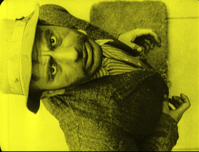
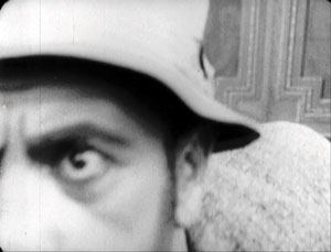
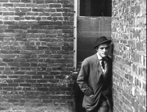
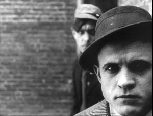
But Weber and Smalley’s tramp sneaks steadily up the stairs, into a menacing extreme close-up.
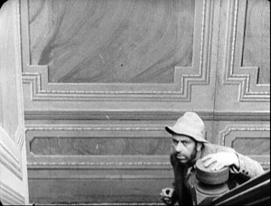
Elsewhere, Suspense gives us close views of the wife and of the door as the tramp breaks in. There are oblique angles on the back door of the house, and virtually Hitchcockian point-of-view shots when the wife sees the tramp breaking in and he looks straight up at her.
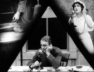
What struck me most forcibly on watching the film again was the way in which Weber and Smalley’s daring framings serve as equivalents for parallel editing. In effect, they revise the crosscutting schema by putting several actions into a single frame. The most evident, and the most famous, instances are the triangulated split-screen shots. They cram together three lines of action: the wife on the phone, the husband on the phone, and the tramp’s efforts to break into the house (here, finding the key under the mat). (6)
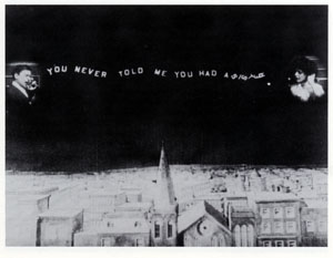
Split-screen effects like this were common enough in early cinema, especially for rendering telephone conversations. Eileen Bowser points out that the three-frame division was one variant, with a landscape separating the two callers. (7) Her example is from College Chums (1907).
But my sense is that in early cinema the split-screen effect was used principally for exposition or comedy, not for suspense. Smalley and Weber have made this framing substitute for crosscutting: instead of giving us three shots, we get one, showing the plot advancing along different lines of action. These splintered frames function much like Brian De Palma’s multiple-frame imagery in Sisters, Blow-Out, and other films. There’s also the nice touch of the conical lampshade over the husband’s head, providing a fulcrum for the composition.
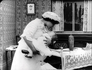
Earlier in the film, instead of crosscutting between the tramp outside and the wife indoors, Suspense gives us both in the same shot, with the tramp peeking in behind her.
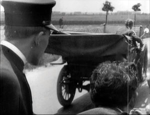
A more ingenious revision of the crosscutting schema comes during the shots on the road. Instead of cutting between the father in the stolen car and the police pursuing him, Suspense packs them into the same frame. This is done not only in long shot but also in striking depth compositions.
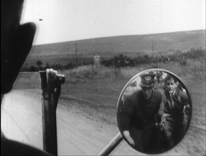
Flashiest of all are the shots showing the pursuers reflected in the rear-view mirror of the father’s car as he races ahead of them.
Again, a single framing has done duty for two shots, one of the father looking back and another showing the cops coming closer to him. By compressing several lines of action into a single frame, our 1913 film doesn’t need to use significantly more shots than the 1909 one.
These are just a few of the imaginative ways in which Weber and Smalley have recast their standard situation. I could have considered as well the unobtrusive use of the knife as a multi-purpose prop, the echoed shots of mirrors, and the shrewd employment of repetitions in the intertitles.
It would take an early-cinema specialist like Keil to trace out all the connections between Suspense and other films of its era. One among many would be the fact that Griffith wasn’t exactly standing still between 1909, the year of The Lonely Villa, and 1913. For instance, his Battle at Elderbush Gulch, made about the same time as Suspense (though released in 1914), displays far more rapid cutting than Weber and Smalley attempt. Griffith also employed a swelling advance to the foreground, like that of the tramp shot I showed above, in The Musketeers of Pig Alley (1912).
Here, Smalley and Weber seem to have replicated a schema that was believed to ratchet up tension, the so-called looming effect.
The very title of the film exhibits self-consciousness about its artistic purpose. By 1913, it seems, American filmmakers were confident enough in their skills to announce their aims. We want, the title seems to say, to arouse you, to make you wait, hanging there, for the resolution. We know how to tell a twelve-minute story cinematically. The film seems uncannily to anticipate all those one-word titles that Hitchcock invoked to unsettle us–Suspicion, Spellbound, Psycho, Frenzy. As in a Hitchcock movie, the fact that we are pretty certain how Suspense will turn out doesn’t seem to dissipate our anxiety. (For more on this paradox of suspense, see this entry.)
Tunnel vision
It was during the Pordenone 1913 season that the full brilliance of Victor Sjöström’s Ingeborg Holm hit me. I had seen the film a couple of times before and found it deeply moving in its restrained treatment of a poignant situation. The film traces the dissolution of a family. Sven Holm is doing a brisk retail business, but his health problems, along with a thieving clerk, plunge the family into poverty. When Holm dies, his wife Ingeborg must take the children into the poorhouse, and from there they are boarded out to foster families. Her plight worsens over the years, and its sorrowful depths are revealed when her son, now grown, returns to visit her.
Ingeborg Holm has long been recognized as a milestone in European film, not least for its effect on improving Sweden’s treatment of the poor. (8) The acting style is muted and delicate, with no mugging or arm-waving. For long periods, the main actors turn from the audience. (9) Just as impressive are the poised compositions, sustained in unhurried long takes. These give what is essentially a bourgeois tragedy a kind of majestic relentlessness. Watching, I remembered what Dreyer had admired in Sjöström’s Ingmar’s Sons (1918):
The film people here at home shook their heads because Sjöström had really a boldness to let his farmers walk heavily and soberly as farmers do. Yes, they used up an eternity to come from one end of the room to the other. (10)
But sitting in the Cinema Verdi in 1993, I spotted yet another level of artistry. Knowing the story of Ingeborg Holm, I was able to watch the shots unfold. I could study how Sjöström was unobtrusively moving characters so that they became shifting centers of interest. Although he didn’t cut in to close-ups, he harmonized his actors’ movements so that at one point you noticed Ingeborg, at another her husband. Performers spread themselves across the frame, arrayed themselves in depth, turned from or toward the camera. Most subtly of all, one actor might mask another one, driving our attention to other parts of the frame. Sjöström could sustain this intricate play of blocking and revealing for minutes on end.
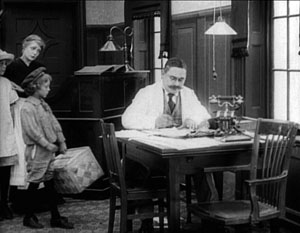
My favorite example of this tactic is the three-minute passage showing Ingeborg’s daughter and son taken away by new mothers. You can read the whole discussion on pp. 191-195 in On the History of Film Style (1997), but here is an excerpt, with stills intercalated. (These stills, grabbed from the DVD, lack a little on the left. The film has been printed and reprinted so many times, and now fitted to the TV monitor, that it has lost some information along that edge.)
Ingeborg’s entry with her children from the rear doorway establishes the trajectory that will be followed during the scene, as foster mothers come in and take away the children. (Again, the scene is built around movements toward and away from the camera.) In a brilliant stroke, Sjöström immediately plants the young son in the foreground, back to us. The boy will stand there immobile for this first phase of the scene, occasionally serving to block the superintendent.
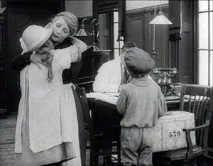
Ingeborg buries her face in her daughter’s shoulder at the precise moment the foster mother enters from the rear left. She passes behind Ingeborg, and as she is momentarily blocked, the superintendent twitches into visibility, handing the woman a document to sign.
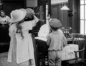
During the signing, when the woman is briefly obscured, the superintendent shifts position again and Ingeborg lifts her face once more. Then Ingeborg and her daughter move slightly leftward as the foster mother comes forward.
This phase of the scene concludes with the departure of the daughter and the embrace of Ingeborg and her son in the foreground, once more concealing the superintendent.
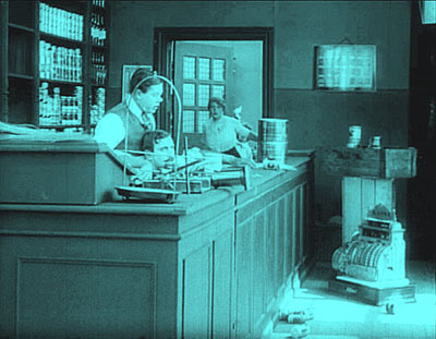
Granted, I picked one of the film’s most exactingly staged scenes, but there are several other examples. Consider the climax, when the adult son comes to visit Ingeborg: the camera position and staging ask us to recall the scene I’ve just mentioned. Or take a look at the handling of the space behind the counter in the various scenes in the Holms’ shop. One instance surmounts this section.
This choreography is hard to catch on the fly: by the time you notice a change, what prepared for it has gone. To understand the overall dynamic, we must reverse-engineer the effects, moving backward from the result to the conditions. As I studied the film, it became clear that creating shifting centers of interest was basic to the scenes’ effects. All the finesse of acting, both solo and ensemble, would come to little if we weren’t primed to watch the most important area of the shot. Directors of the 1910s became supremely skilful in guiding our eye from one major story point to another within the fixed frame.
Some of the tactics of guiding our attention could be borrowed from other arts. Painting and theatre supplied certain schemas, like placing an item in the center of the picture format and turning faces toward the viewer. But some tactics for directing our eye relied on capacities that were as “specifically cinematic” as cutting was argued to be. Theatre is staged for many sightlines, but cinema is staged for a single one, that of the camera lens. That fact allowed directors to organize the unfolding action in depth, prompting the viewer to notice things at many distances from the camera.
It also allowed a precise blocking and revealing of information that would not work on the stage. In a live theatre performance, the slight shifts we detect in the Ingeborg Holm scene would be apparent to only very few viewers; people sitting in other vantage points wouldn’t see them. For another example of this phenomenon, go elsewhere on this blogsite.
There’s a more basic explanation of what’s going on. Cinematic space is a result of optical perspective, like the space of classic painting. The actors may seem to be standing in a cubical space, but in fact they move within a tipped-over pyramid, with the tip resting at the camera lens. They work inside a ground area that’s the shape of a slice of pie. Here’s a reminder from The Black Ball.
When there are figures close to the camera, as here, they fill up more of the frame, indicating that the field of view has narrowed. Filmmakers of the 1910s had discussed this property of their “cinematic stage,” so as researchers we can confirm that the control of position and timing we observe on screen results from the firm intentions of the makers. They might have echoed Uccello, the Renaissance artist who bent over his drawings late at night and exclaimed: “How sweet a thing is this perspective!”
Suddenly the tableau tradition made sense to me. Directors had to organize both the two-dimensional composition and the tapering three-dimensional playing space in front of the camera. The purpose was to create ever-changing centers of interest, laterally and in depth, flowing along with the key moments in the unfolding action.
By studying the same tactics in Feuillade, Bauer, and others, I found that these principles offered a fruitful way to understand much of what was happening in the films of the tableau era. The dynamic of schema and repetition/revision was at work as well, since I found earlier, more rudimentary uses of these principles; these were then refined during the 1910s. Moreover, the idea helped me generalize beyond that era and analyze later directors, including Mizoguchi Kenji and Hou Hsiao-hsien, who also used staging to shape the viewer’s experience. The results can be found in On the History of Film Style and Figures Traced in Light. Those books largely owe their existence to that flash of awareness kindled by Ingeborg Holm. (11)
We can’t reconstruct Sjöström’s stylistic development with much confidence. (12) His first directed film, The Gardener (Trädgärdsmästaren, 1912) survives, but I saw it before I knew how to watch 1910s movies in this way, so I can’t comment on it. Of the twenty-six films he made from 1912 to 1917, nearly all have been lost. Apart from Ingeborg, I have managed to see Havsagamar (The Sea Vultures, 1916). This retains aspects of the tableau tradition, but virtually no scenes display the intricate staging of his 1913 masterpiece.
In the late 1910s, judging by the films we have, Sjöström seems to have moved quickly toward continuity editing in the American vein. (13) The Girl from Stormycroft (Tösen frän Stormyrtorpet, 1917) contains extended passages of analytical editing, and the scenes display a freedom of camera setup one seldom sees in European cinema of the period. Sjöström clearly understands the principles of continuity down to the smallest detail. For instance, he not only uses the frame-edge cut (the cut that lets a character exit one shot and enter another, as the body crosses the frameline); he accelerates it. Our heroine leaves the kitchen, and in the shot’s final frame she hits the right edge. Another director would have had her exit the frame entirely and held the kitchen shot a little longer, to give her time to get to the next room. But Sjöström simply cuts to her already in another room, completing her trajectory.
Sjöström presumes that the constant pace of her approach and the vector of her movement will smooth the shot-change. It does, but few directors of that day would had such confidence that our mind would create continuity of motion.
During this summer’s archive viewing, I spent some time studying Sjöström’s cutting in The Girl from Stormycroft and subsequent films. I may offer some more thoughts later. For now I’ll just say that in these early years we seldom encounter such a versatile director, one who mastered the tableau tradition and then moved, with apparently little effort, to nuanced continuity editing. More generally, examining his technique isn’t a dry exercise. We never lose by studying craftsmanship. Sjöström’s films succeed because his style carefully guides our moment-by-moment apprehension of the heart-rending stories he has chosen to tell.
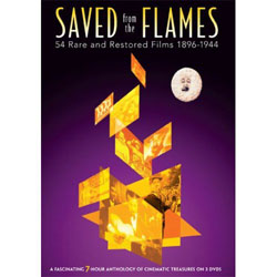
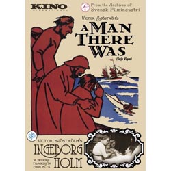
Have I convinced you to surrender your credit-card number? Suspense is available in a dazzling Flicker Alley collection, Saved from the Flames, compiled from the French series Retour de flame. Ingeborg Holm comes with a tinted print of the estimable Terje Vigen (A Man There Was) on a DVD from Kino. The latter disc includes vibrant scores from Donald Sosin and David Drazin.
(1) For the purposes of the outstanding Encyclopedia of Early Cinema (New York: Routledge, 2005), the editor Richard Abel considers that the early cinema constitutes the period from film’s invention ca. 1894 to the mid-1910s.
(2) Silent films were still made into the 1930s, notably in Russia and Japan—a situation that shows the rough-and-ready quality of period divisions.
(3) For an informative series of articles around the 1913 theme, see Griffithiana no. 50 (May 1994).
(4) Gombrich proposes these ideas at various points in Art and Illusion: A Study in the Psychology of Pictorial Representation, new ed. (Princeton: Princeton University Press, 2000). The book is a milestone in twentieth-century humanistic inquiry.
(5) The Lonely Villa (1909) has, in the version I’ve seen, 54 shots in a 750-foot reel (that is, about twelve and a half minutes at 16 frames per second). Suspense has nearly the same number of shots, 56, in about the same running time.
(6) Sharp-eyed readers will recognize one of these shots as Fig. 5.82 in Film Art: An Introduction, 8th ed. (New York: McGraw-Hill, 2008), 187.
(7) Eileen Bowser, The Transformation of Cinema 1907-1915, vol. 2 of History of the American Cinema (New York: Scribners, 1990), 65.
(8) For more background on the film, see Jan Olsson, “‘Classical’ vs. ‘Pre-Classical’: Ingeborg Holm and Swedish Cinema in 1913,” Griffithiana no. 50 (May 1994), 113-123.
(9) Kristin wrote about this technique in “The International Exploration of Cinematic Expressivity,” in Film and the First World War, ed. Karel Dibbets and Bert Hogenkamp (Amsterdam: Amsterdam University Press, 1995), 65-85. She also discusses it in our Film History: An Introduction, 2d ed. (New York: McGraw-Hill, 2002), 67.
(10) Carl Dreyer, “A Little on Film Style,” Dreyer in Double Reflection, ed. and trans. Donald Skoller (New York: Dutton, 1973), 133.
(11) I was probably primed for this by lectures presented by Yuri Tsivian, who has long been studying mirrors in 1910s cinema and calculating how they revealed offscreen space.
(12) Detailed information on Sjöström’s relation to the film industry in these years can be found in John Fullerton’s epic Ph. D. thesis, The Development of a System of Representation in Swedish Film, 1912-1920 (University of East Anglia, 1994). See also Fullerton, “Contextualising the Innovation of Deep Staging in Swedish Film,” Film and the First World War, ed. Dibbets and Hogenkamp, 86-96.
(13) Several people have analyzed Sjöström’s editing. Ben Brewster and Lea Jacobs’ Theatre to Cinema: Stage Pictorialism and the Early Feature Film (Oxford: Oxford University Press, 1997), 133-136 shows how cutting supports the acting in a crucial scene of Ingmar’s Sons. Tom Gunning’s essay “‘A Dangerous Pledge’: Victor Sjöström’s Unknown Masterpiece, Mästerman,” in John Fullerton and Jan Olsson’s anthology Nordic Explorations: Film before 1930(Sydney: John Libbey, 1999), 204-231, argues that Sjöström’s cutting gives his characters a degree of psychological opacity. Most recently, in an unpublished paper Jonah Horwitz discusses patterns of performance, composition, and editing in Terje Vigen (1917).
Twilight of a Woman’s Soul (1913).
PS 31 August: Some corrections. David Cairns writes to point out that the triangle at the top of the frame in the Suspense split-screen isn’t a lamp but simply the shade behind the father’s head, cropped by the masking. Wishful thinking on my part, I’m afraid. By the way, David has an intriguing movie giveaway going on his site.
Roland-François Lack corrects dates on two of my Greatest French Hits from 1960: “The great Marker from that year is Description d’un combat, not Lettre de Sibérie (1958), and likewise Rouch’s Moi un noir is from 1958.” Thanks to him and David. To my original list, I should probably have added Cocteau’s Testament d’Orphée, released in 1960.
Rio Jim, in discrete fragments
The first moving-pictures, as I remember them thirty years ago, presented more or less continuous scenes. They were played like ordinary plays, and so one could follow them lazily and at ease. But the modern movie is no such organic whole; it is simply a maddening chaos of discrete fragments. The average scene, if the two shows I attempted were typical, cannot run for more than six or seven seconds. Many are far shorter, and very few are appreciably longer. The result is confusion horribly confounded. How can one work up any rational interest in a fable that changes its locale and its characters ten times a minute?
H. L. Mencken, 1927
DB here:
Between about 1913 and 1920, the way movies looked changed, and we are still living with the results. What were the changes? What brought them about?
I’m just back from Brussels, after a two-week visit to the archive. During earlier trips, I’ve concentrated on examining films from the 1910s that exemplify the tableau tradition. That’s what we might call the stylistic approach that tells the story and achieves its other effects predominantly through staging—by arranging the actors within the frame, forming patterns that reflect what is important at a given moment.
The tableau tradition dominated European cinema of the early and mid-1910s, and it was also on display in the U. S. It is sometimes considered “theatrical” and “uncinematic,” but that’s a shortsighted view. The tableau tradition is one of the great artistic triumphs of film history. For backup on this, consult Ben Brewster and Lea Jacobs’ Theatre to Cinema and my On the History of Film Style and Figures Traced in Light. And you can go here and here on this site.
As the 1910s moved on, the staging-driven approach gave way to one dominated by editing. Roughly speaking, this strategy surfaced at two levels. Directors began to use crosscutting, aka parallel editing, more strenuously. By alternating shots, you could show events taking place at two or more locations. This technique was not used only for last-minute rescues; it was a way of keeping track of all the characters in nearly every sequence, whether they were going to converge or not.
Second, within a single strand of action, 1910s directors exploited analytical editing, breaking down a scene’s space into a host of details. Griffith often gets the credit for this tactic (and he happily claimed to have invented it), but it’s probably most fairly understood as a collective innovation.
Directors in the tableau tradition didn’t entirely avoid crosscutting or analytical editing, but there was a measurable shift of gravity in the second half of the 1910s. In the U.S., many filmmakers pushed editing techniques very hard. You can sense their exhilaration in discovering how editing lets them control pacing, make story points concisely, build suspense, and force the viewer to keep up.
During the 1910s, American movies became breathless. The hurtling pace of Speed Racer or The Dark Knight has its origins here; seen today, The Battle at Elderbush Gulch (1913) and Wild and Woolly (1917) still look mighty rapid-fire. And then as now some observers, like Mencken, complained that it was all too fast and furious.
Over the last thirty years, many scholars have studied this change, but for a glimpse of some supporting data, you can visit the remarkable website Cinemetrics. Yuri Tsivian, Barry Salt, and a corps of volunteer scholars have been measuring Average Shot Lengths in films from all eras. The data from the 1910s are pretty unequivocal. In the US around 1916-1918, movies became editing-dominated, shifting from an ASL of over 10 seconds, sometimes as much as 30 seconds, to 5-6 seconds or less. A 4-6 second average per shot persists in Hollywood through the 1920s, so Mencken’s guess about the “scenes” (as shots were then known) changing ten times a minute was more or less right.
Back in the 1980s, Salt and others, including Kristin and me, picked 1917 as a plausible point of reference for the consolidation of the continuity style. That was the point at which virtually every US film we watched contained at least one example of specific continuity techniques. (Most contained many more instances, of course.) We talk about that magical year in this entry, which you might want to read as an introduction to what follows today.
In just a few years, continuity editing became a coherent, supple means of expression, and it has defined Hollywood film style up to the present. What brought this about? Kristin and Janet Staiger offered an explanation in our 1985 book, The Classical Hollywood Cinema: Film Style and Mode of Production to 1960. They traced out several factors that encouraged and sustained this style. Especially important were the development of longer films, a conception of filmic quality, and the emergence of a specific division of labor.
Lately I’ve been revisiting these early years, chiefly to watch how directors pick up and refine the stylistic schemas that were coming into broader use. I want to know more about the little touches that directors had to control in creating this style. I’ve also been interested in to what extent these techniques were picked up by directors in Europe and Asia. The evidence is pretty clear that continuity cinema became a lingua franca of film style.
So if last year I pondered the minute compositional adjustments of Evgenii Bauer, this year it was all cutting. I focused on three filmmakers, but I’ll save discussion of two of them for a rainy day, or a book. In all, it was a thrill, as ever, to watch a stylistic system coalesce across a batch of films that are seldom mentioned in the history books.
The trail to continuity
The extraordinary films starring William S. Hart typify early American continuity techniques. After a distinguished career on the stage, Hart began as a film actor in 1914, when he was nearly fifty. He was intent on bringing realism to the newly burgeoning Western genre. His films were at first made under the auspices of Thomas Ince, a pioneer of rationalized production techniques, and with his Ince pictures Hart found worldwide success. He followed a rousing feature debut (On the Night Stage, 1915) with many shorter films. In 1917—mark the year—Hart broke with Ince and set up his own firm for The Narrow Trail. He continued to make films into the early 1920s, with Tumbleweeds (1925) marking his farewell to cinema.
Hart often directed his own pictures, though he also had the services of strong directors like Reginald Barker. The films have an assured brio, thanks to careful cutting and some felicitous touches.
They are fast-moving: In the five 1915 Hart films I watched, the ASL ranged from 8 to 11 seconds, but in 1916, the average jumped to 5-6 seconds per shot. The Narrow Trail seems to have an ASL of 3.7 seconds, but I can hardly believe it and I must verify it with another viewing. The 1918 and 1920 films I viewed average between 4.9 and 5.4 seconds per shot.
Just as important as the speed of cutting, naturally, is what Hart does with his cuts. In one scene from Between Men (1916), you can see the tableau aesthetic undermined by analytical editing. Gregg is a shifty stock trader, a species we still nurture. He’s trying to destroy Hampton’s fortune because he thinks that when the old man is destitute he’ll force his daughter to marry Gregg. Hampton has asked Bob White (Hart) to help get the goods on the suitor.
In one scene, the master shot approximates a tableau setup: Bob and Gregg stand in the middle ground, with a room visible behind them.
As the men swap increasingly tense challenges, Margaret Hampton enters the adjacent room and stands behind them as they talk. A director in the tableau tradition would have sustained the master shot and shown Margaret approaching in the background and drawing closer, reacting to what the men say. She could easily have been stationed hovering at the curtain on the right.
Instead, director C. Gardiner Sullivan has her arrive from another doorway in the adjacent room, one not visible in the master shot of the two men. He then cuts back and forth between the men and Margaret, and he positions her at the left curtain–so that the men block her from our view! The blockage motivates cutting to Margaret for her reactions to what Bob and Gregg say.
Only when she wants to challenge Bob’s suggestion that he might marry her does Margaret come into the same frame as the men, who part to make room for her.
It turns out that this sequence is but a rehearsal for a lengthier passage in which Hampton will come in from the adjacent room (via the door we do see in the background). As with Margaret’s entrance, his arrival will be blocked by Gregg’s body, and Sullivan will cut among the trio in the foreground and Hampton’s approach behind them. That passage, which could also have been handled in a single framing in the tableau style, consists of four distinct setups and eighteen shots!
So even depth-based scenes can be recast as rapid découpage. The passage is probably overcut, but you can sense the filmmakers’ exhilaration in their power to chop up the world into separate, slightly jolting bits, forcing the audience to keep abreast of each item of information.
Managing details
The variety of setups is worth noticing in another film, for here we can see the filmmakers taking pains to show each bit of action most clearly and emphatically. In The Return of Draw Egan (1916), when Egan sees the mayor’s daughter Myrtle he decides to stay on as marshal of Yellow Dog. The first shots show them looking at each other.
The next pair of shots shows the two looking at each other in close-up.
This gradual enlargement of the figures in a reverse-shot sequence would of course become a staple of analytical editing—perhaps it already was in 1916. Cut back to another framing of Egan, as the mayor signals Myrtle to join them. The slightly off-center composition reiterates her position off left.
Cut back to Myrtle, exiting her close-up. The next shot shows her joining the men, to be introduced to Egan.
But this is a different camera position than the one showing the men just previously. The daughter’s entrance has motivated a slightly changed composition. In the 1910s, cutting began to dictate staging, so that each composition had to fit smoothly into the flow of shots.
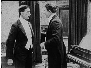
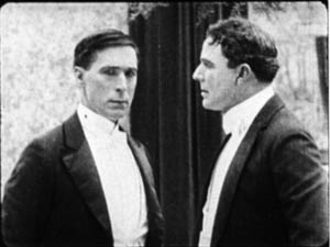
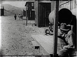
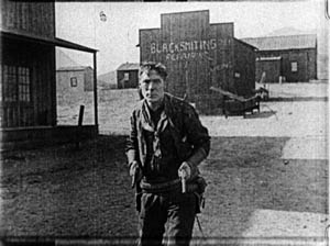
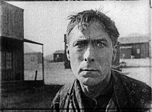
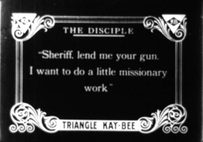
This sequence from Draw Egan doesn’t utilize axial cuts, those cuts that keep to the same angle and move straight in or out. Here the actors are angled to suggest that we are to some degree in between them. Indeed, sometimes the camera will put us directly between the characters. Here is a climactic confrontation from The Disciple (1915). A doctor has cuckolded Hart, but Hart brings him to save his daughter. As the doctor enters, the wife’s shameful look is met by Doc’s anxious expression, with a furious Hart pressing a pistol to his back.
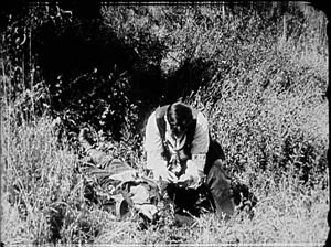
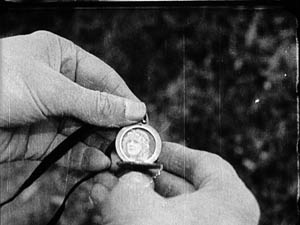
This freedom of camera placement extends to point-of-view cutting. Again, this is an old technique, but like other old techniques, it was revived and refined as part of the synthesis that became the continuity style. So Keno Bates, Liar (1915; a splendid title) can make use of a cameo picture that captivates Bates after a shootout with the man who robbed him.
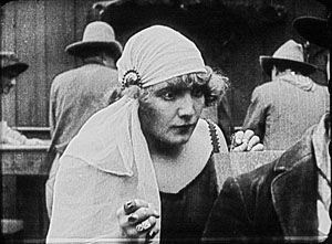
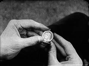
Later, the dance-hall girl catches sight of her rival when Bates muses on the cameo.
The pov framings don’t change much, but the angle chosen easily approximates both Bates’ view and her view over his shoulder. Moreover, the shot of Bates’ hands isn’t the sort of vacuous insert we often see at the period, with a letter or an object isolated against a blank ground. Here, the backgrounds change, so that the first shot is situated naturally in the wild, while the second is consistent with the barroom locale.
Putting the pieces together
From very early in the history of Westerns, the main street shootout seems to have been a solid convention. Already in The Return of Draw Egan, it’s treated with a vitality and ingenuity that suggests creative reworking of a staple. The climactic shootout also shows just how flexible the new technique could be.
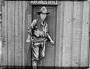
Egan has told his enemy, Arizona Joe, that he’ll meet him when the setting sun’s rays hit the saloon window. So the film crosscuts Egan in his marshal’s office with a nervous Joe, seen in close-up, eyeing the window.
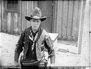
When Joe gets up the nerve to leave, he hides behind a barrel and waits to ambush Egan. When Egan leaves his office, a reverse tracking shot follows him striding toward us.
Then we get an orienting long shot with Joe in the foreground and Egan approaching.
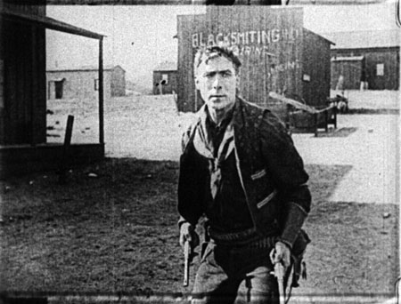
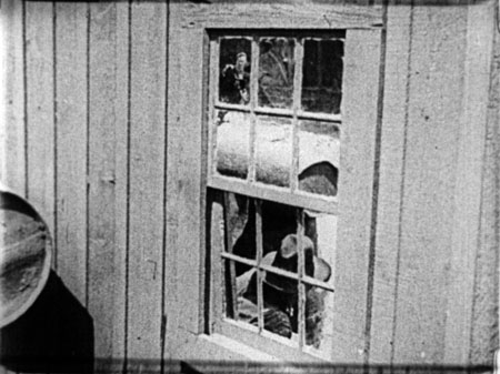
Edging sideways, Egan spots a reflection of Joe’s head in a window. These shots surmount today’s blog entry. You can see Egan’s reflection in the upper left pane.
Now aware of Joe’s tactic, Egan steps diagonally forward, coming ominously right up to the camera.
He fires and dispatches Joe. The townsfolk, who have been huddled in a house watching, declare they want Egan to stay on as marshal, despite his outlaw past. Myrtle chimes in, and we get a happy ending. Chaotic fragments? Mencken couldn’t have been more wrong. Or maybe he was just being grumpy.
The trail to Hollywood
There’s plenty more in these films—beautiful, sometimes minuscule matches on action; subtle timing of frame entrances and exits; and even proto-over-the-shoulder reverse shots. And we don’t have to claim that Hart’s films are the only innovative ones. They take their place within a broader, collective achievement that we still haven’t fully grasped.
Editing permitted everyone to act at small scale; the bargirl who sees Bates’ cameo need only lower one fist, tighten the other, and narrow her eyes to express her jealousy. The new style nurtured laconic stars like Hart. His films are full of pathetic situations that demand he display stoicism but also sensitivity. The long shots could emphasize his gestures and stances, while close-ups could display his worn, haunted face and pale eyes. He acts with those eyes, glancing aside to recall a traumatic event or looking downward as he hesitates to break bad news. Often the plot demands that he conceal his feelings or hide the truth behind an event, and the changing shots could penetrate the surface drama and highlight his slightest reactions. Hart could underplay his role because the editing shows us everything he might have said.
Known in France as Rio Jim, Hart was very influential on the Europeans. His pictures, along with De Mille’s The Cheat (1915) and the films of Chaplin and Fairbanks and many others, offered tutorials in the new style. Arguably, the cumulative force of these mainstream releases was greater than the influence of Griffith’s more prestigious output of the moment. There was only one Intolerance (1916), the film by which Griffith was most widely known abroad, but week by week the Westerns and comedies and dramas pouring out of Hollywood flaunted a new, almost frighteningly energetic approach to cinema.
Timing favored the Americans. The style emerged at around the start of World War I, when hostilities gave U. S. films a chance to displace the big French and Danish companies in many markets. Kristin explains how this happened in Exporting Entertainment, and she talks about the exceptional case of Germany in Herr Lubitsch Goes to Hollywood.
Some European directors picked up the new style immediately, others took a bit longer, and a few, like Feuillade, never fully adjusted to it. The principles of the older tableau style never utterly died out, as I try to show in Figures Traced in Light. But the future belonged to the editing-based aesthetic. Canonized, tweaked, updated, dismantled, undermined—however filmmakers reacted to classical continuity, it became the basis of international cinematic storytelling.
My epigraph comes from H. L. Mencken, “Appendix from Moronia: Note on Technic,” from Prejudices: Sixth Series (New York: Alfred A. Knopf, 1927), rep. in Phillip Lopate, ed., American Movie Critics: An Anthology From the Silents Until Now, expanded edition (New York: The Library of America, 2006), 35-36.
Silent film speeds can vary, so shot counts can yield different averages. I saw some of the Harts I mention in projection at last year’s Il Cinema Ritrovato, and they were projected at 18 or 19 frames per second, a common speed for the period. My ASLs are based on the running time. For the titles I saw in Brussels on a flatbed viewer, my basis was the length in meters. From that I’ve calculated running times and averages, assuming 18 frames per second. Projectionists of the time had freedom to screen at different speeds, so it’s possible that late 1910s Hart films were sometimes shown at 20 frames per second, which of course would make their cutting pace even faster.
For more on Hart’s career, see Diane Kaiser Koszarski, The Complete Films of William S. Hart: A Pictorial Record (New York: Dover, 1980). Koszarski devotes space to each film, with credits, excerpts from contemporary reviews, and excellent production stills. She also provides a sensitive critical overview. In William S. Hart: Projecting the American West (Norman: University of Oklahoma Press, 2003) Ronald L. Davis has given us a brief, engrossing biography based on interviews and extensive archival research. Hart’s memoir, My Life East and West (1929, reprint 1994) is of course indispensable.
What happens between shots happens between your ears
DB here:
In Number, Please? (1920) Harold Lloyd plays a lovesick boy who’s been jilted by his girl. Moping at an amusement park, he sees her arrive with a new beau.
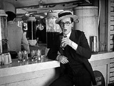
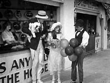
He shifts to another spot to watch them. When she notices him, she scorns him, and he reacts.
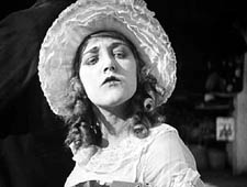
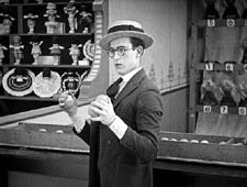
She and the escort stroll past, then she turns and cuddles up to him, making sure Harold notices.
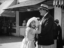
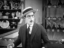
Her flirting precipitates the rest of the action in this very funny short.
In this scene from Number, Please? Harold and the couple aren’t shown in the same frame. The action is built entirely out of singles of Harold and two-shots of the couple, with an especially emphasized close-up of the girl’s snooty reaction. The sequence is rapidly paced and carefully matched in angle; note the shift in eyelines as the girl and her beau walk a little way and then she looks back at Harold.
This approach to building a scene was consolidated in American studio cinema in the late 1910s, as we noted recently, and it soon spread around the world. One of the places it caught on most fervently was Soviet Russia.
Kuleshov glories in the gaps
The great director and theorist Lev Kuleshov always claimed that he and his associates learned the power of editing from American cinema. Russian films were slowly paced, consisting of long tableaus occasionally broken by an inserted closer view of an actor. (For examples, see my Bauer blog entry from the summer.) Kuleshov noted that the Hollywood films brought into Russia grabbed audiences’ interest more intently, and Kuleshov attributed this effect to the fact that the Americans exploited editing more fully, creating the scene out of many shots.
Kuleshov’s example was the formulaic scene of a man sitting at his desk and deciding to commit suicide. The Russians, Kuleshov claimed, would handle this all in one distant framing, with the result that the key actions were just part of the overall view. By contrast, Americans would shoot the scene in a series of close-ups: the man’s face, his hand taking a pistol out of a desk drawer, his finger tightening on the trigger, and so on. This gave the scene a powerful concreteness, and was cheaper to film besides (no need to have a full set).
But most American filmmakers didn’t create the scene wholly out of close-ups. Typically there would be an establishing shot before the action was broken down into detail shots. The process has come to be called analytical editing. (We discuss it in Chapter 6 of Film Art.) As the label implies, the cutting analyzes an orienting view into its important details.
Less commonly, as in our Number, Please? example, American directors could create a scene entirely out of separate areas of space, without ever showing a master framing. This technique, usually called constructive editing, remains common today as well, especially in action scenes.
While praising analytical editing, Kuleshov was particularly taken with constructive editing, because that shows that cinema can call on the spectator’s tacit understanding to assemble the separate shots. Kuleshov realized that we will build a sense of the scene’s space and action out of separate shots without need for the comprehensive view supplied by an establishing shot.
What the Americans developed, the Soviets thought seriously about. Around 1921, Kuleshov and his students mounted some experiments, several of which he discusses in his books and essays. He probably didn’t need to experiment; the American films were full of examples. Indeed, the Number Please? passage is more intricate than any experiment Kuleshov seems to have mounted. But he had a bit of the engineer about him, and he sought to break the technique into its simplest components.
For one thing, constructive editing offered production efficiencies. You could film two actors separately, at different times, and then cut them together. Further, Kuleshov saw that editing could abolish real-world constraints. It created events that existed only on the screen, with an assist from the viewer’s mind.
This is perhaps best seen in his experiment involving an “artificial person.” Evidently it wasn’t a case of constructive editing, because it seems to have begun with an establishing shot. The first shot shows a girl sitting at her vanity table putting on makeup and slippers. A series of close-ups of lips, hands, legs, and the like were derived from different women, and they were edited together to create the impression of a single woman. (Something of this effect survives in the idea of a body double in contemporary films and TV commercials.) But the point is that the woman on screen, made out of different parts, doesn’t exist in the real world.
The same possibility could apply to geography, if we delete the establishing shot. As Kuleshov describes his experiment, we initially get a shot of a woman walking along a Moscow street. She stops and waves, looking offscreen. Cut to a man on a street that is in actuality two miles away. He smiles at her and they meet in yet a third location, shaking hands. Then together they look offscreen; cut to the Capitol in Washington DC. Kuleshov saw the potential for imaginary geography as both a useful production procedure and a demonstration that editing could create a purely cinematic space, one not beholden to reality.
Kuleshov’s most famous experiment, the one he identified with the “Kuleshov effect” proper, involves a stock shot of the actor Ivan Mosjoukin, taken from an existing film. In his writing he’s rather vague and laconic about the results.
I alternated the same shot of Mosjoukin with various other shots (a plate of soup, a girl, a child’s coffin), and these shots acquired a different meaning. The discovery stunned me—so convinced was I of the enormous power of montage. (1)
Kuleshov’s pupil the great director V. I. Pudovkin offers a different description of the shots: a plate of soup, a dead woman in a coffin, a little girl playing with a teddy bear. He also goes farther in reporting how the audience responded. People read emotions into the neutral expression on Mosjoukin’s face.
The audience raved about the actor’s refined acting. They pointed out his weighted pensiveness over the forgotten soup. They were touched by the profound sorrow in his eyes as he looked upon the dead woman, and admired the light, happy smile with which he feasted his eyes upon the girl at play. But we knew that in all three cases the face was exactly the same. (2)
Now it isn’t only geography or a human body that has been created by editing; it’s an emotion.
These experiments have been poorly documented, and only a couple have survived. One consists of fragments of the imaginary geography exercise. Here is Alexandra Khokhlova waving, but we don’t have the answering shot of the male actor responding. The two meet at the foot of a statue.
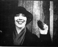
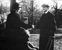
After the two shake hands, they look up and out of the frame, but unfortunately we lack the shot of the Capitol.
Kristin and other scholars have written more about these surviving fragments, and their essays are published along with Kuleshov’s proposal for funding the experiments and his wife Khokhlova’s memoir of filming them. (3)
It’s worth taking these prototypes of constructive editing apart a little bit. Clearly, there are several cues that prompt us to see the shots as continuous.
One cue is a common background, or at least a consistent one. Kuleshov thought that sometimes a neutral black background worked best, especially for close shots, as you can see with the handshake shot. Another cue is roughly consistent lighting from shot to shot. Yet another is the presumption of temporal continuity; no moments seem to be omitted in the cut from shot A to shot B. It never occurs to us to consider that Kuleshov’s man is looking at something hours or days before the soup is laid on the table in the second shot.
One of the most important cues goes unmentioned by Kuleshov: the very act of looking. Like most commentators, he seems to take it for granted. Yet it’s crucial in prompting us to imagine an overall space in which the actions take place. Knowing the real world as we do, we can infer that if you’re close enough to watch someone, both people are probably in a shared space, such as the arcade strip in the amusement park in Number, Please?
Another cue is facial expression. In his soup/girl/coffin sequence, Kuleshov supposedly picked a shot of Mosjoukin that doesn’t have a clearly identifiable expression. If Mosjoukin was smiling in his interpolated shot, he would presumably seem not grieving but wicked. Normally, though, performers seen in the single shot are expected to express the appropriate emotion more fully, in order to specify what we take the characters’ mental states to be. Our sequence from Number, Please? makes sure we understand the drama by giving the actors unambiguous expressions.
Finally, in the Kuleshov prototypes each shot should be simple. Its action can be stated in a brief sentence. A woman waves. A man responds. A man looks. A plate of soup sits on a table. Even in Number, Please? we can summarize each shot: Harold looks off. His former girlfriend disdains him. That’s to say that the shots are composed to present only one, quickly grasped point of interest.
Filmmakers don’t need to tease apart all these cues; they use them intuitively. Soon after Number, Please?, Hollywood filmmakers were creating amazing passages of eyeline-match editing—the most virtuoso being probably the racetrack sequence in Lubitsch’s Lady Windermere’s Fan (1926). Within a few years of Kuleshov’s experiments, Soviet filmmakers were creating their own masterworks, like Battleship Potemkin (1925) and Kuleshov’s By the Law (1926). Benefiting from a very compressed learning curve, filmmakers took constructive editing to new heights.
Constructive editing, dissolved relationships
Sometimes constructive editing is used to save a scene when production goes astray. When Doug Liman reshot the climax of The Bourne Identity, Julia Stiles couldn’t be on set, so singles of her taken from the first version were wedged in among the retakes, to create the impression that she was watching Jason confront his controller. More positively, a carefully calibrated constructive editing is central to a sequence I analyzed a while back in In the City of Sylvia. For over 100 shots, the spatial relations are built up without an overall establishing shot. (4)
Constructive editing can be used systematically throughout a film. A good example is Alan J. Pakula’s thriller Presumed Innocent (1990). Spoilers coming up!
Harrison Ford plays Rusty Sabitch, a prosecutor in the District Attorney’s office who becomes infatuated with a new woman on the staff. He has a brief affair with her, but after she’s broken it off she’s found brutally murdered. He has to investigate the crime without involving himself, but eventually he becomes the prime suspect.
At the start of the film before Rusty learns of the murder, Rusty and his wife Barbara are shown at breakfast, and establishing shots bring them together.
At the office Rusty learns of Carolyn’s death, and after he comes home, the conversation between Rusty and Barbara is treated without an establishing shot. Barbara knows about the past affair, and Rusty is wracked by guilt and shame. The cutting seems to reflect the fact that Carolyn’s death has revived the pain in their marriage.
In a series of flashbacks, Rusty relives his affair with Carolyn. Pakula treats their early encounters by means of constructive editing. The common-background cue is especially helpful in this scene in a kindergarten.
Only after Carolyn and Rusty cooperate and win a child-abuse case does the cutting’s rationale become clear. Pakula has saved the traditional two-shot framing for their moment of passion, as they make furious love in the office.
But soon their affair wanes and Rusty is reduced to watching Carolyn from across the street in point-of-view shots.
After the flashbacks end, Rusty is investigated and eventually charged with Carolyn’s murder. In these scenes Pakula often situates Rusty and Barbara in the same frame, as if the threat to him has healed the breach between them.
Yet in the film’s climax—and here is the big spoiler—they are pulled apart again. The last scene is a sustained monologue by Barbara. As Rusty listens, across twenty-six shots the two are never shown in an establishing shot.
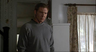
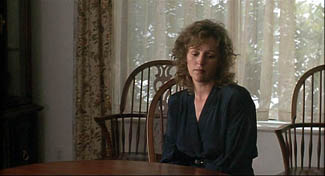
Contrary to the standard Hollywood ending, in which the loving couple embrace in reunion, here they are left divided.
Pakula’s use of constructive editing has effectively traced two arcs: the growth and dissolution of Rusty’s affair, and the reuniting and dissolution of his marriage. In such ways, what might seem a purely local effect, confined to a handful of shots, can create stylistic patterning across a film. The judicious use of constructive editing matches the dramatic development.
Godard of the gaps
Robert Bresson has made more varied and complex uses of constructive editing across a film, as I tried to show in Narration in the Fiction Film and in an Artforum essay. (5) A more radical approach, somewhat in the purely Kuleshovian spirit, can be seen in Godard’s films since the late 1970s. In presenting a scene, Godard often omits an establishing shot, so constructive editing takes over. But he makes the technique quite abrasive and ambivalent.
In watching films like Number, Please? and Presumed Innocent, we fill in the gaps between shots with ease. Godard, however, makes his images and sounds more fragmentary by equivocating about the Kuleshovian cues. The background elements and lighting don’t match entirely; time seems to be skipped over; glances and facial expressions are ambivalent. Adding to these factors, lines of dialogue slip in from offscreen. Godard does present a dramatic scene taking place, but he also creates a sense that images and sounds have been pried loose from their place in an ongoing action, floating somewhat free and functioning as objects of contemplation for their own sake. The cues that Lloyd insists on and that Kuleshov plays with are ones that Godard suppresses or makes ambiguous.
I’ve mentioned this tendency in a recent entry, but to elaborate a little, consider the science lecture in Hail Mary (Je vous salue Marie, 1985). A professor who has emigrated from an Eastern bloc country is explaining his theory that life on earth began and evolved because it was directed by extraterrestrials. No establishing shot of the classroom shows us where he, Eva, and two male students are located, so we have to construct a rough sense of their positions on the basis of a few cues. As Eva, perched on a windowsill, toys with a Rubik’s cube, we hear the professor’s lecture begin to speculate on whether life could have evolved spontaneously. His remarks about sunlight coincide with a burst of sun on her face.
After the Biblical title, “In those days,” we get a series of shots that allow us to apply our mental schema of a classroom lecture: attentive students looking off, a professor at the blackboard.
Lacking an establishing shot, we can’t specify how many people are in the class, nor indeed where Eva and her classmate are sitting—since the professor looks off in several directions during his talk.
At the end of his talk he remarks, still scanning the room, that we can presume that life exists in space. “We come from there.” At that point Godard cuts to the head of another student, seen from behind. The sproingy haircut is a little explosion of yellow, and it’s accompanied by a burst of choral music. And as the shot goes on, we start to notice that the professor is pacing in the background, out of focus.
The student, whom we’ll learn is named Pascal, asks a question (at least the slight head movement suggests that it comes from him), and the professor replies. Pascal scratches his head as the professor continues, still out of focus. If I had to choose one shot that condenses Godard’s strategy of suppression in this sequence, this shot would be my candidate.
At the end of the shot, the professor asks Eva to stand behind Pascal. Cut 180 degrees and somewhat farther back to Pascal, now seen from the front. The professor’s hand brings the Rubik’s cube into the shot and Eva comes up behind Pascal as the professor passes.
Later she and the prof will become lovers, but Godard lets them meet first as simply two torsos intersecting behind Pascal. The purpose is a demonstration that a “blind” agent can be steered toward a goal through simple yes/no commands. This models the professor’s theory that an alien intelligence could have guided evolution.
Pascal will twist the facets of the cube under Eva’s hints. Godard makes this a tactile, even erotic exchange, with the close-up of her by his ear and Eva saying, “Yes,” more urgently as Pascal’s hands arrive at a solution, in the close-up surmounting this blog entry.
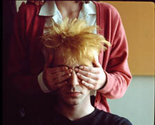
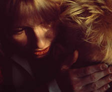
The next two shots of the sequence center on the prof, who has exited frame right from the “three-shot.” Now he’s at the window, recalling the initial shot of Eva; but unlike her he’s little more than a silhouette. As crashing organ music is heard, he seems to be watching the experiment from afar. The second shot, an axial cut-in, coincides with the offscreen voice of a male student: “Were you exiled for these ideas?”
“These ideas, and others,” the prof replies. He says he’ll see the class on Monday, evoking the idea that he’s dismissing the offscreen students, and he turns his head slightly, though we can’t be sure they’re on his right. This shot will be held for some time as students quiz him more about his theory, and Eva asks him if he’d like to come over for a drink some evening. But we don’t see her say it. Godard cuts to a shot of Eva at the window, bathed in sunlight, opening and shutting her eyes as she slightly lifts and lowers her head.
As we see her, we hear the rustling of people leaving (so the class was evidently larger than three). And we hear him reply to her invitation, “That’s another story [scénario].” Are Eva and the prof looking at each other? We’re inclined to say yes, but her closed eyes and tilting head suggests someone lost in contemplation rather than engaged in conversation. Here the classic facial-expression cue is made indeterminate. We have no way of knowing if the prof’s line comes from offscreen, or is displaced from another point in time; maybe he has left the room. Such displaced diegetic sound occurs elsewhere in the film.
We don’t have to decide; our indecision is the point. By pruning away the most reliable cues, Godard wins both ways. We’re kept somewhat oriented to an intelligible action: a prof sets forth his far-fetched theory of human origins and a woman in his class invites him for coffee. This side of the balance allows us to feel that a story, however sketchy, is moving forward.
But the moment-by-moment texture of the scene allows the individual shots, gestures, and sounds to drift somewhat free. Each image takes on a more intrinsic weight, and the juxtaposition of picture and sound acquires a resonance that we usually call poetic. A shot of Eva in the sun playing with the Rubik’s cube, unanchored in time (during class? before class started?), invites us to apply metaphors, especially once we learn her name. Pascal’s thorny hair suggests not only extraterrestrials but the explosion of a nova. The silhouetted prof, detached from the mechanism he has set in motion, hints at an unknown deity watching the game play out according to his rules. Why do Godard films spawn long essays built out of erudite associations? Because the narrative progression relaxes and we can weave our own connotations out of what we see and hear.
If you don’t want to go down the expanding-association route, there’s another one open. When individual moments no longer accumulate ordinary dramatic pressure, we can savor the fugitive pleasures of the separate shots (light on face, lips by ear) and the patterns they form: flipover cuts, yellow hair and yellow facets, bookended shots of Eva at the window.
Those patterns, it should be clear, depend on our sensing a bump at every shot change, looking for a way to skip across the gap that Godard creates. The same belief that meaning and effect are born of gaps impelled Kuleshov too, and perhaps even Lloyd. If we pay attention to those gaps we can feel minds—both the filmmaker’s and ours—at work in them.
(1) Lev Kuleshov, “’50’: In Maloi Gznezdinokovsky Lane,” Kuleshov on Film, trans. and ed, Ronald Levaco (Berkeley: University of California Press, 1974), 200.
(2) V. I. Pudovkin, “The Naturschchik instead of the Actor,” Selected Essays, ed. and trans. Richard Taylor (Oxford: Seagull, 2006), 160.
(3) See Kristin Thompson, Yuri Tsivian, and Ekaterina Khokhlova, “The Rediscovery of a Kuleshov Experiment: A Dossier,” Film History 8, 3 (1996), 357-367.
(4) The sequence does begin with a long shot of the café, but it is so distant, crowded, and brief that it can’t really be said to establish the spatial relationships among the several characters we see.
(5) “Sounds of Silence,” Artforum International (April 2000): 123.


