Archive for the '1910s cinema' Category
Movies in the mountain, and on the machine
DB here:
I’m back in Madison from 2 1/2 months in Washington, DC. under the auspices of the John M. Kluge Center, where I was this year’s Chair of Modern Culture. This kind appointment allowed me to pursue my research into 1910s American film style, than which nothing could be more fun. Along with that were some extramural activities. The most spectacular one was our Kluge field trip into the most overwhelming media archive in the world–the bulging-biceps caped crusader of film, TV, and sound preservation.
Treasures under Mount Pony

Dr. Strangelove could have come up with the idea. If the Russians attack the US, better have a deep underground vault for storing a few billion dollars to replenish currency supplies on the East Coast. So in the Culpeper, Virginia countryside build a gigantic secret bunker. Include facilities for housing 500 or so personnel to keep the government, or what was left of it, running for a month. Add amenities like a pistol range and refrigeration units to cool cadavers that couldn’t be buried outside. Getting assigned here in nuclear winter would definitely count as subterranean homesick blues.
This super-secret complex was completed in 1969. It boasted foot-thick concrete walls and was surrounded by barbed wire and machine-gun nests. By 1992, the bombs had failed to fall, so the complex was decommissioned and eventually offered for sale. After a major grant to the Library from the David and Lucille Packard Foundation, a long-time friend of American film history, the building was transferred to the Packard Humanities Institute . The facility was renovated thanks to over $260 million of Packard and Congressional funding. A lot, yes, but in 2017 dollars that comes to about $402 million, and Beauty and the Beast has scared up about twice that over the last couple weeks.
The renovation turned this vast bank vault/bomb shelter into the world’s most colossal and up-to-date media storage and preservation facility. Opened in 2007, the National Audio-Visual Center is also known as the Packard Campus. Its collection of films, videos, and audio records, along with posters and documents, come to over six million items sitting on ninety miles of shelving. With 80 per cent of it sunk below ground, it was designed to be an exemplary green building, with a vast gardened roof.
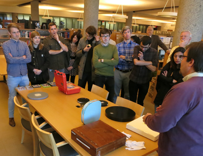
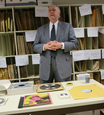
Thanks to the energy of Kluge Center director Ted Widmer and his colleagues, we had a chance to visit the place. Greg Lukow, Chief, NAVCC–Packard Campus, and Mike Mashon, head of the Moving Image section, led us in a labyrinthine, carefully organized three-hour tour of the dazzling facility.
I can’t convey all that we learned about conservation of film, TV, sound recordings, and digital media. Rest assured that the hundred-plus people working away here in state-of-the-art conditions are striving mightily to save media artifacts for you and me and our heirs. Here are some high points.
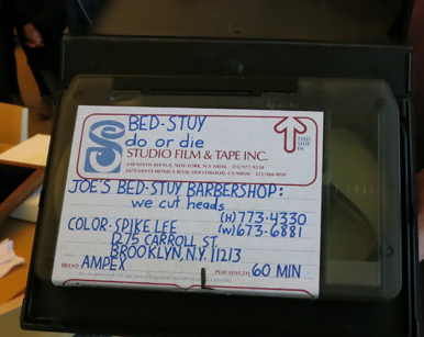
Mike introduced the visitors to the moving-image formats of the media conserved at the facility, everything from film and videotape to Digital Cinema Packages. Spike Lee’s first film, as a copyright deposit, is there too, on Ampex tape.
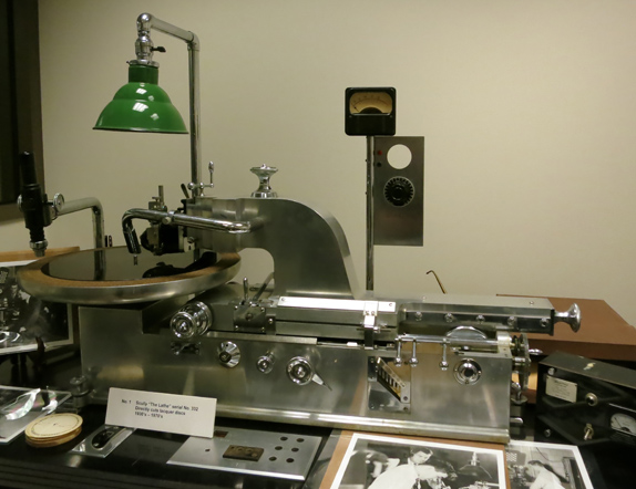
Sound isn’t neglected, as Greg offered a comparable overview of all the audio formats, including cylinder and wire recording. Yes, 8-tracks are also involved. On the right you see the Scully Lathe, a gleaming bad boy that cut disks. Used from the 1930s into the 70s it’s being brought back with the new interest in vinyl records.
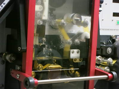
We visited several lab and restoration rooms, including one for wet-gate printing and another for migrating VHS tapes to digital files. Since the latter has to be done in real time, robots are recruited for the job, busily gliding up and down ranks of cassettes.
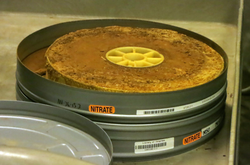
Of course we had to stop by film vaults, kept a chilly 39 degrees. On the left we see some of the holiest of holies, nitrate vaults. It looks like a Spanish Civil War prison, rows and rows of heavy doors. The vault on the right contains master safety film elements, on both acetate and polyester stock.
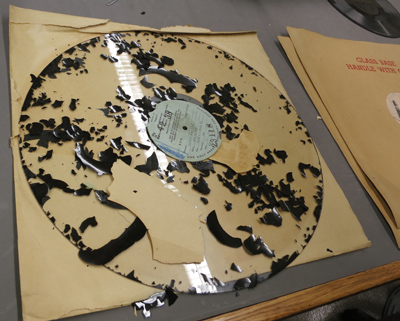
What’s a trip to an archive without despoiled artifacts? On the left, a flaking glass-based 16-inch lacquer instantaneous disc from the NBC radio collection. “Instantaneous” means that it was a recording of a live broadcast, and so was probably unique. On the right, we have decomposed nitrate film.
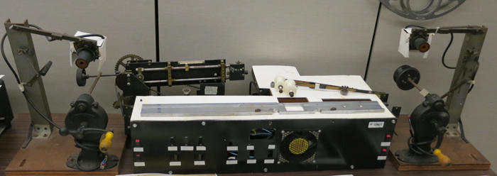
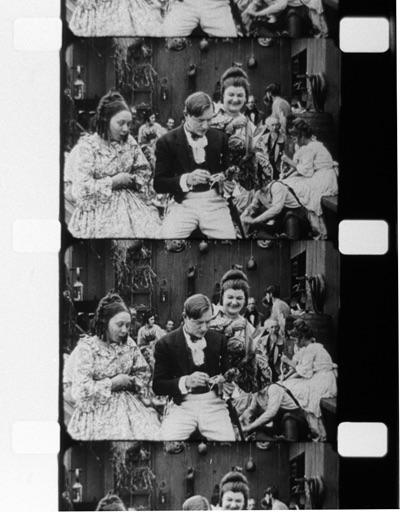
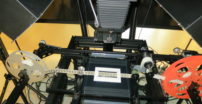
Of enduring interest to cinephiles is the famous paper print collection. Film companies of the earliest years submitted to the Library movies on rolls of paper, to be copyrighted in the manner of still photographs.To be preserved and screened, those had to be turned back into films. During the 1950s that task was fulfilled by Kemp R. Niver in a home-made rig.
He transferred some 3,000 titles to 16mm–not the ideal format, but better than nothing. Some results were fuzzy and jumpy, but many came out okay. I watched several during my stay, including The Hoosier Schoolmaster (1914).
Since then, some excellent 35mm prints have been made from the paper prints, and still more success has been found with digital remastering, which can correct for misaligned frames on the original paper copies.
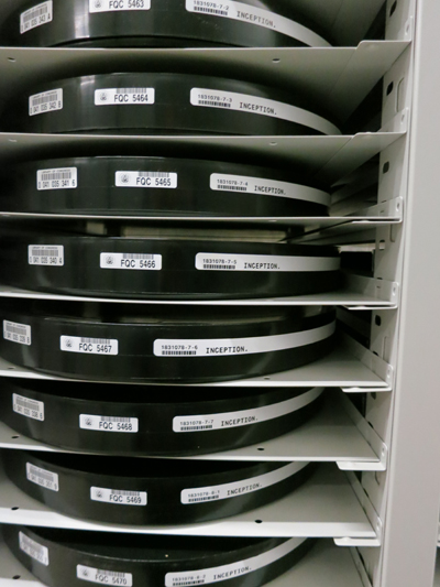
It was good to learn that film copies of new releases are still being submitted for copyright deposit. An impeccable print of Get Out arrived while I was there, and of course 35mm advocate Christopher Nolan wouldn’t miss a chance to save Inception and other of his works.
But I was dismayed to learn that a great many companies, taking advantage of a loose requirement about what counts as a deposit copy, are submitting DVDs, Blu-rays, and even DVD-R versions of their films. If they can’t submit a print, they should at least provide an unencrypted DCP. Otherwise, scholars and audiences of the future will encounter the digital equivalent of the crawling, scraped deterioration we see with film.
101 movies
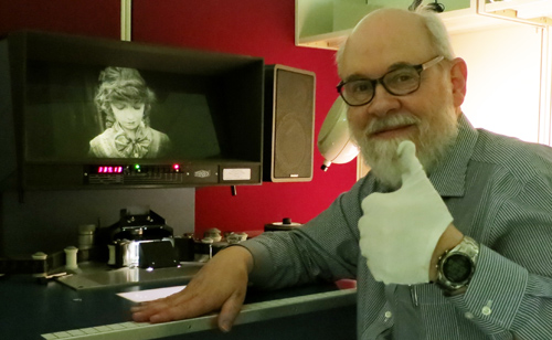
Fortunately for me, 1910s films are still available on film. Viewing prints of films stored at Culpeper are shipped to the James Madison Building in the District. There, in the Moving Image Research Center, they may be viewed on my old friend, the flatbed machine known as a Steenbeck. Every day a Steenbeck patiently awaited my depredations.
The staff of the Reading Room were just superb in helping me order titles and dig up information about them. Above you see the team I worked with: Dorinda Hartmann, Rosemary Hanes, Josie Walters-Johnston, and Zoran Sinobad.
I learned an enormous amount from them, and I enjoyed talking movies with them during our breaks. Others who helped me greatly were Karen Fishman, Research Center Supervisor, MBRS Division; Alan Gevinson, curator of the American Archive of Public Broadcasting; and David Pierce, Assistant Chief, NAVCC–Packard Campus.
My mission was to see as many American fiction features from the 1910s as I could. This was the period when a five-reel film (ca. 60-70 min.) became a dominant format, though shorts and longer films were also being made. I’ve spent about a decade watching largely European films of the period in various archives and in Bologna’s Cinema Ritrovato, with results I’ve occasionally discussed on this blog. A visit to the LoC nicely complemented my Continental and Nordic explorations. Although several American films from the period are available on DVD, I’ve tried to see even those in film copies. (Why? Tell you later.)
For a time I was joined by James Cutting, perceptual psychologist extraordinaire, who enthusiastically wanted to watch these old movies. His presence helped me a lot, sharpening my attention to things in the images. Here’s James, skewed, during our nighttime trip to Chinatown for food and Get Out.
In all, across 42 business days (had to take days off for holidays and inauguration), I saw 101 films, 98 from my period and three others for other projects.
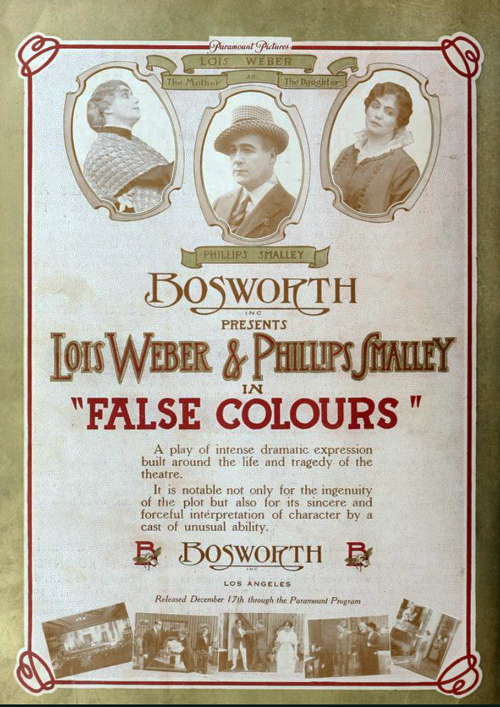
Not all the films survive complete. Some lacked one or more reels. That’s a great pity in the case of Lois Weber/ Phillips Smalley’s False Colours (1914), Sunshine Molly (1915), and Idle Wives (1916); William deMille’s The Sowers (1916); William Desmond Taylor’s Ben Blair (1916); and many other stunning projects I got a glimpse of. But a little is better than nothing, as I’ve tried to show in an earlier entry and hope to show in later ones.
A few portions that remained were plagued by deterioration. Usually, that consists of ameba-like creatures swarming over the image. Some decadents wallow in these miasmas, especially on tinted prints. (See Lyrical Nitrate and Decasia.) Me, I can’t romanticize turning a 1910s drama or comedy into a 1960s abstract film. I want to see the story and the style, dammit.
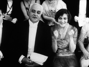
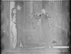
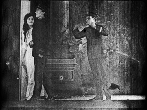
Another form of deterioration yields a ghostly, scraped-off image. Sometimes the decay changes from shot to shot, presumably because at some points the shots were segregated for tinting and toning. Here’s The Caprices of Kitty (Smalley, 1915), with Elsie Janis watching a play. In a gag on celebrity, she’s also an actor on stage (and in drag). After the nice shot of her and her father in the audience, the stage shot makes you shudder.
A first effort to clean it up with Photoshop helps, but still…Makes you remember why all that effort on the Packard Campus is necessary.
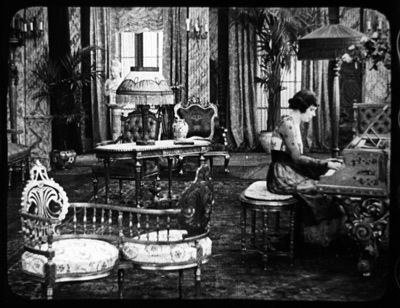
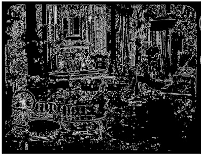
Of course a great many copies I watched were gorgeous. Orthochromatic film, with a ton of light dumped on the sets, yields images with incredibly rich gray scales. (My Ilford photochemical black and white couldn’t capture that range.) When we saw this parlor shot from By Right of Purchase, a 1918 Norma Talmadge melodrama, James blurted out, “Clutter!” A connoisseur of dense images, James later ran it through his algorithms and found that it had a spectacular degree of clutter.
Filigreed clutter is another big reason to like the 1910s, and archives like the LoC team are keeping it visible for us.
Deterioration isn’t the only insult these movies suffer. There’s the degradation of them in oft-copied versions. Compare this shot, from Reginald Barker’s splendid William S. Hart film The Bargain (1914), with the image you get if you buy the bootleg DVD.
Shot scale changes because of video cropping, facial expressions become unreadable, the eyes go dark, and that mounted trophy in the back just disappears. Of course things go a lot better with a video version of a film restored by the Culpeper crew (Moving Image Curator Rob Stone in particular). Olive Films has just released Wagon Tracks (1919), a fine William S. Hart film, on a very pretty Blu-ray derived from a tinted Library of Congress restoration.
So it can be done well, though I still prefer to study a 35 print, preferably untinted. Call me cranky.
The Packard Campus visit brought home to me how much effort is spent saving our film heritage. That heritage includes films that are little-known, but deserve better recognition. Watching with me, astonished by the technical ingenuity and wide-ranging experimentation rushing past us, James was reminded of the Cambrian Explosion, that period of origin and rapid diversification among earthly organisms.
It’s an intriguing analogy. A mere dozen years yielded “our cinema,” as I’ve argued in this video lecture–the sturdy prototypes of moviemaking today. Yet along with enduring models of story and style came a cascade of ingenious novelties that weren’t taken up much. The 1920s, for all their innovations, tended to prune away some of the more eccentric but intriguing tendencies that burst out in the 1910s. In my next entry on the subject, I’ll offer some examples.
I owe a tremendous debt to the John W. Kluge Center for supporting my stay at the Library of Congress. Thanks especially to Ted Widmer, Director of the Center, and his colleagues Emily Coccia, Travis Hensley, Callie Mosley, Mary Lou Reker, and Dan Turello. Also I enjoyed enlightening conversations with Peter Brooks, in residency at the Center, and the other Kluge Chairs Timothy Breen, Jose Casanova, and Wayne Wiegand, all embarked on fascinating projects.
Thanks also to all the staff at the Packard Campus, who enthusiastically shared information about their work habits. We’re grateful to Greg and Mike for spending so much time with us.
The digital spoor on the Packard Campus leads far and wide; a Google search will yield you many nifty items. The 2007 plans for the facility are reviewed in this information-packed presentation by Greg Lukow. For something more recent, try the Wired visit by Brian Gardiner. On the digitizing side, see Boing Boing’s extensive coverage, including an interview with Greg. There’s a good half-hour C-span documentary tour led by Mike Mashon. Mike’s blog Now See Hear! offers updates on current Campus events.
Tony Slide’s Nitrate Won’t Wait (McFarland, 2000) remains the essential source on U.S. film preservation. It has some good anecdotes about Kemp Niver, including one involving a pistol and Raymond Rohauer. Criterion has a nifty little film on wet-gate restoration of The Man Who Knew Too Much (1935).
If you’re interested in film research, you need to read James Cutting’s sweeping big-data studies on film. A good summing up of part of it is “Narrative Theory and the Dynamics of Popular Movies.” There’s interesting commentary on it here from a psychologist and here from a screenwriter (who clings to the three-act model). James’s book on the formation of the canon of Impressionist painting has been invoked in Derek Thompson’s book Hit Makers: The Science of Popularity in an Age of Distraction (Penguin, 2017), 23-26.
For more on visual clutter, see this paper on clutter and visual search, of which Tim Smith, master of eye movements, is a co-author; and two papers specifically on movies, by James, one with Kacie Armstrong: here and here.
DB makes Lillian bashful in The Lily and the Rose (1915).
Waldo Lydecker, James Schamus, and 1910s movie storytelling
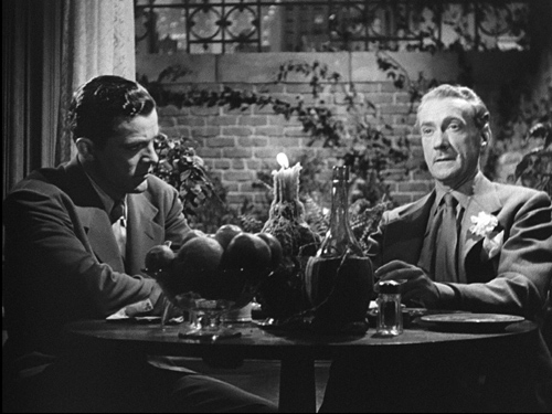
Laura (1944).
DB here (in DC):
Over the next two weeks I’m involved with several events during my stay at the John W. Kluge Center of the Library of Congress. If you’re near Washington, do consider coming to one or all of these doings.
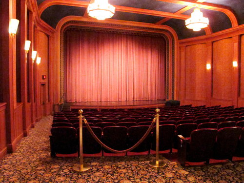
First up is a screening of a sparkling restored print of Otto Preminger’s Laura (1944), at the gorgeous Packard Campus Theater in Culpeper, Virginia on 8 March. The show, a new addition to the Theater’s spring schedule, starts at 7:00 pm, a half-hour earlier than the customary time. I’ll be giving a brief introduction.
On the following Monday, 13 March, the Kluge Center will host “James Schamus on Philip Roth and the Art of Adaptation.” After a screening of James’s directorial debut Indignation, he will participate in a discussion with the audience. I’ll play moderator. The event will take place at 3:00 pm in the Pickford Theater, on the third floor of the Library’s Madison Building, 101 Independence Ave. S.E.
James, professor at Columbia and producer and writer of many important American and Chinese films, needs no introduction to this blog’s readership. (Above, he’s with frequent collaborator Ang Lee.) We’ve celebrated his work here, and I discussed the admirable Indignation just last summer. This upcoming session should be an exhilarating afternoon.
Lastly, I’m giving a talk, “Studying Early Hollywood: The Search for a Storytelling Style.” It develops some of the issues I’ve floated in my books, other lectures, this video lecture, and most recently this blog entry. The talk is set for 4 pm. on Thursday, 16 March. It takes place in room 119, a magnificent venue on the first floor of the Library’s Thomas Jefferson Building, 10 First St. S.E.
All these events are free and open to the public, and you don’t need tickets.
Being at the Kluge Center has been very stimulating, and my research into 1910s visual style has benefited hugely from access to the LoC’s film collections. These three events are wonderful ways to wrap up a stay that has gone by all too fast. If you’re in the vicinity, come by and say hello.
Thanks to the many people who have made these events happen: At the Kluge Center Ted Widmer, Mary Lou Reker, Dan Turello, Travis Hensley, and Emily Coccia; at the Packard Campus Greg Lukow, Mike Mashon (initiator of many things), and David Pierce.
More information on the Packard Campus Theater is here. A summary of James’s vast career is here.
The Packard Campus Theatre. Photo by Glenn Fleishman.
Anybody but Griffith
Motion Picture News (19 December 1914), 148.
DB here:
For almost two months, I’ve been in Washington, DC at the Library of Congress. The John W. Kluge Center generously appointed me Kluge Chair in Modern Culture. This honor has enabled me to work with the enormous collection of the Motion Picture, Broadcasting and Recorded Sound Division to sustain my research in American narrative cinema of the 1910s.
I wanted to go more deeply into an area I mapped out in the video lecture, “How Motion Pictures Became the Movies” and in the books On the History of Film Style and Figures Traced in Light. The general question was: How did the norms of storytelling technique develop between 1908 and 1920? More specifically, I hoped to trace out an array of stylistic options emerging for the feature film. What range of choice governed staging, framing, editing, and kindred film techniques?
Theatre, but through a lens; painting, but with movement
If you’ve seen that lecture, or just followed this blog from time to time, you know that I’ve sketched out two broad stylistic trends operating at the period. One, celebrated as a breakthrough for a hundred years, involves the development of continuity editing. That trend was explored by several historians of early film, including Kristin in the book we did with Janet Staiger, The Classical Hollywood Cinema: Film Style and Mode of Production to 1960.
Critics and historians who saw editing as the essence of cinematic technique called the second trend “theatrical” and regressive. Directors in that trend supposedly simply planted the camera in one spot and let it run, recording performances and not bothering to cut up the scene into closer views. This “tableau” tradition was superseded by an editing-based style–and, many thought, a good thing too.
Over the last twenty years, however, scholars have reappraised that apparently static and passive camera. Lea Jacobs and Ben Brewster’s trailblazing book, Theatre to Cinema: Stage Pictorialism and the Early Feature Film (1997) traced film’s many debts to theatrical plotting, set design, and especially performance. In a parallel series of articles, Yuri Tsivian proposed that the “precision staging” of the 1910s had deep affinities with traditions of painting and visual culture. Lea, Ben, and Yuri showed that the tableau tradition offered rich creative choices to filmmakers.
For my part, I was concerned to explore how ensemble staging worked in a moment-by-moment fashion to call the viewer’s attention to key aspects of the action. Editing does that by cutting to closer views. In the tableau method, emphasis arises from composition, movement, and other pictorial strategies.
In light of all this research, it seems clear that during the 1910s the tableau strategy developed into a powerful expressive resource. After Figures Traced in Light (which found the tradition still alive in directors like Angelopoulos and Hou), I continued to collect examples of creative staging at this early period. The results led me to analyze films by Yevgenii Bauer, Danish directors, and other Europeans.
 Evidently the tableau persisted until 1920 or so in Europe, especially Germany, but the editing-centered option had already become dominant in America. But how long, and in what ways, did tableau methods hang on in the US? Or was the switchover quite quick? By 1917, Kristin had posited, continuity editing had crystallized as the primary storytelling style. I thought I’d try some depth soundings of the period.
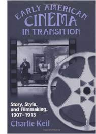
Since my time was limited, I had to focus. Charlie Keil’s superb Early American Cinema in Transition: Story, Style, and Filmmaking 1907-1913 (2001) analyzed a great many films of that phase in depth, particularly with respect to editing techniques. So I thought I’d start with 1914 and simply try to see as many features from that year as I could. I then would sample items from later years. My only rule was to watch films that aren’t part of the canon–no Griffith, Chaplin, Fairbanks, Pickford, Fatty et al. I did, however, try to see rare things by Lois Weber, Reginald Barker, and other well-regarded filmmakers.
What did I come up with? I’m still watching and thinking, but let me share a few items that excite me. Clearly, despite plenty of audacious editing, the tableau technique was alive and well in America in 1914-1915. And the more I see, the more I’m inclined to rethink the terms under which I value Mr. D. W. Griffith.
Tableau trickery
A simple illustration of how a fairly distant tableau can vividly guide our attention shows up in The Case of Becky (1915), directed by Frank Reicher.
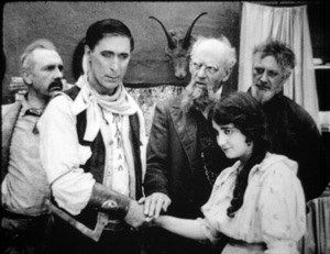
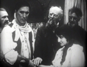
Before an audience, the sinister hypnotist Balsamo hypnotizes Becky. From a deck of cards he has selected the ace of hearts, and in her trance she has to find it. There’s almost no movement in the frame: Balsamo stays frozen, as does Becky, except for her one hand flipping over the cards.
No need for a close-up: With Balsamo as still as a statue, every viewer will be watching that tiny area of the screen occupied by her hands, and we wait for her to find the ace. When she does, Balsamo accentuates her minimal gesture by twisting his arm and freezing into another pose.
Is this, then, simply filmed theatre? Not really. First, many tableau framings, like the Case of Becky instance, put the actors closer to us than stage performers would be.
Just as important, the perspective view of the camera yields a chunk of space very different from that of proscenium theatre. In cinema, for instance, depth is more pronounced, and actors can be shifted around the frame to block or reveal key information. This isn’t pronounced in the Case of Becky example because the two characters are more or less on the same plane and the background is covered by curtains. But consider this shot from The Circus Man (1914), by Oscar C. Apfel.
The circus owner Braddock has been sent to prison for murder and attempted robbery, a plot engineered by Colonel Grand. Now Braddock has served his sentence, and in a scene too complex to trace entirely here (but maybe in a later entry), he bursts in past the butler to confront Grand. Here’s what we see.
Such a scene would be inconceivable on the stage because of the audience’s sightlines. People sitting in the left side of the auditorium couldn’t see Braddock’s entrance, because he’d be concealed by Grand, who’s standing in the foreground left. Audience members on the right side of the auditorium couldn’t see Braddock either, because Mrs. Braddock and David are standing on the right foreground.
The shot makes sense from only a very limited number of points, only one of which is occupied by the camera. Maybe a few people in the center of the theatre would have a fairly clear view of such an action, but as we’ve seen with The Case of Becky, they wouldn’t be so close to the players.
The sheer fact of optical projection means that cinematic space is narrow and deep, while stage space is broad and (usually) fairly shallow. On the stage, players tend to be spread out laterally, allowing for many sightlines. Cinematic staging can be deep and diagonal.
On the other hand, the tableau shot isn’t perfectly analogous to a painting. While the lens chops out a perspectival pyramid in three dimensions, the movement in the frame creates a two-dimensional flow–a cascade of planes and edges very different from what we’d get in a painting. This flow can be used to reveal or conceal bits of space as the action develops.
You can see this compositional flow clearly in an earlier phase of the Circus Man sequence. Before Braddock bursts in, David has been arguing with Colonel Grand in the foreground. David’s and Grand’s heads occupy the area that Braddock will soon claim. Just before that entrance, Mrs. Braddock pulls David back a bit to the right, and Grand recoils fractionally to the left. This creates a hole that Braddock can come into (as above).

This sort of slight shifting is akin to what we see in the astonishing poorhouse sequence of Victor Sjöström’s Ingeborg Holm (1913), analyzed here. Clearly the Americans were executing the same sort of choreography as the Europeans, which turns the static image of a painting into something more dynamic, a sort of micro-dance.
Flo and flow
The married couple Lois Weber and Phillips Smalley are responsible for a little masterpiece of early cinema, Suspense (1913), which I’ve discussed here. It’s become a classic largely because its audacious close-ups and cutting seem to anticipate classic Hollywood style. But seeing, or sort of seeing, two other films by Weber and Smalley suggest that they were no less adept at the tableau method.
I say “sort of seeing” because the copy of Sunshine Molly (1915) was so deteriorated that in long stretches only faint outlines of the people and locales were visible. The plot was pretty clear, but the images were so blotchy that only a few furnish clear frames. Still, it would seem to have been quite a good film. With False Colours (aka False Colors, 1914), two or three reels were missing. But what was there was pretty spectacular, and one scene is really striking if you’re interested in staging.
As with The Circus Man, at first glance things look stagebound. Dixie’s long-separated father comes to the foreground where she stands waiting with the theatrical manager. He abandoned her as a baby, and now that she’s found success as an actress she spurns him.
But no stage arrangement could yield the layout we get in this shot. While father and daughter and manager occupy the “forestage,” we see Flo, who has impersonated Dixie in an effort to get the father’s money, step into the gap. (Flo is played by Lois Weber.)
Thanks to the depth of the “cinematic stage,” we get what Charles Barr calls “gradation of emphasis”–not just two layers of space, as in The Circus Man, but action and reaction in depth, as we wait for the foreground action to develop. That action hits its high point when the father touches Dixie’s chin.
This gesture partly masks Flo, who briefly turns away as well. The emphasis falls firmly on the father’s contrition. Dixie still refuses him, and so he says farewell, re-exposing Flo turning in the background.

As he departs, so that we get the full force of his encounter with Flo, Dixie turns from the camera. We must concentrate on the moment in the background when the imposter shows remorse for having won the love of the man she deceived.
At the door
You might object: “But David! Those examples are still very stagebound. The Case of Becky shot is itself on a stage, and the others, despite all their depth, show boxlike rooms from straight on. They seem firmly tied to a proscenium concept. Shouldn’t we expect something more natural?”
Fair enough, so I submit this earlier phase of the False Colours scene. This time we have a doorway, framed diagonally, that cuts off a lot of playing space. And we see obliquely into a corner of a room, not straight on to a back wall. Yet you still get an interplay of faces and bodies, carrying to a daring extreme the blocking-and-revealing tactics we’ve seen in The Circus Man and in the later phase of the False Colours scene.
Dixie comes to Flo with Flo’s mother. At this point Flo recognizes Dixie as the daughter she’s been impersonating and is deeply ashamed. You won’t be surprised by the dazzling precision of the frontal placement of Flo, no matter how far she is from the camera.
Flo is consoled by her mother, and Dixie shuts the door discreetly.
But why so much empty space on the left of the door? Because now the theatre manager is coming, and the framing shows us what Dixie doesn’t know: Her father is standing there alongside the manager.
There’s a moment of suspense before the father hesitantly steps to the doorway and Dixie sees him for the first time in seventeen years.
He blots out everything but her reaction, until Flo’s face slides into visibility. Cornered, she’s terrified to be confronting the man she has deceived.
The father’s valet has obligingly slid into the left to balance the frame, but he stands as frozen as the hypnotist Balsamo had been, looking patiently downward, to make sure we concentrate on the pitch of drama taking place in the distance. This is as purely “cinematic” a scene as anything involving editing.
And who needs close-ups?
Griffith is a great director, but other filmmakers of his period were exploring cinematic possibilities he didn’t consider. Their editing is often more subtle and careful, and the exponents of the tableau style achieve a pictorial delicacy mostly at variance with his work.
More and more, this Founding Father of Hollywood seems to me an outlier–an eccentric, raw, occasionally clumsy filmmaker who went his own way while others refined a range of stylistic practices. I’m starting to think he favors a brute-force approach, in both physical action and the evocation of sentiment. The result is powerful, but… Well, I’m reluctant to say it, but after my two months of immersion in Anybody But Griffith, he’s starting to seem somewhat crude.
I’m tremendously grateful to the John W. Kluge Center, and particularly its director Ted Widmer, for enabling me to conduct this research under its auspices. A special thanks to Mike Mashon of the Motion Picture Division, and all the colleagues who have been helping me in the Motion Picture and Television Reading Room: Karen Fishman, Rosemary Hanes, Dorinda Hartmann, Zoran Sinobad, and Josie Walters-Johnston.
Ben Brewster and Lea Jacobs’ Theatre to Cinema is available for download here.
For our blog entries relevant to the tableau tradition, go here. Lois Weber made many other important films, notably Hypocrites (1915), Where Are My Children? (1916), Shoes (1916), and The Blot (1921). See the exceptionally detailed Wikipedia entry for more information.
False Colours (1914).
Murnau before NOSFERATU
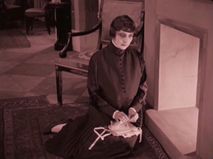
Der Gang in die Nacht (The Dark Road, 1921).
DB here:
For many decades, The Last Laugh (Der Letze Mann,1924) was the F. W. Murnau film. If you were a film buff in the fifties or sixties, that staple of film societies and college courses was probably the first Murnau you saw. Eventually you got to those French favorites, Sunrise (1927) and Tabu (1931). Nosferatu (1922) and Faust (19226) came along in there somewhere. Tartuffe (1926), great as it is, has always seemed a specialized taste.
Today, I think, Nosferatu is probably the one everyone sees first. It fits the modern taste for horror movies, and it is genuinely scary. It popped up in music videos, got remade by Herzog, and will be forever remembered for the vampire’s spindly, ratlike silhouette and the wholly fitting name of the performer, Max Schreck.
Eventually Murnau aficionados caught up with lesser-known Burning Soil (Der brennende Acker, 1922), Phantom (1922), and The Finances of the Grand Duke (Die Finanzen des Grossherzogs, 1923), the latter two available on good DVD versions. But what about Murnau’s very earliest films?
Of the nine films he made before Nosferatu, only two survive more or less complete. They circulated in unsatisfactory condition for many years, but Schloss Vogelöd (The Haunted Castle, 1921), which Murnau made just before Nosferatu, eventually emerged in a splendid restoration based on original negative material. Now we have a digital restoration of Murnau’s earliest surviving film, his seventh: Der Gang in die Nacht (The Dark Road, or “Path into Darkness,” 1921).
And what a restoration it is! The Munich Film Museum’s team has created one of the most beautiful editions of a silent film I’ve ever seen. They started with four reels of camera negative, then carefully integrated material from other sources. Thanks to digital manipulation, I couldn’t tell where the alien footage was.
You look at these shots and realize that most versions of silent films are deeply unfaithful to what early audiences saw. Compare a shot from the lamentable YouTube bootleg and a shot from this version. The smallness of the YouTube image here improves it; blow it up on a big monitor and it goes horribly blotchy.
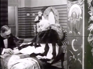
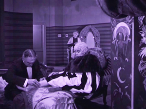
In those days, the camera negative was usually the printing negative, so what was recorded got onto the screen. The new Munich restoration allows you to see everything in the frame, with a marvelous translucence and density of detail. It will project fine big. Forget High Frame Rate: This is hypnotic, immersive cinema.
Der Gang in die Nacht will be shown in the Museum of Modern Art’s “To Save and Protect” series on 13 and 14 November. If you can get there, you should go! If not, we can hope that the film will soon appear on DVD. Remember DVDs?
Silents, golden
The canonized classics of Expressionist cinema, from The Cabinet of Dr. Caligari onward, are superb films, no doubt. But there are lots of other major movies from the period. The German industry flourished during World War I, and even the postwar inflation encouraged a burst of moviemaking. Hundreds of films were produced every year. I’m no expert, but of the seventy or so I’ve seen nearly all are fascinating and surprising. From the brute force of Der Tunnel (1915) and the demented monumentality of Homunculus (1916) to the weirdness of Algol and I.N.R.I. (both 1920), the peculiar pleasures of Sappho (1921) and the splendors of The Nibelungen (1924), I’ve been captivated by this cinema. Caligari is merely the dark and spiky tip of a mighty iceberg.
Der Gang in die Nacht is derived from a screenplay by the Danish scenarist Harriet Bloch. It’s an example of the “nobility film,” a genre cultivated by the Nordisk studio where Bloch worked. In these stories, an upper-class man becomes obsessed with a working-class woman, and she leads him to disaster. The most famous “nobility film” of the era is Dreyer’s The President (1919), when the genre was already somewhat old hat.
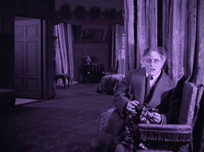
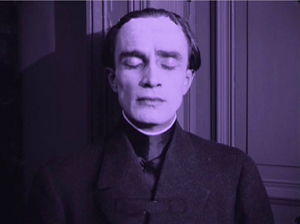
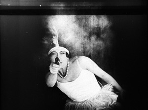
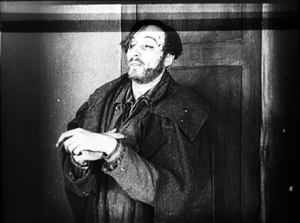
In Murnau’s film, the well-to-do protagonist is Dr. Eigil Börne. Uneasy with his courtship of his wispy fiancée Helene, he plunges into an affair with the dancer Lily. They move to a seaside cottage, where their idyll is interrupted by the spectral figure of a blind artist. (Regrettably, we never get a glimpse of his paintings.) The Painter is played in nearly full Cesare mode by Conrad Veidt: drifting through the landscape and clutching at the air. After Dr. Börne restores the Painter’s sight, Lily falls in love with him and leaves Börne. Unhappiness ensues for all, and yes, suicide is involved.
With only four delineated characters, the plot’s emphasis falls on their reactions to each others’ changing feelings. It’s a surprisingly unsensational melodrama, with no blackmail, threats of murder, or guilty secrets. It’s just about people’s emotional attachments waning, often for reasons they don’t understand. The drama of shifting, elusive moods looks fairly modern.
The playing is deliberate, with a range of acting styles. The drooping Helene, the skittish Lily, the somnambulistic Painter, and the raging Börne may seem to come in from four different movies. But Börne is on a knife-edge from the start, when he nervously leaves Helene. He broods fiercely during his night at the theatre, well before he succumbs to Lily’s charm. Like Scotty in Vertigo, he’s ready to fall. And as a complacent bourgeois, he doesn’t grasp the romantic fascination projected by the passive, wraithlike Painter. Nor is Lily merely flighty and treacherous. The Painter seems to stir her to a genuine love very different from her flirty seduction of the doctor. Helene, mournful throughout all this, is last seen in her sickbed stroking a newspaper photograph of Börne.
The concentration on four characters, each trembling with uncertainty, and the meshing of their moods with the stormy seaside, suggested to one observer an analogy with current stagecraft.
Here for the first time filmmakers try to incorporate the Kammerspiel [chamber play] into a film play. A strong, affecting plot with only a handful of characters has been developed through the smallest psychological details, the unity of locale and characters, the intimate interweaving of the atmospheric mood and the characters’ emotional life. All this has been achieved with the most sophisticated use of facial expression and cinematic direction.
1921 is usually taken as the year that the Kammerspiel genre began, with Scherben (Shattered) and Hintertreppe (Backstairs). Der Gang in die Nacht, which came out before either of these, isn’t usually considered an example. It’s interesting that the review I quoted, based on a December 1920 press screening, sees Murnau’s film as anticipating the trend. Perhaps the more rigorous concentration of time and space in the later films made critics take them for purer prototypes of the genre.
Knowing this background, I think, makes Der Gang in die Nacht more intriguing than it might at first seem. But another context is important too. The film shows Murnau’s debt to an important stylistic tradition. What he did with it is in sync with other filmmakers learning their craft at the same time. (Some spoilers ahead.)
Tableau + insert = proto-continuity
During the years 1908-1920, many filmmakers relied a “tableau” style of filmmaking. The used long shots and long takes, with the actors shifting in expressive patterns around the setting. The tableau might be broken up with titles or close-ups of letters or diaries, but the drama is developed through action played out in the distant framing.
Early historians, and many still today, portray this approach as merely “theatrical.” In fact, because of the way the camera lens creates a pyramidal playing space (the tip resting on the lens), the tableau approach is very different from proscenium theatre, which has a wide, lateral playing space. The result is a choreography of figure movement in breadth and depth that is no less “cinematic”—that is, specific to the film medium—than editing.
Want clarification? There’s a video lecture here, and more discussion in these entries.
In the course of the 1910s, however, filmmakers started to alter this approach. For one thing, they started to cut up the tableau more. American filmmakers were most radical, often abandoning the long shot altogether and building scenes out of several partial views—medium-shots and close-ups. But most European filmmakers were more conservative. They began to use what researchers have come to call the scene-insert method.
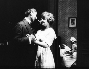
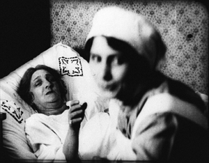
The tableau (the “scene”) would be interrupted by one or two closer views of a face or gesture, before returning to the main framing. Almost always the inserted shot is taken from the same camera position as the long shot. The cut is “axial,” along the lens axis of the camera. It enlarges a slice of space given in the wider view, then usually cuts back along the axis to reestablish the tableau.
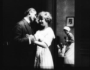
Here’s a simple example from Joe May’s delightful serial Die Herrin der Welt (Mistress of the World, 1919-1920), when a nurse in the room in the background rises.
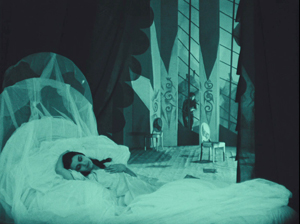
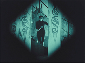
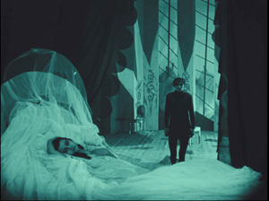
The axial approach is used throughout Caligari too. When Cesare invades Jane’s bedroom, we cut straight in and then cut back as he approaches.
In Kristin’s book Herr Lubitsch Goes to Hollywood (available as a pdf) she traces several instances in other German films, as in this passage from Carmen (1919), with Don José way back at the rear of the tavern–but still on the lens axis.
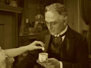
Der Gang follows the scene-insert method often. The only closer view during Lily’s tea flirtation with Börne emphasizes her teasing gesture and his reaction.
The result is a minimal version of analytical editing, a sort of rough, proto-continuity approach to breaking up a scene into details. It can be thought of as a transitional phase toward a fully “classical” style of staging and cutting, and indeed in the 1920s more and more European filmmakers adopt versions of the Hollywood method.
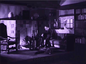
Already, we can see some filmmakers thinking in terms of an establishing shot rather than a tableau. Murnau’s long shot below is probably too far distant to permit a complex play of depth of the sort we see in Caligari and Carmen. It’s designed, we might say, to be cut into.
During this transitional period, we find films exploring the scene-insert method in intriguing ways. The most evident is the tendency to make the cut-in shot very close.
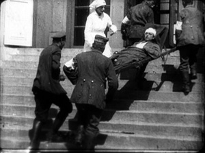
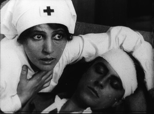
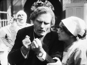
In Paul Leni’s Dr. Hart’s Diary (Das Tagebuch des Dr. Hart, 1918), for instance, we get a rather distant shot showing the wounded Count Bronislaw carried out of the ambulance, followed by a very tight medium-close-up of him and Jadwiga, the Red Cross nurse.
An American director would have been more likely to soften this sudden enlargement with a mid-range two-shot of the couple before providing the intense close-up of their faces.
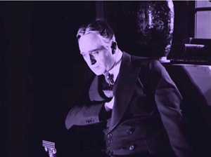
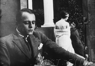
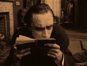
This abrupt jump into a surprisingly close view isn’t uncommon in European cinema of the period, and it’s particularly salient in German films. The insert is often taken with a wide-angle lens, which can accentuate the curves and edges of a face. Murnau’s fondness for the wide-angle lens is a constant throughout his career. A fragment from his first, lost film The Blue Boy shows a wide-angle depth composition, and there’s an astonishing wide-angle close-up of the distraught painter in Der Gang.
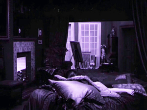
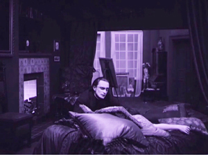
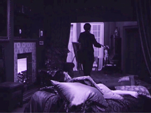
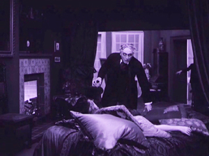
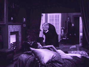
Like many directors working in this line, Murnau balances the power of the sustained long shot with the momentary spike of the closer view. A good example comes in the beautiful passage when Börne discovers that Lily is dead. The setup is given in a classic tableau framing, with only her arm extending out from cushions on the divan. Then the Painter’s head lifts into center frame from behind the pillows, a slow revelation of his pain.
After alternating cuts to Börne hammering at the door, the Painter rises and floats to the door in the back wall. (The rear door is a fixture of the tableau tradition, as it allows for dynamic movement in depth within the visual pyramid.) Once the doctor is admitted, he rushes forward and pauses as the Painter glides into the background.
As Börne wails, Murnau pushes us into the parlor to the Painter, standing in the distant corner like an upright corpse—an alternative version of grief.
Like many films of the period, not only German but also French and Italian ones, Der Gang in die Nacht exploits the resources of the tableau—the graceful, expressive coordination of actors who perform with their whole bodies—while saving the blunt force of the isolated face for a climactic accent. No wonder that film theorists of the late ‘teens and early 1920s were fascinated by close-ups; they were seeing a great many vivid ones.
Not haunted, just mysterious
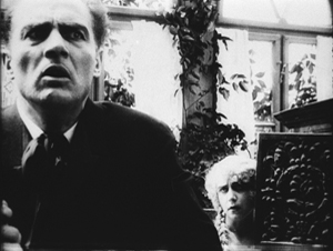
There were a lot of variants on these techniques. As if to give us the tableau and the wide-angle insert in a single frame, Robert Reinert cultivated a looming deep-focus style that suggests a Citizen Kane of the 1910s. The first frame is from Opium, the last two from Nerven (both 1919).
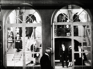
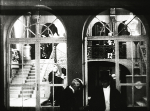
And the extraordinary Weisse Pfau (The White Peacock, 1920) of E. A, Dupont comfortably switches from a dizzying gridded tableau (two men arriving at a theatre lobby, caught in an architectural Advent calendar) to a violent climax using highly fragmented editing.
By 1921 the simplest version of the tableau-plus-insert method was rapidly going out of favor. To get a sense of how techniques were changing at the time, you should watch Murnau’s Schloss Vogelöd (1921) immediately after seeing Der Gang in die Nacht.
The plot is a bit friendlier to our pulpy tastes, involving a past murder that is brought to light during a country house party. (No spooks haunt the castle, just the lingering effects of mysterious death.) Again, there’s a chamber-play aspect to it. Virtually all the action is confined to the mansion of the host, von Vogelschrey, and plays out in a couple of days and nights.
Schloss Vogelöd was released only three months after Der Gang in die Nacht. In the sparkling restoration provided by the Murnau Stiftung, Schloss runs almost exactly as long as the earlier film. But what a difference! I count 231 shots in Der Gang, with 163 of those being images, not titles. I count 511 shots in Schloss, with 356 of those being images. Assuming a common projection speed, the later film is cut over twice as fast.
The sheer number of shots is important, but the crucial factor is that many of the shots in Der Gang retain one particular framing, interrupted by titles or a diary or letter insert. Not only does Schloss have more shots, it has more varied setups. Murnau is shifting his camera positions more often, as were his peers Lang and Dupont, along with other Europeans and of course the Americans.
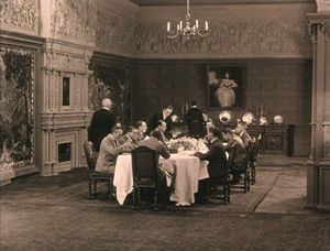
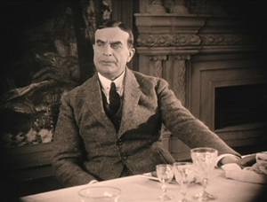
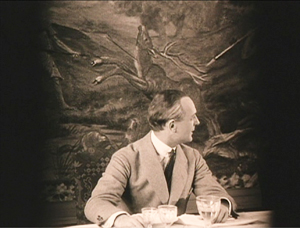
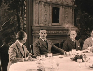
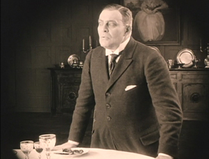
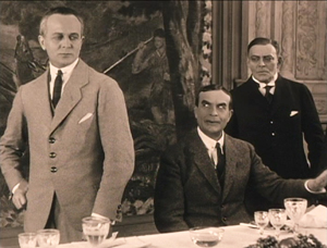
Here’s an example. At a meal, the vengeful Count Oetsch hints that Baron Safferstädt is the murderer. The scene runs about three minutes and contains 16 shots and five titles, played out across six distinct setups. I sample them here.
In a loose sense, the cuts are axial, enlarging or de-enlarging parts of the table as observed from one general orientation. (The judge who stands up and looks left is at the foot of the table.) But within this overall orientation, there’s a variety of setups we don’t find in Der Gang. We aren’t far from that spatial ubiquity and adherence to an axis of action that was pioneered in 1910s Hollywood and would become increasingly common in Europe during the 1920s. The downside: The development of more finely broken-down scenes led to a loss of the complex choreography within a single shot that was common in the early 1910s.
Der Gang in die Nacht was filmed in August-September of 1920; Schloss Vogelöd was shot in February and March of 1921. In between Murnau made Marizza, genannt die Schmuggler Madonna (Marizza, called the Smuggler’s Madonna, not shown until 1922). The fragments of this that have survived are very rudimentary filmmaking, much simpler than anything in either of the other two films.
The faster cutting and more varied setups of Schloss may, as Kristin has suggested, owe something to the arrival of American films. Banned until January 1921, they may have inspired German directors to push further toward analytical editing. She has also mentioned in Exporting Entertainment that some American films did slip through the ban and get screened during the war years, so directors could have had an inkling of what Hollywood was up to.
In any event, Der Gang in die Nacht admirably lays out one set of directorial options that emerged as filmmakers of the first “movie generation” (Murnau, Dreyer, Gance, Lang, Dupont et al.) shifted away from the pure tableau style. All became virtuosos of editing, but they never forgot the power of the sustained long take.
Thanks to Stefan Drössler of the Munich Filmmuseum for information on the restored Der Gang in die Nacht. Thanks as well to Sabine Gross for her translation of German material. As ever, I owe an enormous debt to Gabrielle Claes and Nicola Mazzanti of the Cinematek in Brussels.
The review citing Der Gang as a Kammerspielfilm is reprinted in Film-Kurier (30 December 1920), 2. I was led to this by Lotte Eisner’s Murnau (University of California Press, 1964), 92. Although it’s long been out of print, her book remains a very useful source. Also helpful are Los Proverbios chinos de F. W. Murnau, vol. 1, ed. Luciano Berriatúa (Filmoteca Española, 1990) and Friedrich Wilhelm Murnau: Ein Melancholiker des Films, ed. Hans Helmut Prinzler (Deutsche Kinemathek, 2003).
Schloss Vogelöd is available on two DVD editions, one from Kino and the other from Masters of Cinema. My frames come from the Kino edition, chiefly because they’re brighter than the higher-contrast MoC edition, and thus more legible on the Net. Both editions have their strong points, as DVDBeaver indicates. Surviving frames of Murnau’s first film are available on the Lost Films website.
Many issues of tableau style and its relation to editing technique are discussed in my On the History of Film Style, Figures Traced in Light: On Cinematic Staging, and Poetics of Cinema. On this site, among entries on the tableau tradition, the entry most relevant to today’s piece is “Not quite lost shadows.” I discuss Danish approaches to the tableau in the essay “Nordisk and the Tableau Aesthetic” and the case of Dreyer’s relation to his peers in “The Dreyer Generation,” on the Danish Film Institute website.
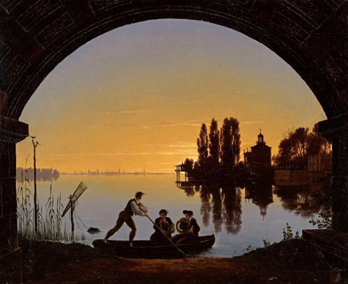
Karl Friedrich Schinkel, The Banks of the Spree Near Stralau (1817).


