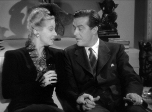
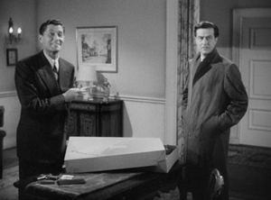
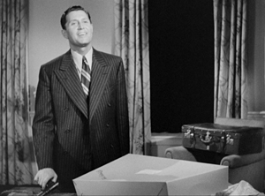
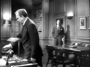
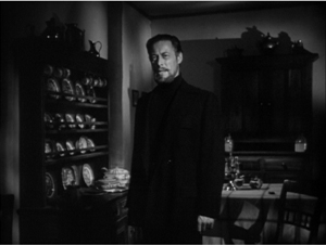
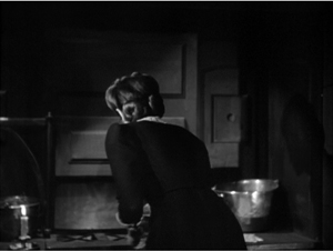
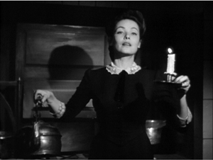
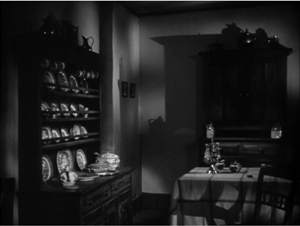
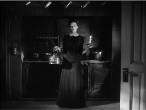
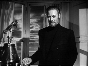
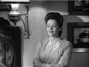
Archive for the '1940s Hollywood' Category
Threefer
DB here:
First, there’s this:
http://isthmus.com/screens/movies/film-scholars-david-bordwell-and-kristin-thompson/
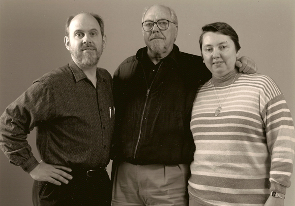
Thanks to Laura Jones and the Isthmus staff for this profile. Among the stills they didn’t use is one of Kristin and me with Robert Altman. I interviewed him for a screening of The Player at the Walker Art Center in 1992. Why waste the scan? I thought, so I put it below.
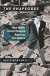
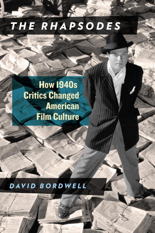
Second, there’s the pleasant fact that my book The Rhapsodes will be available on 4 April, Kristin’s birthday. It’s an essayistic study of four American film critics who, I think, prepared the way for the film-reviewing explosion of the 1960s.
I like to say that good film criticism offers not only opinions but information and ideas. Otis Ferguson, James Agee, Manny Farber, and Parker Tyler met that standard. The book tries to show that they had intriguing notions about American cinema and its aesthetic. They were superb writers as well. Although each man’s style was unique, they all wrote with a gleaming exuberance. The result, as the title suggests, is a controlled wildness, a quality captured I think in the book’s epigraph by Robert Lewis Stevenson:
In anything fit to be called by the name of reading, the process itself should be absorbing and voluptuous; we should gloat over a book, be rapt clean out of ourselves, and rise from the perusal, our mind filled with the busiest, kaleidoscopic dance of images, incapable of sleep or of continuous thought.
I’m very grateful to the University of Chicago Press, particularly my editor Rodney Powell, manuscript editor Kelly Finefrock-Creed, and Senior Promotions Manager Melinda Kennedy. Deep thanks as well to my initial readers Jim Naremore and Chuck Maland, and to the people who kindly endorsed the book: David Koepp, Manohla Dargis, and Philip Lopate.
More background on the book is here. I hope to offer some ideas about film criticism today in an upcoming entry.
Third, later this week Kristin and I are moving to Manhattan for three months. (Whoopee!) She’ll be working on her Amarna statuary project with her collaborator, a curator at the Metropolitan Museum of Art. I’ll be doing research, mostly on Hollywood in the 1940s, while watching movies, seeing friends, and blogging. I’ll give some talks as well. One, presented at Sacred Heart University and at Tufts, is drawn from the 1940s book. I’ll discuss The Rhapsodes at the 92nd Street YMCA and the Museum of the Moving Image in Astoria (details on the last yet to be finalized). Maybe I’ll see you at one of these get-togethers?
Photo: Walker Art Center, Minneapolis.
Off-center 2: This one in the corner pocket
DB here, again:
We got a keen response to my entry on widescreen composition in Mad Max: Fury Road. Thanks! So it seemed worthwhile to look at composition in the older format of 4:3, good old 1.33:1–or rather, in sound cinema, 1.37: 1.
The problem for filmmakers in CinemaScope and other very wide processes is handling human bodies in conversations and other encounters (such as stomping somebody’s butt in an an action scene). You can more or less center the figures, and have all that extra space wasted. Or you can find ways to spread them out across the frame, which can lead to problems of guiding the viewer’s eye to the main points. If humans were lizards or Chevy Impalas, our bodies would fit the frame nicely, but as mostly vertical creatures, we aren’t well suited for the wide format. I suppose that’s why a lot of painted and photographed portraits are vertical.
By contrast, the squarer 4:3 frame is pretty well-suited to the human body. Since feet and legs aren’t usually as expressive as the upper part of the body, you can exclude the lower reaches and fit the rest of the torso snugly into the rectangle. That way you can get a lot of mileage out of faces, hands and arms. The classic filmmakers, I think, found ingenious ways to quietly and gracefully fill the frame while letting the actors act with body parts.
Since I’m watching (and rewatching) a fair number of Forties films these days, I’ll draw most of my examples from them. after a brief glance backward. I hope to suggest some creative choices that filmmakers might consider today, even though nearly everybody works in ratios wider than 4:3. I’ll also remind us that although the central area of the frame remains crucial, shifts away from it and back to it can yield a powerful pictorial dynamism.
Movies on the margins
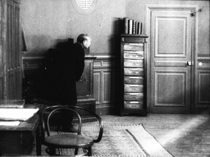
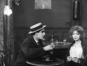
Early years of silent cinema often featured bright, edge-to-edge imagery, and occasionally filmmakers put important story elements on the sides or in the corners. Louis Feuillade wasn’t hesitant about yanking our attention to an upper corner when a bell summons Moche in Fantômas (1913). A famous scene in Musketeers of Pig Alley (1912) shows Griffith trying something trickier. He divides our attention by having the Snapper Kid’s puff of cigarette smoke burst into the frame just as the rival gangster is doping the Little Lady’s drink. She doesn’t notice either event, as she’s distracted by the picture the thug has shown her, but there’s a chance we miss the doping because of the abrupt entry of the smoke.
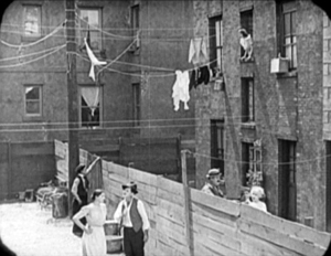
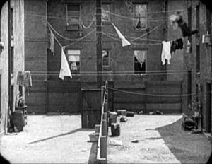
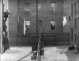
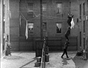
In Keaton’s maniacally geometrical Neighbors (1920), the backyard scenes make bold (and hilarious) use of the upper zones. Buster and the woman he loves try to communicate three floors up. Early on we see him leaning on the fence pining for her, while she stands on the balcony in the upper right. Later, he’ll escape from her house on a clothesline stretched across the yard. At the climax, he stacks up two friends to carry him up to her window.
Thankfully, the Keaton set from Masters of Cinema preserves some of the full original frames, complete with the curved corners seen up top. It’s also important to appreciate that in those days there was no reflex viewing, and so the DP couldn’t see exactly what the lens was getting. Framing these complex compositions required delicate judgment and plenty of experience.
Later filmmakers mostly stayed away from corners and edges. You couldn’t be sure that things put there would register on different image platforms. When films were destined chiefly for theatres, you couldn’t be absolutely sure that local screens would be masked correctly. Many projectors had a hot spot as well, rendering off-center items less bright. And any film transferred to 16mm (a strong market from the 1920s on) might be cropped somewhat. Accordingly, one trend in 1920s and 1930s cinematography was to darken the sides and edges a bit, acknowledging that the brighter central zone was more worth concentrating on.
That tactic came in handy with the emergence of television, which established a “safe area” within the film frame for video transmission. TV cropped films quite considerably; cinematographers were advised in 1950 that
All main action should be held within about two-thirds of the picture. This prevents cut-off and tube edge distortion in television home receivers.
Older readers will remember how small and bulging those early CRT screens were.
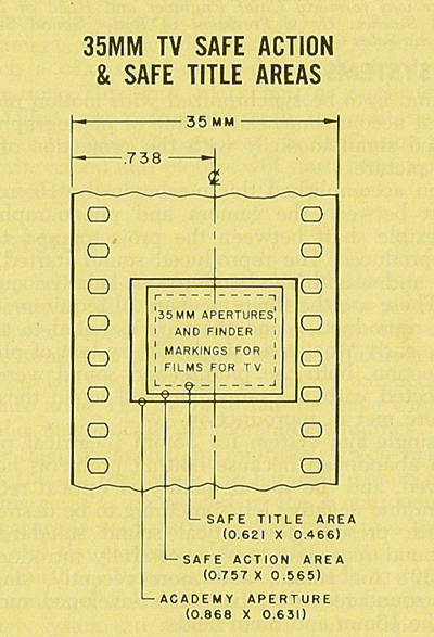
By 1960, when it was evident that most films would eventually appear on TV, DP’s and engineers established the “safe areas” for both titles and story action. (See diagram surmounting this section.) Within the camera’s aperture area, which wouldn’t be fully shown on screen, the safe action area determined what would be seen in 35mm projection. “All significant action should take place within this portion of the frame,” says the American Cinematographer Manual.
Studio contracts required that TV screenings had to retain all credit titles, without chopping off anything. This is why credit sequences of widescreen films appear in widescreen even in cropped prints. So the safe title area was marked as what would be seen on a standard home TV monitor. If you do the math, the safe title area is indeed 67.7 % of the safe action area.
These framing constraints, etched on camera viewfinders, would certainly inhibit filmmakers from framing on the edges or the corners of the film shot. And when we see video versions of films from the 1.37 era (and frames like mine coming up) we have to recall that there was a bit more all around the edges than we have now.
All-over framing, and acting
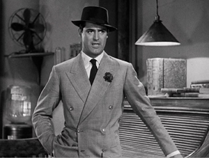
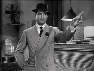
Yet before TV, filmmakers in the 40s did exploit off-center zones in various ways. Often the tactic involved actors’ hands–crucial performance tools that become compositional factors. In His Girl Friday (1940), Walter Burns commands his frame centrally, yet when he makes his imperious gesture (“Get out!”) Hawks and DP Joseph Walker (genius) have left just enough room for the left arm to strike a new diagonal.
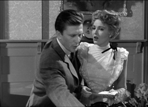
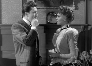
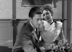
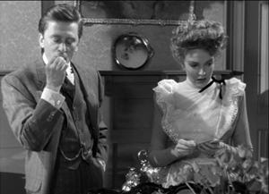
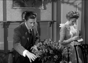
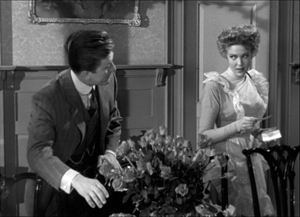
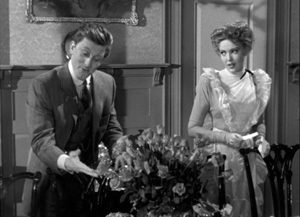
The framing of a long take in The Walls of Jericho (1948) lets Kirk Douglas steal a scene from Linda Darnell. As she pumps him for information, his hand sneaks out of frame to snatch bits of food from the buffet.
As the camera backs up, John Stahl and Arthur Miller (another genius) give us a chance to watch Kirk’s fingers hovering over the buffet. When Linda stops him with a frown, he shrugs, so to speak, with his hands. (A nice little piece of hand jive.)
The urge to work off-center is still more evident in films that exploit vigorous depth staging and deep-focus cinematography. Dynamic depth was a hallmark of 1940s American studio cinematography. If you’re going to have a strong foreground, you will probably put that element off to one side and balance it with something further back. This tendency is likely to empty out the geometrical center of the shot, especially if only two characters are involved. In addition, 1940s depth techniques often relied on high or low angles, and these framings are likely to make corner areas more significant. Here are examples from My Foolish Heart (1950): a big-head foreground typical of the period, and a slightly high angle that yields a diagonal composition.
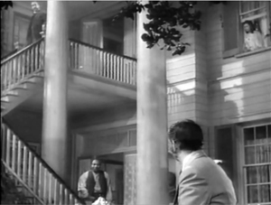
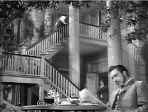
Things can get pretty baroque. For Another Part of the Forest (1948), a prequel to The Little Foxes (1941), Michael Gordon carried Wyler’s depth style somewhat further. The Hubbard mansion has a huge terrace and a big parlor. Using the very top and very bottom of the frame, a sort of Advent-calendar framing allows Gordon to chart Ben’s hostile takeover of the household, replacing the patriarch Marcus at the climax. The fearsome Regina appears in the upper right window of the first frame, the lower doorway of the second.
In group scenes, several Forties directors like to crowd in faces, arms, and hands, all spread out in depth. I’ve analyzed this tendency in Panic in the Streets (1950), but we see it in Another Part of the Forest too. Again, character movement can reveal peripheral elements of the drama.
At the dinner, Birdie innocently thanks Ben for trying to help her family with their money problems and bolts from the room, going out behind Ben’s back. The reframing brings in at the left margin a minor character, a musician hired to entertain for the evening. But in a later phase of the scene he will–still in the distance–protest Marcus’s cruelty, so this shot primes him for his future role.
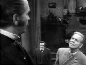
At one high point, the center area is emptied out boldly and the corners get a real workout. On the staircase, the callow son Oscar begs Marcus for money to enable him to run off with his girlfriend. (As in Little Foxes, the family staircase is very important–as it is in Lillian Hellman’s original plays.) Ben watches warily from the bottom frame edge. Nobody occupies the geomentrical center.
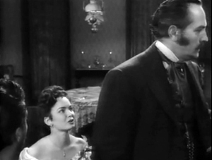
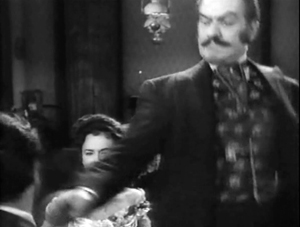
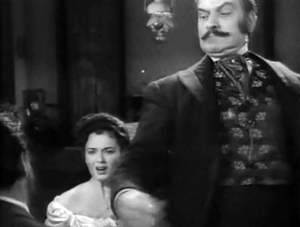
Later, on the same staircase, Ben steps up to confront his father while Regina approaches. It’s an odd confrontation, though, because Ben is perched in the left corner, mostly turned from us and handily edge-lit. Marcus turns, jammed into the upper right. Goaded by Ben’s taunts, he slaps Ben hard. Here’s the brief extract.
The key action takes place on the fringes of the frame, while the lower center is saved for Regina’s reaction–for once, a more or less normal human one. Even allowing for the cropping induced by the video safe-title area, this is pretty intense staging.
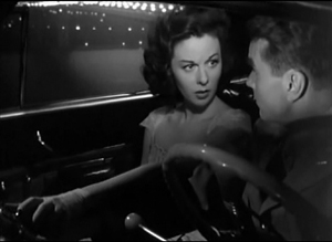
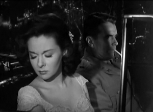
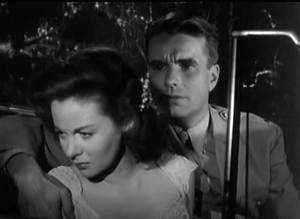
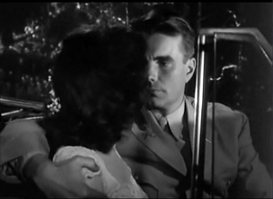
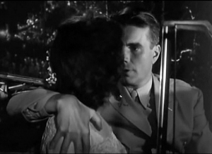
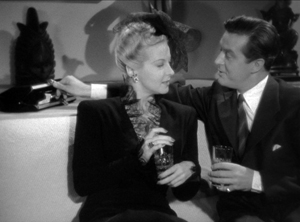
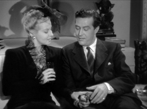
The corners can be activated in less flagrant ways. Take this scene from My Foolish Heart. Eloise has learned that her lover has been killed in air maneuvers. Pregnant but unmarried, she goes to a dance, where an old flame, Lew asks her to go on a drive. They park by the ocean, and she succumbs to him. Here’s the sequence as directed by Mark Robson and shot by Lee Garmes (another genius).
In the fairly conventional shot/ reverse-shot, the lower left corner is primed by Eloise’s looking down at the water and Lew’s hand stealing around her.
Later, when Lew pulls her close, (a) we can’t see her; (b) his expression doesn’t change and is only partly visible; so that (c) his emotion is registered by the passionate twist of his grip on her shoulder. Lew’s hand comes out from the corner pocket.
Perhaps Eloise is recalling another piece of hand jive, this time from her lost love.
For many directors, then, every zone of the screen could be used, thanks to the good old 4:3 ratio. It’s body-friendly, human-sized, and can be packed with action, big or small.
Mabuse directs
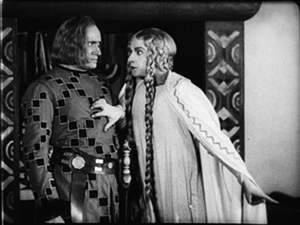
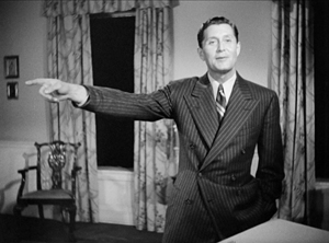
In other entries (here and here) I’ve mentioned one of the supreme masters of off-center framing, Fritz Lang. Superimpose these two frames and watch Kriemhilde point to the atomic apple in Cloak and Dagger (1946).
From the very start of Ministry of Fear (1944), the visual field comes alive with pouches, crannies, and bolt-holes. The first image of the film is a clock, but when the credits end the camera pulls back and tucks it into the corner as the asylum superintendant enters. (The shot is at the end of today’s entry.) Here and elsewhere, Lang uses slight high angles to create diagonals and corner-based compositions.
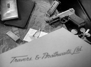
In the course of the film, pistols circulate. Neale lifts one from Mrs. Bellane (strongly primed, upper left), keeps her from appropriating it (lower center), and secures it nuzzling his left knee (lower right).
Later, Neale’s POV primes the placement of a pistol on the desktop (naturally, off-center), so that we’re trained to spot it in a more distant shot, perilously close to the hand of the treacherous Willi.
Amid so many through-composed frames, an abrupt reframing calls us to attention. Unlike Hawks and Walker’s handling of Walter in His Girl Friday, Lang and his DP Henry Sharp (great name for a DP, like Theodore Sparkuhl and Frank Planer) gives things a sharp snap when Willi raises his hand.
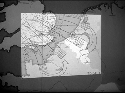
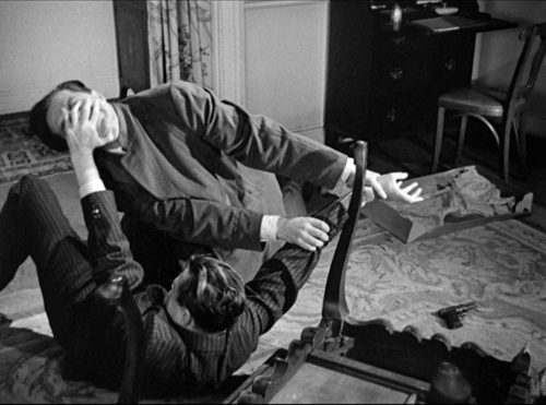
Lang drew all his images in advance himself, not trusting the task to a storyboarder. Avoiding the flashy deep-focus of Wyler and company, he created a sober pictorial flow that can calmly swirl information into any area of the frame. It’s hard not to see the stolen attack maps, surmounting today’s entry, as laying bare Lang’s centripetal vectors of movement. No wonder in the second frame up top, as Willi and Neale struggle in a wrenching diagonal mimicking the map’s arrows, that damn pistol strays off on its own.
Sometimes film technology improves over time. For instance, digital cinema today is better in many respects than it was in 1999. But not all changes are for the better. The arrival of widescreen cinema was also a loss. Changing the proportions of the frame blocked some of the creative options that had been explored in the 4:3 format. Occasionally, those options could be modified for CinemaScope and other wide-image formats; I trace some examples in this video lecture. But the open-sided framings in most widescreen films today suggest that most filmmakers haven’t explored the wide format to the degree that classical directors did with the squarish one.
More generally, it’s worth remembering that the film frame is a basic tool, creating not only a window on a three-dimensional scene but also a two-dimensional surface that requires composition–either standardized or more novel. Instead of being a dead-on target, the center can be an axis around which pictorial forces push and pull, drift away and bounce around. After all, we’re talking about moving pictures.
Thanks to Paul Rayton, movie tech guru, for information on 16mm cropping.
My image of the safe areas and the second quotation about them is taken from American Cinematographer Manual 1st ed., ed. Joseph C. Mascelli (Hollywood: ASC, 1960), 329-331. The older quotation about cropping for television comes from American Cinematographer Handbook and Reference Guide 7th ed., ed. Jackson J. Rose (Hollywood: ASC, 1950), 210.
I hope you noticed that I admirably refrained from quoting Lang, who famously said that CinemaScope was good only for…well, you can finish it. Of course he says it in Godard’s Contempt (1963), but he told Peter Bogdanovich that he agreed.
[In ‘Scope] it was very hard to show somebody standing at a table, because either you couldn’t show the table or the person had to be back too far. And you had empty spaces on both sides which you had to fill with something. When you have two people you can fill it up with walking around, taking something someplace, so on. But when you have only one person, there’s a big head and right and left you have nothing (Who the Devil Made It (Knopf, 1997), 224).
For more on the stylistics and technology of depth in 1940s American film, see The Classical Hollywood Cinema: Film Style and Mode of Production to 1960 (Columbia University Press, 1985), which Kristin and I wrote with Janet Staiger, Chapter 27, and my On the History of Film Style (Harvard University Press, 1997), Chapter 6. Many blog entries on this site are relevant to today’s post; search “deep-focus cinematography” and “depth staging.” If you want just one for a quick summary, try “Problems, problems: Wyler’s workarounds.” Some of the issues discussed here, about densely packing the frame, are considered more generally in “You are my density,” which includes an analysis of a scene in Lang’s Hangmen Also Die (1943).
Ministry of Fear (1944).
They see dead people
DB here:
Continuity editing was one of the great collective inventions of filmmakers. In the ten years after it crystallized in Hollywood around 1917, it was adopted around the world. The technique has hung on a surprisingly long time, rather like geometrical perspective in pictorial art. It’s so powerful that it’s hard to escape.
It’s powerful partly because it’s adaptable to a lot of narrative situations. It provides filmmakers what we can call a set of stylistic schemas, or routine patterns, that can be adjusted in various ways. Analytical cuts that take us into or back from the action, shot/reverse shots and eyeline matches, over-the-shoulder framings (OTS), and slight camera movements that set up reestablishing shots: these straightforward schemas can be used in an indefinitely large number of ways.
I‘ve been noticing this flexibility while writing (still!) my book on narrative strategies in 1940s Hollywood. In particular, I was looking at fantasy tales and the peculiar problems they pose for filmmakers. First, how do we represent ghosts, angels, and other visitors from the Afterlife? And how do we make sure that audiences understand that what we see isn’t necessarily what some of the characters onscreen are seeing?
Angels unawares
Our Town (1940).
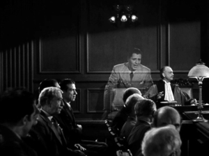
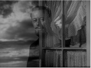
On the first problem: Today we have CGI resources that allow Afterlifers to move freely among the living characters. These effects were much harder to achieve back then. The supernatural-fantasy genre developed its own conventions (yep, schemas). Most films resorted to presenting the Afterlifer in double exposure.
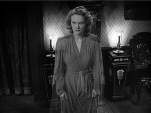
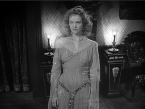
But superimposed characters can’t move easily among the clutter of furniture in a set. A supered ghost can’t go behind a sofa; the sofa will always be visible through it. You might resort to a traveling matte shot, as William Cameron Menzies did in Our Town (1940), when Emily revisits her family after her death. The shot (just above) is particularly flashy because the younger Emily is also in it.
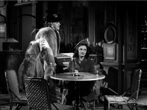
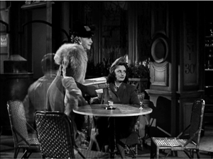
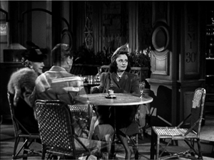
Or you could pull off the remarkable trick in Earthbound (1940). Here a ghostly Warner Baxter settles comfortably into the middle ground and strides around behind furniture and other actors.
He can even give up his seat to an old lady and shift to another.
These effects were achieved by a technical feat that I don’t fully understand. (See the codicil.) But the trick wasn’t widely adopted, and most filmmakers opted for a simple expedient. Typically the Afterlifer shows up as a superimposition, but he or she gradually materializes and becomes a solid presence like all the other actors. This is from The Canterville Ghost (1945).
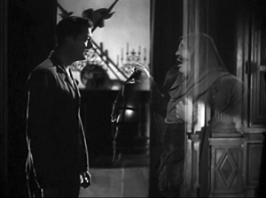
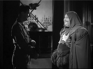
Then comes the second problem. Sometimes the living can see the spectre, but sometimes not. In Here Comes Mr. Jordan, the angel Jordan and Joe the prizefighter arrive from the Beyond and watch the murderous couple from behind. They aren’t visible to the living, but they’re just as tangible.
If a living character seems oblivious to the otherworldly guest, we’re to assume that the guest is invisible. Each film has to inform us of who can see what, and most films do—redundantly. The spook or divine messenger will explain that the living can’t see them, or that only certain characters can. (Sometimes children and animals can see them while grownup humans can’t.)
These conventions can get tweaked. Once we know the Afterlifers aren’t visible to the living, they can comment on the action from the sidelines, as when the dead pilot in A Guy Named Joe (1944) slips in wisecracks while his girlfriend is wooed by a young aviator. In the comic The Man in the Trunk (1942), an all-too-tangible ghost can’t follow a character leaving a room. He explains, “I failed my examination on how to walk through walls.” In The Remarkable Andrew (1941), the ghosts of US founding fathers can ransack offices for evidence in an utterly unconstitutional search and seizure. Most ghosts can pick up objects, but the ones in The Cockeyed Miracle (1946) can’t, a fact redundantly explained to us. This generates suspense when they try to grab a fallen bank check. (Incidentally, this is a long, skillfully directed scene, and it does have recourse to a matte shot when one ghost tries. unsuccessfully, to hide the check by standing on it.)
All of these tweaks rely on continuity editing. But in the course of the 1940s, I’ve noticed, filmmakers played a little more ambitiously with the Afterlife conventions, and continuity style allowed them to do it. The results are sometimes provocative.
Ghosts coming and going
Consider the arrival/departure of the Afterlifer. The default is the special-effects twinkling that lets him or her materialize into the scene and fade out of it. But some filmmakers tried more natural options. In Alias Nick Beale, the title character, aka Satan, strolls in from offscreen, or, thanks to John Cromwell’s staging, is masked by other players before being revealed on the scene. He’s presented to all the characters as a real person, but the staging gives him arrivals of relaxed abruptness.
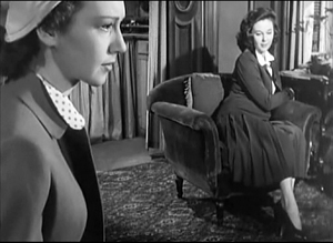
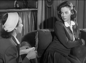
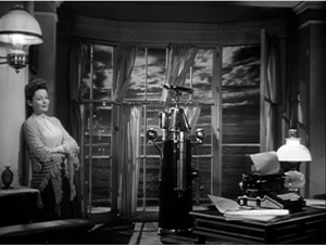
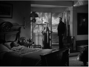
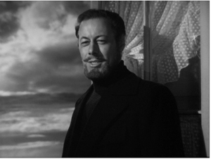
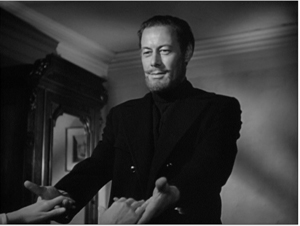
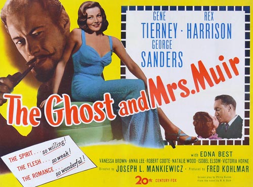
Joseph Mankiewicz’s The Ghost and Mrs. Muir (1947) finds other ways to avoid the hugger-mugger of transparency and melting departures. Captain Gregg assures Mrs. Muir that to her he is “like a blasted lantern slide,” but for us he just steps into the frame and stays on as a solid presence. He disappears just as simply: Mrs. Muir turns away, then a new shot shows that Gregg has gone. Good old shot/reverse shot does the trick.
It’s neat that the second reverse shot on Mrs. Muir reaffirms Gregg’s absence by making her seem more isolated than the earlier mid-shot does. This cut-back to show her isolation after his departure is stressed even more in a later scene, when a medium shot shows her turned slightly away from him; in that interval, he disappears again.
Only after the captain has decided to leave her forever does he resort to the standard spook trick of dissolving away. But in this melancholy context, the familiar device takes on a forbidding finality. He leaves her sleeping and has magically made her forget all about their year together.
In the epilogue, when the elderly Mrs. Muir dies, the captain returns, sturdy as ever, and again the film avoids the cliché. The default schema is to let the dead person’s spirit float up in superimposition from the corpse. Instead, Mankiewicz presents Gregg standing over the lady in a tight shot and simply lifting the now eternally young Mrs. Muir into the frame. Again, all we need is shot/reverse shot, this time with the extra intimacy of an OTS.
These uncommon options take us a little by surprise, refreshing the genre conventions, while also suggesting that the films drive a little deeper into the heart than the usual spook story. The simplicity of presentation helps us take their spectral affair more seriously.
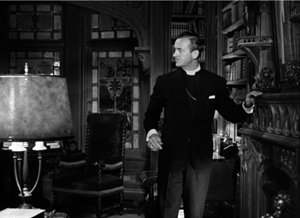
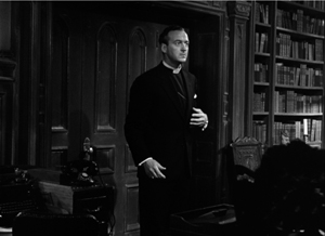
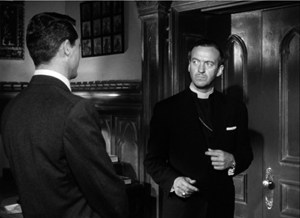
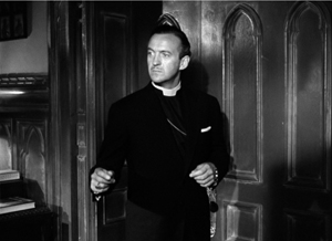
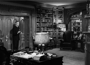
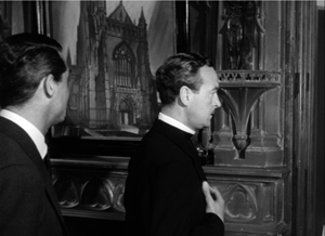
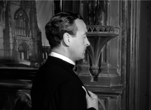
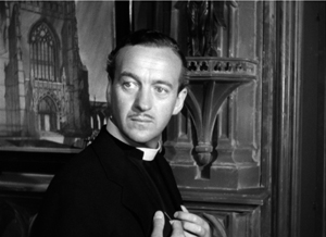
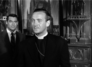
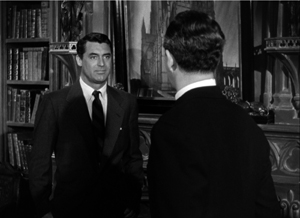
In The Bishop’s Wife (1947) the angel Dudley, like Gregg, comes and goes via offscreen space. A pan follows Henry the bishop, who hears a noise outside his study. The shot pays off with a reverse-angle cut to Dudley, now magically present at the fireplace where Henry was.
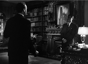
At other points, as in The Ghost and Mrs. Muir, the framing excludes Dudley, and when we cut to the long shot Dudley is gone.
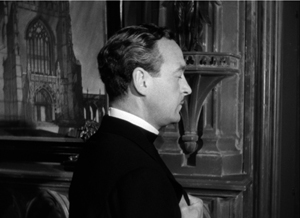
Soon, though, there’s a gag on the device. Henry, furious with Dudley, turns away and prays that Dudley will leave him. As earlier, the camera tracks in.
At first it seems that the prayer has been answered, when the camera tracks back from Henry and we see his slightly surprised expression, implying that Dudley has vanished.
But it’s then revealed to us, before Henry knows, that Dudley has changed position and is still in the room.
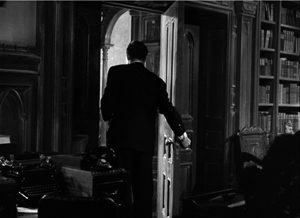
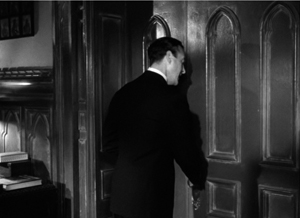
This quiet revision of the schema is in keeping with the film’s other jabs at Afterlifer conventions. At another point, Henry demands that Dudley execute a miracle. He locks the study door, evidently expecting Dudley to stalk through it in the usual phantom fashion. Instead, Dudley just twists the knob, magically opens it, and exits, closing it behind him and leaving Henry to bang against the relocked door.
Re-turning the screw
In general, supernatural romances play down the magical side of the Afterlifers’ visits. This is partly because they rely on a certain ambiguity about who can see what.
Henry James’ brilliant tale “The Turn of the Screw” provides an instance that people have argued about for generations. The unnamed governess, sent to take care of little Miles and Flora, starts to see dead people: the servant Peter Quint and the governess Miss Jessel. Most of her encounters with the ghosts take place when she’s alone, or with the children. Since the story is narrated from her viewpoint, and in the first person, we have no other testimony about the apparitions. The children seem to spot the spooks, but we can’t be sure. And we can’t be sure that they aren’t simply figments of the governess’s imagination. In the one scene that brings in another witness, the housekeeper Mrs. Grose declares that she can’t see Quint or Miss Jessup. Is the governess mad, or are the children really haunted by the corrupt couple?
The tension exemplifies what narrative theories Tzvetan Todorov called the “fantastic,” the tale of uncertain explanation. The fantastic hovers between scientific, or at least real-world explanations, and supernatural ones. Either the ghosts exist, as in most ghost stories, or they can be explained psychologically, as the narrator’s hallucinations.
Actually, in film, and I think in “The Turn of the Screw,” there’s a third possibility: that the Afterlifers exist as beings who can be seen only by the select few. In “The Turn of the Screw,” Flora definitely seems to see Miss Jessel on one occasion, so perhaps we can posit that the governess sees the ghosts when Mrs. Grose can’t.
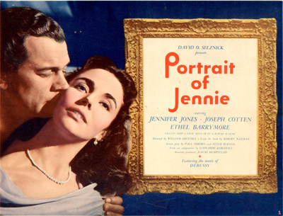
This possibility is of course the premise for The Sixth Sense, and we find it as well in The Ghost and Mrs. Muir, in which Gregg is visible only to Mrs. M. The situation is more equivocal in Portrait of Jennie (1949). In this film, David O. Selznick inflated the fantasy-romance genre as he had pumped up the historical drama (Gone with the Wind), the home-front film (Since You Went Away), and the western (Duel in the Sun).
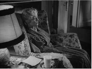
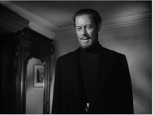
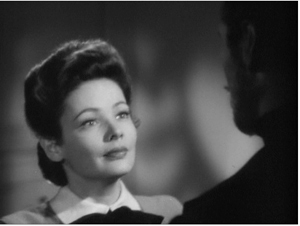
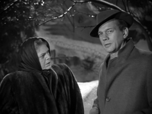
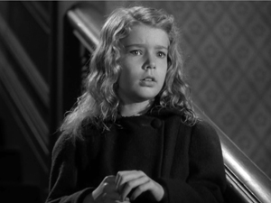
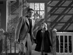
During the winter and spring of a single year, the luckless painter Eben Adams encounters Jennie at different points in her life: as a little girl, a teenager, a college student, and a mature woman. He falls in love with her. Their penultimate encounter takes place when she comes to his apartment and allows him to paint her portrait. Then she disappears.
Is Jennie a time traveler or a ghost or an illusion, or even a supernatural muse? A bit of each. After each brief visit she withdraws, leaving Eben yearning for her. The art dealer Miss Spinney suggests that in order to paint well, Eben must love someone, so perhaps he has conjured up Jennie to inspire his art. It’s true that he sketches, draws, and paints several Jennies. (The final version, the portrait, won’t be shown us until the film’s last image, in blazing Technicolor.) And it’s true that, in a scene much like that featuring Mrs. Grose in James’ tale, we get a hint that Eben is hallucinating Jennie.
He has just spoken with the adolescent Jennie in Central Park when Spinney comes up to him. He watches Jennie go off, in a standard passage of continuity editing.
But then, thanks again to continuity eyeline technique, Spinney doesn’t see her.
Normally this cutting pattern would suggest that Jennie is purely Eben’s vision. (For a modern example, see Johnnie To’s The Mad Detective.) Yet we will soon learn that Jennie did exist. Playing detective, Eben discovers that she was orphaned, taken care of in a convent, and left for college—all things her apparition told him. Worse, he learns how she died: on a rocky seacoast he has already depicted in some paintings.
Selznick was concerned to make Jennie neither a real person nor a pure product of Eben’s imagination. In an early story conference he remarked that Jennie is both in Eben’s mind and in some really existing realm. “We must convince the audience that this story may be strange and odd, but it’s true. All the other characters may say, “Poor Adams, he must be nuts,’ but we know it is true.” The fact that only Eben can see Jennie doesn’t make her a figment of his imagination. Eben may have conjured her up, but she also chose to visit him, predicting that some day he will paint her portrait. The man has, somehow, met a woman from a spiritual world who has been seeking him. Eurydice-like, she will be pulled back into it.
Too few fancies, one powerful friend
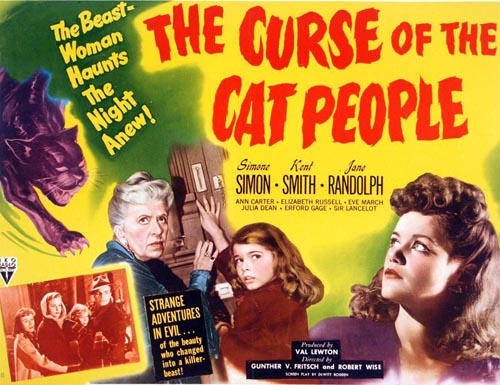
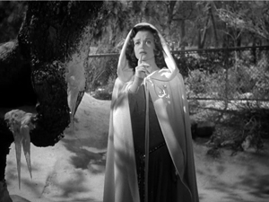
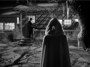
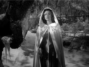
Recognizing that spirits can become selectively visible to the living helps explain the delicate power of another supernatural fantasy of the period. The Curse of the Cat People (1944) uses hyper-judicious framing and editing to create perhaps the most mysterious 1940s Afterlifer.
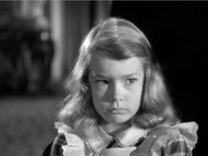
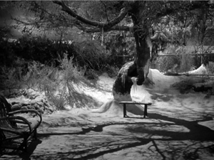
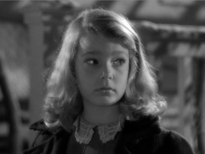
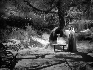
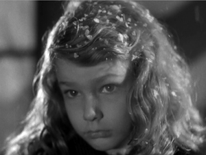
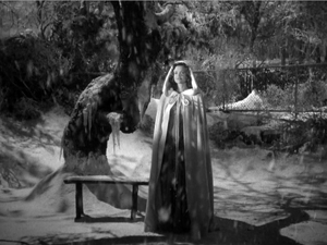
Irena, the woman who can change into a panther, has died in The Cat People (1943). Her widowed husband Oliver has married Alice, and their child Amy, dreamy and unpopular, wishes for a friend. Near the start of the film we’re led to think that Irena is that imaginary friend, wholly a product of Amy’s mind. Irena comes to her in the garb of a traditional princess or fairy godmother, a bit like the fairy of Pinocchio (1940), so we might take her as Amy’s imagining. And the teacher Miss Callahan, who might seem to be playing the raisonneur, says that the little girl has “too many fancies, too few friends.” But that doesn’t seem to me quite right. I don’t think that ultimately Irena is Amy’s projection. Nor are we exactly in the realm of Todorov’s fantastic, hesitating between subjective and objective explanations.
Consider the progression in the film’s depiction of Irena. At first, Amy is shown playing in the garden, purportedly with her friend but alone in the frame.
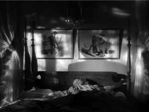
Later she says that her friend taught her a song, but she can’t recall the words. This suggests that that encounter, kept offscreen, is a vague one. That night, as Amy awakes from a nightmare, she is soothed back to sleep by her friend, whom we hear softly singing but see as only a shadow. Her lullaby continues as Amy sleeps.
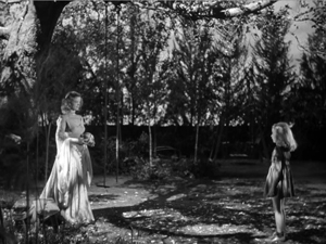
Still later, Irena appears to Amy in the garden only after Amy sees a picture of her. Irena appears un-magically, entering the shot as casually as Dudley or Captain Gregg and holding the ball that Amy has tossed out of frame.
Amy asks her who she is. “I’m your friend.” The fact that Amy doesn’t recognize her from earlier friend-encounters, suggests that the friend wasn’t yet defined in bodily form. She had magical powers, such as darkening or lightening the garden or teaching Amy a song, but she assumed no particular shape. We, however, saw her female silhouette while Amy slept. Now Irena is fully embodied, and we can see her along with Amy.
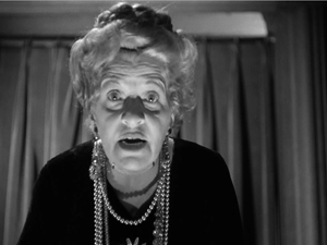
Apart from the Irena scenes, we do get into Amy’s mind. But the techniques used in those scenes are ones that are never applied to Irena. When a deranged neighbor lady recites the tale of the Headless Horseman, we get exaggerated optical POV shots from Amy’s perspective and the subjective sound of wind and horses’ hooves.
The sounds are repeated as auditory flashbacks in Amy’s nightmare and while she is hiding in the forest during the climactic snowstorm. Later, Amy will calm the old woman’s homicidal daughter by envisioning her as Irena (in a superimposition) and embracing her as “My friend.”
From a storytelling standpoint, such images and sounds are sharply distinguished from Irena’s scenes with Amy. Those are treated in quite a neutral, objective manner.
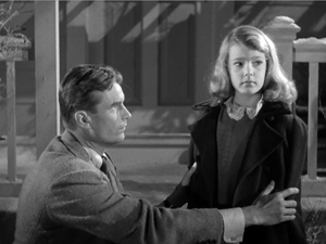
There’s more. At the midpoint of the plot, in a crucial scene, Oliver learns that Amy considers the dead Irena as her playmate. He’s convinced she’s imagining it all. Anxious and angry, he takes her out into the garden and demands to know if Irena is there. Amy sees Irena under the tree, but Oliver doesn’t. As in Portrait of Jennie, reverse-angle cutting conveys each character’s vision.
In cinema, we assume objective (fictional) reality to be the default value. So the incompatible viewpoints of Amy and Oliver in the garden might suggest that Irena exists only in Amy’s mind. But in The Ghost and Mrs. Muir and Portrait of Jennie, the protagonist can see the ghost when no one else can. Nothing in this garden encounter denies the possibility that Irena is a ghost visible only to Amy and us.
We get some immediate backing for this. When Amy looks at Irena a second time, at Oliver’s insistence, Irena puts her finger to her lips, as if urging Amy not to acknowledge her.
This, to put it stiffly, is the action of an independent agent. Amy is unlikely to conjure up an imaginary friend who warns her to keep quiet. And by telling Oliver that of course she sees her friend, she disobeys just as briskly as if Irena were of flesh and blood.
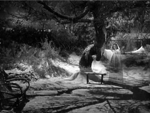
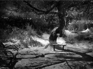
We have a clincher at the very end of the scene. Oliver and Amy go in, turning away. Neither sees the garden, but we get two shots of Irena watching them and reacting unhappily.
Again, it’s hard to reconcile this image with Irena being a pure projection. She’s behaving like an ectoplasmic free agent. In addition, Alice and Oliver, despite their skepticism about Amy’s friend, don’t rule out supernatural goings-on completely. At various points both mention they sense Irena’s presence in the house. Irena has become in the course of the action a full-fledged ghost, but one with benefits.
The epilogue confirms Irena’s otherworldly mission. As Oliver takes Amy into the house, he asks if she can see Irena. She looks and sees her, smiling.
Can Oliver see Irena? Now that he’s decided to trust Amy, he says yes—without even looking.
As in the earlier garden scene, once father and daughter have gone inside, we’re treated to an independent shot of Irena under the tree. And now she melts away, in the conventional disappearing act of an Afterlifer. As with Captain Gregg’s withdrawal from Mrs. Muir, by saving this well-worn option for this moment the filmmakers invest it with an air of permanent departure.
The Curse of the Cat People cleverly invokes the possibility that Irena is purely imaginary, then dispels it. For once, nobody redundantly explains to us who can and who can’t see the ghost; we have to figure things out. Instead, the vague role of imaginary playmate gets gradually defined as Irena, the ghost. Continuity editing is recruited to suggest that Irena is coalescing into the friend Amy wishes for. At first only an atmosphere, then a shadow, and finally a properly solid spirit, Irena is a shape-shifter, more elusive than other apparitions of the period. The plot creates a sympathetic spirit seeking to console a lonely child and correct her father’s harsh, plodding common sense. Perhaps making amends for her effort to destroy Oliver’s romance with Alice in the previous film, the dead cat-woman fills out the role of imaginary playmate and saves a family.
There are other ingenious ways that the conventions of 1940s supernatural films are tweaked by the resources of continuity style, and I’ll be considering them in the book. The general point is that even schemas as commonplace as eyeline matching, or conventions as hoary as having a ghost dissolve out of the scene, can take on new force when filmmakers practice their craft with discreet intelligence.
Earthbound‘s ghost effect derives from a prism set in front of the camera. Warner Baxter is located in an adjacent set, and one face of the prism was silvered to reflect him onto the primary set. The best description I’ve found is here, thanks to good old Lantern. But we need more information. How can Baxter move so precisely around “our” set if he’s offscreen? Presumably, he’s in either a black set or one with furnishings laid out like ours. In that case, the furniture would need to be draped in black, so parts of his body will be blocked to the right extent. But in either case, we need to explain how he manages to synchronize his movements so exactly with the actors in front of the camera. If you know more, please correspond!
My quotation from Selznick comes from “Portrait of Jennie Conference notes (1/20/47),” David O. Selznick collection, Box 1123, file 11, Harry Ransom Research Center. Thanks to Emilio Banda and to Steve Wilson, Curator of Film at the Harry Ransom Center.
I’m using the concept of an artistic schema as E. H. Gombrich does in Art and Illusion (2000). For more about it on this site, see these entries.
You probably know that “The Turn of the Screw” was filmed as The Innocents (1961). It’s also the basis of a strong Benjamin Britten opera.
A vast survey of Afterlifers on screen is provided in James Robert Parish, Ghosts and Angels in Hollywood Films (McFarland, 1994).
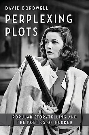
For more on my still-in-progress book on 1940s Hollywood, go here and here. If you’re keen on the Forties generally, you might be interested in The Rhapsodes, my study of film criticism of the period, to be published in March by the University of Chicago Press.
Modest virtuosity: A plea to filmmakers, old and young
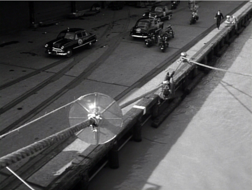
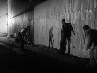
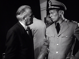
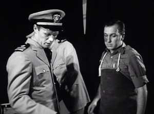
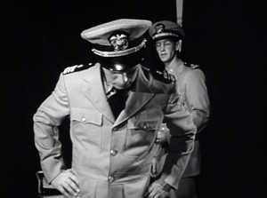
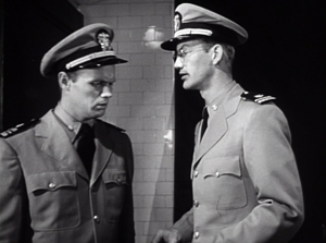
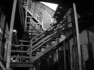
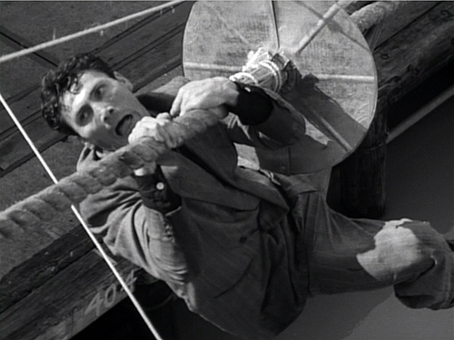
Panic in the Streets (1950).
“It’s where you put the camera and what’s in front of you [that’s important],” Deakins said. “There’s too much obsession these days about digital film…it’s becoming so technically-orientated, and that’s just distracting from what’s actually being put in front of the lens.”
DB here:
Every now and then I get worried by the repetitive look of recent films. I want to beg filmmakers (young ones especially) to try something else.
What could they do? Start with what to avoid. They could suspend the walk-and-talk, the tendency to rely on singles, the bumpy handheld takes, the swoopy crane shots, and the urge to cut on every line of dialogue. They could back off, in other words, from intensified continuity and go for something more daring and original.
More positively, there are some relatively unexplored areas of film style that yield results that are forceful and graceful. Today’s example: ensemble staging that minimizes camera movement and cutting. Minor spoilers.
Some basics
It’s a demanding technique. Essentially the filmmaker has to shape a scene among several actors in ways that guide our attention to the key pieces of information. That guidance is done through performance, framing, lighting, and other tactics. Beyond highlighting the major points of the scene, staging can create what critic Charles Barr called “gradation of emphasis.” Because several elements of the action are all visible at once, some can become primary, some secondary; and this interplay enriches our understanding of the scene.
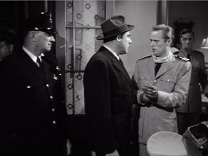
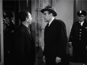
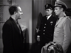
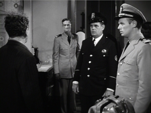
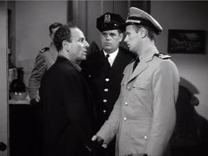
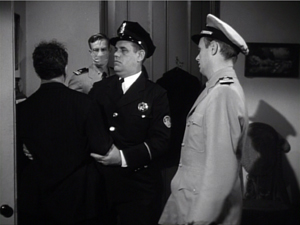
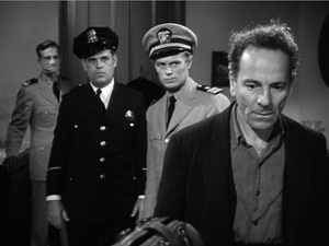
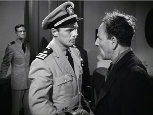
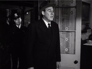
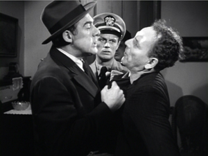
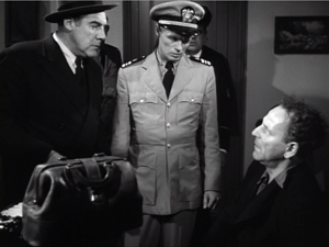
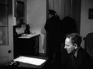
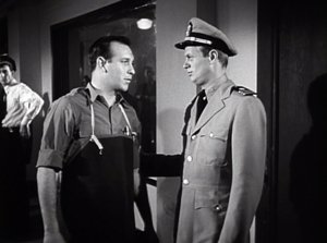
So take this scene from Elia Kazan’s Panic in the Streets (1950). A dead man has been found to carry the Bubonic plague virus, and Dr. Clinton Reed is investigating people who have come in contact with him. A restaurant owner and his wife have denied knowing the victim, but now Reed and Police Captain Warren have learned that the wife has come down with the plague. They visit the apartment, too late to save her. Her husband Mefaris comes in and learns that she has died—and that she might have lived had the couple told the truth.
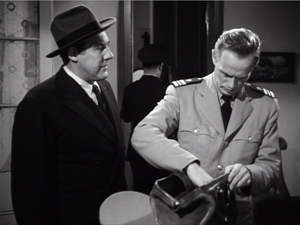
The two-minute scene plays out in just two shots, both with slight panning movements. The scene’s impact owes a lot to the performances: the line readings, facial expressions, and gestures, including the wonderful way that Richard Widmark rips off his surgical mask in angry frustration. But the scene also benefits from small but significant rearrangements of the actors in the frame. This staging ties together the performance elements in a smoothly rising flow.
Here’s the scene. I’ll try to indicate some practical directing principles at work.
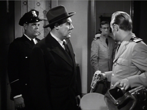
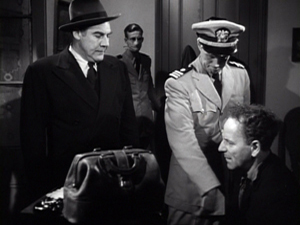
After Captain Warren has sent his men to find the husband, we have our principal players in the middle ground in a framing from the knees up (the plan-américain). As is common in 1940s dramas, the scene will be given added depth, not only by the patrolman behind Warren but by the junior officer Paul behind Reed, coming out of the sickroom. That depth is activated when Reed comes forward to pack his briefcase and orders Paul to burn the bedding, and Warren orders the patrolman to close the bedroom door.
The opening and closing of the door becomes an important pictorial element, but for now it simply clears the background for the two-shot involving Warren and Reed talking of the death certificate. Noise from offscreen motivates the camera’s pan left to follow Warren as he meets the husband, Mefaris, coming in.
Mefaris confronts Reed and demands to know what’s happening. When he calls his wife, Paul steps out, guiding our attention to him as a sign of death. Mefaris begins to guess. The phlegmatic patrolman, who’ll feature throughout the scene, is there to keep Mefaris under control.
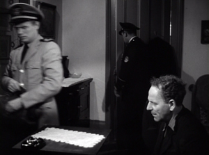
The risk is that we’ll watch that centrally place cop and miss something else, so Kazan takes care to make him impassive. Later, he’ll be more distant, in shadow, and out of focus. More generally, such ancillary characters need to keep still and stare at what we’re supposed to be watching.
Mefaris comes closer to Reed, blocking our view of Paul. Reed tells him his wife is dead. Mefaris tries to go to her room, but the patrolman shows his value by restraining him—and opening up a slot for us to see Paul, who confirms Reed: “She’s dead, mister.”
This sort of unnoticeable blocking and revealing through slight shifts in actors’ position goes back to 1910s cinema but is seldom used today.
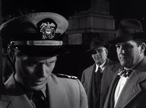
Finally accepting the grim news, Mefaris ponders and comes forward. Without cutting, Kazan has brought him and Reed into closer visibility. As ever, a Cross refreshes the composition. And as Reed asks questions, his head blocks the patrolman so that we can concentrate on Mefaris’ indignant reaction.
Mefaris’ refusal to talk is the climax of the shot. We cut to Warren at the door and the camera pans with him to confront Mefaris angrily.
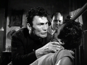
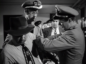
Now only Reed is visible in the background, squeezed between the two faces. Mefaris finally identifies Poldi as the man they need to find. Warren shoves him down and the space, quite clenched just a moment before, opens up. As gradation of emphasis, we get Reed brushing at Mefaris’ lapel after Warren’s meaty hands have crumpled it. After Warren’s outburst, Reed’s anger at Mefaris seems to have turned into a flicker of compassion.
Warren and Reed depart, just as Paul returns to the death room and the patrolman closes the door. The final framing leaves nothing to distract us from Mefaris, brought low by grief and his fatal failure to cooperate.
Kazan is, we might say, a “post-Welles” director in that he, like many others, adopted the vigorous use of depth staging and wide-angle cinematography made famous in Citizen Kane. It’s not hard to find elsewhere in Panic in the Streets some more flagrant instances of in-your-face deep focus, with big heads and exaggerated distant points.
In the scene above, the depth is nothing like so aggressive. It is, we might say, modestly virtuoso—a clean, unnoticeable, but well-calibrated piece of staging that unfolds the action so that we always know where to look.
Why not?
I anticipate some objections from a skeptical filmmaker.
“This scene isn’t cinematic. There isn’t enough cutting and it’s lacking close-ups.”
Today, though, everybody acknowledges that cutting isn’t the be-all and end-all of cinema. Directors get lots of credit for sustaining their shots, if it’s done with a self-congratulatory virtuosity. (See Gravity, Birdman, the opening sequence of Spectre.) In particular, a lengthy walk-and-talk shot is greeted as a bold stroke. So clearly the absence of cutting is okay if you make a big deal of it.
Close-ups are important, but maybe not as much as we think. Today’s style often relies too much on close-ups, partly because people think they won’t read well on small monitors and other displays. But those displays are getting bigger and sharper. I suspect that you’d find the Blu-ray edition of Panic in the Streets plenty okay for home viewing.
“Put it another way. This is too theatrical.”
Too reliant on actors, then? But what mainstream cinema isn’t? And isn’t today’s standard style, bombarding us with facial close-ups, quite “theatrical” in making the actor—and not even the body, just the face—the center of our attention?
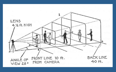
Moreover, as I’ve argued here and elsewhere, the space of a shot is the opposite of the space onstage. Theatrical space is wide and rectangular, and actors tend to arrange themselves laterally, across the stage. Cinematic space–the space captured by the camera–constitutes a pyramid, extending narrowly away from the lens, and so it favors depth. (See the diagram above.) Theatrical space is calculated for the sightlines throughout the auditorium; cinematic space is calculated for one sightline, that of the camera. Accordingly, a film can have staging in depth that wouldn’t work onstage. You couldn’t arrange the Panic scene this way in live theatre; some people couldn’t see the background action clearly, because the foreground figures would mask it.
If “theatrical” also means “too tied to the proscenium,” that objection fails too. Granted, this is a scene that suggests a missing fourth wall. The camera doesn’t penetrate the space enough to suggest the entire room. Shortly, though, I’ll show you that this approach can be more immersive, activating areas behind the camera (and so behind us).
“It’s not realistic. People don’t stand and talk that way.”
Cinema ≠ reality.
“It’s too risky. Too much can go wrong with all that shifting in one shot.”
You need skillful actors who can time their lines, hit their marks, and coordinate with one another. If one thing goes wrong, you have to start again. Shrinking from this, directors opt for plenty of coverage to adjust pacing and select the best performances during editing. “The important thing for the editor is coverage,” notes Ridley Scott. “That’s why I always have multiple cameras, so I can shorten the scene.”
So, yes, it’s risky. But risk is celebrated in the noisy virtuosity of the flamboyant long takes. Why not take risks in this more unusual way?
“It’s too hard! I never learned how to do these things.”
Once upon a time, every director knew how to stage scenes like this. The “tableau cinema” of the 1910s cultivated a rich set of creative choices about staging, and directors proved very versatile in exploring them. With the arrival of continuity editing in the 1910s, a degree of de-skilling took place, but directors still retained some sense of dynamic staging. We see it in 1930s and 1940s films too.
Now, much later, this sense is all but gone. Is ensemble staging taught in film schools? Could even our best directors of today—Wes Anderson, Paul Thomas Anderson, Quentin Tarantino, et al.—pull off a scene in this manner? Soderbergh couldn’t do it when he tried in The Good German. (I look forward to seeing if Todd Haynes makes the effort in Carol.)
On the whole, though, I agree: It’s hard today. Neither directors nor actors nor DPs are, I think, well-versed in what’s necessary to stage scenes this way. Most directors, and nearly all viewers, have simply forgotten that this rich menu of expressive techniques ever existed. So why not revive it?
Post-grad work
One other objection occurs to me.
“Ensemble staging of this sort is too modest. In an age of directorial bravura, where every filmmaker tries to punch above his weight, nobody will notice if I direct scenes this way. And getting the next job demands that my contribution get noticed. I’m competing with a lot of eye candy out there.”
I’d agree. But there is a lot of leeway in this approach for more self-conscious effects. Maybe most viewers and even filmmakers wouldn’t notice the robust delicacy of the scene above. But how about offering something more audacious that stays within the parameters of this style?
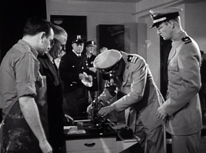
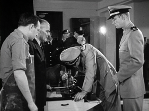
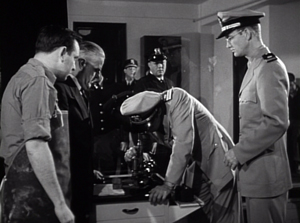
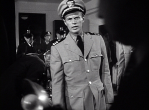
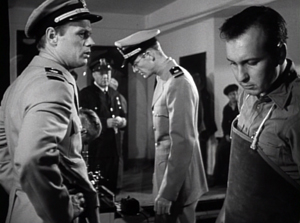
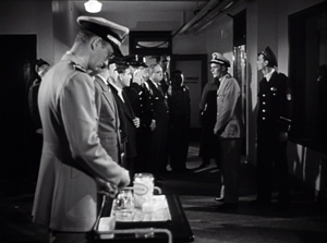
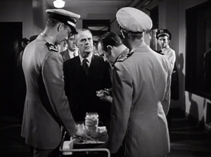
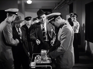
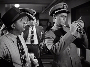
Try this earlier scene from Panic in the Streets. Reed, his assistant Paul, and local officials are now identifying the plague virus and are beginning to figure out how to deal with it. I hope I’ve primed you to notice the less-quiet virtuosity on display here.
A director today might have shown us the body, the reporters photographing it, and the medical team in one vast shot, perhaps from a high angle that craned in. Or perhaps we’d have gotten a long walk-and-talk taking Reed through a hospital corridor as he snaps out orders to all the staff involved.
Instead, Kazan leaves a lot of this material offscreen, to be inferred through details. The plaguey corpse lies just outside the lower frame line, but we won’t realize this for a while. And the reporters are offscreen, “behind us.” So we’re inside the proscenium. Part of the interest of the scene is not just following the ongoing drama but figuring out what’s going around us.
In this more complex scene, Kazan threads characters through the space, making some more prominent and then letting them fall back. He obeys Alexander Mackendrick’s dictum:
Composing in depth isn’t simply a matter of pictorial richness. It has value in the narrative of the action, the pacing of the scene. Within the same frame, the director can organize the action so that preparation for what will happen next is seen in the background of what is happening now.
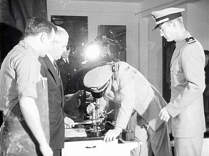
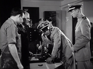
We start with Reed and his team bent over the microscope. In the background a patrolman passes. For an instant the frame flares up.
Reed looks up, slightly annoyed, but when it happens again we can see that it’s the result of a photographer’s flash. In the distance, after Reed bends over, we can see the patrolman blowing his nose. Because we know that the plague is loose, that simple gesture becomes a warning. And on the big screen you can now notice the vague reflection of the photographer in the window between Reed and Paul. The second fading flashbulb tells us where to find this man’s phantom image.
So the action develops in three zones.: the cops in the distance, the team at the microscope, and the offscreen police photographers behind us. Two of these zones get closed off when the photographers leave and Reed orders the curtains drawn.
The space goes shallow as we get a succession of two-shots, the first with the health officer who comes forward and learns that he must cremate the corpse, the second with the morgue supervisor.
Now we get a pause. Reed, isolated against the curtains, stares down at the corpse, trying to work out a plan. As in the earlier scene, a simple pan brings Paul to him for a final two-shot. The serum has arrived, and this sets up the second phase of the scene.
The scene has developed around two nodes: the microscope bench in the middle ground and the still-unseen corpse in the foreground. This use of depth has fulfilled Mackendrick’s dictum, as the action around the ‘scope has prepared us for the series of one-on-one instructions Reed issues to his team. As in the earlier scene, this shot ends with the figures closer to the camera than they were at the start.
As in the earlier example, we get a cut. (Critics have often talked about single-shot scenes. What about studying two-shot scenes? I suggest we start with Mizoguchi.) Reed heads outside for another encounter, this time with a police official, who gets emphasized not through cutting but by letting his head block that of the morgue supervisor.
We pan with Reed as he goes to the corridor and the gathering group. More blocking and revealing: As Reed asks the cop about people who’ve been in contact with the corpse, he pivots and the composition frames the sniffling cop in the vanishing point.
Today a filmmaker might give us a big close-up of this poor guy, playing up his misery. But that would suggest that he’ll become an important story factor. He’s actually not in danger, so his minor status in the frame is completely appropriate.
For similar reasons, no need to cut in to Reed addressing the assemblage of men; none will prove significant. Instead, the action moves back to the foreground. First, Reed thanks the morgue attendant.
More important, and more virtuoso, is the way that the key dramatic elements in what follows are framed in a tight space between Paul and Reed in the foreground. First it’s the official in charge of cremation, then it’s the two skeptics.
Once more a shot ends in the closest framings so far. As a complaining civilian quarrels with Reed, both advance to the camera and Reed obliges him to take his medicine. The shot ends with the man wincing and lowering his head as the needle goes in; not such a tough guy after all.
Far from being simply of casual interest, these reluctant ne’er-do-wells anticipate the stubbornness and stupidity that Reed will encounter when he ventures into the city among the populace.
It seems to me that this sequence, with the flashbulbs and the curtain and the line-up for the vaccine, provides a self-assured command of craft that is as exuberant as anything in today’s flashy direction. If you can be flashy in a quiet way, this scene manages it.
This kind of staging can give cuts extra force. In the first scene, the cut to Warren ratcheted up the tension: Reed’s persuasion failed to win over Mefaris, so brute force is the next step. In the mortuary scene, the cut to the corridor as Reed passes through is more perfunctory, but it at least maintains the fluidity of the action.
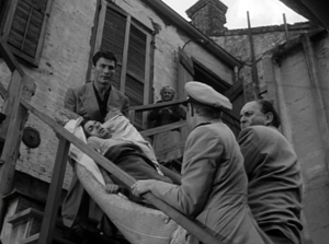
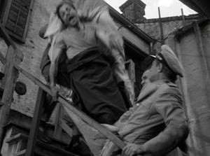
A more dramatic instance of saving your cut for maximum impact comes near the climax, when Poldi is carried down a precarious staircase and his crooked boss Blackie flings his body over the railing. The cut to the extreme long-shot shocks you with how far he must fall.
There is much else to admire in Panic in the Streets; it’s a fine instance of Joe MacDonald’s location cinematography as well. I use it as simply an example of how much classical cinema has to teach us. It’s a pity that our filmmakers have unlearned some of its lessons, but it’s not too late—especially for brave young filmmakers—to relearn them.
For an example of lateral, rather than depth-based, ensemble staging, see our most popular entry, “Watching you watch There Will Be Blood.” Use the category tableau staging to access entries on the principles I’ve mentioned. The whole subject is discussed in more detail in Chapter Six of On the History of Film Style and in Figures Traced in Light: On Cinematic Staging. It’s also treated in my video lectures How Motion Pictures Became the Movies and CinemaScope: The Modern Miracle You See without Glasses. The diagram of the visual pyramid is from Ben Brewster and Lea Jacobs, Theatre to Cinema: Stage Pictorialism and the Early Feature Film (Oxford University Press, 1997), 170.
Panic in the Streets.


