Archive for the 'Animation: Pixar' Category
The other expanded Oscar category

Two Jell-o lovers share a romantic interlude in Cloudy with a Chance of Meatballs
Kristin here:
Back in early 2007, I posted an entry about the supposed over-supply of animated films due for release that year. I realize that journalists have to find topics to fill pages. That year one topic making the rounds was speculation about whether audiences would tire of so many cartoons.
Now that worry has gone, and writers rejoice over the fact that there are enough animated features from 2009 qualifying for Oscar nominations to create a field of five rather than three. There are no fewer than twenty qualifiers: Alvin and the Chipmunks: The Squeakquel, Astro Boy, Battle for Terra, Cloudy with a Chance of Meatballs, Coraline, Disney’s A Christmas Carol, The Dolphin – Story of a Dreamer, Fantastic Mr. Fox, Ice Age: Dawn of the Dinosaurs, Mary and Max, The Missing Lynx, Monsters vs. Aliens, 9, Planet 51, Ponyo, The Princess and the Frog, The Secret of Kells, Tinker Bell and the Lost Treasure, A Town Called Panic, and Up.
The six nominees for the Annie Award for best feature have already been announced: Cloudy With a Chance of Meatballs, Coraline, Fantastic Mr. Fox, The Princess and the Frog, The Secret of Kells, and Up (below).
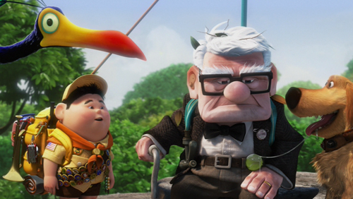
The Annies are no guaranteed predictor of Oscars. Far from it, given the famous, even notorious top award to Kung Fu Panda rather than WALL-E last year. But I’m not trying to predict awards here. I just want to comment on what seems something of a watershed year for animation.
I’ve seen only six of the above films. Some of them haven’t been released yet, and others are being platformed before going wide. The Princess and the Frog is being showcased in only two theaters so far before going wide on December 11. The Secret of Kells, which seems to be the one of the more lauded of the unknown films, won’t open in the U.S. until March 6. Judging from the trailer, it’s made in a simple, somewhat abstract style that recalls the UPA alternative to Disney and Warner animation that appeared in the 1950s. (The Incredibles pays homage to that style.)
Some of these films haven’t played in Madison or, like Astro Boy, came and went quickly. I passed up other the eligible films deliberately. The first Ice Age movie struck me as mildly pleasant but one of those small-kids’ movies with little entertainment aimed at the parents. After Beowulf, I wasn’t about to see A Christmas Carol. The fifth animated item I saw was Monsters vs. Aliens, which was more entertaining than the reviews would suggest, but it’s not Oscar bait.
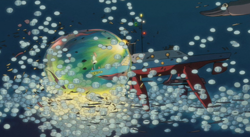
Ponyo on a Cliff by the Sea
In the past, any Pixar film was automatically the obvious choice as best animated feature. I think that Monsters, Inc. was better than Shrek and Cars better than Happy Feet, but perhaps Academy members felt a little guilty not sharing the wealth. It’s lucky that there was no Pixar film in 2002, so that Hayao Miyazaki could get the Oscar for his masterpiece, Spirited Away, and in 2005, when Nick Park could take home his fourth for Wallace & Gromit: The Curse of the Were-Rabbit. (The only Nick Park film that didn’t win an Oscar was the first Wallace and Gromit film, A Grand Day Out, which lost out to . . . Nick Park’s Creature Comforts.)
Now there are more companies producing animated films, not only in the U.S., which once used to dominate this form, but internationally as well. The Secret of Kells, for example, is a French-Belgian-Irish co-production (originally called Brendan and the Secret of Kells). Up to now, foreign animated films have had a better chance in the shorts category, but representation of films from abroad among the features will no doubt increase.
Wonderful though it is, Up is less the obvious choice than previous Pixar films have been. Coraline has earned great respect from critics and industry insiders. Witness its receipt of the largest number of Annie nominations, ten, with Up right behind it at nine. Add in Ponyo (original title, Ponyo on a Cliff by the Sea) and Fantastic Mr. Fox (below), and you have at least four credible contenders for top honors. I suspect Ponyo will be hampered by its English dubbing, including the substitution of another song for the charming final-credits one. Plus Ponyo is aimed at much smaller children than most of Miyazaki’s recent films. It does have the director’s typical focus on the environment, this time humanity’s pollution of the oceans; but it has less of the gravitas that has endeared the filmmaker’s last few films to arthouse audiences.
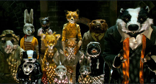
For what it’s worth, Fantastic Mr. Fox has a very rare 100% fresh rating at Rotten Tomatoes among the “Top Critics,” with Up at 95%, Ponyo 91%, The Princess and the Frog at 83%, and Coraline, surprisingly, at a mere 78%. The critics’ opinions don’t correlate with those of Academy voters, so those figures are probably not a good guide when it comes to your office Oscar pool.
I’d like to put in a good word for Cloudy with a Chance of Meatballs. It’s not likely to beat out the four powerhouses mentioned above, but it would be nice to see it nominated. It has a fast-paced, extraordinarily well-constructed script and makes for a thoroughly entertaining 90 minutes. It’s a pleasure to see a whole group of motifs, some in pretty funny but throwaway moments, coming back again and again, and just when you think they’ve been wrung for all they’re worth, they return one last time with a twist. Like Up, Meatballs‘ 3D version has some strong moments without the special effects seeming gratuitous, as when the hero has to slither down a long rope that seems to go on forever into the distance. Cloudy seems currently to be transitioning from first to second run. If you’ve got a cheap-seats theater near you, it’s worth seeing on the big screen, whether in 2D or 3.
Speaking of which, I should point out that Up, Coraline, and Cloudy were all conceived and executed in 3D (as opposed to the early digital features that retooled in-progress films for 3D). So far it’s still easier to make animated 3D films than life-action ones. All three use the technology well, though I’m sure they all look good in 2D.
Ever since the creation of the best-animated feature Oscar category in 2001, there have been complaints that it prevents outstanding animated work from being nominated for the best film of the year. Now people writing about the Oscars are complaining that there aren’t a lot of obvious live-action candidates for best film—in the very year that the Academy has to find ten of them. Maybe this year the best animated features will provide more excitement than the main event. Maybe they will also make it more evident that at this point in the history of mainstream filmmaking, the best animated films are better than any but the very best live-action films. I doubt that the animated-features category will drop back to only three nominees very often in future years.
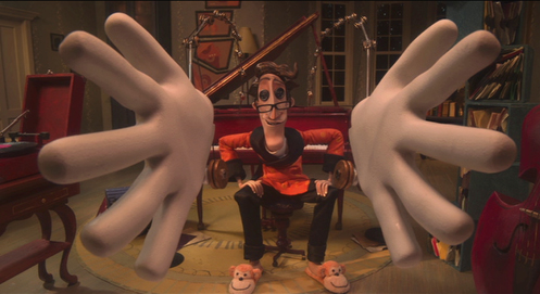
Coraline
(50) Days of summer (movies), Part 1
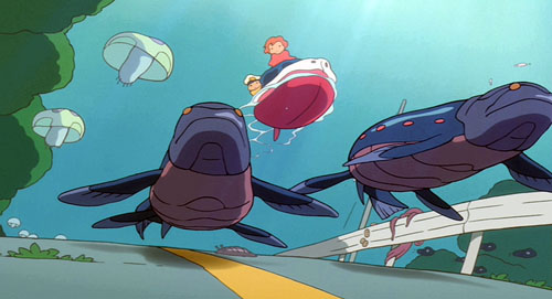
Ponyo on a Cliff by the Sea.
DB here:
Travel took me out of Madison for half of June and nearly all of July. While overseas, I saw only one recent US release. So I caught the American Summer Movies in two gulps–over a couple of weeks early on and over the last month or so. In all, exactly 50 days? Well, were there exactly 50 first dates in that movie?
Herewith, comments on a batch of titles. There are spoilers sprinkled throughout, but most of what I say won’t harm your encounter with the film. Because all my remarks amounted to an even longer blog than usual, I’ve broken it into two parts. The next installment, coming up in a few days, talks about The Taking of Pelham 123, Public Enemies, and Inglourious Basterds.
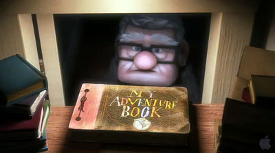
My summer movies were bracketed by two animated pictures. Up is to my mind the most mature Pixar film yet. It has all the virtues we associate with this studio: quick but not frantic pacing, expert handling of resonant motifs, technical brilliance (especially in its depiction of settings), and one-off gags. The poker-playing dogs had me laughing out loud. But as we’ve argued in other blogs (here and here and here), the Pixar team likes to set itself tough challenges. First there is the technical challenge of 3-D, which is easily surmounted. The 3-D effects get more pronounced once the plot lands in South America. More important, I think, is the challenge of representing the emotion of sorrow.
Another movie would have organized its plot around the kid, Russell, and let him meet the elderly Carl in the course of his adventures. That way, Carl would emerge as a merely touching secondary character. But by focusing point of view around Carl’s life, showing his marriage and widowhood, Pete Docter and his team have tackled one of the hardest problems of classic moviemaking. How do you render pure sentiment without becoming sentimental?
The protagonist’s portrait is surprisingly hard-edged. Carl is tightly wound even in his youth, unlike the exuberant and extroverted Ellie. Yet the couple seems to have no friends throughout their marriage, and it becomes easy to see how Carl could will himself into crabby isolation after her death. Thanks to the choice of viewpoint, Carl becomes no mere crank but a truly empathetic figure.
This is fragile stuff, and Docter handles it with tact. Many movies want you to cry at the end, but Up daringly invites you to indulge in its first ten minutes. It then spends the rest of its running time brightening your mood, so that the title could describe the film’s emotional trajectory. It’s one of my two favorite new movies I saw this summer.
Just a few days ago Kristin and I saw Ponyo on a Cliff by the Sea. We’ve been Miyazaki fans since Totoro, and have especially admired Kiki’s Delivery Service and Spirited Away. As with this last and with Howl’s Moving Castle, I have a hard time figuring out the premises of the plot. What rules govern Ponyo’s transformations? Why can’t she become a real girl, exactly? And then why is she permitted to? The well-timed interventions of her mother, like the Witch’s change of heart in Howl, seems a way out of plot difficulties, and as often happens in Miyazaki the plot resolution seems rushed in comparison with the leisurely development of characters’ relationships.
But as usual I was won over by the effortless virtuosity of the imagery and the weird conviction suffusing Miyazaki’s concept of nature. As in Spirited Away, animation becomes animistic. The sea is bursting with hidden forces: goldfish with extraordinary powers of group effort, waves that turn into blue fish, and bubbles as solid and slippery as balloons. Nobody but Miyazaki could imagine the quasi-Wagnerian scale of Ponyo’s race, atop gigantic fish-waves, to catch up with Sosuke and his mother fleeing in their car.
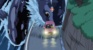
These shots burst with more dynamic shifts of mass and scale than I’ve felt in any official 3-D picture.
Sometimes Nature is scary. Although nothing here is as traumatic as Spirited Away‘s transformation of parents into swine, the tsunami scenes induce genuine awe at nature’s exuberant destructiveness. There follows a reassuring calm. Ponyo and Sosuke glide along the flood waters while ancient creatures zigzag in the depths, and the townspeople quietly accept that their homes have been engulfed. Ponyo is a gentle movie, aimed (as Miyazaki explains here) at a younger audience than was his recent work. It’s suffused with simple human affection, seen in acts of spontaneous generosity. What American movie could include a moment when Ponyo, fish become girl, offers a nursing mother a sandwich to help her make milk for her baby? Again, sentiment without sentimentality. Ponyo offers more evidence that whatever the disappointments we may find in live-action movies, we are living in a golden age of animation.
Am I just being perverse in finding Transformers 2: Revenge of the Fallen not as abysmal as others have? Don’t get me wrong. It is not what you’d call good. It is rushed and overblown. What other movie accompanies its opening company logos with gnashing sound effects? Its plot is even more preposterous than the first one’s. Its performers bear that sheen of meretriciousness that fills nearly every Michael Bay project. It is also lazy in its plotting. Worse, I couldn’t really make out the design of the ‘bots. It’s not that the cutting is abnormally swift (a mere 3.0 seconds ASL, about the same as in Up and slower than that in The Hurt Locker). The problem is that the digital camera is swirling around the damn things so fast as they take shape that you can’t get a fix on what they actually look like. All those spinning wheels and dangling carburetors ought to be worth a glance.
But still….For non-Transformers shots Michael Bay at least puts his camera on a tripod, which these days counts as a plus with me. And a minibot humps the heroine’s leg. And John Turturro is in it. Would he grace a movie that signals the fall of Western Civilization?
 In a similar vein but more satisfying was District 9. Its “racial subtext” is as perfunctory and confused as such weighty hidden meanings usually are, and anyhow whatever political points the movie wants to make drift out of view halfway through. Moreover, its “documentary immediacy” is inconsistent: despite footage marked as coming from surveillance and TV cameras, we have unimpeded access to all plot matters. But here the Bumpicam probably allows for cheaper CGI, and as a run-around-shooting-things movie, it needs to keep things simple.
I found the smash-and-grab look far more distracting in The Hurt Locker. Kathryn Bigelow has directed several first-rate movies, notably Near Dark (where she used a tripod), Blue Steel (ditto), and Point Break (tripod mostly). On this project, she seemed to me to be doing more conventional work. There are the titles telling us that time is running out (“16 Days Left”). There’s classic redundancy of characterization, as when we’re told that James is a hot dogger–“He’s reckless!” “You’re a wild man!”–as we watch him be all that he can be, and more. There’s the hapless kid who is so near to the end of his tour that you know he’s a marked man. There are even aching slow-mo replays of explosions bowling guys to the camera. What if war films gave up this convention and just showed bombs going off and bodies hurled around as fast as in reality? Might war look a little less picturesque?
The camera is locked down for these iconic slow-mo shots, but most of the scenes are handled in heat-seeking pans, artful misframings, chopped-off zooms, and would-be snapfocusing that can’t find something to fasten on. The editing plucks out bits of local color and sprinkles in some glimpses of onlookers that tend to turn them into props. I’ve tried to show elsewhere that this trend in rough-hewn technique nonetheless adheres to the conventions of classical style: establishing/ reestablishing shots, eyelines, reactions, and close-ups to underscore story points. Even wavering rack-focus can still orient us to the action quite clearly.
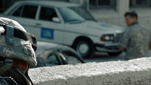
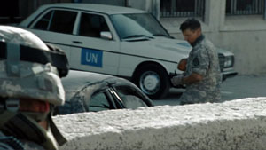
The question is what the harsher surface adds, especially when it’s so pervasive. Habituation is one of the best-proven phenomena in psychology, and movies like this seem to prove that it works. After the first few minutes, we’ve adapted to any visceral punch that the Unsteadicam hopes to provide. Maybe it serves to ratchet up suspense? Doubtful. A director would have to be a real duffer to dissipate suspense in a movie about dismantling an explosive device. The trick is to do something different, as in bomb-disposal movies like the Chinese Old Fish and the British Small Back Room.
Still, the plot is decently engaging, and there’s a taut, unpredictable siege in the desert. That long sequence displays a disciplined interplay of optical viewpoints, a sense of constantly revised tactics, a new aspect of James’s leadership style, and nice details about sharing juice boxes. In another era, The Hurt Locker would have been a studio picture in the vein of Anthony Mann’s bleak Men in War. I suppose it shows that yesterday’s genre film, executed with conviction and a certain edginess, can become today’s art movie.
Speaking of suspense: I thought that the setup to A Perfect Getaway was reasonably engrossing. There was some clever self-referential teasing: our hero’s a screenwriter, and there’s talk of a “second-act twist.” And it was mostly shot on a tripod. I hoped that director-writer David Twohy would have the courage to stick with its initial premise and be Deliverance in Hawaii. But sure enough, the things that smelled like red herrings were red herrings, and the reversal that you feared comes to pass in one of those point-of-view switcheroos that movies now indulge in. Come to think of it, that was the second-act twist. But I did like the strategically placed telemarketer call.
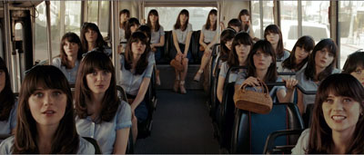
We’re evidently allotted one crossover indie movie per summer, a fact acknowledged in the title of this year’s hit. (500) Days of Summer, which really needs its parentheses not just because everybody now overuses them (there’s even a blog confessing it), but because its strategy is to disarm you with its knowing cuteness. It is so self-consciously winning your teeth will ache. It’s a twentysomething romance of the sort usually called “bittersweet.” The guy’s after love and the girl withholds commitment. Guaranteed result: emotional roller coastering, because we’ve seen her flighty sort before in kooky-girl figures like Petulia. There’s a fantasy musical number with a touch of animation, an avuncular narrating voice sliding in and out, a shuffled time scheme sorted out for us with a sort of daily odometer reading, and pop-culture references including retro ones to The Graduate and Ringo Starr. Everybody smiles a lot, and when they’re not smiling they’re crinkling up their faces.
(500) Days plays by the book. Tom and Summer work for a greeting-card company, a satiric target only a little harder to hit than the Pentagon. As in the movies mentioned above, the cutting is intent on making sure we see everybody deliver every syllable. (What ever happened to offscreen dialogue? Did TV kill it?) (Sorry about the parentheses.) The four-part script layout is as neat as embroidery: the first kiss at the photocopiers comes at 24:00, the splitup comes at 47:00, Tom delivers his diatribe against the lies about love at about 72:00, and the epilogue, with its fatal final line, finishes at 90:00. Yet I’m not curmudgeon enough to despise a movie so desperate to be liked, and at last I found a film whose narration clicks along in syncopation with my little tally counter.
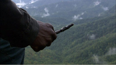
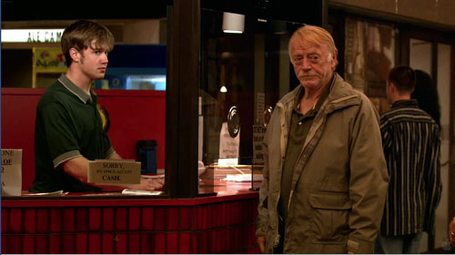
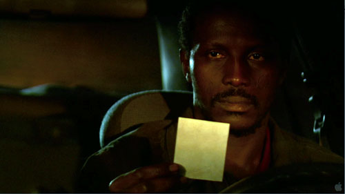
The real indie film I admired in my fifty days was Ramin Bahrani’s Goodbye Solo, or Good Bye Solo as the credit title has it. Kristin and I have registered our admiration for Bahrani’s films here and here on this site, and his latest is no less modest, well-crafted, and affecting. A Senegalese emigre cab driver befriends an enigmatic old man who at the start of the film offers him $1000 to pick him up on October 20 and drive him to Blowing Rock Mountain. Solo infers that William is planning a suicide and so starts to intervene in his life. His involvement with William gets intertwined with his family problems and his hopes of becoming an airline attendant.
Goodbye Solo exemplifies the “character-driven” movie. Solo is sunny, quick-witted, and socially adroit; his audition for the airline managers shows him as an ideal employee. William is just the opposite–morose, aggrieved, profoundly unhappy. The treatment is observational, with lengthy shots (an average of over twelve seconds) capturing dialogue and slowly shifting character response.
 The characters change, but Bahrani and his co-screenwriter Bahareh Azimi, wary of quick fixes, don’t push this too far. It would be easy to make William soften more, even eventually make him likeable, and to keep Solo an indefatigable force for optimism. Instead, if William accepts more of Solo’s ministrations, it’s largely due to his passivity, not a fundamental change of heart. Meanwhile, Solo becomes more anxious and pessimistic, shedding some of that casual charm that captivated us in the opening. Neither executes that neat character arc that Hollywood tends to favor and that’s visible in Up and (500) Days of Summer.
Bahrani’s hatred of cliché obliges him to make his story events mundane and equivocal. As in Man Push Cart and Chop Shop, the plot emerges from variations in routine, a lesson well-taught by European festival cinema of the 1950s. But when you have a stubborn, taciturn character like William, and you’re restricted to another character’s range of knowledge, it’s hard to give the film a forward propulsion. You have a deadline, but no momentum. So plot dynamics arise from Solo’s relation to his wife and daughter, his career goals, and above all his investigation of William’s past–his search for what could drive the man to suicide. And this investigation turns on conveniently discovered clues.
Someday I must do a blog entry on tokens in narratives. Any plot of some complexity seems to need physical objects that encapsulate dramatic forces, spread out information, or become emotion-laden motifs. The photograph is probably the most traditional one, but notes, diaries, rings, and so on are useful too. In Goodbye Solo, William’s tokens move the drama of disclosure forward, and it’s possible to object to the film’s reliance on so many of them.
The problem Bahrani faces is that the film has to give us personal information about William while retaining tact and respect for characters’ integrity. For William to open up into a Tarantino-style confession would tear the movie apart; even a quiet moment of sobbing vulnerability is too indiscreet here. The film needs its tokens, however awkward they may seem as narrative devices, to keep faith with its people.
Staying a little outside the characters, allowing them to retain some private motives, is exactly what (500) Days of Summer doesn’t attempt. Bahrani’s discretion extends to the very last scene. The title becomes a line that someone should speak but doesn’t. Up till now, the quietly precise images have been shot by a camera locked down, but atop a mountain the camera leaves its tripod and supplies some mildly shaky imagery. And now it fits. It’s not just that the drama has reached an emotional pitch. The camera is simply buffeted by the wind. Once more Bahrani lets his world do its work.
You can read about our summer film-related travel here and here and here and here and here.
Overwhelmed by all the material on Pixar and Up, I merely point to two encyclopedic experts: the ever independent-minded Mike Barrier and the always-informative Bill Desowitz, who offers information on Pixar’s approach to 3-D here. For Ponyo background and an interview with Miyazaki, turn again to Bill D, here; he provides a transcript of a conversation between Miyazaki and John Lasseter here. A fat book of Miyazaki interviews and essays has just been published, and it includes some incendiary stuff, such as “Everything that Mr. Tezuka [Osamu, the ‘god of animation’] talked about or emphasized was wrong” (197).
The parentheses in (500) Days of Summer are explained by screenwriter Scott Neustadter at Jeff Goldsmith’s Creative Writing podcast.
Roger Ebert has reviewed nearly all these films and as always he has sensitive things to say, particularly on Goodbye Solo. He’s been championing Bahrani’s films for many years and he offers a warm career appreciation here.
Goodbye Solo.
A glimpse into the Pixar kitchen
DB here:
On some of Bill Kinder‘s business cards, the I in PIXAR is represented by Buzz Lightyear, the blustery, not-too-swift astronaut of Toy Story. It’s a typical gesture of self-deprecation from the studio that showed that computer animation didn’t have to be just plastic surfaces and mechanical expressions. Pixar is cool, geeky, and warm all at the same time. Its films are both smart and soulful, made by movie fans for movie fans, and for everybody else. Like the best of the Hollywood tradition, Pixar movies have the common touch and still offer the most refined pleasures.
 Kristin and I have already written admiringly about Pixar on this site (here, here, and here). It’s quite likely that this studio is making the most consistently excellent films in America today. So we were delighted when our colleague Lea Jacobs arranged for Bill to come to the University of Wisconsin—Madison last fall. He toured our new Hamel 3-D media facility, met with faculty and students, and gave a talk, “Editing Digital Pictures.” Bill is Director of Editorial and Post-Production, a position that gives him an encompassing view of the Pixar process as he champions the efforts of the editors and their teams as key creative contributors.
A graduate of Brown, where he studied with our old friend Mary Ann Doane, Bill is like Pixar movies—intellectual, good-natured, energized, and adept at connecting with people. He started his career in news-gathering and TV editing before moving to work at Francis Ford Coppola’s American Zoetrope, in the days of Jack (1996) and the uncompleted Pinocchio project. He joined Pixar in 1996, while they were finishing Toy Story. When the success of A Bug’s Life enabled Pixar to move to a purpose-built facility in Emeryville, Bill went along.
Whittling vs. building
I’ve always been uncertain about what an editor does in the animation process. Since every shot is planned and executed in detail, what can be left for an editor to do? Bill started from that question. No, editing digital animation isn’t just a matter of cutting off the slates and splicing perfectly finished shots together.
As in live-action filming, the animation editor is working with dozens of alternate versions of every shot. The reason is that at Pixar, there are roughly five phases of production: storyboarding, layout, animation, lighting, and effects/ rendering. Each one generates footage that has to be cut together.
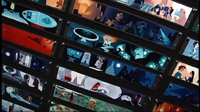
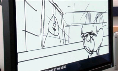
The static storyboards, for instance, present poses, expressions, and movements against a blank background. They are assembled in digital files that can be played back as if they were a movie. In order to plan the next phase, the resulting “footage” has to be edited, and choices are made at every cut. And each scene is storyboarded at least five different ways, with many variations of action and timing. A single film uses up to 80,000 boards!
At the next phase, layout, the scene’s overall action is planned. Layout artists develop the staging of each shot, testing different backgrounds and camera angles with the editors. Again, the alternatives have to be assembled and cut in various combinations.
Whittling versus building, Bill called it. The live-action editor gets a mass of footage that has to be triaged, but the animation editor is building and tuning the film from the start. Editing operates at each phase, from storyboarding to final rendering. This “almost overwhelming iteration,” as Bill called it, demands that the editorial department hold all the alternatives in its collective mind at once. Add to this the fact that Pixar can take up to five years to produce a film, maintaining several editorial teams to cover projects at different degrees of completion. When you realize that all this brainpower and bookkeeping are necessary for even the simplest shot, you appreciate the felicities of the finished product even more. These people make it all look easy.
Continuity and the viewer’s eye
Bill explained that digital animation occasionally requires something like live-action coverage. (1) Action sequences with fast cutting need to be spatially clear, and “chase scenes can be hard to board.” So sometimes the layout artists create master shots and closer shots from different angles that the editor will pick out and assemble, live-action fashion.
Like live-action editors, Pixar editors have to keep an eye on continuity of the objects in the frame. Because each shot is reworked across many phases, items of the set, lighting, color, atmosphere, effects and rendering have to be maintained, on many layers or levels of the program. (I gather it’s like the layers in PhotoShop.) Sometimes a layer, whether a prop, character, or set element, fails to “turn on” and so a discontinuity can crop up. A finished Pixar film typically has 1500 shots or more, so there’s a lot to keep track of.
In another carryover from live-action features, Pixar plots are conceived and executed in three discrete acts. It’s not only a storytelling strategy but a convenience in production. Rather than waiting until the entire film is done to examine the results of the different phases, the filmmakers can finish one act ahead of the others in order to troubleshoot the rest.
I’ve studied how filmmakers compose the image in order to shift our attention (2), so I was happy to hear that this process is of concern to the Pixar team. “Guiding the viewer’s eye,” Bill called it. He explained that in looking at storyboards and animated sequences, his colleagues sometimes use laser pointers to track the main areas of interest within shots and across cuts, especially when characters’ eyelines are involved. Nice to see that sometimes academic analysis mirrors the practical decisions of filmmakers.
The auteurs of Pixar
What makes Pixar films so fine? Bill supplied one answer: It’s a director-driven studio. As opposed to filmmaking-by-committee, with producers hiring a director to turn a property into a picture, the strategy is to let a director generate an original story and carry it through to fruition (aided by all-around geniuses like the late Joe Ranft). Within the Pixar look, John Lasseter’s Toy Story 2 and Cars are subtly different from Brad Bird’s The Incredibles and Ratatouille or Andrew Stanton’s Finding Nemo and upcoming Wall.E.
Bill covered many other fascinating topics, including the importance of sound (“the animated film’s nervous system”). But I’ll end with some pull-quotes from Bill’s talk.
*Francis Ford Coppola: “No film is ever as good as its dailies or as bad as its first assembly.”
*Gary Rydstrom: “Film sound is the side door to people’s brains.”
*Bill himself: “Editing is just writing, but using different tools.”
We’re grateful to Bill for his visit and look forward to seeing him again. Goes to prove what we’ve said before: Popular American filmmaking harbors many of the most intelligent, sensitive, and generous people you’ll ever find.
(1) In live-action production, coverage involves shooting a master shot of a scene that shows the entire action. Then parts of the action are repeated and filmed in closer views. This allows the editor several options for cutting the scene together.
(2) I talk about this in Chapter 6 of On the History of Film Style and throughout Figures Traced in Light. See also Film Art, pp. 140-153, and this blog here and here.
PS: Another glimpse into the kitchen: Bill Desowitz reports on Wall*E at Animation World. Now Pixar is trying to emulate the look of 70mm. And there’s footage from Hello, Dolly! in there? All the signs point to another nutty, dazzling achievement.
Rat rapture
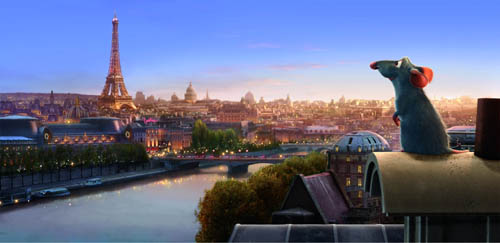
Recently we went to see Ratatouille and both loved it. We thought it was the best Hollywood movie we’ve seen this summer.
KT: Last October, in the infancy of this blog, I posted an entry on Cars. There I said, “For me, part of the fun of watching a Pixar film is to try and figure out what technical challenge the filmmakers have set themselves this time. Every film pushes the limits of computer animation in one major area, so that the studio has been perpetually on the cutting edge.” For Cars it was the dazzling displays of light and reflections in the shiny surfaces of the characters.
Figuring out the main self-imposed challenge in a new Pixar film is like a game, and I avoid reading any statements about the films by their makers ahead of time.
At first glance Ratatouille might seem to be “about” fur. True, there are lots of rats with impressively rendered fur—but fur was the big challenge way back in Monsters, Inc. Surely Pixar wasn’t repeating itself. To be sure, Monsters, Inc. contained only one major furry character, Sulley, and his fur was the long wispy type that some stuffed animals have. Difficult to render, no doubt, but different from the rats’ fur, which is dense, short, and has to ripple with the movements of the animals.
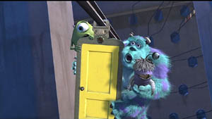
Not only that, but in Ratatouille, we see furry rats in all sorts of situations: just running round, crawling out of water and various other liquids, and in one virtuoso throwaway shot, emerging all fluffed up from a dishwasher. It’s all very impressive, but I didn’t think that was the main technical feat that the filmmakers were aiming at.
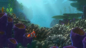
I quickly became aware that there was something different about the settings. Pixar films always have eye-catching settings: the beautiful and convincing underwater seascapes of Finding Nemo, the huge vistas of the factory in Monsters, Inc., the stylized domestic settings in the The Incredibles.
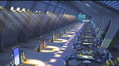
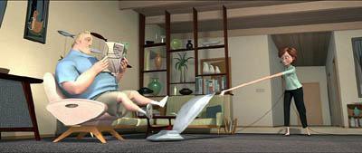
The Incredibles, the first film that Brad Bird directed for Pixar, was deliberately cartoony-looking, evoking the streamlined Populuxe look of 1950s cartoons. Ratatouille, his second effort, takes a very different approach. Here the settings are far more realistic and three-dimensional, approaching photo-realism in some of the Parisian street scenes. Often our vantage-point moves rapidly through these settings, twisting, turning, and plunging from high angle to low angle framings in a second. In the scene where the protagonist Remy is swept away from his family through the sewers until he emerges in Paris, the twists and turns of the pipes sweep by. Likewise, the camera explores the crevices of the restaurant’s crowded pantry.
The settings have a tangible and immediate presence beyond what we have seen in previous Pixar films, partly because so many objects in the surroundings are pulled into the action. Ingredients sit in bowls and jars that take up considerable portions of the kitchen set, and the rat dashes among them, sniffing to find the ones he needs for a new concoction. The lessons learned in Cars return here to make the shiny copper cooking utensils reflect their surroundings. The brick arch and floor tiles of the restaurant kitchen were individually tweaked, so that they don’t have the uniformity that CGI tends to give repetitive patterns. Dense combinations of bricks, tiles, wood panels, carpets, patterned wallpaper, glass, and Venetian blinds make every shot too busy for the eye to fully take in.
A delightful demonstration of all these features and more is given in the “Ratatouille QuickTime Virtual Tour.” 360-degree spherical space allows you to look up at the ceiling and down at the floor as well as scan the walls. (The download time is reasonably quick; you need to move your cursor into the window that opens and use it to scroll in any direction and at variable speeds. Use the shift key to zoom in and the control key to zoom out.)
DB: Two things, one general and one specific to Ratatouille:
(1) The idea of explaining artists’ works in terms of problems and solutions is common in art history and musicology, but not so common in film studies. It can be fruitful to consider that sometimes filmmakers face common problems and that they compete to solve them, or to find different problems they can solve.
I sometimes try to imagine what animators for other Hollywood studios thought when they walked out of Snow White and the Seven Dwarfs. Did the talents at Warners, Fleischer et al. just throw up their hands in despair? Disney must have been the Pixar of its day, challenging its rivals with a dazzling series of achievements along many dimensions. Disney had solved so many problems—of rendering color and depth, of catching detail and voluminous movement, of blending pathos with comedy—that the others could hardly compete in the same race. So it seems that they carved out other niches. Fleischer, though trying its hand at feature cartoons as well, concentrated on the familiar and presold comic-strip world of Popeye. Warners avoided child-oriented sentimentality and offered more insolent and whacked-out entertainment, personified in Bugs and Daffy. In today’s CGI realm, Pixar seems to set the pace, staking its claim before anybody else has realized the territory has opened up–though Aardman consistently offers something different.
(2) Along with the problems that you’ve mentioned, I was struck by what we might call a general task facing all animators: the need to display a sophisticated cinematic intelligence that fit contemporary tastes in live-action movies. So the pacing has to be fast (here, an average shot length of about 3.5 seconds), but it isn’t frantic. Today’s movies are overstuffed with details, so this is too; but here many stand out sharply. Central are all the minutiae of food and its preparation, which you mention below. Our friend Leslie Midkiff Debauche reports that her son, a chef, noticed the burn mark on Colette’s right forearm—a combat wound of the professional cook. Instead of the heavy satire and flatulence of the Shrek cycle, Pixar always gives us something that would engage us even if it weren’t animated.
Every director, I think, should study this film for lessons in making movement expressive. The velocity of our rats’ scampering depends on the surface they cross, and the differences in acceleration and braking are vivid. The vertigo-inducing river turbulence that carries Remy away from his clan displays the old Disney genius in rendering the behavior of water. There’s a caricatural difference in body language among all the characters, from the cadaverous Ego to the heaving movements of pudgy Emile and the spasmodic twirling of Linguini when Remy is at the controls. Shot scale is always well-judged. When there’s a moment of uncertainty about whether the kitchen team will support Linguini, the pause is accentuated by the fierce Horst taking a step forward toward the boy, in big close-up. Will this be the signal for the others to join him? The close-up conceals the key piece of information: Horst has stripped off his apron, and only when he lifts it into the frame do we realize that he’s walking out. Perhaps the visual expressiveness of silent filmmaking survives best today in animation.
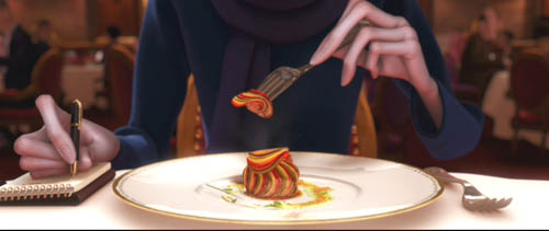
KT: A secondary but still important challenge seemed to be the effort to find ways of rendering the textures of surfaces that are difficult to capture in animation. Most obviously the food—slices of carrots and tomatoes, stalks of celery—must look realistic and attractive if we are to believe that the dishes Remy devises are truly as scrumptious as the characters find them. (The film wisely sticks to soups, desserts, and, yes, ratatouille, sidestepping the problematic notion of an animal cooking other animals.)
Once you decide what you think the Pixar crew was working on extra hard in their newest film, it’s usually easy to find supporting evidence in interviews with the top people involved. For some reason Bird was reluctant to talk much about the big technical challenges for Ratatouille, but he gave a good summary in the interview on Collider.com:
I think our goal is to get the impression of something rather than perfect photographic reality. It’s to get the feeling of something so I think that our challenge was the computer basically wants to do things that are clean and perfect and don’t have any history to them. If you want to do something that’s different than that you have to put that information in there and the computer kind of fights you. It really doesn’t want to do that and Paris is a very rich city that has a lot of history to it and it’s lived in. Everything’s beautiful but it’s lived in. It has history to it, so it has imperfections and it’s part of why it’s beautiful is you can feel the history in every little nook and cranny. For us every single bit of that has to be put in there. We can’t go somewhere and film something. If there’s a crack in there, we have to design the crack and if you noticed the tiles on the floor of the restaurant, they’re not perfectly flat, they’re like slightly angled differently, and they catch light differently. Somebody has to sit there and angle them all separately so we had to focus on that a lot.
DB: This relates back to the idea that an animated film has to offer its own equivalent of what live-action has led viewers to expect. Since at least Alien and Blade Runner, we’ve come to equate realism with a worn-out world. No more spanking-clean spaceships, but rather creaky Gothic ones; no more shiny futures, only dilapidated ones. Bird acknowledges that once his team opts for more detailed settings, they have to look lived-in, rather than the rather generic ones we find in Toy Story and even The Incredibles. But then the food contrasts with this air of casual imperfection; it looks pristine.
KT: Speaking of food, in another interview, Bird expands on the difficulties of rendering it:
There was quite a bit of effort expended to make the food look delicious. Because if one of the things your movie is about is gourmet food, then you can’t have it not look delicious. And computers aren’t really very interested in making things look delicious. They’re interested in things looking clean and things looking geometrically precise, and usually hard not squishy – not tactile. Computers are great for perfection. They’re not great at organic things. We had to work really hard to get the food to look like you could taste it and smell it and enjoy it.
The interviews I’ve read don’t mention it, but the film also takes a small but impressive step toward solving the ever-difficult problem of rendering human skin. Most of the characters are given the usual smooth skin that we have come to expect in computer-animated films.
DB: Agreed! One of the things that put me off CGI animation years ago was the overpolished look of CGI surfaces. Volume without texture always looked plastic to me. But in Ratatouille, the Pixar team has made great progress in dirtying up the surfaces. That kitchen is full of spills and stains, but the faces are still pretty balloon-like, except for that villainous chef Skinner. He’s the most cartoony character, I suppose, and the range of expressions he passes through just in delivering a single line had me in stitches. The Termite Terrace legacy lives on in him.
KT: Yes, Skinner must have inspired the filmmakers. His face gets very sophisticated treatment. In most character animation, eyes and eyebrows are the main means of creating expressions in the upper half of the face. Several times, however, Skinner comes into extreme close-up, so that his expressions of rage and shock are complete with elaborate forehead wrinkles. There’s even a patch of pores on his nose. That degree of detail is used sparingly in this film, but perhaps we see a sign of things to come as the Pixar animators set up new hurdles to jump.
PS 25 August: For an interesting, more thematically oriented discussion of Ratatouille, see Michael J. Anderson and Lisa K. Broad’s entry on the Tativille blog.
PPS 31 August: Bill Desowitz has a lively and informative feature on the film, including behind-the-scenes interview material, at Animation World.


