


Archive for the 'Animation' Category
A glimpse into the Pixar kitchen

DB here:
On some of Bill Kinder‘s business cards, the I in PIXAR is represented by Buzz Lightyear, the blustery, not-too-swift astronaut of Toy Story. It’s a typical gesture of self-deprecation from the studio that showed that computer animation didn’t have to be just plastic surfaces and mechanical expressions. Pixar is cool, geeky, and warm all at the same time. Its films are both smart and soulful, made by movie fans for movie fans, and for everybody else. Like the best of the Hollywood tradition, Pixar movies have the common touch and still offer the most refined pleasures.
 Kristin and I have already written admiringly about Pixar on this site (here, here, and here). It’s quite likely that this studio is making the most consistently excellent films in America today. So we were delighted when our colleague Lea Jacobs arranged for Bill to come to the University of Wisconsin—Madison last fall. He toured our new Hamel 3-D media facility, met with faculty and students, and gave a talk, “Editing Digital Pictures.” Bill is Director of Editorial and Post-Production, a position that gives him an encompassing view of the Pixar process as he champions the efforts of the editors and their teams as key creative contributors.
A graduate of Brown, where he studied with our old friend Mary Ann Doane, Bill is like Pixar movies—intellectual, good-natured, energized, and adept at connecting with people. He started his career in news-gathering and TV editing before moving to work at Francis Ford Coppola’s American Zoetrope, in the days of Jack (1996) and the uncompleted Pinocchio project. He joined Pixar in 1996, while they were finishing Toy Story. When the success of A Bug’s Life enabled Pixar to move to a purpose-built facility in Emeryville, Bill went along.
Whittling vs. building

I’ve always been uncertain about what an editor does in the animation process. Since every shot is planned and executed in detail, what can be left for an editor to do? Bill started from that question. No, editing digital animation isn’t just a matter of cutting off the slates and splicing perfectly finished shots together.
As in live-action filming, the animation editor is working with dozens of alternate versions of every shot. The reason is that at Pixar, there are roughly five phases of production: storyboarding, layout, animation, lighting, and effects/ rendering. Each one generates footage that has to be cut together.
The static storyboards, for instance, present poses, expressions, and movements against a blank background. They are assembled in digital files that can be played back as if they were a movie. In order to plan the next phase, the resulting “footage” has to be edited, and choices are made at every cut. And each scene is storyboarded at least five different ways, with many variations of action and timing. A single film uses up to 80,000 boards!
At the next phase, layout, the scene’s overall action is planned. Layout artists develop the staging of each shot, testing different backgrounds and camera angles with the editors. Again, the alternatives have to be assembled and cut in various combinations.
Whittling versus building, Bill called it. The live-action editor gets a mass of footage that has to be triaged, but the animation editor is building and tuning the film from the start. Editing operates at each phase, from storyboarding to final rendering. This “almost overwhelming iteration,” as Bill called it, demands that the editorial department hold all the alternatives in its collective mind at once. Add to this the fact that Pixar can take up to five years to produce a film, maintaining several editorial teams to cover projects at different degrees of completion. When you realize that all this brainpower and bookkeeping are necessary for even the simplest shot, you appreciate the felicities of the finished product even more. These people make it all look easy.
Continuity and the viewer’s eye

Bill explained that digital animation occasionally requires something like live-action coverage. (1) Action sequences with fast cutting need to be spatially clear, and “chase scenes can be hard to board.” So sometimes the layout artists create master shots and closer shots from different angles that the editor will pick out and assemble, live-action fashion.
Like live-action editors, Pixar editors have to keep an eye on continuity of the objects in the frame. Because each shot is reworked across many phases, items of the set, lighting, color, atmosphere, effects and rendering have to be maintained, on many layers or levels of the program. (I gather it’s like the layers in PhotoShop.) Sometimes a layer, whether a prop, character, or set element, fails to “turn on” and so a discontinuity can crop up. A finished Pixar film typically has 1500 shots or more, so there’s a lot to keep track of.
In another carryover from live-action features, Pixar plots are conceived and executed in three discrete acts. It’s not only a storytelling strategy but a convenience in production. Rather than waiting until the entire film is done to examine the results of the different phases, the filmmakers can finish one act ahead of the others in order to troubleshoot the rest.
I’ve studied how filmmakers compose the image in order to shift our attention (2), so I was happy to hear that this process is of concern to the Pixar team. “Guiding the viewer’s eye,” Bill called it. He explained that in looking at storyboards and animated sequences, his colleagues sometimes use laser pointers to track the main areas of interest within shots and across cuts, especially when characters’ eyelines are involved. Nice to see that sometimes academic analysis mirrors the practical decisions of filmmakers.
The auteurs of Pixar

What makes Pixar films so fine? Bill supplied one answer: It’s a director-driven studio. As opposed to filmmaking-by-committee, with producers hiring a director to turn a property into a picture, the strategy is to let a director generate an original story and carry it through to fruition (aided by all-around geniuses like the late Joe Ranft). Within the Pixar look, John Lasseter’s Toy Story 2 and Cars are subtly different from Brad Bird’s The Incredibles and Ratatouille or Andrew Stanton’s Finding Nemo and upcoming Wall.E.
Bill covered many other fascinating topics, including the importance of sound (“the animated film’s nervous system”). But I’ll end with some pull-quotes from Bill’s talk.
*Francis Ford Coppola: “No film is ever as good as its dailies or as bad as its first assembly.”
*Gary Rydstrom: “Film sound is the side door to people’s brains.”
*Bill himself: “Editing is just writing, but using different tools.”
We’re grateful to Bill for his visit and look forward to seeing him again. Goes to prove what we’ve said before: Popular American filmmaking harbors many of the most intelligent, sensitive, and generous people you’ll ever find.
(1) In live-action production, coverage involves shooting a master shot of a scene that shows the entire action. Then parts of the action are repeated and filmed in closer views. This allows the editor several options for cutting the scene together.
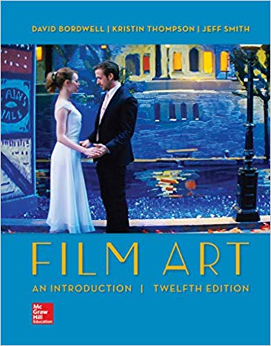
(2) I talk about this in Chapter 6 of On the History of Film Style and throughout Figures Traced in Light. See also Film Art, pp. 140-153, and this blog here and here.

PS: Another glimpse into the kitchen: Bill Desowitz reports on Wall*E at Animation World. Now Pixar is trying to emulate the look of 70mm. And there’s footage from Hello, Dolly! in there? All the signs point to another nutty, dazzling achievement.
Lines of sight and light

DB here:
Two weeks ago the film critic and historian Paul Arthur died. (An obituary is here.) Apart from being a warm and robust man, Paul advanced our understanding of cinema in important ways. He was a committed teacher and an energetic writer. For years it seemed that almost every issue of Film Comment or Cineaste contained an essay by him. Although he had an encyclopedic knowledge of film, he wrote with particular brilliance about experimental work. His book, A Line of Sight: American Avant-Garde Film since 1965 (2005), reflects a lifetime of sensitive study.
Paul was naturally on my mind as I watched the avant-garde films on display here at the Hong Kong Film Festival. I’ve mentioned some in an earlier entry, but I wanted to signal others that seemed to me especially fine.

A set by Ben Rivers had quiet poetic overtones. Very short (We the People lasts only one minute), they center on landscapes. I especially liked House (2007), a spectral suite of images derived from a miniature house Rivers contrived.
 Lewis Klahr‘s Antigenic Drift (2007) was a lovely and funny meditation on, I think, air travel in a post-9/11 age. Glossy images of airports are haunted by wandering bar codes, boarding passes, and anatomy drawings. Tablets burst out of blister packs and gather in colorful rank-and-file formations. The film bears the traces of Klahr’s visit to Wisconsin, some details of which are here.
Ken Jacobs is a legendary figure in the avant-garde. Prolific, outrageous, and wide-ranging in his interests, he has been at it for fifty years. His oeuvre includes the casually goofy Little Stabs at Happiness (1960), the epic Star Spangled to Death (1957-2004), and the classic Tom, Tom, the Piper’s Son (1969). There Jacobs dissected a 1905 Biograph film on the optical printer (see P. S. below), revealing not only isolated faces and gestures in its crowded shots but also abstract masses of light and dark, and even the grain of the film stock.
Across several years, Jacobs and his wife Flo have developed a mode of multiple-projection performance. Their Nervous System shows films at different speeds, halts them, drops down filters, even superimposes slightly different frames from prints of the same film, creating vivid 3-D effects. Such spectacles trigger comparisons to nineteenth-century impresarios of wonder: the conjuror who calls up ghosts, the sideshow entertainer whose calliope happen to be a movie machine. (1)
Capitalism: Child Labor (2006) might at first seem a rerun of Tom, Tom. A photograph shows men and boys at work in a thread factory. This dire image, with the workers’ flat expressions only adding to the sadness, might suffice in itself. But Jacobs takes the picture to pieces and shows us everything. He creates close-ups and long-shots, embedding them within one another to create games of scale. And then? Informed by Nervous System discoveries, Jacobs takes things a step further.
The picture originated as a stereoscope card. A stereoscope card consists of two side-by-side images, shot at angles corresponding to the difference between our eyes. Looking at the card through the viewer, the viewer has an illusion of 3-D. (Remarkably, my top illustration also features a factory scene.) For a detailed account of stereoscopy, see the Wikipedia entry.
Jacobs intercuts the two slightly different photos, often allotting only a single frame to each. With simple geometric shapes this procedure would yield “wiggle stereo,” as illustrated in the Wikipedia piece. But the density of the images evidently allows Jacobs to create a fluttering, nagging sense of volume. We seem to move just a bit around the figures and their workstations before popping back to our starting place, then launching again, endlessly. Somehow my brain thinks I’m spasmodically starting to circle through the factory.
This is why we’re right to call such films experimental. They often try to discover how our senses, our minds, and our emotions reveal themselves in their encounter with cinema. The goals are different, I grant you: Art exposes, science explains. But scientists should have a special eagerness to study avant-garde films. I can’t imagine anyone interested in filmic perception—and not just cognitivist film researchers—who wouldn’t find Capitalism: Child Labor a provocation to marvel at how our vision jumps to conclusions about depth. This movie makes us say Wow.
Song and Solitude, a 2006 film by Nathaniel Dorsky, was simply stunning. (2) In the Brakhage tradition, it’s woven out of lyrical shots of details seized and abstracted. Reflections, silhouettes, out-of-focus textures, veils and grids shedding unexpected ripples of light: everything seems radiant. Sometimes you recognize a familiar object, like a window screen pebbled with rain. Often, though, you have to ask: What am I seeing? And then Why don’t I ever notice this?
Dorsky’s Buddhist-influenced aesthetic, revealed in his book Devotional Cinema, drew this commentary from Paul Arthur:
Old School doesn’t describe it. Dorsky has achieved such a subtle mastery over the most basic means of cinematic expression–composition, duration, juxtaposition–that he can squeeze a wealth of emotional vibrations out of the silent, seemingly banal interplay of foreground and background objects. A formalist with a brimming, elegiac soul, Dorsky will gently rock your attitude toward cinematic landscape. His world is a sublime mystery measured by patience and unmatched visual insight.
I didn’t know Paul well. I met him around 1974, when we had a good conversation about landscape in Anthony Mann. We ran into each other occasionally over the years and corresponded a little.
His generosity to Kristin and me came through on several occasions. In a roundtable discussion published in October no. 100, he called attention to the fact that Film Art tried to remind students and teachers of the importance of avant-garde film. (3) In reply to an essay of mine in Film Quarterly, he sent overabundant praise but added several pointed questions that forced me to tighten up my argument. Most vividly, when I was criticized (some would say personally attacked) in the pages of Film Studies’ most prestigious academic journal, he was moved to write me with encouragement. Of my critic he wrote: “To hell with him if he can’t take a joke.”
Like a great many others, I will remember Paul with affection and admiration.

Song and Solitude.
(1) An engrossing interview with Jacobs can be found here.
(2) By the sort of coincidence I like, Song and Solitude also played the Wisconsin Film Festival, which I had to miss this year. Trusty Joe Beres of the Walker Art Center, still a Badger at heart, provides coverage.
(3) The discussion is here, but beyond the first page the material is proprietary.
P. S. 21 May 2009 Keith Sanborn wrote me to point out that, in a reply to Ed Halter (who discusses Anaglyph Tom (Tom with Puffy Cheeks) in Artforum), Ken Jacobs corrects the frequent claim that the 1969-71 Tom, Tom was made on an optical printer. No, says Jacobs; he rephotographed the movie from the screen. Here is the inimitable explanation Jacobs supplied to Halter.
The movie so pushes forward the character of film projection. Images explode out of darkness. Nor was I using a specialized analytic projector that with a steady flicker minimizes exchange of frames. I used what had been a common RCA home sound-projector, from the 1940’s, possibly the late 1930’s, but one with a hand-controllable clutch that allowed for slowing and even stopping the film. Freezing as it’s called but usually more like burning. A heat-shield would fall in place to protect the film from burning but would then darken the image, and so I removed it and took my chances with burning. The energy that is light was a featured and constant presence in the work. Darkness is death and the old reclaimed images constantly struggle against death to proclaim themselves. Release of energy, via intermittent projection or in the return of rambunctious ghost-actors, was much of what the work was about.
Thanks to Keith for calling my attention to this.
Pausing and chortling: A tribute to Bob Clampett
The Great Piggy Bank Robbery
Kristin here–
During my first year as a Ph.D. candidate at the University of Wisconsin-Madison, the great animator Bob Clampett paid a visit to our campus. I actually got to sit next to him at lunch, and he was a charming, amusing man. Unfortunately I didn’t really know at the time what a genius he was, and, to my eternal regret, I neglected to ask for his autograph.
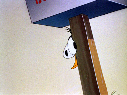
Today Clampett is less well-known to the general public than is Chuck Jones or Tex Avery. Jones and the other main creators of the classic Warner Bros.’s cartoons reportedly resented Clampett’s attempts to promote his own reputation by claiming sole credit for major achievements, such as “inventing” Bugs Bunny. When Jones put together The Bugs Bunny/Road Runner Movie (1979), there were no Clampett-supervised cartoons included. Clampett never wrote his memoirs. Jones did and left Clampett out. (Below, Draftee Daffy, 1945.)


These three major directors had their own distinctive approaches. Jones was on the whole more cerebral and often opted for beautiful visuals, perhaps most obviously evident in What’s Opera, Doc. Avery had a penchant for bad puns, often assembling whole cartoons based entirely around them. Clampett went for craziness and often for break-neck speed. The Wikipedia entry on him has this to say: “his characters are easily the most rubbery and wacky of all the Warner directors’.” (Above, Baby Bottleneck [1946].)
That wackiness was built into the name of one of Warner’s two animated series, “Looney Tunes.” Daffy Duck’s name characterizes him, but modern audiences may not be aware that “Bugs” also was a slang term for “crazy.” Along with Porky Pig, those were the two characters that Clampett used most often.
I’m not going to sum up Clampett’s career here. There is already quite a bit of excellent material on him available on the internet. For an overview of his career and style, see Adrian Danks’s “It Can Happen Here! The World of Bob Clampett” on Senses of Cinema; Michael Barrier’s epic 1970 interview with Clampett, with comments and corrections, is available on his website. That website contains many other shorter pieces on Clampett. Danks and the Wikipedia entry both give enough bibliographical sources to direct enthusiasts to additional information.
My purpose here is more modest. I simply want to point out how to find even more hilarity in Clampett’s cartoons beyond simply watching them.
As I’ve mentioned, David and I are in the process of revising our second textbook, Film History: An Introduction. The other day I was working on the section that deals with Hollywood animation in the 1930 to 1945 period. We’re adding more color to the book for its third edition, so I decided that Draftee Daffy, which we describe briefly, should have its own color plate.
As I watched the film on DVD, I paused on a number of possible frames to use, and I found myself laughing out loud at almost every one—something that doesn’t often happen during the revision of a textbook. Some of the character movements in Clampett’s films are so fast and brief that they come across as a flurry of images too fleeting to register. Frozen, they reveal some of the extraordinary means that the director and his animators used to achieve those effects of speed. Clampett was also adept at highly exaggerated reactions and hilarious distortions of the animal body. Watching these cartoons with a finger on the pause button can yield hilarity and teach you a lot about normally hidden aspects of the art of animation.
David has written about the artistry in Walt Disney’s films. He points out that a quick movement may be accomplished by adding extra limbs, as when in Melody Time Johnny Appleseed gathers an armload of falling apples and multiple arms and hands convey the speed of his gestures—as do a pair of phantom heads in the uppermost frame of the three David reproduces.
Such multiple images work without our noticing them. It’s not an obvious sort of technique to use. As David wrote, “Through trial and error Disney’s animators learned that rather strange single images will look exactly right on the screen; these men were practical perceptual psychologists.”
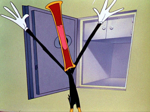
The same was true in the Warners animation department. In The Big Snooze (1946), Clampett’s last cartoon for the studio, he includes a scene of Bugs rapidly tying Elmer to some railroad tracks. In a couple of frames, he sprouts extra arms and hands. In The Great Piggy Bank Robbery (1946), phantom images of Daffy accompany his firing a machine gun.


But Clampett’s single images were often far stranger than the ones in the Melody Time example. In this one from Draftee Daffy, for example, the extra figures of Daffy as he frantically builds a wall between himself and his nemesis (the little man from the draft board) are purple.

I suppose that’s because multiple black figures of Daffy would blend together, but it’s still a bit weird. As an animator, how do you decide on a color?
Maybe it’s because purple is a subdued color that won’t call attention to the extra ducks and yet will contrast well with the black. It’s also the same color as the floor, so that might create an extra reason why we won’t notice them as standing out from the overall composition as it flashes past. If you know those purple ducks are there, you can just barely see them during normal projection. If you don’t know that, then you’re likely to miss them.
(I used that example of Daffy building the wall in my sole academic publication on animation, “Implications of the Cel Animation Technique,” in Teresa de Lauretis and Stephen Heath, eds., The Cinematic Apparatus [St. Martin’s Press, 1980]. There it had to be in black and white, unfortunately.)
Clampett often draws upon a standard animation device, “stretch,” to convey a sense of speed–although his characters may cross a room in as little as two or three frames. The first image of the telephone scene from The Great Piggy Bank Robbery is a fairly straightforward example of stretch, yet in the same scene, Daffy rapidly turning around uses the opposite technique, “squash.”


A similar technique which Clampett uses occasionally for a character about to launch into a rapid movement is a sort of squash with a perspective effect stretching the character toward the viewer, as in The Big Snooze when Bugs instructs Elmer to “Run this way.” (Bugs isn’t the only one who gets into drag in these cartoons.)

I’ve picked some of my favorite Clampett films, but many frames worth pausing on are to be found in others. With the Looney Tunes boxed sets still coming out, in five volumes to date, one can hunt out the Clampett films–though annoyingly, the indexes list neither the date nor the supervising animator, and there seems to be little logic involved in which films go on which discs. (There are also occasional jumps where something has presumably been censored.) It’s best to get thoroughly familiar with these films by simply viewing them. Then, pick up that remote and begin your search. You’ll discover that Clampett was one of the most imaginative of those “practical perceptual psychologists.”
The Great Piggy Bank Robbery.
Do sell us shorts
Kristin here—
I don’t think I’ve ever seen a single theater playing all five nominees for the best-picture Oscar. It’s happening now at the six-screen Sundance Cinemas here in Madison, plus they’ve got The Diving Bell and the Butterfly (nominated for director, cinematography, adapted screenplay, and editing) and Persepolis (animated-feature nominee). The latter is very impressive, and I think it would win in an ordinary year, but probably not when it’s up against Ratatouille.
[February 9. That outcome seems even more likely now. Last night Ratatouille won nine Annie Awards, prizes given out by the professional animation community. In the 35 years of those awards’ existence, only once has the top animated feature prize not gone to the film that went on to win the best animated film Oscar. Pixar’s accompanying short, Your Friend the Rat, won best short subject. It’s not eligible for an Oscar, since it was a supplement on the Ratatouille DVD and not shown theatrically.]
Films like these get widely seen, obviously. An awful lot of films, though, get nominated for Oscars that far fewer people will see. How many people fill out their office Oscar pool ballots knowing anything about the short animated and live-action films? Some you can track down online or on TV (HBO, Sundance, the IFC, and so on), but viewing them all would be difficult.
For three years now, however, Magnolia Pictures has been packaging the films in those two categories into a single program that goes out to theaters and then onto DVD. Magnolia is a small independent distributor, best known perhaps for its documentaries, including Enron: Smartest Guys in the Room and Capturing the Friedmans and for its imports like Ong Bak and The World’s Fastest Indian.
This year’s program, “The 2007 Academy Award Nominated Shorts,” is listed on the company’s website as playing in 80 theaters, though perhaps that number will rise. Many of the runs (including the one at our Sundance Cinemas) start on February 15, and others are scheduled from then on into April.
Thanks to Sarah Simonds, manager at Sundance, I was able to get an early look at the ten films on the program.
As one might predict, the range of quality is greater in the live-action films than in the animated ones. I’m not sure why that would be predictable, but I have my suspicions. There’s not much of a theatrical market for live-action shorts, which mainly get seen at festivals and on TV. They tend to be portfolio films, made by people trying to attract attention and move up to features. Hence they more often come from beginners. Animators who don’t want to work their way up through big studios—and who stand little chance of ever directing a major animated feature—or who simply value their independence may stick with shorts.
Another factor working in favor of animation is that it’s a medium that demands the detailed planning of literally every frame. No improvisation, no casual shooting in real locales, no direct sound. All in all, I think that if I were an Academy member, I’d have more trouble making a decision in the animated-shorts category.
Real, Live People
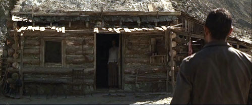
In the live-action category there’s no doubt that I would vote for The Tonto Woman, a UK short directed by Daniel Barber from an Elmore Leonard short story. Remarkably, Barber had mainly directed TV commercials before embarking on this, his first 35mm short, as a way of breaking into the film industry. He produced and funded it himself, with a ten-day shoot in Spain using locations and standing sets that had figured in such films as A Fistful of Dollars and The Good, the Bad and the Ugly.
The result might be described as The Piano meets There Will Be Blood. A cattle rustler (well played by Anthony Quinn’s son Francesco) encounters a rich man’s wife (Charlotte Asprey) who is living in enforced seclusion after having been kidnapped and held for eleven years by Mojave Indians (image above). The film has landscapes with the epic quality of both There Will Be Blood and No Country for Old Men, and its drama has the depth of a feature film without feeling rushed in its 35 minutes.
Leonard’s website has a press release giving more details, as well as a profile of Berber. The latter suggests that the director has been contacted by people within the film industry. All I can say is, fund this man immediately. I definitely want to see what he could do at feature length.
David has written quite a bit about the lively contemporary Danish cinema, including two entries on this blog, here and here. The country continues to be on a filmic roll in terms of Oscar nominations, with the short At Night being the one I’d vote if I were an Academy member and weren’t already voting for The Tonto Woman. It’s directed by Christian E. Christiansen and produced by Zentropa with support from the Danish Film Institute.
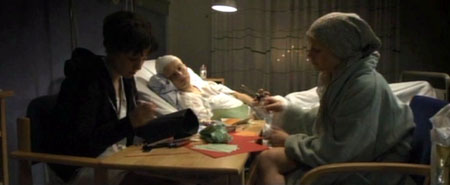
The subject matter sounds like the sort of thing that would ordinarily make me run the other way: three very young women with cancer bonding in the hospital ward they share. But the film avoids the touchy-feely clichés that so easily could sink such a project (except for a conventional Polaroid-photo montage of their little New Year’s party). It’s not just a sick-women’s-solidarity picture. One does come to care about these three and to understand how their illnesses make them better able to communicate with each other than with their families. It manages to pack a considerable emotional impact into forty minutes. Again, here is someone who could probably direct a fine feature film—and, given the current strength of the country’s industry, may well get the chance.
Tanghi Argentini is a charming comedy from Flemish director Guido Thys, dealing with an office worker who asks a colleague to teach him how to tango to impress a woman he has met on the internet. It combines a clever concept with a surprise twist at the end that works so well in both the short-story and short-film format. It’s entertaining but not so unusual or substantial that I would think of it as Oscar-worthy.
The two other films, France’s Le Mozart des Pickpockets (director/writer/actor Philippe Pollet-Villard) and Italy’s The Substitute (director Andrea Jublin), though both amusing, seemed surprisingly lightweight and conventional to have received nominations.
Puppets and Pictures
Trying to decide which of these animated shorts I would vote for is more difficult. Each is well-executed, entertaining, and imaginative. I tried thinking which I would want to watch again, which I would recommend to friends.
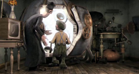
By those standards, there are again two stand-outs for me. I’d ultimately opt for Même les pigeons vont au paradis (Even Pigeons Go to Heaven), a French puppet film by Samuel Tourneux. It’s about a priest who attempts to sell a heaven-simulating machine to a miserly peasant about to be visited by the Grim Reaper. It’s fast-paced, very funny, and beautifully detailed in its depictions of the characters and settings. It’s not claymation, but it has some of the polish and wit of Aardman shorts.
 My close second choice would be a very different sort of film, My Love, from Russia, directed by Alexander Petrov. It’s a pretty, lyrical tale of a fifteen-year-old boy’s idealistic yearnings after a pretty servant girl and a more glamorous and mysterious woman who lives next door. The animation is impressionistic and shimmering, with constantly added brushstrokes transforming the compositions. Its visual style is derived from nineteenth-century Russian realist painting, especially that of Ilya Repin.
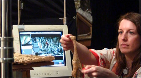
Suzie Templeton animating the Duck for Peter & the Wolf*
I suspect the Oscar winner might well be Peter & the Wolf, a British-Polish co-production that illustrates the classic Sergei Prokofiev tone poem. It was directed by Suzie Templeton and made at the Se-ma-for Studios in Łódź. There’s no doubt that it’s an impressive item, with elaborate miniature studio sets that could pass for real landscapes, precise and amusing puppets, and a mind-boggling frame-by-frame manipulation of furry puppets that leaves nary a ripple in their hair. (The photo above hints at how the latter feat was accomplished.) Still, the appeal of the original music is its evocation of events in our mind’s eye, and for me the literal playing out of those events at times carried a faint air of tedium. It’s the sort of prestige project that one can imagine a lot of Academy members loving.
 The same cannot be said for the edgier I Met The Walrus, from Canada. It’s derived from an existing soundtrack, a tape-recording made by a 14-year-old Jerry Levitan when he snuck into John Lennon’s hotel room and interviewed him. Now, many years later, director Josh Raskin has created an animated image track to accompany it. It’s a clever idea, but to me the illustrations of Lennon’s words soon became a bit too literal, and I found myself thinking that the animation was Terry Gilliam (in his Monty Python days, that is) meets Yellow Submarine meets Max Ernst collage-novel.
I’m very much of two minds about Madame Tutli Putli, the seemingly inevitable entry from the National Film Board of Canada (directed by Chris Lavis and Maciek Szczerborski). A puppet film four years in production, it is an extraordinary technical accomplishment. It deals with a mousey woman who takes a train journey that confronts her with bizarre and ultimately threatening events. The grim tone and grubby puppets and objects reminded me of Jan Svankmajer’s work.
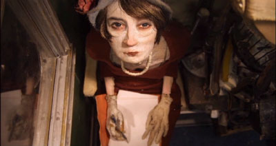
The most disturbing thing about the images, however, is not the subject matter but the creepily realistic eyes. To me it was obvious that real eyes had been superimposed onto the puppets’ faces. Investigating how this had been done, I found this brief making-of demonstration on YouTube, which indeed revealed the main character to be a puppet with blank areas where the eyes would be. Looking further, I learned that the special effects were done by painter/animator Jason Walker, who devised a complicated process to coordinate the photographed eyes with the animation. Some demonstrations of that process are available here, and there is an interview with him here.
There’s no doubt that the technique is unnerving, and yet at the same time it’s distracting (if one notices it). Is it “fair”? Of course people have been combining live action and animation in various ways since the 1910s. Yet superimposing photographed elements in such a way as to make them appear to be part of the animation almost seems like cheating. Here one would be tempted to marvel at how skillfully the animators had simulated human eyes—a notoriously difficult subject to capture realistically. I suppose for many viewers the eyes and the rest of the image would blend seamlessly and not prove distracting. For me, it didn’t quite work.
Overall, the program is undoubtedly worth seeing on the big screen.
As to the previous two programs of Oscar nominees, see here for the list of 2005 shorts and here for the DVD; see here for the 2006 list and here for the DVD.
*The production image from Peter & the Wolf derives from a making-of short on the British release of the German-made DVD (from Arthaus Musik), which now seems to be out of print.