Archive for the 'Animation' Category
Ladies at all levels
La cigarette (1919)
Kristin here:
Earlier this month Flicker Alley released another of its ambitious collections of historic films, Early Women Filmmakers: An International Anthology. The dual-format edition contains three discs DVDs and three Blu-ray discs. Its ambitions are reflected in part by the volume of material included (652 minutes) and in part by the range of its contents, from well-known classics to obscure titles.
The collection was one of the last projects curated and produced by the late David Shephard. As with many of Flicker Alley’s releases, it was a joint project with Film Preservation Associates (Blackhawk Films) and Lobster Films of Paris, working with several film archives. The films are arranged chronologically, with the earliest being Les chiens savants (1902), a music-hall dog act attributed to Alice Guy Blaché, and the latest Maya Deren’s classic experimental film, Meshes of the Afternoon (1943).
The publicity for the collection emphasizes that “More women worked in film during its first two decades than at any time since” (from the slipcase text). I would be interested in how such a claim was arrived at. It seems unlikely to me, if only because the film industries of the major producing countries have grown enormously since the silent and early sound periods. Still, despite this claim, the notes in the accompanying booklet (written by Kate Saccone, Manager of the Women Film Pioneers Project) describe how the DVD/Blu-ray release “reclaims that stature of ‘woman director’ and celebrates it in all its glory.” (One film included, Discontent [1916], is listed as “by Lois Weber”; in this case she wrote the screenplay, which was directed by Allen Siegler.) Thus the program does not survey the range of filmmaking work women performed–but such a survey would be essentially impossible. The lack of detailed credits on early films makes it difficult to determine even the director of a given film.
The silent films
It is not really possible to discuss all the films, but I’ll mention some and link to earlier entries where we’ve discussed some of them.
Of the 25 titles on the three discs, fourteen are silent. Six of these give an overview of work of Blaché, with three French films and three made after her move to the US.
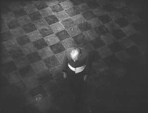
Lois Weber is represented by three films, starting with perhaps her best-known work, Suspense (1913). With its unusual angles (see above), elaborate split-screen phone conversations, and action shown in the rear-view mirror of a speeding car, this is one of those films you show people to demonstrate how wonderfully inventive directors around the world became in that incredible year. I am also very fond of her feature, The Blot (1921).
The third Weber film, Discontent (1916), may surprise those familiar with her socially conscious features. In the mid-1910s Weber worked in a variety of genres. While David was doing research recently at the Library of Congress, he watched some incomplete or deteriorated Weber films that haven’t been seen widely. He wrote about False Colors here and here. Discontent is a comedy with a moral. An elderly man is living in a home for retirees, but he envies his well-to-do family. Finally they invite him to live with them, and naturally everyone ends up annoyed by the situation–including the protagonist, who winds up returning to the home and his friends.
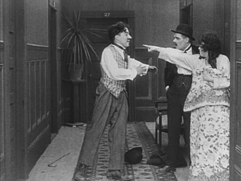
Mabel Normand apparently directed quite a number of her films for Mack Sennett, and Mabel’s Strange Predicament (1914) is one of them. Its cast also includes Charles Chaplin and was his third film to be released, although it was the second shot and the first one in which he wore a version of his Little Tramp costume. Not surprisingly, he steals every scene he’s in. Normand even plays second fiddle to him, with her character forced for a stretch of the action to hide under a bed, where she is barely visible while Chaplin performs some funny business in the same room. (The print seems to have been assembled from two different copies, the bulk of the film being in mediocre condition with the ending abruptly switching to a much clearer image.)
One curious item in the program is Madeline Brandeis’ The Star Prince (1918). According to her page on the Women Film Pioneer’s Project, Brandeis was a wealthy woman who made films, mainly centering around children, as a hobby. Some of these were apparently intended for educational use. The Star Prince, her first film, is clearly aimed at children. A few of its adult characters are played by young adults, while children play both children and adults. This becomes a bit disconcerting when we assume for a long time that the prince and princess are perhaps seven or eight, until they fall in love and become engaged.
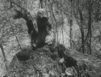
Despite the amateur filmmaking, there are some attempts at superimpositions and other special effects to convey the fantasy, as well as an charmingly clumsy pixillation of a squirrel puppet, the position of which is changed far too much between exposures.
This is the sort of local production, made outside the mainstream industry, that so seldom survives, and it is a welcome balance to the more sophisticated works that make up the bulk of this collection.
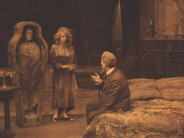
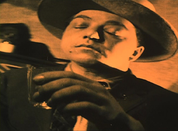
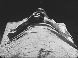
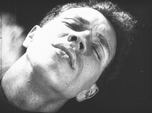
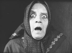
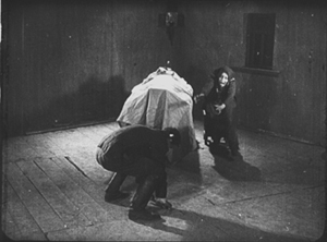
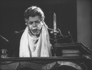
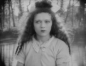
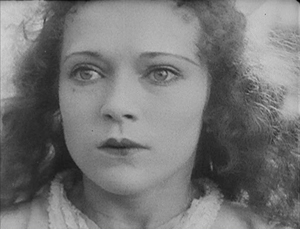
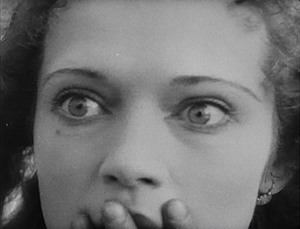
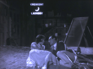
Speaking of which, the next part of the program consists of two features by one of the best-known female directors, Germain Dulac. The first, La cigarette, appeared in 1919. It’s melodrama about an fifty-ish Egyptologist, who has just acquired the mummy of a young princess who was unfaithful to her older husband. The professor begins to imagine that he is suffering a similar fate when his young and beautiful wife (see top) begins spending time with an athletic young fellow.
I remember seeing this film nearly forty years ago and thinking it was pretty weak. Luckily I have seen many films from this era since and know better how to watch them. Seeing it again I liked it quite a bit. It’s beautifully shot and well acted, and its sympathetic depiction of the doubting husband and the clever and resourceful wife is more subtle, in my opinion, than that of the marriage in The Smiling Madame Beudet (which is also included in this set). I was glad to have a chance to see the film again and recognize it as being among Dulac’s best work.
The silent section of the program ends with Olga Preobrazhenskaia’s The Peasant Women of Ryazan (1927). The title emphasizes that Preobrazhenskaia’s film is set in a provincial area. Ryazan, the capitol, is about 120 miles southeast of Moscow, so it is not one of the far-flung regions of the USSR. Still, it would have been distant enough at the time to have its own distinctive culture. Peasant Women gives us plenty of local costumes and customs without giving the sense of this being ethnography first and narrative second. Exotic though it may seem to us, this would have been recent history to Russians when it first came out.
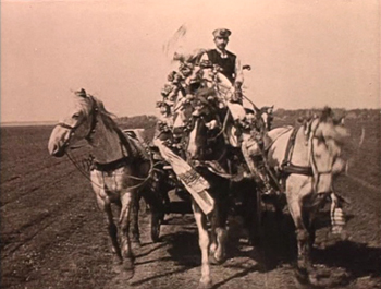
Although most synopses claim that the story runs from 1916 to 1918, it actually begins shortly before World War I, probably in 1914, as the heroine Anna marries Ivan in a lively wedding scene including a carriage ride for the bridal couple (below). Shortly thereafter news of the war comes, and Ivan reluctantly departs for to serve in it. Anna is left in the household of her lecherous father-in-law, who rapes and impregnates her. The war goes on and ends, with the Revolution taking place entirely off-screen.
The second woman of the title is Wassilissa, a tougher sort, who applies to convert a decaying local mansion (we are left to assume that it was confiscated in the wake of the Revolution). She is seen at the end as being the prototype of the new Soviet woman, though Preobrazhenskaia throughout avoids hitting us over the head with overt propaganda.
The sound films
Perhaps not surprisingly, most of the directors on the third disc, devoted to sound films, are likely to be more familiar to modern viewers. Nevertheless, Marie-Louise Iribe and her film Le Roi des Aulnes (1920), were completely unknown to me. She was the niece of designer Paul Iribe and worked primarily an actress during the 1920s, and this seems to have been her only solo directorial effort. (IMDb lists her as the co-director of the 1928 version of Hara-Kiri, which she also starred in.)
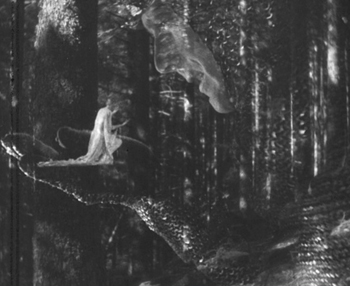
Le Roi des Aulnes is one of the musically based movies that were popular in the early sound era, being based on both Goethe’s and Schubert’s versions of “Der Erlkönig.” It’s nicely photographed, and the part of the father is played by Otto Gebühr, known for being trapped by his resemblance to Friederick der Grosse into playing that role time after time from 1921 to 1941. He’s predictably excellent here, though the stretching of the short poem into a 45-minute film forces him to register worry and eventually grief throughout. Indeed, despite extrapolated incidents, such as the injury of the father’s horse and the need to procure a new one, a great deal of repetition occurs: lots of riding through marshes and menacing appearances by the Erlkönig, who is portrayed as a large man in chain-mail.
The special effects are the most impressive thing about the film, using double superimpositions in widely different scales, with the giant king holding a small fairy on his palm.
Despite its problems, the film is a valuable addition to our examples of this mildly avant-garde trend that flourished for a short time.
Most of the rest of the directors are well-known and can be mentioned more briefly.
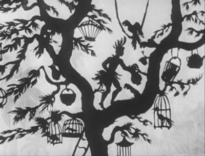
The great animator and innovator of silhouette animation Lotte Reiniger is represented by three short films: Harlequin (1931), The Stolen Heart (1934), and Papageno (1935). I have written about Reiniger’s complex compositions, including her subtly shaded backgrounds. Of the directors represented here, she is the one who enjoyed the longest career, from 1916, when she would have been 17, to 1980, when she was 81. I discuss a BFI boxed set of some of her 1950s films here. I haven’t been able to find a complete filmography, but William Moritz estimates that she made “nearly 70 films.”
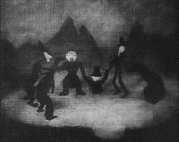
Alexandre Alexeieff and Claire Parker’s A Night on Bald Mountain is similarly familiar. Like Iribe’s Le Roi des Aulnes, it falls into the genre of illustrations of existing musical pieces, being an illustration of a piece of the same name by Modest Mussorgsky, as arranged by Nikolay Rimsky-Korsakov. It was created by manipulating hundreds of pins on a large frame called a pinboard, invented by Alexeieff, his first wife Alexandra Grinevsky-Alexeieff (whom he divorced in order to marry Parker in 1940), and Parker. The textured effect is quite unlike that of any other type of animation.
Dorothy Davenport was a prolific actress from 1910 to 1934. She is perhaps most remembered as the widow of Wallace Reid, a star who died from the effects of morphine in 1923. She directed seven films over the next decade, ending with the film in this set, The Woman Condemned (1934), mostly either uncredited or signing herself Mrs. Wallace Reid.
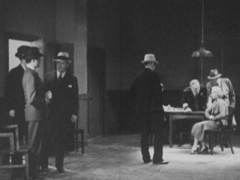
The Woman Condemned is a B picture, produced independently and distributed through the states’ rights system. It’s a competently done murder mystery that gains some interest by withholding a great deal of information from the audience. There are two main female characters, the victim and the accused (seen below in an interrogation scene), and we have very little idea of their motives and goals until the climax of the film. The revelations involve a twist on the same level of groan-worthiness as “and then she woke up.” But again, having a little-known B picture adds to the wide variety of films presented here.
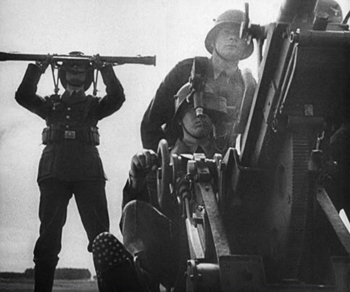
One can hardly study early women directors and skip over the favored documentarist of the Third Reich, Leni Riefenstahl. Day of Freedom (1935) is a good choice for inclusion, occupying only 17 minutes of screen time and amply demonstrating Riefenstahl’s undeniable gift for creating gorgeous images from ominous subjects.
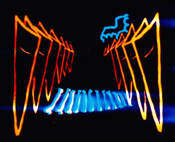
Experimental animator Mary Ellen Bute is represented by two contrasting abstract shorts, the lovely black-and-white ballet of shapes, Parabola (1937) and the vibrant and humorous Spook Sport (1939), the latter (below) made with the collaboration of Norman McLaren.
Dorothy Arzner, the only woman to direct mainstream Hollywood A films from the 1930s to the and 1940s, is introduced via a clip from one of her most famous films, Dance, Girl, Dance (1940). In the scene, Maureen O’Hara’s character interrupts her dance routine to tell off an audience of mostly men who are cat-calling her.
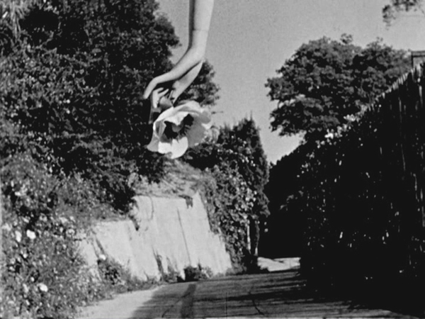
Maya Deren’s first film, Meshes of the Afternoon (1943) ends the program (see bottom). It is a happy choice, since of all the films in the program, it has undoubtedly had the greatest influence on the cinema. Much of the subsequent avant-garde cinema has turned away from music-inspired abstraction and opted for ambiguity, psychological mystery, and impossible time, space, and causality.
Valuable though this collection is, I cannot help but think that some of the directors represented have been oversold. Saccone sums them up:
Together, these 14 early women director have produced bodies of work that are inspiring, controversial, challenging, invigorating, and thought provoking. These women were technically and stylistically innovative, pushing narrative, aesthetic, and genre boundaries.
Surely not all of them meet these criteria. We would hardly expect one hundred per cent of the male directors of the same era to be “technically and stylistically innovative,” so why should we expect all of the work by fourteen varied female directors to be so? Saccone quotes Tami Williams’ book, Germaine Dulac: A Cinema of Sensations. on how the director searched “for new techniques that, in the light of official discourse of governmental and social conservatism, and the modernity of the new medium, were capable of expressing her progressive, antibourgeois, nonconformist, and feminist social vision.” Saccone sees this search in The Smiling Madame Beudet, where “Dulac utilizes cinema-specific techniques such as irises, slow motion, distortion, and superimposition, as well as associative editing, to give visibility to the inner experiences and fantasies of an unhappily married woman …”
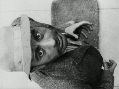
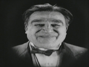
Readers might infer that Dulac innovated these techniques. Yet they had already been established as conventions of French Impressionist cinema, notably in Abel Gance’s J’accuse (1919) and La roue (1922) and Marcel L’Herbier’s El Dorado (1921). For example, Dulac surely derived the distorted image of Beudet that conveys his wife’s disgust (below left) from a similar shot of a drunken man in El Dorado (right).
This is not to say Dulac isn’t a fine filmmaker or that she had no new ideas of her own. Only that she didn’t single-handed discover these techniques, but rather she turned the emerging repertoire of Impressionist techniques toward portraying a woman’s experience.
In some cases films that were co-directed by these women are presented as their sole efforts. Lois Weber’s Suspense was directed, as were many of her early shorts, with her husband, Phillips Smalley. Quotations from interviews with both Weber and Smalley make this clear. In 1914, Smalley said of his wife, “She is as much the director and even more the constructor of Rex pictures than I.” “Even more” because Weber often wrote the screenplays for their films and in at least some cases edited them. Weber later described how Smalley worked from her scripts: “Mr. Smalley got my idea. He painted the scenery, played the leading role and helped direct the cameraman.” Directing the cameraman is part of the job of a director.
The list of films in the booklet attributes Night on Bald Mountain entirely to Claire Parker, though on the backs of the disc cases the credit is to Claire Parker and Alexandre Alexeieff. Alexander Hackenschmied (aka Hammid) is not mentioned in the list of films, and the booklet refers to him as having a “close collaboration ” with Deren, even though he and Deren are both listed as directors on the original credits of Meshes of the Afternoon.
Still, if the collection does not make the case that all of the women represented were wildly talented and innovative, it does show the variety of ways in which women managed to work both in and out of the mainstream industry. It’s valuable collection of historical examples and should be welcomed by anyone interested in the silent and early sound eras.
It is worth noting in closing that viewers should not expect all of these films to be presented in the usual beautiful restorations we are used to from Flicker Alley. Some of these films are indeed gorgeous, including the two Mary Ellen Bute shorts, Peasant Women of Ryazan, Day of Freedom, Meshes of the Afternoon, and La cigarette (though the latter has some small stretches of severe nitrate decomposition). Other prints are quite good or at least acceptable. A few of the films simply do not survive in any but battered or faded prints, notably Discontent and The Star Prince. But we are lucky to have them at all.
The quotations from the Smalley and Weber interviews are from Shelley Stamp’s Lois Weber in Early Hollywood (University of California Press, 2015), pp. 26-27.
[May 23] Many thanks to Manfred Polak, who has drawn my attention to a higher estimate of Reiniger’s lifetime production of silhouette films. Her friend and executor, Alfred Happ, put the figure at about 80. The source is an exhibition catalog from the Stadtmuseum Tübingen, which houses Reiniger’s archived material: Lotte Reiniger, Carl Koch, Jean Renoir. Szenen einer Freundschaft. Die gemeinsamen Filme. ed. Heiner Gassen and Claudine Pachnicke (Stadtmuseum Tübingen, 1994).
Carl Koch was Reiniger’s husband and collaborator; Reiniger created an animated sequence for her supporter and friend Jean Renoir’s La Marseillaise. According to Manfred, “Alfred Happ and his wife Helga were Reiniger’s closest friends and caretakers in her last years in Dettenhausen (near Tübingen, Germany). After Reiniger’s death, Alfred Happ was the administrator of her estate. If you ever come to Tübingen, visit the Stadtmuseum (City Museum), where her estate is hosted now. A part of it is shown in a permanent exhibition.” He also provided a link to a touching account of Reiniger’s friendship with the Happs.
Meshes of the Afternoon (1943)
Wisconsin Fim Festival: An unexpected gem, a Zucchini, and a farewell
Clash (2016)
Kristin here:
Three more films from this year’s Wisconsin Film Festival.
Clash (Eshtebak, 2016)
David and I were intrigued by the festival’s program notes describing Egyptian director Mohamed Diab’s second feature, Clash, as taking place with the camera entirely confined to the interior of a police paddy-wagon. This kind of limitation can be a fruitful device, as it was in the Israeli film Lebanon; there the action took place inside a military tank. Clash turned out to be a real discovery, the best film I saw at the Festival (putting aside A Quiet Passion, which we had already seen at the Vancouver International Film Festival.).
Diab’s paddy-wagon has the advantage of rows of barred windows and a door, so that we can frequently see what’s happening outside. The film is set in the summer of 2013, when there were protests, often turning violent, in the wake of the ouster of President Mohamed Morsi and his replacement by the current president, Abdel Fattah el-Sisi. The truck moves through Cairo, encountering waves of such protests, and it gradually fills with a collection of people with various religions, beliefs, and cultures–supporters of Morsi’s party, the Muslim Brotherhood; others who oppose him; Christians; a homeless man; a nurse; and two journalists–with arguments and violence erupting inside the vehicle as well as outside.
Diab had to tread a fine line in his depiction of these people, since his basic theme is that they all must learn to cooperate to some extent if they hope to survive the baking heat, tear gas, gunfire, police bullying, and the anger of the mobs outside the truck. Officially the Muslim Brotherhood is considered a terrorist organization in Egypt, though Diab manages a fairly even-handed treatment of its members and supporters. Remarkably the censors did not require any changes to the film.
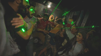
Just as remarkably, Diab was able to stage huge, convincingly terrifying riots in Cairo’s streets and highways (above). In a brief interview at Cannes last year, where Clash was shown in the Un Certain Regard section, he was asked if the shoot was difficult.
Very. You are risking your life because people might mistake the shoot for a protest, or might mistake you for the police. And there are haters of both, who can shoot you. It took us months of preparation. Egyptians to whom I’ve shown the film are blown away because they know that what we did is almost impossible.
He makes similar remarks in a question-and-answer session at the London Film Festival; his discussion of the film’s techniques comes from about 9:30 to 13:50.
The characters in the truck are constantly in danger, both from each other and from the rioters, and the action is absolutely riveting. There are a few lulls to vary the pace and to allow the prisoners to deal with their wounds and try to work out a strategy to protect themselves, but otherwise the suspense is maintained at a high level. A climactic scene in which rioters attack the truck, flashing laser pointers into it and trying to tip it over is handled, as Variety‘s review put it, with “brilliantly choreographed pandemonium.”
Clash was a huge success in Egypt. It was released in France in September and is already out on region 2 DVD (French subtitles only) there. Its festival life seems to be drawing to a close. It’s due for theatrical release in the UK and Ireland on April 21 and presumably will come out on Blu-ray and/or DVD. You can get a good sense of the film from the online trailers, the European one and especially the Egyptian one, though the film is not nearly so fast-cut.
My Life as a Zucchini (Ma vie de courgette, 2016)
2016 was a good year for animation. Kubo and the Two Strings, The Red Turtle, Moana, and Finding Dory were excellent as well. (I thought Zootopia was overrated.) Add My Life as a Zucchini to that list. This being Madison and the Wisconsin Film Festival being a university-sponsored event, we saw it with French subtitles rather than dubbed.
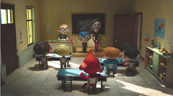
The style of the film, with its bright colors and cute, big-headed characters (above and at the bottom), makes it seem aimed at children, and the story is presented almost entirely through the viewpoints of Zucchini and the other children he meets. Yet children younger than teenagers would probably find parts of it incomprehensible or disturbing. The boys indulge in naïve but somewhat explicit speculation about sex. Zucchini’s beer-swilling mother apparently dies in an accident that he inadvertently causes, though this happens offscreen. He is taken by a sympathetic policeman to a small home for young children in the countryside. Not all are orphans, as it is made clear that one girl was taken away from her sexually abusive father and some of the others come from homes ruined by addiction or violence. Zucchini gets bullied and teased before finally being accepted.
All this makes for a strain of melancholy running through the film, but there is considerable humor to counter it, and the ending is happy.
Like Kubo, My Life as a Zucchini is puppet animation. Clearly it was done on a much lower budget, without the laser-printed changeable faces that make Laika’s characters so expressive. Charmingly, if distractingly, the clothes of the puppets occasionally shift positions, betraying the handling by the animators between frames–as when the red star on Zucchini’s T-shirt inadvertently takes on a life of its own. But on the whole, the filmmakers have used simple means to give their figures considerable expressivity.
The nomination of My Life as a Zucchini for the Best Animated Feature Oscar came as something of a surprise. Foreign films do show up in that category, but this one had its widest American release in a mere 53 theaters. It came out on February 24 and is still in 22 theaters, having grossed $286,154 as of April 6. (Presumably that does not count the two WFF screenings; the one we went to was sold out.) The DVD and Blu-ray versions are available for pre-orders on Amazon. The description says that both the original French-language soundtrack and the English-dubbed one are included.
Afterimage (Powidoki, 2016)
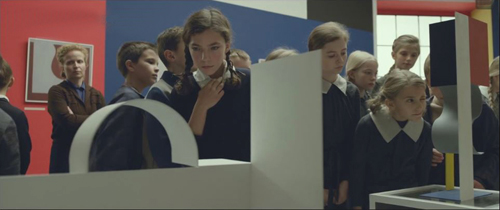
Afterimage premiered at the Toronto Film Festical almost exactly a month before the death of director Andrzej Wajda. It deals with the co-founder of Polish Constructivism, Wladyslaw Strzeminski, who helped create the Blok group in Warsaw in 1923. The plot covers only Strzeminski’s last years, but we get a strong sense of his entire career through gallery scenes displaying his work.
Socialist Realism was imposed upon Polish artists after the country came under the sway of the USSR in the wake of World War II. The film’s action starts with Strzeminski’s being fired in 1950 by the Ministry of Culture and Art because he refused to adhere to the doctrine. We see his stubborn resistance and the attempts by his adoring students to help him find respect and other work. Up to his death in 1952, he is oppressed by intransigent officials bent on denying him even the most demeaning jobs.
Reviewers have treated Afterimage with the respect due a veteran auteur late in a six-decade-plus career, but they deem it to lack the energy and appeal of his earlier work. Certainly compared with Wajda’s films of the 1950s and 1960s (we’ve commented briefly on two from the 1960s), Afterimage is a fairly conventional film. It’s beautifully made, as Wajda clearly had a considerable budget to recreate the historical look of Soviet-era buildings and streets of the early 1950s. To anyone unfamiliar with the impact that Socialist Realism could have on the avant-garde artists in the USSR and elsewhere starting in the 1930s, the film provides a vivid example. The film also contains an excellent performance by Boguslaw Linda, perhaps best known as the lead in Kieslowski’s Blind Chance.
Strzeminski, being the victim of persecution from almost the beginning, automatically becomes a sympathetic character. He also lost an arm and a leg in 1916 during World War I. (The budget is on display again in the fact that undetectable special effects removed Linda’s own arm and leg.) It is hinted that if he had been grievously injured in World War II, some allowances might be made, but having it happen during the Tsarist war of the pre-revolutionary era earns him no credit with the officials.
Yet Strzeminski loses some of our sympathy through his treatment of his teenage daughter Nika. She is interested in his art, closely examining the “Neoplastic Room” he helped create in the Lodz Museum–just before it is dismantled and put into storage as part of Strzeminski’s punishement. Nika also tries to help her father, cooking for him and trying to get him to cut back on smoking, but his ingracious rejection of her efforts helps drive her to live in a girls’ dormitory near her school. He remarks matter-of-factly after Nika leaves, “She will have a hard life.”
Our thanks to Graham Swindoll of Kino Lorber for help with this entry. As well, of course we owe a debt of gratitude to the WFF programmers Jim Healy, Mike King, and Ben Reiser.
My Life as a Zucchini (2016)
The ten best films of … 1926
The Adventures of Prince Achmed.
Kristin (with some help from David) here:
David and I have been offering this greatest-of-90-years-ago series almost as long as this blog has existed. For earlier annual entries, see 1917, 1918, 1919, 1920, 1921, 1922, 1923, 1924, and 1925.
I approached 1926 with the assumption that it would present a crowded field of masterpieces; surely it would be difficult to choose ten best films. Instead it turned out that some of the greatest directors of the era somehow managed to skip this year or turn in lesser films. Eisenstein had two masterpieces in 1925 but no film in 1926. Dreyer made a film that is a candidate for his least interesting silent feature, The Bride of Gromdal. Chaplin did not release a film, and Keaton’s Battling Butler, while a charming comedy, is not a plausible ten-best entry. The production of Lang’s Metropolis went over schedule, and it will appear on next year’s list, for certain.
Still, the Soviet directors were going full-tilt by this time and contribute three of the ten films on this year’s list. French directors on the margins of filmmaking created two avant-garde masterpieces. Two comic geniuses of Hollywood already represented on past lists made wonderful films in 1926. A female German animator made her most famous work early in a long career. I was pleased to reevaluate a German classic thanks to a sparkling new print. Finally, Japan figures for the first time on our year-end list, thanks to a daring experimental work that still has the power to dazzle.
The Russians are coming
Vsevolod Pudovkin’s Mother was a full-fledged contribution to the new Montage movement in the Soviet Union. By the 1930s, that movement would be criticized for being too “formalist,” too complex and obscure for peasants and workers to understand. Nevertheless, being based upon a revered 1906 novel of the same name by Maksim Gorky, Mother was among the most officially lauded of all Montage films. It tells the story of a young man who is gradually drawn into the Russian revolutionary movement of 1905. His mother, the protagonist of the novel, initially resists his participation but eventually herself joins the rebellion.
Along with Potemkin, Mother was one of the key founding films of the Montage movement. Its daring style is no less impressive now than it must have been at the time. One brief scene demonstrates why. Fifteen years before Mother, D. W. Griffith was experimenting in films like Enoch Arden (1911) with cutting between two characters widely separated in space, hinting that they were thinking of each other. By 1926, Pudovkin could suggest thoughts through editing that challenged the viewer with a flurry of quick mental impressions.
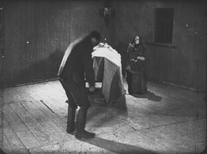
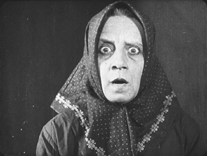
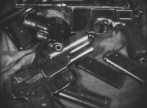
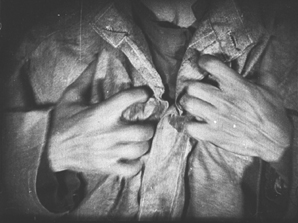
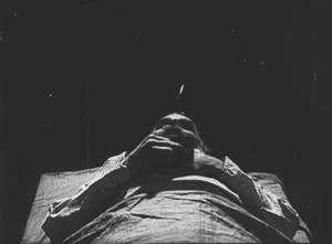
As the Mother sits beside her husband’s dead body, her son, a participant in the 1905 failed revolution, comes in. He is about to bend down and open a trap-door in the floor (73 frames). A cut-in shows her horrified reaction (12 frames), and there follows a brief close shot of some guns she had seen him hide under the floor in an earlier scene (11 frames). Even shorter views of a man clutching his chest (8 frames), two jump-cut views of the dead husband (3 frames and 2 frames), and a tight framing of the son being shot follow (8 frames). We return to her face, registering even greater horror (15 frames). A return to the initial long shot shows her leaping up to try and stop her son from taking the guns out to participate in a seditious act (31 frames).
The series of five shots goes by in a few seconds, and we are challenged to grasp that the guns are a real memory, while the shots of the man’s chest and her son’s anguished face are visions of what might happen. The shots of her husband’s body suggest that she could soon end up sitting by her son’s corpse as well. The jumble of recollection, imagination, and reality are remarkably bold for this relatively early era.
Mother also contains two of Pudovkin’s most memorable scenes, the breaking up of ice in the spring as a symbol of the Revolution and the final violent attack on the demonstrators, including the heroine.
Mother was released on DVD by Image Entertainment in 1999, but it seems to be very rare. An Asian disc, perhaps a pirated edition of the Image version, is sold on eBay. I’ve never seen the film on DVD and can’t opine on these. The time is ripe for a new edition.
Pudovkin was one of the filmmakers who had studied with Lev Kuleshov during the early 1920s, when Kuleshov made the famous experiments that bear his name. Pudovkin played the head of the gang of thieves in The Adventures of Mr. West in the Land of the Bolsheviks, which I included in the ten-best list of 1924.
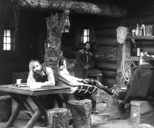
Kuleshov had moved on as well to direct his most famous film and probably his best silent, By the Law, based on Jack London’s story “The Unexpected.” Set in the Yukon during the gold rush, it involves five people who are cooperatively working a small claim and discover gold. Taking advantage of a warm autumn, they stay too long and are trapped for the winter. One of the men kills two of the others, and the heroine, Edith and her husband Hans are left to determine the fate of the killer, Dennin. Edith insists on treating him strictly according to the law. After enduring the harsh winter and a spring flood, the couple finally act as judge, jury, witnesses, and, after finding Dennin guilty, executioners.
The great literary critic and theorist Viktor Shklovsky (one of the key figures of the Russian Formalist school) adapted the short story, condensing it by eliminating the opening section of Edith’s backstory and a few scenes in which a group of Indians appear occasionally to help the prospectors. The result is a concentration on the tense drama of a three people trapped together in a tiny cabin.
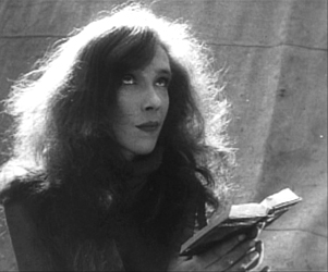
In the 1924 entry, I mentioned that Kuleshov’s team emphasized biomechanical acting and that Alexandra Kokhlova was adept at eccentric acting. She delivers a bravura performance here, as Edith moves closer to a breakdown as the months go by.
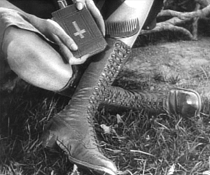
Kuleshov also puts into practice the experiments in imaginary geography that his classes had made. Although in this film he didn’t unite shots made in widely separate spaces, he did favor scenes built up of a considerable number of detail shots before finally revealing the entire space in an establishing shot. Edith, for example, though glimpsed briefly asleep early on, is introduced in a later scene by a shot of her boots and Bible, followed by a shot of her head as she read the Bible. The scene also contains close shots of the other characters before a general view of the cabin interior shows where each of them is.
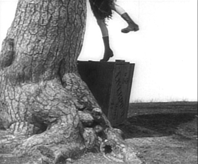
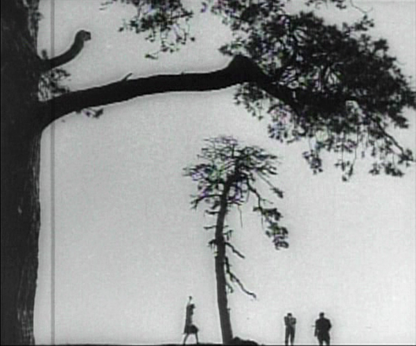
The scene of the execution includes one of the most famous images of the Monage movement, a framing with the horizon line at the bottom edge of the frame and the sky dominated by trees (see bottom). Any number of framings of tall features such as trees and telephone poles against a huge sky appeared in Montage and non-Montage films, and this device became so common as to be a trait of the Soviet cinema of the late 1920s and early 1930s.
The desire to hide the actual hanging led Kuleshov to stage is behind the larger of the two trees, as Edith and Hans struggle to carry out their sentence on Dennin. This leads to some eccentric framings, such as our view only of Edith’s legs as she teeters on the box where Dennin stands, presumably adjusting the noose (see top of this section).
A beautiful print of By the Law is available on DVD from Edition-Filmmuseum.
Grigori Kozintzev and co-director Leonid Trauberg did not study with Kuleshov, but they shared a passion for eccentricity. Having started out in the theater, in 1921 both contributed to the “Manifesto for an Eccentric Theater,” a dramatic approach based on popular forms like circus and music-hall. In 1922 they founded the “Factory of the Eccentric Actor” group and two years later transformed it into FEKS, devoted to making films.
The Overcoat (also known in English as The Coat), their second feature, was based on a combination of two short stories by Gogol, an author whose grotesque creations were very much in tune with their own tastes. It tells the story of a poor, middle-aged low-level government clerk, Akaky Akakievich, who is bullied over his shabbiness, particularly his worn-out overcoat. Scrimping to buy a new one, he finally purchases a magnificent new coat and finds his status suddenly raised–until the coat is stolen.
Andrei Kostrichkin was a mere twenty-five years old when he played the fiftyish clerk, but he was highly effective and provided another model of the eccentric actor. As Akakievich he stands with bent legs and twisted torso, as if flinching away from a blow, and walks in tiny steps along perfectly straight lines through the hallways in his office building. When he applies to a Person of Consequence for help in recovering his stolen coat, the official leans over his desk to look downward, with a high-angle point-of-view framing of Akakievich appearing dwarfed by the other’s superiority.
The script of The Overcoat was adapted by another Russian Formalist critic and theorist, Yuri Tynjanov.
Unfortunately The Overcoat does not seem to be available on any form of home video.
Petit mais grand
The IMDb lists 23 directing credits for Dimitri Kirsanoff from 1923 to the year of his death, 1957. He is largely remembered, however, for one film, the 37-minute Ménilmontant, a melodrama about the travails of two sisters orphaned as children by a violent crime. Each is later seduced by a callous young man who leaves the heroine a single mother and her sister reduced to prostitution. It belongs to the French Impressionist moment. (We deal with Impressionist films in other entries: La roue, L’inhumaine, L’affiche, Coeur fidèle, The Smiling Madame Beudet, Le brasier ardent, Crainquebille, and El Dorado, as well as DVD sets of Impressionist films by the Albatros company and by director Jean Epstein.)
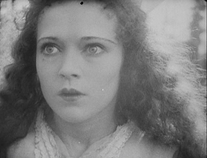
The story itself is simple and indeed might be thought clichéd were it not for two factors. First, there’s the performance of the delicately beautiful Nadia Sibirskaïa as the protagonist. There’s also the lyrical, melancholy use of the settings, initially in the countryside and later in the desolate working-class Parisian district whose name gives the film its title. The simplicity of the narrative also makes it one of the most successful of the attempts to tell a story visually, eschewing intertitles.
The film’s most famous scene is its abrupt, shocking opening. With no establishing shot, there is a series of rapid shots of details of faces, hands, a window, and an ax, during which we can barely discern that a man has committed a double murder. The spectator cannot possibly know who these people are and why the murders occur.
Instead of offering an explanation, the action then shifts to two little girls playing in the woods. As they return home, the camera begins to concentrate on one of them, apparently the younger, as she arrives at the murder scene and reacts in horror. Kirsanoff presents her expression in a series of five shots, linked by what David has termed axial cuts, from medium shot to extreme close-up as she gradually realizes what has happened.
There had certainly been axial cuts before this, including in Potemkin, but Kirsanoff probably went further than anyone of the era by including so many shots, by making each so short, and by moving his camera forward in such small increments. It is difficult to notice every cut, particularly the one from the third to the fourth shot, and the effect adds an unsettling quality to an already intense moment.
After this opening, a funeral scene reveals through labels on the grave that the murdered man and woman are the children’s parents. We might have suspected that the killer was a jealous husband discovering his wife with her lover. As it is, we never learn whether the crime was the result of a love triangle or the random act of a madman.
The rest of the film establishes the sisters now grown up, working in a workshop making artificial flowers and sharing a small flat in Menilmontant. The heroine’s brief romance leads to a baby, and superimpositions and other Impressionist techniques depict her despair and contemplation of suicide. Beautifully melancholy atmospheric shots of the streets of the neighborhood punctuate the action and underscore the dreariness and hopelessness that the heroine faces. The ending, though an improvement in the heroine’s lot, does little to dispel the overall grimness of the story.
Menilmontant is included in the out-of-print set “Avant-garde – Experimental cinema of the 1920s & 1930s.” It has been posted twice on YouTube in a low-rez format.
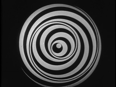
Even shorter is Anémic cinéma, the only venture into film directing by the great French Dadaist, Marcel Duchamp. It’s hard to compare a roughly seven-minute abstract film with narrative features, but this short is so innovative and influential that it’s also hard to leave it off the list.
Duchamp went through a phase of spinning artworks, including some “Rotoreliefs” that he attempted to sell as toys. These were similar to some Victorian optical toys, such as the Phenakistopscope and the bottom disks of Zoetropes. See Richard Balzer’s website for a collection of such devices, as well as “The Richard Balzer Collection” on tumblr, which contains gifs that animate some of the disks, done by Brian Duffy. Some of these resemble the spinning spirals and embedded circles that Duchamp used for his short. (See the top of this section.)
These spinning abstract circular images alternate with slowly spinning disks with sentences laid out as spirals. These involve either alliteration or puns or both. Unfortunately the English subtitles cannot render these in a way that conveys the original intent. For example, “Esquivons les ecchymoses des esquimaux aux mots exquis” becomes “Let us dodge the bruises of Eskimos in exquisite words.” The meaning is the same, and even the echo of the first syllables of “Eskimos” and “exquisite” is retained. Nevertheless, the similar syllables in two other words in the original are lost, as are the echoes of “moses,” “maux,” and “mots.” It is rather as though someone attempted to render “Peter Piper picked a peck of pickled peppers” into another language quite literally. (The Wikipedia entry includes a complete list of the sentences in French.)
Duchamp’s purpose was presumably to create an artwork with minimal means, including quasi-found objects, the disks he had made for another purpose. His idea is clearly reflected in the title, Anémic cinéma, which suggests a weakness or thinness of means. “Anémic” is also an anagram for “cinéma.”
Anémic cinéma is available in the same collection as Menilmontant, linked above. it is also available in the similarly out-of-print set, “Unseen Cinema.” There are numerous versions on YouTube, varying in quality. Some of these have been manipulated by other artists.
Lloyd and Lubitsch
Though Chaplin and Keaton might have had off-years in 1926, Harold Lloyd did not. Over the past several years, Lloyd has gradually been gaining the admiration he deserves. He used to be known largely for Safety Last (1923) and The Freshman (1925), two excellent films which, however, are not his finest. Girl Shy (1924) and The Kid Brother (1927) are better known now for the masterpieces they are. For Heaven’s Sake (directed by Sam Taylor), which clocks in at a mere 58 minutes, is just as good.
Lloyd plays a breezy millionaire, J. Harold Manners, who unintentionally helps Brother Paul found a mission in the downtown slums of Manhattan. He falls in love with Hope, the missionary’s daughter, and decides to help out around the place. By this time Lloyd was known for his spectacular chase scenes, and there are two here. Initially he puts a twist on the chase, luring a growing crowd of criminals into racing after him, ending in the mission. Gaining their respect, Harold makes the mission a happy social center.
The romance provides one of my favorite comic intertitles, leading into a love scene: “During the days that passed, just what the man with a mansion told the miss with a mission–is nobody’s business.” The love scene in turn includes a visual joke that emphasizes the rich boy – poor girl contrast.
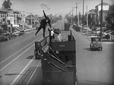
Harold’s rich friends hear that the pair are to be married and determine to kidnap him to prevent the inappropriate match. The result is a lengthy chase through the streets of Manhattan, with the drunken thugs rescuing Harold and using a variety of means to get him back to the mission in time for the wedding–as when the drunken leader of the group demonstrates his tightrope-walking abilities on the upper railing of a double-decker bus (see above).
Two years ago, when I put Girl Shy on my list, the New Line Cinema boxed set of Lloyd films was out of print and hard to find, and the separate volumes appeared to be going out of print as well, with Volume 1 not being available at the time. The situation has changed, and the boxed set, though apparently still out of print, is now available at reasonable prices from various third-party sellers on Amazon and Barnes & Noble. The set contains a “bonus disc” with extras, including interviews and home movies. The same is true for the three individual volumes (here, here, and here). For Heaven’s Sake is in Volume 3.
Inevitably, coming directly after Lady Windermere’s Fan, probably Ernst Lubitsch’s greatest silent film, So This Is Paris does not quite live up to its predecessor. Still, it’s a very fine, clever, and funny film, and it marks Lubitsch’s last appearance in these lists until sound arrives.
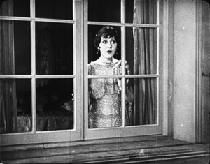
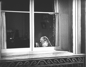
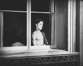
The opening scene, running nearly twenty-five minutes, is as good as anything Lubitsch did in this era. Set in Paris, it’s a slow build-up of misunderstandings and deceptions involving two affluent couples in apartments across the street from each other. One couple, Maurice and Georgette Lalle, are practicing a melodramatic dance in Arabian costumes. Their marriage seems to be a rocky one. Across the street, Suzanne Giraud is reading one of the lurid “Sheik” novels that were popular at the time, involving “burning kisses” in its final scene. Put into a romantic mood by this, she looks out her window and sees the head of a man in a turban at the window opposite–Maurice relaxing after his strenuous rehearsal.
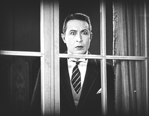
Her husband Paul arrives home, and she kisses him passionately. Apparently not used to such affectionate greetings, he is puzzled until he, too, looks out the window. By now Maurice has doffed his turban and necklaces and appears to be not only naked but also examining a piece of his anatomy.
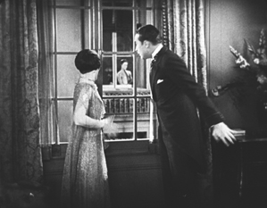
Paul jumps to the conclusion that this sight is what caused Suzanne’s unaccustomed display of passion. He calls her to the window, and we see Maurice in depth through the two windows.
Suzanne then asks if Paul is going to stand for such a thing, and he goes to the other apartment to confront Maurice. Instead he finds Georgette, who turns out to be an ex-lover of his. She introduces him to Maurice, who is very friendly and charms Paul. The latter who returns home and claims that he has beaten Maurice and even broken his cane on him, though in fact he had simply forgotten it. Shortly thereafter Maurice visits Suzanne to return the undamaged cane and takes the occasion to flirt with her. It’s a beautifully plotted and developed farcical scene. The film is based on a French play and could easily have become stagey in its adapted form. Yet the byplay between the two apartments via the windows allows Lubitsch to avoid any such impression; the misunderstandings based on optical POV recall the racetrack scene of Lady Windermere.
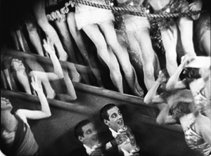
The rest of the film develops the two potentially adulterous affairs, primarily with Paul secretly taking Georgette to the Artists’ Ball. Here Lubitsch uses an elaborate montage sequence to convey the wild party, with superimpositions and shots taken through prismatic lenses.
Such sequences were primarily developed in German films and were still fairly rare in American ones in 1926. Similar techniques convey Paul getting drunk on the champagne he and Georgette are awarded when they win a dance contest–the announcement of which on the radio broadcast of the ball alerts Suzanne to her husband’s presence there with another woman.
So This Is Paris is less famous than Lubitsch’s earlier American comedies primarily because it has never appeared on DVD. Marilyn Ferdinand, in a blog entry that gives a detailed description of the film, writes that Warner Bros. claims not to own the rights to the film anymore and therefore has made no effort to bring it out on home video. On the other hand, a four-minute excerpt of the dance montage sequence was included in the Unseen Cinema set (disc 3, number 18), and the credit there is “Courtesy: Warner Bros., Turner Entertainment Company.” Whatever the rights situation is, a home-video version of this film is in order. A beautiful 35mm print is owned by the Library of Congress, so there is hope.
Two German flights of fancy
I must confess that I was disappointed the first time I saw F. W. Murnau’s Faust, and I have never warmed up to it in later viewings. I am delighted at having occasion to look at it again for this 1926 list, since a recently discovered and restored print reveals that the main problem before was the poor visual quality of the print formerly in circulation.
Different local release prints survived in a number of countries, but there were basically two original versions made: the domestic negative for German release and the export negative. These were shot using two camera side-by-side on the set, as was the standard practice in much of the silent era, given the lack of an acceptable negative-duplicating stock. The primary camera contributed most of the shots to the domestic negative, though in some cases where the second camera yielded a superior take, that was used in the domestic negative. Conversely, inferior takes from the primary camera sometimes made their way into the export negative. The result, as we now know, was that both the visual quality and in many cases the editing of the scenes was markedly different in the two negatives.
The version familiar for decades originated from the export negative. Recently the domestic negative was rediscovered, and the Friedrich Wilhelm Murnau Stiftung restored the that version using the that negative, supplemented with material from a variety of other prints. The result closely approaches the original German release version, including the original decorated intertitles. The contrast in quality between this restoration and the old, familiar Faust is remarkable.
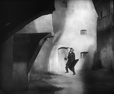
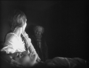
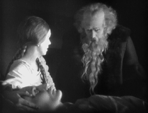
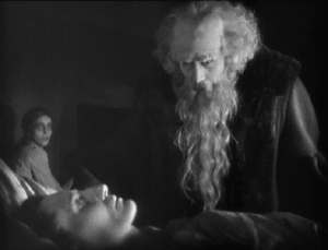
Given how dark the film is, details in the backgrounds could easily be lost. The scene in which Faust is called to help a woman dying of the plague is revealed to have dramatic staging in depth against a very dark room contrasted with the stark foreground underlighting of the woman’s haggard face. Faust enters from behind the daughter and comes forward to her, after which his movement is balanced by the daughter retreating into that same dark background.
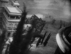
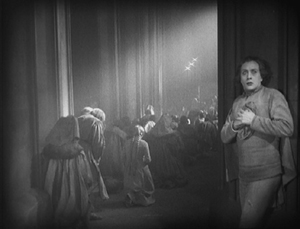
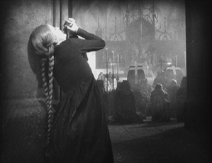
The famous aerial journey of Mephisto and Faust from Germany to Italy (below left) always looked rather hokey, but the detail revealed in the extraordinarily extensive model makes it far more impressive. Similarly, when one can actually see the sets, visual echoes become apparent. For example, Faust first encounters Gretchen and follows her into the church, where he finds himself barred from entering by his pact with Mephisto. Later, when Gretchen has been abandoned, she laments when not permitted to enter there.
No doubt some motifs of this sort were visible in the earlier print, but their clarity here enhances both the beauty and the craft of Murnau’s film.
Faust is available in several editions on DVD and Blu-ray. DVDBeaver ran a detailed comparison among seven of these, including a selection of frame grabs. To my eye, the 2006 DVD “Masters of Cinema” version of the domestic print, released by Eureka!, looked the best. (The two-disc set also includes the export version.) The Blu-ray from the same source, released in 2014, looked slightly darker. The box for the Blu-ray also includes the DVD, however. These releases are Region 2. The film is available on Blu-ray in the USA from Kino.
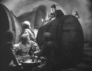
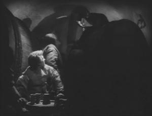
Both Eureka! releases’ supplements include a booklet, a commentary track, a Tony Rayns interview, and a lengthy comparison of the domestic and export versions. One particularly striking example is drawn from the scene in which Mephisto talks with Gretchen’s brother in a beer hall, with the domestic version on the left.
While watching Faust, I kept grabbing frames, far too many to be used in this entry. They were simply too beautiful or impressive to be passed over, and they made my final selection of illustrations difficult. The only other film for which this was true this year is Lotte Reiniger’s silhouette-animated feature, The Adventures of Prince Achmed. The restored, tinted print that is currently available is even lovelier than the older black-and-white version.
Reiniger seems to have invented the use of jointed silhouette puppets, and she still is the first artist one thinks of in relation to this form of animation. She continued to practice it until the 1970s. (See the link below to a collection of many of her short films.) Her one feature film remains her most famous and is probably her masterpiece.
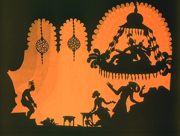
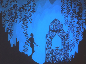
It involves far more than simple black figures moving against a light background. As the frame at the top of this entry shows, her characters, furnishings, and locations, all rendered in paper with scissors, were often elaborate indeed. Characters wore feathers, jewelry, fancy wigs, and other decorative elements. The hanging platform has many little tassels, and the lamps are rendered in delicate filigree. The backgrounds are not blank but have varying layers of saturation that suggest a depth effect, the equivalent of atmospheric perspective. At the left in the top image, a series of identical curtains start out a dusky orange and in three stages lighten until there is a bright, solid glow at the center.
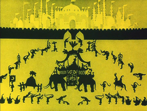
In the frame at the left below, the same sort of shading creates the depth of a cavern, setting off the tracery of the foliage and the kiosk in which the hero finds the magic lamp. On the right, very simple shading suggests a vast and elaborate palace in the background, while Reiniger fills the foreground with many small figures, all marching out to surround the procession of the caliph.
By choosing a classical fantastic tale, Reiniger found the perfect subject matter to fit the technique that she invented. Both the subject matter and the sophistication of the animation give her films a timeless look. Her reputation remains high today as a result. One scene in Harry Potter and the Deathly Hallows Part 1, “The Tale of the Three Brothers,” was made in a style inspired by Reiniger’s work. (I discuss it here.)
A restored, tinted version of The Adventures of Princes Achmed is available from Milestone. A combination Blu-ray/DVD release of the film is available from the BFI. (I have not seen this version.) Note that these have somewhat different content. The BFI version has five Reiniger shorts from across her career along with a booklet. The Milestone version has only one of the shorts, but it includes a documentary about Reiniger. (This documentary was on the 2001 BFI release of the film on DVD but is not listed among the extras on its Blu-ray.) See also the BFI’s collection of many of her shorts, “Lotte Reiniger: The Fairy Tale Films,” which I discussed here.
[Dec 27: Thanks to Paul Taberham for pointing out that Prince Achmed also has no intertitles and gets along without them very well.]
Into the asylum
David here:
Few western viewers of 1926 saw any Japanese films, but Japanese audiences had been watching imported films for a long time. Hollywood films could easily be seen in the big cities, and The Cabinet of Dr. Caligari (released in 1922), La Roue (released in early 1926), and other films from Europe had made a strong impression on local filmmakers. One fruit of this influence was the wild Page of Madness (Kurutta ichipeiji, aka “A Crazy Page”).
Directed by Kinugasa Teinosuke and based on a story by the renowned experimental writer Kawabata Yasunari, the film bore the influence of German Expressionist and particularly French Impressionist cinema. Page of Madness set out to be a bold exercise in subjective filmmaking. But it wasn’t widely seen at the time, and wasn’t revived until 1971, when Kinugasa discovered a print in his house (reportedly, among cans of rice). Apparently the version we have is slightly edited.
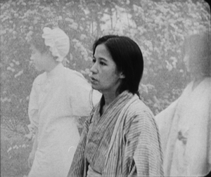
A woman has been confined to a madhouse, and her husband has taken a job as a janitor there to stay in touch with her. Many of the scenes are presented as the hallucinations of the wife and other inmates, while abrupt flashbacks attached to the husband fill in the past. But this story is terribly difficult to grasp. There are no intertitles (perhaps an influence of The Last Laugh, shown in Japan earlier in 1926), and the film is a blizzard of images, choppily cut or dissolving away almost subliminally.
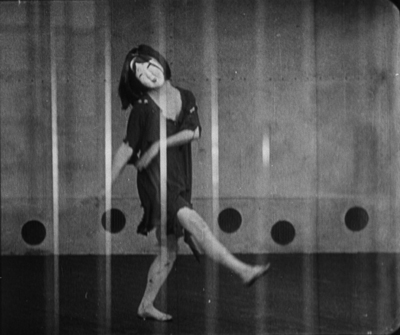
Viewers of the period had the advantage of a synopsis printed in the program, and there was a benshi commentator accompanying the screening to explain the action. Because we lack those aids, the film seems more cryptic than it did at the time. Even when you know the story, though, Page of Madness often surpasses its foreign counterparts in its free, unsignalled jumps from mind to mind and time to time. It remains a powerful example of narrative and stylistic experiment, from its canted framings and single-frame cutting to its frenzied camera movements and abstract planes of depth (thanks to scrims à la Foolish Wives, 1922).
For nearly fifty years it has remained a milestone, a grab-bag of advanced techniques and likely the closest Japan came to a silent avant-garde film.
Page of Madness is not commercially available on home video. It is occasionally shown on TCM, and a reasonably good print is on YouTube. Aaron Gerow’s A Page of Madness: Cinema and Modernity in 1920s Japan is an indispensable guide to Kinugasa’s eccentric masterpiece.
By the Law.
A decade at the Vancouver International Film Festival
The Red Turtle (2016).
Kristin here:
Recently this blog passed its tenth anniversary. Our first modest entry, on Christine Vachon’s book A Killer Life, was posted on September 26, 2006. The second was “A film festival for all seasons,” the first of David’s five reports on that year’s Vancouver International Film Festival, where he was a judge in the Dragons and Tigers competition for young Asian directors. Since then we both have come to VIFF nearly every year. Its organizers and staff are always welcoming and we can see lots of films in a relatively relaxed atmosphere free from the red carpets, the markets, and the celebrities that make some of the bigger festivals difficult to navigate. We’re delighted to be back in Vancouver now, reporting on its rich array of offerings for a tenth time.
The Rehearsal
Canadian-born, New Zealand-bred, New York-dwelling director Alison Maclean gives us The Rehearsal (2016), her first feature since her best-known film, Jesus’ Son (1998). In between she has been primarily working in television, including episodes of Sex and the City and The Tudors.
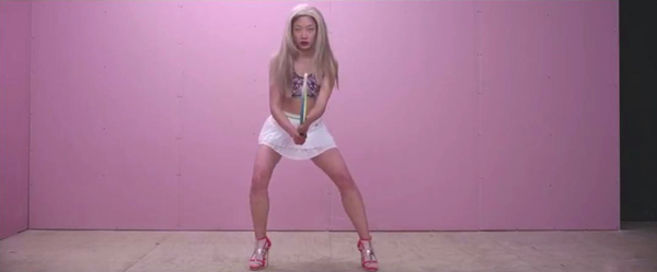
The film begins with an image of an Asian woman in a blonde wig and ultra-high-heel shoes facing directly into the camera and miming a tennis game (see bottom). Such an arresting opening is a wise move, since the film’s early portions are mostly expository. The opening introduces Stanley, a young Maori man who gains acceptance to a high-pressure, prestigious drama school, despite his apparent lack of the necessary talent and drive. Overcoming his initial listlessness, Stanley gradually bonds with his classmates. He also blossoms somewhat under the tough-love approach, sometimes verging on cruelty, that is the policy of Hannah, the demanding head of the school (Kerry Fox, above, best known for playing Janet Frame in An Angel at My Table).
The opening image turns out to be a flashforward to a rehearsal of an original playlet that Stanley and a group of teammates must put on at the end of the school year. For their story they seize upon a current local scandal in which a tennis coach has had an affair with an underage pupil. Stanley has begun dating the girl’s sister Isolde, which gives him knowledge about the situation that the group incorporate into their play. The main suspense arises from Stanley’s failure to tell Isolde what his team is up to, despite the fact that inevitably she will find out. More drama arises from the effects of Hannah’s harsh methods on the students, particularly Stanley’s vulnerable roommate.
The Rehearsal currently has no American distributor but will play on October 5 at the New York Film Festival.
The Confessions (Le Confessioni)
Early in The Confessions a spectacular drone shot follows a moving car from above the treetops. Eventually the car arrives at a driveway crowded with news photographers, and the camera leaves it to reveal a huge modern hotel and then move beyond it over ta body of water. Though not as flashy, the rest of the film has the sort of lush cinematography (above) and rich musical score that are familiar from such other recent prestigious Italian productions as The Great Beauty.
The plot involves a sort of bitter parody of a G8 meeting, with eight representatives of major countries meeting under the guidance of the head of the International Monetary Fund. They are preparing to execute some sinister plan, under the guise of “creative destruction,” that will solve a current international financial crisis in a way that will benefit rich countries at the expense of the poorest ones. Daniel Roché, the head of the IMF, has also invited an Italian monk, Roberto Salus (played by Tony Servillo, so memorable in The Great Beauty and especially Il Divo), to attend.
The reason for Salus’ presence is not clear, though Roché requests him to hear his first confession in twenty years. Roché is soon found dead. It’s apparently a suicide, but some of the finance ministers attending the meeting seemingly try to eliminate Salus by casting him under suspicion of murder. The film turns into a cat-and-mouse game, with each seeking out Salus for devious conversations, punctuated with tantalizing flashbacks that gradually reveal what Roché had revealed during the confession scene.
Although on the surface the film seems to be developing into a thriller, it is too playful to be taken entirely seriously, and the wise, reserved Salus always delivers the final sardonic comic topper in his exchanges with each of the villains. There is even a suggestion of a sort of magical realism at a few points. Ultimately The Confessions is a somewhat uneasy mixture of genres but a highly entertaining one.
The Red Turtle
In the early days of the blog (December 10, 2006), I wrote an entry claiming that in contemporary cinema, animated films are on average more likely to be stylistically superior to live-action ones. Animated films have to be intensively pre-planned, including recording soundtracks in advance. Such careful preparation, which eliminates the easy reliance on “coverage” and limits changes in post-production, imparts a rigor and care that are too often missing in live-action features. Two experiences with animated films here at Vancouver reinforce my point.
David and I agree that The Red Turtle is a standout among the films we’ve seen so far. It’s an animated feature by Michael Dudok de Wit, the Dutch animator who won the animated-short-film Oscar in 2000 for Father and Daughter. The Red Turtle won a Special Jury Prize at Cannes this year. It also has Studio Ghibli’s name attached, which might lead to some raised eyebrows.
Studio Ghibli’s three legendary animators all retired in recent years: Hayao Miyazaki, after The Wind Rises (2013); Isao Takahata, after The Tale of the Princess Kaguya (2013); and Hiromasa Yonebayashi, after When Marnie Was There (2014). Rumors that the studio would shut down fortunately proved false, despite the fact that its crew of animators was disbanded. The Red Turtle is the first film to bear the Studio Ghibli name since Marnie. The studio, not Dudok de Wit, initiated the project, and perhaps it will henceforth support occasional hand-picked productions like this one.
Though The Red Turtle uses traditional cell animation, it does not particularly imitate the studio’s familiar style Nevertheless, the film is far from being a radical departure from its previous output. For one thing, The Red Turtle is vitally concerned with the depiction of nature. It opens with a storm that drives a single survivor from a shipwreck onto the beach of a small island, uninhabited by humans. His first contact with living things there comes when a curious sand-crab crawls up his pant-leg, and a group of these crabs provides touches of comic relief throughout.
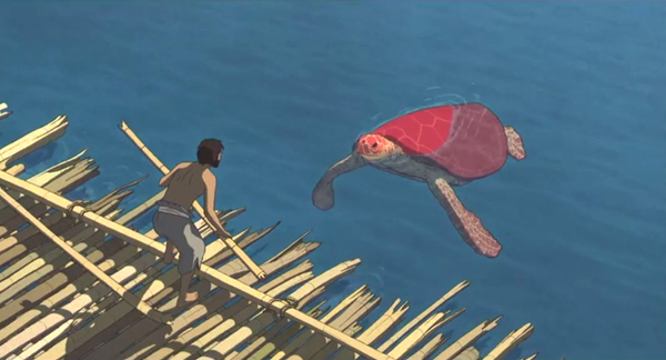
Three times the unnamed man tries to escape aboard bamboo rafts (above), but each time a large red sea turtle destroys his craft (see top) and forces him back to the island. In the story’s first fantastical event, the turtle transforms into a woman, and the two soon fall in love, Adam and Eve in a sparse Garden of Eden. They gain a son, a tsunami introduces a note of threat into the idyllic depiction of nature, and ultimately they face mortality. The simplicity and fantastical elements of the story would be perfectly convincing as a rendition of an existing myth, but the story is completely Dudok de Wit’s invention.
The three human figures are drawn very simply and look like they were rotoscoped, though I can find no confirmation of that online. The depiction of the natural landscape and the creatures that inhabit it are, however, stunningly beautiful. Without attempting a photorealistic look, Dudok de Wit’s team have captured the look and movement of sunlit seawater, the rhythmic rustling of leaves, and even the differences in color between the exposed and the submerged surfaces of woolsack blocks of granite at the ocean’s edge. It is almost as if they have managed to rotoscope all of nature.
The classic films by the main directors at Studio Ghibli are more elaborate and complex than The Red Turtle, but the new film suggests that the studio will maintain its high standards in its future productions.
The Red Turtle was bought by Sony Pictures Classics and is scheduled for a mid-December American release.
Window Horses (The Poetic Persian Epiphany of Rosie Ming)
While The Red Turtle is a high-profile animated film, Window Horses originated as an Indiegogo project. Its success in that campaign led Sandra Oh to back the film, signing signed on as a producer and providing the voice of the film’s heroine. The project gained additional support, including by the National Film Board of Canada. Still, it is likely to remain largely a festival item (it premiered at the Annecy International Animation Film Festival), with only a limited theatrical release in Canada early next year. (Information on that release is not yet available online, but news will presumably be posted on the film’s website.) It exhibits a lively imagination and stylistic sophistication that deserve a wider audience, which with luck it will achieve via streaming.
The story centers on Rosie Ming. With her Chinese mother dead and her father having apparently abandoned his family to return to Iran, she lives in Vancouver with her maternal grandparents. A self-published book of her verses leads to an invitation to a poetry festival in Shiraz. Donning a full chador in the hopes of fitting in, she finds herself surrounded by women wearing simple scarves and vibrant clothing.
The animation itself is colorful, with stylized faces that are vaguely reminiscent of Picasso (as in the tour-bus scene, above). Rosie stands out in her utter simplicity, rendered as a black-clothed stick figure with a round, white face sketched in only by eyes and, when she speaks, a mouth. Recitations of poems are accompanied by scenes of animation is a variety of styles, contributed by such animators as Kevin Langdale, Janet Perlman, Bahram Javaheri, and Jody Kramer.
Overall, it is an engaging and entertaining film, showing how much an independent filmmaker can do with limited means. In that it reminds me of Nina Paley’s Sita Sings the Blues.
Films that have particularly impressed us so far include Pablo Larrain’s Neruda (playing again on October 9), Cristian Mungui’s Graduation (playing again October 5 and 11), and above all Terence Davies’ A Quiet Passion (playing again on October 9). We’ll be blogging about these and others over the next several days.
The Rehearsal (2016).


